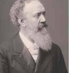
#Eduard Hoffmann
Photo
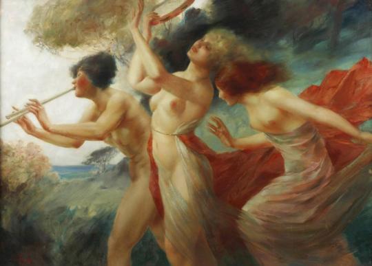
Bacchantinnen by Eduard Ansen-Hoffmann
2 notes
·
View notes
Text

This is a 1920s German notgeld note commemorating laundry detergent entrepreneur Eduard Hoffmann. He used the grooming white cat on his products to symbolize cleanliness. Source.
702 notes
·
View notes
Text
Helvetica - The Documentary
The Rise, Flatline, and Fall of the Modernist Movement's Darling Poster Child
Name: Helvetica (Die Neue Haas Grotesk)
Parents: Max Miedinger and Eduard Hoffmann
Nicknames: "Perfection" / "Ubiquitous" / "Air" / "Ultimate Typeface"
1950’s - post-war period - feeling of idealism
Social responsibility for designers
More democracy, clarity, rebuilding
Early experiments of High Modernist period - Swiss style
1957 - HELVETICA IS BORN !!! - rational typeface for all kinds of information to present ideas in intelligible/legible way - loud and clearly modern
Interesting that early modernism (dadaism, futurism, surrealism) was more subversive and that functionality emerged later

Would you use Helvetica in your designs?
I don't have particularly strong feelings toward it. Jonathan Hoefler says "it's like off-white paint" and many of the other designers in the documentary say it's like air. It's just there. I would use it if it matches the look that I'm going for, but I typically prefer more expressive typefaces - I'd probably manipulate the original form, at least. It's ubiquitous, versatile, and functional, sure, but why would I use it when there are so many other typefaces. Bit corporate. Bit SnoozeVille.
Like Rick Poynor put it (regarding designing with Helvetica over a period of time), “There’s a law of diminishing returns”. More exposure -> more use by designers -> more predictability -> uh oh it's dull now.
No flavour is the point but that doesn't mean I have to love it.
It's ok but why limit yourselfffff (to one type family). I guess to push your ideas as a designer. But experimenting outside that seems more fun to me. Some people favour restrictions though, so to each their own.
My view leans towards that of Erik Spiekerman (Gemini King), who says ��[Type] just makes my words visible” and that “A real typeface needs rhythm, needs contrast; It comes from handwriting. That’s why I can read your handwriting, and you can read mine. And I’m sure out handwriting is miles away from Helvetica… But we can read it because there’s rhythm to it, there’s a contrast to it.” Obviously, you can't always read handwriting, but personally I'm pretty good at it and find it much more compelling than consistent, uniform typefaces. Spiekerman on letters designed to look the same: "Hello??? You know, that’s called an army. That’s not people.” This sentiment is interesting and appeals to me, because I like it when type has personality, as it's a means for social communication -- informed by people. Then again, uniformity is just another style. But, I personally like when you can tell that a human being made something with heart and intention, and if you can do that with Helvetica, then knock yourself out ig. Michael C Place expresses that though he doesn't know the fancy type terminology, he values the emotional response that type can bring and enjoys "the challenges of making Helvetica speak in a different way”. I can admire that idea: Originality with Helvetica depends on execution.
I do like how the designers in the doco describe the typeface in regard to the space between characters as opposed to the space that the characters fill. Mike Parker says “It’s not a letter that’s bent to shape; It’s a letter that lives in a powerful matrix of surrounding space”. The negative space is said to contain the characters which is an effective, formidable way to put it. Similarly, Massimo Vignelli says "typography is really white" which I find to be a refreshing perspective.
Would you use Helvetica for one context (type of work/audience) but not another?
Yes, as long as it suits the content, my vision/the client's vision. It would not be my first choice unless I was going for that neutral look, modernist style, or just maximising attention to the actual text, rather than its appearance.
Not as passionate about this topic as some designers involved in the documentary but it's fun/ny to watch them talk about it with such vigour.
____________________________________________________________
Michael Bierut: “In Helvetica. Period. Any questions? Of course not”
Wim “Gridnik” Crouwel:
“But if I see today's designers, they use all typefaces-one day one typeface, the other day the other typeface, all in favor of a certain atmosphere, I'm not... I don't like that... The meaning is in the content of the text, not in the typeface.”
Why must the meaning derived from either or be mutually exclusive ? Surely both the content and typeface can be used to amplify the message. It's about feeling and communication. Typefaces are just tools. Ricky P says type gives words "a certain colouring" which conveys a sense of a ranging intensity.
Paula Scher: "I was also morally opposed to Helvetica because I viewed the big corporations that were slathered in Helvetica as sponsors of the Vietnam War." <- Personal, moral implications.
Massimo Vignelli: thinks postmodernism is a DISEASE
Tobias Frere-Jones: Type Expression = important
“The same way that an actor that's miscast in a role will affect someone's experience of a movie or play that they're watching. They'll still follow the plot, but, you know, be less convinced or excited or affected.”
David Carson
“Don’t confuse legibility with communication.” I agree.
“If something is a very important message and it’s set in a boring, non-descript way, the message can be lost.” I neither agree nor disagree. Depends on execution.
Questions:
Why are there so many Michaels?
How was Erik's birthday?
Why do I prefer this typeface to Helvetica? It's cuter.
✋︎ ⬥︎♋︎■︎⧫︎ ⧫︎□︎ ⬧︎♏︎♏︎ ⧫︎♒︎♏︎❍︎ ❍︎♓︎⌧︎ ♋︎■︎♎︎ ❍︎♓︎■︎♑︎●︎♏︎ ♌︎♏︎♍︎♋︎◆︎⬧︎♏︎ ♓︎⧫︎ ⬥︎□︎◆︎●︎♎︎ ♌︎♏︎ ♐︎◆︎■︎■︎⍓︎ ✏︎

10 notes
·
View notes
Photo
August Schaeffer von Wienwald - Photograph
August Schaeffer von Wienwald (30 April 1833, Vienna - 29 November 1916, Vienna) was an Austrian landscape painter and Director of the Kunsthistorisches Museum.
His father was a surgeon. Two of his sisters would marry painters; Ludwig Halauska , also a landscape painter, and Karl Borromäus Post , an animal painter.
From 1852 to 1856, he studied at the Academy of Fine Arts with the landscape painter, Franz Steinfeld. After graduating, he undertook numerous study trips throughout southern and western Europe, notably to the North Sea, Hungary and the Alps. From 1871 to 1874, he was a secretary at the Academy's library, then served as Curator of their gallery from 1874 to 1880.
He then moved to the Kunsthistorisches Museum; beginning as Curator from 1881 to 1891, then becoming the museum's second Director, from 1892 to 1910, succeeding Eduard von Engerth. During his tenure, he worked to create a scientific foundation for the museum and pursued a conservative course for acquisitions.
After 1861, he was also an active member of the Vienna Künstlerhaus, serving on the executive committee from 1884 to 1886. He wrote a history of the organization: 50 Jahre Genossenschaft der bildenden Künstler Künstlerhaus that was published in 1913. He was elevated to the aristocracy in 1912, becoming "August Schaeffer Edler von Wienwald". Shortly before his death, he was named a Hofrat (Court Counselor).
He was married twice. His first wife was the opera singer, Emilie Hoffmann (1835–1889). In 1905, he married the painter and writer, Auguste Wahrmund (1862-1936), daughter of the orientalist scholar, Adolf Wahrmund.
8 notes
·
View notes
Text
Typography 1 / Seminar notes

Early Typography
Nicolas Jenson, Jenson (1470), earliest Old Style typefaces, low contrast between thick and thin strokes
William Caslon the first, Caslon (1692–1766) Old Style, serif typefaces
John Baskerville, Baskerville (1750s) the first Transitional typeface, serif, transitional serif, thinner serifs and moderately higher contrast between thick and thin strokes, often used in books.
the Didot family, Didot (1784-1811), a group of typefaces, one of the first Modern serifs, elegant and chic
Typography and the Industrial Revolution
Compared to the fast evolution in mechanics and work industry, typography suffered.
Type was condensed, stretched, mix match of styles, eccentric look.
Many ‘vintage’ fonts today take inspiration from this time period.
Modernism
Paul Renner, Futura (1927), early sans serif, inspired by geometric shapes, the Geometric Sans typefaces
Eric Gill, Gill Sans (1626), inspired by Edward Johnston's Underground Alphabet (1916), typefaces are now known as Humanist Sans typefaces.
Max Miedinger and Eduard Hoffmann, Helvetica (1957), sans-serif typeface.
Digital Age
Typography creation more accessible but still in limitations of screen technology.
Pixel Type
Why is Typography important?
It is how we communicate
Labels, signs, information
Typography is everywhere
3 notes
·
View notes
Text
Week 3 Helvetica research
1957 Swiss font designer Max Miedinger collaborated with Eduard Hoffmann to create Helvetica, now one of the world's most popular types. If you don't know what typeface to use, you can use Helvetica.
It was built specifically for the Haas Type Foundry in Münchenstein, Switzerland. Its design is based on the Akzidenz-Grotesk font, and it is known for its clean, uncomplicated, and highly legible form, making it popular in corporate branding, signage, and a wide range of other uses.
One of the real-world case studies on the timeless use of Helvetica is American Airlines. From the late 1960s until 2013, American Airlines’ logo featured Helvetica prominently. The logo was a classic example of Helvetica’s clean, functional use in corporate branding. It consisted of two capital 'A's and a stylised eagle in between, all set in bold Helvetica. Other airlines in the US have to change their typeface for branding due to the change of trends in design or just to fit in more in the modern world but AAL does not have to.
Helvetica's design emphasises neutrality and clarity, with closed apertures and a high x-height, which improves reading. It has been widely utilised for a variety of purposes, including signs for the New York City Subway system and innumerable company logos.
Helvetica has also been altered and developed into several variations and weights, including the release of Neue Helvetica, a revision of the 1983 typeface with a more consistent set of heights and widths.
0 notes
Text
WEEK3 Research -- Helvetica
Commemorative movie launched on the occasion of the 50th anniversary of the Helvetica typeface.Designed in 1957 by Swiss designers Max Mittinger and Eduard Hoffmann, Helvetica is a widely used sans-serif typeface influenced by the modernist style of the time, which pursued more rationality, neutrality, and practicality. Switzerland, one of the strongholds of modernist thinking at the time, gave the typeface its name "Helvetica" (Swiss).
Due to its special design, modernist designers were happy to use it because it was neutral and unemotional, so it could be used for almost any occasion and to express any emotion. The fact that many brands use this font for their logos is a testament to its influence.
Undoubtedly, it is classic and many designs of later generations may not be able to surpass its status.
0 notes
Text
Helvetica
A documentary film by Gary Hustwit

a cultural history of the Helvetica typeface
provides insight into the role of the Helvetica typeface in shaping Western culture during the modern era
educational insight into a ubiquitous aspect of modernity
variety of design perspectives from designers to typographers
provides a lens to view typography as an interesting and essential part of the design world
Helvetica (Die Neue Haas Grotesk):
became the almost universal default modern typeface over the past 50 years
bold minimalism and elegance coexists
sans serif typeface
developed in 1957 by Swiss typeface designer Max Miedinger and Eduard Hoffmann.
Would you use Helvetica in your designs?
For me, Helvetica used to be the perfect looking typeface I would go to for its simple efficiency. After watching the film I have a much better insight into the historical influences Helvetica has had and the revolutionary change it brought to the design industry. However, through seeing how many logos and signs are made with Helvetica, I also learned that it is used a lot more than I thought and could be overused and sometimes even cliche.
Because of this I would be more aware of using Helvetica in my designs, but will likely still use it.
Would you use Helvetica for one context (type of work/ audience) but not another?
Yes, I would use Helvetica for the correct purposes such as in designs needing a clean, simple, and efficient typeface. Although I would use it when I need to, I will try to have an unbiased view of the typeface (rather than using it or not using it because it is Helvetica) as I want to be open-minded and produce the best work.
I would use Helvetica in designs that need to be more straightforward than expressive. This is because I believe that when used correctly, the Helvetica typeface can create an impactful design that directly conveys the message to the audience. As it is the intention of the typeface, Helvetica is best at being legible, straightforward, and minimal, which makes it suitable for some designs, but sometimes not.
For instance, when I am looking for a typeface that is authentic and tells the narrative in a way that touches and connects with the viewers, I would probably use a typeface that is not Helvetica.
Each typeface is unique and has its own way of expressing the context. I think it is important to be creative and thoughtful when finding the right type.
Support your position with evidence from the film e.g. quotes or paraphrased ideas:
Do you agree or disagree with what they've said?
Why?
Erik Spiekermann
"A real typeface needs rhythms, needs contrast; it comes from handwriting. That's why I can read your handwriting, and you can read mine. And I'm sure our handwriting is miles away from Helvetica. But we can read it because there's rhythm to it, there's contrast to it."
"That's called an army. That's not people."
Spiekermann is one of many designers who believe in the authentic and hand-written type which you can tell that it is drawn by a human. I like the way he describes the identically designed letters as 'an army' as it shows that he thinks of letters as people and finds it very important to able to see that in the type. I agree with him because even though Helvetica's role as a new wave of modern type design is pivotal in the industry, we can't just replace all the authentic, hand-written type design- they are just as important and relevant.
David Carson
"Don't confuse legibility with communication."
"If something is a very important message and it's set in a boring, non-descriptive way, the message can be lost."
I agree with Carson because those two things can be easily confused for one another. I think he is also one of the designers who prefer expressive and authentic typeface designs over legibility and exterior focused type. He emphasises the importance of delivery of message through type and I agree with him. The context and delivery go hand in hand for an impactful communication.
Overall, I enjoyed hearing from different designers and their varying opinions, and was inspired by the impact of a singular typeface. I realised it is very easy to underestimate the ability of type design since it is such a big part of our lives and we experience it so often.
There are designers who love Helvetica very passionately while some prefer more expressive type that has more character. The variety of designers in the documentary and their perspectives were entertaining and it was fascinating to see that there can be such diverse and opposing opinions on a singular typeface! I think the designers and their different preferences from the film represents the wider design industry- the disagreement between their own strong opinions is what creates diversity and makes each designer unique. The design industry thrives with the variety of diverse opinions, preferences, and design styles.
0 notes
Text
Helvetica
“Its inherent qualities are straightforward,”
Simple, clean, unassuming.
“People don’t even think of it as anything except type,”
“This blankness is its power,”
0 notes
Text
Christian Schwartz. Font (re)Creator of Neue Haas Grotesk 2010.
2004-2010 Originally designed 1957-1961 by Max Miedinger with art direction by Eduard Hoffmann. Released as Neue Haas Grotesk by the Haas’sche Schriftgiesserei, and then revised and released as Helvetica by Linotype AG. Revival originally commissioned in 2004 by Mark Porter at The Guardian. Completed in 2010 for Richard Turley at Bloomberg Businessweek. Thinnest weight designed by Berton Hasebe.…

View On WordPress
0 notes
Text
VCDM 340 - Blog Post #1

In my Visual Communications Course, we have been working on the History of Typeface. For my first font, I chose Helvetica which was created by Max Miedinger and Eduard Hoffmann. The creators are from Switzerland, therefore, I recreated the Switzerland Flag. This project took a lot of time but I am happy with the results.
0 notes
Link
0 notes
Text
Visual Identity
Below are the common visual themes of the Green Party, exploring colour patterns and typefaces. I have noticed the use of bright green throughout their campaigns, and although I could not find an exact copy of their typeface, I found that the fonts Helvetica and Times New Roman were close enough. I plan to incorporate these fonts and colours in the visual language of my animation.

Helvetica Typeface
Helvetica or Neue Haas Grotesk is a widely used sans-serif typeface developed in 1957 by Swiss typeface designer Max Miedinger with input from Eduard Hoffmann. Helvetica brings unusually tight spacing between letters that give the typeface a dense, solid appearance, making it perfect for capturing headlines. Notable features of Helvetica as originally designed include a high x-height, the termination of strokes on horizontal or vertical lines and an unusually tight spacing between letters, which combine to give it a dense, solid appearance.

Times New Roman Typeface
Times New Roman is a serif typeface commissioned by the British newspaper The Times in 1931 and conceived by Stanley Morison. Being a default font on most computers, Times New Roman is a classic typeface that everyone is familiar with. Being used in olden day newspapers, I feel like this font would be great to use as the theme of my audio speech relates to politics and the news.

1 note
·
View note
Text
Some tangents I needed to get out of my system
The English alphabet as we currently know it allows communication through written symbols, however we now are noticing another purpose, emerging rapidly (Yadav, Preeti, 2014, Typography as a statement of Design.)
There is no necessity behind this invention in design, the world doesn’t depend on having a variety of fonts to choose from, but seems to not stay static.
There are 7 purposes of line according to Andrew Loomis (Creative Illustration, 1947) who is an American illustrator, writer, and art instructor.
Loomis’ set of skills as a writer and as an illustrator grants a unique perspective on visual communication as well as written.
He categorises line into 7 vast but finite categories that this essay will look into.
By looking at types of lines in letter shape, thickness, height, style, we may begun to scratch the surface of type as line and what it says about how we communicate and what we perceive through the written word.
Type is line.
You can let it be an asset to your message or completely slide by, unnoticed.
And if you choose to ignore the function of type, your words will make a bad statement on your written communication. In most cases, to read is to see, with the exception of Braille, and we can see the form the words take and lines comprise of them.
Large bold text reads far differently than small italic text.
Their real estate on a page or screen are not equal and read differently.
The text is set in the infamous Helvetica font, gaining a controversial title as the “perfect font” since its creation in 1957 by Swiss typeface designer Max Miedinger and Eduard Hoffmann. It’s equal thickness of line throughout every letter, whether straight or rounded allows for uniformity through the entire alphabet.
But its most unique characteristic is “simple efficiency” (The Story Of The World’s Most Famous Font: Helvetica, Design&Paper, 2022, https://www.designandpaper.com/the-story-of-the-worlds-most-famous-font-helvetica/).
The success of Helvetica has been attributed to tall x-height and tight kerning.
This means the height of lowercase letters are relatively high compared to upper case and tight kerning refers to having less space between letters.
Less space between letters and equally thick lines through letters, results in a solid and balanced feel when reading the text. Within Helvetica, the font family has variations of italic, in both regular bold, here is a loop to demonstrate how the feel of each version within one typeface varies greatly.
So, we can accept that even within one typeface, various ‘feels’ of letters can be found. So every specific typeface means specific use of line.
Specific line leads to a specific feeling, showing communication of a specific message.
For the rest of this essay, i will focus on one section Loomis wrote titled ‘Creative Illustration’, in New York, 1947, an artist with a combination of written language and visual.
In relation to line within typography, we will be focusing on Part 1 - Line, pages 1 through 70, where Loomis explains 7 main functions of line.
By looking at how different quality of line serving different functions, we can see the connection between line in illustration and line in typography.
Despite being written nearly 80 years ago, Creative Illustration addresses topics that are as relevant as ever, especially in the digital age, where designing font can be done by any layman.
“Line is the very beginning of artistic expression” (pg 25, Creative illustration) an intriguing premise that starts us of in the right direction.
As mentioned earlier, typography is a necessary artistic expression, that goes beyond function alone. if there was no need for more than 1 type for every language, we wouldn’t see the endless fonts being birthed every day.
If we accept line is the start of creative expression, we can analyse the elements it is made of.
The 7 functions of line are:
1. intrinsic beauty
2. divide an area
3. delineate thought
4. define form through edge
5. direct eye
6. tonal graduation
7. design arrangement
The spoken word is rich with elements that determine the essence of every syllable.
Through speech, the use of volume, tone, intonation, pace and more, we express ourselves verbally, now the question is how to design text that fits those elements.
Consciously or unconsciously, we dictate our message by saying it in a specific manner. If one is not precise and mindful when selecting tone and volume, mixed messages occur – the tragedy of miscommunication.
Even if we have the best of intentions, misspeaking results in tangled thoughts, where most won’t be inclined to detangle.
“Oh lord, please don’t let me be misunderstood”
The written word is comparable to speech in ways such as stated, but not in others.
Such as, having the benefit of editing the text prior to viewing to say precisely what we mean with the fewest words and sharpest adjectives, or at least to best of our abilities…
And when designing said text, the appearance of words matters.
We can see this through the masses of type faces that exist. As communicators, we want, if not need, that variety to allow for MAXIMUM COMMUNICATION.
This can be seen particularly in the digital age where a plethora of typefaces exist with little prompting.
Type is also extremely accessible, for novices to study and experts to play with.
Loomis’ concepts of line nearly 80 years ago stand strong against the test of time and prove of massive use when analysing typography. His concepts made me see typography as the cousin of illustration. Line to communicate.
How:
I will attempt to categorise a variety of selected typefaces into Loomis’ 7 functions of line and functions of type to demonstrate how much it impacts the final piece.
This will hopefully draw a connection between illustrative line and typography line, showing how written words are merely an extension of symbols and imagery we use to “speak”.
There is a semi unspoken time and place when it comes to typefaces. And one doesn’t have to be an expert to feel when the type simply doesn’t sit right. I will argue that this ‘time and place’ is dictated by the line used within the font.
0 notes
Text
Visual thinking & Studio process - 08
Typeface selection
Since my theme is related to artificial and natural clouds, I want to be more inclined to the modern technological style in the choice of fonts. I selected three fonts in total, which are used for headlines, poetry texts and common texts.
Didot Font (used for headline)
The word/name Didot came from the famous French printing and type-producing Didot family. The classification is known as modern, or Didone. Vogue has been using Didot as the typeface for their cover title since 1955. So I think it is very modern and fit my project theme.
Drescher Grotesk BT Font (used for poetry texts)
Designed by Arno Dresche and Nicolai Gogoll in 1930 / 2001. This typeface has many different weights. It is slender overall and not particularly suitable for reading, but it has a sense of technology.
Helvetica Font (used for common texts)
This typeface is a widely used sans-serif typeface developed in 1957 by Swiss typeface designer Max Miedinger and Eduard Hoffmann. It is a neutral typeface with great clarity, no intrinsic meaning in its form, and could be used on a wide variety of signage, so I used it for common texts.
0 notes
Text
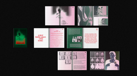
[Editorial] Love is Love
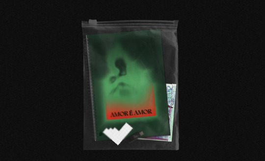
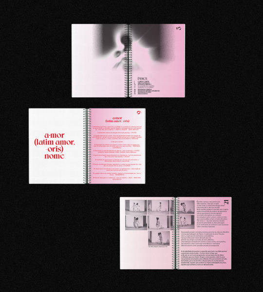
''Amor é Amor'’ (Love is Love) is an experimental project which intends to immortalize love as a discursive theme. The book is built on a reader's perspective through Camonian Poetry and Marina Abramovic's performative art. The book thrives on philosophical love from Plato to contemporaneity.
BOOK - 180MM X 250MM - MUKEN PAPER 110 GR - HELVETICA BY MAX MIEDINGER AND EDUARD HOFFMANN AND VOYAGE BY JÉRÉMY SCHNEIDER - ADOBE INDESIGN AND ADOBE PHOTOSHOP
0 notes
Last Seen Blogs
inorganicrociel
Rociel's World

jtollethesis-blog
Jacob Tolle's Thesis
missinginthefog
Bring me to the River


strayharmony943
Glitch's studio!