#lsad
Text
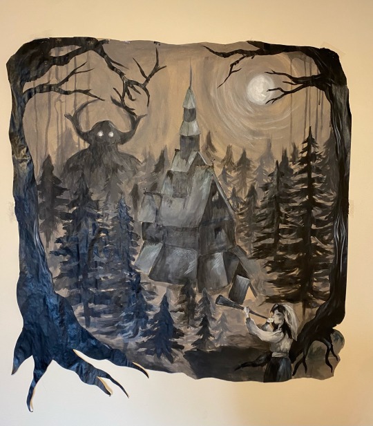
My painting inspired my the black metal movement.
I created this using the brown paper provided by the school as well as black and white acrylic paint.
I wanted to create a atmospheric piece and felt that I’ve done and I’m very proud of my work.
#artists on tumblr#art#design#lsad#diy#watercolor#mayhem band#burzum#black metal#norse mythology#norse paganism#varg vikernes#dead#euronymous#pelle ohlin#acrylic paint#acrylic#college
170 notes
·
View notes
Text
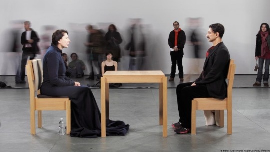
Marina abramovic
(artist research)
I found the work of marina abramovic quite interesting to view and to experience.
Her work " The artist is present", is a spectacular performance piece where she sits and stares at whoever is willing to sit and stare at her.
I love the idea of art being able to stare back at us, making us feel a mixture of emotions.
Eye contact, can be so hard to maintain as well while interacting with people, even though it sounds so simple to do. So I love this element of her holding her gaze determinedly, provoke different reactions from the person opposite her.
Her work, "Rhythm 0" is also a disturbingly spectacular piece too.
She let people do whatever they wanted to her body, for many hours, with acts becoming more violent as the hours went by.
She put herself as an object (like how women can feel) and represented, I feel, toxic masculinity and how power and lack of boundaries can become very dangerous.
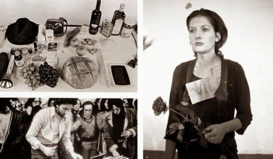
Overall, in my opinion, she is excellent at creating an uncomfortable feeling within people, something of which I feel resonates with my own project work.
(Some work found in book, "The artist body" by Tracey Warr and Amelia Jones.)
EDIT
My use of the word uncomfortable was not intended to be negative. I was conveying how I feel her work is very deep and is heavily thought provoking.
#art#lsad#tus#disrupt#disruptproject#feminism#piano#toxic masculinity#marina abramovic#performance#uncomfortable
55 notes
·
View notes
Text
Movement Project - Artist Research, Q Hayashida
Q Hayashida is a Japanese manga creator known for her works such as Dorohedoro and Dai Dark.
In one of her rare interviews, Hayashida reveals that she is a mixed media artist who uses whatever media she ‘feels like in the moment.’
The chaotic, sketchy, raw and colourful look to her art works harmoniously as she depicts her gory and dark but funny stories.
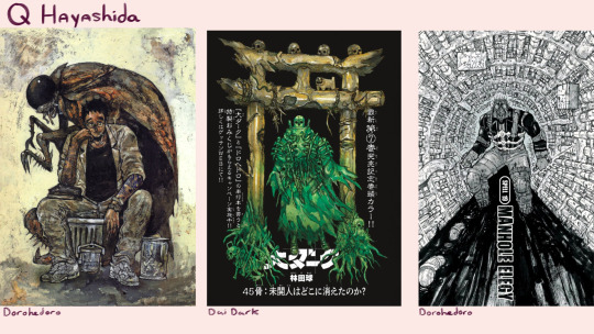
I love her usage of gouache, watercolour, ink and pen, majority of the time mixing these media together in the same piece creating a layered texture reminiscent of grime, reflecting the apocalyptic settings often found in Hayashida’s manga. Matching her colours, line weight and compositions to fit each scene and its tone is highly impressive and a source of inspiration for myself since I first read her work Dorohedoro many months ago.
Her character design is also equally interesting. Dorohedoro’s cast including the protagonist, Kaiman, a man with a lizard head searching for the sorcerer who cursed him, mypersonal favourite being Jonson, a giant realistic cockroach and plenty others, diverse, well-written and designed human characters. I can’t forget the monsters, each with unique personalities highlighted by their designs, brilliantly adding to the horror aspect of her works.
Lastly, my favourite technique Q Hayashida uses to instil discomfort, is her use of repetition and massive spaces, infinite crowds of monsters showing the viewer how powerlessness feels and drawing giant empty settings, such as a department store where the protagonists are stuck in devoid of all life, which perfectly matched the unease the characters she wrote were feeling.
40 notes
·
View notes
Text
Short Stop Motion Animation
I decided to make a simple Stop motion animation of pouring coffee from a pot.
I first quickly sketched all the pieces I would need to draw and cut out for this animation, then once I got the idea of it I drew it out on a big sheet of card.
I painted in each piece, I didn't mind if the edges were messy since I'd just be cutting it up anyway.

Here's all the pieces cut up and ready to go. I used a knife to cut out the pieces and a pair of scissors to round off some of the sharp edges.

During the animation, I had to cut up the coffee bits more so they would fit better. This also meant I couldn't redo it unless I painted more out.
I don't have a picture, but I propped up my phone in a large candle on top of a tin box to use as a phone holder. It turned out pretty steady, so would totally recommend.

I took all the pictures with my phone camera, then downloaded capcut which is a video editor to compile the pictures and change the speed of the video.
The Finished stop-motion animation.
It's a bit messy but after a few tries of messing around with the pieces this was the best result. I also used blue tack under the cup since it wasn't going to be moving.
One of the biggest things I'd change would be around the end when he steam stops, it looks kind of awkward with the sudden change and felt empty.
28 notes
·
View notes
Text
Stop Motion Animation of my Zine from the Publication Workshop:)
for my collages I utilized recycled paper using old gifts from my workplace, and this reflects the ethics and sustainability core values
song: headstones and landmines - Lizzy McAlpine
34 notes
·
View notes
Text
Project : Disrupt
Week : 23rd Oct - 27th Oct

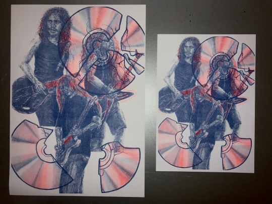
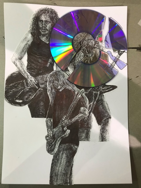
After learning about risograph printing yesterday, I decided to make a print with my drawings from last week.
I photocopied the drawings from my sketchbook and stuck them on the definition sheet. I layered them on top of each other to create disruption to the image. To broaden the disruption, I broke up a CD and drew the outlines of the shards on the definition sheet. I used the ferderal blue ink for the definition colour.
On the highlights sheet, I focused the highlights on the shine of the CD, the lighter parts of the hair and the guitars on the images. I used orange ink for the highlights, to compliment the blue definition.
I printed my design onto A4 and A3 sheets.
#lsad#artwork#art student#disrupt#cds#risograph print#risograph#music artwork#guitars#guitarists#kirk hammett#metallica#alice in chains#jerry cantrell#dimebag darrell#pantera
39 notes
·
View notes
Text
DISRUPT
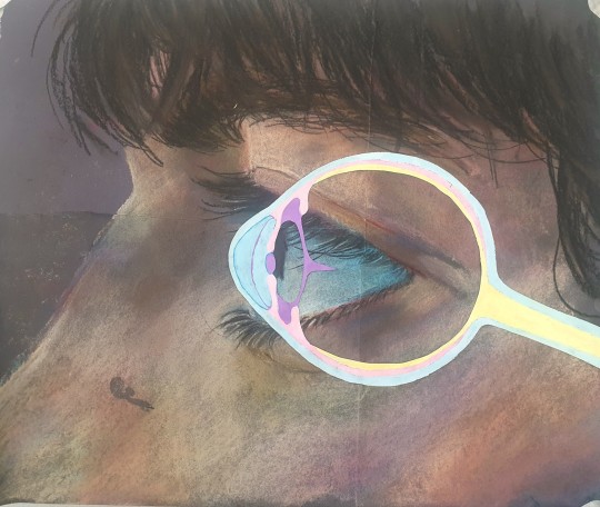
Finished eye piece. Gouache eye diagram over chalk pastels. I wanted to highlight the reality of an eye, usually when we think of an eye we picture an eye on a human, but in reality it's much more anatomical and slightly unnerving. A headache isnt visible, just like the whole eye. The disruption in my life isn't visible, just like the the eye. There's always something hidden.
I also wanted to give the idea of the whole eye being exposed to air. The eyelid exists to protect the eye from debris and dryness, but a headache behind the eyes to me feels so dry and like the eyelid isn't even there. That's what I wanted to accentuate with the whole eye.
44 notes
·
View notes
Text
Disrupt
Week 6
To continue progress from my Adobe workshop I created this video to show the different ways clothes can feel on the body. One of my peers was wearing a neon yellow jumper which worked very well as a green screen so I asked them if I could use this video for my project.
The video was made using Adobe Premiere Pro, I used stock footage I found online as well as my own to edit in how clothes disrupt the body. It was interesting to get to work in a digital way for this project as I have mainly stuck with 2D works as of now.
This video continues to relate back to my theme of clothes and my sensory issues with them. Clothes can sometimes feel soft like the gloves or baby chicks pictured, sometimes too hot like the fire shown or too suffocating and sharp like the knife or broken glass in the video. I also finally found a way to use the song ‘Buying Smokes’ in my work as the audio of the last 30 seconds really recaptures the feelings of stress and panic that come with clothes disrupting the way the body feels.
#art#lsad#disrupt#clothes#limerick#animation#adobe animate#adobe photoshop#adobe premiere pro#video#video editing#green screen#the academic#digital art
23 notes
·
View notes
Text
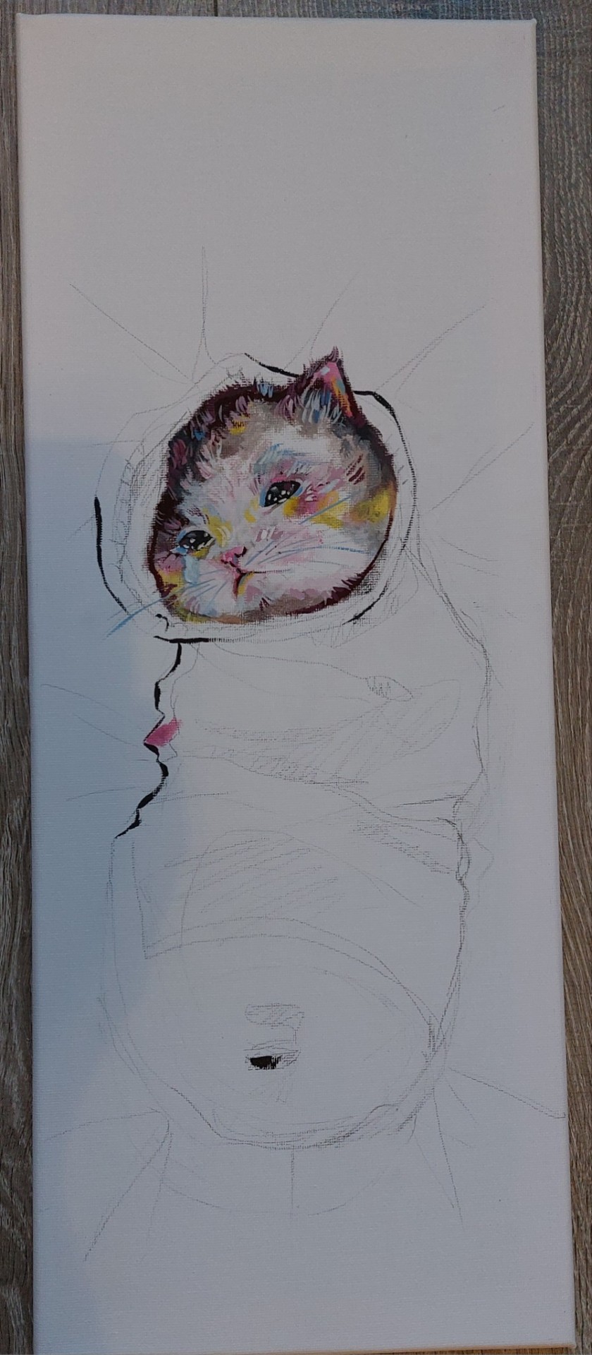
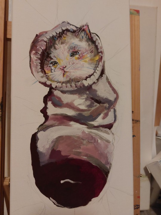
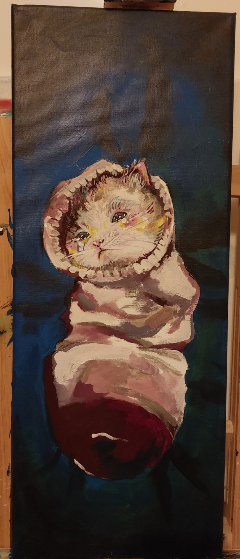
Painting :)
I've decided to continue this idea I have with movement. The idea is that cats always end up in the weirdest of places like anywhere they can fit they will. That to me is movement and I decided instead of painting just the cats moving I would do this to symbolize it instead. I used a lot of references from family members and the internet to make these paintings. This first one I call "Let him out! "
The process of this and all of these paintings are really fun because I can use two mediuns that I'm familiar and sort if confident in. I used a mixture of gouache and acrylic on both pieces. I thought the idea of a cat being stuck in a sock really funny and wanted to paint it. I tried to make the cat look as if it were sad and trapped unable to escape this "Sock jail". I used a dark blue background with black corners and making the cat look smaller to make it feel as if it was in peril. The final touch was the little tear 💧
Here's the progress pictures!
Sketch

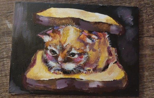
I also did another painting with a similar theme with a really similar process. This kitty is stuck in between two slices of bread.... How did he get there?? Why did he get in there???? We will never know.. But he doesn't seem too upset
17 notes
·
View notes
Text


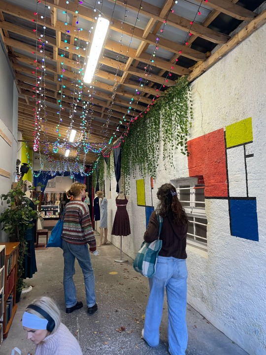
Radius Project First week, 18/09/2023-22/09//2023
These are the pictures I took until now for the project.
With my group, 36b, we went to St John's Cathedral and the little Protestant Church on the other side of the road, which is surrounded by its graveyard.
When we discussed it later, we all agreed that for us, there were a few themes that needed to be explored, such as death, nature, horror, religion, time...
We were all a bit nervous the first days, but at the end of the week we were more comfortable around each other and able to talk about it easier.
I, personally, was more interested in nature, the plants, who grow even on the tombstones or the cathedral, who give some hope when you're beside such a monumental building, surrounded by death and so much history.
I look forward to the next few weeks, and discover how my project will be at the end.
25 notes
·
View notes
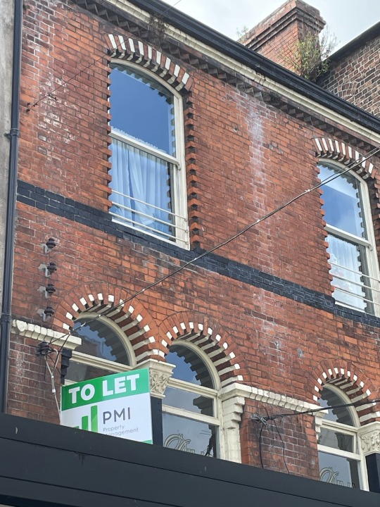
Text


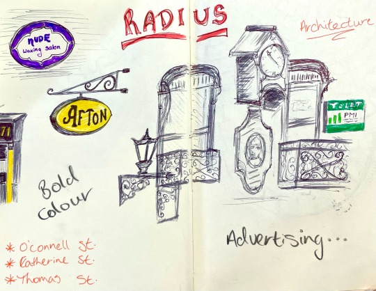
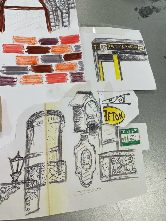


Beginning the Radius Limerick assignment with sketches on architecture & colour from o’connell st, catherine st & thomas st.


25 notes
·
View notes
Text
Finished Ceramic Cat House
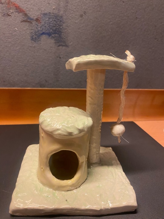
After the final firing my cat house was finished, and I’m so pleased with the results.

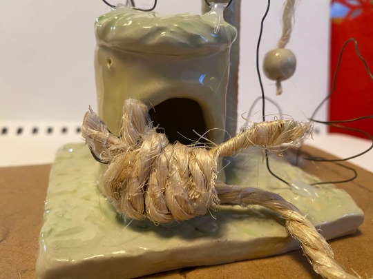

I added my two cats to the ceramic piece, and a trail mapping out their movements.
The wire cat and trail, represents loona, my kitten.
And the wool represents ponyo, who’s 10 years old.
I wanted this piece to convey the abundance of energy the kitten has compared to my older cat.
Loona jumps over, around and under the structure, whilst Ponyo just strolls over to hollowed out section to sleep.
#art#artists on tumblr#design#diy#lsad#books & libraries#watercolor#cats of tumblr#cat#ceramics#clay
119 notes
·
View notes
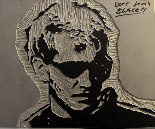
Text
Layne Stayley lino carving
completed the physical lino for the Layne Stayley piece, hoping to get it finished and printed on Tuesday

19 notes
·
View notes
Text
Disrupted Cutout Video
(5/12/23)
With the help of my friends, I created a short video centred around the disruption of the Minecraft cutout figure.
I wanted to capture how I felt in my preteen years unhealthily using multiplayer online videogames, especially Minecraft and the people I met through it as an escapism to the trauma/disruptions happening to me. The darker scenes symbolised my realisations, leaving that problem behind, and finally getting my ‘revenge’ but through a comical way by incorporating such a cartoonish character.
My song choice felt fitting, being Just by Radiohead, a song I find myself listening to when I get mad or upset.
31 notes
·
View notes
Text
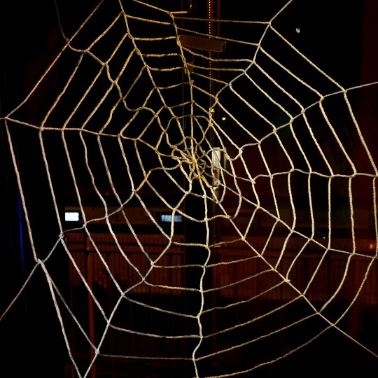
I made a spiderweb out of yarn.
It was a lot harder and more time consuming then i thought 😭, Tightening the knots would sometimes turn out to be too loose or tight.
At the start of the web it was hard to find a consistent way to knot but eventually i got into a decent flow.
A video of the web being torn down.
I wanted this to be a simple representation of how quickly webs can be disrupted and taken away.

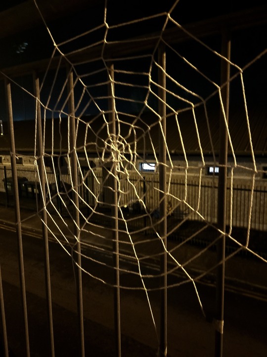
When I hung the web up at my window it created a nice shadow on the curtains, its a bit of a dodgy photo but i still wanted to share it.
48 notes
·
View notes
Text
Thursday 15th January - Fabric Samples for the ‘Movement Project’
The technique featured in this video is called Mexican pleating. It is made by creating pin tucks and then sewing them down in opposite directions so the constrain the strate of grain in the fabric and ‘move’ the natural order of the threads. I chose this technique because the appearance of Mexican pleating reminds me of the strands in our muscular and vein system, and how they all join together 🫀
song: rose coloured lenses - miley cyrus
21 notes
·
View notes
Last Seen Blogs

mudabercerita
Muda Bercerita
9hei-blog
Sorry mum, I'm a ホモォ
rowritesstuff
💜Ro💜
lovecolibri
Vita sine libris mors est