
yasminmwong
Yasmin Wong
HNC Graphic Design Student // Design Blog and Journal
35 posts
Don't wanna be here? Send us removal request.
Last Seen Blogs

2023andme
twenty twenty-three

isbr-art-blog
Isbr-art._

freelyelectronic1415
맞선대화 결혼소개팅 남친만들기 유람선파티


supremeloading328
Untitled
Text
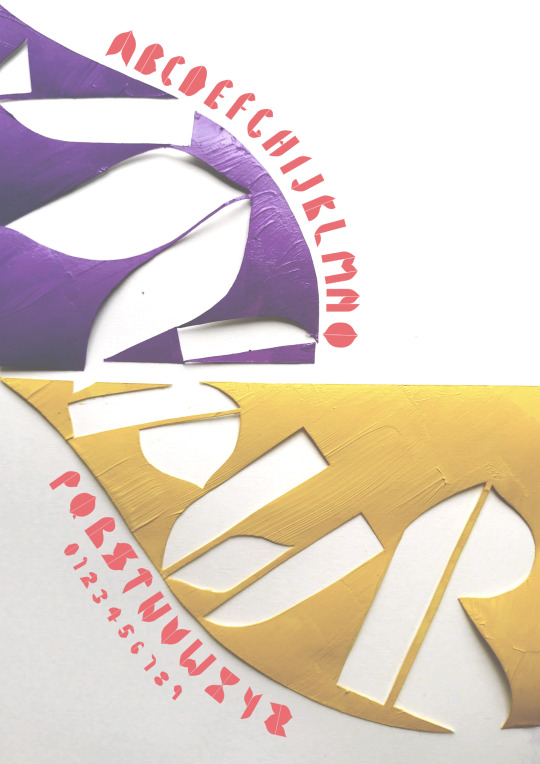
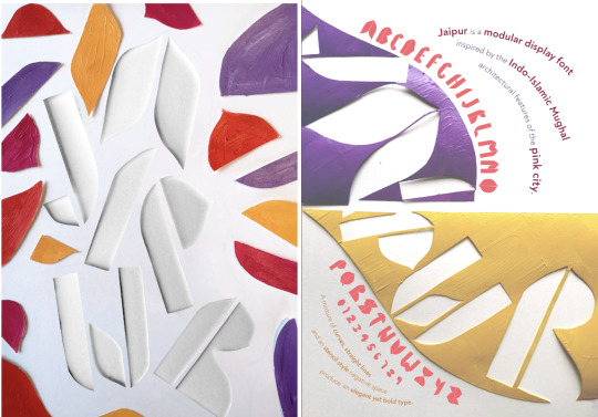
Typography Brief - Jaipur
When creating my type, I really wanted to take shapes from the real world. I thought about the shapes I found most satisfying in typography. I was really drawn to modular type that features curves and circles, and so I wanted to find something I could create to reflect this.

I decided to create a font that would be a love letter to my trip to India. I focused on examining the shapes, particularly of the Hawa Mahal. I remember seeing the landmark for the first time when I was 18, and it was one of the most beautiful pieces of architecture I had ever seen.
I decided to work with these shapes to create a modular font. I particularly wanted the font to be bold and elegant, but also playful. I think the mixtures between curves and straight lines provides this. Once I had worked with the shapes a few times, I built up my font, and named it Jaipur.
When utilising this into my type poster, I really wanted to have playful movement and diversity of the type. I really enjoyed looking at the work of Hey Studio and loved how bold and beautiful the designs were.
I also wanted to incorporate the bright colours and bold styles of the Hawa Mahal, and I felt the style of Hey Studio matched what I wanted to achieve. I tried a few different layouts on illustrator but felt I wasn’t able to get the effect I wanted.

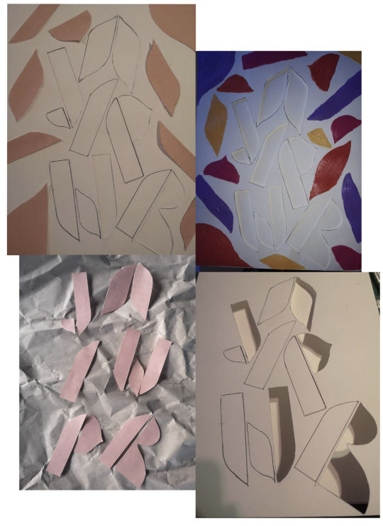
I decided to go back to cut-outs to play with analogue ways to play with type. I really liked the idea of using the modular shapes for the backgrounds as well as the empty space left behind.
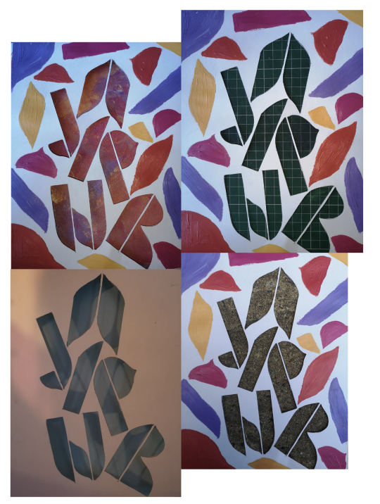
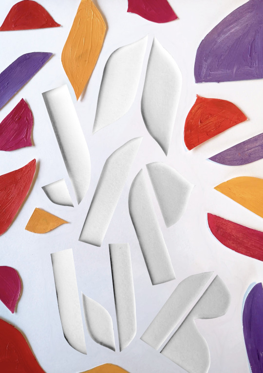
Once I was happy with the layout, I tried a few different backgrounds with the cut-out font. I liked the idea of it having a stone background, however when I tried it, it felt to dark and rough for the feel of the font. I also tried different colours but my favourite was the white on white. Finally, I cut the shapes out and lay them on top to give a very slightly 3d effect.
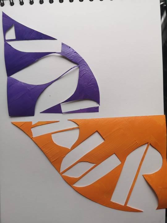
For the back, I wanted to follow a similar theme, and so I followed the same idea with cutouts, only this time I cut out painted shapes. The large dome shapes split in half left me with a page that was well divided. I like the way it halved the page. I also loved the idea of using the curves as a path for the type to follow, and really accentuate the shapes of the font.
Finally, for my typographic system, I again wanted to relate back to the curves. I decided to try a dilatational style. I felt for the amount of content I wanted to share, and for the style and feel of the poster that I wanted to convey this worked really well.
Reflection
I was really happy with my final font and poster, as it reflected well my initial intentions for the project. I do wish I had given myself a bit more time to experiment with lots of different typographic systems, as I think there could have been some interesting ways of incorporating grid and axial systems as well, and I would have liked the front and the back of the posters to flow a little better, perhaps reflecting the dilational shapes on the back.
I also think in general I would have liked to have tidied up the design, but it was fiddly work with those cut-outs! Perhaps with a bit of free time, I will update the poster with some bolder choices.
5 notes
·
View notes
Text
Designers who influenced contemporary typography.
Wim Crouwel
Wim Crouwel is one of the most influential graphic designers of the 20th century. Born in Gorningen, Netherlands in 1928, and as during his six decades as a designer created experimental typefaces and grid-style visuals that are still referenced today.
Crouwel’s work had process and structure at its core. Being inspired himself by the work of Muller-Brockman and Karl Gerstner, prominent swiss-style designers, the use of the grid-system was prominent in his work. However, where Crouwel strayed from this was in his creation of typefaces. Although a lot of his work did featured Grotesk sans-serif fonts that was typical of swiss style, he also is notable for his work in creating modular letterforms (Design Museum, 2021).
Perhaps one of his most well-known works is the font set ‘New Alphabet’. This was developed after seeing the first digital typesetters at a print exhibition. The move to digital technology came with its limitations, with the level of detail on screens not being high-enough, and therefore the traditional typefaces produced looked less than perfect. The creation of the New Alphabet created a solution, using only horizontal and vertical strokes, perfectly aligning with the way screens and typesetting equipment displayed fonts (MoMA, 2021).
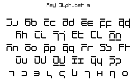
New Alphabet - MoMA
The typeface divided designer’s opinions. It was criticised for being to experimental and being ‘illegible’, and in his own words Cowell even described the type as “over-the-top and never meant to be really used’. However, in 1988, the typeface was digitized and can now be seen gracing the cover of Joy Division’s 1988 Substance Album Cover (Designculture, 2021).
Other works of Crowell include the geometrical typeface ‘Gridnik’. The name of the font was inspired by Crouwel’s affectionate nickname ‘Mr Gridnik’ which made reference to his strict use and love of grid systems. The font was based on the typewriter typeface Olivetti Politene. The font was digitised by The Foundry in 1996 and was used on Dutch postage stamp until 2002. Examining the work of Crouwel, even now you can see how his work was devoted to systems and process to create something refined, logical and bold. (Foundry Gridnik - The Foundry Types, n.d.). Crouwel showed how a classic system can be used to create new and exciting designs that push boundaries of what we expect and allow in designing.
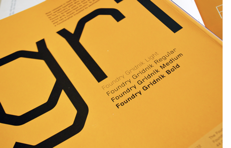
Foundry Gridnik - The Foundry Types.
Rus Khasanov
In total contrast to Wim Crouwel is the work of Rus Khasanov. Although Khasanov’s work is just as striking and memorable, the core of it relies on the fluidity and unpredictability of real-world materials. I’ve never come across such a unique type designer. The incredibly unique designer creates mesmerizing typefaces using scientific methods. Hailing from Russia, Khasanov has changed the face of typography by using unconventional methods and materials to produce amazing lettering in psychedelic colour schemes. (Rus Khasanov’s Scientific Design Experiments, 2021)

Lumen Type - Rus Khasanov
His process includes using anything from fire to soy sauce. Khasanov particularly likes making use of microscopic imagery and taking inspiration from everyday objects such as magnifying glasses and mirrors. Khasanov described his experiments as ‘creative chaos’, and he relies heavily on using analogue techniques to make playful and wonderful shapes which he then refines in illustrator and photoshop (Magdaleno, 2013).
Close to my own heart, Khasanov aims to create work that combines the worlds of science, art and design. His inspiration comes from all corners of his world. His ‘Sauce Type’ came to him when he noticed beads of soy sauce forming at the bottom of a glass.Some of Khazanov’s clients include magazines such as Bloomberg, Popular Science and Wired. Khasanov contributions to typographic design encourage designers to think outside the graphic design box, and take inspiration from as many places as possible.

Typography for Popular Science. Fall 2020. - Rus Khasanov
Marian Bantjes
Marian Bantjes is a designer, typographer, writer and illustrator who creates beautifully intricate and typefaces. From Saskatchewen, Canada, her career began as a book typesetter in 1983, before she eventually began her own design studio – Digitopolis. The design firm created materials for educational, corporate and arts companies. Eventually, Bantjes left her firm to pursue her own work, and began showcasing the design work she is most well-known for today. Her pieces are notable for being colourful and ornate, featuring in over 100 books across the world, including her own ‘I Wonder’ and ‘Pretty Pictures. Her work is also featured in the pemenant collection of the Cooper-Hewitt National Design Museum. (Creative Bloq, 2008).
In 2004, Bantjes created the typeface ‘Restraint’ which shows a perfect example of how her illustrative background influences her as a graphic artist. The unique typeface makes uses of complex patterns creating letters in the negative space, in contrast to usual ornamental typography which has details and flourishes added onto the letters themselves. (Typographica, 2008)

Retraint - Marian Bantjes
You can spot Bantjes’ style from a mile off, as is obvious from the example below. She has created countless images that show off her talent for using complex patterns and structures. She states that she is influenced a lot by calligraphy from the 14th-18th century, as well as islamic art and art nouveau, textiles from around the world and baroque, rococo and gothic styles. (Bantjes.com, 2021). These influences come through very clearly in Bantjes’ work. The most interesting thing about Bantjes’s work is its combination of structure with playfulness. There’s a freedom in her designs, a fluidity, but there’s obviously a lot of thought and process that goes into both their creation and use. One thing’s for sure is that Bantjes’ unique stye will continue to be celebrated for it’ creativity and boldness.

Before My Memory Goes - Marian Bantjes
References
Designculture • Wim Crouwel (n.d.) Designculture.it. Available at: http://www.designculture.it/interview/wim-crouwel.html (Accessed: 17 April 2021).
Foundry Gridnik - The Foundry Types (n.d.) The Foundry Types. Available at: https://www.thefoundrytypes.com/fonts/foundry-gridnik/ (Accessed: 17 April 2021).
Holms, C. (2008) Restraint, Typographica. Available at: https://typographica.org/typeface-reviews/restraint/ (Accessed: 17 April 2021).
Magdaleno, J. (2013) Rus Khasanov Creates Typefaces Using Laptop Screens, Tasers, And Soy Sauce, Vice.com. Available at: https://www.vice.com/en/article/xy489q/rus-khasanov-experimental-typefaces (Accessed: 17 April 2021).
Marian Bantjes | Creative Bloq (2008) Creativebloq.com. Available at: https://www.creativebloq.com/computer-arts/marian-bantjes-6089304 (Accessed: 17 April 2021).
Marian Bantjes (2021) Available at: https://bantjes.com/ (Accessed: 17 April 2021)
Rus Khasanov (n.d.) Ruskhasanov.com. Available at: https://ruskhasanov.com/ (Accessed: 17 April 2021).
Rus Khasanov’s Scientific Design Experiments (2021) Fold Magazine. Available at: https://www.foldmagazine.com/rus-khazanovs-scientific-design-experiments (Accessed: 19 April 2021).
Wim Crouwel (2021) Design Museum. Available at: https://designmuseum.org/designers/wim-crouwel (Accessed: 17 April 2021).
Wim Crouwel. New Alphabet. 1967 | MoMA (2021) The Museum of Modern Art. Available at: https://www.moma.org/collection/works/139322 (Accessed: 17 April 2021).
4 notes
·
View notes
Text
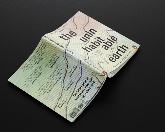
Concept 3: Alarming Data
Inspiration
For this cover, I wanted to represent the books outpouring of data, facts and figures that had been collated and carefully researched. The book was originally based on an article for the New York magazine and was expanded to become a non-fiction book. The book isn’t a story, it’s an essay, a collection of data, put together in one book to show exactly how much evidence there is that climate change is happening, and fast.

My original ideas on this were based around incorporating data on climate change as part of the imagery. I found a few examples of data visualisation that had been used by NOAA AND NASA and decided to use these as the jumping off point for conception.
In terms of design style, I was drawn to the works of designers like Roy Cranston.
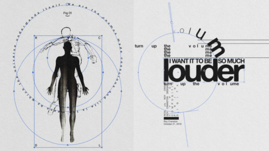
I really liked the way he played with the typography shapes and sizes, changing the paths the type was on to compliment the shapes in the visual. I wanted to incorporate the shapes of the data in the cover and relate it to the typography.
Experiments
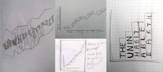
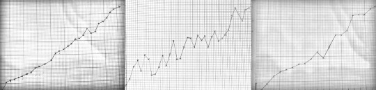
I began experimenting with the different graph shapes that might work for the cover. The line graph was the most commonly used in my research of this data, although some featured bar graphs and other representations. When playing about with the different orientations, I felt like the lines were the the ones I wanted to use.

I felt pretty strongly about representing real data on the cover, as much as the inside uses facts and figures. I took the shapes of the lines from real data on the rising levels of CO2, sea-levels and global temperature.
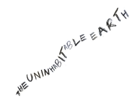
After I had sketched out these graphs, I looked at the different ways the type could interact with them.
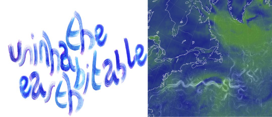
I tried creating some lettering that might work alongside the graph data lines as well. I initially thought it would be good to create letters that looked like the ocean current visualisations. I used an old paintbrush and ink to get the line effect I wanted. I was happy with the end result, but thought overall it seemed too playful to suit the cover of this book.
I also looked at using charcoal and paint to create some more textured letters. I liked this but felt with the rigidity and clean lines of the data I wanted to represent, it felt disjointed. Taking a look at the style I wanted to emulate, I decided it might be better to use a sans-serif typeface.
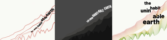
After playing with the different ways of layering the line graphs, I took the patterns into illustrator and starting working with the selected type face. I enjoyed playing about with the blending tool in illustrator to create something visually impactful, but I felt it took away from my original concept, and although interesting to look at, it was hard to interpret what was happening. I decided as well that instead of creating shape with the title itself, which I wanted to be bold and clear - I used quotes from the book relating to the data to represent.
For the background, I tried a variety of different textures. I thought a ground texture might work to loop it back to this idea of ‘Earth’ but similarly to the charcoal, it didn’t feel like it connected as well. I instead went back to the graph paper I used originally. I soaked it in water to make the grid lines bleed a little, to give just a hint of the chaotic events suggested in the book.
Reflection
My final piece was something I was really proud of. I wanted to create something that didn’t directly link to climate change events itself, but much like the book alluded to the overwhelming data that alerts us to a need for intervention. The type I choose was the sans-serif Bhanschrift which, although dark and bold, was written in lowercase. I felt that this was better than all uppercase because the book does not feel like it is shouting ‘This is your fault!’ so much as it is stating matter of factly ‘We need to do something” - clear and concise. I paired this with the ‘Letter Gothic Standard’. The style seemed to go well with the data theme, having a slight monospace feel as well as looking like traditional typewriter font.
By using the quote from the book to sit along the lines of information from NASA’s website, I felt I was able to create something visually intriguing, representative of the book, as well as snippet of what’s inside. Using the background of gridlines keeps in theme, but by adding subtle hints of colour and bleeding to the ink, kept the imagery from looking flat, and also linked to the colour palette of other data visualisations.
I think although I choose to do with a font, I would have been interested to find a lettering style that suited the cover. The way the lines of data are drawn may have allowed for a hand written type, although having them different creates a contrast.
3 notes
·
View notes
Text
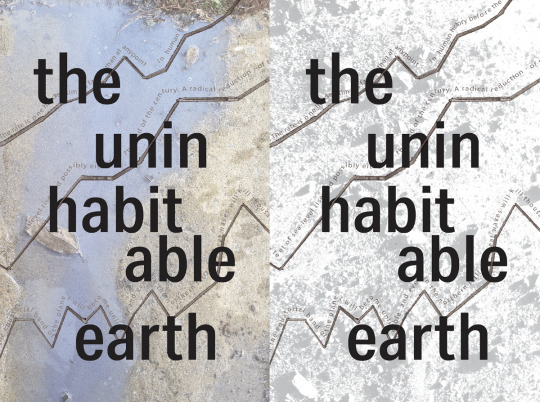
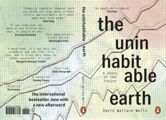
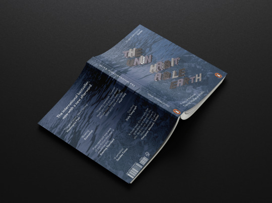
Concept 2: Cities Flooded
Inspiration
‘The scariest variable is how quickly that flood will come. Perhaps it will be a thousand years, but perhaps much sooner. More than a billion people live within thirty feet of sea level today’
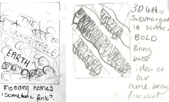
Throughout the book, there are a lot of references to rising sea levels. This is both in factual data, as a result from rising global temperatures, but also in the context of what this means for human life. The book reminds us that the rising sea-levels, that have already resulted in climate refugees whose homes have been engulfed by water, will cause devastation on our doorstep if we let it.
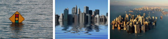
I wanted to create a cover that referred to these rising sea levels - but relate them to the reality of life as we know it. Often we think of climate disasters being far away and someone else’s problem. I wanted my cover concept to show a city flooded, surrounded by water. I think it’s very easy to assume that the devastation of climate change is only happening abroad, but it’s happening to so many people everyday.
‘What would be submerged by these floods are not just the homes of those who flee - hundreds of millions of new climate refugees onto a world incapable, at this point, of accommodating the needs of just a few million - but communities, schools, shopping districts, office buildings and high rises, regional cultures so sprawling that just a few centuries ago we might have remembered them as empires unto themselves, now suddenly underwater museums.’
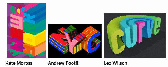
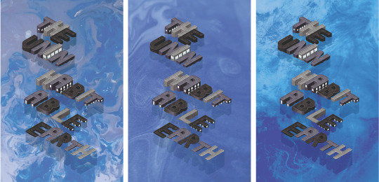
For this concept, I wanted the title of the cover to be the image. I wanted to create a 3D look, of text that was itself being submerged in water. Therefore for this cover - the type itself would be the imagery. I was inspired by isometric styles of 3D text - such as the work by Kate Moross, Andrew Footit and Lex Wilson.
I wanted to try and created this in my own version, especially giving the text some texture as it would bring some reality to the image.
Experiments
Initially for this idea I had planned to create 3D letters by hand and submerged these in water - using photography to capture my concept. I began by create flat letters propped up by stands. This was relatively time consuming and didn’t give me the effect I wanted, the letters still looked flat although standing upright.
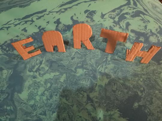
I went on to try creating box-type letters which fitted more to the idea I had in my head. I was really happy with the outcome, but it was really time-consuming. It took me about 3 hours just to three T’s and 2 H’s - which I knew were going to be the easiest letters.

I decided that even though this looked how I wanted it to, it wasn’t going to work for the finished product. So I tabled the hand-made 3D idea and decided to look into other techniques.
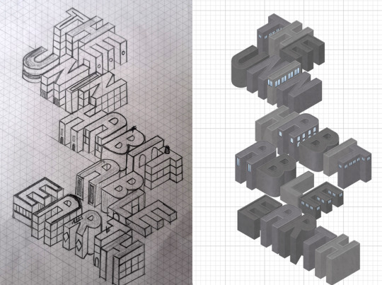
Looking at the references, and how they created their lettering, I decided to draw my letters out instead. I started by using the dotted paper in my typography notebook, and starting to get the effects I wanted (in a much quicker time-frame).

I decided I would instead go down this route and work on creating the letters with an isometric grid. I printed paper out and started designing my cover. I was really happy with how this turned out and I was able to quickly produce what was in my head. I took this design into illustrator and created a digital version - and voila!
For the backdrop - I experimented with some previous techniques of paint pouring and ink droplets to create water for the letters to sit in. I really liked visually how each of these looked but I felt they didn’t match the lettering or the feel of the book. The colours and playfulness of the lines created in the ones I created were too happy looking for the book I felt. I decided to replace it with a photo of actual water This made it much more realistic and therefore linked better to the idea of this being a reality of our future.

Reflection
I was really happy with my final design in the end and I was thrilled that I was able to produce the original concept I had in my mind from the beginning. I would have liked to create more texture on the letters perhaps by using photography of actual concrete buildings, which may have brought a bit of a grittiness to the cover.

I had thought about using isometric type for the supplementary copy as well, but I felt this took away from the title. I decided it was better to add these using indesign.
Using a stock image instead of a making was a tricky decision but I think it was the right one. By using an aerial view of the sea. I was able to communicate what was happening in the image better than if I had gone for a more abstract approach. I felt the style of the letters as well as the tone of the book was quite direct, so needed something a little less open to interpretation.
Had I been able to create the 3D letters by hand, I think I would have gotten some really interesting effects. That way I would have had more control over the lighting and realistic nature of the submerging in water. However, I’m still really please with how it turned out. I think the cover is able to convey many of the sentiments mentioned in the book around rising sea levels, coastal cities at risk and the idea of this being our problem, not someone else’s. I think the cartoony style of the letters may be slightly less serious than I was looking for initially, and perhaps working in more realistic textures may have helped that.
Overall I’m really happy with the final design and happy to have learned some new techniques on isometric design on the way!
7 notes
·
View notes
Text
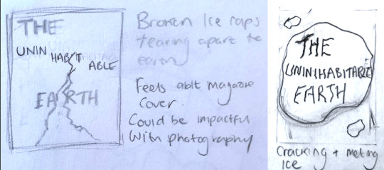
Book Brief - Concept 1: The Breaking Ice

Inspiration:
When initially preparing for this brief, I remember an image coming up on my timeline. A crack in an ice sheet was shown, with the heading ‘Iceberg the size of Bedfordshire breaks off the Antarctic’. It was quite impactful a thought, that even while reading this book and doing this project, the effects of climate change were very real, very present, and very unavoidable.

In the book, Wallace-Wells references ‘dreamtime’ which is the ‘experience of encountering, in the present moment, an out-of-time past’. He goes on to liken this to watching footage of an iceberg collapsing, ‘a feeling of history happening all at once’. He also discusses the ‘climate’s kaleidoscope’, and the idea that we as humans can ‘be mesmerized by the threat directly in front of us without ever perceiving it clearly.
Therefore, I wanted to use imagery that represented this phenomenon. This idea that such a grand and frightening event is happening in-front of our eyes. That we are seeing the world breaking day by day. Visually, I wanted to use photography that linked to that original image of the iceberg and had the type closely interacting. I wanted there to be a sense that the typography elements would be part of the image, rather than layered on top.
I was inspired by book covers such as the ones below. I really enjoyed that although the photography itself is bold, the typography clearly compliments it, rather than distracting from it, or acting as an afterthought.
Experiments:
To link back to the iceberg I had two trains of thought. One was the destruction, the breaking apart, and ‘cracking’ of our climate, and the other was the heat, ever rising that caused these events to happen.
Initially I looked at how I could work with fire and burning - not only because this linked to the heating of the earth also the patterns created from the flames actually created a crack-like appearance. Layering each of the burnt pieces on top of one another created some depth which I enjoyed.
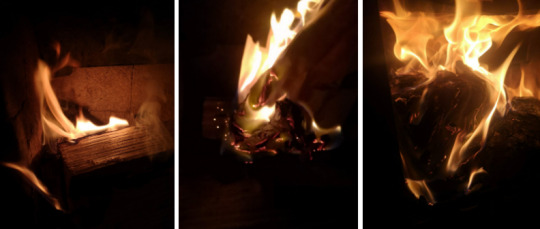

Although I was a fan of the visual, I wasn’t sure if it conveyed what I wanted it to. I did however like the space I had created with the empty parts of the cover - and decided that was a feature I wanted to keep.
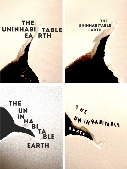
I also tried creating my own iceberg crack from polystyrene. I experimented with how this would work with some text as well, trying text directly on the image and superimposed on top using digital methods. I think the thickness of the polystyrene helped bring a depth to the image. I was happy with this as the backdrop to the cover.

When playing with type interactions, I wanted to the crack in the polystyrene to manipulate the types orientations. I think the type being straight worked in some aspects but it felt more fitting to the image when the words were slanted to an extent.
Reflection:
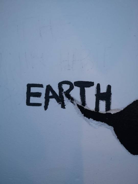
The final piece I ended up using something directly from making. I thought that it well reflected my concept, and was a clear link to the book. I liked that the imagery was bold, but it was abstract enough to let the viewer come to their own conclusions about what the crack was representing. Some may see the physical, reality of the cracking ice, some may see the breaking of our world as we know it. It may have been improved by being wrapped around the whole spine and incorporating the imagery with the type of the back as well. This might have allowed for the copy on the back to also play with the imagery, and there could be some empty space filled with a visual.

The title typeface was cutout text - with a font style based on sans-serif ‘Intro Condensed’ font. The type is bold against the white of the background, a nice contrast that makes it stand out. The placement of the type was important to me, and I felt I was able to achieve what I wanted. The letters are orientated with the crack on the cover, and are hanging over parts of the broken 'ice'. This represents the Earth being on the edge, being on the brink of falling. The supplementary copy uses the much softer, but still clear, sans-serif ‘HK Grotesk’ font.
As a cover itself, I feel that it is a bold statement on the cover. It links to the book as it represents a warning, a very black and white 'this is happening, here it is'.
4 notes
·
View notes
Text
A Century of Book Covers
Taking a look at the tends of book covers throughout the decades
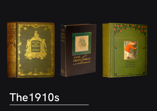
The 1910s saw books still commonly covered in cloth, with delicate monograms. Interestingly enough these examples all seem to follow similar styles in the type choice, and an intricate pattern surrounding it a central image.
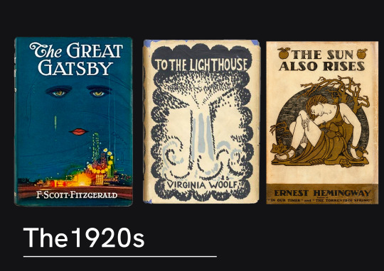
Artist designed covers were becoming quite regular now on book shelves. Books would now regularly have dust covers made of paper, meaning they could have much more interesting designs mass printed. Francis Cugat and Vanessa Bell were both painters come designers who provided artworks for The Great Gatsby and To The Lighthouse respectively.
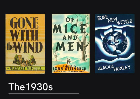
1930 trends appeared to have a lot of illustrated artwork, paired with a bold type. The illustration style was very traditional and mirrored that of the traditionally animated films that were growing in popularity.
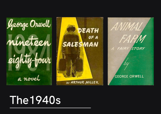
Something noticeable about the 1940s covers was the exploration of type-only, or type-centred novels. There was a lot more exploration of typography and it’s integration into a design, rather than just a superimposed title.
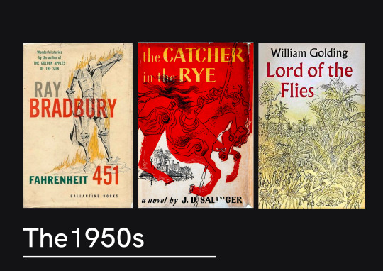
The 1950s seemed to have a lot more abstract artwork. Some really bold illustrations were used, but following on from the exploration into type - there seems to be a lot more thought about the placement of the type and how it works alongside the illustration.
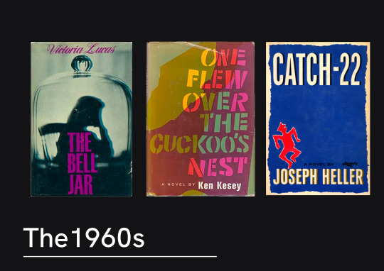
The 60s seemed to be a turning point for book covers. There’s a lot more design creativity in these images. The type and images being much more playful together. These examples show the move away from illustration work.

In the 70s book covers you can see a clear shift towards photography being used. The composition of the photography plays with the type creating layers.
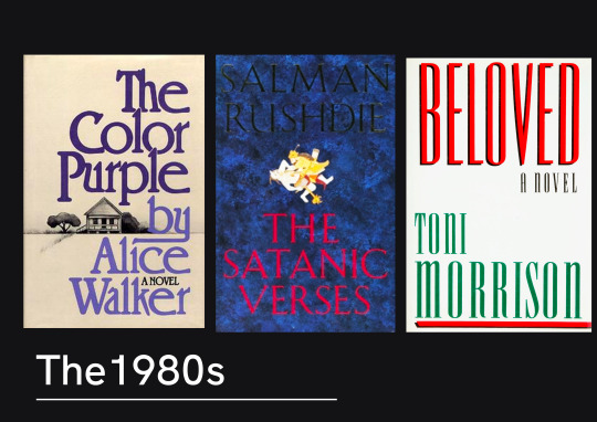
The 80s seemed to have a lot of books that had large, bold text on the front. This seemed to be the theme where there would be little to no imagery on the cover with it. There seems to be quite a stripped back approach.
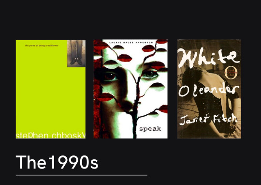
Speaking of stripped back, the 90s appear to be more minimalist and edgy looking. There’s a lot more negative space used between the text and there’s a lot of duller colours. Albeit the most popular books of the 90s were childrens books, so it’s possible there was an attempt to create a clear divide between the illustrated colourful images you might see on Harry Potter and these young adult and adult fictions.
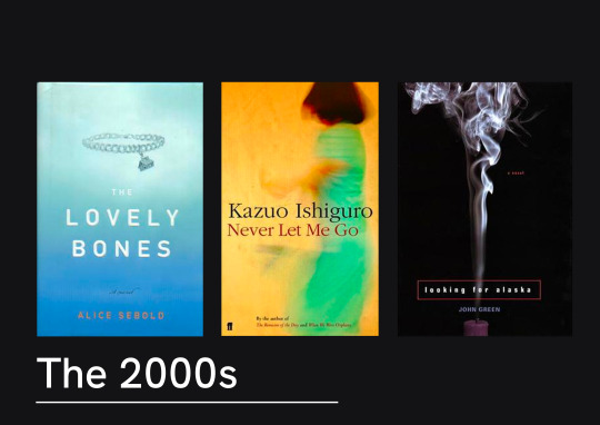
The 2000s we can see that this stripped back approach is still popular. Often the books seem to have a central image and neutral background. The fonts in these examples are even quite simple.
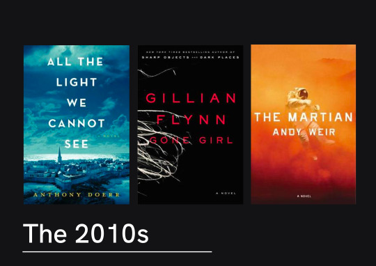
The last decade didn’t stretch much further in design trends. There was a lot of sans serif, centre-aligned titles over layered on top of a dramatic photograph. These are visually quite striking, and certainly wouldn’t be out of place hung on a wall as well as on the front of a novel.
It does seem that there title of the novel throughout the last few decades has become part of the artwork. As the years have gone on, titles have gone from being place below or above the imagery of the to become much more heavily integrated, and even becoming the artwork itself. Much bolder choices in type have been made and creative composition has been much more common place. These last few decades have seen stripped back covers being popular, perhaps because they offer a much more dramatic effect. It’s definitely clear that type can be used throughout these
12 notes
·
View notes
Text
A whistle-stop tour of book cover design
The practical leather-bound books of the middle ages
Book covers historically were only required to do one thing - protect the book. Although this didn’t stop them from being works of art in themselves. Leather-bound books with gold and silver clasps, lined with gems and detailed with embroidery were not an uncommon sight on a 13th Century Book-Shelf (Domestika, 2020). These books were mostly if not all handwritten and therefore needed something sturdy to ensure they were not damaged.
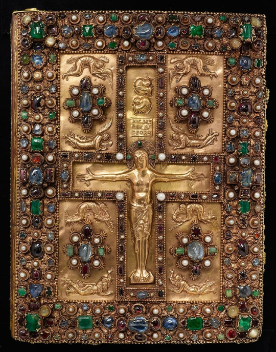
Lindau Gospels. Court School of Charles the Bald Lindau Gospels, in Latin, Switzerland, Abbey of St. Gall, late ninth centuryAvailable at: The Morgan Library & Museum https://www.themorgan.org/exhibitions/magnificent-gems
In 1450, the invention of type printing by Johannes Gutenberg changed the world of books, but leather binding of books continued to be the normal. However, in the 16th century, we began to see title pages appear at the beginning of books. Information about the author and printing information of the book were traditionally placed at the end of the book - the colophon - but this gradually made it’s way to the beginning go the book. These would not only have information present but would often have illustrations as well.
Victorian adventures into new mediums
Not until the 1800s did we begin to see books that resemble what we know today. Books were now mass produced, and material like paper and cloth were used over leather. For a period of time in the 1830s, books would have an illustrated tissue paper cover that would protect the book during trade - an early version of the modern books dust cover. By 1840, new techniques allowed for coloured printing and illustration to be used on the book covers themselves. Chromolithography and halftone printing allowed for designs featuring text and images to appear right on the cover. This created a whole new avenue for designers - book cover design (Graphieine, 2017)
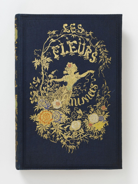
Les Fleurs Animées - J. J. Grandville. Published in Paris - Available at: https://collections.vam.ac.uk/item/O1317967/les-fleurs-animees-par-book-grandville-jean-jacques/les-fleurs-anim%C3%A9es--par-book-grandville-jean-jacques/
Due to these new techniques meaning printing designs was much more manageable on a large scale, books started to dawn intricate drawings. Yellowback books were on the rise - lightweight, lower cost books that could be read on the now more accessible trains. Yellowbacks were named after their yellow tinge - due to them being made from low quality wood pulp. These were the early examples of what we think of as paperbacks.
Speaking of yellow, the 1890s saw introduction of the British magazine The Yellow Book. The covers were designed by Aubrey Beardsley, who laughed at the idea of Victorian prudishness. This saw a shift in book covers being the of a Victorian style - with intricate art nouveau designs - to becoming much more abstract and contrasting illustrations of people and creatures. Design in general began to become much more modern, and as the 1900s began, book covers were becoming even more creative (Collie, 2017).
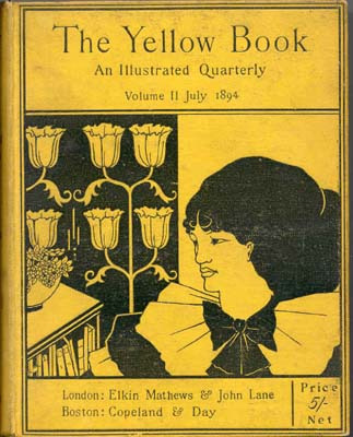
The Yellow Book - 1894 Elkin Matthews and John Lane, Illustrator Aubrey Beardsley. Available at: https://en.wikipedia.org/wiki/The_Yellow_Book#/media/File:Yellow_book_cover.jpg
20th century - graphic design lives
After the world war at the beginning of the 20th Century, a new era of design was afoot. Book covers began looking to cubist and abstract designs inspired by Soviet and German artists. There was also a move to paper covers on books - as was the end of illustrated bindings. Paper coverings were now much more convenient as fabric printing became too expensive. To have a paper cover meant more intricate and beautiful designs could be created.
In 1935 - the first paperback books were born. Much like their predecessors the yellow backs, these were much more lightweight and accessible, as they had shedded their heavy cardboard cover. Unlike the yellow backs, these books were of higher quality.
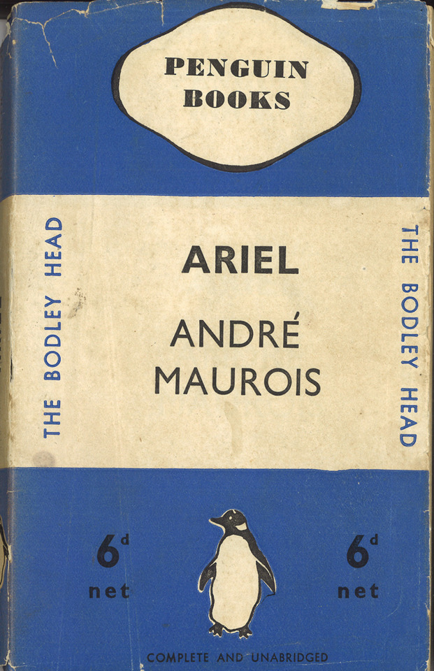
The first penguin book published - Ariel by Andre Maurois. Available at Penguin - https://www.penguin.co.uk/company/about-us/company-history/company-timeline.html
With a move towards illustration in television, film and advertising, graphic design became much more defined as a profession, and book cover design began to adopt influences - and become the main medium for many in the modern graphic design world.
References:
Collie, F., 2017. Graphic Design — ‘The Yellow Book’ — Aubrey Beardsley 1872–1898. [online] Medium. Available at: <https://medium.com/fgd1-the-archive/the-yellow-book-aubrey-beardsley-1872-1898-9bae4e9ca78d> [Accessed 21 February 2021].
Domestika. 2020. A Brief History of Book Covers | Blog | Domestika. [online] Available at: <https://www.domestika.org/en/blog/5484-a-brief-history-of-book-covers> [Accessed 21 February 2021].
Graphéine - Agence de communication Paris Lyon. 2017. A short history of book covers - 1/4. [online] Available at: <https://www.grapheine.com/en/history-of-graphic-design/history-of-book-covers-1> [Accessed 21 February 2021].
Graphéine - Agence de communication Paris Lyon. 2017. A short history of book covers - 2/4. [online] Available at: <https://www.grapheine.com/en/history-of-graphic-design/history-of-book-covers-2> [Accessed 21 February 2021].
6 notes
·
View notes
Text
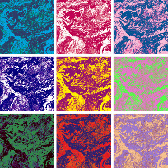
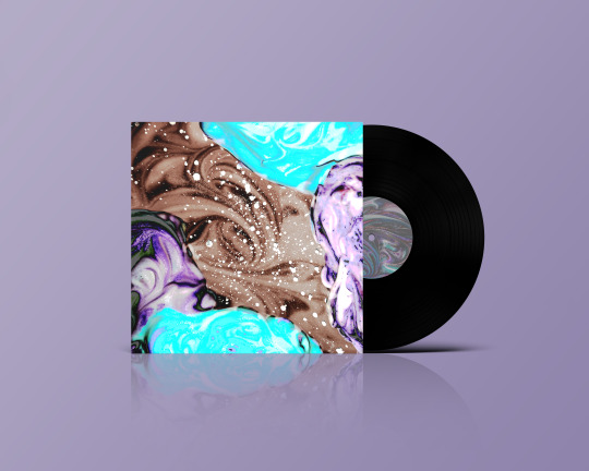
ALBUM COVER//COLOUR EXPERIMENTS//HARMONY AND CONTRASTS


0 notes
Text
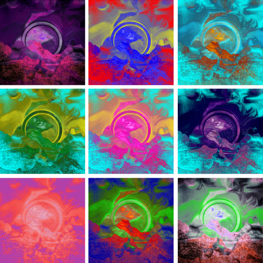
ALBUM COVER//CONCEPT DEVELOPMENT AND REFINEMENT
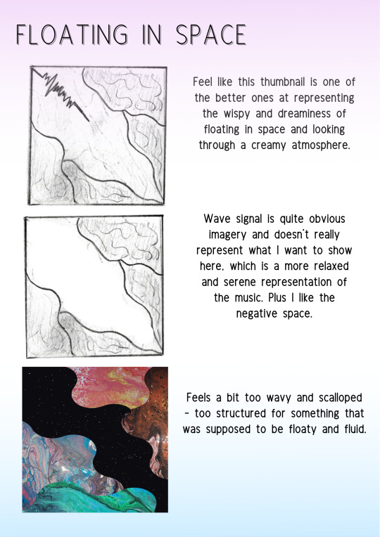
This was a more scaled back imagery as I felt representing isolation in space could be done either very obviously or very abstractly. I wanted to keep things minimal but powerful and impactful. I tried adding layer however it worked best just stripped.
I kept the centre of the circle slightly to the side as I felt it drew your eye to it more than in the middle, and was a little but unnerving, as you would be all alone in space.

As a theme throughout this, I felt blue and purple were the colours that best went along with the music. I think using these and working with the contrast created something visually quite stand out.
3 notes
·
View notes
Text
ALBUM COVER//CONCEPT DEVELOPMENT AND REFINEMENT
For this concept I did originally think I should stay away from these images but I felt like this was the best representation of the song that I wanted to show.
I messed around with different paper cutting and lights and found that using ink was a really successful way to get the effect I wanted.


Overall, I think I managed to capture the dreamy essence of a new world, and really compliment the song.
7 notes
·
View notes
Text
ALBUM COVER//CONCEPT DEVELOPMENT AND REFINEMENT
I found that this concept I had initially pictured as lots of neat even lines, but the more I worked on my experiments the more I found that something a bit more mixed and random represented the song better.

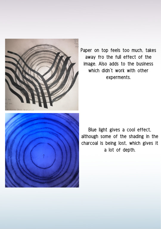
I tried seeing if layering or cutting shapes into the pour benefitted it at all but it felt like it took away from the image as was.


Playing wit the colour and composition, I didn’t want it to bee too close in, as I felt a wider scene worked better. I wanted to keep the tones close to black and white as that went well with my inspiration and the static aspect I had in mind.
4 notes
·
View notes
Text
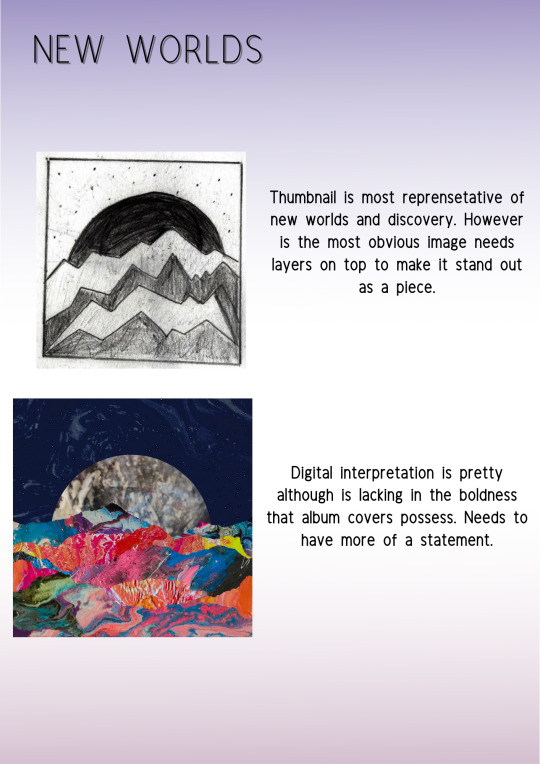
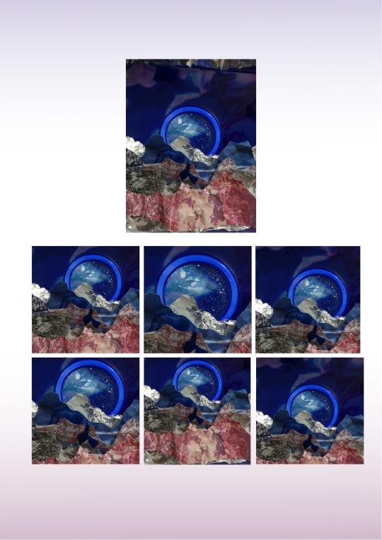
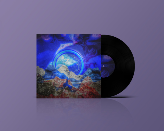
ALBUM COVER//CONEPT DEVELOPMENT AND REFINEMENT
Refining my concept began with choosing the thumbnail I most wanted to emulate. I like this one was it really was at the forefront of my mind when I listened to the music.
I then decided to try and create the image physically. I worked with felt and shaving foam to try and get the textures I wanted to get some depth in the image.
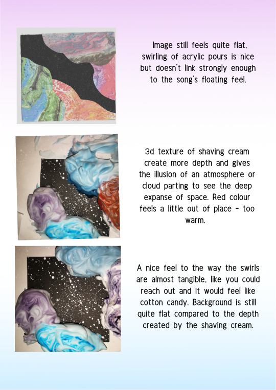
I was happy with what I had created but felt the backdrop was quite flat and dull compared to the sides, it wasn’t one whole complete picture. I tried to digitally add on some texture from previous experiments.

After than I played with colour and composition, I kept it quite wide and open to keep that empty and felt that purpley blue tones worked really well.

And voila!
5 notes
·
View notes
Text
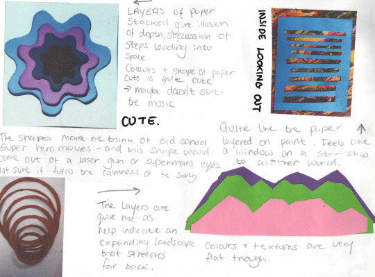
ALBUM COVER//EXPERIMENTS//PAPER AND NON-CONVENTIONAL
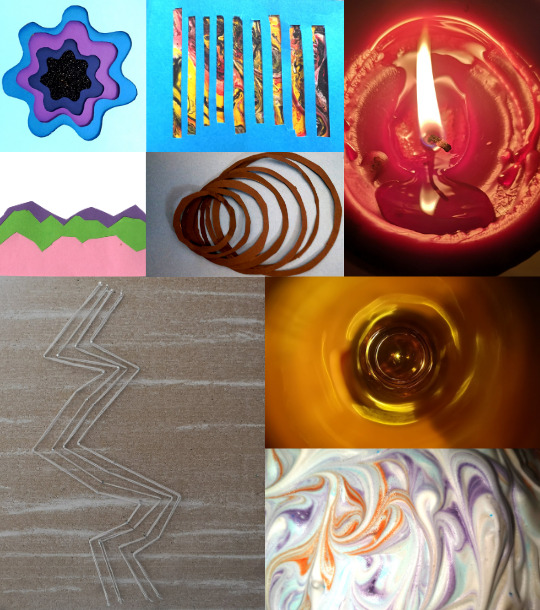
Experimenting with Paper-Cutting
I was inspired to try and create some paper cutting after looking at the work of Owen Gildersleeve. I love the way the beautiful images were made from layering paper on top of each other and over different patterns. I found that using paper was a useful tool in the creation of interesting visuals. It was a really simple way to elevate a texture to give it a literal and figurative extra layer.
I found that some of the paper cutting was quite difficult to make look very professional. The only one I managed to do neatly enough was the flower shape below. This was a really good outcome of the experimenting but I felt like it didn’t link in with the music enough. It was very cute and pretty but didn’t feel like it belong together with the song. I felt like I could use the technique in combination with something else however.
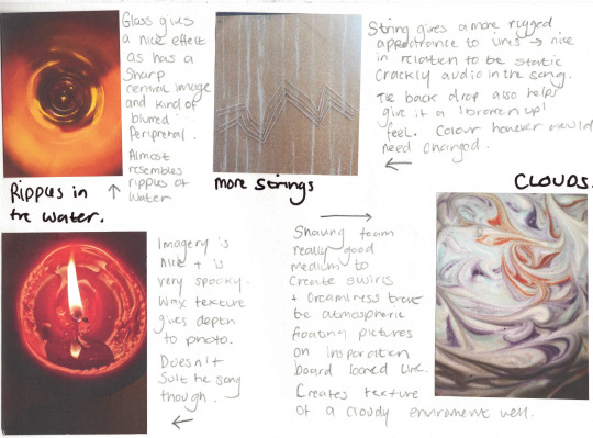
Unconventional Materials
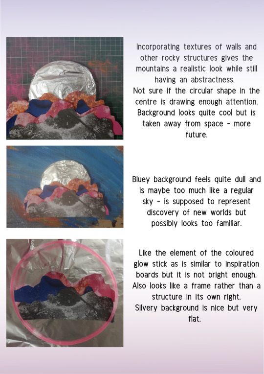
I also wanted to have a play about with things that weren’t necessarily go to. I photographed some random things I could get my hands on. I found that it really helped me pick up textures. I found that there was lots of use in household items. Glass and wax lended themselves well to representing liquid and fluid, and the shaving cream gave a beautiful swirling cloud effect. I thought this was quite a good way to model the atmospheres and mistiness that went with the song.
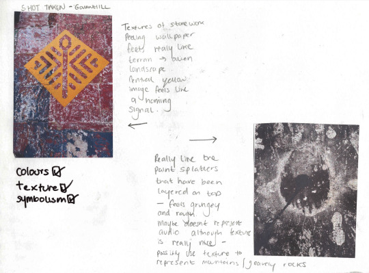
Outside of the house I found that rocky, gravely walls that had been painted or wallpapered over gave me really beautiful textures. The interesting mix of colours that were’t natural made me think of alien terrain and how it might resemble these. I also found that metallic structures were quite effectives as they were not only reflective and therefore brought in light, but also I always think metal links quite well to space travel, aliens and futuristic technology.
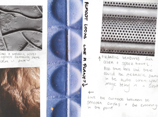
This was a really useful session of experimenting as it helped me find a lot of beautiful textures to both incorporate and try and recreate within my work.
4 notes
·
View notes
Text
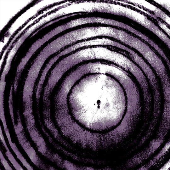
ALBUM COVER//EXPERIMENTS//CHARCOAL

I had used charcoal previous to this brief but had only really worked with charcoal pencils. Turns out charcoal pieces are much better to work with! They allow you to mess about way more and create much more interesting textures.

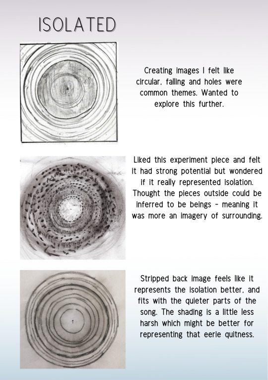
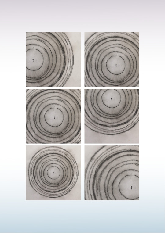
I found that I was most interested in charcoal because it allowed you to create very striking and bold images that evoked a lot of emotion. I felt that they had their own merits. When the charcoal was fine, I felt that you got quite a good idea of depth and direction. I drew this first image and immediately felt it emitted a sense of unease, of distortion. I thought the circles well representent a black hold, a huge engulfing mass that somehow is nothing at all. I thought it was a good imagery to represent isolation, and well matched the inspiration boards I had collated.

I decided to continue with this theme and use charcoal to make different looking holes and portals. Firstly I tried to see if I could add in more shapes and colours to build up an image.
The image on the left was achieved using charcoal and pastels to bring in blues and purples. I felt like this was a good representation of the song, but wasn’t strong enough to really show the emotion and feeling behind the concepts. The colours and lines being slightly neater made it feel too comical, too nice.
The image on the right felt more like the emotion I was trying to achieve. Although the song has relaxing feel, there’s a underlying sense of fear, of floating alone in space, and being completely isolated. I liked the image on the right as it also showed the black hole imagery, but it also made me think of how even with the big wide universe surrounding us, we can still be completely alone. I wasn’t completely sure if it was possibly too busy, but I liked what it seemed to represent.
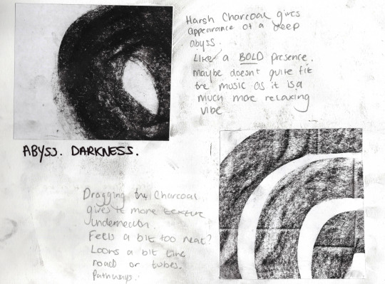
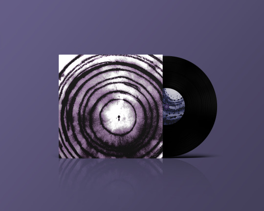
I also played with putting different weights and using different shapes of charcoal. This worked quite well as it gave a very bold image, striking and very much ticking the boxes of an album cover. However, I wanted it to be eye catching, but not necessarily loud. I felt like bother images had quite a lot of volume, and didn’t represent the quiteness of the song, and the eerie calmness you feel when listening to it.
I felt like just by creating a few images I got a lot of good material to work with in the final concepting, and was really happy with how they turned out.
2 notes
·
View notes
Text
ALBUM COVER//EXPERIMENTS//LINES
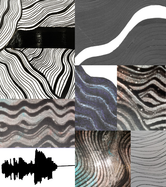
I wanted to experiment with line art as I had seen countless images of intricate line work when creating my inspiration board. I really wanted to create something really detailed that looked textured. However - this is harder than it looks!
A lot of the images I managed to create were nice but didn’t quite hit the mark of I wanted to make. The main issues were - not bold enough, looked a bit too much like flowing water (which wasn’t an issue I just felt it was a skip too far away from the imagery I wanted to create), and in general just not tidy enough.
I think the idea of consecutive lines does portray waves and sound quite well, and I enjoyed coming up with different ways of creating the lines.
I think if I was to use them I would use them as a factor in the design of the album cover but not the central image. Although I quite liked the larger line piece I did (below) and felt has it been a bit neater it would have bee quite effective as an album cover. I might look into digitally tidying it up.
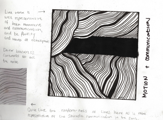
Some of the imagery was just far too obvious or cliche. I thought a sound wave drawing would be a really cool way to suggest communication, however it actually looked quite naff when I was finished, and was maybe a bit too obvious. I wanted to keep thing semi abstract, so that was crossed off my list.
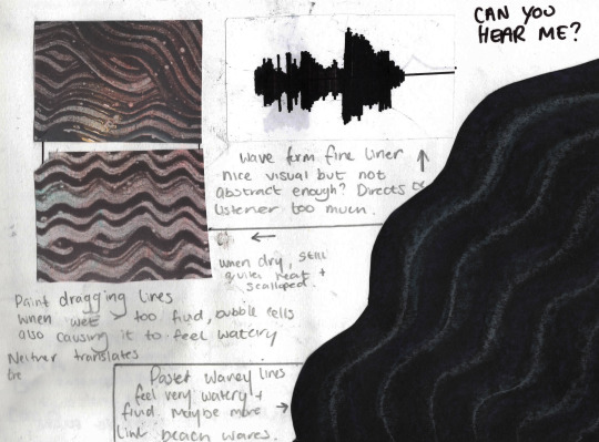
It was nice to try different techniques and see how different mediums created different effects. For example the the pastel created a really nice wavy-shore line feel, and paint dragging produced quite a funky pattern. I think i’d like to experiment with these further in other projects to see how I can refine my skill and create some other cool things.
2 notes
·
View notes
Text
ALBUM COVER//EXPERIMENTS//LIGHT PHOTOGRAPHY

I really wanted to explore light and light photography - because there’s lots of things you can do with light and the effects almost always turn out beautiful.
I had a lot of fun trying to make different shapes and patterns with the long exposure as well as taking photos of some lights to try and creating some sharp and contrasting images.
Taking a look at my themes: Floating in Space, Isolation, Communication and Connection and New Worlds.. there was a lot of ways light filtered into these.
Light for example is a big feature of space. It’s what allows us to see the stars at night, and has helped us in so many ways to identify new worlds. It also well represents technology and how we have used it to communicate and build new ways to explore.
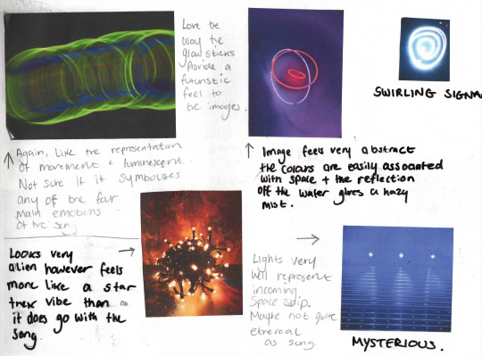
Experimenting was useful to figure out the specifics of how light can be used to symbolise these different parts of the song.
For example, the glow sticks were useful in creating patterns and depth. Moving the camera about to create tunnel like images that connected well to the isolation and the travelling aspects of the music. The way the images presented in these bright lines was also closely representative of waves again. Some of the pictures such as the three glowstick rings in the water, and the bundle of fairy lights gave a kind of alien life vibe. I wanted this to be implied rather than presented obviously, so I kept that in mind.
Some of the images was quite nice because it felt very futuristic. Like I was creating an image from tron. I quite liked the idea of using this to represent the exploration of new worlds, as a lot of the images in my mood board had neon elements.
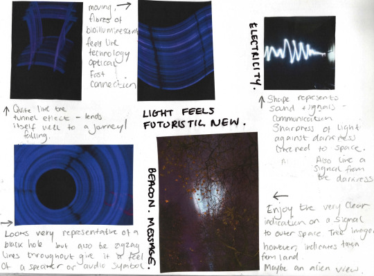
This has certainly gave me a lot of material and ideas to develop my initial concepts and thumbnails with.
2 notes
·
View notes
Text
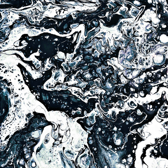
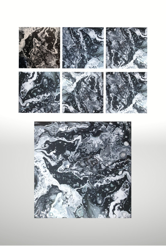
ALBUM COVER// EXPERIMENTS//FLUID ART
My making began with creating pieces of acrylic pouring art. I had seen these before and was really mesmerised by the colours and patterns that could be created quite easily and effectively.
I found that creating the pours - there was a lot of connection to the song. The feeling and emotion of the imagery depended a lot on the colour schemes - and this in turn effected how well it related to Laika.

For example, the more bright and colourful ones felt quite ethereal and mystical - but perhaps weren’t quite fitting the feeling in the music. The rainbow colours I had used in one created a really nice visual but I felt when I was looking at it that it was quite playful, whereas the song was very quiet and serene, at times eerie, but not playful.
Similarly, red and orange tones in two of them were very warm, hot even, and made me think of burning suns, molten lava and fire and brimstone - which was very unlike the song. It had a very chill feel and definitely made me think of colder tones like blues and purples.
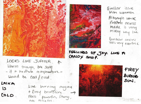
The green and blue pour of course made me think of earth, and I quite liked how this could have been what Laika was looking at as she orbited the earth. Although there was something about the canvas texture in this one that felt like you were taken out of the floating feel a bit.
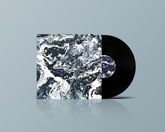
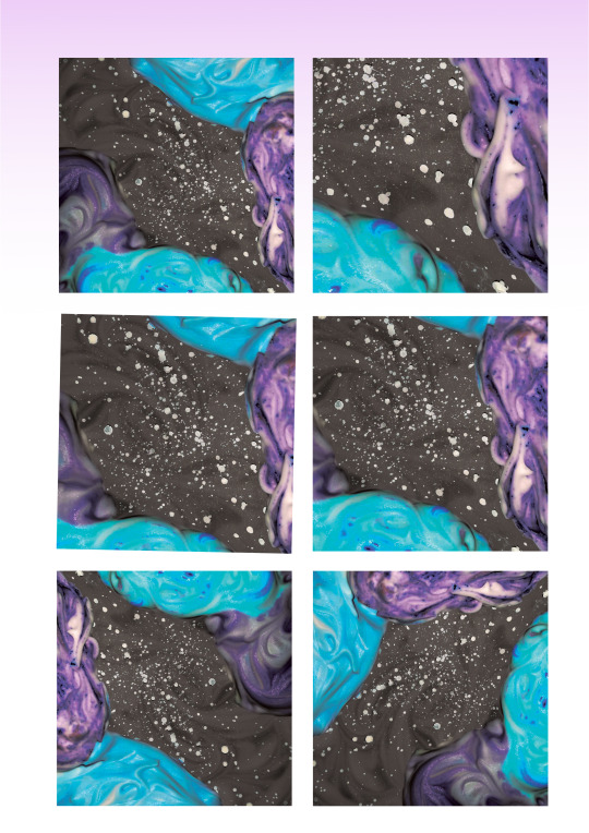
My favourite two were the purple and the black and white.
The purple had everything very obviously spacey about it. It looked like a expanse of galaxy and with swirling clouds and stars. I loved how this one related to the music and the movement it demonstrated. The only thing I wasn’t sure about was how boldly it would stand out as an album cover. A lot of the shapes were blended into one another and it was a softer colour scheme. I decided to keep it in mind for concept development later on, but to consider that it might not be striking enough to be picked up at a vinyl store.
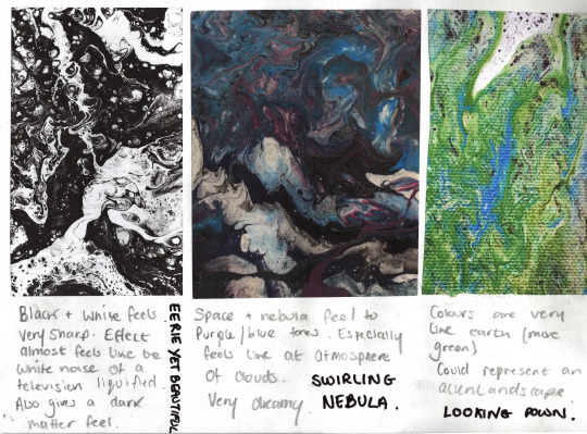
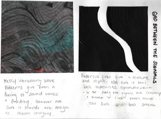
Lastly, the black and white pour was fitting for a slightly different reason. It still successfully made me think of space, and really looked like it was an abstract representation of dark matter. However it also kind of looked like the static noise you get on screens when the signal isn’t coming through. I thought that this was quite nice. Although one of my themes was connection and communication, the LACK of communication was also a factor. The fact there was someone speaking and then long gaps where you heard nothing simply made those talking parts more effective.
There was also in my mind this image of perfect sound waves and this pour represented distortion of that noise, like something was trying to get through but was coming through scrambled.
I was really happy with these pours and have found a new hobby it seems!
4 notes
·
View notes