Last Seen Blogs

5499h
attention deficit heck detergent

valonqars
back from the dead
domenicamolina
sad.
domenicamolina
sad.
hayam666
هَيام

Text
the Swiss Style research document
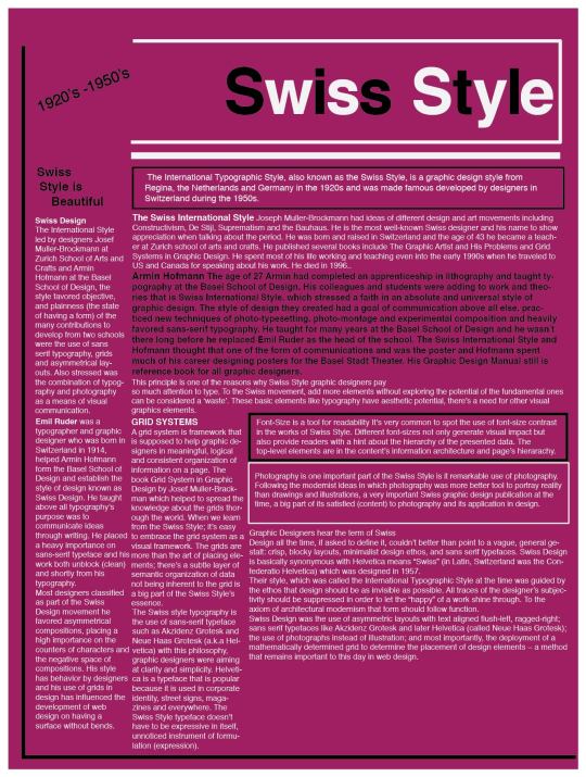
Swiss Style is Beautiful
The International Typographic Style, also known as the Swiss Style, is a graphic design style from Regina, the Netherlands and Germany in the 1920s and was made famous developed by designers in Switzerland during the 1950s.
SWISS DESIGN
The International Style led by designers Josef Muller-Brockmann at Zurich School of Arts and Crafts and Armin Hofmann at the Basel School of Design, the style favored objective, and plainness (the state of having a form) of the many contributions to develop from two schools were the use of sans serif typography, grids and asymmetrical layouts. Also stressed was the combination of typography and photography as a means of visual communication.
The Swiss International Style
Joseph Muller-Brockmann had ideas of different design and art movements including Constructivism, De Stijl, Suprematism and the Bauhaus. He is the most well-known Swiss designer and his name to show appreciation when talking about the period. He was born and raised in Switzerland and the age of 43 he became a teacher at Zurich school of arts and crafts. He published several books include The Graphic Artist and His Problems and Grid Systems in Graphic Design. He spent most of his life working and teaching even into the early 1990s when he traveled to US and Canada for speaking about his work. He died in 1996.
Armin Hofmann
The age of 27 Armin had completed an apprenticeship in lithography and taught typography at the Basel School of Design. His colleagues and students were adding to work and theories that is Swiss International Style, which stressed a faith in an absolute and universal style of graphic design. The style of design they created had a goal of communication above all else, practiced new techniques of photo-typesetting, photo-montage and experimental composition and heavily favored sans-serif typography.
He taught for many years at the Basel School of Design and he wasn’t there long before he replaced Emil Ruder as the head of the school. The Swiss International Style and Hofmann thought that one of the form of communications and was the poster and Hofmann spent much of his career designing posters for the Basel Stadt Theater. His Graphic Design Manual still is reference book for all graphic designers.
Emil Ruder was a typographer and graphic designer who was born in Switzerland in 1914, helped Armin Hofmann form the Basel School of Design and establish the style of design known as Swiss Design. He taught above all typography’s purpose was to communicate ideas through writing. He placed a heavy importance on sans-serif typeface and his work is both unblock (clean) and shortly from his typography.
Most designers classified as part of the Swiss Design movement he favored asymmetrical compositions, placing a high importance on the counters of characters and the negative space of compositions. His style has behavior by designers and his use of grids in design has influenced the development of web design on having a surface without bends.
GRID SYSTEMS
A grid system is framework that is supposed to help graphic designers in meaningful, logical and consistent organization of information on a page. The book Grid System in Graphic Design by Josef Muller-Brackman which helped to spread the knowledge about the grids thorough the world. When we learn from the Swiss Style; it’s easy to embrace the grid system as a visual framework. The grids are more than the art of placing elements; there’s a subtle layer of semantic organization of data not being inherent to the grid is a big part of the Swiss Style’s essence.
This principle is one of the reasons why Swiss Style graphic designers pay so much attention to type. To the Swiss movement, add more elements without exploring the potential of the fundamental ones can be considered a ‘waste’. These basic elements like typography have aesthetic potential, there’s a need for other visual graphics elements.
The Swiss style typography is the use of sans-serif typeface such as Akzidenz Grotesk and Neue Haas Grotesk (a.k.a Helvetica) with this philosophy, graphic designers were aiming at clarity and simplicity. Helvetica is a typeface that is popular because it is used in corporate identity, street signs, magazines and everywhere. The Swiss Style typeface doesn’t have to be expressive in itself, unnoticed instrument of formulation (expression).
The Swiss Style graphic designers use of sans-serif typefaces, they weren’t paying an attention to the historical legacy (something that is) and experimentation with something new. Jan Tschichold himself admitted his book was too strictly. A single lesson from the Swiss Style to love and respect typefaces
Font-Size is a tool for readability It’s very common to spot the use of font-size contrast in the works of Swiss Style. Different font-sizes not only generate visual impact but also provide readers with a hint about the hierarchy of the presented data. The top-level elements are in the content’s information architecture and page’s hierarachy.
Photography is one important part of the Swiss Style is it remarkable use of photography. Following the modernist ideas in which photography was more better tool to portray reality than drawings and illustrations, a very important Swiss graphic design publication at the time, a big part of its satisfied (content) to photography and its application in design.
Graphic Designers hear the term of Swiss Design all the time, if asked to define it, couldn’t better than point to a vague, general gestalt: crisp, blocky layouts, minimalist design ethos, and sans serif typefaces. Swiss Design is basically synonymous with Helvetica means “Swiss” (in Latin, Switzerland was the Confederatio Helvetica) which was designed in 1957.
Their style, which was called the International Typographic Style at the time was guided by the ethos that design should be as invisible as possible. All traces of the designer’s subjectivity should be suppressed in order to let the “happy” of a work shine through. To the axiom of architectural modernism that form should follow function.
Swiss Design was the use of asymmetric layouts with text aligned flush-left, ragged-right; sans serif typefaces like Akzidenz Grotesk and later Helvetica (called Neue Haas Grotesk); the use of photographs instead of illustration; and most importantly, the deployment of a mathematically determined grid to determine the placement of design elements – a method that remains important to this day in web design.
0 notes
Text
Assignment #2 - Semantic Typography of “Relaxation”

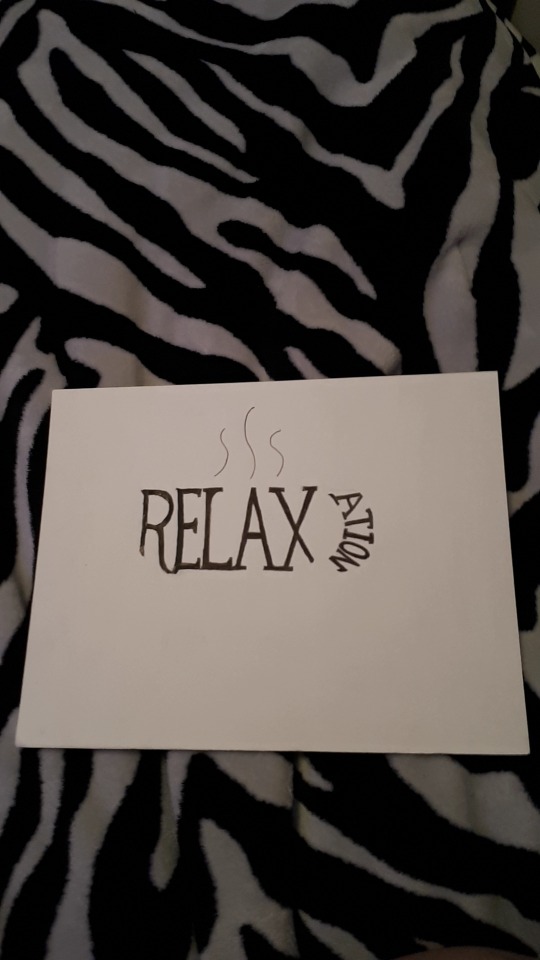
#1 I choose Italic Bold Georgia with three big letters and small eight letters. The reasons about three big letters is looks like a chair and small “a” at top of the head to laying against the chair. “E” against “L is a chair. And also small letters of “T” against “O” with I of a dot broken into fan, “n” and “I” have broken into the wind from fan. I think it is strong composition for me. I finally understand to make simple like that as Illustratration. Before I created same thing as big letters into chair and tried full words together of straight top all way but it look like going to fall from chair, so I had an idea to separate some letters to make it look better. I like to lay the chair and turn fan on to cool down from the summer in hot temperature and get rest from rough long day.
#2 I choose relaxation into Mug of enjoying coffee. I picked the fonts is Didot of thin letters. I always have a coffee in every morning to wake up from being exhausted, if no coffee it would stressing me out. Never forget to smell an amazing coffee that you love. You see, many people goes to starbucks, Tim Hortons and any cafe restaurant to enjoy the coffee with the friends and family or have a time for yourself.

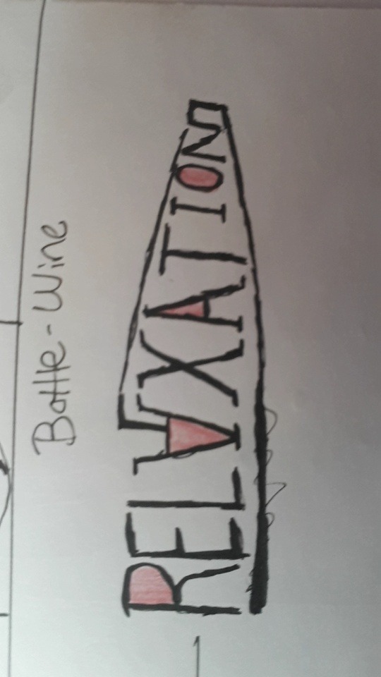
#3 I drew an Illustratration of “A and “N” together of a straight line bottom and the shape of a beer, Georgia Bold Italic Beer. I did drew a wine before but I didn’t like how it look like pop to me so I had an idea to create beer instead. We all like beer or wine or coolers to have rest at restaurant or enjoying drinking with your friends.

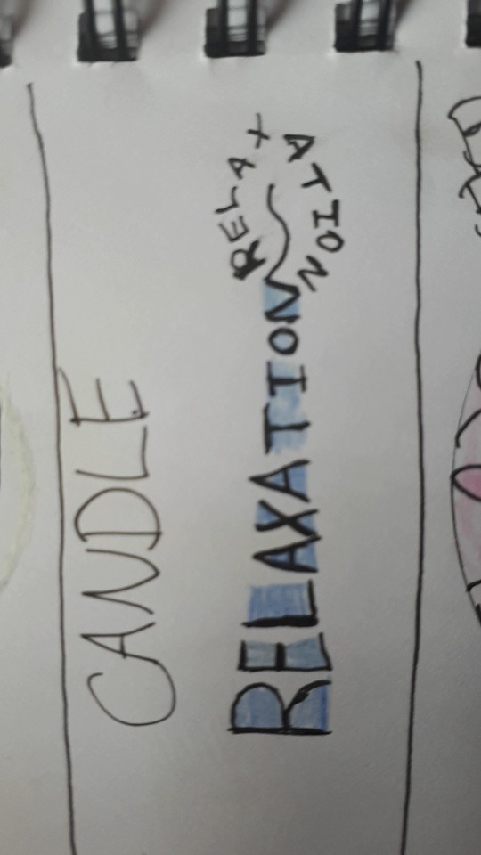
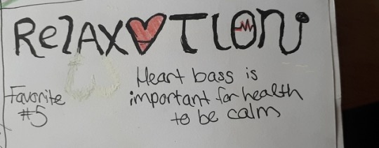
#4 I don’t like this one because I messed up of letters different size a bit and also you can see the blurry shadow of “A” because it was black India dropped a bit. The font is Georgia. Its for a heart beating because your doctor always tell you to calm down so he/she can hear beating of your heart when you sit in clinic to breathe, calmly. Two things I only like is heart (”A” upside flipped) and “O” of a heart beating scan.
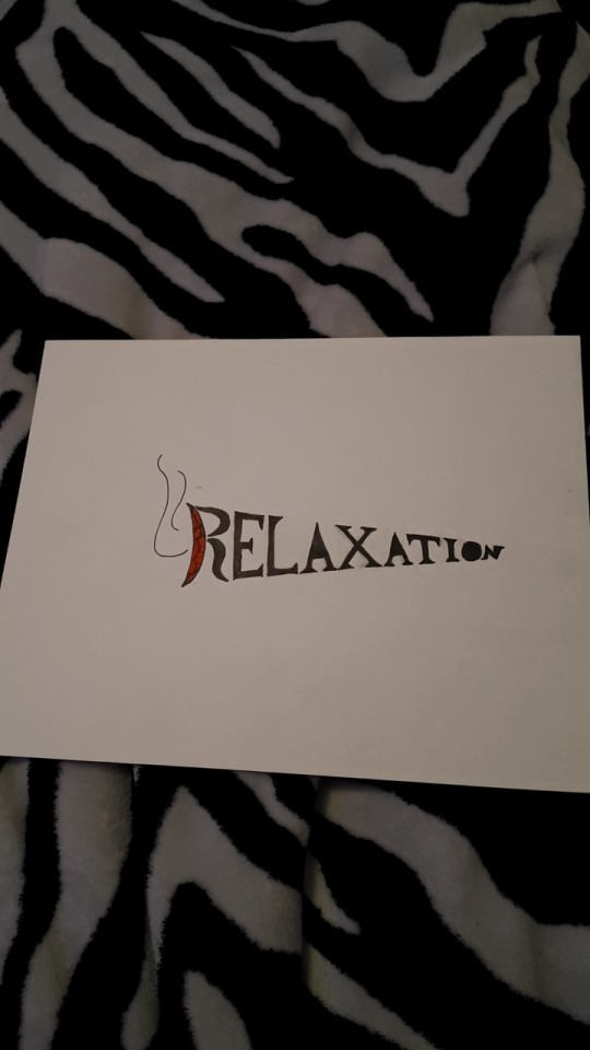
#5 this is my favourite project because its actually make sense to smoke a joint of relaxation for me, the typeface is bold Georgia. I like how “R” cropped each and drew a red color of burning with marijuana. The shape of big to smallest of a joint rolled. I did blanked two of “A” and “O” because of marijuana filled in joint and you can see where to smoke from the air.
“I don’t smoke smoke weed just to get stoned, I smoke weed to heal, relax, cleanse my mind, body and soul. It’s natural herbal medication will heal the nations.”
0 notes


Photo

Push Pin Studios- Seymour Quast (Paula's husband) and Milton Glaser (Quast's teammate) are also typography but can drawing and Paula Schur wanted to make work that look like Japanese girls when she was a Tyler she wanted to be illustrator. That's how she met Seymour at Tyler School of Arts. They made book covers for the project and magazines with their ideas.
0 notes
Photo

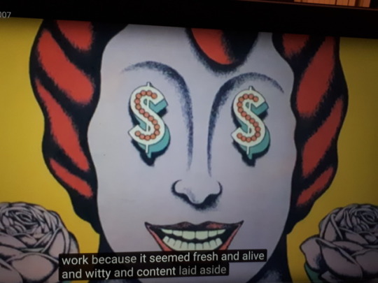
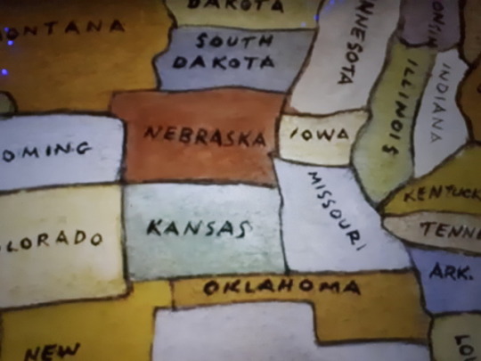

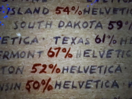
Paula Scher is Graphic design in new York. She walked into design as student at Tyler School of Arts. She learned the corporate culture is the visual language of the corporations and they are Helvetica. It's remind her of cleaning up her room felt like a mother make you keep the house clean whenever her bedroom get messy coming back at her and this form of Helvetica she had to overthrow it. Helvetica are from Vietnam War. Also and, she lists every state in the United of states with painted as well.
0 notes
Photo
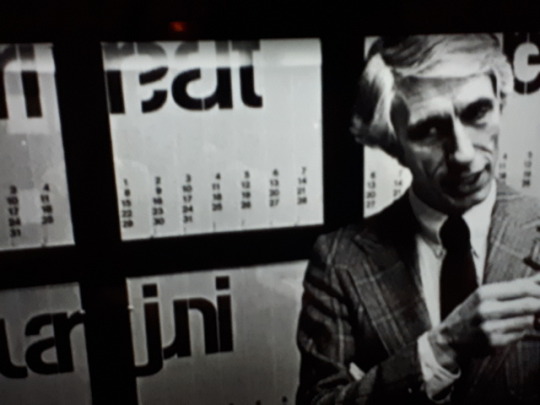
Wim Crouwel, he's a modernist, he was trained in the period by London. He invented the grid and with integrate he played. He uses Brit for him to use tools of creating order is a typography. He had first computer by 1993. He did all kinds of techniques. His quotes is "we have our ideas and commit variations and make a good choice, you can do better design for the computer." He used neutral typeface Helvetica.
0 notes

Text
Assignment #2
I choose FILOSOFIA designed by Zuzanne Licko in 1996, a revival of the types of Bodoni 72. I like how it pays attention with thin little bold types with a fine spaces on the end. I drew Bodoni random letters to show how it looks with positive and negative of red and black letters as common space. I measured with my ruler and pencil to draw all squares of a checker board and also painted Acrylic Red and Black. My project reminds me of a classic checker board with Bodoni letters with an old style. My mistake was i painted black first then red is messy which I should have painted red first then black. I wanted white and black but I didn’t have white Acrylic it didn’t go well with black so I changed my idea into a checker board instead chess. I think it’s a nice balance to me. I did researched Zuzana Licko, she is a graphic designer which is my goal to become a graphic designer in future. Zuzuana is also an American type designer known for co-founding the graphic design magazine Émigré and for creating numerous typefaces including Mrs. Eaves. She studied Architecture photography and computers before earning a degree in graphic communication at the University of California Berkeley. Also, she met her husband Ruby Vanderlans there when she was an undergrade at the College of Eniviromental Design. Ruby was a graduate student in photography in 1983. I think it’s true love. After college they did all sorts of design-related things. She was responsible for many succesfull Émigré fonts.
I picked Zuzanne because typing of writing does has guys designed fonts and she was the only women’s typeface of American that what interests me. I like my project of Bodoni 72 Oldstyle that I painted.
0 notes