#& do the final layer/colors/bg there
Text
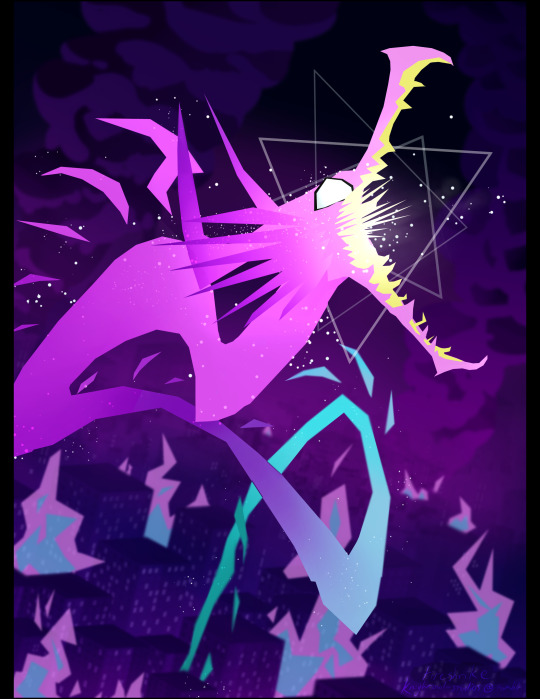
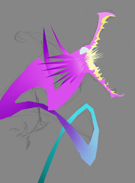
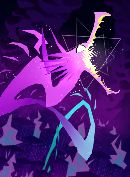
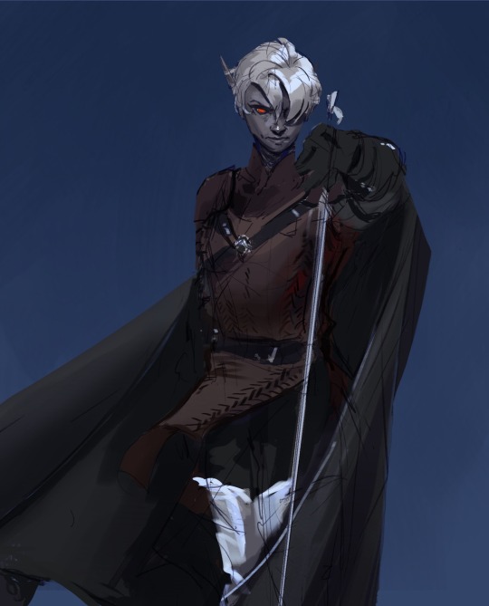
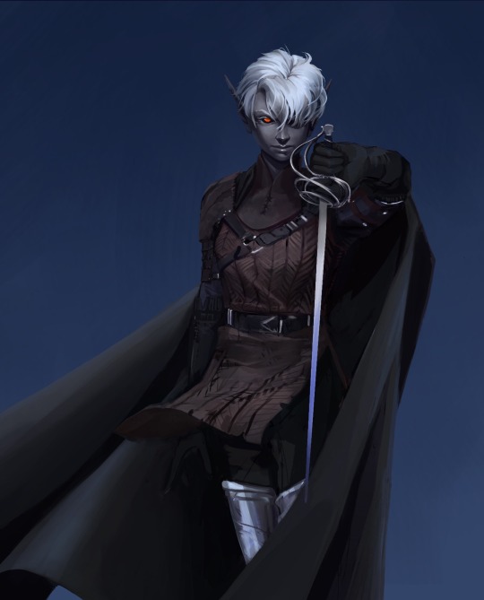
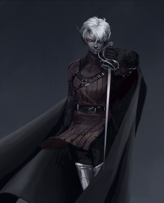
world's longest staring contest GO-
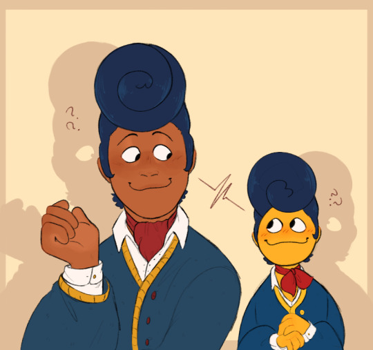
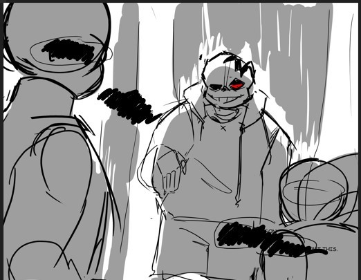
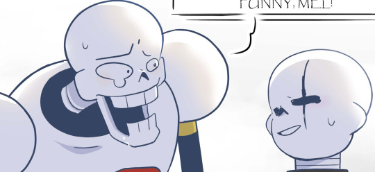
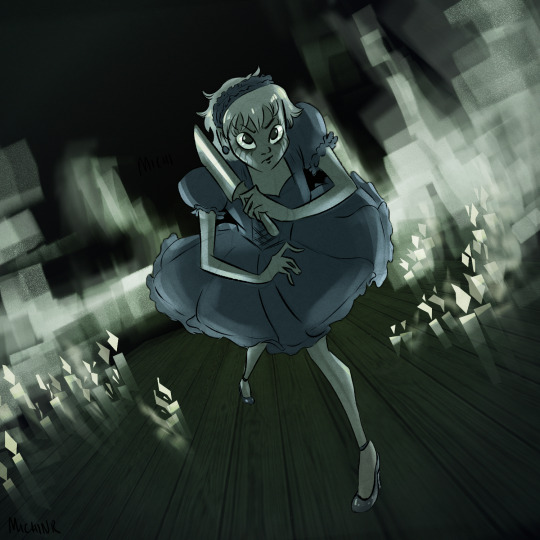
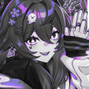
#them. he??? wally plural <3#how are they the same little man....#looking between them in confusion so fast i get whiplash#one half of my brain: huh what huh what huh-#the other half: HOLY SHIT TWO WALLYS!!!!!! <3<3<3<3<3<3#wait would it be wallys or wallies#fr what Is wally plural#existential questions we should all ask ourselves#scribble garnish#welcome home#welcome home puppet show#welcome home fanart#wally darling#i got a little lost in the Sauce making this & finished before realizing i didnt copy it over to a new larger canvas#& do the final layer/colors/bg there#so its a Little Bit Lower Resolution than id like#BUT HEY ITS NOT LIKE THATS EVER STOPPED ME BEFORE!!!!#whatever whatever doesnt matter its done and im satisfied with it#& i fuckin better be bc working on this killed my wrist lmfao#nearly dropped my stylus at one point from the sudden Oofie Ouchie#suffice to say i will be queuing this & then taking a day-long break from my hobbies#which are all hell on the wrist#which means i will probably leave the house out of sheer boredom#maybe ill watch spiderverse. go get a tasty Beverage. take a walk. summon the old gods if im in a silly goofy mood#just now realizing i probably drew wally too small#puppet wally. og wally light of my life. AHAHA OOPSIES TOO LATE TO FIX IT NOW 🥲👍
8K notes
·
View notes
Text
made some changes to mattodore's sims so now i've been flipping back and forth between screenshots of their newer vs. older versions for the last ten minutes trying to decide if i wanna keep the changes or not. agony. pain. grief AND wailing. slings and arrows.
#river dipping#have i slept at all? no#i originally opened the sims just to test out the changes i made to my cas bg w/ the help of vyx <333#um but well. then i was spinning theo around in cas and i realized how crazy it is how little skin details he and matthias have#so i finally started going through all the categories and added things here and there... i added some shading to theo's face#and then i was like wow that looks great let me do the same to matthias but... looking at him now i'm thinking not djkfghkf#he's too pale for that i think it makes him look... idk off. so i'll probably be completely reverting matthias's sim back#but theo.......... he looks SOOOO much better now#i FINALLY went in and gave him an overlay for his body which i hadn't done... for whatever reason?#honestly matthias needs a new one as well but i think i'll have to make him a custom blend for him so his face isn't layered over. ugh.#i also need to make his skintone ww compatible so i might do those both at the same time... 😑#then again i say this but ykw i still haven't done? fix the color of his eyebrows despite saying i was gonna do that days ago.#i'm a liar. i lie.#………………… <- posts i was in the middle of writing nearly seven hours ago and fell asleep on before posting#and now i’ve woken up with futile devices by sufjan stuck in my head so yeah. today’s gonna be a crazy one probably#good morning i guess djfhfgsgdf
12 notes
·
View notes
Text


wtf epic artist just said she rlly likedmy stuff -w-
#rex.png#lately my process has been to. sketch terribly. paint underneath. final layer on top when im bored#in order to cut out the middleman of lineart....#but i would like to do lineart........ i just get so frustrated getting past the ugly stage is such a brutal undertaking like girl help#and im unable to use more than 3 layers otherwise i have to die#i hate compositing i hate gradient maps i hate overlays i hate glowy lighting#how is it that whenever i try my stuff looks stupid and overdone but other ppl draw the sickest anime stuff with a million colors#and either high contrast or no contrast or something and it's sick digital art like#but whatever shit i try looks like a bad instagram filter?? sick of liviign like this omfg#and i tried low contrast bc it looks cool... fortiselle my dearly beloved...#but w/o lines?'!?!?#its just with lines how am i meant to change things or keep things coherent with the bg or not have flat lighting
5 notes
·
View notes
Text
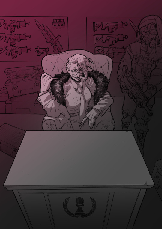
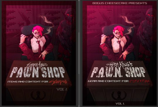
TIME FOR A PROCESS POST let's talk abt getting from this (client sketch - which, btw, i know other artists have talked about this plenty, but i LOOOOOOVE a client sketch as early direction on a commission. LOVE it)
to this!
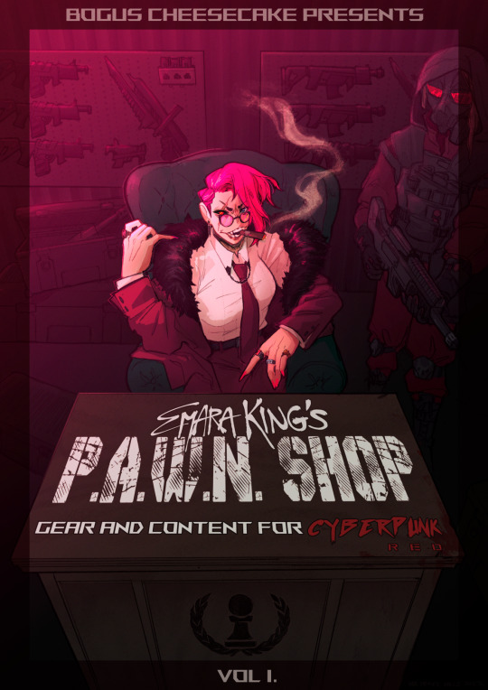
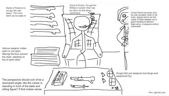
at first we didn't know if the title was going to go across the desk, or over the central figure (emara's) head against the back wall. so there was a 1st version where we were favoring a higher title, then we started favoring the desk so we scrapped the clutter + centered it more

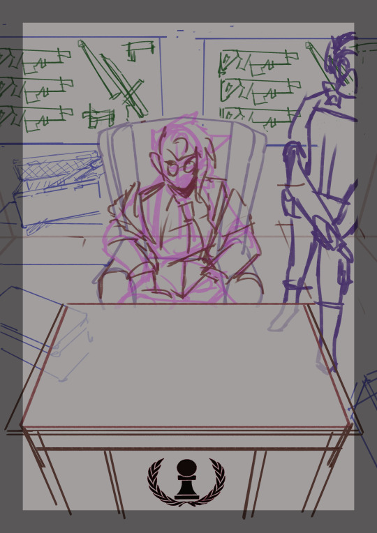
i used clip studio's 3D models (particularly for the chair, guard, + weapon crates) and perspective rulers to help with laying everything out at this stage, tho i abandoned the 3D pretty early on bc it's a bit too clunky for me. maybe i'll find it quicker to use w more practice!
(the rest under the cut!)
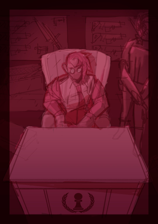
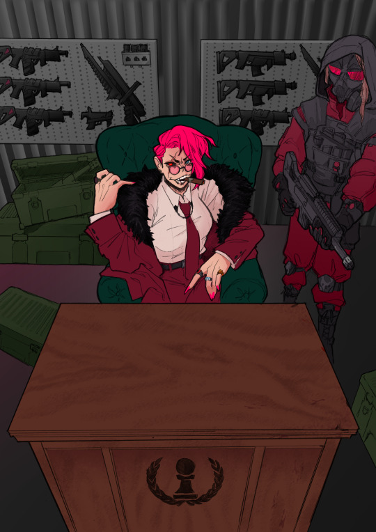
once the basic layout was approved, i threw together a value study to explain how in the final image all the clutter of the bg detail would be unified and pushed back. lately i find myself thinking abt value earlier + earlier in the process; planning ahead saves me a lot of time!
i fiddled with starting to refine things digitally, but then i got A BRAND NEW LIGHTBOX delivered in the mail with perfect timing (lmao) so i just ended up printing off the digital sketch, finalizing in pencil, + scanning back in

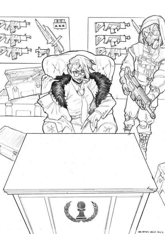
then comes five billion different steps of locking in values, again. i did everything greyscale first, but i didn't worry abt getting things super polished at this stage bc i knew color would factor in a lot to later decisions
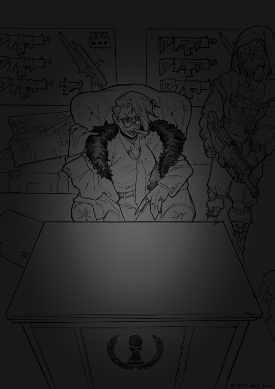

this is the point at which presenting these wips "step by step" is kind of misleading; i didn't do these stages one at a time, but rather had a BUNCH of different lighting/shading layers that i kept toggling on and off as i worked to make sure everything was coming along well.
(to get some of these caps i actually went into the main file again and turned a bunch of stuff on/off just for the sake of getting specific examples, because actually when i was actively working on it there was rarely a point where i was actually working on something with "all lighting turned off and just the shading on," or anything like that; but i AM interested in showing what effects different lighting/shading changes had on the base colors, even if i wasn't really making these changes in a rigid order.)
i.e., just for the sake of interest, here's how the flat colors look without those adjustments!! but i honestly never looked at it like this on its own for long...i had all the shading/lighting turned off so i could see what i was doing while flatting, but i was constantly checking back and forth.
then tones added on top (which were actually just two copies of the tone folders in the above posts, set to linear burn and overlay) -
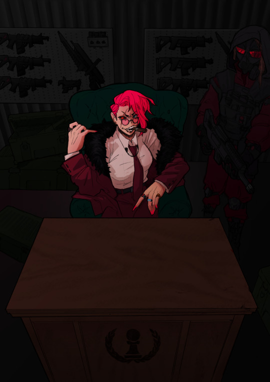
which makes it get HORRIFYINGLY dark, but that's when we go in and add a bunch of lighting adjustments.

the most obvious lighting change above is the big burst of hot pink light from the corner, but there was also some masked overlay + burn layers to pop out the guard + emara and make sure they were pulled out from the bg. if this were a standalone illustration, i maybe would have let the bg (and all that painstakingly drawn detail..........) stand out a little more, but a cover functions differently, and i wanted to make sure the eye goes to the title first. that means sacrificing bg detail even if it looks sick lol
then final touches! a lot of my very last touches are things that are close to invisible; gradient maps on very low opacity, noise, a little bit of scribbling on upper layers. the typesetting was all by the client, except for the lettering for "emara king's," which i did myself!
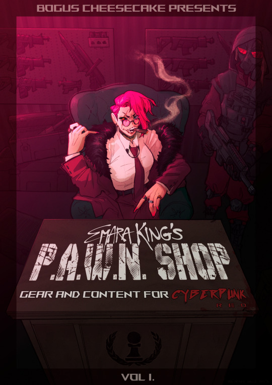
finally, here's a comparison of ⬅where i left off one night close to the deadline thinking "it's probably done, but i'll sleep on it just in case," then all the adjustments i made the next day with fresh eyes.➡ and that's it!!! phew!!! that's how i make a cover!
#my art#process#wip#tutorials#<- not really but. i just figure someone browsing my tutorials tag might be into this#i am so so so so so fucking mad that i didnt think to turn timelapse recording on for this#bc a timelapse wouldve been so fucking sick. but i can at least share this
596 notes
·
View notes
Text
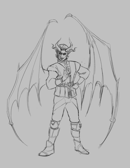
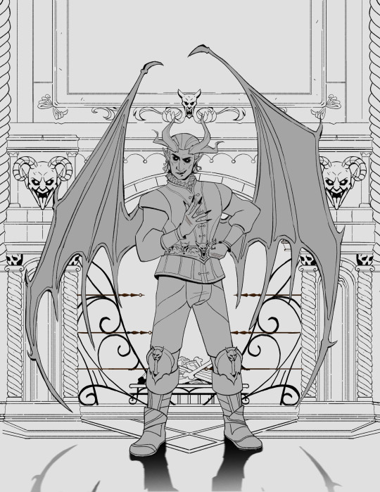
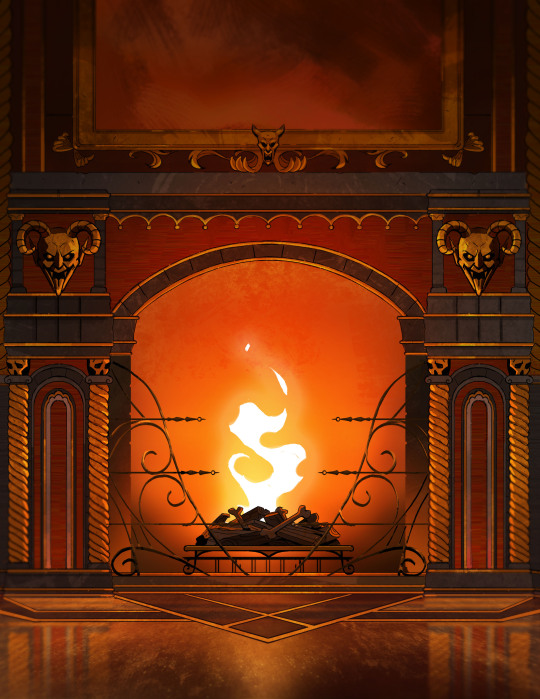
Here are some process shots for this one of Raphael from BG3! That magnificent bastard...

So I started out with a sketch of Raphael. He's got such a charismatic swagger doing the whole "What's better than the Devil you don't know? The devil you do" scene. I just wanted to do a caricature study and have a bit of fun.
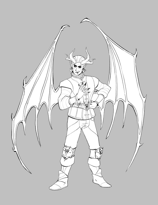
Moving from rough sketch to clean line art is always challenging for me as I often get bored or what was originally loose and fun can become stiff.
I had to redo the linework twice because I didn't like how the first one turned out! Second time is always the charm.
I initially only planned to draw the character but I love the design of House of Hope too much, so I went back into the game and took a bunch of screen shots and sketched out the rough bg.
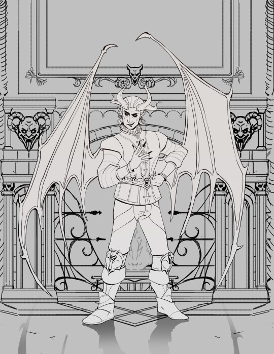
Then I went ahead and cleaned up the bg. At this point is when I group the layers properly, so there is a clear separation between foreground, and background as well setting up the layers for animation. (Making sure the fireplace guards overlaps the walls behind it.)
At the next stage I adding in the flat colors. I wanted to keep the style treatment of this piece more on the cell shaded/cartoony instead of super painterly. So I keep the color treatment fairly flat with a small amount of texture with the intention to add lighting as a fx overlapping treatment instead of painted in.
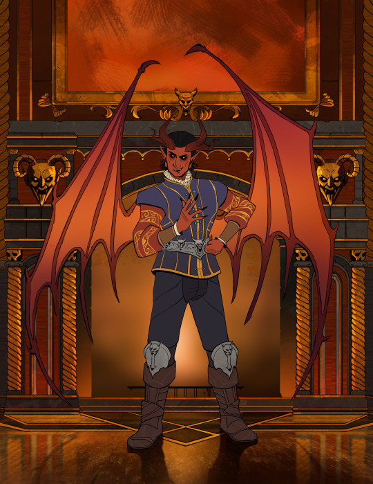
I work on the characters and the bgs at the same time to keep the values and color temp consistant, constantly adjusting as I go. From habit from work, I always paint the entire BG JUST incase I need to make changes or make adjustments to subject in from. Here is the bg all done, with fire painted in as a place holder.
And finally, adding the final lighting layers added on Raphael. I keep it simple here, just a redish/purple multiply player with the areas in the light masked out, and inverse mask on an orange/red overlay layer of the areas in the light.
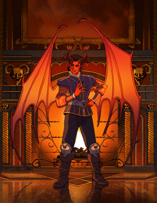
Animating the fire took ironically the longest, the animation tools in photoshop is clunky and I haven't animated since school days. I looked up a lot of references and tutorials! It's not perfect but good enough for me!
#raphael bg3#raphael baldur's gate 3#bg3 animation#bg3#badlurs gate 3#bg3 fanart#artists on tumblr#sketches#drawing#art#artprocesses#art tutorial#bg3 art#art process#art style#animation#bg3 spoilers
131 notes
·
View notes
Text
“This is a warning for Kray Foresight - free all captive Burnish immediately, or I’ll burn Promepolis to the ground!”
Many hours, layers, micromanaged bg assets, and egregious amounts of colorpicking later, it is finally done //passes out
As soon as I watched Promare I was legally obligated to draw the dragon.
Please do not reupload without permission!
(Very ramble-y) process notes and wips below the cut:
[[Shoutout to Tamberella’s wonderful city brushset, the bg would not have been possible otherwise!]]
I had to cross-reference so many stills and gifs from the movie in order to try and recreate the atmosphere and style XD This whole drawing was also the perfect excuse to whip out the polyline tool again, it’s one of my favorite things to draw with but I don’t actually use it much for...some reason lmao. Habit? Who knows...
As you can see, it was initially supposed to include his lil arms, but I couldn’t find a way to make them flow well with his line of action and had to exclude them (which was a bit painful as I was really happy with how the claw shapes turned out). I figured since the film seems to cheat it the same way, it was fine for me to do it as well XD Though I don’t have a capture of it, originally his body was also in a more straightforward loop-de-loop kind of shape.
I wanted to put special focus into the pose and sense of action (two things Trigger really excels at), namely when it came to the head and jaws. I noticed that in a couple of shots the dragon’s jaw is “broken” - opened at an unrealistically wide angle - to better emphasize the action, and while I didn’t take it as far as Trigger did I wanted to try and capture something similar in my own way.


The windows required SO much micromanaging. I blocked out a “template” of windows using one of the brushes in the mentioned set, grid-warped it to align with the perspective, and then copy-pasted it onto each building and then manually went through each one to make sure every patterns of “lit” windows was unique and felt believable. The process had to be repeated twice, for both visible sides of the buildings. As far as individual parts of the pic go, that step probably took the longest.
I also really wanted to somehow incorporate triangles into the drawing since they’re so representative of the Burnish and the Promare, and adding some around the face seemed the most intuitive way to do it.
A lot of miscellaneous things were added at this point, such as the ground flares (polyline tool my beloved), the smoke, and smaller details like making sure the dragon felt more “sourced” in the scene by clipping the tail behind a tower. The background was also blurred, to help sell the perspective as well as keep the focus on Lio. The flares were one of the hardest things to manage in the latter regard, too, as due to some oversights in my initial color choices they were actually brighter than Lio and stole his thunder! So it took several different tries to find a way to successfully de-emphasize them without inadvertently making them some weird sickly color XD
If you read through all of these notes, thank you so much, I love you!! //hands you a cookie
Bonus layer screenshot:

#reupload#personal fav#promare#if you were one of the people who reblogged or liked the original THANK YOU!!#it meant so much to me you have no idea!#and if you ARE seeing this again in the tags please pardon the dust of reuploading it here too XD#I just still like this one a lot so I wanted to bring it to my new art blog as well#everything in one place and all :P
110 notes
·
View notes
Note
How do you happen to do your shading id you don't mind sharing? Its so subtle and soft that you can't tell its there but it really helps highlight the characters
Phew, finally got some time on my hand to answer this one! It's a fairly simple/fast process so I figured I'd make a tuto once I'd get started on the shading for the next part, and here we are!
Alright so, we've got the panel (lazy screenshots cuz I'll never finish this if I have to export everytime ahah)
The advantage of digital art is that I don't have to think about color harmonies right from the start, I can always add filters and fiddle with the hues at any stage, so I just apply base colors at first and draw the background (it will help me build up a palette for the shadows later).

Okay, now the fun really begins. First I need to know which direction my shadows are likely to go and what atmosphere I want for the panel (which element I want to highlight? palette idea? etc). A sketch is enough to establish your intentions. Sometimes I'll mess up the lighting but it's okay to cheat if it looks coherent enough xD
(Patreons exclusive, shhh)
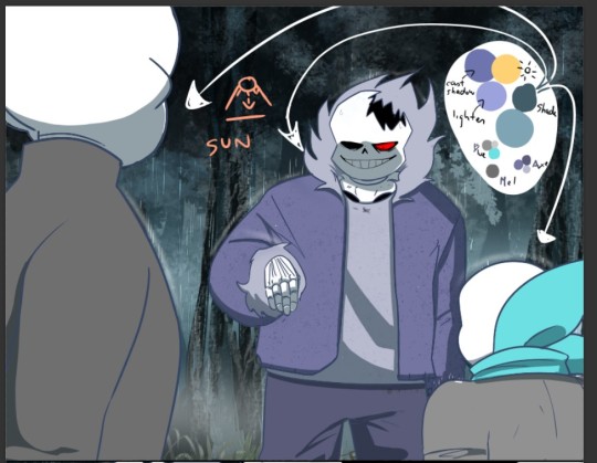
Now to create palette and apply the said shadows. I have a hand made one for TMS, but I had to make a special one for Ebott since there's a lot bg and kinda heavier atmosphere (I'll prbly have to make one for each part frow now on too hm). It's mostly made up of blues and greens (no black or greys here, but it can be fun to use in other styles! Purple too, so have fun!)
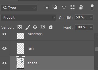
(My configuration - Produit=multiply?)
There, cast shadows (clothes, faces, folds, etc.) are roughly in place and looking sharp! Maybe a little bit too sharp actually... Let's smooth all that up

I use an airbrush eraser to soften a few shadows. Not necessarily all of them or the whole shape, you have to find the right balance of soft/sharp.
Now to spice things up a bit-
On a layer linked to the shadow layer, I add a lighter color that matches my light source or the environnement. Here it's a light blue, but in part VII I used a lot of orange (sun)! It makes the shadow much richer and the whole palette more vibrant!
(Again, you don't have to do it on all of them)
(not sure if you can see it lol but there's orange!)
And last but not least: Global shadow and filters (? never had to name or translate it bwahaha)
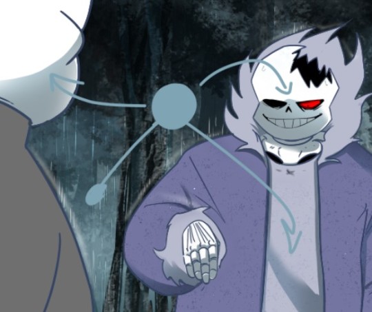
It's a lot of fiddling to achieve a result where the character looks more or less rooted in the background (=blue layers and filters to harmonize colors) and where I draw the last shadows. They're often the biggest ones (=on Axe's body+ leaf/tree shadows etc.).
You can use the techniques I've described above, or just go for it, it's completely freewheeling from here, ahem. Just make sure to step back regularly to see where you're at and stop.
(You can also add lights layers and spots if it's too dark but in this example, I use the base color as a light layer + their skulls are such a bright white already xD )
A bit of blur and ta-da~
Pretty easy, right?
#ask#undertale#The missing scarf#txt#seirin talks#tuto#spoil#I hid the dialogues but let's be careful xD#it's an efficient technique for comics !
47 notes
·
View notes
Text
the more im able to let go of the idea of a perfect step by step art process the more i realize how unhinged *my* process actually is
in a perfect world it would be thumbnail>rough sketch> clean sketch> lineart> shadows> lighting> final effects
but its actually
20 thumbnails> sketch 3> hate all 3> new thumbnail i drew as a joke> "wait he kinda slays" >rough sketch> separate foreground and bg layers> fuck the middleground and background are the same layer(doesnt fix it)> add three rulers> 17 more layers of resketching, they are all different colors> thumbnail color time :) (is doing this on the actual sketch instead of a thumbnail sheet)> 19 layers of rough colors > hasnt even finished the rough sketch btw so color placement may not be accurate> move everything to a new canvas bc there are too many fucking folders> wait dont i also need to do a 2nd piece aw hell
and im like. 4-5 hours in i think
#thank god for folders if i had to do this all in one layer queue id die i think#im not complaining btw i think its funny#my canvas looks like mfering pride parade#i think i just have a rat controlling my brain
122 notes
·
View notes
Text
Soooo... since i got a bunch of new followers for DAiBN, i think ppl will actually appreciate this:::

It’s Dami!!! AHHHH!
I’ve finally done it. I’ve become an art god. I understand the secrets if the universe/hj.
I wanted to make him both intimidating and adorable. ❤️❤️❤️.
more versions + rambling under the cut

If you zoom in, there’s textures! A lot of people seem to think that you need fancy brushes to make textures, but imo, they look better when you make them yourself!
My dumb butt did all the coloring and shading (minus the sword and bg) on one layer bvndbhsns why did i do that???
I starte this drawing like four months ago and suddenly got motivation to finish it today.
I love him SO MUCH RbaSHAVJDFAarghleflargerARGH
#Dami ❤️❤️❤️#That’s how im gonna tag him from now on#art#my art#damian wayne#drawing damian in cool poses i found on pinterest saga
49 notes
·
View notes
Note
how do you do the alternate colorways??? are you using like layer modes or ?
nope i never touch layer modes for anything but tiny effects (like the ink stamps on the postmaster drawing) because they frighten and appall me but each of those drawings i used different Methods
first one i used the curves tool to manually shift around the colour curves, resulting in a more warm-toned final piece. that one was soooo close to being posted but because that piece was based off of a real sunset i'd seen i decided to use the unaltered version which was closest to the real sky
second one, not really an alternate colour way i just drew that one with black pencil brush on a white bg. then for the one i posted, i just changed the pencil layer to blue and the bg to pink. done
third one is actually the original painting, i did that in sai. the one i posted had a gradient map applied at a low opacity to turn it more purpley and also a bloom and noise effect on top for a blurry glowy look iirc
fourth one was a gradient map at 100% opacity, this one was the earliest of the four drawings and i hadn't really learned much about procreate and just jammed the colours on because the original was not wowing me. but what the original needed more than a totally different colour scheme was just a saturation and contrast bump to make it more vivid
bonus alt colour under the cut
here's a headwreck: this is sun eater when i was done painting it, in the colors i originally hand picked for the drawing. i finished this and then i was like hey this is Not good so i went back and changed the curves to make it all nice and actually legible. but yeah this is the original painting. sometimes i get it right first try with colours but this time i didn't. it's also an illustration of how screen brightness can mess up a drawing because if your ipad or tablet screen is too bright, you will select colours which are too dark without even knowing
to keep my colours good i often just take screenshots as i go and look at them on my phone (with vibrant colour mode turned off). the ipad screen is also especially bad at yellows to a noticeable degree
#info asks#also if anything this should show that you can never RUIN a drawing with a bad colour scheme. nothing is unsalvageable#you can alter it or gradient map it or i guess use layer modes (??) before you should consider repainting it#and even then repainting it isn't the end of the world#i've done it loads of times
104 notes
·
View notes
Text
I FINALLY FINISHED IT!!!!!!!! (about three months late lmao)
I'll probably keep my ramblings short today because my brain's fried. (mostly burnout from school, but also I'm still processing the Rolling With Difficulty finale)
Decided to play around with some photomanipulation techniques I've been experimenting with. I swallowed my pride and finally downloaded photoshop since Krita's photomanipulation tools were acting funky (and that's not what Krita's designed to to anyhow)
I wanted to push the exaggerated nature of the pose in the shapes of the body, idk how successful I was. But I did play with simplifying the candles with good ole poly-lasso tool, which was nice.
I also decided to push the "camera" even more, using a canted angle on top of the super distorted pose. I played around with warping the bg into a fisheye effect, but that wasn't super successful. I think I'd have to plan that out more concretely if I really wanted it.
I also used a different approach to colour: blocking in values in greyscale then using a gradient map and some masking layers to throw some color back in. It's still super desaturated, but I think I'm satisfied with it, I think it fits with the mood of the piece.
I feel like there are still things I could "fix" with it. But I don't want this sitting in my to-dos for another three months lol. And for the most part, I am satisfied and happy with the photobashed effects, the smoke and mirrors are doing what I want them to.
If you're still reading this, go read Rodney R. Rodney! It's a delightfully charming and just plain fun comic, that is more than worth your time!
Go read that instead of listening to me rambling about lens choices or whatever nonsense I'm going on about (this is a loving jab at myself, and also you. why are you still here?).
#my art#finished art#process reflection#drawn with krita#digital art#krita#illustration#adobe photoshop#rodney r rodney#dtiys#gallery
66 notes
·
View notes
Note
ill do it rn! any advise you have for me to improve my art (spisify how do you render stuff digitally 💀💀))
:D
AHDJEJTJ I'm honored!! I'm totally fine if you want to carry this convo on in dms, but otherwise I'll answer here.
If you have a particular drawing, I can be more specific, but for rendering it really depends on your style (a bit of a lame answer, I know 😭). In my case, I tend to render a bit like traditional painting? Usually I'd make sure to have a solid sketch first, then put flat colors (depending on how realistic it is, I'll actually make them a base tone instead -- a green usually) on a separate layer. After that, I'd start blocking in the colors + values on the same layer and keep building it up until I'm happy with it. I'll then paint in clothing on the same layer, hair on a separate one, and finally the bg (if there even Is one). However, I've started painting backgrounds first recently because it's much easier to draw to an established setting rather than create a setting from an established subject to me.
In the case of more stylized things, I'm a lot less experienced LMFAO. When I'm doing simpler pieces, it's the same steps: maybe base color -> flat colors -> lighting -> extra stuff (tonal shifts: blush, bruises, discoloration, etc) but with a lot less detail, and the lineart tends to be more prominent/exist. I generally do the same with clothes and other aspects.
What I highly suggest doing is finding styles you really like and even watching time lapses of their processes. Observing other art and better yet disecting it is really helpful. I also recommend playing around with brushes/texture, which are very important for visually enhancing a piece.
#this is such a long post im sorry 😭🙏#if you have any other questions feel free to ask!!#yap sesh#slipperlations#art#im not the best person to ask for style tips but i can make things realistic at least 🥲
7 notes
·
View notes
Note
I am OBSESSED with your colored in manga pages!!! They’re beautiful I can’t stop thinking about them, how do you do your TWST page edits??? I’m really wanting to color the chapters too! It looks so fun!
I downloaded the pages (of chp1) straight from where I read them, and edited over (im using krita! Maybe photoshop would be better??) but I can’t seem to make them look the way I want them to. The line quality is nowhere near yours, yours looks so professional! I hope I’m not stepping on your toes by asking but I feel like I’m missing something 😭 would you mind explaining where/how you download the pages with such high quality? Do you turn them transparent like coloring books or edit overtop of them? I hope this ask isn’t too much!!
XOXOXOXO I hope you’re doing well!! You’re easily one of my fav twst blogs!

kicking my feet and giggling,,,,,, I hope you're doing well too!! you're not stepping on my toes at all, don't worry!
The pages I've been using for color edits are from turtlesoupscans' uploads – they're a scanlation group focused on TWST, and currently have stuff up for the manga (both the main story + anthology comic) as well as translations for the official novel. To my understanding, their scans ARE okay to use for color edits, but not for re-translations or mass-reuploads.
I do all my edits in photoshop using a lot of multiply & lighten layers! The coloring book method u mentioned is so enticing yet so traitorous…in photoshop, the selection + erasing method tends to damage the lineart, and the inverted channel method for removing white backgrounds quickly will keep a 'film' if the background isn't pure #ffffff. (Maybe krita has a more effective solution? 👀)
(Also bc I brought up using photoshop I'm ethically obligated to mention that photopea, an online equivalent to photoshop, exists and is free to use)
I've never used krita before, but from what I'm seeing of its layout/capabilities, the process I use should translate over fairly well–
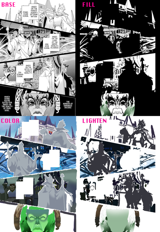
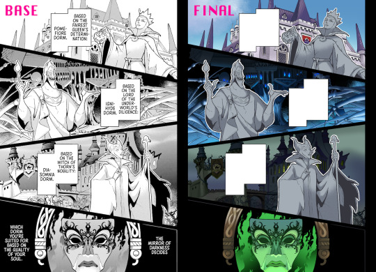
(Added a black bg to the "fill" portion to make it easier to see)
First come the "fill" layers, which are for covering up halftones & similar shading techniques. This step isn't super necessary (and sometimes involves a lot more editing to replicate halftone gradients/patterns), but I heavily recommend it for scenes that involve a lot of dark colors. Leaving halftones in can cause colors to look darker & grayer than they should, the latter of which you specifically want to avoid when making color edits of darker-skinned characters. (They can also be really good for conveying texture tho, which is why I left the statues' shading alone in this example.)
Next are the color layers, where the bulk of the editing happens. As I mentioned above, I use a ton of multiply layers for this so I can just draw over the image. Darken layers also work, but I've found they tend to affect line density & smoothness. The shading and highlighting here is done using masking layers for individual objects/structures – I think quick group + choosing inherit alpha for the mask layer is the krita equivalent? Layers for darkening the overall lighting (like for nighttime scenes) would also go in this section.
Finally, the lighten layers are solely for the lineart. This is to help "soften" the the lineart, so to speak, making the scene feel a little more 3D/fleshed-out. This step is especially important when dealing with hard shadows, like on the Dark Mirror's frame, Pomefiore's windows, and Ignihyde's central pillar-thing. What I do is put down a bunch of lighten layers, typically at 50% or 75% opacity, and color-pick the darkest part of whatever feature I'm editing the lineart for. Because I'm using a darker color, the surrounding multiply layers will usually go unaffected by the lighten layers – if not, I just gotta zoom in and be careful about it. These layers need to be on top of/closer to the 'front' than the color layers, or else the multiply effect of the color layers will apply to the lighten layers as well.
Thanks for bearing with my kinda long-winded explanation! I've been learning as I go, so there might be easier/better ways of doing things that I haven't stumbled across yet.
I hope this helps & that you have fun doing color edits!!
#ask#anonymous#twst#twisted wonderland#twst manga#manga editing#color editing#twstuned edits#sorry for the delay on answering btw i was rereading it 20+ times to make sure i didn't forget anything fgjhgfjh
8 notes
·
View notes
Text
hey everyone! this is my first tutorial on giffing! I'll be covering some of the basics of coloring and specifically my usual steps and preferences in editing!
A basic understanding of giffing is required here since I won't cover any of the first steps nor pre processing involved in giffing and we'll go straight into coloring in photoshop.
For this tutorial I'll be using this Felix set as an example:

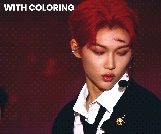
For my gifs I usually always go for a really bright and clear look. I like to have vibrant colors and making the subject pop a lil. I try to achieve skintone accuracy but I tend to make my gifs just a tiny bit pink as well, avoiding super warm tones. (which in hindsight I realize I may have overdone the warmth for this felix set a bit but oh well)
Let's get into it!
So after you have imported your clip and added any smart filters of your preference, you should start coloring (above the frame layers of your gif) by using a special type of effect called Adjustment Layer. You can find this tool on the bottom of the layers panel:

There are many options of Adjustment Layers, but for now we will be using: Exposure, Curves, Vibrance, Color Balance and Selective Color.
☆ Exposure ☆
this is always ALWAYS my first step. It's crucial for my gif to end up with that clear and bright impression. There are 3 settings here, exposure / offset / gamma correction:

The first picture is without any editing, the second is my editing for the Felix gif.
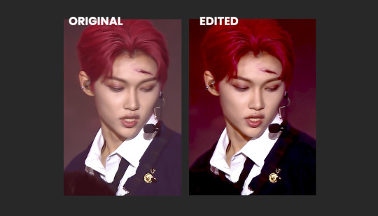
Exposure: Helps to highlight and overall light the entire image up.
↳ raise it up in tiny bits to add light
Offset: I use this to sort of "defog" everything.
↳ lower it to "defog" (in this case my overuse of it ended up removing most details from his dark clothing but I still like the final look)
Gamma Correction: similar as the one above, it helps to give more depth to the whole image.
↳ you can lower it to add depth, it might look confusing but as u drag the controller to the right, the number will go down, so it will be less than 1. In this case I raised it a bit so I turned it down just a lil.
↳ note: these settings will greatly affect the whole gif so try not to go too far with it, I usually only change these in tiny increments.
☆ Curves ☆
there's a lot that can be done with this Adjustment Layer. if you keep the drop down option as RGB, it will have a similar effect to the exposure Adjustment Layer I explained previously. You can just create points on the line and move them around and that will affect the image. The areas near the bottom of the grid affect the darker colors of the image, the middle afftecs the middletone colors and the top of the grid affects the lighter areas. Dragging the line upwards will make things lighter, and dragging it down will make it darker. Sometimes I use this to further complement on top of the Exposure layer, but again with caution.

The first picture is without any editing, the second is my editing for the Felix gif.
↳ note: Now the really interesting thing about this Adjustment Layer is if you click on the dropdown menu where it says RGB, you can choose between the 3 color channels - red, green or blue and make changes on those specifically. In this case, if you create a point on the line and drag it down, it will sort of remove that color from the image. If you do it around the top grid, it will focus on the highlight areas, in the middle will be middletones and at the bottom will be the darkest areas. This can be VERY useful when editing clips that have one predominant color, for example stages with red lighting.
In this case tho my use of this layer has been very slight, it's really only complementing what I had already started with the previous exposure layer. So it's giving him a bit more depth and contrast while also darkening the bg a bit more to help him pop.

☆ Color Balance ☆
this Adjustment Layer allows you to alter the balance of the colors within the 3 ranges of the entire image: highlights, midtones and shadows (darker areas). It can change the entire vibe of the image very quickly. I always play around with it a little bit. I usually like to reduce some of the warmness of the image and specially the shadows by turning the blue and cyan handles up.

The top row is without any editing and the bottom row is my settings for the Felix gif.

☆ Vibrance ☆
this Adjustment Layer is quite simple, with it you will manipulate how saturated and vibrant the colors will be. I usually raise vibrance a lot and saturation just a bit. This is because the vibrance setting is a lot more subtle than saturation.

The first picture is without any editing, the second is my editing for the Felix gif.

☆ Selective Color ☆
this Adjustment Layer is the true game changer imo. It gives you total control over most colors. I use it specially to adjust the skin tone usually. Usually to edit the skin colors you'd touch on red and neutrals. This is where I can add or remove warmth from the skintone alone if I want to. I also tend to mess with the blacks because I like to make it a bit blue.
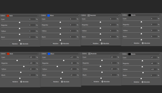
The top row is without any editing and the bottom row is my settings for the Felix gif.
☆ Extra Color ☆
sometimes i like to add a color (usually some shade of blue) on top of everything and set it to a different layer mode such as lighten, overlay, soft light etc (i just test them out a lot). I also tend to mess with the layer opacity here, usually leaving it at around 60%. In this case, I used a dark blue to soften out the final result a bit while still giving Felix a pop of contrast. To be honest you can also do this step with the Gradient Map adjustment layer. But I built a habit of doing it this way since before I learned how to use that adjustment layer.

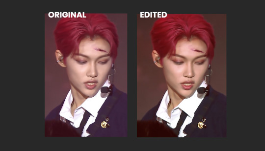
By itself each step doesn't look like much but when you add them up, you can see how they all work together:

☆ Final Comments ☆
I highly recommend playing around with all of these settings to get the hang of it and see what you like. Keep in mind that the order of your adjustment layers will also matter but it's up to you to find out your style and what works for you. You may also need to use the same adjustment layer multiple times depending on what you're editing so don't worry about your editing layers getting long.
I hope this is helpful! If there are any questions feel free to reach out to me :D
#giffing#coloring#tutorial#how to gif#gif tutorial#createskz#idk if that network applies sorry if it doesnt
132 notes
·
View notes
Note
Listen, can you tell me more about your art process? Because honestly everything from your sketches to the final product is amazing and I'm really curious to know how you go about it.
i am finally neither drunk nor hungover so i can reply to this properly! honestly, never expected an ask like this bc this is like. for the good (tm) artists. i started drawing in february, as well as this blog, and i'm still finding and changing things!
either way, what i strongly advise to think about first is a good idea and a good composition: first more important than last, but a drawing can just be hard to look at if it's not well-organized. for some reason, i like to do triangles with a detail in the center to which attention will be naturally drawn.
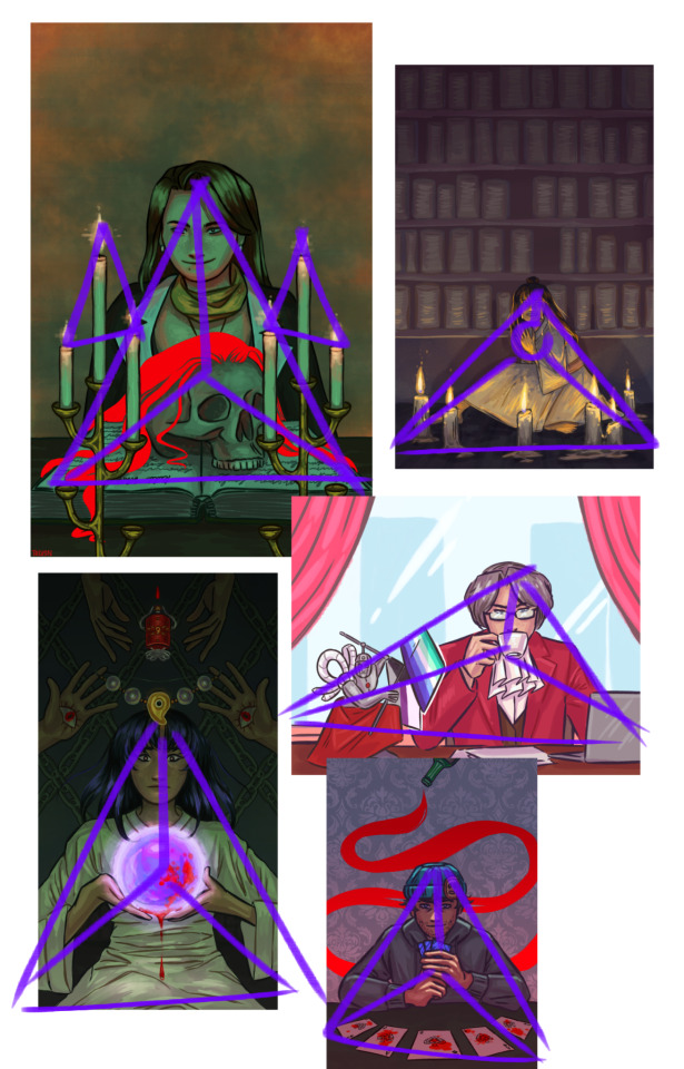
once i figure out what i want, i start doing multiple sketches: a very rough one with no reference and very thin repetitive lines, then a better one with references and corrections, and then a finer one, with thick strokes. here, you see the final sketch (still not lineart, though), and this is also where i put a base in the background: i find working with a white bg to be inconvenient, and it does add somewhat of an undertone.

then i do the lineart in thinner and better strokes! i'm still playing with the brushes and customizing them, but here are the ones i use rn in ibis paint:


i later go a layer below lineart and fill in the simple colors. even if i plan on making the light green later or using some interesting shadow colors, right now i imagine the lighting is simple and white. i put on the basic shadows by using the multiply layer and some dull pinks.
as you can see, i also color the lineart later with a clipping tool. frankly, by this point, the drawing looks bad. that's where i use the multiply layer again:
in this case, i added light by coloring some parts of the layer with a lighter contrasting color, but sometimes i just erase parts for really bright lighting in an otherwise dark setting, like in the beanix, kristoph and maya drawings in the first picture.
i add light with a normal layer by color-picking, and sometimes just go over the whole thing with a normal layer as well to correct small imperfections. i only use stuff like blurring and hard light layers for the candles, as i like to keep a certain roughness to the drawing.
uhh, what else is there? i do love doing a spot-the-symbolism moment like, everywhere, especially in the fey clan pieces... but i feel the most important part is painting not an image, but a character. this is why I'm so fond of painting from a live model: you don't capture a singular moment, you compile millions of images into one, this capturing the essence of the person, locking time with paint. that's, of course, not the case here, i just like to talk.
either way, just have fun with it!! duplicate your drawings to experiment, use clipping tools, learn some composition and color / shading basics, make things stand out!!
and thank you so much for the compliment:)
30 notes
·
View notes
Text
Hey y’all, here are some process stages for one of the more recent illustrations I did!
My sketches have never been very detailed. I remember being inspired for a pose while scrolling through pintrest and just threw some lines down on a page. I think more about the general pose and feeling I want more than the worry of anatomical correctness because I know I’ll fix it as I go.
In the next stage I establish stronger more contrasting colors and start to define the form of some shapes. The anatomy is still bad so at this point I’ll start to use the warp tool to move things around and adjust proportions. I also end up using the selection tool to cut various parts of the figure apart in order to put them back together in a way I like (I do not recommend doing this lol the sooner you can establish a solid foundation the better because it’ll save you a lot of work as you go. I just have a really hard time seeing my mistakes until I have something visual to work off of.) I alternate using the warp tool and selection tool and painting again and again until I get something relatively presentable like what I have at stage 3!
At this point all I have left are color adjustments and tweaking some small details. I usually don’t make such drastic color changes at the end of my work because I’ll have found my desired pallet through rendering. However with this one I wasn’t yet sure if I wanted a strong blue bg to contrast the orange of Lucéena’s eye or if I wanted the eye itself to be the main point of color. I knew I wanted the eye to stand out so I thought it was worth trying some things. That’s also why I decided to leave some parts messy in the final piece. I wanted the most well-rendered area to be Lucéena’s face to bring attention to that new shines eye she has.
I hope this was interesting and insightful!
With every illustration, I start off with a loose sketch. At this stage I’m not worried about perfection, my lines are more to serves as composition guides so I know where things will roughly go. If there are parts of the illustration that I know I want to put a lot of detail into (such as the face) I will often give that part more time. Then, I jump into colors by laying down flats behind the lineart and then beginning the process of refinement with a new layer on top. At this stage I would have 4 layers, 1 as the bg color (the blue expanse), 2 as the flats of the character, 3 as the line sketch, and 4 as the rough detailing. After this the number of layers I uses depends on how much of the illustration I want to preserve from itself or how many layer filters I end up using (to tweak color and lighting). Still, my illustrations always start with these 4. Once I get to a rendering point similar to stage 2 I start worrying more about the “correctness” of my structure and how I can make the anatomy more realistic. To do this, I like to duplicate then merge all of my layers, excluding the bg layer. Now I have my character one one whole layer and the expanse of blue on another. I have the individual layers still on hand if I want to refer to my og sketch but at this point having them all as one is easier to work with because to tweak the anatomy of a character I usually cut them up into parts and move/warp them to be more precise. Is this the most effective method? Probably not, but I rely a lot on the warp tool to get the exact shapes that I want. And seeing shapes for me is a lot easier when I have some color and value to work with. (I’m not a very “line visual” person if that makes sense XD) The rest of my process is a combination of rendering and adjusting details with the warp tool. At the very end I did some color adjustments (seen between stages 3 and 4) to see if I could get them closer to the initial feel that I wanted. Because I drew this to showcase Luceena’s new magic eye I wanted that to be the focal point of the illustration. So not only is that the place I put the most detail into, it’s also where I wanted the most color to be. I thought that having a blue bg would contrast nicely with the orange of her eye, but I ended up desaturating the whole piece and let that one note of color stand by itself. Lucéena also received her eye in the Shadowfell so the grey, drab vibes ended up fitting perfectly!
#art#digital art#wip#art process#dnd#dungeons and dragons#I was asking some friends for their thoughts on the desaturated version (never be afraid to ask for a second opinion!)#and we joked that this was Lucéena’s villain look because I don’t usually make her quite so angry#she has a resting bitch face tho so I mean this is prob what she loks like all the time lolo#I think her hair is kinda growing out since I first established her design#it didn’t always cover her face so much I think??#what is consistency let me draw my self-indulgent character traits#which means that all of my characters have to have long hair or at least long bangs so that it can be sexily flung over their face#in the heat of battle#and i love givig luceena in particular messy hair because thats a Vibe
69 notes
·
View notes
Last Seen Blogs