#using public data!!!!
Text
OK you know what ? Fuck that. Fuck her. That's it. I'm done with her. Done with her.
#never expect any positive taylor related content on this blog again#that's the straw that breaks the camel back#he's a college student!!!#using public data!!!!#elon fucking musk didn't drag him to court#and with this coming to light right after the grammys and just before the eras tour starts again?#oh isn't that convenient#I'm so mad#so mad you can't get it!#the energy I wasted defending her#I'll never get that back#I'm this close to wish I never even grew an interest in her music because it's too precious to me to ever let go#but her as a person..? we're so done#“direct and irreparable harm#as well as emotional and physical distress.”#“no legitimate interest in or public need for this information#other than to stalk#harass#and exert dominion and control.”#fuck you fuck you fuck you#can you be less self aware ???#we do care actually to know how one woman destroys our planet without a trace of care#this is sickening I swear to god#this is a pure pr move filled with nastiness and manipulation#they claim to act following the law but do not present any of said laws#funny how she's the only celeb to take suck actions#SO funny right??#artist: taylor swift#text#oli schist!
17 notes
·
View notes
Photo
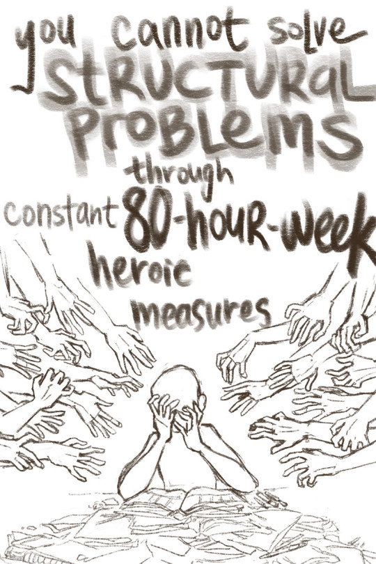
even Atlas has only two hands
vent art
#this one's for all the teachers out there#horror cw#hands cw#draws#after 2.5 years of caution and masking everywhere; i tested positive for covid on wednesday morning (first day of fall semester) 😔#at earliest; i can be back in the classroom on monday#wednesday itself was an absolutely horrible 24 hours (but admittedly the anatomist side of me has been going 'ah! physiological data!')#but thursday and friday were a grim indicator of how much capitalism has rotted my brain#because after getting through 24 hours of a MASSIVE illness with undetermined long-term effects; i felt compelled to return to the#6-hr-sleep 18-hr-waking cycle that i was accustomed to; out of GUILT for falling behind in work#(note: i was NOWHERE near 100% back on thursday. i could have charitably been put at 50% - still headaches & fatigue & productive coughs)#a friend had to very sternly tell me 'you cannot solve structural problems through constant 80-hour-week heroic measures'#'you especially cannot do this when you are recovering from a debilitating illness which has the potential to remain a -#- serious lingering problem if you overwork yourself'#like. gods. yeah. it's not my fault that my classrooms are stuffed to the student maximum that our union has valiantly maintained#it's not my fault that the district only gave us one pre-semester prep day; meaning that my room & plans were left unfinished before day one#and - even bigger; it's not my fault that public health in the US is careening into 'can we pretend hard enough like nothing's happening'#my students will have a milquetoast start this fall semester. that is fine.#their teacher might not be able to stand and talk for longer than ten minutes at a time#i will do what i can. i still care about them. i am reading their introduction emails and smiling a bunch.#but i refuse to allow myself to be consumed in order to keep this fire lit.
861 notes
·
View notes
Text
a little bit sad @ myself :(
#working on a paper w someone and shes first author so ofc shes doing quite a lot of work and she deserves it absolutely#the 2nd author is a friend i respect deeply and she basically was like. expecting me to do most of the code/data analysis#this friend also gave the first author the first author-ship (she was going to be first auth originally) but when me and the first auth wor#together she sort of takes the coding over entirely and she just said shes gathering the code we need and then were going to hop on a call#like#oh i was under the impression we are doing this tgth whats the point of me being here if we are just using ur code...i feel so useless 😭#good on her + im proud of her but i also wish i had the chance to do more yk. idk#i feel like i havent done enough...yay first publication...
28 notes
·
View notes
Text
I dont think most of the islands would have internet connection, or at least not widely available or easily accessible. 4 year old tails not knowing much about the internet or caring about it until he and sonic end up on the mainlands and in a public library and he discovers the Joy of Internet. whole new world has opened up baby and he is tapping away at that keyboard
#sonic just wanted some new books but hes happy to hang out for a while#i was 17 when i finally got consistent access to the internet at home#as in. wifi ig#before then i mostly used school computers and public libraries#we DID have internet at home but. it was very expensive and parents used most of the available data and we had to be careful not to go other#when i got credit on my phone i would buy credit and mostly use that just be careful what sites i would use#connection was spotty#im rambling lmao but i think the islands would be a lot like that.l
18 notes
·
View notes
Text
It's so vile of JKR and the people she's boosting to paint Magnus Hirschfeld as some sort of race science enthusiast
The gay jew who was almost beat to death by Nazi thugs in 1920 for being loud about decriminalising homosexuality, women's sufferage, abortion rights, socialism, the horrors of war, suicide prevention for queer people, etc
Who only survived the burning of his pioneering Sexuality Institute because he was abroad and who died in France because he could not return to a homeland that did not acknowledge him as a German
You want to say he's the ~real Nazi~ for holding beliefs that were mainstream science at the time he held them?
Yes, Hirschfeld was a eugenicist, insofar as most doctors were prior to the Holocaust
Yes, he argued that gay people having kids would lead to sickly kids -- as an argument for why society should stop forcing gay people into heterosexual marriages
Hirschfeld was by no means perfect, but smearing the legacy of someone who was specifically, by name, targeted by the Nazis for being a jew, for being gay and yes, for pioneering gender affirming care, as if he was fucking Mengele
That is just fucking evil
(but the people who criticise her are antisemitic homophobes, right?)
#it's also worth noting that hirschfeld was not above bending the truth if he thought that might help his cause (gay rights)#so just because he wrote that thing about gay people having sickly kids in a text targeted at the general public#doesn't mean he genuinely believed that as a medical matter#even if he did if he existed today who would take one look at the data we have access too now and go#'welp guess i was wrong''#because he does not fucking care about that part lol#it's useful to him as an argument for why society should accept gay people#in a world where same sex couples can have kids together the point is utterly useless to him
10 notes
·
View notes
Text
We're so back
8 notes
·
View notes
Text
i looked it up and in 2022 taylor swift would have caused around 14,217.49 metric tonnes* of carbon emissions by use of her private jet alone. so that is not more but on par with the total greenhouse gas emissions in 2022 from the countries of
Anguilla 🇦🇮 28,000 metric tonnes
Falkland Islands 🇫🇰 25,000 metric tonnes
Saint Helena, Ascension, and Tristan da Cunha 🇸🇭 20,000 metric tonnes
t swift ✈️ 14,217 metric tonnes
and remember this is 2022 so before the eras tour and before she started dating the football guy and her shortest flight in 2022 (as of the study) was 36 minutes while just last week she took a 13 minute flight
anyways here are my sources teehee countries & swift
*you’ll see the number 8,293.54 floating around a lot but that study was only from Jan 1, 2022 - July 29, 2022. so do the math that averages about 1,184.79 per month.
#anyways i am not a trained data scientist yadayada#i am just using publically available data and…… noticing stuff#also the fact that the three lowest countries are all british territories. odd. like i get its most likely just a sheer size and -#- population thing but still interesting#fish.txt
7 notes
·
View notes
Text
day TWO of fighting AI art bros on social media LMFAO
I feel like that one gif of some video game character where you only see the back of, whom oddly looks like Freddy Mercury, strutting forward, saying "ah, shit, here we go again."
#someone told me that editing public imgs on PS#is the same as feeding an AI art theft machine data information#they are NOT the same#1. artists usually give consent to#you can open an artists page on twt and see they are OK with pfp use#2. most artists have unionized AGAINST AI art#to use AI art simulators and train them is to be disrespectful to those who ask you not to do that#you do NOT support artists in fact you are ANTI-ARTIST#typing in prompts to make MEDIOCRE art does not make you an artist too btw#art NEEDS active intent and editing and engaging with and CONTROL#once you enter ur STUPID prompts you no longer have control#you have relinquished the control#and the simulator has shown you the color of ur soul and its ugly <3
6 notes
·
View notes
Text
my first ever poll because i'm being attacked by my twin for how i google things and i need to know if i'm valid or weird
#my twin and my friend both made fun of me because i use question words#and it never occurred to me that other people *don't*???#like yeah i know how to efficiently use a search engine#and i do that if i'm doing actual research for scientific publications or whatever#but a quick question? a one off wonder??#i ask google my question!#i thought everyone did this!#i need to know if i can shove this in my twin's face#or if i'm as weird as she said i am for this#her actual words were ''this feels like something a person from an older generation would do" rip lmao#i'm a baby millenial idk if that's a relevant data point or not
46 notes
·
View notes
Text
Unfortunately all chatgpt is good for is interview/job application stuff which I think says a lot about the hiring process as a whole
#wrenfea.exe#as an actual artifical intelligence? no its horrible bc it really ISNT one#its a writing synthesizer it generates writing based on data searches and boundaries from training#thats what a neural network is its a very convoluted input-output sequence#it has no capacity to understand the meaning behind what it generates#it is simply generating the specific things that the user is looking for#the job interview process has become so robotic and automized that ai fits in perfectly#but employers HATE that people are turning to chatgpt for cover letters and interview answers#so it was fair for them to use filtering programs to accept/deny applications before it got in front of an actual human being#and its ok for them to use ai and pre-written formats to make job announcements descriptions and interview questions#but god forbid we are forced to use those exact same tools to get a humans attention so we can get a job and not starve#pushing aside the whole copyright debate on chatgpt and the environmental impact of its power usage btw#im soley analyzing how its become commonly utilized on both sides#by interviewer and interviewed#the mechanization of the whole process is now on both sides#it just seems very inhuman..#its also how some people have figured out how to somehow become employed multiple times by the same company due to lack of human oversight#and how automated theyve made their hiring process#probably should have made these tags into a separate reblog oops#also disclaimer do not cut and paste right into your application materials bc chatgpt often just lies#also many places now can tell you used chatgpt due to how similar its answers are#i only use it to make a template and see how things can be phrased to be more professional and buzzwordy#id never use it for something actually creative#and dear god do not write academic essays with it#i tried using it to supplement my own cover letter template but it was too robotic even for a cover letter#it is very good at accessing and summarizing publically available information#thats all it does not make sure the information is true or good
5 notes
·
View notes
Text
As I leave the land of my spotty youth and leave behind most of the 2022 midterm elections, I do so with a real nostalgia for the following provision of the U.S. Constitution:
Article IV, Section 4: The United States shall guarantee to every State in this Union a Republican Form of Government, and shall protect each of them against Invasion; and on Application of the Legislature, or of the Executive (when the Legislature cannot be convened) against domestic Violence.
This was placed into the new Constitution as a further device to exorcize the evil spirits of the Articles of Confederation, which blew goats. The passage has gone largely unexamined almost since it was adopted with the rest of the Constitution. (For example, it’s hardly mentioned in the Federalist Papers, and the Supreme Court, when it has taken up the subject at all, is incoherent on it.) But whatever “a Republican Form of Government” means, it cannot possibly mean the situation as it stands in Wisconsin.
On Tuesday, the Democratic Party got 51% of the vote statewide. This got the Democrats…30% of the seats in the state legislature. Any reasonable definition of “a Republican Form of Government” cannot possibly include this kind of result. It is completely and utterly a product of grotesque partisan gerrymandering sanctioned by the Supreme Court in its disgraceful decision Rucho v. Common Cause three years ago.
The die was cast on this atrocity last April, when the state supreme court ruled that this year’s elections would be contested on the ludicrous maps produced by the state legislature, itself the product of past gerrymanders. The U.S. Supreme Court was a critical accessory after the fact. From Wisconsin Public Radio:
"It was a reversal for Hagedorn, who joined the court's liberals in early March to choose a legislative map drawn by Gov. Tony Evers. But after the U.S. Supreme Court struck down Hagedorn's ruling based on the way it applied the federal Voting Rights Act to draw Black-majority districts in Milwaukee, it sent the case back to the Wisconsin Supreme Court to consider all over again."
You will note that the carefully manufactured conservative majority on the court was not shy about meddling with maps in this instance.
"'We could construct one ourselves or with the assistance of an expert, but time and our institutional limitations make that unrealistic at this juncture,' Hagedorn wrote. 'The remaining option is to choose one of the proposed maps we received as the baseline. Only one proposal was represented as race-neutral in its construction: the maps submitted by the Legislature.'
For Democrats, the decision was likely the worst-possible outcome. For the past decade, they've felt the sting of the 2011 map, which Republicans drew when they controlled all branches of state government. Even during years when Democratic candidates have performed well statewide, Republicans have maintained large majorities in the Legislature, thanks in part to a map that political scientists have said is among the biggest partisan gerrymanders in modern U.S. history. The new map, drawn by Republicans and made law by four justices on the state Supreme Court Friday, further entrenched that advantage, giving Republicans a realistic shot at a two-thirds majority that would let them override a governor's veto. It took effect despite being vetoed by Evers last year and being initially rejected by the state Supreme Court last month."
The best chance that Wisconsin has to un-fuck itself here comes next April, when an election could bring a Democratic majority to the state supreme court, which theoretically could open the door to maps that less closely resemble a game of three-card monte. Of course, John Roberts and the gang put the kibosh on the last attempt at un-fucking last April. The roundness and completeness with which extreme conservatism has deformed the American republic is occasionally stunning.
Maps are an indispensable tool for outlining natural features, human boundaries and transportation networks. But when it comes to depicting how many people are in a given place — how populations are distributed —a traditional map has distinct drawbacks. Mapmakers have sought to offset this limitation through an innovation that's known as a cartogram.
There are two types of cartograms. Distance cartograms are often used to show stylized bus or subway routes. They depict networks without strict adherence to location or range. The other type is called an area cartogram. In these graphics, the size of each shape making up the map — like counties, states or nations — is adjusted to represent a different variable, often the number of people living there.
Cartograms can highlight the difference between places with large populations (or large amounts of whatever variable is replacing area) and places with large amounts of land and/or water, but which have small populations. In other words, a cartogram shows population density in a graphic format.
There are many different ways to develop an area cartogram. In a contiguous cartogram, the shape of a specific area is altered to account for differences in population (or another variable), but shapes retain their positions relative to one another. This approach leads to distortion of the basic shapes. Another is a non-contiguous cartogram, which means that the shapes can move and resize without remaining in position with their neighbors. Rather, the shapes keep their usual form, and are scaled in size based on population (or other variable).
Cartograms can be helpful in interpreting data when the number of people is important. For example, area cartograms are often used to display election outcomes when the variable of interest is total number of votes — not some rate or percentage. An election results cartogram is an increasingly common tool used to help highlight dynamics related to population density. In conventional maps showing election results large areas that are sparsely populated take up the most space, and thus have the most visual impact, while more densely populated areas that take up very little land area have far less visual impact despite representing many more people.
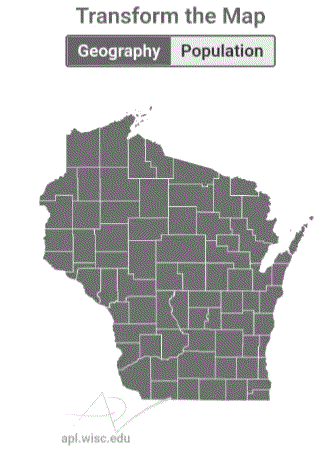
In an non-contiguous area cartogram of Wisconsin, the state's counties have been resized according to their their populations. Counties with large populations grow bigger than they would appear on a standard map, and counties with sparse populations shrink in comparison.
These two maps of Wisconsin's counties highlight a few key points about the distribution of the state's population. First, the cartogram emphasizes how overwhelmingly large Milwaukee County's population is, relative to all other counties in the state. Dane and Waukesha counties stand out as the next two largest after Milwaukee. In addition, the other counties on the southern and eastern edges of the state together represent a preponderance of Wisconsin's total population. Another takeaway is just how different an area-based map and a population-scaled map look. It's easy to think of Wisconsin's rural areas as making up a lot of the state, but in terms of population they are quite small.
A cartogram can help make sense of any topic where the important information is in the number of people, and there is wide variation in population density in a region. For example, cartograms can be useful illustrations of economic activity, immigration, school enrollment, votes, jobs or housing numbers.
#us politics#news#op eds#esquire#charles p. pierce#wiscontext#maps#data#data visualization#gerrymandering#wisconsin#2022 midterms#2022 elections#2022#gov. tony evers#Wisconsin Public Radio#us constitution#cartograms#land doesn't vote people do#representative democracy
39 notes
·
View notes
Text
Tiktok and tumblr are both blocked on the free hospital WiFi wtf
#like i ger tiktok#cus filming strangers in public is a big phenomenon rn#but tumblr???? why do i have to use data to see all the gay little posts in my phone#spilled sugar#sick sugar
2 notes
·
View notes
Text
well i finally (technically) got wifi in my apartment!
#shhh sharkie#i’ve been just using my mobile hotspot or going to the library or work for internet things#it’s mostly been forgetting to do it rather than a reluctance or financial strain yknow?#tho looking at how this bill is going to evolve once the initial deal is up…we’re gonna have to finangle some shit#I still need a router and such but the like ‘public’ xfinity wifi is available so now i can actually connect#idk id just been putting it off. all of my other utilities are covered within rent besides internet so it hasn’t been super pressing#but i don’t want to keep eating through my phone data just to download episodes and movies to watch offline#or eating through it during telehealth appointments#lord knows it makes my phone a furnace for my weekly hour-long therapy appointment
2 notes
·
View notes
Text
If I had access to a massive sample size just to collect data for my own amusement I would like to see what percent of teachers and educators are the oldest sibling broken down by gender because there are some actually WILD statistics with the breakdown of people who are in education
#the number of times I use by older sister voice on my kids is insane#I’ll hear myself talking and I’m like o shit#and out of my coworkers#4/6 of us are the oldest sibling#1/6 has a twin#and only 1/6 is the youngest#and ALL my teacher friends are the oldest sibling#like I don’t know if that’s just my personal confirmation bias#and me extrapolating data out of an incomplete data set with a VERY small sample size#but I have a gut feeling that there are a LOT of older sisters in public education
2 notes
·
View notes
Text
pdfs from other universities are CARRYING my ass through computer organization and architecture 😭😭😭 thank you university of washington and university of california irvine 😭😭😭😭😭 i may not be a student for either of these but trust that i am learning from them (instead of my own class 👁️👁️)
#unrelated but one of my hw questions were directly taken from one of these pdfs#so when i found out that it was a perfect match#well#can’t blame me for using a university’s resources they publically show#pdfs from other universities are goated frfr#i guess that really isn’t unrelated though? bc the pdfs carried me for it#Computer Org. and Arch. was supposed to be a blowoff class but I just got a… bad professor…#ironic bc i’m literally acing the Data Structures class that every cs major cries over#but i digress#ok but what’s really unrelated is that#i think it’s kinda neat how other places have a different naming/numbering system for basicallg the same course#although i can see that being annoying
4 notes
·
View notes
Text
The burden of keeping training data free of copyrighted data-poisoned works should be on the company using it, not on the people just trying to protect their works.
#wrenfea.exe#i hate ai bros who cry that people should put warnings on their work that its poisoned#no YOU shouldntve have stolen their fucking creation#the warning is that you didn't get permission in the first place#you cant go into someones house steal a pie and then cry that it was full of shit#i mentioned this in my official public comment in a more...politically friendly way#i also said that peoples right to protect their work HAS to be protected#people cannot get sued for their work causing someones data to be fucked up#if they never explicitly agreed for their work to be used for that in the first place#and clicking yes on the terms of use doesnt count btw#if you want to scrape top results off of pixiv you shouldnt be surprised when your data gets fucked up#its your fault for not scrutinizing your dataset in the first place#ai#ai discourse#artifical intelligence#fuck ai#ai art#dall e ai#i studied ethics for computer scientists so im not just pulling this out of my ass
2 notes
·
View notes
Last Seen Blogs

aidansplaguewind
we've all done the worst kinds of thangs

iskra81
Iskra

prissypurple123-blog
Everything Sidemen