#tildas
Text


"Извините, не продам..."
⠀
Обожаю людей влюбленных в кукол. Именно таких покупателей жду.
⠀
Но... просить скидку в половину цены?
Не из-за проблем с финансами, а потому что так хочется ?
Потому что все вокруг делают скидки?
Потому что, я тоже так могу!?
И при этом писать: "...понимаю, что Ваши работы уникальны...такие не встретишь.... этим они и привлекли меня..."
Секундочку !
А Вы материалы видели сколько стоят?
А сколько времени на создание уходит?
А детали? Те что отличают куклу от множества других!
Про себя уже решила - "не отдам!" Только влюбленным!
Буду ждать настоящего ценителя кукол.
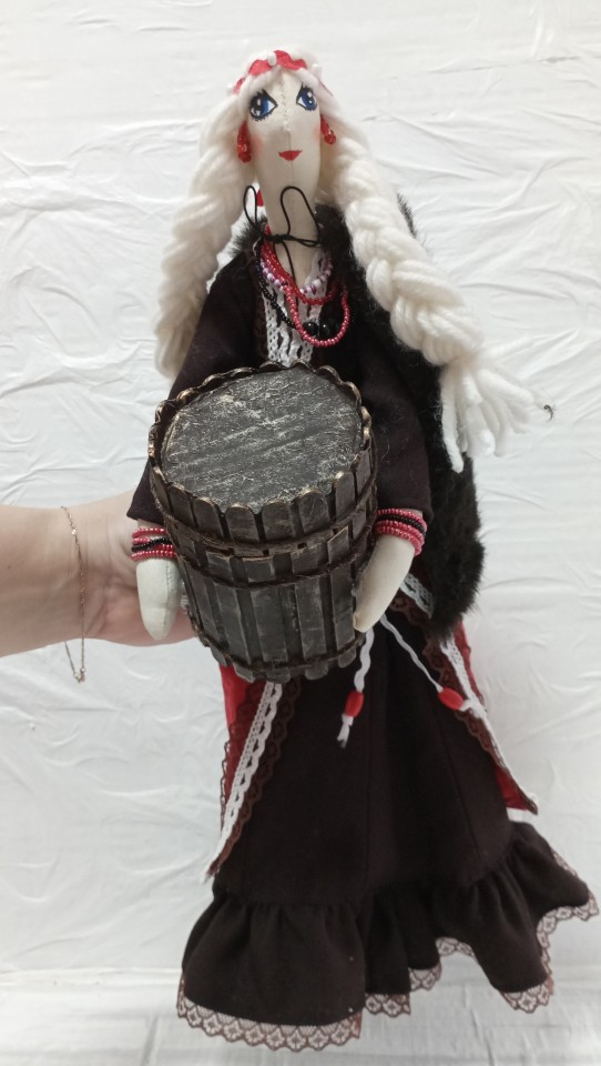
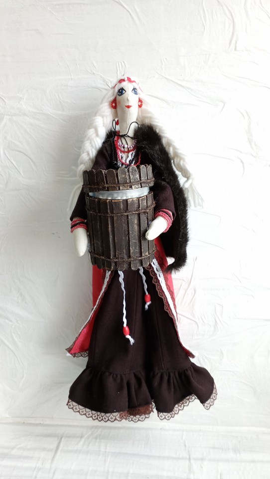
Вот если вы любитель эпохи Викингов, то эта кукла для вас.
Простая и прекрасная девушка скандинавка тех времен.
Украсит интерьер и принесёт пользу.
Кукла органайзер. Хранение ватных дисков. В коробе ватные палочки.
Скромность, просто и польза.
Замечательный вариант подарка на любое событие.
Возраст от 0 до бесконечности.
Все описание в товарах.
И напомню - для участников клуба "Шьем с Белкой" скидка на все товары 35 %.
Вступайте.
10 notes
·
View notes
Text
Still haven’t moved on from this btw

2K notes
·
View notes
Text
my favourite thing about all for the game has got to be the fact that the guy who spent three years in juvie, killed his mother and is on court-ordered mood stabilisers and the child of a serial killer who spent most of his life on the run and is also a pathological liar somehow manage to have the healthiest relationship i have ever read in a piece of media. literally wild
#andreil#aftg#all for the game#neil josten#nathaniel wesninski#nathan wesninski#mary hatford#andrew minyard#tilda minyard#nora sakavic#cube original
6K notes
·
View notes
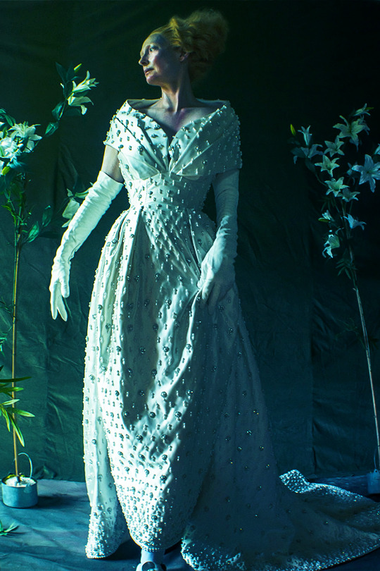
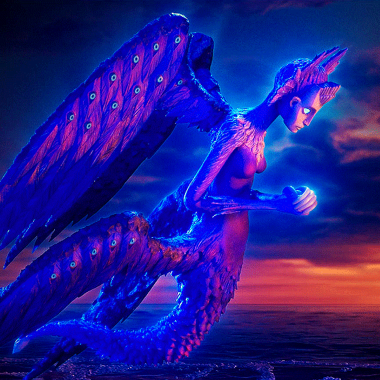
Photo
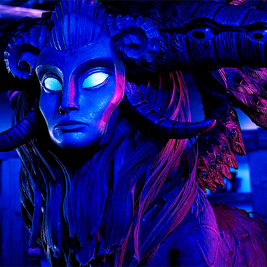


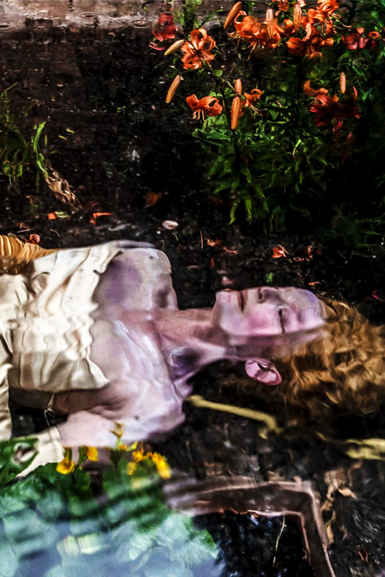
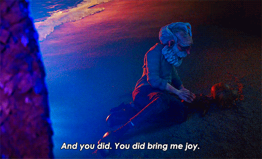
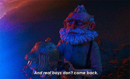
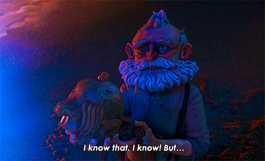
Death in Guillermo del Toro's Pinocchio
#pinocchio#guillermo del toro's pinocchio#pinocchio 2022#death pinocchio#tilda swinton#pinocchioedit#*
15K notes
·
View notes
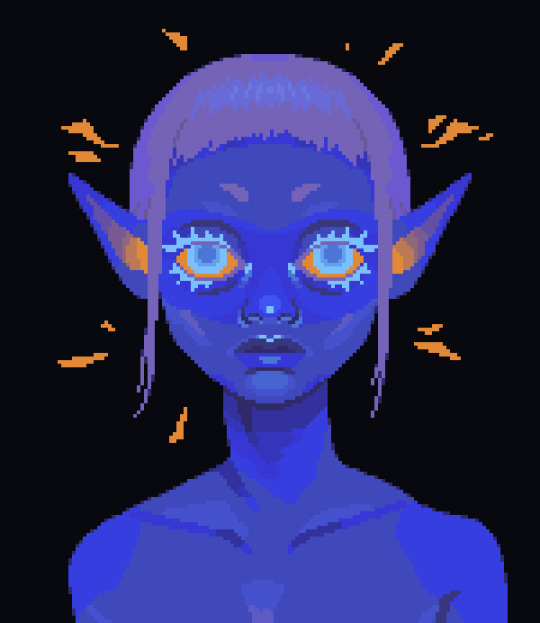
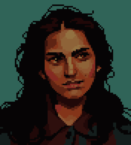
Text
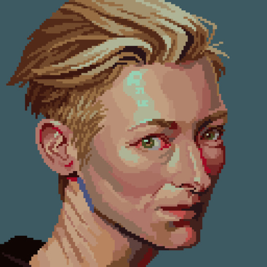

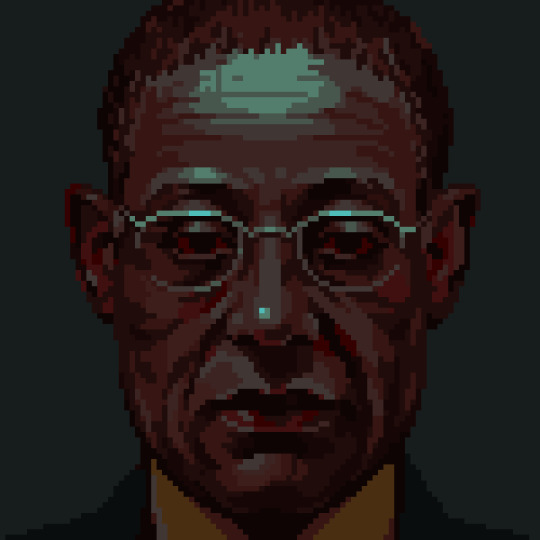

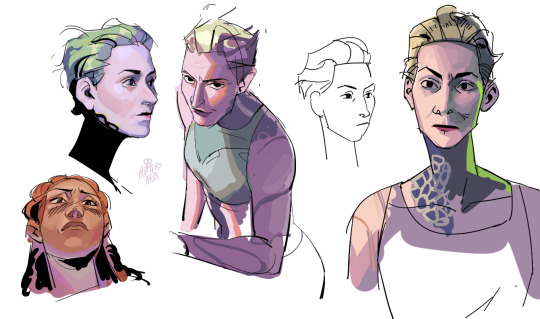
pixel portraits from the past couple months
im doing 1 every week to become more stronger
#pixel art#pixelart#artists on tumblr#art#8bit#pixel#illustration#16bit#willem dafoe#tilda swinton#gus fring#astarion#bg3#astarion bg3
2K notes
·
View notes
Text
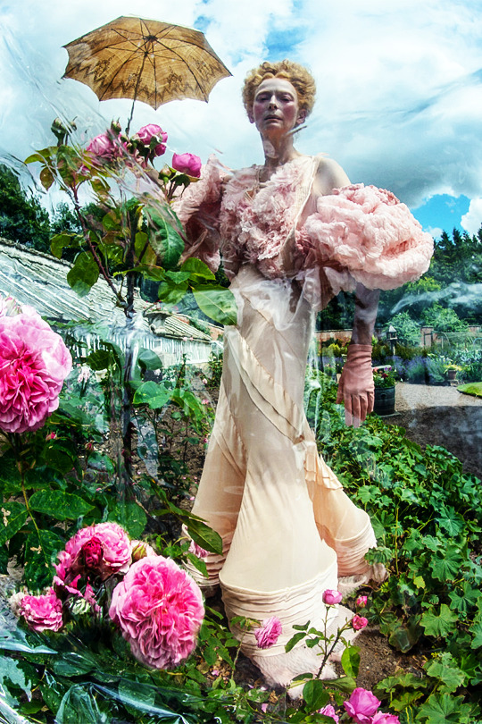

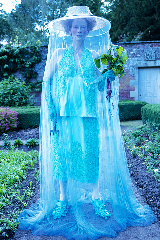
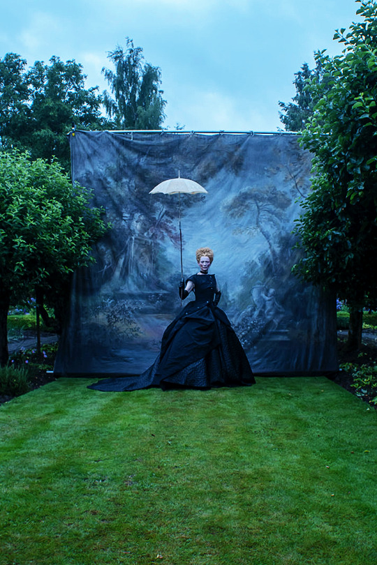


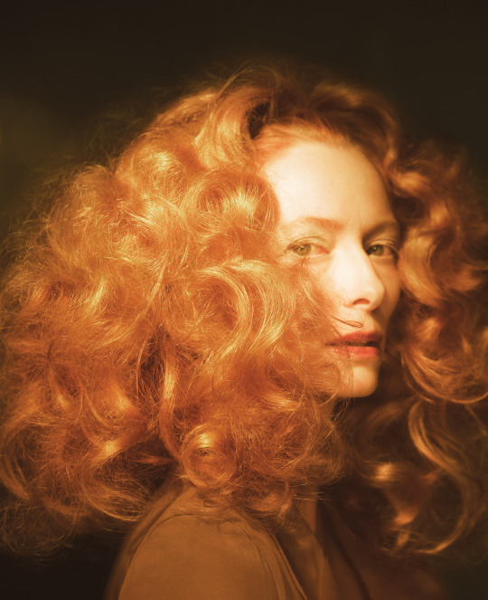
TILDA SWINTON
Tim Walker ph. for W magazine (2023)
#tilda swinton#tildaswintonedit#edits#userrobin#glamoroussource#wonderfulwomendaily#userchristineb#userfrodosam#femalestunning#usermandie#flawlessbeautyqueens#usermorgan#tusermary#nessa007#cinemapix#userbbelcher#useralessia#useraphael
2K notes
·
View notes
Text
i love wes anderson's regulars because if i was a famous director i too would only do stuff with my friends and include them in everything i do
#wacu (wes anderson cinematic universe)#wes anderson#bill murray#adrien brody#owen wilson#jason schwartzman#tilda swinton#moonrise kingdom#edward norton#the darjeeling limited#the grand budapest hotel#fantastic mr fox#isle of dogs#asteroid city#the french dispatch#the royal tenenbaums#rushmore#bottle rocket#chrasillasss
2K notes
·
View notes
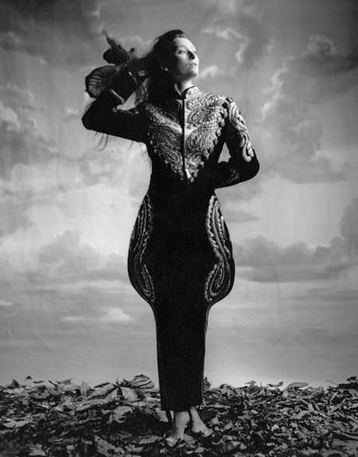
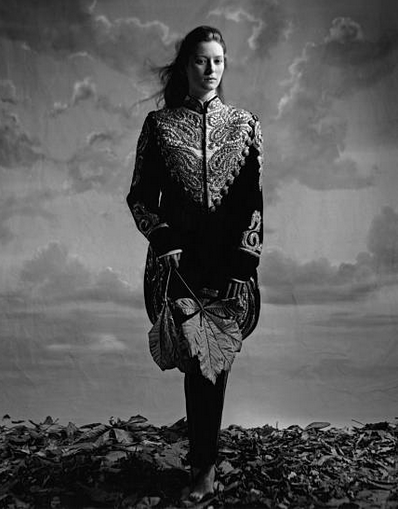
Text
Tilda Swinton by Glen Luchford for Dazed & Confused Mayo 2010
#tilda swinton#glen luchford#dazed and confused#actress#beauty#movie star#photography model#movies#over k
1K notes
·
View notes
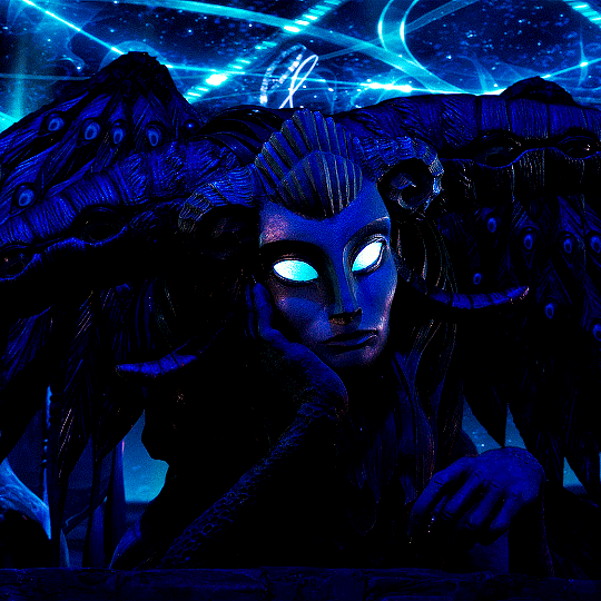
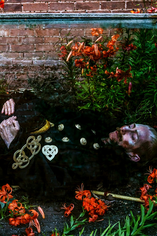
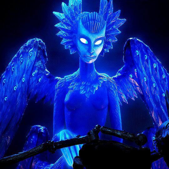
Photo

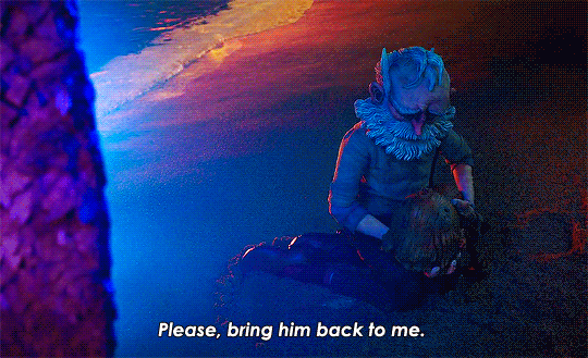
Guillermo del Toro's Pinocchio (2022)
#animationedit#filmedit#pinocchioedit#guillermo del toro#patrick mchale#guillermo del toro's pinocchio#gdt pinocchio#pinocchio#geppetto#wood sprite#david bradley#tilda swinton#gregory mann#original#*gifs
9K notes
·
View notes
Text


TILDA SWINTON photographed by John Stoddart, 1986.
2K notes
·
View notes
Text
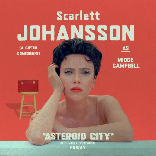
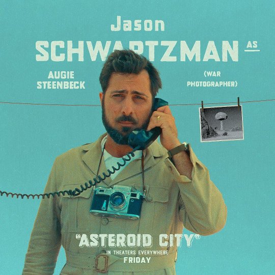
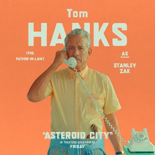
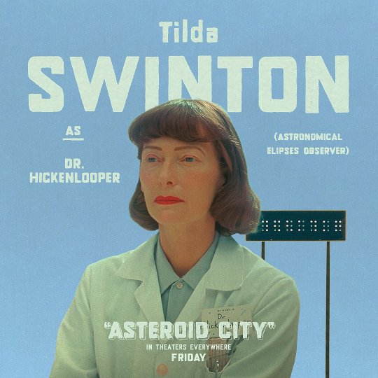
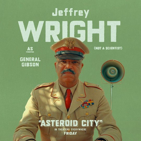


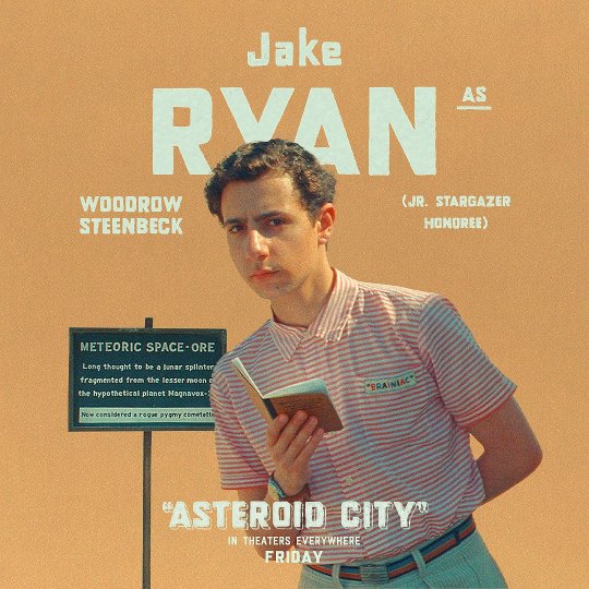
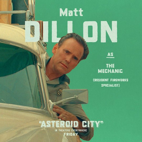
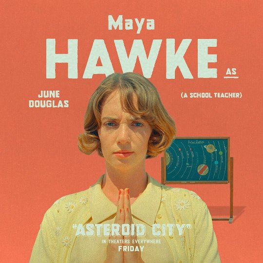
Character posters for "Asteroid City" by Wes Anderson.
#asteroid city#wes anderson#scarlet johansson#jason schwartzman#steve carell#tilda swinton#matt dillon#jeffrey wright#jake ryan#maya hawke#tony revolori#tom hanks#character posters#posters#cinema
2K notes
·
View notes
Text


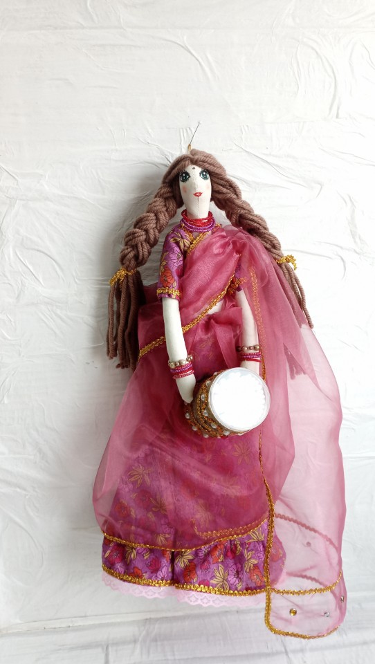
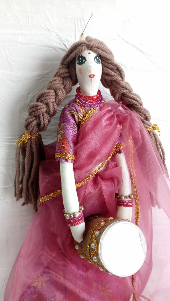

Намасте! Здравствуйте.
Посмотрите какая гостья к Вам собралась.
Красотка Сати из жаркой и солнечной Индии!
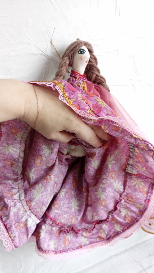
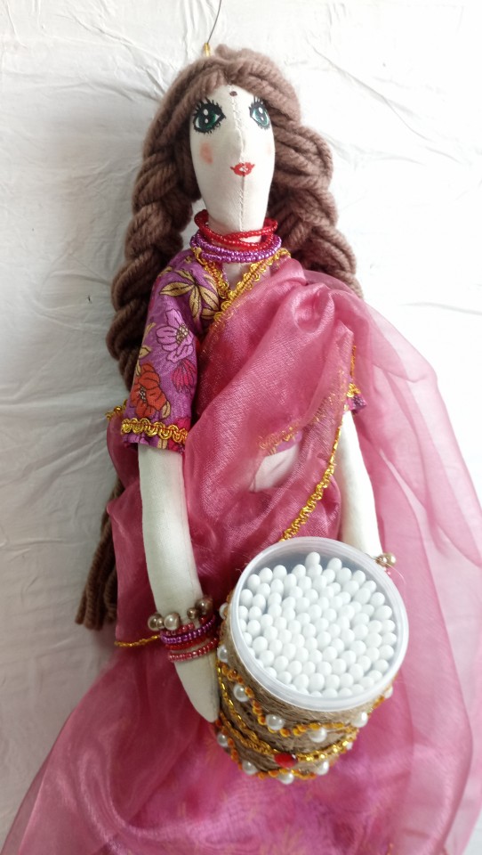
Сати не просто кукла. Сати кукла органайзер.
Она хранит ватные диски под своей шикарной юбкой. В руках у нее короб, где спрятались ватные палочки.
Наряд у нее похож на наряд невесты, но она не невеста.
Продружка невесты.
Только только с обряда бракосочетания.
И сразу за работу.
Хранить и украшать.
Принимайте гостью! Она одна такая в наших краях.
Напишите мне, и Сати тут же отправится к Вам.
До встречи! Пхир милеге!
Все подробности читайте в товарах, смотрите там же видеообзорчик.
5 notes
·
View notes
Text
The Magnus Archives (Season One) Production Design Project
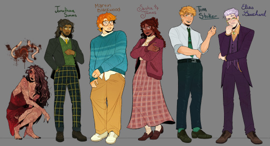

Hello everyone! Let me introduce myself- I'm Tilda (or Tilde), and I'm want to be a production designer.
Production designers create the overall look of a piece of media. From costumes, lighting, environments, props, etc., these designers make sure that everything looks cohesive and sets the mood.
So, I thought it would be fun to put my skills to the test by designing season one of The Magnus Archives. My winter break started as soon as I became interested in the show. Needless to say, a new obsession and an abundance of free time go well together.
You may have seen these illustrations posted separately, this is a master post of the whole project. My thoughts, processes, and critiques are all included under the cut. If you read them, I hope you enjoy! If, not, thank you for supporting my work regardless.
The Characters
When designing these characters, I tried to avoid being influenced by fan interpretations. Though, that was a challenge (especially with Jon and Sasha). I found that I looked to my friends for inspiration. Certain elements (Jon's glasses) were based off of what they wore.
Pinterest was also useful for finding clothing and pose references. Some looks were based off of different actors- in particular, Tim was inspired by Nicholas Galitzine and Elias inspired by Matthew Lillard.
Jane was the most fun to design! I believe in making terrifying characters actually terrifying.
Elias's design needs the most work. Having now finished the show, I see that it doesn't fit him. The purple is overly saturated, especially compared to the set. He looks out of place! I'd reverse the color palette to mostly green/yellow with purple accents instead. Although, I will forever defend the purple tint in his gray hair.
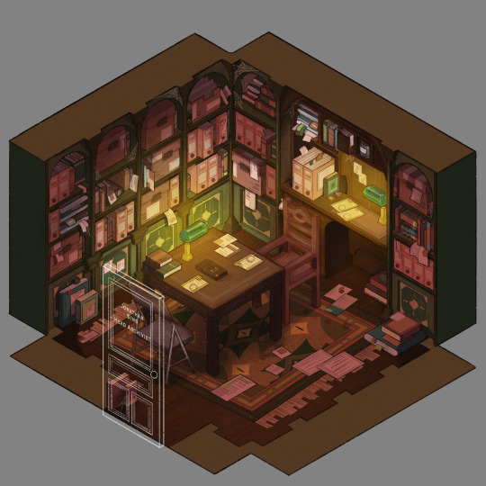
The Set
Jonathan's office was a treat to design! Balancing the color and clutter was especially important. This room is meant to be claustrophobic and uncomfortable, but not overbearingly so.
The wood looks to be full of splinters, but not so worn that it can be thrown out. The chairs offer no back support, and the shelves make the room smaller. The goal was to represented Jon's mind. Intricate, messy, and suffocating (Note: that is more of a season two description).
One goal was to capture the look of an actual archive. Valuable times was spent researching the different kinds of storage, files, paper, etc. The texture and color had to be accurate.
A split-complementary color palette of blue-green, yellow-green, and red was used. Of course, I had to get green in there, and the varying hues and desaturated reds worked well for the wood and filing supplies.
Jane's ashes and the Web lighter on the desk place this set at the end of season one. I find details like this to be important, it's one of my favorite parts of design. There is much needed abundance of eye imagery as well. Most obviously in the carpet, but eyes are carved into the table and watch from the shelves.
My main critique is the lighting- the filters used could be adjusted as to not distort the colors of the boxes. They look inconsistent. The Web lighter could also be more obvious, yet it is small and pixelated.
The Props
I designed these as I re-listened to season one, and it is the most recent piece I finished. Combining the details described in the show with what the objects would have realistically looked like was interesting. That was most useful for the clown, the Ming vase, and Ex Altiora.
Each of these objects came from a specific time with a specific look. Ex Altiora was bound in calf leather from the 1800s, so those books were referenced. Same with the frills on the clown's outfit.
The Ming vase was especially interesting, as it is from the Jiajing period. When looking at photographs of Jiajing vases, I found that many of them lacked handles and had an hourglass shape. That was fascinating to me, as many artists depict a standard oval-shaped vase. Also, the vase's design is described as straight lines that create distorted patterns when looking at it. That effect was achieved using chromatic aberration and the liquify tool (chromatic aberration was used to create a vertigo effect on Ex Altiora).
My critiques are... nitpicky. minimal. The shading on top of the garbage bag is unnatural. The thickness of the gold engraving on Ex Altiora is uneven. The "I" in "Immediate Consideration" is not capitalized. Other than that, I'm happy with how the props look.
Conclusion
First off, if you read everything, thank you!! It is a lot, I know.
My greatest takeaways are that 1) ask for critique, always 2) research skills are necessary for design 3) references are your friend! Seriously guys, use your references.
I hope you enjoyed this project and I'm excited to share more of my work in the future!
#and before anyone asks#i am not doing this for any other season#feel free to ask any questions about this project!#tma#the magnus archives#tma season one#production design#tildexart#tilda rambles
3K notes
·
View notes
Text

tildoy my beloved
#horizon#horizon forbidden west#horizon forbidden west spoilers#tilda van der meer#aloy sobeck#idk i saw some old art and was like....oh them
1K notes
·
View notes
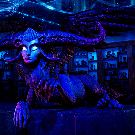
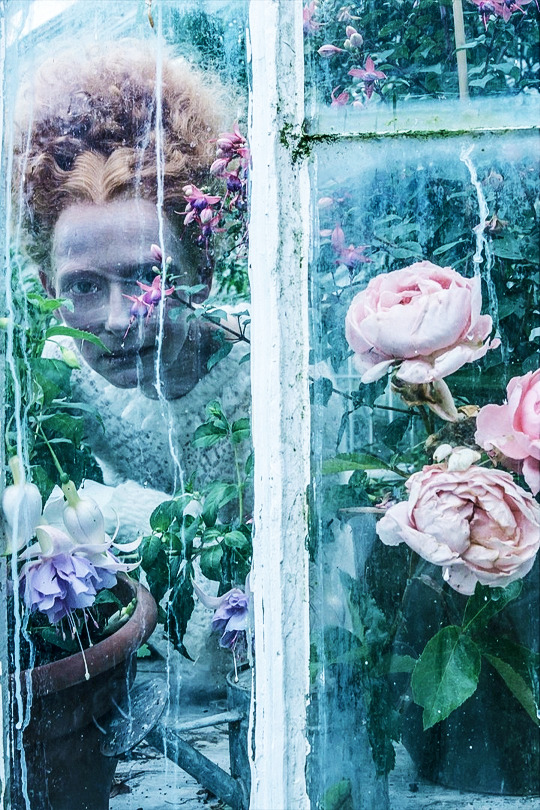
Photo
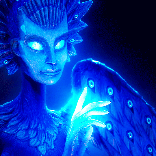

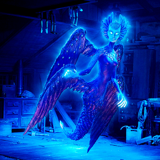
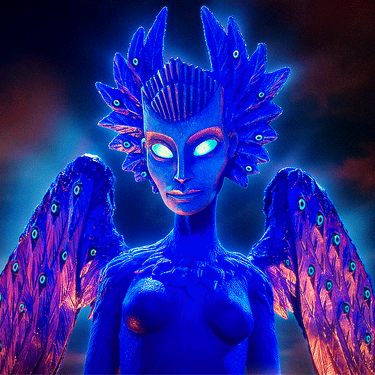
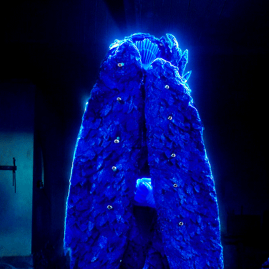
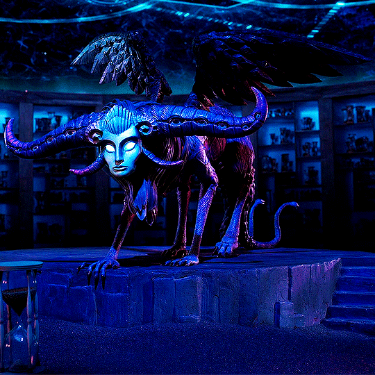
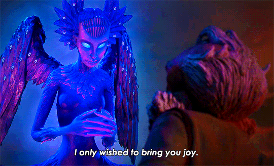
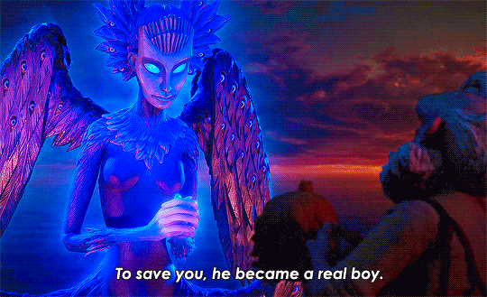
The Wood Sprite in Guillermo del Toro's Pinocchio
14K notes
·
View notes
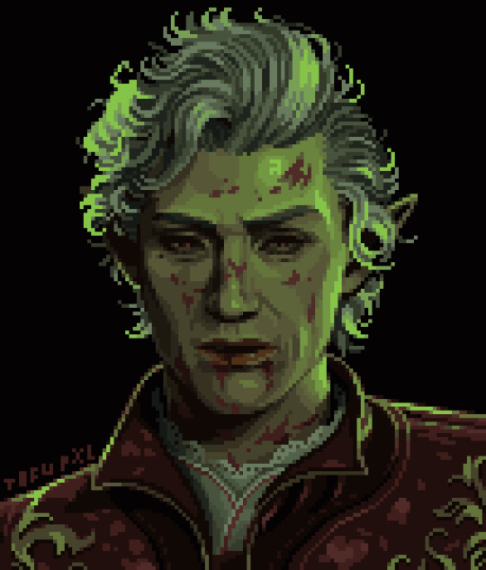
Text


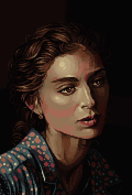

pixel portraits for level up. been doing 1 a week for a couple months
its been fun after years of avoiding drawing people because i was scared to mess up
#pixel art#pixelart#artists on tumblr#art#8bit#pixel#illustration#16bit#pixel portrait#portrait art#portrait#willem dafoe#tilda swinton#gus fring#mads mikkelsen#astarion
1K notes
·
View notes
Last Seen Blogs

marcoxdecastilla
Marco DeCastilla, M.D.

fabioabecassis
FABIO ABECASSIS

anm39
Anm_3

mrmogussy
Mr Frog Man

stpaulsdayton
St Pauls Episcopal Dayton (unofficial fan blog)