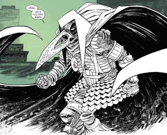
#they have so many other artists doing thinner designs
Text
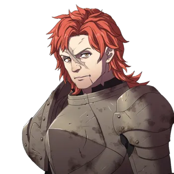
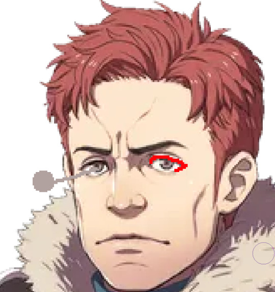
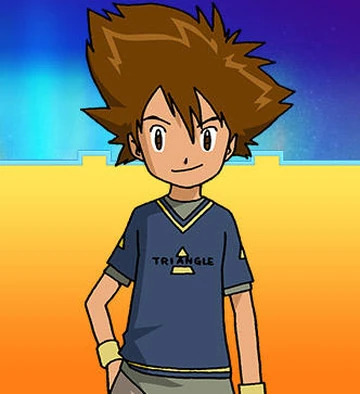
oh btw. my goal is to make every single tmp character midsized or larger. im fighting the twink agenda. now that the canon diversity is on par with last series' fan designs, i've got to escalate. they r all big now
#colin is a bear#sam is a cub but dw he's on the journey to beardom#uh um alice is rlly tall and broad <3#im working on the others i'll get to it i swear#tmp#tmagp#'but cael dont thin people need representation too?'#shut up /nm#they have so many other artists doing thinner designs#im hear for the bears and the butches#also the fat femmes and anything in between ofc#also the twink agenda thing was a joke
26 notes
·
View notes
Note
I swear I dont wanna be mean but why does everyone keep making stella fat. Why is it that the most attractive character, whom everyone finds beautiful inside the show, is the one who is always turned fat. Like... No one would find her attractive if her canon design was like that. I promise im not being mean but I feel like the artists are always projecting themselves onto Stella and wanting to be loved like she is, cause usually the ones making her fat are fat too, like I saw your selfies and you're a bit curvy. I promise im not being mean im just curious.
For starters, send me more fat Stella’s if you can I haven’t seen that many made and would love to see more varied takes on her appearances in redesigns.
Secondly, I made her fat because I think it’s nice to have the character that’s canonically considered to be the most beautiful girl in all of magix, a fashion icon in the magical dimension, a very celebrated trendsetter, be something other than the stereotypical concept of socially acceptable fashion tropes. She isn’t an hourglass, she has cellulite and stretch marks, she’s super pear shaped, and that can be and should be considered something to be normal, since they are, and shouldn’t be seen as things that need to be hidden. Having that put on a loud and proud fashion girly seems good imo and it can only really contribute to good stuff for body image stuff and representation. I did it so people like you could reconsider that beauty is something that comes in multiple forms and shouldn’t have to fit one type of standard. If we wanna get super technical too those standards also very from culture to culture and I image that’s extended even further in Winx club.
The girls are all aliens from different worlds. There’s bug people. There’s a lady in the miss magix episode that has tentacle hair, a blue body, and tentacle hands and feet. I highly doubt beauty standards in canon would be the same as what you’re saying, ie that no one would consider her beautiful. As if people who look like her irl also would inherently be considered not beautiful too. I know lots of people who have people that think they’re the hottest thing ever and they have all sorts of different body types and traits. Lets just call it realism lol
I’m not really projecting any of my physical stuff on her also, outside of I guess stretch marks and cellulite?? But I put those on other characters too so I don’t really think that holds up. I actually put my old body type on Flora since she’s my favorite, but now I’m way more midsized, like a slightly thinner Bloom from my stuff (love this unit of measurement gonna start using the gorls as a reference point for my appearance going forward lol). I’ve always had the “socially acceptable” fat type of body, ie hourglass with even proportions and a super snatched waist. I just think it’s tired and trite to constantly reenforce the idea that “the hot fashion one” needs to be tall and thin all the time, and if she is made fatter, that she needs to look like I did ie not much of a tummy with super equal proportions, big boobs, and a big ass.
Kinda related to that also, I made a post about a lot of character design “rules” too that I think are kinda outdated and annoying, at least to me, since I’ve seen them a million times. We all have. So I decided to do something different that I think would be good for normalizing traits outside of what we consider typically acceptable for that kind of character.
I’m already very loved also and don’t need to project anything on Stella lmaooo
I got multiple partners, great friends, do modeling, and am slaying with my own fashion and appearance stuff outside of that too. That’s all independent of whatever I’m doing with her physical body type when I draw her.
Gonna level with you also, you going “I’m not trying to be mean” doesn’t erase how weird this ask is. Sounds like you have your own gripes that you need to work through. Like, if you consider those traits on Stella ugly, that means you definitely have some internalized hatred for fatness, skin blemishes, scarring, and other peoples’ general appearances if they don’t fit some specific molds that aren’t realistic for the majority of people. Even if it is just genuine curiosity, being aware of this stuff going forwards and reevaluating how you view beauty standards and bodies in general would do you a great benefit imo.
Thanks for going through my old selfies tho it was pretty weird of you but at least make sure to leave a like on them. I looked hot when I was fatter and I look hot now too sharing this with the world is the least I can do💕✨💕✨
#winx club#winx#asks#normalize other body types being considered hot because that’s just how it is irl too outside of what magazines and movies might tell you#people fall in love with all kinds of people or think all sorts of people that aren’t models are hot#and they’ve got bodies like hers#it’s just realistic if you wanna get technical lol
45 notes
·
View notes
Text
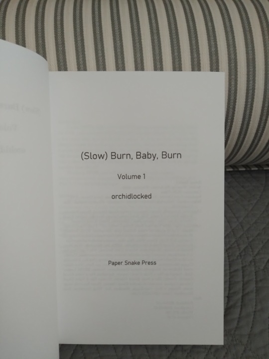
Very belated Binderary books, uh...I've lost track actually. I think they are #6 and #7. And it's another two-volume split! This is (Slow) Burn, Baby, Burn by orchidlocked, an extremely long Good Omens fic set in the 1970s. It's about our favorite angel/demon pair navigating the disco scene, and it's not an AU, which is sort of usual in a fic this long and with such a specific premise. There are a fair few real people featured here, some as major characters, and a lot of music history and an excellent playlist alongside all the fun and angsty relationship stuff that so many of us are here for. I learned a lot about disco reading this fic and it was fascinating and also way more queer than I ever realized.
For the cover up there we have a white Allure book cloth on the spine, and white HTV over homemade book cloth for the main cover. The cloth pieces both come from the same sheet but I oriented the stripes this way so they'd be coordinated-but-not-matched and I really love the effect. They're also cotton and really nice to hold. It's funny, I was thinking of binding this fic when I found the fabric while digging through the Joann's remnant bin, and as soon as I saw it this fic not only came to mind but moved up to the top of the to-bind list. It was fate, clearly.
More photos under the cut!
Both spines and a top view. That's orange HTV for the titles. This it the first time I've worked with matte HTV (I usually use metallic or foil) and I was surprised at how much thinner it is, and how easy it was to stick. And I like the color inverse here in counterpoint to the front cover. The top view shows off the handmade endbands and bookmark, and also the rounding job. I'm still working on rounded spines, and the turn-in over the spine didn't come out as smooth as I'd have liked, but I think it's a good result. The ribbon bookmark was supposed to be blue to match the endbands, but every blue ribbon I could find clashed horribly with the cover so it's this nice leafy sage green. Which actually works really well with...
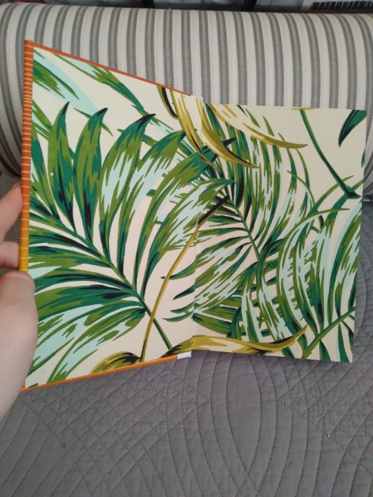
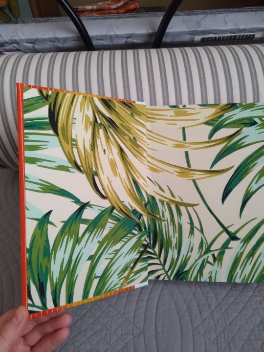
The endpapers! I got these as Joann's too. All four are cut from the same print, but I shifted and rotated them when I trimmed them so the patterns wouldn't all be in the same place. I had desperately wanted this other paper I found on Etsy with little vinyl records all over it, but the pieces weren't the right shape and I'd have had to ship them from overseas ($$), but I like the mood these ones set. And they're thick and nicely textured and look awesome with the cover, so really I think things worked out very well.
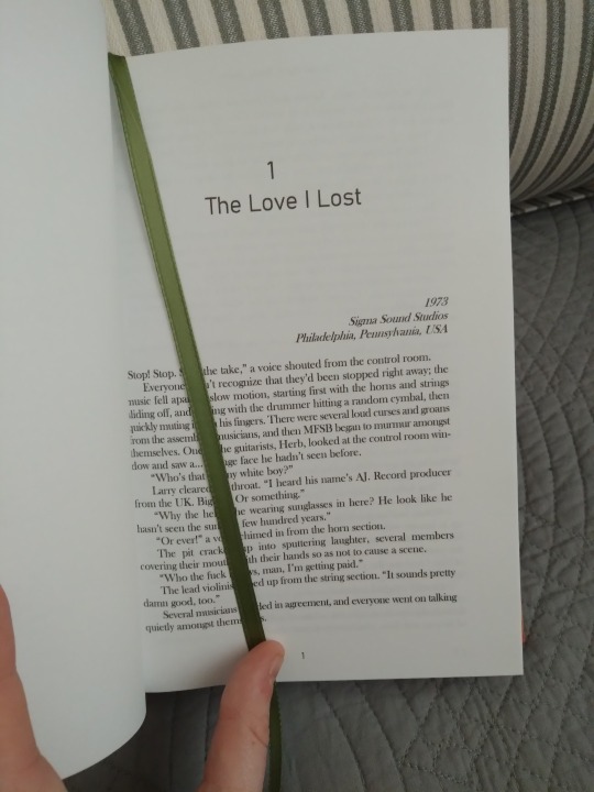
Couple of pics of the interior. I kept it fairly simple but I feel like it fits the story.
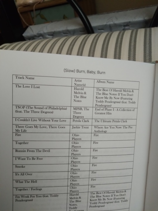
The scene break line is orange, to match the covers. I usually use gray but wanted something more fun. I recently bought some off-white paper that I used for most of my binderary projects this year because I've heard it's easier on the eyes, and it is, but I used the older bright white for this so the color contrast would be sharper. No complaints; I think it looks amazing. The second image above is the appendix I put together for the volume. Being so centered in the music industry, this fic has a really long playlist that the author put together with their preferred recordings. It's linked in the story and I did include the link text in the book, but I had my mind on preservation and the challenges of digital archiving while I was making this one, so I also took all the title/artist/album info and just listed it here. It was too much to do all by hand, so I learned how to export a Spotify playlist into an Excel doc, then moved that into the Word doc to print. A lot of steps, but not nearly as hard as I'd thought, and way less tedious.
I have to say this book is aesthetically really different than all my previous ones. I ran into so many design hurdles but I honestly couldn't be more pleased with the end result. I'll have to push my comfort zone like this more often, I guess.
#bookbinding#fanbinding#snek makes books#good omens#it's disco so it needed to be appropriately funky#and i think i nailed it actually#look at them they're awesome
37 notes
·
View notes
Text
Sorry but I can't get over this
I know plenty of people have joked about this already, but Sylvain just...looks almost nothing like his dad???
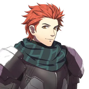
(Using Sylvain's Hopes portrait to account for any changes in artists/art style)
Like, just by comparing these two pictures I can list so many differences:
Sylvain has a slight widow's peak (more obvious with his Houses post-TS portraits) and Matthias doesn't
Sylvain has a more heart-shaped face & pointier chin compared to Matthias's square head & jaw
Matthias's nose is taller and rounder (with visible nostrils) compared to Sylvain's anime nose
Sylvain's hair is a more vibrant orange-red compared to Matthias's darker red
Matthias's tall cheekbones
Sylvain having slightly thinner eyebrows (unless he just thins them out with tweezers/scissors)
Matthias having a pronounced brow ridge and a worry line between his eyebrows deeper than the chasm Byleth falls into right before the Houses timeskip
Sylvain's ears are less...veiny (?) compared to his dad's? Unless that's just like, an art style thing.
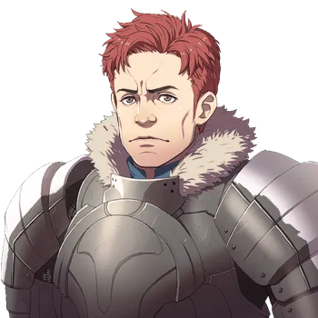
Maybe some of it could be explained by Matthias being 20+ years older than Sylvain, but not all of it. Especially when you compare Matthias to his other son, Miklan:
Same head shape, same jawline, same brow ridge, near-identical ears... Probably similar noses too, though it's a bit hard to tell with the different angles (Miklan's face is turned slightly more to the side compared to his dad's frontal view). Like it's obvious that Miklan inherited more of Matthias's physical traits.
But you know what physical traits all three Gautiers share?
Hair curliness
All three of them share red hair that curls upwards at the ends, with a few notable cowlicks in the middle of their heads that stand almost perfectly straight up. They also have bangs on both sides of their faces that curl inward. (It's harder to see with Matthias since the hair on the side of his head is cut super short, but still visible on the top of his head where his hair is longer.
2. They have the same fucking eyes.
Like, look at this:
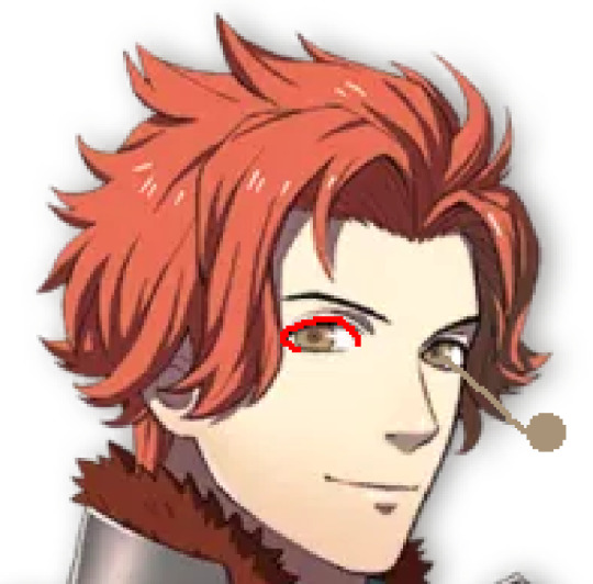
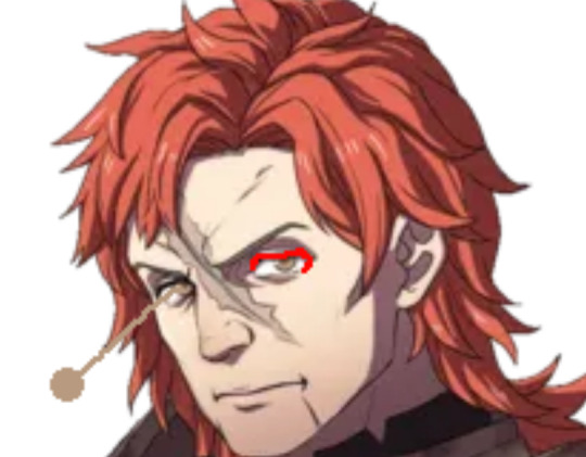
Not only do they have the same eye color (or nearly the same color, in Matthias's case), they also have the same droopy eye shape.
AKA Sylvain's infamous sad doe eyes? He inherited them from Matthias.
Like can you imagine Matthias (or Miklan, for that matter) giving you this look?
So now that I've cursed you all with that mental image, I just want to say one last thing:
Since Sylvain barely resembles his dad, logically we would assume that he inherited most of his facial features from his mom. Knowing this, we can use Sylvain's features to approximate his mother's: a heart-shaped face, widow's peak, small pointed nose, and probably light-haired (so the red color Sylvain inherited from his dad would more prominent than it would be in darker hair). Might be useful info for anyone who wants to create fan designs for Mama Gautier.
Also Sylvain's mom must be super hot in order to balance out his dad's ugliness, lol.
#fe3h#few3h#sylvain jose gautier#matthias raoul gautier#miklan anschutz gautier#fe3h analytical#fe3h meta#my post#long post#this would not leave my head until I made this post so now you all have to live with this knowledge too#Sylvain really lucked out in inheriting few of his dad's looks#but I am mad that Sylvain's eyes - one of his best traits imo - came from Matthias of all people
111 notes
·
View notes
Text
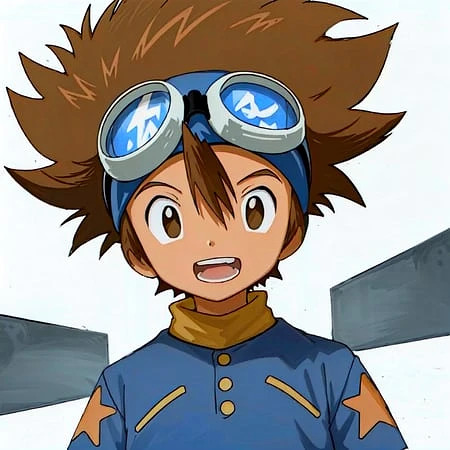
How to Spot an AI-Generated Tai in the Wild!
Because I am insanely obsessed with the blorbo and AI art is a hot-button topic right now, here's a silly thing. I'm sure most artists can tell the difference between real and AI art. But my autistic brain wants to pick apart Tai's character design a bit so here you go. This applies to all seasons, touching on basic traits Tai has between them. So I won't go too much into clothing here (people like to dress him up in different cool outfits anyway- keep doing that).
Note that this isn't true to all models, but works 90% of the time. AI art is advancing so quickly that this may be obsolete by tomorrow. Also, real art might "fail" these little tests simply due to lack of experience drawing the character. If you suspect someone is posting AI art, just block and move on. Report if you want, but you know how Tumblr feels about AI. Most importantly? Don't use this post to be a dick.
WARNING: This post uses AI-generative images found from around the Internet for demonstrative purposes. No credit is given because if the "creators" wanted credit, they should've learned how to actually draw. :)
SKIN TONE
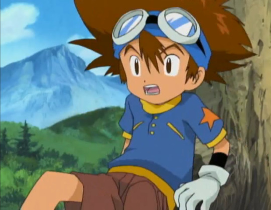
Tai has this nice, tanned skin tone that the rest of the Adventure DigiDestined do not have. While he keeps it in 02 and tri, he loses his color in Kizuna. A real fanart piece is most likely to reflect this, or even add color to his paler designs.
Most AI models have a generic pasty white skin tone for anime characters. This applies to any anime character, not just Tai. I believe this model might have gobbled up his Kizuna skin tone. But I've seen fake Tais even paler than this.

There are some AI models that combat this. But the standard AI identification tricks apply. Here, the tongue is mushy, and the highlights on his goggles make no sense.
HAIR OF FLOOF FLOOF
Ah yes- my point of expertise. Tai's hair is a difficult thing to draw. I don't blame anyone for dropping the ball here. But AI does have some notable, repetitive failings.
A "legit" Tai tends to have fluff, rather than spikes. The bangs consist of one stripe over the forehead. The few spikes present designate messiness, but the general shape is actually curvy (look at the top right side of the head for the most wavy lines). The size of the floof ranges between adaptions and even storyboard artists.
AI-generators are convinced that all "anime hair" is spiky. Notice this AI Tai has more spikes and less curved lines.
Then, there's this one, which drops the ball on Tai and Matt so bad that both characters resemble Bakugou from My Hero Academia.

WHO'S THAT DIGIDESTINED?
Eye shape and color has some leeway depending on the artist's style. Adventure/02, tri., and Kizuna supply three different eye styles. However, there are still some dead giveaways.

Revisiting this AI-generated image, the eyes look...familiar. No?
How about now? The modern Pokemon anime style has been completely absorbed by AI models. Sometimes, Digimon and Pokemon will be confused for each other, resulting in similar eye shapes and other traits (look at the noses, too).
HUMAN TOUCH
There's some times you can look at an art and know with confidence it was human-made, such as-
MS Paint blobs/sketches on lined paper/anything showing layers/etc. They're too unrefined for an AI image creator to want to profit off of, so why would they make them?
Some fetish art. A lot of kinksters are using AI, which is why deviantArt made good ammunition for this post. But many have distinct art styles that AI has not copied yet.
Western-cartoony art with hard or thick lines. AI is allergic to these traits atm. Notice the softer, thinner outlines on all three fakes.
Clearly attempting to master Tai's unique traits, even if they don't translate well (e.g.- a dome vaguely shaped like his hair is more credible than a "perfect" hairdo with too many spikes).
FINAL NOTES
All of this could change tomorrow, at the rate at which AI advances. I'm fairly good at deducing AI art from human-made art. But a recent piece almost tricked me (interestingly, it was Davis- not Tai- who looked off). These things are constantly evolving. But in addition to the usual tricks, knowing your blorbos can help identify AI images so you can freely block (or, when applicable, report) the idiots who made them.
#tai kamiya#digimon#taichi yagami#taiposting#fuck ai art#all of this will change in three days#character design#ai art#ai art identification#might go into tai's hair more one day there's a lot i want to say about drawing it
26 notes
·
View notes
Note
Hey Neyla! I hope it’s ok that I ask but is there a brush setting you prefer on procreate? I’ve been inspired by your art for eons but I can’t comprehend photoshop. You can totally disregard this if you don’t use procreate though!
Hello! I don't know how long this message's been sitting in my inbox because i didnt check in for a while 🥺 I hope you get to see this either way!
I don't use procreate unfortunately, but I can explain the settings I use for my brushes on CSP in general, and if it works like any other art software then you should have similar settings on procreate
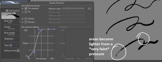
for sketches/linework, I will very often use an opaque & slightly textured round brush. the most important for me is for the brush to have that fuzzy sort of texture that gives the impression of using a pen/marker on paper.

note that i am actually terrible when it comes to line weight, it's definitely not something i work on a lot other than in backgrounds, so I don't actually bother too much with pen pressure settings.
the only rule I abide to is to always set the minimum value above 0 (anywhere between 20-30 is what I use). this is because when I started drawing, I used to be very heavy-handed and would wear out my pens too quickly-- so setting a minimum can help you become more aware of how hard you're pressing on your pen and make gentler strokes.
another fun little setting i use is opacity: like I said, I use opaque brushes for lines, but I like to reduce a tiny bit of opacity when brushing very lightly to give that impression of pen on paper.
There's a couple more brushes I use for coloring or rendering; the major sticking point being that I don't use pen pressure to control brush size that much. If I want to make thinner/smaller strokes, I'll simply reduce the brush size because it's easier for me to control!
(also, opacity is something I'll use a lot more when I'm working on colors)

just know that this is my way of handling it, and it may not suit your style. pen pressure may be another artist's best friend, so please make sure you try out what works best for you :)
finally, some art softwares come with stabilization. I don't use it personally, unless i'm actually trying to do really smooth curves (which is practically never). stabilization can also make CSP lag a lot with higher values and large brushes. the use of stabilization doesn't make you a bad artist or a lazy one, and not using it can make your lines look a tiny bit wobbly if you're not used to doing quick strokes. use stabilization at your own leisure!
on a different note, i know this wasn't part of the question but I'm bringing this up since it's something I tend to hear from people who say they were inspired by my art (thank you by the way🥺💕!!) : don't be misled by artstyles that "make it look easy"! my sketches may look very simple and natural because i'm more adept at bringing out the essential and discarding details in a design. this is not necessarily what you want for your art style; maybe you like drawing details a lot, maybe you prefer the lazy way out going straight to the point. neither are good or bad, only what you like to do matters.
also, if you're frustrated by your work, don't be afraid to draw over it as many times as you want, adjusting things with the lasso tool or deform if something feels off then drawing over again. sometimes you'll be satisfied with your first take, and sometimes you'll need 3 bases before its acceptable (examples below)-- it all depends on your mood, energy, motivation, desired outcome, format, or even just randomness
oh and, sometimes the best way to enjoy drawing..is to find something to obsessively draw (,:
take care!
239 notes
·
View notes
Note
You probably get this a lot, but I love your art style and would like to draw like that (obviously with my own flare and style and not an exact replica because idk how I would even do that), so I was wondering if you have any tips ?
(Obviously you don't have to answer ! I totally get it if you don't wanna ^^')
I never mind giving out advice when/where I can! Drawing takes a lot of time, and its even more time to get a style down (or several! Because I think you wind up finding that many artists have multiple styles or ways they can draw! But there are often still consistencies throughout!)
My biggest suggestion is experimentation. Referencing how other people draw certain things AND also referencing real life. I always suggest using poses, random photos or even your own hand to draw from or use as jumping off points before distorting or changing around anatomy to stylize it.
Messing with brushes too on whatever program you use is always a big suggestion too! I personally love rougher or less "smooth" or vector-looking brushes for things, as well as adoring bigger thicker lines that vary in that thickness depending!
Most of the time esp in the case of line-art I variate line thickness by erasing parts or going back over them or just generally fucking with pen-pressure. Smaller thinner lines put less emphasis on something, where thicker ones make it more evident. Its why thicker outlines all around then the inner lines or details being smaller or thinner works so well!! Bolder the line, the more somebody will see it!
Also experimenting with color and what colors you like to use. I adore a mix of colors but always like at least one to be more neon or to pop more so it stands out and highlights a point in the piece or design!
Other good tips are:
sketching a lot and as much as you are able, but also not to pressure yourself into drawing when you have no motivation or no ideas.
warm-up sketching and drawing before getting into drawing a bigger piece or returning to coloring!
Just in general experimenting more! Again, looking at what your favorite artists do and ALSO how the human form or any form you wish to study functions in reality too. I VERY often will make huges files of art from artists I like or will save photos to look back at or turn opacity up on to sort of vaguely outline. Not to trace and use for my art, but to see or break down how an artist I admire used shapes or gained the fluidity in the art they have.
I am still learning a lot, constantly. And I'm not 100% always the proudest of my work, or I will compare it to someone else with a vastly different niche or style. But, ultimately, I've got to know that art is always a process of growing and changing as much as all things in life!
A very big personal tip is patience. Art takes time, and rushing a piece because you are excited or might put pressure on yourself to finish it- maybe you're sick of it etc, it isn't healthy and it will not produce good work. Draw, color, and paint at your own pace, and allow that pace to be as slow or as fast as it feels.
o7 Hopefully all of that is helpful! I'm always happy to answer more questions!
18 notes
·
View notes
Text
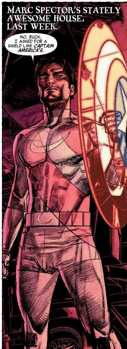
History of the Vestments (Part II)
Long post incoming! :D Here are the rest of my random thoughts on 616!Moon Knight's costumes up through modern comics. As I was going through the material for this post, it normatively felt like there were a lot more artists drawing Moon Knight around the same period of time but with slightly different styles, so unfortunately this definitely isn't an exhaustive collection; it kind of ended up being a little less ontological and a bit more of a tour of some of my favorite points along the timeline (RIP my academic credibility).
1. The Skinny Peaked Hood Era
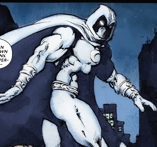
Although it was probably more indicative of artist David Finch's style than perhaps how Moon Knight's hood was actually supposed to be perceived, I do find it interesting that the markedly longer and thinner peak in the hood distinctive of Mr. Finch's work started to bleed into other artists' interpretation of Moon Knight around this time.

Moon Knight (Vol. 5/2006), #5
For example, there is this comic with art by Arthur Adams and Walden Wong.
Hulk (vol. 2/2008), #8
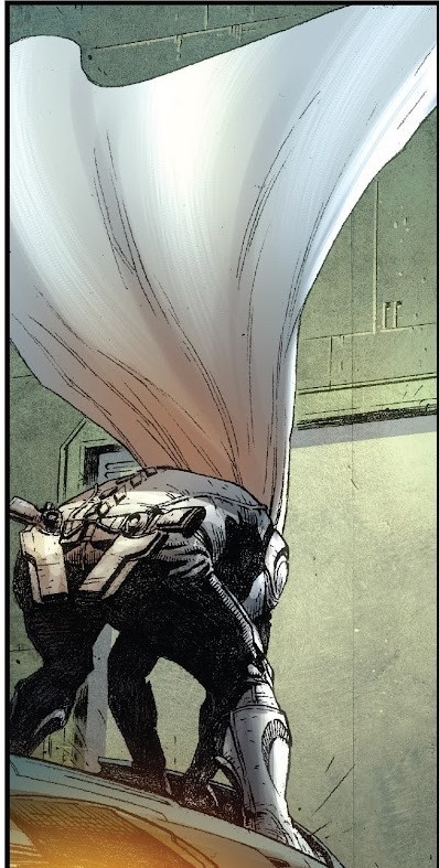
Another interesting characteristic that was especially emphasized during this period was the cloak's volume, which was expanded to create such wonderfully dramatic panels as this one by artist Jefte Palo:
Moon Knight (vol. 5/2006), #29
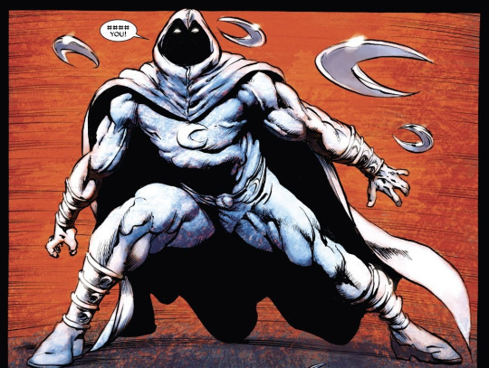
Other artists around this same time period, such as Mark Texeira and Javier Saltares respectively, chose to emphasize other elements, instead adding more prominent crescent details on the bracers, boots, and belt. (This definitely confirmed for me that the correct answer to the question "how many crescents are on Moon Knight's suit at any given time?" is "yes")
Moon Knight (vol. 5/2006), #17
Moon Knight (vol. 5/2006), #24
2. Armored, High-Tech Jake Lockley
With a new series and artist, Vengeance of the Moon Knight and Jerome Opeña respectively, the Moon Knight suit once again got a new look, featuring a new crescent logo design on the chest plate and what looks to be, in my opinion, more "futuristic" armor. The designs of the spaulders, bracers, and boots have been altered to include more elongated crescents and the armor overall appears to be more extensive and intensive to put on (necessitating the very post-Iron Man (2008) suiting up scene hahaha). Furthermore, there's also the addition of the firearm holsters, which is a marked development from the Moon Knight of the 1980's who largely tried to avoid firearms.
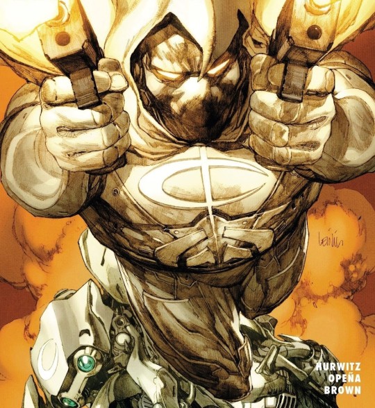
Cover for Vengeance of the Moon Knight (Vol. 1/2009), #1

Vengeance of the Moon Knight (Vol. 1/2009), #7

Vengeance of the Moon Knight (Vol. 1/2009), #4
One other interesting detail that I noticed becoming more prevalent around this time is the inclusion of more noticeable seams, especially along the sides of the mask (which frankly reminds me of Fantomex hahaha), as seen in this panel with art by Juan Jose Ryp.
Vengeance of the Moon Knight (Vol. 1/2009), #9.
But to be honest, this period was a bit of a free-for-all when it came to design, with some people like artist Bong Dazo really focusing on the details....

Shadowland: Moon Knight (Vol. 1/2010), #2
....others like Mike Deodato Jr. and Will Conrad going with a more "classic" look...
Secret Avengers (Vol. 1/2010), #10
...and others still sort of splitting the difference, as seen with Graham Nolan’s work...

Captain America: Hail Hydra (Vol. 1/2011), #5
3. Meleev’s Take
Moon Knight (Vol. 6/2011), #8
Maleev’s work on volume 6 leaned more towards the “understated” end of the spectrum, with no decoration on the bracers and boots and a belt that frankly reminds me of the sort of the thing Spider-Man would keep under his suit to carry his web cartridges (and of course, there’s all the other costume weapons/accessories that came with this volume hahaha).
Moon Knight (Vol. 6/2011), #9
4. Precursor to Mr. Knight????
Now this was an interesting (re)discovery: apparently in Secret Avengers #19 (a personal favorite issue of mine) with art by Michael Lark, Moon Knight's undercover stint as a civilian ends with him wearing a combo that is very similar to what Mr. Knight would wear in his debut in an issue published three years later. Just a fun little bit of trivia.
Secret Avengers (Vol. 1/2010), #19.
5. Ladies and Gentlemen, THE Mr. Knight
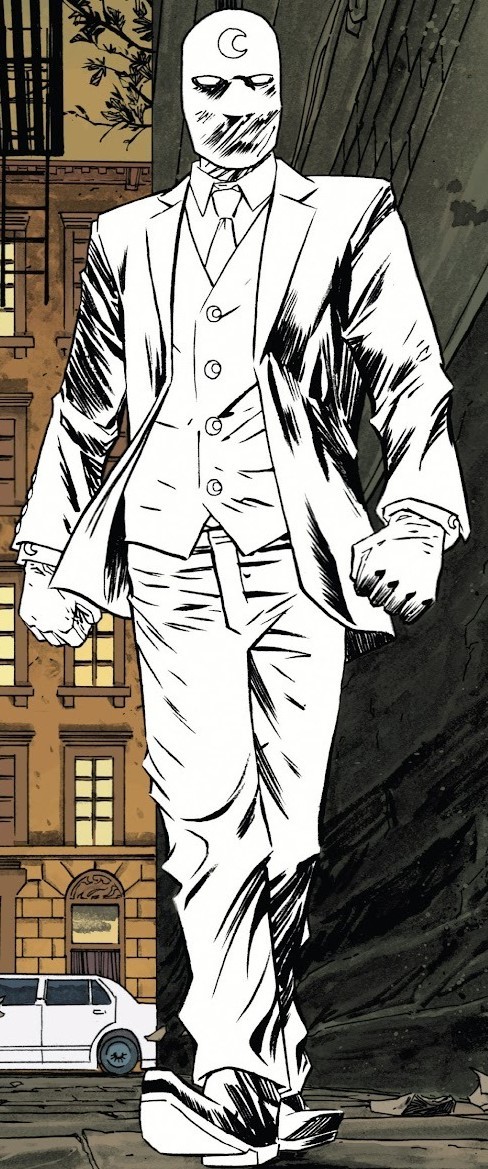
Moon Knight (Vol. 7/2014), #1
Perhaps one of THE most iconic looks for Moon Knight, Declan Shalvey’s Mr. Knight was described as a respectable public persona who could interact with official authorities, unlike the vigilante Moon Knight, and with such a smart looking three-piece suit, he definitely looks the part. In this particular panel, I especially like the crescent details on the buttons and cuffs.
5. That One Black Suit
Moon Knight (Vol. 7/2014), #2
I uuuuuh actually already wrote a whole post breaking this suit down, so you can find that here, if you like hahaha
6. Ghost Ripper Armor
Moon Knight (Vol. 7/2014), #3
If Mr. Knight is for respectable, above-board business and the Moon Knight armor is for beating up crooks in alley ways, this here armor is for the more mystical elements Moon Knight might need to deal with. While most prominently featured in Shalvey’s work and throughout volume 7, it has popped up in two issues of Moon Knight: Black, White & Blood, first in a story drawn by Akande Adedotun and then in a story with art by Leonardo Romero.
7. Lockley????
Moon Knight (Vol. 7/2014), #8
This one isn’t revolutionary so much as it just haunts me personally. This appearance by an alter only referred to as “Lockley” (Jake Lockley??? although some argue that this may be another alter???) is only found in this issue with art by Greg Smallwood. It features the volume 7 black suit sans the cowl and with the addition of a white mask and honestly, the whole lack of information surrounding this incident just insures that at least I will forever lie awake thinking about it hahaha
8. Bemis Era
Cover for Moon Knight (Vol. 8/2016), #189
The initial artist for the Bemis run, Jacen Burrows, continued the trend of keeping the Moon Knight suit fairly simple in design and monochromatic in color. Some elements I do appreciate, however, are the subtle change in shape of the bracers while the straps across the inner arm still mimic the banding of earlier designs. Furthermore, I just find the use of white lenses surrounded by black, as opposed to the typical glowing blue or slightly less common red, to be an interestingly distinctive artist’s choice.
Moon Knight (Vol. 8/2016), #197
9. MacKay Era
Simply put, I owe artist Alessandro Cappuccio and colorist Rachelle Rosenberg my soul. On my last post about Moon Knight’s suits, there’s a comment about how the body of Marc’s suit was originally supposed to be black while the white was only intended to act as highlights. The classic all-white suit wasn’t adopted until around the West Coast Avengers era due to changes in printing and some readers coming to the conclusion that the suit was white (sort of a Spider-Man 2099 situation where his suit is described in the text as being predominantly black despite looking blue). Mr. Cappuccio seems to be harkening back to that effect and I personally find it very exciting. Depending upon the lighting in a panel, the suit in volume 9 can look almost like the one introduced in volume 7 or it could look almost entirely black…
Moon Knight (Vol. 9/2021), #1
…OR it could look as pure white as people have thought it has been for decades hahaha
Moon Knight (Vol. 9/2021), #8
Add on to that the faint glow effect that’s present even with Mr. Knight's suit and you get a truly otherworldly look perfect for a guy who’s been brought back from the dead a couple times by an Egyptian deity and who will not hesitate to punch a ghost or kill a faery. Or live in a haunted house for that matter.
Moon Knight (Vol. 9/2021), #1
Moon Knight (Vol. 9/2021), #7
Look at this walking glowstick
#Marvel#Marvel comics#Marvel 616#History of the Vestments#Moon Knight comics#Moon Knight#Marc Spector#Jake Lockley#Lockley#Mr. Knight#yeah this post feels a lot less thorough than the last but eeeeh what am I trying to do here???? Get a good grade in tumblr???#(....I would be lying if I didn't answer with at least '....a little bit' but I am practically yerding that instinct hahaha)#I had some fun and I hope at least someone else enjoys this too :D#I might do a big ol' compilation of non-616 Moon Knight suits#and then it'll be on to all the vehicles that have been crashed in Moon Knight comics hahaha#long post
40 notes
·
View notes
Text
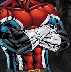
CAPTAIN BRITAIN COSTUME RATINGS
Totally impromtu and totally subective to my tastes! Focusing on Brian because his are the costumes i have the strongest feelings towards. Here we goooo!!!!
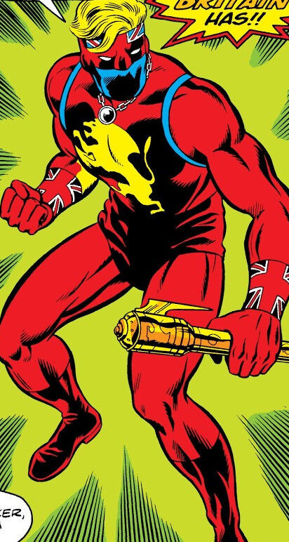
Original: 6/10
This one is a-okay and ive seen it look really cool in the hands of some artists, but it’s not a fave. The mask is cool, i like the big lion, and the Union Jack armbands are pretty neat, but it just doesnt really come together to me. Also i think Lionheart wore it better, but nobody gives a damn about her 😔
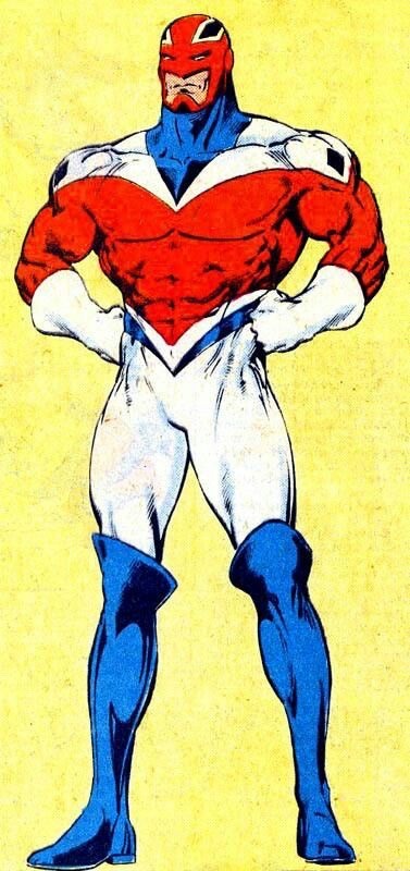
Alan Davis design: 10/10
PLEASE look at this suit, the simple iconic design, the color placements, the boots, the COOL helmet with the chin guard, i love it so much. I used to be confused by the huge X his costume makes but it does fit with how much he associates with X-Men characters. This will always be one of my favorite Alan Davis designs, and now that I’ve seen the other potential costumes he drew when brainstorming i can say we hit the fucking jackpot here.
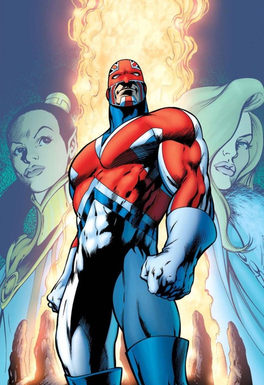
Alan Davis Redux: 9/10
I dont like this one as much as Davis’ original design, but it’s still really good. The color balance is more or less the same, and as as a person who has drawn the previous Captain Britain suit i do appreciate the simplification. Plus, the biggest thing I appreciate Davis bringing to Captain Britain’s design is his beefy physique, and that has yet to change. So what’s to complain about?
Britannic: 2/10
In terms of 90s redesigns this is about as inoffensive as you can get, but it’s so damn boring. This looks like something Brian would wear for some one-off Excalibur mission, but it’s just his regular suit. Hell it looks like an undersuit that’s missing some kinda armor! Literally only thing worse than this costume to me is the name “Britannic.” Like are you kidding me. The only reason he isnt 1/10 is this is some of the best hair Brian has ever had. Literally a helmetless version of any of his costumes with this flowing hair would be SICK.
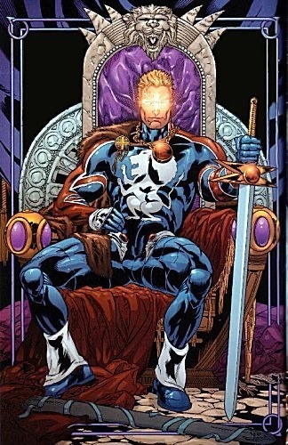
King of Otherworld: 3/10
Really don’t give a fuck about this one tbh. It’s not all bad, it’s clearly drawing from his original costume with some of the iconography and i can certainly see that working, but without the mask??? The best part of his original costume??? Or maybe some variation on helmets? Also, again, Lionheart basically wore a version of this suit that was better in every way.
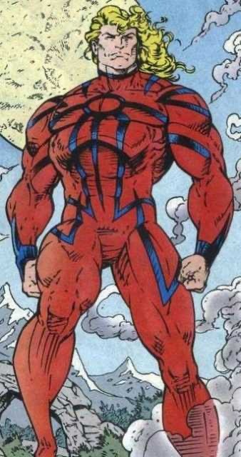
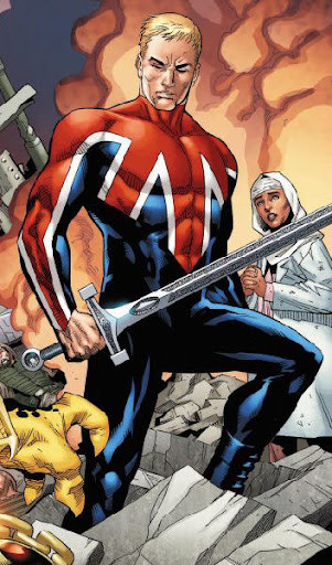
New Excalibur: 8/10
Okay now we’re talking!!! A nice update of the classic design that makes a few interesting changes. I always thought the black sleeves were kinda neat, as is the helmet resembling a more traditional superhero mask. The modern detailings, however, i’m completely indifferent toward. You could tell me this was Ultimate Captain Britain and id believe you (which is funny as some of the Ultimate designs resemble the classic suit way more than this one does). Still, not bad at all!
M.I. 13: 4/10
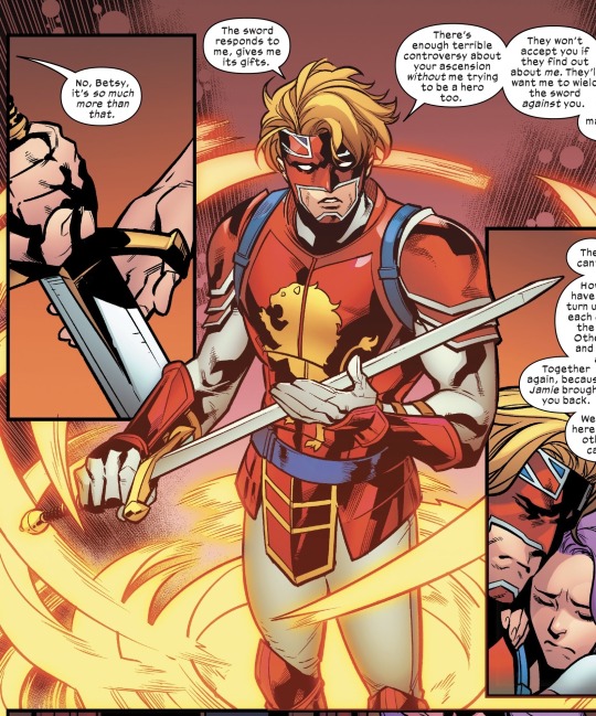
Im gonna be real, this is probably my least favorite one, but i don’t think it’s the worst. It’s just so bland. It’s not like a helmetless look couldnt work, Brian and Betsy rock that look quite a bit, and Ultimate Jamie Braddock KILLS with it. But like the overly simplistic design, thinner build, lame haircut, he’s just missing so many vital qualities.
Sword of Might: 7/10
This design is very cool and i love how it combines his og and classic looks in a more armored appearance. If he had blue covering his mouth this would be my favorite upgrade of his original design. However i ultimately don’t think this is a design id wanna see regularly because i just don’t like his original suit that much. But still, so cool to see!
Captain Avalon: 6/10
I greatly appreciate the return of the BEEF but i find this suit kinda mid. It’s just a Captain Britain reskin, like he’s Thunderstrike or the Scarlet Spider. But that’s perfectly okay. Frankly my biggest problem with it is that I don’t get why it exists. Like okay Brian is retired and he seems fine with that but there’s a million Captain Britains. There are LITERALLY retired Captain Britains hanging out in Otherworld all the time! Did they get new costumes too? Who knows. On the other hand, this is the least connected to Britain he’s ever been in terms of name and design, so in a way that makes it a secret 10/10!!! Wow!!!
4 notes
·
View notes
Text
So as I was saying before tumblr rudely deleted my post stuff.
One thing I do love about Threnody is the body diversity even if it is subtle at times.

I want to mostly highlight these four characters which at the moment are the ones my brain at 2am can focus on the most. Though an argument could also be made for Artemis as he too does not typically conform with gender-norms.
I want to start with Brier and highlight a detail I think Alyssa (the current artist for Threnody) has made a lot more obvious and prominent which I love. Brier is intentionally supposed to have more Masculine features. One of these, the most obvious in my opinion, is her chin being more flat and near clefted in some scenes.
I personally love this detail because even when I first watched Threnody I never really paid much mind to it but can appreciate it more in this styling. Mina even said these choices are intentional to her character design as not only is she supposed to have this smaller detail but the fact she has broad shoulders and is taller all plays into the more masculine parts of her. Yet I love how her identity even if she has "stereotypical" masculine traits is never questioned.
Quote: "Yeah it's intentional because I want them to seem kind of nonconforming but also hot - but like Brier is pretty tol and has broad shoulders and yeah some kinda masculine features on purpose"
I like how this plays on a few parts for the artifacts, how emotion has many different faces, the stages of grief don't conform to what is considered "normal" or what someone might believe them to be.
I'll briefly address Des because we don't know as much about him, but still I did I think guess a few things right.

Des has what I would consider an "anime chin" where it's "softer" and more rounded, pointed at the end which for many would indicate a more feminine-facial structure. He doesn't have the hard chin line as others do when looking at them from a side angle like this. A subtle way he doesn't conform with more stereotypical male designs.
Eton is. A bit of everything. Looking at his facial features he definitely has that more solid chin-line that men do tend to have but his body type speaks differently as he holds what is considered to be a very feminine or "female" body type with wider hips and smaller shoulders.

Not only does he wear pink, un-apologetically, he also holds that same stereotypical feminine body type. With a larger chest, though still "flat" and wider hips with thinner long legs despite the fact he's actually the shortest artifact there is. Eton seemingly is what many would consider to be a "twink" or "femboy" who still identifies as a man but embraces the feminine sides of him that make him happy.
Nim is the last, and I only have a couple things to say I wanted to kinda point out about how the pajama scene with her does show she isn't just that super skinny person we know her as. Yes, she has that curve and the hide hips and ass but she isn't completely, deathly, skinny. I can appreciate being shown moments when she isn't in the corset making her look like that "perfect" hour glass figure women are expected to have. Then again it works since she does sell baked goods and she has to look good to sell stuff ect idk.
I just wanted to make a post about how I appreciate the subtle or not so subtle non-conforming things in Threnody that while are not explicitly stated (a huge attention is not put on them, and yeah i know im kinda ruining that by pointing it out) nor is it really made an "issue" just is refreshing. It's nice to have characters that can be just in the world and be considered "normal" in that setting.
Also we stan thicc Artemis

7 notes
·
View notes
Note
Hello!👋 I would have a question for you, as an artist who designes many Miraculous
Wich one do you prefer; having a small pool of Miraculous, wich gives the possibility to change what animal the kwami is, or having many, which allowes a vider set of powers, but have to stick to specifics? Like, for example, Pollen isn't a wasp or a bee, but the kwami of Action. And I kinda like this, you can designe a holder more ways. But, for example, there are the Ox and the Buffalo Miraculous (the second offically confirmed it's in the Native American Miraculous box) so, it can be interesting what are the differences and similarities, but they have to be specific which one is wich....(that's why it's bothers me when they mixed up this in the finale....😅)
When you create kwamies based on similar animals, how can you make them distinct enought other thsn colouring? I'm asking, because I stuck on how to differenciate two of my Miraculous, the Hamster of Agglomeration and the Leming of Ignoration... two very different concepts, but two too similar animal😅
Sub chategory of this, what would you suggest when I designe Miraculous for an alternatív universe which doesn't have the Miraculous from the seria, but based on the same animal (but they are not counterparts)?
Thanks for any suggestion, hope you have a nice day!🙂
I think I prefer it when there's more miraculous. Pollen is kind of a grey area for me since the line when it starts to look like a wasp instead of a bee is very hazy to me. Wasps and bees are very similar, the only difference I can really think of is the fluff. The other animals are pretty easy to distinguish from each other. Ox and bull are the same animal but the kwamis look very different from each other so the issue isn't there. The issue is probably with the color palette too, as far as I'm aware there's no distinct color palette in canon, so the holder's color can change to whatever they like. I have very set color palettes that I almost never change (I think the only time I did that was with Lily Pad).
Change their patterns or silhouettes. I have a fox and an arctic fox and it's pretty easy to tell them apart. Fross is white and fluffier than Trixx, He also has no patterns and his eyes are different. Or Iraa and Stompp, they're the same animal basically but they're easy to distinguish. Besides the color, Iraa has her horns pointed inwards and her tail looks like a cloud. Stompp has a thinner tail and her ears are round. For the hamster and lemming, I'd give the lemming the whiskers, smaller ears, and maybe a little more fur. The hamster could maybe have bigger cheeks.
I don't think I really get that one. Could you elaborate?
4 notes
·
View notes
Photo
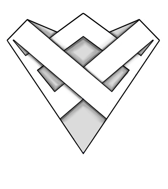
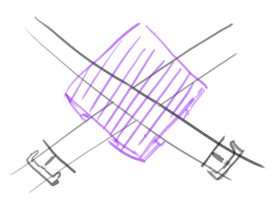
[[ Artemis Entreri’s Cloak Clasp Design: A Detailed Analysis
Although it is never mentioned or described in the books, Todd Lockwood’s design of Artemis’ cloak clasp has become an insignia of the assassin’s canonical look. Both fan and official artists have included this element in their portrayals of Artemis, however due to the small size of the item in the cover art, there have been many variations in its depiction. As I’ve been working on a 1:3 scale replica of Artemis complete with his armor following Lockwood’s depiction, Todd was kind enough to provide me with full resolution samples of his original paintings of this particular item. I can’t share those samples as that would go against Todd’s wishes, but I can and am sharing my investigation process.
The above two images are, respectively, a three-dimensional version that shows the relations of the various shapes and lines, and an unshaded version. These are assuming that one is looking at the clasp straight-on, as well as that the clasp is in a flat state, which I don’t think is its final form. These images were drawn up with real life replication in mind. I will go into detail about what its most likely final form is based on Lockwood’s paintings below.
Before I get into that, I’ll go over the steps that this investigation took. First, it required a good look at and study of the source material. I did directly trace from the paintings and then isolated the tracings so as to get a better look at the lines:
As you can see, there is a fair amount of inconsistency within Lockwood’s art, in part due the angle in some cases and lack of rendering in others. The first one, from the painting for the cover of Promise of the Witch-King, is the only one that shows all the details, so that was the one I referenced most heavily, while ensuring that the concept fit the other paintings as well.
This isn’t the first time that I’d studied that cloak clasp design. The most effort I’d put into it previously was for this piece. Although it isn’t apparent from that drawing, the bottom of the shape didn’t actually close, so I had to rework it before using it as a starting ground for this investigation. Here is the adjusted version from that:
This rounded shape did feel the most pleasing in terms of symmetry, but it wasn’t accurate because what “roundness” that appears in Lockwood’s paintings of the clasp is due to angle and perspective. So, after straightening out the edges, I figured out the relations of the various lines, then made an image document in which I could move those lines around to generate the overall shape.
This is the first result that came out of directly adapting the lines relation from the rounded version into a non-rounded version:
It wasn’t as aesthetically pleasing as the rounded version, and my initial thoughts were that it was due to the two crisscrossing bands A and B being too thin. I also wanted to experiment with making the top band C thinner, like how it appears in the cover of Road of the Patriarch.
However, simply making A and B thicker would’ve meant obliterating some of the side shapes, so I went with making A and B gradually wider. I arrived at this:
Although I liked the look of A and B, space 1 was too big while spaces 2, 3 and 4 were too small. To make 2, 3 and 4 bigger, there were two approaches: make A and B thinner, and decrease the slopes of A and B. I decided to do both to see how it’d turn out.
C also felt too thin, but since I was going to be tweaking the relationship between the other shapes, I left it the way it was going into the next rendition:
This looked much better. As with the previous attempt, A and B in this attempt also gradually increased in width, but not as drastically. The relative sizes of 2 and 3 looked about right, but 1 and 4 were both too big. Decreasing the size of 1 by increasing the width of C would also mean decreasing the sizes of 2 and 3, unless I also increased the slopes of A and B again.
But then, I had this crazy idea of incorporating non-straight lines, so things got a bit wiggly:
The curvature did allow 2 and 3 to be bigger while also restricting the sizes of 1 and 4. In the above, A and B remain the same width across the diagonal.
However, I did feel that the curves were too much, so I experimented with making A and B less curved while also increasing their width like I did with some of the straight line examples above:
This was probably my least favorite one. A and B were overall too wide, C was too thin, 1 was too big, 2, 3 and 4 were too small. And, ultimately, I went back to the fact that the perceived curvature of this object is due to perspective, and that I needed to stop copping out and just focus on finding a good geometrical relationship with straight lines.
Ironically, for the result I was most happy with, I returned to the first attempt I’d made. After some adjustments and erasing lines following the depiction on the Promise of the Witch-King cover, it was finished.
-------------------------------------------------------
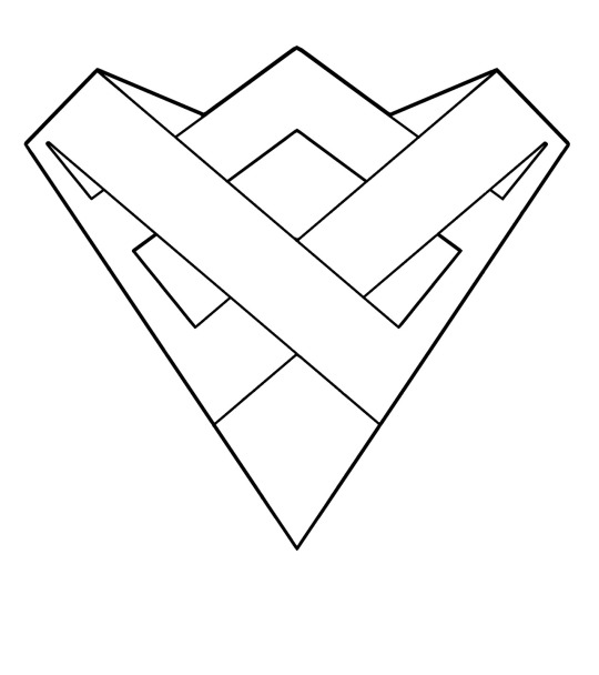
All of that was just for the design of the top piece of the cloak clasp. As for how it would function, my work was quite cut out for me. I still don’t have a mechanism with which I’m totally satisfied, but I’ve made the following deductions:
First, based on the art, there seems to be a bottom piece that's attached to the chest piece or the belts, something like this:
The belts cross over Artemis’ chest, and like the chest piece they’re on top of, follow the curve of his ribcage. Thus, this bottom piece of the cloak clasp would have to be similarly curved so as to conform.
Then of course the top piece goes on top of that base:
The top piece would also have to conform to the shape of the bottom piece and chest armor, so would be similarly slightly curved along the vertical axis.
As for how this entire contraption would serve its function as a cloak clasp, my best theory is that the side view of the two pieces is something like this, so the cloak can be shoved into the opening:
It would have to work by having some teeth or grabbing hooks in between the two pieces that will hold onto the fabric. I’m honestly pretty stumped. I know how to make it look like the art but not function like the art.
I will update this post if I ever figure it out, but for now, at least the aesthetics are correct. ]]
28 notes
·
View notes
Text
Parallel Universes
It’s interesting to ponder how for companies, often their most valuable assets are intangible. Whereas we private citizens count houses, cars, investments, and money-all tangible if we converted them to cold hard cash—as our portfolio, a company’s long-term success is typically wrapped up in things you can’t so easily convert to cash. And, in many cases, it’s hard to even establish a value.
And so we see companies guarding recipes and processes, because their lives depend on it. More recently, intellectual property has come to play a prominent role. Then there’s trademarks and service marks, the visual/and or audio essence of a brand. According to the US Patent and Trademark Office, these are defined as:
"A trademark is generally a word, phrase, symbol, or design, or a combination thereof, that identifies and distinguishes the source of the goods of one party from those of others. A service mark is the same as a trademark, except that it identifies and distinguishes the source of a service rather than goods.”
Understanding the value of these explains why companies like Coca-Cola protect their “dynamic ribbon device,” Nike its swoosh, or McDonald’s its golden arches. Don’t even think of doing something similar. Even a parody could find you in court.
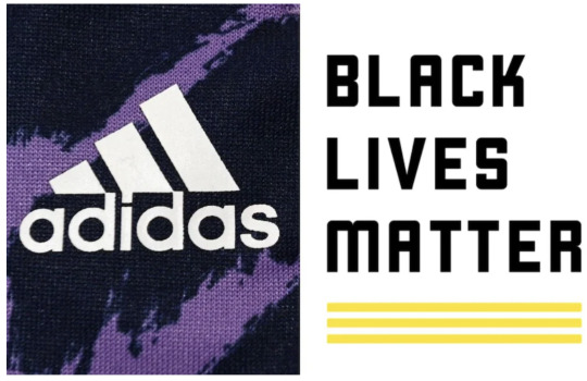
So when German sports wear company Adidas learned that the Black Lives Matter movement was launching a new logo that features—in admittedly a minor way—three parallel lines, their eyes and ears perked up. Adidas has spent millions and many years using their logo that has three parallel, albeit slanted, lines. They cried foul, and filed a complaint with the USP&TO, arguing their brand would be diluted and consumer confusion would ensue.
Just as quickly as they filed it, they back-pedaled, saying effectively, “OK, y’all do what you want.”
I get it from both sides, at least in part. A company has to protect its trademark, and any infringement must be taken seriously. Then there’s the contentious matter of fighting a movement that has had significant media play in recent years, even if it has helped further divide a divided population. The PR fallout could be huge.
In this instance, though—and I am no attorney, mind you—I think Adidas’ original claim was a stretch. The new BLM logo does have three parallel lines, but they do not play a prominent role, they are much thinner, and they are at the bottom of the logo. It raises the question of exactly how far trademark law can reach. Does Adidas own all parallel lines now? I have my doubts.
One of the first rules of parenting is to pick your battles wisely. You can’t fight everything. It’s regrettable that Adidas chose to fight an organization that has been in the limelight, even more so in a controversial way. There is no way that Adidas could come out of a battle like this unscathed. It could win the battle, but lose the war, just like you can ultimately lose the respect of your children.
Furthermore, I suspect that even with Adidas dropping it all, there has already been some damage. You just don’t need your name in the news like this, and I will fall on my sword before I concede that there’s no such thing as bad publicity. Bad is bad, and you don’t want it.
Adidas has had other problems of late, notably its slowness in distancing from Ye—the artist formerly known as Kanye West—and his Yeezy brand. The last thing it needs is more controversy. I for one cannot fathom how any consumer might be confused between the two logos, which, when compared side-by-side, look nothing at all alike.
In fact, the only confusion is why Adidas chose to go down this path in the first place. But you can’t get a trademark on stupidity.
Dr “Leave It Be“ Gerlich
Audio Blog
1 note
·
View note
Text
substance painter wireframe
Webster defines abstract as: one.considered apart from a particular instance, b.expressing a quality aside from the object or c. having only intrinsic form with little or no pictorial representation. In other words; taking an object and focusing on its core fundamentalness. All three definitions very conveniently fit abstract painting in showing, telling, drawing and painting the very essence of the object without actually depicting the object once more.
Water and soap - Before using water, ensure the electronic parts in your RC car are 100% waterproof. When they are, discover clean your RC chassis with drinking water and some detergent. Never submerge the chassis in water! Otherwise, you might damage some very vulnerable parts, like the gear box or differentials. Useful tip: For locations where are hard to reach, try using a toothbrush or a designer brush. After you're done, rinse off the soap with cold lake.
When individuals about surrealism, an idea becomes sketch then sketch a preliminary composition attracting. Then I look up models of objects in the course of surreal essay or dissertation. If human bodies, it is time for photo shooting session: me, my girlfriend and my children. If objects any specific kind, images shooting really. Of course, there's always need for hand drawings as well.
The next phase is cleansing the segments. This can be either by offering them a blow by having an air line, or through them a reliable brush. Ensure that you remove all the grit and dirt stuck to the segments, then blow some motor spray on them and but let's let them dry.
It is important to tone down your canvas especially gets hotter actually is just too bright. Therefore, you have to have a toning substance painter to complete this. You can use the general toner that a majority of painters use - the paint leaner. After substance painter Activation Key Free do so, it is that you wipe amazing excess thinner before beginning with a lot more painting whole process.
The tanks can by quite bulky. Plan to do your project when someone else that could help move the tanks is in existance. The last thing anyone wants is planned to be is lying immobile with full back spasms in a bed of spray foam insulation.
Keep working hard always practicing and listening to advice from any learning resource. Promote your art as much as they possibly can but keep watch period spent when you strike it. There are so many promoting a lot and creating less aid coming to a degree when there is nothing new market. Be substance painter License Key than marketer. Keep watching for artists you think make art better than yours. Don't strive to have "personal reach for." Strive for a better technique first then that thing can make your art unique, that cognoscible personal touch can look naturally.
Hence your past end, their acts are not adjudged great but as evil by their own people whose sake they did all the evil. The story of painter may be imaginary however the message in it is quite real. The same as it takes no effort in falling from a height in order to some gutter, similarly no effort is needed in falling from good to evil, or from light to night. Yet it requires considerable effort construct light and also to perform good deeds. One needs to therefore constantly desire and prey for light which arrive only internally by faith which enables the soul of man to be guided by the Universal Soul or The lord.
0 notes
Text
substance painter free materials
Decorating the nursery is an extremely the most fun parts of expecting. It is a bonding experience for reused . that's already here and also the one ultimately oven. What's going to be his favorite color scheme? Will she like birdies or duckies? Whatever you decide, in order to your newborn baby to be aware his parents have taste, style and other artistic version than a slapped on coat of paint. And when they don't they know ways to fake it with several pre-designed nursery decals that will make his nursery look professionally designed.
With just a little effort, a person make the guards. substance painter Cracked Download to need is some plastic material, like old bottles or tubs and the like. Just grab a couple of scissors and start shaping really mud-guards or flaps. So that you to obtain the best results, you should first see which part of your RC chassis gets dirty the actual. Try fitting some flaps or guards where they're necessitated.
RC dirt bags specified for for this exact good reason. They're water, nitro and oil proof and tend to be made by a very good type of fabric. They help your office stay clean, dry and tidy. Also, they an individual plenty of room, in which means you can keep moving around your RC car. Meanwhile, the dirt and mud you taken out of your RC car will remain off from your table, carpet and dresses.
I didn't have live exposure, I mean no show in brick and stones gallery. This is because I never could make required number of paintings to put together a show. Internet is my gallery make for matches. Yet, I didn't impact online paid competitions for not a gambler. You so many wonderful artists applying to be sure you must be lucky to win even should you be very good quality.
It vital to tone down your canvas especially the mulch can become actually as well bright. Therefore, you will need a toning substance painter get. You make use of the general toner that a majority of painters use - the paint sleeker. After you do so, it is crucial that you wipe out of the excess thinner before beginning with the actual painting process.
While transmitters don't actually need much maintenance, it is significant that they're kept in good condition. To wash it, exclusively use a damp micro-fiber material. Remove all the dirt and dust from the transmitter by wiping it and make use of a cotton bud for small places which hard attain. If the transmitter has grease or oil on it, take it off with babies wipe. Hold the electrical contacts keep clean.
Scientists deny the presence of God and the soul. So they believe that all evils in this world could be eliminated by logic and reasoning while individual i truly.e. by influencing the mind. It is argued which would leave the path of evil or destruction by reasoning and proper guidance. However, it is well known that people today who follow the evil path (like crime or addiction) have no dearth of internet data. Yet, it is surprising that they find it difficult to convince their mind to adhere to the right path.
Nearly almost all my collectors are outside my country yet I do promote myself locally too in my small in-town. The local gallery curator still awaits my paintings to buy show. I had close to achieving that 3 years ago, while i managed hold all vital paintings less 4 or 5 more, when most recent baby girl was generated. This event needed money. then i had to offer all my available paintings and so the show was postponed.
0 notes
Text
Getting the perfect eyebrows with the help of an eyebrow tattoo.
Go through the below given article to find out about an eyebrow tattoo.
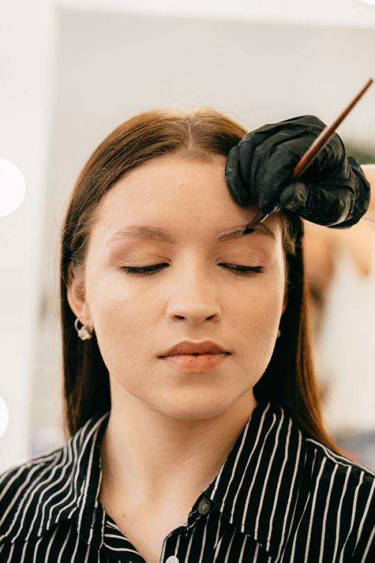
Eyebrow tattoos are only one of several permanent cosmetic treatments available to everyone. As a person, you must consider if it will be of considerable benefit to you and whether you will have any regrets in the future. For example, some ladies like experimenting with different appearances by framing their features with their brows. They want strong, thick brows at moments, and thinner, more perfectly shaped brows at some other occasions. By tattooing your brows, you would be limited in the future eyebrow designs you may wish to try for a fresh appearance.
At the same moment, it is critical for a person to understand that there are some hazards associated with permanent cosmetics and eyebrow tattooing. For example, an error might readily occur, while it is unlikely, resulting in a devastating outcome. Tattooing, on the other hand, carries potential health hazards if the equipment is just not completely sanitized and newer needles are actually not used with each new client. That being stated, it is critical to work with a professional tattoo artist to avoid this happening to you. Eyebrow Tattoo Alabama is actually the best thing which you can easily rely upon as they use the finest equipment's and all the things which are required.
Before embarking on such a surgery, you should have thoroughly investigated the issue, probably spoken with others who actually have already gone through it, and you must understand precisely what you actually want in terms of length, form, with, and so on. Possibly, eliminating some of the hairs and shaping the brows in a pleasing and appealing manner could be a good beginning point. For a couple of weeks, see just how you felt with the specific form. Throughout that time, thoroughly examine the prospect of getting a permanent tattoo. This might give you the courage you need to go forward with it, or it could entirely alter your mind and cause you to pull back from it. Areola Tattoo artist Alabama is usually preferred by a lot of people throughout that region.
This is entirely a personal decision, and you must not feel compelled to make it. Furthermore, if your brows have actually thinned, there aren't many options for fixing the problem right now. Tattooing your brows might be the only method to truly allow your brows stand out without having to constantly touch them up as well as pay attention to them. The fact is that most of us have bigger priorities to do with our time than to obsess about such minor matters, even if they are crucial.
#Realistic eyebrow tattoo Alabama#3D Areola Tattoo Alabama#Alabama brows#permanent eyebrows Alabama#Permanent makeup Atlanta
0 notes
Last Seen Blogs

sohamjagade
Untitled
siryl
I Wish for Peace
clickclackadinfinitum-blog
Scaredy-Cat Writer
whatscoolaccordingtodom
WhaCa2D
siryl
I Wish for Peace