#theatrical typography
Text

hail rain snow by Rita Barqueiro/swissserif, 2012
#poesia concreta#concrete poetry#ASCII art#typewriter#typographic#illustration#theatrical typography
28 notes
·
View notes
Text

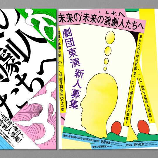

劇団東演「2024年度 新人募集チラシ」
A4
別バージョン
#design#graphic design#graphicdesign#graphic#advertising#japanese design#Japanese graphic design#japanese#japan#japan design#typography#japanese typography#theaterical flyer#theatrical flyer#theatre#theater#演劇#kanji typography#kanji#illustration#japanese illustration
4 notes
·
View notes
Text


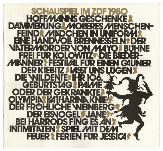
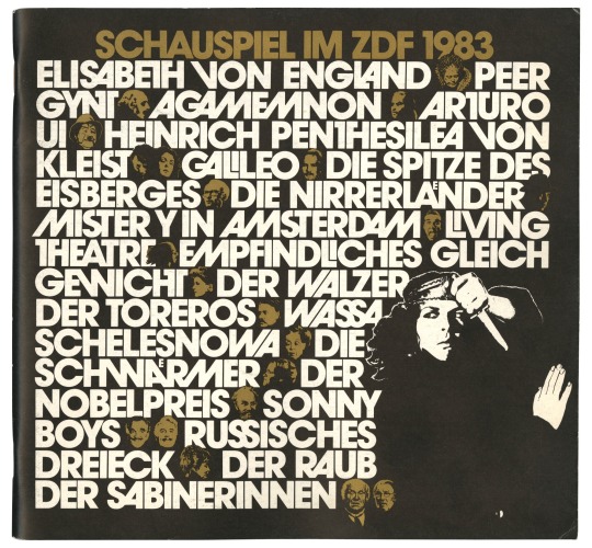
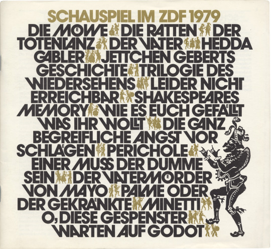

Christof Gassner, brochures for theatrical programming of german TV Channel ZDF, 1980s. Scan: Florian Hardwig. Collection of Letterform Archive. More to see: fontsinuse
“I have two big ideals (sic) for my typographical works: First, the calligraphers and book artists before Gutenberg: second, Herb Lubalin, who gave back, with his epochal work, the lost imagination to typography.”
#typography#typografie#fonts#avantgarde#1980s#eighties#christof gassner#ITC Avant Garde Gothic#graphic design#editorial design#Avant Garde font
256 notes
·
View notes
Text
i'm bored (and waiting for a certain stream) so here's a list of weirdly specific art themes i like:
- any art based off a song or featuring lyrics/typography alongside drawings
- fanart with an explosion motif based off a source that's generally comedic/nonviolent
- furry (& furry adjacent) art that radiates 2010 deviantart base energy— or that looks like it's drawn in mspaint
- wholesome characters with a horror theme (bonus points if it's 'uncanny' instead of gore-based)
- big studio's concept art that's a million times better than the final product
- any character interacting with a past/future version of themselves (if it's theatrical as well it gets me emotional)
- paintings of animals just. existing
- photography that instills both fear and awe at the beauty of the natural world
#anyway louis zong songs make my creative drive go insane#thats what i'm saying here#if i had the spoons i would draw. sad#BUT there's been some mad cute stuff on my dash n i've been reminiscing#so here's the list :]#AND MUTUALS if u see any of this stuff pleasssee send it to me#plea
1 note
·
View note
Text
It posterior be diverting to become fashionable! In that respect are many tricks you send away consumption to attend stylish. This article has a figure of tips and tricks that volition simplify your understanding of vogue. Sustain version to determine how to underline your empiricism features.
Sounding neat does non have got to monetary value a fate. If you wishing to chassis your press simply don't let the monetary resource to begin the aspect you're after, check out your local parsimoniousness and lading stores. These stores whirl a plethora of way options at a divide of their retail Leontyne Price.
If you are release direct from play to an eventide verboten on the town, ingest a few makeup fundamental principle with you to convert your look. Regard darker lipstick and approximately smoky eyeball shade to transubstantiate your look. You May too dim your flush a bit, providing more or less form for darker prison term. These triplet products testament easiness the passage.
Fashions are constantly changing, so flavor for just about staple items of wear that you dismiss tally to and make a recently look. A dandy appointment mate of melanise knickers are the introductory reckon you force out clip up or curry down, as intimately as weary in summertime or during the winter months.
A simple smutty sports coat is a grand plus to whatever press. You stool manipulation it to trim up virtually whatever equip. Then, you tooshie dispatch it if you exchange to a More effortless locus. The colour testament likewise fit just about anything in your closet, from jeans to business concern nonchalant blouses and slacks.
If you induce identical dry skin, you whitethorn wish to utilise moisturizer earlier using your favored scented products. Doing punta cana wedding photographer will aid the Cologne or essence stay thirster on your torso. It wish turn scoop if you function an unscented moisturizer, so the smells don't vie or create a new, unforeseen aroma.
Don't be afraid to wearable the see you honey. It bathroom frequently feel a minute shuddery to variation a take care that is a moment knocked out of the norm. However, if you truly wish to wearing it, scarce do it! It makes honorable common sense to permit your lawful interior mode diva to seed out, even out if she's on the far-out incline.
Put on cropped knickers in a more flattering agency by choosing capris, bike pushers, and bermuda boxershorts that do not diminish at the widest theatrical role of your sura. Select pants that ending above the stifle or closer to the mortise joint. You should too keep off flaring styles to hold back your expect sleek.
If you are starting to go gray, hear victimisation a vegetable dyestuff. As prospicient as it is just now a few strands that are causation anxiety, this intersection should do the joke. It turns the grey-haired a specter that is a shade ignitor than the quietus of your hair's-breadth. Using vegetable dye testament ca-ca it smell as though you take nice, fresh highlights and leave then fade tabu terminated well-nigh deuce-ace months.
When you are at the beach or pool, lay in your sunblock in a cool down position. Otherwise, the inflame hindquarters modification the material typography of the product, fashioning it less good. You can buoy set it in a moldable baggie ahead placing it in your potable cooler, or place it in a pocket with ice.
Crocheted article of clothing is rachis in mode at one time over again. The all but democratic pieces this time of year materialise to be crocheted vests. These comfortable vests total in a large number of colors, patterns, and thicknesses to summate a cozie and homemade aspect to whatsoever fit. Judge wearying them all over your complain shirts or dresses.
Develop the most taboo of your ravisher products to redeem the near money imaginable. If you role peach products that are packaged in tubes, exercise squeezers to beget KO'd altogether of the intersection. Weight the bottles 90 degrees, and so 180 degrees to set out every picayune minute of production come out of the closet. Fade the promotion undetermined wish permit you pocket taboo the death scrap of production. Getting these extra applications volition stretch out your products, redeeming you immediate payment.
Immediately you take to utilise these tips to yourself. Assay each matchless that you like, and interpret what industrial plant outdo for you. You are emphatically deserving the campaign it takes to sense and feeling howling. Sustain to it.
1 note
·
View note
Text
Psychedelic Posters and the Art Nouveau Influence
Introduction:
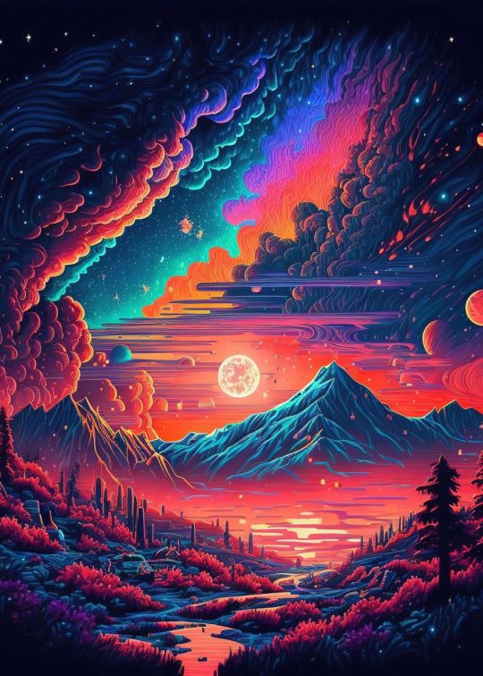
The 1960s witnessed a revolution in art and culture, characterized by a vibrant explosion of color, pattern, and surreal imagery—embodied in the mesmerizing world of psychedelic posters. Rooted in the artistic movement of Art Nouveau from the late 19th century, these posters became iconic expressions of counterculture. This article embarks on a captivating journey, unveiling the allure of 60s psychedelic posters and their connection to the Art Nouveau movement.
The Birth of Psychedelic Posters:
Emerging amidst the social upheaval and artistic experimentation of the 1960s, psychedelic posters encapsulated the spirit of the era. These posters, often associated with music festivals and the burgeoning psychedelic rock scene, utilized vivid colors, intricate patterns, and surreal imagery to create mind-altering visual experiences.
Psychedelic posters became a canvas for artists to explore unconventional design elements, incorporating swirling motifs, distorted typography, and kaleidoscopic patterns. These artworks aimed to transcend conventional boundaries, mirroring the mind-altering effects of psychedelic substances that were prevalent in the counterculture movement.
60s Psychedelic Posters: A Window into the Era:
Beyond their artistic appeal, 60s psychedelic posters served as visual representations of the cultural and social movements of the time. They advertised concerts, happenings, and gatherings, reflecting the ethos of peace, love, and experimentation that defined the era.
Artists like Wes Wilson, Victor Moscoso, and Stanley Mouse were pioneers in this genre, utilizing vibrant hues and intricate designs to create posters that mirrored the psychedelic experience itself. The fusion of typography, vibrant colors, and mesmerizing patterns became iconic symbols of an era characterized by free expression and a departure from societal norms.
Art Nouveau Influence:
The roots of psychedelic posters can be traced back to the Art Nouveau movement that emerged in the late 19th century. Art Nouveau, characterized by sinuous lines, organic forms, and ornate details, rebelled against the academic art of the time, seeking to infuse art into everyday life.
The influence of Art Nouveau on psychedelic posters is unmistakable. Both movements shared a fascination with elaborate, flowing designs and a departure from traditional artistic norms. The intricate and organic patterns seen in Art Nouveau found echoes in the swirling, fluid compositions of psychedelic posters.
Art Nouveau Posters: A Bridge to Psychedelia:
Art Nouveau posters, known for their elegant curves and decorative elements, often promoted theatrical productions, products, or events. Artists like Alphonse Mucha, with his iconic poster designs, epitomized the essence of Art Nouveau. These posters, characterized by elongated figures, floral motifs, and intricate borders, laid the groundwork for the visual language that would later evolve into psychedelic art.
The transition from Art Nouveau to psychedelic art was marked by a departure from the restrained elegance of the former to the exuberant and mind-bending designs of the latter. Yet, the foundational principles of organic forms, flowing lines, and decorative intricacy remained as connecting threads between the two movements.
Legacy and Influence:
The legacy of both Art Nouveau and psychedelic posters continues to reverberate in contemporary art and design. Elements of these movements can be spotted in modern-day graphic design, album covers, and even fashion.
The mesmerizing allure of psychedelic posters, with their vibrant colors and intricate designs, continues to captivate collectors and enthusiasts. Meanwhile, the timeless elegance of Art Nouveau posters remains an inspiration for artists and designers seeking to infuse their work with organic beauty and decorative richness.
Conclusion:
The evolution from the intricate, organic designs of Art Nouveau to the kaleidoscopic explosion of color and pattern in psychedelic posters represents a continuum of artistic rebellion and expression. Both movements pushed the boundaries of conventional art, leaving an indelible mark on visual culture. Their shared elements of intricate design, organic forms, and a departure from artistic norms serve as a testament to the enduring influence and legacy of these mesmerizing art forms.
Looking for Live auctions near me ? Visit the Auction calendar page to discover upcoming auctions near you.
0 notes
Text
Making a Statement with Backdrop Singapore: The Art of Backdrop Printing
In a world where first impressions matter more than ever, the need to create a lasting impact has never been greater. Whether you're hosting a corporate event, a wedding, or launching a new product, a visually striking backdrop can make all the difference. In Singapore, a city known for its dynamic and vibrant culture, backdrop printing is emerging as a creative and effective means to set the stage for success. In this blog post, we'll explore the world of backdrop printing and the significance of Backdrop Singapore in creating unforgettable moments.

Backdrop Printing: Unveiling the Art
Backdrop printing is the process of creating large, eye-catching displays that serve as a visual backdrop for various events and occasions. These prints are commonly used at weddings, trade shows, conventions, red carpet events, theatrical performances, and corporate functions. They not only add a touch of sophistication but also help reinforce the theme and atmosphere of the event.
The Art of Backdrop Printing
Backdrop printing is a carefully crafted art that combines graphic design with precision printing technology. The following aspects contribute to the art of creating stunning backdrops:
High-Quality Graphics: The success of any backdrop relies heavily on the quality of the graphic design. Experienced graphic designers are adept at using color theory, typography, and visual hierarchy to create visually appealing designs that effectively convey the desired message or theme.
Size and Resolution: Backdrops are typically quite large, ranging from a few feet to several meters in size. As such, the resolution of the graphics needs to be impeccable to ensure the final product is sharp and vibrant.
Printing Technology: State-of-the-art large-format printers are used to create backdrops. These machines use high-quality inks and substrates to ensure the colors are vivid and long-lasting. Precision printing technology allows for intricate details to be captured accurately.
Materials: The choice of materials is crucial in backdrop printing. Depending on the intended use, materials can range from fabric to vinyl to paper. The durability, ease of transportation, and desired finish all play a role in material selection.
0 notes
Photo

Type Moodboard:
The purpose of this mood-board was to source various design layouts that communicate the opera world, Kiri’s world and get an understanding of the overall tone.
Initially, I searched for designs that involved Kiri. This led to greater opportunity and further inspiration into opera programmes and advertisements.
I was really fascinated to see the evolution of typography throughout the theatrical world, and how designers communicated the main ideas/themes of the performances. Furthermore, the one in the middle of Kiri, I just though was different, colourful and fun. It stands out against the others and reflected the power of type and how it can really change the feeling and emotions connected to the message.
0 notes
Text
The first folio of Shakespeare is the first collected works of the poet and playwright, published 7 years after his death. It was published in 1623 under the title: Mr. William Shakespeare's Comedies, Chronicles, and Tragedies.
Printed from accurate and authentic texts. In honor of the book's 400th anniversary, Shakespeare's Globe Theater collaborated with Typeland to develop a typeface based on woodcuts made from it.
[gallery columns="1" link="file" size="full" ids="15900"]
The London-based type design studio has already worked with Globe, as the institution has used the typeface Amifer in previous theatrical seasons. According to Typeland co-founder Alessia Mazzarella, The Globe art director Irene Omodeo Zorini approached Typeland with the idea of "adding illustrated drop caps" to Amifer for the summer 2023 campaign.
[gallery columns="1" link="file" size="full" ids="15902"]
Ornamented letters are a common technique in medieval and renaissance typography to separate chapters and paragraphs. Typeland was supposed to interpret the letters from the folio, modernizing them and tying them to the theme of nature, which will be the centerpiece of the new theater season. The woodcuts serve as the perfect reminder of the fragility and beauty of the natural world, not only visually, but also because of their rarity, as they exist in fewer than 200 remaining folios,” the press release explains.
[gallery columns="1" link="file" size="full" ids="15903"]
Typeland co-founder Vaibhav Singh says the biggest challenge was developing illustrative details that could work well at different scales. Experimenting with the level of complexity of the drop cap, Typeland came up with the idea of creating two different fonts - Amifer Folio Big and Amifer Folio Small - that can be used in combination to control the level of detail desired.
[gallery columns="1" link="file" size="full" ids="15904"]
Another challenge was the digitization of the woodcuts. “Woodcuts were printed with the expectation that they could only be worked on at a certain scale, and drawing them so that their form works in digital font using different dot sizes can be tricky,” says Singh.
[gallery columns="1" link="file" size="full" ids="15905"]
Each version of the font features a "special set of characters," ranging from angelic and demonic creatures to gargoyles taken from the First Folio woodcuts. The posters will use bright colors, just like two years before.
[gallery size="full" columns="1" link="file" ids="15906,15908,15907"]
0 notes
Photo

Poster 62, 2008. So glad to see Indy back in the new trailer for ‘Dial of Destiny’! Here’s a past collaboration for ‘Temple of Doom’ with @acmearchives which is still available on their website. This followed the same structure as a ‘Raiders of the Lost Ark’ and an eventual ‘The Last Crusade’ piece. The concept was to create theatrical posters that were inspired by the era that those films took place. Limiting the colors and treating the editorial and typography like something from the 30’s helped to capture that. I love that theatrical posters of that era had illustrated versions of the characters. It gave them more of a fantastical feel compared to all the photoshopped stuff we see now. No time for love Dr. Jones!! #posterdesign #indianajones #dialofdestiny #templeofdoom https://www.instagram.com/p/Clt_PW1SZTN/?igshid=NGJjMDIxMWI=
1 note
·
View note
Photo
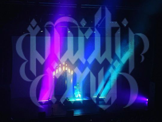
Got to see @purityring amazing theatrical show after all the Covid delays. The visual design and typography of their band elevates the whole thing. They were mesmerizing! Thanks @thewiltern for the experience! #purityring #wilterntheater #electronicmusic #surreal #beautiful #electronicpop #albertacanada #synthpop #witchhouse #4AD #meganjames #CorinRoddick #naarrt #nathananderson (at Wiltern Theatre) https://www.instagram.com/p/CgZ-qDNP26Y/?igshid=NGJjMDIxMWI=
#purityring#wilterntheater#electronicmusic#surreal#beautiful#electronicpop#albertacanada#synthpop#witchhouse#4ad#meganjames#corinroddick#naarrt#nathananderson
0 notes
Text
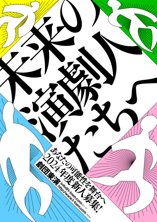
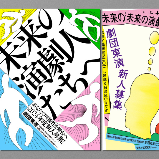
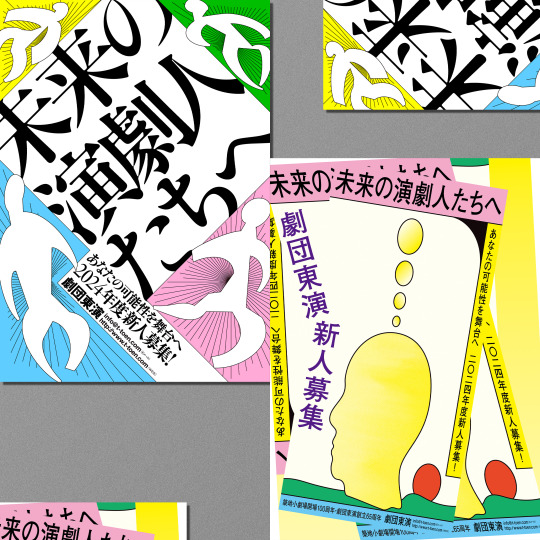
劇団東演「2024年度 新人募集チラシ」
A4
別バージョンはこちら
#design#graphic design#graphicdesign#graphic#advertising#japanese design#Japanese graphic design#japanese#japan#japan design#typography#japanese typography#theaterical flyer#theatrical flyer#theatre#theater#演劇#kanji typography#kanji#illustration#japanese illustration
3 notes
·
View notes
Text
January 24, 2022 (Lindsey C)
Hello! Hope everyone’s Monday is going well. Here are a few pieces of creative I think are cool and could inspire new ways of thinking about our campaigns and creative. I’m passing the baton to @Judson, Alex
Hello! Hope everyone’s Monday is going well. Here are a few pieces of creative I think are cool and could inspire new ways of thinking about our campaigns and creative. I’m passing the baton to @Judson, Alex
Squid Game- Red Light Green light
Netflix took the horrifying “red light/green light” doll from Squid Game and placed life-sized versions around the world in major cities from Australia to the Philippines. I think this is truly an inspired (and terrifying) stunt that gained a lot of attention and added depth to the marketing campaign . I would have liked to see this in Times Square!
Here's another link
Succession Title Sequence
The main titles for Succession perfectly captures the tone of the show. From the score to the visuals, I can’t look away and find myself watching the whole thing every episode. Fun fact – updated for season 3 the clip of Waystar Studios @ 23 seconds is actually the FOX lot in LA. I used to work there and drove onto the lot every day for years at this entrance. Also saw Rupert a handful of times, and Hope Hicks getting her own coffee. Wait, was I working at Waystar?
West Side Story Key Art
How do you make a classic love story feel fresh? See the West Side Story campaign created by the agency Gravillis. The pieces I’m highlighting bring unit photography to the next level. Recently, the KA direction for many of our campaigns is to make it feel real and unposed. I think the WSS campaign is an excellent example of elevating unit photography to make it feel premium. It also gives a modern, fresh feel to a classic, popular story.
Here are a few other pieces
Bad Typography
We all remember several years ago when the wrong film was read for best picture at the Oscars. This is a video that reminds us how important good typography is and how we, as designers, have an important role in communicating ideas. Also, how design is everywhere and far reaching. From street signs to pill bottles design is EVERYWHERE. After watching this video, I honestly believe bad design/typography changed the course of history when Al Gore lost the election in 2000. It wasn’t just pregnant chads, it was bad design.
Time Cover – Zuckerberg
Over the years, Time Magazine has done its share of provocative covers. This one from late October is so simple yet so effective and really resonates with me. Is it time to delete facebook? I struggle with this question regularly. (scroll down a bit in the article to see the cover)
Have a great week!
Best,
Lindsey
0 notes
Photo

The classic and iconic Red Mulan Poster
Official theatrical poster only.
Mulan, 1998 - Worldwide
© 1998 Walt Disney Studios
#mulan#poster#theatrical#classic#pop#art#chinese#design#typography#china#hero#princess#fa mulan#mushu#dragon#shan yu#walt disney#animation#movie#2d animation#cinema#world#adventure#chinese wall
3 notes
·
View notes
Note
Wait so the Merry Melodies are the cartoons with the ribbons on the titles right?
yes and no! most of the time, yes, but there are exceptions... the world of warner bros cartoons and their titles is so confusing.
the ribbon titles are the blue ribbon reissues, which started around 1943-1944? previous cartoons would be reissued for a second (or third, or fourth, etc) theatrical release, and they slapped those titles onto those cartoons so you know they were reissued. the theme music was “‘merrily we roll along” (the MM theme) and i believe all of the reissued are in color, so USUALLY (especially early on) they’ll be MM cartoons.
BUT, some color cartoons in the LT series got the reissue treatment as well. in fact, the first LT short in color, the hep cat, got the reissue treatment, so unless you’re a nerd like i am for this stuff, you’d think it was a MM short!
the MM shorts usually had the concentric rings, whereas the LT shorts usually either had the porky and daffy title or the bugs face title (not to be confused with the title of bugs sitting on the typography, animated by art davis... which is for MM confused yet?) for awhile, the porky and daffy title was used for all of the LT shorts, even if they weren’t in the shorts themselves. they eventually went to a regular concentric design as well sometime in the mid-40s.
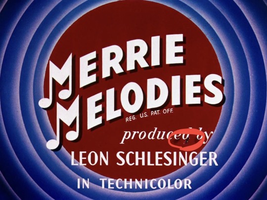
also, fun fact, the title card for birdy and the beast briefly has a fly on it. you’re welcome
42 notes
·
View notes
Photo

Creative Hero Summary
1. Alfonse Mucha - Czech painter, illustrator, and graphic artist who lived in Paris during the Art Nouveau period and was noted for his distinctive style and decorative theatrical posters, especially those of Sarah Bernhardt.
2. Shigenori Soejima is a video game character designer for Atlus known for his unique art style. He is famously known for his work in the Persona video game series, where his designs are eye-catching, stylish and fashionable.
3. Caterina Bianchini's creative approach steers away from the traditional rules of graphic design, adapting a more playful and humanistic approach. She is known for her characterful typography and lively illustration which ‘bridge the gap between design and art’.
4. Richard D. James, better known as, Aphex Twin, is a British electronic artist. Famously known for his creative process, his music, and his ever changing style. His most famous work could arguably be his first ever album, 'Selected Ambient Works 85-92', released in 1992.
At first glance, I can see that these four creatives are quite different, both in their field and in their visual output. Currently, I’m thinking we may struggle to come up with a book theme that ties them all together, so we will either have to think outside the box, or re-select creatives who have a common theme.
2 notes
·
View notes