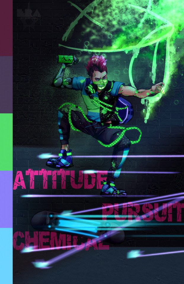
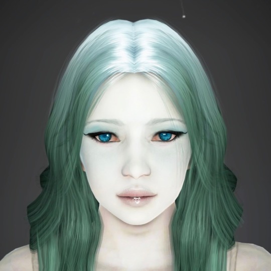
#the color palette for their designs is so far out of my comfort zone but I tired rly hard to get the vibe right 😭
Text
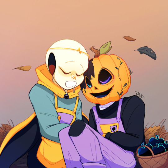
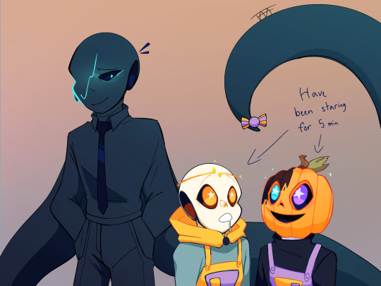
It’s @dadmareau’s Halloween au!
When I tell you I dropped everything for this the second I saw their lil’ matching overalls. Literally audibly gasped, it is the cutest thing ever and has held my brain hostage since.
also hooray bonus \o/
Kinda just a doodle I liked and wanted to flesh out. I imagine these two would like, lose their little minds anytime they had access to sweets, something which Mare would definitely find amusing and take advantage of lol
#komorebi#Komorebi Halloween AU#Sunbeam Dream#Moonbeam Nightmare#Dream sans#passive nightmare sans#Nightmare sans#Dadmare#the color palette for their designs is so far out of my comfort zone but I tired rly hard to get the vibe right 😭#also come on I had to do Moonbeams pumkin head design#look at my pfp#twas’ fate#obligatory art tag
655 notes
·
View notes
Note
Hi! So my questions for the Q&A are:
Will Powder and Silco meet in the future?
What's Powder's fashion style in the fic? Do you have any visual description of an outfit she'd wear in the revolution verse, or an aesthetic pic with the right feel?
Speaking of visual aids, I'm sorry but can you help me out identifying the support cast and who is who from the show? It took me an embarrassing amount of time to realize who Scar and Kai were from the show, and Eve I know is the pink haired Firelight Jinx shorts, but I'm a bit confused as for the others 😅
Favorite scene you've written so far?
Scene from the future you're most excited to write?
Can you share a future fluffy moment between Powder and Ekko we should be excited about?
What has been/will be the more taxing scene to write due to its political and personal importance to you?
I think that's it, sorry if I pushed the bar 😅
oh my gosh these are great lol and certainly provide a (more than welcome) challenge! I'll do my best!
the plan is that they get to meet at least once, not far from the end of the story. By then, things have gotten pretty crazy, and Powder has to appeal to Silco's dad mode
I feel like Powder would still be generally in the Jinx color palette, lots of pinks and purples and black, but also blue. Lots of tank tops and t-shirts, and she's pretty much always stomping around in combat boots. I imagine her wearing a good bit of denim. She has a favorite denim jacket, too, kinda bomber jacket style, totally swallows her up, that sort of vibe. High collars, chokers, etc would still be part of her look. I see her as certainly liking style but keeping it more practical these days to make things easy. Like an effortless look. She still paints her nails fun colors.
I figured I'd pull up some Mush pics to honor the originator of the reverse au design that started it all lol. These I think Powder would wear:


jacket would be kinda like this, though I'd do a lighter wash of denim:
no problem! So as far as the supporting cast is concerned, Sky is Jayce and Viktor's lab assistant. Megan's an OC, but they'd look similar (I needed someone to work at the hospital for chapter 3 and then I liked her and just kept her around lol). Gianna is based on the Firelight who kicks Caitlyn in episode 6 lol and is working on the mural in episode 7, though we never see her face. Ajuna is part of Ekko's lore from League, a friend who dies and he's unable to save. He's connected to the predecessor to the Firelight mural from the show. i just kinda threw him in there for fun because "The Revolution Will Not Be Televised" did the same. I think that's it for actual characters. The rest are OCs. I really ought to gather some visual references for them. Marnie is around Mel's skintone, for example...
UGH favorite scene this is so hard lol. I still really like all of chapter 2. I just can't help it. But since I've talked about liking it before, let me get out of my comfort zone. I think it's a little too hard to pick one, so I'll give a handful: the last section of chapter 3, all of chapter 7, really, the deal scene in chapter 10, the hospital in chapter 16, the balcony in chapter 18, the room key scene in chapter 19, and Caitlyn's conspiracy board in chapter 22 are all ones I'm pretty proud of or just enjoy reading because I think they're funny lol. I'm also proud of chapter 20 in general because plot twist!
I pre-write a lot of things, but as far as a scene I haven't written yet, I'm really excited to finish some stuff for Ekko's collection and there are some fun scenes of Powder really coming into her own. In particular, there's one that'll be quite a ways off where Powder sits down with Vi and they hash out a lot of the things between them, acknowledging the need to give each other space to live their lives as they've chosen to live them.
ahhhhhhh these idiots are gonna have so much fluff! What I will say is they should be dating within the next ten chapters (lest the story get away from me which is possible but I think by then they should be together lol). Before then, though, they're going to do some graffiti, fall into a fountain, and get all sappy in Ekko's car. And then after they get together they cuddle a lot and have a bunch of sex lmao. In a way, the physical relationship relates to the broader story in that Ekko helps Powder work on her confidence and articulating what she wants, which is similar to her journey of growing as a leader, a journey he also kicks off (though he kicked that one off by accident lol).
I think as the story keeps going it'll just get more taxing for me in general, if that makes sense. I'm always worried about coming off as preachy or heavy-handed. I'm probably overthinking things a lot. But I'd say that some of the setbacks the characters are going to face in pursuing their goals are going to be taxing in that emotional way. So far I think some of the stuff at the beginning was hard, and chapter 17 with Powder thinking about her hair was also hard, but it's kind of cathartic. The most I struggle with is how do I write a liberation story that works, because there's not a lot in the world for me to draw on in the way that I want due to international sabotage, etc. So I'm kinda taking these movements and trying to learn from their mistakes without feeling like I've got a perfect solution, because that's certainly not true, but I want to be hopeful. That balance of hope, a gesture at realism, tone and balance, trying to learn from the past, all of that can get a bit difficult for me.
okay, I think that covers it! These were so good for getting me to really think. It got a bit rambly at the end. I need to give that last one some more thought, so I might revisit it later. Thanks so much! 😄💙
13 notes
·
View notes
Text
ok i can't resist posting progress pictures already!!!
my new 2023 temperature blanket is on it's way and DAMN is it beautiful. i've designed a nice little color chart and am doing something i'm calling "abstracts" to make color tracking easier. at the beginning of each month, i'm making a small diagram of dots of the colors for each day, so that when i'm crocheting, i can just look at the next dot to see what color i need. it's much easier than having to convert temperature to color for every day. i'll attach a photo:

and yes, i'm using SEVENTEEN colors!!! this thing is going to be a beautiful, colorful monster. the palette is out of my comfort zone in the most exciting way.
more updates to come. can't wait for the pops of green and chartreuse coming in late jan and throughout feb (it was a cold one!!).
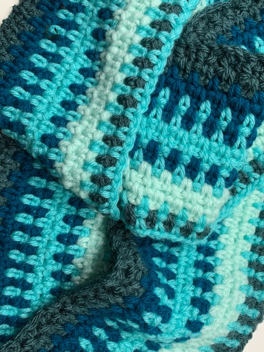
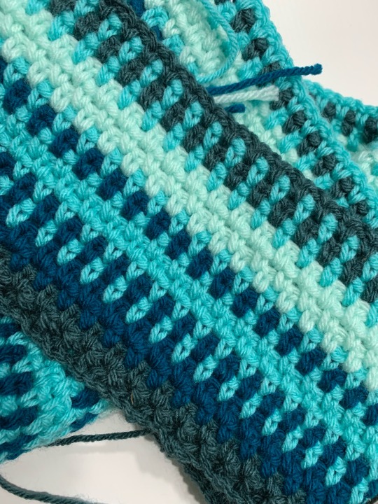
[ID:
The first two photos are closeup shots of my temperature using moss stitch. The colors so far are a dark muted teal, a brighter, greener teal, aqua, and a light seafoam green.
The third photo shows a diagram of all of my colors
labeled "Temperature Blanket 2023", showing the 17 colors I am using and the degree range correlated to each. The colors range from chartreuse, to teal, to blue, to purple, to orange, and finally to a golden yellow. To the right is a small diagram labeled "January" made up of dots of colors representing the colors needed for each day. ]
8 notes
·
View notes
Photo

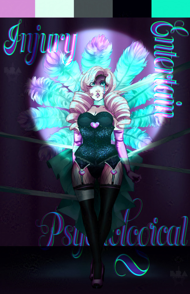
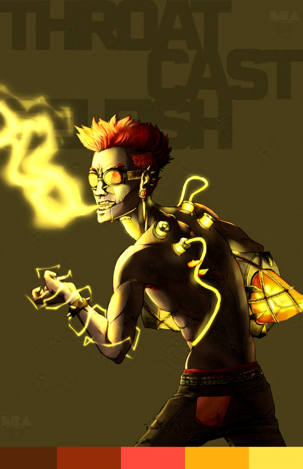

Been doing this thing in my free time lately where I design a character based on 3 randomly generated prompt words and a color palette. Here’s the first set so far! It’s been a ton of fun and I’m trying to get more out of my comfort zone as I go on.
#2022#original#character design#character design challenge#digital art#artists on tumblr#color palette
5 notes
·
View notes
Text

Chapter one of the textbook goes through the history of type as well as including other big events in history on one timeline. I guess I had never really learned much about the history of some very common typefaces still popularly used today which really shocked me how old some of these typefaces are. Garamond named after Claude Garamond a designer of old-style French typefaces was during the Renaissance then Caslon was used by the British Empire starting in 1720 and Baskerville created in the 1750s. I was just so shocked to know that some of these typefaces go back so far, I guess I assumed they were mostly created in the 19th and 20th centuries not this far back. I found this history of type really fascinating as the periods these typefaces were made place them as little pieces of art history in a way that I guess I had never really considered type to be before.
This week in class we started to hit the ground running on our projects, starting off with a festival branding assignment. I created my mood board this week and began brainstorming. In class, we pitched our ideas to a small group and I got some good feedback. I am planning on doing a women-directed film festival for my festival brand but am a little torn between that and doing an 80s new wave festival, however many of the bands that would be headlining are either not around anymore or are very old so I am not sure if I want to move forward with that idea. I wanted to do something a little more edgy and bright and electric feeling than what I usually do and step out of my comfort zone by not doing something as simple as an indie festival with a very common color palette that seems predictable. I want to get creative and really play around with mediums and add a sort of subtle edginess to this with maybe some spray paint and duct tape while still keeping it clean and professional enough it could be for a film festival.
0 notes
Text
Process Blog Six
Reading Response:
Chapter Seventeen (pages 276-291) is about user experience in design, and its influence in making good design work. I have similar thought on being knowledgeable with user design as I did with interface design. Understand both can help to make more efficient and streamlined design work, as well as making the process of using designs to create a project digitally quicker for everyone involved.
Chapter Eighteen (pages 292-298) is about programming and its ability to improve work flow when a designer is programmer-savvy. As a designer who has a passion for programming, I can definitely begin to see the appeal of hiring a designer with programming knowledge. This is especially true in fields of design that are in high demand. Having a proficiency in programming can help to push over the tipping point of gaining or losing a job opportunity.
Chapter Nineteen (pages 301-327) is about design and art education, and its importance in producing competent designers and efficient design work. I may have disagreed with this point about "needing" some sort of formal education in order to be a good designer when I was at the beginning of my design journey, but now at my fifth year of designing I definitely feel as though formal education makes a significant difference in skill and the production quality of design work. While formal design education isn't strictly required, it helps to fast track learning design, and it gives a well structured environment with peer feedback in order to force designers to create designs, especially ones outside of their comfort zone. If I hadn't taken all of the design classes that I've taken so far, then I wouldn't have found some of my favorite areas of design.
Reflection:
This week's assignment has been about preparing our portfolios for out final projects. I have been focusing on gathering final images, inspiration images, and as many clean looking process images for each project as I can. I have also been looking at and thinking about the possible layouts I can use for the portfolio, as well as color palettes and styles that might look good with all of my works in order to elevate them, but not take away from their designs. I plan to possibly sketch out some layouts for the pages in order to determine the best layout to display the many images that I plan on including.
0 notes
Text
chiaroscuro
artist!Robert Plant AU one shot.
a/n: this really started out as a song I wanted to write. But I knew I had to turn it into a longer writing!!
themes: fluff, mild implications of nsfw and tw: childhood trauma.
summary: in which Y/N becomes a muse for Robert, a landscape artist in more ways than one. (Man, that summary is so shit but let's roll with it)

pairing: artist!Robert Plant x fem!reader
chi·a·ro·scu·ro
the treatment of light and shade in drawing and painting.
an effect of contrasted light and shadow created by light falling unevenly or from a particular direction on something.
"Lean back for me a bit more, darling. That's right, relax."
As she moves, the old sofa creaks beneath her. Chilled air gusts through a partially opened window, making her shiver and sending miniscule bumps all over her bare skin. Her eyes drift over the fixtures inside the cozy cabin, illuminated by an outmoded oil lamp situated on the man's table. Several tiny moths were floating around it as the flame wavered ever so slightly from the breeze.
Scattered were all paintbrushes and smudges of paint were messily smeared all over the table. A round board was placed so close at the edge (one she heard him call before —a palette). In the middle is a rustic cup with half-empty, now cold tea. But a paint-smudged hand grasped on its handle and swiftly brought it over to a mouth.
Then her eyes met his.
His frizzled, curly blond locks are pulled into a disheveled bun. One he pinned up so carelessly with a thin, unused paintbrush as to prevent it from obstructing his view but a few ringlets managed to escape and are now framing his face.
Ivory-colored shirt, a few buttons undone to reveal smooth skin of his collarbones which were also marked with a few shades of paint. Some scattered across his jawline to his cheek.
Lips are pursed and eyes are pulled into deep concentration, they are set into a particular part of her. As if to capture the exact curvature of the crease on her waist.
Salient was the cleft on his chin and the sharp edge of his cheekbones by the incandescent light lent by the lamp, making him look like a contrast between sinister and elegance.
He dipped a brush and carefully made short strokes on the canvas, pausing every now and then to look at her.
The sun was setting and the sky was shaded a dull gray, providing so little of brightness which seemed to have darkened even more being situated in a lush forest.
Many months ago at this time of the day, she would have just been getting up from her sleep. Wake up and get ready for a long shift. It was a routine she had gotten so used to every day.
Take a bath. Eat. Pick out an outfit. Put on makeup. Be into the persona.
She would become a completely different person as soon as she stepped into the establishment she knew for as long as she moved into the town a few months ago.
From having to move into different cities and using different names to hide her identity. All of it to escape the filthy and haunted ghost of her past.
Screaming. Glass breaking. Bruises. Slamming doors. All of the things a child shouldn't have to go through. She took a risk and ran away from it.
And here is where she ended up thirteen years later.
Lacklustre eyes unmoving as they steadily stared back at her in a blurry mirror inside the changing room. All the girls' chattering seemed to have been muted and faded in the background as she gazed at her reflection. She picked up the small item in her hand, before taking the cap off and swiped the crimson lipstick across her chapped lips, creating a thick shade.
"Y/N, you ready to go?"
She turned her head back to Don, the club manager. She smiled and moved her head in a single nod.
“Sure, Don. Just give me a short moment”. She adjusted the strap of her black velvet dress and walked on the familiar, dimly lit hallway. Her stilettos clapped quietly on the floor as she padded and stopped in front of a red curtain covering the doorway from the side to the stage.
"How's it going, folks? Alright, alright. I'd get right into it. This is the moment you've all been waiting for. The crowd favourite, slithers like a python, mistress of the night; Marilyn"
Then, she waited as the main lights switched off and took her cue to enter as smoke filled the platform. Coloured lights gleamed right through. She situated herself right in the middle then circled her hand on the pole as the first note of the song started to hum quietly. Like a distant patter of rain—calm before the storm. Her hips moved into the rhythm and fluidly sneaked around the pole as the cloud of smoke started to clear out. Gazing into the crowd of men, her blood-red lips quirk into a smirk.
It was the only time she knew she had complete power and control. And she relished it, savoring the potency.
Her hands smoothed all over her now slightly perspired skin as men clamored and hooted for her. Bills were haphazardly thrown into the dancefloor. Something that she wasn't used to when she first started, it made her feel cheap. Dirty. But her routine carried on almost every night, she eventually got used to it and had even grown to like it.
Then she spotted him.
Big ball of golden hair illuminated by stage lights. He was situated amongst the sea of predators, his eyes followed the fluidity of her movements. But what struck her the most was the way he was watching her. It wasn't shadowed by lust, but more of an intense wonder and curiosity. It was as if he was memorizing each part of her curves, but for another purpose.
Her gaze somewhat mirrored his. He definitely wasn't strange-looking. Hell, he might have been the most beautiful man she has ever seen. He didn't belong to a place where no good men wander around. Both his beguiling beauty and aura was completely out of place for such a place like this.
The song then came to a stop. Her number was over but her eyes remained locked with his. It was only then she came back to consciousness as Don's voice boomed into the large speakers, signalling the end of her performance. She collected the bills scattered on the floor and walked off the stage, throwing a last glance into the crowd as she took her exit.
He was gone.
He wouldn't show up for a couple of days. She was sure, of course. The moment she steps out, her eyes would already be skimming through the lounge, and would sigh in disappointment if she didn't spot any sign of him.
"Have you seen your mysterious man yet?"
One of the girls she was closest to, Hershey, asked as she counted the thick block of bills on her hand.
"He wasn't out there tonight"
"You could have been hallucinating. Anyway, you told me he was 'like an angel'"
Hershey laughed, mimicking the way she had said the last part with a breathy tone and added, "Or could have been disappointed in your dance number, ran away and swore to not step a foot into this place again"
She stopped momentarily, chuckled lightly and sighed, "You may not be far from the truth but we'll see."
Then he would be there the next night, positioned right at a table at the back. His curly locks gave his identity right away, with his elbows propped up and fingers poised against his chin, bearing the same gaze.
Later that night, he'd be waiting right outside of the club.
"The show was spectacular."
She tilted her head to him, nodded and smiled.
"Thank you."
She wasn't sure how it ended up with her sitting on a stool inside a cozy 24-hour operating diner so late at night, chatting with her "mysterious man" late at night, who introduced himself as Robert. He was apparently a landscape artist and has traveled the world where he finds inspirations for his works.
"The best place I have ever been to? Hm. I'd say Machu Picchu, set in the high mountains of Andes in Peru, above a river called Urubamba. I had to hike all the way up, and you could see the breathtaking view when you reach the top."
"That does sound very lovely." She sighed wistfully.
"Have you ever traveled anywhere outside the country?"
"Oh no, I have not. I move to different places a lot but I've never gone out, never had the chance to."
"Ah, you should! It's wonderful."
She nodded, "Do you only do landscaping?"
"Well, no. I do a little bit of abstract art but I focus mainly on landscaping. I was thinking of expanding more, though. Maybe portrait, or nude art."
"That's a good idea. An artist has to come out of his comfort zone and be able to become great."
"Yeah…", he trailed off, as if lost in thought. "I hope this doesn't come off as strange or I as a creep. But may I ask you to be my muse? Don't worry! We'll only do portrait." He added the last sentence quickly.
She tilted her head to the side and looked at him, her brows furrowed deep in thought.
"You don't have to s—"
"I'll do it."
A few days later, she was again popped up on a stool inside his flat just a few blocks away from the club. His place was spacious, but had a very rustic feel to the interior design. A few souvenirs from different countries were neatly placed on a shelf and most of his paintings were hung stylistically on the walls (in which she stared at in complete awe for what she could tell an hour each painting until he had to drag her away to his studio)
Her fingers fiddled as she tried to stay still under his calculating gaze. She never had much problem with how she looked and never had insecurities. Perhaps she just didn't care enough to be insecure. But at that moment, she thought of how she must've appeared to him and if she was good-looking enough to be an inspiration for his art.
"Are you alright there?"
"Yes! Yes, I… Yeah I'm alright."
His hand stopped and placed the paintbrush on the table. "Are you sure? If you're not comfortable or if you need a break, we could stop for a bit."
She shook her head vigorously, "No, it's okay. Don't worry."
"If you say so."
She let her eyes travel from his bare foot, to his khaki trousers, to his satin shirt with top three buttons undone, to his face. Oh, his gorgeous face. It was pulled into a deep concentration as he stared at his work, giving her some time to study his majestic features.
His eyes flickered to hers as if sensing her stare and playfully frowned, a small smile curled on the side of his lips.
"What?"
"What?"
He laughed, "You were staring."
"I was. Is it a crime?"
"No, I wouldn't say it is." He said with a teasing edge to his voice.
It was their arrangement which they stick to a few times a week. On her day off, after work if she wasn't feeling too exhausted. There was an obvious attraction lingering inside the room of his small studio but none of them acted upon it other than just casual flirtations thrown around. He was a perfect gentleman and had always been accommodating. A couple of times he would insist on paying her in which she would always refuse to accept.
"The tea you make for me is enough for a payment." She had jokingly said. "Do not worry about it, Robert. Really, it's okay. I'm making enough from my job."
One night, after their sessions, they had too many drinks and bottles were littered over the table along with his paint brushes which had long dried of paint.
"Tell me about you, Marilyn. Mistress of the night, who apparently, slithers like a python." He mused, mentioning her alias. His glossy eyes filled with mirth.
She snorted, took a long swig of beer and swiped the back of her hand across her mouth.
"Marilyn is… Nobody. I'm nobody. I came from somewhere that in my mind, ceased to exist." She stared ahead. "I ran away from home. Who calls it a home anyway?" She laughed humorlessly.
"My parents fought a lot. They spent so much time fighting, they didn't even have time for me. Looking back at it now, I could have just preferred that. But then, they turned their anger towards me." She sniffed and quickly wiped the salty tears before they even slid down to her flushed cheeks.
"I went to my grandparents. They loved me so much and I loved them so dearly. But they were not my parents. Eventually, both of them passed away and I was left on my own. But I was eighteen. I didn't have to go back to my parents. So I went to different cities, finding places where I could feel like I could fit in. Looked for jobs, and then I ended up here. I made friends and I have my own place, but it still never felt like home."
He was quietly staring at her, and the silence was deafening. Then he lifted his free hand to her face and ran the back of his index finger to dry her cheeks. Her hand caught his and brought it to her lips and placed a soft kiss.
"But with you, it feels… different. I like hanging out with you. I like being with you. You feel like home to me, Robert."
Her voice echoed softly as he took his time to reply. But he didn't, instead, he leaned down and sealed his lips against hers.
He layed limply on top of her body as he shuddered from his release. Both tried to desperately catch for their breath as her hand smoothed down his back and the other combed through his damp locks. He slid out of her and dropped beside her, not too long before he enclosed his arms over her and pulled closer. He catches her lips on his in a lazy kiss and smiled.
"You feel like home to me too, Y/N."
Her heart soared and nuzzled her nose against his.
"I want to paint you like this. May I? You are so beautiful. In light and in shadow."
She blushed, "Yes, but right now? I'm tired."
"No, no. We'll do it tomorrow. I'll take you somewhere." His warm breath hit her skin as he whispered.
"Where?" She whispered back.
"Well, I'm not telling you that. But it was what I helped my Father build when I was younger. It's somewhat like a special place for me, and I want you to see it."
He gazed at her as he waited for her to respond.
"Okay."
Under the light of the lamp, she peers at him under her lashes.
"Don't look at me like that."
"Mm? I have no idea what you are talking about."
"You know what it is. Cut it out or I'll never get to finish this."
She huffs. "You're no fun"
"I can prove you otherwise in a few minutes."
He continued to do his finishing touches and leaned back to admire his work.
"That isn't too bad. But nothing compares to the real art."
"And what might that be?"
"You, my love." He stood up, walked over to where she was, placed his hand at the back of her neck and pulled her to him.
"I've been waiting for this for hours."
"I've been giving you hints and you insist on finishing your art."
He chuckled. "Of course I had to."
His fingers danced their way from her sides to her hips, rubbing along the marks littered across her skin.
"Are you ready to see it?" He murmured against her neck. She shudders as she nodded, giving their playful banter a break.
He bit her earlobe softly, "Okay."
He walked over to his canvas and carefully turned it around to face her.
She gasps.
.
⭐ writings list ⭐
.
taglist: @jonesyjonesyjonesy , @princesspagey , @ritacaroline , @jimmys-zeppelin , @rebel-without-a-zeppelin , @reincarnated70sbaby (if you wanted to be added in, let me know 🤘🏻🤗)
#robert plant x reader#robert plant#led zeppelin#fanfic#led zeppelin fanfic#led zeppelin imagines#john paul jones#john bonham#jimmy page#fluff#cabincore#rustic#artist!au
71 notes
·
View notes
Text
Darryl Carter Review! Part 1: The New Traditional
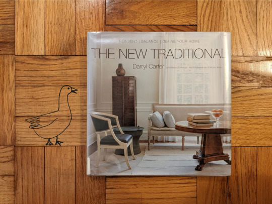
The New Traditional by Darryl Carter
With Trish Donnally
Photographs by Gordon Beall
Clarkson Potter Publishers, 2008
I’m venturing out of my comfort zone in both form and function. This book is from 2008, so not the freshest on the interior design scene. Additionally, the sophisticated style is far from my personal taste. Regardless, I also thought it’d be fun to have a two-part review, rating Darryl Carter’s two books. Carter is Black and male, and I’m trying to include non-white cis-female authors in my reviews. I was going to do two books in one post, but I think each one stands on it’s own. This post will address The New Traditional and next time, I’ll review The Collected Home. Welcome to Part 1.
This large-scale, hardcover volume is fit for a coffee-table, with impressive photos and a very intimate writing style. Carter lauds a classic and calm sensibility, as he describes it, and repeatedly refers to logic. When I took a breath from the fantasy, the book did feel out-of-reach. Old money vibes. Overall, I award this book 5 out of 6 worldly geese.

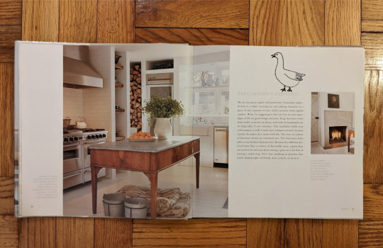
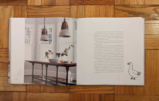
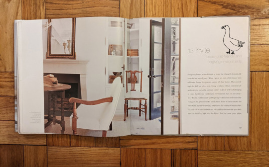
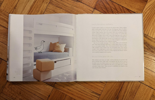
The New Traditional is a very refined aesthetic catalog guided by precise and thoughtful prose. Three subtitular key phrases span the top of the front cover: reinvent, balance, and define your home. The book really carefully details a design philosophy, pulling from anecdotal experience and the discipline of craft. Carter does an excellent job articulating this new approach to a traditional style, emphasizing in particular a mix of modern and antique. Elegant images of dining rooms and studies, in the limited color palette of warm neutrals, free from clutter or disarray, upon closer inspection, reveal a very intentional composition of old and new, worn patina and sleek smooth surfaces.
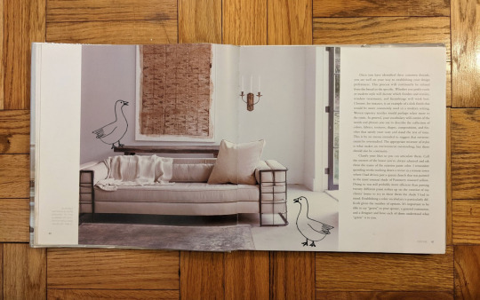
As I mentioned, many of the rooms portrayed aren’t my particular style. Carter enjoys antique mechanical tools and centuries old figurines, for example. The rooms are also pretty sparse and formal. I still was able to enjoy him narrating countless examples of his design reasonings, what he did when a challenge presented itself, how he put a fun twist on a found piece of furniture. This book is generous in sharing knowledge, but I must be clear: he fancy. But he comes from traditional arts schooling (and law!) rather than a scrappy, DIY ambition. So yes, he’s dealing with nicer homes and nicer stuff, but the tone of the text (which can also get pretty fancy) is warm and insightful. And, I mean, the pictures look like they’re from a museum!
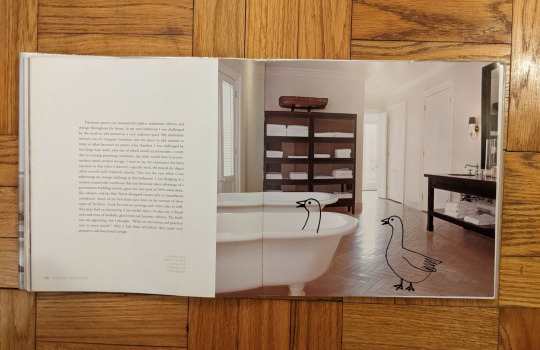
I think the reason I’m okay (I think) with this clearly well-funded designer’s interiors is because the written content expresses a tremendous amount of care and appreciation for the materials of the objects in the home. Carter is keen to preserve antiques and to experiment on pieces that aren’t. He hopes that any furniture piece or any room is not too precious to go unused, which is a very precious insight. He consistently encourages his readers to lean into their own style, to find harmony and use cooperation to achieve balance. I love how he playfully uses pieces outside of their intended function: using a dining table as a desk, altering a couch arm to hinge down for more lounging space, putting shuttered doors in front of windows for the illusion of a terrace. One of my favorite nuggets of his advice is to use the reverse side of a rug, as it preserves the rug and shows more muted, abstract colors which is to my taste. His philosophy does not seem to identify with excess, but rather with having a hand in making home feel like home for those living there, for the things they actually do… his clients just have money.
Small critiques here. Firstly, most of the pictures were not on pages nearest the text describing them. Carter would paint such a vivid picture, I would think to myself, wow that would look cool, and then 20 pages later there it’d be: the picture he was describing! So I don’t know what the editing team was doing there. A second thing is a question: there were like 800 (hyperbole) ancient Chinese figurines mentioned, and I hope those clients were Chinese. Rich Westerners just hoarding artifacts from non-Western cultures is whack. More on this in Part 2, as The Collected Home goes into more depth about obtaining collections.
Finally, I just wish someone who seems to be ridiculously classy would also care about using more sustainable resources. So many times he’d suggest using synthetics and other machine-made materials because of all the benefits that technology has come to provide (mostly durability). I feel a little sad, thinking, of course he can recommend that. That’s why people pay him a lot! For the result! Even if getting there isn’t green.
In the end, 5 of 6 sumptuous geese for Darryl Carter: Part 1. I was very pleasantly surprised and actually enjoyed The New Traditional even though it wasn’t ‘my’ style. On the surface, Carter’s other book, The Collected Home, looks like more of the same, but I could be surprised again. Let’s see what more there is to see in Part 2!
With loving curiosity,
DesignMod
#designmod#darryl carter#wehavethoughts!#wht!#reviewblr#book review#the new traditional#traditional style#interior design#furniture#living room#dining room#antiques#antique collection#bedroom#the collected home#repurposing#balance#reinvent#coffee table book#patina#texture#trish donnally#gordon beall#clarkson potter publishers#clarkson potter#scale#old and new#modern#sensibility
5 notes
·
View notes
Text
Aaaand that’s the last of these kiss prompts! One last one that I had @flamekeeperbellroc pick a kiss type for me because I need at least one where Skrael was givin Bells a kiss! Here is [Forehead] + some fluff to make up for the angst just now <3
--
“Bells? Are you alright?” Skrael gave a gentle knock on their door.
He didn’t mean to hover; he really didn’t. It was just…
“You’ve been listening to… ‘Mr. Brightside,’ on repeat for the last hour? It’s not-- a problem, per se, just--”
The sounds of The Killers turned less audible through the walls, and Skrael could hear shuffling inside their bedroom. As he was about to turn back to his own room, feeling horribly awkward, Bellroc’s door opened a fraction.
He whirled back to face them, quickly. As of now was his first actual sighting of them since the morning, when they’d grabbed their favorite 21 ounce mug, filled it near to the brim with barely-lighter-than-black coffee, and stalked back to their room without a word.
Standing in front of them now, he gave them a once-over, worry growing. He knew what they were working on-- it was the project all three of them had to turn in by the end of the semester-- and while it wasn’t quite that Skrael was unbothered by the assignment where they were, it was just… Bellroc had been having a bit of inspirational trouble.
The assignment had all three of them out of their comfort zones, to be entirely fair-- randomly assigning them a classic style prompt.
But Nari had been the luckiest of all three of them, getting “historical vintage - mid-60’s”; it was different from her modern designs, but it still fell rather squarely in her skill range. She adored making flowing silhouettes and using lighter colors than either Bellroc or Skrael favored, to bring out a more natural look on her models. The hippie movement of the era would support her concepts perfectly.
Skrael, on the other hand, who had managed to end up with “black tie,” wasn’t particularly struggling either, but he did have to consult the professor on more than one occasion about toning down the hints of alternative fashion that had slipped into more than one of his drafts.
Bellroc, however, had ended up with “sportswear.”
And it wasn’t that they despised sportswear clothes. They understood that the style served a function that was in high demand. They even held a certain respect for designers that could make their entire careers in sports fashion.
But it was also nearly the polar opposite of the formal, campy, vaguely punk designs that they wanted to make into their brand.
So it had been difficult.
Bellroc raised an eyebrow at Skrael’s sudden silence, and before he could try to remedy that, they turned to walk back into their room. They left the door open, though, so Skrael knew he was being invited in.
This was furthered when they mumbled, “shut the door behind you, please,” as they sat back down at their desk.
He complied, grateful for the excuse to do something, as he gathered his thoughts.
Skrael started with something easy, to breach the subject’s surface, but only just. “So... How’s the project going?”
They shot him an unappreciative look.
He winced. “That bad, huh?”
Bellroc exhaled through their nose. “Yes.” It sounded nearly physically painful for them to admit that.
Skrael softened, walking over to place one hand on the back of their chair, and the other on their desk, as he leaned over to get a look at what they’d been doing.
His brow furrowed. “Wait. I thought you said it wasn’t going well. These look great!”
They gave a frustrated groan. “They’re fine, I guess, but they feel… typical. Boring. There’s nothing about them that would stand out in a Nike store.”
Skrael hummed. “Well, I suppose that’s true. But do they have to stand out? Don’t you want them to look like they belong there?”
“Maybe if it wasn’t Overton. But you know how he is. He’ll dock points immediately for unoriginality.”
Skrael gave a quiet sigh. They were right.
“Hm. Okay. Well. Let’s brainstorm. Wanna bounce some ideas off me?” He asked.
Bellroc considered the idea, and Skrael gave them one more nudge, “I don’t mind.”
They looked at him skeptically. “You’re not busy, too?”
He shrugged. “Nah. Overton and I have another draft meeting tomorrow, so I’m at a good stopping point.”
“...If you’re sure.” They hummed.
“I am. Now. What do you have so far?” He asked, glancing down at the various pages scattered around their desk. “I see these, which I still think look great,” he gestured to the top page, “But how are the others?”
Bellroc gathered the pages into a stack and passed them off, “Here. Feel free to rifle. I’ve stared at these for way too long today, anyway.”
Skrael accepted the stack with a reassuring smile, before he flipped through them slowly, taking it all in.
“Hm… Okay. I like pages one, three, four, five, and seven; I think those are your strongest pairs so far. Have you considered trying shoe designs?”
Bellroc nodded, “Yeah, but I’m saving those for another day. I wanted to get the clothes done first.”
“Right. Well, the jacket on page three is really nice. I highly recommend making that one of the main statement pieces. The pants on page one are good, too, and… I mean, honestly, everything on pages four, five, and seven seems nice to me, too. And none of these have been colored yet, so I’m sure you could do something with that. Maybe experiment with some various palettes? Add prints or patterns to some of these?”
They nodded, gesturing for him to hand back the sheets. He did so, and they scribbled out the notes he’d given on the back of page one, adding them to a long list of crossed out brainstorm ideas that were already there.
Skrael couldn’t help a small, fond smile, before they glanced back up, and he schooled his features into something more neutral.
“I was thinking about some prints on the shirt; they might add something dynamic to them, make them less flat. It’s just, there’s only so much you can add to workout gear before it gets in the way of actual physical activity.” They grumbled.
“Can you not do athleisure wear?” Skrael asked.
“Overton said not to put that many of those pieces in it. He’s looking for functionality.”
Skrael frowned. “Oh. Well, okay, so, not too many distracting prints, but a few would be alright, right?”
They nodded. “Yeah; a few. I’ll probably rely on patterned fabrics, though. Lots of geometrics.”
“Ah, yeah! Geometrics are nice for workout gear.”
“Mhm. Thing is, there’s only so many hexagons you can apply to something before it gets repetitive.” Their voice was wry.
Skrael snorted. “True.”
Silence fell in the room, then, as they both tried to brainstorm further ways to combat the unoriginality problem.
After a few moments, Bellroc finally chucked out an idea, and Skrael picked it up and ran with it, leading them to a new idea, which again allowed Skrael to follow it to another one, giving Bellroc even more creative inspiration. They carried on this way for a while, Skrael eventually ending up in a pulled up chair next to Bellroc at their desk, as they traded concepts back and forth, occasionally throwing out ridiculous ones, just to get the other laughing.
Finally, Skrael suggested, “Maybe you could mess with texture? Or some different-looking fabrics?” He perked up. “Oh! How about--”
Their eyes went wide. “Reflective metallics?” They finished for him, also sitting up straighter, and he flushed.
“Have you already considered that one?”
“No, but I…”
“--like those kinds of flashes when you need to spice up a piece. Right. That’s exactly why I was gonna suggest it.” he caught on, smiling.
“Exactly.” They grinned back. “Well. This has been a very successful session. It seems I should have started the Mr. Brightside loop, earlier, hm?”
Skrael laughed softly, “Maybe so. Do you think you’ve got enough concepts now?”
Bellroc beamed. “Yeah. Thanks to you.”
Skrael shook his head. “Thanks to your brilliance.”
Bellroc got a funny look on their face that Skrael couldn’t quite identify, but to avoid an awkward silence after his… disarmingly honest compliment, he said, “So. Can I steal you for a break, now?”
Bellroc looked a touch relieved at the subject change, before a sly grin crossed their face. “Mmm… if I was convinced…” They shot back.
“Well…” Skrael’s eyes turned mischievous. “We haven’t had a bad horror movie night in a while.”
“Oh, that might just do it.” They smirked.
Skrael resisted the laugh that threatened to break his demeanor, as he playfully said, “I know what you like.” He winked.
Not one to be outdone, they matched his tone. “You sure do, darling.”
“Only the best for you, my dear.” Skrael stood back up, but before Bellroc could stand, too, he moved one hand to their shoulder, looking them in the eyes.
“But, first. On a serious note, are you sure you’re feeling up to it? I won’t force you; I just think a break will be good for you.”
Bellroc stared into Skrael’s eyes, searching for something, before their face eased into a softer expression. “...Yeah. I’m sure. I feel a lot better, now. Which is also thanks to you.”
Skrael was no stranger to their hugs, so feeling their arms loop around him, he adjusted quickly, reaching to wrap his arms around their shoulders, placing one hand on the back of their head.
“I’ve got your back, Bells. Always.”
Neither of them acknowledged the soft brush of his lips against their forehead, for fear of breaking whatever had just passed in the air between them, but as Skrael’s chest warmed, and Bellroc’s face heated, they both allowed themselves a hidden, indulgent grin.
#:D#fashionista how do you look? - rival designers au#P. S. y'all have exactly one guess to guess who gave Bells that mug ;D#(it is not a trick question)#(it's exactly who you think)#ok to rb#(forgot to put that tag on the other one but you can on that one too!)
8 notes
·
View notes
Text
Favorite Art Supplies of 2019!
Hello everyone!
2019 is nearly over and I thought to do something I haven’t done before - talk about art supplies! Have you met an artist who isn’t going bananas over art supplies? Nether have I and I’m no exception!
This year was kind to me and I got to try so many different things. I feel in love with drawing all over again! I’m so glad I went out of my comfort zone for some things, I kept what materials worked for me and gave up on those who weren’t my cup o tea without feeling remorse. Now my cousin’s daughter enjoys a huge bag of watercolor brush pens, pastels, chalks and other goodies I so generously donated. :’D
But without further ado, favorite art supplies I discovered in 2019, GO!
1. Posca Pens

I saw various artsy youtubers use these but they didn’t seem like something I’d enjoy. Boy, was I wrong! I absolutely fell in love with the these acrylic pens. I felt like I had to push my creativity with how I build shapes and simplify a lot of designs in order to properly use them. It was so much fun and I remember doing artwork after artwork the next day after I got them. I bought a few extra, more thin ones after which I use for finer details. They are so, so vibrant and just make me happy! The fact I can’t really go into too much details with them takes so much pressure off the artwork and just makes me enjoy it a ton more.
2. Paul Rubens Watercolor - Custom Pastel Palette
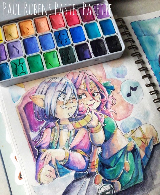
This custom palette I saw on aliexpress and thought it’s not colors I’d use but I found myself thinking about it for weeks until I finally ordered it. The paints looked like a cute little candy box! The colors were so creamy, mostly opaque and they felt like some mix between gouache and watercolors. None of them were chalky after they dried and I didn’t see any granulation. I absolutely love, love, love them! They layer great, they go great with one another, I adore this palette and used it plenty for these dreamy, fluffy, lovey dovey pictures. Definitely going to order another one if I end up using all of it, or try to re-create it with my own refills.
3. 100% Cotton Watercolor Paper
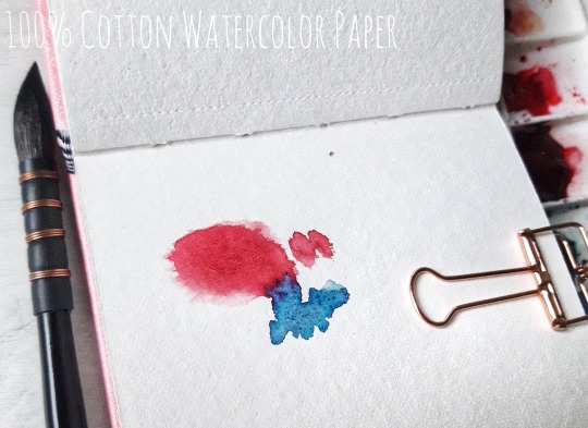
That’s a bit embarrassing to say but as someone who was new to watercolors but practicing diligently I um, discovered this year that the watercolor paper I use may not in fact be the best watercolor paper to use. I was so confused! I saw a video called “It’s not your watercolor, it’s your paper” where the difference was explained. Needless to say I was very, very surprised and very very curious! I ordered some small and medium sketchbooks with 100% cotton watercolor paper and me, oh, my!! The difference is insane! It’s hard to pick any other watercolor paper now that I’ve tasted the sweet 100% cotton one. It soaks so much better, it keeps the colors so much more vibrant and the way the colors bloom... ahh!
4. Spectrum Noir Illustrator Markers

This brand of markers I discovered through a Scrawlbox subscription box a year or so ago. I loved the colors but the marker nib frayed so fast. Later this year I read they upgraded the markers with different brush nibs and I saw my local art store had them there. I bought two colors and now I have about 20. They layer so well, they blend absolutely fantastic and the nib hasn’t frayed at all after using them for about 5-6 drawings so far. They are definitely replacing the Touch markers I was using them until now. Both brands being amazing, it’s just that I find the brush nib on the spectrum noir to be more soft, more flexible while Touch are bit harder but also feels sturdier. At the end it’s up to the artist’s preferences. Some prefer sturdier nibs and I do too to an extend. I think perhaps working with watercolors for a while made me prefer the softer ones? Hmm!
5. Erasable color lead mechanical pencils
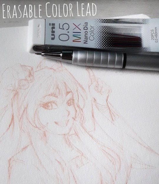
Another thing I had no idea existed, ahem! I saw people use erasable color pencils in some videos and got pretty curious, what was that!? I saw none sold locally so it was another order from aliexpress for me. I got a couple of color leads aaand, I will likely not pick a normal pencil for a while lol.
Unless my drawing is meant to be in darker tones, where I’d imagine a regular pencil would be nicer, color lead did wonders for my marker drawings! Absolutely in love and glad I got two packs of color lead to last me for a while! :D
And that’s it!
It wasn’t a thorough review or anything, I’m sure you can find such on youtube. I just wanted to share my experience with new art supplies and maybe inspire you to try some as well or buy something nice for yourself that you’ve meant to but thought it’s not your kinda thing. Who knows, maybe it’s exactly your thing!
Thank you for stopping by, have a good week! 🤗
89 notes
·
View notes
Photo


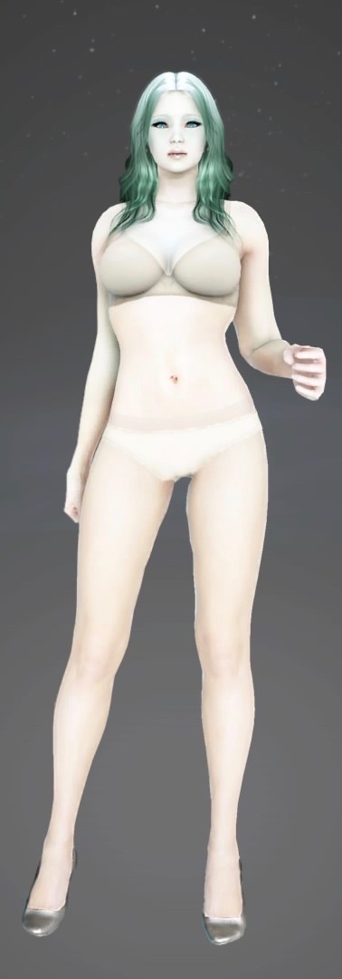
Archer is above, Warrior is below!
I forgot to do Kunoichi straight up so still have one class left, but this is otherwise every class with a couple extras!
I wanted to try to push myself out of my comfort zone at least a little bit, but this pretty much confirmed that when I have to go with super buff dudes I will usually either play it down as much as I can or play up edgy/weird as much as possible. Times I didn’t do either of those things were a concerted effort lmao, like with the warrior on the very bottom and the ninja (second row from the top on the left).
Going from top left-to-right and down chatting under the cut!
Did one more hashashin, wanted to see if I could do a cool palette/more djinn visual if possible. I’ve done a lot of warm visuals so wanted to mix it up there.
The maehwa, her model was thicker set tbh and I wanted to see how fragile I could go. I knew I had other characters who are more thickset, so figured that would be fun too. Went natural with black hair but vibrant eyes/tried to soften her features with makeup.
The ninja is honestly the BUFFEST ninja body type I have seen possibly in my life, and I decided to play with that and just go full-beefy/as thickset as I could with a male model. Used more natural palettes at the same time because I hadn’t been using them as much.
The witch actually doesn’t go as thickset compared to other female body slider options, but I had fun regardless!
Quick comparison between her and the valkyrie:

For the witch, I waffled on what color palette I wanted for a while but ultimately settled on a very cool and ocean-y look! Again, partly because I have been gravitating toward warmer palettes overall but also because it just looked super pretty and was fun imo. ^^
The striker is the red-orange demonic looking guy. His face reminds me a little of a buffer Reno structurally, which amuses the shit out of me. It was fun going with a darker fiery look, although this is a case where I tried to go for lean muscle rather than the most swole option I could lol.
Valkyrie I wanted to go blonde, big boned, and give a sense of her being an imposing tank kind of? I also wanted to see how wideset I could make a lady character here and I’m pretty happy with the result!
I didn’t have a definite plan when I started designing the musa character, but he wound up reminding me of nothing so much as a Lovecraft protagonist who has seen some shit and I’m kind of okay with that lol.
The mystic I went full-orange because I normallh don’t, and I wanted to make her read cute and small and kind of fluffy.
Warrior, there were a few things that went in. One was that I wanted to give someone the spooky goat eyes lol. Another was that I like gold/blue contrasts. And another still was that frankly this is a tougher build for me, but spooking it up made it easier. I made a straightforward attempt afterward but if I’m stylizing for my own tastes I’d probably do something sort of like this? Still beefy but more lanky in a way.
The lahn girl I wanted to do pink and champagne colors lol, I was not complicated.
Blonde archer I went more traditional pretty boy and tried to weave in some moeh factor lol, and the blonde warrior I tried really hard to go as traditionally beefy, handsome, and lantern-jawed as I could. I felt a little like I’d cheated with the goat man lol.
But yeah, I got a tiny bit more to do I figure but this is overall what I’ve wrought so far! XD
2 notes
·
View notes
Text
I have eyestrain and it’s a grand old time
Downwell is a game it feels like I was destined to play eventually, because the first time I put it on my wishlist was years ago. Years before I knew I liked roguelikes, before I knew I could like any kind of action game, let alone one that uses the word “gunboots,” something about Downwell called out to me. I eventually removed it from my wishlist, deciding it was too outside my comfort zone to spend money on (despite it costing literally three dollars). Then enter 2021 and my obsession with game design analysis YouTube channels. Game Maker’s Toolkit has a whole video all about Downwell and its elegant simplicity, which I watched and was like “Heck, I gotta buy it now.”
I have almost thirteen hours logged in Downwell. Heck, I didn’t even realize. Runs are super short, even shorter than in Binding of Isaac or Nuclear Throne, so you don’t notice them building up on each other over time. And they do build up, because it’s really addicting. A great diversion for when I want to hang out with my mom in the family room but she’s watching The Sopranos and I don’t want to pay attention to The Sopranos.
Like with most other roguelikes, I’m noticing a wall that I can’t seem to get past. I’ve gotten a couple levels into the Aquifer a few times now, but even more often I’m still dying in the Caverns. Rather than getting to the end, I think my goal is going to be to play until I’ve unlocked every palette, because those are by far the best part of Downwell. I love changing the colors.
1 note
·
View note
Text
Artist Interviews (2011) - Sarah Mensinga
Recently I got a request to repost the student email interviews I did with some established artists back on my blogspot in 2011. They really did help me, and I’m even more amazed now, than I was then that they took the time to reply. So here’s part 1/3, starting with concept artist and writer Sarah Mensinga, whose thoughts on style are always at the top of my mind on the topic even now. :
[Sarah Mensinga] is an illustrator, animator, and comic artist who is currently taking time to work on her own graphic novel called The Wellington Division. I first read her work The Changeling in Flight, and I think her comics are lovely and endearing!

Interview
1) What sort of medium or programs to you use for your work?
I usually start with paper and color-erase pencils. I scan that and paint it digitally, usually with Photoshop, sometime with both Painter and Photoshop. I love the look of Illustrator, but I've never had the chance to sit down and really figure it out.
2) What are some of your favorite websites/magazines/books/publications for inspiration?
I add nearly every cool art blog I find to my google reader, which I try to check everyday. Most of the blogs I follow are conceptual artists in animation-related feilds. My newest discovery is ha.com, which is an online auction site. If you get a free membership, you can browse their lots and study high-resolution images of some fantastic illustrators. As far as books go, I have a huge collection of visual reference books. I love books on architecture and costume, most of all.
3) What was your favorite professional assignment that you've ever done?
I once got to design some Wizard of Oz dolls for some product pitch. I don't think the project ever materialized, but it was a lot of fun.
4) You have a really distinctive, painterly style has it always been that way? How did you get there?
Ha, it's a bit of a relief that you say that. I still feel that my painting is a bit unpredictable and that I'm not entirely happy with my process. I went to an arts high school and for my final year I focused on oil-painting and illustration. I think that gave me a pretty good foundation for learning how to digitally paint, but it wasn't until I started professionally character designing that I had to knuckle down and really learn how to digitally paint well. I realized that if I wanted my designs to catch the eyes of producers and directors who weren't necessarily accustomed to looking at line drawings, I'd better figure out how to make my designs look more like they would on screen. To learn, I asked friends who painted well a lot of questions, I did a lot of terrible paintings, I searched for tutorials and I studied the work of other artists I admired. I still do all those things. :)
5) What sort of process do you have? Do you work on many pieces at once or one at a time?
My process now is a bit up in the air, but that's just because I'm not doing working full-time. (My kids are very little and I'm home with them.) In general though, I do a fairly tight line-drawing and scan it. I usually look for some photo (often completely unrelated) to create a color palette, and often tweak it even further in photoshop. I do a rough painted pass, keeping as many things on layers as I can and then I save and tighten and polish. The polishing part always takes forever. :) I do often have several projects on the go, both story-related and art-related. I try to focus on them one at a time, though.
6) What do you do when you can't come up with ideas? How do you manage stress?
If I'm working on a professional project, usually I have enough direction from a client that it's not difficult to build on their ideas. But sometimes if I'm working on my own art and there is no deadline, I feel a bit lost. Often, I start pulling reference books down from my shelves and open them to random pages, looking for inspiration. Other times, I think about something I could draw that would make my daughter or husband smile. As for stress, I push through it! I'm definitely the sort of person that just gets more determined when confronted with something that is stressing me out. The more I work on it, the faster it will be done and the faster is will stop stressing me out. :)
7) How do you advertise yourself/get work? What works for you?
At the moment, I'm sort of anti-advertising. :) Since I'm home full-time with my kids, and trying to focus on writing, I don't really want to be inundated with freelance projects. When my kids are older, I'll probably try to go back to a studio because I like how social it is. Or at the very least, I'll look into getting an art rep. I'm terrible at negotiating contracts.When I do want to advertise though, I find attending comic-conventions with my portfolio and lots of nice business cards pointing to my website works very well. Being active on my blog, helps too.
8) Is your personal work particularly different from your professional work?
Yes. When working professionally, I often work on designs or draw subjects I might not otherwise. I think it's a good thing, it pushes me out of my comfort zone. My personal work usually revolves around stories I have on the go.
9) What's the best advice you would give a student aspiring to work as an illustrator?
Don't go looking for your style. The best kind of style is something that naturally comes into your work and you can't get rid of it even if you wanted to. That way, it's really, genuinely you, it will set you apart and it will be unique.Never put limitations on yourself. Never tell yourself "this is as good as I will ever get" and feel frustrated. Sometimes it feels that way, but as long as you try to stay positive and keep trying to learn, you will always be improving throughout your career and new doors will open, which is exciting! :)
She's so nice! I felt more comfortable asking her random questions. She wrote such long, helpful replies. You can find Sarah over here on Twitter and Instagram!
#long post#text post#artist interview#sarah mensinga#illustration#parts of this may be dated since it's been 6 years
177 notes
·
View notes
Text
AMA Transcript: Simple Melody
For our final AMA of Resbang 2017, @alliope, @bbbutterfingers & @daciafu stopped in to answer questions about their Resbang, Simple Melody! Here’s some of what went down:
Q: My first question for Allie is what inspired you to do this AU?
Allie: Well I've generally had the idea for an Over the Garden Wall AU for a while, not necessarily for SE, but as the first check-ins deadline was approaching I ended up rewatching bits of Over the Garden Wall and it just kinda clicked? Mainly I think it came from Crona's betrayal and Beatrice's betrayal and everything fell into place from there. I thought the eerie atmospheres would work well together! So I ended up scrapping my previous idea and wrote 3k plus a summary like three days before the first check-ins, rip.
Q: For butter/dacia, what went into how you decided which scene(s) to art?
butterfingers: HM well there was some chitchat when we started about what kind of work we wanted to do and I said that I loved the Boom comics covers, and then I shouted WHAT IF I MADE COMIC BOOK COVERS! and I think Dacia went WHAT IF I DID BACKGROUNDS and I guess we just approached it as if we were doing something comic-y haha!
Allie: You two were the power duo.
daciafu: I've always been in love with the style of the backgrounds of OTGW since that's where all those cozy and spooky feelings of fall and the Unknown really shine and I'm honestly HORRIBLE at designing backgrounds so I wanted to take the challenge and push myself to get better! Mimicking other people's styles really helps me break down how they make their choices and teaches me how to make things look Decent so I was super hyped to pick up the OTGW style! And then when Butters and I were trying to figure out What Do and she said she wanted to tackle covers, I decided to do background-heavy scenes. 😊
Q: What is generally your guys’ process (writing for Allie and arting for butters and dacia)?
Allie: Well, I wrote in little scenes, like I would get an idea for a scene and just go for it, the fic wasn't at all coherent until maybe a few days before posting. This actually posed a problem since linking scenes took longer than I thought it would. Because I had most of my scenes written, I thought I had more finished than I really did. By the end of Resbang, I had 56k written but only 20k remotely post-able. I'm a super obsessive planner though, so my whole fic was outlined in detail early on, which was nice cause I knew what I was doing lol
butterfingers: I loved going through Allie's notes, I was always excited to see how they'd connect the dots! My art process is as follows: scribble something, put it aside, look at it a lot throughout the day with the thought that maybe I can surprise myself into seeing something new, find something I hate, fix it, rinse and repeat. For this project I actually... have a friend who works with Boom Comics and she was able to hook me up with a nice little gallery of illustrations for the OTGW comic so I got to go through and put together my mood board for it 😊
daciafu: I read over the gloriousness that was Allie's draft and immediately picked out some neat scenes or wanted to reimagine the classic OTWG ones. I spent a lot of time studying first! Looking at the art books, and poring over the show’s scenes and kind of getting a feel for the color palettes, textures and compositions. Then I watched a tutorial on Youtube where someone just deadass uploaded their painting process on a piece of official art that made it into the show. So that was EXTREMELY helpful to watch the way they painted back-to-front and kind of blended the planes without like, losing depth?? The internet is so, so wonderful. And then I got to work! Started with a soft brush for lineart so it wouldn't be too prevalent, moved onto base colors, then shading, and then really trying to establish textures and make the atmosphere Just Right(tm).
butterfingers: Genius!! Oh damn that sounds like such great advice vis à vis backgrounds. /takes notes
Q: You sound like the dream art partner Allie, I weep for my artists and my last minute HERE IS 10K I JUST TYPED UP BC IM A MESS.
Allie: Ahh geez, these two were the dream partners honestly, like I'm so glad they could gather stuff from my notes, cause I've always got everything together in my head, but then it gets out there and it's a mess, these two deserve all the love.
butterfingers: There was one thing I regret that I didn't have the chance to draw and it was like a throwaway line somewhere in your notes about Maka presenting Soul with a praying mantis and him freaking out. I resonated with that so hard hahaha.
Q: What was the hardest scene for you to write?
Allie: The hardest scene to write that's actually posted was anything with Justin really, I don't get his character and it was tough to write him. There were a few scenes that were hard to write because I rushed them, but I wouldn't say they were genuinely difficult scenes, I just gotta rewrite 'em! But overall the ending scene I'm still struggling to write and there's a dream scene that occurs which has been difficult to write just for making it dream-like enough?
Q: And what was the hardest to art? :o
butterfingers: I had a hard time with Maka's expressions. I had many scribbles designing a Ragnarok lantern, too, but it was very fun!!
Allie: Your design for the Ragnarok lantern was so good, I still cry over it.
butterfingers: Ahaha thank you! He was very Calcifer inspired ;)
daciafu: I struggled quite a bit with the first one I painted, just because it was all so new to me. I had to base color 3 different times because the soft lineart bothered me if something extended too far, or there was white background peeking through. And then reimagining the texture in the leaves and the ground to try to separate the planes there but also wanting them to be cohesive was a bit of a headache. If I had to go back and do that one over again I think I'd be more prepared to deal with the foliage lmao.
butterfingers: Your textures were very excellent, that was a quality I struggled with as well!
daciafu: The first one I painted was the Golden Light scene where Maka and Soul are leaving the woods and entering the fields.
butterfingers: Trees r hard.
Allie: They all came out so incredible though, I'm in awe of how you were able to create those leaves.
daciafu: Omg ;;;;; At the same time trees are so organic and flowy and the chances of getting them wrong are pretty slim considering they can get janked as hell lol they're super fun to just zone out to. "I’ll just put a happy little leaf here, ooh and how’s about another one right next to it. They can be happy friends. Oh look, the squad showed up!!" Channeling my inner Bob Ross... but yeah you can just do whatever with them and they somehow come together.
Q: Daciafu how do u.....background, like you did so well and all I hear from art friends is various levels of pterodactyl screeching when the word background is mentioned.
daciafu: I heavily based the Leafing the Forest scene and the church scene after stills from the show so I don't get composition points there, but I built the pumpkin fields just based off of the environment’s design elements. I really wanted to push the depth of that scene but also give it that same never-ending quality to it, and I'm super happy with the results. Another note is that I omitted the characters entirely while building the backgrounds. Since I'm usually a pretty character-heavy artist, I wanted to tackle it like I was preparing the scene for an animator later. And then once they were done, I added in our sweet kids. Doing it that way first really helped to cement the characters in the space rather than my usual "character is done, how can I put them in an interesting physical space?" struggle lmao.
Q: Did you guys feel like your writing/arting changed at all or that you learned anything/picked up new skills/honed old ones etc. etc. during Resbang?
Allie: Gosh yeah, it changed a lot. In hindsight a bad idea, but this was the first fic I'd ever written with intention of posting and the longest piece I'd ever written. Before this I had written very little and my longest piece was maybe 10k. Throughout Resbang I've learned most of everything from the ground up, it's taught me a lot about my limits, how I work and writing in general. I've definitely improved a lot from the experience!
butterfingers: Let me tell you all about the airbrush tool that I discovered during Resbang. Amazing. Incredible.
daciafu: I learned how to paint backgrounds!!! Which is something I've always wanted to get better at. And I got super comfortable in Clip Studio (I'd just gotten it) as well as using texture brushes, so overall it was a very helpful and wonderful experience as a Resbang participant and as an arteest.
Q: Oh that reminds me butters, what program do you use?
butterfingers: Paint Tool SAI for the most part, and then Photoshop for color correction, borders, and, like, finesse things! :)
Q: Did you guys listen to any music that inspired you or helped you create?
Allie: Ah, yeah! I had a playlist actually! https://www.youtube.com/playlist?list=PLjTCaFkFU6rkD1edJwCZmHvJiUwlSUeGZ
If you want I can explain some bits of it? I use music a lot when writing aha. I like to associate certain songs with characters and character relationships, so most of the songs are connected to a particular part of the story. The Monroe Transfer, Wayfaring Stranger, and Mountains were all more general atmosphere stuff. Blame was very much related to Maka, which may not be apparent now, but yeah. Ragnarok I actually connected a lot with Willow Tree March. Soul was probably closest with A Lady. Crona had a lot of songs, but Neptune was most specific to them, as was probably Ghost Towns. Some character relationships I associated with certain songs, Crona-Ragnarok and Soul-Maka were both pretty connected to Always Gold, especially that dang last line "there were holes in you, the kind that I could not mend" oh man. Crona-Maka was definitely We Could Be Friends, Bloom, and Spell. Meet Me in The Woods I thought was a pretty good group song! Those are just some general bits of my thinking with the music aha.
daciafu: Definitely checked out Allie's dope playlist. For most of my working time, tho, I was either listening to TAZ: Commitment or MBMBaM oddly enough lol. I will forever think of Justin's uproarious laughter whenever I look at them lmao.
Q: Were any of the relationships difficult to characterize?
Allie: Mmm this may sound weird but early Maka-Crona was weird for me, cause they were kinda at that point where they want to (or at least Maka wants to) like each other, but they don’t like or trust each other at all and it's a weird spot for them. I'm used to writing them as at least interested by one another, if not enemies or already fond of one another, so this felt like a very odd place to start with them.
Q: Do you guys have future plans for writing/drawing? Aside from polishing and posting the rest of the fic!
Allie: I have,,, too many plans,, I need less plans,, someone please take them away from me, I can't be trusted with them,,,, I do want to do a sequel for this when I get it finished, playing on the detail about crows memory lasting five years so. Beyond that I have a SoMa fic to finish for the prompt challenge!! I'm working on a gift for Crescentcrona, which is a fantasy Kirona fic called Eat The Rich. I have polyam week fics that I'm cleaning up, I think my favorite so far is a Azusa/Naigus/Sid/Mifune one for Through The Seasons. And God I have so many CroMa fics I want to write, I gotta fill the AO3 tag. I think the biggest one right now is a wings-related soulmates au that I've been working on on the side since October I think?
daciafu: Yo there's one scene that I'm like sUPER hyped to do if Allie does the sequel because I already know exactly how I wanna draw it but I wasn't able to fit that in near the end, and it didn't end up in the first part. But there are a couple of other scenes Allie and I workshopped that would be super fun to do and I would love to draw them. Other than that, my drawing plans are pretty much working on commissions as they come in. Surprisingly my queue has been maxed out and I just got a full time job so of course now I'm like.... hm.... I'll get 'em done eventually!!
----
That’s the end of the AMAs for the 2017 season! Thanks again for reading along with us, and see you next year! :)
7 notes
·
View notes
Text
Kadie Smith Finds Her Passion For Design During a Career Day in High School (DOTW#5)
We’re super excited to continue our series of interviews “Designer of the Week” with an amazing and passionate designer, Kadie Smith. Webdesignledger: Kadie, at Webdesignledger we’ve been very impressed with your work and we decided that we want to get to know you better. Please tell us five characteristics you want people to know about you when they first meet you. Kadie: Thank you! If I were to meet someone for the first time, I would want them to know that I’m sincere, a good listener, observant, enjoy brainstorming creative ideas, and love collaboration. Webdesignledger: When did you discover your passion for design? What originally made you want to become a graphic designer? Kadie: I found out I was passionate about graphic design when shadowing a family friend who owned a branding agency for career day in high school. The thing I loved most about graphic design was the visual organization and editing process. I never quite felt like a pure artist, but as a designer, I loved creative problem-solving and that it was rooted in an understanding of communication. Webdesignledger: Your agency offers a wide range of design (branding, logo design, brand development, marketing graphics, brand experience, creative direction, lettering, illustration, layouts). Which of these branches offers you the most satisfaction as a graphic designer? Kadie: I find the most satisfaction (personally) in the branding process. I enjoy building a personal relationship with new clients and walking through the whole evolution of the brand from start to finish. In this process, design becomes an opportunity for my client to express their dreams and ambitions and translate their passion for their business in their style and visual communication. From there, my team and I get to play and see just how far we can extend a brand’s experience and create opportunities to add a personal touch to the brand’s growth and development over time with different visual elements. Webdesignledger: What are the top three fonts you love and use the most? Kadie: My favorite go-to fonts are Coromant, Gotham, and Garamond. Webdesignledger: Every designer has at least one project that he/she is very proud of. What is the project that has the most emotional value to you, that helped you express your style the most? Kadie: My favorite project to date is Bossladies Magazine. Chelsea came to me right after Volumen One released and she unexpectedly built a large following. We worked for a year together putting together issues two and three as our friendship and mutual trust grew. After issue three, Chelsea gave me the green light to rebrand the magazine and I had never felt such a personal connection to a branding project, having worked with the client for so long before getting to start the process. It became an extension of my own style since I had come to identify so closely with the heart and mission of the magazine, and was the most rewarding experience I’ve had in a branding project. Webdesignledger: We love the way you organize your portfolio and take time to give all the details describing your clients’ business. We understand that the designer-client relationship is important to you. Have you ever disagreed with the client’s feedback? How did you handle it? Kadie: I have! I think almost every designer has at one time or another. When I was just starting out, I felt so personally tied to my designs that I had a hard time understanding feedback and became really disappointed if the project went in a direction I wasn’t excited about. Now, I first take time to try to understand the root of the feedback – is it a misunderstanding? different style preference? fear? My role as a brand designer is to communicate my client’s vision for the company, not to create my own version of their business, so I try to keep as much of my personal bias in check as I can. Sure, I want the end result to be beautiful, but I also want it to resonate with my client and give them passion and confidence to take ownership of their brand. If I feel like their feedback is rooted in a genuine lack of understanding or fear of taking a risk, I try to work through those fears and uncertainties with them as a co-collaborator. If it’s merely a different style preference, I do my best to execute their style and vision for the brand as best I can! Webdesignledger: If you could choose the era you were born in, what other century would you choose design-wise? Kadie: Design-wise, I would love to be in the Art Deco era! I love the typography from that period in design and still take so much inspiration from the way they pushed the limits of traditional letterforms. Webdesignledger: Being your own boss comes with many responsibilities. Do you use a certain time or project management software to make your workflow smoother? Kadie: Asana has really helped my team workflow, but personally I am still so old school and just use my Moleskine planner! I need to be better at being more digital (my project manager would love it if I was!) but I’ve found I always gravitate back to pen and paper. Webdesignledger: Describe your creative process. What are the major steps? Do you follow a certain routine? Kadie: I do have a creative routine. I start with extensive time in the discovery phase, asking lots of questions, researching ideas and putting together mood boards, meeting with my client, and making sure I understand their style and brand message as best I can before designing. Once I start designing, I try to keep the options pretty minimal to help with decision paralysis. I spend time explaining why I’ve developed each concept and how I see it developing. Once a design concept/direction is selected, I build it out and refine the design, adding mockups and additional visual elements to create a full experience. Then we start the revision phase to further refine and perfect the design to make sure it’s ready to launch! Webdesignledger: Are you currently working on a project? How is it coming together? Kadie: We are currently working on several projects! This month, we’re working on branding for a children’s clothing brand, an interior design firm, a fertility specialist, a travel agency, a financial firm, an elementary school, and an app for wedding photographers, as well as some packaging and illustration projects. We stay busy, but we have fun! Webdesignledger: What is something new that you learned as a designer in your past experience (jobs & internships)? Kadie: I have learned so much about discipline, creating buffer in timelines (at least 40% for all the unexpected mishaps and creative blocks!), and the importance of forming relationships in the design and local community. Webdesignledger: What advice would you give to a new designer? Kadie: I would tell a new designer to work on lots of different projects before settling in on the type of design they want to do. And then keep experimenting! Reach outside of your comfort zone to try different creative hobbies to spark your inspiration. Often it’s when I’m painting, collaging, or sewing that I’ll think of a solution for a logo or come up with a color palette for a client. Develop a broad skill set and form lots of relationships – go to events and conferences, reach out to designers you admire online, and join online groups and forums. There’s so much out there that you can use to grow as a professional designer if you put yourself out there! Webdesignledger: Thanks for letting us get to know you and we wish you best of luck! You can stay updated with Kadie’s work on the following platforms: Blog: dropcapdesign.com Instagram: dropcapdesign Read More at Kadie Smith Finds Her Passion For Design During a Career Day in High School (DOTW#5) http://dlvr.it/QXjk41 www.regulardomainname.com
1 note
·
View note
Text
Wedding Décor: 7 fundamental mistakes brides make
Décor – how much in this word! A lot of beauty, inspiration and … mistakes. On the one hand, the Internet is full of angry reviews from brides like “Decorators ruined my wedding!” On the other hand, with a huge number of examples of banal, tasteless design that looks cheap and inappropriate. The brides step on the same rake over and over again, walk in the same circle, which they so want to break! This article contains intimate knowledge that will help you really DECORATE your wedding, make the decoration stylish, without spending huge money. You just have to read – and act!
Mistake # 1:
Paying too much attention to decor
In the last couple of years, weddings have become more and more beautiful, and there is a fashion for stylish celebration. Moreover, the style of the wedding is associated primarily with the decor: an unusual arch for registration, designer printing, cute little things, a sweet table … For many brides, an excellent wedding = original, beautiful decor. Therefore, the girls immediately begin to dream of some non-standard palette for the celebration, rack their brains in search of a theme, rummage through tons of pictures on the Internet, and then find fault with every detail, every flower and are VERY very upset when it is not possible to realize something of the decorating ideas … In general, design is given almost the first place in preparing for the wedding.
Dear daughters-in-law, for a holiday to be excellent, it must, first of all, be perfectly organized… And only then – perfectly decorated. First of all, make sure that you and your guests at the wedding feel comfortable, fun, so that everyone feels “at ease” – then the celebration will go off with a bang and without any special originality in the decor. But if there is constant turmoil and confusion at the wedding, the decor, alas, will not smooth it out.
Mistake # 2:
Thinking that decor doesn’t matter at all
So far, it is much more common than the previous extreme. And extremes, as you know, do not lead to good. Of course, if you don’t care what your wedding will be (and there are, unfortunately, enough brides like this), it doesn’t matter what the decor or anything else matters. But if you still strive to make your celebration stylish and unusual, you cannot do without a thoughtful design. And we are talking not only about accessories like a bridal bouquet and pillows for rings. It is very important how the banquet hall will be decorated: whether it will create the right mood, whether it will give the impression of a truly solemn atmosphere. After all, a wedding is a big celebration, and not just another feast.
Mistake # 3:
Trying to fit the wedding style / palette into the wrong interior
A very common problem for brides is to fall in love with a certain palette or style of a wedding, and then find out that there are no suitable halls in the city, or they are too expensive, or not suitable for the number of guests, or are already occupied. At the same time, the brides do not intend to give up: they select a site that suits their capabilities, and then go to the forums with the question “what-to-do-help-how-to-decorate-an inappropriate-hall?’ Naturally, there are immediately comforters and well-wishers who declare that a rustic wedding will very much fit into a baroque interior with columns, you just need to add more canvas.
As for the hall in unsuitable tones, the issue is solved even easier: they “forget” about it. The decoration is done in the colors that the bride needs, and the walls / floor / curtains of a radically different shade are nothing more than an annoying trifle.
So, dear daughters-in-law – THIS DOESN’T WORK. You may adore Rustic, but if your banquet floor is a sample of pure classicism, no Rustic will work there. Or you have to completely re-equip the room – imagine how much it will cost. The same applies to the desire to arrange a wedding in soft lilac colors, having a burgundy hall. Do not waste time and energy fighting with an unsuitable interior – rather, spend it looking for an establishment that will be decorated in the style and / or colors you need. This will save you unnecessary headaches, and most importantly, save a lot of money on decor. Summer brides always have an option to transfer the celebration to nature: in a tent, on an open veranda. These venues tend to be lacking in pronounced décor and are suitable for most wedding styles. Is there no suitable hall? Love whatwhat is: find the pros in the existing interior, discuss with an experienced decorator what you can do here. Surely there is a compromise solution that suits you and at the same time does not disfigure the hall.
Mistake # 4:
Get inspired by luxury examples without having enough funds
Don’t think that I am expressing disdain for brides on a budget. It’s about something else. It just so happens that the most outstanding examples of decor are also the most expensive. That is why such designs “catch” – they are created by super professionals, using very expensive materials in large quantities.
And so the bride, having typed a bunch of such pictures on the Internet, goes with them to a decorator / florist. And he honestly gives her an estimate of how much IT will cost. Naturally, the bride’s eyes fall on her forehead, and she runs away in horror … in search of a specialist who will promise her to do what is in the pictures – but several times cheaper. The problem is that “the same thing” can NOT be done cheaply. And the brides end up with scammers or novice specialists who are ready to do anything to get a client. The result is the extreme disappointment of the bride: she was promised a luxurious decor, but it turned out to be squalor. And all that remains for the poor bride is to write bad reviews.
Dear bridesmaids, so that this does not happen to you, take off your rose-colored glasses and understand that what is expensive cannot be done cheaply. You can dodge and do something similar at an average price. But never cheap! A good specialist will definitely explain this to you, and suggest acceptable options for your budget. So, if 2-3 reliable companies told you about the same prices for your beautiful pictures, and these prices do not suit you, it is better to discuss with experts what you can really afford, and do not hope to find a “genius for a penny”. Perhaps you should abandon some of the details from the pictures, and replace some with more affordable ones – and you will get a very beautiful decor for a reasonable price for you. So pictures are pictures, but the most important thing is to find a really good professional who can make your dreams come true.
Mistake # 5:
Hope for cheap materials
A huge number of brides are still convinced that the best materials for decorating a wedding are balls and fabric. After all, they can decorate the hall literally “for ten”! In the last couple of years, paper has also joined here: a new trend taken from foreign weddings.
I do not argue: balls, fabric, and paper in wedding decor have a place to be. BUT only in a modern reading and as part of the decor, and not the main component! Good examples:
Pay attention to the differences between this decors:
– The design creates a lot (there are a LOT of balls and paper flowers, they are striking);
– Balls and paper are only one of the components of the decor, which does not exclude the presence of flowers and other details;
– Balls and paper are used with imagination, they are bright, colorful and look cheerful, giving the decor a zest.
All this means that the design was done by a very competent specialist, and it is not at all cheap – i.e. you cannot get the savings you want on such a decor.
Those who save money will get this paper and balloon decoration:
I think the difference is obvious.
Mistake # 6:
Give up floristry
Yes, fabric and balls are cheap, but fresh flowers are expensive. But in terms of beauty, quality and style, floral decor has no equal! The presence of fresh flowers, even in small quantities, will decorate your holiday at times with a ray than tons of balls and kilometers of fabric! And, by the way, about the cost: modest compositions for guests ‘tables cost from 1200 Rupees, good high ones – about 2500-3000, decorating the newlyweds’ table with flowers – about 5000-6000 Rupees. Even if your decor budget is only 10,000 Rupees, you can afford flowers! How? Just don’t make the next mistake.
Mistake # 7:
“Smear” the decor into several zones with a modest budget
So, we have 25,000 Rupees for the decor of the hall for 50 people. The amount is more than modest, but the bride needs everything at once: to decorate the newlyweds’ area, guest tables, chairs, plus a sweet table for complete happiness. What kind of decoration can you count on with such appetites? Naturally, again on fabric, balls, paper. At best – a modest floral arrangement for the newlyweds’ table.
The estimate will look something like this:
• Table decor for newlyweds (fabric drapery) – 1500 Rupees.
• Backdrop at the newlyweds’ table – 5,000 Rupees.
• Flower arrangement for the newlyweds’ table – 3,000 Rupees.
• Decoration of chairs (covers with bows) 50 pcs. – 5,000 Rupees.
• Runners for guest tables – 1,000 Rupees.
• Decoration of the sweet table (cloth, paper) – 1,500 Rupees.
• Decorators’ work – 10,000 Rupees.
The total budget of the decoration is 27,000 Rupees, and the decor we get is the most ordinary and simple.
Lovely brides! If you are the owner of a modest budget for decor, moderate your appetites and do not try to decorate everything at once! Understand that your money is simply not enough for this, and it does not matter who will do the decor – the question is in the cost of consumables. Go to the nearest flower stall, haberdashery store, see how much flowers and one meter of fabric cost. So – your designers buy materials for their work not much cheaper! And the only way to cut costs is to understate the price of decorators’ work, which is only done by beginners or outright bunglers who will ruin your wedding. If you want decent, truly beautiful decor for little money, just focus on one or two decorating zones without trying to decorate EVERYTHING. First of all, take care of decorating the newlyweds’ table, since it is to him that all eyes will be riveted during the evening. A decent decor for this zone (floristry plus details – candles, figurines) will cost you about 10,000 Rupees.
Zone for decoration number two – guests’ tables, and the best decor option is tall floristic compositions. When seated at two long tables, 4 such compositions will be enough for you – 2 for each table. If seating is planned at separate round tables, you will need 5 compositions. Consult with a florist which flowers will cost you less – and keep within 10-12,000 Rupees. Total – you spent only 20-22,000 Rupees on the decor, and you even have money left! And the decoration with flowers looks expensive and stylish. Figurines) will cost you about 10,000 Rupees.
Zone for decoration number two – guests’ tables, and the best decor option is tall floristic compositions. When seated at two long tables, 4 such compositions will be enough for you – 2 for each table. If seating is planned at separate round tables, you will need 5 compositions. Consult with a florist which flowers will cost you less – and keep within 10-12,000 Rupees. Total – you spent only 20-22,000 Rupees on the decor, and you even have money left! And the decoration with flowers looks expensive and stylish. Figurines) will cost you about 10,000 Rupees. Zone for decoration number two – guests’ tables, and the best decor option is tall floristic compositions. When seated at two long tables, 4 such compositions will be enough for you – 2 for each table. If seating is planned at separate round tables, you will need 5 compositions. Consult with a florist which flowers will cost you less – and keep within 10-12,000 Rupees. Total – you spent only 20-22,000 Rupees on the decor, and you even have money left! And the decoration with flowers looks expensive and stylish. If seating is planned at separate round tables, you will need 5 compositions. Consult with a florist which flowers will cost you less – and keep within 10-12,000 Rupees. Total – you spent only 20-22,000 Rupees on the decor, and you even have money left! And the decoration with flowers looks expensive and stylish. If seating is planned at separate round tables, you will need 5 compositions. Consult with a florist which flowers will cost you less – and keep within 10-12,000 Rupees. Total – you spent only 20-22,000 Rupees on the decor, and you even have money left! And the decoration with flowers looks expensive and stylish.
I sincerely wish you, dear bridesmaids, good decorators and florists, good inspiration, and most importantly, the desire to make your wedding special. And, of course, a reasonable approach to decor – and not only.
Courtesy: best marriage halls in Lahore
0 notes
Last Seen Blogs
majinsawdust64
SSJ Majora


brightoverthere
Bright Over There

jewel-moody
Jewel Moody
invisible-storyteller
Tales of the dreamers