#so i lost the other 2 and had to redraw it in csp but i was so pissed off about it
Text
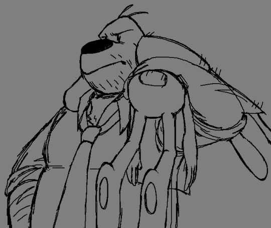

yall i drew these back in may when i finished the devils playhouse and just forgot to post them so im doing that now
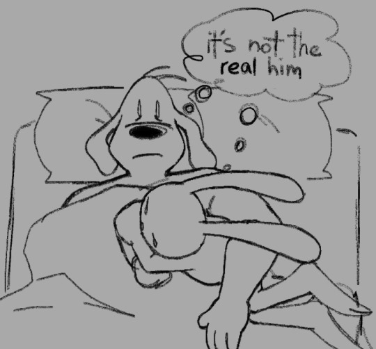
also obligatory shitpost:


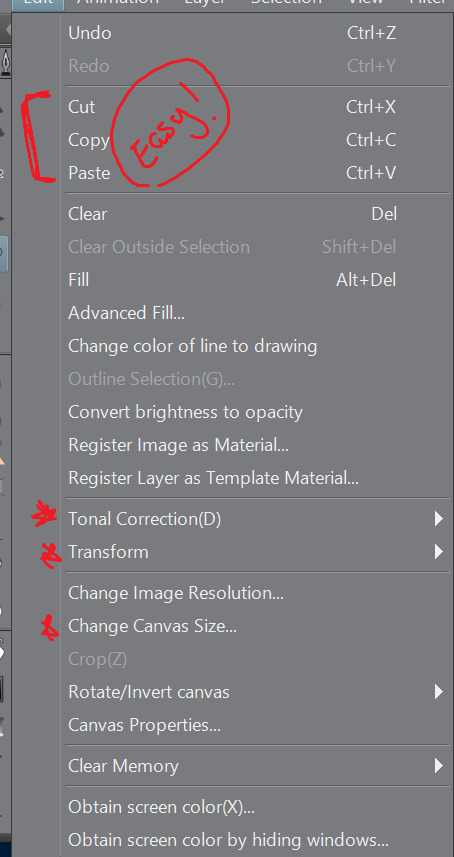
#(spoilers for the devils playhouse if you havent played it)#HIII SAM & MAX FANS im glad to officially join you all in the Extreme agony#im literally never going to get over the ending to this game like THIS FIXES NOTHING??? MAX IS STILL DEAD!!!!! WHAT!#giving him another max from a timeline where sam was the one who died does not make it better in fact i think this makes it worse!#i thought this series was about a silly dog and rabbity thing solving crimes i didnt sign up for this#sam and max#sam and max freelance police#sam and max the devil's playhouse#freelance husbands#my art#shitpost#ms paint#clip studio paint#oh funny story i drew the first 3 in ms paint on one canvas initially but did a stupid thing and cropped the first image to edit it#forgetting that ms paint has a stupidly low undo limit#so i lost the other 2 and had to redraw it in csp but i was so pissed off about it
579 notes
·
View notes
Note
heyo! it's padawin (or wan??) anon again!! thank you for your very kind words ;////; huu, who knows, maybe you'll be able to see them one day! but for now i have another question ~as usual i am dum~ i recently got csp and i have 0 idea how to work it? not asking for a whole tutorial just a basic review on why it's so good since i won't lie i almost deleted it and had a heart attack o(-( thank you! hope ur having a good day!
AH! hello young padawan!
This is ganna be long so I’ll put this under a readmore!
thats great news! honestly from experience once you’ve learnt how to use CSP you can master pretty much adobe (Photoshop and illustrator) The program can be really intimidating at first thats for sure take it easy and stick to the basics and once you’re comfortable with that
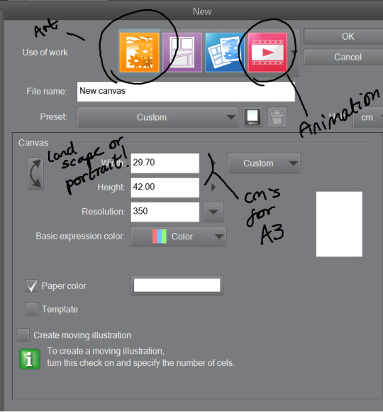
Once you’ve opened the program you’d want to work on an illustration so click on the top bar file > new. You’ll see something like this-
The Illustration one is for drawing and is overall best and easy! The comic ones are little more over whelming with shapes and layout hh and animation is more so timeline (little like flash animation and photoshop sorta)
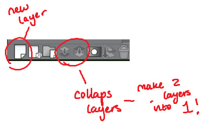
This tool bar here is mainly useful for layers hhh
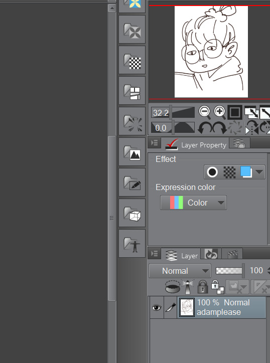
I don’t really touch much from there hhh, I only use expression colour to really look at the work in grayscale!
The three most important tools that’ll help give your work dimensions!
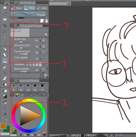
1) These are the tools for drawing, Each tool here represents the mediums they look like/ named after. Listed in order!
The pen - Thick lines, different options mess around to see which one suits you, I mainly use this for lineart or bulky shape work
Chalk - in the name! I use this tool for sketches!
Paint brush - This one is best for colour and for defined work! this is biased but the best is the oil paint brush, it just HMMM it just GLides from One colour to another and helps me create this effect -
The spray - Similar to the chalk but is more so identical to the mspaint spray one hhh from experience so I dont really USe THAT one
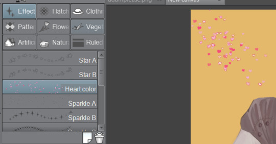
Stars - these are shapes! If you’ve used gimp you’d know how this one works! your brush turns into the pattern and shapes you chose like so -
Eraser - Self explanatory!
Blend tool - alot of people like this hhh but I’d recommend the oil painbrush over this but this basically makes blending alot more smoother and easier!
2) this is more so layout, some of these activate a new layer (like text)
fill bucket - my lazy butts fav tool, It fills in the pixilated or selected area, be careful tho if the colour is weak it’ll leak out and fill other areas!
Gradient - This… I dont use this at all hhh
Contour Line paint - This tool I dont use either hh, it basically bucket fills and area that is similar to the line around that area
TYPEEE!! - this is where you add text! the text on this program is kinda annoying but hey you can rotate it! how you rotate it, after you’ve chosen what type face (font) you want and size and colour COLLAPSE IT to a EMPTY LAYER!!! then use the selection tool and rotate it! (I will discuss the rotation took in part three!)
NO idEa WHat THIS tOOL IS IF IM HONEST
3) This is basically cropping and editing!
Zoom - This will help you zoom in and out!
Rotation - helps you turn your canvas around, upside down and so on to make difficult angles easy to reach!
— no clue
Movement - helps you move selected layer around! can be a pain if done by accident but hey what is ctrl + z for!
Selection/ lasso! - THIS TOOL wILL bE yoUR SAVOIR! I use to to fix layout as well as anatomy and perspective. When you select an area this will pop up!. The first one on the left is to cancel selection, 7th from the left is the one where you can move, resize! Those are really the important ones hh

Wand - The iconic select took, that selects an area you click and the same options from the selection/ lasso will pop up!
eyedropper - this tool will basically copy a colour on any canvas that is advisable, helps to reuse a colour! it auto works if you just right click on your mouse or pen so you dont have to keep changing from your pen,painbrush or bucket tool!
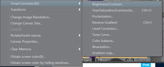
I think thats the basics? now I’ll talk about all the aspects CSP has to offer in Edit that makes life a blessing such as colour corrector, change line of drawing and change canvas size (which is a million times easier than photoshop, which makes you use math and NUmBERS)
Tonal correction is what I use to basically fix the colours of my artworks, Its easier than redrawing the entire piece hhh, sometimes we all draw a little off colour pallette! so when you click that you’ll get -
Brightness and contrasts - brightness really just makes its more white and black but contrast makes the colour more vibrant and pop, its a scale option so its really fiddling around with the two bars until what you see is something you’re happy with!
Hue, saturation hhhh - This will help you change YOUR ENTIRE hue aka the CMY (the primary colours, magenta cyan yellow) and the saturation tones the contrast making it easier on the eyes! same as the last one it’ll be sliders! so really mess with it and pick which one is pleasing to you!
the rest i dont use hhh but
Colour BALANCE - this helps me hhh basically you change the entire colour layout beyond CMY, it has three effects, the highlight, shadow and halftone! same as before sliders! mess around with until youre happy with how it looks! (It’ll auto preview)
I think that’s really it? any more questions please shoot me up!
OH! CSP is known to crash, its the only downside tbh, it also auto saves alot, so save alot! SAVE ALOT!! i’ve lost whole works like 6 hours from csp crashing as it was overwhelmed from my layers hh
here is how you can look for backup files incase it does crash! -
My documents -> CELSYS -> Clip studio PAINT DATA-> -Document BackUp or -Initial Backup.
5 notes
·
View notes
Text
August 10th-August 16th, 2019 Creator Babble Archive
The archive for the Creator Babble chat that occurred from August 10th, 2019 to August 16th, 2019. The chat focused on the following question:
What is your process for planning out the paneling/layout of each comic page?
kayotics
I’ve finally gotten my process down to a process that works for me. For Ingress Adventuring Company https://www.ingress-comic.com/ I start with scripting the whole chapter out. Step two is thumbnailing the whole chapter out, so I can figure out pacing and paneling. I started to do thumbnailing on sheets of printer paper, which has been easier to figure out my drawings and to see how the comic flows on paper. Once that’s done it’s pretty straight forward. Panel borders in pencils > rough sketch & balloon placement > letters and tight sketch in pencils > ink letters > ink bubbles and borders > ink the rest of the page. Then I scan it and do the colors. With the thumbnail process I kind of do the chapter twice in pencils but it ended up being way easier in the long run, since I hate doing panel layouts and doing that work in the beginning is way easier.
Steph (@grandpaseawitch)
Afraid there's no scripting for https://oldmanandtheseawitch.tumblr.com/. It's all pretty much in my head but I go over it literally every day, and I have a few roleplays archived to keep things on the right track, but that's about it. Thumbnails are done in big batches. Last batch was about 20+ pages done at once. Thumbnailing is also where I figure out composition and such. Just detailed enough to give me the idea of what I want, with enough leeway to do as I please on the page itself. Thumbnails done, I make a batch of empty pages, and go in and make all the panels for the 20+ pages. Since I already know the composition from the thumbnails and I have digital guides set up on each page, that's super easy. With all of those done, then I just go back in, do rough sketches for each page. Cleaner than the thumbnails but not too clean yet. Once the rough sketches are done, this is actually where I'll add text and balloons, so that I know what the bubbles will be hiding and don't have to waste extra time. After that, I do as much in large batches as I can, usually cleanup sketches, then inks, maybe flat colors. But after that point, I just have to sit down to work on individual pages until they're done. And voila!
authorloremipsum
http://signsofthreecomic.webcomic.ws/comics/ For Signs of Three, I always start with the script, get the basic idea of what I'm going for in the page. Then panel layout and gesture sketches of people and the environment. THEN! BEFORE I START DETAIL SKETCHING! I LAY IN THE SPEECH BUBBLES. Seriously speech bubbles are critical to controlling how readable your page is and so so many people don't seem to see that. They must lead from one bubble and panel to the next in an easy to understand way or your reader will get lost and confused. So I always make sure to put bubbles in during thumbnailing. After that it's just basic refining the sketch, lining, coloring, and shading.
AntiBunny
Typically in AntiBunny http://antibunny.net/ I thumbnail a page first to decide what needs to happen. After that I look at those event and decide panel layout based on how best to depict them, factoring in what needs to fit, who needs to be there, and how time will pass. I'd say time is the most important aspect, followed by emphasis, and then content. Typically bigger panels depict more time passing, but that's not a concrete rule. A big panel can depict a very short moment in time. The amount of population has a big play in that as well. A lot of action in a big panel can be a short moment in time that's just heavily emphasized. A big panel with very little movement depicted is great for dwelling on a single moment, which is great for slowing down the pace of reading.
heroesofcrash
I used to not have a script at all, but now I tend to write out scripts in advance. I keep a four-panel format in mind (2x2) when I write a strip, but I'll sometimes combine or split panels depending on the flow of the story. (I'll place some sample strips below, showing a "default" 2x2 strip, and a few that combine or split panels based on that structure) I then draw guidelines in Manga Studio (I have the CD, not the digital version that became Clip Studio Paint) for where each panel will be. I put the dialogue in each panel, sometimes editing for space or to fit it nicer in a speech bubble. I can usually visualize how a speech bubble will generally fit in a scene; it's easier for me to draw around the bubble than to draw first and add the words later. After I sketch out the panels, I may move the words around to fit in the scene a little better. I may even tweak it a little when I draw the speech bubble around the text, if I don't like how the text fits in the bubble or how the bubble fits in the scene. As I mentioned earlier, here's two strips. One has four panels (which is the most common for me), the other has six. The latter is made by splitting the upper right panel into two skinny panels, and breaking the bottom half into three panels rather than two. Not only does it give me enough panels to do a complicated visual gag, but having panels with a similar layout next to each other makes the action easier to follow, and thus makes the gag flow better.
Desnik
For http://ask-a-warlock.tumblr.com/, I make tiny thumbnails to quickly go through layouts. I tend to have a few different ideas and doing small/quick is a lot easier on the revisions
LadyLazuli
For Phantomarine (http://www.phantomarine.com/) I've gotten into the habit of thumbnailing each chapter extremely roughly in a sketchbook, then bringing the pages into Photoshop and shifting the panels around to improve the flow throughout the chapter. I put in rough dialogue bits to anticipate balloons, then I get going on rough sketches and color placement in Procreate, then clean up and paint the sketches, then bring them back into Photoshop to finalize the page. It's honestly really haphazard, just because I tend to change details and dialogue around a lot, depending on what I feel is working/failing - but that core chapter flow doesn't change too much, just so I don't get caught needing more pages in one part. So... I keep the roughs very rough, but I adhere to them quite strongly? The details are where things get experimental (edited)
JUNK
I am a fool who hasn't been doing thumbnails lately, so my process is the typical script>sketch>inks>tone.
MJ Massey
I start with my storyboards, which are just skethcy first drafts of the pages in a sketchbook. I have a vague genreal story outline, but this is where I really figure things out--both the layouts and the script.
In my head, I tend to see things as if they were an animation, so I am usually trying to catch that sense of movement in the comic panels. I try to keep things interesting and thinking outside the typical grid layout, usually resulting in some pretty crazy stuff. It's easier with action scenes, but I try to mix up everything. I do my final pages on 9x12 bristol (I used to work on 11x14 but that was...too big for markers), but there are many times where I will scrap the storyboard and do something totally different for the final page, or add or take away things. But it's good to have that first draft down as an idea, it's easier to adjust from there if I need to
FeatherNotes
@LadyLazulii love your process ahhh!!!
LadyLazuli
@FeatherNotes MERCIIII
Nutty (Court of Roses)
For Court of Roses http://courtofroses.thecomicseries.com/ I mostly sketch out thumbnails, scan them in, and lineart/color. Like most of y'all, I have a general story outline, and specific scenes get more detail as I work closer to them. If there's a scene that has emotional hits and I want the right dialogue for it, I'll script it. If there's lots of exposition and detail, I'll script it. Just, largely winging it on my end!
Tuyetnhi
I usually work from loose script dialogue for a chapter, to get the feel for the page, then start thumbnailing. After thumbnailing tho, I redraw the thumbnails on csp, sketch, then change/define panel layout or render till finish. Often, my thumbnails don't give me enough info till I start the page. And that's good for me since it's still under a set guideline but I don't feel rigid on "Oh gotta make it exactly like this" or some sorts. Same goes with dialogue/scripts too since I tend to go back and correct panel layout if i don't think it was strong enough on the first go. Idk, I treat it more of a fluid process that I can go back and fix due to how I digitally paint/render things. Still the process depends on the page i'm working on, how strong the thumbnails are, dialogue, and color scheme theme I had with certain pages. Most of it is 40% gut feeling tho. Images shown here how I got OIYD! Ch. 2 - Page 15 to be to its finished form. [thumbnail-> Rough sketch -> add with color -> final render with dialogue]
ErinPtah (Leif & Thorn | BICP)
I took scans/notes about each step of the BICP page-making process back during chapter 5: http://www.bicatperson.com/comic/step-by-step/ ...and then again, seven years later, during chapter 28: http://www.bicatperson.com/comic/the-webcomic-page-making-process/ The art has gotten better, but the actual workflow...basically hasn't changed. (If it ain't broke...)
snuffysam
First I have the script for the entire book, which I'll have finished ahead of time. At the start of each chapter, I'll divide the upcoming script into pages based on how I want the comic to be paced - e.g. making sure the setup and punchline to a joke aren't on different pages, making sure there's not too much dialogue to read on a single page, etc. Then, when it comes time to do the page, I'll split things up into panels. That's pretty easy - I generally want to keep things to one line of spoken dialogue per panel, or one "action" per panel. Sometimes there'll be beat panels, sometimes two people will talk in one panel, but that's the general rule. Next I... put together the panels. I don't really use thumbnails to work this stuff out - important panels or panels with more dialogue are bigger, less important panels or ones with less dialogue are smaller. I try to make sure panels don't intrude on each others' vertical space, because i've always found that complicates things in a web medium - but that just means there's less for me to worry about. I make sure the panel layout is different from the previous page, and if there's an action I need to emphasize I'll do something weirder than just a rectangle. If there's not enough space on one page for the panel sizes I want, I'll make it a double-length or triple-length page. As for the actual artwork - I try to make sure the reader's eye line is led along the page. So panels on the left would have the characters generally facing to the right, and panels on the right would have the characters generally facing downward and to the left. I try to leave enough space for word bubbles - and in general, the characters on right panels will be placed lower than characters on left panels, because i want the speech bubbles to move downward as you read across a row. And, well, that's basically it!(edited)
authorloremipsum
finally someone who considers the eyeflow (am joking, mostly)(edited)
snuffysam
i didn't always, but a reviewer once told me how one specific action scene was really difficult for him to parse because the eye flow was just completely in the wrong direction, nearly every panel. so since then i've been making a conscious effort about it :p it's tough when there's two characters up against a wall and you need the page to flow the other direction from how they're standing though, lol.
#ctparchive#comics#webcomics#indie comics#comic chat#comic discussion#creator interview#comic creator interview#creator babble#comic tea party#ctp
0 notes
Last Seen Blogs

juanpepito333
Sin título

bitesizejackie
Untitled

homedesignhub-blog
HomedesignHub
bellasblueblues
cut low enough to reveal her collarbones

new420dispensary
420 Dispensary