#sketching in photoshop or csp is... fine
Text
yknow sketchbook might not be the best/prettiest/most functional drawing software out there but it IS good for sketching, which at the end of the day it its main goal u_u
#sketching in photoshop or csp is... fine#but sketching in sketchbook feels much better once you get the hang of it (and change the wheel to what you use more)#(i have the pen + horizontal flip + eraser + transformation and thats all you need tbqh)#tani's personal shit#its a shame it doesnt have good lineart brushes but again. not what its made for#the shading brushes are nice though
4 notes
·
View notes
Note
What advice would you give beginner artists?
it's fine to want to do more stylized art, but nothing will help you improve quickly like studying from life. even if you want to draw very stylized figures, life drawing is still going to help you understand how the human body works and then you can build your stylization off of that understanding. I also recommend studying specifically things you're looking to improve--if you feel like your poses aren't dynamic, ask your model to do some quick (1-2 min) dynamic poses and work on getting the gesture down. if you're looking for anatomy, ask for longer, more static poses and really study the contours of the body. this also applies for portraiture and character art--my expressions and facial structure improved like CRAZY when i started doing portrait studies from life! (note: i know live model sessions aren't accessible for everyone. i'm a huge advocate for nude models, if you can find a studio nearby that's affordable to you that offers sessions, that's the best you're gonna get. however, there are sites that will give you photos of nude models to draw from, too, or you can even just ask friends or family to pose for you when they aren't busy, that's what i did before i started getting model sessions from my school!)
materials are not everything but sometimes a good material can make a difference. it's important to know what's worth it and what isn't for your skill level. invest in some decent-quality supplies or a good art program, but understand that you're still going to need to work to understand your materials and use them to their fullest potential. (if you're a digital artist buy csp. trust me on this. get it on sale. it will change your life. also do not fucking use photoshop)
tracing is ok. listen to me. TRACING. IS. OK. tracing is how you learn. don't trace other people's art and pass it off as your own, obviously, but there is literally no problem with tracing real-life reference photos. I routinely trace references for backgrounds and the like. there is no reason for you to kill yourself trying to make complex perspective and shit up from your head when you can very easily just overlay a photo and get what you need.
in that same vein, USE REFERENCE PHOTOS. find pics online or take pics of yourself and USE THEM to see how your poses work. it makes it SO SO SO much easier. the understanding that you need to create a pose out of nowhere will come with time but you're not going to get that skill unless you have a foundation of understanding how the real human body works, and the easiest way to get that understanding is by copying photos of real people.
last but not least, there's generally a sort of 'rulebook' that new artists are expected to go by, especially online, when it comes to digital art. when i was first learning, it was all about lineart and cell shading, two things that I didn't really like. Nowadays it seems to be all about rendering. the single most important thing i can tell you is if it sucks you don't have to do it. if you hate lineart just color your sketches. if you hate shading don't shade, or find a different way to shade that you enjoy more. if rendering is annoying or difficult for you DON'T BOTHER!! art is supposed to be fun. if part of your process is annoying or upsetting to you, cut it the fuck out. don't torture yourself just to do art the "right" way. i guarantee your art will look better when you're having fun making it anyway!
#asks#ALSO don't go in expecting to monetize your social media presence/go viral as an artist. make art for YOU and make what you want to make.#if your art has passion behind it then attention will come naturally!
328 notes
·
View notes
Text
Crisp those Lines!
Or: a small collection of suggestions for a crispy, neat lineart.
SO MANY OF YOU ASKED FOR THIS (it feels absurd to say, yes), so here you go.
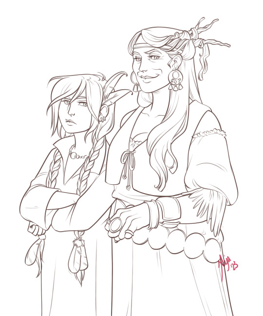
A premise: there's no right or wrong way of inking, and some of the following tips entirely depend on the type of inking I do. Which is neat and clean, with no blacks, and moreover: digitally. More under the cut because it's gonna be long and full of explanatory pictures. Here's an example:
SOFTWARES AND BRUSHES:
Let's address the elephant in the room: Photoshop SUCKS for inking and linework. The stabilisation of the brush there is SHIT. Good for colouring and painting and doing photobashing, but for Lineart you want it to be precise. Do yourself a favour and don't use Photoshop.
I generally use Clip Studio Paint, but i have to say that the best program for it that I've tried keeps being Paint Tool SAI 2. It has few functions, it's true, and I use CSP because it has more instruments. But if you don't want to pay much, SAI is incredible as for brush rendition and stabilisation.
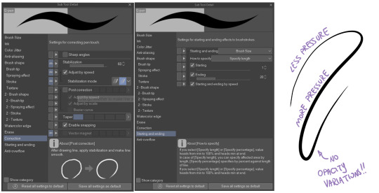
As for the brush: you don't need a fancy brush, anything in your software will go. What I use and what works best tho must have:
Tapered start and end.
High stabilisation (I go from 60 upward, lower it down for trees and grass or anything more natural that needs to be less neat and flowy)
Low tapering.
It must be set so that pressure controls only the dimension. The more you push on your pen, the bigger the line gets. No colour or opaciy variation!
On Clip Studio Paint, I use the G-Pen in the program. It's good as it is, but I think I did some variations as per here:
FILE DIMENSIONS:Better work larger and then resize down. Sizing files up digitally is possible, but it leads to unfocused images.
I generally work on files at 600dpi (300 is fine too, but don't go any lower. Particularly if that's something you want to print later on, any printing wants a minimum of 300dpi). in roughly an A3 format (bigger dimension is 43cm). Most pictures I upload here are 6000x5000 pixel.
A bigger file will give you more possibilities with brush sizes, and it'll be easier. Remember: digitally, sizing down is ok, sizing up is not something you should do.
SKETCH:
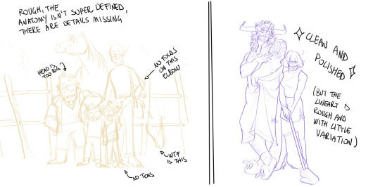
This is the suggestion I should follow but never do.
Having a clean, polished sketch simplifies your life A LOT. This is because if you don't have to worry about drawing details and fixing the anatomy of your drawing during the lineart, and doing it so GOOD because it's the lineart... You'll go that much slower and your life will be more complicated (it's not impossible, my sketches usually are very rough. I am ok with it, the most I do drawing wise is during the lineart... But I'm lazy, don't do like me. A good sketch will help you out.)
Compare the two sketches below:
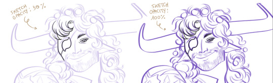
Another note about your sketch layer: you know those memes that complains that the sketch looks good but when you hide it the lineart is shitty? That's easily solvable.
When you're inking, lower the opacity of the sketch layer down, A LOT. I generally go for a 30 or 40% opacity (depending on the colour of the sketch. the yellow sketch will go around 40% because it's less visible, the purple one lower).
When you're inking, you MUST see clearly the lineart you're doing. If the sketch isn't contrasting enough, you won't see clearly what you're doing... It's like trying to sketch with a dim light, not seeing the paper clearly. See the difference:
BEFORE YOU START:
You probably have read it everywhere, but it bears repeating: warm up your hand.
You're using muscles and for more than five minutes. The warmer they are, the firmer your hand is, the easier it gets controlling your lines. It also prevents you from damaging your wrist. Stretching is also great, and grippers are nice to have. Keep your hand fit!
As for warming up: I usually do some calligraphy exercises, practicing on flowy cursives. You want to practice varying the pressure of your lines in a single trait, hence why calligraphy is good. But generally, what you can do is...

PRESSURE VARIATION AND LONG LINES:
So. My main tip and trick is to vary the pressure of your lines. In the same line, and between different details. This will help making the lineart more dynamic and interesting.
A note: this works for semi-realistic styles. If your goal is obtaining a Cartoon Network style: they have generally little to no variation and it works. My suggestion would be to study the kind of style and effect you want to obtain, different styles will work best with different linearts. If you're aiming at hyperrealistic painting, there's no point in spending time over a lineart, for example, I inked the same lineart, but with a brush that doesn't vary it's dimensions with pressure, and not changing the dimension of the brush.
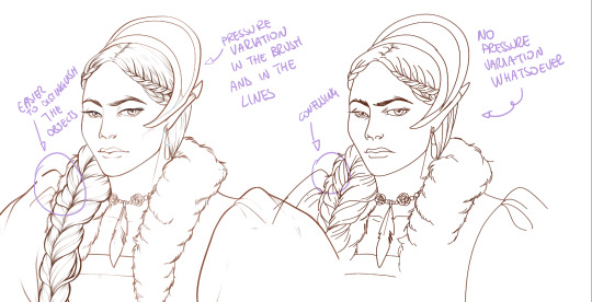
What makes my linearts look "flowy" and "neat" is the fact that I tend to draw less lines and longer, and pay attention when I stop, to start the line where I end it. This will give the impression of one continuous, single line, and make everything more fluid. See above in the french hood: on the right, I left the line rough on purpose, you can see where I stopped and started again. On the left, where I took care of it, you can't.
Generally speaking:
Thick, dark lines communicate that the object is close to the viewer (always keep the viewer in mind!) or in shadow. Lines should be thicker on the outside of your objects, to separate two planes, and in stuff closer to you.
Thin lines are delicate, they should be used in the background, for small details (see the hair, the lips, the small wrinkles around her eyes.)
As for line continuity: in both cases, the line of her face is one single line I drew. This can be obtained with a smooth result, particularly in curved lines, by getting the brush stabilisation on higher settings (80-100): sacrifice speed for accuracy.
MORE IS MORE, WHEN IT COMES TO LEVELS:
Particularly when there are two objects intersecating, or more characters interacting… Instead of inking all on the same level, I always do one level for each object, trace the WHOLE line as if there was nothing above, and then erase where it's not shown. This is a little thing, but pays off. Always in the drawing of above, the feather and the hem of the bodice were on separate layers, and then I erased the bodice under the feather. Take advantage of being inking digitally and not traditionally!

For many characters, here's an example of a vignette of a comic page before cleaning it up and erasing. Every single character and the weapons are on separate layers

For this it's very useful knowing your recurring mistakes. For example, I tend to draw heads bigger than they should. I know I do, so generally I keep the head on its own level, and the body on another, so it's easier to modify and size down just the head without getting crazy selecting only the lines you want with the lazo.
Again, you're inking digitally. It's not easier than traditionally necessarily, take full advantage of your instrument!
OTHER TIPS AND TRICKS:
High brush stabilisation sacrifices speed for accuracy. The line will lag a little from your cursor. Get used to watching the cursor and not the line, and trust that the line will follow.
GO SLOW.
Rotate and flip the canvas. Don't ask me why, but tracing long lines towards me is always easier than not the other way around.
Use the Free Transform, Warp, Distort etc etc and the Liquify to your heart's content if you notice the lineart has something wrong. The only cheating in art is using fucking AI generators (and AI pictures are not art, sorry not sorry)
References are your friends. Study how an artist you like does the lineart. Try and imitate them, and if you can and need to post them: tag them! (don't trace and sell it as your own)
Experiment with brushes, find one that you like for the effect you'd love. You do you, there's no right or wrong way of inking.
Remember to breathe when you trace those lines! (and to drink and do pauses and stretch, you don't want a tendonitis!)
Have fun. Lineart is not evil, lineart is your friend!
I hope this essay is exhaustive enough. I'm tagging ALL THE PEOPLE that requested it (and giving each of you a muffin).
@ndostairlyrium @narina-gnagno @salsedine @whimsyswastry @layalu @n7viper
If you have any questions, don't hesitate in asking!
#tutorials#lineart#inking#digital inking#digital art#tips and tricks#petrel explains#COME LO FECI (cit)#listen if we're mutuals and we chat... ask me to share my screen I don't mind the company when I work if it's not something I can't show#or if it's not too late at night for me#also I unironically like how Alyra inked without variation looks even angrier and more judgemental than normal LOL#also some spoilers for The Last Bacchae if you follow that#“Marmotta” means “Groundhog” in italian#art ref
126 notes
·
View notes
Note
Hello Mieau, would you mind to give a tour of the art materials you use? xo
Yeah, sure! Let me see, here is what I mostly use:
For digital art I love to draw with Clip Studio Paint, paired with Photoshop for touch-ups and preparing files for printing. My tablet is a Wacom Intuos Pro medium. I also have an Ipad pro with a CSP subscription, that I use sometimes.
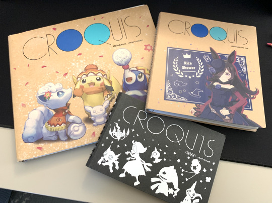
For traditional art recently I'm mostly just sketching but my favorite brand of sketchbook is definitely Maruman! The pages are very thin so it's a good reminder that a sketchbook has to be used in a lighter way, it can't be perfect. I have different sizes!
Pencil-wise I like to use Kurutoga (it's a brand of mechanical pencils that automatically rotates the nib, so you go trough them more efficiently). Basic kneaded eraser. And for book signings I use Faber Castell Polychromos (they are very hummm... "soft"?) for a nice colored under-sketch paired with some fine nib permanent black marquer!

20 notes
·
View notes
Text
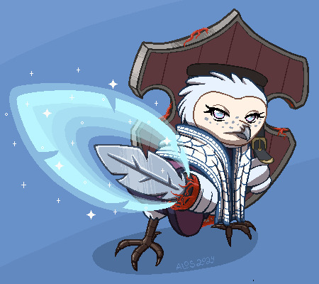
So, everyone, I got a story about this picture right here. I will include some pics from the process and there's even a moral at the end.
So the client approached me about it, I sketched it out, standard affair. It was supposed to be a gif image and I imagined her moving side to side while her sword glowed.
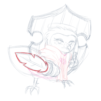
Mistake number one I did not plan out the side to side movements. This was the only rough I did before I started rendering it.
"Wow this is going to be so cool" I thought.
"This is going to be a piece of cake"
I wanted to animate it on Clip Studio Paint EX that I got this year specifically so I could do animation there.
I ended up drawing all the assets and I was happy with them. Side note, in pixelated animation it is better to use as little colors as possible, and I ended up having a lot more than 256 colors with the colored lineart here n stuff. That was my mistake number two. I really need to work on that.
I warmed my hands as the program was opening, ready to do some animation, only to come across a very unexpected problem.
In the end I have made a reddit post describing it, but you can basically see the results of it in this test animation

I spent an entire freaking day trying to figure out what to do with the blurring. It seems that it functions as intended, but it would be really nice if CSP didn't do this. I had to go back to photoshop to do the actual animation.
... I couldn't quite do the diagonal movement I wanted. Right, so I settled on this.

I drew like 3 movement frames for the white and blue cape and ended up not using it because it looked awful. And the sleeve movement is so wrong.
This is why you test these things, guys! In sketch phase!
So I made these static gifs, thinking this is probably over now and I did a good job.

Nope. Not even close.
My big brain missed one crucial detail in the initial sketching phase...
IT WAS SUPPOSED TO BE A BIG BEEFY GLOWING SWORD!
To be fair the initial glow was cool, the client didn't realize what I've been drawing. So we both missed it. Okay, fine. I decided to just redraw the glow, thankfully it didn't take long at all.
... Right we got another problem. How do I animate a sudden burst of energy coming from the sword?
... Oh no.
My head drew a blank.
I felt... I felt... Like a failure. I failed the client. I thought I could do this but it's not right.
I decided to slap a glowing effect and hide the burst under a white screen.

I couldn't imagine anything better.
Despair, utter despair.
In the end the version that looked the best was this one.

Feeling horrible, I decided to make a free quickie for the client to make up for my failures.
I poured my disappointment with myself and my ability to come up with cool animation into this little tiny owl that did nothing wrong. I gave her the most adorable but angry stare I could muster.
She's angry because she's short
... too short for this picture.
The client assured me that my work was fully acceptable from start to finish and that it's all great. That I shouldn't beat myself up.
But I usually get it all from the very beginning, you see. I typically don't do too much revisions. This kind of situation is not common. I wasn't able to see my clients needs and make the kind of gif that was needed from the beginning.
And I've been tipped extra for this picture too.
It's like the money I got was not quite worth the gif I ended up with.
I suppose it covered the extra useless work I did drawing the assets, but... I feel guilty, like I ripped off the client.
If I just needed to draw the static gif with some glow I could've made it cheaper.
Perhaps I undervalue myself and it costs more than I charged for it.
I don't know.
The moral of the story is DO TEST ANIMATIONS IN SKETCH PHASE. ALWAYS. FOR EVERYTHING.
I swear I got it the first time, why make this mistake so many years later? smh...
8 notes
·
View notes
Text

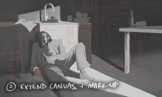


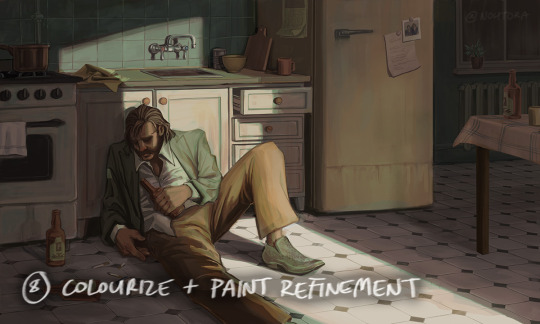

process stages & comments below
( original painting )
process:
i did 70% of this (up to img #6) on my samsung tablet, on my train commutes, battling motion sickness & neck pain lmao
drawing on my tablet is still a lot harder & feels more restrictive for me bc i'm limited by unfamiliar software (still learning CSP) and lack of keyboard shortcuts (my digital art workflow for years). i also struggle with starting / continuing artworks on my tablet unless i've already planned / sketched most of the composition on my PC. likely because 90% of the time when i'm drawing on the tablet, it's on the train. hard to get in the zone as it turns out lol
this is the first full painting i've started and made substantial progress on purely with my samsung tab, so i'm happy it's starting to feel a bit more natural.
also first time i've tried doing a funky gradient map as a colour base. then applied colour on top with multiply blending mode. 10/10 would use fun gradient maps again - helped me introduce more colour variation bc i feel like my colours are usually quite flat by comparison
given the nature of the fucking bumpy melbourne trains & my broken commutes, i can still only do so much rendering on my tablet. the more refined painting will probably always happen using photoshop on my PC bc that's where i feel i have the most control
i tried not to overwork / overpaint it too much as i often tend to do, and kept the brush strokes rough and loose as much as possible. made sure my brush wasn't set smaller than a certain size so i wasn't tempted to go into fine detail. you can see i didn't refine harry's form/clothes much beyond img #4 because i didn't want to lose the soft/loose quality of the clothing folds. pretty damn proud of that shoe though. but then i posted it before i realised i forgot to paint in his fucking tie lmaoooo
but yeah, i got my tablet as a secondary drawing device to help me draw more often so i'm gonna keep trying to get the hang of it !!
composition/concept:
the pose was referenced from this shot of arthur in peaky blinders and i had a vision of HDB slumped over in his kitchen like this

the composition was built around that, and i had the idea of framing it him in shadow and having a strip of light from a doorway illuminating his body. evidence of his drinking and smoking are kept in the shadows.
the original idea was to have a silhouette of someone standing in the doorway (likely jean finding him), but it didn't work with the overall balance & i felt like it interrupted the shape of the light too much / wasn't very legible at that angle. kitchen design was inspired by soviet & post-soviet era style kitchens.
*** feel free to send in an ask if you actually want me to explain how i did things in more detail. these are mostly thoughts for my personal reference
#disco elysium#harry du bois#art process#nohtora art#nohtora wip#sorry my notes aren't comphrensive/intelligible - it's more for me to remember & not a tutorial#always welcome to ask further though <3
59 notes
·
View notes
Note
Question, what program you use or at least recommend. Just asking bc for some reason when ever I start a new drawing program it cape's me motivated to draw more things ig. Hope the question doesn't bother you. Love your udul art btw ;v;
I primarily use Paint Tool Sai 2! It's super lightweight and runs great on my computer, so sketching on it feels buttery smooth compared to stuff like CSP or Photoshop where there's a significant amount of brush lag. Sketching in Sai feels almost as good as sketching on paper. It doesn't have a ton of complex features and its kinda bare bones, but that's fine by me because I prefer when things are simple lol
7 notes
·
View notes
Note
Hi! You're one of my favorite artists ever, and I would love to do some studies of your art! What are some of your favorite pieces that you've done, and how do you pick your colors? There's a lot more questions that I could ask, but figured you wouldn't appreciate an entire list of questions XD
Hello and thank you, I am honored! Feel free to send me all and any questions! I'll answer these two, starting by:
How do you pick your colors?
As I change art style with pretty much every illustration project of significance, this varies a lot. Here are, from most to least common, ways I pick my colors.
Eyeballing it. Unfortunately my most common... What I will do a lot digitally is lay down a color background, and flats of a few colors, then manually adjust each until they look good together by selecting by color and using adjustements. I then paint over it all.
Using a limited palette, eyeballed. Same as before, but this time I force myself to only use a few colors. It helps me, as constraints do.
Using a reference, eyeballed. This happens a lot when I mimick an art style. My medieval drawings for example, are often done by looking at images of actual medieval art to get an idea of what colors to use to look medieval.
Using an existing image, pipetted. Rarely, often as a challenge or if I'm super stuck, I'll just take a pic with colors I like and pipet from it. This website automates this if you want a good easy starting point!
These can be combined around. I'll post examples now, explaining how they use each.
This is a sketch for a drawing I ended up doing way different. This is the first method - I used a flat layer for the characteres and three colors for the sky to test out atmosphere. This is how I plan out most full paintings, just trying to nail down a mood I have in my head. I fiddle around until I like it or, like in this case, fully give up and iterate further. Here, the composition was to be redone too as I did not like the body language. I was going for "bright hot sunny day under a weather that feels wrong".
For this comic, I combined a very limited palette and a photo ref to pipet from. I was looking for the stark cold/warm contrast of a mid-season bright night by a fireside. I took a google image photo of a campfire at night that was already edited. The photo itself looks unnatural but conveyed what I wanted. It's still on the file itself! From it, I pipetted a few colors I found "summed up" the palette and did all with them.

While my own habits make me prefer painting as you would in traditional methods, with directly picking the right colors, I will often digitally alter with overlays and layer blending modes some colors and gradients, etc, to alter a drawing to fix it's color palette. The following is a quite egregious example, because I first drew the character in flats before putting him in a full scene. Here is a before/after summed up.

The shadow is a layer, the bright yellow light zones also, and the orange "transitions" of light zones on the skin a third. There's also an overlay over the full character to blend him in. I do this by...making a full flat color of a layer, fucking around until a blending mode does what I want, and adjusting hue/brightness/saturation and opacity until it looks good.
Another WIP where I was struggling with the overall palette. I was going for late 60s psychedelic. You can see in the top right the original color. I thought it looked too...new, so I added a yellow layer on top, and fiddled with it. Final choice was the following setting. I then put it with my sketch and color blockout in a folder and painted over it.
For this sort of adjustement, the "Color Balance" modifier in CSP, Photoshop, and others is also a godsend - but one I often use for fine tuning a finished piece.


This being said, there's some rough rules to coloring which are...born from studying color theory and doing studies. I am guilty of doing very little studies...so I'll just sum up the basics of the color theory rules I use.
For "default" shading, I use a color that is darker, more saturated and with a slight hue diff. This is my "don't shade with black".
Using a shadow that's cooler will make the light look warm.
Vice versa.
There's a bunch of stuff to remember in how colors relate to each other and pipetting images who's atmosphere you think is interesting really is the best way to learn... It's learning how to black-blue/gold-yellow dress in your own art for the lack of a better word...But the basics will be:

Don't trust numerical values, but look at your colors in context. A same hue, brightness, saturation can look so much different. This is how Rakkan's beard looks whiteish here despite being a light very grey brown.

All this but...colour is such a wide topic, I can't really say a lot but can also type for hours... if you have precise questions about a piece in particular I can explain :') I hope this wasn't too vague and was instructive!
Speaking of particular pieces, answering your question last under the cut:
What are some of your favorite pieces that you've done?
In no particular order, illustration only.
Including this in another poast bc staff's new post editor limits the amounts of pics I can put in response to asks. Insert colorful language here...
Frankly twas hard to pick I am rarely fond of what I draw
41 notes
·
View notes
Note
I'm sorry if these have been asked before, but:
- How long have you been drawing?
- What equipment do u use?
- What is ur favorite method to draw? And do u sketch first?
- Any tips for someone who is in their mid-twenties, has trouble drawing a darn football, but would very much like to learn?
oooh ive been drawing since like elementary school and i was very fortunate to have a supportive family who encouraged that!
i used to draw primarily in photoshop but i switched to clip studio paint earlier this year and it's been great except for a few filters that i miss from PS
i draw on a cintiq, but i have an intuos that i use if i can't set up a cintiq for whatever reason
definitely drawing on a cintiq or intuos in CSP or PS is my preferred method to draw, and i do sketch first or even draw thumbnails if it's a more complicated drawing that requires more planning
i def recommend drawing from life or studying your favorite artists' work for practice. Figure drawing is especially great imo and i think one of the best ways to learn how to draw faster/cleaner the more you do it. Taking a class would be the best way to learn, but there are sites like posemaniacs.com or adorkastock which are good free resources if you can't take a class
i think it's okay to copy your fav artists' works IF YOU DON'T POST IT ONLINE like just keep it private lol, it's what i did as a kid and it def helped me learn how to draw the things i enjoyed seeing in other people's art.
Of course try not to fully copy someone else's style, especially if they're a smaller artist.... it's just considered poor taste :y though parody work of famous artists is (usually) fine.
22 notes
·
View notes
Text
Adobe Broke Photoshop in 2023 (October Update)
Back in July, I made a post detailing how bad Photoshop has gotten for me this year, which you can read here. But if you want a tldr version of it, following new years Photoshop stability and reliability has taken a nose dive with constant crashes that prevent auto recover from being as effective to glitches that make working in it a nightmare. Its been over 3 months since I made that post and I kinda wanted to do an update on how photoshop has been. Has it actually gotten better? Kind of but not really. In some ways, its gotten better, in others worse but generally not much has changed. I guess two positives that come to mind is that one of the afformention glitches I noted was patched up at some point in July, so I was able to update finally. Though, I didnt experience the backlash from not updating photoshop like I had in March (fuck you Adobe). And I havent been experiencing the left click lock as much, although thats more to do with me not doing certian commands that I found could trigger it than adobe actually being a good company and fixing it. There's a thread on the adobe forums about this issue, and according to one of most recent posts as of the 22nd, they run a photo company and have called Adobe support 5 times about this issue, and it seems that no one at Adobe knows about this glitch. Yes a billion dollar company who sells programs at inflated prices because they're "industry standard" knows nothing about a single bug that has been in the program for 6 months, but will gladly add in new features no one will use.
Now when I say things got worse, crashes started happening more frequently again in late September and Early October. But instead of happening weekly, they happened almost every fucking day. One day I would have a crash, the next day nothing would happen, before a crash happening the following day. And what was more crushing about this was that it happened while I was dealing with selections and flatting comic pages... whats funny about this is that not only can selections not be recovered if you close the file (even if you save), but can only be saved by pressing a seperate save button which has no keyboard commands. Which made these crashes more horrible than if I had been inking or sketching. Once again, I consulted the Adobe forums for help and once again, the solution was to update my gpu driver which was out of date. I don't think its the fact that I had already done this and nor that somehow, the driver I had been using since March was already out of date by September that makes this situation so ridiculous. But its the fact that I've pretty much had to bend over to change my pc just so I could run photoshop within the same year. In contrast to how things were before 2023 where I didn't have to do a single thing and photoshop ran fine. Its only this year that for some divine reason that the program decided to be shit to me.
So why was I still using it if it was so bad? It was because of my first Chapter. Around the time I had that initial post, I was still hard at work on finishing my comic's first Chapter which has taken me 4 years to complete. I had anticipated getting it done around that time, but due to burn out I ended up taking much longer, finishing it on October 13th. During those final few months, I decided that upon finish Chapter 1, I would be done with photoshop and moving onto a different art program for the rest of my comic. And that program ended up being Clip Studio Paint which I got as an early birthday present from my dad, following photoshop crashing on me two times in that day, the latter happening an hour after I took a break to calm myself down after the first crash....I wish I was making that up. I went with CSP due to the fact that most tapas artists I know use it and because of the many good things they've said about it. Its a pretty highly regarded program, and even if my motive for buying it wasn't because of Photoshop's "quirks", it has features that make producing comics much faster in CSP than in photoshop. So with CSP in my hands, you'd think the nightmare would be over, right?
You so, my plan was to use CSP for my comic starting with Chapter 2 but after spending some time in the program, I realized I probably wouldn't be knowledgeable enough or adapted to it enough just in time for me to start drawing Chapter 2 with a release date of early 2024. So in the end, I decided to wait until Chapter 3 to make the switch, while limiting myself to CSP for spur of the moment drawing ideas and illustrations. Yes, Photoshop has been a complete failure to me but I am way more experienced with it than with Clip Studio. I dont want there to be a potential quality drop following the most recent episode and I want to be sure I can use it before jumping into creating comics. This isnt like the switch from traditional to digital for my comic back in 2021, because I had already had more than a years worth of experience with photoshop and digital drawing by that time. Because of that, the switch wasn't as rough as it would've been if I had done it earlier. I was going to save this announcement for one my kofi 'comic corner' blogs (btw if you want to support me on kofi click here: https://ko-fi.com/kenthenugget) but Im making this post now so why the hell not. But for the time being, Im still going to be using photoshop for Chapter 2, and my character sheets of course. Given how long I spent on Chapter 1, you might think Im crazy for wanting to use the program for another 4 years but I don't anticipate this chapter taking as long, due to skill and because its much shorter in comparison.
Im not going to lie, I have mixed feelings on continuing to use Photoshop for my comic. On one hand, Im glad I wont need to worry about a potential quality drop but on the other, I dont know how long I can handle crashes and glitches that only seem to persist as time goes on. I'll just pray to God to give me strength during the drawing of Chapter 2 once I finish thumbnailing. Hopefully, I and photoshop will be able to last.....
1 note
·
View note
Text
thinking out loud about art process/medium
pros of tablet (screenless):
-no art supply costs after initial cost (in my case it was like 80 bucks cause i use an old bamboo pen&touch)
-hand doesn't get in the way of seeing
-1 physical tool for everything (pen)
-can resize, undo, erase ink, and very importantly use bucket tool
-coloring is easier (see bucket tool)
-hotkeys (ctrl-z....)
-no need for scanner, digital only takes up less physical space
-pattern brushes! 3d models! assets!
- rulers, grids, snapping etc. shift for straight line, line tools
-change colors easily
-choose canvas size arbitrarily and at any resolution i want, plus cropping and cutting, copying, pasting etc.
-screen doesn't need a light on to see (at least not these days lol)
-text tool
-some tablets come with free software bundles (mine came with photoshop and corel, though not the new ones lol)
-if tablet is durable, may be cheaper in the long run (my first lasted about 5 years? i think? only busted because cable got damaged; current one is still fine)
-weird filters and effects, blur, etc.
-bitches love layers (i'm bitches)
-i can resize shit when i inevitably fuck up proportions
cons:
-upfront cost is expensive if it breaks (tho there are more cheap options on the market now)
-less intuitive for my brain-to-hand connection and coordination personally... harder for me to recreate lines digitally --always impressed by people who can follow their sketch precisely cause it's literally impossible for me 😂 i've gotten better at the intuitive stuff since i first started 10 yrs ago but it's still always a liiiittle awkward haha... but tbh this is still true for traditional to a lesser extent
-i get tangled in my cables a lot 😂
-digital storage on pc only, have to have printer for physical copies and colors can come out weird since i draw in rgb lol, risk of deletion or file loss or corruption
-using refs can get cluttered on only one monitor
-handwriting becomes even more illegible and calligraphy pens are kinda meh (at least defaults are)
-hand hurty because cramped space
-future...? longevity not any clearer than physical media tbh. might last forever or might be gone in an instant, even before considering future of technology... shrug! lol
-screen colors and brightness?! girl help my art looks different on every device i own 😂
-if you forget to save it's gone (luckily i save compulsively)
-csp text tool kind of mediocre tbh
-companies want you to buy new programs, stop supporting old ones, charge subscriptions, etc etc etc....
pros of traditional art:
-tactility and naturalness of hand on paper makes lineart and stuff a little easier--i'm still not very coordinated though so i still have issues with this regardless of medium...
-can look at reference on screen separate instead of swapping between tabs or cramming on one screen or canvas (physical references like books or objects make this moot for either medium tbf)
-medium experimentation easier than digital in that it lets you feel the different textures and behaviors in a way that's less functional digitally (tho there are some great brush sets) and more tactile or even potential 3-dimensional (ie thick layers of oil paint or mixed media painting with sculptural techniques)
- handwriting is (marginally) more legible...
-physical object, already exists, cannot be deleted (but ...)
-color not completely dependent on screen (but can still be affected by lighting or fading, in fairness)
-i like doodling with ballpoint pens (i do all my thumbnails with bic pens and yellow legal pads or sketchbooks lol)
-if you don't save, nothing happens because it's just an object you made irl lol there's nothing to save; it exists (see physical object)
-no cables
-no download or program (or subscription) required (not that i use Photoshop except the free copy that came with my tablet but it's relevant as a digital artist)
cons:
-buy new art supplies constantly cause stuff runs out; markers are expensive (though ink refills in long run less expensive than buying new markers, still needs frequent replacement for certain colors such as skin tones, still adddds up)
-have to buy or otherwise acquire everything separately, can't experiment in different mediums without buying more stuff... different paper.... different pen types... ink types.... etc. and then if you don't like it or use it, it's like.... ok i'm out $20 (or more)
-hand is always in the way! ahh!
-no undo or any of that and no saving copies unless manually tracing or you scan it first
-if you are bad at letter placement you can't move or resize 😂 i def have trouble with this sometimes lol
-i don't like coloring in traditional mediums and filling large inks is time consuming and generally unpleasant... alcohol markers are better but i am just not a colorist at the end of the day... obviously other people like it more (i enjoy abstract watercolor though)
-can't change colors after the fact... (probably good to swatch huh)
-erase erase erase ugh i hate erasing...
-can't hide layers or group together cause it's all one layer (at least, in practice. i'm sure it's technically scientifically in layers of ink, paint etc.)
-white gel pens never work 😂 and i can't do large areas of white on top unless I'm using opaque paint (not always feasible) (maybe i should have become a painter, huh)
-shitty or cheap materials feel tangibly worse to use; also my inking pen of choice is microns and similar felt tip technical pens, and they can feel unpleasant on a lot of paper types, plus fast lines are harder to do without skipping and scratching, and larger nibs often aren't very good tbh (maybe my pens are just cheap?)
-have to manually measure out frames, panels, borders, use physical ruler for straight lines, often with pen bleed if you do it wrong....
-doesn't have any of those easy assets, models, pattern brushes etc. (well, partially; they do make stuff like screentone, manga background assets, and you can do collage in theory or trace stuff if you have a lightbox)
-messy or smelly depending on what you use (paint pens, alcohol markers etc), sometimes requires extra ventilation or working outside for safety (tho really at that point you probably wouldn't be using a technique that works digitally anyway so i guess it's an inevitability lol)
-some materials take longer to dry than others, need protective coating or are not archival/will fade
-physical object, requires scanning and editing (esp to make copies), takes up space, can be destroyed or lost (not so different from digital in that regard) also takes up more physical space to store lots of drawing or paintings, art supplies, etc.
-requires working space especially if you work larger or are using lots of colors etc.
-needs light (... usually. i did make a painting in the dark once but that's usually not practical lol)
-cannot type on drawing (well. you CAN but it's less straightforward than clicking a text tool)
-hand still hurty
-no resizing! have to live with fucked up proportions 💀 (i'm working on it)
no point to this just thinking about things i like and dislike about both ways of creating
when it comes to writing i will take typing over handwriting any day though
0 notes
Note
aaaa hello, i recently found your blog and fell in love w aa again bc of your retro brushes! if it's alright to ask, what are the other brushes you've used like for your lineless art? the subtle textures and edges are so sweet and i'd love to experiment ^^
Ooh hi !! It's totally fine to ask about my other brushes :D I'm putting this under read more because of how long it got though lmao
Thank you for liking my retro brushes! The ones I uploaded aren't actually all the ones I used in that piece. They're actually missing the textured brush I used to recreate the ink texture that riso printing has. I also had to make these brushes myself, but since I used a texture pack that's been uploaded to csp assets (This one, I used the one called solid-uneven tones, which is actually really good on its own!), I wasn't allowed to upload them without violating the rules on the csp site, but you can get it from my google drive here! I could have just used one brush for all four colors considering there's no halftones, but observe:

On your left, the irregularity you're going for would've been the same on all layers, which creates a lot of blank white spots that might be pleasing for some, but it wasn't what I was going for... plus if you move the layers around it sort of creates a 3d effect that might be cool but also ends up being a bit distracting, so I just duplicated the brushes and set the texture rotation to different angles ^^ In the end it's really up to the look you're going for, though. So feel free to experiment!
I also used this vertical line brush that's super fun to play with. You can see how that looks alone in here (I changed the texture's scale ratio, the actual brush has thicker lines and a wider gap between them):
As for most of my lineless art, I actually only use four brushes!

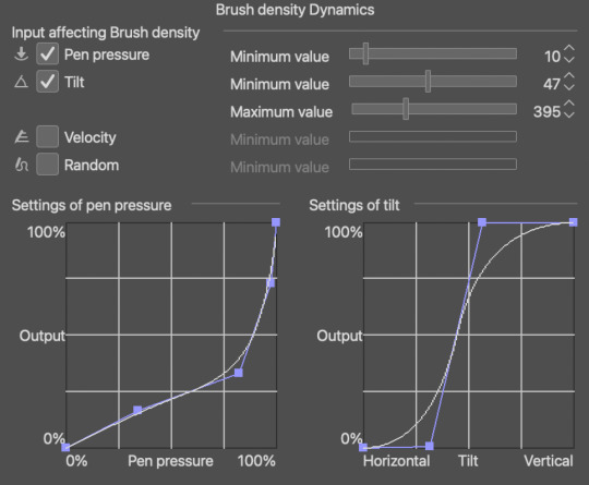
This, for example, was sketched with a modified colored pencil brush that comes default with csp 1.10.9 which you can find here, since it's gone by the version 10.10 update
if you want the exact modifications I did, (since the default brush comes out super light no matter how hard you press) just go into brush tip > brush density > brush density dynamics and change the settings to these! Or however you see fit. The brush engines in csp are surprisingly easy to get the hang of once you've been doing it for a while
I color with two to three brushes! depending on if i want to put in the extra effort or nah
The main brush i use is the flatman soft from @/frenden's megapack which you can find in this post ! It costs maybe 15 bucks? But I believe it's worth it! It might actually be the only brushpack I'm willing to spend some cash on. You get access to so many brushes + any future updates (aka more brushes) so it's a pretty good deal hihi
For softer edges (like blushes, and the fur on this girl's hoodie wahoo) I use either the colored pencil brush from above or the flatman hard from the aforementioned megapack, depending on the kind of "soft edge" I'm going for. colored pencil brush is for anything fuzzy and the flatman hard is good for blending two colors together!

Last brush is the SU-Cream pencil! You can get it over here. I mostly use this for details, like adding lines and drawing the eyes, nose, mouth... the larger it gets the fuzzier it is, too! So you can just as well use it for soft edges if you don't dig the former two brushes
For adding texture to things, I just use this noise texture and the paper texture from this material catalogue ^^ I don't use them much, but I tend to combine the two, and it ends up looking like this, which I think is p neat:

Lastly, did you know you can import abr files to csp? and that adobe gives photoshop subscribers free access to a ton of brushes? and that I don't believe in the inherent elitism and capitalism and anti-ownership mindset that adobe's subscription service model perpetuates?
Anyway, unrelated, but here's a google drive of all the brushes offered by an unnamed over-charging company that I hate that you may or may not be able to use in programs like krita, csp, and procreate
Have fun!!! I'm sorry this is really long I just like handing out brush recs :3
#filing this under uhh#resources#and#brushes#i hope this helps !!!#ask#anonymous#edit: I FORGOT TO ADD TBE LAST LINK F.... but i put it in just now lmao
17 notes
·
View notes
Text
• General art advice/ how to get started in digital painting •

First of all, thank you for the ask and the opportunity to spread some tips regarding how I got started in digital art and how I learned. Please note that I don’t consider myself a professional, this is just pure self-taught “skill” I gathered over the years. Let’s get started!
1. Your canvas and settings (I will use Photoshop CC as an example because it’s the industry norm for digital art and that’s what I use daily).
• Sketch and lay out your drawing on a slightly gray/darker canvas so you don’t hurt your eyes! Staring on a white background for a long time tires you out and gives you headaches.
• If you plan on drawing a portrait or human, use a brown/dark reddish color to sketch out the shapes on a separate layer, so it’s easier blendable with the skin tone later on and you won’t have black spots. If you established a base tone for your portrait, use “Overlay” or “Multiply” on the sketch layer to blend in the sketch. This is a method I use very often for quick portraits.
• Size your canvas appropriately: I used to draw on 72 DPI which was fine for smaller applications/emotes but as soon as I started posting stuff online or sent it out for printing, the needed size is 300-450 DPI. Brushes will show up differently as well depending on your canvas size. Remember: It’s much easier to size your canvas down than to enlarge it once you’ve finished a drawing.
2. Drawing & learning
• Besides learning anatomy and the structure of the face, I wanted to share some tips regarding values and shading since that’s a topic I struggle most with.
Also, there are plenty videos on how to draw anatomy and how to simplify a face on Youtube! (My favorite art teachers on youtube are Marc Brunet, Atey Ghailan, Adam Duff and Ahmed Aldoori).
• Refrain from watching too many speed paint videos, rather watch in depth lessons in real time and draw alongside with them!
• Before you start with color, learn how to use values. The easiest way to do that is by drawing only in black & white.
• Doing fan art to learn anatomy, values or color is great! My obsession with white haired video game characters (*looks at Vergil & Dante*) got me started in digital art.
• DO NOT BE AFRAID to experiment, to fail or to try again.
• Also don’t delete any of your sketches, old drawings, they are all beautiful and one day you will go back and see how much you’ve progressed even if it’s just one tiny aspect like a button or a certain shape.
• DO NOT overload yourself with learning EVERYTHING at once. You cannot master them all. Focus on one thing and split it up into groups.
For example: You want to learn how to draw humans more realistically. Pick one part of the human body, e. g. the face. Focus on that. Now, you have to pick again. What do you want to learn/need to improve about the face? Maybe it’s the nose or the eyes, and then you solely focus on that. This way, you will train your brain to memorize the shapes.
• Nobody expects you to draw perfectly! Improve for yourself instead for others.
• Something that probably many others have told you: Just draw. The more you use a skill, the better you get at it. It’s like a video game in that sense lol.
3. Technical equipment
• I use a Wacom Intuos Pro M tablet and for a few weeks now I’ve been practicing with a Wacom Cintiq 24 Pro. Both tablets are great. Cintiq is a display tablet which allows you to directly draw on the screen. The biggest difference for me tho is the price. In my personal experience, it doesn’t matter if you have a display tablet or not. It’s all about the brain/hand coordination anyway.
• Photoshop is annoying with its monthly payment, but it is the digital art industry standard program. Some professionals also use Clip Studio Paint, which is also a great option! I’m currently learning how to set up CSP properly so I can make the transition one day.
• Make sure your monitors are calibrated correctly! That will impact the values, colors and overall look of your drawings. I used to draw a lot darker because I messed with my monitor’s brightness too much. Also google for gamma tests, they are pretty useful and very simple to apply.
Hope this helps a bit. If you have any specific questions, let me know. ♥
312 notes
·
View notes
Note
Quick question for ya! What do you recommend for art tablets/ programs/ digital drawing stuff? Or what do you use? I’m looking at getting into digital stuff, and have no idea where to start. My art style is similar to yours, I absolutely love your work btw 💛💜 thought I’d ask one of the best! 😉 thanks so much! Have a lovely day.
Oh boy okay, here’s a confession, I have no idea how to use art programs or anything. I do it all in two layers which is the sketch and the colour and so I probably wont be able to give an in depth analysis of the perks of each art program?
I used to draw with a wee Wacom Intuous Draw ctl-490 and I originally used photoshop, which I suppose is the main go to. I started using Clip Studio Paint because there was a sale and I had wanted to use it for its animation features (surprise, I never did) I liked the brush dynamic more on CSP just cause it felt more natural to draw.
I recently pooled in the money to get an ipad pro though, because I liked the idea of a portable drawing device with a lot less wires and set up. I don’t have a desk so I tend to curl up in odd places to draw, which was harder to do with a laptop and tablet. It works fine for me cause I don’t really need any complicated features, I just like to doodle.
29 notes
·
View notes
Note
Hi Sammy! Sorry if this has been asked before, but I'm trying to work on my first digital comic and I was wondering if you have any tips to share? Your work is so beautiful and the composition is amazing and so inspiring! I usually work in CSP when I draw, and I've done some paper drafts, I'm just starting the digital process now :) thank you so much! And I hope that mine will come out to be even remotely as incredible as yours!
hi there, omg thank you so much!!
for me, the process i’ve usually been doing for digital comics goes like this:
1. planning/research - this can go on throughout the entire process of making the comic, but it’s a good idea to get a big chunk of it done before you start so you have ideas and know what you’re doing! grab ref photos if you need, look stuff up on the internet, do whatever
2. write script and create characters (usually i write scripts in microsoft word, but for “dream” i worked off of an account i wrote up on the notes app of my phone after i woke up from the dream, and improvised the script page by page) - i frequently make up characters before i even have a story, but if i do have a story in mind i tend to do the characters at the same time as the script
3. sketch comic, insert placeholder text - i do all of my comics in FireAlpaca! i use the box/shape tool to lay out where i think i want panels to go and what size they should be. i usually work at the same size i would be printing at, but you could work bigger! i usually combine the sketch stage with the thumbnail stage because it’s easier for me to layout panels on the actual page so i can see how they fit instead of tiny thumbnails. here i sketch out placement of objects and poses, and make sure perspective makes some kind of sense, and any other important things i don’t want to forget in the lining stage (or coloring, like lines where i want certain shading to go). i also include placeholder text that may or may not be final, but i highly recommend laying out words as early as possible bc they can take up a lot of space you need to account for
4. draw comic - i go right into ink/lines! i don’t do a pencil stage (the pencil stage is the same as my sketch stage). to start i always draw the panels by hand (i don’t use a tool because i like an organic line, but to make sure they’re somewhat straight i use the boxes from before as a guide). i also do the word balloons by hand, and then i do figures/backgrounds. sometimes i leave out details that i will include in the coloring stage, like certain textures (texture of trees or grass, for example)
5. color - i start with flat color and then shade! usually i hand pick the colors i want to shade with instead of using a multiply layer or something like that, but for really complicated things i do tend to use different kinds of special layers.
6. (this is throughout the process) but sometimes i will take the FireAlpaca file and put it into photoshop to use their guide tools to adjust things, or use a textured brush for something, or to insert text. for “dream” i went back and forth regularly with FireAlpaca and photoshop
TIPS
- for composition, i like to consider mood and keeping the eye interested. lately, i don’t tend to break the mold of the grid without a reason (this is just me, you can do whatever you want!! tons of people don’t adhere to the grid and do other really cool stuff. i’m still learning!). the reason for breaking it could really be that i just need more room for words or to show something and i’ll extend the panel into the margins or bleed area. or maybe the shape of a panel needs to be changed bc it’s a dream or a flashback, or maybe you need to go into the bleed area bc something dramatic is happening! you can also mess with the colors of your panels, and the colors of the margin space. consider too, if you like the look of the page overall as an individual piece!
- if you plan on printing your comics, make sure you print out your sketched pages/layouts at actual size so you can make sure the panel sizes and font sizes are legible when a person is going to read it! this can take a lot of attempts, but once you find what you like hopefully you won’t have to do it a million times again
- for longer comics, i recommend creating a palette of colors that include all the ones you use most frequently so you don’t have to constantly eyedrop them from other pages
- don’t get too hung up on any 1 panel, remember that the average person spends something like 6 seconds (probably less) looking at one panel before moving on
- i work at a very high dpi, like 400, which has always been fine (so far), i always recommend working higher bc i think it’s safer, even tho it does make bigger files
- remember to save your work, and save it in MULTIPLE places!! back it up!
- this is just a taste thing but i love comics with custom type/handwritten type styles! you could try out doing a handwritten font or something! i used Calligraphr for mine, and i’ll prob use it again to make more
- i think it’s important to try and best recreate how your audience will experience reading your comic! since it’s impossible as the author/artist to see your own work for the first time as a finished piece, make sure that before you call it done, you give it a couple days without looking at it, and then come back to read it with fresh eyes. see if you think you’re getting the effect you want and if you like the flow! sometimes this can be hard to see/feel though, so you’ll have to just trust your gut sometimes haha!
that’s all i can think of for now but you can always ask me if you have more specific questions!! good luck with your comics!!
7 notes
·
View notes
Note
Hey Lilium! I love your Servant redesigns! I'm starting to learn to draw digitally so that I can design Servants myself, like Kriemhild. Would you have any advice you could give me on this?
Hi! Thank you so much for your words!
I’m a bit unsure if you’re asking for tips on digital art itself or on chara design?
In doubt, I’m going to go with “digital art” in this post, if you meant chara des hit me up with an ask and I’ll happily provide for that :)
*necessary intro*: please consider that my art education ended 10 years ago and never prepared me for more stylized/cartoon styles, so I’m self taught for almost all intents (100% regarding digital art).
Long wall of text under the cut:
First suggestion is to get a good, reliable art program.
Plenty of artists use Paint Tool SAI and Clip Studio Paint (currently using CSP myself and don’t plan to ever abandon it). Neither of them is free but both are less pricey than Adobe bundles and both were created more for illustrating than “photoshopping” purposes. There’s plenty more but those are two I used and can recommend. Many art programs usually offer a 30 days trial so my suggestion would be to try them out and see which is more to your liking and offers the best quality/price wise.
By personal experience, it’s much better to pay and have support than to find a free unofficial version and then get fucked and lose all your works when you update your operating system and discover the bootleg program doesn’t work anymore. Learn from me, don’t risk it.
Next suggestion, get a drawing tablet or a tablet. Nothing too pricey as a beginner, when paired with a good program any decent tablet will do its job. What you really need is pen pressure, everything else is optional. People draw on their iPads with great results but never having tried I can’t give suggestions here, if not to look for artist who do and see how they work (YT surely has tutorials ‘bout it).
With hardware and software out of the way, let’s get down to proper drawing business:
First of all, forget that “but you’re not a real artist if you use references/copy poses” noise: use references, use all the references you want.
If you want to paint a starry sky and don’t know how to rend the effect, maybe the glowing of a nebula? Look up Youtube and Deviantart tutorials, tumblr tutorials, look up on how all the artist you like paint and their tips, all the IRL photos in google.
Something I personally find very helpful are tutorials comparing realistic and stylized styles and showing how to go from one to another, how to simplify shapes etc.
Renaissance artist invented the darkroom/camera oscura to help them drawing perspective and then traced over that shit. If Caravaggio traced to save time, then so can we.
And there’s so many different ways to reach a similar result that maybe your first attempts will look like copycats of that tutorial you saw or that really inspiring artist. It’s fine. But the more attempts and the more you play with your program of choice, brushes you like/find more comfortable, the more you look up different sources and integrate bits of them all in a singular piece, the more your work will be distinct.
Now, onto one of the big elephants in the room: do you know how to correctly sketch a human body from scratch? If yes, amazing! (all my respect).
If not, there’s plenty of solutions without having to learn how to (which is the way I currently work bc drawing is a 100% hobby and I’d rather spend my time elsewhere than in re-learning human anatomy) and working digitally makes these solutions way easier.
After you find a “how to draw anatomy” book or blog or tutorials and safely store it somewhere safe to go back and reference, then you can
1. find stock photos, either from google (be careful not to use copyrighted stuff) or in bundles specifically created for artists to use as bases or references. On Deviantart for example there’s SenshiStock, incredible project with hundreds of photos free to use. The anatomy book/blog here will be useful if you want a certain body shape and your reference doesn’t match with your idea.
2. chose a program like CSP or similar that comes with 3D stock poses which you can then alter as much as you like in size, weight, rotation, light direction, position of every body part down to each finger (in CSP’s case, you can also download plenty more free to use poses, brushes, 3d objects, patterns etc created by the userbase and shared in the library bundled with the program).
3. if your main art program doesn’t come with human poses? no problem at all, get one just for this specific purpose, like Design Doll (both free/pay ver, imo free ver is more than enough), Posemaniacs (free, online, uses flash), MagicPoser (free with option of in-app purchases, it’s an app, good reviews, just tried it a little and seems quite good).
4. less conventional but imo still useful, especially if you want to draw in “anime” style and proportions for Servants designs: go to My figure collections and use figmas.
They’re highly posable plastic figures from the most different jp (and not) characters, each one with a photo gallery and as long as you modify the final piece and -important!- don’t sell it if you base it on a specific user photo? I’d say go for it. Or mix body parts of different figmas, or use the “archetype” products, naked bodies made precisely for drawing bases, there’s options with both more “anime” and more realistic proportion.
I collect them for both owning Fate/other characters without spending a fortune and for drawing references and I find them quite well suited for this purpose. Why on earth despair if I’d ever want to draw Arturia in armor when I can just grab my figma of her, pose it, take a photo and then draw on it? :P
Now, hardware and software check, way to find poses check, what else?
Layers are your best friends. For example, Bradamante? A good 50+ layers, some of them stored in folders so I could just select and deselect them to remove or put on mantle, lance, shield, sword etc. Just... remember to name them to save yourself a lot of time.
And changing a layer’s opacity too, especially to draw the definitive lineart over the first rough sketch or for shading or highlights.
The more I write the more I find things to write about so I’ll call it for now, this post is already a WoT as it is. Hopefully I was of use, but if you need more, ask right away and I’ll do my best! :)
13 notes
·
View notes
Last Seen Blogs

jasper-valentino
The Brainrott goes hard ngl

hndery
无翼而飞
sunball
Ace
cyuntz
cyuntz

bitbrow7
The Journaling of McDougall 162