#or adds like a pixel line to the image
Text
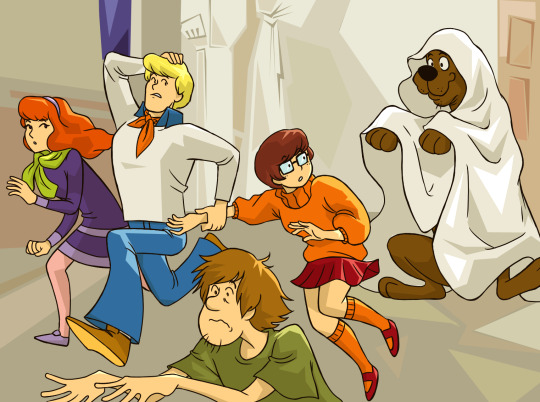
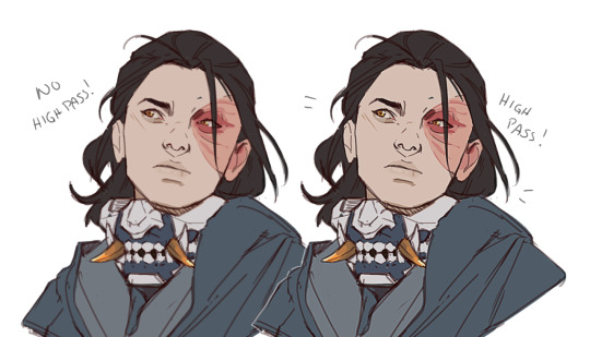
ZOINKS! a ghost!!!
(redraw of this concept art:)
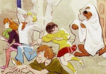
#click for higher quality#ignore the fact that the original pic has like 5 pixels total lol#this is just what i have and ever since google changed their backwards image search its basically useless#fuck google lens all my homies hate google lens#if anyone has a higher quality version of the original feel free to add it on or send it to me ill gladly take it#my posts#my art#scooby-doo#daphne blake#fred jones#shaggy rogers#velma dinkley#redraw#scooby doo where are you#fan art#i actually did line art separate from the sketch for once#usually i just clean up the sketch and use that
115 notes
·
View notes
Text

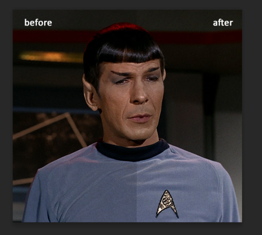
ms paint. you know her. u used her age 8 to make loads of rainbow ovals all over the canvas and then scramble it with selection tool. now u will know her true powers with my handyrandy tips under the readmore. some will be pretty basic and others are very special.
this post has 8 cool trix to learn for you. enjoy and i may do another in the future if i remember/learn more stuff
some of it might be common knowledge. but its got some deep cuts. all tips have gifs to show process easily.
🙂 enjoy and i hope this encourages you to fuck around in mspaint more
soundtrack for this post (loop it while you learn for advanced learning experience)
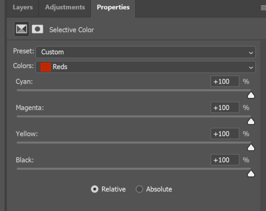
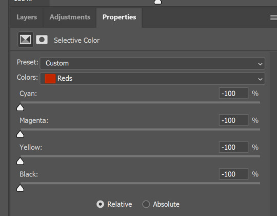
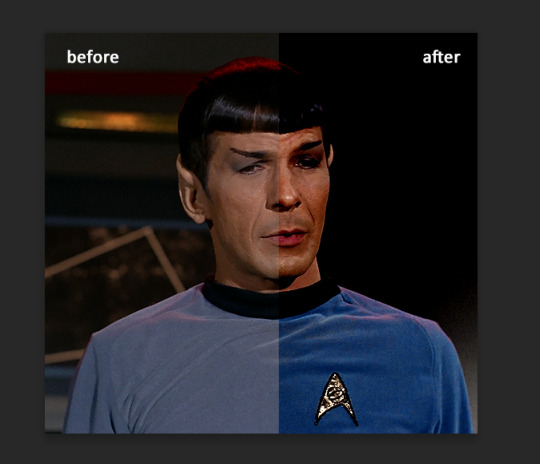
TIP 1) the right click trick
left and right mouse click correspond to col1 and col2 respectively, which u can see in the top bar. this applies to all brushes and the fill tool like above. when using shapes col2 will be the fill colour (if you have solid fill selected). right clicking with shape maker will reverse the colours use on the shape.
TIP 2) right click eraser
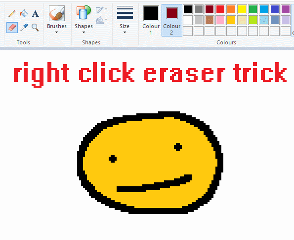
this one is extremely helpful for lineart or add shading. the eraser always uses col2. so your eraser can technically be any colour. but here's where you get powers: right clicking with eraser will only erase onto col1, with col2.
TIP 3) transparent selection change a guy destination
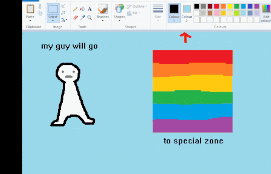
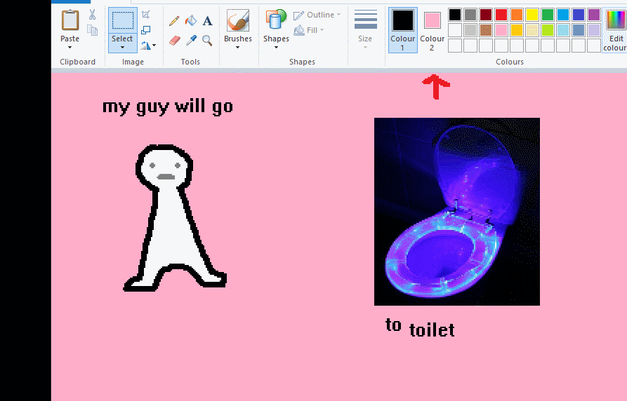
the beloved transparent selection tool works based on what is selected as col2. so long as you have the correct colour as col2 you can make any image transparent and put it on top of anything else. and yes this works with photo bg as you can see.
TIP 4) the gradience
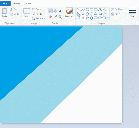
this one is a little more complex. you want to start off with any canvas size, and make as many diagonal coloured bands as you want. (protip: holding down shift makes a perfectly diagonal line with line tool)
then you need to resize the canvas to a width of 1px (make sure you resize by pixels, and do not maintain aspect ratio). then resize again back to its original width (or a different width i cant stop you). you will have your lovely gradience.
TIP 5) superimposter

so. you got a cool gradient and wanna put a guy on it. heres what i do:
i open a 2nd mspaint with same canvas size and draw whatever i want on there. i then pick a completely unrelated colour to my entire piece, and set that as the bg. you could use white, pink, geen, whatever you want as long as it doesnt appear somewhere else in ur drawing. copy the guy.
go back to your gradient tab. ensure that col2 is set as that bg colour you picked (lilac for me). have "transparent selection" enabled. paste your guy in. cue fanfare
TIP 6) advanced superimposter
the great thing about this method is u can put multiple gradients in multiple areas of the image. this is where it gets all japanese printmaking type of shit. ukiyo-esque
all you need to do is make another canvas with a new gradient, ensure col2 is set as the colour you want to replace, then paste your original piece onto the new gradient. now my guy has a soft fade. you can do this as much as you want. (you could even make a canvas with a texture or photo and paste your drawing onto there)
TIP 7) "sketch layer"
so as you now know, col2 is what is removed when you click "transparent selection". which means you can also remove any instance of a colour from ur drawing. which means you can have a unique colour for sketch layer and remove it from the drawing later. i admittedly dont do this but it is a great trick to have.
now combine this with lowering your dpi for smoother lines. may seem obvious but it helps. its like a free stabiliser whenever u want.
TIP 8) rainbow art
now this is where you can get dizzee rascal "bonkers". check out my small and shitty rainbow trick. you can select anything and hold down shift, then drag with left mouse, to turn that selection into its own brush. i even did it with a guy. and you can of course do this with a photo as well.
🙂well that it for now. hope you liked it thanks for reading now back to your regularly scheduled tgcg programming
2K notes
·
View notes
Text
how to make cool blobby turing patterns in photoshop
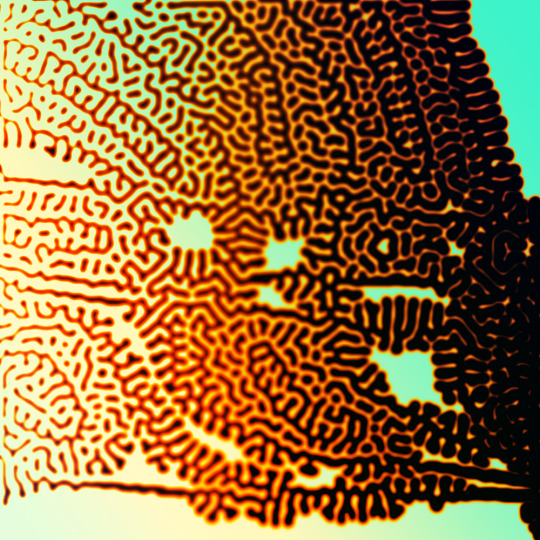
i'll preface with i learned the basic loop from skimming a tutorial on youtube, but as someone who prefers written tutorials i'm sure many would appreciate one! also, the second part of this is some of the visual effects i figured out on my own using blending modes and stuff.
i'm using photoshop CS4 on a mac so some buttons and stuff might be in different places on windows and newer photoshop versions but all the actions are the same. my canvas is 1000x1000 pixels.
UPDATES (i'm hoping these'll show up whenever you open the readmore?)
it's possible to do something similar in krita using this plugin, made by the love @arcaedex
it's also possible to do this in photopea, a free browser alternative to photoshop! the results are pretty much identical.
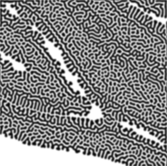
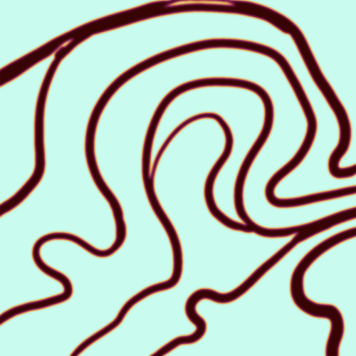
FIRST off you wanna get or make a black and white image of some kind. it has to be one layer. can be noise, a photo, a bunch of lines, whatever. here's mine, just some quick airbrush lines:

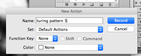
now find the actions tab. idk what it looks like in newer versions of photoshop but you probably won't need to dig!
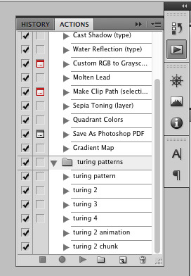
hit the little page thingy to make a new pattern. once you hit 'record', it'll record everything you do. the little square 'stop' icon will end it.
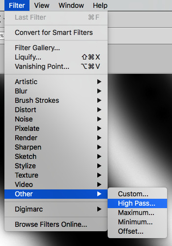
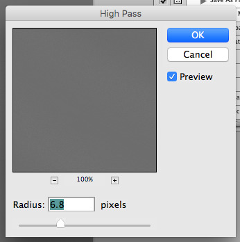
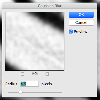
now you want to do a high pass filter. you can mess around with the radius to change the size of your squiggles, but the tutorial had it set to 6. experiment!
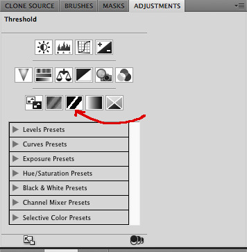
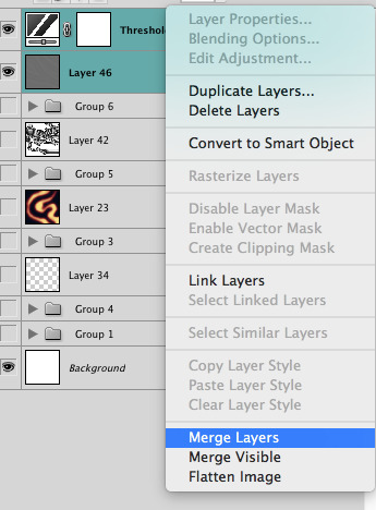
now add the 'threshold' adjustment layer. i use the adjustments tab but i think there's also a dropdown menu somewhere. keep it at the default, 128. merge it down. (control or command + E or you can right click it like some kind of weirdo)
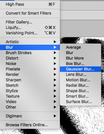
and finally, the gaussian blur! the radius of this affects the shape and size of your squiggles as well. i like to keep it around 4.5 but you can mess around with that too.
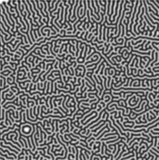
after that, hit 'stop' on the action you're recording, and then repeat it a bunch of times using the 'play' button, until you have something you like, like this:
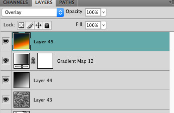
WOW!! that was fun!! and only a little tedious thanks to the power of macros. anyway, here's some fun layer blending stuff i like to do. it's with a different pattern cause i made this bit first.
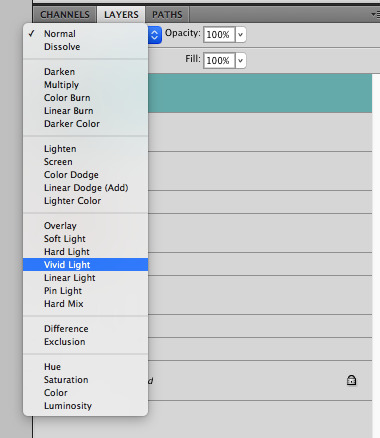
anyway, using a black and white gradient (or a grey base that you do black and white airbrush on), make a layer with the vivid light. this will make the blobs look thicker or thinner.


then, for cool colors, do a gradient map adjustment layer over that:

and finally, my best friend, the overlay layer. just using a gradient here bc i'm lazy, but feel free to experiment with brushes, colors, and blending modes!

NOW GO. MAKE COOL SHIT WITH THE POWER OF MATH. AND SEND IT TO ME
also these are not hard and fast rules PLEASE mess around with them to see what kind of weird shit you can make. here's a gif. as you can see i added some random airblush blobs in the middle of it, for fun.
924 notes
·
View notes
Text
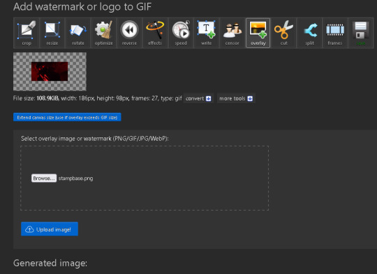
how to make gif stamps
you ever wanted to make your own stamps with gifs like this and have no idea how the fuck to do that?


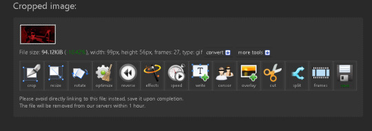
it's really easy and all you need is a gif of your choice and the stamp base. all stamps are 99 x 56px as a tip for normal stamps.
during these steps i am pressing the buttons below every edited image so its easier to navigate.
step 1.
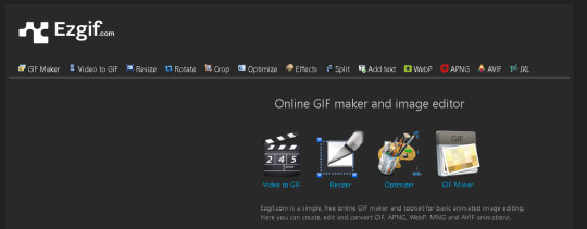
head over to the website ezgif.com. i use it for a lot of gif related things too and its really damn useful.
step 2.
head over to the resize tab and toss in your gif.
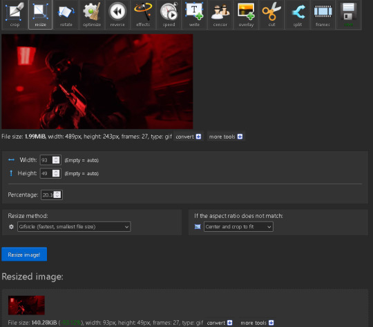
make sure the width is 93 pixels and the height is 49 pixels, dont worry about it being stretched since it resizes it down and some a little bit of cropping.
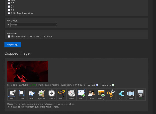
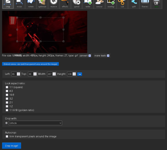
and if you want it to cover a specific area just go to the crop tab and make a selection around the area that's about the shape of the stamp, doesn't need to be perfect. and then head back to resize and do the resizing.
step 3.
head over to overlay in the effects
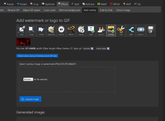
make sure to press the blue button under the gi that says "extend canvas size" its really important you do this so the actual stamp part doesn't get cut off. and add your overlay image aka the stamp base
and heres the base:

step 4:
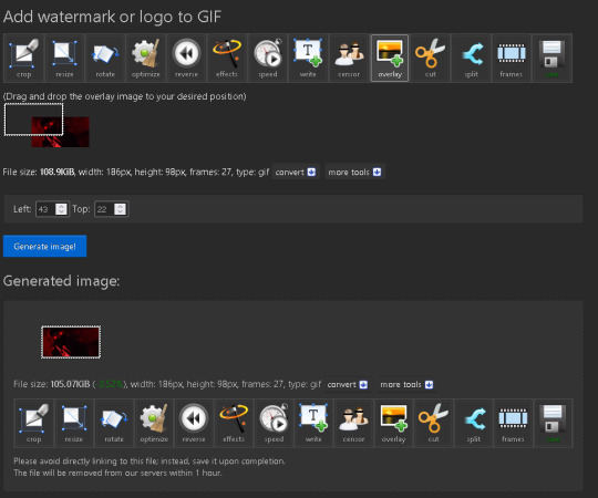
adjust the overlay by putting 43 to the left and 22 to the top so it lines up like its shown here.
step 5.
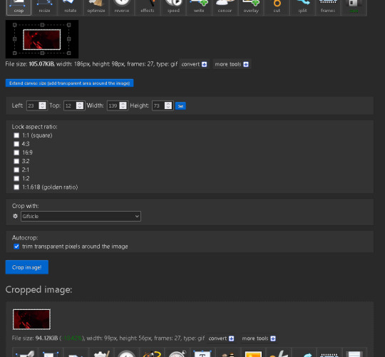
and finally go to crop and scroll down and enable the checkbox that says "trim transparent pixels around the image" and hit crop image.
and there you go, you just made an animated stamp. and heres the finish product on the one i made.

hopefully this helps out in someway and that the steps were easy to understand, let me know if you have any issues or questions.
202 notes
·
View notes
Photo
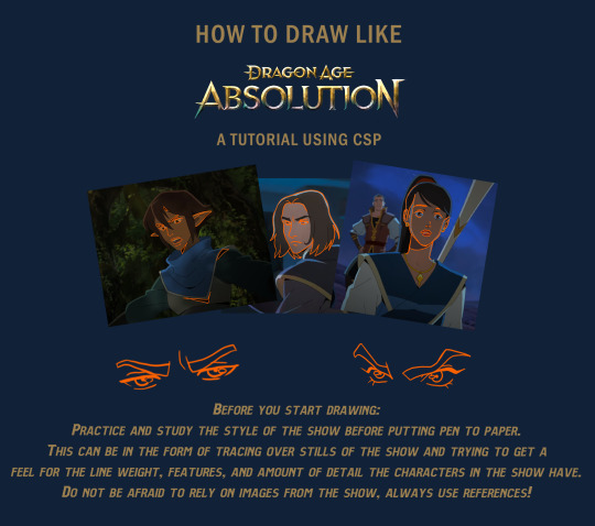
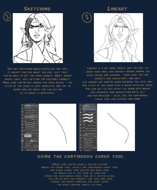

Dragon Age Absolution tutorial!
Note: All you will need to draw this is a tapered pen and a pen with no pen pressure for lines.
Here is a link for the brush I used for lines: Download
Written Steps in the Read More!
Before you start drawing:
Practice and study the style of the show before putting pen to paper. This can be in the form of tracing over stills of the show and trying to get a feel for the line weight, features, and amount of detail the characters in the show have. Do not be afraid to rely on images from the show, always use references!
Steps:
Sketching - Use any sketching brush you’d like for this, it doesn’t matter what you use, just that you’re able to get the form correct. Don’t worry about lines, just getting the features correct. Make sure you’re not adding too much detail - the style of the show is very stylized and try to weigh and see what you can get rid of vs what is necessary.
Lineart - Lineart is a bit more tricky, but try not to judge your lines too harshly before adding the base colors and shading - make sure the line weights are consistent, and only use larger line widths when drawing the lash line. The style of the show uses a brush with no taper. You can get to this effect by going into brush size dynamics and unselecting both tilt and pen pressure - also, use the continuous curve tool for clothes and hair!
Continuous Lines - (Make sure you’re using a vector layer!) Under the figure tool, select the continuous curve tool and start lining your sketch and make sure the brush size is the same as your pen. Using the continuous curve tool on a vector layer, you can go into the connect line tool and then change the points however you want using the move control points setting.
Flat colors - For flat colors, it may be helpful to place or paint your background first to get a sense of lighting and tint. Feel free to adjust and use color balance, the style of DA Absolution uses solid and saturated colors.
Cell shading - Now - for cell shading, use a solid tapered pen on a clipping mask above your colors. For highlights, set the layer mode to Add (Glow) and adjust opacity and color as necessary. For shadows, use either multiply or soft light layer with a darker color to create dimension - as before, adjust opacity and color as necessary. Try to keep the shapes sharp, but if the edges are too rough, use a small amount of blur.
Final Touches - Using a black tapered pen, create shadows around the folds of clothes, the chin or jaw, and hair - add highlights in the same method as before for smaller details and add a shine to the eyes and lips. If the image is pixelated, use a small amount of blur - and you’re done!
#step by step#art help#art tutorial#digital art tutorial#clip studio paint#dragon age absolution#da absolution#dragon age#dragon age fanart#long post#brushes#resources#bioware
1K notes
·
View notes
Text
Scott pilgrim is a modern retelling of Dante’s Inferno, and I want to talk about it
Hi . Brought this up very briefly a while ago but i rewatched spto with friends last night and got my gears turning. I don’t usually make posts like this but It’s been on my mind and I want to share. Here we goooo. Under read more becwuse I wish not to disturb my beloved friends with a long post
First off, let’s start with theeeee obvious.
Say hello to our Dante and Beatrice.
I don’t think I need to go into this first one much, but Scott and Dante are of course the heroes(term used lightly. Scott is not a good person and honestly neither was fuckinh Dante of all people) of their respective tales, going through hell and back to win over this ethereal, “too good to be true” heavenly dream girl. Scott even dies to get her in the end, like Dante venturing down into the depths of hell, dying and then ascending to get to Beatrice. If I wanted to really stretch it I could say the dreamscape is a sort of purgatory but I don’t think there’s enough evidence for that one.
Next,

Our Virgil. What’s up, Wallace.
In the comics Wallace acts as a sort of guide to Scott. We end up seeing him less as the comic progresses, which I find lines up with Virgil having to part ways with Dante before he enters heaven. Not much to say otherwise admittedly. Love you though buddy
Now for the symbolism of hell. Since there are nine circles of hell, it obviously can’t match up one to one with the exes unless we add some of scott’s relationships to the mix, which both doesn’t make sense, causes this analysis to get stupider than it already is, and leaves some characters left over that already don’t fit in to these parallels.
Luckily, however, there are The Seven Deadly Sins. Going to be going in sin order rather than ex order here
Firstly,
MATTHEW PATEL - PRIDE
- the first boyfriend and the first sin very conveniently line up, which threw me off track because I thought the exes would go in the order of the sins. Enyways
- in the movies, comics, and shows, he is insanely flashy with how he presents himself. It’s the entrance, the dances, the expressive clothing (“that guy’s dressed as a pirate” “pirates are in this year!”, modifying Gideon’s suit to fit his color palette, the outfit he wore while kicking gideon’s ass). The theatre kid in him essentially
- taking the lead in the musical Knives and Stephen presented him with— they knew how to cater to him, because he views himself as the coolest bitch on the planet. Which honestly he kind of is but don’t tell him this
- so headstrong in his pride that he fucks up. Repeatedly. First to get killed, too cocky, spends all of gideons money “I’ve lost billions!”
- believes he’s entitled to Ramona as soon as he wins the fight against Scott
GIDEON- GREED
- I don’t feel like I have to explain this one but I will because I enjoy him greatly
- CEO, billionaire. Money money money mr rich
- literally “owns” or tries to excersize ownership Ramona in the comics and movie as if she belongs to him— with the glow, or with the chip implanted into her neck with his logo on it.
- has all of his past girlfriends cryogenically frozen. All for him none for anyone else. They should only love meeeeee.
- wants everything for himself in excess. Women, fame, money. Almost considered pride for him also but greed is more fitting
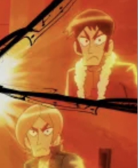
KEN AND KYLE- ENVY AND LUST
- holy shit this image has five pixels so sorry about that I’m on my phone and Google images sucks
- anyways of course they’re sharing sins
- not much to say here as they don’t show up much, and it’s easy to make the argument of envy or lust for ANY of the seven exes. These two were the hardest to figure out. Not as sure on Envy, but can definetly advocate for lust— playing around with women, thinking they were playing around with Ramona.

TODD- GLUTTONY
- this one was the easiest one for me. Like come on
- breaks vegan edge in the comics, movie, (vegan police), and show (Wallace breakup event 2 dead 5 injured)
- his whole persona revolves around food. Of course gluttony doesn’t always mean food but here it most definetly equates. Even when he’s vegan he always makes it a talking point of how superior he is to others because of this fact, only for it to blow up in his face when his enjoyment of non vegan food catches up to him.
ROXY- WRATH
- a very angry girl to be sure. Takes her emotions out using violence, attacking Ramona the first time she sees her, even though she is going out of the order of the league and supposed to be attacking Scott (although I guess that point is moot because they all think he’s dead at that point)
- “I’m bi-furious” line from the movie deserves a shout out here I think
- (completely justified) Unending rage against Ramona in the show, and scott in the comics and movies. She is PISSED.
Lastly,

LUCAS LEE- SLOTH
- also one of the easiest ones. Could have made an argument for pride (tries to prove he can land a sick ollie so hard that he dies) or greed (movie star who lives in huge mansion), but sloth ultimately fit the bill the best.
- even before we get into his reoccurring theme of “whatever” in the show, it’s pretty evident in the comics and movie that he doesn’t care enough to extend effort. He tells Scott he’ll leave him alone and say his ass got kicked if Scott gave him a twenty dollar bill, sends his stunt doubles to fight Scott in his stead.
- onto the show, he lets his stardom slip out of his fingers with his attitude, not even caring to read or memorize the script anymore (“is that why half the lines in your last film were ‘Let’s Party’?” “I uhh, read the title.” Etc). Just spends all his time messing around and skateboarding. The title of his episode is literally “Whatever”. He doesn’t give enough of a shit to care. Which. Respect I guess
Extra; the exes ARE referred to as “the seven deadly chumps” in the show.
In conclusion;
#Scott pilgrim#ramona flowers#Wallace wells#matthew patel#gideon graves#todd ingram#roxy richter#lucas lee#kyle katayanagi#ken katayanagi#scott pilgrim takes off#scott pilgrim vs the world#writing#not ocs#this took me an hour to write tghis is why there’s so many tags.#anyways thank you bye bye
156 notes
·
View notes
Text
Hidden text?
I’ve been going insane over this for months... I don't think I've ever seen any meta posts talking about this, but if there are, feel free to link them!
So. If you look carefully at the end credits, there seems to be some sort of hidden text there in the grain filter. I'll add a couple of screenshots though tumblr will absolutely butcher the quality, so I encourage you to check the credits if you have access to them. Here's the original and one with added brightness:
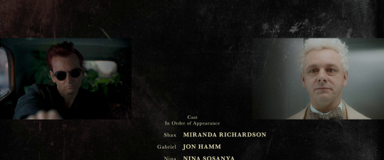


See what I'm talking about?
More under the cut
I know this is most likely nothing. That grainy filter has a lot of little details that appear to be letters or even doodles, and our brains love to find patterns. However, this text-looking line does seem a bit weird. I don't know... something about its placement there in the middle. There’s also something that looks like an “x” right below it. As the credits roll, the entire filter moves upwards. This is how it looks near the end:


I have spent a LOT of time trying to decipher what it says but it’s too pixelated. I tried rotating the image and even mirroring it. English is not my first language, so there’s also that.


Again, this is most likely nothing lol. But I just wanted to know what you folks think!
#good omens#good omens meta#good omens 2#good omens 2 meta#good omens s2#gos2#the final fifteen#crowley#aziraphale
70 notes
·
View notes
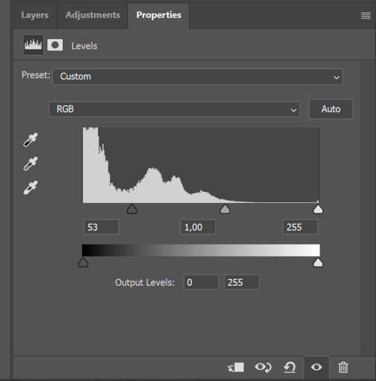
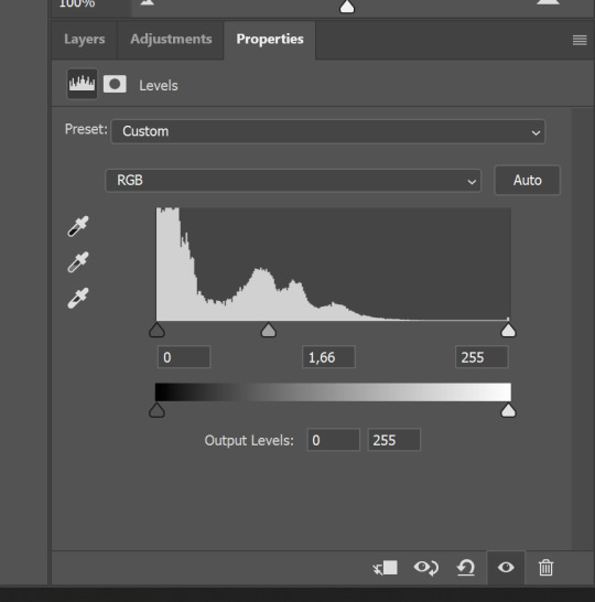
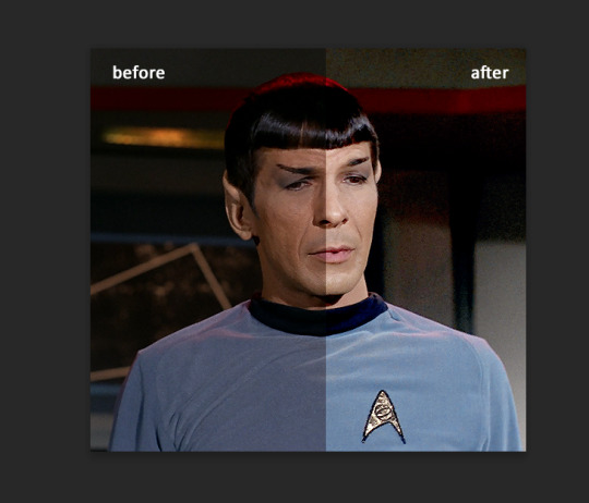
Text
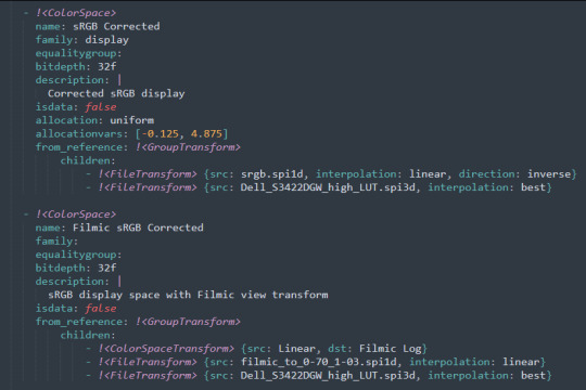
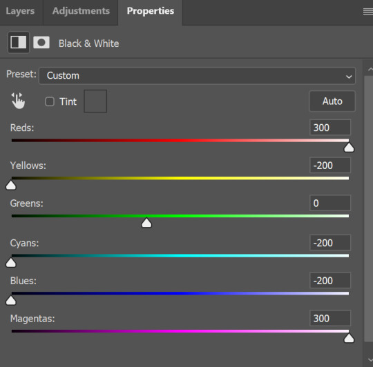
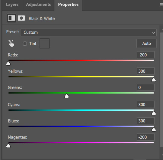
canmom's notes on fixing the colours
ok so if you've been following along on this blog for the last week or two i've been banging on about colour calibration. and i feel like it would be good to sum up what i've learned in a poast!
quick rundown on colour spaces
So. When you represent colour on a computer, you just have some numbers. Those numbers are passed to the monitor to tell it to turn some tiny lights up and down. The human visual system is capable of seeing a lot of colours, but your monitor can only display some of them. That's determined by its primaries, basically the exact colour* of its red, green and blue lights.
(*if you're wondering, the primaries are specified in terms of something called the CIELAB colour space, which is a model of all the different colours that humans can possibly see, devised by experiments in the early-mid 20th century where the subjects would turn lights at different frequencies up and down until they appeared visually the same. Through this, we mapped out how eyes respond to light, enabling basically everything that follows. Most human eyes tend to respond in pretty close to identical ways - of course, some people are colourblind, which adds an extra complication!)
Now, the problem we face is that every display is different. In particular, different displays have different primaries. The space in between the primaries is the gamut - the set of all colours that a display can represent. You can learn more about this concept on this excellent interactive page by Bartosz Ciechanowski.
The gamut is combined with other things like a white point and a gamma function to map numbers nonlinearly to amounts of light. All these bits of info in combination declare exactly what colour your computer should display for any given triplet of numbers. We call this a colour space.
There are various standard sets of primaries, the most famous being the ITU-R Rec.709 primaries used in sRGB, first defined in 1993, often just called the sRGB primaries - this is a fairly restricted colour space, intended to be an easy target for monitor manufacturers and to achieve some degree of colour consistency on the web (lol).
Since then, a much wider gamut called Rec.2020 has recently been defined for 'HDR' video. This is a very wide gamut, and no existing displays can actually show it in full. Besides that, there are various other colour spaces such as AdobeRGB and P3, which are used in art and design and video editing.
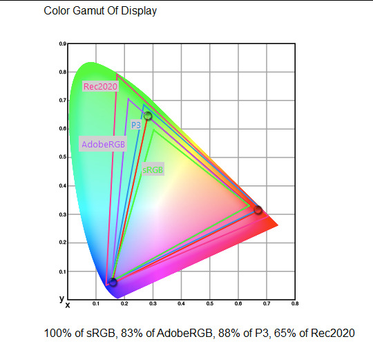
What you see above is something called a 'chromaticity diagram'. the coordinate system is CIE xyY with fixed Y. The curved upper edge to the shape is the line of monochromatic colours (colours created by a single frequency of light); everything other colour must be created by combining multiple frequencies of light. (Note that the colours inside the shape are not the actual colours of those points in CIE XY, they're mapped into sRGB.)
In this case, the red, green and blue dots are the primaries of my display. Since they are outside the green triangle marked sRGB, it qualifies as a 'wide gamut' display which can display more vivid colours.
Sidebar: you might ask why we didn't define the widest possible gamut we could think of at the start of all this. Well, besides consistency, the problem is that you only have so many bits per channel. For a given bit depth (e.g. 8 bits per channel per pixel), you have a finite number of possible colours you can display. Any colours in between get snapped to the nearest rung of the ladder. The upshot is that if you use a higher gamut, you need to increase the bit depth in order to avoid ugly colour banding, which means your images take up more space and take more time to process. But this is why HDR videos in Rec.2020 should always be using at least 10 bits per colour channel.
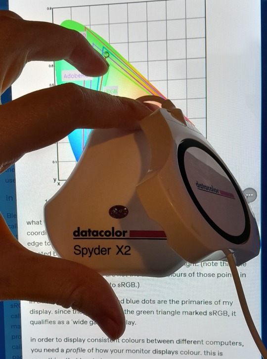
in order to display consistent colours between different computers, you need a profile of how your monitor displays colour. Yhis is something that has to be measured empirically, because even two monitors of the same model will be slightly different. You get this information by essentially taking a little gadget which has a lens and a sensitive, factory-calibrated colour meter, and holding it against your screen, then making the screen display various colours to measure what light actually comes out of it. This information is packed into a file called an ICC profile.
(Above is the one I got, the Spyder X2. I didn't put a lot of thought into this, and unfortunately it turns out that the Spyder X2 is not yet supported by programs like DisplayCal. The Spyder software did a pretty good job though.)
Wonderfully, if you have two different ICC profiles, and you want to display the same colour in each space, you can do some maths to map one into the other. So, to make sure that a picture created on one computer looks the same on another computer, you need two things: the colour space (ICC profile) of the image and the colour space (ICC profile) of the screen.

Now different operating systems handle colour differently, but basically for all three major operating systems there is somewhere you can set 'here is the icc profile for this screen'. You might think that's the whole battle: calibrate screen, get ICC profile, you're done! Welcome to the world of consistent colour.
Unfortunately we're not done.
the devil in the details
The problem is the way applications tell the operating system about colour is... spotty, inconsistent, unreliable. Applications can either present their colours in a standard space called sRGB, and let the OS handle the rest - or they can bypass that entirely and just send their numbers straight to the monitor without regard for what space it's in.
Then we have some applications that are 'colour managed', meaning you can tell the application about an ICC profile (or some other colour space representation), and it will handle converting colours into that space. This allows applications to deal with wider colour gamuts than sRGB/Rec.709, which is very restricted, without sacrificing consistency between different screens.
So to sum up, we have three types of program:
programs which only speak sRGB and let the OS correct the colours
programs which aren't colour aware and talk straight to the monitor without any correction (usually games)
programs which do colour correction themselves and talk straight to the monitor.
That last category is the fiddly one. It's a domain that typically includes art programs, video editors and web browsers. Some of them will read your ICC profile from the operating system, some have to be explicitly told which one to use.
Historically, most monitors besides the very high end were designed to support sRGB colours and not much more. However, recently it's become easier to get your hands on a wide gamut screen. This is theoretically great because it means we can use more vivid colours, but... as always the devil is in the details. What we want is that sRGB colours stay the same, but we have the option to reach for the wider gamut deliberately.
Conversely, when converting between colour spaces, you have to make a decision of what to do with colours that are 'out of gamut' - colours that one space can represent and another space can't. There's no 'correct' way to do this, but there are four standard approaches, which make different tradeoffs of what is preserved and what is sacrificed. So if you look at an image defined in a wide colour space such as Rec.2020, you need to use one of these to put it into your screen's colour space. This is handled automatically in colour managed applications, but it's good to understand what's going on!
(*You may notice a difference in games even if they're not colour managed. This is because one of the things the calibration does is update the 'gamma table' on your graphics card, which maps from numeric colour values to brightness. Since the human eye is more sensitive to differences between dark colours, this uses a nonlinear function - a power law whose exponent is called gamma. That nonlinear function also differs between screens, and your graphics card can be adjusted to compensate and make sure everyone stays on the standard gamma 2.2. Many games offer you a slider to adjust the gamma, as a stopgap measure to deal with the fact that your computer's screen probably isn't calibrated.)
For what follows, any time you need the ICC profile, Windows users should look in C:\Windows\System32\spool\drivers\color. MacOS and Linux users, see this page for places it might be. Some applications can automatically detect the OS's ICC profile, but if not, that's where you should look.
on the web
Theoretically, on the web, colours are supposed to be specified in sRGB if not specified otherwise. But when you put an image on the web, you can include an ICC profile along with it to say exactly what colours to use. Both Firefox and Chrome are colour-managed browsers, and able to read your ICC profile right from the operating system. So an image with a profile should be handled correctly in both (with certain caveats in Chrome).
However, Firefox by default for some reason doesn't do any correction on any colours that don't have a profile, instead passing them through without correction. This can be fixed by changing a setting in about:config: gfx.color_management.mode. If you set this to 1 instead of the default 2, Firefox will assume colours are in sRGB unless it's told otherwise, and correct them.
Here is a great test page to see if your browser is handling colour correctly.
Chrome has fewer options to configure. by default it's almost correctly colour-managed but not quite. So just set the ICC on your OS and you're as good as it's gonna get. The same applies to Electron apps, such as Discord.
To embed a colour profile in an image, hopefully your art program has the ability to do this when saving, but if not, you can use ImageMagick on the command line (see below). Some websites will strip metadata including ICC profile - Tumblr, fortunately, does not.
For the rest of this post I'm going to talk about how to set up colour management in certain programs I use regularly (Krita, Blender, mpv, and games).
in Krita
Krita makes it pretty easy: you go into the settings and give it the ICC profile of your monitor. You can create images in a huge variety of spaces and bit depths and gamma profiles. When copying and pasting between images inside Krita, it will convert it for you.
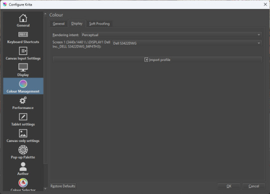
The tricky thing to consider is pasting into Krita from outside. By default, your copy-paste buffer does not have colour space metadata. Krita gives you the option to interpret it with your monitor's profile, or as sRGB. I believe the correct use is: if you're copying and pasting an image from the web, then sRGB is right; if you're pasting a screenshot, it has already been colour corrected, you should use 'as on monitor' so Krita will convert it back into the image's colour space.
in Blender
Blender does not use ICC profiles, but a more complicated system called OpenColorIO. Blender supports various models of mapping between colour spaces, including Filmic and ACES, to go from its internal scene-referred HDR floating-point working space (basically, a space that measures how much light there is in absolute terms) to other spaces such as sRGB. By default, Blender assumes it can output to sRGB, P3, etc. without any further correction.
So. What we need to do is add another layer after that which takes the sRGB data and corrects it for our screen. This requires something called a Lookup Table (LUT), which is basically just a 3D texture that maps colours to other colours. You can generate a LUT using a program called DisplayCal, which can also be used for display calibration - note that you don't use the main DisplayCal program for this, but instead a tool called 3DLUT Maker that's packaged along with it. see this Stack Overflow thread for details.
Then, you describe in the OpenColorIO file how to use that LUT, defining a colour space.

The procedure described in the thread recommends you set up colour calibration as an additional view transform targeting sRGB. This works, but strictly speaking it's not a correct use of the OpenColorIO model. We should also set up our calibrated screen as an additional display definition, and attach our new colour spaces to that display. Also, if you want to use the 'Filmic' View Transform with corrected colours (or indeed any other), you need to define that in the OpenColorIO file too. Basically, copy whatever transform you want, and insert an extra line with the 3D LUT.
Here's how it looks for me:
in games (using ReShade)
So I mentioned above that games do not generally speaking do any colour correction beyond the option to manually adjust a gamma slider. However, by using a post-processing injection framework such as ReShade, you can correct colours in games.
If you want to get the game looking as close to the original artistic intent as possible, you can use the LUT generator to generate a PNG lookup table, save it in the Reshade textures folder, then you load it into the LUT shader that comes packaged with Reshade. Make sure to set the width, height and number of tiles correctly or you'll get janked up results.
However... that might not be what you want. Especially with older games, there is often a heavy green filter or some other weird choice in the colour design. Or maybe you don't want to follow the 'original artistic intent' and would rather enjoy the full vividness your screen is capable of displaying. (I certainly like FFXIV a lot better with a colour grade applied to it using the full monitor gamut.)
A 3D Lookup Table can actually be used for more than simply calibrating colour to match a monitor - it is in general a very powerful tool for colour correction. A good workflow is to open a screenshot in an image editor along with a base lookup table, adjust the colours in certain ways, and save the edited lookup table as an image texture; you can then use it to apply colour correction throughout the game. This procedure is described here.
Whatever approach you take, when you save screenshots with Reshade, it will not include any colour information. If you want screenshots to look like they do in-game when displayed in a properly colour managed application, you need to attach your monitor's ICC profile to the image. You can do this with an ImageMagick command:
magick convert "{path to screenshot}" -strip -profile "{path to ICC profile}" "{output file name}.webp"
This also works with TIFF and JPEG; for some reason I couldn't get it to work with PNG (you generate a PNG but no colour profile is attached.)
It's possible to write a post-save command in ReShade which could be used to attach this colour space info. If I get round to doing that, I'll edit into this post.
video
In MPV, you can get a colour-corrected video player by setting an appropriate line in mpv.conf, assuming you're using vo=gpu or vo=gpu-next (recommended). icc-profile-auto=yes should automatically load the monitor ICC profile from the operating system, or you can specify a specific one with icc-profile={path to ICC profile}.
For watching online videos, it seems that neither Firefox nor Chrome applies colour correction, even though the rest of the browser is colour-managed. If you don't want to put up with this, you can open Youtube videos in MPV, which internally downloads them using Youtube-DL or yt-dlp. This is inconvenient! Still haven't found a way to make it colour-corrected in-browser.
For other players like VLC or MPC-HC, I'm not so familiar with the procedure, you'll need to research this on your own.
what about HDR?
HDR is a marketing term, and a set of standards for monitor features (the VESA DisplayHDR series), but it does also refer to a new set of protocols around displaying colour, known as Rec. 2100. This defines the use of a 'perceptual quantiser' function in lieu of the old gamma function. HDR screens are able to support extreme ranges of brightness using techniques like local dimming and typically have a wider colour gamut.
If your screen supports it, Windows has a HDR mode which (I believe) switches the output to use Rec.2100. The problem is deciding what to do with SDR content on your screen (which is to say most things) - you have very little control over anything besides brightness, and for some reason Windows screws up the gamma. Turning on HDR introduced truly severe colour banding all over the shop for me.
My colorimeter claims to be able to profile high brightness/hdr screens, but I haven't tested the effect of profiling in HDR mode yet. There is also a Windows HDR calibration tool, but this is only available on the Microsoft store, which makes it a real pain to set up if you've deleted that from your operating system in a fit of pique. (Ameliorated Edition is great until it isn't.)
Anyway, if I get around to profiling my monitor in HDR mode, I will report back. However, for accurate SDR colour, the general recommendation seems to be to simply turn it off. Only turn it on if you want to watch content specifically authored for HDR (some recent games, and HDR videos are available on some platforms like Youtube). It's a pain.
is this all really worth the effort?
Obviously I've really nerded out about all this, and I know the likely feeling you get looking at this wall of text is 'fuck this, I'll just put up with it'. But my monitor's gamma was pretty severely off, and when I was trying to make a video recently I had no idea that my screen was making the red way more saturated and deep than I would see on most monitors.
If you're a digital artist or photographer, I think it's pretty essential to get accurate colour. Of course the pros will spend thousands on a high end screen which may have built in colour correction, but even with a screen at the level I'm looking at (costing a few hundred quid), you can do a lot to improve how it looks 'out of the box'.
So that's the long and short of it. I hope this is useful to someone to have all of this in one place!
I don't know if we'll ever reach a stage where most monitors in use are calibrated, so on some level it's a bit of a fool's errand, but at least with calibration I have some more hope that what I put in is at least on average close to what comes out the other end.
94 notes
·
View notes
Text
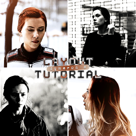
here's my quick tutorial for making layouts in photoshop! i'll be going over how to make this 4-panel square one!
↳ requires basic knowledge of photoshop
「 step 1: making your file 」
make a new file, 540 x whatever height you want (just make sure it fits within tumblr’s image size guidelines), and make sure the background is set to transparent. for this specific layout, i want the overall shape to be square, so my dimensions are 540x540!

「 step 2: mapping out 」
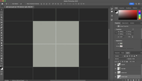
the best way to make sure your layouts are even and spaced equally is using guides! go to view > guides > new guide layout. the color of your guides doesn’t matter at all (i just like green so mine are green lol), and you can have as many columns and rows as you want. since this is going to be a 2x2 layout, i’ll have 2 columns and 2 rows. the general rule of thumb for gutter is 4px.

once your guides pop up, select the rectangle tool by pressing U on your keyboard. make sure shape is selected from the drop-down menu at the top (right by the home button in the top left), and make sure that you have snapping on (view > snap).
using the rectangle tool, trace out your layout panels! as long as you have snapping on, your path should naturally snap to the guidelines, making it a LOT easier to do this! when you’re done making your rectangles, you can turn off guides by going to view > guides > clear guides (i usually keep them on until i’m done adding in my gifs but this is up to you). i always name each shape layer after where it is in the grid to not get confused.

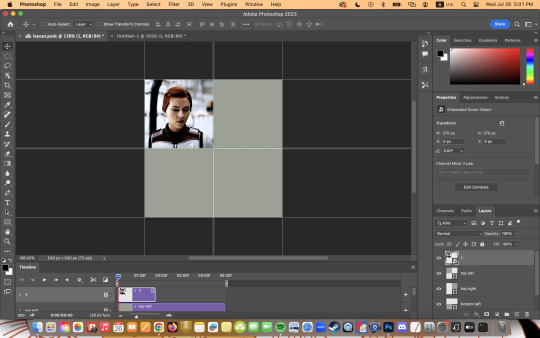
「 step 3: adding gifs 」
some quick things before i go over actually adding in your gifs:
1. make each of your gifs in their own individual files. you’ll be adding them into the main one later.
2. your gifs have to be the same length — you can cut them down to length in their own individual files or later in the main one. either way is fine, totally up to you!
now you have your layout set up, you can make and add your gifs! in order to make sure that they fit into the panels, check the dimensions of each shape you’ve created by selecting the layer and looking in the properties tab. my panels are each 268x268.

i’ll actually be making each of my gifs 270x270, just to make sure that i don’t have any weird gaps or anything (i’ll talk about how i’ll be getting rid of the 2 extra pixels on each side later).
once you have your gifs done, you can duplicate them into the main one. convert your gif and anything else (coloring etc) into a smart object (right click > convert to smart object), and then right click it and select “duplicate layer”. make sure the document you’re duplicating to is the one with your layout in it.
layers automatically duplicate aligned into the top left corner. since this is where my first panel is, i can just leave my gif there, but for the other ones, drag your gifs into place using transform and your mouse (once again making sure that snapping is on).
now to get rid of those extra pixels. this step also makes sure your gif is perfectly in line with the shape you’ve outlined the layout with. make sure your gif is right above the shape layer in the layers tab, and then right click and select “create clipping mask”. this makes sure your gif doesn’t go outside the limits of your guidelines. this is what it should look like in the layers tab:
「 step 4: exporting 」
exporting a layout gif is pretty much like exporting any other gif, but you do need to check your matte settings before saving. the wrong ones can make what should be the transparent dividers solid, which can throw off the look of your gifs. make sure matte is set to “none”, and then save as normal!

here's my finished gif:
happy giffing!
feel free to send me an ask/message me w any questions!
#gif tutorial#gif tutorials#allresources#completeresources#userchibi#userpjo#uservivaldi#userraffa#userbess#usermorgan#tuserheidi#userrobin#userkosmos#usershreyu#userzaynab#userisaiah#thingschanged#rogerhealey#*mine
216 notes
·
View notes
Note
How do you get your drawings to be high quality? Whenever I post art the quality is SO bad 💔
uhm... sorry this is got long. for some reason you activated my work mode. i don't have a constumer service voice but i have like an explenation mode for clients so... uhm. here is way more information that you asked for. my apologies...
Resolution is what determines the sharpness of the artwork. The low-resolution illustration will appear pixelated when scaled in large sizes. this is why it is recommended to work on a digital canvas with a resolution of at least 300 dpi when you work. (i prefer 400dpi)
dpi are Dots Per Inch. dots just being a different name for pixels. the more pixels are contained in an inch the smoother lines and gradients are. an indication of higher quality. but, the device you are working on has to use up most of its ram/power to calculate the preview on the screen. so higher quality demands more capacity from your device but also from websites that display your artwork. Soo...
I have two files.
One on 400 dpi is way larger for me for smooth comfortable drawing.
and the second drawing is sized down to 150dpi to accommodate the recommended resolution of the website I want to post the image.
luckily for us, most social media sites have a similar resolution.
Tumblr's Dashboard images have a minimum size of 500 x 750 pixels, a maximum expanded the size of 2048 x 3072 pixels, and a recommended size of 1280 x 1920 pixels for a 2:3 aspect ratio.
I use a with of 1280. the high depends on the drawing
It's way easier and recommended to size images down rather than up.
sizing artwork up would put them through an interlacing process, which means that the graphics program of your choice would calculate the average between two pixes and add it in between them. It adds pixels to make the image larger. easy answer it blurs your image.
it isn't the end of the world if you have to size up the image a tiny bit.
I kind of have to do a bit all the time for work. and most of the time it's fine! it depends on your art style and how forgiving it can be.
It's also a difference if you post images in a JEPG or PNG.
uhm... without going into much detail... take PNG just trust me.
now... a tiny little last trick out of my sleeve.
if you... use photoshop. and you want some extra sharpness.
you can sharpen your images with the high pass filter.
Duplicate your artwork
Filter > other >highpass

As soon you select High Pass, your image will turn grey

It works by filling the entire image with flat, neutral grey. It then looks for edges in the image and highlights them by making the light side of the edge lighter and the dark side darker.
Don't overdo it. keep the contrast low. a radius of 1,5px is enough most of the time!
Click okay to exit the menu and set the layer on overlay.
ta-da! it is sharp and crisp!!!
It's all a trick!!! vary subtle... i know but ehh i like it
I am sorry I don't know if other programs also have this option. I know CSP has a sharpening filter. but... you can keep images crisp by keeping resolution and dpi in mind too.
uhm... well so... -hides-
#chip!ask#chip!talks#i maybe overdid it here#but i ended wrtiting it and now i just... eh. i don't want to delate it... sorry!#zuko
980 notes
·
View notes
Text
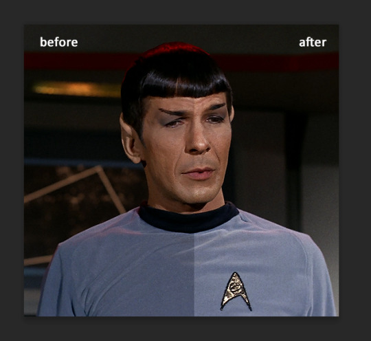
a very foking detailed GIF tutorial you asked for and how I color my gifs
However, I color them individually, so there will be explanation of tools I choose instead of showing what settings I used for this specific gif in this tutorial.
I will go through entire process of how I create gifs, the process of gifmaking can be different for others and there is no obligation of how to create a gif. Basically, do it however you like and enjoy the process.
this is part I, part II is here\in reblogs.
First, you will need to prepare everything, you choose the moment you want to gif and make screencaps. I use mpv player to create them, here is a great tutorial on how to install it. So I won't go over it, just follow it and or use another player which allows to make screencaps, such as kmplayer.
Once you make screencaps go to photoshop - file - scripts - load files into stack - browse - select screencaps and upload them.
At this point I will also add that I use keyboard shortcuts a lot, you can set them up to your preference, that is much easier for me and might be for you too, and I am so used to them that I forget where are some settings. You can do it from edit - keyboard shortcuts, you may set up anything there.
You will have all screencaps uploaded into one file. Once I have it I change canvas/image size, I also remove 10 pixels from each side, because I hate that some files have that weird black line which looks awful on gifs. But that's up to you. Use proper dimensions for tumblr, that is important since your gifs will look 'not good' when you upload them. I will go with 540x500px this time. (correct dimensions for tumblr are 540px for big gifs, 268px for two gifs along each other and 177-178-177px for the three gifs together)
Go to images - image size (crtl+alt+i) and change the size.
After that I make animation, because without it we would not be able to convert all the screencaps into smart filters. Go to windows - timeline
you will have something like this by default

click on create frame animation - then on 4 horizontal lines which will open menu - make frames from layers
click on convert to video timeline (that 3 horizontal lines and 1 vertical line or whatever it is, right under the first layer) you will get something like this.
now, this will be animated. If you choose convert to video timeline right away it will not be animated.
Now, select all the layers - filters - convert to smart filters
You will have something like this, and if you play it - it will be animated anyway. That way you can edit ALL the screencaps at once.
I usually start with sharpening, settings may change according to the files I have, for some you will need more sharpening, for some less. I go with filters - sharpen - smart sharpen and usually that's enough
but I sometimes add more sharpening, just change radius to 0,2. So, repeat the action.
You will have it like this
and at any point of making gif you will be able to change settings for it, if after coloring it will look not as good as you wanted to.
I will not go into a lot of details about coloring for this gif, because does not matter how good the coloring on this gif will be, it won't work as good on another gif.
There is no right way to start coloring, you may start with curves, levels or selective colors depending on the screencaps you want to edit.
Well, this time I did start with layer - new adjustment layer - curves. (yeah, i guess by the end of the day we all do lmao)
(Always use 'layer - new adjustment layer'. That's the only thing I suggest to remember when you color. )
Just to brighten gif a little bit, but you also can change colors with it.
those are not settings I used for this gif!
Curves have option to edit colors, just press RGB and you will see options for RED, GREEN, BLUE. Upper slider adds the said color, the slider at the bottom removes it. That's a great tool if you have a very red\yellow\blue\green scene, with those settings and moving sliders here and there you will be able to add the color you want, for red scene I suggest to use more green and blue, as well as for yellows but with less green. Just move them to see what fits your gif better.


there are also eyedrop tools which will help you to edit picture, with the first one you need to find the darkest part of your gif and click, it will adjust your picture according to it. If there's too much red, it will make it bluer, etc. The middle one is the one I use the most out of them, cos it changes the midtones, it's great if you have very yellow picture, just press the yellow part and it will make it bluer\greenish, depends on the picture, and then you can adjust it to make it look better. And the last one you can use to lighten picture as well, just find the brightest part of the picture and press it. It will adjust other colors accordingly.
I like to play with settings, I could add more darkness to the gif by levels, by selective colors making dark colors even darker, but sometimes I just use layer - new adjustment layer - black & white. Putting it on soft light blending mode and changing opacity. Idk, I like the effect :D Also, by using these, you will be able to darken part or lighten specific colors
so yeah, play around and figure out what is the best way for you.
after that I used layer - new adjustment layer - selective colors. I think this is one of my favorite tools out there, I love it, I usually end up with 30 selective color layers if I make a super complex gif :D
You can change colors with it, make them more vibrant, or less.

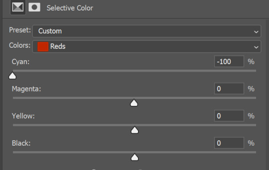
for each color you will have 'cyan, magenta, yellow and black' and by dragging sliders you can change colors, make them darker or lighter for the lovers of those paster gifs :D

But don't worry, that's not where I will go with the gif, so it will look better, i promise.
You know how much I love making blue even more blue. So I go with more selective color layers to enhance it.
You do not have to use just one, and you won't be able to make it with just one sometimes. So add as many as you like to get the result you want.
next is one of my favorites - layers - adjustment layers - levels
with it you can darken colors or lighten them, there's also auto, as well as on curves, which will find the most suitable settings for your picture.

I hardly ever change the middle slider, cos
nope.
so, we are at this part of the gif by dragging sliders.
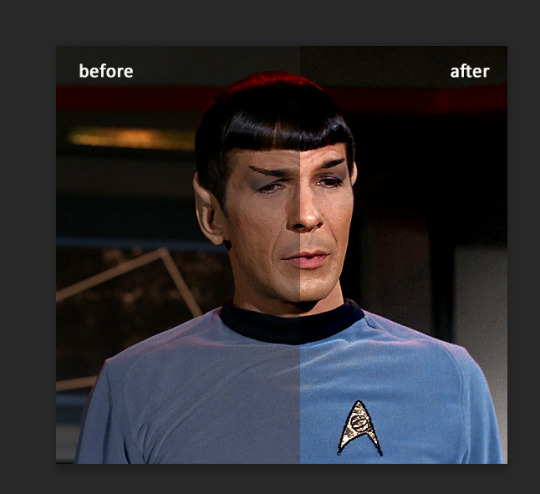
next one I used is layers - adjustment layers - color balance.
right now I will stop adding directory, this tutorial is already long enough, so most of the things are there in layers - adjustment layers.
Absolutely love it, most of settings do the same things but a little differently, this one changes colors but also entire picture, not just part of it. You have shadows, midtones and highlights
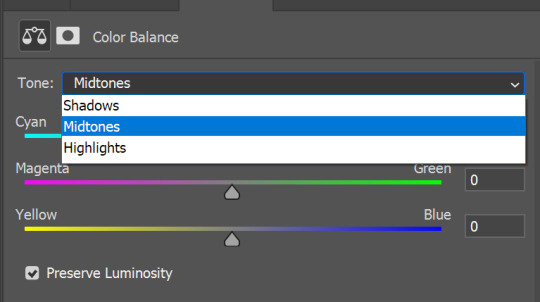
Each of them is really great when you have a yellow\red\blue\green picture to edit. And each of them has 3 sliders cyan\magenta\yellow.
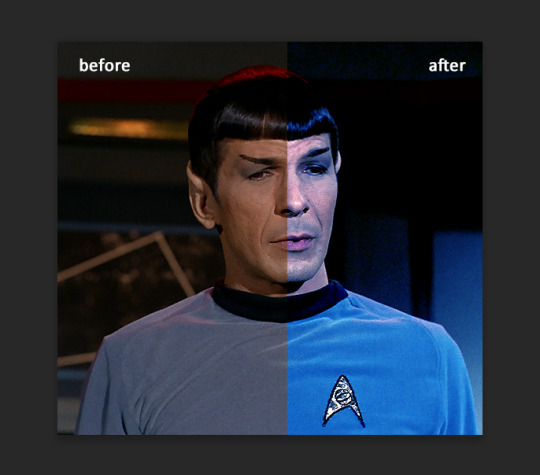
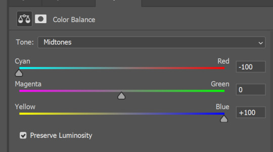
You see, if you drags sliders the other way it will make picture more yellow.
END OF PART I
since tumblr
101 notes
·
View notes
Note
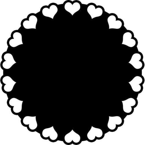
Anon here!! How did you make the heart graphic for the power rentry?

hi!! i’ll put it under the cut since there’s quite a few steps. lmk if you need a more specific tutorial or images for any of the steps!!

1) finding the base
find the shaping mask you wanna use. you can look up “shaping mask png” or “mask png” on pinterest to find some. this is the one i used:
2) removing the background
to remove the background, use the selection layer in ibis paint x. to find this layer, go to the layers panel and it should be the one all the way at the top. it is titled “selection layer.” to remove the white background, select the bucket tool and select the white background. it should turn blue. then switch from the selection layer to the layer you’re removing the background from. look at the top middle of the screen. there should be a square composed of dotted lines that looks like this:
click on it and select “cut.” this will remove the white background. click on it again and select “remove selection area.” now you’re ready to continue!
3) creating a cleaner base layer
you might want to do this if you plan to add a stroke, as once the background is removed from the mask, it tends to leave some remnants behind. this makes the stroke look choppy and pixelated. to do this, take the paint bucket tool on a new, blank layer, and fill in the black part of the base with black. then, delete the base layer underneath the new layer. the hearts will become transparent (to see this better, change the canvas from white to transparent in the layer menu) and the base will hold its shape. you can also remove the hearts in the previous step, but this tackles two birds with one stone and (in my opinion) looks cleaner.
4) filtering manga panels
to make the manga panels pink, i looked up “pink manga polarr code.” pretty much any one will do, but this is the one i used:
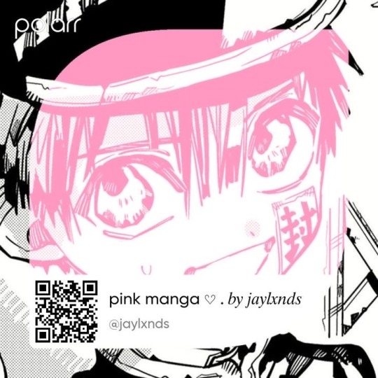
for the rest of this step, you’ll need the app polarr. once you get the app, go to the edit section of the menu on the bottom. click “open photos” and insert the manga panels you wish to change the colors of. then, click “filters” and “import filter.” from there, click “import qr code” and click on the filter in your gallery. the filter will go into polarr, and you can just click instant export or you can save it and then export it. it’s up to you.
5) masking the panels
import the images you just filtered into your canvas. now we’ll use a clipping layer to have them take the shape of the base. click on the image layer you want to do this with, and then hit the clipping option in the layer menu. this will have it take the shape of the base.
6) coloring the hearts
now we’ll add a new blank layer atop the clipping layers. i color picked the pink color from the image, and then used the bucket tool to fill in each of the hearts.
7) adding the extra pngs
for this step i used the sticker option in picsart and a transparent canvas to collect the pngs. i believe i looked up “pink png” in the search bar, but i’m not sure. then i imported them into the ibis paint x project and positioned them where i wanted them to go. download transparent pngs of the project (one of each image you added). toggle the eyes on and off so that you can save the different versions (not individual layers. i just mean if you added two manga panels, make sure you get one with one manga panel and one with the other).
8) creating the gif
search up ezgif animated gif maker. it should be the first option that comes up. for this, i typically switch to “manually ordered upload” opposed to “alphabetically ordered opload” (the default) so i have more control over the order of the images in the gif. once you upload them into the site and you get to the editing menu, set the delay time to 100 and click the box that says crossfade frames.
andddd you’re done!!! i hope this was somewhat comprehensible and i didn’t miss any steps xD
139 notes
·
View notes
Text
i think it’s really really important that we keep reminding people that what we’re calling ai isn’t even close to intelligent and that its name is pure marketing. the silicon valley tech bros and hollywood executives call it ai because they either want it to seem all-powerful or they believe it is and use that to justify their use of it to exploit and replace people.
chat-gpt and things along those lines are not intelligent, they are predictive text generators that simply have more data to draw on than previous ones like, you know, your phone’s autocorrect. they are designed to pass the turing test by having human-passing speech patterns and syntax. they cannot come up with anything new, because they are machines programmed on data sets. they can’t even distinguish fact from fiction, because all they are actually capable of is figuring out how to construct a human-sounding response using applicable data to a question asked by a human. you know how people who use chat-gpt to cheat on essays will ask it for reference lists and get a list of texts that don’t exist? it’s because all chat-gpt is doing is figuring out what types of words typically appear in response to questions like that, and then stringing them together.
midjourney and things along those lines are not intelligent, they are image generators that have just been really heavily fine-tuned. you know how they used to do janky fingers and teeth and then they overcame that pretty quickly? that’s not because of growing intelligence, it’s because even more photographs got added to their data sets and were programmed in such a way that they were able to more accurately identify patterns in the average amount of fingers and teeth across all those photos. and it too isn’t capable of creation. it is placing pixels in spots to create an amalgamation of images tagged with metadata that matches the words in your request. you ask for a tree and it spits out something a little quirky? it’s not because it’s creating something, it’s because it gathered all of its data on trees and then averaged it out. you know that “the rest of the mona lisa” tweet and how it looks like shit? the fact that there is no “rest” of the mona lisa aside, it’s because the generator does not have the intelligence required to identify what’s what in the background of such a painting and extend it with any degree of accuracy, it looked at the colours and approximate shapes and went “oho i know what this is maybe” and spat out an ugly landscape that doesn’t actually make any kind of physical or compositional sense, because it isn’t intelligent.
and all those ai-generated voices? also not intelligent, literally just the same vocal synth we’ve been able to do since daisy bell but more advanced. you get a sample of a voice, break it down into the various vowel and consonant sounds, and then when you type in the text you want it to say, it plays those vowel and consonant sounds in the order displayed in that text. the only difference now is that the breaking it down process can be automated to some extent (still not intelligence, just data analysis) and the synthesising software can recognise grammar a bit more and add appropriate inflections to synthesised voices to create a more natural flow.
if you took the exact same technology that powers midjourney or chat-gpt and removed a chunk of its dataset, the stuff it produces would noticeably worsen because it only works with a very very large amount of data. these programs are not intelligent. they are programs that analyse and store data and then string it together upon request. and if you want evidence that the term ai is just being used for marketing, look at the sheer amount of software that’s added “ai tools” that are either just things that already existed within the software, using the same exact tech they always did but slightly refined (a lot of film editing software are renaming things like their chromakey tools to have “ai” in the name, for example) or are actually worse than the things they’re overhauling (like the grammar editor in office 365 compared to the classic office spellcheck).
but you wanna real nifty lil secret about the way “ai” is developing? it’s all neural nets and machine learning, and the thing about neural nets and machine learning is that in order to continue growing in power it needs new data. so yeah, currently, as more and more data gets added to them, they seem to be evolving really quickly. but at some point soon after we run out of data to add to them because people decided they were complete or because corporations replaced all new things with generated bullshit, they’re going to stop evolving and start getting really, really, REALLY repetitive. because machine learning isn’t intelligent or capable of being inspired to create new things independently. no, it’s actually self-reinforcing. it gets caught in loops. "ai” isn’t the future of art, it’s a data analysis machine that’ll start sounding even more like a broken record than it already does the moment its data sets stop having really large amounts of unique things added to it.
#steph's post tag#only good thing to come out of the evolution of image generation and recognition is that captchas have actually gotten easier#because computers can recognise even the blurriest photos now#so instead captcha now gives you really really clear images of things that look nothing like each other#(like. ''pick all the chairs'' and then there's a few chairs a few bicycles and a few trees)#but with a distorted watermark overlaid on the images so that computers can't read them
115 notes
·
View notes
Text
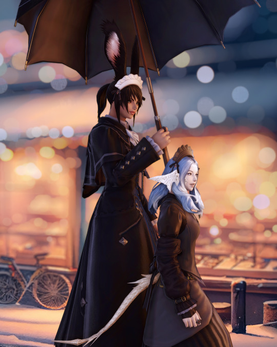
GShade guide: External Textures 101

External textures open up an amazing world of possibilities: think superimposed visual effects, or custom stickers (like logos or decoration)!
So grab a coffee and let’s learn how to use them for a simple but powerful purpose: custom backgrounds!
But first, what’s a texture? In short, a texture is simply an image, like a .jpg or .png file, that you can load and use within the 3D space for different purposes. In broader 3D terms, it means the 'skin' you wrap a 3D model's wireframe surface around.
(You can learn more about the broader meaning of texture mapping with this handy video.)
Now, back to GShade - we can’t replace in-game textures, but we can add new elements to the 3d space within the game and apply custom textures. So here's the step-by-step:
1 - Locate the Custom Textures folder
Tap the Windows key to open the Windows prompt, type the following line, and press Enter:
%SystemDrive%\Users\Public\GShade Custom Shaders\Textures
This will open an Explorer window listing all the custom textures available for GShade to use.
Now, the good stuff™: you can install new textures simply by copying new files into this folder!
2 - Load and Show a Custom Texture
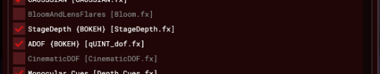
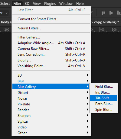
Open GShade, locate a shader named Stagedepth, and enable it:
(Leave the number of StageDepths to 1, that's enough for now.)
Now look out for a little widget called Preprocessor Definitions, and expand it.
We need to inform 3 parameters:
StageTex (the name of the texture we want to use)
STAGE_SIZE_X (the width, in pixels, of the image we’re loading, or the BUFFER_WIDTH keyword for full-screen width), and
STAGE_SIZE_Y (same, but for height, or BUFFER_HEIGHT).
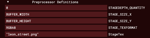
For now, let’s use one of the textures installed by default. Locate and enable StageDepth, and use this value (and make sure to use double-quotes around the texture name):
StageTex: "LensSprite.png"
And hopefully, you'll see something like this:
Now play with the shader’s sliders, especially the 'Depth' value since it allows you to determine how close or far the texture will be placed. (Remember, you can always right-click on a GShade control to open up a context menu with the ‘reset to Default’ option.)


If you got to this point - congratulations! You just loaded your first custom texture into GShade. I’m proud of you!
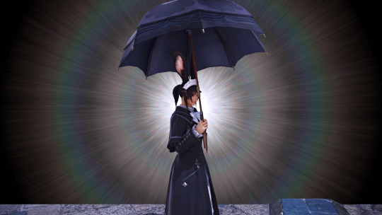
Time to put your safety goggles on - we’ll use Depth to project the texture away, and use in-game scene set-up to match the injected background composition. Here's the image I'll use, generated with MidJourney:
Since we can’t modify the texture itself, we need to make sure our scene setup matches aspects of the injected background like color and contrast. (It can be modified by GShade filters, though, so you can apply effect like Blur by placing StageDepth closer to the top of the filter list):
First, the scene setup...
Now, enable a preset - in this case, Neneko Jolt:
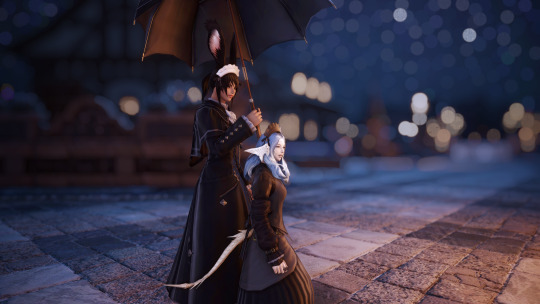
Enable StageDepth and specify the custom texture in StageTex, so it automatically loads...

...and place StageDepth before the ADOF filter, so its bokeh effect applies to the texture as well:

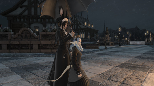
...and presto! Now you have a beautifully merged custom background.
This opens up a lot of composition possibilities; looking forward to seeing your attempts with external textures!
204 notes
·
View notes
Text
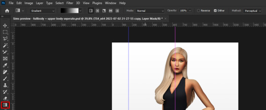
How I edit my Sims' shadow in Photoshop
as requested by @adelarsims
& based on this tutorial.
━━━━━━ ・❪ ☾ ❫ ・ ━━━━━━
1. Taking a screenshot
First of all take a screenshot of the Sim - I always do CAS but in-game works too ofc.
I take mine in front of a background that loosely matches the color of the background of my edit, in this case white. If you have a fancy CAS background, I recommend this CC by @sonyasimscc to easily get a simple background for screenshots.
I also use this tutorial by @katverse to get really good screenshots, I use 4000x3000px resolution, and this tutorial by @vyxated to not have a CAS UI in your screenshot if you use a reshade like me.
━━━━━━ ・❪ ☾ ❫ ・ ━━━━━━
2. Setting up the Photoshop file
Now in Photoshop create a file, I use 1250x2000 px.
I made a few guidelines, pink being the middle of the image and dark blue guidelines for my shadow editing.

I have a usually white background and a slight Curves adjustment layer with a gradient layer mask so it gets slightly darker at the bottom, completely optional ofc.
━━━━━━ ・❪ ☾ ❫ ・ ━━━━━━
3. Removing the original background
Import the screenshot and place it however you want. I try to align the Sim in the middle and make it as big as possible.
Then select the layer and go to Select - Subject.

This will usually do a decent job.
If there are some leftover unselected areas (like on her left hand on the hip) you can either add them to the selection now or edit the layer mask later.
Then create a layer mask.
Since the screenshot has a similar background, it shouldn't show too much if it is not perfect.
━━━━━━ ・❪ ☾ ❫ ・ ━━━━━━
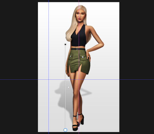
4. Creating the shadow
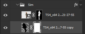
First duplicate the Sims' layer (Shortcut: Ctrl + J).
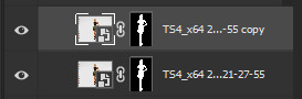
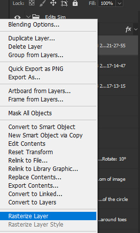
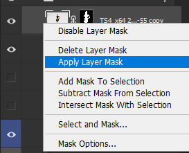
The layer is probably a Smart Object, so you need to rasterize it and right click the layer mask to apply the layer mask.
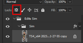
Now lock transparent pixels and paint the layer black.
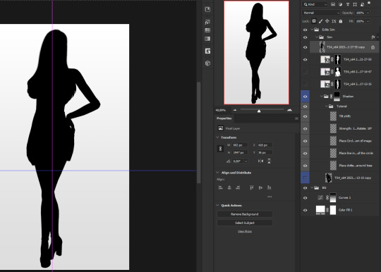
Next unlock the transparent pixels again and move the black layer below the actual Sim. Leave it selected.
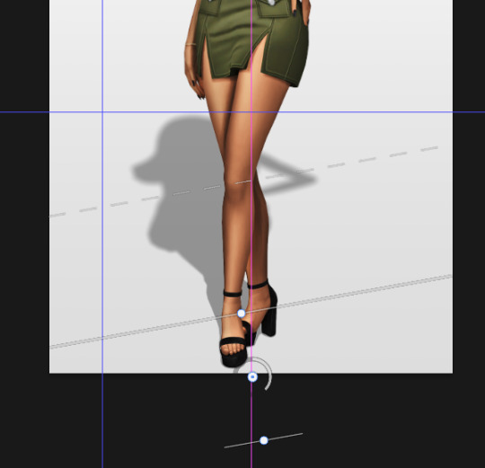
Now you will need the Perspective Warp tool.
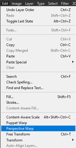
Draw the grid over the Sim, it doesn't have to be perfect, but make sure every part of your Sim is in the grid and nothing pokes out.
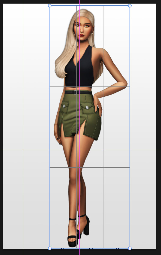
Press enter.
Now you want to drag the upper 2 corners separately wherever you want the shadow to be. I always put mine to the left and around the upper thigh area. I also try to match how slanted the left and right side are.
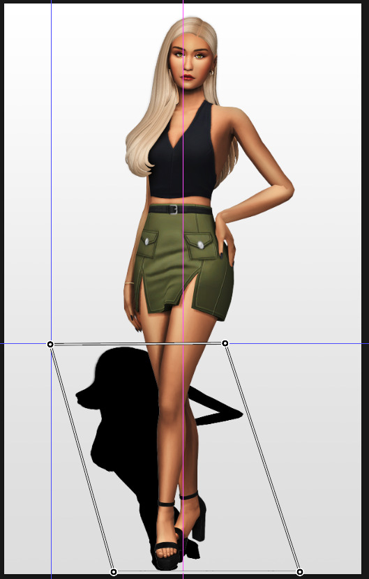
Now move the bottom 2 corners to try and match the shadow with the Sims' feet kinda. It won't work perfectly and you will need to fix it by hand after.
Press enter again.
Now go in by hand and fix the shadow around the feet.
Simply paint with black on the same layer and erase parts if necessary.
━━━━━━ ・❪ ☾ ❫ ・ ━━━━━━
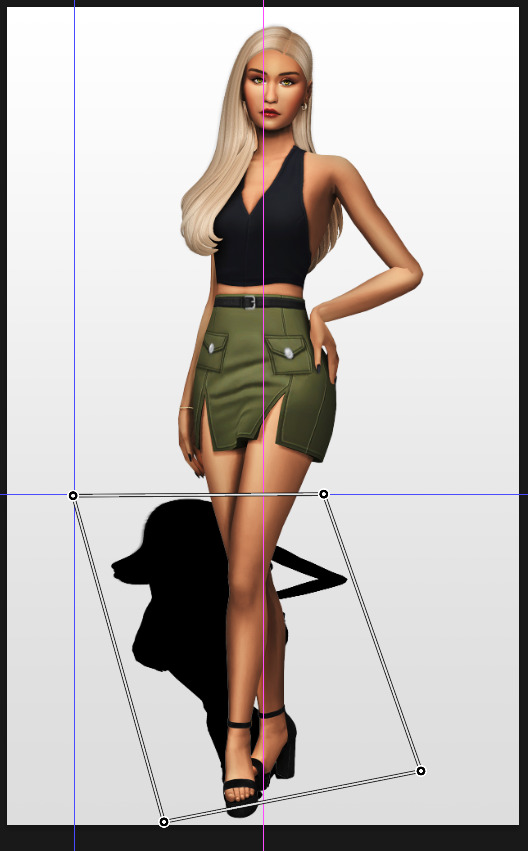
5. Making the shadow look nice
I like to change the layer opacity to 35%, but it depends how strong you want the shadow to be.
Next I apply a tilt shift blur, unlike in the video.
I use a blur of 15px.
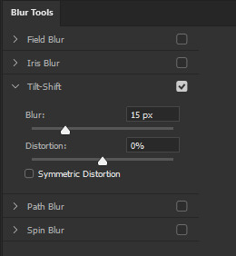
Move the circle at the edge of the image basically or a bit below by dragging the middle of it. Then rotate it on the bottom line by around 10°.
Next move the solid line to the middle of the circle and the dashed line around the ankles.

Then press OK at the top.

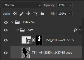
━━━━━━ ・❪ ☾ ❫ ・ ━━━━━━
6. Optional: Gradient layer mask
Lastly I like to make the shadow fade out a bit towards the top.
Apply a layer mask to the shadow.
Then get your gradient tool and the default black to white gradient.
Hold shift to make a straight line and drag the gradient down.
This is how I roughly place mine so it's not too strong.
━━━━━━ ・❪ ☾ ❫ ・ ━━━━━━
And that's it!
If you have any questions, let me know~
80 notes
·
View notes
Text

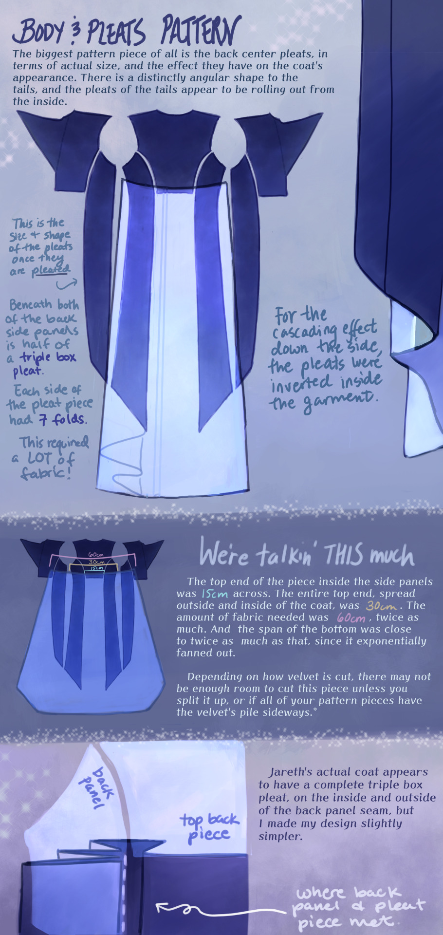


Cheers, loveys!
Here is post 1 of 3 about Pattern Construction. I’ll make a diagram post like this and then also take photos of my actual coat and with me in it.
I don’t remember how I started off doing the pattern, but I will guess that I took a tailcoat that I already possess and used it as a base, which in general seems to be a helpful way to start making clothes that fit if you’re not a master pattern maker (which I’m not, and I made plenty of mistakes which we’ll get into.)
There are two people I want to thank, and the first is Aria Couture [X] and their quality photos and observations, vocabulary and groundwork. They are the shoulders I stand on. Their photos were how I made all of the notes discussed in these diagrams, and how I discerned what kind of pattern needed to be made.
So the main changes that needed to happen to my base pattern was 1.) jacking up the shoulders to high heavens, 2.) elongating the side pieces (which I’ve come to call panels so go with me), 3.) adding pleats in that squared off spot in the back between them, 4.) adding a custom collar and cuffs, 5.) designing my own lining.
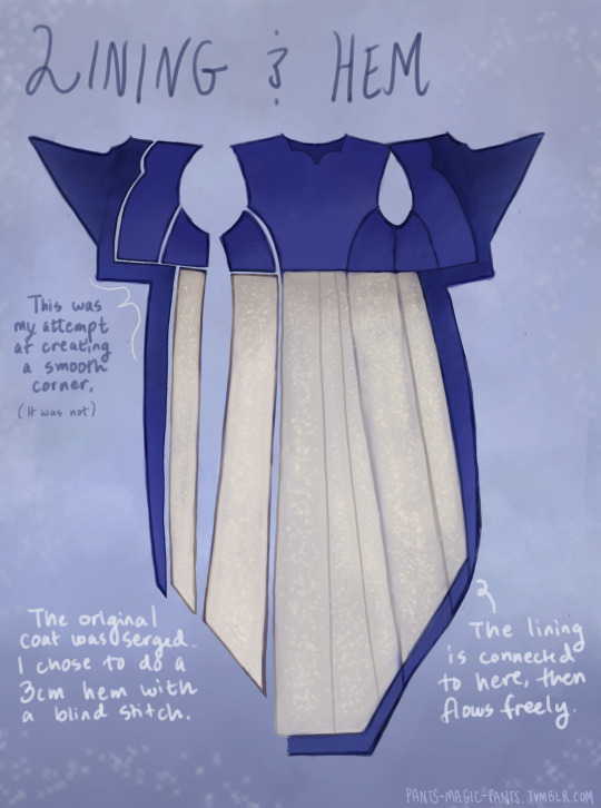
THE PLEATS were a nightmare. There was a lot of math involved, and math that was not necessary, but the most important thing was creating a shape that would fold together into a straight line on top, look cascading on the sides, and marry the rest of the coat in a reasonable place. After a lot of trial and error, I ended up with this rounded wedge that spreads out on the inside of the coat, but also folds backwards onto itself (like half of a box pleat), to reattach to the back side panels. This is what gives the coat its look of all this shiny velvet blossoming from beneath the back buttons and gushing out the sides.
As to why the pleat piece is rounded, all of the pleat lines were diagonal, so that the coat would flare out. Cutting this piece as a completely straight line on top meant it ran out of fabric in the top corners, and more of it needed to be pulled in, more and more sideways. Adding a sloped height to its corners helped it do what it was supposed to and become a mostly straight line when folded together.
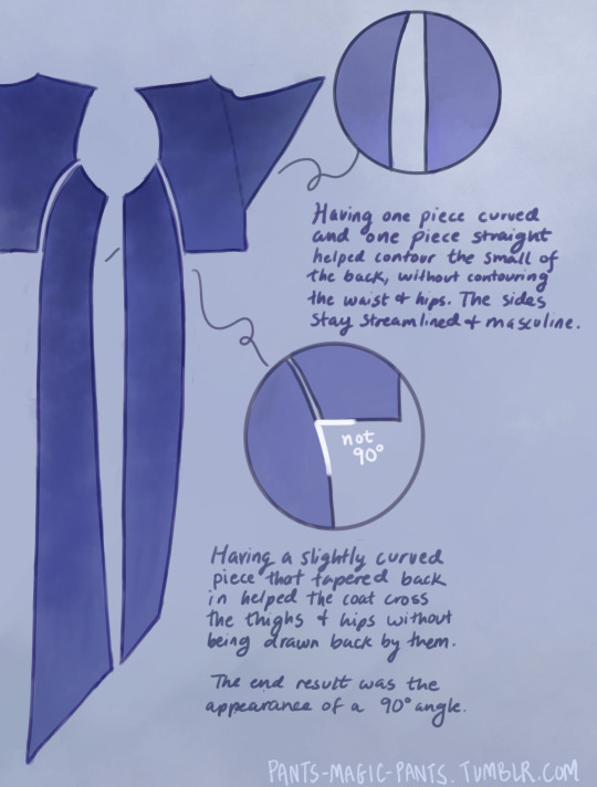
THE PANELS (second image), there are just a few notes about those which I think are important. As I am female cosplaying a male and wish to keep the masculine shape of the garment, some tricks needed to be pulled to hide my waist and hips, so this is what I came up with.
PROPORTIONS MATH. It’s a thing I started doing a couple cosplays ago, to get accurate shapes and lengths of garments, to give me the same silhouette as characters. It’s worked out really well for me. It’s been a real life application of algebra that I wasn’t expecting, as a former student who hated math. Now, I love math! Armed with a ruler and a protractor, I have taken down a lot of notes about such silly things as: what degrees the angles of the lapels are, and how wide are the shoulders compared to the head? (In Jareth’s coat’s case, the ratio of head:shoulders is 1:4.) With that knowledge, I took a photo of myself in the bathroom, measured my own head and shoulders in pixels, wearing a mock-up, and corrected shoulder span measurements to fit this ratio. It was a whooole thing, but I think it was worth it.
And I used proportions math for everything. How much of the arm do the cuffs take up? Where along the legs did the dramatic slope of Jareth’s “fishtail” start? Those things aren’t listed here, but hopefully this post gives you enough tools to figure it out on your own for your specific garment, or any garment you ever want to make.
THE COLLAR. Not much to say about it, but there’s how it looks.
SLEEVES. Dear God. I was stuck on sleeves for months because go ahead and look around online for detailed information about how to add basically football gear sized padding to your shoulders, and all of the intertwined modifications that needs. It isn’t out there.
One thing I can at least say is that it helps to start off with a great base, and the other person I have to thank is a tailor on YT called Chris Sartorial [X]. This guy hasn’t been active for years, but when he was, he was no nonsense, such a professional who knew what he was doing that he couldn’t even take the time to properly light his videos. Such a king. His channel helped me with my dress shirt, and also with making the base sleeves for this coat, which were of the “2 piece” variety. This kind of sleeve is used for blazers and coats so that it appears to fall in a nice boxy shape off the arm, usually from a shoulder pad, and then slightly turn at the elbow. While he doesn’t go into shoulder pads, this still halfway set me up for success, and knowing the relationship between shoulder and sleeve.
However, there are a few things I learned about shoulder+sleeve modification as shown above, and hopefully it’s a good “bouncing off” observation.
THE CUFFS. Again, not much to say, but this is how my pattern came out, to create that nice tear-drop shaped gap, with that sort of blooming and expanding height that his cuffs have, like a vase. The lace trim will be in another post. One thing I should mention is that the lace trim is tall enough that the bottom of the cuff won’t end on your wrist if you want to be able to see your own hands. The cuff needs to be measured so that it will end 2-3 inches up from your wrist.
THE LINING
Dear God, she’s still writing. I am a huge fan of lining even though I’m not good at it, and my actual lining didn’t turn out looking as smooth as my drawings, but this is what I came up with, which in theory should look good. haha Any deviations from the norm that you see are just stylistic choices. I wanted the area in the top back to look sort of dripping like the back lace piece.
Was this interesting? I sure hope so. Please ask me questions if I’ve glossed over something.
53 notes
·
View notes
Last Seen Blogs

seethehumanside
See The Human Side

birhevess
birhevess

barbiemichiru
Make-up Michiru's inner beauty life
mummykink
SABIHOE ` S BITCH
writingsfromhome
WFH