#nongif
Text
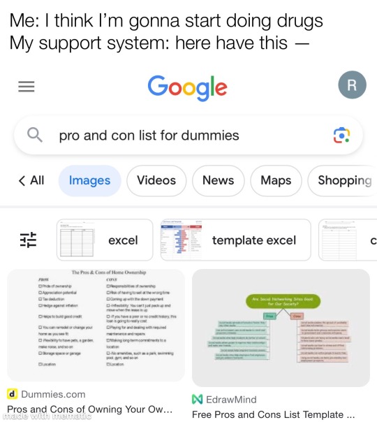
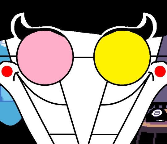
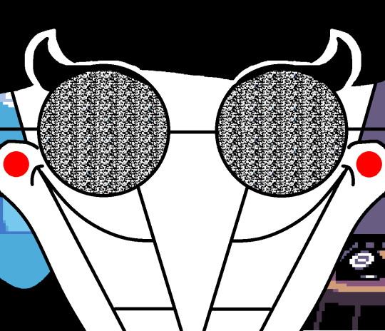
#drugs tw#substance abuse#support system#substance abuse recovery#mental illness memes#meme#nongifpost#therapy meme#mental illness meme#relapse problems#nongif
8 notes
·
View notes
Text


mileapo teasing bible
#the nongification of bible by apo a story in ??? parts#bible wichapas#apo nattawin#mile phakphum#camgifs
697 notes
·
View notes
Text

Summary: Anakin and Obi-Wan attend a wedding. Anakin doesn’t expect to be so sad.
They walked out of the ballroom together. Most of the guests were still dancing, so the foyer was empty and the music dull behind them. Obi-Wan led by a few steps, Anakin trailing behind so he couldn’t see his face. And maybe that’s what gave him the courage to ask.
“Did you ever think you’d get married?”
Obi-Wan’s pace faltered for a moment. “Where did that come from?”
Read on ao3
#sorry for the nongif header I just didn't have it in me to track down a fitting scene to gif lol#my fic#obi wan kenobi#anakin skywalker#satine kryze#wedding
31 notes
·
View notes
Text


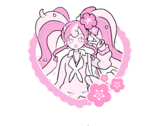
which one should i use orz
#i cant find any more official art thats in the style of the nongif one#but i rlly like the look of the nongif one…….
4 notes
·
View notes
Text
who decided that percy jackson should be so hard to color???
0 notes
Text


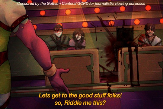
The riddlefactory is SUCH a good set piece that is CRIIMINALLY underutilized
But i hope yall like this mini comic n ill be putting the nongif versions of panel 1 and 4 underneath :D


#my art tag#edward nygma#edward nigma#riddler#ginger riddler truther lolol#the riddler#gotham rogues#gotham#batman rouges gallery#dc fanart#dcu#gif#tw blood#cw blood#riddle fanart#riddle factory#riddlefactory#glitch
377 notes
·
View notes
Text

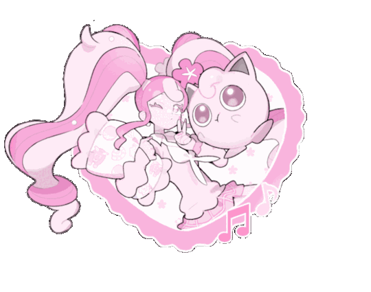
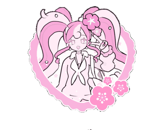
jigglypuff, use sweet kiss!
fairy type miku graphics, rb + credit if used | for @enananhearts' 700+ event!
day 01; monochromatic or vibrant - nongif under the cut!


#enananhearts700#icons#graphics#rentry graphics#vocaloid#hatsune miku#miku#miku hatsune#miku vocaloid#project voltage#pokemiku#fairy miku#pokemon#RUN N' GUN◞ my edits
69 notes
·
View notes
Text

a genderbend i made of spamton g spamton from deltarune chapter 2! her name is spamtina, and she is literally spamton verbatim except girl and that makes her automatically better because girls are cooler than boys in every conceivable way
transparent + nongif versions under the cut!

#spamton#spamtina#my ocs#genderbend#deltarune#deltarune oc#fanart#transgender#2021#flashing#tw flashing#digital art#gif#q#og post
14 notes
·
View notes
Note
may i rq green tubbo from qsmp rentry graphics maybe? nongif preferably but ill take anything really, its been so hard to find ppl without mcyt on their blacklist 💔
i'm fine with mcyt stuff but not dream smp i'm sorry anon, i've updated my blacklist to reflect this, i realized i didn't have any sources on there

2 notes
·
View notes
Text
hi @s-opal! i was your secret santa this year for @homestuckss so i decided to draw you a jade! she has a squiddle… they are silky to me
gif & nongif version (quality is worse in the gif. looks cool though!)
27 notes
·
View notes
Text
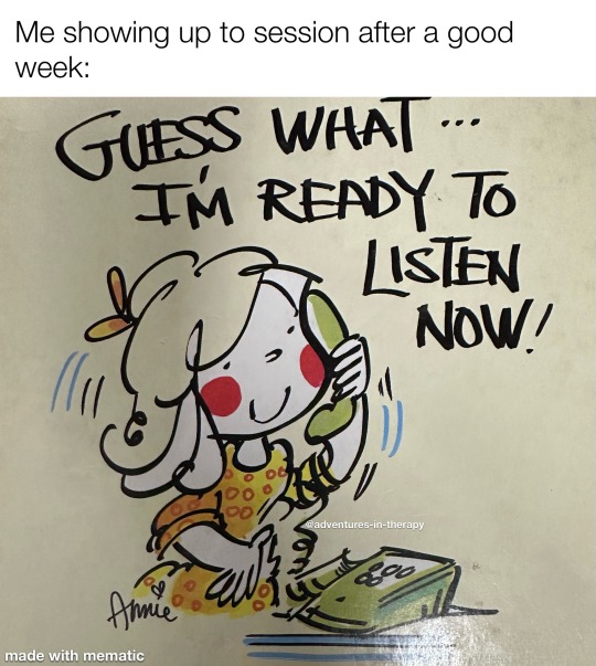
#therapy#therapy meme#memes#addiction meme#mental illness problems#mental illness things#mental illness humor#relapse problems#nongif#nongifpost
7 notes
·
View notes
Photo
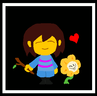
happy birthday to another of my favorite games of all time
nongif under cut
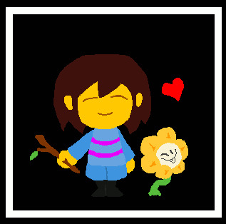

#undertale#frisk#chara#flowey#my art#gif warning#gif#i cant believe that in seven years ive only done two undertale fanarts#undertober
37 notes
·
View notes
Note
Oh so #xuserann is your tag! I couldn't remember what it was and I've been meaning to tag you in some of my stuff. Are nongifs okay as well? Such as art and videos? - @thechaoticfanartist
Yes absolutely! Go ahead :)
3 notes
·
View notes
Text

oh and the other nongif shit too
@blue-jester and @possiblytracker
#digital art#artist on tumblr#sketchandsneeze#my art#art#krita art#doodle#sketch#made with krita#artistontumblr#artists on tumblr#artfight 2022#artfight attack#artforyourhome#af 2022#really loved doing Tracker's shading so much
14 notes
·
View notes
Text

This guide will help make the quotes or words in your gifs consistent, harmonious, and most of all — pretty!
How will you know which fonts work well together and which ones don't?
↓ FIND OUT HOW TO PAIR FONTS UNDER THE CUT ↓
If any of you might notice, I know I've discussed the difference between fonts and typefaces in this post, but for this one, I'll just use the term 'font' even if I probably meant typeface so nobody come for me please 😂
Kinds of Fonts
Before we dive in and start downloading fonts, let's first discuss the kinds of fonts, starting with these two:
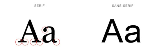
Serifs have serifs.
A serif is a small line attached to the end of a bigger line in a letter or symbol. Think Times New Roman, Baskerville, and Didot.
Sans Serifs have no serifs.
‘Sans’ is old French for 'without’. So, sans serif means without serifs. Think Arial, Century Gothic and Comic Sans.
NOTE: There are a variety of styles under serif and sans serifs, but this guide (hopefully) won't dive in too deep. This is just a tiny guide that will help you make prettier gifs. ✨
Script
Script fonts are the ones that are cursive or in longhand. They often look handwritten with a brush.
TIP: Script is best used for headers (big text). Avoid using them as body text (small text) or in long sentences and paragraphs because it won't be very readable.
〰️
Each of the following tips will help add contrast, create consistency and establish harmony in your font pairings.
[1] Limit the # of styles
Don't use too many fonts. Fonts are like introverts. They work best with just a friend or 2 😂
This would also depend on the style, which will be explained in the next tip.
[2] Opposites attract
Don't pair fonts with similar styles like this:
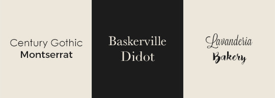
❌ Century Gothic + Montserrat are both Sans Serifs.
❌ Baskerville + Didot are Serifs.
❌ Lavanderia + Bakery are Script fonts.
Even if both fonts look good individually, it just wouldn't work.
It's like if two of the most beautiful people in the world became a couple. They both look good, but their beauty is overpowering each other. There has to be a balance, you know?
Do pair different styles instead:
[3] Avoid conflict
This tip is similar to [2].
Don't:
❌ pair similar font styles
❌ pair an attention-grabbing font with another attention-grabbing font
❌ pair distinctive fonts together such as these:
Notice how they would both keep fighting for the spotlight, destroying the harmony of your texts.
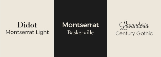
Do pair a distinctive font with a neutral font, like this:
[4] Sans Serif + anything but Sans Serif
Here's a fun tip: When you're too lazy to think about what to pair your serif / decorative / script font with, just pair it with a clean sans serif font. It's what I did in the Do examples in [2] and [3] if you haven't noticed 😂
[5] Pair a font with itself
Opposites attract, and it works with just one font family as well! Play with a single font family's weight and styles.
Do pair a thick sans serif font with its lighter relative (as seen below: Montserrat Bold + Montserrat Light).
Do pair a regular serif font with its italic sibling (as seen below: Baskerville Italic + Baskerville Bold).

TIP: Play with the tracking (letter spacing) and capitalization (lower or uppercase) too. See Montserrat Bold and Baskerville Bold above.
I prefer to increase the tracking whenever the text is bold and/or in all caps to make it easier to read.
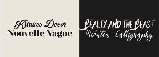
[6] Don't mix moods
Fonts have moods. They have traits (i.e. loud, friendly, trendy, timeless). They can be used to convey feelings (i.e. happy, sad).
For example, avoid pairings such as this:

There is nothing about the two fonts above that unite them. They have different vibes — nothing in common.
Though mixing personalities work in friend groups, it doesn't work very much with fonts.
〰️
With all that said, I know some of the tips might contradict each other, and some probably won't always work. It all depends on the font. Just see what looks good to you, and if you're unsure, then come back to this post :)
Please like/reblog if this has helped you and feel free to hit me up for any questions and concerns! ♥︎
〰️
REFERENCES:
reuxdesignco
visme
undullify
FREE FONT SOURCES:
Google Fonts
Open Foundry
awwwards.
Font Squirrel
dafont
#here you go anon!#club post#club tutorial#nongif#font pairing#typography#completeresources#allresources#itsphotoshop#yeahps
2K notes
·
View notes


Last Seen Blogs

crypto-marketing-agency
Crypto Marketing Agency

nathegrate
Untitled

hiballi27
Untitled
seraquevaichover
Carpe Diem.