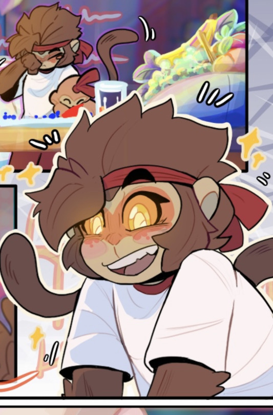
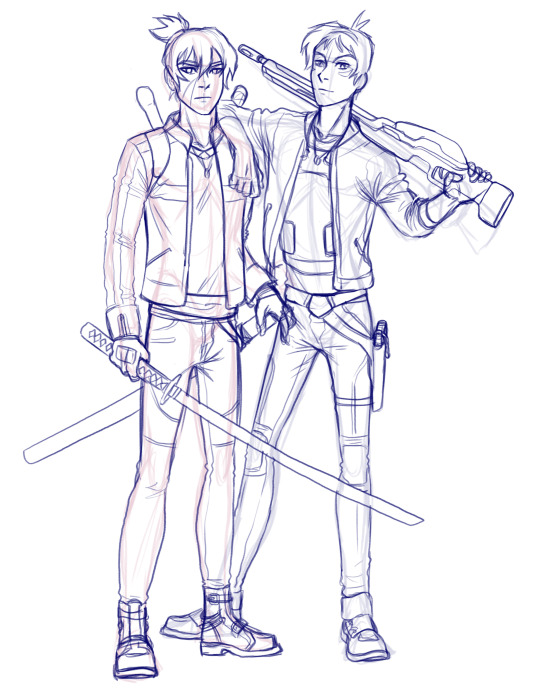
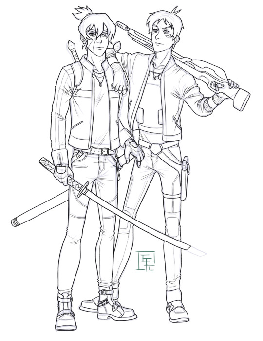
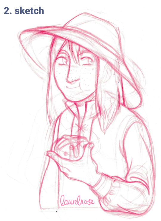
#maybe i should use my. lineart brush. so i just have to clean up the sketch
Text
tired.....
#oh my god 4/11 sketches done......... kill me......#FUCK NO I DELETED THAT TAG UFCK#anyway#the next pages shouldnt be too hard? i did draw some panels in my sketchbook with better detail so i just have to. copy that#maybe i should use my. lineart brush. so i just have to clean up the sketch#......... its fine#rambles
1 note
·
View note
Note
I love your art style so much. 😅
Do you have any tips for coloring/shading or just tips to draw bodies (I can't do any without them being weird) ??
Have a nice day, :)
I’m glad sweetie
And of course I can give some tip I use!
I have to say I have many ways of shading and lighting so I will share my usual and then add some new one I have been experimenting
First: don’t do shadow on multiply ,that’s for later, shadows and lights are made on a mask layer and they are not just the darker shade of the colors, but a different color entirely
Same with lighting.
Some colors are easier than others for me tbh, like I love shading red and purple but blue not that much.

I also usually put blue everywhere cuz it looks pretty but it’s on me honestly
(Obviously I decrease the opacity of some layers, there is not really a rule, I just go as I like)
If it’s a style choice I also do shadow in light blue multiply, but just if I am in a rush or working with flat colors
Second: choose how you want to smooth your shading and light.
Over the years I picked up my own way to do it but lately I have been a little experimenting.
Anyway i always start of with defining shadows then get to smoothing, it’s tempting but I don’t advise the use of the airbrush, just use it for lighting maybe.
( I want to be clear. This is my style, other artist may say the contrary)
I am one of those artists that clears the shadows from the inside to the most exterior part

Just how you can see here.
All the cleaning is made with a soft brush cuz it doesn’t have to be too definite.
In my latest comic tho the shooting was made the other way around with a water color brush to give this kind of 3d effect.
You essentially have to make some tests and find the one that you prefer.
Third: apply a layer of shadow in multiply to give more volume .
Usually when the work is done I add another layer of multiplied shadows that won’t be smoothed, just in the places that would cast a neat shadow, like a cape on the body, some fabric folds and some body shadows.
It really make things pop.
Four: don’t exaggerate, simpler is better, in both shadows and lighting, experiment , find your way but don’t rush , there is no need to exaggerate
Five: the subject of your drawing should be affected by the atmosphere.
For example if it’s night you can put a blue multiply layer over and erase where the soft light is, or don’t be afraid of adding some gradients of light is it’s a bright day outside, make the character be a part of the backgrounds
Six: you can color your lineart, it make the drawing very fine
That’s it mostly, I mostly go on the flow and I always test and try new stuff and you should try too to find you preferred way to do this stuff.
I want to say again that THIS is MY WAY of doing stuff, you can totally disagree and have your own way, I hope this way useful
243 notes
·
View notes
Note
(If you're comfortable with this) could you make a tutorial on how you make your creations??? It'd okay if not, thank you for making them :D
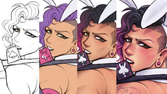
WAA i can try!! baby's first tutorial ft. this guy

🐾 first, a picture of your blorbo
i use waifu2x to up the quality, not always neccessary but it makes everything a bit easier and prettier. i use firealpaca to edit but you can use whatever you like, im not your mom
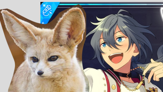
🐾 probably get a reference
yeah i dont always do this. but you should! i should! so google whatever creature you want to turn blorbo into and maybe scroll for a bit to get a feel for what they look like :3
try to find one at a similar angle to your blorbo picture and paste it/open as a layer. look this is close enough ↓
🐾 onto the actual editing! human ear surgery
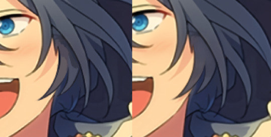
in case you prefer just one pair of ears. you have to understand the style so you can imitate it.... so look at their hair, maybe theres more colors or gradients than you can see at a glance or something ! i colorpick a bunch of them and put them over their ears, then blend them together with a low opacity watercolor brush
ALSO, notice the.. lighter glowy aura thing around his ear in the og? i try to imitate details like that too, used watercolor for this again
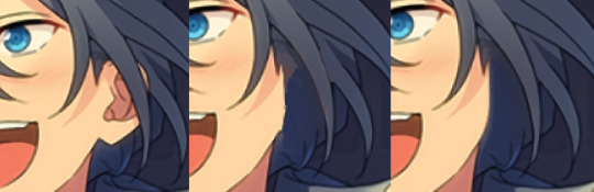
now maybe you wanna make it look like theres something covering that spot, since theres kinda nothing there now. soo if that looks weird to you, (open a new layer and) put some hair over it. i cant tell u how to imitate Any style so just. study it and keep trying
with enstars here the lines are pretty soft, so i go over it with watercolor brush after doing the general shape. with a higher opacity you could probably just use a softer brush from the start, i just like starting with the basic pen
🐾 the lines!!!
nowww i lower the blorbos opacity to around 50%, bring the reference somewhere i can see and just kinda... start sketching. lot of redrawing and transform tooling here sometimes
TIPS 1. you can clean the lines up at the end so dont stress
2. think of your blorbos new ears as a real tangible part of their body and how they fit on their head since you dont wanna make it look too flat !
3. and for the placement i always end up at roughly one human ear length above their og ears if that makes sense. tried to visualize it
as for inner ear fluffs phew i dont know either. draw a circle and start from there? maybe there are actual animal ears in blorbo artstyle out there you could reference
🐾 coloring 🏳️🌈
finally some progress huh. i color the lines in a contrasting color first so i see the lines properly and dont miss anything, then fill it in with the actual color :3 OH and for gradients i just use the airbrush at the ear tips or sides
noww shading! new layer, basic pen brush and try to follow the shapes in the og art. it's best if you pick the colors from the actual picture!!! take notes mentally and just do your best i dont know how to explain this more
taking this as an example, the shading is mostly in pretty simple wider areas, so not a lot of seperate strands in there. and its again pretty soft around the edges of shades and highlights, so i'll go over it with my beloved watercolor. keep things like that in mind so the creaturing blends in well :3
if you like more detail better you can still go with that. or less detail on a complex artstyle. the world is your oyster
🐾 and the rest
what else could there be???? making the lineart more cohesive for example ★ oftentimes it's not one solid color, thicker or thinner than yours, things like that.
for things like piercings or fangs you can just draw them on top i believe in you <3 if its like an intricate earring use the lasso? magic wand? the one that lets you select an area to copy and move on top of your ear layers
+ remember details like shadows, if you put a tail on top of say blorbos leg there's gonna be a shadow under it! put a layer under the tail ones and freehand draw the shadow, OR copy the tail layer, put the copy under the og one and change color/opacity until it fits
30 notes
·
View notes
Text
my drawing process (thank you @pepper-ika!)
i draw and colour for a long long time. i don't do the traditional sketch + lineart + colour -- sketches are hard to line, they're kind of time-consuming and usually they end up better than the lineart, so i just draw like normal and clean it up before colouring. i start at the head and end at around the feet, kinda like a person showering (lol). here i'm using your typical pencil brush you can find in any standard art program.

a tip i got from another artist was to colour using a thick, opaque pen brush that varies a lot in width. it saves a Lot of time. before they showed me that, i made the mistake of using a soft, painterly brush to colour my art. it hurt my wrist because i had to press really hard to get flat colour -- when all that time i could have just been using a pen brush! also, i start with soft colours because they're nicer to look at.

2. i do colourful midtones like redness in the skin or maybe a blue five o clock shadow if they have one. from this point onward, i use a flat square-ish brush combined with a painterly smudger and a soft airbrush.
i read somewhere that you should apply perfume on the moistest parts of your body so i kind of use that same idea when drawing redness. usually i do it where skin meets skin: folded arms, a crunched back, closed hands, and that place where the thighs touch the buttcheeks, lolol. and of course: the nose, lips, and ears. it makes the skin look real and warm and lively!

3. i lay down my shadows and lights, usually in that order. and at this point, i'm throwing extra shadow on wrinkles, fat, bumps, lumps, etc. a body without rolls is like an angel without wings!
also i smudge like CRAZY here. just like how it's impossible to have "too much gravy" on your chicken, it's impossible to have "too much blending" when you're drawing skin. blend that ish.
when it comes to the colour of the shadows, i always make shadows the base colour but darker and more saturated, and i move the hue a little to the left (for example: orange goes to red, green goes to yellow, purple goes to blue). i do that with, like, every colour. i can't tell if it's lazy or not but at this point i'm too scared to ask.

4. finally i make some minor adjustments like liquifying to fix lopsided eyes or oversized heads/hands. when i was in high school, my art teacher would say "great, but watch the size of the feet, hands, and neck," lolol. he was right ofc. when i go "hm... that looks a little weird," i have to trust that gut feeling because when i do fix it, it ends up looking way better. here is a horrifying gif illustrating that.

AHH!!!
alternatively you could do a messy line and color, then do a whole paintover like i did here. this is awesome for details because you dont have to go back and change the lineart - you just paint over and add whatever you want and redraw the line to fit it.
i dont really use the different layer modes that much. in this one i used a gradient map of the drawing as an overlay. idk if that really does anything major but it does create a new range of colors to play with. i also used a multiply layer to cast a big shadow over the card (layer 8) because it has this tiiiny little pattern that would be a pain in the butt to draw shadows over. everything else is pretty standard.
(and no i dont name my layers... yes i will be changing my name and moving countries)
another thing worth noting: i use airbrushing A LOT. i remember reading somewhere that using airbrushes is like. a cardinal sin. it’s not, man. it’s great. airbrushes and smudging are dope and i use them all the time.

i hope you found this helpful! have a great weekend <3
34 notes
·
View notes
Text
i dont intend to say this like im putting myself down but when im burnt out or in an extended art block i do often look to what i have done in the past- maybe as a "was i doing something back then that i miss doing now?"
my art has shifted a lot over the years. im sure anyone whos followed for a long time would say so. ive gone through phases and styles and vibes of many kinds and theyre all very different. and theyre all times that sometimes i look back and think "maybe i should do that again". of course i need to avoid getting overwhelmed with the "i want to do this- no this- maybe that-".
But the hardest "change" in my art was probably a year ago when all that stuff happened with wcrp. which i wont reiterate- but it was forced. that was the big thing. and i think its whats hurt now that i have this burn out settling and i am looking at old art. I did hit a burn out last year after wcrp when i quickly dove into other fandoms like half life- i did what i often did, where i overexerted myself from hype and quickly burned out. but then i picked up mcyt which has been going strong for a year after leaving it for many years back.
when i look at whats changed about my art from then to now, i notice one big things, which i felt was obvious (and i deliberately did this)- i was going into that fandom simple. first it was a lot of lineart, no color. then i started adding some one flat color to bodies and sometimes minor effects done with the help of gradient maps. then i started using thicker brushes where i could, knocking out the need for clean details. then i started using the binary pen. i had a few detailed drawings in between but really so much of what i have done has been so simple.
and as i said, i did this on purpose. i got into this right after half life and i knew i was burnt out but i really wanted to draw anyways, so my plan was to do it like that! i wasnt very good with humans either so i didnt want to focus too hard on it anyways. and i certainly have liked this method. i enjoyed finding a way to draw that IS simple and doesnt put a lot of strain on me... it helps me no longer be a perfectionist as much as i used to
but at the same time its taken away some aspects that i liked about my art from 2020-early 2022. which was that i was so much more detailed than ever. my warriors art was very detailed, the designs were intricate, i drew a number of scenes just for the rps i loved, etc. i experimented quite a bit with coloring and shading and i still love a number of looks i tried, and i keep wanting that back. (ex 1, ex 2, ex 3)
interestingly i actually started to simplify that style too, esp as i got deeper into my own rp, and i know full well it was because i was also getting tired. used a lasso tool for markings, used less layers, dropped the texture and using a thin pen brush to make sketchier lines. (from this -> to this)
THE problem with these notes about simplifying stuff is that like. i rush things. i rush them SO much. and this has always been my biggest struggle, and what leads to annoyance with my current art and also to burn out.
Burn out, caused by how much i am drawing, because im fast. drawing fast because i want to make content for the fandom i am focused on. art block because im not happy with my art, but im also too impatient to slow down and take my time and REALLY remember and realize what it is i want out of my art!
its a never ending cycle and sorry we're at the end of the post because i dont have a solution lol
1 note
·
View note
Note
HAHAHAHA Every Turk Family has one of those names and unironically mine does too 🫡 Tell your mother thank you she is a very lovely lady
I know all of the artists you listed below because my dad blasts them on the radio everytime we go out... I call it old people music but hey I never said it was bad, they're awesome and I might have memorised some of the artist's songs from how much I listen to them... Barış Manço is a classic without a doubt! Fun fact my parents were able to go to his concert and got a signed picture with him I will always envy how lucky they were 😭 I love how women in the industry made the most iconic songs I hear them often in weddings too! Or clubs, even though I only went to one once I'm not very fond of them...
My questions were do you have any tips or inspiration with how you draw! I love your art and artstyle and it's honestly what I've been trying to achieve for a while, I can't believe I'm learning how to draw men because of a silly lawyer show it's a disease...
(We are just having a conversation at this point) (I feel like those people who speak out loud in public) (I hope you and anyone who's reading this is having a good day :) be kind to yourself and others everyone)
OH MY GOD i envy them too😭😭 also omg that sounds like heaven to me. the other day i went out partying and i felt sooo out of place because i only knew like 3 songs. omg it was so so bad.
hmmm tips and inspiration…. my number 1 tip would definitely be to look at a lot of other artists you like and analyze what exactly you like. and then try to emulate that in your own work. i try to look for inspiration everywhere - artists online, traditional artists, old masters, 3d artists, even theatre and poetry, etc. - doesnt mean that i am equally inspired by them all (because all these things at once sound so scary and big but they really arent!) but rather, i try to be open for anything and that helps me find inspiration :)
ill try to explain my thoughts more under the cut because this got long:
for me for example, so far i only posted some art i made that was lined (which, i would say makes up maybe half of the art i draw - i mostly sketch and recently have been building up the courage to paint more) and one of my inspirations is meltow. i think if you go over and check out their art youll definitely see it lol. but also i love the clean look some comics have and my friends tell me my art looks like it belongs in a comic which, i guess yeah :) when it comes to colors and composition i LOVE this artists works. i still have a lot to learn and just looking at their works inspires me so much!!!
i will say i have ALWAYS struggled with lineart. its probably the worst thing in the world to me because it never feels right!!! i like lining on paper with harsh inks and stiff ink nibs that allow for like. very little variety in line weight, but i havent done that in over 3 years (i hope i can get back to that). but yes, something about lineart makes me feel so icky when i use any brush that reacts to the pressure you put on your tablet LOL i just hate it. ugh. i havent been able to work it out.
it was only in 2020 i think that i decided to try it out with a thick brush with some texture and no pen pressure. that probably was the first time i got actual lineart that (at the time) i liked done. and then later on, discovering that other artists are able to achieve beautiful drawings with similar brushes AND that lining with a very simple brush can feel so satisfying helped me evolve a lot! until 2022, i actually wasnt able to give my art the kind of finished look that i wanted. so what people consider my style is really just born out of my limits and working with them. that obviously doesnt mean that i dont try to challenge myself as much as i can. i do and i think everyone should! thats what makes art so fun
if theres any good advice i can give to a beginner itd probaaaaably be. okay this is difficult and i feel like im not really qualified for this. as a hobbyist much less so because a lot of the knowledge and skills i acquired was through an intuitive process (i could never stick with habits such as regular studies or warmups or whatever is meant to be good for you) which definitely isnt the most “productive” way but i mean it doesnt have to be. its just a hobby! you dont have to perfect art. but yes, i would definitely say dont stop drawing. youll always be your harshest critic and at the beginning, and especially if you begin at an older age because youve been training your eye your whole life but your drawing skills for only a relatively short time you will notice a lot of mistakes. and youll think you wont achieve the image you have in your head. and maybe you wont (because youll always strive for more and youll never really be satisfied as an artist bla bla) for a while. but you have to keep drawing! try out different strategies, find out how other artists draw, watch speedpaints, try out different papers and pencils, try everything that makes it more fun and keep going! it will all pay off!!
in my eyes theres also no point in saying “i should wait till im better to draw this idea i have” because if inspiration strikes you you should use that. even though i still sometimes catch myself thinking like that. you can always redraw things later on!! if theres anything that will keep you drawing you should use that! like getting into shows and games that make me want to draw helps a ton LOL people are not joking when they say getting obsessed with one character is the quickest way to improve. i 100% agree!!! if you saw my first nachos you wouldnt even recognize him. not kidding
wow this got long. thank you for the questions though!! i hope some of my rambling can help you. feel free to talk to me whenever!
2 notes
·
View notes
Note
Hi!
I absolutely adore your Efteling art. How do you capture the Anton Pieck style so well? I've been trying myself but it's quite tricky. Do you have any tips?
Hey! Thank you so much 💙 sorry for the late reply, I haven't been keeping up with this site as much lately;;
Honestly it's been a lot of trial and error before I managed to get the right aesthetic in my art, so I'll try to give some tips, but I do believe one of the most important things is to study the basics of art, colour, light, that sorta stuff, because it'll help you massively when trying to understand how other artists work! (But try to find more professional sources, I feel a lot of tutorials out there try to teach you their own specific steps rather than giving you insight on the progress).
Also don't back down from studying Anton Piecks work from up close, maybe even redrawing elements of it or experimenting with their colour. As long as it isn't all you end up doing and try to find the elements you enjoy most to add to your own thing, that should be fine! (My style is also inspired by other artists styles like Arthur Rackham, Tim Burton and the 20k series and games I've been into).
As for some actual more targeted tips:
- Find brushes that replica watercolour /pencils / ink that you like working with. I like giving my drawings a bit of a rough textured look, because traditional art isn't as clean as digital can be.
- When I just started with the style I liked to replica working traditionally with watercolour in Photoshop, meaning that I started out with light colours and worked my way up to darker tones later (Don't fear big light and dark contrasts tho!). I also work on 1 layer in this style a lot of times. But that's not a requirement;;
- I do my lineart during or after I colour. Usually I just darken my sketch lines, actually.
- Use an overlay with paper texture, although you could probably do without as well. Honestly I'm figuring this part out rn bc the layer I use makes my prints look ugly. Oops.
- Maybe try to do the style with traditional art too! I've done it a few times, limiting your tools and options, and experiencing traditional art does give you a good feel of what it can and can't do.
Like I said, this progress was a trial and error thing for me, so I never really made any ground rules for myself, so I hope these are clear enough and helpful;;
5 notes
·
View notes
Note
Any tips for someone who just started digital art? how do you get clean lineart? I love your art sm
Thank you very much!
Congrats on starting digital art! I came from traditional art so it took me a while to get used to digital, but now it's basically all I do. One of the things I've found most helpful is doing multiple sketches. I use photoshop, but the setup for most programs will be similar.
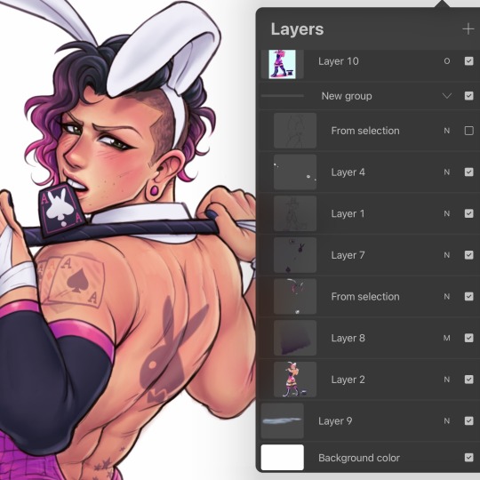
My sketch layer breakdown looks like this (bottom to top):
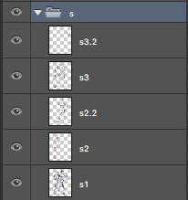
S1 (sketch 1) looks like this (very rough, just to get the layout and pose on the page):
S2 and S2.2 are for a more refined sketch. I use one layer per character if there is any overlap whatsoever. This way it's easier to move or resize anything without having to erase and start over. S2 layers are for getting the basic anatomical shape of the characters because then it's easier to lay the clothing on top and find out where the folds would be.
S3 and S3.2 are the final sketch layers for me. This is where I'll add the details – face, hair clothing, etc. I use the first (S3) layer to get the basics down and will add layers (S3.2) for extras, such as the weapons – because again, sometimes it's easier to be able to move or resize a single item or area without having to redo an entire section.
Once I have the detailed sketch layer, I'll lower the opacity and trace over it with the lineart on it's own separate layer. One thing that's really helped me is keeping all layers to the bare minimum. Putting all sketch layers in a group, keeping lineart on one layer, colors on another, etc. One of the most chaotic things in digital art is when each separate item or area is on it's own separate layer, and it all becomes overwhelming.
Taking art in steps/stages has been the most helpful thing for me, especially since I started doing freelance – and that's why this sketch process works for me. If you breaks things down to stages like this, you can still feel as though you are accomplishing something even if you don't have a finished piece yet. You did the first rough sketch layer? Great! That means you have the positions down on the page, and can move on to the next layer to clean it up and refine it. You got that second sketch layer done? Amazing – you're one step closer to being done.
One more important thing I've found with lineart is to find the right brush. The basic photoshop brushes never worked for me because they were too...hard and clean. I felt like my lines had to be 100% perfect with absolutely no wiggle (which is very difficult without a stabilizer). So I started looking for brushes to download that imitated more traditional art materials, since that's what I was used to.
These are the brushes I use now, and I absolutely love them! There are a ton of brushes to download for free, but just make sure they are free and the creator intended them to be so, as pixelstains does for the ones I use.
For lineart, itself, I like to do a base layer down and then go over it, thickening and defining the lines where I feel necessary.
That process looks like this.
Base lines:
Defined lines:
To get dynamic lineart, remember that the outer edges are the thickest lines, and anything that overlaps are the thinnest lines (or even a break in the lines). You want to show someone gripping something hard? Where the fingers press into that object, you should use thin lines. Want to show someone biting their lip? The point where the teeth meet the lip, the line should be almost invisible.
I hope this makes sense and maybe even helps a little. I've got more detailed tutorials (anatomy breakdowns as of right now) on my Patreon.
104 notes
·
View notes
Note
What is your step by step drawing process like, if you don't mind my asking?
I'll just use Sunstealer as an example since he's the most recent thing I did. Under the cut because this is horridly long. You wanted step by step, I’ll give you step by step.
That is a threat.
And every step of the way I use a sharp pen with high pressure sensitivity and a sharp eraser with high pressure sensitivity, unless stated otherwise.
1. Alright, sketch first of all. I pick a whatever color, set a folder to multiply, and add layers in it. I start with the face/helm and take moderate care with making it look decent.
2. From there I sketch the rest of the the pic, preferably very loosely. I aim to not lift the stylus from the pad very much and instead just SCRIBBLE lines into the vague shape I'm after.
3. Set the sketch folder’s opacity real damn low, like somewhere under 10%, create a new folder, set it to multiply, and this is where the horrid amount of layers and layer folders I use comes in. But, you can see I actually did a second sketch of the arms (and legs, though that isn’t visible here) ‘cause I couldn’t make them look right based on my initial sketch.
4. On top of my second sketch I draw the rest of the clean lines. The lines were drawn with this purplish color, btw. I use something akin to it pretty often in my lineart.

5. After all that I use the Auto Select tool to select everything outside my lineart, e.g. everything I don’t want to have color. I then invert the selection and lay down my flats. At this point I used the gold as my base color, but then added separate folders for each following color, clipping them to the gold base layer below. In the case of black, its folder has a whole bunch of layers while I tried to figure out what parts to color black. With layers for the different parts, I can just click them on and off to see what things look like with or without them.
6. Okay, now to the meat of things. I use a correction layer (hue/saturation/luminosity in this case) to change the base gold to a far darker color that I can easily edit later without losing my initial color choice, and create a new layer on top of all my colors, set it on multiply, and in this case used a sort of peachy color to add my first shadows on top of the whole entire picture. At this point the exact colors in use don’t matter one bit, though, as long as you see what you’re doing.
7. I create a second multiply layer on top of the last one, and go over the whole thing again, adding deeper shadows, this time using bright red. But again, color doesn’t matter yet. I like contrast too, so you can see some areas turn almost black.
8. Shinies! We add our first Add (Glow) layer (that can be named differently in other programs, in SAI it was just “Luminosity”). Once again, color doesn’t matter, just as long as you see what you’re doing, but I was working with about the same peach I used on my first multiply layer. And how I add the shines is basically just color the glow over the whole area, then use the eraser in sweeping and circling motions to remove parts of it. I don’t treat each plate/portion separated by lines individually, because then you’ll just end up with mismatched areas that don’t communicate with each other at all and just fight. (Remember to erase the shine from over your shadows too. Auto Selecting the shadows and erasing the glow from the selected area is a good trick.)
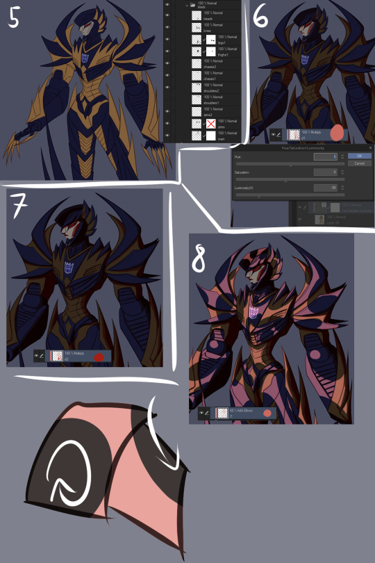
9. More shinies! This time we want it to show up as a bit lighter/brighter than our previous shiny. Using a brighter color or higher opacity does the trick. I do the same thing of coloring large areas and erasing shapes out of them afterwards, but this time I make it argue with my first glow layer a bit. Some overlap is good, but I also want them to live their own lives. (I included a view of the second glow layer alone, but I worked with both glow layers visible.)
10. We now have two multiply layers and two glow layers. What we also have, is a base color (gold) and separate folders for every subsequent color (black, face, insignia in this case. And optic, but let’s not touch that yet). We now copy our two multiply layers and two glow layers, and move copies of them into each folder (sans optic) and clip them to the base layer in that folder. We move copies of the multiply and glow layers right over our base layer too, below our other color folders. (I deleted the glow layers from the “face” folder because I don’t want the face to be as shiny, and the multiply layers from the “insignia” folder because there’s actually no shadow over the insignia.) We can make our original multiply and glow layers invisible so they’re not messing things up, and what we should have is... The same exact thing as in step 9. Wow.
11. Now we actually make it look good! Though let’s just color the optic while we’re at it so it’s not all empty. Anyway, this is the stage where we really start to think about color and opacity. I want a neutral lighting to showcase his colors best, so let’s see how we get that. The thing we’ll just do is use Tonal Correction > Hue/Saturation/Luminosity to change our multiply and glow layers one by one, starting from our first multiply layer. I turn the other multiply and glow layers off so I can see what I’m doing and and tweak the colors until I get something that doesn’t scream “interesting lighting”, because I want neutral lighting.

12. Then I go through all of the layers one by one and do the same thing to each of them. The reason I have them each on separate layers is exactly this, that I can affect all of the drawing’s colors individually and make them look just as I want to and always have the option of just going back and easily editing things. I also add a glow layer to the face, but with a brush rather than a pen so I get a softer look, buuut then add a second glow layer with a low opacity to add just a little bit of sharp light in there. And now we have a thing! But it looks pretty flat, doesn’t it? We don’t want that.

13. First of all, let’s add some soft glow to the gold. New glow layer below our multiply and other glow layers, choosing a soft color to accentuate the gold, and then using either a brush or airbrush we add just a bit of color in there. Arrows point to the spots where I added it, because we want the effect to be subtle and easy to miss.
14. We can do better than that, though. Let’s add a multiply layer and do the same thing, adding juuuust hints of darker color here and there. It adds a touch more depth, but again, we want it to be easy to miss.
15. Let’s have a look at the black, next. You may have noticed I turned off the second glow layer on it entirely, and that’s because it was decided that the black shouldn’t be as shiny as the gold. We still want to add some life to it though, and because Sunstealer’s black tints towards blue, let’s make some blue happen by adding a glow layer, and again, very softly with a brush or airbrush, add just hints of color in there.
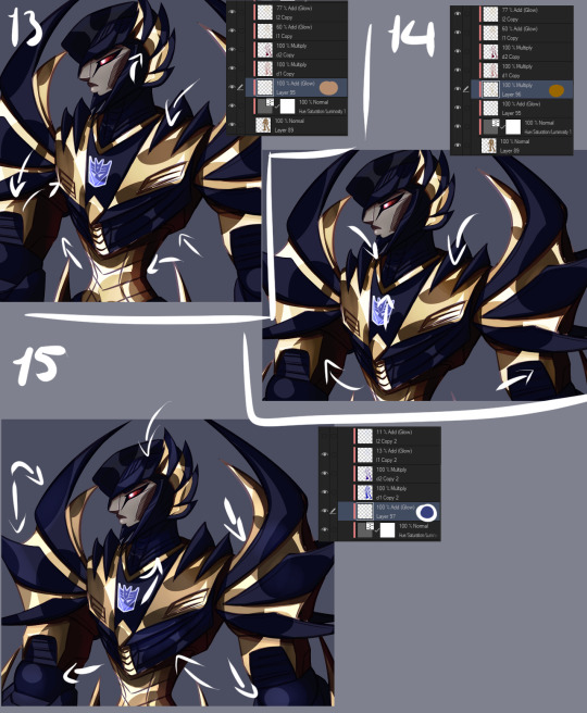
16. It still doesn’t really good though, does it? It’s pretty boring and lifeless despite our efforts. More layers, then! Some fucking edges, this time. A glow layer above all of our existing layers and folders to affect all of them (except optic, ‘cause optic doesn’t need it), take good ol’ bright white, turn the opacity down a bit, and add sharp light to the edges. Like, all the edges that are touched by light. Seams, everything. We want this motherfucker to shine.
17. Okay, now do the same, except this time on the shadows. The layer is on lower opacity and I didn’t use white but desaturated blue instead. Just add a bit of reflected light in there.
18. Slowly getting there, but let’s do a couple more things. First of all, warm color. Basically, I just like to slap a random color on top of the whole damn thing when I’m finishing a drawing, using either a color, a glow, or a normal layer, depending which one gets me the best results that time. Or, all three, if that’s what I feel like. This time I used a color layer with briiiiiight neon orange. I switched the layer to normal and opacity to 100% so you can see where it’s actually applied, which is, again, on top of all the layers. A pretty large area, but even on 100% opacity with a normal layer you can see it’s pretty transparent. If I had wanted to do a more interesting lighting, I would’ve left it more visible and maybe added another similar layer in a different color, but I wanted neutral lighting so we leave it as just a tiny, tiny hint in there.

19. Still not done. Colors reflect other colors, so let’s make that happen on the black and have it reflect our gold some.
20. Almost there. What are we missing? Color correction, that’s what. I didn’t do much of it for this piece, but with some I really play around with correction layers and layers set to overlay and whatnot. But let’s see what we have here. First of all, there’s one brightness/contrast correction layer affecting the gold only, increasing the contrast so things look a bit brighter.
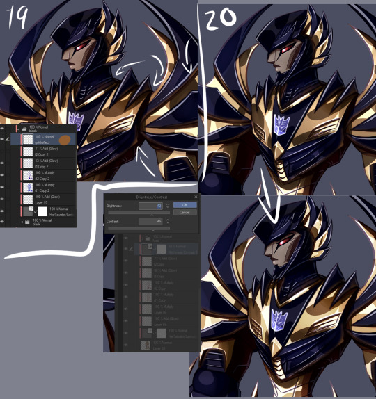
21. There’s also a second brightness/contrast correction layer, this one simply increasing the brightness a bit. It’s mostly for the sake of the black, because I wanted to make it look a bit more blue by making it lighter, but it worked to make the whole image a little brighter along with it. Aside from the optic, that’s still on top of everything else. But like said, how many corrective layers I have going on depends entirely on what I’m doing. In some cases I can have around a dozen in effect, not all of them always affecting the entire image, but split around to do their thing on different layers.
22. But speaking of the optic! It glows, so let’s make it glow with two layers on top of both of the “color” and “lines” folders. One layer is for the blurred red glow, the second is for the sharply reflected light.
23. And for things like these I like a simple background, which I generally do by just using a couple of gradients and altering their color to whatever looks decent. I also often add an outline to the entire character in pieces like this to make the character pop a bit more, by just copying my base color layer and performing gaussian blur on it.
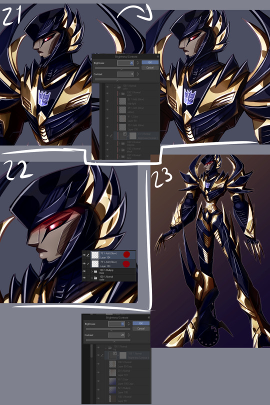
WHEEZE. That’s that, though. Finished product can be viewed here.
Oh, and ctrl+shift and tap will jump you straight to the layer you tapped on. Makes moving between layers and finding the damn layer you wanted to edit a hell of a lot easier.
Annnnnd obsessively naming layers and layer folders so you can tell what the heck they actually are when you have way, way many layers to work with.
*thumbs up*
#asks#anonymous#is that step by step enough#i might've forgotten to mention some layers because there is A Bunch even just for the colors#but i tried to be thorough#but yeah non destructive editing and editability#that's how we get to some overachieving layer counts but make sure we can always go back and always have control
9 notes
·
View notes
Text
My art process: start to finish
For @sisterdragonwithfeathers and anyone else who wants some art tips :)

Step 1: sketch your art. Don’t need to be too fussy, just get it all down. I do traditional sketches and upload them to Krita but for digital sketching I like to use the airbrush in a bright color.
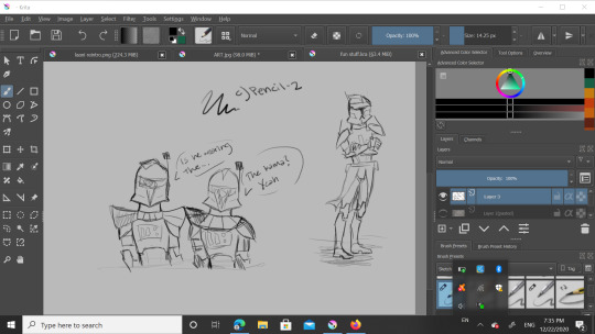
Step 2: Yes, another sketch but this time it’s digital. I lowered the opacity on the OG and used “c) Pencil-2″ but you can see it highlighted in blue in the 1st pic. Here I adjust proportions a bit if needed, maybe clean it up a ~tiny~ bit, but I’m going for a sketchy look for this piece.

Here i used “b) Basic-5-size” but I customized it a bit to fit my style. It’s highlighted but my thumbnail is just scribbles so it should look like the paintbrush to the left of it. Also I basically just unchecked “flow” and checked “softness” in brush settings to customize. The soft brush lineart over the digital sketch layer gives it a nice look. Next step!
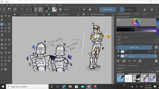
Add a new layer under both the lineart and sketch layers and use that same basic brush for the base color (here it’s white) and then either use that or the pencil to block in some flat colors. I have color pallets there but I didn’t use them that much. You’ll see in a sec, but understand that I mainly only colored Cody here because blue in the next few steps gets a little funky.
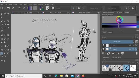
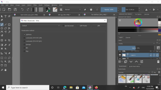
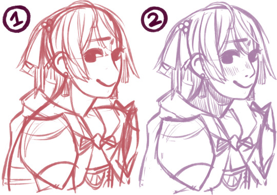
Be not afraid, I say confidently, as this is my third time doing this. Anyway to get grayscale like this just smash Control+Shift+U and a menu will shove its way onto your screen. I used “lightness” which should be the first option. Ignore the blueish markings, I was just playing around with a layer above to see what shade of blue to use later.
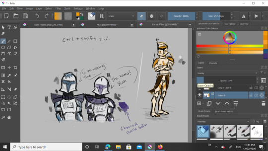
Ok, new layer. I recommend not being a di’kut like me and actually naming your layers. There’s alot. See the leftmost column on the toolbar? Good, now look at the magnifying glass at the bottom and go 2 up to the squiggly shape. It’s a lasso so you can outline what you want to color- I had to do each clone seperately for this one- and when you color it in it won’t go outside your selection. For 501st bois I tend to use a dark blue but for 212th I use a bright orange. Now that you have clone shaped blobs of color, change blend mode from Normal to Overlay. Lower the opacity until you like it, I do around 40%

You did it! You got through the hard part. Smooth sailing from here, just add details, speech bubbles, WHATEVER, just go crazy! In my last piece I had a white glow around Rex and Ahsoka. For that I made a new layer below all the others, used “grainy chalk” in very light grey on Add blending mode. Also, for the armor texture I use the soft charcoal in white on Add mode and lower the opacity. That’s it, you’re done.
Feel free to follow these steps, adjust them to your style, or do something completely different. If anyone wants to draw this particular piece as practice, go ahead but please don’t post it without crediting me.
That’s all for now, have a great day/night y’all!
15 notes
·
View notes
Note
Hi! I just found you through @revolutionaryduelist and I just wanna say 1, I LOVE your art, and 2, could I ask a lil’ about your art? What program(s) do you use? What brush do you use for your AMAZING lineart and how do you choose lineart colors?? What dark magic do you use to shade??? I find your use of color phenomenal! Have an amazing day! :-D
thanks for this nice ask! i use paint tool sai, specifically the anglicized version that you can find online.
lets draw bernie fire emblem and go through my process.
first off, my brushes.
this is the brush i use for sketching, coloring, and cleaning. sometimes for highlights in the eyes or the rough first patch of shading, i also use ink pen, just the default settings.
this is my blending brush. if you give it a texture, blending stuff wont look as boring as it otherwise might.
now, let’s draw bernadetta.
(1) first of all, the rough sketch. i start out with just shapes and then just keep going, all on one layer.
(2) then, i clean that sketch up a little - not too much, you dont need it to look perfect. i dont like drawing lineart at all, so this is what i work with - the sketch, a bit cleaned up, put on multiply. i change the color of the sketch according to what im drawing. for example, if i draw a character like inigo, whos got brown skin and hair, ill end up with yellow, orange or red lineart. if i draw a character during the night, ill use blue lineart. if its dusk, maybe a strong purple. you can change this later, as well.

next, below, i fill in the colors, usually about a layer for each color i use. i usually start out with the hair and end with skin, but it doesnt really matter. try to use colors that vary in saturation and brightness - if everything is very saturated, things end up looking blinding, but if everything is desaturated, it might be boring to look at. this isnt a hard rule, of course, but for this kind of normal illustration with neutral lighting conditions, its good to keep in mind.

now, onto shading. here i used the ink pen for a moment. take your base color, in this case bernies purple hair. the highlight is less saturated, and moves up the color wheel, more toward a reddish tone. the shadow is more saturated, and moves down, toward a blue-ish purple. you can also make the highlight more saturated than the base and the shadow less saturated than the base, but i think its best to decide on one or the other. moving along the color wheel rather than just decreasing or increasing brightness will also help making the picture more vivid.
for hair and gauntlets, i just put on the shadow and highlight and blend it out with the blend tool. for skin and fabric, i use a different method.

first, add blush. blush should be far more saturated than the skin color. i added a touch of deep red in the middle as well for depth. this should be blended.
the shadows on the skin, however, i fill in with ink pen. some parts of this need hard lines, like the outside of the ear shadow, the lower side of the nose shadow, etc. you dont just want an airbrushed look, but a defined line. for this, i use a shade that is slightly more saturated than the base color, but not as saturated as the blush.

then, i add a lowlight color to make the shadow feel more dynamic and interesting. you can go many ways with this - if you check the coat in the next few images, youll see that i used a less saturated color to counteract the very orange shadow. in the case of her skin, i used a more saturated color that is very pink to mimic her hair. i cant really explain this step well, because most of the time, i get to that shade through experimenting.

blend some of the lowlight, but make sure not to ruin the harder lines of the shadow. i did it on the same layer as the base color because im lazy, but you could easily make a clipped layer, add the shadow, and then preserve opacity to make sure everything stays clean. for my purpes it doesnt really matter though since ill be going over the whole thing during cleaning again.
in the circled areas, i took the blush color and gently airbrushed some on for depth and warmth.
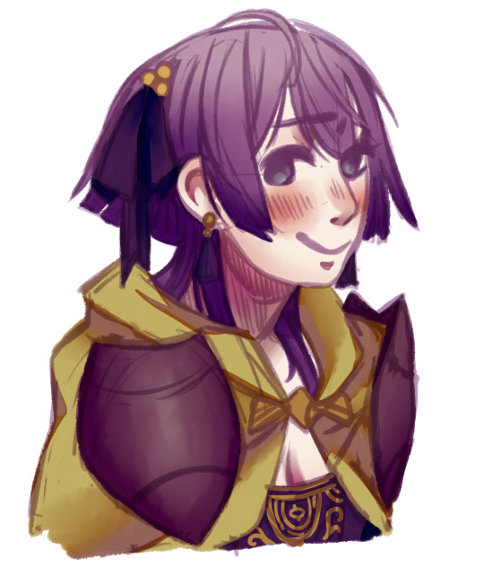
heres the rest of the shading. as i said, i used a less saturated reddish tone for the lowlight in the cape. for the bow and cape, i opted out of highlight, because i imagine them as made out of a sort of thick, unreflective fabric.
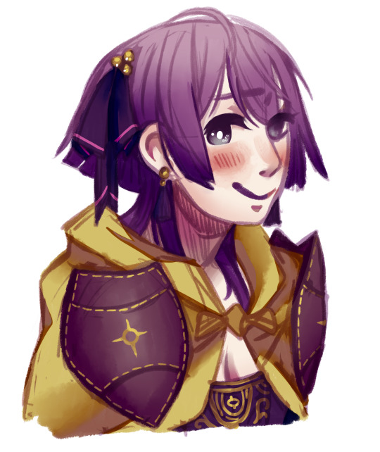
now, all thats left to do is clean! i make a new layer atop everything, zoom in a bit, and go over it all with my brush and the eyedrop tool. a lot of my WIPs look like this, with a part of it very crisp and clean and most of it still sketchy and vague lol. colordrop from everywhere, and create something nice!
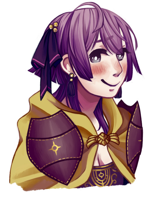
in the end, this is the finished picture! i turn the blend on my brush up and down depending on what im doing and what i need. the cleaning process takes the longest by far.
anyways, i hope this was helpful. if you have other questions, feel free to ask ‘em.
#art tips#is the tag i used for a similar ask before i think#anyways today i drew bernie just for this lol#t1mmytim#long post
191 notes
·
View notes
Photo
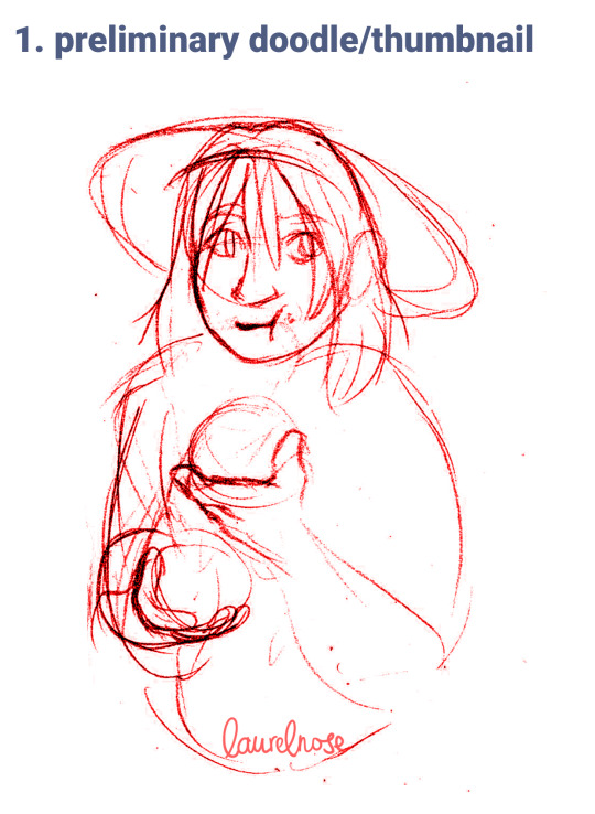


I scanned every step of the stickybun geralt drawing because of reasons and then realized I had enough to make a process post, so I went back and grabbed the thumbnail sketch for completeness. i always love seeing step-by-steps from other artists and i think there should be more of them in the world (there’s lots of speedpaints but it’s Different, okay), so here’s mine.
1. preliminary doodle/thumbnail
the contrast on this scan is fried because it was just done super lightly and i couldn’t get it to show up otherwise, lol. it’s the same pencil as for the proper sketch. these vary in how seriously i take them—sometimes they’re an entire first draft of the drawing—but the main point is to put down the gist of the idea and figure out where the sticking points in the pose are gonna be. for instance, I realized I didn’t want to deal with the perspective on a second hand and stickybun, and also that I wanted Geralt’s shoulders to be relaxed because he’s having a NICE TIME, dang it.
2. sketch
...yeah, it’s a sketch. I usually sketch with Prismacolor Col-erase (erasable color pencil) in whatever color takes my fancy at the time. Colored pencil is easier to remove digitally from inked pieces, but as you can see, I did not bother to do that. I didn’t even erase. colored pencil does blend better under colored inks—the reason oil painters often draw in brown—so there is that. I check my drawings frequently during the sketch process by taking pictures of them with my smartphone and flipping them horizontally, just like a digital artist.
3. ink that puppy
Inking tools of choice are a Brause 361 Blue Pumpkin steel nib and a regular old-fashioned dip pen, which produces lovely line variation. I used to use fineliners and always kind of hated them, and then I bought a dip pen on a whim and I CAN NEVER GO BACK. This is Kuretake’s black sumi ink, which is water/alcohol-proof if you let it dry completely first which i didn’t
4. more ink, but make it color
you thought it was watercolor, but it was ME, ALCOHOL INKS— anyways. the difference between watercolor and ink is kind of complicated and the techniques are very similar but I Just Like Ink Better, Okay. for this one i used red, yellow, blue, and magenta Higgins drawing inks, applied with a shitty synthetic brush (I’m going to invest in sable...eventually...). This is just flat colors, I didn’t shade or layer or anything. All the variation is either the paper (Strathmore mixed media—which...interacts real weirdly with ink, tbh, it works for me but i wouldn’t recommend it) or lazy ink application. Oh, and the freckles are colored pencil, easier to make little dots on wet ink.
5. clean it up and add whites
A Curves layer in photoshop adds back vibrancy to the scan, and then I go in with my tablet and add white highlights/rimlights. I usually clean up some of the sketch lines I didn’t erase in this stage and sometimes I fiddle with the lineart. then it’s done! congratulations, it’s a baby witcher. total time: 4 hours maybe?
#laurelnose art#art process#not only did i scan every single step i also removed the drawing from the sketchbook before i got the inks out#WE CAN'T LET THE ESKEL INCIDENT HAPPEN AGAIN
11 notes
·
View notes
Text
The Circus V
Werewolf! Kylo x Reader
Modern/Monster AU
Words: +3.200
Warnings: None
AN: HAPPY HALLOWEEN! I’m back! At least for the last parts for the Circus. The next Parts will be posted each Friday until we are done with them. I’m also writing on other stuff but I’m honestly not sure if I will post them. Zero Feedback = Zero Motivation to post them, since it makes no difference to me. So yeah we will see...
MASTERLIST: Can be found in my bio if you are interested in more!
-
“What happened to you?” Kylo chuckled when he came around the corner to find his beautiful girlfriend covered from head to toe in paint streaks.
“I started your banner!” taking the cool bottle of lemonade from him, Y/N quickly took a few sips before brushing over her forehead to look at her work.
Following her gaze Kylos mouth fell open. With a chuckle she carefully pushed his chin up.
“Holy shit! That's me?” he asked astound and stepped closer to look at his own face on the gigantic Banner.
“Well yeah, who else. But it's still not finished so don't expect too much!” she mumbled a bit worried that she wouldn't be able to satisfy everyone's expectations.
“Oh don't make that pouty face, Moonshine. I look fucking badass.” grinning at the banner he already saw the wolf sketch that would be behind his shoulder.
“This will be awesome, you should really stop underestimating yourself so much.” he mumbled and pulled her closer, to press a kiss on her soft lips.
“I know … but that's how the progress works.” stretching herself, Y/N yawned.
“How about we take a little break?” Kylo already grabbed her by her hip and sat her down on the hood of his car.
“Yeah… the paint needs to dry anyway.” leaning back she already enjoyed the nice sunshine and closed her eyes before Kylo joined her.
“Ah wait, careful...” quickly shielding her ear with one hand, she grabbed the tiny white snake that had been sleeping in her hair again.
“Well … Hello Koh, what are you doing here… again?!” Kylo growled with a sweet tone to the snake who just looked away and curled around Y/Ns fingers.
“Phasma is training for her show and he is still too young so I babysit him.” with a smile Y/N started to pat it's tiny head and the little snake closed its eyes in relaxation.
“Well if you want a baby to take care of, I have an idea...” Kylo growled seductively in her ear and she started to chuckle.
“Mhmm I think I should listen to Poes tip and tie you up at night from now on.” with a teasing grin she pressed a kiss on the tip of his nose.
“I`m not in my rut!” he huffed offended and she just giggled even more.
“You are so sweet when you try to hide the truth.” ruffling through his hair, Kylo quickly pulled his head away, not wanting to give her the satisfaction.
“Oh come on. I`m just teasing, Darling.” Y/N took the last sips of her drink before looking surprised at the little snake in her other hand.
“Did you hear that?” looking over to Kylo he only shrugged his shoulders.
“What should i have heard?” gently laying his hand against her cheek, she lightly shook her head.
“Maybe I just have been to long in the sun.” watching the little snake for another moment, she placed him back around her left ear before sliding off the car.
“I get you some water, then… Don't overdo it please.”
“Don`t worry about me, you have your training soon!” she reminded him and he looked shocked down at his watch.
Running into the tent, he quickly grabbed a glass of water and brought it to her before pressing a strong kiss on her cheek.
“I`ll see you later! Love you! God dammit!”
Watching him run towards the big tent she could only try to hide her laughter.
“Yes you`re right. He is a bit clumsy sometimes.” Y/N answered the little snakes hiss and started to mix her paints to continue Kylos banner.
A few hours later, Y/N had made a lot of progress and the little snake slowly poked his head out between her hair.
“You want to take a break?” she asked it and Koh hissed delighted. For now the Banner needed to dry anyway and tomorrow she would be finally finished with the first one. It was only missing Kylos stage name now.
Cleaning her brushes and the glasses she had used, she stepped inside the cool tent. She had already noticed that whatever kind of weather was outside, the tents were always at a comfortable temperature.
“Want to help me choose the colours for your Mamas Banner?” she asked the little snake while placing it next to her sketchbook on the wooden work desk.
Letting out a small hiss, Y/N nodded with a smile.
“I'll get you some water then.” getting a tiny bowl she filled it with water and placed it next to the small snake and watched him drink for a moment, before she pulled her aquarelle colours out of a drawer.
“So what do you think? I put you big in front like you wished for. Phasma right after you with all your other siblings.” Y/N stretched her hand out to the white snake who quickly slithered on it and looked down at the finished lineart she had made.
“Pretty!” the snake hissed and pressed his scaled snout against Y/Ns cheeks just like a small kiss. Giggling to herself, she watched Koh for another moment. So it was him she had heard earlier, first it was a little shock but now that she had time to think about it, it made sense. Since she was here she had noticed more and more magical things inside the circus, little things like the changing appearance of her co-workers, who looked more and more like their original forms. A man with horns, a woman with flowing hair as if she was constantly underwater or the wondrous animals she just had laid eyes on so far. So, that she was able to understand Koh it must have been a part of being here and especially being accepted by everyone, even though she was just a mere human, at least that was her conclusion to all of this.
“So since you're white, how should i paint you ...” Y/N started to mumble to herself while taking a closer look at Koh who rolled himself together on her hand.
“Rainbow.” he hissed and she noticed the lightest bit of colourful shimmer on his small scales.
“Oh I see! I can definitely try something like this!” grabbing another piece of paper she prepared an example and showed it to Koh.
With a small hiss the Snake observed the paper before turning itself to it's own body.
“More shimmer, please?”
“No problem, sweety. Silver or Gold?” placing two containers next to the test drawing the small snake looked between them.
“Silver, please.” he nodded excited and watched closely while she placed a thin layer over the light rainbow part.
“How is that, my little friend?”
“Perfect! Thanks!” getting booped by his snout again, Y/N smiled. It was nice to have the little snake around while all of the others were so busy preparing their acts, since the first date of the show was announced for this weekend.
Working on the colouring for Phasmas Banner, Koh slowly made his way on her head to watch from above while he curled around a strand of hair.
-
“Can we visit Mama soon?” the small snake asked after a while with a yawn and Y/N carefully stretched herself after putting her brush down.
“Yeah, let's go… I'm creatively exhausted too.” cleaning up her desk, Y/N soon made her way towards the big tent, the sun slowly sinking in the background.
Koh climbed back down towards her ear where he had the best grip and felt the most comfortable.
“Y/N? I was just about to come over to you.” Phasma was approaching them and Koh quickly stuck his head out of Y/Ns hair.
“Mama!” he called with a wide open mouth which made Phasma smile with adoration.
“Are you done already? Koh wanted to watch you rehearse.” Y/N stated and helped Koh from her ear before holding him towards his mother.
Surprised, the tall woman let Koh climb from Y/Ns hand to her own, not taking her eyes off of the young woman in front of her.
“How did you know?”
“He told me.” tilting her head the slightest Y/N shrugged her shoulders as if it was the most normal thing.
“Is that so?” Phasma smiled, not trying to show how concerned she was.
“Yes. She understands me, Mama. It's very nice. We talked a lot today.” pushing his head against Phasmas cheek for a moment, Koh soon slithered up into her hair.
“Let's go together then. Everyone is still in the tent. How did your painting go?” she asked while they walked to the Main Entrance.
“Good! Just need to put Kylos Name on the Banner tomorrow and then I will be starting with yours. Koh helped me pick most colours.” she smiled and the small snake nodded delighted, Phasma could tell he was very proud about it.
For her little child it was of course exciting to be able to communicate with a normal human, but it made her more than worried.
Entering the main tent, Y/N could already see Kylo on the wooden stage in his big wolf form, before someone laid their arms around her waist, it was Rey.
Y/N could feel Rey slightly rub her head against hers and she started to laugh. Since she had spent a few hours with the female werewolf to sketch her, Y/N and Rey slowly became friends after getting over the first awkward hurdle.
“Get your goddamn awful smell off of her!” Kylo suddenly screamed and came running, before turning back into his human form and ripping Y/N basically away from the other before nuzzling his face like crazy against hers.
Starting to giggle, she quickly pressed a kiss on his lips and in an instant he seemed to calm down.
“Come on, at least let me borrow her from time to time.” Rey called teasingly while stalking around them.
“In your dreams, bitten!” growling he wrapped his arms tighter around Y/Ns waist.
“Don’t be so selfish, especially when she smells so sweet at the moment.” Rey sighed deeply as if she was talking about the most beautiful thing in the world.
“Now you've done it!” turning back the black much bigger wolf chased around a brown one which only snickered while running away.
“What is it with them today?” Y/N laughed while watching them before Finn landed right beside her, which made her look up in confusing wondering where he even came from.
“As far as we understand it...”
“More like just assuming...” Poe interrupted.
“We think Rey is teasing Kylo for his rut, since you are ready to have pups.”
“Oh okay… Wait… what?!” first she nodded understandingly before Y/Ns eyes widened in realization.
“Kylo explained to us once that werewolves fall into ruts when they smell that their female is most fertile to have the pups.”
“And he smells that?!” she shrieked while sniffing on her own arm, her cheeks getting redder by the second.
“Your blood does smell a little sweeter than normal, I guess.” Finn agreed nodding.
Shocked Y/N looked at Finn, before she pulled the jacket around her shoulders closer and quickly zipped it up.
“Pervert ...” Y/N crossed her arms in front of her chest.
“No! Please don’t misunderstand I'm not doing it on purpose!” Finn plead to her.
“Vampires and Werewolves just have a very sensitive nose for blood. Believe me!”
“How embarrassing ….” she mumbled and wrapped her arms around herself.
“Don't give it any mind. That's just how these things work i guess.” Phasma tried to calm her and patted her head.
Kylo had thrown Rey off the stage who landed in her normal form next to them.
“Fine big guy. I keep away from her for now until you calmed down.” the young woman bowed and winked to Y/N before leaving the tent.
The black wolf quickly came running again, his mouth curled up into a grin, very proud of himself to have defended his mate, before he turned back and embraced her.
Nuzzling his face against hers again, Kylo tried to get rid of every bit of smell that wasn't his.
When he looked down at her again and saw her flustered face, Kylo bit his lip, she was just too cute and goddamn tempting.
“Sorry for the chaos...” he apologized and she only nodded slightly while avoiding his gaze.
“Are you already done with training? Kou and I planned to watch.”
“Ah yeah sorry … maybe tomorrow. I'm pretty beat too...” leaning with his heavy weight down on her, Y/N started to struggle to keep him up.
“How about we just go home and cuddle… lots.” he suggested with a loud yawn.
“Actually Kylo, there is something I would like to talk with you beforehand. If that's okay with you...” Phasma suggested and looked down at Y/N.
“Oh sure. I will prepare a nice hot bath for you, my love.” standing on her tiptoes, Y/N pressed a gentle kiss on his lips before she wished everyone else a good night and left.
With a heavy sigh Kylo watched her leave before he gave Phasma and the little snake on her head his attention.
“What is it? You look pretty serious.” raising his eyebrows, she suddenly pointed up at the small snake that was just letting out a long yawn.
“Y/N can understand him! I don't know why or how, but she can completely understand him!”
“Are you really sure about that?”
“I didn't see it myself, but Koh and her both confirmed it.”
“Wait… holy shit does that mean she is one of us?” sitting down next to the werewolf, Poe crossed his legs.
“She can't be...” Kylo stated shocked before letting himself fall on a chair nearby.
“She doesn't smell like any of us. And if Y/N really can understand him shouldn't she at least have a similar fragrance like Phasma?” he asked Finn who only nodded in thought.
“Yeah, they have completely different scents.” the Vampire agreed.
“She doesn't have to be a Snake person to talk to him. I mean… Nature Spirits could too.”
“And it seems like Y/N just now started to understand him, right?” Poe added and Phasma looked to her small son who slowly nodded.
“He tried before but today was the day she seemed to really understand him.” she explained to the others.
“That is… unexpected.” brushing his hair back, Kylo took a deep breath.
“Well it doesn't really change anything seeing that she might not know herself.”
“Is it only Kou she can speak to?”
“I don't know… come to my tent tomorrow and we can find out. It just really surprised me...”
“Finn and I could do some research if you want too...” Poe suggested but Kylo seemed to barely listen anymore.
“Yeah, I will try to talk to her about it.” standing up he left the others behind without saying another word and made his way to the edge of the Circus where their tent was.
As soon as he saw her, Kylo grabbed her by her waist and picked her up before letting his lips clash against hers.
With a chuckle she wrapped her legs around his hip and quickly held onto his broad shoulders.
“Don't get ahead of yourself...” she warned with a smile when she felt his firm grip on her behind.
“But you are so goddamn tempting.” kissing along her neck, he could hear her heartbeat fasten before she quickly pushed his face away and laid her hands over his nose.
“How do I smell like to you?” she asked ashamed and for a moment he looked confused at her.
“Oh … the others told you, huh?” nodding the slightest, Y/N laid her head on his shoulder.
“Well to me ...” leaning down to her he let his nose run over the exposed skin on her neck.
“You smell like a warm summer night and since yesterday there is a hint of sweetness that just drives me crazy. Similar to the Cotton Candy that we ate the night we met.” Y/N screamed when Kylo suddenly let himself fall with her onto their bed.
“And it's not just that, if you should think that. You`re drop dead gorgeous and i still can't fucking believe that you are mine. Only mine.”
“Okay okay enough or my heart will explode!” chuckling shyly, Y/N was the one who nuzzled her head against him.
“Are you sure, because I have a lot more.” he smiled while smothering her face with kisses.
“Kylo?” hearing her serious tone he stopped and looked down on her.
“How is that when someone is expecting pups? What happens at full moon when the baby is still in the mother?”
“You were worrying about that?”
“Well when we have pups at some point ...better I will be prepared, right? Besides it seems to be the topic of the whole damn Camp...” she mumbled and her cheeks started to flush with a pink hue. They never had gone further than snogging and already talking about children seemed a little much, but also necessary and she was curious herself.
“Oh sweetheart… let me show you something.” pulling out his phone, he rolled right beside her and showed her a few pictures.
“I asked my mom to send them earlier this week.” he swiped through the pictures and watched intently when she started to giggle.
“Wait, is that really you with little wolf ears?”
“Yeah that's me when I`m two. Werewolves start transforming around their 3-5 year. It will be just like a completely normal pregnancy my mother told me.”
“So you were an early one, huh?” she grinned.
“I always was. When you hit puberty it's starts that the full moon takes over.” he explained while Y/N had taken the phone from him still staring interested at the pictures until she saw a small Kylo in a tub.
“Oh no! Your bath!” suddenly jumping from the bed she run to the back of the tent.
With a smile on his lips Kylo shook his head before his eyes fell back on a picture with his parents. A heavy sigh escaped his lips before he followed Y/N after a short while.
“Maybe you should join me… you are still covered in paint, my Moonshine.” laying his hand on her hip from behind, he looked over her shoulder while she added something into the hot water.
“I would just ruin the nice water and we two would both be stained. So you still have to go in alone, my love.” leaning against his chest, she felt him press a kiss against her head before he buried his face in her hair.
“Maybe next time then.” he said teasingly before turning her around, pulling Y/N into a soft kiss.
“I love you, Moonshine.”
“I love you too… my big bad wolf. Now get your butt in that tub!” she chuckled before giving him a light slap on his butt just like he would always do.
“Yes ma’am.” pressing a quick kiss against her temple, the werewolf let her leave and soon was laying in the tub, just letting the hot water soak in and his sore muscles relax.
Now waiting for Y/N to come out of the bath, Kylo was just rubbing his hair dry while trying to think of a way how to start up a conversation about the fact that she could speak with the little snake.
It was something that he just couldn't wrap his head around, for him her scent always had stuck out of the crowd of normal humans, but that she might be one of them was a light shock for him.
Of course it didn't change anything about his feelings for her, he was just worried under which circumstances she lived beforehand since she didn't seem to know herself.
Hearing her little footsteps come closer he looked up to find his girlfriend in her favourite pyjamas and dripping hair.
“You stole all the towels!” she pouted and he quickly took the towel he just used to throw it over her head to ruffled her hair dry.
Letting herself fall into his lap, she waited patiently with a smile.
Just these small moments were something that always made her day and it seemed like for Kylo it was the same, that he literally forgot to talk with her and soon the were cuddled up in their gigantic bed.
-
Tags: @kyloren-supreme-ben @celestiaelisia @sdavid09 @ayatimascd @acunningstargazer @agirlwithlonelymusic @ev3e
#Kylo Ren#Kylo Ren AU#Kylo Ren Imagine#Kylo#Kylo AU#Kylo Imagine#Kylo Ren x Reader#Kylo Ren x You#Kylo x Reader#Kylo x You#The Circus#werewolf!kylo#Werewolf Kylo#werewolf au#revengeworld
109 notes
·
View notes
Text
Hello and welcome
Idk what to, but welcome to whatever this turns out to be, I'm winging it here okay
So, moving to a new house, the start of a new year...big things like that sometimes incentivise you to start fresh, change things up, become a new you, etc etc.
Well, I'm about to start rambling about some things that I want to start getting into this year! Can't say I'll get far with them though, executive dysfunction is a pain in the butt.
One of the main things I want to get into is bullet journalling, or something similar to it. Mainly for mood tracking, habit / task tracking, and just generally keeping a record of what happens. Oh yeah, and also some kind of calendar so I can keep an eye on my TAFE work...
I'd also really like to improve my drawing skills (mainly digital, but maybe traditional too?). I'd love to draw more than I do already, I have lots of little ideas!!
Oh yeah, side note. I'm getting a waaaaay bigger desk over the next 2 weeks, and I am so excited. My current one is 90cm long, and my new one is 180cm long!! It's also a corner desk, so each side is 180cm long. I'm planning on having my computer, Cintiq, and some other art stuff (drawing / journalling / colouring stuff and origami) on the desk. Planning on getting a small TV or monitor with audio so I can dock my Switch and more easily play and / or stream ACNH too (人 •͈ᴗ•͈)
Anyway, where was I. Right goal things yeah...okAY! I want to get more organised as well. Yeah I'm not too hopeful for this one. Basically, I want a timetable kind of thing, set blocks for certain tasks. On the other end, keeping things neat and tidy is great too, I'm capable of that part at least.
Also, I have rainbow fairy lights on order and they should be here early next week and omg... they're so pretty I can't wait to get them...
My friend from TAFE and I have loosely planned that she'll stay over my house on one of the TAFE nights so we can go there in the morning together. She's gonna teach me polymer clay stuff and painting, eeeeeee I'm excited! This new desk will come in handy for all this art stuff, heck yeah...still anxious about it all because it's all new to me, but I'm sure I'll get used to it over time~ she's so nice too (・∀・)
I'm trying to read through what I've typed so far and it's too much text for my brain to want to focus on...hhhhhh welp, we really are winging it.
I don't know if I want to use the big crossbody messenger bag I got for TAFE, or my backpack. I like the messenger bag, but it's a bit too big and there's no pockets or dividers in there...but then I'm not sure what I'd use it for instead. I really do prefer my backpack over it in terms of functionality, but the messenger bag looks cute... it's pastel and rainbow and has Pusheen on it. I want to use it for something, otherwise it's kind of a waste of money...
Another thing I kinda wanna do this year is maybe try and open art commissions? I'd love to do it, but I don't know if anyone would want to commission me especially since I kinda have a small amount of stuff I can actually draw, and also I haven't been doing clean lineart...I like the neat sketch look... I've been using a good pencil brush for most of my drawings lately. I also don't know where to do it... I'd need to figure out PayPal stuff and all that, and then some kind of branding / logo / "official name" kinds thing. I mean PhotonDragon13 is probably fine, and I guess I do have a logo and all. I'm really not sure. I need a watermark though...still haven't figured out one.
Okay...I thiiiiink that's all for now.
Bye bye and have fun whatever it is you do on tumblr (ノ◕ヮ◕)ノ*.✧
1 note
·
View note
Note
Can you like tell me your process when comes to drawing? Only if you want to of course
ooo of course! Hmm with this particular drawing i painted instead of the regular sketch - lineart - colors - touch ups, so i’ll talk about that here a bit! (i actually considered screen recording that drawing but i only thought of it when i was half way finished ;w;)
so first, using a handful of references I quickly make a sketch! I always make the sketch on one layer and don’t bother with many details, I’m just getting down shapes, poses, layout, and such! (for effect or add-ons like the night gown goes on a different lighter layer) I like working with a grey background when drawing cause the stark white hurts my eyes a lot 💦

From here I started to line but it wasn’t working out for the life of me so i blocked out the shapes more with colors to help me line better. While lining i then started to hate the thought of coloring in so at that point i figured i should just merge the lineart and the colors. (That happens i lot with me, it’s more complicated and time-consuming, but sometimes i dont like the thought of coloring or i don’t like the thought of lining so i just squish them together. Two birds with one layer! An example of this is on my leo crop top drawing)

Digital painting is done a lot of ways, but for me I make a duplicate of my sketch layer so i have two. The top one is put at a low opacity, about 15%, and the other is left as is and i start blocking in colors, cleaning up, refining the lines, etc! (For this drawing i had the body, head, and hair on their own layers) It starts of very very choppy as you can see with the right arm lmao. So yeah from there it’s a lot of filling and chiseling ✨
clip studio paint is seriously an (affordable) monster. It has a bunch of special brushes i used to get the fluff on his night gown and the folds on it too. I really love the gaussian blur it has and i abuse that effect A LOT, you can see the difference from the left and right side 👀 To get this effect it’s best to duplicate your lineart, or in my case duplicate the whole drawing, and add the effect to your copy. It looks nice with the blur effect both on top or behind your drawing! I put it behind my drawing here
A bunch of color correcting, pacing back and forth between 15% or 20% opacity on my overlay layers, and hue shifting the background 30 times cause i was so indecisive on a color, and I’m done!
I wasn’t keeping track on how long this took but from the time stamps on the gc i think this took 6 hours? To sketch I used the default Persona brush, the main brush I used for draxum was csp’s default oil paint brush, I shifted the “amount of paint” tab depending if I was reinforcing the lines or adding small details, the default gouache brush for the bed sheets and night gown, and a downloaded brush called “dw Strands 2″ for the fluff on the night gown! Hope this was insightful and maybe even helpful! I’m always down to share my art process if anyone else is interested!✨
29 notes
·
View notes
Text
Turns out its a helluva mess when i start messing beyond flat colors!! Might be a sign to not do so much again (but yet .. practice to get to where im one day happy??)
Like ive done as much as i know how to do at this point in time to the portraits (still gratuitously bloody shame on me :') ) oh except for a background bc WHAT does one DO for a character shoulders up portrait background??? Settled for now on a gradient old school photo style lmao
I like the fix it one as is, a lot (but also i liked the lineart for the portraits better i think) and idk, imngonna try give it a light bit of shadows and lights, maybe step away from a lot of blending bc i think i think thats where i went wrong on the other one
Like, they look fine, but they also look. Meh. Like ive used too much blur tool (i havent, i tried using kritas wet brush thing and it looks....ok close up but the effect is no good when zoomed out like posting size APPARENTLY) and its all noncommittally washy.
(cont'd over thinking)
Am i gonna 'render' them a third time??? Do i have the mental strength?? Bc i think maybe trying for something not so, "realistic" could do me better, like a little more cell shady. But also i dont?? I dont know how to cell shade? I dont watch anime or cartoons v much and my style isnt that cartoony or clean lined?
Maybe on the fix it i can try a more....... Conservative and less blended shade/highlights? (And if i like it/learn smth new go back and re re do the portraits same style) I also just. Idk. How does one make it not look so. Flat and meh?? Im doing basic color stuff ok i think, ive got a bit of texture but its still? Eh???
Honestly i could just post them and move on but i dunno, i have the energy to problem solve a lil bit so why not?? (Not tonight. Im gonna sleep on this all)
Why post shit im not 100% proud of? (Ngl kinda been in the mood to take down that first sketch of the fix it bc it looks nowhere near as good as what i fixed it up to but ....... Ah fuck it i was happy w it when i did it so eh)
Why why why oh why is art so hard?????????
I wanna try and become one of those cool artists who post multiple fun things yknow, like u get inspired and can draw it beginning to post in one evening! Im probably way over thinking and pushing myself to some standard of unrealistic perfection i have for myself...
(also i like thumbnail doodled out like, all these things i wanna draw for a really nice fic i read and even after editing some i have like 8 bits i wanna draw?? 4 as like a mini comic bc i havent done one since i was a child and i think itd be kinda rad if i learned to draw short comics for fic scenes i like??? But yeah basically in one inktober post there would only be 5 ideas (a lil more complicated on average i do give for granted but like. Those took me WEEKS) but yeah i just. I wanna draw them. Even if itll probably take me for fuckin ever... (And i didnt even finish off the last two inktober batches, oh. And i have a uni thesis to do ew) .... I wanna push myself to draw faster (less iterations to get it right) and so i can have rly solid and good and quickly done drawings to then color in as i learn to for future?)
Ugh man. You know what i need to do/shouldve been doing before i jumped into coloring original stuff?? I shouldve done colored studies. Like ive been drawing scenes both from reference and original on the inktobers and i think thats why my drawing/character stuff has gotten decent. I really should just whip out like prettily colored movie screencaps and work on painting studies of them. That would really fix up why i cant figure out lights and shadows and blending in coloring! No horrid tutorials just figuring out how can i make it work for me
And you know? You know what it is okay to have pieces that are from before i figured it out right? Im gonna try a slightly different thing for the fix its (if i hate it, theyre good as flat colors too) and yes they dont have a background either please love of god someone tell me how to add random backgrounds bc im not in the mood of scene building further but they float in off white space atm.
If i learn smth ground breaking and can QUICKLY do a bette rendition of the portraits, sure the perfectionist wins. But maybe just maybe. It would be fine to post them as they are. Yea, they look roughly as lifeless as my first big painting/that dinluke poster redraw. And maybe thats okay. Because hi if i do dedicate to doing like a good few color focused studies of star wars scenes as a treat i can come back stronger and have a better piece???? Its about growth babes. YEA
Alright i said to myself thats it in gonna go sleep on it and continue tomorro but. I thought id slip in here a secret surprise for anyone unfortunate enough to have clicked read more... And i got a little whiplash opening the picture bc it looks. SO WRONG but the more you look at it its like ... Fine. Ok judge for urself and tell me pls, first and second attempts at 'rendering' the portraits (the darker bground was the first attempt just going by gut, the lighter one after trying to watch like 1 tutorial and using more brushes and just generally trying rly hard!!)
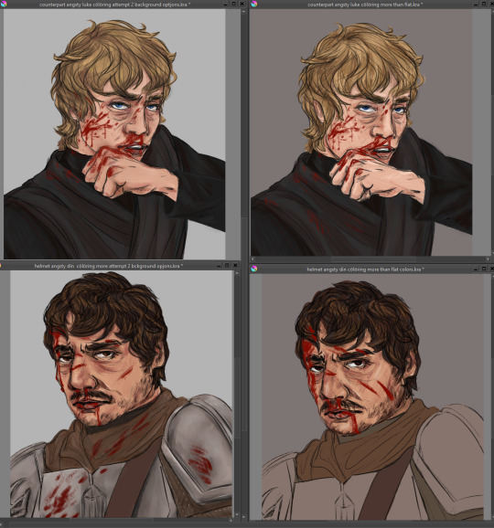
yes ive clearly fixed issues in the sketch differently in both so they... look... like different expressions?? idk man idk idk idk see now this small they look differently off!! god the curse of the zoom in and out and perception.
#art woes#but make it extra long because im DISTRESSED at not being able to just whip out ideas from my brain to page and it look good in one try#long and rambly and probably doesnt make much sense no pressure or expectation for anyone to read lmao#love yall kiss kiss time for bed itll be easier after sleep#did include a pic of current progress at the v bottom eheheheh
0 notes
Last Seen Blogs
rulersreachf4n
CEO Of Randomness

satanslittleangeel
WelcomeToMyLife☠️🍁
Knock knock, let the devil in

the-apple-of-her-eye-au
The Apple of Her Eye

jonnysingh
HERE & THERE
dixiedraws
Dixie