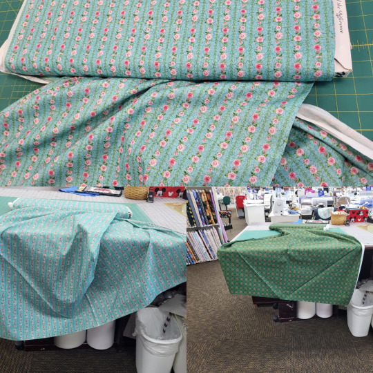
#lolita fabric
Text
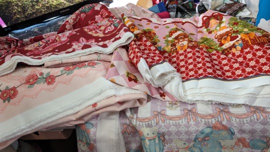
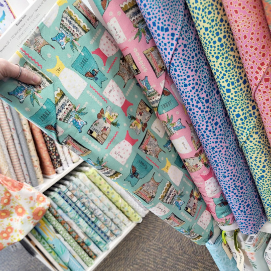
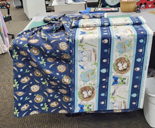
My taobao order arrived on my birthday!!
The picture isn't great at showing everything, due to not having enough room, but lookit all my fabrics! I got 21.5m of fabric that came out to 12lb/5kg (and expensive AF shipping!).
The purple cat and teacup/pot print is not on the selvage, which is extremely frustrating as it's only about 20in/50cm in length, and I am toll. So some splicing or tiers will be done so as to have a skirt that goes past mid thigh.
Everything is lovely and a nice texture, I'm excited AF to start sewing...except that I still need to do patterns, as well as finish my first two pieces that I've already gathered everything for, before I start buying even moar trimmings and lace.
#homemade lolita#lolita sewing#lolitafashion#lolita sewing blog#plus size lolita#pattern drafting#sewing#lolita fashion#sweet lolita#lolita pattern#taobao order#taobao fabric#fabric stash#handmade lolita#lolita fabric
12 notes
·
View notes
Text


Angelic Pretty - Sunny Day Brunch
#angelic pretty#lolita fashion#sweet lolita#fashion#cute fashion#jfashion#japanese fashion#fabric#prints#sunny day brunch
228 notes
·
View notes
Text
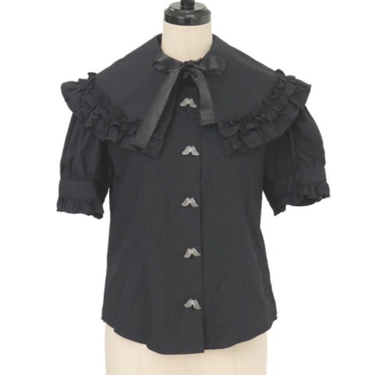

Innocent World - Angel Tears Self Fabric Ruffle Blouse (2001)
#innocent world#sweet lolita#classic lolita#egl#egl community#egl fashion#elegant gothic lolita#otome kei#lolita fashion#harajuku fashion#jfashion#alt fashion#girly fashion#angelcore#irl angel#dark academia#blouse#blouses#angel tears self fabric ruffle blouse#my post tag
242 notes
·
View notes
Text

🍀I made this the other day but haven't had the weather for a flatlay, so please enjoy this sneak peek at my new ivy dress :)
#classic lolita#dolly kei#mori kei#vintage#mori girl#jfashion#naturecore#offbrand#vintage sewing#thrifted fabric#thrift flip#hobbitcore#hobbit
91 notes
·
View notes
Text
kind of disappointed that ouji & ega fashion trousers aren't anywhere near as elaborate as the skirts and dresses
they could have beautiful lace trim, they could lace up or have decoration up the side seams, jacquard and beautiful illustrations could be on the bottom portion of the leg opening/cuff, the pockets could have patterns on them, if you do high-waisted looks the waist portion could be elaborate with lace, buttons, illustrations, etc,
god i wish i could afford more fabrics. ouji and ega trousers could be SO much cooler.
#lolita fashion#ouji fashion#ega#egl#been adding bits of lace and ruffles to some of my things for ages#but i Hate making trouser patterns rip#i might illustrate what im talking about#might bug my friend to help me draft trouser patterns#alas i still have to afford fabric#maybe the thrift store has decent curtains this time around
82 notes
·
View notes
Text
hey did you guys know they released official maru and moro angelic pretty xxxholic collab gowns as a movie tie in but they were ultra limited run custom reservations for a REALLY high price (even for modern ap) so there was no way i was gonna get em but i want them so bad just so i could say i have the official xxxholic lolita dresses anyways
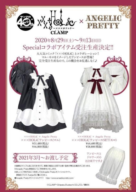
#xxxholic#lolita fashion#im gonna say it holic fans never let go of their items easily no matter how much time has passed so when stuff like this stops its a vault#im keeping an eye out for them online but i doubt theyll turn up affordably theyll just be added to my list of xxxholic white whales#dont get me wrong theyre really basic especially for the price and i like most ap stuff way more but its fucking xxxholic man!!!#i could make sick oddly specific coords of this#lolita collabs w my favourite media are rare and precious#it was a miracle we got this for the movie especially when holic is kinda the clamp black sheep any other time of year#but like#just letting yall know#the more you know!#xxxholic movie#I understand why they did it but i wish it wasnt plain default fabric for that price#a good plain fabric colour block can save lives but it feels kinda uncalled for for 60k#if i find them for under £150 then yoink
85 notes
·
View notes
Text
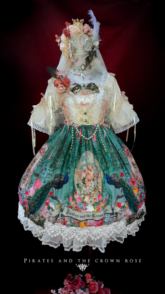
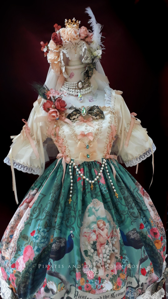

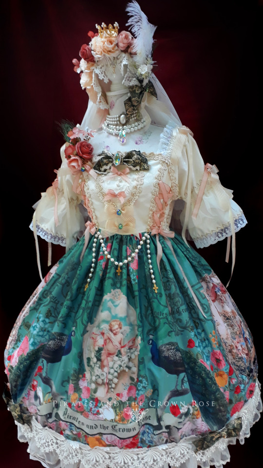

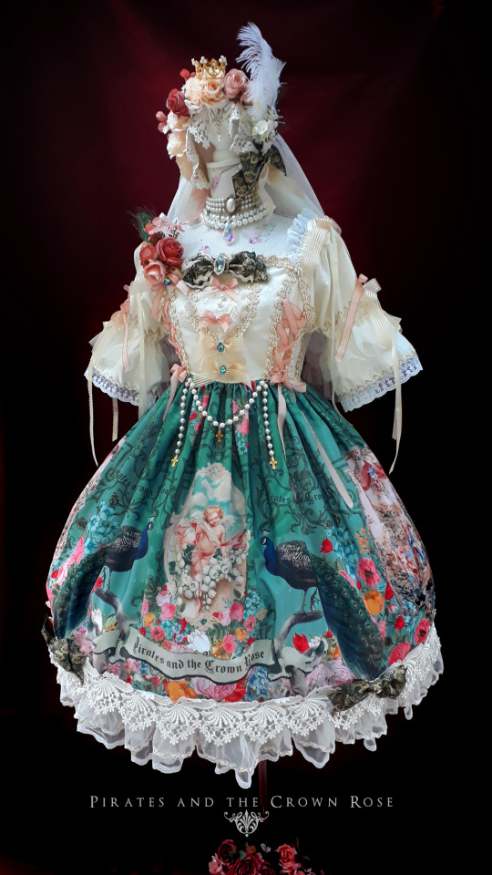


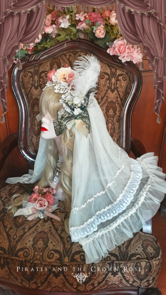
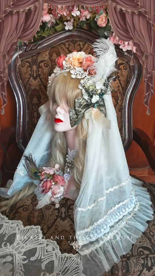
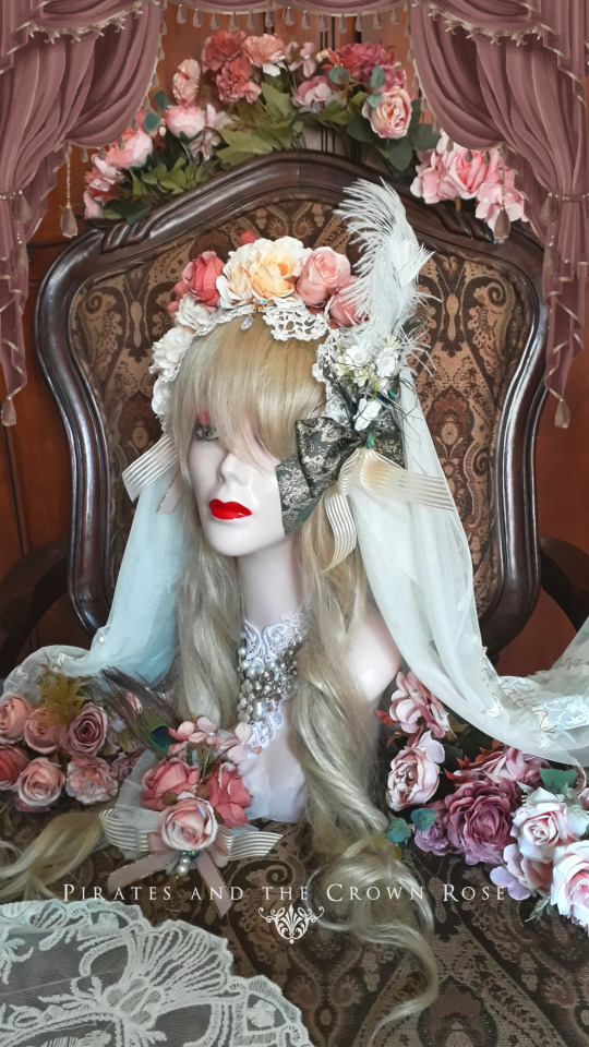


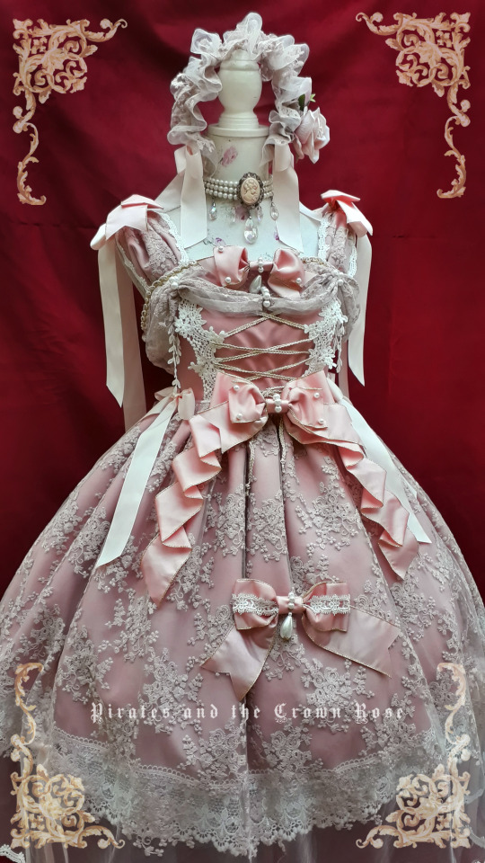
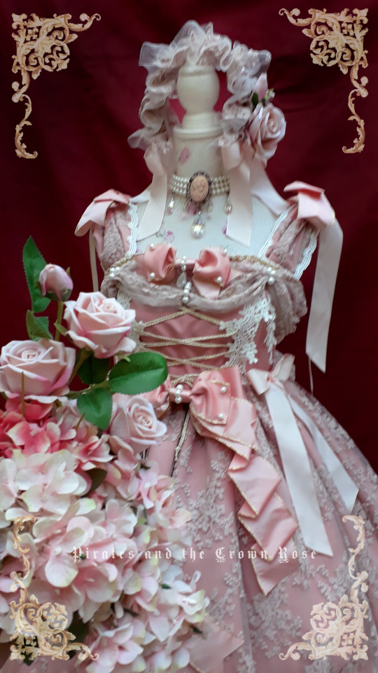
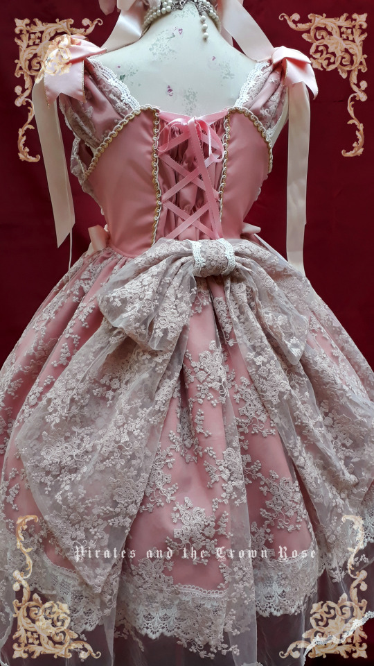
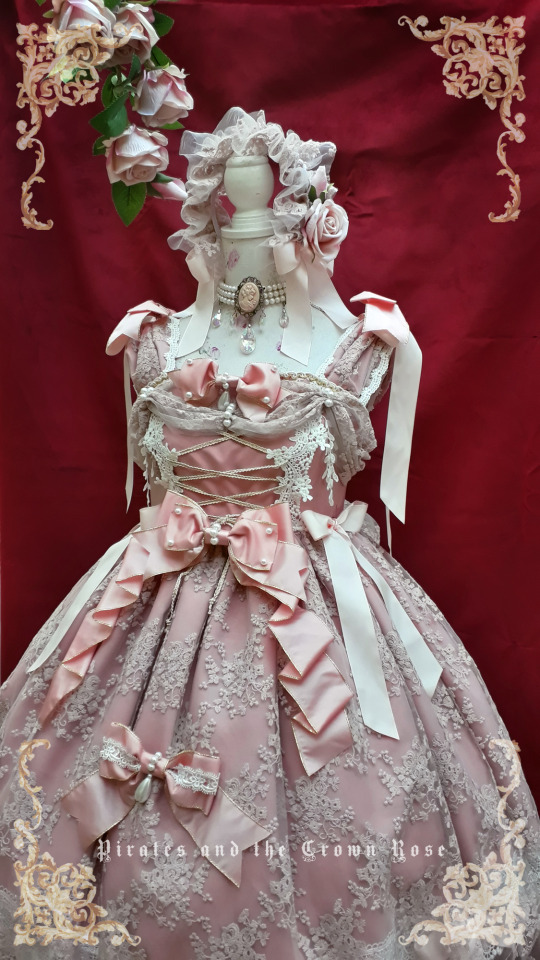
A n g e l ´s . G a r d e n -
by: Pirates and the crown rose
https://www.instagram.com/piratesxrose
#lolita fashion#pirates and the crown rose#lolita style#handmade#dress#harajuku#fashion#harajuku fashion#lolita design#baroque#angel#lolita dress#indie brand lolita#eglfashion#eglcommunity#fantasy#fabrics#inspiration#aestechic
26 notes
·
View notes
Text
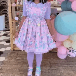


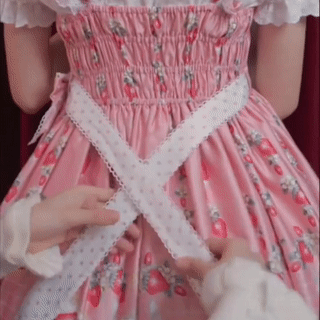
A KAngel stimboard for @archangelofretribution !!!
🎀🦋🎀|🦋🦋|🎀🦋🎀
#stim#stimboard#fashion stim#clothing stim#pastel stim#fabric stim#textile stim#butterfly stim#bow stim#skirt stim#dress stim#kawaii stim#Lolita stim#Harajuku stim#jewelry stim#headband stim#toasted stims
55 notes
·
View notes
Text
Picking quilt prints to use in lolita fashion
You're going to find different opinions on if you can use quilt fabric for handmade lolita fashion. Some say that it's fine, and some say it'll never work. The actual answer is really simple: you can definitely absolutely sometimes in some applications use some quilt prints, maybe.
Aren't we glad we've cleared things up?
One of the difficult things about using quilting fabrics in lolita fashion is that prints that read really well in a quilt do not always read very well in a garment. Quilts are made up of small squares of fabric, usually somewhere between 12" (30cm) and 2" (5cm) on a side. This means that a lot of quilt prints are meant to have the majority of the print contained within that small space.
Garments, on the other hand, especially lolita skirts, have very large amounts of fabric in them. I cut a lot of skirts at about 88", or twice the full width of the fabric. When some patterns repeat every 7" or so, it starts looking boring or muddy when it's gathered up into a big lolita skirt.
Quilts also are generally viewed from up close. The backing of a quilt is a large expanse of fabric. However, it's also usually only viewed from a couple of feet away, the distance between a person and their bed or their lap. If someone is viewing my skirt at the same distance that they're viewing a quilt, they are much too close to me.
This is about prints, but I'm going to include a couple of fast tips about quilt fabric. 1) If you're making a garment with quilt fabric, lining is not optional, even in skirts. 2) If at all possible, when you're still learning how to spot good lolita quilt prints, go to a physical store. Ideally, see if you can go to a quilt store with a lot of prints and a lot of collections. Just like how we need certain scales of print for our garments, quilters need different scales of prints for different applications in the quilt. Quilt collections have coordinated fabrics with several different scales, so if you find a fabric that you love and that just plain won't work, you have other options of related fabrics. For what it's worth, most quilt stores can get you higher quality prints for less than you pay for them at Green Craft Store and other similar fabric places. Your local quilt store can't necessarily match Green Store's $5/yard thingies but they'll have pieces comparable to Green Store's $18.99 prints, but for $12.99. If you find the perfect
So, let's break into the main thing about working with quilt prints for lolita fashion: how well does any given fabric look when a large chunk of it is viewed at a distance. Shopping in a physical store is great for this, because you can see the scale close up.
We're going to talk about motif prints (prints with things on them, like animals or food or plants) instead of geometric things like polka-dots or stripes. There's plenty of existing images for how to work those things into a dress, so I'm going to jump in to the more complex element of picking detailed prints.
If a fabric can work largely depends on four components: how large the motif is, how far away the motifs are from each other, how the motifs are laid out on the fabric, and color palette/contrast.
This print, while cute, is something that I won't use. It does fine in one of the categories, and not fine in three of them.
Motif size in this case is how big the dresses on the print are. Here, you can compare them to my thumb. What size of motif you have is going to depend on your garment. A headbow, which is much smaller than a skirt, might need a small motif, so that you can see all of it in the finished piece. A skirt can use a much bigger motif, since it's a very large space, and the whole motif will be visible. These dress motifs on that pattern are large enough to show on a skirt, but small enough to be visible on a bodice. This is a motif of a usable size.
Motif spacing is the one that's going to kill most print spaces. Let's look at how much space there is between the dresses. There's pretty much none. There's a few filler patterns in between, which clutter up the space a little bit. However, look at just the dresses in the print. While this condensed space works really well in a quilt block, they don't have any breathing room.
On a lolita print, we often have more space between the motifs than we have motif. This is very hard to find in a quilt print, but remember that it's the look we're going for.
Another element of motif spacing is how much fabric you go through before the motif repeats. If we use the dress with the yellow bodice as our reference point, we can see that it repeats twice in the 22" of fabric that we can see. This isn't too close together, but keep in mind that a fabric that repeats the print every 10" is going to have the same print motif a lot when it's on a skirt.
Motif alignment is just taking into account that garments are inherently directional. Your dress has a distinct top and bottom. You can't put on your socks upside-down or wear your blouse with the collar around your waist. Because clothes have a top and a bottom, prints that are intended to be viewed from any angle often look like part of them is upside-down when you use them in a garment. If we make a dress out of this dress fabric, half the dresses will be flipped.
Color palette is how many different colors there are in the fabric, as well as how close they are to each other on the color wheel, how much contrast there is between the lightest and darkest shades of each color, and the colors in general. For this print, we have a lot of colors: teal, yellow, pink, white, and a little bit of green and brown.
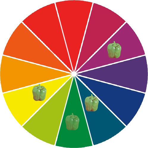
When we plot those colors on a color wheel, we see that the colors aren't particularly close. We have two of the most dominant colors being directly opposite on the color wheel. While it's totally okay to have complementary colors in your print, when both of them are dominant colors, the print can start to read as muddy when you look at it from far away. You don't need to plot every print on the color wheel, but it's a good way to show where the colors fit.
So, let's just look at a bunch of fabrics, and how I feel they do and don't work for lolita fashion. Some of this is just kind of my opinion. Some of these would look okay with good styling, and some wouldn't look okay unless there's good styling. But let's jump in.
Here's some small prints with geometric repeats. I like the teal one for lolita. Even though you can't really see the details from a distance, you can see the geometric stripe pattern. When you get a little closer, you can see the pattern, and the motif there is a nice lolita-applicable concept. I grabbed the one on the right because I thought it reminded me of a skirt by The Black Ribbon, but when I looked it up, it didn't look at all like that. That said, it still looks okay from a distance. The color reads as green, and isn't muddy or ugly. You get a little bit of geometric texture from a distance, and you can see the motif when you're a little closer.

Here's some that don't work. While the cupcakes and the teapots are both nice ideas, and we love cupcakes and teapots in lolita prints, they're not in a good presentation here. The teapot fabric has the teapots so close together that you can't actually tell what they are from a distance. The cupcakes are also very tightly packed together, making it hard to tell what the image is. Look at the cupcakes with the light brown swirl on the top, and look at how many times you can see it in this one image. The fruit is another example of the repeat being too close together, as well as having a bad color palette. You can see how many times the red fruit repeats, as well as how the red and green right next to each other doesn't read well from a distance.
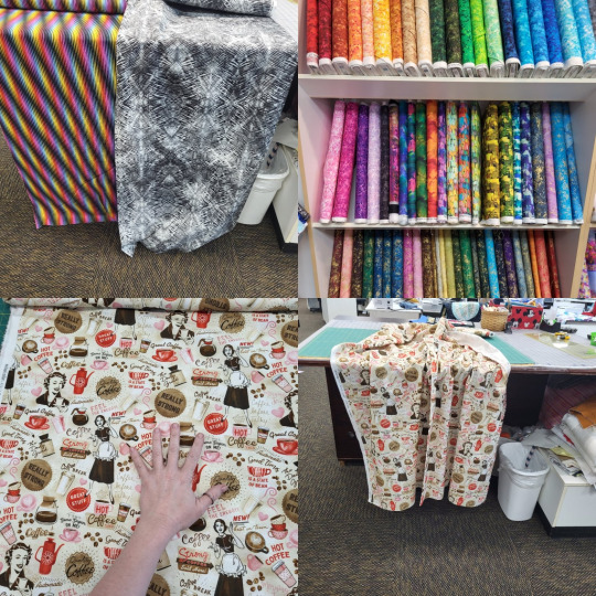
Not sure why I stuck these four in the same collage, but let's go. Up top, we have some fabrics that don't work due to color palette and texture. Some of these are actual rainbows, and the way they're arranged gives them the feeling of movement. When this is on a garment, it starts making your eyes tired. In lolita fashion, we don't want people to be exhausted just looking at us. The gray one would just read as kind of messy and dirty, since the print is a more grunge print. The ones on the shelf also have the same problem of either having too many colors that are too far apart on the color wheel, or having really irregular patterns that would read as dirty or messy.
This coffee one is something that I really want to work, but the print spacing kills it. On the left, we can see that the standing coffee lady three times in a single 11" square. Also, between every large motif is a lot of filler text. Sadly, this just reads as a mess from a distance. This would be a lot more usable if we could delete all the "it's coffee time!" text. As far as fabrics go, it's not the worst on this list, but it's not ideal.
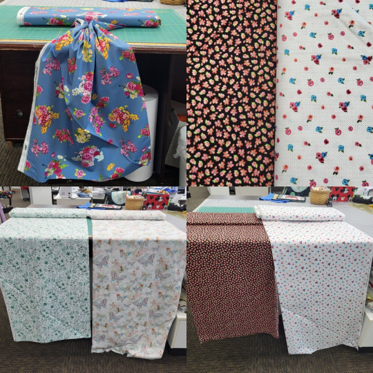
The blue fabric at top left is a good choice! You can see how much space is between each flower. It's a nice, empty space, and it reads well when you gather the top up. I'd wish that it'd have more detail in the print, so the flowers could look better up close, but I went through so much fabric here and it was nice to find one that felt good.
Top right, we have two small motif fabrics, with very different spacing. When you look at both of them from a distance (bottom right), you can see how the one on the black background reads more yellow than black, and the one on the white background reads as dots on a white background. This is just something to keep in mind when you're looking at motifs.
On the bottom left, we have two prints that have some color palette issues. The green one has some lovely leaves that could work in some more classical applications, but it doesn't look good from a distance. All of the green shades are very close together, without a really dark shade to make the shapes distinct from a distance. The butterfly one also doesn't have enough dark colors to look good from a distance.
Here's a nice example of why shopping at places that have collections is a nice idea. This line has an all-over pattern with bird's nests, and a border fabric with a much larger print. If we stacked these two, we'd have a nice print on our hem, without the large print being too big for a bodice. The bird nest fabric has a more wide print spacing than some other prints. While I wouldn't use it as a standalone fabric, it works well when paired with the print. The extra-large scale of the border fabric helps the all-over fabric look more spaced out.
These terrifying baby animals with too long of eyelashes would feel like it wouldn't do too well as a dress. The print is nice for a skirt, but kind of big for a bodice. There's a lot of colors here: orange, gray, green, yellow, pink.

However, there ARE dresses that use horizontal stripes all over, which have mostly this color scheme. The pop of green is unusual, but not unheard of. This is one of those ones that is going to need some really careful styling. This is also why it pays off to window shop and make lists of things you do and don't like in lolita fashion.
This one is pretty damn adorable, and it's got a wider spacing than most prints, but you would have to figure out how to come to terms with the fact that no matter how you cut it, some teacups will be upside-down.

If you can find some border prints, definitely consider them! Most premade lolita print dresses and skirts are made of a border print fabric. This geometric metallic print isn't an ideal example of a border print for lolita fashion, but it does demonstrate the different ways that motif spacing can work. If you look at the very center of the fabric, you'll see that the little motifs have a huge amount of space between them. This is more the spacing that we want for many of our pieces. At the bottom, they're all packed together, and in the middle, they're spaced out like most quilt prints are. It's okay to have a lot of detail on the hem of your skirt. The petticoat holds the print out and makes it more visible. If the print is just at the hem, it doesn't overwhelm the whole piece, even if is much closer spaced than you'd want in the area around your waist.
So, let's get some basic guidelines for buying quilt prints for lolita fashion:
a) How much of the background color of the fabric can you see? To make sure you're getting good spacing, you want to see a lot of background.
b) How many times does a part of a print show up in a 10" square? Is there a big, notable piece that shows up multiple times in your sample space? Watch out.
c) Can you determine what's right-side-up and what's upside-down on this fabric? If there's highly directional motifs, you don't want your garment to always look like it's on wrong.
d) how much does this look like fabric used in extant lolita pieces? If you get this fabric, are there references available for how to style it? It never hurts to have some references for what you're trying to make!
And now, a quick reminder about buying fabric: quilt fabric shrink, maybe a lot. It often comes with a sizing on it, which makes it easier to quilt with, but harder to determine what the fabric will really look like. Having worked in Green Store for almost five years, I can assure you that I've never personally seen their quilt fabric shrink more than 10" in width when it was first washed. I'll leave a significant pause after that statement and let you fill in some blanks. Some cheaper quilt fabric will shrink a whole lot, or lose pigment, or really change feel when you wash them. Some expensive fabrics will do the same. I really recommend doing a prewash with liquid fabric softener on the first wash. I know a lot of people hate fabric softener, but you only need to do it once per project. If you don't mind smelling like pickles and reducing the longevity of your garment, you can use white vinegar instead of fabric softener. Just get that sizing out and pre-shrink your fabric so that you know what you're working with.
As a final note: the more you actually transform some fabric into a garment, the more you're going to learn about how to do it. We all have things we look back on and wish we changed. Don't let your fear of it being imperfect stop you from making the thing you want to make. It will be imperfect. It will always be imperfect. Everything is imperfect. We learn when we make decisions that weren't ideal. You will learn when you try.
Some old posts from this blog that are related: Print Scale from 2018, and A Quick Guide to Prints from 2015 (Which, yes, was actually photographed with a potato. I believe that camera was 2.1 megapixels).
111 notes
·
View notes
Text
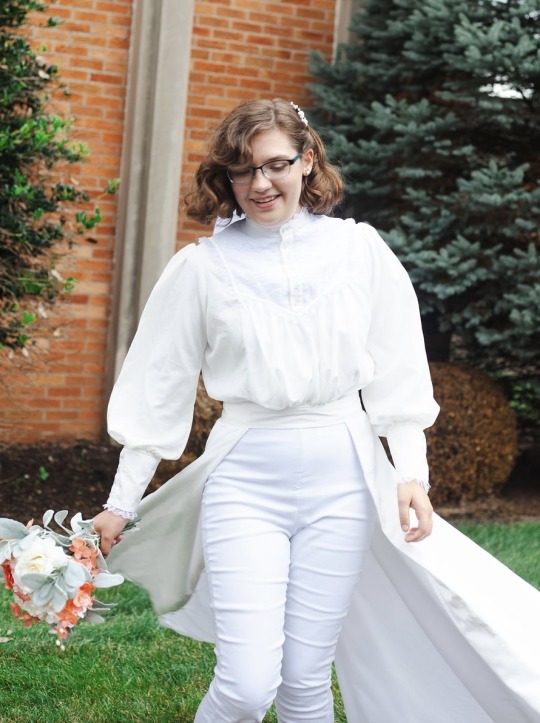


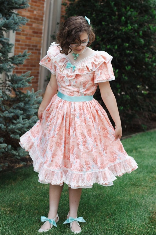
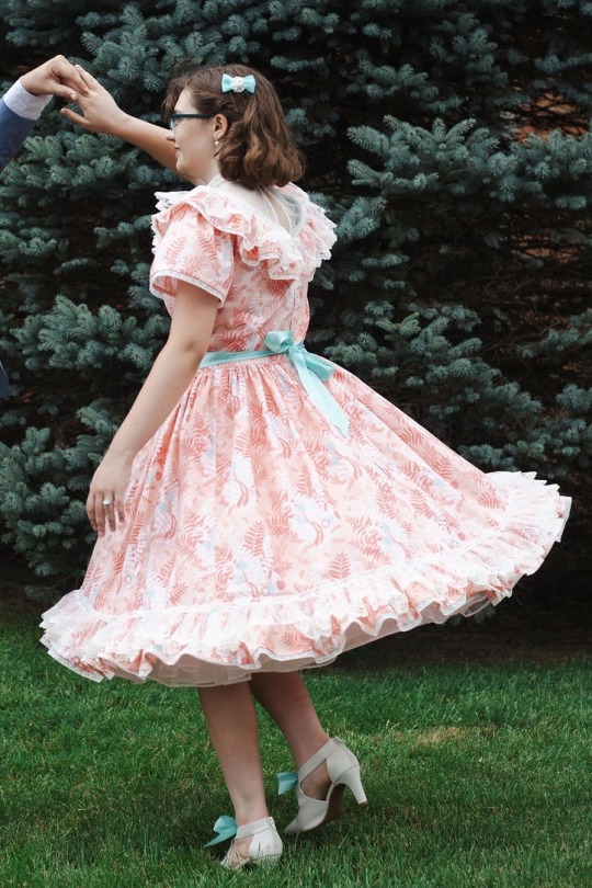
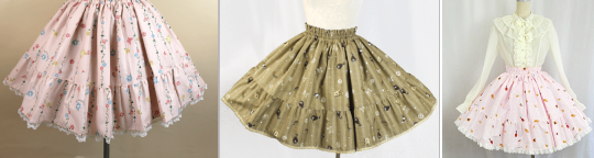
I got married this summer!! And I spent the year leading up to it designing & patterning & making my dresses! So here they are; unfortunately my photo selection is pretty limited cause our photographer got almost no fullbody pictures of me alone from the front, but w/e
My wedding dress/outfit/what have you consisted of an Edwardian-ish blouse and a skirt which I drafted off of an actual Victorian walking skirt pattern except since I didn’t wanna obtain/wear a corset & bustle I took out the hip shaping so it just turned out to be a partial circle skirt that’s a little longer and fuller in back. Oh, and the front panel was actually two overlapping panels which could be folded back and attached to the inside of the skirt. I wore it closed at the actual marriage part which I didn’t get good pics of, and open at the ring ceremony, which is where all the above pics were taken. The pants were resale, but I did make my veil and bouquet!
The second dress was very inspired by this set of classic lolita OP’s (particularly the one in the first two pics) which I first saw back in 2021 and I’d been itching to make something similar ever since, so I picked up the fabric for it when it was on sale back at my old job and then pencilled it in as my reception dress so I would actually get around to making it. (Although fun fact both of these outfits STILL need more sewing done before they’re completely ready for regular wear lol. Someday) I got the cameo for the brooch off Etsy (it has a butterfly on it) and my grandma bought me the shoes for Christmas last year, though I added the bows to them (they’re removable and I also made a pink set) and also made the earrings and hair bow.
Anyway we recently got done moving and stuff so hopefully I will be able to do more art soon! (Also they/them preferred as usual 💜)
#sewing#victorian#edwardian#lolita#wedding#ok search tags are done I can relax#Yes my wedding dress was very hot to wear outdoors but I didn’t wanna make it for just one event so it’s also my temple dress#which had certain requirements including long-ish sleeves#I call the reception dress my snail dress because the fabric is patterned with ferns and mushrooms and one little snail per repeat#continuing the animal trend of my peacock skirt & bee shirt & butterfly dirndl#also not very visible in the photos but covering up the ruffle seams are length of lace which I snipped slits in to run tiny ribbon through#and then I had to sew it on BY HAND and oh man that yoke seam got sooooooooooo thick with the ruffled net lace and tulle#(which were nylon cause that’s all I could get cheap in person at joannes & such) and also several layers of quilting cotton#I never would’ve finished both dresses (the exterior at least) if I hadn’t tried taking aripiprazole for a month#cause I got the whole skirt for the snes (snail dress) finished in like A WEEK#sadly it gave me weird physical side effects so I had to stop taking it. sadge#oh yeah also I finally drafted my own bodice block for the snes cause I couldn’t find any princess seamed high neck bodice patterns#and for the white blouse I made changes to the shoulder seams and collar of my bee shirt pattern buuuut I probably shouldn’t have#ended up a bit wonky#anyway future planned projects include… watercolor painting for the apartment (feat. kirby)#Elfilin/Elfilis gijinkas which are. being somewhat difficult#Magolor gijinka minecraft skin LOL (I have the account migration cape and it goes perfectly with his EX colorway)#not sure if I’ll ever get around to finishing that pmv. we’ll see
36 notes
·
View notes
Text
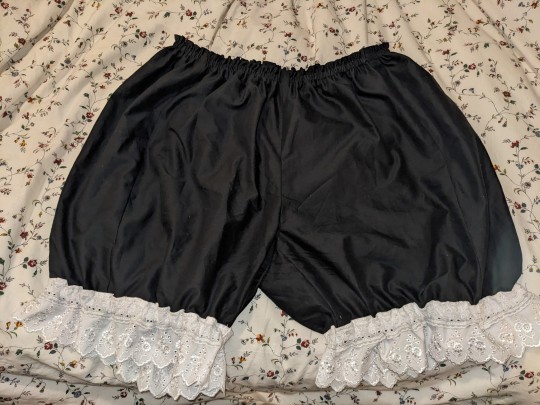
BAM. The bloomers are finally done!
This was actually such a great project for getting over my fear of attempting pants seams. And once I got the hang of how to plan out french seams, not nearly as complicated as I thought it would be.
#the pattern pieces actually led to me cutting the fabric to small#which was really frustrating#but I ended up piecing extra side panels#which meant that the bloomers fit perfectly and also were nice and roomy#sewing#lolita fashion#egl community
11 notes
·
View notes
Text


AatP went hard on this design
#a high effort kodona release in my good year 2023??#vampire prince vibes wow#my posts#gothic lolita#egl#the design is just so neat with shiny fabric and the hanging cape ??#Mysterious attendant in the shadowy woods#alice and the pirates#aatp#kodona#ouji#ouji fashion
25 notes
·
View notes
Text
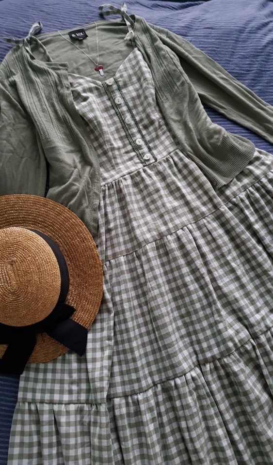
🌱S o f t G r e e n🌱
🍄I loved this sage gingham (duvet cover) as soon as I clapped eyes on it, and I knew exactly what I wanted to make :")
🌱Self drafted sundress bodice with button placket and back shirring, with self draft tiered skirt. Styled with thrifted cardi and hat, and a little enamel mushroom necklace from mairijewellery.bigcartel.com 🍄
🍄Drafting that tiered skirt was hard! Proportions for a flattering waist-hip ratio are actually quite delicate (I have no hips), so I wound up making the top tier 2.5x waist and the same length as the side bodice after a LOT of trial and error ;_;
#classic lolita#dolly kei#mori kei#vintage#mori girl#mori fashion#natural kei#offbrand#autumn style#ootd#handmade fashion#handmade lolita#handmade dress#thrift flip#thrifted fabric#cottagecore#light academia#mushroom necklace#cute style#cozy style#gingham dress#gingham#girly kei#country lolita#lolita sewing#sewing#dressmaking#memade#straw hat
376 notes
·
View notes
Text
I'm bored and don't want to go to sleep yet. So, people who are interested in lolita fashion, what's your favorite print and in which colorway ? (Regardless of the style of the dress/skirt, if you would wear it or if it's a rare print... just the print alone)
Mines are either Angelic Pretty Candy Sprinkles in lavender or BtSSB Blooming Snow White in ivory.
#lolita fashion#egl#angelic pretty#baby the stars shine bright#I'm just really curious#sorry for the wrinkly photos#it's hard to photograph a print on a gathered fabric#and my candy sprinkles jsk hasn't been worn in years so it's really creased
66 notes
·
View notes
Text


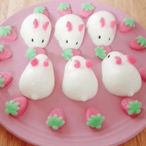

🍰 | 🍓 | 🍰
🍓 | 🐐 | 🍓
🍰 | 🍓 | 🍰
#goatlings#goatlings stimboard#strawberry shortcake ad#strawberry shortcake#red#white#pink#stimboard#cake#food#bunny#fabric#fashion#lolita
40 notes
·
View notes
Photo


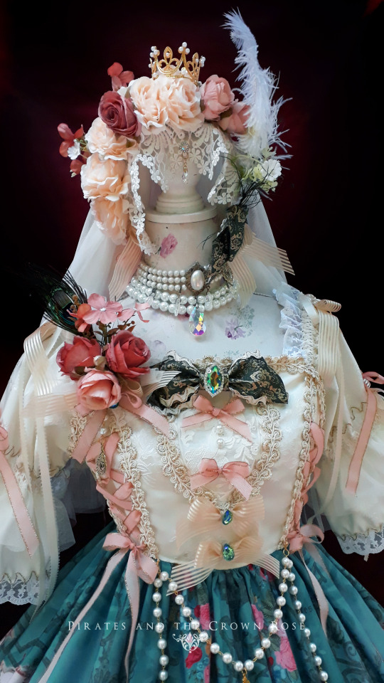
⚜Classic Embroidered Corsage⚜
Design: Hidox Rose Addict
By: @piratesxrose
https://www.instagram.com/piratesxrose/
#Lolita#LolitaFashion#LolitaStyle#LolitaDesign#EGL fashion#eglfashion#EGL Community#harajuku#HarajukuFashion#pirates and the crown rose#fashion#baroque#fabrics#headdress#dress#spring dress#spring#flowers#Aesthetic#jfashion#ribbon#pink
58 notes
·
View notes
Last Seen Blogs

suugarbabe
Just Trying to Diffuse the Tension

eusouonelson
Best Live Sex Cam Sites

wichita23732
bi-curious
mysterioustimer-time4machine
Mysterious Timer Time4Machine.de Ästhetik diy

hobby-kanato
kanato's hobby life