#iconic it’s in so many rococo paintings
Text
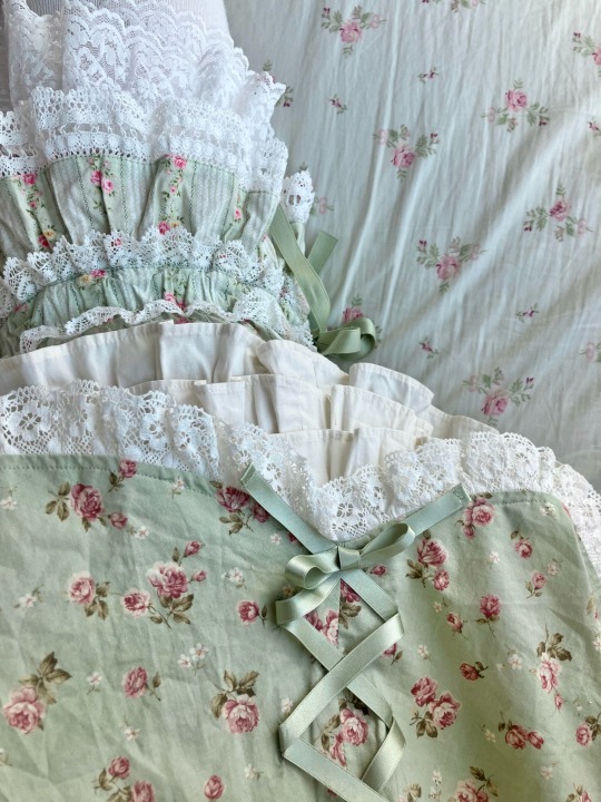

#lolita fashion#innocent world#metamorphose temps de fille#cottagecore#cottagecore fashion#dollcore#mine#pink + green roses is one of my favorite color combos ever I think#iconic it’s in so many rococo paintings#you know it’s good when mme de pompadour wore it#Dress: IW rose scallop frill Bloomers: Meta cotton dolly drawers Socks: Meta#the bedspread is vintage
273 notes
·
View notes
Text
it is like. a little insane how many iconic scenes are in lucifer rising tbh. azazel's plan to create the special children actually being on lucifer's orders so he could create a true vessel, the green room with the rococo paintings and disappearing doors, the angels manipulating dean's voicemail so sam thinks he has no choice but to murder lilith, the reveal that god is gone and has been from almost the very beginning, cas using his own blood to expel zachariah, sam's eyes turning demon black, ruby's betrayal, LILITH'S DEATH ACTUALLY BEING THE FINAL SEAL. literally peak cinema i'm going insane
38 notes
·
View notes
Text
Gilded Age is not Regency or Rococo, those are centuries before the Gilded Age. Gilded Age is late 1800's- early 1900's American upperclass glamour. It has overlap with Victorian Era fashion in many respects BUT Gilded Age is specifically an American period where the upper class bastards like Carnegie, Vanderbilt, Rockefeller, J.P. Morgan etc built their empires and made a glossy sheen for the rest of the world to look at to mask the growing economic and social disparity and how these people built said empires off of it.
In terms of artistic movement it's most famous figures are Twain, Whitman, Stowe, Emerson, Homer, and John Singer Sargent (although many consider him more of an Edwardian artist, his most famous painting "Portrait of Madame X" is a gilded age icon). Theres so much from this era to take fashion cues from!!!
18 notes
·
View notes
Text
EXHIBITION
CERAMICS
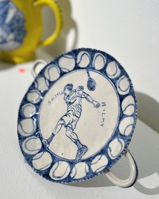
Ceramics 2022 with Gerry Wedd, William Eicholtz, Bern Emmerichs, Bill Blampied & Geoff Mitchell
Maunsell Wicks Gallery, Paddington. 16 Aug 2022 - 28 Aug 2022


What I connect with…
It’s so lovely seeing an exhibition focused on Australian ceramics. Ceramics 2022 brings together five artists represented by Maunsell Wicks. With the exception of William Eicholtz, each artist treats the ceramic medium as a surface to paint on, with the works easily imagined on paper or canvas.
Gerry Wedd’s intricate line work is highly conceptual referencing back to a myriad of influences ranging from Ancient Greek & Roman pottery motifs, religious art, Edo Japan woodblock prints, early colonial Australia, to contemporary consumerist brands, and sporting celebrities, all while dancing over a variety forms. Each of Wedd’s artworks find a unique and appropriate form to match the content; from vessels, plates, and the iconically Australian rubber thong. It’s easy to draw comparisons to U.K. ceramicist Greyson Perry for Wedd’s approach in using traditional forms loaded with contemporary subject matter, especially the bright canary yellow works with delft blue and white details; this comparison may seem like a lazy link to make especially when discussing ceramic artists, however both seem to take joy in the shock value of crude or controversial subject matter on the surface of their alluring pots.
Another artist in the exhibition, Bill Blampied, also uses shock value but works in a much more reduced aesthetic, with artworks that seem to be less about the medium and more about the concept. Blampied’s white plates and slip cast commercial cleaning vessel forms, have minimalist line work reminiscent of highly stylised logos, or info graphics, and often include typography of high-end brand names, disparaging sentences, or ironic slang. The body of work Blampied has presented in this exhibition seem to be about the shallowness of hedonistic consumerist culture, memento mori, crippling anxiety, and self-medication, while playing with the dichotomy of a low-brow or unheroic subject matter on an expensive and permanent medium.
An absolute standout in this show is the work by Melbourne artist Bern Emmerichs. It’s been wonderful watching the work of this talented artist develop over many years, with this collection such a masterful display of technique, which provides the framework for the artists strong point of view concerning issues of colonial settlement, First Nations people, and gendered work. Like many ceramic artists who are primarily concerned with surface instead of form, such as fellow Maunsell Wicks artist Geoff Mitchell, or even the celebrated Stephen Bowers, it seems Emmerichs uses commercially available ceramic blanks as a starting point; the upside to this is consistency, especially with plates, with little to no warping which is common to the ceramic slab making process. This technique has allowed Emmerichs to work on quite large tiles, with complex compositions in many colours. In addition to these significant pieces, there are many smaller works that carry ideas, flowing freely across the body of work, like little pieces of a jigsaw puzzle that help give the viewer clues when viewed in its totality.
Finally, William Eicholtz is such a breath of fresh air for this exhibition. Eicholtz’s works celebrates the medium of ceramics, successfully playing with an exploration of glazes, textured surface, and dynamic forms. There is an element of nostalgia to the artists work, with the marine themes verging on generic bathroom decor kitsch, however, elevating the subject while speaking in this familiar visual language. Eicholtz’s artworks are clearly not from the Rococo period, but play in this asymmetrical world of serpentine splendour, with pearl, and oyster glaze finishes that should be wrong, but seem to work so well, almost inviting the viewer to fill his oversized shells with bath salts and design an opulent bathroom around them.
Ceramics 2022 is on at Maunsell Wicks Galley in Paddington, Sydney until August 28, 2022.
0 notes
Note
omg do you have any ideas for the gaang + room decor (in a modern au ?? perhaps ??)
ok so aang wouldn’t really have that many material possessions, especially nothing flashy (though he probably has some art and assorted knickknacks) but his spaces would always have really warm vibes. like i picture his childhood bedroom walls being painted a kind of friendly, mustard yellow, and there being candles and blankets and pillows everywhere like when you’re in aang’s abode you just feel welcome and cozy and at peace
and then coupled with katara’s vibes, when they move in together as adults, it’s just extra warm and lovely and the walls are painted a light beige and there’s lots of indigenous art on the walls and seashells they’ve collected over the years on the mantle and on the coffee table and they’re both obsessed with candles which sokka claims is a fire hazard
katara’s childhood bedroom is entirely blue and purple because those are her favorite colors and she refuses to display anything in her rooms that does not match her particular colorscheme. she has lots of posters hanging on her walls, like she has a karl marx quote next to a picture of some boyband she’s obsessed with next to a poster of sea turtles she got at a climate change rally. also she would have one of those cutesy little landlines that is also purple and she twirls the cord around her finger while telling aang about her day, even though he was with her the whole time they still call each other every night just so she can twirl her phone cord around her finger
sokka’s room is extremely clean, like freakishly so, except for his desk which is an absolute fucking mess. he wouldn’t even know how to begin organizing it so he never bothers. half his closet space is dedicated to katara’s clothes (even tho she has her own closet) which he’s fine with because he only wears like three shirts, or just wears suki’s clothes anyway. he has a bunch of posters with science puns, and a periodic table poster, and a poster of uranus which is his favorite planet (everyone thinks it’s his favorite planet because he thinks the name is funny but it’s because he thinks it’s cool that it has a 98 degree axial tilt! she’s so unique.... so mysterious...) and also he has a really fluffy bright blue rug in the middle of his room that yue always insisted on lying down on even though the bed would have been objectively more comfortable. she liked sitting on the floor and getting lint all over her white sweaters, which her mother couldn’t stand. sokka gives the rug to katara after she dies because it reminds him too much of her looks kind of childish. katara had been eyeing that rug all her life (it’s fluffy and blue??? sign her tf up!!) so it actually worked out pretty well... all things considered.
the only things toph wants in her room is things that her friends have given her that remind her of them. otherwise she hates material possessions of any kind (reminds her too much of her evil bougie family) and thinks furniture should exist to be comfortable, and that’s it. if she couldn’t fit everything she owned into a small backpack, then she wouldn’t be toph.
zuko keeps everything because he gets sentimental over literally any object. no azula you can’t throw out that old leaf!!!!! he found that leaf in the park and it had a little caterpillar bite taken out of the side and don’t you see that leaf symbolizes him???? if he threw out that leaf it would be like parting with a piece of his soul!!!!! sokka’s like “oh so you’re a hoarder” which makes zuko even angrier because how is HOARDING if every object MEANS something even marie kondo would claim that if it sparks joy then it must be kept!!! and sokka’s like “....this empty sprite can sparks joy??” and zuko, deadpan, is just like. “IMMENSE joy.” katara hung out in his room one time and the clutter was so stressful for her that she just invited him back to her house every single time after that day. at one point mai just straight up says to zuko “maybe your weird little trash collection isn’t the problem, you just like feeling like you have some semblance of control over yourself and your life” and zuko immediately bristled at such a ridiculous, unfounded accusation and then refused to speak to her for three days, yknow, for no particular reason.
no one knows where suki lives (though the most popular theory is that she was actually raised by wolves) so no one, including sokka, has actually seen the inside of her bedroom. they’ve seen the inside of her pickup truck, though, which is basically the same thing. it’s filled with empty chip packets and loose joints and underwear that is not hers and sports gear that is mostly hers. it smells distinctly of girl sweat, and the same playlist of indie rock angry sad girl bangers is always on in the background. she knows the words to every single song that comes on when in her car, and she isn’t afraid to sing along to them, which most people find endearing, but katara absolutely cannot stand. she enjoys driving with no destination in particular in mind, and she and sokka like going to secluded areas and lying in the back of her truck and getting high and stargazing, an activity which might resemble a date to the untrained eye, but is in fact, totally not a date, because that would mean they’re dating and they’re definitely not, okay???
azula, naturally, is all about the minimalist rich bitch aesthetic. her apartment as an adult is so cold and uninviting sleek and modern that people are amazed that she’s not depressed just living there (and honestly. isn’t she?). there just is so much empty space and modernist architecture, not even a single carpet or piece of art on the walls. normally people who are into modernism would at least have some modern art, or something, but azula doesn’t actually understand modern art because it’s too abstract and mystical, and all art, really, is some froufrou nonsense for people like zuzu who gaze into wells all day instead of knowing how to get ahead and make bank. most of her bookshelf is just books that look good on a bookshelf, her old law textbooks, the art of war, and of course, ayn rand. lots and lots of ayn rand.
ty lee shares a living space with so many other girls that attempting to carve out her own distinct space for herself would be a fruitless endeavor. instead she makes a bunch of interior decor dreamboards for herself that comprise an inexplicable mix of gothic cathedrals, iconic 80s/90s teen girl bedrooms, cottagecore, and french rococo. yes, she knows it’s not aesthetically cohesive; sue her.
mai really really hates her parents’ style of mcmansion with just enough diluted japanese influences that it somehow makes them seem more assimilated. she wishes her room had yellow wallpaper just so she could peel it. as an adult, she makes sure to hang art she actually likes on her walls, but her taste in art is strange and offputting to pretty much everyone. she’s like grunkle stan in that one scene. whatever. everyone is a bunch of filthy aesthetes; they can’t handle the real shit that actually says something. also she has a giant terrarium for her lizards that takes up like a quarter of her living room. what i’m basically saying is that she is the coolest girl in the world and also fundamentally undateable.
when mai and ty lee ultimately move in together all of their stylistic interests clash with one another but they don’t care because their home is just filled with things they like, so it doesn’t matter. ty lee thinks that mai’s offputting art is amusing (mai’s like no it’s supposed to be DEEP but ty lee has a really twisted sense of humor so it’s just funny, the same way that horror movies are funny) and mai likes how eclectic ty lee’s tastes are. anyone who walks into their home only need to look around for 3 seconds maximum to be like “ah yes........... lesbians live here”
#the gaang and#modern au#i got rly into this one lmao#i love these kinds of asks#just rly fun#asks#mrsmiroir
146 notes
·
View notes
Photo


1760′s Robe a la Francaise – Solids!
by Simulated Styles
A historically-accurate court gown in 16 solid swatches – 8 each in “daytime” and “evening” themes.
full details and download below the cut... 😘
I’m a super-fan of all things historical fashion and French history! There are many different gowns of this style in the community, but I was never quite satisfied with them when it came to the volume of the skirt or the detailing of the iconic “sack-back”. So I made my own to fit my tastes!
As my first piece of CC ever, I’m sure it’s far from perfect. But I’m loving it in my game and am super proud of teaching myself how to make this! There are some minor clipping issues when it comes to the arms and skirt, but that was something I was willing to overlook in favor of voluuuuume, bb. 😇
This gown in simple solid colors with minor embellishments will be the first in a set of gowns of this style. Historically, the 1760′s court dresses could get very loud, so I plan to release different versions of this dress with more elaborate flounces and patterned fabric. Stay tuned!!
1760′s ROBE A LA FRANCAISE – SOLIDS
base game compatible
16 swatches in my custom SimulatedShades palette
teen-elder, enabled for both frames, disabled for random
all LODs, morphs, shadow map, specular, normal map, & custom thumbnails
this is a highish poly mesh (10K polys)
download here!
Custom pose and Rococo room backdrop by yours truly! I’ll be releasing these soon as well. Thanks especially to @felixandresims and @harrie-cc for the cc in my setting. 🤩
If you like my content and would like to support me, I’d appreciate your donation through Ko-Fi! I work full-time as a wedding cake designer and am currently out of work for the unforeseeable future due to COVID-19. I am also happy to accept commissions – either for Sims 4 content or for a piece of custom artwork (check out my about page or Ko-Fi for a sampling of my work)
Please contact me if you’re interested in recoloring my content – I’m happy to share my already-separated texture files for simpler editing and coloring of individual pieces of the gown!
Special thanks & credits:
@linzlu – weighting reference
@mauvemorn – vertex painting and weights help at @sims4studioofficial
@sentate – in-game testing & great advice 🥰
@simsfromthepast – sleeve flounce & petticoat ruffle textures
@teanmoon – bow mesh & texture, specular reference, & amazing tutorials!
994 notes
·
View notes
Text
life is so stressful......
#i bought some cool art at the thrift store#i bought like an icon its kind of a mix between baroque and rococo made in china#and its like mary joseph and christ baby in a window balcony thing its very pretty#i also bought a little angel bell its like a cupid on a cake basket thing#i love the art its v pretty#and i bought a recipes box thats pretty and has a sunflower painted on it and some pretty china#with strawberries on it#but like this all brought me joy but its also like how is it real i have so many assignments#i wish i could just decorate things for a living or something! idk!#:-(#text
1 note
·
View note
Photo

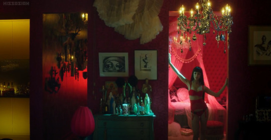


#152 Helter Skelter (Heruta sukeruta) (2012)
Director: Mika Ninagawa
Japan
“We’ll be forgotten, We are machines for the processing of desires.”
“The most fascinating thing about stardom is that it is a kind of deformity, like cancer. A fascinating face in a state of collapse.”
The whole time I’m watching this, I kept thinking about Andy Warhol. This is not a film about the sixties or pop art, but on the phantasmagoria of consumer culture. It’s an old tale – the misfortune that seems to come as part of the dual package of beauty and power. For our main character Lilico, vanity is all consuming; it is the product and process her identity is entrapped in. The emotional / psychological pressure of manufacturing endless prurient fantasies eventually gives way, and comes crashing in upon Lilico’s psyche. It’s an old story, and in this film, one that is not given any real new twist.
What is remarkable about this film is the way it looks. From the opening shots to the end frames it is a visually stunning spectacle. A lush, glossy, neon infused, hyper fabricated spectacle that allures and transfixes the viewer. Every seamlessly perfect photoshopped beauty that stares back at us from a fashion magazine, becomes an important catalyst in this film. The movie becomes a two hour demonstration on the vulgarity and power of beauty, and the control it exerts on the monetization of our desire. Being fashionable could be the downfall of this film. It will probably get dismissed as adolescent, self-consumed, too beautiful and picturesque for its own good; visually too gorgeous on its surface to be taken seriously, too coy to deliver any depth of meaning.
But, hold on a minute. Let’s not forget the main point here. Despite its somewhat predictable storyline, what the film really offers us is seduction. The alluring power of beauty and flawless sensuality. This is escapism. It is what movies have been peddling from day one. It is what fashion keeps dangling in front of its audience – a chance to transcend the ordinary, the ordinariness of ourselves. The mechanisms of spectacle and appeal are like sirens luring men to their watery deaths, the pursuit of desire and beauty becomes all-consuming and the self gets lost. We have seen and experienced this before, and this is what keeps bringing me back to Warhol. Andy Warhol was fascinated by the process and spectacle of fame. The careful manicuring of a dream that is maintained and propagated through the repetitious images of glamour fed to us through media. Repetition and verification help sustain this illusion, and the film’s extensive use of mirrors and reflection emphasize the idea that we the audience, as well as Lilico herself, are transfixed by the power of the image. Much like the Narcissus caught and absorbed by his own reflection, we succumb to the intrigue of the elusive entity – something more perfect, unobtainable.
These reflective mechanisms are exactly what this film delivers. In many ways, its storyline is secondary. One could turn the sound and subtitles off and still be enraptured by the visuals alone.
When we are not bombarded by the lushness of beauty we are pounded by spotlights and strobes, light directed at us as much as a model or a patient on a table. The reverence of the image, the worship of obtainable beauty is given a subtle reinforcement by the religious icons / idols scattered throughout Lilico’s sumptuous neo –Rococo apartment. Perhaps they might just be cheeky props, but there is a serious comparison to be made here. Lilico has an entire wall filled salon –style with images of herself. There are also images of Christ and Mary, their eyes redacted out with black bars. Idols that can see and idols that can’t. A not so subtle correlation to our character, but religious tokens blend well into the glittery décor. Nothing is off limits, not even the sacred – after all what could be more sacred than desire?
Lilico is a monster, an expensive creation born of syringes and expensive clandestine surgeries. she is a creature, a machine programmed for a single task –to disseminate beauty. If successful, fame and popularity are the byproduct of this transaction. But it is a risk that comes with a hefty cost. The ultimate price to be paid for recognition is that of becoming irrelevant, obsolete – no longer the subject of adoration. The film sprinkles in clips of armies of adoring fans, who at any moment can shift their allegiance from praise to scorn. Vicious, vindictive teen age girls, exact a kind of character assassination on their own idol. Where they once manically parodied every tangible nuance of their idol, they now recoil in revolt and en masse move on to the next diversion.
Glamour must be seen to survive, it is relational in nature. This is its one liability. And when it is ignored, it essentially dies. This is the emotional trajectory of Lilico. The rest of the film’s story and characters serve as warnings against vanity’s inevitable downfall. We have built entire cultures / societies on the pursuit of fantasy. It is a monster we have created. It is an idol offering transcendence. This is how beauty wages war against death.
“If you want to know all about Andy Warhol, just look at the surface of my paintings and films and me, and there I am. There’s nothing behind it. “
filmjrnl365.tumblr.com
59 notes
·
View notes
Text
Baby Boomer Memories: Liddle Kiddle Dolls
I was a girly little girl, and loved dolls. (I still do.) Most of my favorite dolls were by Mattel, including Barbie, my beloved Sister Belle, and my last childhood doll, Dancerina. Mattel was a major, major toy maker for the Baby Boomer generation.
Elliot Handler, founder of Mattel (and husband of Ruth Handler, inventor of the Barbie doll!) wanted a line of dolls representing small children in neighborhoods across America. Famed doll sculptor Martha Armstrong Hand, who sculpted other popular dolls including Drowsy (1965) and Cheerful Tearful (1966), made the first ten Kiddles in 1965. They were soft vinyl, with bendable wired legs, painted facial features, and rooted hair that could be brushed and combed. Each came with accessories and a little illustrated “komic” or story booklet.

Florence Niddle (1966 - 1967), one of the first 24 Liddle Kiddle dolls.
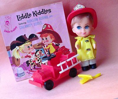
Bunson Burnie (1966 - 1967), one of the original 24 Liddle Kiddles.

Rolly Twiddle (1967) the only African American doll of the first 24 Liddle Kiddles released. She is highly sought after, especially with her original clothes, wagon, pail and shovel, and Komic booklet.

Freezy Sliddle (1967), one of the first 24 Liddle Kiddle dolls.
Liddle Kiddles were introduced at the New York Toy Fair in 1966. The Toy Fair is a buying show, not open to the public, so the dolls hit the market a little later.
I was the fourth grade and turned nine years old in 1967, the perfect age to discover Liddle Kiddle dolls. They were about three inches tall -- much smaller than most dolls of the day -- with playful accessories and outfits. I had so much fun with them!
I had the Storybook Kiddle Liddle Biddle Peep doll (1968), and two Lucky Locket Kiddles. Liddle Biddle Peep was, of course, Little Bo Peep, complete with a chenille sheep and a little shepherd’s crook, a pink dress with paniers, and a matching bonnet. Like all the Storybook Kiddles, Liddle Biddle Peep came with a storybook. She was played with until wires started poking out from her limbs.

Liddle Biddle Peep from the Storybook Kiddles collection. I loved her.

Sleeping Biddle Storybook Kiddle. I wanted this one so much!
Lucky Locket Kiddles were about two inches tall, and came in wearable plastic lockets with “jeweled” frames and clear plastic bubble fronts. There was a stand on the back that could be pulled out, allowing the locket to be displayed like a picture frame. Unlike their larger siblings, Lucky Locket dolls were not wired, and their clothes were sewn on.

This excellent collection of Lucky Locket Kiddles includes some from the original “Gold Series,” plus some later issues.
My first Lucky Locket Kiddle was Lois Locket, the sole black doll in the Lucky Locket series. I loved her. The summer between fourth and fifth grade, when I was ten, my family drove to San Francisco for a rare vacation. Lois went with me. While we were in San Francisco, we visited a Russian family we had befriended in Japan. When we arrived, we met the newest addition to the family, a darling little girl named Lana but called Kinka. She was five and spoke only Russian, but language was not a barrier. Kinka saw me and immediately pulled me away to play with her. The first thing she did was show me her big sister Tanya’s room. I could tell she attached special importance to Tanya’s make-up and View-Master. I gave Kinka a coin purse from a set I had shaped like dolls. (I was in my “It’s a Small World” phase, and the coin purse dolls represented various nations.) Kinka liked my Lois Locket, and my mother encouraged me to give it to her when we were leaving, so I did. I was not able to replace Lois.

Larky Locket.
My next and last Kiddle was Larky Locket, a sweet blonde baby. I still have her, sans locket, in an ornate, Rococo-inspired little doll cradle. Lois and Larky were both in the first set of seven Lucky Locket Kiddles (1967), known as the “Gold Set,” since the frames were gold. Lois was the only doll repeated in the second set of seven Lockets called the “Pastel” set, (1968) due to the difference in frame colors. I’m almost certain my Lois was from the second set, as I recall her locket frame as pastel green, but I could be wrong. Her clothing was the same in both.

The cover of a Lucky Locket Kiddles set of paper dolls shows photos of the actual dolls inside illustrated frames. Larky Locket, in the center, was the baby of the bunch. I still have her. Lois Locket, just to her right, was the only African-American Lucky Locket Kiddle.
Carrying cases were sold for the dolls. Some of my friends had them. There were also tie-in coloring books and paper dolls.

Liddle Kiddles Klub carrying case, exterior.
Liddle Kiddles Klub case, interior.

Pink train case-style Liddle Kiddle carrier.

Liddle Kiddle and hat-box style case. Sailor doll Lola Liddle (1966-1967) came with a sailboat. (She is not missing her shoes -- her feet were bare.) The picture on the case shows her with Howard "Biff" Boodle (1966). Lola Liddle and Biff Boodle were among the original 24 Kiddles released. Each was sold with a Komic book that featured them both together.
Mattel released many additional Kiddles, including Kola Kiddles and Kiddle Kolognes. These were two-inch dolls, much like their Locket sisters, but in clear plastic bottles that looked like soft drink bottles and perfume bottles. The tiniest Kiddles were Jewelry Kiddles, from just under to just over one inch high. The largest, four-inch Skedaddle Kiddles, were able to walk, ride vehicles or wave thanks to an internal mechanism. Five Holiday Kiddles (1968 - 1969) representing Christmas, Easter, and Valentine’s Day, had soft bodies and vinyl faces. They could be worn as pins, and the Christmas dolls could also serve as tree ornaments. Four Kiddles n’ Kars dolls (1969 - 1970) wore old-fashioned dresses and drove cars based on early automobiles.

Rosebud (1968 - 1969) from the Kiddle Kolognes collection. The Kologne Kiddles were scented.

Apple Blossom (1968 - 1969) from the Kiddle Kolognes series, shown outside of her bottle.
Some of the other later releases were four tiny (two inch) dolls in animal costumes with yarn hair, the Animiddle Kiddles (1969-1970) that could be worn as pins, and four Zoolery Kiddles (1969-1970). Zoolery Kiddles were four plastic animals (panther, lion, chimpanzee, and bear) rather than children, in plastic circus cages, each attached to a bracelet. The cages could be combined to form a circus train.

Robin Hood and Maid Marion from the Storybook Kiddles Sweethearts Collection.

Never opened Lady Crimson from the Tea Party Kiddles series (1969).
From 1968 to 1970 the Storybook Kiddles Sweethearts, tiny but well-detailed pairs of Kiddles portraying star-crossed lovers, such as Romeo and Juliet, and Robin Hood and Maid Marian, were released, along with the Tea Party line in 1969, featuring girls in beautiful gowns, each with a teacup and saucer large enough for human use. This was also the year of the wonderful, whimsical Kozmic Kiddles -- glow-in-the-dark space aliens in flying saucers. I remember Kozmic Kiddles from the Sears Christmas Catalog. How I wanted one of those!

Kozmic Kiddle Greenie Meanie (1969). The Kozmic Kiddles fetch some of the highest prices.
Six Sweet Treat Kiddles with ice cream and lollipop motiifs came out 1969 - 1970. Three Playhouse Kiddles, one set in a kitchen, one in a parlor, and one in a bedroom, were sold only in 1970. Four Liddle Baby Kiddles were also released in 1970. (I was glad to see one of the Liddle Baby Kiddles was African American. For the time, the representation was significant.) I was aware of the Sweet Treats, but otherwise don’t remember most of the later Liddle Kiddles.
A story I read as a child compared growing up to going through a magic door. It closes behind you, but a new door opens. When I was 12, I gradually stopped playing with dolls the way I had before, even though I still liked them. I felt profound sadness for leaving my childhood, but understood it was inevitable, and looked forward to what was ahead. I vowed not to forget what it was like to be a child, and like many creative people, I do remember.
Coincidentally, as my childhood and the 1960s came to a close, so did the heyday of Liddle Kiddles. The rising price of petroleum was bad news for makers of vinyl and plastic products, including toys. Mattel made drastic cuts, and the last Kiddles were released in 1970. ln 1971 production discontinued. (The iconic and perennial best-seller Barbie endured.)
There were a few postscripts in the late 1970s. Lucky Locket Kiddles were reissued 1976 - 1978 with bright color frames, then some final ice cream theme Sweet Treat Kiddles were released in 1979, but otherwise the Liddle Kiddle series was no more. Their influence remains. Liddle Kiddles paved the way for other small dolls, including a Kiddles-like series by Uneeda in the 1980s.
Liddle Kiddles remain very popular with collectors, and there are many on-line resources and collector groups. For quite of few of us, these dolls are a treasured memory.
#liddlekiddle#mattel#barbie#sisterbelle#dancerina#elliothandler#martha armstrong hand#drowsy#cheerfultearful#newyorktoyfair#storybookkiddle#liddlebiddle#liddlebiddlebeep#littlebopeep#luckylocket#luckylocketkiddle#loislocket#black doll#larkylocket#kolakiddle#kolognekiddle#skedaddlekiddle#kozmickiddle#kozmickiddles#teapartykiddle#sears catalog#petroleum#petroleumprice#kiddle collectors#babyboomer memories
199 notes
·
View notes
Text
So my bedroom and sanctuary finally feels complete! It’s taken 4 years but it’s come together, featuring influences from the beautiful rococo, Queen Anne, French Country, Victorian and Hollywood regency styles. Read on for text details or skip to the bottom to reply to my prompt!
A couple weeks ago I enlisted some friends to repaint the walls. Originally two were lilac when i moved in and back then I had painted the other two a light blue which you see in many photos. Now they’re a delicate pink (the shade was called “Pink Ribbon” so of course I had to have it!) with vertical stripe overlays of a white regal/floral pattern rolled on that looks like wallpaper, but at a fraction of the cost. I redid my frame wall, adding more opulent designs and this time actually putting up pictures of my icons and people that inspire me! I also painted my wrought iron headboard gold.
In the last year I’ve replaced various furniture items I’d been given, with pieces that matched what I was going for aesthetically and added new trinkets and delicate odds and ends— most of which are used and/or vintage. I also upgraded the accessories and vanity in my bathroom.
To quite literally top it all off, I searched high and low and found a gold leaf reproduction tole style chandelier, around which I wrapped a pink rose vine and from which i draped crystals, and it was installed just yesterday. I actually have... a chandelier... in my bedroom now! It all simply looks unreal.
And the overall costs for the level of visual opulence I achieved is unbelievable. That being said, it meant it took lots of time, effort, research and combing the internet, thrift stores and vintage sales for the right deals and right items, but this labor of love was absolutely worth it.
So many parts were previously unfinished or didn’t fit before and I had to be strategic in my framing to compensate, but now I want to share it with you all. I’m going to re-debut my fairytale space in all its glory, so I may do a live tour on Instagram sometime soon. Please let me know in the replies if you would be interested in that!
123 notes
·
View notes
Photo
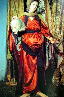
Untitled #228 “History Portraits”,Cindy Sherman, 1990
Cindy Sherman was living in Rome when she began her series of “History Portraits” (1988–90), a suite of intentionally peculiar images through which she investigates the representation of individuals in Old Master and other historical varieties of portrait paintings. Though she had access to many iconic works of art in Italy, she chose not to see them in person. As she explained: “I was living in Rome but never went to the churches and museums there. I worked out of books, with reproductions. It’s an aspect of photography I appreciate, conceptually: the idea that images can be reproduced and seen anytime, anywhere, by anyone.”2
Sherman served as model, set-dresser, and photographer for her “History Portraits.” Drawing from a range of art-historical styles and periods, including the Renaissance, Baroque, Rococo, and Neoclassical, and alluding to canonical paintings, she used costuming and settings to transform herself into the historical-looking male and female figures at the center of each photograph. Full of obvious prostheses, bad wigs, and theatrical makeup, the images are made to appear artificial. By revealing her disguise, she demonstrates that her pictures are constructs; through them, she draws attention to the staged and often mannered nature of historical portrait paintings, while also playfully mocking the discipline of art history.
Among these pictures is Untitled, Number 228 (1990), a full-length portrait of the artist as the biblical heroine Judith, who is said to have rescued the Israelites from the invading Assyrian general Holofernes by seducing and beheading him. Judith was a popular and frequently depicted subject, and Sherman based her own portrait on paintings by numerous Renaissance and Baroque artists. In keeping with the grand scale and forceful visual impact of these earlier paintings, Sherman’s photograph is nearly seven feet high by four feet wide and filled with richly patterned, color-saturated fabrics. Filtered through the lens of the camera, these fabrics seem sumptuous, but they are, in fact, cheap knockoffs from secondhand stores. As the artist described: “I would go to a Salvation Army and look for certain kinds of costume-y things. But so much of it was junky stuff.”3
Sherman shows Judith standing against a backdrop of brocaded cloth, dressed in an iridescent, voluminous crimson robe and holding the masklike head of Holofernes in one hand, a blood-smeared knife in the other. Her feet, planted firmly on the dirt ground, are slightly spread and appear incongruously large and thick. With her head slightly cocked, she stares ahead with a placid face, her expression open to many different speculations about her mental and emotional state in the aftermath of the violent act—and in keeping with the ambiguity that the artist builds into all of her work.
Source : https://www.moma.org/learn/moma_learning/cindy-sherman-untitled-number-228-1990/
1 note
·
View note
Note
Why are so many mormon temples in old Gothic architecture?
I don’t actually think there are any temples, much less many, built in the Gothic style of architecture? like, some huge parts of Gothic architecture are the immensity of the interior space (those vaulted ceilings!), the interplay of light you see in stained glass, and the intricacy and dizzying detail seen in the gargoyles and carvings of saints:

Mormon temples don’t really do this! Indeed a large number of them, built from the same basic blueprint during the 1990s, follow what’s maybe the least? Gothic design possible:

(this is Anchorage, Alaska, by the way)
When you talk about “Gothic” Mormon temples, I have to assume you’re talking about the four temples built in Utah during the nineteenth century: St. George, Logan, Manti, and especially Salt Lake:

St. George doesn’t look Gothic; it looks like you stuck some medieval ramparts on the roof of a New England colonial church. Those ramparts and the slight buttresses that descend from them are kind of like the contemporaneous Gothic Revival style, but only in the same way that Star Wars is kind of like Star Trek because they both happen in space and have “star” in the title–if you squint, some of the same elements are there, but they’re really not used in a way that fits the Neo-Gothic style.

Logan is more explicitly medieval-esque: it’s got those rook turrets, and the revealed stone (not the architect’s original intent!) leaves it looking more like a castle. The ramparts also look more elaborate than St. George’s, although I’m not entirely sure that’s not another accident of the paint wearing off. But it’s still too blocky and not nearly pointy enough to count as Gothic! That might be different if the towers ended in spires and not barn toppers, but they don’t.

Manti is really close in design to Logan, but it comes out looking much more European. That’s not because it’s Gothic Revival; instead, I’d pin it on the more understated side of the Baroque Revival which is basically to say: it looks like a French chateau.

If you were going to pin down any Mormon temple as being Gothic or Gothic Revival, your best option would be Salt Lake. If you made that case, you’d have the Wikipedia page on Gothic Revival architecture agreeing with you, which isn’t nothing. But look at literally every other example of the Neo-Gothic style on that wiki page: they’re all a lot more complicated and intricate than the straight-forward, bold, iconic profile the Salt Lake Temple cuts. It’s got the spires you see in Gothic architecture, but much more square than usual. Gothic cathedrals want to dazzle you, but this temple just wants to awe you; it’s playing a different game.
Now’s a good time to talk about interiors:


Almost all of the space in a Gothic cathedral is taken up by one giant room in the shape of a cross. The largest section of this room, the nave, is where the laypeople sit to watch the priest at the altar placed in the crossing; the choir sits behind there. The only meaningful subdivisions of this giant liturgical space are the smaller chapels often stuffed along the walls of the nave and in the transepts, and even they’re still contained in this one big room.

Contrast that with the way the interior of the Salt Lake Temple is set up, as seen in this cutaway model. You don’t walk in and get struck by the immensity of one giant space. Instead, rooms required for each element of the ordinances performed in the temple are kind of just crammed wherever they’ll fit; the only controlling idea behind the use of space is that each of the successive endowment rooms is placed higher than the next. The only large room in the temple is the top-floor assembly hall, which is more a vestigial element from the pre-endowment plans for Kirtland and Nauvoo than an essential part of the building. Gothic cathedrals are built for large, public liturgy; temples are built for smaller, more private liturgy. (It’s also worth noting here that the interior decor of the Salt Lake Temple is not mimicking Gothic Revival either; in the places where it’s not just murals, it’s much more imitative of Rococo).
So, if no Mormon temples are really Gothic, what are they? That’s a hard question because all of them really are architectural mutts (and I mean that in the best possible way). Truman Angell, the architect behind three of these temples (he didn’t do Manti), did go on a mission to Europe to review architecture (including Gothic and Gothic Revival buildings) but he “was generally neither very impressed by nor very interested in the great buildings of Britain and France…Angell’s taste in architecture seems to have been firmly set in favor of American simplicity,” a fact that’s reflected in the way his temples mute and assimilate their European elements into an eclectic, simple, and unique style. They’re not really classifiable as any one thing.
(special thanks to @justthatspiffy, who’s taken more than the one semester and couple hundred wiki crawls that make up the sum total of my art history knowledge, and who was invaluable in hashing out the architecture terminology so I didn’t make an entire fool out of myself with it)
80 notes
·
View notes
Photo

Michael S. Smith, the Obamas' 'decorator in chief', reflects on 8 years at the White House Written by Oscar Holland, CNNThere aren't many interior design jobs in which a decorator is prohibited from visiting the property before starting work. But then again, there aren't many residences like the White House.So, when Michael S. Smith -- President Barack Obama's self-described "decorator in chief" -- arrived at 1600 Pennsylvania Avenue in Washington on Inauguration Day 2009, he knew he had to hit the ground running."You're given all sorts of research material ... you have photos and diagrams, but you don't really know what's going on in the rooms until you show up," he recalled in a phone interview, adding: "One thing I didn't anticipate -- and most people don't, if they've never been upstairs -- is how unbelievably tall the rooms are."Smith renovated, redecorated and reimagined America's most famous home over the course of the next eight years. Now, in his comprehensive new book "Designing History: The Extraordinary Art & Style of the Obama White House," the interiors expert reveals how he did it, whether selecting mahogany chairs for the State Dining Room or commissioning a handmade carpet for the master bedroom.The White House's master bedroom complete with a late 18th century desk and bookcase, and a high-post bed from the early 19th century. Credit: Michael MundyWritten alongside journalist Margaret Russell, the book provides a detailed history of the White House's layout and contents. Smith and his team found reminders of past Presidents at every turn, such as the service wings constructed at Thomas Jefferson's behest, the installation of running water during Andrew Jackson's term, James Monroe's French-inspired stylings and James Buchanan's penchant for Victorian Rococo Revival furniture.As such, the challenge was partly about reconciling the building's heritage with the progressive tastes of a first family that -- as Michelle Obama noted in the book's foreword -- included "two little girls who preferred Crate & Barrel over antique credenzas and a grandmother who bristled a bit at any whiff of pomp."The interior designer is, however, quick to defer credit to his most famous clients."Being so incredibly interested in history in general, I think they were unbelievably respectful of what existed before," he said of the Obamas, adding: "They were so thoughtful and so appreciative of the fact that this wasn't their house, it was the country's house -- America's house."Family needsUpon his arrival, Smith's most immediate task was to redecorate the living quarters, with an emphasis on helping the Obamas' children settle in.While the White House had, he said, been left in "extraordinarily good shape" by the Bushes, the 18th-century building was ill-equipped to meet the needs of a young family. With Sasha and Malia ages 7 and 10, respectively, when the family moved in, the Obamas' arrival marked the first time in decades that small children had lived in the residence.President Barack Obama and Michael S. Smith pictured at the White House in 2015. Credit: Pete Souza/Barack Obama LibrarySome of the changes were relatively practical, like improved lighting that "literally made it possible for the girls to do their homework," Smith said. But transforming their bedrooms into fun, colorful and age-appropriate spaces required a more radical approach.Here, he combined vibrant colored wallpaper and bold, oversize leaf-patterned carpets with down-to-earth decorative flourishes -- accessories from Anthropologie and playful chandeliers made of bottle caps and other found objects."To try to contextualize it and keep it somehow tethered to the White House was really more challenging," he added. "That was about taking furniture that was newly made, but really emulated classic American shapes."At the other end of the spectrum lay the Oval Office, a room so iconic and historic that even the slightest alteration can attract ire -- as Smith discovered when his revamped design was described by Arianna Huffington as the "Audacity of Taupe" (a play on Obama's memoir "The Audacity of Hope") upon its unveiling in 2010.Inside the redecorated Oval Office, which was unveiled in 2010. Credit: Michael MundyWith its walnut coffee table and light brown velvet sofas, the room's neutral tones were seen by some critics as cautious, boring even. But Smith received greater plaudits for his choice of ornaments, which included Native American pottery and a rug embroidered with quotes from five celebrated Americans, including Martin Luther King Jr. and Abraham Lincoln. And he still stands by the choices he made in America's highest office."Someone said that Bush's (Oval Office) looked like the kind of room you'd have tea in, and that it was very genteel, but that Obama's looked like a place you'd have a quick espresso and get down to work," Smith said. "And that pleased me to no end, because that was very much my intent."The country was facing a very, very serious financial crisis," he added. "I knew that (Obama) was an incredibly Socratic thinker, and would work really late into the night, so this room ... was really a working office."Contemporary touchesOne might expect the White House decorator to have access to a rich selection of old furnishings, but until the turn of the 20th century, decorative objects and items of tableware were often auctioned or sold off at the end of any given administration. So, while there is a secretive warehouse containing a cache of usable presidential furniture, it's not, Smith said, as bountiful as some have speculated."There's this lore ... that it's this crazy treasure trove," he said. "But anything really wonderful is already in the building."Though he did borrow items from the warehouse, Smith instead focused on acquiring contemporary pieces from outside, injecting a sense of modernity into the historic setting."My big initiative, which Mrs. Obama was very enthusiastic about and signed off, was this idea of bringing more 20th century, postwar art into the collection," he said, "because the most recent (artwork on display) when the Obamas moved in was from 1943."A painting by Sean Scully, on loan from the National Gallery of Art, pictured in the family sitting room. Credit: Michael MundyAfter meeting with museums and curators, Smith secured loans from across the spectrum of America's modern art tradition, incorporating the minimalism of Robert Mangold, the abstraction of Mark Rothko and a work of pop art by Ed Ruscha. Paintings by Edward Hopper were famously displayed in the Oval Office, and as the first African American family to reside in the White House, the Obamas also expressed a preference for the work of pioneering Black artists like Jacob Lawrence, Alma Thomas and Glen Ligon, whose lithographs hung in the Billiard Room."The idea was to make up for lost time," Smith said. "You basically had 75 years of American art history and cultural history to bring the building up to (speed with)."This is not to say that the house's rich collection of historic portraiture and European masterpieces were tossed aside, but -- as the former first lady wrote in her foreword -- old artworks needed to brought back to life."A little recessed lighting here, a dimmer there," she wrote. "And, like that, the Monet painting hanging outside my bedroom door and the Degas sculpture in our dining room became newly vibrant, newly alive."Changing of the guardEffusive in his praise for President Obama, Smith described his former employer as having "the precision and the focus of an architect." And while the first couple possessed plenty of opinions on interior design (Barack has "never liked decorative plates," the decorator revealed), they trusted him to execute their vision -- all while keeping one eye on the needs of future occupants."Everything was always met with this question of, 'How will this be for the next family?'" Smith recalled. A painting by Jules Olitski, "Jean Harlow's Night, Black and Blue," pictured on the left in the third-floor corridor. Credit: Michael MundyQuite what that next family -- namely the Trumps -- make of his work remains to be seen. Despite maintaining a "cordial relationship" with the White House's current decorator Tham Kannalikham, Smith admitted to knowing "very, very little" about what has taken place since the keys were handed over in 2017.There are signs that the Trumps may have more traditional tastes than their predecessors. Architectural Record magazine in February reported seeing a draft executive order calling for all new and upgraded federal buildings to be constructed in a "classical architectural style," while a new tennis pavilion being overseen by the first lady is being built to a neoclassical design.In any case, the artworks borrowed by the Obama administration have already been returned to the institutions they belong to. And much of the contemporary furniture (which was largely purchased out of pocket by the Obamas, and thus could be taken to their next house) now serves as "the nucleus" of the family's new Washington property, said Smith, who also helped decorate the family's post-administration home. Regardless of what has transpired within the White House's walls, the designer seems at peace with the transience of a role in which decisions can be later overturned as easily as they were made. Related video: Photographer Pete Souza on capturing unguarded moments with Obama "Always knowing that it is not a permanent situation makes you hyperaware of enjoying being in the space," he reflected.And while Smith said he would be "surprised" to get a call from former Vice President and 2020 Democratic presidential nominee Joe Biden should there be a change of administration at the upcoming election, he doesn't rule out a return to the White House, if asked -- by a President of any political persuasion. "It would depend," he said diplomatically, "on the President more than the party.""Designing History: The Extraordinary Art & Style of the Obama White House," published by Rizzoli, is available now. #lifestyle Read full article: https://expatimes.com/?p=12947&feed_id=12626
0 notes
Text
Churches in Munich
I have been living in my second hometown, Munich, for over three decades, and still, I haven’t explored all of its places. No, it doesn’t mean I don’t travel a lot or have no interest in discovering nooks and crannies of my city.
It means the town is filled with an infinite number of mesmerizing architectures to see that every time I visit any corner of Munich, it amazed me differently.
However, being a Catholic German, I have vast information about churches in Munich. The cathedrals of my place are worldwide famous, and they draw millions of sightseers from every corner of the universe.
And today, I want to share that knowledge with everyone, but first, let me put some light on the history of Munich and its churches.
Munich and its Connection with Churches
Munich has more than twenty churches, and all of them are charismatic in their way. The Bavarian capital has an enormous religious history. People of Munich are still following sacred norms and obligations.
Talk about the history of the place, the third-largest city of Germany, began as a benedictine monastery. It later transformed into a new settlement when monks stepped in and installed a market at the junction of the route from the river and Salzburg (once named Iuvavum).
When you enter this urban town, you will witness the iconic old-fashioned walls and three old city gates. However, the central point of Munich is none other than my favorite square. Marienplatz, which is an enormous and ancient public location to meet new people. All tourists should start from here.
Marienplatz
Near the Marienplatz, there are some outstanding buildings, such as the New City Hall (Northern side), the Old City Hall (Eastern edge), and few highly renowned churches. Yes, I am talking about Frauenkirche, St. Peter’s Church, and Saint Michael’s Church. Out of all three, Frauenkirche, the Cathedral Church of Our Lady, is the most-visited sacred landmark in Munich.
My hometown has a deep connection with religious history, especially Christianity. It would be hard to find non-Catholic churches in the city. However, every other cathedral is different from the rest in terms of architecture and design. Some of them are small, while many of them are quite large in structure.
One thing I like about these holy places is everybody can visit the churches regardless of their faith, so one doesn’t have to be significantly Christian or religious to roam in the buildings freely.
Top Churches in Munich
Though every tiny location in Munich is worth exploring, however, visiting some religious architecture is a whole different story. It took me so long to compile a list of the best churches in Munich because of their beauty, designs, and charisma, but I finally made it. So, check out!
Dreifaltigkeitskirche (Trinity Church)
Popularly known in the entire Munich, Trinity Church, Dreifaltigkeitskirche in German, is a votive cathedral. The church lays in the center of the city, near Lenbachplatz. The construction finished in 1716. It was all constructed according to the plans of Giovanni Antonio Viscardi. The building is one of the ancient Bavarian Baroque-style landmarks.
This monastery cathedral of the Carmelites is also the church of the Metropolitan parish of Our Blessed Lady. Let me share a surprising fact about it. In the Second World War, Trinity Church was the only religious landmark that had been spared from damage caused by bombs. Call it a miracle or something, but the church has weirdly attractive and mysterious vibes around it.
Some Barock
Being the first church building in the late Baroque style, the Trinity Church went through some changes, too. After the death of Viscardi in 1713, Enrico Zuccalli took the responsibility to finish it. The central building, along with its beautiful dome and entrance, are the masterpieces of him. Other than these, the two-faced south façade extends the front side of the houses of the street. Moreover, the polygonal central door is parted by columns and baroque crowns that enhance the appearance of the structure.
In the Trinity Church, you will witness the beautiful artwork by Cosmas Damian Asam, whose paintings are on the dome’s ceiling. Other prominent artists include Joseph Ruffini, Johann Baptist Straub, Andreas Faistenberger, and Johann Georg Baader. To discover more about the cathedral and its remarkable displays, one must take a tour of the place.
Michaelskirche (St. Michael’s Church)
No tour to Munich would ever be completed without visiting Michaelskirche, also famous by the name of St. Michael’s Church. It is a Jesuit cathedral in the city. Consider it the most magnificent Renaissance church settled in the north of the Alps. The design of the building features the Baroque-style structure.
It was opened in 1583 as a Parish church. Friedrich Sustris, with the help of Wendel Dietterlin, designed the building. And the Duke of Bavaria, William V, built the landmark between 1583 and 1597. Moreover, the monument was initiated as a spiritual center for the Counter-Reformation.
If I have to talk about the façade of the building, I must say it’s very influential. It contains standing figures of Duke William and previous rulers of the Bavarian Wittelsbach dynasty. All the statues are made of bronze, and they placed in the positions to form a family tree. Furthermore, the interior of the cathedral is outstanding. It depicts Roman Catholicism in a beautiful style. From the arches to the aisles to the chapels, every display in the church is worth praising. And yes, there is a deep choir room, too.
Even after faced damaged in the Second World War, the church looks hypnotically stunning and picturesque. It was fully restored between 1946 and 1948.
Heiliggeistkirche (Church of the Holy Spirit)

Another Catholic church in the heart of Bavaria, Heiliggeistkirche, commonly known as the Church of the Holy Spirit, is a Gothic hall basilica. The church lies on the edge of the Viktualienmarkt. It originally belongs to the Hospice of the Holy Ghost of the 14th century. Johann George Ettenhofer remodeled the landmark in 1724, and he took six years to complete the architecture. The areas of renovation were vaults and pillars.
The inner side of the church features Rococo frescoes and stucco ornament by the very famous Asam brothers. Well, the original décor was awe-inspiring, but this cathedral had faced destruction during World War II. Even the interior furnishings were damaged to a great extent. However, after the war, renovations and restorations were carried out. In 1991, the interior was entirely reconstructed.
If you are looking for the original landmark, you will only get the remnants of the north wall of the nave. And the tower of the church has a beautiful lantern dome. Look closely at the Neo-Baroque façade, and it is quite clear that the elements used in it are borrowed from Viscardi’s Trinity Church.
Overall, the Church of Holy Spirit is worth exploring, and especially, its interior has something captivating that you can’t resist yourself from seeing it.
Burgersaalkirche (Citizen’s Hall Church)

Most probably one of the smallest churches in Munich, Burgersaalkirche, known as Citizen’s Hall Church, is not less than others in terms of architecture. If you ask locals about it, you may find a mix response. Yes, this is not very famous among the Bavarian community. However, the vibrantly painted ceiling inside the basilica is magnificent. It also has a cute but contemporary style chapel on the ground floor. You need to go upstairs to discover more paintings and highlights.
It’s another masterpiece by Giovanni Antonio Viscardi, and it was built between 1709 and 1710. There are two churches in one big Burgersaalkirche. The upper church is on the higher floor, while the ground church is on the lower portion. From the outside, the Citizen’s Hall Church is Baroque-style, and the statues of Madonna and Child are placed above the entrance gate.
If you have plenty of time, visit the upper section of the church, too. It was once the prayer room, but it has been used as a church since 1778. I am sure you would like to view the masterpiece of decoration in the place, which is the statue of the Guardian Angel with the child. And yes, there is also a grave of Rupert Mayer on the lower floor of the church.
St. Maximiliankirche (St. Maximilian Church)

Like many others in the Bavarian capital, St. Maximiliankirche, popularly known as St. Maximilian Church, is a Roman Catholic Parish Cathedral. It beautifully nestles near the River Isar in Munich on the southern side of Germany. The church took several years to finished, and it was erected from 1892 to 1908. Heinrich von Schmidt was the designer and the mastermind behind the stunning architecture of St. Maximilian Church. He made sure to design it in the Romanesque Revival style.
If I talk about myself, I couldn’t get a chance to visit this place more than once. However, the giant structure of beauty is still in my memory. The cathedral is quite massive as compared to small churches in Munich. I adore the Romanesque-style façade that plays a vital part in heightening the value of the place. When it comes to the interior, it’s modest. The walls are plain with a few paintings and murals, but the furniture and ceiling are highly decent yet elegant.
Galleries
Open galleries connect two towers of the building. Moreover, the soil of the place was very soft in most of the construction location. That’s why wooden beams were used for the support of the roof instead of traditional stones. Keep in mind one thing that the church was damaged a lot during World War II, and it was reconstructed in 1949. The overall appearance of the building is outstanding. So, everyone should visit this gorgeous land at least once in their lifetime.
St. Lukaskirche (St. Luke’s Church)

I am sure you don’t want to skip St. Lukaskirche, as known as St. Lukas or St. Luke’s Church, which is probably the largest protestant church in the urban center of Munich. This only preserved Lutheran Parish Church is the creativity of Albert Schmidt. It was erected and completed between the time duration of 1893 and 1896, so it took three years to get the final appearance.
It gracefully lies on the banks of the Isar, between the Mariannenplatz and Steinsdorfstrabe. And you can consider it among the historical places where people not only worship and perform holy rituals, but it is open for non-believers, too.
Special on Architecture
Nobody could ever ignore the structure of the building because of its Romanesque-style features. Albert wanted to give it a pre-reformation look, so he designed the façade of the church to rule the skyline of Roman Catholic Munich. And if you explore the interior, you will be surprised to view Gothic-style décor. However, both designs make the St. Lukas Church worth seeing.
The church welcomes visitors and sightseers from all around the earth almost every day. It is also the venue for various cultural programs and concerts. When it comes to services, they held plenty of times per week. Moreover, the church community is in love with the St. Lukas gospel choir, which started in 1991. Now they have over 70 singers with flawless and melodious voices.
Kreuzkirche (Holy Cross Church/All Saints Church)
Not the typical one in the city, Kreuzkirche, also renowned as All Saints Church, is a cemetery church in the Bavarian capital. It is famous by the name of Holy Cross Church, too. Located in the southern end of Germany, Kreuzkirche features a sharp façade, and it is among the top-notch Catholic churches in my hometown.
Jorg von Halsbach was the creator and designer of the landmark. It was erected in 1478, and consider it the first holy building with a cemetery in the Saint Peter parish. In the beginning, it was situated at the crossing of four roads. That’s why locals call it the Holy Cross Church. The building of the cathedral is in highly good condition, and all the visitors have permission to roam without hesitation.
With brickwork walls in red and a giant bell tower, Kreuzkirche can be seen from a distance. Its architecture highlights the sky of Munich. When it comes to interior décor, it is in Baroque style, and the frescos are stunning to view, too. There are also few attractions within the church, so book your tour to discover them by yourself.
I think I forgot to mention about the tomb of banker Gietz and the Phantom of Virgin to St. Augustine that are also there to teach mysterious old facts related to Saint.
Paul’s Church

One of the large Catholic churches in Munich, St. Paul’s Church, lies in the city’s quarter of Ludwigsvorstadt-Isarvorstadt. Austrian architect Georg von Hauberrisser designed this gorgeous building, and it took almost fourteen years to complete the landmark. It was constructed between 1892 and 1906. The church was created in the Gothic Revival Style.
For outer appearance, limestone from Ansbach is used to enhance the façade of the church. On the other side, upper Bavarian tuff is the primary component for the interior décor. Other than these, the core of the masonry consists of brick. When it comes to towers, the central one is 97 meters, while the two on the west are 76-meter tall. Moreover, the western exterior is decorated by a giant rose window above the entrance side of the church. The entire façade and interior look highly gorgeous.
Unfortunately, during the time of World War II, St. Paul’s Church was severely damaged by air raids. It was one great destruction because the large pieces of equipment were lost, which also include the high altar. However, the church was restored with time.
Other Churches in Munich
As I have mentioned earlier, Munich has over twenty churches, but not all of them are equally famous. Here, let me share a list of some not-so-famous cathedrals to show you some more colors of the city. Though they are not as popular as Frauenkirche, St. Michael’s Church, or Trinity Church, however, they still have some great value. So, if you have discovered all the well-known basilicas and have no idea what to do in Munich, you can try these churches, too.
Damenstiftskirche St. Anna
Damenstiftskirche St. Anna, a chapel in the old town of the Bavarian capital, is drop-dead gorgeous in its structure. It is no doubt one of the wonders of Munich. Elector Charles Albert commissioned it in the 18th century, and a monastery in the legal form of a chapter of nuns was set up in the church. And yes, the cornerstone was laid in 1733. It was opened for the public in 1735.
This beautiful chapel is the work of a famous architect, Johann Baptist Gunetzrhainer. However, the Asam brothers took responsibility for the interior décor of Damenstiftskirche St. Anna. The ceiling fresco is the most appealing thing in the church. Other includes the nave, altar, and interior ornamentation.
Like many other churches and landmarks, St. Anna was also destroyed during World War II. Later, the interior was restored in the 1980s by using old photographs and images. Even though the inner side is completely renovated, but the murals are painted in classic black and white, but the charm of the place is still alive.
The only negative point of this landmark is its gate that separates the visitors from the entrance and church nave. It restricts people from exploring the central area of the church, so it can be a little bit difficult for sightseers to view highlights of the church from close.
Kathedrale Maria Schutz und St. Andreas
The beautiful Catholic Church, Kathedrale Maria Schutz und St. Andreas, is another under-rated cathedral in southern Germany. Call it the Cathedral of the Intercession of the Mother of God and St. Andrew. Its origin is from Ukraine, and it’s the Ukrainian Greek Catholic Cathedral.
The cathedral is a piece of modern architecture. The church opened for the public in 1976. Its exterior is modest and decent. The interior is lovely, like many other churches in the city. Moreover, it can be among the best indoor things to do in Munich.
Klosterkirche St. Anna in Lehel
The Catholic Abbey church, Klosterkirche St. Anna in Lehel, also known as Abbey St. Anna Church, is an example of a unique art. Nestled in the heart of Bavaria, it was the first-ever Rococo church of the Old Bavarian region. It shaped the development of sacred and religious architecture in the land. Johann Michael Fischer designed this beautiful masterpiece in Rococo style in 1733.
The interior designers included the Asam brothers and Johann Baptist Straub. It was all started in 1727 as a gesture of thank you for the birth of the heir to the Bavarian crown, Maximilian III Joseph. The construction was completed in 1733, and it was opened for the public in the same year.
I have mentioned many times that World War II destroyed plenty of monuments. Unluckily, Abbey St. Anna was among those buildings. Rebuilt in the 1960s. The façade may look plain now, but it somehow managed to appear modest and decent.
Salvatorkirche (Church of the Savior)
Another Gothic-style church in Munich, Salvatorkirche, popularly renowned as the Church of the Savior, is a former cemetery church of the Frauenkirche. The Greek Orthodox Christians have been performed rituals in this place since 1829. It was also the head office of the Metropolitan German region and the Exarch of Central Europe. Do you know the Greek Orthodox community called it the Transfiguration of the Savior?
Initially, it was erected in the late Gothic style in the 15th century. Later, the exterior of the church was built in a Gothic-like architecture, and some Baroque pieces were removed in the restoration process. The inside of the building is fantastic, and the entire church looks captivating, even from a distance.
Don’t have enough time to observe every detail of the site? No problem. It can be one of the top outdoor things in Munich. Just spend a few minutes outside the church to know the worth of its beauty.
New St. John’s Church
Located in Haidhausen, the district of Munich, the Parish Church of St. John the Baptist is a Roman Catholic Church. It is a masterpiece of Matthias Berger. He designed the building in the Gothic Revival style.
According to historical facts, the population of the city grew swiftly in the early 19th century on both sides of River Isar. For this reason, the church of Haidhausen became too small to fit its growing gathering, so a new, larger church was constructed. Keep in mind the foundation stone for the church was laid in the 1840s. That is why it is called the New St. John’s Church. Though the construction of St. Johannas was almost completed by 1858, however, the tower took more time. It was erected by 1870, and the west tower of the church is 97-meter high.
We all know what happened after World War II, and New St. John’s Church couldn’t save itself from destruction. The bombardments from world war II damaged many portions of the building. After the war, restoration works repaired the building. Even the tower received a new spire, too.
Wies Church
The UNESCO World Heritage Site, Wies Church, is among the traditional pilgrimage churches near the city of Munich. Dominikus Zimmerman ordered to construct this gorgeous landmark between 1746 and 1754. No doubt, Wies Church is one of the purest and holiest creations of Bavarian rococo. Its decent exterior looks super-classy, and the interior snatches the attention of everyone. Add this place to enjoy historical architecture.
To put it briefly, I want to say visiting cathedrals and getting information about them is one of the best things to do in Munich. From the Cathedral Church of Our Lady to Theatiner Church to St. Peter’s to every gorgeous church in the city, the highlights will not let you think you have wasted your time or something. Not even for a second. And yes, don’t hesitate to try new things. Every adventure gives us unlimited experiences. So, are you ready to unlock new chapters of thriller activities in the heart of Bavaria?
Read the full article
0 notes
Text
In and around Szentendre: An oasis of serenity - travel
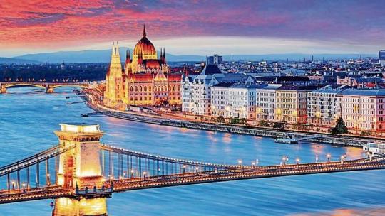
For a couple of years, as a student, I called the Hungarian capital of Budapest home. Exotic, unfamiliar, Eastern European — a city that boasted of a range of architectural styles from distinct time periods. An exciting artistic and musical scene, the iconic Széchenyi Chain Bridge twinkling in the night time, summoning you to cross from hilly, tranquil Buda to young, pulsating Pest; ruin pubs with their eclectic decor and mismatched furniture that echo with the raucous song of many a tourist; gentrified districts with hip cafés and brunch places that serve artisanal food; and the continent’s beloved Danube — Duna to the locals — calm, winding, snaking its way under the city’s many, many bridges. For months, I was intoxicated, spellbound by its seemingly magical ability to feel so welcoming and familiar, despite the grandeur of its buildings and a tongue that none of my foreign language training had prepared me for. It took the rigour of academia and the monotony of routine for me to stop finding romance in the creaking of the hardwood floors of my 19th century apartment, in the drunken revelry of those who congregated at the pub beneath my window, or in the smell of freshly baked bread from the neighbourhood pekség (bakery). No longer did a sighting of the majestic neo-Gothic style parliament building make my day. The spell had broken and Budapest’s famous thermal baths, impossibly relaxing as they were, didn’t seem quite enough. Craving a break, the humble town of Szentendre was beckoning.

Lutheran Church in SzenendreEscaping the city’s escapadesA mere 40 minutes away by the suburban railway with its green carriages, starting from one end of the yellow Margaret bridge that affords breathtaking views of Pest, Buda and the gentle blue-grey waters between them, is the small town of Szentendre, making for a perfect day trip from the bustling capital. For the athletically inclined, a tree-lined bike path leads one from Buda to Szentendre, replete with riverfront views and snack stations for quick bites. The popular tourist destination lies on the west bank of the picturesque Danube Bend, the region where the river turns sharply between the hills on either bank and is home to several charming towns that teem with visitors.Szentendre’s building facades — in pastel shades of blue, pink, yellow and green — with white window ledges that house flowerpots bursting in bloom, labyrinthine cobbled streets lined with souvenir shops and cafes, and many churches, museums and galleries make it a postcard European town. It has mixed ethnic influences and a somewhat Mediterranean vibe that are a result of, as travel books say, its cultural mix of Greek, Dalmatian and Serb immigrants, as well as that of German and Slovak populations. While the Serbian Orthodox Church and the Baroque-Rococo Greek Orthodox Blagovestenska church, both important points on a tourist’s agenda, are the most obvious testament to the region’s cultural diversity, Szentendre has seamlessly integrated its influences into not just its art and architecture, but also its food.Once one enters Szentendre, either from the station or from where the ferry docks on the bank, one is likely to first visit Fo Tér, the spacious main square that is almost always decked with twinkling lights, decorative umbrellas or rows of hanging patterned lampshades that form a colourful canopy over the historical town’s winding alleys. Small cafés with cozy outdoor seating amidst trees briskly changing colour, and large restaurants with garden seating, rustic wooden tables and distinctive art work on their walls offer soft, crumbly ricotta cheesecake, and warm, sour cream-topped deep-fried langos (a Hungarian delicacy). Whatever the season is, a trip to Szentendre is usually incomplete without a pit stop at Levendula, an ice cream shop dutifully painted in shades of lavender and sporting in its window a violently purple bicycle that admittedly conjures up images of carefree rides through unspoiled meadows. Its ice cream is less predictable than its decor, however, with flavour combinations such as lavender-lemon, strawberry-balsamic vinegar and even Camembert. A trip to the Marzipan Museum, which fancies itself to be a Tussauds of sorts with its sometimes odd recreations of celebrities and buildings in marzipan, may perhaps best be avoided by those to whom the idea of sugary almond paste is not particularly appealing. Instead, a visit to the National Wine Museum that educates the visitor on the region’s many vineyards and the development of Hungarian wine, may be more appealing.Bustling street lifeSzentendre’s streets are lined with quaint little shops with brass name boards, carved wooden doors, and ivy-covered windows that sell everything from kitschy souvenirs, bunches and bunches of fiery-looking Hungarian paprika, and memorabilia inspired by folk art to fine clothing, delicate glass jewellery, Chinese porcelain, handcrafted artefacts, paintings and sculpture.
Michael Jackson’s statue at the Marzipan MuseumSzentendre, in fact, is known as a hub of Hungarian artists, authors, musicians and sculptors; its Artist Colony, founded in 1928, brought together several important creative people, and the artistic tradition of the region continues to flourish today with several generations of artists calling Szentendre their home. A number of museums pay homage to this tradition: the Margit Kovács Ceramic Museum houses Hungary’s leading ceramicist’s work; Barcsay Museum celebrates the many works of local artist Jeno Barcsay, and the Art Mill holds exhibitions of painting, photography, sculpture, and other modern innovative art.For most people, a day at Szentendre typically ends with a lazy stroll by the river or a sprint up to Templom Tér, which offers a view of interlocking, overlapping red roofs at various heights, the wide plazas, and the cobbled streets of the city below.So postcard-perfect Szentendre, that people often remark it is lost in time, a place almost removed from reality, and the perfect escape, therefore, from the caprices of everyday life.B014RGVIG2, 1786575426Follow more stories on Facebook and TwitterAt Hindustan Times, we help you stay up-to-date with latest trends and products. Hindustan Times has affiliate partnership, so we may get a part of the revenue when you make a purchase.
Source link
Read the full article
0 notes
Text
Aesthetic Characterization in Marie Antoinette
Rarely is a film so assiduously photographed as Sofia Coppola’s third feature, 2006′s Marie Antoinette. Her production capitalized on bridging the editorial fashion world with the cinematic, spheres of which Coppola is equally familiar, exploding most memorably in a sleek Vogue photoshoot encompassing eleven original shots and a wardrobe of custom made haut couture. Accordingly, no amount of opulence was left unrecorded, and a trove of candid stills from the set exist documenting the cast as they portray their respective figures of finery. This would seem only prudent as the budget was an astonishing $40 million spent to the last detail on the finest pastries and designer shoes. It only makes sense to capture every inch of the spectacle while it hangs, suspended in time, for a brief period of incandescence.

Photography by Annie Leibowitz, Vogue, September 2006.
What’s remarkable about these behind the scene images are their tendency to include modern technology along with the costumed actors for an intentionally anachronistic, somewhat comical juxtaposition. We see Kirsten Dunst posing with a Mac laptop, for instance, or splitting headphones with co-star Jason Schwartzman while both are clad in full costuming. The more these documents are considered in conjunction with the finished film, and indeed their chic companion in Vogue, the clearer a harmonic correlation becomes. It was never Coppola’s intention for Marie Antoinette to have unflinching historical accuracy because that is not the philosophy of the film or indeed her career. Instead, Coppola shines in contemplation on female adolescence and every melodrama, ecstasy, and heartbreak it entails. This is not a textbook, but a poetic biography prioritizing the ageless trials of teenage emotion.

Many detractors lament that the film’s style over substance approach is insufficient, but Marie Antoinette is only portrayed as she is remembered: a naive fashionista in over her head. Minimal dialogue is required where costumes, that earned designer Milena Canonero an Oscar, are able to paint a more vivid depiction of the titular character. Her consumption by courtiers is stitched in every instant they posses her by dressing her, and her childlike helplessness emphasized by a recourse of shopping sprees.

The sequences are absolutely drenched in materialism, but so is the character’s consciousness when confronted with societal demands. Cheerful pastels and playful ruffles work in unexpected unity with a soundtrack of 1980s synth pop, and materialize the image of a peer influenced girl who represents a deathless teenage archetype. The symphony of Rococo fashion, 1980s music, and 2006 styling reverberates an echo that repeats this refrain. Human experience does not change with time but is merely expressed differently.

Thus, the anachronistic set photography beholds a great deal of thematic continuity, just as the haut couture spread captures Antoinette’s twin avatar as fashion icon. Clothes become inextricably wound with the infamous queen’s identity, and some universal truths are ineffable, only communicable through the senses. As such, Marie Antoinette is a sensory feast which evokes decadence in every direction while never straying from a skein of helpless melancholy. The dauphine’s trapped perspective exists in her carefully French wardrobe or else in escapist shopping habits. Her vision represents her character: a typically delighted and dysphoric teenage girl.

Bibliography/Works Consulted:
Dobbins, Amanda. "In Defense of Sofia Coppola's 'Marie Antoinette'." Vulture. 18 June 2013. Web.
Ewens, Hannah. "What 'Marie Antoinette' Taught Me About Being a Teenage Girl." Vice. N.p., 5 July 2016. Web.
Andersson, Therése. "Costume Cinema and Materiality Telling the Story of Marie Antoinette through Dress."Culture Unbound: Journal of Current Cultural Research 3.1 (2011): 101-12.
Brevik-Zender, H. "Let Them Wear Manolos: Fashion, Walter Benjamin, and Sofia Coppola's Marie Antoinette." Camera Obscura: Feminism, Culture, and Media Studies 26.3 78 (2011): 1-33.
Filmography:
Marie Antoinette, USA, Sofia Coppola, 2006.
3 notes
·
View notes
Last Seen Blogs

loganguy69
LoganGuy69
KIK-OutbackOz69

dreamsandgirls
Dreams & Girls

isieoop
Stan blackpink

stonelionhearts
LIONIZE

birifine
ekl