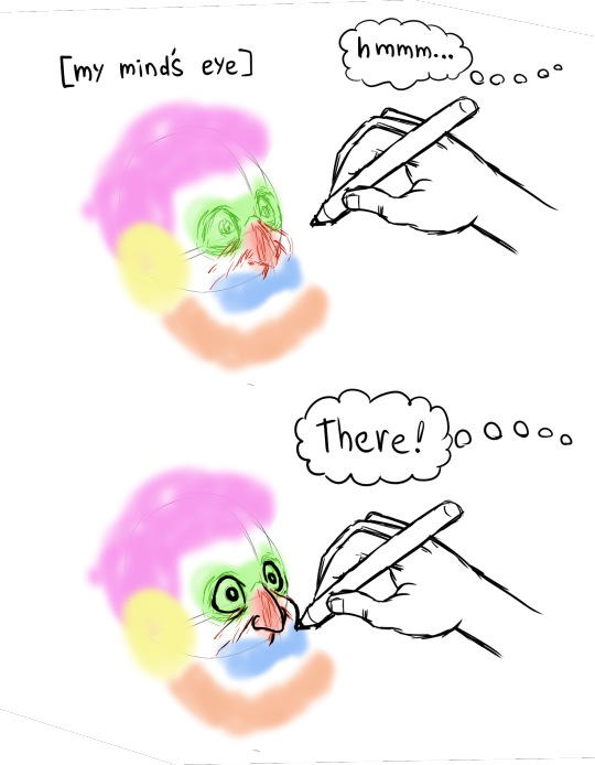
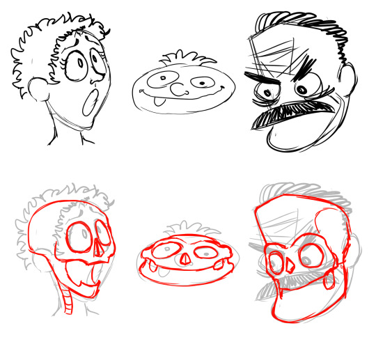
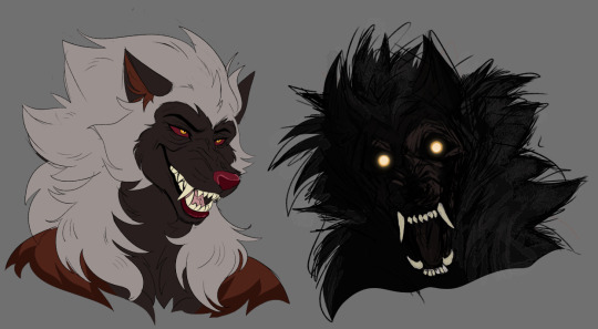
#i tried coming back to the cartoony style i used to use a lot and Boy am i out of practice dbxlxbslg
Text

@coyotehusk 's Goretober
--- Part 4: Tools ---
Across the floor in the hand of where we drove the drill
A cautious ear to the mouth of your confession
Think of all the things we put him through
In the face of his god, would he tell the truth?
(Coheed and Cambria - Three Evils)
[ID in alt]
#gore#goretober#goretober 2023#hand injury#hand whump#whump#whump art#oc whump#whump blog#captain's stuff#captain's ocs#kintsugi#u gotta squint to see it but it is#i am Not happy w/ this#i cropped it to shit bc what's off frame was even less certain#i tried coming back to the cartoony style i used to use a lot and Boy am i out of practice dbxlxbslg#i realized it like halfway thru the colouring but by then i had commited#i gambled and i lost lmao#anyway it is Finished and frankly what more can a man hope for#i'll probably draw this exact scenario again so i'll have another chance at it ¯\_(ツ)_/¯
12 notes
·
View notes
Note
not a question but basically any time i remember your art exists im looking it up and down and trying to take inspiration from it. your expression work is always top notch, and the way you depict faces is the perfect balance between cartoony and well defined
oh my god this is such an amazing compliment! thank you so much!
you know, i think this has been a long time coming. im going to take this as a chance to go in depth about how my style works, why i do what i do and how i do it. do keep in mind that none of this is me saying "this is the objectively correct way of doing art" but rather just how my own process works, what I like to see in my own art.
that balance that you speak of comes from a commitment to underlying structures. what im going to call the stylization sandwich
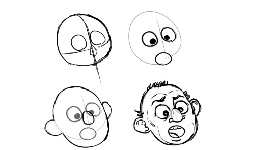
i start with a clear, well defined solid structure, i add whatever wacky cartoony features i want on top of it (none the less strongly tied and guided by the underlying structure) and then i refine by adding as many more realistic, grounding details i want, although you can go too far with it so i gotta be careful or ill end up with those shitty "cartoon character IRL would look scary!" clickbait drawings.

(quick aside, this trend fucking sucks, its obvious the artist went out of their way to make the drawing creepy, this pretension that "actually the character would look scary irl" deliberatly misundertands the principles of stylization, its as creatively bankrupt as jokes about mario eating mushrooms)
getting back on topic, the point is that, as long as the underlying structures are solid you can build whatever you want on top of them and it will make sense

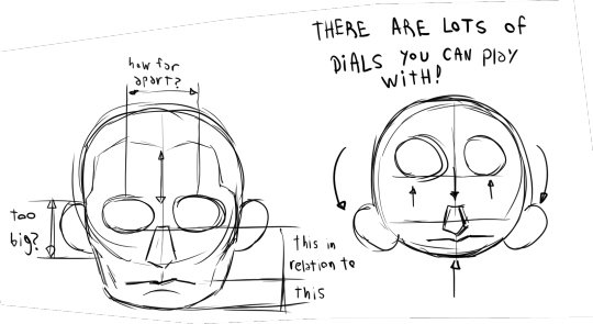
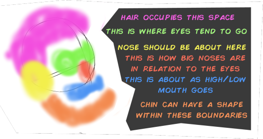
a key tool here is internalizing the way the proportions on the face work. and i say internalize because obviously i dont actually have the golden ratio memorized inside my head nor do i stop and measure and calculate all the proportions in the features. i just read a lot about drawing, i drew a lot, i tried to always keep a critical eye to what im drawing and see if it "feels" disproportionate. once you get an eye for it then you know how far you can push things before they complitely break
let me give you another example of what i feel is a botched execution of this.
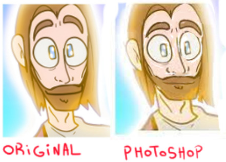
if you look closely at the face on the left there are a lot of things that dont make sense. the corners of the eyebrows dip down into the eyes when usually the eyes are enveloped by the eyebrows, the way the beard grows around the nose is just not how facial hair is distributed, the mouth is too big, etc. on the left i used photoshop to reorganize the factions into something that makes a bit more sense to me
(another quick aside, the real big problem at the heart of the original drawing were not so much the proportions but the tangents, when different lines touch each other like this that is usually a big no no but that is a topic for another day)
also a lot of it is just me cheating. yeah i cheat. you ever heard how people say there is no innate talent and its all practisce and hard work. well, yeah, that is mostly true, but is also true that some people are born with inherent advantages. either taller or more predisposed to being thin or with better facial structures or better innate hand-eye coordination. i was born with an uncanny capacity to visualize stuff. i have whatever the opposite of aphantasia is. i can borderline hallucinate things if i want to. and that goes coupled with the visual intuitions i developed through practisce and training.
so first come the learned wisdom, and then comes the innate talent that helps me exploit that learned wisdom to its full potential
on top of that is corporeality, i try to draw in such a way that it conveys depth and weight to the things im drawing, certain kinds of stylizations dont care about that and choose instead to have their drawing look flat, a classic one is the UPA style

is a very fun style! very cute, very dynamic, very expressive in its simplicity. it became very popular in the 60's and 70's. personally i choose to go in a different direction. i draw in such a way that if one were to turn my drawings into 3d models not a lot would get lost in the process.
whereas other artists....

...not so much
but yeah, ultimatly it all goes back to underlying structure. any drawing can work
as long as you have a strong foundation underneath.
PS: if you like my style i cannot reccomend enough the art of @rezuaq i feel they follow a lot of the same principles i talked about here but i could be wrong.

they have been my biggest inspiration as of the last 4 years, i shamelssly stole the design of one of their characters for jennyffer. go to their blog and give them a like
46 notes
·
View notes
Note
could you show a little bit of your art progression over the years? your style is absolutely magnificent btwbtw!!
sure ! i've done a similar post, but that was focused on shape language and didn't go over all of my art progression. i'll link it at the end of this post!
anyway, i started digital art around 7 years ago, but all of the art from that period is essentially lost. at that time, it was just deviantart bases and various furry/warrior cats fanart made in MS paint. while i'm not a fan of vivziepop anymore, she was a big inspiration at that time, as well as a handful of popular animation meme artists at the time. around 2019, i started making art in krita using a mouse. and later that year, i started making art in ibispaint (mostly skullgirls fanart). unfortunately, practically everything from before 2020 is lost because it was on reddit accounts that i had deleted out of cringe. don't delete your old art ever!!! i do have this piece though, made in 2020 on krita with a mouse. my main inspirations were invader zim and other cartoons.
my artstyle took a lot of dips and turns around this time. i got back into anime, and it influenced my style in a way that i think made it really ugly and bad looking. i also refused to ever flip my canvas. i think this era actually held me back. here's an example.
anyway, by 2021, i had gotten into more anime that influenced my style in a different way. i forget the exact ones, but i did watch a lot of stuff from trigger (like BNA and LWA) at the time, and also got into enstars which influenced my compositions a lot. it's also around the time that nova in her current "space astronaut bunny" concept was born. i started experimenting with backgrounds, color palletes, and colored lines, which was crucial. i look back at this era pretty fondly. though i still refused to flip my canvas :D

by 2022, my artstyle looked like this -
(this is actually from dec 2021 but like. it's still what my artstyle looked like)
i had played world's end club and rewatched panty and stocking, and it changed my brain chemistry. i decided that my artstyle would be "60% anime, 40% western cartoon", and despite some shortlived phases where i'd go for a slightly different style, i still kept it up. looking at least year's art summary, though, you can see that i broke away from that style for something more anime. and also, i hardly ever experimented with colors anymore because i was focused on character design. i'm gonna be real i think everything after july looks like absolute bootycheeks. i hate this weird single tiny dot reflection style i had going on it looks like dogwater.
after 2022, my art was in a miserable transitional period where i had zero clue what direction i wanted to go in. but despite all that, this piece in particular is crucial. because i used halftones in the background. it's foreshadowing!!!

i continued like this for a while, until the time where i decided to play around with shapes with those vocaloid big 8 drawings. people really liked the shapes that i used in that one, and i found them fun to draw. so i started exaggerating more, and after i rewatched panty and stocking for the 307492020506th time, as well as invader zim for the 2nd time, my cartoony roots came back.


and then, when my art was already steadily improving, across the spiderverse dropped, and i watched it. funnily enough afterwards i had a big art block because i was just thinking, "you need to draw if you want to work on something as big as that! improve!!!!" which kind of held me back. but after all that, i decided to take a note out of ATSV (and comic books in general)'s book and start using halftones in my work. as well as that, i started focusing on lineart way more, and tried to play around with lineweight. which brings us to present day, where my latest art pieces look like this :


i still think that my artstyle needs a lot of work. even these pieces have issues when it comes to symmetry, values, and the like. but nowadays, though my art takes far longer now (as i've abandoned special pens and just do lineart with the hard dip pen in a kind of tedious way), i'm having more fun with it than i have in years. i think halftones fit my artstyle really well, and they're a unique way to "fill up" areas. now that i pay attention to lineart, i think it makes my art feel 'fuller', at least with more depth. did i mention my inspirations for this current 'phase' of my art? :0 i've been playing a lot of muse dash lately, and my pinterest boards are always full of stuff from TWEWY and megaman. there's far more than that, but in short, i want a sharp and striking style with bright colors. i know that you said a little bit of my progression and i basically dropped a whole essay 😭 ,,, but i really like talking about art in general even if i'm not very good at it. i hope this was interesting at the very least! here's the other post also:
#ask zeno#zeno's art#long post#VERY long post#i reallly wish i had my old art to show you guys but oh well#i think my art is improving maybe
55 notes
·
View notes
Text
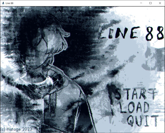

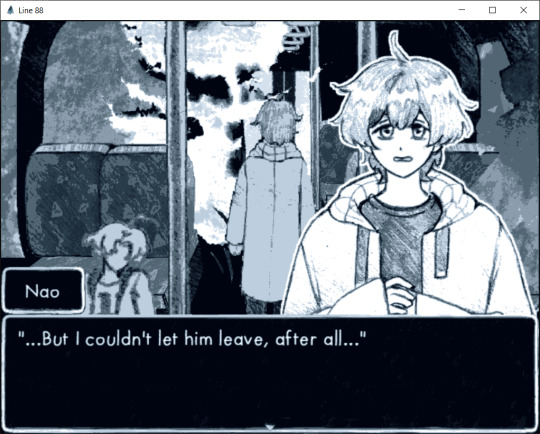
Line 88 (Visual Novel)
Created by: Hatoge
Genre: Horror/BL
I was pretty happy to see Hatoge participate in this year's #yanjam because their last year's submission, Mistrick was very fun to play. Line 88 is a kinetic novel, meaning there are no choices, but it was still a good experience. It was pretty laggy from my experience due to the repeating backgrounds and effects, though maybe it's just my computer having some problems. If you like their games, you can view more at @hatogedev.
The story starts with Nao riding the bus to work, at least until the person next to him starts to talk to him. As it turns out, it was one of his high school friends, Siren who seems to have recognized him. Siren starts chatting away at him, asking about his work and even asking for his number. The lights in the bus start to flicker, and Nao and Siren are left alone in an empty bus. Nao seems a bit freaked out, while Siren plays it cool, stating that everyone had probably gone to the front to complain to the bus driver. The two of then walk to the front in the never ending bus and as they walk, they talk about various things. Siren remains cheerful while Nao seems nervous about talking to him, worried about the fact that they seem to be going nowhere fast. The bus changes around them- they see something flicker in the distance, and plants start to grow in the seats around them. They talk about the past, how Siren would hang out with Nao and how hurt he felt when Nao moved away suddenly without a word. Nao tells Siren that he was afraid that Siren would throw him away and that he would get too attached, while Siren was afraid that he had come on too strongly to Nao. Nao was afraid that Siren would get bored of him and didn't want to be alone so pushed him away. Siren offers to hang out with Nao after they get out- inviting them to karaoke. Nao seems hesitant, but Siren tries to comfort him by telling him that his girlfriend used to be afraid of singing as well, and that he will introduce the both of them. Siren even tells Nao the reason that he was on the bus was to go meet her. They end up finally reaching the front door, however, it seems locked and the two are trapped. As they walk around trying to find a way out, Siren becomes exhausted and sleeps in one of the benches.
While sleeping, Nao ends up talking to the thing that was flickering in front of the two while walking in the bus. Nao talks about how he left Siren behind for his own good that he was afraid of him finding out about his true self (namely what is going on in the bus). He seems to have really wanted to leave together, that he liked Siren because he always was there for him, but once he found out about his girlfriend, knew that he would choose her over him. Nao leaves the bus, warning that if the thing hurt Siren, he would cause it a fate worse than death. He promises that he will bring back food for it, namely Siren's girlfriend and that they will never be alone again.
First of all, I really love the art style. I'm a big fan of Hatoge's general art style, but I'm also a big nerd for the more sketchy types as well! I think it really adds to the whole atmosphere (and I bet it makes it a lot easier to make too haha). I think I did mention this before but I'm more partial to the cartoony style of Mistrick which is the same style they used in this game since it makes the characters more identifiable and have more life.
I'll be honest, I'm not sure if it was intended, but I did think that Siren was going to be the yandere in this. His name is sort of strange (invocative of Sirens that sing to draw their prey in), the fact that he's a lot more persistent when interacting with Nao and the fact that he seems pretty nonchalant about the situation despite it being strange. Of course all that goes out of the window when Siren mentions that he has a girlfriend leaving only Nao to be the yandere. Nao for the most part seems nervous about going near Siren and is nervous about what is going on in the bus. From what it seems like in the end, Nao's nervousness was what causes the bus to become what it is, with him initially going to let go of Siren until he heard about his girlfriend. Nao it seems is a reluctant yandere since he initially pushes away Siren because he doesn't want to get too attached to him and his fear of abandonment and when Siren persists, he becomes (re) attached to him. It is interesting to see this kind reversal near the end when Nao keeps Siren and gets rid of his girlfriend, seeing as it seemed like he would have let him go had he not mentioned his girlfriend. I am curious how Nao exactly got this beast or ability or if it was something that he was born with, but it does add to the horror aspect of the story. Now that they are all stuck together, I wonder what kind of adventures they may have with each other.
Anyways, Line 88 is a very good game. I do kind of wish it wasn't as laggy, but other than that, I very much enjoyed it. It was simple and I didn't expect the yandere turn at the end. If you like hatoge's games like Mistrick or Misfiction or you like more horroresque yanderes, this game is something you should play.
35 notes
·
View notes
Text
THE AMAZING DIGITAL CIRCUS: PILOT
A Promising Premise with a Playful Plot
SPOILERS AHEAD
youtube
I’ll be upfront: I don’t like clowns. I’m not afraid of them, but something about them makes me… uncomfortable. Overly joyous, bright and flashy, and more effective at drawing in a crowd of those goblins we call “children” than a box of Capri-Sun. The Amazing Digital Circus (which will henceforth be referred to in this article as TADC) plays with the vibes I get from clowns perfectly, goblin children and all.
Quick plot synopsis! We find ourselves inside the titular Amazing Digital Circus, a virtual world in which a wacky cast of characters have been trapped for an unknown amount of time. The story follows Pomni, the newcomer, as she tries to escape the circus and get back to the real world without losing her mind. After meeting the other suckers trapped in this world (and then running away from one of them), Pomni finds an exit door free-standing in the middle of the tent. After running through a Backrooms-like facility, her efforts turn out to be all for naught, since the ringmaster Caine hasn’t even finished building the exit. Whoopsies! Yeah, a bunch of other stuff happens, but the B-plot isn’t really as interesting as Pomni’s journey.
I’m going to start the actual review part of this article with the art and animation. The love and care put into making the characters feel alive is not to be overlooked, and it’s clear that the team behind TADC took care in making sure the animation was the best it could be. The characters are expressive in the way they walk, run, and use their hands. Each design is unique and fun, with none of them being standout great and none lagging behind. My personal favorite design is Caine, who is as wonderfully ridiculous as the circus he runs. An honorable mention to Gangle, whose ribbon body leads to some genuinely funny goofs and gaffs in the show. I think the only character design I have problems with is Zooble, a mishmash of multicolored parts of many styles. It’s a neat idea in concept, and Gooseworx’s previous works prove abstract designs can be pulled off well, but Zooble is way too cluttered for my tastes.
Something I really enjoy about TADC is how well it pulls off sound. Music production and voice acting are my hobbies and sound work is my job, so it's always nice to see a show or movie pull off sound well. Goofy character movements are often accentuated by bouncy and cartoony sound effects, and the overall mixing and mastering of the episode is high-quality. At no point did it feel like any character was too loud or too quiet, too bland or too overeffected. I like the subtle changes in reverb as the camera switches to a new point of view, a thing that in hindsight seems obvious but many people may miss when making a show like this. I must also commend the voice actors and voice directors for their amazing work bringing these characters to life and giving them personality. As soon as I heard Caine in the promotional material, I realized it was a complete no-brainer to bring on Alex Rochon to use the Spamton voice from his Deltarune dubs. I also must point out Michael Kovach's work as Jax, being just obnoxious enough to make you want to hate him but not enough to stop you from absolutely loving him. The music is also fantastic, as one comes to expect from the talented hands of Gooseworx. It should come as no surprise that my favorite track from the pilot is Your New Home, and I seem to be far from the only one with that opinion.
Unfortunately, it's not all sunshine and rainbows with TADC. I do have one major gripe with the show, and that's the writing. The story is intriguing and entertaining, but a lot of dialogue near the beginning of the episode falls flat for me. It's a good script assisted by great VAs, but it really does feel like some of the dialogue is trying to cram in lots of information in a shorter time frame, to the point where some of it feels stilted and drags on. However, I suppose I can understand why this is the case. A pilot is a way for a show to tell the audience what it's doing, what it's about, and why you should watch. Thus, it's reasonable to put more information into a pilot than feels necessary, so that you don't need to take as long to get someone hooked.
All in all, TADC is a lovely show that I highly recommend checking out if you haven't already, and I wish the best of luck to GLITCH, Gooseworx, and the rest of the team in funding a full season of this show.
FINAL RATING:
A Breaking Point out of 10
- Rock
#the amazing digital circus#tadc#tadc caine#tadc pomni#tadc jax#tadc zooble#tadc kinger#gooseworx#tadc review#iconsumecontent
10 notes
·
View notes
Text
This sounds a bit sad, but I'm someone who used to have absolutely zero faith in my artistic abilities. I've been writing my entire life, and haven't had too many self-confidence issues with that (well, I've gotten down on myself about my writing before, but I've gotten a lot better about that). I've always known I have the ability to write, as I've been doing it almost my entire life.
But drawing was a different story. I used to always tell myself "Ha! I just need to stick to writing. I'll never be able to draw. Are you kidding? Look at all of these talented artists. And look at these gorgeous realistic anatomy they can do!! I'll never be able to do that. I have no artistic ability whatsoever. It's just not my thing."
That was really my first mistake, comparing myself to other artists, and judging my ability to draw before I even tried. But another thing that really lowered my confidence in my artistic abilities was this one moment in my English class my Sophomore year of high school. We had this assignment to make a short comic based on the story The Fall of the House of Usher by Edgar Allen Poe. I'm sure everyone knows that story. I did mine, and forgot to sign it at first, and my teacher saw. He was always a harsh grader, but he held up my paper, not knowing it was mine, and called it Kindergarten work. In front of the entire class. Needless to say, I was mortified. I immediately redid the assignment, losing almost all of my faith in my own artistic abilities.
But something changed when the Pandemic hit. I got an iPad, which made digital drawing so much easier and more fun. And I just had a lot of time on my hands because of lockdowns. And I thought to myself: Huh. Well, maybe I don't have to draw realistically. Maybe I can practice my drawing skills more by drawing more cartoony art.
And that's exactly what I did. And now I'm proud to say I'm actually confident in my art now!! I sort of have my own style now, which has definitely evolved over the years. I guess that's just what can happen when you practice and try to push aside the self-doubt festering in the back of your mind. It wasn't always easy, but I kept trying to encourage myself instead of just putting myself down.
Now I can proudly say that I've gotten paid for my art, and my clients were all thrilled with the results so far. And I can't wait to keep drawing for people and making them happy. I think I've definitely come a long way from so-called "Kindergarten work".
#personal#doodler's daydreams#drawing has now become on my absolute favorite hobbies#now i don't know what i'd do without it#i think i've just been thinking about art a lot considering i managed to make an art piece for EVERY SINGLE DAY of roudise week#that was a massive accomplishment for me and i want to try doing that again for more ship weeks/other events#if boblin week happens again this coming may y'all better get ready#anyway who's laughing now tenth grade english teacher!! look i've gotten paid for my art now i have the right to brag a little~
3 notes
·
View notes
Text
I HAVE FINALLY DEFEATED RUINA!!
After that, I tried lobotomy corporation and Limbus. Playing both a fair bit to get a good sense for them before making any judgments. These are my thoughts so I can come back, and any mutuals can ingest my thoughts. Because I do recommend all 3, but want to clarify why. With minimal spoilers other than names of characters met right off the bat.
Library of Ruina
Card/War Game - It's kinda hard to describe. You have an entire team and complete control of what's in their decks. Able to customize and use whatever play style you see fit. With each floor/team having unique unlockable abilities to further specific play styles. You face waves of enemies with your teams. Sometimes only one wave or one powerful boss. Many fights are battles of attrition, (Philip and your 7 stage fight you rat bastard) or if that's too hard you can always (just about anyways) unga-bunga your way through things. Some of my hardest fights became trivial when I gave up strategy and just HIT IT HARDER, REPEATEDLY!!
Stress - 6/10 Rising Stress. It starts out pretty manageable. Not an easy game, not a hard game. But difficulty spikes beware!! The final stretch of the game is a lot of really hard fights back to back. It is mentally exhausting. It took literal weeks for me to get through. Beating one maybe 2 bosses a day if I was lucky, and that is just the final stretch. This starts about the middle of the game and rises. So unless you like/can manage high tension and stressful game sessions. I don't recommend for relaxing. It is not a relaxing game. It is a 'clear your schedule because this will be all you have energy for' kinda game.
Style - Sprites are great! The horrors look horrifying and the cute things look cute! They have a fully animated anime opening. Each character design is unique and if you put a Ruina character in front of me. 7/10 times id be able to tell! Each one is charming in their own right! Does have an issue with text on cards being so tiny you can't fucking read them. So I often had to look up cards/bosses on the wiki just to read their effects. So beware my fellow shitty eyesight friends.
Lobotomy Corp
Management Gameplay - Lots of facets and things to handle. Very good game for this genre. Tutorial is good at explaining everything! Walking you through every important step. Disclaimer: I just suck at these types of games. Which does effect my opinion.
Stress - 8/10 Again, I suck at management games. I played to max out the first two teams. Then I got too shaky and stressed.
Style - Functional for the game it is! It does share the Library of Ruina problem of 'WHY THE FUCK IS ALL THIS IMPORTANT TEXT SO TINY MY SHITTY EYES CANNOT READ IT!!?!' Other than that it is cartoony and cute. While being able to express all the horrifying things that come with the setting. 10/10
Limbus Company
Gacha Game! - I love gacha games, but my luck is dog shit. So they don't love me that's for sure. The actual combat is simpler than RUINA and eaiser to read. Also way faster. While still being pretty complex allowing for strategy.
Stress - 4/10 Way less stressful than RUINA and Lobotomy Corp. Still enough I have to think about what I'm doing. It's a good pass your time game. Instead of a - 'I must have a clear schedule today so I can throw myself at this one obstacle over and over again without interruption' - kind of game.
Style - You can see the sprites are a big step up. The animation in combat is also way more fluid. Everyone is fitted and looking great as usual. (except Vergil who looks like the bus hit a bump and he fell out of bed after a hell of a bender then refused to bathe or change that morning) Personally, outside of Charon and Dante (MC), no character really stuck out to me though. Not to say the designs aren't appealing. They just hit you with a lot of characters at once instead of a slow introduction to each. Which makes it hard to focus on any one in particular.
Well, that's my thoughts for anyone who has nothing better to read! Thank you random person who convinced me to buy these games when they were on sale. Best $16 I've ever spent! Highly recommend even at full price if one of these games sound like your kind of game! Each were released within 2 years of each other. Showing vast improvement between each game despite that small amount of time! You can also play any game in any order, and still get the full story!
For anyone who has already played these games and read anyways. Hello!
#library of ruina#lobotomy corporation#limbus company#hmmmmm#game opinions#this is also a journal because I'm a forgetful fuck and will keep replaying the games if i forget what my thoughts were#note i played the early game for both#this has no bearing on the later levels and is based entirely on my own opinion
9 notes
·
View notes
Note
Have you answered Q21 and 30 yet? Would love to hear your thoughts on those :o
21. Art styles nothing like your own but you like anyways
hi chiko!
I think I tried so many different styles over the years, and bc of art school I can probably draw in cartoony or anime styles pretty alright, so I won't pick any kind of animation adjacent styles for this one!

Edward Gorey, Ronald Searle


Norman Rockwell, J.C. Leyendecker
Dean Cornwall, Mead Schaeffer
30. What piece of yours do you think is underrated
this one is tough! as I haven't been drawing a lot of full pieces/posting very very sporadically this year.
like what is considered "underrated"? is it notes? funny enough I think before the pandemic my art used to get more notes, so, would someone consider my recent works "underrated" in that sense? it's tricky. 🤔 I know it's easy to blame the algorithm but there are so many factors at play that we cannot qualitatively control for. being on the right platform at the right time, drawing for the right fandom at the right time, catering to a suitable audience, how you format the post (like do you show closeups or just post the full illust or crop your art? do you just post a video instead??), and a suitable caption (e.g. something witty, relatable, funny, or just something basic like emojis or just 1 word)
for me I consider a work "underrated" or underperforming (I think is a better word for it), is if the drawing is not interesting enough that nothing is said about it. either about either subject matter or artistic techniques. for me connecting to others through art is so integral to the artist experience. if a post gets 1000 notes but it gets 0 comments, then i consider it a failure. if something gets 100 notes but it gets many comments, i would consider it the opposite of "underrated'.
like would original drawings be more underrated than fanart? 🤔 people have trouble connecting to ocs since they don't know the source material, so often those kinds of posts would get less notes or less comments. just interesting things to think about.
it's easy to go into the archive and look at the older stuff that possibly didn't get seen around as much, but i'll try to pull some more recent pieces.
I think this 6 fanarts did badly in comparison to other works because the trend appeared in 2020 but I wasn't able to complete this that year ^__T and the trend didn't come back in 2021... guess I'm not a trend setter..................... sighs 😔 haha
I do want to try this kind of fanart compilation again though! I'm bad at drawing under pressure though so I would have to come up with my own prompts...
this Kekkai Sensen x Trigun piece! I think the crossover alienated fans of both series bc you had to enjoy both T__T and I also didn't draw characters from either series interacting so I don't think it ended up that interesting? bc I wanted to make this a diptych (it's clear that there's a middle divide now that I mention it) but the triptych didn't end up happening!
besides both being created by Yasuhiro Nightow, I haven't come across that many fans who are fans of both, actually...? it's not in the case where the author's work is more or less similar in tone (or same universe), like Baccano x Durarara, Pandora Hearts x Vanitas no Carte, Higurashi x Umineko. I think something like trigun x cowboy bebop would have worked better because people are always unfortunately comparing the two hahahaha.
20 notes
·
View notes
Text
Review: The Flash: Rebirth
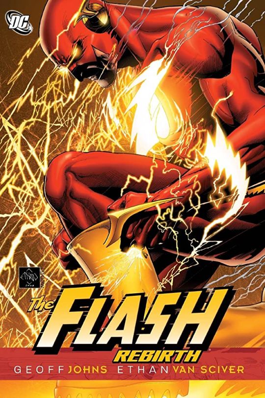
A Good Attempt at Fixing the Title That Doesn't Work for Me
There is no one in the comics industry who is better than Geoff Johns when it comes to taking convoluted continuity and streamlining it into something that is exciting and readable for both newer and long-time readers. This is why he's consistently been one of the most commercially successful comics writers of the modern era. The list of characters that he's revived for DC is staggering: Teen Titans, the Justice Society, Green Lantern, Hawkman, and Aquaman. All of these titles were languishing before he turned them around with his magic touch. He actually did this for the Flash once before in the early 2000's, but after Barry Allen returned in Final Crisis, Johns also came back to the title to hopefully kick-start a new era for the Scarlet Speedster. Was he successful? It depends on what you're looking for.
While I admire, on a technical level, the way that Johns is able to massage decades of continuity into one clean narrative, I can't say that I enjoy The Flash: Rebirth. The problem is that the story essentially double-downs on many of the elements of The Flash that I personally don't like: the tendency to try to make the Speed Force more complex than necessary and the fact that, honestly, there are just too many speedsters in the DC Universe.
I realize that the latter may be a point of contention for a lot of fans (and I say this as someone who also likes Johnny and Jesse Quick, Max Mercury, etc.), but nine is simply too many. The Flash family is not a police force like the Green Lantern Corps (and even then there are way too many human GLs) and they only operate in Central City and Hub City, so there's no need for so many of them. Johns tries to make use of all nine in order to stop Thawne's plan, but it ends up ringing false, because it feels like Johns had to massively overpower Thawne in order to justify using the entire Flash family. Obviously, a lot of people were not happy about the New 52, particularly the way that Wally was basically erased, but comparing it with the pre-Flashpoint Flash family demonstrates how much cleaner having only one Flash* makes the DC Universe.
Likewise, I also was not a fan of the way in which Johns expanded the Speed Force. To me, the Speed Force is at its best when it's a fairly simple plot device for explaining the Flash's powers ala the Force in Star Wars. When writers try to overcomplicate it, as many have both before and after Johns, it just comes across as a bunch of pseudo-scientific bullshit.
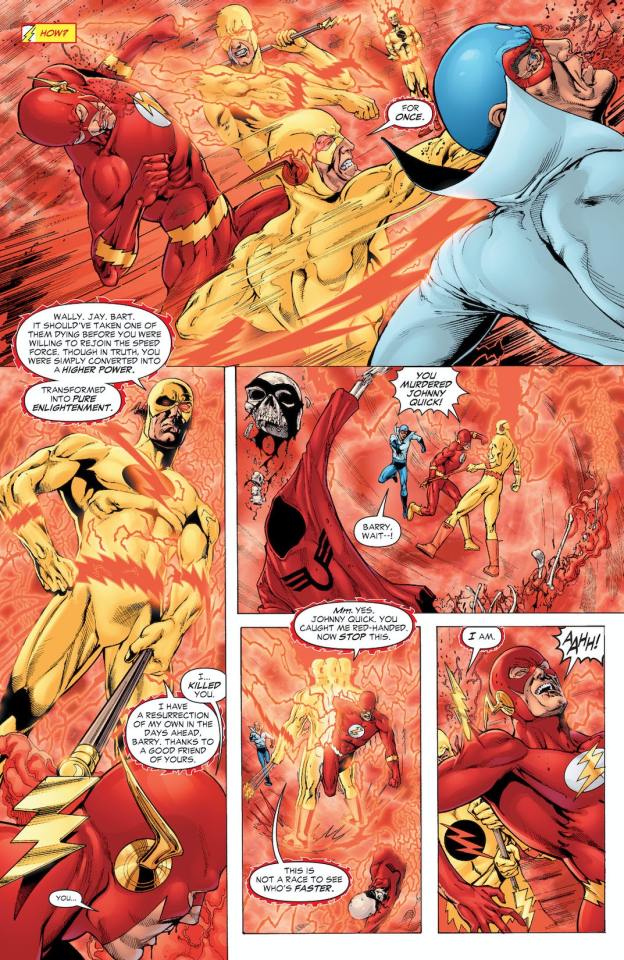
Although the A-plot of The Flash: Rebirth didn’t work for me, the book does shine during the smaller moments, particularly the interactions between characters. Barry Allen isn’t the most dynamic character in the DC universe, but his everyman persona works well in contrast with the bigger personalities of Hal Jordan. Further, his love for Iris, as written by Johns, is both sweet and relatable. One other advantage of Johns’ cinematic storytelling style (especially his use of splash and double-splash pages) is that even when the narrative isn’t working, you still get a lot of really cool moments.
In order to trade in on the success of Green Lantern: Rebirth, Johns’ collaborator from that book, Ethan van Sciver, also provides the art for The Flash: Rebirth. Van Sciver is hated by large portions of the comics internet, which makes it difficult to have any kind of discussion involving him, but if you look at his artwork purely as art, then he is a very good storyteller. Although he works in the same post-Image school as others like Tony S. Daniel, Ed Benes, David Fitch, and Jason Fabok, van Sciver’s fundamentals are much stronger than most of the artists in that school. He has dynamic but clear layouts and his anatomy doesn’t fall in and out of proportion. That said, I don’t really think he’s the best choice for a Flash artist, which, in my mind, needs a more cartoony aesthetic.**
Ultimately, there’s a reason why The Flash: Rebirth doesn’t have the staying power that many of Johns’ other projects do. While the creative team is obviously capable, and Johns knows the Flash as well as anyone, there are just a lot narrative elements that really don’t work. Personally, I tend to believe that Flash stories are often at their best when they tell something very simple, and when you try to stretch them in order to make an event comic, you can see all the cracks and seams. It’s worth noting that, Johns’ first arc on the relaunched Flash title that followed this, The Dastardly Death of the Rogues, was excellent. While The Flash: Rebirth isn’t a great story, if you think of it as a necessary step to get Barry Allen back as the Flash, then it was worthwhile…..but it’s also entirely skippable.
*-Yes, Bart Allen was also in the New 52, but he was in the Teen Titans and had literally no interaction and never appeared in the main Flash title.
**-In my mind, Francis Manapul was the perfect Flash artist. Now that I think of it, I’d also love to see R.B. Silva’s or Mahmud Asrar’s take.
#comics#comic review#2000s comics#flash#the flash#barry allen#wally west#johnny quick#jesse quick#max mercury#bart allen#iris west#geoff johns#ethan van sciver#dc comics#dc#reverse flash
5 notes
·
View notes
Text
Here is the story of my forearm tattoo. I had wanted a tattoo of a sword for a handful of years, since before I was old enough to get a tattoo. At some point it gained the meaning of my struggle with mental health. It didn't start with any meaning, but it got it at some point.
Then just over a year ago I wanted to do something to annoy / shock my mom's family, cause far too much drama. I had enough money saved up, and decided to actually get the tattoo.
I designed it myself. The sword was cartoony, like you'd find in adventure time or old Disney flims, but that's sorta my style. The sword had an uneven blade, cause I've had a fight. I have terrible anxiety and at one point I couldn't go to school. I commonly got the critique of having "just a sword" as a tattoo, mainly by my tattoo - skeptic family. (My sister has one tattoo, and my parents don't mind Tatto as long as they don't get them, nor pay for them). So I decided to as a flower with the meaning of happiness. Now you can get many flower with that meaning, and yet find the same flowers with different meanings. So I decided on Lily of the Valley, which is a unique flower visually, as well as my favorite flower in minecraft. I made a joke that it's my minecraft tattoo.
I made one design I was happy with. I then showed it too my parents, who made some judgemental remarks on it. At the time my mental health still wasn't the best, so I went and made another design that I was not going to show them. I put a lot of work into these designs. I measured out my arm so I'd be drawing it to scale. There had to be like two entire days where I had flower references up on my computer. I put more effort into these than most projects I had in art school.
This is actually my second tattoo, my first is just some Nordic runes, but I still wanted to go to the same studio. Around where I live this studio is the most recommended place to go for tattoos. I decided I'd be fine with two of the artists at the location I wanted to go to. I based it off of other flower tattoos they had done. I just wanted line work, so I wasn't too picky.
I first scheduled a consultation, cause this was my first big thing, and I wanted to share my design. Like I knew the artist would probably change it a bit to make sure it look good as a tattoo, I accepted that. But I still wanted my design to be the heart of it.
Should have probably been suspicious when he tried suggesting a different flower than Lily of the Valley. But my anxiety make me a people pleasure, so I was like "I'd prefer lily of the valley". It had been a virtual consultantation, so he asked me to email him the sketches. I'd assume he'd send his versions when he'd make them, expecially if there was a large divination from my sketches.
The original day for the was only a couple weeks after. However my Dad gave me a bad cold, so I rescheduled to not spread the cold. The new date wasn't until the next month, which I originally wanted the tattoo before Christmas to piss of the extended family, but it probably wouldn't have done anything anyways.
So the day comes, I go in with that mixture of nerves and excitement. He shows me the design. Since he never got back to me, I assumed he stuck pretty close to mine. Nope, the only thing the same was the fact it was a sword and Lily of the Valley, at least he kept the flower the same. But what I drew as a thick broad sword one would hack enemies down with became a delicate saber that I swear I've seen on Pintrest before. I didn't care much about the flower placement, but I wanted that sword. That sword that I imagine in every book, draw on every knight, my thick nonfunctional sword.
But anxiety, I just agreed to it, and told myself I'll grow used to it. I have indeed grown used to it. Even the fact the tip is curved from how my arm was positioned when putting on the stencil. I still wish it was my design though. I'll just look for an artist alright doing the clients designs the next time I'm doing something like this.
Hindsight reveals a lot about the artist. This artist had also been the artist who had done my first tattoo. My friend and I wanted to get tattoos together, like I said mine were Nordic runes, and she wanted song lyrics. He took one look at my friends and said "I can't do that". Which he was an apprentice at the time, but the way he said it was rude.
Then during my session for my sword, of course there was a bit of small talk. I'm an introverted person, so I was on my phone for most of the time. The small talk ended up on videogames, and he wanted to know what kind I liked. Now I go off of graphic and vibe when deciding videogames, so I just told him I was currently playing Hollow Knight and Hades. And he was quick to call them dungeon crawlers, which neither are. I just agreed, cause I didn't care, but looking back seems sorta mansplainy to me.
If it was an option, I wouldn't go back to him. Luckily he recently quit.
0 notes
Note
hi! I love your illustrations, and i was wondering if you had some tips for making wolves/werewolves look more unsettling? I'm going for a more folklore-y vibe but everything i draw comes out looking very... hot furry. which is a good vibe but not the one i'm going for.
Thank you very much :D!!
June was a character I designed to solve the same dilemma! I wanted to make a werewolf that was scary/unsettling but had a more anthro design later in the story.
The first thing is to gather inspiration! Reference and research is incredibly important if you're looking to try a different art style. Look at various cultural art styles and folklore about wolves or lycans and so some style studies. That way you'll find ways to incorporate those styles into the way you draw.
I also looked at various werewolf designs and picked out all my favorites to make what I considered my ‘perfect’ werewolf. With June, I looked at Bad Moon, Van Helsing, Dog Soldiers, Royakan (Inuyasha), Foxx (Gargoyles), and The Beast Of Gevaudan for inspo. I like to tell people that if you can name at least 3 characters/references that influenced your character, congratulations, they're their own unique character! Use your inspirations and build off of them until you create something uniquely your own. And of course add your personal flare as well :>
For a while I tried to combine the two aesthetics which for me became very difficult. If I drew her too ‘scary’ as an anthro she came out with very little energy/personality. If I drew her too anthro, then she was too cartoony and not intimidating. That’s when I remembered We're Back: A Dinosaur's Story and how the dinosaurs had two separate designs. BUT even as a kid, I knew those were the same dinos, whether they were cartoony versions or the scary ones. So I realized, at least for me and for the sake of June’s design, that two designs were needed. One influenced by the more anthro work, and one by the more creepy/folklore look I was going for.
So after I decided on making two designs, I found more references. I followed a bunch of horror artists to see they conveyed unsettling energy in their work. I'm also just a big fan of both horror movies and horror anime, so I will watch a lot of that while drawing to see how to mimic that feeling in the media. June can't control her primal instincts for much of the plot, so I wanted to convey that feral nature and put most of the focus on her eyes, teeth, and claws. She has very few recognizable ‘human’ features and the features emphasized in her design related to various fears people have (scopophobia, dentophobia, and achluophobia).
So that’s my thought process when I do more stylized folklore/horror work! Research, reference, and experimentation. Some of my personal favorite things to go back to when making something unsettling but still animated are Primal and the demon designs in Inuyasha. They're both phenomenal!!!
69 notes
·
View notes
Text
Animation Night 78 - Blender Open Movies
So, the plan tonight was to focus on Northern Irish animation, primarily the work of John McCloskey. Unfortunately I hit the problem that McCloskey’s animations have generally never seen wide release, so with a bit of scouring of the intertubes later, I have had no luck acquiring them.
So it’s time for a plan B!
B in this case stands for Blender.
Let’s roll the clock back to 2006, when a fifteen-year-old Bryn is doing her GCSEs and eagerly posting, in that unselfconscious childlike way, on forums for the open-source CG software Blender. Blender at this point isn’t nearly such a presence as it is now, used in various mainstream productions with a whole industry of tutorial producers. The Cycles raytracer hasn’t been invented, nobody has heard of nodes or sculpting, and even the interface is generally a lighter shade of grey with slightly more colourful buttons.
Here’s something a 13-year-old Bryn made in 2005 in Blender for comparison (a school project):
youtube
So what even is Blender, where did this program come from? Before it became a flagship open source project to compete respectably with the likes of Maya and 3DSMax, not to mention linchpin of 3D erotic art etc., Blender was an in-house animation tool for a Dutch animation studio called NeoGeo (not to be confused with the game console which gave NewGrounds its name). It came into existence around the same time as Toy Story (see Animation Night 75):
The version 1.00 was released in January 1995,[14] with the primary author being company co-owner and software developer Ton Roosendaal. The name Blender was inspired by a song by the Swiss electronic band Yello, from the album Baby which NeoGeo used in its showreel.[15][16][17] Some of the design choices and experiences for Blender were carried over from an earlier software application, called Traces, that Roosendaal developed for NeoGeo on the Commodore Amiga platform during the 1987–1991 period.[18]
Blender outlived NeoGeo, seeing a first release as a freeware program in 1998, then development as shareware until 2002 when Roosendaal’s company went bankrupt again. At this point he started crowdfunding Blender to be released open source, controlled by a not-for-profit Blender Foundation; this was successful and Blender became FOSS. Which is actually very soon before I started using it! A tiny handful of tutorials sprang up around this time, mostly on the Blender website, covering such subjects as Pixar-style eyes.
Alongside them was a forum for users of this obscure kinda janky 3D software, called Blender Artists. (I seem to remember it going by a different name at some point, but if so, that is lost in the mists of time). Nowadays BlenderArtists attracts a lot of very impressive professional-looking work; that was not so back then outside of a tiny handful of users, who were revered as sort of local gods, much to their frustration as artists seeking feedback! But most of us were just kids jumping into computer graphics at the deep end.
Anyway, into this milieu came the ‘Orange Open Movie Project’: a challenge (with Netherlands film board funding) to make a short film using entirely open-source software, primarily Blender, which would push the Blender devs to implement whatever new features the artists might need. The resulting film would be distributed for free under creative commons.
The project was a big success, though perhaps the resulting movie was a little opaque for many viewers! It became a rather enigmatic art film about two people trapped in a vast, surreal chairoscuro machine titled Elephants Dream, which is still striking, and features a great soundtrack by Jan Morgenstern (who became the composer for most of the Open Movies).
youtube
Soon, Blender Open Movies became a semiannual event, starting with the Peach Open Movie Project in 2008 which tried for something much more cartoony, a kind of slapstick cartoon called Big Buck Bunny in which a giant kindly bunny fights a group of sadistic squirrels, pushing them to develop fur and grass rendering features. Subsequently, there was a big group effort to re-render the film at 4k60fps HDR, with the work of rendering frames split between hundreds of different computers.
youtube
The Durian Open Movie Project followed this in 2010, a pretty straightforward fantasy story about a girl adopting a dragon:
youtube
The next fruit on the list was Mango, bringing Tears of Steel, which focused on developing camera tracking and live-action compositing, directed by Ian Hubert. Hubert would later go on to be create many widely watched ‘one minute tutorials’ and embark on a massive film project called Dynamo Dream, the first episode of which dropped earlier this year. Tears of Steel involved human characters interacting with a large robot in real-world environments:
youtube
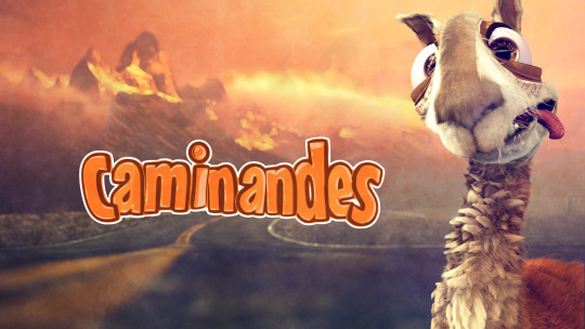
2013 brought the first of the Caminandes series of Chuck Jones-inspired cartoons about an ill-fortuned llama, starting as a small side project of Pablo Vazquez, Beorn Leonard and Francesco Siddi. I’m not sure what fruit named their project, or if this was the beginning of them dropping the fruit naming scheme; in any case it led to two more episodes down the line. Unfortunately I am now at the video limit for a post, so I’m going to have to post still images from here on out!!
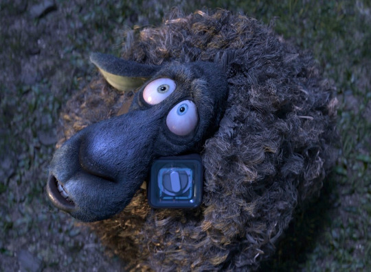
The Gooseberry Open Movie Project created a pilot for what was intended to be an open-source animated feature film called Cosmos Laundromat in which a suicidal sheep is isekaied through a washing machine into a series of strange worlds. The pilot was completed in 2015, but the longer term project sadly seems to have stalled...
Glass Half also dropped in 2015, a tiny short film dir. Sarah Laufer with a heavy emphasis on character acting, the characters speaking in a gibberish language with a cel-shaded, 2D style. (This was not yet Grease Pencil, but using Blender’s 3D graphics tools to make a 2D film!) It features two thumb-shaped art fans arguing about taste, eventually finding unity in their mutual distaste for a third party...
Another attempt to make a feature film came in 2017, with an adaptation of a Dutch comic book character, a comedy spy called Agent 327. So far this has produced a fun little three-minute teaser called Operation Barbershop.
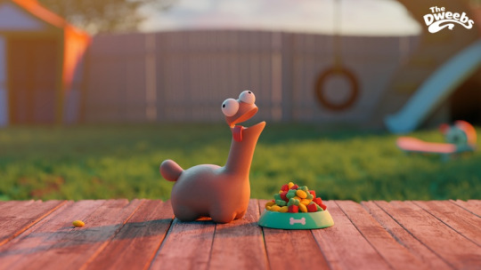
Alongside this was, uh, The Daily Dweebs (2017) by Andy Goralczyk, a one minute film about a weird dog? I don’t know what to say about this one lmao
The next year, the open movie focused on demonstrating the capabilities of the new Grease Pencil 2D-in-3D tool, with a short film called Hero (2018) dir. Daniel Martinez Lara. Grease Pencil has since seen a pretty enthusiastic adoption by at least some parts of the 2D film industry, used to make films like J’ai Perdu mon Corps (Animation Night 32) and adopted by anime animators like Ryo-Timo. In my experience, Grease Pencil takes a lot of getting used to if you’re familiar with a raster workflow but it has a lot of potential for bridging the gap between the ease of drawing with a tablet, and the computer-facility of vector animation...
Two years ago we got Spring (2019), a film in the vein of Hilda about a girl interacting with mythological creatures again dir. Andy Goralczyk, inspired apparently by his childhood in Germany. Naturally this emphasises environment rendering, with some really gorgeous shots...
The next year Hjalti Hjalmarsson directs another 2D short, this one a very short (three minutes) but visually rich loop in which a girl through her memories titled Coffee Run (2020).
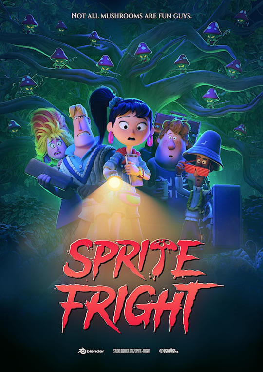
And that brings us to the most recent Open Movie Project, which landed just a few days ago! Sprite Fight is a very violent little cartoon riffing on 80s movies, in which a group of humans are slaughtered by murderous smurflike mushroom guys for their disrespect of nature. Featuring all sorts of uh little mushroom guy guro i guess lmao. I actually already showed this one a few days ago after my films wouldn’t download on Toku Tuesday, but now you get to see it again... in context!
So what to say of the phenomenon of Blender Open Movies? Do they represent a new paradigm of filmmaking or something - a way out of the dead end of capitalist media production and copyright?
Only somewhat; Blender Studios are able to pay their animators thanks to extensive crowdfunding measures and support from primarily the Dutch government, which doesn’t mean it’s not still really good that we have a very talented CG animation studio putting out all their work, including the assets used to make the film, under Creative Commons. As a model it kind of depends on creating a unified identity around being a user of particular software, the ‘Blender community’, with its weird loyalisms and
The most interesting thing about these films is inevitably how they were made: by being done in the open, have a way of illustrating just what an insane amount of work and organisation goes into making even a short animated film; I recall being part of an effort to make more volunteer-driven ‘community organised’ short film around the time of Big Buck Bunny, which I’m sure you’ll be shocked to hear basically fell apart after the initial burst of enthusiasm for planning and asset creation. The fact that they are still making films more than 15 years after Elephants Dream is really impressive.
Artistically... these films are very polished, usually with a lot of technical animation skill which makes them hold up well in comparison to other CG short films; they often tend to be at least surprising enough to not disappear into being simple tech demos. Elephants Dream in particular stands as particularly unique, to the point that I’m not sure what I could compare it to; perhaps the short film Dream of Kafka we saw at Annecy? Some of the cartoony ones also fare very well, in that they take a suitable glee in violence! That said, one can imagine how they are limited by the burden of being the flagship Blender Open Movies, representing the tribe of Blender to the wider ‘CG community’. But still, I’m very fond of them, they were a big part of my early animatorly aspirations...
Animation Night 78 will be starting very soon; please head over to twitch.tv/canmom while I get set up! Along with the Open Movies, I’m also going to show some of Ian Hubert’s more recent work, and if anyone knows of other noteworthy Blender works, throw em my way and hopefully we can include em~
15 notes
·
View notes
Text
I binge-watched the spn anime because of the brain rot
It’s bad except for the parts that are good, and it’s pretty to look at. Here’s a comprehensive list of pros and cons. Spoilers ahead!
Pros:
- more psychic kid backstories: Max (Nightmare), Lily (Darkness Calling), Jake (Loser)
- more psychic Sam
- more Azazel
- basically if you want more about the psychic/demon kids, watch the anime
- more young Winchesters
- the monsters, the superhuman abilities, the fight scenes, it all looks really cool animated. (But PSA it’s violent. It doesn’t shy away from blood and gore.)
- Sam and Jessica backstory
- more of the brothers being cute and funny together
- Missouri isn’t forgotten
- includes some Japanese legends/mythology
- the impala looks great in every scene. They did Baby good
- the “Supernatural” intro title
- the outro sketches of the boys hanging out with Baby
- Episodes adapted from the original show are different, but I like some of the changes? It’d be boring if it was an exact retelling and the visual medium wasn’t utilized. (I know I said spoilers before, but this is when they get detailed. If you wanna skip over, I’ll tell you where they STOP.)
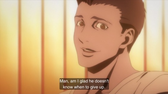
Nightmare goes more into the abuse Max has suffered. Instead of locking Sam in a closet, Max sends Sam through the floor and covers the hole by breaking his bed in half, and it’s extremely sexy how Sam shoves the 2 halves apart with his mind. Later on Dean puts bandaids on Sam and they talk about demons loudly in front of a fast food intercom.
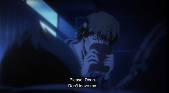
In My Time of Dying highlights the guilt Sam feels over Dean. In both the og and the anime John verbally blames Sam for not shooting Azazel, but where in the og Sam goes right on arguing, in the anime he reels back for a moment like he was slapped. Dean’s spirit touches Sam’s shoulder, and Sam knows immediately that it’s Dean. He doesn’t even question it. Instead of “Are you here?” it’s “I know you’re with me. I can feel it.” And I love that. Dean figures out right away he’s dealing with a reaper, and the reaper takes on the appearance of Mary to convince Dean to move on to the afterlife. Instead of a Ouija board, Sam uses a laptop to talk to Dean, and the first word Dean types is “Sammy!” Dean is so fond of his little brother and Sam is so baby.
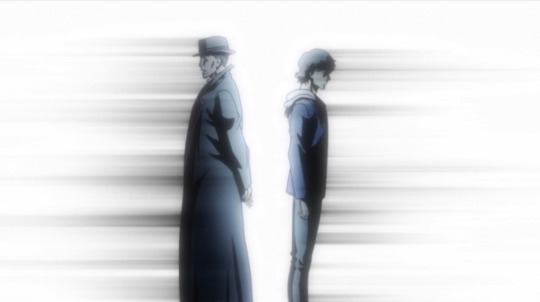
Rising Son is an anime only episode, but it draws inspiration from John’s journal. Dean has a proper breakdown over his dad’s death and the possibility of having to kill Sam. Ms. Lyle, Sam’s favorite teacher who turns out to be possessed, is explored. John takes Dean hunting, and in the journal Dean hesitates to shoot a buck, and little Sam shoots it thinking it was endangering Dean. In the anime, Dean’s cornered by a moose and Sam makes it explode with his mind and it’s so !!! How little Sam’s first words are, “I’m glad you’re okay. It didn’t hurt you?” The boys are covered in blood and guts and Dean’s like 👁👄👁 “Why are you here? Did you do this?” And then Sam starts freaking out a little, the shock sets in. “I don’t know. I don’t know, honest.” And he’s staring at his hands, and I am a big fan of Sam showing superhuman signs as a kid. Like in the journal, Ms. Lyle tries to take Sam. She gives Sam the illusion of a choice to come with her or stay with Dean, and Sam chooses Dean. This ep is pretty much when John figures out Sam has demon blood. He kills another hunter that wants to kill Sam.
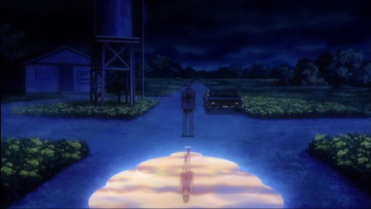
Crossroad is based on Crossroad Blues, and I love how the crossroads demon shows up. It’s hard to describe, but it’s so neat, like she’s walking underneath Dean in this mirror world, and then the mirror world takes over the regular world, so you really get this sense of otherworldly seclusion, existing outside of time.
What Is and Should Never Be shows Dean is a firefighter in his ‘Mary never died’ world, and Sam got to play soccer growing up like he wanted. The brothers hold each other after Dean is saved from the Djinn.
AHBL part 1. When Azazel shows Sam that he fed Sam his blood, Sam gags and slaps a hand over his mouth, and I like that reaction more than the live action. The psychic kids get to go more anime with their powers, and that’s a lot of fun. They don’t need weapons. Ava slams Sam into the brick side of a building and cuts him without touching him. Jake snaps Ava’s neck with one hand and then catches Sam in his arms. When Jake attacks Sam, there’s no gun or knife. He’s relying on his super strength, his fists. Sam throws his arms up to protect himself, and (accidentally?) pushes Jake back with his mind, and the collision creates a crater in the ground. Jake puts his fist through Sam’s chest to kill him. It’s brutal and it’s rad as fuck. These kids are terrifyingly powerful.
The Sam and Dean reunion before Sam is killed is not as emotional as the live action imo, but what the anime does intrigues me. Hurts in a different way. Because Sam is stunned after he uses telekinesis again, on Jake, and when he hears Dean behind him Sam freezes. He doesn’t look relieved to see Dean, but wary and weary. It’s Dean taking steps towards him, not the other way around, and it has to be because Sam doesn’t know if Dean saw him push Jake back. Sam doesn’t know how Dean’s going to respond to all this, to him, having powers that come from a demon, the demon, Azazel. Sam hasn’t had a chance to process anything. He’s scared. He’s tired. And the way the anime focuses on Sam’s eyes here. Gah. “Dean. Dean, I’m...” I’m sorry. I’m all right. I’m glad you’re okay. I’m a monster. There’s also this one shot between Sam and Azazel that sends me because of how anime it is.
AHBL part 2. I love how Sam brought back to life is animated, with all the color returning to his face and a light wind rustling his hair and his lips parting to indicate his soul returning to his body. Jake attacks Dean, and, a lot like how Sam activates telekinesis to save Dean from Max in Nightmare, Sam gets a burst of superhuman strength. He rips Jake’s arm off and tackles him to the ground and beats him to death, punches holes into his body, and it’s so savage and bloody and scary, and I love it. The Devil’s Gate opening looks so cool animated. Same goes for Dean shooting Azazel with the Colt.
Not to turn this into a meta post, but I also noticed how the last couple times Sam uses his powers they’re colored green-yellow, the same colors as Mary’s ghost when she reveals herself in the anime’s Home, and I don’t know if that’s intentional, but it’s neat how it draws a connection to Sam’s biological family instead of Azazel’s blood.
The Spirit of Vegas is like Bad Day at Black Rock, but Dean has all the bad luck instead, and it shows off the silly cartoony physics that make animation fun. The boys sleep outside and split a chunk of bread for dinner. Also this lil bit of Dean’s hair tied in a bow.
- (STOP) the brothers are pretty. I am not immune to animated Sam and Dean Winchester.
Cons:
- Jensen doesn’t voice Dean until the last 2 episodes
- The English dialogue is really bad sometimes. I wish I could’ve watched the sub, but I couldn’t figure out how to change the language
- Some character designs are really different from the live action, and maybe that’s petty, but if you’re gonna change the characters diversify them? Don’t just make them unrecognizable white people
- Missouri’s design as a stereotypical witch doctor is racist
- Gordon is replaced by some British guy named Jason?? Why
- There’s an LGBT character who is not accepted by her family and, while that bigotry is always shown to be negative and she dies the hero of the episode, she still dies ://
- In the English dub Lily’s gf is made into her roommate instead. Idk about the sub
- Bobby’s pretty much a totally different character
- Sam and Dean are OOC sometimes
- Dean’s hair usually looks darker than Sam’s and it drives me crazy
- The storytelling is, overall, not nearly as good as the live action
- The non-Japanese lore in some episodes makes no sense. Sometimes it’s just plain ridiculous?? Like there’s a giant robot made of cars and scrap metal controlled by a demon? ? I wish I was making this up
- Meg’s role is severely reduced
- No Harvelles or Roadhouse
- Shadows are overused, but maybe that’s because the og show is so dark?
- I don’t mind the art style. I like the aesthetic, but I wish it was a little more expressive. It doesn’t do Sam’s puppy eyes justice.
- AZAZEL’S SHADOW?? PROPORTIONS?? PEA SIZED HEAD

- Idk why they mashed season 1 and 2 together? The story feels rushed
- there’s not as much chemistry between Sam and Dean, but that’s a given without J2 on screen
- Nobody tells you!! That there’s scenes after the credits!! And some of them are important! Why are important scenes after the credits??
The anime would not be good on its own, without the heart and depth the live action brings, but it works as supplementary material you can cherry pick from. I would watch more if there were more episodes.
It hasn’t turned me off from wanting an spn anime. I’d like to see it continued or redone, with updated animation and better scripts. There’s a lot of potential in exploring more about the psychic kids and Sam’s powers, storylines that were cut short in the og show. Animation is a great medium for showing off the supernatural, getting creative and creepier with the designs, dramatic with the fight scenes, without having to worry about bad CGI. I don’t want a live action reboot, but I think a redone animated series could be a lot of fun! (As long as it’s not an excuse to make any romantic ships take over. SPN is a platonic love story, and I like it that way.)
If you made it to the end here and are interested in watching the spn anime, you can watch it for free on the CW Seed app! You can probably stream it elsewhere, but idk where!
#spn anime#supernatural#supernatural the anime#my detailed pros is pretty much me letting you know what episodes are worth watching#and why#its bad but I kind of like it#I like what they were going for. the potential it has#I like sam and there's lots of sam
65 notes
·
View notes
Text
My Hero Academia Character Design Analysis
My favorite thing about My Hero Academia is how the characters are cleverly created in their designs. I love the series for its simple yet complex character designs.
I wanted to share this with others so I created this so you could get a better idea of designing your Ocs for My Hero Academia. BNHA is a shout out to superheroes of Marvel and DC since the entirety of BNHA is composed of heroes since they’re the important aspect of the series, you can base your OCs and their quirk on a superhero or supervillain you know and use them as reference. They also don’t have to be based on superheroes and villains either; it's alright to base them on people or yourself when you’re designing them.
What is your OC inspired by? That would be something you will answer in your design. As Horikoshi said in an interview, it's important to feel inspired. You can take inspiration from just about anywhere from down to scotch tape and earphones. So go out, take a walk, shower and the inspiration will come right there.
The series BNHA has basic character design elements, but BNHA fully utilizes this basic character design. You see how the simple shapes are incorporated in their design and how they tell a lot about a character. What kind of elements that go into a design is an important aspect to know what makes the character stand out as themselves and show their quirks which come up a lot in their design. Though I am going to talk about how to design your characters I am also going to talk about how to choose their names, quirks, hero costumes, and hero names.
Shapes and “what goes into the design” is an important aspect. but first I am going over the design before I elaborate on these aspects. Let's start on how these designs utilize simple shapes and “what goes into it” for the design components.
Designs:
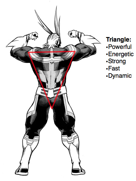
All Might
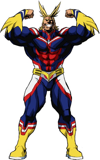
Let’s get started with the titular hero of the series and the greatest of all time: All Might. As you see his design encompasses two simple shapes in both his muscle form and true form being both a square and a triangle. These shapes in both his forms convey a lot about his personality. You see All Might is defined with two basic shapes in his design. All Might's muscle form consists of a solid square. Horikoshi’s design features in All Might are his eyes in which he uses to convey his personality If you look at All Might’s face even his eyes share this shape. What could the square say about All Might in terms of role and personality?
Look at how square are used in design squares when used in the design are known to be Ordered, bold, strong, dependable, stable, strong, confident, solid, balanced, grounded. Squares are large and comforting, slightly clumsy, and are considered masculine in shape. Squares make us feel safe and contained gives a sense of security and stability. They symbolize fortitude or someone strong and steadfast. Squares are commonly used for superheroes with the square jawline in their faces. These aspects of All Might’s personality are visible in the overall appearance of his muscle form since both his face and eyes are square-shaped, which bears the similar jawline you see in heroes in cartoons.
But for All Might, squares don’t only convey his heroism, they also say something about his strength and determination. All Might give the impression of strength when in his muscle form All Might is the world's strongest hero, steadfast and determined when it comes to saving people no matter the cost. This determination pushes through to defeat powerful villains to save the day.

Squares reflects All Might’s role in keeping societal order as the symbol of peace, in which he inspires others to feel safe and secure, smiling to keep people at ease with his presence. All Might’s presence emits strength and reassurance to others which causes people to easily trust him due to it. Much like how the squares make people feel safe and contained with its presence. Surface-wise he comes off as sturdy, dependable embodying overall confident
but underneath he’s clumsy at certain aspects he may be a great hero but as a teacher, he’s clumsy at teaching.
Speaking of clumsy, let's move on to All Might’s true form.
All Might’s true form’s shape is angular in many aspects of his design. It doesn’t harbor the solid square that his muscle form has. The triangle is symbolic of All Might in many ways it conveys his personality differently than what the muscle form’s shape square does: his true form which is lanky and skinny in contrast to his public persona he displays he’s more insecure in certain aspects. Squares symbolize balance; triangles are lopsided and imbalanced because of the shape they have. All Might’s true form's face has an angular and lopsided triangle pointed down symbolizes the imbalance that he has in his life.

All Might’s private life is always in constant disorder since he got his injury from AFO, he struggles to maintain his work ethic despite injury limiting the amount of hero work he does, the prophecy of his upcoming death from Nighteye since during their falling out, his time of the symbol of peace running out, the fact he feels he only smiles to hide his fear of losing his power, he struggles to keep OFA a secret, even after All Might retired from his hero work and lost his power when fighting AFO he has his insecurities after he lost his strength he feels powerless when he can’t help others plus on top finding out that Tomura was his master grandson. The triangle reflects his insecurities with and without his quirk, he lacks the confidence his muscle form gave off the triangle notes this aspect of his character. The triangle seen in his face pointed down symbolizes imbalance and his lack of stability and balance in his personal life. Think of how hard he tries to juggle all these things back and forth and has a hard time managing all these things in his hero work and personal life. All Might’s life is a constant of constant imbalances.
His muscle form has a triangle it has another shape that shares his true form
they both have a similar shape but have different meanings and impressions where for All Might’s muscle form triangle points up whitish his true forms triangle points down conveys something differently about his muscle form that his true form didn’t. Unlike how the triangle pointed down symbolizes imbalance, the triangle pointed up symbolizes power. The triangles pointed upright are very strong and dynamic. Although All Might's muscle form is a square, it has a triangle hidden in the triangles that have a sort of energy and power in them in which it’s upright; the position represents his stability and power of OFA. All Might is strong and fast in his abilities as a hero and dynamic when he appears on the page.
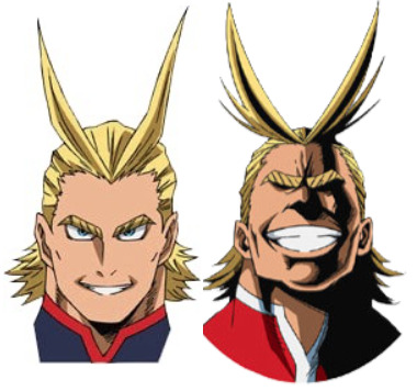
I am going to talk about the lines that are used in All Might’s design since like shapes, lines say something about a character’s personality. Lines are another way to convey a character’s personality; this is seen when Horikoshi uses these lines when he’s doing All Might’s character design in both true and muscle form. In-universe he’s said to be drawn differently this could be the number of lines that he's drawn with. He is drawn with solid black ink,
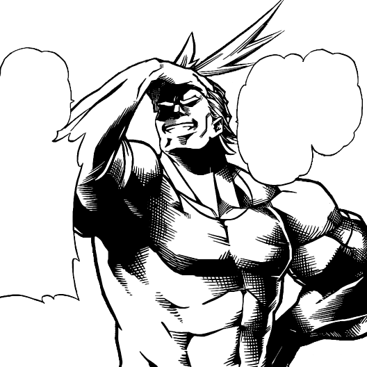
solid black is used for traditional superheroes you see in golden age comics.
All might have straight lines and bold lines in his design his muscle form is drawn with thick lines, thick lines that are difficult to break suggest strength much like how his muscle form emits. Both thick lines are bold to make a statement in his design. All Might’s bold lines show his dynamism in his outward appearance. His incredible bold lines he has when he makes entrances in a flashy way looks like he stands out for being drawn differently from other characters like a superhero from a comic than a character from a manga looking dynamic enough to pop out on-page. His lines make All Might look more like a cartoon hero in contrast with the rest of the cast of characters.
More lines that All might is drawn with are vertical lines and horizontal lines.
vertical lines are filled with energy, strong, rigid suggest stability and horizontal lines are there to be stable and secure. These lines tell these aspects in his role as the symbol of peace a call back to him keeping society stable with his entire presence as well as his strength.
This embodies All Might’s simple design elements.
Now next on to what goes into the aspects go into his design.
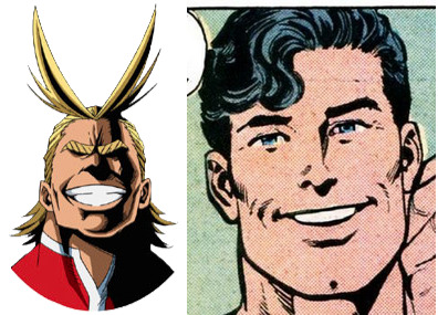
such as his art style is different from the characters drawn because his design uses techniques from American comics. All might is drawn by different styles from different artists Mike Mignola and John Byrnes which he takes a lot of influences from. All Might’s smiles in his muscle form look like Byrnes’s version of superman’s smile.
His muscle form’s large towering body is drawn exaggerated to resemble John Bryne’s superman due to his absurd size and face shape.
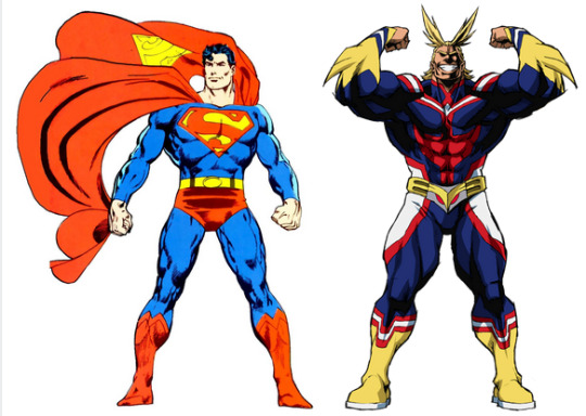
Byrnes' superman has heavy shading like All Might’s design encompasses heavy shading. He's drawn with a much thicker outline shading.
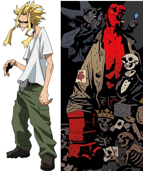
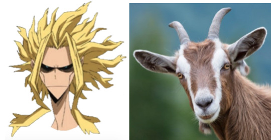
Another artist who influenced All Might’s true form is Mike Mignola who is known for his superhero comic Hell Boy, All Might’s true form is inspired by Mike Mignola’s art style Mike Mignola was one of Horikoshi’s favorite artists and inspiration in All Might’s true form with his slouched angular shoulders and his face is angular with very few lines and fingers are square. This art style makes him appear more expressive than his muscle form and the very cartoony Mignola’s style is grimmer and suits All Might’s mindset in that state. These artists tell something about All Mights personality’s John Byrne’s art style showed All Might brimming with life and Mike’s shows All Might lifelessness. It gives All Mights design different impressions because of the art styles used in his design.
All Might is taken from an animal which is a goat his surname is yagi which is harmonious in Japanese for yagi which is translated into mountain sheep or goat. Goat is abbreviated as the greatest of all time All Might is considered the greatest hero of all time. and another abbreviation god of all things. Goats are associated with many gods this goes for all might: a hero and his god-like abilities to defeat enemies with a single punch and change the weather how he saves others no matter what effortlessly. His design resembles a goat with his narrow face looks exactly like a goat’s. All Might’s long strands of hair on top of his head are called horns; two strands of long hair look like goat’s horns. The horns are symbolic, being a symbol of strength and power the strength is usually seen in the horns, the horn of plenty symbolizes his abidance, and plenty for storing strength is seen in his powers and strength of his quirk OFA whose functions is a stockholding power in his attacks. The goat’s symbolism goes with his personality and role in the story. Goats represent peace, security, and determination, action initiative, order, force, protection, fearlessness. Peace and security notes all might as the symbol of peace and presence that’s used to comfort others. Power and force symbolize his power from OFA and determination, action, fearlessness, stubborn side notes, his drive to save others, and defeating a villain regardless of how powerful the villain is. Goats are commonly used for sacrifices in rituals of different cultures the term scapegoat is used to bear the sins of the entire community suffering for and bearing the sins of the world, notes All Might’s overly self-sacrificing nature his burden from his role as the symbol of peace beacon of light to the world his need to bear the burden makes him feel guilty when someone was hurt without him knowing. Horns are used to drive devils away, showcasing All Might’s presence that is enough to install fear in villains. The mountain goat that climbs the highest peaks symbolizes overcoming obstacles demonstrating the slogan plus ultra on how All Might would push his limits when facing a powerful villain and saving people overcoming his obstacles via plus ultra.
The last thing that goes into his design is on how All Might is designed to look like a quintessential American his design is based on a phenotype stereotype of a western foreigner with him having blonde hair and blue eyes which usually is the stereotype of a foreigner in the media and his loud, cheerful, booming personality fit his American image and his bright and vibrant style resembles All Might’s all American enthusiasm this notes on how All might be designed bearing American influences in mind he’s based on American superhero since his design is influenced by American comics. All Might is a huge fan of American pop culture having his super moves named after states would be largely due to his stay in America.
Shown in his backstory, When All might depart for us after the death of his mentor and his graduation from UA. his departure to stay out of AFO’s reach to gain enough experience to confront AFO. America is the birth of superheroes and where they first originated from. All Might references several heroes in his design. Horikoshi loves referencing superheroes in his works so they come up now and then he is heavily designed with American comics in mind. All Might’s all-American attitude and appearance came from superman and the golden age and comic book heroes his body resembles golden age superheroes like superman in the ways he’s drawn as well as his face and smile are modeled him. The color scheme of his hero costume comes from both Captain America and superman being red, white, and blue

his muscle form being massively buff when powered up resembles the hulk and having the signature cry Hulk has when he punches with saying “Smash” imitating Hulk’s cry in his attacks.

All Might resembles Superman in power and appearance, since he’s considered an ultimate existence in his universe. His powers are inspired by Captain America and Superman, with them having super strength and speed the powers of traditional American superheroes.
Horikoshi didn't just use simple design elements when designing All Might; he also took many references in putting All Might together. He didn’t take elements but also artistic styles from different artists to communicate All Might’s state and personality in his design which you get the sense of what they are by people by intuition. Horikoshi taught us that in his design of All Might you don’t only half use shapes and aspects to communicate what their personality is but how the art style affects the mood of the character that you're designing. Use any art styles you like and incorporated into your character you can choose what art styles you like to absorb as much as you like if you like an art style, use it. Don’t be concerned with genre and medium. Have fun with it.
Izuku Midoriya:
Time to start with the main character, Izuku Midoriya.
Izuku is a simple person not overly complex before his character development and his design says that he’s a good person because it gives you the impression that he’s a kind person you automatically understand as a character. Izuku follows the basic rules of character design with his personality explained through shapes and lines to convey his personality. Like All Might, his design harbors two simple shapes: a circle and a square that tell something about his personality.
The circle’s symbolism is optimistic, charismatic, endearing, innocent, harmless, purity, or youth. Circles note the potential of the characters and are used to make characters harmless and innocent in design smooth rounded characters are calm, simple, pure, and safe. The thing to note: these shapes are used for children since it invokes youthfulness and innocence. Circles evoke positivity and are non-threatening; they give off a feeling of friendliness that appears soft and harmless that invokes likable characters. Characters with circles in their design are considered relatable. Circles are expressive and emotional; they make the character seem expressive and abundant in expressions.
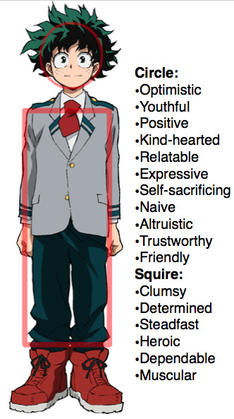
Izuku’s character design of circles makes him timid and nervous and friendly as well as appear soft and harmless at a glance. His round eyes for circles display Izuku's variety of exaggerated expressions in bizarre situations and show his relatability since his reactions to those situations make him a relatable person. The potential part notes Izuku’s potential in being a hero. His altruism notes his kind nature in how he wants to help others in need, his self-sacrificing qualities in that he always rushes in to save others to the detriment of himself reflects his desire in how wants to be the hero that saves everyone.
Izuku is positive and optimistic. He's someone who’s always looking ahead and tries not to dwell on things too much. Izuku has this hidden charisma in him which attracts people who were once hostile like Iida and Todoroki. His design makes Izuku a likable character. Izuku might be the most endearing character in the cast of BNHA. Izuku is a juvenile character, someone who is in their teens the shape of the circle has shown that he’s still on the cusp of childhood and adulthood. The purity and innocent aspect note his naivete and inexperience he has since he recently got his quirk and her personality. Izuku’s circle in his design’s being a kind selfless person as well as naive and simple notes all his character traits he has.
His second shape in his design is a square. Squares in the design are strong, dependable, confident, steadfast, their masculine in shape squares are comforting and clumsy and used to convey heroism.
The masculine part of the square symbolism references Izuku’s muscles underneath his clothes and his gender.
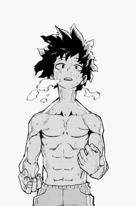
His steadfastness refers to his determination and resolute will he has in never giving up when he wants to save others. Another note of his steadfastness in how Izuku wants to be a hero above anything else this shape conveys the desire of his dream to be the world’s greatest hero. Izuku is naive and clumsy; it notes Izuku’s naiveté and overall inexperience in his character and use of his quirk his clumsiness notes his inexperience when it comes to his powers that he recently inquired about and his naiveté in his personality when dealing with situations. he’s emotional but Izuku is someone who always thinks first before he acts. The square notes his intelligence and thinking the circle notes his emotional side. The confidence aspect notes Izuku's growing confidence in himself compared to when he’s first introduced and his dependability references him being one of the most reliable figures in class 1-A.

Remember what I said on how drawn lines of a character can go some way to describe your OC’s personality well for Izuku his drawn lines describe his personality in his design. Izuku lines are both curved and straight. Soft lines and curves suggest something that is rounded since it’s seen in round things like circles naturally soft as well as unimposing, unthreatening, approachable, and harmlessness. Curved lines are seen best in his curly hair since the curly lines are used in his hair. Izuku’s soft lines in his design make him more approachable and harmless. His freckles on his cheeks make Izuku give him a positive feeling in his personality. His design gives us the impression that he’s optimistic and kind and trustworthy since his design conveys this. Straight lines are balanced and grounded, pointing to an aspect of Izuku’s personality that being his intelligence and strong will when He tries to be stable in a crisis with him despite panicking. Despite this, he keeps his head and thinks and uses his intelligence in strategies defeating his opponents.
Onto what goes into his design here’s something I noticed when I was researching his design all the characters of BNHA designs are centered around their quirks. Quirk is called Kosei in Japanese. The term Kosei is translated as individuality in Japanese in a world where quirks are personalities as they are powers, the quirks represent metaphorically the individuality of the characters. Unlike the character who stands out because of their quirks, Izuku doesn’t: he’s very plain. Izuku is called plain by many characters in the story even Horikoshi acknowledges that he’s a little plain for a protagonist since being plain meant you don’t stand out as a person or have special qualities you go into the background. But Izuku’s plainness plays a part in his character design in which Izuku's plainness notes his lack of quirk since he is someone who lacks any individuality. Izukus plainness reflects his initial quirklessness in his design since he doesn’t have individuality or stand out; he's someone who was designed to not have individuality. He doesn’t stand out like everyone who has a quirk; it’s Izuku that stands out as someone who has no quirk; his plainness inspires his quirklessness in the way it suits him in the course of the hero academia. Horikoshi is pleased with this design aspect of Izuku; his plainness tells of his lack of quirk in his design.

Another interesting aspect of his design is that it explains the characters designs are based around their personalities, as seen in his school uniform with his tie: his tie is not tied very well, only appearing as a round bundle around his neck. This ties into his nervous jittery demeanor and how he recently got his quirk and lack of control of his quirk compared to his classmates. He hasn’t gotten the hang of it by tying a necktie.
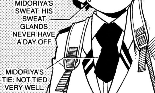
Izuku’s main trademark is iconic big red shoes. Red in the media is commonly associated with heroes and makes him stand out as the main character as well as being an inspiring hero.
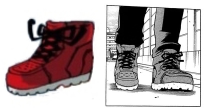
Izuku’s design goes through many changes to correlates to his character development shown in the number of battle scars he receives from the sports festival and the camp training arc.
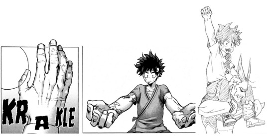
One thing I learned in Izuku’s design is that clothes can show a character’s personality as well as the state in the story. The clothes are decided by the character, not the designer so think about which outfit that your OC would be comfortable in.
Katsuki Bakugo:

Time to talk about Izuku’s childhood friend with a short fuse and rival Katsuki Bakugo. Katsuki’s main shape is a triangle. Bakugo has many triangles in his design whether it’s his hair, eyes, and face all of them are composed of triangles even his slim yet muscular body is composed of a huge triangle.
Triangles are rigid, dangerous, stubborn, angry, quirk, nimble and agile, devious, conniving, dynamic, competent, aggressive. Triangles give off this feeling of action, they show strength and are very intense, grabbing attention and being in your face they communicate aggression and are sharp and angular. Triangles are edgy and evil since villains that are drawn by using the triangle pointing downward triangles and sharp angles show danger and warn others to watch out. the symbolism of the triangle matches Bakugo’s personality perfectly.
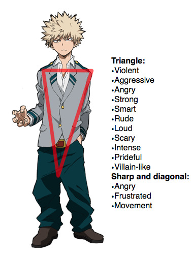
The impression Bakugo gives off is someone dangerous, violent, and aggressive. His design makes you think he’s looking for trouble since he emits this sort of vibe to him. Bakugo has an intense personality; he is loud, rude, and overbearing he’s violent and comes off as scary at first glance or tries to be but doesn’t work this part show how much he demands people's attentions due to his large ego and tremendous pride and conceited nature and over competitive since he wants to be seen as the best.
Bakugo’s sharp lines and angles, his hair eyes mouth and jaws down to his quirk are visual traits often used for villains. He’s spent a lot of time being a bully as a little kid; his personality
doesn’t fit into the mold of a traditional superhero would gear towards being a villain than a hero. Bakugo was pointed out by many characters he would be a better villain, so the triangle would also note that he has the composite to be a villain, but he isn’t.
Being conniving has been toned down with Bakugo, but it is a fact Bakugo is smart and intelligent. He puts it in strategies from fighting or written exams and he’s perspective able to see through situations and people he may not look it, but he’s very capable in many areas whether it in general or hero studies.
Bakugo has a flashy quirk explosion and wants to be seen as the strongest since the triangle depicts his strength. Bakugo is obsessed with his strength and doesn’t stand being thought of as weak and stubborn when it comes to winning.
As for lines, Bakugo has plenty of sharp lines and diagonal lines in his design. His face has sharp right angles lines showing his anger and frustration. Bakugo is always seen as angry in his character design. Diagonal lines show off-balance and in motion references; Bakugo who constantly moves around never citing still and in his overall fighting style utilizing jumping and flying in his quirk movements.
His main design is based around his quirk explosion since his wild blonde hair coming out in the shape of an explosion
Bakugo aspects from his design are based on a Japanese delinquent (he’s even referred to as a delinquent by Horikoshi in his character bio). His uniform shows how his pants are all sagged like a street thug and a detail of characters that Japanese delinquents are that they have dyed hair which Bakugo’s bleached blonde hair fits; he also doesn’t wear socks. Bakugo’s unique expressions pose comes from the way Japanese delinquent pose: his distinctive pose with his head tilted back to the side upper body learning back with hips thrust out shoulders hunched forward with his hands in pockets is like how a Japanese street thug pose might do. Bakugos tendencies to bare his teeth a lot as a sign of aggression the same expression a Japanese diligent bears to show aggression.

His school uniform is reminiscent of a Japanese delinquent with messy hair and coming to class without a tie with his shirt collar unbuttoned and pants sagged. When he dresses in his school uniform, he doesn’t wear a tie because he hates wearing ties. He doesn’t like conformity and plays by his own rules but at the same time doesn’t step out of line. Even though he abides by the rules it’s only so he wouldn’t get in trouble to get a stain on his perfect record.

Bakugo was inspired by Tetsuo from Akira, much like how All Might was inspired by Goku from Dragon Ball with the hair and body. Horikoshi loves Akira, it's one of his favorite manga that he loves to cite BNHA has roots in different media like superhero comics and star wars but its roots come from Akira. Bakugo’s character is similar to Tetsuo in many ways with being a teenager who holds a tremendous amount of power and immaturity.
With Tetsuo who has really strong power but he’s like a kid who uses his power as a kid. Tetsuo is mentally like a child who’s strong with a way of fighting like jumping flying around which Bakugo’s powers, fighting style, and characters came from. Bakugo’s and Izuku rivalry harbors the same roots as Kaneda and Tetsuo rivalry.
Where the former used to be a childhood friend until the latter became corrupted by their newfound powers and friendship soured after the use of his powers. This mirrors Katsuki’s relationship with Izuku whose attitude shifted after he manifested a powerful quirk. Another thing they have in common is how Tetsuo despises being thought of as weak and protected by Kaneda. This is like how Bakugo hated to be thought of as weak when he believes looks down on him; they both harbored an inferiority complex to their friend. Another thing to note Tetsuo and Bakugo are both “delinquents”.
What I learned when I researched Bakugo’s design is that it’s alright to take inspiration from characters in different media; you don’t always have inspiration from real people you can just take your different sources.
Ochaco Uraraka:
Time to discuss the next character design Ochaco Uraraka, one of Izuku’s best friends.
Ochaco’s design has prominent round shapes and motifs drawn from the circle aspect. Her bob cut hairstyle, face, eyes, and cheeks are designed based on roundness; even her finger pads all have a roundness to them. Even her hair has a circle shape to it.
This shape suits her well since she has a majority of her personality characterized by it. It affects how people perceive this with that shape alone at first glance of her character design, it tells us by intuition from just looking what Ochaco is as a person that she’s a likable character due to her design.
Circles have a lot of symbolism. I know I already discussed this without explaining Izuku’s character design but this is going to elaborate on the symbolism of what it has to do with Ochaco. Circles symbolism, as stated, is cuteness, innocence, warm, cheerful, non-threatening, comforting, love, charismatic, soft, harmless and endearing as well as friendly, circles are expressive in expressions, circles are considered feminine because of the soft shape. Circles are associated with rounded shapes and round things are mostly used to design anything that is cute or for things that are cute in design.
Horikoshi is a great designer: he knew how to design Ochaco by using this shape; not only he designed her to be cute he kept her personality in mind.

Despite having a similar shape, they have different impressions. When paired up with Izuku Ochaco, bright, cheery, and outgoing in contrast to Izuku, he is shy and timid. Ochaco is first introduced as kind, cheerful, friendly shown when she prevents izuku from falling in the entrance exam her presence exhibits a warm refreshing vibe different from what Izuku was treated with other people, and Katsuki and how perceptive she can be when she noticed the emotions of people around her. Her main personality is bubbly and endearing, that's enough to make her a likable character to be around.
The love that notes in the symbolism notes her blossoming affections to Izuku which she tries to hide.
Ochaco is considered cute by various characters and the artist himself. Her main features, her blush stickers on her cheeks highlight both her cuteness and innocence portrayed in her character.
Ochaco is just as expressive as Izuku; she displays a variety of wacky expressions and reactions in bizarre situations. Ochaco is the third in the trio to have abundant expressions.
Another thing they have in common in the circle symbolism is altruism. Izuku wants to be a hero that can save others since it’s his dream. Ochaco takes a more realistic approach. She wants to be a hero to earn money to provide for her parents out of poverty. Izuku’s altruism goes to other people, her altruism goes to her parents.
Circles match her gender since Ochaco is a girl.
Ochaco has soft bendy lines and soft lines are innocent and harmless as well as feminine because of their softness the soft bendy lines show her innocence, cuteness and bubbly personality, and femininity in her design.
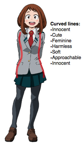
Horikoshi designed Ochaco to be not only a cute girl in the story but noted her personality and quirk concerning her design. Design-wise she was created to drive Izuku’s conversations and he was successful with her in choosing her shape in which her design conveys to this extent.

One last thing to mention is that her hair can resemble the moon because the circle shape silhouette looked like a moon, her being called moon face in smash extra reference this. Ochaco’s hair is designed resembling a moon due to the roundness in the relation of the space theme of her quirk zero gravity.
Tenya Iida:
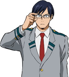
Now time to go to Izuku's second-best friend, Tenya Iida, president of class 1-A and aspiring hero.
Iida’s dominant shape is a square. Iida has a square jawline in his design; even his eyes and glasses are square-shaped it reflects Iida’s personality traits.
Iida’s personality is you know a typical square both design-wise and character-wise since squares are considered dull and boring since they follow a set of rules.
Squares show rigidity and have the effect of a stubborn character there other symbolism is that they can be reliable, uniform, dependable, bold, stable, large, and daunting. Squares are masculine in shape and are used to convey heroism in character designs. Iida is over-serious and a huge stickler to the rules and can be overbearing at times due to this. Iida cares about following the rules and expects others to follow them.
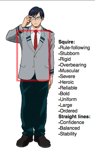
Iida is rigid and stubborn when it comes to the rules as well as following them. He doesn’t tolerate it when people don’t follow them like Mineta’s indecent tendencies and when Izuku attempts to break the rules by going to rescue Katsuki he gets visibly angry at him but this mostly out of concern towards him for doing something dangerous and reckless. Iida is uniform and traditional. He is the class president, even his dorm room is organized.

Iida follows the rules and puts high standards on himself at least he tries to be but in reality he loves to be praised and to be competent you see how he feels happy to be praised by Momo in the test and compete against Izuku in the sports festival. Despite his personality caring about the rules, it is not at all above breaking the rules out of selfish reasons such as him going after hero killer stain for revenge rather than rescue another pro-hero Native.
Iida’s frame is large and imposing due to its shape when first introduced, being referred to as scary by Izuku since he comes off as more severe. Iida is incredibly muscular in shape like a square which caused him to be taken as someone older than he usually is.
In his disguise to rescue Katsuki, he looked like the most adult in his disguise during the rescue arc; he is the only one in the group dressed as more grown-up due to his large frame this can note that he was originally designed to be an adult pro hero.
Iida is just as reliable when he’s taking care of his classmates and looking after their wellbeing As a class president, he wants to make sure everyone is safe when he is one of the people who were part of the Katsuki rescue team as their chaperon and claims he’s doing this to monitor them. Iida is steadfast to his friends and rushes to help them like when he rushes to Save Izuku and the rest of his friends in the war arc.
Iida doesn’t stand out in boldness but a few things that reference his exaggerated mannerisms such as how he moves his arms up and down. Another example of his boldness is when Iida posed as an emergency exit icon to inform everyone that everything is okay. The square reflects a majority of Iida’s positive traits.
Iida design is drawn with straight lines. Straight lines communicate his confidence and stability. Iida is confident in his abilities and how he keeps his class in line as the class president and leader.
Now time for the second thing that goes into his character design: Iida is designed based on a track runner since his quirk has a lot to do with his legs since he runs fast. Track runners relied on their legs; another example is his mannerisms with his arms bobbing up and down resembles the way the track runner runs.
When I was researching Iida’s design I struggled to figure out what his arched eyebrows are but it turns out his eyebrows are arrows half arrows to be exact Iidas eyebrows are shaped like a half arrow. The arched eyebrows go with his intimidating appearance when he was introduced.

Arrows symbolize the direction are used to illustrate the direction you are pointing at The arrows can refer to the function in which Iida’s quirk works pointing in the direction in which he runs. Iida runs straight and can’t make twists and any U-turns.
Direction can infer to how Iida directs the class as student president the arrow part references Iida poses as a warning sign much like how the arrow is represented to point the direction of the exit.
Iida is designed to look like a stereotypical honor student with glasses and side-parted hair. You see this kind of thing a lot in anime and manga with the hair swept to the side and glasses to make him seem studious and serious much like how Iida portrays himself to be or tries to be.
When you see glasses on someone you think of them as studious, smart, and serious It's also a unique way to tell Iida’s character: his glasses are metaphoric and symbolize his sight: how he only sees the future he looks ahead forward. Another detail is when he lost his glasses during his encounter with Stain it symbolizes how he lost sight of himself in his anger to get revenge on Stain.
The thing I learned when researching his design is that the square doesn’t always refer to all Iida’s personality traits. I discuss this before on how it reflects his base personality. We know that Iida is goofy and serious but secretly selfish at times. When you design your OC their personality doesn’t half follow upon the shape they have. You can make the shape a base personality and add other stuff underneath it.
Shoto Todoroki:

Last but not least the cool dude with a fiery passion and the people in Izuku’s friend group: Shoto Todoroki.
Shoto is the exception of the characters I spoke about in their design. His design does not incorporate any visual shapes. Instead of shapes, Shoto’s design is told in lines. Shoto’s lines are soft and thin. Thin lines in designs are easy to break and are considered fragile but convey elegant quality.
Rei has many thin lines like Shoto and the lines convey his mother’s personality more Rei is gentle and fragile in personality. The thin lines make her delicate and the many lines give her gentleness and daintiness in both her appearance and personality. She’s a really beautiful woman, the most beautiful mother of BNHA.
The thin lines make Shoto out as someone cool and collected make him seem more subdued his lines don’t just give him a sense of coolness but show he’s expressive in the number of his lines the lines show that he’s a normal kid in that way and show that he’s a beautiful character.
Thin lines are used to draw something really simple and Shoto has a simple character design; it's not overly complicated. When Shoto is drawn with thin lines it comes off as very simple and less distinctive in character design. Besides the hair and scar, Shoto lacks any other distinctive features hairstyle when compared to other characters Shoto lacks any distinctive hairstyle that his classmates have without those features, his design is considered plain and indistinguishable.
Shoto has a rounder sort of face and rounder looking shapes, meaning the character is youthful. This notes that he’s a juvenile character empathizes with the fact despite having a cool collected exterior he’s still a kid, even though he wasn’t allowed to be.
Shoto has a traditional Japanese character design; it's been noted many times in the series that Shoto has traditional Japanese influences.
As I said before Shoto is a Japanese character with being a traditional Japanese home he grew up in and dorm room that has Japanese style interiors. If growing up in a traditional Japanese household was any indication his character design starting with both his eyes and hair has Asian influences in them.
Shoto has almond eyes, they are called long eyes because of the way they are drawn slanted downwards Shoto’s eyes are longer and wider like a Japanese eye. Almond eyes are considered attractive eyes of the Asian shape, in character design, it’s used to design beautiful characters they make a character seem more attractive and cool because of the shape. Shoto is called a beautiful character by many others and his personality is noted to be cool. It suits him well since he’s considered the prettiest boy in class 1-A.
The burn scar on his left side symbolizes the abuse he suffered from Endeavor's abusive training to groom him as a successor that his violence drove his wife insane causing her to burn Shoto. The burn scar symbolizes the abuse present as the scar on his face and connection to his past.
On the design aspect of his quirk, there are two colors in his hair white and red; they are drawn from his quirk half hot and half cold; his hair colors represent the sides where his ice and fire manifest.
The two colors in his hair symbolize duality, the duality motif that he has inherited his fire and ice powers from his parents and his character arc. Shoto’s struggles are how he can’t see himself as a full person, just an extension of his father. That even though he uses his flames he still hasn’t fully accepted the part of him that he doesn’t want to see. He struggles to come to terms with himself and his past. His arc is that of accepting himself and his past as it is. His character arcs main theme is this, the strongly rejecting someone you may end up embodying what you hated yourself only through acceptance of the situation or circumstance can you change whether it is who you are, your situation, or even your relationship. His design represents his entire character arc both metaphoric and literal.
One interesting aspect I learned when I looked at Shoto’s design is that you can use it to explain your OC’s backstory and character arc. Shoto’s design perfectly encapsulates this in his design.
Epilogue:
One thing keep in mind the characters are designed based on corresponding to their quirks you can see this in the example of Hanta Sero, Sero’s face is described by Bakugo as a “Soy sauce face” which is one of six stereotypical ways to draw an Asian to be specific “flat-faced”. “Soy sauce face” is a typical Japanese face. The basic way to draw a Japanese person references another part of mundanity from Sero. Since his design is drawn pretty basic it’s fitting since he’s one of the characters in the background.
Hair plays a major part in the characters design and personality it also references their quirks the hair acts as a silhouette in the design to reference a character’s quirk.
Like Sero’s hair looked like slabs of tape, Ochaco’s hair is a silhouette of a moon, Bakugo’s hair is shaped as an explosion, Todoroki’s two colors from his hair references which side his quirk coming from, La Brava’s twin tails are styled in a silhouette of a heart, Hachitsuka’s hair two arenas resembling being literal arenas of a bee, her huge side bang covering her face resembles the head of a bear, Momo’s hairstyle has the silhouette of a crane with the ponytail resembling a tail end of a crane and her bangs the head of a crane. Mineta’s hair is shaped like grapes, an innuendo of his quirk, Kaminaris blonde spiky hair and natural lighting shaped streak matches his electric powers.
Lastly, for Jiro, her eyes and hair go with her entire quirk which her eyes are triangle-shaped, unlike Bakugo’s triangle eyes which are used to portray anger and aggression. Her eyes are made to portray her cool and laid-back exterior and punk rock attitude, her triangle but eyes come from knobs of a stereo referring to her quirk utilizes ear jacks relating to sound. her straight asymmetrical kappa hairstyle go with her punk rock aesthetic and
Jiro’s streak on her resembles cardiac lines about her heartbeat sound attacks.
Her entire design is a reference to her quirk and personality.
I hope this at least gives you the picture of how to design BNHA OC’s though you don’t half make their design based on a quirk but one that would explain their personality in their design.
Compare and Contrast:
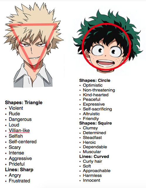
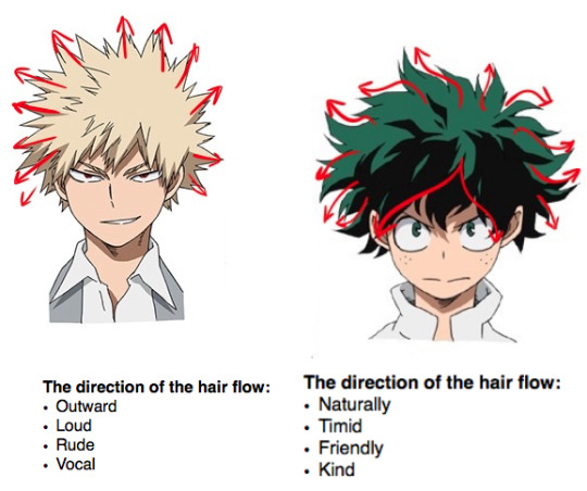
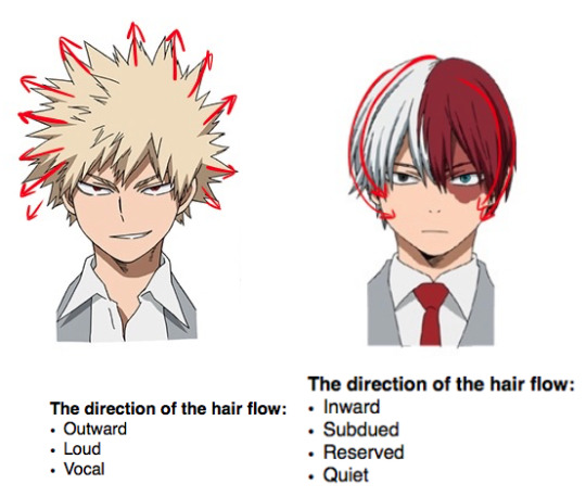

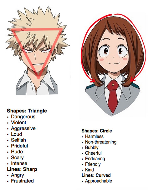
Hero Costumes:
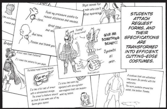
Time for discussing the hero costumes the characters wear
What do you think when you hear about masks?
The mask is typical in the superhero genre In superhero comics here use masks and costumes to hide their secret identity.
In BHNA society, the mask serves as a stylistic purpose it represents individuality
the masks characters wear symbolize their individuality since it’s the literal definition of quirk.
The mask is used on a costume to distinguish one’s self from the rest. The mask symbolizes the character’s individuality and ideals that they portray themselves to others and show themselves to the world. The hero design says something about the character’s personality.
other than designing the hero costumes you should add functionality to them, the functionality that comes with hero costumes are there to reduce the downsides of their quirk or make it easier for them in the fighting.
I am going to go over both design and functionality of hero consumes. To a hero, the costume thinks about what you want to represent in your OC, shows the mentality of the characters and development, and shows what you want to emphasize in their hero costume designs.
Compare both Izuku and Bakugo’s hero costumes. They contrast and complement each other there’s a duality in their hero costumes. They both have different beliefs in regards to the foundation to their values as heroes; for Bakugo’s being able to win no matter what and Izuku to save no matter what. They both idolized all might think act on this administration you can see this in their hero costumes complementing and contrasting each other other than colors in the hero costume compliment and contrast each other both belts match and both have masks.
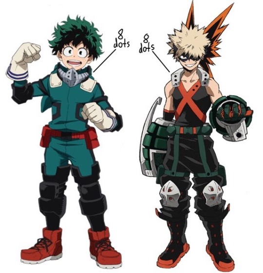
The observation is the number of holes in the collar areas of the costume. Izuku's mask has eight holes in his hero costume. Bakugo has 2 dots and six holes. the eight holes in their designs number that symbolizes balance and harmony ironic for an unstable relationship but would foreshadow their eventual harmony as their interactions in neutral territory. 8 can note the number eight in “Yagi” All Might’s surname; this notes how they both idolized All Might. Izukus and Bakugo’s relationship is seen in their hero costume designs. The hero costumes compliments their rivalry.
Izuku Midoriya:
Izuku’s hero costume goes through an evolution that correlates to Izuku character development His costume's color scheme is green and green goes with Izuku’s overall color scheme. Although design-wise it doesn’t stand out since it comes off as plain, this can showcase that Izuku has a vague idea of who he wants to be as a hero.

Izuku’s hero costume is based on his admiration towards All Might so the costume is modeled after all might the ears look like the horns on All Might’s head even complete with the teeth resembling the smile he even imitating his fighting style including yelling smash in his attacks.
Most of the things that make up Izuku’s hero costume are everyday items you can find anywhere from a convenience store to a military shop.

Spiderman was a major influence in Izuku's character design and hero costume as seen in his drafts that the mask resembles Spiderman. The Izuku hero costume takes heavy inspiration from Spiderman such as the ripped-off mask resembling Sam Raimi Spiderman’s film with his torn mask when he was facing Green Goblin. Izuku’s torn mask imitates this when he faced Bakugo from the battle trial shows us how Horikoshi pays homage to a superhero film.

His costume tells us his character development,how Izuku started as a timid, finicky boy with a huge admiration for All Might concerned about Bakugo’s bullying; he steadily gains his confidence within himself and the control of his quirk. During the battle trial with Bakugo he manages to overcome a large hurdle and become different from the bullied kid Bakugo picked on and his resolve to make his quirk his own and announcing his rivalry to Bakugo. The costume alpha was developed after Bakugo destroys costume beta, his costume became darker and rugged only with Izuku's metal mask that was replaced and the Izuku's gloves changed the only thing that didn’t change was the jumpsuit according to him represents his mothers love and belief in him.
The new costume symbolizes Izuku's new development from a great deal of experience from the sports festival he received and the mastery of his quirk as when he began to use the full cowl.

Izuku receives a new upgrade after All Might's retirement and damage to his arms from his battle with Muscular. the damage caused to his arms was due to his recklessness this caused his mother to be adamant in not sending her son back to U.A but Izuku deflect this by showing her a letter that was given tells his mother it can be any hero school besides U.A but he won’t stop being a hero. The reason why he chose U.A was that All Might went there to be a hero, saying he will choose another hero school shows that this is shown that he is walking out of All Might’s shadow. The armbands are another facet of his development; special leg armor is added to minimize the damage caused by his recklessness.
Izuku is learning to preserve himself more and stop harming himself when he uses his quirk. He switched his fighting style from punches to kicks more close to his legs than his arms Izuku utilizes kicks not punches shows Izuku is ever so slowly walking out of All Might’s shadow seen in his instance in his fighting style.
The gloves that were added not only noted him after his experiences from the Yakuza raid arc discovering another machinist of his quirk that he learns all might doesn’t use 100 in his moves His new technique is air force moves are long-distance attacks similar to how Bakugo uses AP shot another way it correlates his rivalry with Bakugou is on how they develop. He faced gentle as his first personal villain as well as seeing himself in gentle as a major milestone in how he views villains.
He came from someone everyone mocked during the entrance exams to be a force to be reckoned with during the battle training arc in which class b takes seriously as a threat. He came very far from someone who flinches when people talk to him to be self-assured and confident in himself and take a decisive role as a leader seriously. His costume shows how far he got in using OFA and his slow but surely character development.
Katsuki Bakugo:
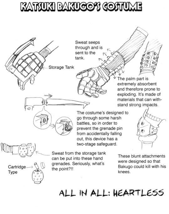
I love how the design aspects of Bakugo’s hero costume says something about his personality it gives a sense of what kind of person he is by looking. one overall look gives the sense of what he’s like as a person that he is rude, violent, and dangerous much to tell people to “watch out” and “look at me” and “I'm scary” the costume grabs a lot of attention and stands out visually and mentally. Bakugo’s dangerous because his costume gives the sense that he is. That's the original idea that Bakugo had to go for. This hero costume was successful in conveying his personality.
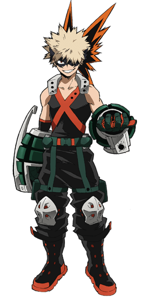
Bakugo’s costume is modeled after his quirk Explosion, given Bakugo’s quirk, his costume is based around it. his hero costume has dynamite all over due to being explosive themed, The horns attached to his mask coming out of his head resemble an explosion with the spiky headpiece looking like an explosion. His two grenade gauntlets are shaped as grenades that represents his explosion. Quirk Bakugo’s hero costume is themed after his quirk.

His hands have a weapon motif and the military for the bottom half of his pants and boots gives him an aggressive look that goes with his personality, his love for battles, and winning in which the military part represents. Given his battle-ready tendencies, Bakugo’s hero costume prioritizes his combative mobility; his costume was designed to withstand harsh battles. this would not only reference his quirk but also notes his love for fighting.
Bakugo’s costume design doesn’t just show the aspects physically but mentally as well with the gauntlets have a symbolism that correlates to Bakugos character The gauntlet's function is to store his sweat to amplify the power and effects of his quirk to the fullest; it represents his power he wields to the most extreme degree and goes into Bakugo’s head. Bakugo wants to win by himself and not rely on anyone to help the grenades; it represents his strength that's stored in the gauntlets.
His costume showcases his want to be scary and strong and it told us something about the personalities in his hero costume it was something that he wanted to be terrifying or he tries so hard to look strong and intimidating he wants to look scary but isn’t Bakugo is obsessed in being and looking the strongest this aspect in his costume screams the loudest he wants to be taken seriously and hates being looked down on his costume would be he wants the attention he wants people to know that he’s the strongest and fear him. but given his loud, overbearing and brash, and overblown personality takes him too seriously.
His hero costume is the embodiment of those said things he wants to be and it was successful not only conveying his personality but also his ideals.
Ochaco Uraraka:
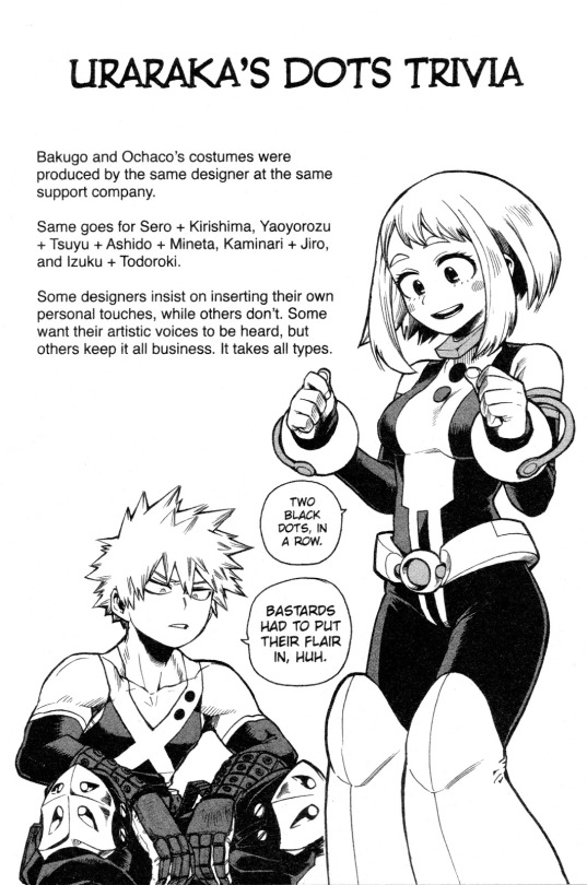
Ochaco is my second favorite hero costume design mostly because the visual comments convey her personality very well. A thing to mention before I get started is looking at both they have incredible design references. unlike Bakugo’s, Ochaco’s hero costume has notable visual components seen in her personality; both Ochaco’s and Bakugo’s hero costume are designed by the same company so it wasn’t a coincidence that they would be paired up to show design differences.
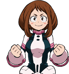
There is a contrast of the hero costumes Ochaco and Bakugos unlike Bakugou hero costume Ochaco’s hero costume has no sharp corners her costume was designed with a round motif so its not aggressive but soft impression with Bakugo looks dangerous and Ochaco looks harmless and approachable this shows well in her personality.
Like Bakugo hero costume, Ochaco’s hero costume is based around her quirk zero gravity her helmet resembling an astronaut relating to the space theme in zero gravity. Her hero costume is based on an astronaut with her quirk in mind.
Despite the armbands and belt that are made with hard material, they’re rounded which gives Ochaco the soft impression embodying the round motif in her character design.These aspects make her appear harmless and soft but look cute and approachable. It suits someone as cute and bubbly as Ochaco who's a nice girl in personality. These parts tell her personality both mentally through her design.
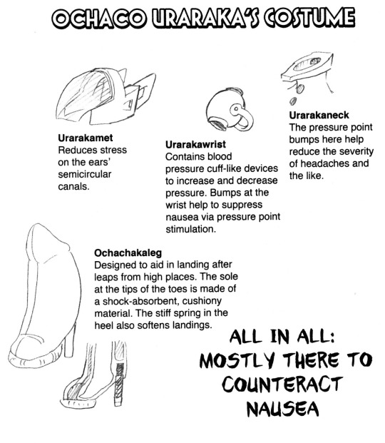
Ochaco isn’t there to just look cute. Ochaco’s original idea of her hero costume was to reduce the dizziness and nausea from the use of her quirk; her entire hero costume was there to reduce her quirk’s drawbacks.This shows that Ochaco is practical. Ochaco is realistic; she won’t ask for nice things and gets embarrassed when she has it. Her heels in her hero costume are supposed to absorb the force that comes into contact when hitting a hard surface. Her heels have sharp points in contrast to the rest of the hero costume which is designed based on roundness; pointy objects in designs are seen as on point or blunt; this showcases her blunt, practical, and saying whatever comes to her mind.
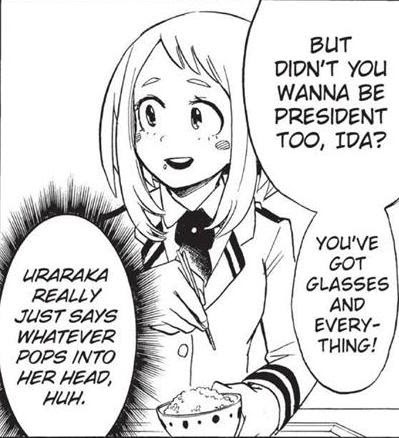
This part in her hero design doesn’t just highlight cuteness but shows she is determined and serious underneath her bubbly exterior.

When her hero costume receives an upgrade to include grappling hooks if you look at the grappling hooks it resembles Izuku’s new facet of his quirk black whip. It's only an obvious implication of Ochaco’s growing romantic feelings towards Izuku she keeps hidden away that has been implemented in her hero costume.
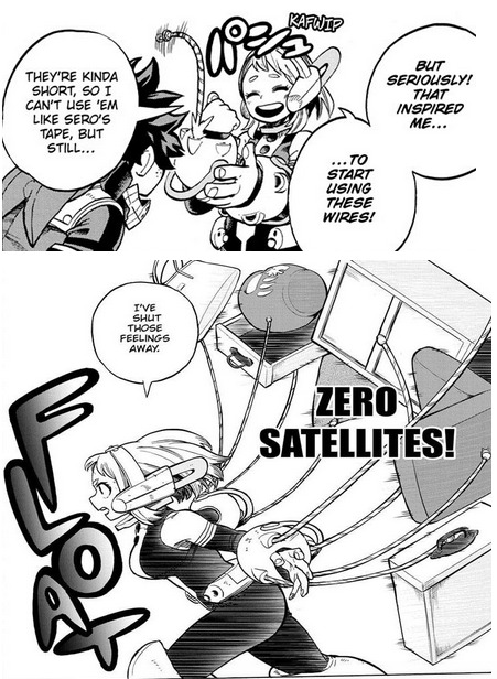
Tenya Iida:
Time for Iida’s hero costume. The impression that I had the armors based on a knight. Knights follow the code of chivalry considered honorable and heroic. Iida follows the rules to an annoying degree and is training to be a hero.
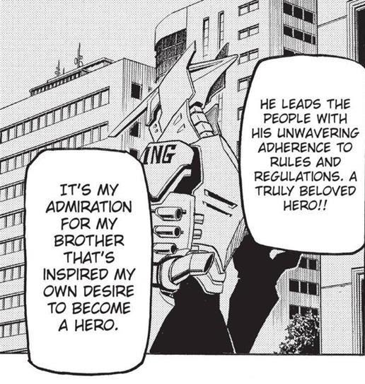
In ancient times knights come from nobility, a not so subtle reference that Iida comes from a renowned rich hero family.
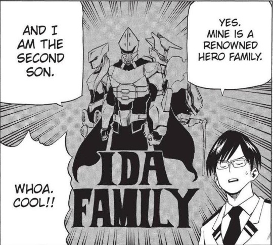
Knights are considered heroic in stories; this notes Iidas determination to be a hero. His costume is his version of an ideal hero citing Iida as idealistic to a degree and how he looks ahead in the future. This notes both how he’s proud of his lineage and determination in training to be a hero.

His armor could also be from a steam engine, the costume itself is based on his quirk engine for mufflers looking like steam pipes and relies on speed mentioning how it’s light to reduce drag from his quirk.

The helmet both resembles a knight and racers helmet you see on drivers when they race. The mufflers and mini-engines can be engines are what you see in cars and the helmet giving a close resemblance to race car driver helmets Iida can be considered a cross between a racer and a knight since his quirk is based around speed and increases the use of his abilities.
Shoto Todoroki:
Last but not least let's go over the hero costume of our resident cool and hot student Shoto Todoroki. Shoto’s hero costume like Izuku doesn’t stand out callbacks to how they don’t stand out since their costumes are considered plain, simple, practical, and boring they both have a vague idea of what it means to be a hero and are still learning if not they are still growing into themselves fully. One thing his hero costume has in common with Izuku is how it goes through a costume evolution that correlates to Shoto’s character development and as well as it goes with his mentality.

His idea for a hero costume was simple: it consisted of a white shirt and pants. It's very plain given a white shirt color scheme centered around the ice and the ice on his left side of his body. His debut costume is very simple but closely ties into Todoroki’s character.
Looking at his first hero costume rather than it being simple there is one thing that stood out that is the ice that covered the left side of his body his fireside is covered by ice blocked exterior he is focused solely on his ice side. The ice completely masked the fire aspect of his quirk like the use of ice to smother the flames within with a glowing red eye staring forward into the unknown unapproachable at first it’s frightful in appearance, not that inspires security but fear.
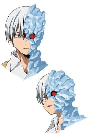
His costume is a metaphor for how he has a single-minded goal to reject Endeavor and doesn’t care about anything else other than that goal. In the beginning, his costumes reflect his personality at the time closed off rejecting his peers have their mindset on one goal his focus on rejecting endeavor his ice hid his burn scar on the side of him resembling his father the side mother rejected. Shoto’s use of his ice side over his fire symbolizes Shoto’s hatred towards his father and love towards his mother. His ice is trying to smother Endeavor’s quirk out of him and hides the stuff he hated about himself. This is in complete rejection of his father because of the abuse he suffered.
Before he uses to view the flame side that resembles his father and the ice from his mother his refusal to use his fireside stemmed from the abuse he suffered under endeavor. His emotions that were locked away due to the abuse he suffered from was until after the sports festival the ice he used as a mask to hide his emotions melted after his fight with Izuku, started using his fireside he opened up to his classmate.
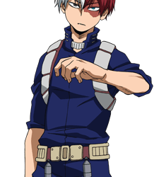
His hero costume now accommodates both the fire and ice side of his quirk; this was a personal evolution. There were notable changes in his hero costume such as coming with a built-in temperature and different color scheme. His costume now fits his heating abilities, has heat resistant fibers and functions to regulate his body temperatures and the color scheme changed from an ice color scheme to a darker one his hero costume matched flames but still retains ice capabilities. Even though his hero costume changed to match his heating abilities the white boots tell us that he still retains part of his character.

Other things about the new hero costume said something about Shoto’s personality as I stated before his costume doesn’t stand out it's just a plain jumpsuit it isn’t flashy or attention-seeking but modest it reflects how Shoto wants to do good and has no grand ambitions and only wishes to be a hero that would put people at ease. The costume having heat resistant capabilities told us that the costume is very simple and very simple functionality.
Shoto is simple and he would prefer function over flashiness. The hero costume says these aspects of Shoto’s character and I find it a great way to show Shoto’s transformation as a character and inner metamorphose.
Colors:
In character design, people choose a color scheme to communicate the character’s overall personality. People use color to show characters in simple but effective ways by explaining how these characters’ colors communicate their personalities in their design. the meaning of their colors are used in their character’s design is incredibly important the colors help communicate a character’s personality. There's a good example of anime using colors to communicate the characters personalities.
Image colors or just regular characters colors convey the characters overall personality
this rings true for characters like All Might and his colors being comic book reds, yellows, and blues that showcase him as a superhero since he’s the number one top hero in BNHA.
This can’t be any more true in anime characters are differentiated by the different colors they display in the anime Naruto series Naruto Uzumaki’s main colors are orange, yellow, and blue. Naruto’s colors communicate positive aspects of his personality. His blonde hair and blue eyes are uncommon in real life they also communicate and how he stands from the rest of the cast of characters from Naruto encapsulates his status as the main character of the series and notes his backstory on how he was shunned by the villager he treated like an outcast because of the nine-tailed fox within him.

Sakura’s color scheme came from cherry blossoms and cherry blossoms are usually pink and red. notes not only her being a girl but her name Sakura. The color pink and flower references a love interest or being in love which could indicate a love interest or only her feelings towards Sasuke.

Sasuke wears only darker colors to show his dark, brooding personality blue is one of the colors he wears blue is a deep emotional color that shows his cool, collected exterior. His colors are a direct contrast to Naruto showing their rivalry.

This might get a picture to help in choosing colors for your OCs in their design
choose your colors carefully.
Izuku Midoriya:
The color green showcases Izuku. Taking a deep look tells Izuku’s personality in this color and his role in the series.
Most protagonists in media have reds, yellows, and oranges that attract the viewer’s attention the characters having vibrant communication personalities as people that are bright and energetic and have special abilities. Characters with the color green in their color scheme are associated with the common man with no particular talents or out of ordinary abilities but are hard workers with a strong sense of what is right. Green doesn’t stand out, it blends in the background and a refreshing one to follow.
If you think about it Izuku doesn’t stand out from the other protagonists by having any special ability especially when you compare everyone having flashy, brightly colored heroes. The color green correlates to Izuku’s plain character design since it's a color that doesn’t stand out; this part references his quirklessness.
He is not the chosen one type of lead and sticks out for being a normal, unremarkable character the color green is part of his character design suited Izuku’s overall presence he emits it matches his plainness that is in his design he stands out for his actions not his looks it shows one of Izuku’s character traits in which he is ordinary and hardworking you see in his personality. Izuku’s color being green is a fresh perspective on the shonen genre in which he stands out for being ordinary, not extraordinary.
For the color symbolism of green, it's the color of inexperience like the phrase greenhorn you hear is someone who joined recently. Green is a positive color it is easy and restful on the eyes relaxing color to people its other symbolism includes generosity, hopeful color, shyness, quietness, shy, compassion, safety, healing power, healing power, growth, harmony, freshness, optimism, stability, and endurance. In Japan green is the color for youth and vitality, a symbol of growth.
Izuku is quiet and shy. He gets nervous when he interacts with others or deals with bizarre situations. Overall Izuku is a positive person and has incredible determination to never giving up. Izuku is kind and caring. His kind nature can show his personality in helping others in need. Izuku wants to be the greatest hero to save everyone he always rushes to save others despite his incapability, seen in how he attempts to help with Todoroki and his family issues, Kota and his pain Eri with hers after she was saved and traumatized by Overhaul. Izuku is peaceful and avoids conflict with others and he is aiming to be a beacon of hope to people. Though Izuku is considered the symbol of hope instead of peace since Izuku brings hope in situations.
Green the color of youth notes Izuku is an adolescent when he first starts and the inexperience aspect notes that Izuku is the most recent holder of OFA but cannot control his powers and is clumsy when he first uses his quirk he is learning how to control his quirk. Izuku is very inexperienced, he constantly repeats that he is inexperienced in multiple aspects. When it comes to knowing how to be a hero he has a vague idea of it and doesn’t know the gray area when it comes to hero and villain. This is Izuku’s character development in being a hero and a person Izuku is still fairly naive not completely knowing the situation completely and inadvertently making things worse for himself.
The color Green emphasizes one of the themes of BNHA and that is being of growth and change. This especially with Izuku since he slowly grows and develops as a person and questions the idea of what it means to be a hero.
Green being the primary color of his design is also a complimentary color derived from blue and yellow. Blue and yellow came from the All Might color scheme Izuku's color derives from All Might's color scheme. He idolized All Might when he was young, no surprise since his color came from him and seen in his color in his character design. This also notes that he’s All Might’s successor and the one who inherited OFA from and mentor and portage relationship
Katsuki Bakugo:
You might think Bakugo’s color is red but actually, his main image color is orange. You see, his hero costume implements in this color and orange the color suits his personality well.

Like green, orange is a complementary color and is mixed with the colors red and yellow. They are colors that came from All Might and this communicates Bakugo’s idolization of All Might. Izuku and Bakugo both idolized all might in different ways, Where Izuku is about saving and Bakugo about winning they are both rivals since they have complementary colors in their design and their color plays up here intensity in their dynamic.
Orange symbolizes is heat, success, determination, expressive, creativity, passion the color oranges enhances confidence, it's full of energy, flamboyant demanding of attention has high visibility used to gain attention. Orange is a flashy color being bright and vibrant orange is bold, vivid, and obnoxious, symbolic of strength and endurance, is a hot color sensation of heat. Orange is the color of his explosions,
Bakugo demanded attention from others, wants to be seen as the strongest, hates to be ignored. Bakugo is determined to become a hero will always strive for the best and does whatever it takes to achieve it with being determined and strong at the same time to reach his goals. He has a flashy quirk and an explosive personality. He's prideful, has a lot of confidence in himself, he's angry and hot-headed well as is self-centered, arrogant, and lacks care towards others. Bakugo is a heated person for a hot and loud quirk, he’s expressive in the way he expresses his anger. Bakugo is skilled when using his quirk he’s smart and intelligent he can use his quirk effectively in combat.
Bakugo’s secondary color is red. His eyes are red, a color which notes many of his personality traits. Red symbolizes energy, speed, war, the color of leadership, courage, willpower, rage, anger, danger, action, determination, energy, passion, strength, power, aggression, danger, passion.
Bakugo is intense, aggressive, and passionate, has strong emotions linked to wanting to be the best, and always wins. He's driven by his instincts combined with his intelligence and is always seen moving around never sitting still. He is aggressive to both people and fighting looks to pick fights to prove his strength. When he’s in the room you know he’s dangerous. Bakugo has great leadership qualities when he leads his classmates in the jointed tail and sports festival.
Bakugo is never afraid of a challenge fearlessly seen when he rushes headfirst in danger without fear. His eyes show his intense and rage driven character Bakugo always looks in a rage he’s petty and loses his temper. like orange, red is a color that demands attention and wants people to focus on him and demands of others and cannot control his emotions too well. red is flashy such as Bakugo’s quirk explosion. he embodies psychical energy like red has to be all action never words; he’s not too elegant but very vulgar.
Red is a popular color for heroes, again, and Bakugo wants to be the number one hero above all else.
Ochaco Uraraka:
Ochaco’s main image color is pink which is associated with girly things and her character In a character draft Ochaco was drawn holding floating sakura cherry blossoms. Sakura flowers indicate a flower of love, which denotes her character.

The symbolism for pink is sweet, nice, playful, cute, charming, friendship, affection, and a feminine color associated with girls. love interests color of innocent love and romance, love as in the innocent kind, not the passionate kind you see with red.
Ochaco is called cute by characters and the artist. All this is true since she is nice, playful, talkative, and sweet and wants to help others as well. The color notes her friendship with Izuku and Iida and the rest of her classmates in which Ochaco is very caring towards him, especially with Izuku. She loves her family, wanting to be a hero based on the pure desire to help them. Ochaco has growing romantic feelings towards Izuku unlike Himiko, her love is purer and not distorted based on the pure inspiration that Izuku gives her.
Her second color is brown and it’s used in her character design. Brown is considered a common color in Japan, the most normal and mediocre. It’s a color that doesn’t stand out. Ochaco may be considered mediocre and has the most normal color of hair when compared to the rest of her classmates. As well, she would be called mediocre on the surface compared to her classmate’s abilities and intelligence.
Brown is considered down to earth and serious. Despite her plucky attitude, she harbors a strong determination when she is pursuing being a hero to help her family and is hardworking and set out to become a hero she grounded in tough situations and practical. Ochaco is forethought and serious, she's blunt and always speaks her mind. Instead of acting on her feelings, she chooses to suppress them like Ochaco decides to push down her feelings for Izuku to become a hero in fear it would become a distraction.
Ochaco has two different colors. Pink represents her cuteness and cheeriness and kind nature and romantic innocent love; brown would reflect her serious, hardworking, practical personality traits.
Tenya Iida:
Iida’s color is blue dark blue. Both Shoto and Iida actually have the color blue, but are different. Let me begin with Iida and how it goes with his personality.
The symbolism of the color blue is authority, high values, honesty, idealism, dedication, stiffness, conservation, order, sincerity, integrity, seriousness. blue is a conservative and highly masculine color.
Much like the color blue symbolism, it matches his earnest, honest and serious personality
Iida is straightforward if not being completely honest and overly serious. Iida is honorable and sincere, willing to admit his mistakes. He is idealistic when it comes to being a hero and has very high standards for himself when it comes to rules or wanting to be a hero. He works hard to meet the expectation put on him for his heroic lineage.
Iida himself upholds the rules and regulations, he dedicated to his studies and. He is a complete stickler to the rules. He expects his classmates to follow the rules and is obsessed with organization and discipline. Seen with his responsibility as president he takes personal responsibility for the safety of his classmates in a crisis.
Iida has a very masculine build out of all the classmates, even when disgusted he looks like a to rescue Katsuki he was easily identified as an adult when compared to the rest of them.
Shoto Todoroki:
Blue is Shoto’s image color. You see this best in his hero costume, but his color is specifically ice blue. His one eye is described to be turquoise but it’s blue just a different color variation of the design.
Blue represents his personality , but unlike how blue matches Iida own straightforwardness, honestly and overall seriousness, blue is deep links to the inner emotions of Shoto’s personality his ice blue reference his coolness that appears icy and cold and the ice side of his quirk.
The other symbolism of Blue is cold, calm, depression, depth, intelligence, sadness, aloofness both calm and intense deep emotions. Blue represents that depths better yet emotional depths.
This symbolism references to Shoto’s own deep emotions underneath his cool exterior surface-wise shoot appeared cold, calm, collected and serious but deep down he’s emotional He’s motivated by his own emotions in becoming a hero concerning and all might interview he watched with his mother. blue can symbolize shoot being both stoic and emotional by nature.
He’s passionate, feels deeply, he’s emotional not outwardly but deeply and is sometimes brooding. Blue is considered a sad color that relates to Shoto’s sadness with the abuse he suffered at the hands of his father.
Thanks to Izuku he expressed more of his other personality traits, that is he is loyal to his friends and mother Shoto’s honest to the point of being ill-mannered, Shoto is intelligent whether in studies and hero work he’s precise and highly capable. He’s reliable in a state of a crisis.
Quirks:
In most shows, they try to give a character a superpower that better matches their personality BNHA takes it a step further by introducing the concept of quirks as superpowers. The context of the power system is that personalities are superpowers or superpowers are personalities. Quirks are not limited there is so much diversity in quirks you can see everyone having a different quirk, not the same one.
The word quirk in kanji “Kosei” is loosely translating to “individuality” in Japanese. A person's individuality is the literal definition of a quirk.
The quirk is chosen first because the designs of the characters are based on the functions of their quirks makes sense since characters are designed based on their quirk. If you think about this it makes a lot of sense for example, Minata’s…ahem…sticky balls are an innuendo of his personality since he’s a pervert. Sero’s tape is a mundane thing that is used in everyday life fitting since he considers himself to be very plain. The majority of the cast of characters are designed based on their quirks with the expectations of Izuku who is quirkless.
Horikoshi took creative liberties with quirks gets very creative with this
Horikoshi knows about the details of the personality of the character; another instance is how they use their quirks.
The details of character quirks show an aspect of their personality,
In BNHA quirks are not just powers they are a personality consider quirks to a core part of a person being part of who you of what makes you they are part of the person's character and a person's very essence.
the quirks show how the character’s abilities fit their personalities and determine a person's personality and essence. A peculiar aspect of a person's character or behavior matching the personality of the user. Quirks will influence the personality or personalities will influence the quirks depending on the subject.

There's a similar connection to quirk and personality. It's linked to a person's identity not just with heroes but villains to a character's quirk are influenced by their personality this can be true to the characters and I think that this bounds well with the character overarching personality. Quirks influence your possible, future, and social standing by your very personality and identity they are vital aspects of what they are shaped by. In that person's self-perception of the world, their views are shifted and distorted in how their quirk forces them to interact with their surroundings.
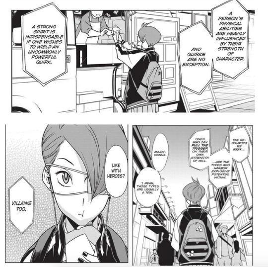
The part based on their personality is hard-pressed by many characters since the character’s personality traits are linked to their quirks. It’s no argument that quirks have something to say about these characters’ personalities; whether quirks are reacting to personality or not is up to discussion.
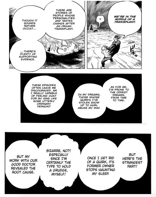
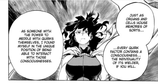
For quirks to be realistic, you need to create drawbacks to the quirk. Your quirk needs to have limits, they can use their limits to defeat or outsmart a villain.
Using their weakness to their advantage and creating a weakness for your quirk is important not only it’s realistic it also gives a character a limit to overcome. It would fit the theme plus ultra or surpass your limits going past one limit and beyond. This shows how to create and choose a quirk and develop their weaknesses by examining the quirks of the characters. Horikoshi shows the flaws in the quirks similar to how you see flaws in people. Quirks are used to showcase the character's flaws. Creatives use flaws in someone's power creating an imaginative and creative design with subsequently good quirks.
Create a limit to a quirk creative uses for flaws in someone's power notes the flaws in a person be creative when you use this. The system of quirks promotes creativity and is creative when creating quirks by exploring the character's personality.
This is seen in the way their quirks demonstrate the character’s personality; you deny the way the characters use their quirks; it shows aspects of their personalities that can’t be any more true for the mains characters' quirks in which I will explain and explore how their quirk links to their personality.
Izuku Midoriya:

Izuku’s quirk is One for All, his quirk stockpiles power in the form of super-strength that greatly enhances his physical abilities. It's a quirk that has been passed down by various heroes of the past storing their power. This represents Izuku’s potential born from his analytical mind and his kind, altruistic behavior to help others despite how powerless he is and his incredible determination on multiple occasions to become a hero to help others despite people telling him it's hopeless.
His quirk being standard super strength this is a typical power you see in traditional superheroes from comic books. Izuku is the biggest superhero fan and his dreams to become one Izuku wanting to be a hero can show in his quirk. Each quirk tells there characters but Izuku is interesting since he didn’t have a quirk until he was given it by All Might however in a way like everyone I am going to talk about in this list it tells his personality in the way he uses it
His quirk doesn’t just tell his personality but also carries along with the themes of the story passing on one legacy and character development, One for All is a quirk that is passed on from user to user this is much like how quirks can be passed on from parent to child. Izuku inherited his legacy from the world's greatest hero and his idol All Might to be his successor the legacies in which OFA is represented in the themes of BNHA.
Another theme that his quirk carries is character development that showcases this theme in his quirk. One for All reflects his character development in the story, Izuku recently required power he doesn’t know how to control yet and his lack of control of his power showcases his inexperience in both learning how to control his quirk and as the protagonist in the development.
He first starts both quirk wise and character-wise a timid, nerdy heroic but with a bout of reckless heroism but after every battle, Izuku's confidence and self-respect grow over time, his bravery becoming more noticeable the more control he gains his growing confidence is seen in the control of his quirk. Izuku slowly gains self-confidence in himself to stand on his own two feet; he is willing to work with others, accepting help when needed.
One for All symbolizes Izuku's character growth throughout the story, his growth is best seen in his use of control in his quirk. Izuku’s control over his quirk symbolizes his growth as a person that reflects him in terms of personality where he came from timid and anxious to confident and assured.
Izuku’s power has influences from Spiderman since black whip resembles his web Izuku's entire character is molded after Peter Parker with Peter Parker understanding the responsibility that comes with power and him accepting the responsibilities that come with it.
This is seen best in Izuku’s character arc and development.
One of Izuku’s weaknesses is his overall naiveté. He is pretty naive when it comes to handling situations out of his control such as when trying to confront Overhaul with Eri and his battle with Shinso with the latter falling into his trap. Another aspect of his naiveté is how he approaches things without any knowledge or empathy, and doesn’t fully see other peoples’ views due to his admiration in response to hero society prevents him from seeing unable to see the flaws of hero society his naiveté truly prevents him from seeing just how much suffering is done by heroes. Izuku has yet to accept his power as his which was branched off from a villain power.
Izuku’s other flaws other than his Izuku’s naiveté is his lack of belief in his self-worth. This stems from his initial quirklessness that without a strong quirk he's useless he cannot do anything if he doesn’t meet anyone’s expectations if he doesn’t feel that he’s good enough then he’s useless. Despite being entrusted with power by All Might izuku doesn’t he doesn’t feel as worthy of his quirk he doesn’t believe that he deserves his quirk and try to prove that he isn’t useless so he doesn’t care about what happens to him as long as he would feel useful to others. When he saves others how he doesn’t consider himself in part of his equations Katuski points out that he doesn't take himself into account in his plans.
This showcases in how he uses his quirk with him breaking his limbs when he uses his quirk you can see this several times in the story that for Izuku, helping others he constantly hurts himself, he breaks his bones while he risked his life to save someone at the expense of himself this utter lack of regard towards himself nearly costs his arms his powers are harmful to him destroying his body overtime he uses it. Izuku’s lack of faith in himself gives birth to his self-destructive nature, creating reckless tendencies where he doesn’t put his safety in the mind; this approach backfired on him numerous times.
his powers go hand in hand
with the duality of his determination to become a hero to save people
and his self-destructive nature in which his fatal flaw is the lack of faith in himself ends up endangering himself. This self-destructive power of his quirk notes his self-destructive nature.
The quirk shows both his strength and weakness
like the name, one for all implies they demonstrate Izuku self-sacrificing nature and his self-destructive tendencies
Katsuki Bakugou:

Horikoshi's initial concept of Bakugo was that he is a natural-born genius who would inadvertently insult people but found it boring and decided to turn him into a nasty guy with an explosive personality. I’m glad Horikoshi did this because his current personality better fits well into his quirk and the laws of the power system since Bakugou’s quirk Explosion explains his entire personality perfectly. Bakugo is the rival unlike Izuku, he stands out for having a quirk that is loud and explosive. he has a quirk and he’s loud and overbearing in contrast to the quiet and timid Izuku
His entire personality is characterized by his quirk that he has an explosive personality and explosive temper. Bakugo is introduced to have a lot of explosive qualities shown flashy, loud his quirk is. much like how his quirk explosion is very loud and attention-seeking, this is shown in the way He wants to be seen by others as the best and not just the best but the best of the best he wants to be the number one hero who surpasses All Might and he demands to be always seen by others to be the strongest, not the weakest. he has an obnoxious personality he’s loud, demanding, and overbearing he's vocal and upfront on opinions. he’s conceited and self-centered and both hot-tempered and hot-headed and incredibly pettyone other thing the way Bakugo uses his quirk creatively showcases his intelligence.
Bakugo displayed overall aggressive behavior during the sports festival
people pointed out that he would be a better villain and he can be villainous if he’s on the wrong side he may have the potential to be a tough hero but also a dangerous villain. Bakugo’s quirk can be seen as villainous; he chooses to be a hero; he's dead set on being a hero which allows him to not join the LOV.
His quirk is a metaphor for how his ego blows up on him.
Bakugo is the constant victim of his ego as seen how he acts.
Even though he is not safe in his explosions he has a flashy quirk but puts unrealistic expectations on himself he’s terrible at managing his feelings causing them to come out in outbursts. This blows up in his face literally but thankfully grows out of his negative qualities.
Ochaco Uraraka:
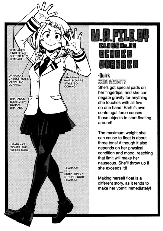
Ochaco’s quirk is zero gravity, zero gravity allows her to nullify objects depending on there mass leaving them weightless nullify gravity on any object or person she touches.
This references Ochaco’s uplifting, lively, bright, cheerful, talkative, and bubbly attitude She can be an airhead at times her personality makes her seem that she is weightless. Ochaco lightens and uplifts the mood when she is around she brightens the room with her positive attitude and nullifies people's problems with her uplifting attitude. Seen in how she said she likes Deku’s nickname since it gives a feeling of a can-do, how her presence to Izuku is a breath of fresh air to him. She’s warm and empathetic; her warm nature is highlighted when she cared for her family and friends. Her parents are her main drive to becoming a hero in which to earn money to give them a comfortable life.
remember what I said before that you can tell a character’s personality in the way they use their quirks? They’re a small detail where OChaco, balls up her fists to be careful to not touch anything since her quirk would allow anything to float if she’s not careful. This is a small detail but this detail shows her careful side to not let things slip up. This aspect references her more serious, practical side in contrast to her cheery persona and says that she is grounded in the way she’s careful what she touches seen in the way she handles her quirk.
She’s grounded and someone careful not to float away in a sense this notes back in the way she uses her quirk that always has to remain grounded and prevents herself by not getting carried away by her emotions metaphorically and physically.
Ochaco is willing to shut down her emotions in order not to get carried away by her feelings. She does this to complete her goals. Ochaco shuts down her feelings for izuku viewing them as a distraction to her goal to be a hero.
Tenya Iida:
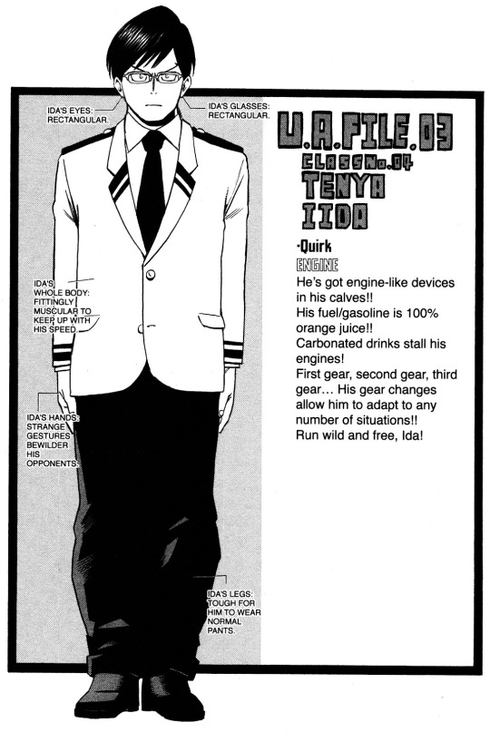
Iida’s quirk engine allows him to run straight and struggle to make turns this could refer that Iida is straight-laced, straight forward, serious, honest seen in how his quirk runs straight he comes off as stiff and robotic being technically minded like a robot with efficiency carrying out a job without a single thought. But single-mindedness in his goal to be a hero also granted him a serious case of tunnel vision.
The detail in how his quirk preventing him from making turns when he runs only allowing him to run straight not allowing him to turn and look around this shows an incredibly selfish aspect of his personality from how his quirk is used with Iida focusing on a single goal to the detriment of others, he did not stop and turn to see if there are people who needed help instead goes straight single kindly to his goal such as abandoning Uraraka to zero pointers to focus on the entrance exam, and being consumed with revenge against Stain that he ignored the injured hero Native on the floor in favor of pursuing Stain. His lack of twists and turns references this selfishness of his personality.
He does show character development and thankfully he grew out of this flaw, when he grew more concerned about the well being of others. After Izuku and the rest came back from the Yakuza raid, Iida prevents the rest of his classmates from swarming around in consideration of their wellbeing. During the joint training arc, rather than pursue Honenuki fruitlessly, he instead intercepts Kaibara as he battles Ojiro; he goes straight for their wellbeing rather than for his personal feelings. Iida became more thoughtful in his actions, seen in how he becomes more considerate of his classmates.
Shoto Todoroki:

Shoto’s quirk is half-cold and half-hot. This showcases his personality very well which shifts into being cold and hot.
Shoto was introduced as cool since he mainly uses the ice side of this quirk. Shoto came off as cold, cool, stoic, and focused and reserved, aloof and closed off to others this is seen in how he interacts with others where he came off as cold and distant is shown in how he only used his ice quirk. However, he harbors feelings of passion underneath. Shoto’s refusal to use his fire abilities reflects not only him holding his issues inside but how his temper flares when others inadvertently bring up issues he’s trying to suppress. The fire is a metaphor for his personality in how he was not taught to properly regulate his own emotions.
Todoroki froze his own heart but when Izuku lit a fire in his heart; it awakened his desire to be a hero when he remembered the All Might interview with his mother, awakening his emotions that were long suppressed in the abuse.
After the sports festival, he begins to show more emotions become more friendly when he opens up to his classmates. He starts to use his fire abilities but remains reserved and oblivious. He’s starting to use his fire abilities again symbolizes him opening his warmer gentle traits. Shoto came off as cold reveals his fiery feelings of passion and a gentle heart underneath his cold exterior that was locked away from the abuse.
His quirk is a metaphor for his character arc in the way Shoto has yet to accept himself who he is and him growing to be his person, not Endeavor’s son.
Names:
The reason why I wrote the quirk segment first is that the majority of the characters are named after their quirks, mainly because their identity is loosely tied into their quirks.
The characters names Hoirkoshi uses are harmonious and carefully constructed Japanese word puns to explain the characters themselves. Most of the characters are named after quirks, but there are exceptions to this naming theme in which the characters of BNHA are not only named after their quirk but also after their role and/or personality in the story. Their names always have meant that tie into the characters quirk, ambition, or personality that ties into their role in the plot too.
This can be said that when you do names for BNHA OCs they have cultural subtext to them since a majority of BNHA names are influenced by Japanese culture since that’s where the series takes place.
Even if a Japanese name's meaning may not seem much on the surface when you look into it there is an understanding of the cultural context in the naming of work here. There’s a lot of subtlety that goes into naming a character with Japanese involved in your first half to know the meaning of the name and nuances of what it has to do with the characters themselves. this isn’t here to explain Japanese since it’s a work of fiction. This segment is here to help you get a better idea of how to pick Japanese names and how Japanese names work. It's only here to know how to properly choose a name for your OC. Japanese is a very contextual language, a very complex language to learn from when you’re choosing Japanese names for your OC’s keep in mind there are so many nuances in the language to learn from. You might need to look at different sources on how to do Japanese names but this is meant to explain how the BNHA character’s names match their personality role and quirk. I wanted to help you get the general idea of Japanese naming and create an authentic Japanese name for your OC. Japanese names are characterized by sounds and vibe, the sound that rolls out of your mouth when you say that name, and the vibe the feeling that comes from the name when you hear it.
besides the meaning of the name, what do you think of when you hear this name? It will change your impression of what you think of your OC if you choose a name. depending on the meaning and sound of the name it can change the feeling when you hear these names.
Take Aki for example. It has two different kanji assorted with it but different meanings. The kanji takes on different meanings depending on the kanji used for it. Aki 秋 means autumn in Japanese; when we think of autumn we think of a cool walk in the leaves and the leaves changing color in the season things we associate autumn with as well as melancholy. Aki is a cool name to use for cool characters Aki gives a cooler serious vibe when spoken aloud.
Another way Aki is written is with this kanji 明, unlike the other kanji which is translated to “bright” in Japanese. It’s used differently when you’re naming your female OC you add ko in the name 子 “ko” meaning child. In Japanese Ko is a common syllable for girls to have in their names: when it’s used it turns into the name Akiko. when you give characters the name Akiko usually translated to “bright child” in Japanese.
Akiko
秋子
autumn child
明子
bright child
When you hear Ko that would give the impression that she’s still a child hearing the name Akiko you get the impression that her personality is bright and cheerful. If you're writing her quirk it could be something light-based since the meaning of her name means bright you think of light. Since light is seen as something good it would fit quite well for her role if she wants to be a hero or better yet her character being a ray of light to others when they are down. Aki can be translated to the emptiness in Japanese and the meaning and feelings to it feel devoid of all emotion and happiness with a melancholy vibe, the same vibe that you assorted the kanji, Aki, with.

Hearing this used instead would make her have a different personality different from the kanji Aki you hear from you get the impression that her quirk is too being a void quirk since the name is close to emptiness. You see, you get a different impression of the character depending on the kanji of the name, sound and feel that is used in their names
Before you choose a name take some research to see how a Japanese name is used kanji have multiple readings. The one on-yomi means Chinese reading or kun-yomi. depending on the spelling of the kanji you need to check the spelling in the kanji and see if it lines up.

If you wanted your character’s names to sound more authentic here is a list so you can get a better idea.
Common prefixes of Japanese girl names
e
ko
yo
ka
ki
ho
mi
na
ne
no
o
ri
me
ko
Common prefixes of Japanese Boy’s Name
ya
o
ou
ki
ta
shi
ji
to
ma
dai
goro
hei
hiro
jiro
maru
masa
ro
shiro
suke
taro
yoshi
hiko
I am going to begin explaining the meaning of the character’s names down below.
All Might:
first up is All Might or Toshinori Yagi (八木 俊典). All Might was initial quirkless so he didn’t have a quirk until later, but his entire name consists of his character, role, and quirk.
First, let’s start with his given name Toshinori (俊典). Hi s first name is comprised of two kanji with “Toshi” means “俊, an excellent person” and “nori” means “典, model or example”.
When put together means “excellent role model.”
This goes very well with All Might role in the story: a great hero that everyone looks up to and aspires to be. All Might inspires others to be the best they can be and he’s a great example of a hero in the story.
His surame is Yagi (八木) and is comprised of two kanji. Ya means “八, eight” in Japanese and “Gi” means “木, tree” This references All Mights being the 8th user of OFA. The tree aspect of his surname can be referenced in Japanese history trees and wood are used to uphold buildings and bridges and used in Japanese architecture. The tree/wood likely refers to his role as him being the symbol of peace, the pillar that upholds society.
Yagi is in Japanese harmonious with a goat, a reference to his true form design. Goat being abbreviated to greatest of all time. All Might is the number one hero in his series universe.
Izuku Midoriya:
Now, the main character of the series. Izuku Midoriya’s (出久 緑谷) name is the exception of the quirk naming theme go BNHA, fitting his initial quirklessness. Instead his name denotes his personality and overall role in the series.
Izuku’s given name is comprised of two kanji the first one “Izu,出” means “coming out from a certain place, to leave or exit,” and “Ku,久” means “long ago”. Together means “waiting a long time to emerge”. This is concerning Izuku’s role in the story, emerging as a brand new hero but also a new hero coming out after the long all might era Izuku who is emerging from all might's shadow to take his place as the new hero after the All Might era is over. His name refers to his main strength, his perseverance, his entire name gives the feeling of someone who is always rising to go all out to win and always emerging gives his name a lot of spirits his name is very plus ultra to use. The “Ku” in Izuku’s name is harmonious with the number “nine” in Japanese notes that Izuku is the 9th user of OFA.
When broken down “Midori,緑” means “green” and “ya,谷” means “valley” in Japanese. altogether means “green valley” it sounds like a river running through the valley sounds refreshing and gentle for someone nice, kind, and timid like Izuku. It also has deeper meanings.
I spoke before about how green matches his overall personality in the colors section
and his green color scheme in his character design. “緑” kanji as green is relatively a new use this kanji “青” blue and green used to share the same kanji. The green came from the kanji for blue brings a new idea that is more positive than the kanji it's used to describe izuku as a new fresh hero much like how the kanji is derived from. This connects to All Might since his hero uniform is mainly blue; he is a mentor to Izuku.
For the second kanji “ya,谷” this may not say too much on the surface it means “valley” but
it has a deeper meaning underneath the given meaning a valley means a gap between two high places it’s used to describe someone in a difficult position or predicament. Like a rock and a hard place in kanji “進退維谷, between a rock and a hard place” like a gap between two high places. there's no doubt Izuku is someone who is always in a sort of predicament Izuku is always met in a difficult position, whether being quirkiness and realizing he can’t reach his dreams, learning to control the quirk that was recently given to him by All Might, trying to keep his quirk a secret or be in danger of losing his arms he is someone who is always seen in a dangerous predicament he doesn’t catch a break.
Time to elaborate on Izuku’s insulting nickname and hero name Deku (デク).
Izuku has a different spelling in the kanji, Izu can be read as “de”, “De” and “Ku” have the same spelling when together with “deku”.

Deku came from a wooden puppet but the nickname was served as an insult by Bakugo which means “good for nothing and useless person.”
Deku came from a kanji the famous idiom called “dekunobou” (木偶の坊) used to describe someone useless. Dekunobou can sound roughly equivalent to calling someone a blockhead right? But, it’s not used to insult someone's intelligence, it's insulting someone by calling them useless and boring.
Deku is not seen as something positive; this is just a reference to his lack of quirk in the beginning. But it changes after he enrolled in UA. Ochaco likes the nickname since it gives the feeling of can do this is called “dekiru”(出来る) which bears the same kanji as Izuku’s given name. Dekiru means “can do”; dekiru is the Japanese verb you use to express the ability for something. Ochaco liked it because “deku” sounds a lot like “dekiru” so Deku can mean can’t or can do depending on who’s saying this inspired by Ochaco’s encouragement, this causes Izuku to take deku during his fight with Katsuki. Another thing “Dekiru'' shares the same kanji in Izuku’s given name.
“dekiru”(出来る)
“Izuku”(出久)
One last fact about Deku,: it's that it came from a Deku doll, and its particular feature it has no arms or legs. This can refer to Izuku always breaking his bones to use OFA causing him to almost lose his arms. The Deku doll has also referenced the legend of Zelda games with the wood goblins, an interpolation of the term Deku. Horikoshi may have taken references from Zelda games but knowing Horikoshi it would not come as a surprise as he references pop culture in his works.
Tips of advice if you want a nuanced name lookup Japanese culture references.
I am not an expert on the Japanese language so you don’t have to use a completely authentic Japanese name in fiction.
One last thing All Might and Izuku have in common is that they have wood themed naming in their names that can note that they were both quirkiness.
Katsuki Bakugo:
Now for Katsuki Bakugo’s (勝己 爆豪) name.
His name when split apart contains “katsu,勝” means “to win” and “ki,己” means “self”.
His name is very self-explanatory, it describes someone who always wants to win by himself and surpass everyone, someone who’s ambitious and stays strong.
Bakugo’s surname (爆豪) when put together means “strong explosion” a reference to his powerful quirk explosion and explosive personality.
It also can be read as “explosion master”, referring to his skill and mastery of his quirk and how
Bakugo is smart and creative when he uses his quirk.
The “ou” in his surname of “Bakugo” sounds like the word for “king” in Japanese reflecting on his drive to be on top and even attempting to take it as his hero name.
Ochaco Uraraka:
Now time for Ochaco Uraraka (お茶子 麗日) one of Izuku’s best friend and chatterbox starting with taking a deep drive at her entire name, an example of Horikoshi’s genius being a nuanced name like Izuku’s. First her given name “Ochaco'' is written with hiragana and kanji, “Cha'' means “茶, tea” in Japanese; the “o” in her name is denoting a degree of politeness a refined value to target for tea it a nice way to say tea in Japanese. “ko,子'' is a common end name for girls in Japanese, but here Horikoshi uses c instead of the typical K for ko this was added to make Ochaco sound cuter. Her entire given name together means “tea girl” in Japanese.
this meaning notes her personality, much like how people drinking tea are relaxed.
This notes how her presence gives a refreshing and calming to other people how her presence makes others comfortable to be around. Ochaco’s other meaning of her name is punny ones, Ochaco is derived from the Japanese expression “ocha ko pi” roughly meaning “piece of cake!”
a play on her positivity she exhibits in her personality or “ochappi” “chatterbox girl”. Her name illustrates her chattery bright nice girl of a personality.
On to her surname “Uraraka”. “Urara,麗” means “bright and beautiful”
“ka,日” means “day” when put together means “beautiful and bright day”.
Given to Ochaco’s personality it associates with her energetic and positive mood as something as bright as the sun itself a peaceful wonderful day a note to her peaceful cheerfulness. Horikoshi designed her to be cheerful enough to drive their conversation and bright in contrast to the timid quiet Midoriya.
Her name is also the Japanese provocation of gravity: ura can be part of the word and bi can be vi then ti sounds like the English word tea making it sound like this (ウラビティ,guraviti) Gravity her entire name references her zero-gravity quirk.
Tenya Iida:
Tenya Iida’s (天哉 飯田) entire name is a pun, much like Ochaco’s.
Besides Iida having a punny name, his entire name has a lot of deep meaning that goes into it.
Tenya’s first and last name’s kanji put together to form the word “Iidaten, 韋駄天” which is the Japanese term meaning “fast runner” or someone who can run fast.
This is fitting his quirk engine denoting his super-speed abilities
His name was also taken from one of the gods in Buddhism, Idaten, who is the protector of Buddhist temples famous for being a fast runner. This can relate to Iida’s role as the class president since he is put in charge to protect and take care of his classmates.
“Ya” in his given name is interjections “哉, how, what alas”
“ya” in his name is a popular end character of a boy’s name that is commonly used. This notes Iida’s exaggerated mannerisms; he displays his arms and personality being loud and overbearing and extremely goofy.
His surname “Iida” have kanji that are comprised of rice being “飯, cooked rice” and “田, rice field”. The rice aspect of the surname might seem to not harbor too much importance but rice holds huge importance to Japanese culture namely for its rich history Japanese history and culture is strongly rooted in rice fields. In historical Japan having a rice field meant that you are rich since if you have rice fields it means you have a lot to eat. This refers to Iida’s background, his family being of one of the distinguished hero families. Iida's upbringing came from a rich family even implied by Ochaco that Iida sounds like a rich kid.
Shoto Todoroki:
Time for Shoto Todoroki (焦凍 轟).
Shoto’s kanji “sho” in his given name has the first kanji for the character “焦, to burn” and the second one “to” meaning “凍, to freeze” referencing the functions of his quirk half hot and half cold. His name can be harmonious to a Japanese short sword “shoto, 小刀” which is made by heating and cooling. This is a reference to both Shoto’s Japanese character design and quirk.
His surname “Todoroki” means “轟, to roar or reverberate”. It’s used in Japanese to describe a loud noise that crackles and for thundering expressions. The kanji is widely known for people far away that can hear the loud sound. It's an expression used for somebody for whom they are famous.
Shoto’s surname refers to his background as the son of the number two hero Endeavor, the second most popular hero in Japan, and another thing is how he’s popular among his classmates. Shoto is so well known so much that people can hear his name far away.
and it refers to how powerful Shoto’s quirk is in the series.
So as you see Shoto’s name when said aloud gives the impression of someone cool much like how Shoto himself is.
Hero names:

As Best Jeanist said, hero names represent your desire, the embodiment of who you wish to be your ideal self, or better yet who you want to be. The hero name of BNHA talks about the character’s desires themselves or as someone points out it can refer to their future character arcs later in the series. The hero names are not just symbolic of not just character ideals but also their desires and character arcs.
Izuku's hero name Deku was inspired by Ochaco’s encouragement. Since Deku sounds like the Japanese verb dekiru which is translated “to do your best”. Deku was originally an insult against him but he shows this to proudly show his determination rather like how he’s not inherently a hero but has to work towards becoming one.
All Might’s hero is short for is almighty; this refers to his unmatched strength, status as the number one hero and symbol of peace. The origin of his hero name came from All Might’s backstory in volume 0 when he was leaving for America he said “I’ll save everyone with all my might”.
Rumi’s hero name is Mirko. The origin of her hero name came from her backstory,
in her high school days, her friends call her Ruko instead of Rumi a prefix at the end of her name in japan (school girls will often give their friends nicknames that are the first syllable of name and ko). Mirko’s hero name ends up being her first name spelled backward. or ko could be taken from her surname from middle school usako, who crashed into various fight clubs until she was caught and expelled. Her hero name references an MIA fighter and her love for fights. Horikoshi did the character in meta-reference.
Bakugo’s initial hero name “king explosion murder” is Bakugo’s high expectations of himself on how he wants to be seen as the strongest. His surname “ou” is a reference to the “o” the Japanese word for “king” sound-alike in Japanese .It's like he is declaring himself to be the king of explosions and reflecting on his drive to want to be the best. His second hero name lord explosion murder may not seem all that different but if you looked close lord is below king you can see how he personal downgrades himself and doesn’t see himself as the best he never felt like he won since Todoroki didn’t face him with full-strength and wasn’t a complete victory when Todoroki held himself back.
Bakugo’s immaturity and childishness are seen in how he chooses his hero names him realizing he was not all-powerful as he thought he was. In the recent arc he finally reveals his hero name Dyamight. His childishness and immaturity is still prevalent but this shows his admiration towards All Might be combined with his quirk
Ochaco’s hero name is a pun on the Japanese procuration of the word gravity and her surname. This refers to both her quirk zero gravity but also her motive relating to her family. Ochaco using her family name instead of her name is a reference to her family matters and how she loves and cares for them and her main motive to being a hero comes from wanting to get them out of poverty.
Todoroki just chose his name as a hero name. Todoroki’s hero name reflects his character growth; this notes how Todoroki is changing compared to when he was first introduced. He’s just choosing his name instead of his surname shows that he’s destroying any possible connection to his father his way to shed Enji’s grip from him and yet he cannot shed himself from his family nor his left side. Shoto has yet to accept himself as who he is and his arc is about accepting himself and his past as it is.
Superhero powers:
Much like how the characters from my hero academia have many influences from heroes from different cultures. BNHA pays homage to pop culture and heroes
Izuku and Peter Parker (Spiderman) are nerdy kids that were bullied by their peers who recently acquired power. Petterare struggles with managing his day to day life as a hero and student and Izuku is struggling to control his powers and keep his quirk a secret.
Peter’s character arc is one about what it means to have personal responsibility and Izuku’s questioning what it means to be a hero it ties into Peters character in what it means to take responsibility for his said actions. How Izuku fights is similar to how Spiderman fought his opponents: they use their smarts to outmaneuver their opponents (even his quirk black whip resembles Spiderman’s webs when he swings).
Izuku was a huge influence on Izuku in both character and superpowers. Horikoshi was initially going to make him talk in a similar way to spiderman
Spiderman is a huge influence on BNHA as a whole. There is the use of Spiderman in his works with Sero was inspired by Spiderman in his works seen with his quirk and web-slinging building to building to the next
Since Horikoshi has a love for Spiderman this wouldn’t be considered surprising used this with Sero and Kamui Woods since they have similar designs and quirks.
All Might takes a lot of influences from superheroes like Superman, Captain America, and Hulk. One thing these three have in common they embody traditional superhuman strength super strength is typically seen in superheroes. All Might’s buffed up form resembles Superman and how he changed from his true form to muscle form like the hulk. Even imitating Hulk’s catchphrase “smash” from Hulk smash in his attacks. Red, white, blue color scheme coming directly from Captain America.
Tenya’s quirk came from the Flash from comics due to his super speed.
These are only examples
You don’t have to base your OC off of a superhero or power they use.
Choose whatever you want you can take references from heroes if anything that is entirely up to you.
How to do:

I am going to go over my two OC’s Hozuki Kizuki (Oni) and Keiko Uchihara(Kitsune) there OCs for My Jirokichi Academia series a friend has done. They don’t harbor a lot of BNHA influences but Jirokichi influences though they have some such as being designed based around their quirks, personalities, and motifs.
They’re both inspired by cosplay photos done by a friend,
The photos served as a source for their inspiration for their design while I worked on them; they became their people the more I breathed life in them. The things I paid the most attention to is how I designed my BNHA OCs are the face, hair, and eyes.
Oni and Kitsune are aliases that go with their designs and motifs since their designs came from Kitsune and Oni from Japanese folklore. I based it on it with the mask that references the motifs around it.

For Hozuki, her face is shaped like a circle making her face rounded. Round looking shapes are used to portray someone youthful: her shape notes her age being 17, her design is meant to portray her as a juvenile character, someone on the cusp of adulthood. Circles are used for female characters or child characters makes sense since she’s still considered a child in normal terms and a young woman.
Hozuki’s hair bun, bangs, and fringes are shaped like a flame and when turned right side up it closely looks like a Chinese lantern plant. This aspect is a reference to where her name and quirk Demon Ray that being the rays of light from the lantern and the flame aspect in her hair being flame from a lantern.

Keiko’s face is narrow and its shape closely resembles an oval; this emphasizes that Keiko is an adult and an older woman. Keiko has many curved lines on her face and designs the lines to look softer and feminine another addition to that she’s a woman. The curved lines closely resemble the lines that are seen in traditional Japanese art, in which they are fluid, this notes Keiko’s Japanese character design. The curved lines are also used to portray movement and I think that it resembles the way a fox is drawn with the bendiness and fluidly in the lines going to her fox motif.
The eyes are the main thing in design to portray the personality of the characters. This goes well with the personalities I conveyed with Hozuki and Keiko with their eyes in their personalities.
Hozuki’s eyes are round, they have two shapes combined, one circle with a triangle at the end. the sharp end of her eye looks like pointed pointy objects that reference a character's blunt nature and are on point with someone. This says something about her personality which notes her blunt, curt attitude with others and shows her strength and strong will. The circle says she’s a good guy but just not in the traditional sense. She does good but others are scared of her. The triangle and circle symbolize how she comes off as approachable but in reality, she’s easy to talk to. She’s not friendly, but she’s easy to speak with. People are just put off by her blunt nature. Hozuki's straightforward she doesn’t hide any ulterior motives and she’s very simple her design would portray her personality by using these simple shapes and it highlights that she has a simple design that is not overly complicated

As I previously mentioned Keiko has a lot of curved lines,
This is seen well with her eyes; they are curved to resemble foxes’ eyes.
In media fox eyes in designs, they are usually used to portray sneakiness and untrustworthiness in the character’s personalities. However, in this case, her eyes have a gentleness in them; they show her to be easygoing and open-hearted which goes along with her personality. the lack of eyelashes highlights the androgynous in her design. The curved lines meant that she’s approachable and easy-going so that people would go to her since she has the expression of open acceptance. Just shows how her design in contrast to Hozuki makes her someone approachable due to the impression she has.
If you compare their faces even their expressions say something different about their personalities and impressions they give off.

For Hozuki outfit it’s a sailor school uniform,
a sailor uniform is commonly something you see in student uniforms.
students from Japan wear school uniforms, a reference that Hozuki is a high school student since 17 is school-aged. Another fact her outfit is extremely durable and can withstand harsh battles this says something about Hozuki that she would choose function over looks in clothes.
Keiko is a traditional Japanese in design, with her wearing a male kimono and samurai sword along with Japanese foxes. Keiko has a ponytail along with the sword reminds the net of a samurai where samurai would tie them up in a ponytail and carry swords. The samurai aspect correlates to her fighting style in which she uses a sword. Keiko’s androgynous features resemble Inari Okami god of foxes who are considered androgynous in Japanese culture. Her entire design notes that she grew up in a traditional Japanese household. The aspect where she wears a male kimono instead of a female kimono notes that she doesn’t care for gender differences all too much and thinks people should wear what they want. This goes in hand with her open-minded acceptance trait.
When I was choosing quirks for both Hozuki and Keiko, I focused on which fighting styles match their personalities; their fighting styles reference the Kitsune and Oni motifs in their design. Keiko’s fighting style is swift and dexterous like a samurai, being precise, skilled, and careful and her movements are fluid as a fox. Her quirk gives a similar effect of vanishing than appearing in Japanese mythology foxes are known to disappear and reappear at will. Keiko’s quirk relates to precision and Hozuki's quirk relies on her raw strength. In her quirk, Hozuki relies on raw power and strength this is related to Onis in Japanese folklore.
Hozuki’s quirk is called Demon ray,
Her Quirk allows her to convert her emotions into monstrous strength, speed, stamina, and reflexes turn her skin red as an effect of her quirk. One of the drawbacks of her quirk is that if she overuses her quirk she will get mentally exhausted. If Hozuki becomes too emotional she will go on a rampage she’s considered unstoppable and dangerous when she’s in that state.
her quirk turning her skin red to give her the appearance of an Oni.
Her quirk references aspects of her personality,
her passionate personality underneath her stoic behavior, and
in that Hozuki emotional person deep down who feels things deeply.
and her fierceness in her fighting style resembling that of a beast that goes with her character reference to her strong will. She looks cool on the outside but inside she has turmoils of her past
her quirk acts as a metaphor for her emotions. Lastly, the red skin correlates to her oni motif.
Keiko’s quirk is Dimension cross. Her quirk allows her to move back and forth between dimensions at will and control them as well. If she makes a move in the dimension she resides in it will leave a mark. The drawback of her quirk is that she accidentally ends up doing damage to herself, others, and the environment if she is not careful. Another limit of her quirk is that even though it looks invisible if a disturbance is made in her dimensions she will be pushed back like if she’s being tackled with a phase quirk smiler like Mirio she will be pushed back.
This function of her quirk could reference an aspect of her personality in which
Keiko can easily penetrate people’s walls noting her acceptance and openness traits.
For their names, Hozuki Kizuki’s (鬼灯 筑気) given name goes with her Oni motif.
“Hozuki” (鬼灯) means “demon lantern” in Japanese Hozuki is another way for “demon”. Her name is also called “Chinese lantern” referring to a fruit that was a distinctive red husk. The fruit references the functions of her quirk with her skin turning red with use and for the lantern aspect, lanterns emit rays of light that go back to the name of her quirk demon ray.
Hozuki’s surname Kizuki sounds similar to Chitoses Kizuki’s surname but with different kanji that is used. “Kizuki” comes from the Japanese verb “Kizuku” (筑く) meaning “to contract, build up” the second kanji “ki” (気) translates to “feelings”. Her surname references the function in which her quirk is used; she stores her emotions in her quirk, an accumulation quirk that grows in power from her emotions.
For Keiko Uchihara (形交 内原), Keiko’s first kanji of a given name, “Kei” (形) means “shape, form or body” and “ko”(交) means “cross”, “ko” is a common end particle for girls in japan.
her surname “Uchihara” (内原) means “Between Plains” or “inside planes”
Her surname may not mean much on the surface but if you look closely at her name when said together in Japanese means “body crossing between or inside plans” this refers close to the function in which she uses her quirk.
Hozuki’s color is dark red. Red symbolizes passion,strength,determination,energy and danger
The danger part would note her fierce and beast-like battle skills and quirk.
Hozuki has a passionate side that is hidden underneath and incredible determination when she is with her goals. The strength references her quirk, body, and strong will. Red is an intensely emotional color that fits Hozuki perfectly since she is someone deeply emotional.
The brown in Keiko’s design notes that her personality makes her come off as laid-back and decent and down to earth.
Hozuki’s quirk is inspired by powers from the Hulk with Hozuki’s quirk and the name came from.
Her quirk Demon Ray’s name that was taken from Gamma Ray
a call back to the Hulk’s Bruce Banner who was infected with Gamma radiation.
Hozuki’s skin turning red when she uses her quirk references Bruce Banner's skin turning green when he uses his powers.
Keiko and Hozuki have matching swords in their designs symbolizing the partnership and friendship between them.
Out of one of the designs of my two OCs Hozuki’s design is the one I incorporated so much into.
She’s the design I spent so much time with the most.
When I was choosing a quirk for Keiko I thought dimensions sounded too moderndayish and didn't have any traditional Japanese influences in culture, but when I did research I found out that the kanji for dimension came from “Ma” (間). Ma is used to describe space and used in Japanese culture, Ma is used in traditional Japanese it means negative space Japanese word for space and dimension and used in Japanese aesthetics.
When I discovered the “ma” I had a feeling I was successful in Keiko’s design and quirk with incorporating ma in there. I thought Keiko’s quirk was a perfect reference for her Japanese character design.
Overall I felt help that I was successful with their designs because I incorporated a lot of things correctly.
Epilogue:
In light of the recent arc, I apologize if I left anything out or forgot to mention anything. This was written until up to the manga’s recent arc. I am not an expert on Character design this post was only here to serve as a basis to help design your OCs. this analysis was put there to help you get a better picture of what to do so this is not 100% correct this is just my analysis.
This post serves only as a guideline to help you design your BNHA OC’s
If I made mistakes or if I'm missing something feel free to edit I’m open to opinion. I hope this post can at least help with creating an OC and don’t worry about the extra details just as long as it's authentic it’s fine. What was I going to say? Be inspired by the things around you, do things you like, have fun creating an OC.
The last thing, have fun!
#Character Design#my meta#my last meta of the year#izuku midoriya#shoto todoroki#ochaco uraraka#tenya lida#katsuki bakugo#bnha oc#my hero academia oc#THANK YOU SO MUCH HAMLIET!
99 notes
·
View notes
Text
thank you for this blessed template, @possumsunshine. this was so fun and cute, i couldn't resist after seeing it on my dash 💗
pulled a couple of answers from oc asks i've done recently because oof this got long.
QUICK READ OF YOUR DETECTIVE
Name: alma greene
Pronouns: she/her
Sexuality: bisexual
Love interest: mason
Best friend: felix but also nate
Main skill: science/tech
Secondary skill: people/psychology
Main personality trait: tied for impulsive and sarcastic
Secondary personality trait: stubborn
Why did they join the Wayhaven PD?: she’s not a detective, but science skills
Relationship with Rebecca: very close, even with absences, but waning
Relationship with Bobby: college friend, currently hates him
Verda or Tina?: both
Murphy bite?: wrist
Murphy’s fate?: at large, babyyy
Rescue LI or Rescue Sanja?: sanja
GENERAL
Name: alma eloise greene
Nickname: sweetheart/space girl by mason; sweetie by rebecca
Birthday: june 12th
Age: 29
Pronouns: she/her
Sexuality: bisexual (demiromantic??)
Hair color: dark brown
Eye color: dark brown, nearly black
Height: 5’1”
Piercings: ears, former nostril piercings
Tattoos: a small snail on her right arm, super cartoony spaceship and tractor beam over the words “i want to believe” on the back of her left calf
Clothing Style: “modern” i guess, according to the game. tbh i usually describe it as “too old to be an e-girl but too cute to care.” bleached denim, dark plaid, graphic crop tops, black vans or converse, thigh-high tights, etc etc
Apartment Style: cozy. did she find it on the side of the road or goodwill or an estate sale? if not, it’s probably not in her apartment.
STATS
Personality:
Charming | Intimidating
Impulsive | Cautious
Sarcastic | Genuine
Friendly | Stoic
Easygoing | Stubborn
Traits:
Heart | Mind
Optimist | Pessimist
Team Player | Independent
Skills:
Main Skill: science/tech
Second Skill: people/psychology
By the Book | Bend the Rules
KEY DECISIONS
Reason for joining the Wayhaven PD: alma is wayhaven’s only forensic analyst because i refuse to let my black oc be a cop
¯\_(ツ)_/¯ in-game, she’s 100% there for her scientific prowess.
Murphy bite: Wrist | Neck | None
Murphy’s Fate: Captured | Escaped
Rescued: Love Interest | Sanja
ROMANTIC RELATIONSHIP
Love Interest: mason
Why them?: on a meta level: oh no he’s hot
but alma’s reasoning is that he’s very upfront about what he wants in the beginning and she’s never been pursued in such a way. It’s a bit of a rush and an ego boost for her at first. but mason’s loyalty very quickly becomes the steadiness alma’s been missing for most of her life and she latches on to that. she’s not had someone so dependable around in… well, ever. and her physical attraction becomes emotional VERY quickly.
Bold, shy, or mixed?: shy until they sleep together, then a mix of bold and genuine afterward.
What were their first impressions of each other?:
alma on mason: thought he was super attractive but that was quickly pushed aside by “holy shit, this guy’s an ass.” she thinks he’s an uncooperative jerk that only cares about himself for quite a while, honestly. she asks him along for things she wants to do alone precisely because she thinks he’ll be the most likely to just stay out of her way. she’s surprised by his attitudes and opinions, and her incorrect assumptions about them, during those times.
mason on alma: would never, ever, ever admit that his first thought upon meeting Alma was simply “cute.” he quickly found parts of her to assess individually. those first few days were mostly spent appraising her physical attributes and watching her back when she needed it. mason did find her funny right away, but he wasn’t willing to trust someone new, regardless of that person being their handler’s daughter or not.
What do they find attractive about each other, mentally or physically?:
alma on mason: his eyes, freckles, and every single version of his smile. his decisiveness, differentially, and willingness to stab as a warning.
mason on alma: her hair tbh, there’s just… a lot of it. her hips, her eyelashes. He also likes her adaptability, sense of humor, and the warmth she gives with no expectation of reciprocation.
What do they do to spend time together?: lots of stargazing, lots of watching tv very quietly and making fun of the storylines they don’t understand until they get bored and make out instead, walking around the quieter parts of wayhaven or taking late-night drives.
What is their favorite memory together?: i like to think mason finds the carnival photo of them after the place has been sacked and gives it to alma sometime later. both the taking of the photo and the giving of it are very fond memories for both of them.
What are their love languages?: touch, quality time.
How do they handle being apart from one another?: badly. mason absolutely hates it after a time. if alma’s out of town, he’s in her apartment with the excuse of feeding her cat, but it’s 100% just to sleep in her bed and be around all the things that make her, her. alma does a little better. she’s used to having folks sort of come and go and come again, but she gets almost hyper-insecure?? it’s nothing she’d admit openly, but she’s second-guessing herself in totally unrelated aspects of her life until they’re reunited.
Do they argue? How do they handle arguments and disagreements? How do they make up?: they don’t necessarily argue, but they disagree with the intent to problem solve. alma is pretty flexible and as long as she can understand why someone might feel the way they feel, she’s willing to hear them out or go along with their plan. if an argument does get out of hand, they need space from it for a while. they each have places to retreat for those times, and they wait for the “hey” text to come through to know it’s time to talk about it.
What does their future look like?: alma becomes a vampire two years into their relationship. they move into a quiet, old house on the edge of town until the whole team moves elsewhere. mason has to get used to having a cat because october has several years left in him. they don’t get married, but they’re inseparable.
Anything else you’d like to share: in the time before alma turns, mason learns to perfect making grilled cheese because it’s what alma craves when she’s not feeling well. He makes the grilled cheese then he immediately showers to get the smell off him but he makes it regardless.
BEST FRIEND RELATIONSHIP
Best friend: depending on the playthrough it swaps between felix and nate, but felix feels more in character
Why them?: alma loves felix’s sense of adventure and nosiness. Most of all she loves that he won’t judge her for pulling the same shit every now and then.
What were their first impressions of each other?: alma was super thrown off by that hand kiss. “who the fuck is this mischief-maker?” while nate was very kind and warm, felix (surprisingly) was the UB teammate that really humanized the rest of the team for alma. he’s fun and genuine and wants everyone else to be happy together. felix was incredibly interested to learn more about alma, as a human, as his boss’s daughter, and then as a friend when she readily accepted the supernatural and, by extension, him as a vampire. The fact that she’s easily flustered or surprised really works in his favor because he lives for being the most shocking person in the room.
What do they do to spend time together?: they share music, they dance, and they text A LOT. lots of memes, lots of “what does [x] mean?” “oh nice” “[proceeds to use the thing they just learned incorrectly]”. they also compare and share hair products.
Anything else you’d like to share: they each have a tamagotchi named after the other (baby felix and baby alma) and they compete to see who can keep theirs alive the longest. everyone loses.
OTHER RELATIONSHIPS (Feel free to go in-depth!)
Relationship with Rebecca: oof okay. alma seeks rebecca’s approval and depends on her for a sense of safety and “stability.” in some ways, she wants to be exactly like her mom: strong, independent, unbothered, worldly. but a lot of that shatters the longer alma works professionally with rebecca and with the revelations surrounding rook. alma sees how much rebecca uses her as a crutch, projects her perceived failures onto alma’s life, and over-shelters her.
Relationship with Rook: alma doesn’t remember him and tries not to think of him often or fondly or at all BUT she has so many of his things. his flannels, his detective badge, his ancient comic book collection (which is the only reason she has her own). she has his eyes and his impulsive streak, his care for people of all varieties. she IS rook’s daughter and she ignores that fact so it doesn’t hurt her.
Relationship with Bobby: they used to be very close, slightly flirty friends but there’s no way in hell alma can trust him now. (i originally had bobby as alma’s ex but it was all getting a little too Bella Swan for me. like bobby, douglas, the werewolves, falk, and mason like????? it was a bit much so bobby’s just an old ex-friend)
Relationship with Verda: alma fucking loves verda. that’s her mentor, that’s her dad friend. she feels a sense of Pride and Accomplishment when she can make verda laugh or impress him in the lab, or both. alma’s fond of spending evenings over his place with eric and the kids, making dinner, or just hanging out.
Relationship with Tina: tina was alma’s first friend as a kid. they lost touch in high school because tina was bubbly and cute and popular, while alma was… not. but the summer before they left for college they ran into each other at a house party and since that reconnection, they’ve been thick as thieves. it was like nothing had changed. tina is a light in alma’s life, and alma lets tina lean into the stranger parts of herself without judgment.
Relationship with the Mayor: thinks he’s a creep and a bad parent.
Relationship with Capt. Sung: appreciates how he prioritizes the town and its people, but thinks he could loosen up a bit.
Relationship with Haley: haley is a couple of years older than alma but they’ve known each other forever. alma admires haley’s work ethic and cheery attitude.
Relationship with Elidor: oh man, alma is absolutely stunned by elidor. he’s beautiful, kind, and knowledgeable. in those early days, elidor is responsible for quite a bit of her supernatural education. alma grills him while he nurses her back to health. her curiosity is refreshing to him.
Relationship with Tapeesa/Vieno: alma thinks vieno is cute and funny, says hi when she sees them around, but they’re not best friends or anything. she can’t shake the thought that they’re basically a fae version of danny devito.
Relationship with Unit Alpha: absolutely smitten with lesedi. she’s never seen a more beautiful woman. tamiko ends up being a pretty good friend. the twins are on her social periphery but alma’s not close with them.
Relationship with the Maa-alused: alma sincerely wants to help them adjust to life in this world and takes that goal very seriously. at the same time she really really wishes falk hadn’t developed this weird attachment to her.
Do they have any other important relationships, past or present? (Relatives, friends, etc.?): YES. i’ve thrown another oc in wayhaven for the express purpose of being The Detective. His name is javi. alma met him in college and they were fast friends. alma convinced him to try out wayhaven after graduation. They lived together for a while and now they, along with tina, can often be seen in the corner booth of chen’s pub.
she was also very close with her maternal grandmother before she died. she was raised by her while rebecca was absent, but i need to develop this more.
her cat, october, whom she’s had for five years. he’s a sweet, mostly black tortie that can hardly meow. alma adopted him as an adult when she got her own place.
PERSONAL BIO
Describe their personality: alma is so open and ready to accept new possibilities. she’s the sort of person that embraces what scares her, finds beauty in it, and loves it intensely. she’s sharp and resourceful. i wouldn’t exactly describe her as hard-working, but she’s knowledgeable about her field and tries to be helpful when she has a goal in mind.
she’s quite tactile. touchy with other people. likes to use her hands for work or hobbies. she doesn’t really mind being alone for long stretches of time but would prefer not to be. she wants others to want to be around her.
she’s also terrible at being honest about her trauma. everything is fine, she’s fine, she doesn’t need to talk about this :) :) :) she will handle the breakdown when it happens and not one second before. also, with quick wit comes uncontrollable sarcasm and it does not always hit well.
Strengths: the only person in unit bravo that knows how to use google
Weaknesses: squishy
Where in the world is their Wayhaven?: super torn here because wayhaven feels inland to me, but i think i’ve finally settled on the north carolina coast but not like the outer banks area. If not there, then maybe virginia, closer to the chesapeake bay.
What is their personal history?: alma is born to rook and rebecca in wayhaven. spends her childhood being raised mostly by her grandmother, idolizes rebecca. academic success comes easily for her; a heavy interest in science leads to a scholarship at a university just far away enough to feel like she’s Leaving The Nest. alma dates a bit in college but she’s the type to end up becoming friends with everyone she sleeps with and romance is difficult for her to cultivate. when she does date, the relationships are short-lived. she returns to wayhaven after school and puts her degree to work in wayhaven’s police department. she wishes she’d applied for a position in the city but craves the comfort (and tbh, the low stakes) of home.
If they weren’t a detective, what would their dream job be?: she’s a forensic analyst and honestly?? it’s a pretty dreamy job for her. she loves being a scientist, loves helping people, and isn’t easily grossed out.
Anything else you’d like to share: has tried to stay overnight in an ikea. did not succeed.
RANDOM FACTS
Zodiac sign: gemini
Hobbies: reading peer-reviewed journals, watching terrible sci-fi, collecting comic books and mugs, thrift shopping
Likes: good hair days, denim jackets, vanilla candles, halloween, unflavored lipbalm, driving at night, that warm “surrounded by love” feeling, snails, fuzzy socks
Dislikes: the lights while driving at night, winter, dry skin, minimalist decor, smudged glasses, being overwhelmed with choices
Drink of choice: white wine usually, white russians if she’s out at chen’s, or shots of jaeger if she’s feeling trashy
Starbucks order: grande flat white with 3 pumps of toffee nut syrup and a sprinkle of cinnamon
Favorite food: a simple, fresh spaghetti pomodoro OR lemon meringue pie
Favorite color: golden mustard yellow
Favorite music: she loves just about everything and it’s heavily dependant on her mood. (this is actually really difficult to think about without feeling like i'm giving her my exact taste in music but here's a little playlist that fits her vibe)
Favorite genre (and favorite movie/book/etc): science fiction or psychological thrillers, but her favorite movie is oliver and company.
Favorite season: fall
Anything else you’d like to share: has a stupid amount of blankets stashed around her apartment. she really does not like being cold.
#alma greene#twc#i uhhh i spent a very long time on this and i'm still like#who is this person#but it's fine it's fine#i can rest
16 notes
·
View notes
Text
CatCF: White Chocolate
And here is my White Chocolate retelling!
About this version: This version could take place in something between the 90s and the 2000s. It has been strongly inspired by both the world of cartoons in general, and "A Series of Unfortunate Events", as strange as it may seem. In this version, you have Seven Platinum Tickets.
Reinterpretation of Augustus Gloop:
Augustus Gloop, first Platinum Ticket winner. This Augustus, I imagined as a bully.
Physically, he is a very round boy. His belly is round, his torso is round, his face is round, his arms and legs are round, he basically looks like a bunch of balloons tied together, or a mass of spheres/globes. He has two great "beaver teeth". In terms of clothes, he eithers wears hoodies too small for him and of bright, vivid, flashy colors (orange, yellow, pink) or he wears striped shirts that are not slimming at all (such as the red and white stripes shirt of Augustus Gloop in the 2005 movie).
To all adults, Augustus plays the part of the cute, happy, innocent boy. But to all the other kids, he is a horrible, nasty, brutal and greedy bully. He likes to torture and dominate others - though he is not a sadist. He just seeks power and dominion, he loves to strike fear and submission in the heart of other children. A good exemple of his double-faced nature are his beaver teeth - he can actually speak perfectly fine with them, even though they gave him a slight lisp that is quite cute to adults. But with children, he worsens his lisp on purpose so that he would spit and splutter all over their faces, and when said children complain, the adults keep saying things like "He can't help it, he is just different, don't discriminate".
Augustus actually used to be a regular-sized kid (even though taller and bigger than his comrades, but not that fat). He regularly beat up, gave wedgies or other typical bully tortures on his peers to get their money or their toys. But it all changed when one day a boy had the idea to offer him his lunch instead of his money. Augustus was a big eater you see, and he seized the opportunity of having a free lunch. And since all the other kids preferred to give up their lunch rather than their money of their toys, they all started to "encourage" (as in, subtly manipulating him) so that he would racket lunch and food instead of money out of them. As a result, Augustus grew immensely fat on all the free food he got each day - and with his bigger size he could intimidate and crush other kids more easily. But at least, they didn't had to steal money from their parents anymore.
His demise will be with the Exploding Candies (remember those?). I think they would be going by a section of the Factory where some of Wonka's candies are stored, and Augustus would see another kid holding an Exploding Candy. Not knowing what it is, he would bully said kid (maybe Charlie?) into giving it to him. He would swallow it and then...
BOOM! HE EXPLODES INTO LITTLE PIECES!
No, I'm kidding Xp Actually I went with something much more cartoony (this Augustus himself being cartoony - in fact I based him in "fat Chuck with beaver teeth" from the cartoon "Chuck's Choices". It may sound weird but it makes kind of sense in the series Xp). He would suddenly be all distended and inflated like a balloon, and then deflate completely (again, like a balloon), reduced to a flat, pancake-like boy, with smoke coming out of his mouth, nose and ears.
Reinterpretation of Violet Beauregarde:
The character is named Violet Strabismus, second Platinum Ticket winner. For her, I tried to think about what kind of people/archetype/stereotypes were seen chewing gum all day long, and I ended up finding this idea upon seeing a girl on a train that corresponded exactly to that.
This Violet is the typical embodiment of the cynic, "pseudo-edgy" teenager that seeks everything that is bleak and dark. She is a mix of goth, of emo, of punk and grunge. She only wears and surround herself with things dark, creepy, sinister or sad. She romanticizes notions such as despair, death, suicides, and the like. She is the kind of teenager that claims her whole life is just a series of pains and losses, that she seeks comfort in the darkness and the morbidity, and she disdains everything joyful, innocent or happy. Her two favorite hobbies are chewing gum, and trying to destroy other people's dreams and hopes with depressing talk.
The irony in all that, however, is that despite Violet's claims that she has a miserable and sad life, she actually has a very happy one. She has loving parents that support her in everything she does, and siblings that also love her. She comes from a wealthy background, which allows her to buy all the chains and piercings and extremely complicated goth/punk clothes she wants at specialized stores. She is quite a pretty and good-looking girl, even with her creepy clothes and dark makeup. She even has a huge house, and in fact despite her claims to adore death, never went to a funeral ever in her life, and never knew anyone that died. Still, she keeps repeating that she is a "misunderstood, bullied, rejected loner". And she is not suicidal herself, mind you, nor depressed. She is perfectly fine. She just wants to look like she is, to "fit her style".
Her demise, as with all the Violet variations in my stories, relies on the Three-Course Meal gum. But here, the dish used is the ice-cream. I had the idea that the gum would actually turn Violet's flesh into ice-cream. As a result she is immediately put inside Wonka's cold storage room and freezers, so she doesn't melt. And she is condemned to live her life alone, in dark, cold, locked up places, exactly as she pretended and wished to.
Reinterpretation of Veruca Salt:
Now, I am not much satisfied with this Veruca Salt, but well, it is still worth a shot, even though the idea itself may be not so original.
Veruca Salt, third Platinum Ticket winner. For this Veruca, I envisioned actually a character based on Darla Dimple from "Cats Don't Dance". She is a small, cute and child-like girl, that looks almost like a pretty little doll, but who is able to scream with an insanely powerful voice and can act like a total brat by throwing extremely destructive tantrums and breaking everything everywhere if she doesn't have what she wants.
Her demise was actually suggested by ArtMakerProductions - the Geese Room. The Geese Room from the 70s movie would return, with a full room having geese lay chocolate eggs for Easter (I also think Wonka would be disdainful of this silly idea according to which rabbits laid the Easter eggs). And when Veruca would throw one of her usual tantrum, one of the goose would believe her to be one of her children (due to Veruca's screams sounding like a goose' screams) and just sit on her, crushing the little girl. (Not to death of course, but that's one big goose Xp).
Reinterpretation of Mike Teavee:
This one was hard to think about, but I finally found something I'm quite proud of.
Mike's character is obsessed with television, right? And he wishes to be INSIDE television, right, that's the core of his demise. Well... what about a Mike Teavee that is obsessed with television not as a watcher but as an actor?
Henry Trout, fourth Platinum Ticket winner, is a former child actor who used to be the star of numerous teenager sitcoms and other televisions shows by Disney-like productions. All this fame turned him into a spoiled, arrogant and selfish brat, and when he was kicked off the shows, for both being too old AND being just too much of a jerk, he couldn't let go of the past. He believes that everyone knows him through his work as an actor, and that everyone is a fan of him. He spends a lot of his time looking at his old television shows, and television is his only topic when speaking with other people. He still dresses and acts like a star - and never once realizes that a good lot of people don't know or even remember him. As per ArtMakerProductions, his parents are also his agents, and they desperatly try to find back their son's former glory, by "overselling" him to get a lot of media exposure, and still doing a lot of advertisement and promotion despite him not getting any real work - the finding of a Platinum Ticket was another attempt at becoming famous once more.
Take the characters of "fallen stars" such as Norma Desmond in "Sunset Boulevard" and Jane Hudson from "Whatever happened to Baby Jane?". Mix them with the former Disney or Nickelodeon child and teenage stars, especially if they had a dark turn in their life (the Spouse twins, David Henrie, Cameron Boyce, Zac Efron...). And you get Henry Trout.
His demise is still the Television Room, like all the other Mikes. However his variation is that the television Wonka used was prepared to teleport and air objects, such as Wonka bars. It is still a technology in working, and they only focused on the material and visual parts. They haven't worked on the sounds. As a result, once Henry Trout gets on TV, he is insanely happy because now everyone will see him and nobody will kick him out... but then he realizes he can't speak, because there is no sound. And when rescues from the television, he discovers he turned completely mute.
Reinterpretation of Charlie Bucket :
Charlie Bucket, the seventh and last Platinum Ticket winner.
For this one... I actually don't know. I wanted to do a Charlie based on the "brown-haired Charlie" as illustrated for exemple by 2005's Charlie. But I hesitate. On one side, I haven't used yet the idea of "the too-saint Charlie", aka a Charlie Bucket so good and so perfect he becomes a male Mary Sue, unrealistic and annoying, an exaggerated caricature of a good boy. I thought I could potentially use this with the brown-haired Charlie, especially since 2005's Charlie was criticized for being a too-perfect child.
On the other side, I also liked the idea of a crippled Charlie, in the mind of "Tiny Tim" from A Christmas Carol, and I also thought it would be fitting for him...
So I'll let it float for now.
Reinterpretation of the deleted kids :
# Terence Roper. Since this one had barely any personnality in the original drafts, I decided to include him (especially since I already reinvented the two other kids part of his trio - Clarence Crump and Bertie Upside).
I think of Terence Roper as the typical "hot bad guy" archetype. He is a criminal kid, and a little delinquant, that drives despite not having a permit, that steals, that robs, that like to spread chaos and destroy shop windows and tag walls etc... I think he is the son of two famous criminals, and thus thinks of crime as the "family business". But he is also a very good-looking, very charming, and very popular boy, which resulted in him not only being leader of gangs and the like, but also having a sort of cult or worship around him - similarly to how "bad boys" in high schools can be idolized. I think something very similar appened with his parents - I want to explore with this character how people worship criminals, with very successful bandits, mafioso or drug dealers ending up as popular and romanticized and idolized as movie stars, singers or the like.
He is the blousons noirs of the 50s and 60s, the old-fashioned troublemakers pachucos, the greaser delinquants of the movie Grease, and all other fashionable kind-of-criminal groups you could think of.
But the irony here is that Terence actually got his Platinum Ticket by legal means, by buying a chocolate bar - and in fact, for him to have found the Golden Ticket and not stole it is a great disappointment and shame.
For his demise I thought of re-using the Fizzy Lifty Drink. He would stole it in an act of bravado, and drink it without realizing what it was - which would result in him getting a perpetual case of bad gazes (frequent burps, farts, and other stomach noises). This would completely ruin his cool and good looking image, as well as any kind of grace or discretion he may have.
# Miranda Mary Piker. Sixth Platinum Ticket Winner (Terence Roper was fifth). She is based on the character as most know her : a school-obsessed, fun-killing girl. The original incarnation was a stern, no-nonsense, very strict girl that basically acted like any cruel headmistress or teacher from those horrible British boarding schools. However, given that this character was alreayd beautifully reintepreted by Danguy96, I wanted to do something slightly different. This Miranda is more like an "annoying moral guardian". She is still obsessed with school, good work and being an obedient and good child, and she still disdains silly things such as games, entertainment or fun in general, but instead of being a stern and harsh girl, she would rather be a nagging and annoying pest, that keeps giving speeches and sermons to everyone about why you should act a certain way and not another, a walking moralization that keeps trying to teach "proper manners", "maturity" and "basic knowledge" to everyone in a very condescending way. I also thought she would try to dress up as an adult, and thus with adult clothes - but since she is just a cild, said clothes are much too big for her, resulting in her looking kind of ridiculous.
Her demise would, of course, be the Spotty Powder. I can't remember if this was an idea that was suggested to me, or one used by someone else in their reinterpretation, but I like the concept that instead of falling inside the machine and being crushed to death, Miranda (and possibly her school director father) would actually fall into a big pile of the Spotty Powder, and thus develop all the symptoms of a contagious disease and be forbidden from setting a foot in school for a very long period of time.
Reinterpretation of the rival chocolatiers :
This is the big defining feature of White Chocolate. In this version, the rivals of Wonka have a big part to play.
They don't appear in themselves - but they sent emissaeries, messengers and spoekpersons to contact each of the kids that won a Platinum Ticket, in a similar way to the 70s movie, and each chocolatier tempts the kid with a different "treat".
Slugworth seems to be a chocolatier involved in the criminal underworld - his emissaries at least seem to have some criminal undertones, and act through fear and violence rather than seduction. In fact, I think his chocolate and candy business may actually be a "cover" for darker criminal activites, and "washing" of dirty money.
Augustus Gloop receives the visit of a man with "icy blue eyes and nasty purple scars on his cheeks". He passes off as a waiter in the restaurant in which Augustus is celebrating, even though it is just a disguise. He tries to convince Augustus by both subtle threats, and the promise of a free pass and unlimited offer in all the restaurants and buffets of the town.
And Terence Roper, due to his criminal connections, actually is invited to the house of a wealthy man with ties to the criminal world, a creepy man in fancy, wealthy suits, but stuck in a wheelchair and with a fake eye shining like a silver dollar.
Slugworth's purpose seems to be the destruction of Wonka. He tries to convince the children to sabotage or put maybe bombs and things like that inside the Wonka factory, or to ruin batches of candy, stuff like that.
Prodnose rather keeps sending women as emissaries. In fact even thought of making Prodnose actually a female chocolatier, but I don't know yet... I thought of Prodnose as some sort of media mogul, that tries to spread their brand to everything (there are Prodnose television shows, book series, toys, sport equipment, gardening tools, etc...) including candy-making and chocolate-making.
One "messenger" contacts Veruca Salt. She is one of the journalists interviewinv the young girl after she found her Ticket. Based on Cherry from the musical, she is a happy, charmant, pleasant woman. But her face has something... weird to it, almost unnatural, as if she had a bad surgery job done to it. And she keeps smiling all the time - her smile seems completely stuck.
Henry Trout is the other one to receive a messenger from Prodnose. As Henry goes to have a new suit tailored for him (because of course Henry only had tailored suit perfectly to his size), the tailor reveals herself as a messenger of Prodnose, who could easily bring back Henry in Prodnose-made television series and shows. The tailor herself is a tall and thin lady all dressed in black, and with long, spindly fingers with long and pointy nails - her hands in fact look like creepy spiders.
I thought of probably Prodnose trying to cause a huge scandal inside the Wonka factory, and thus asking the kids to find out Wonka's dirty secrets, and if not, to invent some that they would "reveal" upon leaving the Factory. Where Slugworth tries to ruin physically and economically Wonka, Prodnose tries to ruin his reputation and to discredit him on moral ground.
As for Fickelgrubber, he is actually envious of Wonka. I think he is a very young person hailing from a very wealthy and powerful family, and his dream was to become a candy-maker, but he was very bad at it. However he refused to give up - especially when seeing how Wonka was succesful. Fickelgrubber is an envious and jealous child-minded young person, and he refuses to admit Wonka can succeed where he fails. Fickelgrubber has tried to copy and steal Wonka's inventions for years now, but all his attempt ended up failing miserably - he copied the ice-cream that never melt of Wonka, but they had a tendency to turn into rock-hard material. He copied the gum that could create gigantic balloons of Wonka, but he mixed up the recipe, and the gum actually made kids inflate and pop like balloons. And when Fickelgrubber released glow-in-the-dark candies, it was later revealed they contained a huge dose of radioactive components.
Fickelgrubber's emisseries are creepy kids (I still don't know if they are "friends" of his or merely all sorts of cousins of his real family - as I said, Fickelgrubber is quite young, both in spirit and mind).
Violet, upon visiting her local cemetery, is contacted by a beautiful blond teenager standing on the wall of the cemetery. He acts flirtingly, seductively, playing the "good cop" (and he also actually acts like a cat, meowing, purring and sometimes even moving like a cat - I thought of him as a parody of Cat Noir from Miraculous). And when Violet is not receptive to this, the boy presents his sister, that is waiting behind Violet. A big, burly, muscular girl with a bulldog-like face.
Miranda is also contacted by Fickelgrubber emissaries - twin girls, identical, but "perfect", as in with perfectly clean and ordered clothes, identical beautiful hairstyle, and the like (I thought of them as inspired by the twins from The Shining). They are basically the kind of "perfect" and "proper" kids Miranda seeks to create in the world. And they try to convince her to join them (they even have prepared for Miranda clothes identical to their own so that they would become their new sister). I don't know however how would Miranda react to that - either she refuses, due to stealing secrets being perceived as cheating and she is against it ; either the sisters actually convince her to go along with the plan by the simple argument that Wonka is an excentric, ridiculous man that gets success without hard work, and Miranda hates both goofy/clownish and not-hard-working people.
As for Charlie Bucket, he will actually be visited in turn by one messenger from each chocolatier (in fact, he may even escape them when they start fighting each other).
Slugworth's emissary... I actually don't know. Xp I thought of maybe a kind olf man, almost grandfather like, that acts all nice and doting, but then reveals that inside his cane, there is a blade.
Prodnose's emissary is a loud-talking woman with a lot of makeup and wearing a huge coat made out of crocodile (I thought of her as a mix of Cruella and Ursula).
As for Fickelgrubber's emissaries, Charlie meets at first a beautiful Japanese teenager (male or female?) dressed in a refined suit, something between a fashion model and a succesful business owner. And when their smooth talk fails, they present their brothers - because they are triplets. And appear from the darkness two huge sumos, teenagers yes, but the size of elephants. (This was again inspired by usual sumo appearances in cartoons, from JCA to the Simpsons passing by Shuriken School).
#catcf#charlie and the chocolate factory#white chocolate#augustus gloop#mike teavee#violet beauregarde#veruca salt#terence roper#miranda mary piker#fickelgrubber#prodnose#slugworth
13 notes
·
View notes
Last Seen Blogs

xxfna
kyoshi

vamoonelf
●○●
neko-2428
KaiShi

nikenoshow
Looking to buy men used socks & underwear

lempiredeslumieres
L'Empire des Lumières