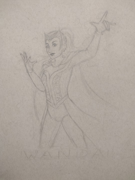
#i love Dauterman
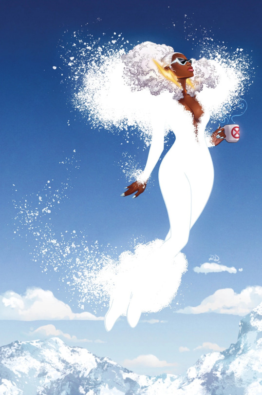
Text
you want me to be a tragic backdrop so that you can appear to be illuminated, so that people can say ‘wow, isnt he so terribly brave to love a girl who is so obviously sad?’ you think ill be the dark sky so you can be the star? ill swallow you whole.
#julian doodles#scarlet witch#wanda maximoff#marvel#marvel comics#wanda django maximoff#brotherhood of evil mutants#avengers#x-men#i genuinely have no idea what to tag this as#as always lmaofjsadlk#russell dauterman#steve orlando#i redraw this piece every year#like the one i redrew last time in like 2014 went viral & kept getting credited to a famous marvel artist lmafodjsafosa#anyways im super happy w how this came out i love the new outfit#redereew it the second isaw the new outfit#hope this gets clout#1k
1K notes
·
View notes
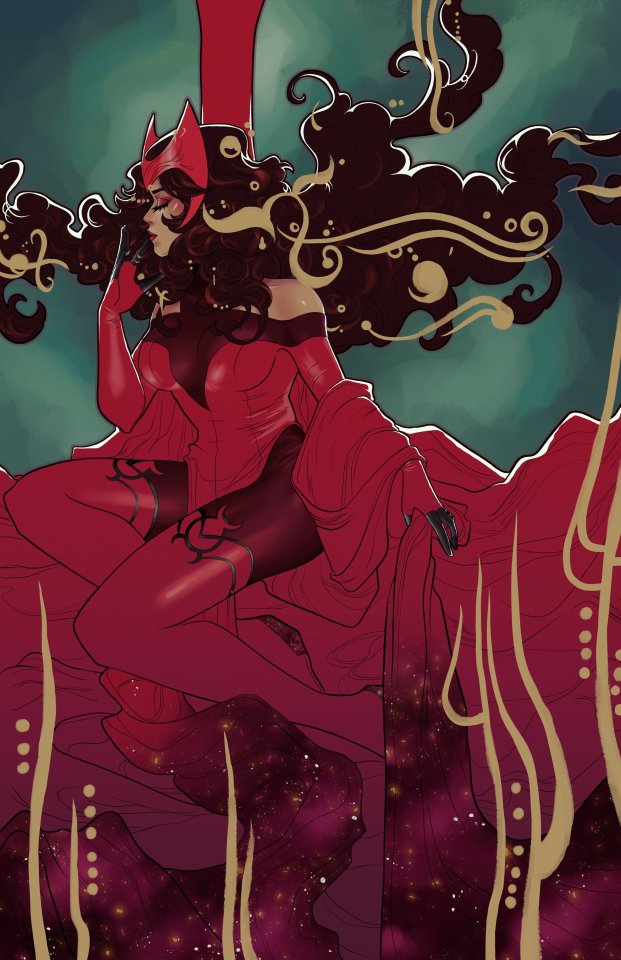
Text

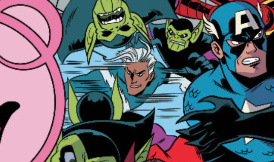
issue summary: Wanda and Pietro Maximoff are no longer on speaking terms. So when the Wizard corners each of them with his new army of Frightful Four Hundred, it will take all their ingenuity – and all their power – to survive. But can the twins save themselves without unleashing something worse? And are they really as alone as they think?
So this is a gorgeous cover. Dauterman never misses and I am fully aware of the reason why Vision is on this cover but I am super dissapointed that a Scarlet Witch and Quicksilver official cover doesn't actually include Quicksilver and instead includes Vision.
Covers are never indicative of the actual story (look at the uncanny avengers covers) being told and when I did ask Dauterman about it he said this is to represent the fact the twins are not on speaking terms which I respect but I also wonder why then Vision of all characters had to be included, why not Wanda on her own? Why not one with her and Tommy as her ally. Why not a connecting cover with both twins facing away from each other to represent their distance? For me this kind of feels like executive meddling due to that aweful WandaVision show but I love Dauterman as an artist and will respect and take his words at face value. So long as the story gives the twins equal focus (especially given how much Steve Orlando has been emphasising this is a story about the twins) and vision is a small part of it there will be no complaints from me ultimately.
Dauterman has confirmed he was really happy with Pietro on the cover of the third issue to maybe if Pietro is the main focus of the third issue that balances things out! Like ultimately I want the twins to have equal focus as coleads. Vision really doesn't need to be in this story and I think he's ultimately detrimental to Wanda's character. She's moved on let's keep it that way. Fuck movie synergy it's not done a single good thing for the majority of characters included in the MCU.
The book is also ultimately about a brother/sister bond and I don't think we should focus on romantic relationships or promote then. Having a romantic relationship the MCU promoted feels cheap. Wanda and Vision is the worst one but I know I wouldn't have been happy either if it was Wanda/Jericho, Pietro/Crystal or Pietro/Monet. Given how much MCU synergy has screwed over the twins and Pietro in particular I can't help but worry but let's see! The issue summary sounds promising and it's best not to judge but this admittedly beautiful cover has certainly dampened the optimism I had after reading the AITP interview with Orlando.
#scarlet witch and quicksilver#wanda maximoff#pietro maximoff#maximoff twins#quicksilver#Scarlet Witch#Vision#I both this this cover is extremely beautiful but also extremely disappointing#I love Dauterman as well#But it's offset but my disdain for vision and Wandavision#And I can't help but worry that Pietro may be shafted in a story he is supposed to be co-lead#But let's not jump to conclusions and wait for the actual story#I'm certainly keeping an eye out for the variant covers
4 notes
·
View notes
Text

Cover by Russell Dauterman
AHHHH I AM SO EXCITED!!!
Pietro and Wanda co-leading a mini!!!
#nycc 2023#wanda maximoff#pietro maximoff#scarlet witch and quicksilver#russell dauterman#steve orlando#I fucking love comics#inject this straight into my veins
6 notes
·
View notes
Text
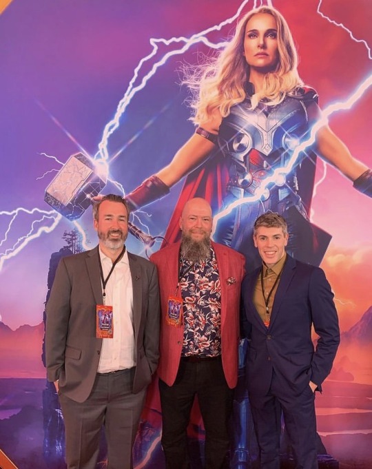
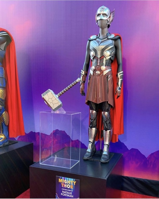

rdauterman: Thor editor Wil Moss, @jasonaaron, me, and Jane at the Thor: Love and Thunder premiere! So awesome to see the Mighty Thor on the big screen! ❤️⚡️🐐
x
Some of my favorite pictures of the Jane!Thor/Mighty Thor comic team at the Love and Thunder premiere from @russelldauterman’s Instagram! I’m so glad Marvel’s acknowledging the work these awesome people did in telling us Jane’s story in comics. Thank you so much for an amazing story. (And thank you as well to Matthew Wilson, who isn’t here, but was the colorist for Jane’s Thor comics!)
Bonus:
#i’m a bit late on this but i wanted to post these#there are a couple more pictures of the marquee and a billboard and things on Instagram as well!#russell dauterman#jason aaron#wil moss#jane foster#the mighty thor#thor goddess of thunder#toothgnasher#or#toothgrinder#i love the ‘goat will bite’ sign :)#thor: love and thunder#thor love and thunder#thor 4
12 notes
·
View notes
Text

Ever since Russell Dauterman blessed us with his first stunning costume cover, I have been threatening to do this while secretly hoping he would so I wouldn't feel as compelled to... and also, how gorgeous would that be?! C'MON RUSSELL!
At some point, it got too far to abandon so here she be. I just love my soft precious baby cinnamon roll/crunchy badass diva icon goddess so much you guys. 😭
#dazzler#xmen#x-men#marvel#comics#art#illustration#comic cover#artists on tumblr#alison blaire#daniel mcnea
224 notes
·
View notes
Text
“This is chaos magic, Wanda. And that makes you the Scarlet Witch.”
— Agatha Harkness
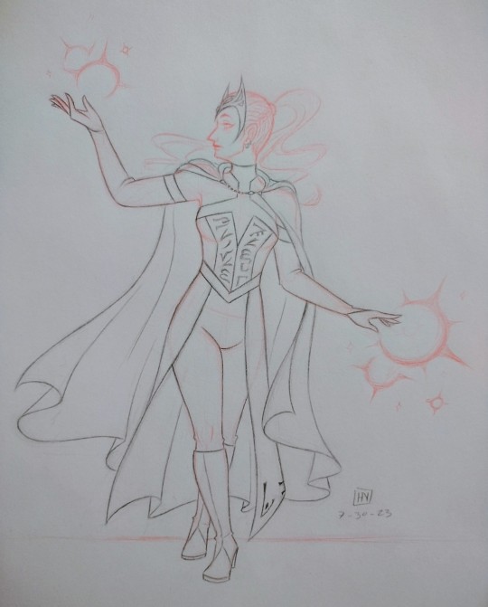
a sketch showcasing my Wanda design!! credit to @adorkastock for the pose reference used :)
below the cut is a full breakdown of my design, including its evolution, my thought process, and other unposted drawings relating to this project, so read on if you’re interested!!
okay, so real talk, I first decided I wanted to make my own Wanda design because I Could Not be bothered to keep looking up refs for whatever tf is going on with her mcu costume bodice. I mean, look at this:
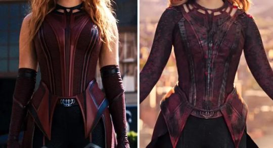
I mean, maybe it looks okay onscreen, but there’s so many fiddly little details, especially around the collar, and it was just a pain to draw whenever I would draw my Wanda. and okay I’ll be real I also wanted to distance my Wanda from the whitewashed Wendy version of her, because I Do What I Want. and also, the dullness of the reds did not spark joy within my heart. she’s the Scarlet Witch, people, not the Vaguely Maroon Witch!!
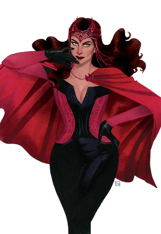
and I fell in love with the Kevin Wada design when I first saw it. it’s gorgeous, it’s sleek, it’s witchy, and it’s significantly less frustrating to draw!!
so for a while, I drew my Wanda in a variation of this fit, blended with some of my own touches (a high ponytail + an occasional choker) and a few of the things I did like from her mcu fit (the crown + the half skirt thingamabob + the long cape). but I was still feeling :/ about it, mainly because while the off-the-shoulder design looks lovely, I found it tricky to draw whenever Wanda would raise her hands above her head. exhibit a below:
behold, the sketch for an old drawing I never finished!! and I know artists smarter than me have figured out How The Sleeves, because some comics even today still use this design, but I only have so many brain cells to spend, and I felt like simplifying things for myself even further.
that was when Russell Dauterman’s design for the 2022 Hellfire Gala dropped. and I went FERAL.
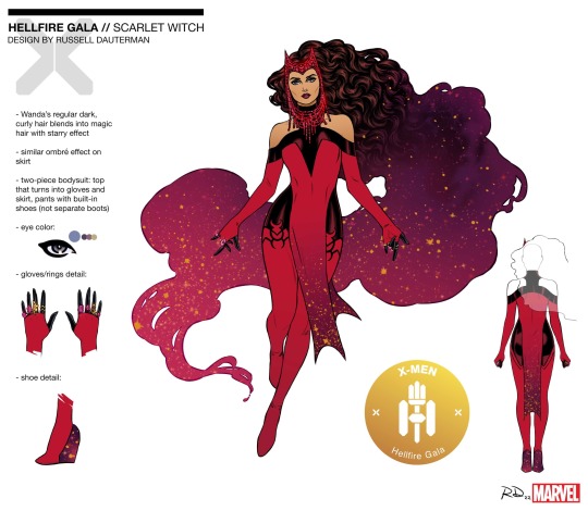
it’s gorgeous!! it’s stunning!! high collars my beloved!! so I took the collar design and ran with it for my own design.
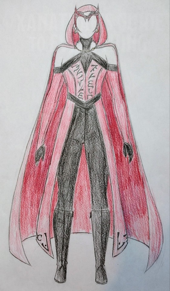
behold, a janky rendition of my costume design in the crappy colored pencils provided to us during my fashion design class!! I know, I know, the coloring looks atrocious, but I was working with what I had. now, you may have already noticed some elements not present in any of the designs I cited as my influences. let’s talk about those!!
the sleeves are split from the main bodice as gloves: this was for my own sanity, haha. it was a construction my smol lizard brain could comprehend and work with much better than Whatever is going on with the comics designs.
the red portion of the gloves tapers in kind of a V design rather than cutting off at the fingers: personally, I felt like this accentuated the elegant flow of all the hand gestures Wanda makes when using her powers better than the classic fingerless design, or whatever thumb strap thingy was going on with her MoM costume.
where’d the design for her cloak clasp come from?: now we all know that tumblr’s pixel budget is next to nil, but if you zoom in, you’ll notice that the clasp of Wanda’s cloak is not her M crown design, but rather a golden kinda coffin-shaped thingy. see, I saw this one theory that this hex shape in Wanda’s mcu bodice was an homage to Vision and the Mind Stone, and I liked that theory, so I referenced it with a hex-shaped clasp.
and the runes on her bodice and skirt?: I actually referenced the Enochian font for those!! according to wikipedia, it’s said to be the language of angels, which feels appropriate for a character as tied to cosmic powers as Wanda. also, real talk, it just looks cool. the script on her bodice originally said “not born, forged,” in reference to the Darkhold’s Scarlet Witch prophecy, but it’s become truncated as the bodice has become shorter to accommodate a more high-waisted structure, which I personally believe to be more flattering in general. I added the runes pretty late in the design process to her skirt to tie the whole fit together visually. from an in-universe perspective, I like to think of the writing as Chthon visually marking Wanda as his creation. his witch.
why does Wanda have a high ponytail when she’s never had one in her most recognizable incarnations?: because a) I do what I want, and b) Alba Flores looks STUNNING in a high ponytail.

and let it never be said that I am not fruity as all heck about Wanda Maximoff <3
so there you have it, a Wanda design that I think is as beautiful, regal, and magical as she is, not to mention one that I can draw repeatedly without having to immediately reach for my phone to Yet Again look up references for how the heck the bodice works.
(and really, it only seemed fitting that the Scarlet Witch of Earth-19384 should receive her own unique design.)
#ari does art#long post#mcu#scarlet witch#wanda maximoff#alba flores as wanda maximoff#costume design#earth-19384#marvel#artists on tumblr
70 notes
·
View notes
Text
So one really awesome aspect of Russell Dauterman's artwork in Jason Aaron's Thor run that I absolutely love is how he truly nails the likeness of actress Natalie Portman when illustrating Jane Foster!


It honestly an incredibly effective way of synergizing both the comics and the Marvel Cinematic Universe together!
#thor goddess of thunder#thor#jane foster#mighty thor#natalie portman#comic art#russell dauterman#jason aaron#marvel comics#mcu#brand synergy
7 notes
·
View notes
Note
Do you know of any good examples of Pietro being coloured with darker skin? There’s the new SW solo and No Surrender but is there any other that you know of?
I hope the positive change we’ve seen with colouring Wanda correctly will extend to him as well
Depends on your definition of "darker." A lot of what passes for brown or tan in comic books is shockingly light to me.
There are plenty of comics, particularly in the 90s, where Pietro and Wanda are somewhat tan, but that's usually just because the artists were working in a warmer color palette. It's not an intentional choice-- they're usually in the same shade range as other white characters.
Things really started to change with Quicksilver: No Surrender. The color artist, Rico Renzi, intentionally gave the twins deeper skin tones, and I've heard that this is something the writer, Saladin Ahmed, specifically requested from him. Unfortunately, you can't really tell in most issues, since Pietro is mostly alone in a grayscale setting, and the flashback sequences were colored by a different artist. Still, it really stands out in the final issue, and it was the start of a slow but steady change for the entire Maximoff family.
Over the past four years, many artists have begun changing the way they draw Wanda, Pietro, Billy and Tommy. Here's a quick timeline:
Rico Renzi went on to color Wanda and Pietro with brown skin an issue of Squirrel Girl Beats Up The Marvel Universe
Marcelo Maiolo gave Billy a deep tan on the cover of Empyre: Aftermath Avengers and in a splash page of Marvel's Voices: Pride.
Jesus Aburtov gave Wanda noticeably tan skin tone in Darkhold.
Rye Hickman and Brittany Peer drew both Wanda and Pietro with defined noses, curly hair, and brown skin in Who Is the Scarlet Witch?
Russel Dauterman debuted his new design for Wanda ahead of the 2022 Hellfire Gala-- in all of his illustrations and design sheets, she has light brown skin, dark curly hair, and a defined nose.
Peach Momoko began drawing Wanda with brown skin in official cover art and personal pieces during the Judgement Day event, which has been mimicked to varying degrees by several other artists.
Scarlet Witch (2023) is announced, featuring Dauterman's Gala design as Wanda's new definitive look. Dauterman is on covers, with Pichelli and Wilson on interiors. In the most recent previews, Wanda and Pietro both have rich, warm brown skin.
The Maximoff family appears together in Love Unlimited: Hulkling & Wiccan. They are initially shown with fair skin, but by the end of the series, color artist Matt Milla has noticeably adjusted Billy's skin to a light brown.
I had a brief conversation with Dauterman on Instagram last month and he acknowledged that Wanda's new look was an intentional choice and was glad to hear that it's making people happy. I'm delighted that so many artists are starting to take cues from his choice, and Renzi's, to show Wanda and Pietro this way.
Here's Pietro in Squirrel Girl:
And here's the twins in Scarlet Witch again BECAUSE LOOK AT THEM!

61 notes
·
View notes
Text
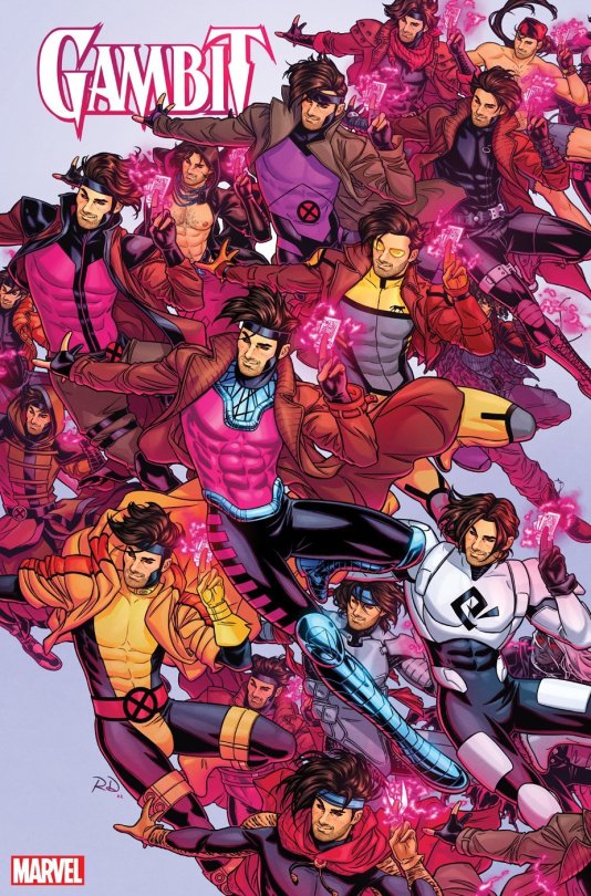
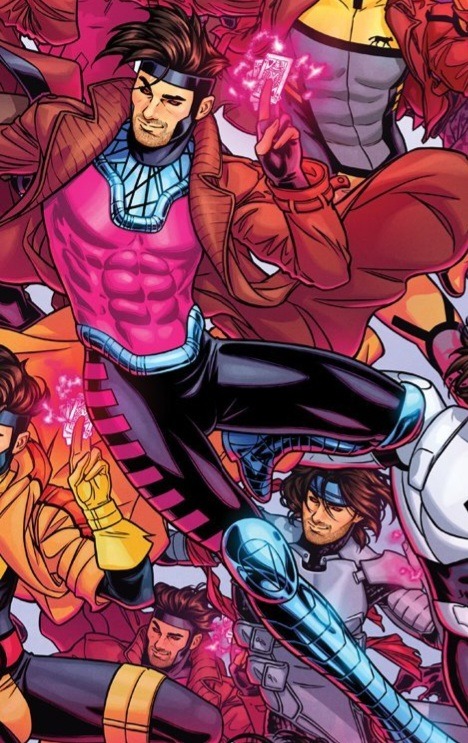
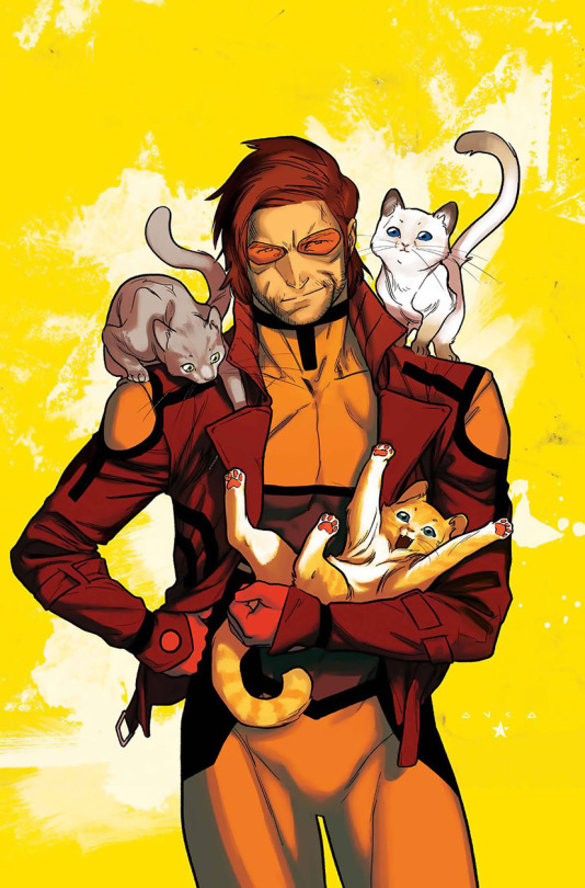
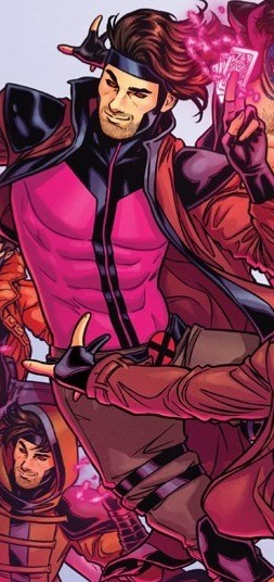
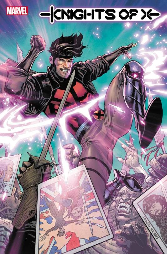
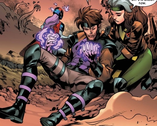
Since I'm getting so much brainrot over Remy it's time to look through and find where most of these outfits come from (I don't know the exact issues or the years but will try my best to find them)
Variant Cover drawn by Russell Dauterman
First one we have is Classic Gambit, debuting in 1990 in Uncanny Xmen #266
Iconic 10/10 love the hot pink and metal boots
Next one is ANXF Gambit (my beloved) written in 2010
Yellow may not be His color but he looks amazing nonetheless, also this era he gets to be a cat dad with his speedster bf so it's an overall win

Next one is from Knights of X debuting this year
He died but he died looking hotter than hell
Right below that one is Excalibur Gambit debuting in 2020
I wasn't a fan of this comic but he looked very nice in it, but that's probably thanks to Marcus To drawing him. Also Remy looking like a thief in a DnD party is always a plus

(More TBA in the reblogs so this post doesn’t get too long)
#remy lebeau#gambit#robin speaks#this might be a waste of time but WHATEVER#its not like i have anything else going on and i get to stare at pics of remy#so im not complaining at all
107 notes
·
View notes
Text


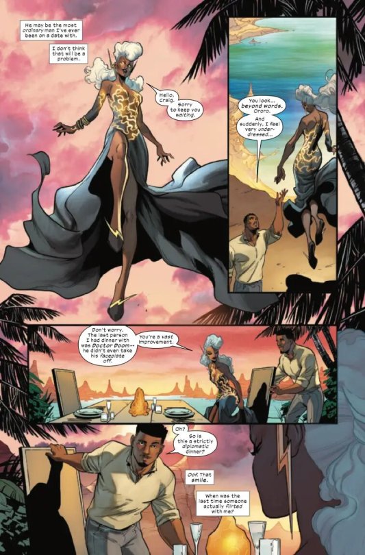
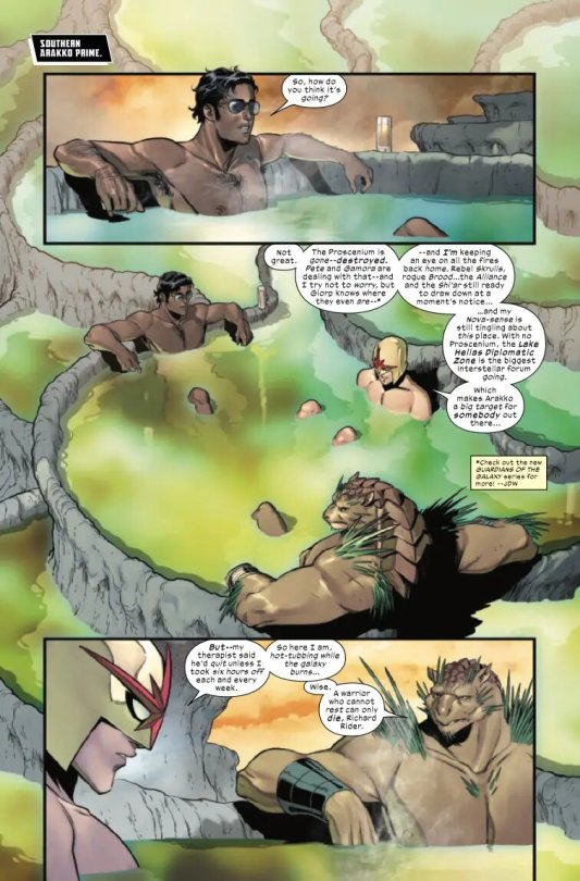

A preview of X-Men Red #11
X-MEN RED #11
THE CALM BEFORE… After Brand’s machinations and the Sins of Sinister, the mutants of Arakko are catching their breath…but even as Storm begins a new romance, she has no time to rest. Charles Xavier has questions about Magneto’s death. He’s not asking nicely.
Written by: Al Ewing
Art by: Jacopo Camagni, Federico Blee
Cover by: Matt Wilson, Russell Dauterman
Page Count: 28 Pages
Release Date: May 10, 2023
I love that part when Sunspot mentioned the New Warriors vs New Mutants in the soccer/basketball game. Please make the New Warriors Vs New Mutants in sports match happen, Marvel!
#Storm#Ororo Munroe#Sunspot#Roberto Da Costa#X Men#XMen#Nova#Richard Rider#Nova Corps#X Men Red#XMen Red#marvel preview#marvel
12 notes
·
View notes
Note
out of all the choices books, which ones do you think would have worked better with a different art style? (like, for example I would love to see some of their horror stuff with a comic book-ish art style like what they used for hero bcs i think that'd be cool)
You guys have heard me say my reasons for how I think Choices’ current art style could be improved—adding texture, not making the sprites so rigid, individualising major character sprites etc—so I won’t go at length about that here. But in general, I think I’d be interested to see what the current style looks like if they added/left in the line art. Maybe that might help with the texture issue?
I think for fantasy books, returning to an art style like they had in TC&TF would’ve truly elevated the experience of Blades even further. That style had more grit, and for lack of a better descriptor, wasn’t ‘plastic doll-y’ like the current art style. It’s just one of the many factors that can help set and hone in on the tone. I think this same style could also serve their horror books well.
For a future sci-fi book like Across the Void, I’d actually be interested to see what that would look like in a style like the series professional comic book artist Lucas Werneck did designing what the X-Men might look like in the MCU. He has such an amazing style and I think I could actually work really well with a sci-fi heavy book.
Speaking of professional comic book illustrators, I’d actually really be interested to see what one would do with Hero. The original art style worked amazingly for the book, but I do want to see the alternate universe where the sequel wasn’t cancelled and someone like Travis Moore or Russell Dauterman stepped in to do the character art.
Continuing in this vein, if we ever get the hypothetical gay book, I want Nick Robles working on it because that guy gets it. He gets it.
Now to switch it up, are there books where I think Choices’ regular/current art style is the best? Yes, actually! I genuinely think it works really well for books like Desire and Decorum, Queen B, and also Perfect Match. I don’t think I can imagine any other art style for those.
#funnily enough travis moore actually has done choices fanart in the past so that’s wild#playchoices#choices#ask me
15 notes
·
View notes
Text

OMG! I would love to see Jean rock the short hair look . She slays ! Edited art work of Russell Dauterman #JeanGrey #Xmen #Xtwitter #Marvelcomics @rdauterman
13 notes
·
View notes
Note
We're getting a Scarlet Witch and Quicksilver series next year! What are your feelings about that and it's premise? Any hopes for the series?
I know I can’t believe it! My boy is co leading a comic (albeit a mini) and I finally got to see him drawn by Dauterman!
I’m cautiously optimistic. Pietro hasn’t been in SW enough for me to gauge how good Orlando is at writing him, but I’m liking what I’ve heard so far.
This mysterious letter from Magneto is very intriguing, I like the premise and the fact that Wanda burns it to try and protect him. It’s not her decision to make so Pietro is right to be upset and I’m interested to see how Orlando writes that conflict and the resolution.
I also LOVE the fact that we’re getting a development on Pietro’s powers (time manipulation not just super speed maybe? I can dream). Pietro’s powers are difficult because if they let him use his full potential he’d be really hard to write because then he could just solve everything.
Hoping for some good family interactions, especially with Luna and Tommy who always get shafted when it comes to this sort of thing. If we’re going full pipe dream hope MAKE PIETRO BI!!
I don’t think they’ll undo the retcon sadly, Trial of Magneto was the perfect time to do that and they didn’t so I can’t see it happening at all now. I’d love Pietro to have his say on the whole found family thing. Magneto treated him the worst out of his three kids and y’know LITERALLY MURDERED HIM, so I’d love to see him just go off. I also hope Wanda and Pietro are treated as co leads. Writers recently tend to paint Pietro as some abusive controlling older brother who is holding Wanda back (see SW 2015) so I hope we don’t get anything like that.
TLDR: Cautiously excited and just happy my boy is out of limbo and co leading a comic where it seems he will finally be drawn non white as well
4 notes
·
View notes
Photo


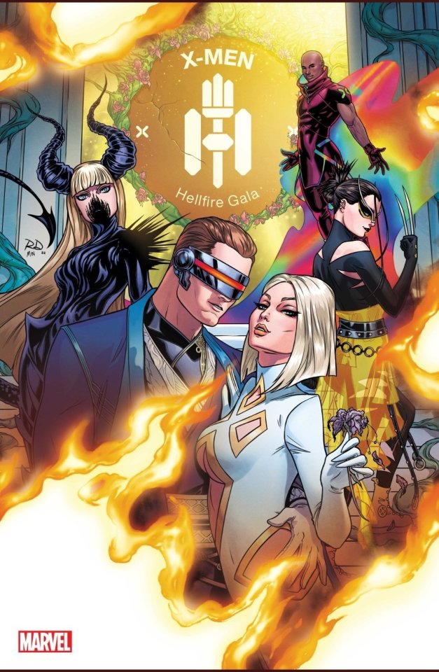
Hellfire Gala #1 (July 2022)
Writer: Gerry Duggan
Penciler: Matteo Lolli, Russell Dauterman, Kris Anka, C.F. Villa
Cover Artist: Gerry Duggan, Carlos Gomez
-----------------------------------------------------------------------------------------------------------
I’m ecstatic that Jean & Scott are FINALLY being portrayed as passionate lovers and partners.
Also I LOVE how Jean removed Scott’s visor & Scott can look upon her face without his optic blast engaging.
25 notes
·
View notes
Text
yknow. Dauterman is like incredible at backgrounds, they're always super detailed and beautiful (though some of that might be because of good colorists? idk much abt how that works) but his people are always so generic looking, like dolls. People can't really have big facial features or make unique expressions because they all look kind of the same very westernized attractive face. I don't mean this as hate, I hope he continues to get better at drawing people. I do love the way he draws curly hair though especially on Kate and Wanda.
2 notes
·
View notes
Last Seen Blogs

aqualusinteriors
Aqualus Interiors
mechanicx
Amored Cyberware
sophiacipriani
SOPHIA CIPRIANI
yeoyuo
𝐄.
fantomsquid
The Softest Working Man in Show Business