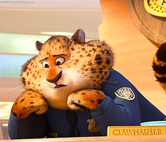
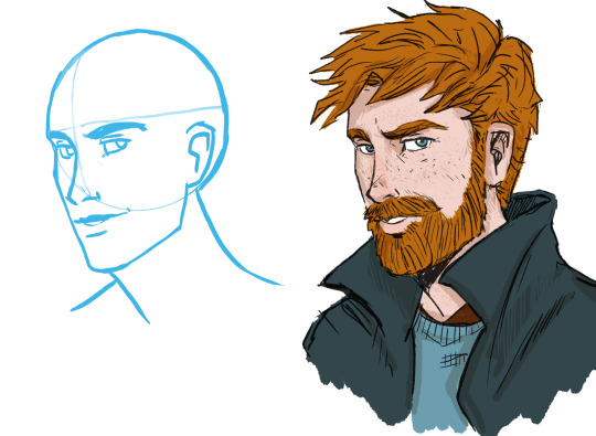
#i know this is lined and shaded vs colored sketch but i am so much happier with my art now and his design
Text

hits him with the transgender beam
#original character#oc#i know this is lined and shaded vs colored sketch but i am so much happier with my art now and his design#yuyu used to be a sona from like 2020-2021...#i made a vtuber model and everything#and them i completely forgot about him#fast forward to 2023 and he has been redesigned and gender transed#and also less of a sona now hes just his own guy with a sprinkle of me#speaking of.. yuyu is a nickname by eve! his real name is yuling (玉玲) which is my chinese name lol#(because i cant think of names for ocs)#yuyu oc
6 notes
·
View notes
Text
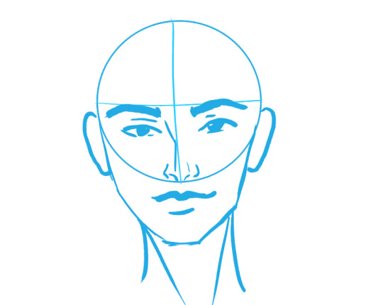
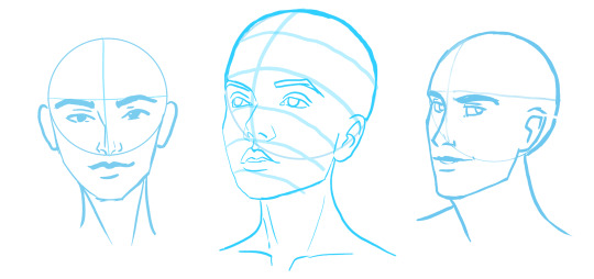
how to draw faces
So awesome human being @smallpumpkinboi posted an wonderful WIP sketch earlier and said ‘Can someone please explain to my why, everytime, without fail, my eyes are always too high??’ I offered to give my two cents, and asked if it was ok for me to make it a public post- they said yes :) This ended up going long- but hopefully it’ll be handy for people. :D
BEFORE YOU DRAW- some tips to keep in mind:
1) do some warm ups! (sketches and drawing exercises) yup! artists need warm-ups just like athletes! :D)
2) Get the structure drawn first! don’t get into details, shading, or color until you have the structure DRAWN (Aka, the major features are all placed, the pose is in place etc)
So let’s look at some heads, y’all! :D
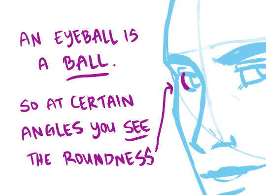
what’s with that ball so many people draw before they do a portrait?
You know the one:
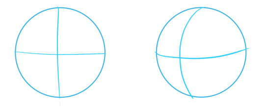
In and of itself it’s confusing. It’s like, Faces aren’t shaped like this. Where am I supposed to put the eyes? The mouth? The nose??
HERE ARE SOME HEADS I VERY QUICKLY DREW USING THE ‘CIRCLE METHOD’
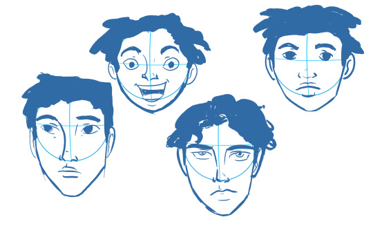
Wait a moment! Do you see what’s going on? Do you see how I messed up?
OH NOOOO - I wasn’t using the circle method consistently! Look at those proportions!!! Look at the placements! There’s all using different ratios!
Look at how the noses were placed in different ways
Omg! And the eyes too.
Oh my gosh! What do I do to fix this?
How can I do it the same every time?
Which is the RIGHT way to draw a face?
Want to know how to draw using the PERFECT ratio?
Here’s THE secret:
THERE IS NO ‘PERFECT RATIO’
Depending on the face shape, depending on the style of drawing, age of the character being drawn etc. you might change up the placement of eyes, noses, mouths etc.
But the one thing you need to know is:
Faces and heads are all different.
Some people have tiny little squished faces, some people have LONG faces. They’re all different.
‘AHHHHH!’ HILL- YOU ARE MAKING THIS MORE CONFUSING FOR ME!!!’
I know! I’m sorry! But wait wait wait. I’m getting to stuff that’ll help. I swear!
Even though there’s ‘not a perfect ratio’ there are ratios that play into certain styles better.
Cartoons, especially, can be all over the place on how they do ratios. Like, look at Prince of Egypt and how they place the eyes SUPER high on heads- vs, like, Disney- who likes to place eyes for heads super low (they love to give women the proportions of doe-eyed children.)
__________________________________
A ratio I generally like is what I use for REALISM/REALISTICALLY PROPORTIONED PEOPLE
Here I’ll be going into a general breakdown of the proportions for an ADULT head.
Remember- every face is different!!!
There is ENDLESS variety to faces.
The variety can and does affect every feature- from eyelids, to noses, to brows, to foreheads etc.
These varietes vary person to person, and also there are varieties and commonalities you see more often in certain populations- be it race, sex, or ethnicity.
I am not giving examples of ALL these varieties here today as this is just a general guide to proportion. However if anyone wants me to go more in depth on this topic I’m happy to. :D Let me know in the comments.
________________________________
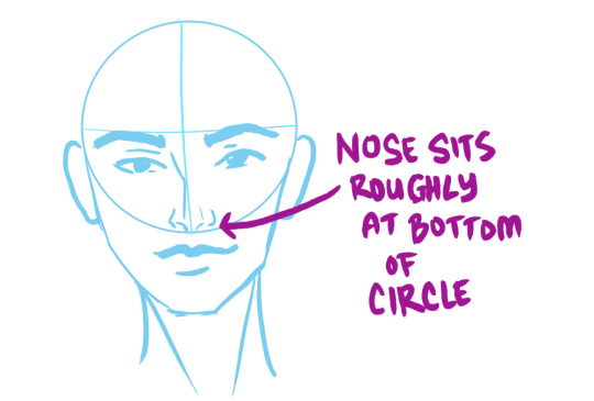
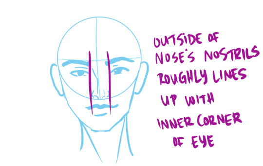
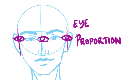
THE PROPORTIONS OF A HEAD
__________________________________
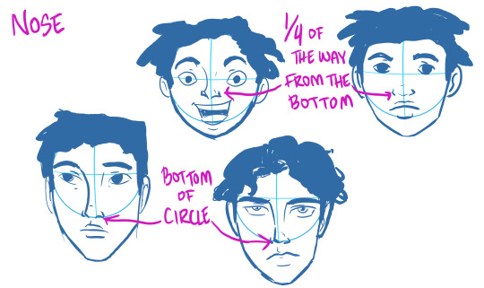
NOSE
________________________________
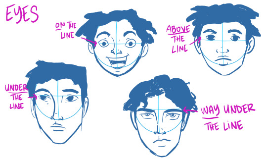
EYES AND EYEBROWS


________________________________
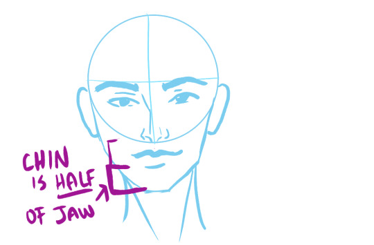
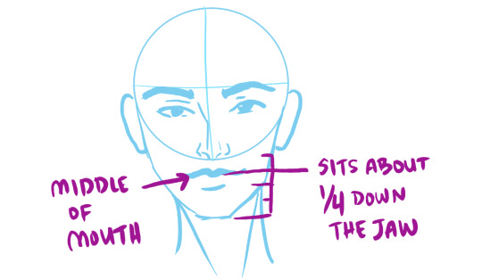
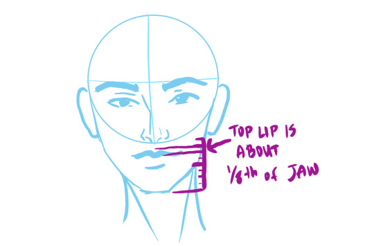
JAW, CHIN and MOUTH


________________________________
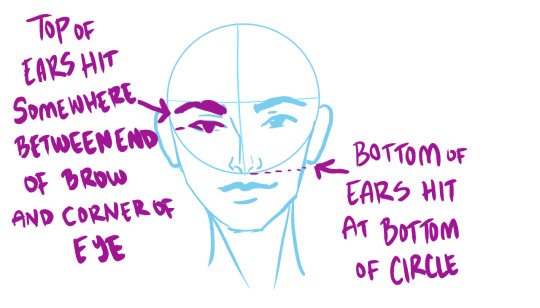
EARS
________________________________
WE TEND TO THINK ABOUT DRAWINGS IN A 2-D WAY
Which makes sense. It’s a 2-D drawing!
BUT HEADS ARE 3-D
Heads are a three-dimensional object. When it’s a straight on portrait like above you can get away with not thinking about it as much. A bit of shading here and there- and bam! You drew a face! :D
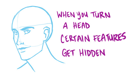
But what about when that dang head has the AUDACITY to TURN?
All of a sudden it’s a whole lot harder to draw.
________________________________
3/4 VIEW OF HEAD

ahhhhhhhhh the proportions feel different now!!!!
DON’T BE SCARED. They aren’t different, they have just TURNED.
Ron here has slightly different proportions to Hermione up Above.

He has a longer face, longer nose, a bigger more defined jaw, slightly lower brows, thinner lips etc.(
I made the ‘circles’ the same size- but in reality- his head is bigger than hers. REMEMBER!!! People have different size heads!)
But even with all that, a ton of his proportions are the same as hers.
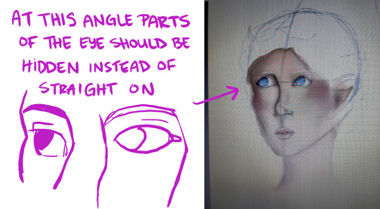
When you turn a head, the main things people forget to take into account are:
And some are getting FORESHORTENED-
aka- they look all SQUISHED AND SMALL.
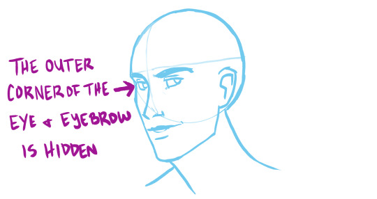
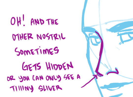
a lot of the time with my ‘cartoony lines’ this little sliver disappears altogether.
Even though there’s suddenly foreshortening happening to the features of the face
YOU CAN SUDDENLY SEE SOME THINGS BETTER
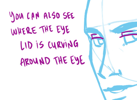
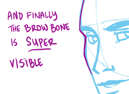
BROW BONE

EYELIDS, BROW BONES AND BROWS ARE VERY VERY VARIABLE FOR PEOPLE- LOOK CLOSELY AT IMAGES OF DIFFERENT PEOPLE OF VARYING RACES, GENDERS, SEXES ETC.
Again, this is just a general guide.
So now we’re going to look at @smallpumpkinboi ‘s awesome WIP piece
(gonna refer to them as SPB when talking about them later :) )
LET’S PRAISE THIS DRAWING, BECAUSE IT HAS A TON TO PRAISE

As you can see, they have been VERY SUCCESSFULLY using the ‘circle method.’
They have some wonderful proportion going on! Look at those brows, eyes, nose and jaw! They are very well placed.
Also, look at some of this early shading they started? It’s very effective and really gets across MASS well. :D
Also, the expression? It’s really well done. Like, super arresting!
You should be very proud of this Work in Progress, SPB!!!
Earlier SPB said “Can someone please explain to my why, everytime, without fail, my eyes are always too high??’”
Your eyes are NOT necessarily ‘too high.’
I think what’s happening here is you are applying ‘straight on 2-d proportions’ to a turned head, but aren’t entirely familiar with how to do this. This is making you struggle a bit with certain features when they are at an angle.
Source images are very helpful, but also remember that source images can be at weirder angles than just a head turning left to right.
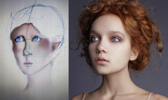
The image you were working from was actually INCREDIBLY challenging, as not only is it 3/4 view, but the model’s head is slightly turned UP.
look at all that angle happening! super hard to draw :P
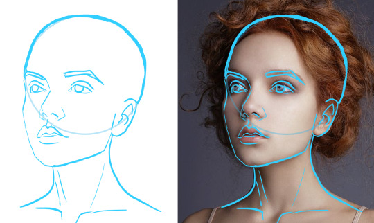
So the artist has a choice here:
1) change the drawing so it matches the pose
2) use the source image as inspiration for color/shading/expression- but find a simpler pose to work from that more matches the angle drawn.
Either choices is a valid one! :D But it’s probably easier to do #2
So here are some things you could edit
And define the brow bone, so that it hits the corner of the eye.
That’ll fix your ‘eyes too high’ problem really quickly! :D
For a drawing of a face, the eyes are correctly placed as far as height goes!- but they are very different from the proportions of the model.
For future drawing keep in mind proportions- like eye distance, mouth size, and think about defining jaw/ear shapes.
Getting structures (like eyes, ears, mouth and nose) firmly in place before you start shading/putting in details will help a lot! :D
HOPE Y’ALL FOUND THIS HELPFUL
If ya’ll would like other tutorials, or want help with your drawings, let me know! :D
My hands aren’t all the way well, but I’m the road to recovery and love helping people- so while I can’t draw-draw much right now, I can do this!
337 notes
·
View notes
Note
I used to want to be an artist but then i stopped drawing for like 7 years. I want to go back but i'm scared and dont know where to start. So yes, i am interested in those drawing videos can you post them if you dont mind? ^_^
Of course!! I am in the same situation as you actually. I used to draw a lot in middle school (2010-2012) but my depression worsened during high school and in college, I’d only draw as a distraction, never seeking to study or improve. I decided to get back this year, since I decided drawing was the only thing I could see myself doing professionally. I felt very lost, because how do you get back? How do you know what’s your actual, current, art skill? What are your weaknesses? Your strong points?
That’s how I learned to study the fundmentals of art. Because visual art is not a skill. It is a set of skills, if you are very good at anatomy but not really when coming to painting your art is going to look differently than someone who learned anatomy in how to draw manga books but paint like a pro. I am going to divide this post in categories, Also, all the videos I link I also recommend all the channels they are from! My favorites are The Drawing Database, Sycra and Ganev, Sycra and The Drawing Databse have a little of everything and are great at explaining. Ganev is a bit sarcastic but I like the way he teaches. I took some parts of the text of this post from here.
How do I begin?
How do you even get back at art? What tips should you use? These are general tips videos, usually nice to draw along.
/the fundmentals and how to get started/ /5 tips for better drawing/ /perfect pratice/ /beginner’s guide/ /5 tips for digital art/ /10 tips to improve/ /why your drawings are stiff/ /what level is your art/ /improve your art fast/ /drawing basics/ /how to hold and control your pencil/ /intuitive drawing method/ /iterative drawing/
The Fundamentals: Proportion & Placement
Proportion is relationship between one element and another.
In the visual arts proportion relates most importantly to the abstract quality of scale and placement. You know how stereotypically an artists puts a pencil to their eye when looking at an object? They’re mesuring the proportion of the object in question and how to represent it corectly in the drawing.
/principles of proportion/ /ways to create illusion of space/ /drawing the human figure/
/how to draw proportions playlist/ /how to use proportion in character design/ /basic anatomy and proportions part one/ /part two/ /part three/ /part four/ /proportion basics/
Form & Construction
The idea of form is how we see the 3D objects in or world and transform them into 2D in the paper/canvas. It’s understading that eveyrthing is made up of basic forms.
/dynamic sketching part one/ /part two/ /how to draw forms/ /structure/ /building form/ /another how to draw forms/ /how to visualize 3D forms/ /form study process/
Perspective & Depth
Perspective is knowing that as things move away from the viewer’s eye, things seem to get smaller. Get familiarized with terms like horizon line and vanishing point. This is the basic that must be understood to learn perspective.
Here’s a good article about this.
/an intro video on the subject/ /step by step tutorial/ /perspective basics part one/ /part two/ /part three/ /part four/ part five /part six/ /another basics video/ /20 perspective lessons/ /eye level tip/ /linear perspective/ /simple form perspective/ /drawing the figure in perspective/
Anatomy
Anatomy is something I think it’s one the most crucials things to learn in order to make your drawing look good. Once you understand how joints work you’ll be able to see how bones and muscles move. And this goes for anything with a skeleton. It’s one of those things of you learn the rules before breaking them. I am linking different playlists, since linking different videos on various parts of anatomy would take forever. Just study a body part at time: head, eyes, nose, lips, ears, shoulders, neck, hairline, breats, torso, hands, feet etc.
/how to do an anatomy tracing/ /playlist 1 / /draw the head from any angle/ /anatomy for artists/ /draw facial features/ /how to draw and paint/ /playlist 2/ /draw 3/4 head with loomis method/ /playlist 3/ /drawing a head in 3 hours (this one is great to draw along with the artist)/ /how to draw a body/ draw a head with loomis method part 1/ /part 2/ /part 3/ /decipgering bridgman’s anatomy/ /anatomy quick tips/
Gesture
Gesture drawing is a method of capturing figures in exaggerated poses, usually drawn quickly. It is important to undersand that the goal of all gesture is to study the figure and see how it moves. I like looking at poses and copying them. Here’s a good article.
/how to draw gesture/ /how to draw any pose/ /draw interesting poses/ /a guide on gesture drawing/ /tips for expressive dynamic poses/ /figure drawing tips/
Composition
The overall layout of a piece is very important. Artists often consider things like the rule of thirds or the infamous golden ratio. Neither truly defines a composition, but they can both go into your decision making.
/composition in art/ /understanding composition/ /10 composition tips/ /beginner’s guide to composition/ /art fundamental: composition/
Value
Studying value is very much the study of light and shadow. But there is a technical side of light that you’ll want to pay attention to if you’re going for technical rendering.
/guide on rendering/ /seeing light and shadows in daily life/ /10 minutes to a better painting/ /understaing colors and values/ /shading basics/ /ambient occlusion/ /shadow colors/ /tips on how to shade/ /draw shadows on objects and people/ /lighting tutorial/
Color Theory
Color theory is understanding which colors go good with eachother, and knowing the pyschology behind it. (what are cool colors? what colors make someone feel comfortable?) It is fundamental in art for you to understand the relationship between colors and what makes them look good. Best color theory books. A comprehensive guide to color theory.
/hue value saturation in photoshop/ /color theory for noobs/ /understanding color/ /what you should know about colors/ /warm and cool colors/ /the basic elements/ /choose colors that work/
Traditional Media
If you draw in traditional media, all videos above can be used easily. These are just videos for general tips in traditional media, there isn’t many since my focus is digtal ^^’
/watercolor tips/ /draw with colored pencils/ /blending colored pencils/
/4 how to draw lessons/ /Block in colors/ /holding the brush/ /
Digital Media
Digital art is how everyone’s been doing art these days. It doesn’t matter if you’re doing with your phone or your computer. I don’t do art on my phone, I know the most used app is mediabang for android and procreate for apple, and I think anyone who is able to do art with their finger is very skilled. If you are like me and prefer doing art on your computer, you probably have your tablet. If not, well you should have. Not having a tablet is not an option if you want to get better at art ^^’ Best tablet for beginners in 2020. Or you can just buy an old used one, if it still works, and you are a beginner, a small intuos is all you need. When talking about softwares, the three big ones I see people using are: Photoshop, Clip Paint Studio and Paint Tool Sai. The best one is CPS, but I find Sai easier to navigate, but CPS is extremely complete and I hope to be able to master it someday. CPS Tutorials. I don’t have much to say about photoshop, people use it mostly because they’ve been using it forever lol I divide my digital painting process in steps: Sketch/Lineart/Color Blocking/Shading/Blending/Color correction.
Sketch is the basics, draw your idea. Lineart is to clean your sketch. Color Blocking is to color your drawing one color, so it’s easier to work in it. Shading is to understand where the lighting sources are coming from and apply them. Blending is to blend the colors of your drawing with brushes. Color correction is when I use filters of hue/saturation and others to make the drawing more appealing. These require understadings of the software of your choice which I am not very good at the moment so I can’t give you more tips than that ^^’ Hopefully these videos can help.
/perspective grid/ /clean line art/ /coloring process/ /make lineart interesting/ /best brushes for digital painting/ /skin shading tutorial/ /lineart vs painting/ /art in clip studio paint/ /hair tutorial/ /3 tips for improving/ /10 digital art mistakes/ /color block tutorial/ /shading skin/ /from lineart to painting/ /cleaner lineart/ /add texture to your art/ /improve your art with better shadows/ /the importance of brushes/ /use layer modes/ /improve your lines/ /how to blend colors/ /another blending tutorial/ /color blocking/
Exercises
It’s no secret that to improve on art, you must pratice. Everyday, even if it’s just a little! A great way to pratice is make use of youtube picture in picture function to draw along in your software of choice.
/pratice drawing forms/ /proportion exercises/ /perspective exercises/ /value studies/ /creative drawing exercises/ /simple drawing esercises/
Resources
Senshi stocks, a deviantart page full of poses photos.
Quick poses, pictures of models, contains nudes.
Character design references
DesignDoll, create a personalized sketch doll and make it pose.
Phew!!! This took forever to make and is way more than you asked for, but I decided to go all in so I can have a masterpost for me too and for anyone else interested in art. As soon you can understand the fundamentals, you can do your own research and study, youtube is really great for this. I hope this helps, let’s get better at drawing together!!! Ganbarimashou (ง •̀_•́)ง
#anon#askbox#I feel there's a lot more to add but I'm tired I've been working on this sicne yesterday ^^'#Like there's more softwares and resources I could link you I know of that#So when I think of something else I may add to this psot#post#if you feel overwhelmed because this is a lot of info you can start with the beginner section of this psot#and sycra's channel
82 notes
·
View notes
Note
Heya! I really really like your style and saw the commission thing and was wondering how to, y'know, commission a tningy ^^' I haven't done it before
Glad you like my art and like it enough to consider commissioning! ^u^
My commission information page is here. I suggest looking through it. I explain how I work in that as well, at the very bottom. But, I’ll give ya a breakdown for the Never Commissioned Before. (since that version lowkey assumes at least slight familiarity)
It’s not too difficult or anything so don't stress it! If you want a general price-point before diving in or anything: for me, an average work tends to be around $35-50ish USD (usually mostly depending on color or number of characters) but some of the more complex stuff, which often includes multiple characters and background goes more up towards $200ish. If you’re tighter on cash, as I know a lot of people are, I suggest setting yourself a budget and telling me what it is! That way if you want something, but you can’t afford it, I can help make it something affordable! (ie I may suggest not using full color, or having a bust rather than a full character- etc)
For the actual process, I’ve put it under the cut. I go pretty in-depth and it got long.
Step One: Message me with what you want to commission me to do. Give a short description.
You can message me on tumblr or through my email [email protected]. I like it if you come in with a semi-solid idea of what you want. Hopefully you read through my commission page, but, I’m also happy to provide suggestions and ideas as well. I do fanart and original works! You should have a description of what you have in mind ready.
Here’s two examples on each extreme of what I can work with:
“A picture of my character, standing with their hands on their hips. They have long brown hair and eyes and wear a pirate-like costume”
“A picture of my character, standing with their hands on their hips, a little sassy in pose an expression. They have long brown hair that goes to their hips, and is parted to the left. They have brown eyes, and a small scar on their cheek. They’re a little stocky and they wear a v-cut loose black tunic, a purple vest and leather belt.”
I’d ask more questions for both of these! I’ve never had a commission where I don’t feel the need to ask for more information. If it’s an original character (or even au-versions of fanart or characters I’m not familiar with), I love hearing about who they are as a character, since that gives me a sense of what energy I’m trying to portray with the character. If you have references (doesn’t matter if it’s an amalgamation of references plucked off of google or something you drew yourself) that’s awesome! I don't require it, but, they’re always appreciated. I am totally open to helping you make decisions too! if you have the base idea, but you don’t know if you want them to have a coat or not, I can give you sketches with both options.
Step 2: Pricing.
If you don’t already mention it, I’ll ask you specifics of the things in my commission post- ie: if it’s full body or a half body, or if it’s full color or anything.
If anything on my commission post confuses you, you can always ask me for more examples or an explanation of the difference!
After determining exactly what you want me to do, I’ll usually give you an estimate for how much it would cost to complete. Sometimes, if you’re still deciding between things that determine the price, like how complex the pose is, I might do some sketches first and see which ones you like before giving you a price. I have a little leeway on pricing here, and if you think it’s too much, you’re welcome to ask me to explain why I priced it that way and if I can lower the price. That said, a lower price means lower complexity and detail.
If we’re confident in the price, I like if you pay me at this point, rather than later, as it’s easy to forget, and frankly, I’d rather not do all this work just for someone to take the image and not pay me at the end. I have some leeway, but I usually prefer if you pay me before I get to the last step before completion. If it’s a lineart work, that means after the sketch. If it’s a colored work, it means after the lineart.
Step 3: Sketches.
When I get started with sketches it usually takes me a day or 2 to get them done. I’ll give you several to choose from. I usually do about 4-6 individual sketches and label them by number (because I’m dyslexic and for the life of me never remember left vs right).
Once I send you a batch of sketches I’ll ask you for your opinion. I basically want to know: which sketch(es) fit your idea the best and if there’s anything I’m missing or need to get rid of. It’s going to be loose and messy, so if you want me to explain anything about how it looks, please feel free to ask. I can combine sketches if you like parts of one or two of them but as a whole they’re not perfect. If I’m totally off the mark, you can totally tell me so! That kinda means I didn’t do my job right in step 1, and I’ll ask more questions to understand which aspect I’m missing.
Once we have one sketch that works, I’ll ask you a few more questions about what you’d like to see on the lineart.
Step 4: Lineart
Depending on how complex it is and how busy my life is, this might take me a day or a whole week.
Using the sketch as my base I’ll use this time to make clean lines, get some details in (this is usually where expressions and clothes are defined beyond the general structure.)
I’ll send you the sketch after I’m finished and once again, ask you what you think and what might need adjustment. Your job is to nitpick here! Please, feel free to nitpick. Is the hair too short? Is the arm in a funky angle? Tell me! You’re buying it, you get to critique it. I’ll work with you to come to an agreeable look.
If you’re commissioning me for a colored work, I’ll also ask you for any clarification/changes from the original concept for the color.
Step 5: Color
This tends to take about 1-3 days.
If it’s flat color, it’ll be pretty simple, and shading or lighting will be done with kinda flat bold lines unless otherwise stated that you just want it Flat-Flat. It’s not my usual style, so most people tend to go for full color. Full color is my usual coloring style, and I use some pretty soft shading. It tends to reflect a midday-look, but if there’s a specific background I’m doing, I will match the color to it. Dynamic shading is a secondary layer of color. I usually do color and shading on one layer. Dynamic shading is where I work with really bold, dramatic lighting.
I usually work with a background at the same time as everything else, but, sometimes I don’t because I focused on one aspect or another, so that might be an additional step.
Once again, I’ll send the work to you and ask for your opinion.
Step 6: Finishing up
Once you’re happy with it, all that’s left is A) confirming you paid me (I’ll usually remember or write it down, so if you had, I won't ask.) B) signing the artwork and C) sending it to you via email. I usually send it as a .png but you’re welcome to request other filetypes. I’ll ask you for all these things too.
You’re also welcome to request that I record the process I can take screen-capture videos or I can screen-shot each step that I’m not screen-shotting already to send to get your opinion. (you’d have to ask me to do this at the beginning though.)
After all that, I’ll usually post it on my tumblr here, and you’ll have your commission!
5 notes
·
View notes
Note
As a baby watercolorist, please tell me everything about your painting setup: Lighting! Paper! Paints! Opinion on New Sap Green vs Original Sap Green! Brushes! Preliminary sketching! How the heck do you stop using watercolor like it's gouache! Your TRANSPARENCIES OMG WTFBBQ??? you have the beautiful glowing quality watercolor is known for DOWN and I am AMAZED. What's your favorite size paper and brush? Seriously, anything you want to talk about re: watercolor I want to hear it (notice me senpai)
2/2 and when do you know that you need to Stop Messing With It and let the painting *be*?
I was gonna say I'm no one's senpai, but then I remembered I've been working almost exclusively in watercolors for 15 years now and had to lay down for a bit.
But yes, senpai has noticed. She's just a little slow to respond because she wanted to give clear answers and has a tendency to ramble when she doesn't edit herself. Still rambled here but with more purpose.
and before we begin: ask box is always open for more questions should you have any.
Lighting!
I keep the room super well lit. I've got multiple lamps in the room I use to paint, not including the clamp lamp that's attached to the art desk, and I open the blinds on the windows whenever I have daylight. Light bulbs that have a much more pure white glow are the best, as the yellow-ish ones will affect your perception of the colors.
Paper!
I use Arches 300lb Hot Press paper these days. I used to use Fabriano 300lb Soft Press, but they changed the formula/process a few years back and the quality just hasn't been the same.
The weight of your paper is something to keep an eye on. The heavier the paper, the more water it can handle. As such, anything under 140lb is scrap paper. Under 140lb really can't handle water particularly well for anything of quality, and has a tendency to warp badly on top of not absorbing the pigments and thus killing your colors
Side note: Press is how the paper is made, using hot water vs cold water and such. Cold Press is the traditional method, which gives the paper it's classic texture while Hot is a more modern process that gives the paper a smoother texture. Soft is a specialty of Fabriano that is the point between the two. There is also Rough which is extra textured, though I personally do not care for it.
Paints!
There is no perfect brand, so don't buy into any notion of “brand loyalty” and only buy from one company. I buy several brands since I find they each do certain colors better than others. Most of my cools (blues, greens, purples) are from Winsor & Newton (Artist Grade) where as my warms (reds, oranges, yellows) are Senneiler. I have a few from Holbien as well, but those are specifically colors I need that are super bright. There's no hard rule on who does what better though, one of my most used yellows (Naples Yellow) is the W&N version for example.
You can buy watercolors in either little tubes of paint or in dried little pallets called cakes. I use tubes almost exclusively as I find they're easier to adjust the ratio of paint to water, not to mention easier to find in store. Cakes are often what you get in sets, and they’re decent, I just find them a pain to use.
Opinion on New Sap Green vs Original Sap Green!
I wasn't sure what you meant by this, but google results mentioned there was a recipe change for Daniel Smith in the past few years, so I'm assuming you mean that! Personally, I have no opinion on this exact color situation as I don't use DS, but I can weigh in on the concept of altering recipes.
It sucks. Watercolor is a set up of pigment : gum arabic : preservatives : water ratios, and is at the end of the day a chemical equation/reaction that can vary wildly with minimal alterations. While it's entirely possible the new recipe works better, such things are an ultimately subjective matter. Changing without warning can also massively screw a person over, because they're expecting one result and getting something completely different.
Brushes!
A mix of natural fiber ans synthetic fiber brushes, and a decent range of size and shape.
Princeton Neptune (synthetic) and the Silver Brush Black Velvet (natural squirrel fur) are the brands I've found that work best for me. Winsor & Newton are famous for their sable watercolor brushes, but I haven't used them in a while as all of mine are older and need to be replaced. I mostly use round brushes, but flats are excellent for filling in large spaces or sharp angles. Size range usually goes from 1 through 12 depending on what your doing, though I do have a few super small 0 sizes for detail work.
Preliminary sketching!
Do it on other paper. Pencils can damage watercolor paper super easily. Erasers are instant death. I have seen people essentially maul a piece of watercolor paper trying to erase a line.
But seriously. I am super messy when I do prelim sketching so I work on a separate piece of paper first, clean up the sketch, then transfer the completed linework to the watercolor paper with my light box.
How the heck do you stop using watercolor like it's gouache!
How much water are you using when you paint? Use more. No, more. I said use more.
I think a lot of people forget that your paper is a key part of your piece when working with watercolors. Other paints have a white you use to cover the canvas, where as with watercolor your paper IS your white. Think about how it is when you're shading a pencil sketch. Do you also shade in white on the highlights? Of course not, the white of the paper is your highlight, you just need to make the shadows. Same thing applies to watercolor.
(one day I’ll cobble together a video to actually show this properly because I don’t word good with this one, it’s honestly instinct for me at this point)
What's your favorite size paper and brush?
No real favorite size of paper honestly, I buy the large sheets and cut tot he size I need/want to work in. On average most of my pieces come out to around 11″ by 17″ though. As for brushes I have a pair of size 4 and size 6 brushes that are used constantly.
When do you know that you need to Stop Messing With It and let the painting *be*?
That's one of those irritating "you learn to gauge it over time" situations. You'll start to naturally tell when a painting is done the more you make.
What does help though, is when you get to a point that makes you question if you're done, is to get up and walk away. Just go do something else, something that keeps you away from your art setup for a while. Giving yourself some space to rest your eyes is important. When you get back to it after your break, ask yourself then how you feel about the piece.
hope this all helps ❤
#parlour queries#lemonsharks#watercolor#technique#the 'not use it like gouache' question made me actually cringe#that's not how watercolor works#you are literally throwing away your money using the paint like that
7 notes
·
View notes
Text
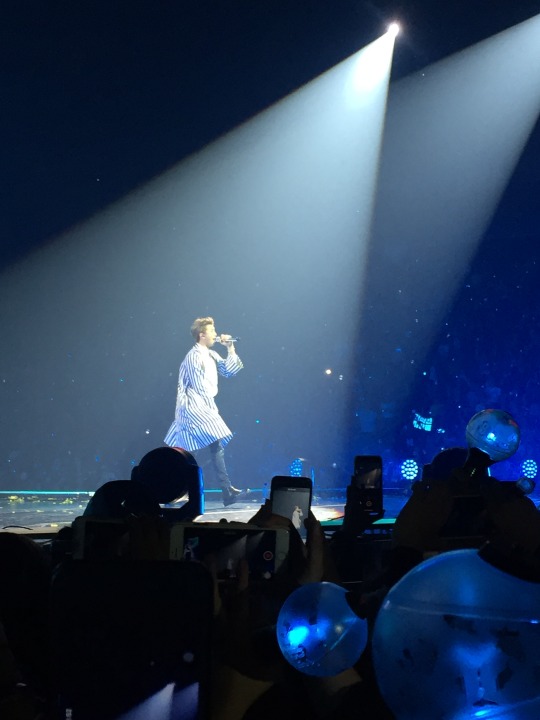
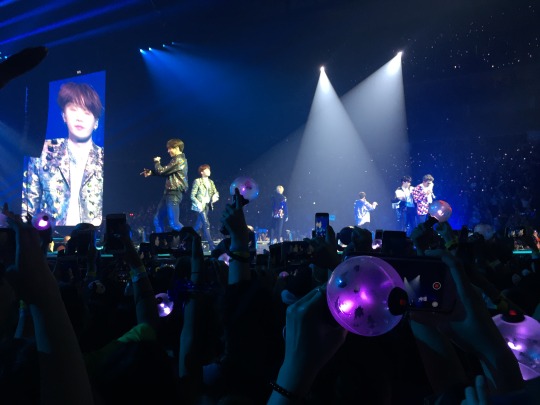
Julie’s Love Yourself Concert Diary
Concert Date: September 29, 2018
Written: September 30, 2018
Warnings: I curse more than I should?
Words: 3,330ish-added a few things at the last minute (phew!)
A/N:
[Update: Tumblr couldn’t upload all my photos that I spent awhile choosing and placing, so I’m going to have to pare it down. Sorry bbs! I opted to cut my personal & merch photos in favor of the boys]
So I have one thousand and one things I should be working on-for school, for work, for my eventual job hunt. But instead I am going to write about last night’s experience while it was still fresh in my mind. I was thinking of doing a song-by-song play-by-play, but you can look up the setlist on Wikipedia, so instead I am going to talk about the things that jumped out at me. WARNING: This is essentially one giant spoiler, so I will try to put a “Read More” cut, though it’s been being weird for me lately. So scroll carefully if you’re going to a later date and don’t want to know. All photos taken on my (now ancient) iPhone 6, so I tried to choose the best ones). Will edit as I see typos I made.
I’m a little nervous since I usually write fiction instead of sharing my personal experience. Anyway, full disclosure that this is just my perspective, and I’m (always) happy to discuss things (civilly) if you disagree with me. <3 Photos and opinions are mine.- please don’t re-post anywhere else.
The Background/ Pulling a Namjoon and Leaving my Ticket at Home
Even though I was going to the Saturday show, I flew into LaGuardia using frequent flyer miles on Friday morning. I was staying with a friend in Queens, so I went straight to her apartment. I’m a grad student as most of you probably know at this point, so I spent most of Friday working on a paper that was due. I had two friends I met at last year’s concert going to the Friday concert, and they went for merch promptly at 9, but I had just arrived and had a deadline to meet for school. Around 4:30PM, I decided that I was done for the day and opened Ticketmaster to print my ticket for the next day’s show. When I logged in, I saw the notice that the ticket had been mailed to me. I remembered having seen that when I bought the ticket in May, but in my defense I was jet-lagged and ill on that day. Furthermore, I moved to and from NYC in that time for a summer internship, and SO MUCH HAD HAPPENED. The tickets had been mailed while I was living here and I had never seen them, so somehow it slipped my mind. Obviously I lived too far away, but I didn’t know if I could express overnight them, but I think when I called Ticketmaster, the old ones were deactivated when the guy tried to send me the link.
Anyway, print at home was not an option, so I called Ticketmaster and in a panic explained my situation. They said it happened all the time and offered to send me a link. Luckily I kept the rep on the line, because it turned out that even they couldn’t email a link because of the anti-scalpers/fraud/whatever.
Then the rep said that I could show the credit card, but I had literally cut it up the week prior since the Vendor (e.g. the store that the card was through) had switched their card to a different bank (e.g. Visa to Mastercard), so I seemed shady af, even though I was telling the truth. He said as long as I had a login to a statement showing the transaction (I didn’t, since they had opted to close the account at an institutional level). So I called my mom frantically, and luckily she is the hyper-organized type who keeps paper copies of everything and sent them to me. Seriously, Mom for the win! I run to this print shop as it’s closing and print everything out. I had the Ticketmaster receipt & order #, and two photo ID’s confirming my address. The guy said it should be fine, but I was on the verge of a mental breakdown. This was my one birthday gift and something I had been looking forward to for months. Anyway, my friend and I went out to a local bar near the Halsey (yes, the singer took her name from the station) stop on the L line, and I was super anti-social because I was so upset. I also burst a blood vessel in my eye (it will heal, no worries) because of too much birthday partying the prior weekend, so I’m sure I was a (sour) sight to behold.
I slept poorly for obvious reasons, and left the apartment around 7AM, and arrived to Prudential center around 8:30ish. There were only a few people outside of will call, but the GA line was already wrapped around the building. I made small talk with people outside of the box office, and one woman told me she had gotten soundcheck both days. Seriously, what kind of karma do I need for that to happen to me? She and her friends had been camping out since Thursday, and they were SUPER organized: while she waited in line, one was at merch, and someone else was holding their GA site. I almost wondered if they were a fansite or something. ARMY are a truly organized bunch (except for me, clearly).
Anyway, after another half hour of pure anxiety, they opened up will call and I was panicking, but they were really helpful and gave me my ticket after I verified the order number, showed my id and confirmed some other personal data. I decided then and there that nothing else mattered and I was just happy to be there and be in.
Waiting in line/Logistics/Staff
I left the box office, and got into the GA line. It was probably around 9:15, and the line had already doubled-back on itself all the way around the building. The woman from earlier told me that her friend had got #1000 and was only 3 rows back, so I still had some hope. Basically, you line up to get your spot in line- though it’s kinda dumb that you have to line up twice, it makes security go faster and guarantees that there isn’t a huge surge/stronger people cutting in line later.
I wore what I thought were my most comfortable shoes, but after standing on concrete for hours, I don’t think it makes a difference. People were so friendly though- I never once felt awkward even though I was by myself. The same was true last year- the friends who had gone up for merch on Friday I met while in line at last years’ Wings concert. I chatted with people around me, drank the two bottles of water I had, and looked at my phone. Bring an umbrella for shade and sunscreen though-I didn’t and am rocking a nice farmers burn/tan today. It wasn’t humid though, and it wasn’t raining, so it could have been so much worse.
Even though there were tons of people, everyone was well-behaved. I didn’t see any altercations, though as the day went on the staff seemed a bit overwhelmed with crowd control. I didn’t see too many people selling unofficial merch like last year, though I did buy a few necklaces (Joon and Chim, ofc).
After 3.5 hours, I finally got my wristband. They told us to be back by 2pm to line up for real, as they were going to try to open the doors at 3 instead of 3:30 (didn’t end up happening).
Merch
I then ran to merch, but there wasn’t much left. The fans/pickets were selling out as I got in line, and people were basically yelling “NOOOOOOOO” everytime the staff put up a “SOLD OUT” sticker. I bought what I could that was left, including a bracelet, which I’m actually in love with, the eco-tote (super overpriced tbh, $50 for a canvas bag), but the shopper bags were gone and I needed something to carry the box and batteries V3 ARMY Bomb I bought. I had one from last year that I also forgot, but I think the new version was cool because they are synced up with the music so you can change colors and patterns along with everyone else. Overall, it’s EXPEN$$$$IVE, but if anyone’s worth it, it’s Bangtan.
Newark
I was getting super tired after this, so I kinda passed on the photo studio table, big poster, and UNICEF stuff. I tried to go to Starbucks, but even though it was the middle of the day, I didn’t feel that safe, even though it was like 11:45 in the middle of the day. I’m a 27 year old who’s lived in Latin America (which is generally stereotyped for violence), solo traveled around the world, and I’m from the Rust Belt (aka home of true urban decay), but that part of Newark sketched me the heck out. Probably it would have been fine, but I opted for caution, and went to a Dunkin Donuts and empanada place right around the corner. The timing was actually good since we had to get back pretty quickly to line back up.
The second line was where the staff struggled, telling people to back up and get in order, but it seemed like staff were doing different things. Plus, if they wanted people to back up, they should have created room at the back first, before telling the front to basically “back that ass up” on the people behind them.
GA vs. Seated
I can say this- if you are short, you probably want a seat. Or if you have any kind of knee, back, or joint problems- I stood for approximately 14 straight hours on concrete yesterday. I am just under 5”5” but I was probably one of the taller people in the crowd, so I had a pretty good view. Even though they asked people to not take videos or record, you WILL be looking through a sea of cell phones. I could see pretty well, but sometimes when they were on the main stage I had a hard time seeing around other people’s arms.

Last time I had P2 seated, and the view was wonderful. I went to the bathroom, charged my phone, and ate nachos (lol), so it was generally a more chill experience. I was still super close but up a little higher and could see absolutely everything. But last night I was SO close I could see Joon’s dimples irl, and got splashed by both Jungkook and J-Hope when they threw the water bottles. Probably 100 people think this, but I’m also pretty sure Yoongi (and maybeeee Jimin) saw me jumping and singing along like crazy since I was one of the taller people. At the very least, Yoongi keep looking in the general direction I was in. Ofc I looked gross af with my messed up eye and crazy hair, but what I loved about the concert is that I was 100% able to forget all the insecurities I carry around with me on a day to day basis and have an AMAZING time.
Of course the whole place is crazy high energy, but I feel like last night was INSANELY high. I’m not sure if it was the overall vibe or if that was the GA influencing my opinion. It just depends on what kind of experience you want to have. Also, if you are claustrophobic, you should probably pass on GA. The guards kept forcing people to back up, at one point even coming in with a flashlight, and people would surge forward whenever a member came close. But someone said the night before was chill, so maybe it’s just luck of the draw.
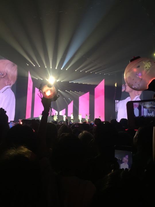
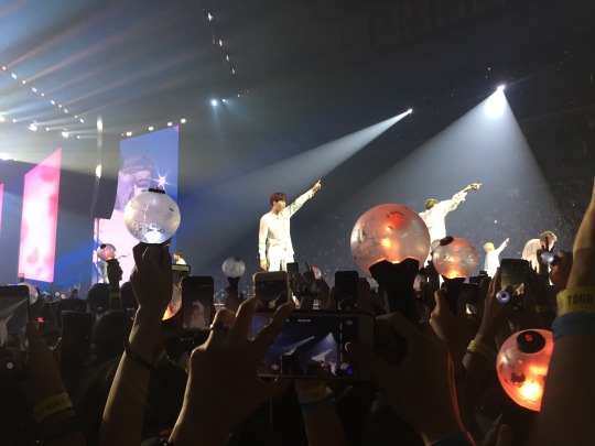
The Show
The show was absolutely amazing. They opened with IDOL, which got people hyped from the get-go. Their dancing was ON POINT as always. People were chanting during the intro videos and chatting as it filled in, so it was a great vibe once again- just super happy feeling. The audio visual part was AMAZING, though I’m no pro, and I loved all of the concert outfits, especially Jimin’s super sparkly sweater. Lots of jumping, and lots of screams. I didn’t have earplugs and was fine, but if you’re sensitive to loud sounds I definitely recommend them. ISTG I remembered hearing a mashup of FIRE, but maybe not? Wikipedia seems to think not. But they played a few older ones too, which made me so soft and nostalgic.
More on the members during the concert
Kim Namjoon
Ok, this is so so so biased, let me start with that. If you’ve followed me for any amount of time, you know how much I love this man. Seeing him smiling and happy was amazing. And they had a professional translator for this concert, so I felt like Joon was able to relax a little and enjoy himself instead of worrying about translating for everyone else. He is just as tall and proportional as everyone says he is. Everyone talks about how soft he is these days (and I love it), but he has undeniable charisma when he raps. Plus him in sunglasses, ddaeng. Seeing him so close was akin to something spiritual for me (I SAW THE DIMPLES WITH MY OWN EYES), as were people shouting along with him to “Love.” At the end, he commented how we were all sharing the same air, and hearing him think the way (I know at least some of ) us think was so heartwarming.
Also during some of the videos, there were some NOT AT ALL subtle Minjoon moments.
Kim Seokjin
The crowd last night ADORED Jin and gave him all the attention he deserves to have all the time. People were chanting his name SO LOUDLY during instrumental breaks in Epiphany. His voice was phenomenal, particularly the high notes. it’s clear how hard he’s worked to make it sound so effortless. I noticed that people weren’t moving as much during some of his notes and I can only think it’s because we were literally transfixed. It’s well established, but I don’t think this man has any bad angles. Even in the still pictures I took while dancing, he DOESN’T look awkward in any of them. #impossible.
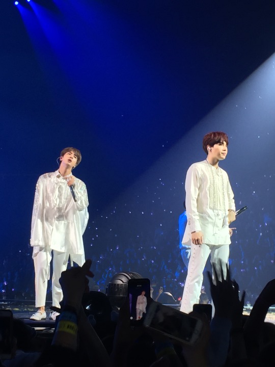
Min Yoongi
Suga was clearly happy about something last night- he was SO cute and happy. Other ARMY on the train back to the city agreed with me. His rapping was fire (duh), but he was really smiley and took out his earpiece a number of times to hear us screaming. “Seesaw” starts with him laying on a couch and I can think of no better way to capture his true soul (lol). He was extra attentive to fans, and I feel like what Tae mentioned in Burn the Stage, he was trying to memorize ARMY’s faces and live in the moment. I felt bad because there were clearly parts where he wanted us to sing along, but we couldn’t necessarily keep up with his tongue technology :P But people definitely tried their best.
Jung Hoseok
Idk what I can say here that’s new. J-Hope is one of the most charismatic members on the stage. And there’s something in the American air that turns him into Jay Hope. Seriously, he’s hard to move your eyes away from. “Just Dance” was the first solo track if I remember correctly and he did not disappoint. His glasses at the end were adorable, and one of the other members called him a “happy grandfather” or something like that. Seriously, if you’re still sleeping on Hobi, we can’t be friends.

Park Jimin
Jimin was ethereal as always, and the choreography for Serendipity was…..salacious, to say the least. Like if you thought the “Take Me Down” cover from last year’s Festa was too much, then idk what to tell you. Bring holy water or something. Despite the free water that fans were providing to others (ARMY are seriously the best) there was a different kind of thirst occurring, if you smell what I’m stepping in. Jimin is pure charisma, like J-Hope. Obviously their styles are totally different, but when they move, you stop whatever you’re doing and watch. Again, I didn’t even see many ARMY bombs moving during Serendipity- I think we were too entranced. I personally thought that he killed his vocals and did great, but he seemed a little tired or like he was working hard at it. Jimin was also the one (at least that I saw from my angle) that got the closest to the fans, crouching down and leaning over the teleprompters/fans/lights/ whatever the black boxes were at the edge of the stage.
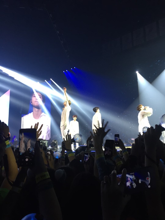
Similar to Tae and Yoongi, I saw him looking at fans A LOT during the show. He was exactly how he seems in V Lives and cameras, and I’m fairly certain I would spontaneously combust if I ever ran into him irl (even if I didn’t know who he was)- he just radiates warmth and friendliness. Seriously, if I believed in magic, I feel like he would be able to influence people’s emotions.
Kim Taehyung
So many fic writers have this ultra primal (for lack of a better word?) for Tae, but all I see is a cute sweetheart. Obviously I’ve never seen someone create as much tension with their own arm as he does during Singularity, but when he’s not dancing, I just got a super innocent, cutesy vibe from him. His voice was so smooth last night. I mean, I knew, but now I KNOW. He actually was shooting hearts at one fan (how lucky they are), and pretended to fall down when they shot him back! They were further back in P2 as well so he really does work hard at paying attention to everyone. He actually called over another member (maybe Yoongi or Jimin? I was too busy trying to remember how to breathe, to see whatever he was seeing).

At the end he whipped a heart out of his beanie (how I pray to god someone got that moment on camera) a la Jin. He just seemed really comfortable in his own skin last night, and I was so grateful for it.
Jeon Jungkook
I had a hard time seeing most of his Euphoria performance as it was relatively early on and people were taking a shit ton of videos. He also stayed mostly on the main stage, rather than come out to the extension area near where I was. His abs are just as great in person, and the screams were (as is to be expected), absolutely deafening. They’ve talked about it in shows, but his voice is SO stable. Obviously they stopped at times and don’t use too much backing vocals, but it sounded EXACTLY how it does on the album. He threw something into the crowd (I think a banner) at the end, and it FLEW so far-back to P2 or further. They’re not kidding when they talk about how strong he is.
Final thoughts
At first, I was a little exhausted after my emotional trauma of the prior day, and from standing for so long but the minute it started I forgot everything else. I was salty when I couldn’t see that much bc of people recording (esp when they asked us not to), but I understand the specialness of the moment and wanting to have some tangible evidence that you were there. By the time the concert was over, I realized how special GA was, even if it’s more difficult logistically (since I went solo and didn’t have parents or friends to stand in). I still don’t know if it’s hit me that I was like 10 feet away from them, max. It reaffirmed how important they are to me. I didn’t write this to brag, but to hopefully share my perspective and let others live vicariously through my experience. If you want clarification or anything else, write to me!

10 notes
·
View notes
Text
Slower pace, but more focus on quality.
If you follow me on Instagram of Facebook, you may have noticed that I’m no longer churning out 2-3 pictures in one week. And in the worst case scenario, the algorithm has buried somehow.
I am still posting at least 1 completed picture each week, along with a corresponding WIP before it’s finished. Funny enough, I’ve been noticing last year that I was neglecting the loose doodles I used to post on the weekends. They were supposed to be fun little experiments and exercises, rather than ehhh, another picture.... *focuses a bit too strongly*.
As for these blog posts... these will likely slow down this year too. Here’s to hoping that as freelance writing work picks up again, these blog posts don’t become like the neglected doodles where I think eughh.... more writing QAQ But casual writing-like-I’m-talking about semi-personal hobbies and interests is *very* different from research and business-driven writing.
Anyhow, here’s possibly the cutest darn thing I’ve ever drawn digitally.
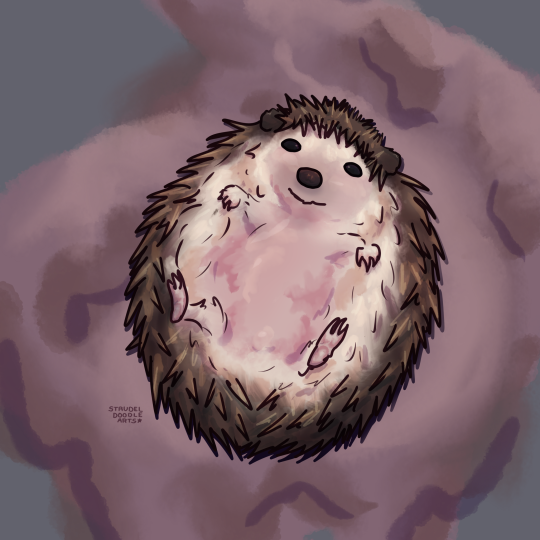
LOOK AT IT QAQ I actually paused multiple times during the drawing process to just gawk at the wittle face and belleh AAAAAAAA
Lately I’ve been thinking about texting/detail/shading as all part of one step. I can’t help but think back to a post I wrote about thinking about digital art in terms of coloring vs painting.
With these new time constraints for drawing quality doodle, I was forced to rethink my process yet again without the sacrifice in, well, quality. It’s a shame that there isn’t really a clipping method I know of in Autodesk Sketchbook (or, simply the Sketchbook program now. I don’t know if it’s still affiliated with Autodesk.)
The closest I could get to that is a multi-step process:
1. Draw good line art in order to get a clear silhouette.
2. Use the magic wand tool (up the tolerance a bit to avoid bleed) to select the area around the line art.
3. Invert the selection. Then create or select the proper layer for base color.
4. Paint in base color. I rely a tad on the steady tool so that the lines aren’t shaky. I don’t set the steadier too high as that would slow me down too much. Erase anything out of place.
5. I’m very mindful about how the base colors look underneath the line art because the line art is set to multiply, and the opacity is below 100%. This makes me think about how the layers can be stacked in order to save time.
6. I lock each base color layer...
And that’s how I “clip” in Sketchbook. This leaves me free to paint directly inside each region for texture/detail/shading/lighting in one step.

This was how the base colors were laid out for this drawing. Each distinct color region has its own layer. Stacked from bottom to top in the following order: Quills (brown), fluffy belleh (white, with edges smudged out with a “hair” blender), warm area with skin peeking out (pink smudged with a regular blender), and face/nail features. So four layers in total (not including the background and sketch/line layers. Mostly everything beyond this was painted directly into these four layers. The sketch helped me envision shading direction before I was satisfied and hid it away.
I don’t touch the multiply setting again until I’m done with all the defined texture shading in each layer. On a new layer (again, with the hedgehog silhouette selected), I set it to Multiply and simply airbrush a few darker areas to add contrast.
I then played with some Overlay settings in another layer to give the hedgehog some tints to reflect its environment. So a slight tint of deep pink/greyish blue. My overlay goal was added contrast and *pop* without looking too out of place.
These two additional steps took around 5 minutes. Finally, I created a cast shadow of sorts underneath the hedgehog by transforming a copy of the figure’s silhouette. (And then I added my signature.)
So satisfying~ 0w0
#art process#quality over quantity#hedgehog art#too cute#digital painting#sketchbook program#texture
0 notes
Text
Pricing Commissioned Writing
I do a lot of commissioned writing (see me about details, eh? EH!? PLEASE!?) and how I base my pricing is really dependent on what I’m doing, writing wise..
Freelance writing rates are very good, and I think if you’re writing for business entities you should demand standard freelance rates! For fics and social-media type stuff, I get wanting a different price-point. Hourly minimum wage as a start is always a safe and awesome way to start (include research time for the love of god, please!)
Price Like an Artist?
But for fics, another great way to think about it is to look at how the artists are pricing things. Just like their art, your fics are gestural, and as you add more detail, it becomes more expensive.Think about it like:
Sketch = Drabble (800 words)
Line Art = One-shot (2000 words)
Color = 3500 words
Shading = 5500 words
Just like with artists, the more complicated the background of the story, the more characters, the more involved: the more money.
Complex Backgrounds, Extra Characters = Big Bang-ready fic (10k words)
Highly Realistic = Novella (25-30k words)
Oil on Canvas = Novel (50k)
Like artists do, consider what adds a lot of time to YOUR work, and maybe add price modifiers on for those things. Spitballling here, but maybe something like:
Complex Hair/Scars = Unique Character traits
Different Perspective = AU requiring extra research
Bust vs. Waist-up vs. Full body = Character Study vs. Romance vs. Ensemble cast
Some things to consider, because this method of pricing sure does have some caveats:
this system works best on the low word-count end, and once you get to that 10k words level, the amount of research and plotting REALLY skyrockets, so your prices here may start to be much higher than an artist at the ‘equivalent’ level. That’s fine!
You gotta loosen up a bit! If you’re writing a drabble, you can’t be worried about how the characters got in that room or that situation or whatever, just like an artist doing a sketch is not thinking about why their character is wearing a jacket or ‘that hat.’ Different sizes of story really take different levels of detailed planning. Don’t be afraid to skip some details if you’re just writing 3000 words!
Make sure you know how quickly you can produce each level, so you don’t get over-run!
Every artist has one of those niches that is really their bread-and-butter. If your thing is 2000 word one-shots, MAKE SURE YOU ARE CHARGING ENOUGH! That's what people know you for, after all!
I like this method, despite the problems, because it allows people to compare with a broad range of talent. Commissioned authors can be hard to find, but commissioned artists are plentiful on tumblr, so you can compare with a lot of different people and find a pricing scheme that works for you!
It's also really salient to the public who is used to seeing this sort of pricing scheme, and I've found makes them more likely to commission if they know they're having a similar experience.
More than anything, I like how it refocuses your writing! What you do is like what artists do: use a little to convey a lot of character! The more detail, the more background, or the more scope that needs to be conveyed, the harder you work.
Commissioned writing can be fun and can really help improve your stuff, and yes, finding people who will comment on a fic, much less pay for one, is HARD. But please at least get a sense of the value of your work, even if you aren't going to do commissions!! It can really help you realize "Holy crap, I am a good writer! I am also so generous!"
#writing advice#commissioned writing#writing commissions#commissions#pricing#freelance writing#fics for $$$
226 notes
·
View notes
Text
At the beginning of the year I set two goals for myself:
First, to use the avenue of this blog to post daily creativity, either from myself or from other artists, in order to make 2017, for me, a year of “creating dangerously”, that is, a year of making art public, open, vulnerable, accessible, engaged with the world; in other words, art where and what it is supposed to be. I wanted to take in a wide spectrum of artists and creative expression so this blog touches on visual art, music, movies, writing, oratory, poetry, and on and on…
Second, I challenged myself to get back into painting and set the goal of creating at least one new piece per month. I haven’t worked on any “serious” painting since college (back when dinosaurs roamed the earth). I decided to use the theme of artists who inspire me, who created or create “dangerously”, and honor them in my paintings. The first painting was actually completed at the tail end of 2016 but it was, fittingly, of Joe Strummer. If you know anything about me, you know I have a thing for Joe. To me, he’s top of the heap when it comes to creative types I am inspired by. Here is that first painting again:
“Punk Rock Warlord (Joe Strummer Vs. the Void)” Mixed media 2016
My second painting was just completed a few days ago. It is meant to honor Maya Angelou (1928-2014), the glorious author, poet, dancer, speaker and all-around phenomenal woman. It seemed fitting to finish this in February, acknowledged as Black History Month. Here is a closer view of “Maya Rising”:
Unfortunately, I didn’t take photos of the process of creating this work. I wish I had. But I do want to describe some things that I planned and things I did not.
First, I took my 16″by 20″ canvas (each painting in this series will be that size) and affixed photocopied pages from “I Know Why the Caged Bird Sings”, the first and most celebrated memoir of Angelou’s career. My goal was to make her words the “backdrop” to her portrait, with the text coming through as shading and detail. She often spoke of writing as her greatest passion and, certainly, she is known best through her prose and poetry. I let the pages wrap around the canvas. I didn’t have any plan for laying the pages out, I just did it and hoped for the best.
Second, I looked for an appropriate photo of Maya to work from. I ended up visiting the Facebook page dedicated to her. There we a lot of great images but I was struck by one in particular. Most photos of her are sweet and beautiful, that big smile figuring prominently, truly conveying the joyful and intelligent person that she was. But this photo had something different: Defiance, power, pride. It was so different from the others that I was immediately drawn to it and thought, “That’s the one.” Here it is:
Thirdly, I worked on ideas of adding one of Maya’s poems to the piece. At first I thought of her poem “Phenomenal Woman” but it wasn’t resonating with me as I looked at the photograph. Then it hit me: “Still I Rise” would be much more apropos to this particular portrait. That poem is defiant, powerful, proud – It was a big “Aha!” moment for me. As it may be difficult for you to read it in the photo I posted of the painting, here is the poem in it’s entirety:
Still I Rise
You may write me down in history
With your bitter, twisted lies,
You may trod me in the very dirt
But still, like dust, I’ll rise.
Does my sassiness upset you?
Why are you beset with gloom?
’Cause I walk like I’ve got oil wells
Pumping in my living room.
Just like moons and like suns,
With the certainty of tides,
Just like hopes springing high,
Still I’ll rise.
Did you want to see me broken?
Bowed head and lowered eyes?
Shoulders falling down like teardrops,
Weakened by my soulful cries?
Does my haughtiness offend you?
Don’t you take it awful hard
’Cause I laugh like I’ve got gold mines
Diggin’ in my own backyard.
You may shoot me with your words,
You may cut me with your eyes,
You may kill me with your hatefulness,
But still, like air, I’ll rise.
Does my sexiness upset you?
Does it come as a surprise
That I dance like I’ve got diamonds
At the meeting of my thighs?
Out of the huts of history’s shame
I rise
Up from a past that’s rooted in pain
I rise
I’m a black ocean, leaping and wide,
Welling and swelling I bear in the tide.
Leaving behind nights of terror and fear
I rise
Into a daybreak that’s wondrously clear
I rise
Bringing the gifts that my ancestors gave,
I am the dream and the hope of the slave.
I rise
I rise
I rise.
I decided instead of writing the poem myself on the canvas, to print it up and divide up the “stanzas”, making them “rise”, in a way, along the left side of the piece. I was originally going to layer a few of these on top of each other but is was turning out too busy and too distracting.
Fourthly, I sketched out where I wanted Maya to be on the canvas, giving myself enough room for the pieces of her poem but also getting here entire profile in the image. Then I dove in with an art marker. That was a scary moment where I didn’t want to screw anything up! I drew out the shape of her face and head, neck, chest, etc. with the pen. I thought the black of the marker would help bring out the contrast of the photograph. I chose to “remove” the jewelry she was wearing in the original photograph. I thought the effect of seeing her neck, shoulders and chest unadorned was more stark and direct, befitting the poem.
Fifth, I took some watered down black paint and a sponge and darkened the background around the portrait. I wanted it dark but not too dark, so you could still see some of her words coming through. Then I added paint to the portrait I had drawn with pencil and marker. I only used three colors – brown, white and black, with a bit of mixing and adding water to give different shades. I kept a “sketchy” quality to it as it seemed to fit with the whole look of the painting.
Sixth, I glued on the bits of poem. After it dried, I used three layers of varnish to seal the artwork well.
As I was working on it, and after it was done, a couple of things surprised me. First, the lines of the photocopied paper, one following her neck line, another following the line of her chin – I did not plan that at all. In fact, I didn’t notice it until everything was done. I was also able to keep the white of the paper as the color of the bit of dress you can see at her breast, helping to create the strong contrasts. Secondly, the fact that in this photo she is facing left – her determined gaze going that way – but all her words run left-to-right, so as you read the poem, you come to the end of a line and confront her portrait each time you do so. It adds extra punch to this punch-filled poem. I’d like to take credit for figuring all this out beforehand but that would be a big fib.
In the end, I believe Maya and her words really did inspire me, both consciously and subconsciously. And, really, isn’t that what a great artist is able to accomplish in their art?
Thanks, Maya. God bless. We miss you.
A Year of Creating Dangerously, Day 52: Maya Rising At the beginning of the year I set two goals for myself: First, to use the avenue of this blog to post daily creativity, either from myself or from other artists, in order to make 2017, for me, a year of "creating dangerously", that is, a year of making art public, open, vulnerable, accessible, engaged with the world; in other words, art where and what it is supposed to be.
#blackhistorymonth#Mayaangelou#Black History Month#I Know Why the Caged Bird Sings#Maya Angelou#Maya Angelou poems#Still I Rise
0 notes
Last Seen Blogs
marshmallowdonutsprinkles
This Unintentionally Became A Champion Leon Blog

pocket-ghostie
Stories :3

sh662
Sans titre

benopixtu
BENO DESIGNER