#i guess the longer stuff isn’t as popular compared to the shorter stuff because it’s more time consuming - which i totally get btw!!
Text

Yukhei threw a small bit of cheddar cheese at Kun for the lame joke he just said. For a second, it seemed that Kun wasn’t going to retaliate until a smile spread across his face.
“That’s real mature of you.”
It took a second for all of you to catch onto his pun; Kunhang being the first to facepalm, Dejun following with laughter.
You chuckled, eyes roaming until they landed on Yongqin who did the same. The two of you shared an amused grin and he shook his head before looking away.
This time Yangyang threw a grape at Kun.
#there’s something really special/charged about sharing a look with someone after another person said something silly/dumb/funny#or is it just me??? maybe im phrasing it wrong but ur eyes would just find that person first and u 2 share a little moment#where u laugh or roll ur eyes or something like ur on the same wavelength u know???#idk maybe it doesn’t make any sense and i’m talking shite 🥲 i hope u get me tho#another drabble!! ‘what about the sicheng fic u promised yakult?’ yeah...idk about that cause i don’t think i’m happy with it anymore#i might scrap it ://#my longer written stuff doesn’t seem to do well???? i might just stick with drabbles + timestamps#i guess the longer stuff isn’t as popular compared to the shorter stuff because it’s more time consuming - which i totally get btw!!#it’s just a bit of a bummer yk?? like i wrote a 12k taeyong fic and it only has like 3-4 notes (lol) and it just makes me doubt myself#(more than usual) and even my shorter fics don’t really gain a lot of interaction - maybe it’s a sign for me to let go of this blog#a lot of writing blogs have shut down/are shutting down so it seems like the end of an era...idk i’ll sleep on it ig#wow that went downhill huh?? ANYWAYS i hope y’all enjoyed this one!!!!!!!!!!!!!#anyway here come the tags:#wayv#wayv au#wayv scenarios#wayv imagines#wayv drabbles#wayv x reader#wayv x you#wayv fluff#wayv ten#ten x you#nct#nct u#nct au#nct scenarios#nct imagines#nct drabbles#nct fluff
7 notes
·
View notes
Note
hi!! so i just started writing fanfics, and i was just wondering -- how do you deal w/ numbers and the whole posting online thing? while i know that i should be writing for fun and stuff (bc it is!) and that im literally JUST starting out, BUT i just.. im someone who really heavily relies on validation, and when people don't really respond to my works well (or at all), i kinda just.. feel bad ): idk.. do u have any tips?
🥺 You came to me for advice on this, anon? 🥺 Thank you so much! I’m more than happy to pass on what I’ve learned and help out a new writer. I’ve been reading/writing fanfics on-and-off in some form or another for like ten years, but especially over the last four and am happy to share some tips. There are five main things that I think can help grow your follower count and the amount of feedback you get:
Don’t feel bad about wanting validation.
Consider the platforms where you post.
Write for active fandoms and popular characters.
Post frequently.
Interact with other authors.
This got rather long so I have more info under the cut about each of these.
1. Don’t feel bad about wanting validation.
There’s this dumb trap that we all fall into as writers that tells us that validation isn’t important and that what matters most is our love of writing. While I enjoy writing, if my stuff got no notes and no feedback then I would definitely have gotten discouraged and quit writing awhile ago. Why would I put all that effort into something if no one seems to appreciate it? There’s nothing bad about wanting people to let you know they like your writing! I get so happy when I see someone left a comment on one of my fics or went crazy in the tags or sent me an ask. And when something doesn’t get any feedback, I get depressed about it and second guess whether I should have bothered writing it. So, definitely try not to get caught up feeling bad because you want people to tell you that they liked your work. 💕
2. Consider the platforms where you post.
I only use AO3 and Tumblr, so I can’t speak to any other platforms, but posting my writing on both of these are widely different experiences. Part of the culture of AO3 is giving kudos and leaving comments, so you’re more likely to get feedback there than anywhere else. I slowly built a following on Tumblr because of my AO3, even when I wasn’t posting anything on Tumblr itself. I would really recommend checking out AO3 if you’re not already on there! You do need to request an invitation, but it only took me a couple of days to receive one. I also have 8 invitations that I haven’t sent out, so DM me if you want one and I can give you one!
I’m sure you’ve already seen posts about this, but the unfortunate thing about writing on Tumblr is that the feedback is absolutely minuscule and I’m not sure why. There’s this awful culture on this platform of people only liking content and not reblogging it to make sure it gets shared with other users. So, you end up really reliant on your own followers and the tagging system for your works to reach people. And the tagging system is a mixed bag. Sometimes your posts don’t show up in the tags or they will but only after a couple of days. If your post gets enough notes then it might go to the top of the search feed but then only for a few days at most.
As a sidenote to readers, this is why reblogging is so important! Even if you only have five followers or don’t leave a comment, just reblogging it means a lot to content creators!
Here are some of the tips I have for the mechanics of Tumblr:
Use the tagging system, as imperfect as it is. I think Tumblr now reads the first 20 tags in your post, so use that to your benefit. I usually always tag at least: [character name]; [character name x reader]; [fandom]; [fandom x reader]. You can always also try things like: [character name genre], [fandom genre], [fandom fanfic], [character fanfic] as well.
Make sure your blog is easy to navigate and have a masterlist that’s easy to find. If a reader sees your content on their dash and decides to check out your other works, if they can’t find them on your blog then they’ll probably just leave.
Self-reblog as much as you feel you need to for your followers who may have missed your post. I self-reblog a lot for new content over the first couple of days and then even will do a few icymi self-reblogs later as well. It also helps to have a list in your profile somewhere of your recent updates so people can easily see if they’ve missed something.
3. Write for active fandoms and for popular characters.
This might seem like common sense, but I think it’s something to keep in mind if you want to grow your follower count and your chances of getting feedback. And there’s nothing wrong with prioritizing a fic over another just because you want more feedback. I actually really want to write something for Chainsaw Man but the fandom is so small compared to the other fandoms I write for that I’m putting it on hold until the anime comes out.
That’s not to discourage you from writing for characters or fandoms that are less popular -- I have a bad habit of writing for niche characters and fandoms. But I always see my activity spike when I write for more popular characters. Another tip is to try and figure out which characters people are thirsting over but where there’s a lack of fics for them. You’ll also find that some characters or fandoms just have louder fans than others. The stuff I’ve written for Gojo has gotten a lot of likes and notes, but not so many comments or much feedback. But the amount of asks and thirsts I’ve gotten for Naoya is wild. This is something you’ll learn over time as you keep writing!
4. Post frequently.
This one is annoying because writers have lives and real-world responsibilities and we can’t just write 24/7. But when you’re trying to build a following, even if you can do a couple of short drabbles a week, you’ll really start to see your follower count and feedback grow. I’m not sure if people tend to like longer or shorter fics more, but overall people are just hungry for content and if you can give it to them on a frequent or at least regular basis then they’re more likely to interact, especially if you’re taking requests.
But don’t prioritize writing and posting content at the cost of your own well-being. As authors we’re all guilty of this at one time or another, but your followers will understand if you have writer’s block or you need to take a step back! Taking care of yourself is more important than getting feedback or interaction. ❤️
5. Interact with other authors.
Building relationships with other authors is a big one, but it’s also probably the hardest because a lot of us (me included!) are just so shy about reaching out! It’s like asking someone on a date or trying to be friends with someone you really admire. I know it’s scary to come off of anon (I still sometimes send asks on anon!), but authors recognize the names we see often in our notes and in our inboxes and we’re all really nice, I promise! 🥰 And I’m much more likely to read the fics of my mutuals and the people I follow than I am to be searching through the tags.
And I think there’s nothing wrong with reaching out to an author you love and politely asking if they’ll read your work. I think it’s totally okay to send something like, “I really love your writing and wanted to know if it’s alright if I share this fic I just posted with you? I’ve seen you thirsting over [character] and think you might like it if you have the time to read it!” The worst they can do is turn you down. I would never be upset over getting an ask like that as long as it was polite and the person was understanding that I might not have time to read their fic. But, I know that this is really scary to ask of someone. I’ve only done it once or twice, so maybe I don’t have any ground to stand on here, but I really think you should try it even if you need to send the ask on anon first.
Please just be mindful of an author’s rules before reaching out.
Another added bonus is that authors are more likely to reblog and give you feedback on the stuff you write because we’re in the exact same boat as you! We’re the perfect audience.
And don’t forget...
Growing your follower count and reaching the level of feedback you want takes time. If you’re just starting out, don’t get discouraged. The more you write, the better you get so even if you’re not getting the feedback you want now, that doesn’t meant that you never will!
And of course, pay it back in kind. Just how you want people to interact with your fics, we want the same. I always try to leave comments on the fics I read on AO3 and always reblog the fics I like on Tumblr and try to go wild in the tags so that the author knows that I loved their works.
I hope you found all of this useful, anon! Best of luck with your writing! 💕
37 notes
·
View notes
Note
multiples of 3 ✌🏼-sgmdrcklee
@sagemoderocklee you’re really trying to kill me lol
This got long as heck so I’m throwing it behind a cut. Read on for answers and fic recs! (Mostly the fic recs)
3. favorite line/scene you wrote this year
This is a tough one to answer for me generally because I tend to spit words onto the page and once I have written them I no longer remember writing them. And 2020 has stretched on so long that as I’m looking at some of the stuff I wrote in the beginning of this year, I hardly remember what’s even in it. I think at one point someone (@goblin-draws maybe?) mentioned a line in Sleeptalk with Me where the innkeeper calls Kankuro “chubby boy”, and I was like “Oh ... did I write that? Yeah, sounds like something I’d have someone say to Kankuro ...”
It might be easier to talk about this in other terms. One of the scenes I worked the hardest on this year was the fight scene in Chapter 3 of Skeleton Key. The original draft of the scene was a lot shorter, and a lot of the backstory for Misaki’s revenge quest was elided. The scene as originally written was clunky, confusing, and as my lovely wife/beta put it sounded “like a Naruto villain” was doing the dialogue, when previously she’d found Misaki sinister and intriguing. Which wasn’t what I wanted. I basically entirely overhauled the scene and re-wrote it several times. I wouldn’t call it a ‘favorite’ scene (I hate writing fight scenes generally; having chosen to immerse myself in a fandom about ninja where much of the drama comes from battle is my eternal regret), but it is a scene that I put a lot of effort into, and I’m moderately satisfied with the improved product that resulted.
6. least popular fic this year
By far my least popular fic by kudos ever is Pitch Perfect. Which makes complete sense to me. It’s a fic where I’ve written 2 characters who are men in canon as cis women, which pushes a lot of uncomfortable buttons for a lot of people. It contains F/F smut, which is something that a lot of people who choose to read GaaLee probably aren’t out there looking for. And people comment and kudos less on smutfics, I assume because they don’t want their username attached to porn or because they’re embarrassed (which I totally get, no shame there). It’s a modern AU with a sports twist, and AUs are often less popular than canonverse in my experience. I will say though that it has a surprisingly high number of private bookmarks compared to other fics with comparable hit and kudos counts. So I assume people are just a bit more shy because the premise is so ‘out there’. I will say as far as my fics go, it’s one of my personal favorites and probably one of the most intimate and true-to-life things I’ve written? So it actually is a little comforting to know that something so vulnerable has relatively little attention.
9. longest wip of the year
If we’re going based on stuff that’s partially published but not complete, my Gaara-adopts-Shinki fic On My Way Home is my longest in-progress fic at just over 20k words, although technically I started it in 2019. It will probably end up being right around 40-50k when it’s complete, which might end up situating it as my longest fic ever?
12. favorite character to write about this year
Okay, this is an easy one. I love writing Kankuro. I think he is hilarious. He is the devil on my shoulder and a creature of pure id, and every time I write a line of dialogue for him it’s the summation of my rudest thoughts about a situation put in the crudest possible terms. If there were a megaphone directly from my unfiltered brain giving running commentary, that would be Kankuro.
15. something you learned this year
I have learned SO much this year! This is only my 2nd year properly ‘focusing’ on writing fic and investing any substantial time into it. I think the biggest thing I have learned, though, is how to overcome a lot of my self-consciousness about writing stories with NSFW elements in them. Starting out, I was so extremely shy and mortified about writing fic at all, much less things like hugging or (god forbid!) kissing. So taking on the smut prompts I took this year and really buckling down on learning to write the mechanics and emotions of sex has been a massive learning experience. (And sorry, by the way, if I haven’t gotten to a prompt you sent me in January yet. I do intend to write all of them eventually!)
18. current number of WIPs
Ah. The call-out question. My general fic process is idea -> outline -> wip -> edit -> ready to post (where the final draft sits in my docs until I gin up the courage to actually post it). So skipping fics that are just “ideas” on the big mega-list, I have 3 fics in the “outline” stage, 13 fics in the partially written “wip” stage, 1 fic in the “editing” stage, and 2 that are complete but yet-to-be-posted. So, like, 19 total in the offing. (The “ideas” list is even worse lol.)
21. most memorable comment/review
This is such a difficult question because every single comment I get makes me do a little dance for joy. That’s not an exaggeration btw I really sit there and like bounce around in my seat for a moment before I open the Ao3 email. I am not an especially emotive person irl, but there have been times I’ve been brought near tears by comments. I’ll also occasionally show them to my wife like !! look at this nice thing this person said !! and she’s indulgent enough to actually read them. There have been a couple comments that have really stuck with me, that I starred in my inbox and return to frequently, but I don’t want to bring attention to someone else without their permission. I will say there was one person recently who mentioned (not in the comments on one of my fics) that they had found someone who does physical binding of fanfiction and they were about to ask my permission to do that, but then the person who does the binding only does certain ships that she likes ... so that, just, absolutely floored me. The idea that someone might actual want a physical copy of my stupid little ninja fanfictions is, like, so truly immense and completely overwhelming?
24. favorite fic you read this year
You can’t make me pick just one!! (For reference, I have bookmarked right around 180 fics in the past year, and that’s not including fics that I just read, really enjoyed, but didn’t think I could ‘handle’ a second time around.) So, skipping over the ones that AREN’T Naruto ... here is a brief sampling of some faves:
Silica by deepestbluest (rated E, GaaLee, ShikaTema, and Kankiba) - An absolute emotional powerhouse of a fic that manages to skillfully interweave three complex relationship dynamics, satisfactorily resolve them, and give you ALL the sandsibs feels in just over 10k words.
Childhood Not-Friends (series) by MegaWallflower (rated G, KakaGai) - @megawallflower is a KakaGai god for good reason. Absolutely adorable relationship development fics (five of them!) with the premise that Kakashi thinks he and Gai have been dating since they were kids ... Gai just hasn’t been clued into it yet. These stories will give you heart-eyes.
The Bright Side by gidget_goes (rated T, GaaLee) - This is the Buffy AU I never knew I needed, because I’ve never seen Buffy the Vampire Slayer. But truly you don’t need any Buffy knowledge to enjoy this fic. @gidget-goes command of imagery is masterful, and the way they manage to snap from snark to tugging at your heartstrings is awe-inspiring. Gaara breaks my heart in this. And did I mention Kankuro wears a 10-gallon hat? Because Kankuro wears a 10-gallon hat.
Nature vs. Nurture by Bidiza (rated T, GaaLee) - So introspective and so poetic. This looks like a WIP but it’s actually multiple oneshots, although by the end of the second one you’ll be dying for the rest of the promised series.
I’m a Fool to Want You by BeelieveRosemarie (rated M, GaaLee) - Turns out @tuttiefruttiegaalee isn’t just an amazing artist, they’re a writer, too! Slow-dancing that will break your heart. Listen to the Frank Sinatra song while you read this for extra tear-jerking effect.
Let Love be Known (series) by TenTomatoes (rated G, GaaLee) - This is the twist on the arranged marriage trope and Beauty and the Beast that I didn’t realize this fandom was missing. I’m absolutely obsessed with their concept of Gaara as the Beast
I Could Be by LilacNoctua (rated T, GaaLee) - I know I big up @lilac-writes Worthwhile series a lot (deservedly so, because it’s so good it makes you look at the series and go “Why the fuck didn’t Kishimoto make this canon exactly like this?”), but this story made me absolutely die between the butterflies in my stomach and how hard I was laughing. There’s one line--you’ll know it when you read it--that absolutely bowls me over every time I re-read this.
And Then Continue by EgregiousDerp (rated E, GaaLee) - Obviously I’m biased because this was a gift, but @egregiousderp writes some of the the best characterized porn I’ve ever read. You will read this and go “Wow! This is exactly how it would happen!” It’s such a tender, beautiful exploration of Gaara’s insecurities and a very real feeling first time, for all its soft edges.
Cake by citronelle (rated E, KanKiba) - I don’t even know what to say about this one other than ... phew, this is extremely well written, extremely hot, and extremely in character. Just read it. I promise it’s worth it.
Saudade by YumKiwiDelicious (rated M, GaaLee) - I’ve run around reccing this to just about every person on the face of the earth at this point. If you’re in the GaaLee Discord you probably saw everyone salivating over every new update of this fic and with good reason. The twists and turns of this fic will have you on the edge of your seat, second guessing every single moment. And it will break your heart in the meantime. What more could you want?
the love potion commotion by floating_cats (rated T, NejiSasu with background GaaLee) - One of those fics where you wish the author’s sense of humor was your own. So many hilarious moments in this story, and it brought me a new appreciation for a ship I never would have even considered.
Finger Lickin’ Good by whazzername (rated E, GaaLee) - Whazz is another one of those authors where I literally want to rec every single thing she’s ever written, she’s just that good. (Speaking of which, if you haven’t read Fools Rush In and its sequel Degrees of Separation, you’re missing out on the best possible Metal origin story of all time. Don’t deprive yourself of this.) But this story is just ... so incredibly in character for a situation that reads like crack. It’s handled with the utmost straight-facedness and it’s so. freakin’. good.
heart lines by winterberry_holly (rated M, NejiTen and GaaLee) - I don’t even have the words to describe how perfect this fic is. It’s a truly beautiful exploration of Tenten’s relationship with her palmistry hobby and with the people in her life. My heart ached with every single line.
Standing on Ceremony by kuroashi (rated E, GaaLee) - This is just ... such a beautiful wedding story. So lovely, like getting the best possible warm hug from someone you love. If that love one was slightly strange and socially inept, because, well. It’s still Gaara doing Gaara-things. @baphometsss is another one of those authors whose handling of smut scenes is so stupendous it makes me wildly jealous.
Thrall by RokiRiot (rated T, GaaLee) - Idiots-to-lovers with a magic AU twist! This is such a wonderful story, and Gaara’s internal monologue is absolutely amazing. And Lee is Deaf in this fic, which I never ever get to see and which absolutely made my entire day/week/month/life.
Make-Out Consequences by LuxaLucifer (rated M, KakaGai with background canon Boruto ships) - I laughed so hard reading this that I had to take a breather to stop crying. That’s not an exaggeration. The characterization in this fic is impeccable and the humor is to die for. Naruto’s buffoonery truly shines here, and the author’s wit is just beyond anything I could even properly summarize. Hysterical. A++.
Thirteen Strokes by Luna_Lee (rated T, GaaLee) - Again, like, if you aren’t reading literally everything @sagemoderocklee writes, are you even really a GaaLee fan? But this fic is beyond even for one of Eeri’s incredibly excellent writings. The worldbuilding in this, the cultural notes, the imagery ... it’s all so lush and so fulfilling and so beautiful. It’s a story about love and it’s a story that you can tell has love poured into every single line. I can’t recommend it enough.
Checkmate by shadowstrangle (rated G, GaaLee) - The pettiness vibes ... this is so funny. Such a cute story and I love Gaara’s sense of humor here. Not a lot of writers give him a sense of humor, but I love how @shadowstrangle gives him a slightly odd, slightly left-of-center take on humor that still manages to be so funny.
To Court a Village by FanFictionEngineer (rated G, GaaLee) - Another one where my bias is perhaps slightly obvious, but the premise of this fic is amazing. I love cultural misunderstandings, and the idea of Lee trying his hardest to court Gaara ineptly is just so perfect.
affliction of feeling by theformerone (rated E, SakuHina) - One of those ships that it would never have occurred to me to seek out but that absolutely works with how the author’s set it up. The dynamics here are delicious. It’s so rare to find good F/F porn but this is one of them for sure.
Tried and Tested by twentysomething (Rated M, KakaIru with background canon Boruto ships and GaaLee) - Iruka’s narration in this story is just incredible. I haven’t laughed this hard reading a fic in ages. And the concept alone (that Naruto can’t be promoted to Hokage until he passes his chuunin exams ... as an adult ... and Sasuke gets dragged along for the ride) is just brilliant. Amazing concept, amazingly executed.
a fireside waltz by winterberry_holly (rated M, GaaLee) - I really tried not to rec a single author more than once here but for this one I had to. I got about halfway through this fic and immediately started running around ringing the town crier bell like READ THIS FIC! READ THIS FIC! An absolutely smoldering Regency AU with such beautiful, intimate dance scenes. My heart was racing every single time their fingers brushed. If you don’t read anything else on this list, at the very least read this.
27. favorite fanfic author of the year
I really can’t pick just one. I am lucky enough that @egregiousderp passes me her drafts under the table before (or without) publishing, and getting to read those is a private treat of unparalleled proportions. Some of my favorite things I’ve read this year I can’t even rec because they’re her unpublished stuff.
30. favorite fandom to read fic from this year
This is gonna come off strange because I just wrote such a long Naruto reclist, but I recently watched What We Do in the Shadows, and found an incredibly talented group of authors in that fandom with really amazingly good dialogue and narrative voice. I also read a lot of fic for the new It movies (even though I couldn’t watch the 2nd one for ~reasons~), and damn if there isn’t a talented crop of authors in that fandom, too. And finally with ATLA making its way onto Netflix, I had the chance to start watching that for the first time and found a ton of really good fic there as well!
fanfic end of the year asks!
24 notes
·
View notes
Text
Thanks to @mandelene for the open tag!
Name: My online pseudonym is Feyna.
Fandoms: Currently, only Hetalia.
Most popular oneshot: I’ve never written real one-shots so I guess it’ll have to be a ficlet. On tumblr, the one with most notes is Small Stream. However, Christmas Is with Family has nearly as many notes and also got quite a few comments on FNN and AO3 (while Small Stream didn’t) so I don’t know which one is objectively more popular.
Most popular multichapter: Needy Child. Because apparently, it’s the only fic existing in the Hetalia fandom set during those few years when America was a teen and Canada a child/toddler, so anybody who wants to read something like that has only this fic of mine available. 😅
Actual worst part of writing: I know this is cliché, but the hardest part is the writing itself, lol. Especially, as it turned out, when I was looking forward to writing that scene and had daydreamed about it million of times... Pity that I’m never able to give it justice when I write it down, which is incredibly frustrating.
How you choose your titles: I’m awful at choosing titles, haha. It’s a random process. I try to churn out titles (mostly going by words’ association) and hope for a good one to strike me. (Ideally, the title would have some sort of double meaning, both related to the theme of the story. I once wrote a better explanation of the process [x].) If it doesn’t happen, I go for the one I dislike less of those I had tried.
Do you outline: For fics that ended up being shorter than ~40k words, I’ve never done it (even though I did have the general plot and some scenes in my mind. I daydream a lot about a fic before writing it). For longer fics, instead, I write a very loose outline of the main events and how they can be divided into chapters. (I explained it better in answer to other questions [x] [x].) I don’t always end up sticking to that once I’m writing, though.
Ideas I probably won’t get around to, but wouldn’t it be nice?
Lol there’s so much stuff here... Something I’ve been thinking about a lot (since I got a question about it) is the fantasy AU with Matthew and Alfred as knights [x]. The more I think about it, the more I love the idea. However, I don’t have an organic plot in mind so it’s quite unlikely I’ll ever get around to writing it. (Even though a collection of full-length – at least 6k words – one-shots...)
Of other ideas I’ve talked about in the past [x], instead, for how I love all of them, one of the most unlikely ones is the one with Arthur being a lawyer who has to help Alfred get custody of Matthew because... the idea is lovely. Pity that I know absolutely nothing of adoptions and all the legal stuff involved, the research required would be daunting. 😅
On a similar note, I’m quite enamoured with one of the fantasy ideas I had (the one with Alfred and Matthew as princes) and I keep adding details to that plot but I don’t think I’ll ever write it as, compared to a canon-verse setting or a more generic human AU, it would require a lot of effort in terms of worldbuilding, I would also have to describe wars and peace talks... honestly, I highly doubt I’d be good enough.
Callouts @ Me: I’m way too long-winded. A bit of introspection is fine, but too much is too much. 😅 Second, I’m writing in English. I need to stop relying on the more complex syntax of Italian. Third, way too self-indulgent. Shameless hurt/comfort in the way I write it is the exact opposite of good writing.
Best writing traits: I don’t think I have one, to be honest. But I guess my writing isn’t completely awful (at least, I hope!) so I’ll put it down as ‘my writing isn’t as bad as it could be’, lol. It’s still something! 😅
Spicy Tangential Opinion: Less isn’t always more.
———
Tagging: I’m tagging anyone who feels like doing this! I’d love to read your answers. 😊
8 notes
·
View notes
Text
First Time: Kissing
Request: I’m a sucker for first kiss reactions, could you do a first kiss reaction for monsta x? ps. not sure if this is deliberate but your anon is turned off :)
Thank you for requesting! We hope you like it and we have now turned anon on for requests.
- Admin Wonhoe & Admin Hyungwon
Shownu/Son Hyunwoo (Written by: Admin Wonhoe)

You are part of the student government at your university and there’s a fundraising carnival being held for a local orphanage in need of supplies
It’s like the whole shabang. Cotton Candy. An unhealthy amount of fried foods. Couples winning prizes for each other
But you don’t get to enjoy any of it because you’re working a popular booth
THE KISSING BOOTH TA-DA
You didn’t expect many people to want to pay 25 cents for a peck on the lips you know
But the line proves you wrong immediately
Lol the line wasn’t for you though. It was for you partner. Son Hyunwoo. People around campus called him Shownu. He was part of the student government too.
The line of girls for the kissing booth could probably wrap around a building twice if you had to take a random guess
You weren’t like disappointed or anything at least he was raising money for a good cause you know
So you sat back on your stool with your baby soft lips which weren’t being put to good use right now
Like why did you spend a whole week keeping them moisturized
For nothing apparently BECAUSE NOBODY WANTED TO KISS YOU
Like to compare you had maybe $5 in quarters
But Shownu had dollar bills in his jar. Way more than $5
So the night goes on an yeah you get a few more kisses but it seemed like Shownu’s line never even got shorter
At this point it was like 10 PM and the carnival was ending slowly but surely.
It was time to take the kissing booth down but there was still al line of girls.
Shownu apologizes to everyone still in line in literally the most polite way ever and you’re melting from the boyfriend look he’s sporting right now.
The group of girls left simultaneously groan but leave because they literally have to now
Shownu is like inspecting his jar with a proud smile on his face
“Wow, this was a big success wasn’t it-”
He sees your jar and the significant difference in amounts is obvious.
“Yeah, you did such a good job Shownu! We should do this again for sure. I didn’t realize you were such a heartthrob. You must have at least $50 in your jar.” But you know, he’s very observant so he sees the upset look on your face
“Nonsense, I’m sure you have more than I do!” You scoff. YOU SCOFF right in his face.
“Don’t be ridiculous. I made $6 at most.”
“No, I’m serious look at your jar!”
You look down at your pathetically empty jar and you’re so confused because this is literally almost empty
And then you look back up
AND BAM Shownu’s very plump, very soft, very kissable lips are on yours.
You’re surprised they’re not more idk chapped or something he’s been kissing for 5 hours straight
But you kiss him back
Because your mom always told you to follow your dreams and you were pretty sure you dreamt about this one time.
Shownu gently takes the jar out of your hands and places it on the table and he cups your face in his hands while he kisses you.
You involuntarily wrap your arms around his neck because that’s what happens in all romantic kisses and you’re not about to jinx it by not doing it.
So you guys kiss for what seems like a really long time.
Like when Shownu pulls away you’re kind of panting in each others faces and you can smell the mint on his breath
And he gives you that smile YOU KNOW THAT SMILE OF HIS? The one that can end wars? He gives you that one.
And he reaches over onto the table and shakes your jar a little bit while lifting it up to eye level.
Inside is a hundred dollar bill and your eyes widen bc holy shit
Did Shownu just pay $100 to give you the kiss of your life
You bet your ass he did
Only one sentence comes out of your mouth
“…I wonder if this is what strippers feel like.”
Wonho/Hoseok (Written by: Admin Wonhoe)

Ok you’re casually in like Victoria’s Secret trying to find some bras or something spicy idk but the point is you’re there right
And you’re really just browsing to find the right size and stuff
But like you hear the most annoying laugh you have ever heard
And it sounds close
You know who it is
Your ex
WHY HE HERE
You look around the store and you spot him hand in hand with another girl
Of course he would have another girl already
It’s been like a month.
You try to sneak your way to the opposite end of the store but you end up dropping every bra in your hands.
So now you’re hiding near the floor between racks and suddenly some guy is in front of you, helping you pick bras up
How embarrassing
But also at least he gets to see your cute new bras because nobody else will (your DMs are dry as heck)
Oh no oh no oh no
Your ex-boyfriend is definitely coming this way
“Hey Hey. My name is Y/N. I need you to pretend be my boyfriend for like 5 minutes. My ex is here and oh god this is embarrassing.”
The look on this guys face
Is not as surprised as you thought it would be
And oh god he’s handsome
“Yeah. Sure. I’m Wonho.”
“Great. You’re a lifesaver.”
You stand up, pulling Wonho up with you hoping your ex doesn’t see you
But with your luck
He will
And oh look here he comes
“Wow. Y/N. I didn’t think you even knew Victoria Secret existed. At least not from what I remember. Do you even know what lingerie is?”
You’re about to speak up
But Wonho beats you to it.
“Trust me,” THE COCKY SMIRK ON WONHO’S FACE IS SO BELIEVABLE
“She definitely knows what lingerie is.” lol you’re blushing.
“And who the fuck are you?”
“I’m her boyfriend. I would say it’s nice meeting you but you tried to disrespect my girlfriend right in front of me so it’s not.”
The girl right next to your ex chimes in next
“There’s no way you’re with her. You’re out of her league. This has to be a joke.”
“I can assure you we’re very much together.” You’re also very much lying out of your ass
“There’s nothing even pretty about her. She’s average at best”
“Well I mean average is an understatement. What are those?” Wonho gestures to the items in your exes hand.
“Those have to be what, B cups at most? While you’re playing with a child I got a real woman right here. Not that I’m all about looks I mean have you had her lasagna? I should’ve wifed her up then and there.” WHAT A FUCKING BLUFF BUT WONHO BUT SO GOOD.
“Oh man that lasagna was great I remember it….” the girl next to your ex smacks his arm and you hold back a laugh.
“Have you ever had someone take care of you when your sick? Y/N is the full package. Soup, medicine, warm socks. WARM SOCKS DUDE.” Okay maybe now Wonho was hyping you up a bit too much
When you’re about to say something he cuts you off?
“And holy shit have you seen those lips? I could kiss them all day if she’d let me. I bet they’ve never been chapped a day in her life. And they always taste like strawberry. AND she wears lipstick that won’t rub off on me. That comes in handy if you know what I mean.” Your ex literally has no words to say now and the girl next to him is fuming.
“Just talking about those lips drives me crazy. Anyway run along now. Y/N and I have some shopping to do for an important date.” Wonho winks before leaning down towards your face.
At this point your ex is being dragged away by the girl he was with.
You expect wonho to pull away as soon as they’re out of sight
BUT HE DOESN’T!!!!!!!!
He plants his lips right on yours right in the middle of this Victoria Secret (Right in front of someone’s salad).
They’re really freaking warm and he’s really freaking gentle despite looking so big and tough.
Like one hand is gently caressing one side of your face and the other hand is on the small of your back pulling you in a little closer.
And it’s kind of perfect?
You’ve never had a kiss like this
Usually it was like the other guy was trying to eat your face and there were teeth clashing and tongues literally fighting for dominance
But suddenly with this stranger it’s butterflies and fireworks and just enough tongue
Wonho pulls away slowly and it’s been like 2 minutes since your ex left but you were just really enjoying that kiss.
“Wow. OKAY. Can I pretend to be your boyfriend for a little longer?” You blush a little bit because he’s such a good guy and he’s handsome and he wants to be your fake boyfriend longer
“Yeah okay. We can fake date a little longer if to buy me real dinner!”
Both of you laugh
The fake dating isn’t fake for long.
Kihyun (Written by: Admin Hyungwon)

You and Kihyun are roommates (and they were roommates, oh my gosh they were roommates), living together because it was a cheap place why not
So you guys were probably like arguing or something. Probably about groceries, or you didn’t like how he folded the towels.
The whole deal of you two picking on each other, and none of you would admit this was all just innocent teasing, you two seemed like you were going at it.
Eventually you did actually start getting at it. Very intense, words start flying.
“At least I clean my room!”
“You can’t even put the milk back in the fridge!”
Next thing you know you screamed at him that he never did any of the dishes and now you guys are just staring at each other, faces inches apart.
You both looked mad though, arms crossed, gritted teeth.
You don’t even know what the fuck happened my dude. You were ready to throw punches because of how he folded that stupid towel.
And now he had his lips on yours like what the actual fuck?
He kissed you first, though. Like this boy grabbed your face and smashed it on his.
For some reason you didn’t pull away?????
In fact, you kissed him harder????
You physically pulled yourself closer to him, wanting no space in between.
It was very confusing for you.
But Kihyun was not at all phased during this. You felt yourself hesitate in the beginning, but not once did he even stop.
Eventually, he pressed you against the wall, not even flinching once. Wow what a whole man.
You have lived with this boy for months and you don’t know how you never thought about how soft his lips were. There wasn’t even a thought in your mind that you two would kiss.
Yet here you two were, your back pressed against the wall, Kihyun cupping your face, making sure your lips stayed on his.
It was hungry kissing, the kind that felt like separating would be torture.
It went on for a long time though. Like a very long time. Lungs begging for oxygen long time.
When you both finally come up for air, you’re both shocked.
Well, more you than him. He was actually smirking, trying to catch his breath.
Your mind kept racing, though. Why did Kihyun kiss you? Where did all that energy come from? Why didn’t he let go of the stupid towel that started the argument while he was kissing you?
You didn’t get off the wall, and he wasn’t moving either. You both just kind of stared at each other, trying to breathe.
You broke the silence first.
“…you still fold towels wrong no matter how good you kiss.”
“Oh my God Y/N, are you going to yell at me about towels or are we going to kiss again?”
Apparently kissing again was an option.
Minhyuk (Written by: Admin Hyungwon)

The first thing you need to know?
This boy planned this kiss.
Okay, maybe he didn’t plan it to happen the way it did, but he had been planning to kiss you.
You two had been just friends, but this boy could not stop thinking about what would happen if he just went for it.
One day, you had gone over to just chill with him like you always do.
You were sitting next to him on his bed, playing random songs on your phone, innocently leaning against him.
This poor boy could literally smell your hair, and he didn’t want to do anything impulsive. You were right there though, the girl had he had a crush on for ages.
He should’ve been used to you being this close to you. But, this day in particular made it hard for him to concentrate.
It was probably because he knew outside the door the other boys were listening intently.
You had finally chosen a playlist to keep, then threw your phone to the edge of the bed.
“Hey Minhyuk, I have a question.”
You suddenly spoke and he jumped. You sounded serious though, it kind of made him nervous.
“Why in the hell is your heartbeat so fast?”
Poor Minhyuk had no idea what to say. Like????
You were sitting there, smirking at him because his heartbeat was going ten thousand miles a minute.
He could have said something like he was exercising before you got there, or he was thinking about something that made him nervous.
Maybe he could have told the truth and admitted he liked you.
But no. You know what this boy says?
“I was thinking about ordering a pizza.”
First thing that comes out his mouth, yup. He could practically hear the boys outside groaning.
He was mentally kicking himself though. Ordering a pizza.
He saw the slight disappointment in your eyes though. Or maybe he just imagined that. He couldn’t be sure though, you leaned back on him.
The music kept playing, and all he could think about was if he should just go for it.
You had repositioned yourself, your head now laying on Minhyuk’s chest. This was making it so much harder for Minhyuk to not kiss you right now.
Especially when you started singing along to the music and he was completely focused on your lips.
What did it for him was when you got a lyric wrong and you pouted.
That pout made it nearly impossible for Minhyuk to not kiss you now.
I mean hey, there’s lips. They’re out. Minhyuk wants to smooch them.
He didn’t mean to do it. He was trying to face you, but you weren’t exactly paying attention.
So, instead of some romantic, look in eyes deeply like he wanted, he accidentally pushed you off the bed.
Yup. Homeboy pushed you off the bed.
He immediately got off the bed to help you up though. He kept apologizing, his hands on your shoulders, making sure you weren’t badly hurt.
You were trying to reassure him that you were okay though, actually laughing a little.
“Minhyuk! I’ve fallen off this bed before I’m not going to die from that.”
“I’m so sorry, Y/N. I didn’t mean to I swear—”
He kept apologizing profusely before he made eye contact with you. His apologizing stopped immediately.
He just kind of…stayed there, his hands on your shoulders, head tilted, looking at you. You could tell he was worried though, or was it nervous?
He finally talked after a while. His voice wavered, so you figured he was nervous. What he said though just kind of shocked you.
“So uh…I’m…I’m gonna kiss you now.”
MINHYUK TRIED TO MURDER YOU WITH A SENTENCE. NOT CLICKBAIT.
Also. What were you supposed to do with that information? Literally, in reply you just kind of squeaked and nodded.
He was slow about it too. He was the one telling you he was going to kiss you then took his sweet ass time doing it. His hands were shaking as he went to cup your face, so that was probably why he was going slow.
When he finally did it though, wow. You felt what movies describe.
Fireworks, butterflies, air leaving your lungs, the whole thing.
He did it so softly too?????
You don’t know why that surprised you. You knew he had the softest looking lips ever. But, feeling them pressed on yours????
Wow what a feeling.
You kissed him back, trying to be as soft a kisser as him.
You pulled away first, wanting to ask him what that was all about. But when you did, you saw Minhyuk grinning from ear to ear.
“Y/N you had no idea how long I have been waiting to do that.”
Now it was your turn to be speechless and say stupid stuff.
Instead of saying something meaningful or maybe kissing him again. You know what you said?
“Hey, does this mean we’re ordering pizza?”
Wow. A true match in heaven.
Jooheon (Written by: Admin Hyungwon)

All you wanted to do was be a good sister and take your brother out to watch a baseball game.
It sounded so nice at first.
Hot dogs, foam fingers, possible cute guys with bats.
Sure you got all of those, but baseball was so boring?
You didn’t remember it being so boring, but whatever. Your brother seemed to be enjoying himself.
He’s just sitting there, waiting for a foul ball to come his way so he can catch it or whatever.
Everything’s going smoothly, you guess.
You don’t know.
What even is a baseball?
You were slouching in your seat now because it was just the same and you were just bored. Even the excited chatter coming from your brother couldn’t keep you from not being bored.
Finally, there was a break and you could finally pry your attention away from the boys with bats without it being considered rude to those around you.
You heard cheering and wondered what was happening. Like what are they cheering for nobody’s playing.
When you turned to look at the jumbotron, you saw that it was time for the famous kiss cams.
You know the ones. They picked two poor souls, couple or not, and then the crowd pressures them to kiss.
Luckily, the ones that were chosen all seemed to be couples since they looked so comfortable with each other.
You were hoping for like….mascot dances or something.
So there was a break, but you were still so bored because what were you going to do?
Watch other people kiss each other?
Be reminded that you literally haven’t been kissed in a while?
No thanks, you’ll just chill.
But then your brother is gasping and slapping your arm, repeatedly saying “jumbotron”.
You looked up to see who the poor unfortunate souls were and then realized that it was you up there.
Maybe a doppelganger?
Nope it was definitely you.
And it was focused not just on you (that’s not how kiss cams work) but also the guy sitting next to you.
You hadn’t paid attention to him because why did you have to?
All you knew was that he was equally as bored as you were. And actually, he looked very confused from time to time.
When you turned to look at him, he was already staring at you, shock in his eyes.
And lemme tell you.
This boy was handsome.
So handsome.
There was no doubt in your mind, or any other person’s mind in this arena that he was handsome.
You should’ve stared at him more throughout the game. You might have actually enjoyed yourself more.
The crowd kept cheering, trying to get you guys to kiss but like?
You had no idea who he was. What if he had a girlfriend? What if he didn’t want to kiss you?
He just kinda smiled at you though. It was like this little half-smile that you knew he probably used on all the girls.
Mostly because it made your heart melt.
He was that handsome. He hadn’t said a single word to you yet and he was already ruining your life.
“I mean…we can’t defy the jumbotron right?” He finally spoke.
Were you supposed to say no???
A cute stranger really just agreed to go along with a kiss cam so there’s like a 100% chance that you’re going to get kissed.
And of course the crowd just keeps edging you two on to kiss.
So logically, you decide to kiss him.
You actually kissed him first, which caught him by surprise.
He was a really good kisser???
Like you expect a kiss with a stranger to be awkward and short but nope.
He was kissing you like he had done it a million times before.
And for that reason only you just kept kissing him because wow this is better than any hotdog you ate today.
He actually tilted your chin up with his fingers, to keep your head still during the kiss.
Sadly, even the best of kisses have to end.
But, you wished it didn’t end because your brother had interrupted, telling you that you guys were off the jumbotron.
You didn’t really realize how warm this guy’s lips were until after you had separated and the cold hit your lips.
“I’m Jooheon, by the way,” he smiled at you, introducing himself.
“Y/N,” you smiled back.
“You know we should do that again sometime. Preferably not on a jumbotron. But maybe at the movies?”
Hyungwon (Written by: Admin Hyungwon)

Your friends decided that hey, you need a date.
You didn’t agree with them but they were very persistent.
They kept telling you that he was cute, amazing, really talking him up.
Finally, you just gave in. You’ll see exactly how cute and amazing this boy was.
You showed up at the restaurant, trying to find the guy, but there’s like 500 guys all sitting alone.
“Hi, are you Y/N?”
You turn around and see nobody other than Hyungwon.
He looks like a whole meal with his suit and tie, his hair all looking nice.
And his smile. It could possibly have been the key to world peace.
You thought your friends were lying when they gushed about how cute he was. But nope. He was cute. Super cute. You kinda felt like you wanted to die because of how cute he is.
You realize that yikes, you’ve just been staring at him.
“Yeah. You’re Hyungwon?” you were stuttering, tucking your hair behind your ear.
“Yeah. Wow they told me that you were pretty but they didn’t tell me you’d be gorgeous.”
Your face goes bright red. He just called you gorgeous and you are so paralyzed you can’t even say coherent sentences.
He kind of feels that you’re nervous and just guides you to a table.
The rest of the date went off without a hitch.
After you got past your nervousness at least.
The beginning of the date was you hiding behind the menu because you were expecting a horrible date, but now you gotta actually make a good impression.
He was nervous too, but god forbid he’d show his nervousness to you despite you being a jittery mess.
It was when you both ordered the same drink at the same time and then started laughing right after did you both start to loosen up.
You guys connected so well after that.
He was funny, interesting, and he didn’t seem bored when you talked his ear off about your favorite book.
Instead he asked to borrow it? Like he was really interested in this book (and you obviously).
But also, you could listen and watch him talk for the rest of your life.
You guys were at a really expensive restaurant (apparently a huge first date place) and you know what this guy was talking to you about?
Not money, or his job, or anything like that.
He was talking to you about how he saw the biggest teddy bear in target.
(In your mind you were thinking that he was the biggest teddy bear)
The more you guys talked the more you thought, wow, maybe being in a relationship wouldn’t be so bad if it was with him.
The thought of kissing him kept creeping in your mind.
Like he had such soft looking lips. You just wanted to smooch them.
Maybe like a peck, just to see what they’d feel like on yours.
But no this was the first date and you told yourself you wouldn’t kiss anyone on the first date no matter how great he was.
Apparently that thought process took a while and you had zoned out because next thing you know, hyungwon is waving his hands in front of you trying to get his attention.
“Y/N? Oh my god I’m so sorry am I boring you?” He was apologizing??? Because he thought you were bored???? You were actually just thinking of kissing him though.
“No no! I’m sorry I was just distracted.”
“Is everything okay?”
“Yeah I was just-“
You stop there. Were you about to tell him that you were fantasizing about kissing him?
Not in front of your salad you weren’t.
He looked at you confused so of course you had to keep talking.
Well, actually you were babbling. You seemed as nervous as you were at the beginning of the date.
But this time it was because you were trying to not think of kissing him.
Suddenly
The worst thing happened.
You ended your babbling with “And I know I don’t kiss on the first date but it’s getting extremely hard not to, you know?”
And you are mortified.
You just told Hyungwon, the boy you were set up with, that on your first date, a couple hours knowing each other, you wanted to kiss him.
I mean, it could have been worse. You could have said something way more forward and then get rejected.
But in that moment you were just kind of panicking.
But he leans forward on the table?
And you were also leaning forward the entire time, so now you guys are super close and you can feel his breath?
“Yeah,” he finally speaks. “I definitely know.”
And he presses his lips against yours??????
Your heart is beating so fast you think you’re about to explode.
His lips are as soft as you imagined, possibly even softer.
You start to pull away to like I don’t know thank him or say something dumb.
But nope, he’s not having it and he leans forward, making your lips meet his again and you are so thankful he did because you can’t have enough.
This is probably like super pda but nobody is stopping you and you two definitely aren’t stopping.
Well eventually you two do stop because you can only kiss for so long.
“So does this mean there’s a second date?” He was smiling so wide, looking so hopeful.
You started to say yes, nodding your head when the waiter comes up to you guys.
“We closed an hour ago.”
I.M/Changkyun (Written by: Admin Wonhoe)

Okay so with Changkyun it started off as a dare but it turned out great in the end
Changkyun and the other guys often went to like an indoor pool when they were bored
And you were a lifeguard there right
So all of the other guys knew Changkyun had the BIGGEST crush on you but he never really acted on it because he’s a baby.
So one day Minhyuk was like “I dare you to kiss Y/N at the pool today”
And Changkyun was like
“No way I’m not gonna do it just because you dared me to”
Then Wonho chimes in
“I double dare you”
And Changkyun’s smile drops
Bc oh shit a double dare is serious. Can’t back out now. It must be done.
So he has to do it. Today.
He needs a plan or at least an excuse to talk to you.
So confident Changkyun walks up to the lifeguard tower with a little pep in his step you know
And he finally gets there
And
He has no idea what to say to you
He could go with like ‘hey I like your eyes’ but he couldn’t even see them from the bottom of the tower.
‘I like your shoes’
You didn’t have any on
‘Wow isn’t the weather nice today’
You were inside
Changkyun spent 10 minutes there before giving up and diving into the pool
The pool didn’t allow that but you let it slide because he was cute.
He spends the next hour hanging with the guys and swimming and trying to devise a way to get you to kiss him
And then it hits him.
Literally why hadn’t he thought of this sooner.
Changkyun quickly gets up from the sitting area where all the guys were hanging out the past 10 minutes.
And he just casually wades through the water.
You of course have your eyes all over the pool darting from kid to kid and the occasional grown man like Changkyun.
You’re distracted by a coworker for a minute until you hear splashing and thrashing
You turned your head so fast your sure you almost gave yourself whiplash
You can’t quite tell who it is underwater but your duty as a lifeguard has you jumping off the tower and into the pool in a split second
And you swim and swim until you get to the thrashing and you try to help whoever it is towards the edge of the pool.
There’s no way you’re going to be able to get him out
“Changkyun!” You hear from the edge and suddenly this guys body is being lifted out of the pool by a whole group of guys
You pull yourself up and get to work. You put your ear to his chest and listen carefully to hear if he’s breathing. He doesn’t really respond to anything so you start CPR
You place your hands, one on top of the other, in the middle of his chest and begin compressions. 100, just like you were taught in that CPR class.
You swore you saw one of his eyes open slightly so you stopped but he wasn’t magically all better
After no response still you begin mouth-to-mouth and you know that works because the water he coughs up goes all over your face which is something they don’t tell you will happen when you take a CPR class by the way.
Changkyun immediately sits up and begins apologizing through his coughing
He nearly died and he’s,,,,,,apologizing,,,,,,,what an angel
The other guys begin bombarding him with questions but you insist they back off and give him room but you stay by his side.
“Are you okay?”
“Yeah, thanks for like saving my life. Sorry about the whole water in your face thing.”
“It’s okay. Just be careful next time. I’m gonna go file my incident report now.”
You leave and Changkyun stares at the other guys with wide eyes.
“That’s not what I planned but I think I completed your dare.”
The other guys are like wtf
“SHE PUT HER LIPS ON MINE”
“Did you,,,,plan,,,,,,that,,,,,Changkyun,,,,,,”
“Well I planned the CPR part but I was supposed to be faking it you know like in the Sandlot movie. But I guess I pretended to drown too well and I ended up taking in a lot of water when I was under and I really did start drowning after I got a cramp in my leg…”
“The point is she kissed me.”
Kihyuns kinda smirking, “Did she really kiss you?”
“Yeah you guys totally saw it!”
“Are you sure about that Changkyun?” Hyungwon has a smug look on his face and Changkyun is confused about what’s going on because it literally just happened didn’t they see it
“Why are you guys acting weird?”
Changkyun jumps when he feels a tap on his shoulder and he turns around only to be face to face with you
“I came over to to ask for your name for my incident report but I guess I won’t need to ask anymore will I, Changkyun?”
“I,,,I,,,I,,,,,,,,please DON’T GET ME BANNED FROM THE POOL I LOVE THIS PLACE.”
“I won’t get you banned if you tell all my coworkers I really did kiss the pools resident cutie.”
“Well who is this guy? I’ll vouch for you.” The other guys facepalm bc Changkyun is a dummy
“It’s you! They triple dog dared me to kiss you and now that I told them I did they don’t believe me.”
“Oh my gosh, hear that guys! I’m the resident cutie.”
“WAIT, you’re friends with manly muscles (shownu) AND dimple daddy (jooheon)?”
“wait..what….”
That’s it.
#monsta x#monsta x imagine#monsta x x you#monsta x reaction#lee hoseok#lee minhyuk#yoo kihyun#chae hyungwon#lee jooheon#im changkyun#shownu monsta x#shownu x reader#wonho monsta x#wonho x reader#minhyuk monsta x#minhyuk x reader#kihyun monsta x#kihyun x reader#hyungwon monsta x#hyungwon x reader#jooheon monsta x#jooheon x reader#im monsta x#im x reader#shownu#wonho#minhyuk#kihyun#hyungwon#son hyunwoo
2K notes
·
View notes
Text
get to know the author
i got tagged by @yaoyoroses, which like, thank u sm?? this looks really fun to do. this got really long so i’m gonna put it under a read more so i don’t clog up anyone’s dash!
1. How did you come up with your username and what does it mean?
its a bit of a case of a normal name getting turned into a nickname and then a nickname getting turned into another nickname until it’s unrecognizable from the normal name? Grace -> Grass -> Grassepi !
2. Which fanfic of yours has the most feedback? (bookmarks/subscriptions/hits/kudos).
all of them for Blue Petals, Silver Thorns ¯\_(ツ)_/¯ . The yuri on ice fandom was crazy yo
3. What is your AO3 profile icon, and why did you choose it?
it was supposed to be Uraraka from boku no hero academia, though I drew it without a ref so it’s a little off from how she looks in canon? I chose it cause I was really happy with how that doodle came out, though!
4. Do you have any regular/favourite commenters?
oh hell ya, ive made a lot of good friends through people commenting!! @dansantsouslalune first started editing my stories because she and i started talking in the comments! I’ve got a couple people who I ended up giving my skype so we could talk more easily, too. It’s a really nice way to make friendss
5. Is there a fanfic that you keep going back to read again and again?
Close to the Chest (yahaba character study, kyouhaba), constantly, always, re-reading this one. uhhhhh I’m sure there have been some others but I re-read this like, every few months so I’ll just put this here.
6. How many stories are you subscribed to? How many do you have bookmarked?
...I’m subscribed to two stories.... I’m not the biggest fan of reading WIPs cause im a wimp, suffer under cliffhangers, and like to just read the whole story at once. I do keep more tabs open on my phone of stories I’m reading, which I guess count as subscriptions? So, 3 more stories that way! I’ve got 134 bookmarks, which isn’t really a lot compared to some people.
7. Which AU do you find yourself writing the most?
.............., fantasy. im a big slut for faeries and merpeople, i keep coming back to ittt
8. How many people are subscribed and bookmarked to you in total? (you can view this on the stats page)
108 people are subscribed to me and ive got 1794 bookmarks across all my works
9. Is there something you’d like to write about but are afraid of people judging you for it? (Feeling brave? If so, share it!)
mmmm i guess i’m hesitant about writing anything explicit? like, even vanilla explicit stuff- i would be too embarrassed to ask anyone to edit that and even more embarrassed if any of my friends actually read it. ironic, because i read all my friend’s porn the instant it goes up lmao
10. Is there anything you would like to be better at? Writing certain scenes or genres, replying to comments, updating better, etc.
every once in a while i go through like, blackout months where i post nothing and respond to no comments and i literally Do Not Mean To, i just look at my AO3 and go OH SHIT I HAVENT DONE ANYTHING IN OVER A MONTH, so maybe that? Also, writing longer fics... and shorter fics? I have a sweet spot around 20K which is... kind of unwieldy
11. Do you write rarepairs or popular ships more often?
popular ships, literally always... i dont say that because im trying to pander to a fanbase! i guess, i just? i’m one of those people who does base most of my shipping off canon relationships. no offence to rarepair writers, i just have a hard time sustaining the desire to write an entire fic about two character if they arent close in canon
12. How many stories have you posted on AO3 to this day (finished and unfinished)?
9
13. How many stories do you have saved in/with your writing program?
,, bruh,, 56
14. Do you write down story ideas, or just keep them in your head?
mmm sometimes! i ponder them for usually a few hours and if i think it’s a good enough idea to make a whole story out of, i’ll write it down. one of my favourite things is outlining stories, so i have a lot of outlines for stories that i’ll never write tho
15. Have you ever co-authored a story?
(weeps softly and gestures to the phineas and ferb/voltron au i wrote with my friend @horizon-runner) DISCLAIMER: this is meant to be written poorly, we wrote it for shit n giggles, go in with caution and patience lmao
16. How did you discover AO3?
oh my god i was like, “probably tumblr?” then i had a sudden vivid memory of reading a soulmaka fanfic on fanfiction.net and seeing the author linked to the same story on their AO3, but “with the mature parts” there. i started reading on AO3 after that lmaoooo
17. Do you consider yourself to be a popular or famous author in your fandom(s) on AO3?
ive been... recognized a couple times in fandom discords, when i mention that i wrote X fic? But no, definitely not
18. Do you have a nickname or fandom name for your readers?
nah, but i have jokingly referred to them as my children a few times to my friends
19. Was there an author who inspired or encouraged you to write?
not really? ive just kind of always wanted to do this since i was like 7
20. What writing advice would you give to a beginning author?
!! -JUST USE ‘SAID’. as someone who reads a lot of fic? the reader, aka me, is basically just reading the dialogue when dialogue is happening. i personally find myself skipping over the “they [something that means they said that]” part mostly and just going to the next piece of dialogue. dont stress about it so much. use said, its Safe and There for U.
-Just use their names. epithets are weirdly removing from the characters ur talkin about, avoid as much as possible. if ur using their names Too Much, ur probably not actually. as the reader u never think “god they used X character’s name TWICE in that sentence, how dare they?” u just move to the next line.
-if ur writing a scene with characters of the same pronouns, please be careful about those pronouns. i personally try and designate one person to be the pronouns of the sentence, and the next person to always be their name. if u switch it mid-sentence, it gets very confusing for the reader!
-most of these thus far are “here’s what ur reader is thinking”, so here’s one- as the writer, do whatever you want? Just have fun writing. Speaking as someone who got a lot of kudos when she started writing because she was writing for a large fandom that was just starting out, and then that trailed off into basically nothing just a few months later, it can be really hard to remember sometimes that the whole point of this was to Have Fun yourself. but it’s really important that you’re writing because you want to, not because you feel like you have to <3
21. Do you plot out your stories, or do you just figure it out as you go?
depends on my mood! I really like plotting stories, but i also really like surprising myself when i’m writing lmao. i try and give myself leeway to figure things out as i go while i plot, so i write down like, a couple objectives for X chapter and then say “and whatever the hell else u wanna do for that chapter”
22. Have you ever gotten a bad comment on a story? If so, what did you do?
Yea! When i was just a small twelve year old posting my first awful story to fanfiction.net, my first EVER comment was some 20-something dude telling me that it was awful and I should basically stop writing! Anyways, 12-year-old me was so fucking spiteful about that that I chilled out for the next 3 years just working on my writing. So thank you, dipshit 20-something who felt the need to tell a 12 year old how awful their story was, you motivated me so much through pure spite and salt
23. Is there a certain type of scene that you have a hard time writing? (action, smut, etc..)
Uhhh scenes that transition from internal monologue to dialogue wig me out a lot, i never know how to make that transition smooth? Also, arguments. I write a lot of them, but they stall me out a lot. I usually end up staring at myself in the bathroom mirror saying the last piece of dialogue to myself, trying to figure out how the other person would respond.
24. What story(s) are you working on now?
of published things, everything stays (right where you left it), an otayuri childhood friends AU. The next chapter is at like, 7K i think? So it’s getting there! Also, Text Me, Call Me, Skype Me Later, a haikyuu groupchat fic that i’ve been gradually picking away at for over a year now! that’s sort of a constant WIP, since I don’t really have an end goal in sight right now. There’s also Dust and Starlight, a longer yuri on ice fantasy AU i started in march this year and i stalled out HARD on because i took such a long break from it that now I’d have to re-read it to keep writing, and I .... don’t.... want.... to .... do .... that....
25. Do you plan your next project(s) before you finish your current ongoing story(s)?
u ask that like i ever finish my current stories
26. Do you have a daily writing goal set for yourself?
nah, but i do have a monthly writing goal for the past few months- 20K a month! and there’s a deadline in my writing groupchat too, we’re supposed to be able to say we’ve published something every 15 days or so. there’s no punishment if we can’t manage that tho
27. Do you think you’ve improved as a writer since you first started?
i literally feel my soul slowly setting itself on fire when i read my older writing
28. What is your favorite story that you’ve written?
in terms of the effect it’s had on my life, absolutely Text Me Call Me Skype Me Later- i’ve made so many friends through it, it’s so fun to re-read because i forget all the jokes i wrote in, it’s so therapeutic to write. It’s also something I started writing because of how depressed and anxious I was during the summer of 2016- writing it was the only time my brain wasn’t screaming at me, I found out. It really helped me during a time when nothing else seemed to help at all. For that alone, it means a lot to me, even if I’m bad at updating these days.
In terms of writing prowess? no idea. Probably More or Less, i was really proud of how that one turned out.
29. What is your least favorite story that you’ve written?
the phineas and ferb/voltron fic, which i refuse to name for the sheer negative chaotic power it holds. it was supposed to be a joke but theres this one person who keeps commenting on it and really bothering the person i wrote the fic with, and its kind of ruined the whole joke factor of the fic for the both of us
30. Where do you see yourself (as a writer) in 5 years?
ill be.... 22 then? Hopefully, I’ll be the kind of writer who looks back at what i’m writing now and goes, “damn that was some shit writing” lmao. i hope future me roasts the FUCK outta current me and then writes something amazing. for real tho, hopefully working more on original ideas? i love fanfiction but i do wanna work on my own stuff eventually!
31. What is the easiest thing about writing?
outlining!! i love it sm
32. What is the hardest thing about writing?
trying to motivate myself to reread something i wrote last night and edit it,,, also avoiding the question when my extended family asks what i want to do with my life because if i said “i want to be a writer” they’ll just look back with worried looks because thats Such a Risky Career
33. Why do you write?
Writing stole my heart away ten years ago, and it won’t fuckin give it back
Tagging:
@jamthedingus AK A @jamthewriter, @oops-i-accidentally, @literally-a-person, @tootsonnewts, @ironinkpen, @horizon-runner, @call-me-kaii, @drdone, @dansantsouslalune, @packitandgo, @exile-wrath
Feel free to ignore <3333
#grass talks to herself#bless yaoyoroses for tagging me in this#would die for them#tagged#writing#mutuals#not queued#this was so fun to do ahhhhhh#thank god i checked my notifications
3 notes
·
View notes
Photo
Happy birthday to me. /o/ And that’s the first and last time I mention it in this post. I don’t care and you shouldn’t either—I just want cake.
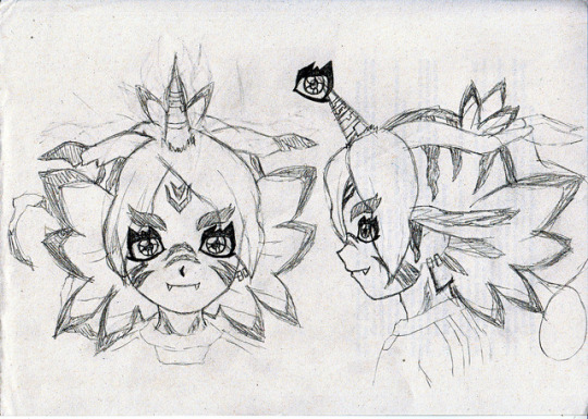
FubuGabu is back! Not by popular demand because, well, no one has asked for it, although the feedback I got was lovely. But, hey, I had this material ready, so might as well do something with it, lame as it might be.
These are some early and not-so-early doodles of FubuGabu. The latter was pretty much the base of the final design, but the former… that’s from 2014 or something wild like that. I actually had many more doodles and concepts, but I hated them all so much that I erased most of them. I’m surprised I could save that one. I might have kept it because it was a full lineart, I guess. In any case, I’m glad I could find that much.
Since it’s fitting to do, let’s talk about FubuGabu’s design today! There’s a lot to talk about, but my memory is awful, so I’m sure I’ll forget about some things. I hope it won’t betray me too much.
Anyway, as usual, more under the cut.
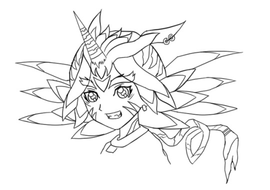
Well, well, well. Ain’t this boy one little shit. Fudou gave me nightmares. Kidou is still giving me nightmares (to the point where I’m considering changing the idea I’ve had for around a year now). Someoka was awful to draw and make sense of. Max’s tail was awful to work with. But Fubuki? Fubuki is on a whole different level.
Let’s start by talking about the final design, since that’s the better one. Not even good, just better. That’s an epic victory as it is, so who cares.
FubuGabu’s design, as the reference sheet and my last post states, is not based on Gabumon, but on Gabumon’s line. What this means is that it has elements from (almost) every single one of Gabumon’s evolutions. Just for the sake of satisfying people’s curiosity, namely @IshidoShuuji’s, I’ll list the different elements here, since that’s the easiest and most straightforward way to explain it:
Tsunomon: eyes, colour of the face.
Gabumon: horn, face stripes, teeth, hair ears.
Garurumon: eyebrows, pretty much all of the hair, hair tail, forehead marks.
WereGarurumon: nose stripes, pretty much all of the hair, earrings, eye scar.
So, no, MetalGarurumon, Punimon and Omnimon/Omegamon aren’t part of the design. …Or are they?
Just kidding. They are not. ww But you shouldn’t rule them out just because of that. Well, no—rule Omnimon out. There will be no Agumon miximax, so that isn’t going to happen. I don’t want to keep people’s hopes up for nothing. I made it pretty clear from the start that I wouldn’t use a franchise twice, but I bet most people don’t know that. So, yeah.
Now that I have broken down the elements, let’s look at them from up close. This is truly a difficult design to understand, so I’ll get the explaining done as I move along.
Let me start with Tsunomon’s part. I used the colour of Tsunomon’s skin because it looks human: I didn’t want to turn Fubuki into a furry—I mean, have him all covered in hair, because it just looks weird. It was either Tsunomon’s skin or Gabumon’s, and he’s BRIGHT YELLOW. So you’re welcome.
The eyes have changed very dramatically. Tsunomon’s aren’t all that complex compared to Gabumon’s, for example, so it was easier to pull off without screwing up too much. That’s in the early concept you can see above, Fubuki has eyes based on Gabumon’s instead and it looks like he’s using about 4kg of eyeliner, hah— You’re gonna run out of money if you wear so much of it every single day, pal.
They’re not exactly Tsunomon’s eyes, although it’s a rather radical change. As I mentioned when I talked about Creature miximaxes, eyes get rather distinctive shapes when animals (or monsters) are involved. I did something that goes against my analysis, though: I added light to FubuGabu’s eyes. Just because I hate myself and because it looked kinda weird without it.
While Tsunomon’s eyes are completely round, FubuGabu’s actually follow the shape of Fubuki’s eyes, although vaguely. The irises are Fubuki’s, period. I simply extended the lines to match the new shape of the eye. The lower eyelid creates a straight line based on the hypothetical line of Fubuki’s eyes, which is visible in coloured art. The outer part of the eyes also matches that of Fubuki, not to mention that I kept the fold over the upper eyelid and the little marks below the eyes. The main difference, therefore, is the thicker contour (which is linked to the spikes) and the curve that replaces the right angles on Fubuki’s usual eyes.
Let’s move on to Gabumon. His marks were probably the toughest to place, and it doesn’t help that Fubuki’s refs are so BAD. REALLY. Many, most characters have references that match. Maybe not perfectly, but almost. But Fubuki? Fubuki ain’t need none of that crap. When you are this FABULOUS, no one cares about your face changing size and shape in every screenshot or your hair going longer and shorter every 5 seconds. Everyone is blinded by your sparks, anyway, so who will notice?
I noticed. But anyway. ww
Since Gabumon only has markings on half of his body (since the rest is all yellow), I let FubuGabu borrow those on Gabumon’s nose. Actually, if you were to strip FubuGabu (please don’t do that), you’d see that his whole body is covered with markings. I like to think that those belong to Gabu, even if they could easily belong to Garuru or Were instead. Still, that means that the marks on his neck are Gabu’s.
As for the marks on his cheeks, they were very easy to place on the front view and frustrating to figure out elsewhere. I just gave up on them at some point and thought, “meh, Inazuma has pulled off weirder stuff!” They’re supposed to end somewhere behind the jaw, though, but before reaching the neck. Hence why I actually drew the jawline ww
The horn and the teeth are pretty self-explanatory, but I’ll point something out about the latter: I only added two teeth even though Gabumon has many because I wanted some kind of parallelism with Someoka. He, too, has two teeth, but they grow on the opposite direction. True teammates who complement each other!
Now, for the hair ears, aka those things growing from the sides of his head. Those are 100% hair—they don’t really serve a purpose. As such, using Gabumon’s seemed like the best idea. After all, what makes WereGarurumon’s ears interesting are the earrings, but how do you put an earring on hair? As for Garurumon, his ears are just more boring than Gabumon’s. Gabu’s ears are kind of quirky and worn out, which is a cool little thing that I felt like adding. Also, Garuru’s ears go upwards and I didn’t dig that.
Regardless, Garurumon is probably the star of this design. Most of the bigger elements are based on him, after all. You could argue that many of them also belong to Were, but I was looking at Garuru when I designed them. I guess that’s enough of a reason. I guess.
There was an element of Garuru’s design that I really, really wanted to add to Fubuki: the feather-shaped hair growing from his back. You know, these things:

After fiddling with that idea a whole lot, I eventually realised that it was best to keep it simple and shape Fubuki’s hair to look like those… however you wanna call them. I’ll just call them feathers. It may not be a perfect resemblance (and it may not make perfect sense either lmao), but I definitely thought it looked the best. These are actually not too hard to draw:
The first feather (from the top) follows the natural curve of Fubuki’s hair, but instead of curving down again, it creates an arrow-like shape.
The second feather starts and ends in the exact same spots as Fubuki’s, but instead of curving upwards, it’s completely horizontal.
The third one is the trickiest: it’s long and doesn’t match Fubuki’s normal hair. The part that touches the second feather starts where it should, but the part that touches the fourth one doesn’t. It’s tough to explain, so here’s a picture that will hopefully make it all clear:

The last feather is shorter and isn’t as diagonal as the third one, but it does start and end at odd places, too. The “trick” to draw it is keeping in mind that the third and the fourth feathers end at pretty much the same height:

The fifth feather isn’t even a feather; it’s just a simple spike. Nothing relevant there ww
Garurumon is also responsible for the marks next to the ears and the one on the forehead, not to mention the top of the head in general. The ones on the ears weren’t too bad, but the forehead was frustrating. As I mentioned, Fubuki’s references are a mess and I draw over them for the sake of keeping the original proportions, but it backfired in this case. Since they’re all so different from each other, Fubuki’s forehead grows bigger or smaller depending on the view, so the forehead mark is radically less visible sometimes, even though it technically shouldn’t be. Still, rather than repositioning it every time, I thought it made more sense to place it correctly to settle for a specific place, so that’s what I did.
Now, the top of the head is tricky. Let’s start by saying that it’s based on Garurumon’s back. Maybe WereGarurumon’s too, but I couldn’t find a single picture of Were’s back, so who knows. As you can see in the following image, Garuru’s back has a long, thin line that goes from his head to his tail, and that’s exactly what happens to FubuGabu too. You can’t quite see the end of the line because of the hair, but it’s still there… technically.
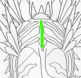
That thin line sprouts into a bunch of rugged lines, and that’s exactly what happens with FubuGabu too. The lines are rather random (and I didn’t spend much time figuring the size out, whoops), but they do follow some certain shapes. The closest line to the face might be rugged, but it goes straight down. The second one starts from way back, but it’s shaped like an arrow pointing at the face. The tips of both lines are fairly close, too. The third line is way smaller than the rest, and is also the last one you can see, but definitely not the last one in general.
Let’s talk about Fubuki’s little sprout as well. As you know, Fubuki’s sprout has two locks of hair, but FubuGabu’s has three. That’s because FubuGabu’s is also based on Garurumon: to be more specific, on this part:
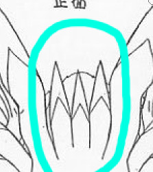
I tried adding that part just the way it is by sticking it to the forehead, but I didn’t like the result at all, so I figured it was best to do something funny with Fubuki’s sprout instead. Oh, well. Choices! And talk about choices, I added Garurumon’s tail simply so the hair would be a complete portrayal of his figure. As I mentioned in the post I linked to above, miximaxing with creatures often leads to that, so yeah.
The hair is obviously the biggest and most visible part of FubuGabu’s design, but Garuru hogs quite a few other spots. Not Gabumon, nor Tsunomon, nor WereGarurumon (nor Punimon) have eyebrows, so I was pretty much forced to use Garurumon’s. Not like I mind, because they’re pretty awesome. It’s kind of sad that they’re usually not visible, but, to be honest with you guys… they’re kind of a pain to draw because of their very specific shape. So I’m secretly glad. ww
And last, but not least, WereGarurumon. Ah, what a little shit. How come there are official linearts for MetalGarurumon, but not for WereGarurumon? Anyway. ww
Were’s contribution is pretty straightforward. Earrings, a scar and marks. There are a couple of things worth mentioning, though.
For the earrings, I noticed too late that Were has both white and red earrings. I was going to use the red earrings because they stand out more, but I noticed that the visible ear was on the side of the white ones… And it was too late to change the design completely, so I just went for the white. Too bad, but life is simply unfair. Especially when you don’t pay attention.
Now, the nose marks are funny. I struggled so much with those. As you can see on the second picture of this post, they were originally going to be shaped like triangles, but I didn’t dig that. And even after I changed the design, I couldn’t get them right, which was… frustrating.
(Also, it took me a long time to realise that the bridge of the nose would be hiding one half of the marks in every view except the front one. After I did, though, everything finally looked better. Thank goodness.)
Anyway, I think that pretty much covers the final design, but let’s also talk about the early designs real quick.
Nothing much to say about the second picture of the post. I just made sure to make some sense out of the markings and retouched the elements I mentioned above. Well, I tried to polish everything, really.
Now, the first picture of the post is easily over 2 years old. It was one of the first, if not the very first, concept of FubuGabu. And, man, what a mess.
It was like, “what does Garurumon have? Feather thingies! SO LET’S ADD THEM EVERYWHERE.” The feather thingies appear on his forehead, the locks of hair over his face, on his hair and even behind his head. I could never figure the latter out—but, man, did I spend hours trying to make those work. And all because Garurumon has feather on his face and on his back, so I felt like FubuGabu needed two layers of feathers too. Thankfully, I eventually realised many of these elements simply weren’t needed, like that second layer of feathers, the earrings on Garurumon’s ear (which, again, are made of hair, so wtf), and… the ring at the end of the tail? Where did that come from? This is Garurumon, not Gatomon! Geez, self!
Some of the early elements made it to the final design. The overall shape of his eyebrows, the markings on the head, the neck and the cheeks and even the horn, just to mention a few. The final feel to it is completely different, though.
This is probably because of how different the hair looks. FubuGabu’s original hair was full of feathers, but they didn’t fit Fubuki’s normal hair. They were randomly coming out of his head for whatever reason. Not to mention that the hair falling over his face looks like tentacles rather than anything else. It looks like a miximax with Squidward rather than with Gabumon. Ugh, I hate myself. XD
One last note: I don’t know where the forehead mark on that first design comes from. I guess it’s meant to be Gabumon’s, somehow? I forgot and I’m too tired to investigate it. It probably never made sense, anyway. XD
I think I covered everything! But, phew, that took long. Still, if anything isn’t clear or there’s something I forgot to mention, please let me know!
(Also, I’m too tired to re-read this post, so excuse the many typos that I probably made. I’ll check it out... eventually.)
25 notes
·
View notes
Text
The State of SaaS Landing Pages in 2020
SaaS landing pages have changed a lot over the last 10 years. Long gone are the days of blocky designs, cold informational copywriting, and generic stock photos that show suspiciously-attractive people shaking hands in what looks like a very important business meeting.
To get the best possible conversion rate in 2020, you need to explain the complexities of your software without boring the pants off your prospects. You need to use authentic visuals that show visitors they can really trust your brand. And you need to target your landing page so the right audience sees it at just the right moment of their customer journey.
It’s no easy task. But it is possible. And SaaS marketers are getting better at all of the above in 2020.
Just take a look at a landing page we used to advertise our trial of Unbounce back in our early years, compared to a landing page we’re using today…
I believe this is what the kids these days call a “glow up.”
And it’s not just us—you can do the same comparison with any SaaS brand that’s been in the landing page game for a long time. The design, copy, branding, tactics…they’ve all gotten better, like little Pokémon evolving into—uh—bigger, better-looking Pokémon, I guess. (OK, you got me. I’ve never actually played Pokémon.)
But while SaaS landing pages have come a long way, there’s still plenty of room for improvement. I recently went through and manually reviewed 200 real-world SaaS campaigns to see if I could learn what works (and what doesn’t) in 2020. (Full disclaimer: I know this is a relatively small sample size. But my goal was to look for high-level trends vs. data-driven insights.)
Keep reading to see what I learned in the process, some examples you can use for inspiration, and some tips on how to optimize your SaaS landing pages like a pro this year.
The Big Problem: SaaS Marketers Are Converting Less
For the upcoming 2020 Conversion Benchmark Report, our team of data scientists (yep, they have lab coats) have been using machine learning and a rigorous methodology to study more than 34,132 landing pages and 19.2 million conversions. (Get hyped—it’s coming soon to a marketing inbox near you. If you’re curious, you can take a look at the 2017 version in the meantime.)
One of the perks of working here is that I got an early look at some of their research. And I don’t want to sound overly dramatic here, but one data point made me raise my eyebrows two-and-a-half inches higher than usual…
On average, SaaS landing pages convert 10.46% lower than the overall conversion rate baseline.
This means that SaaS pages are less likely to convert than the majority of other industry landing pages covered in their in-depth research—including ecommerce and education pages. (“Whaaaat?!”)
Now there could be a few reasons for this. For starters, software can be pretty intangible and boring-looking, making it harder to market. (Although, believe it or not, I have seen some super sexy bookkeeping platforms.) It can also be complicated to explain in simple terms what your software does, who it’s for, and what all the different features do that make it special. Plus, most SaaS businesses are targeting a very specific niche, in an industry that’s constantly changing—and there’s typically a longer sales cycle, too.
All of these challenges add up to make SaaS landing pages a particularly tough nut to crack. And Talia Wolf, the Founder and Chief Optimizer at GetUplift, says they often cause marketers to miss out on what’s really driving conversions on their landing pages…
Most SaaS marketers know what a great landing page looks like. They get the concept of focusing on a singular offer and leading visitors down the funnel. But there are other parts they miss out on ALL THE TIME. Strategy, emotion, persuasion, and most importantly—creating a customer-centric landing page. If you don’t go back and optimize for these things, then your page will never get the results you really need for your business.
Yikes! It might be a bias we have here at Unbounce, but we believe you should never “set it and forget it” with your landing pages. (Though, I totally get how easy that is to do with all you’ve got going on.) To score those above-average conversion rates, you need to optimize each page before and after you hit publish.
And by optimize, I don’t just mean tweaking your button colors. To shape up your landing pages the way the experts do, you’ve gotta make smart decisions based on data and research. Track who is visiting your page and understand what they’re looking for. Use tools to discover whether your copy is actually resonating. And record what happens after someone clicks your CTA.
Because it’s only if you keep iterating and optimizing over time that you’ll be able to uncover the true conversion potential of your landing pages.
SaaS Landing Page Trends in 2020 [A Qualitative Look]
I spent the last couple of weeks studying 200 randomly-selected SaaS landing pages built in Unbounce. The goal was to look for qualitative trends and commonalities between the pages, and get a sense of what a high-converting SaaS landing page looks like in 2020. (Inspiration credit to Ross Simmonds, who recently did some similar research on SaaS websites.)
My methodology was pretty straightforward. I’d open a SaaS landing page, check it for some of the different elements, then mark it off in a spreadsheet. I went with a smaller sample size (200) that was manageable enough for me to take a self-guided look and satisfy my own curiosity.
Before we dive into the data though, there is one other caveat. While I did my best to keep only the pages that looked, felt, and smelled like SaaS, some of the sampled companies might not sell their software on a purely subscription basis.
Sound cool? Then let’s get to the good stuff…
The most popular type of SaaS landing page I saw was the “Demo/Consultation Page.” Marketers are using these to get visitors to try a demo of their software or reach out for a free consultation to learn more. No surprises here—it’s that classic “try before you buy” approach that gets leads in the door.
“Sign-Up Pages” were the next-most popular at 24%, which skip the demo and ask visitors to get started right away with either a free trial or paid plan. These work well at the bottom of the funnel—but you’ve gotta make sure you target them properly so only the decision-ready people are clicking onto your landing page. Otherwise, you’ll just end up scaring folks away.
Coming in third place were “Lead Magnet Pages” at 21%. These are your webinar registration pages, your ebook download pages, and… well, that’s pretty much it, actually. Seems like those are still the two most popular ways to get top-of-funnel leads into your email database in 2020.
Here’s an interesting data point—the average H1 headline I saw on these SaaS landing pages was 44 characters long, which usually comes in at less than eight words. In general, this gives you just enough space to communicate the problem your software is going to solve for visitors. (E.g., “Rescue Customers When They Need Quick Support.”)
And while I know we tend to think the shorter, the better when it comes to headlines, that’s not always the case. As I went through these 200 pages, one thing I noticed was that the shortest headlines were usually just the names of the software or literal descriptions of what they did (e.g., “AI Dialer”). This is a classic mistake that SaaS marketers tend to make—making the landing page all about you and your software, and not enough about the problem you’re solving or the people who need it most. (Further proof? Words like “You” and “Your” only appeared in about 27% of the H1 headlines on the SaaS pages I sampled.)
Curious about what other problems are plaguing SaaS landing pages? CRO expert Talia Wolf has identified three other mistakes marketers make and put together step-by-step instructions on how to solve them in the epic new guide—How to Optimize Your SaaS Landing Pages.
When it comes to the images being featured at the top of SaaS landing pages, there were a few surprises. For starters, it seems like most marketers are still choosing to show off their software at the top of the page (40%), rather than a photograph of people (27%) or an illustration (8%). This is despite the fact that many SaaS brands have moved towards using illustrations on their websites in the last couple of years. Seems like marketers are choosing to go literal on their landing pages, instead.
Even more surprising? Almost one in four SaaS landing pages are choosing to use no images at all in their hero section. In my opinion, this isn’t a bad strategy—cutting down on the design elements of your page can help visitors focus on what’s important (like your headline and that big, beautiful CTA) and help your content load faster too.
Social proof is one of the most valuable things you can have on your landing page. Not only does it build trust with your visitors, it can also help to highlight key software benefits and features that you want prospects to know about.
And yet—only 54% of the SaaS landing pages I sampled featured a testimonial of some kind. (And that number gets even lower if you only count the testimonials that feature photos of the customer and their real, full names.)
But you don’t have to take my word on why you should use social proof—here’s a testimonial (omg, see what I did there?) from Andy Crestodina, Co-Founder and Chief Marketing Officer at Orbit Media.
When you say it, it’s marketing. When your customer says it, it’s social proof. This is why testimonials are so powerful. The substance is better; it’s an objective, third-party perspective. The style is also better; it’s more authentic, less polished.
Here’s some good news! When it comes to keeping your landing page distraction-free, most SaaS marketers seem to be on board. 91% of the pages I sampled had no top navigation, and 73% of them had only one, singular CTA for visitors to click on. Keeping eyes on the prize—that’s the landing page advantage.
What Are the Most Popular CTA Buttons?
Your CTA has to do a lot of heavy lifting. Not only should it inspire action from your landing page visitors, but it should also make it clear exactly what will happen when someone clicks through.
The word cloud above shows which CTA buttons SaaS marketers are using most frequently on their landing pages. “Get Started” and “Get Free Demo” are two of the most popular phrases, with other classics like “Start Your Free Trial” and “Try Now” coming in close behind.
The majority (72%) of SaaS landing pages I sampled feature a form of some kind for visitors to fill out. This means rather than have visitors click-through to a sign-up flow or some other registration page, marketers are opting to collect lead info right on the landing page itself.
The forms I saw ranged in type and size. The largest had over 10 fields to fill out, including mandatory boxes asking for your “Type of Organization,” “Job Title,” and “Company Website.” (It also had a box at the end asking if you had any “Questions/Comments.” Which, I mean, of course you do. But this landing page form probably isn’t the best place to put them.)
The average number of form fields came in between four and five, with the shortest forms asking you to only fill out one thing: your email address.
Long and clunky forms can tank your landing page conversion rate—learn to make ‘em smarter with tips from CRO expert Talia Wolf. Download the free guide: How to Optimize Your SaaS Landing Pages.
Three Examples of Modern SaaS Landing Pages
Looking for some inspiration for your next campaign? Here are three SaaS landing pages built in Unbounce that impressed us with their smart, tailored approaches to copy and design.
The “Try a Free Demo” Page
Image courtesy of Mixmax. (Click to see the whole thing.)
So many SaaS landing pages have headlines that focus on the product. What I love about this example from Mixmax is that the copy makes it about the visitor and the problems they care about most. “De-clutter YOUR email. Prioritize YOUR focus. Automate YOUR day.” These are the benefits of the software, and the Mixmax team has framed them in a customer-centric way that really resonates with visitors.
The “Start Your Free Trial” Page
Image courtesy of Peakon. (Click to see the whole thing.)
When you get to the bottom of the funnel, it’s important to layer on the social proof so visitors are ready to take the plunge into a free trial. This example from Peakon does a great job of showing that they’re the “world’s leading platform for measuring and improving employee engagement” by dropping in some big-name company logos right underneath.
Add in a simple and straightforward form that includes objection-handling microcopy (“Peakon is free to try for 30 days. No credit card required.”) and you can see why this page delivers the goods.
The “Lead Magnet” Page
Image courtesy of Shoelace. (Click to see the whole thing.)
This beautifully-designed lead magnet landing page from Shoelace is like a work of pop art. The on-brand illustrations and animations make downloading the deck seem like a downright fun proposition, and the copy highlights the problem before sliding in the downloadable deck as a solution.
Also, did you notice the “book a demo” secondary CTA in the top nav bar? Although it goes against one of the landing page best practices, this works nicely as a shortcut for more solution-aware visitors who are ready to take action.
Are You Ready to Start Optimizing?
Every year, SaaS landing pages keep getting better. More marketers in this industry are becoming optimization experts in their own right, which means they know how to target the right people with their campaigns, use copy that taps into visitor emotions, and drive more conversions.
To help you optimize like a bonafide expert, Unbounce has teamed up with Talia Wolf and ActiveCampaign to create an epic new guide. Inside, Talia has identified the four biggest problems on SaaS landing pages today (like having a UX that bleeds visitors) and is sharing the customer-centric checklist she uses to make sure her client campaigns are high-converting.
from Digital https://unbounce.com/conversion-rate-optimization/the-state-of-saas-landing-pages/
via http://www.rssmix.com/
0 notes
Text
The State of SaaS Landing Pages in 2020
SaaS landing pages have changed a lot over the last 10 years. Long gone are the days of blocky designs, cold informational copywriting, and generic stock photos that show suspiciously-attractive people shaking hands in what looks like a very important business meeting.
To get the best possible conversion rate in 2020, you need to explain the complexities of your software without boring the pants off your prospects. You need to use authentic visuals that show visitors they can really trust your brand. And you need to target your landing page so the right audience sees it at just the right moment of their customer journey.
It’s no easy task. But it is possible. And SaaS marketers are getting better at all of the above in 2020.
Just take a look at a landing page we used to advertise our trial of Unbounce back in our early years, compared to a landing page we’re using today…
I believe this is what the kids these days call a “glow up.”
And it’s not just us—you can do the same comparison with any SaaS brand that’s been in the landing page game for a long time. The design, copy, branding, tactics…they’ve all gotten better, like little Pokémon evolving into—uh—bigger, better-looking Pokémon, I guess. (OK, you got me. I’ve never actually played Pokémon.)
But while SaaS landing pages have come a long way, there’s still plenty of room for improvement. I recently went through and manually reviewed 200 real-world SaaS campaigns to see if I could learn what works (and what doesn’t) in 2020. (Full disclaimer: I know this is a relatively small sample size. But my goal was to look for high-level trends vs. data-driven insights.)
Keep reading to see what I learned in the process, some examples you can use for inspiration, and some tips on how to optimize your SaaS landing pages like a pro this year.
The Big Problem: SaaS Marketers Are Converting Less
For the upcoming 2020 Conversion Benchmark Report, our team of data scientists (yep, they have lab coats) have been using machine learning and a rigorous methodology to study more than 34,132 landing pages and 19.2 million conversions. (Get hyped—it’s coming soon to a marketing inbox near you. If you’re curious, you can take a look at the 2017 version in the meantime.)
One of the perks of working here is that I got an early look at some of their research. And I don’t want to sound overly dramatic here, but one data point made me raise my eyebrows two-and-a-half inches higher than usual…
On average, SaaS landing pages convert 10.46% lower than the overall conversion rate baseline.
This means that SaaS pages are less likely to convert than the majority of other industry landing pages covered in their in-depth research—including ecommerce and education pages. (“Whaaaat?!”)
Now there could be a few reasons for this. For starters, software can be pretty intangible and boring-looking, making it harder to market. (Although, believe it or not, I have seen some super sexy bookkeeping platforms.) It can also be complicated to explain in simple terms what your software does, who it’s for, and what all the different features do that make it special. Plus, most SaaS businesses are targeting a very specific niche, in an industry that’s constantly changing—and there’s typically a longer sales cycle, too.
All of these challenges add up to make SaaS landing pages a particularly tough nut to crack. And Talia Wolf, the Founder and Chief Optimizer at GetUplift, says they often cause marketers to miss out on what’s really driving conversions on their landing pages…
Most SaaS marketers know what a great landing page looks like. They get the concept of focusing on a singular offer and leading visitors down the funnel. But there are other parts they miss out on ALL THE TIME. Strategy, emotion, persuasion, and most importantly—creating a customer-centric landing page. If you don’t go back and optimize for these things, then your page will never get the results you really need for your business.
Yikes! It might be a bias we have here at Unbounce, but we believe you should never “set it and forget it” with your landing pages. (Though, I totally get how easy that is to do with all you’ve got going on.) To score those above-average conversion rates, you need to optimize each page before and after you hit publish.
And by optimize, I don’t just mean tweaking your button colors. To shape up your landing pages the way the experts do, you’ve gotta make smart decisions based on data and research. Track who is visiting your page and understand what they’re looking for. Use tools to discover whether your copy is actually resonating. And record what happens after someone clicks your CTA.
Because it’s only if you keep iterating and optimizing over time that you’ll be able to uncover the true conversion potential of your landing pages.
SaaS Landing Page Trends in 2020 [A Qualitative Look]
I spent the last couple of weeks studying 200 randomly-selected SaaS landing pages built in Unbounce. The goal was to look for qualitative trends and commonalities between the pages, and get a sense of what a high-converting SaaS landing page looks like in 2020. (Inspiration credit to Ross Simmonds, who recently did some similar research on SaaS websites.)
My methodology was pretty straightforward. I’d open a SaaS landing page, check it for some of the different elements, then mark it off in a spreadsheet. I went with a smaller sample size (200) that was manageable enough for me to take a self-guided look and satisfy my own curiosity.
Before we dive into the data though, there is one other caveat. While I did my best to keep only the pages that looked, felt, and smelled like SaaS, some of the sampled companies might not sell their software on a purely subscription basis.
Sound cool? Then let’s get to the good stuff…
The most popular type of SaaS landing page I saw was the “Demo/Consultation Page.” Marketers are using these to get visitors to try a demo of their software or reach out for a free consultation to learn more. No surprises here—it’s that classic “try before you buy” approach that gets leads in the door.
“Sign-Up Pages” were the next-most popular at 24%, which skip the demo and ask visitors to get started right away with either a free trial or paid plan. These work well at the bottom of the funnel—but you’ve gotta make sure you target them properly so only the decision-ready people are clicking onto your landing page. Otherwise, you’ll just end up scaring folks away.
Coming in third place were “Lead Magnet Pages” at 21%. These are your webinar registration pages, your ebook download pages, and… well, that’s pretty much it, actually. Seems like those are still the two most popular ways to get top-of-funnel leads into your email database in 2020.
Here’s an interesting data point—the average H1 headline I saw on these SaaS landing pages was 44 characters long, which usually comes in at less than eight words. In general, this gives you just enough space to communicate the problem your software is going to solve for visitors. (E.g., “Rescue Customers When They Need Quick Support.”)
And while I know we tend to think the shorter, the better when it comes to headlines, that’s not always the case. As I went through these 200 pages, one thing I noticed was that the shortest headlines were usually just the names of the software or literal descriptions of what they did (e.g., “AI Dialer”). This is a classic mistake that SaaS marketers tend to make—making the landing page all about you and your software, and not enough about the problem you’re solving or the people who need it most. (Further proof? Words like “You” and “Your” only appeared in about 27% of the H1 headlines on the SaaS pages I sampled.)
Curious about what other problems are plaguing SaaS landing pages? CRO expert Talia Wolf has identified three other mistakes marketers make and put together step-by-step instructions on how to solve them in the epic new guide—How to Optimize Your SaaS Landing Pages.
When it comes to the images being featured at the top of SaaS landing pages, there were a few surprises. For starters, it seems like most marketers are still choosing to show off their software at the top of the page (40%), rather than a photograph of people (27%) or an illustration (8%). This is despite the fact that many SaaS brands have moved towards using illustrations on their websites in the last couple of years. Seems like marketers are choosing to go literal on their landing pages, instead.
Even more surprising? Almost one in four SaaS landing pages are choosing to use no images at all in their hero section. In my opinion, this isn’t a bad strategy—cutting down on the design elements of your page can help visitors focus on what’s important (like your headline and that big, beautiful CTA) and help your content load faster too.
Social proof is one of the most valuable things you can have on your landing page. Not only does it build trust with your visitors, it can also help to highlight key software benefits and features that you want prospects to know about.
And yet—only 54% of the SaaS landing pages I sampled featured a testimonial of some kind. (And that number gets even lower if you only count the testimonials that feature photos of the customer and their real, full names.)
But you don’t have to take my word on why you should use social proof—here’s a testimonial (omg, see what I did there?) from Andy Crestodina, Co-Founder and Chief Marketing Officer at Orbit Media.
When you say it, it’s marketing. When your customer says it, it’s social proof. This is why testimonials are so powerful. The substance is better; it’s an objective, third-party perspective. The style is also better; it’s more authentic, less polished.
Here’s some good news! When it comes to keeping your landing page distraction-free, most SaaS marketers seem to be on board. 91% of the pages I sampled had no top navigation, and 73% of them had only one, singular CTA for visitors to click on. Keeping eyes on the prize—that’s the landing page advantage.
What Are the Most Popular CTA Buttons?
Your CTA has to do a lot of heavy lifting. Not only should it inspire action from your landing page visitors, but it should also make it clear exactly what will happen when someone clicks through.
The word cloud above shows which CTA buttons SaaS marketers are using most frequently on their landing pages. “Get Started” and “Get Free Demo” are two of the most popular phrases, with other classics like “Start Your Free Trial” and “Try Now” coming in close behind.
The majority (72%) of SaaS landing pages I sampled feature a form of some kind for visitors to fill out. This means rather than have visitors click-through to a sign-up flow or some other registration page, marketers are opting to collect lead info right on the landing page itself.
The forms I saw ranged in type and size. The largest had over 10 fields to fill out, including mandatory boxes asking for your “Type of Organization,” “Job Title,” and “Company Website.” (It also had a box at the end asking if you had any “Questions/Comments.” Which, I mean, of course you do. But this landing page form probably isn’t the best place to put them.)
The average number of form fields came in between four and five, with the shortest forms asking you to only fill out one thing: your email address.
Long and clunky forms can tank your landing page conversion rate—learn to make ‘em smarter with tips from CRO expert Talia Wolf. Download the free guide: How to Optimize Your SaaS Landing Pages.
Three Examples of Modern SaaS Landing Pages
Looking for some inspiration for your next campaign? Here are three SaaS landing pages built in Unbounce that impressed us with their smart, tailored approaches to copy and design.
The “Try a Free Demo” Page
Image courtesy of Mixmax. (Click to see the whole thing.)
So many SaaS landing pages have headlines that focus on the product. What I love about this example from Mixmax is that the copy makes it about the visitor and the problems they care about most. “De-clutter YOUR email. Prioritize YOUR focus. Automate YOUR day.” These are the benefits of the software, and the Mixmax team has framed them in a customer-centric way that really resonates with visitors.
The “Start Your Free Trial” Page
Image courtesy of Peakon. (Click to see the whole thing.)
When you get to the bottom of the funnel, it’s important to layer on the social proof so visitors are ready to take the plunge into a free trial. This example from Peakon does a great job of showing that they’re the “world’s leading platform for measuring and improving employee engagement” by dropping in some big-name company logos right underneath.
Add in a simple and straightforward form that includes objection-handling microcopy (“Peakon is free to try for 30 days. No credit card required.”) and you can see why this page delivers the goods.
The “Lead Magnet” Page
Image courtesy of Shoelace. (Click to see the whole thing.)
This beautifully-designed lead magnet landing page from Shoelace is like a work of pop art. The on-brand illustrations and animations make downloading the deck seem like a downright fun proposition, and the copy highlights the problem before sliding in the downloadable deck as a solution.
Also, did you notice the “book a demo” secondary CTA in the top nav bar? Although it goes against one of the landing page best practices, this works nicely as a shortcut for more solution-aware visitors who are ready to take action.
Are You Ready to Start Optimizing?
Every year, SaaS landing pages keep getting better. More marketers in this industry are becoming optimization experts in their own right, which means they know how to target the right people with their campaigns, use copy that taps into visitor emotions, and drive more conversions.
To help you optimize like a bonafide expert, Unbounce has teamed up with Talia Wolf and ActiveCampaign to create an epic new guide. Inside, Talia has identified the four biggest problems on SaaS landing pages today (like having a UX that bleeds visitors) and is sharing the customer-centric checklist she uses to make sure her client campaigns are high-converting.
from Marketing https://unbounce.com/conversion-rate-optimization/the-state-of-saas-landing-pages/
via http://www.rssmix.com/
0 notes
Text
The State of SaaS Landing Pages in 2020
SaaS landing pages have changed a lot over the last 10 years. Long gone are the days of blocky designs, cold informational copywriting, and generic stock photos that show suspiciously-attractive people shaking hands in what looks like a very important business meeting.
To get the best possible conversion rate in 2020, you need to explain the complexities of your software without boring the pants off your prospects. You need to use authentic visuals that show visitors they can really trust your brand. And you need to target your landing page so the right audience sees it at just the right moment of their customer journey.
It’s no easy task. But it is possible. And SaaS marketers are getting better at all of the above in 2020.
Just take a look at a landing page we used to advertise our trial of Unbounce back in our early years, compared to a landing page we’re using today…
I believe this is what the kids these days call a “glow up.”
And it’s not just us—you can do the same comparison with any SaaS brand that’s been in the landing page game for a long time. The design, copy, branding, tactics…they’ve all gotten better, like little Pokémon evolving into—uh—bigger, better-looking Pokémon, I guess. (OK, you got me. I’ve never actually played Pokémon.)
But while SaaS landing pages have come a long way, there’s still plenty of room for improvement. I recently went through and manually reviewed 200 real-world SaaS campaigns to see if I could learn what works (and what doesn’t) in 2020. (Full disclaimer: I know this is a relatively small sample size. But my goal was to look for high-level trends vs. data-driven insights.)
Keep reading to see what I learned in the process, some examples you can use for inspiration, and some tips on how to optimize your SaaS landing pages like a pro this year.
The Big Problem: SaaS Marketers Are Converting Less
For the upcoming 2020 Conversion Benchmark Report, our team of data scientists (yep, they have lab coats) have been using machine learning and a rigorous methodology to study more than 34,132 landing pages and 19.2 million conversions. (Get hyped—it’s coming soon to a marketing inbox near you. If you’re curious, you can take a look at the 2017 version in the meantime.)
One of the perks of working here is that I got an early look at some of their research. And I don’t want to sound overly dramatic here, but one data point made me raise my eyebrows two-and-a-half inches higher than usual…
On average, SaaS landing pages convert 10.46% lower than the overall conversion rate baseline.
This means that SaaS pages are less likely to convert than the majority of other industry landing pages covered in their in-depth research—including ecommerce and education pages. (“Whaaaat?!”)
Now there could be a few reasons for this. For starters, software can be pretty intangible and boring-looking, making it harder to market. (Although, believe it or not, I have seen some super sexy bookkeeping platforms.) It can also be complicated to explain in simple terms what your software does, who it’s for, and what all the different features do that make it special. Plus, most SaaS businesses are targeting a very specific niche, in an industry that’s constantly changing—and there’s typically a longer sales cycle, too.
All of these challenges add up to make SaaS landing pages a particularly tough nut to crack. And Talia Wolf, the Founder and Chief Optimizer at GetUplift, says they often cause marketers to miss out on what’s really driving conversions on their landing pages…
Most SaaS marketers know what a great landing page looks like. They get the concept of focusing on a singular offer and leading visitors down the funnel. But there are other parts they miss out on ALL THE TIME. Strategy, emotion, persuasion, and most importantly—creating a customer-centric landing page. If you don’t go back and optimize for these things, then your page will never get the results you really need for your business.
Yikes! It might be a bias we have here at Unbounce, but we believe you should never “set it and forget it” with your landing pages. (Though, I totally get how easy that is to do with all you’ve got going on.) To score those above-average conversion rates, you need to optimize each page before and after you hit publish.
And by optimize, I don’t just mean tweaking your button colors. To shape up your landing pages the way the experts do, you’ve gotta make smart decisions based on data and research. Track who is visiting your page and understand what they’re looking for. Use tools to discover whether your copy is actually resonating. And record what happens after someone clicks your CTA.
Because it’s only if you keep iterating and optimizing over time that you’ll be able to uncover the true conversion potential of your landing pages.
SaaS Landing Page Trends in 2020 [A Qualitative Look]
I spent the last couple of weeks studying 200 randomly-selected SaaS landing pages built in Unbounce. The goal was to look for qualitative trends and commonalities between the pages, and get a sense of what a high-converting SaaS landing page looks like in 2020. (Inspiration credit to Ross Simmonds, who recently did some similar research on SaaS websites.)
My methodology was pretty straightforward. I’d open a SaaS landing page, check it for some of the different elements, then mark it off in a spreadsheet. I went with a smaller sample size (200) that was manageable enough for me to take a self-guided look and satisfy my own curiosity.
Before we dive into the data though, there is one other caveat. While I did my best to keep only the pages that looked, felt, and smelled like SaaS, some of the sampled companies might not sell their software on a purely subscription basis.
Sound cool? Then let’s get to the good stuff…
The most popular type of SaaS landing page I saw was the “Demo/Consultation Page.” Marketers are using these to get visitors to try a demo of their software or reach out for a free consultation to learn more. No surprises here—it’s that classic “try before you buy” approach that gets leads in the door.
“Sign-Up Pages” were the next-most popular at 24%, which skip the demo and ask visitors to get started right away with either a free trial or paid plan. These work well at the bottom of the funnel—but you’ve gotta make sure you target them properly so only the decision-ready people are clicking onto your landing page. Otherwise, you’ll just end up scaring folks away.
Coming in third place were “Lead Magnet Pages” at 21%. These are your webinar registration pages, your ebook download pages, and… well, that’s pretty much it, actually. Seems like those are still the two most popular ways to get top-of-funnel leads into your email database in 2020.
Here’s an interesting data point—the average H1 headline I saw on these SaaS landing pages was 44 characters long, which usually comes in at less than eight words. In general, this gives you just enough space to communicate the problem your software is going to solve for visitors. (E.g., “Rescue Customers When They Need Quick Support.”)
And while I know we tend to think the shorter, the better when it comes to headlines, that’s not always the case. As I went through these 200 pages, one thing I noticed was that the shortest headlines were usually just the names of the software or literal descriptions of what they did (e.g., “AI Dialer”). This is a classic mistake that SaaS marketers tend to make—making the landing page all about you and your software, and not enough about the problem you’re solving or the people who need it most. (Further proof? Words like “You” and “Your” only appeared in about 27% of the H1 headlines on the SaaS pages I sampled.)
Curious about what other problems are plaguing SaaS landing pages? CRO expert Talia Wolf has identified three other mistakes marketers make and put together step-by-step instructions on how to solve them in the epic new guide—How to Optimize Your SaaS Landing Pages.
When it comes to the images being featured at the top of SaaS landing pages, there were a few surprises. For starters, it seems like most marketers are still choosing to show off their software at the top of the page (40%), rather than a photograph of people (27%) or an illustration (8%). This is despite the fact that many SaaS brands have moved towards using illustrations on their websites in the last couple of years. Seems like marketers are choosing to go literal on their landing pages, instead.
Even more surprising? Almost one in four SaaS landing pages are choosing to use no images at all in their hero section. In my opinion, this isn’t a bad strategy—cutting down on the design elements of your page can help visitors focus on what’s important (like your headline and that big, beautiful CTA) and help your content load faster too.
Social proof is one of the most valuable things you can have on your landing page. Not only does it build trust with your visitors, it can also help to highlight key software benefits and features that you want prospects to know about.
And yet—only 54% of the SaaS landing pages I sampled featured a testimonial of some kind. (And that number gets even lower if you only count the testimonials that feature photos of the customer and their real, full names.)
But you don’t have to take my word on why you should use social proof—here’s a testimonial (omg, see what I did there?) from Andy Crestodina, Co-Founder and Chief Marketing Officer at Orbit Media.
When you say it, it’s marketing. When your customer says it, it’s social proof. This is why testimonials are so powerful. The substance is better; it’s an objective, third-party perspective. The style is also better; it’s more authentic, less polished.
Here’s some good news! When it comes to keeping your landing page distraction-free, most SaaS marketers seem to be on board. 91% of the pages I sampled had no top navigation, and 73% of them had only one, singular CTA for visitors to click on. Keeping eyes on the prize—that’s the landing page advantage.
What Are the Most Popular CTA Buttons?
Your CTA has to do a lot of heavy lifting. Not only should it inspire action from your landing page visitors, but it should also make it clear exactly what will happen when someone clicks through.
The word cloud above shows which CTA buttons SaaS marketers are using most frequently on their landing pages. “Get Started” and “Get Free Demo” are two of the most popular phrases, with other classics like “Start Your Free Trial” and “Try Now” coming in close behind.
The majority (72%) of SaaS landing pages I sampled feature a form of some kind for visitors to fill out. This means rather than have visitors click-through to a sign-up flow or some other registration page, marketers are opting to collect lead info right on the landing page itself.
The forms I saw ranged in type and size. The largest had over 10 fields to fill out, including mandatory boxes asking for your “Type of Organization,” “Job Title,” and “Company Website.” (It also had a box at the end asking if you had any “Questions/Comments.” Which, I mean, of course you do. But this landing page form probably isn’t the best place to put them.)
The average number of form fields came in between four and five, with the shortest forms asking you to only fill out one thing: your email address.
Long and clunky forms can tank your landing page conversion rate—learn to make ‘em smarter with tips from CRO expert Talia Wolf. Download the free guide: How to Optimize Your SaaS Landing Pages.
Three Examples of Modern SaaS Landing Pages
Looking for some inspiration for your next campaign? Here are three SaaS landing pages built in Unbounce that impressed us with their smart, tailored approaches to copy and design.
The “Try a Free Demo” Page
Image courtesy of Mixmax. (Click to see the whole thing.)
So many SaaS landing pages have headlines that focus on the product. What I love about this example from Mixmax is that the copy makes it about the visitor and the problems they care about most. “De-clutter YOUR email. Prioritize YOUR focus. Automate YOUR day.” These are the benefits of the software, and the Mixmax team has framed them in a customer-centric way that really resonates with visitors.
The “Start Your Free Trial” Page
Image courtesy of Peakon. (Click to see the whole thing.)
When you get to the bottom of the funnel, it’s important to layer on the social proof so visitors are ready to take the plunge into a free trial. This example from Peakon does a great job of showing that they’re the “world’s leading platform for measuring and improving employee engagement” by dropping in some big-name company logos right underneath.
Add in a simple and straightforward form that includes objection-handling microcopy (“Peakon is free to try for 30 days. No credit card required.”) and you can see why this page delivers the goods.
The “Lead Magnet” Page
Image courtesy of Shoelace. (Click to see the whole thing.)
This beautifully-designed lead magnet landing page from Shoelace is like a work of pop art. The on-brand illustrations and animations make downloading the deck seem like a downright fun proposition, and the copy highlights the problem before sliding in the downloadable deck as a solution.
Also, did you notice the “book a demo” secondary CTA in the top nav bar? Although it goes against one of the landing page best practices, this works nicely as a shortcut for more solution-aware visitors who are ready to take action.
Are You Ready to Start Optimizing?
Every year, SaaS landing pages keep getting better. More marketers in this industry are becoming optimization experts in their own right, which means they know how to target the right people with their campaigns, use copy that taps into visitor emotions, and drive more conversions.
To help you optimize like a bonafide expert, Unbounce has teamed up with Talia Wolf and ActiveCampaign to create an epic new guide. Inside, Talia has identified the four biggest problems on SaaS landing pages today (like having a UX that bleeds visitors) and is sharing the customer-centric checklist she uses to make sure her client campaigns are high-converting.
from Marketing https://unbounce.com/conversion-rate-optimization/the-state-of-saas-landing-pages/
via http://www.rssmix.com/
0 notes
Text
The State of SaaS Landing Pages in 2020
SaaS landing pages have changed a lot over the last 10 years. Long gone are the days of blocky designs, cold informational copywriting, and generic stock photos that show suspiciously-attractive people shaking hands in what looks like a very important business meeting.
To get the best possible conversion rate in 2020, you need to explain the complexities of your software without boring the pants off your prospects. You need to use authentic visuals that show visitors they can really trust your brand. And you need to target your landing page so the right audience sees it at just the right moment of their customer journey.
It’s no easy task. But it is possible. And SaaS marketers are getting better at all of the above in 2020.
Just take a look at a landing page we used to advertise our trial of Unbounce back in our early years, compared to a landing page we’re using today…
I believe this is what the kids these days call a “glow up.”
And it’s not just us—you can do the same comparison with any SaaS brand that’s been in the landing page game for a long time. The design, copy, branding, tactics…they’ve all gotten better, like little Pokémon evolving into—uh—bigger, better-looking Pokémon, I guess. (OK, you got me. I’ve never actually played Pokémon.)
But while SaaS landing pages have come a long way, there’s still plenty of room for improvement. I recently went through and manually reviewed 200 real-world SaaS campaigns to see if I could learn what works (and what doesn’t) in 2020. (Full disclaimer: I know this is a relatively small sample size. But my goal was to look for high-level trends vs. data-driven insights.)
Keep reading to see what I learned in the process, some examples you can use for inspiration, and some tips on how to optimize your SaaS landing pages like a pro this year.
The Big Problem: SaaS Marketers Are Converting Less
For the upcoming 2020 Conversion Benchmark Report, our team of data scientists (yep, they have lab coats) have been using machine learning and a rigorous methodology to study more than 34,132 landing pages and 19.2 million conversions. (Get hyped—it’s coming soon to a marketing inbox near you. If you’re curious, you can take a look at the 2017 version in the meantime.)
One of the perks of working here is that I got an early look at some of their research. And I don’t want to sound overly dramatic here, but one data point made me raise my eyebrows two-and-a-half inches higher than usual…
On average, SaaS landing pages convert 10.46% lower than the overall conversion rate baseline.
This means that SaaS pages are less likely to convert than the majority of other industry landing pages covered in their in-depth research—including ecommerce and education pages. (“Whaaaat?!”)
Now there could be a few reasons for this. For starters, software can be pretty intangible and boring-looking, making it harder to market. (Although, believe it or not, I have seen some super sexy bookkeeping platforms.) It can also be complicated to explain in simple terms what your software does, who it’s for, and what all the different features do that make it special. Plus, most SaaS businesses are targeting a very specific niche, in an industry that’s constantly changing—and there’s typically a longer sales cycle, too.
All of these challenges add up to make SaaS landing pages a particularly tough nut to crack. And Talia Wolf, the Founder and Chief Optimizer at GetUplift, says they often cause marketers to miss out on what’s really driving conversions on their landing pages…
Most SaaS marketers know what a great landing page looks like. They get the concept of focusing on a singular offer and leading visitors down the funnel. But there are other parts they miss out on ALL THE TIME. Strategy, emotion, persuasion, and most importantly—creating a customer-centric landing page. If you don’t go back and optimize for these things, then your page will never get the results you really need for your business.
Yikes! It might be a bias we have here at Unbounce, but we believe you should never “set it and forget it” with your landing pages. (Though, I totally get how easy that is to do with all you’ve got going on.) To score those above-average conversion rates, you need to optimize each page before and after you hit publish.
And by optimize, I don’t just mean tweaking your button colors. To shape up your landing pages the way the experts do, you’ve gotta make smart decisions based on data and research. Track who is visiting your page and understand what they’re looking for. Use tools to discover whether your copy is actually resonating. And record what happens after someone clicks your CTA.
Because it’s only if you keep iterating and optimizing over time that you’ll be able to uncover the true conversion potential of your landing pages.
SaaS Landing Page Trends in 2020 [A Qualitative Look]
I spent the last couple of weeks studying 200 randomly-selected SaaS landing pages built in Unbounce. The goal was to look for qualitative trends and commonalities between the pages, and get a sense of what a high-converting SaaS landing page looks like in 2020. (Inspiration credit to Ross Simmonds, who recently did some similar research on SaaS websites.)
My methodology was pretty straightforward. I’d open a SaaS landing page, check it for some of the different elements, then mark it off in a spreadsheet. I went with a smaller sample size (200) that was manageable enough for me to take a self-guided look and satisfy my own curiosity.
Before we dive into the data though, there is one other caveat. While I did my best to keep only the pages that looked, felt, and smelled like SaaS, some of the sampled companies might not sell their software on a purely subscription basis.
Sound cool? Then let’s get to the good stuff…
The most popular type of SaaS landing page I saw was the “Demo/Consultation Page.” Marketers are using these to get visitors to try a demo of their software or reach out for a free consultation to learn more. No surprises here—it’s that classic “try before you buy” approach that gets leads in the door.
“Sign-Up Pages” were the next-most popular at 24%, which skip the demo and ask visitors to get started right away with either a free trial or paid plan. These work well at the bottom of the funnel—but you’ve gotta make sure you target them properly so only the decision-ready people are clicking onto your landing page. Otherwise, you’ll just end up scaring folks away.
Coming in third place were “Lead Magnet Pages” at 21%. These are your webinar registration pages, your ebook download pages, and… well, that’s pretty much it, actually. Seems like those are still the two most popular ways to get top-of-funnel leads into your email database in 2020.
Here’s an interesting data point—the average H1 headline I saw on these SaaS landing pages was 44 characters long, which usually comes in at less than eight words. In general, this gives you just enough space to communicate the problem your software is going to solve for visitors. (E.g., “Rescue Customers When They Need Quick Support.”)
And while I know we tend to think the shorter, the better when it comes to headlines, that’s not always the case. As I went through these 200 pages, one thing I noticed was that the shortest headlines were usually just the names of the software or literal descriptions of what they did (e.g., “AI Dialer”). This is a classic mistake that SaaS marketers tend to make—making the landing page all about you and your software, and not enough about the problem you’re solving or the people who need it most. (Further proof? Words like “You” and “Your” only appeared in about 27% of the H1 headlines on the SaaS pages I sampled.)
Curious about what other problems are plaguing SaaS landing pages? CRO expert Talia Wolf has identified three other mistakes marketers make and put together step-by-step instructions on how to solve them in the epic new guide—How to Optimize Your SaaS Landing Pages.
When it comes to the images being featured at the top of SaaS landing pages, there were a few surprises. For starters, it seems like most marketers are still choosing to show off their software at the top of the page (40%), rather than a photograph of people (27%) or an illustration (8%). This is despite the fact that many SaaS brands have moved towards using illustrations on their websites in the last couple of years. Seems like marketers are choosing to go literal on their landing pages, instead.
Even more surprising? Almost one in four SaaS landing pages are choosing to use no images at all in their hero section. In my opinion, this isn’t a bad strategy—cutting down on the design elements of your page can help visitors focus on what’s important (like your headline and that big, beautiful CTA) and help your content load faster too.
Social proof is one of the most valuable things you can have on your landing page. Not only does it build trust with your visitors, it can also help to highlight key software benefits and features that you want prospects to know about.
And yet—only 54% of the SaaS landing pages I sampled featured a testimonial of some kind. (And that number gets even lower if you only count the testimonials that feature photos of the customer and their real, full names.)
But you don’t have to take my word on why you should use social proof—here’s a testimonial (omg, see what I did there?) from Andy Crestodina, Co-Founder and Chief Marketing Officer at Orbit Media.
When you say it, it’s marketing. When your customer says it, it’s social proof. This is why testimonials are so powerful. The substance is better; it’s an objective, third-party perspective. The style is also better; it’s more authentic, less polished.
Here’s some good news! When it comes to keeping your landing page distraction-free, most SaaS marketers seem to be on board. 91% of the pages I sampled had no top navigation, and 73% of them had only one, singular CTA for visitors to click on. Keeping eyes on the prize—that’s the landing page advantage.
What Are the Most Popular CTA Buttons?
Your CTA has to do a lot of heavy lifting. Not only should it inspire action from your landing page visitors, but it should also make it clear exactly what will happen when someone clicks through.
The word cloud above shows which CTA buttons SaaS marketers are using most frequently on their landing pages. “Get Started” and “Get Free Demo” are two of the most popular phrases, with other classics like “Start Your Free Trial” and “Try Now” coming in close behind.
The majority (72%) of SaaS landing pages I sampled feature a form of some kind for visitors to fill out. This means rather than have visitors click-through to a sign-up flow or some other registration page, marketers are opting to collect lead info right on the landing page itself.
The forms I saw ranged in type and size. The largest had over 10 fields to fill out, including mandatory boxes asking for your “Type of Organization,” “Job Title,” and “Company Website.” (It also had a box at the end asking if you had any “Questions/Comments.” Which, I mean, of course you do. But this landing page form probably isn’t the best place to put them.)
The average number of form fields came in between four and five, with the shortest forms asking you to only fill out one thing: your email address.
Long and clunky forms can tank your landing page conversion rate—learn to make ‘em smarter with tips from CRO expert Talia Wolf. Download the free guide: How to Optimize Your SaaS Landing Pages.
Three Examples of Modern SaaS Landing Pages
Looking for some inspiration for your next campaign? Here are three SaaS landing pages built in Unbounce that impressed us with their smart, tailored approaches to copy and design.
The “Try a Free Demo” Page
Image courtesy of Mixmax. (Click to see the whole thing.)
So many SaaS landing pages have headlines that focus on the product. What I love about this example from Mixmax is that the copy makes it about the visitor and the problems they care about most. “De-clutter YOUR email. Prioritize YOUR focus. Automate YOUR day.” These are the benefits of the software, and the Mixmax team has framed them in a customer-centric way that really resonates with visitors.
The “Start Your Free Trial” Page
Image courtesy of Peakon. (Click to see the whole thing.)
When you get to the bottom of the funnel, it’s important to layer on the social proof so visitors are ready to take the plunge into a free trial. This example from Peakon does a great job of showing that they’re the “world’s leading platform for measuring and improving employee engagement” by dropping in some big-name company logos right underneath.
Add in a simple and straightforward form that includes objection-handling microcopy (“Peakon is free to try for 30 days. No credit card required.”) and you can see why this page delivers the goods.
The “Lead Magnet” Page
Image courtesy of Shoelace. (Click to see the whole thing.)
This beautifully-designed lead magnet landing page from Shoelace is like a work of pop art. The on-brand illustrations and animations make downloading the deck seem like a downright fun proposition, and the copy highlights the problem before sliding in the downloadable deck as a solution.
Also, did you notice the “book a demo” secondary CTA in the top nav bar? Although it goes against one of the landing page best practices, this works nicely as a shortcut for more solution-aware visitors who are ready to take action.
Are You Ready to Start Optimizing?
Every year, SaaS landing pages keep getting better. More marketers in this industry are becoming optimization experts in their own right, which means they know how to target the right people with their campaigns, use copy that taps into visitor emotions, and drive more conversions.
To help you optimize like a bonafide expert, Unbounce has teamed up with Talia Wolf and ActiveCampaign to create an epic new guide. Inside, Talia has identified the four biggest problems on SaaS landing pages today (like having a UX that bleeds visitors) and is sharing the customer-centric checklist she uses to make sure her client campaigns are high-converting.
The State of SaaS Landing Pages in 2020 published first on https://nickpontemrktg.wordpress.com/
0 notes
Text
The State of SaaS Landing Pages in 2020
SaaS landing pages have changed a lot over the last 10 years. Long gone are the days of blocky designs, cold informational copywriting, and generic stock photos that show suspiciously-attractive people shaking hands in what looks like a very important business meeting.
To get the best possible conversion rate in 2020, you need to explain the complexities of your software without boring the pants off your prospects. You need to use authentic visuals that show visitors they can really trust your brand. And you need to target your landing page so the right audience sees it at just the right moment of their customer journey.
It’s no easy task. But it is possible. And SaaS marketers are getting better at all of the above in 2020.
Just take a look at a landing page we used to advertise our trial of Unbounce back in our early years, compared to a landing page we’re using today…
I believe this is what the kids these days call a “glow up.”
And it’s not just us—you can do the same comparison with any SaaS brand that’s been in the landing page game for a long time. The design, copy, branding, tactics…they’ve all gotten better, like little Pokémon evolving into—uh—bigger, better-looking Pokémon, I guess. (OK, you got me. I’ve never actually played Pokémon.)
But while SaaS landing pages have come a long way, there’s still plenty of room for improvement. I recently went through and manually reviewed 200 real-world SaaS campaigns to see if I could learn what works (and what doesn’t) in 2020. (Full disclaimer: I know this is a relatively small sample size. But my goal was to look for high-level trends vs. data-driven insights.)
Keep reading to see what I learned in the process, some examples you can use for inspiration, and some tips on how to optimize your SaaS landing pages like a pro this year.
The Big Problem: SaaS Marketers Are Converting Less
For the upcoming 2020 Conversion Benchmark Report, our team of data scientists (yep, they have lab coats) have been using machine learning and a rigorous methodology to study more than 34,132 landing pages and 19.2 million conversions. (Get hyped—it’s coming soon to a marketing inbox near you. If you’re curious, you can take a look at the 2017 version in the meantime.)
One of the perks of working here is that I got an early look at some of their research. And I don’t want to sound overly dramatic here, but one data point made me raise my eyebrows two-and-a-half inches higher than usual…
On average, SaaS landing pages convert 10.46% lower than the overall conversion rate baseline.
This means that SaaS pages are less likely to convert than the majority of other industry landing pages covered in their in-depth research—including ecommerce and education pages. (“Whaaaat?!”)
Now there could be a few reasons for this. For starters, software can be pretty intangible and boring-looking, making it harder to market. (Although, believe it or not, I have seen some super sexy bookkeeping platforms.) It can also be complicated to explain in simple terms what your software does, who it’s for, and what all the different features do that make it special. Plus, most SaaS businesses are targeting a very specific niche, in an industry that’s constantly changing—and there’s typically a longer sales cycle, too.
All of these challenges add up to make SaaS landing pages a particularly tough nut to crack. And Talia Wolf, the Founder and Chief Optimizer at GetUplift, says they often cause marketers to miss out on what’s really driving conversions on their landing pages…
Most SaaS marketers know what a great landing page looks like. They get the concept of focusing on a singular offer and leading visitors down the funnel. But there are other parts they miss out on ALL THE TIME. Strategy, emotion, persuasion, and most importantly—creating a customer-centric landing page. If you don’t go back and optimize for these things, then your page will never get the results you really need for your business.
Yikes! It might be a bias we have here at Unbounce, but we believe you should never “set it and forget it” with your landing pages. (Though, I totally get how easy that is to do with all you’ve got going on.) To score those above-average conversion rates, you need to optimize each page before and after you hit publish.
And by optimize, I don’t just mean tweaking your button colors. To shape up your landing pages the way the experts do, you’ve gotta make smart decisions based on data and research. Track who is visiting your page and understand what they’re looking for. Use tools to discover whether your copy is actually resonating. And record what happens after someone clicks your CTA.
Because it’s only if you keep iterating and optimizing over time that you’ll be able to uncover the true conversion potential of your landing pages.
SaaS Landing Page Trends in 2020 [A Qualitative Look]
I spent the last couple of weeks studying 200 randomly-selected SaaS landing pages built in Unbounce. The goal was to look for qualitative trends and commonalities between the pages, and get a sense of what a high-converting SaaS landing page looks like in 2020. (Inspiration credit to Ross Simmonds, who recently did some similar research on SaaS websites.)
My methodology was pretty straightforward. I’d open a SaaS landing page, check it for some of the different elements, then mark it off in a spreadsheet. I went with a smaller sample size (200) that was manageable enough for me to take a self-guided look and satisfy my own curiosity.
Before we dive into the data though, there is one other caveat. While I did my best to keep only the pages that looked, felt, and smelled like SaaS, some of the sampled companies might not sell their software on a purely subscription basis.
Sound cool? Then let’s get to the good stuff…
The most popular type of SaaS landing page I saw was the “Demo/Consultation Page.” Marketers are using these to get visitors to try a demo of their software or reach out for a free consultation to learn more. No surprises here—it’s that classic “try before you buy” approach that gets leads in the door.
“Sign-Up Pages” were the next-most popular at 24%, which skip the demo and ask visitors to get started right away with either a free trial or paid plan. These work well at the bottom of the funnel—but you’ve gotta make sure you target them properly so only the decision-ready people are clicking onto your landing page. Otherwise, you’ll just end up scaring folks away.
Coming in third place were “Lead Magnet Pages” at 21%. These are your webinar registration pages, your ebook download pages, and… well, that’s pretty much it, actually. Seems like those are still the two most popular ways to get top-of-funnel leads into your email database in 2020.
Here’s an interesting data point—the average H1 headline I saw on these SaaS landing pages was 44 characters long, which usually comes in at less than eight words. In general, this gives you just enough space to communicate the problem your software is going to solve for visitors. (E.g., “Rescue Customers When They Need Quick Support.”)
And while I know we tend to think the shorter, the better when it comes to headlines, that’s not always the case. As I went through these 200 pages, one thing I noticed was that the shortest headlines were usually just the names of the software or literal descriptions of what they did (e.g., “AI Dialer”). This is a classic mistake that SaaS marketers tend to make—making the landing page all about you and your software, and not enough about the problem you’re solving or the people who need it most. (Further proof? Words like “You” and “Your” only appeared in about 27% of the H1 headlines on the SaaS pages I sampled.)
Curious about what other problems are plaguing SaaS landing pages? CRO expert Talia Wolf has identified three other mistakes marketers make and put together step-by-step instructions on how to solve them in the epic new guide—How to Optimize Your SaaS Landing Pages.
When it comes to the images being featured at the top of SaaS landing pages, there were a few surprises. For starters, it seems like most marketers are still choosing to show off their software at the top of the page (40%), rather than a photograph of people (27%) or an illustration (8%). This is despite the fact that many SaaS brands have moved towards using illustrations on their websites in the last couple of years. Seems like marketers are choosing to go literal on their landing pages, instead.
Even more surprising? Almost one in four SaaS landing pages are choosing to use no images at all in their hero section. In my opinion, this isn’t a bad strategy—cutting down on the design elements of your page can help visitors focus on what’s important (like your headline and that big, beautiful CTA) and help your content load faster too.
Social proof is one of the most valuable things you can have on your landing page. Not only does it build trust with your visitors, it can also help to highlight key software benefits and features that you want prospects to know about.
And yet—only 54% of the SaaS landing pages I sampled featured a testimonial of some kind. (And that number gets even lower if you only count the testimonials that feature photos of the customer and their real, full names.)
But you don’t have to take my word on why you should use social proof—here’s a testimonial (omg, see what I did there?) from Andy Crestodina, Co-Founder and Chief Marketing Officer at Orbit Media.
When you say it, it’s marketing. When your customer says it, it’s social proof. This is why testimonials are so powerful. The substance is better; it’s an objective, third-party perspective. The style is also better; it’s more authentic, less polished.
Here’s some good news! When it comes to keeping your landing page distraction-free, most SaaS marketers seem to be on board. 91% of the pages I sampled had no top navigation, and 73% of them had only one, singular CTA for visitors to click on. Keeping eyes on the prize—that’s the landing page advantage.
What Are the Most Popular CTA Buttons?
Your CTA has to do a lot of heavy lifting. Not only should it inspire action from your landing page visitors, but it should also make it clear exactly what will happen when someone clicks through.
The word cloud above shows which CTA buttons SaaS marketers are using most frequently on their landing pages. “Get Started” and “Get Free Demo” are two of the most popular phrases, with other classics like “Start Your Free Trial” and “Try Now” coming in close behind.
The majority (72%) of SaaS landing pages I sampled feature a form of some kind for visitors to fill out. This means rather than have visitors click-through to a sign-up flow or some other registration page, marketers are opting to collect lead info right on the landing page itself.
The forms I saw ranged in type and size. The largest had over 10 fields to fill out, including mandatory boxes asking for your “Type of Organization,” “Job Title,” and “Company Website.” (It also had a box at the end asking if you had any “Questions/Comments.” Which, I mean, of course you do. But this landing page form probably isn’t the best place to put them.)
The average number of form fields came in between four and five, with the shortest forms asking you to only fill out one thing: your email address.
Long and clunky forms can tank your landing page conversion rate—learn to make ‘em smarter with tips from CRO expert Talia Wolf. Download the free guide: How to Optimize Your SaaS Landing Pages.
Three Examples of Modern SaaS Landing Pages
Looking for some inspiration for your next campaign? Here are three SaaS landing pages built in Unbounce that impressed us with their smart, tailored approaches to copy and design.
The “Try a Free Demo” Page
Image courtesy of Mixmax. (Click to see the whole thing.)
So many SaaS landing pages have headlines that focus on the product. What I love about this example from Mixmax is that the copy makes it about the visitor and the problems they care about most. “De-clutter YOUR email. Prioritize YOUR focus. Automate YOUR day.” These are the benefits of the software, and the Mixmax team has framed them in a customer-centric way that really resonates with visitors.
The “Start Your Free Trial” Page
Image courtesy of Peakon. (Click to see the whole thing.)
When you get to the bottom of the funnel, it’s important to layer on the social proof so visitors are ready to take the plunge into a free trial. This example from Peakon does a great job of showing that they’re the “world’s leading platform for measuring and improving employee engagement” by dropping in some big-name company logos right underneath.
Add in a simple and straightforward form that includes objection-handling microcopy (“Peakon is free to try for 30 days. No credit card required.”) and you can see why this page delivers the goods.
The “Lead Magnet” Page
Image courtesy of Shoelace. (Click to see the whole thing.)
This beautifully-designed lead magnet landing page from Shoelace is like a work of pop art. The on-brand illustrations and animations make downloading the deck seem like a downright fun proposition, and the copy highlights the problem before sliding in the downloadable deck as a solution.
Also, did you notice the “book a demo” secondary CTA in the top nav bar? Although it goes against one of the landing page best practices, this works nicely as a shortcut for more solution-aware visitors who are ready to take action.
Are You Ready to Start Optimizing?
Every year, SaaS landing pages keep getting better. More marketers in this industry are becoming optimization experts in their own right, which means they know how to target the right people with their campaigns, use copy that taps into visitor emotions, and drive more conversions.
To help you optimize like a bonafide expert, Unbounce has teamed up with Talia Wolf and ActiveCampaign to create an epic new guide. Inside, Talia has identified the four biggest problems on SaaS landing pages today (like having a UX that bleeds visitors) and is sharing the customer-centric checklist she uses to make sure her client campaigns are high-converting.
from Marketing https://unbounce.com/conversion-rate-optimization/the-state-of-saas-landing-pages/
via http://www.rssmix.com/
0 notes
Text
The State of SaaS Landing Pages in 2020
SaaS landing pages have changed a lot over the last 10 years. Long gone are the days of blocky designs, cold informational copywriting, and generic stock photos that show suspiciously-attractive people shaking hands in what looks like a very important business meeting.
To get the best possible conversion rate in 2020, you need to explain the complexities of your software without boring the pants off your prospects. You need to use authentic visuals that show visitors they can really trust your brand. And you need to target your landing page so the right audience sees it at just the right moment of their customer journey.
It’s no easy task. But it is possible. And SaaS marketers are getting better at all of the above in 2020.
Just take a look at a landing page we used to advertise our trial of Unbounce back in our early years, compared to a landing page we’re using today…
I believe this is what the kids these days call a “glow up.”
And it’s not just us—you can do the same comparison with any SaaS brand that’s been in the landing page game for a long time. The design, copy, branding, tactics…they’ve all gotten better, like little Pokémon evolving into—uh—bigger, better-looking Pokémon, I guess. (OK, you got me. I’ve never actually played Pokémon.)
But while SaaS landing pages have come a long way, there’s still plenty of room for improvement. I recently went through and manually reviewed 200 real-world SaaS campaigns to see if I could learn what works (and what doesn’t) in 2020. (Full disclaimer: I know this is a relatively small sample size. But my goal was to look for high-level trends vs. data-driven insights.)
Keep reading to see what I learned in the process, some examples you can use for inspiration, and some tips on how to optimize your SaaS landing pages like a pro this year.
The Big Problem: SaaS Marketers Are Converting Less
For the upcoming 2020 Conversion Benchmark Report, our team of data scientists (yep, they have lab coats) have been using machine learning and a rigorous methodology to study more than 34,132 landing pages and 19.2 million conversions. (Get hyped—it’s coming soon to a marketing inbox near you. If you’re curious, you can take a look at the 2017 version in the meantime.)
One of the perks of working here is that I got an early look at some of their research. And I don’t want to sound overly dramatic here, but one data point made me raise my eyebrows two-and-a-half inches higher than usual…
On average, SaaS landing pages convert 10.46% lower than the overall conversion rate baseline.
This means that SaaS pages are less likely to convert than the majority of other industry landing pages covered in their in-depth research—including ecommerce and education pages. (“Whaaaat?!”)
Now there could be a few reasons for this. For starters, software can be pretty intangible and boring-looking, making it harder to market. (Although, believe it or not, I have seen some super sexy bookkeeping platforms.) It can also be complicated to explain in simple terms what your software does, who it’s for, and what all the different features do that make it special. Plus, most SaaS businesses are targeting a very specific niche, in an industry that’s constantly changing—and there’s typically a longer sales cycle, too.
All of these challenges add up to make SaaS landing pages a particularly tough nut to crack. And Talia Wolf, the Founder and Chief Optimizer at GetUplift, says they often cause marketers to miss out on what’s really driving conversions on their landing pages…
Most SaaS marketers know what a great landing page looks like. They get the concept of focusing on a singular offer and leading visitors down the funnel. But there are other parts they miss out on ALL THE TIME. Strategy, emotion, persuasion, and most importantly—creating a customer-centric landing page. If you don’t go back and optimize for these things, then your page will never get the results you really need for your business.
Yikes! It might be a bias we have here at Unbounce, but we believe you should never “set it and forget it” with your landing pages. (Though, I totally get how easy that is to do with all you’ve got going on.) To score those above-average conversion rates, you need to optimize each page before and after you hit publish.
And by optimize, I don’t just mean tweaking your button colors. To shape up your landing pages the way the experts do, you’ve gotta make smart decisions based on data and research. Track who is visiting your page and understand what they’re looking for. Use tools to discover whether your copy is actually resonating. And record what happens after someone clicks your CTA.
Because it’s only if you keep iterating and optimizing over time that you’ll be able to uncover the true conversion potential of your landing pages.
SaaS Landing Page Trends in 2020 [A Qualitative Look]
I spent the last couple of weeks studying 200 randomly-selected SaaS landing pages built in Unbounce. The goal was to look for qualitative trends and commonalities between the pages, and get a sense of what a high-converting SaaS landing page looks like in 2020. (Inspiration credit to Ross Simmonds, who recently did some similar research on SaaS websites.)
My methodology was pretty straightforward. I’d open a SaaS landing page, check it for some of the different elements, then mark it off in a spreadsheet. I went with a smaller sample size (200) that was manageable enough for me to take a self-guided look and satisfy my own curiosity.
Before we dive into the data though, there is one other caveat. While I did my best to keep only the pages that looked, felt, and smelled like SaaS, some of the sampled companies might not sell their software on a purely subscription basis.
Sound cool? Then let’s get to the good stuff…
The most popular type of SaaS landing page I saw was the “Demo/Consultation Page.” Marketers are using these to get visitors to try a demo of their software or reach out for a free consultation to learn more. No surprises here—it’s that classic “try before you buy” approach that gets leads in the door.
“Sign-Up Pages” were the next-most popular at 24%, which skip the demo and ask visitors to get started right away with either a free trial or paid plan. These work well at the bottom of the funnel—but you’ve gotta make sure you target them properly so only the decision-ready people are clicking onto your landing page. Otherwise, you’ll just end up scaring folks away.
Coming in third place were “Lead Magnet Pages” at 21%. These are your webinar registration pages, your ebook download pages, and… well, that’s pretty much it, actually. Seems like those are still the two most popular ways to get top-of-funnel leads into your email database in 2020.
Here’s an interesting data point—the average H1 headline I saw on these SaaS landing pages was 44 characters long, which usually comes in at less than eight words. In general, this gives you just enough space to communicate the problem your software is going to solve for visitors. (E.g., “Rescue Customers When They Need Quick Support.”)
And while I know we tend to think the shorter, the better when it comes to headlines, that’s not always the case. As I went through these 200 pages, one thing I noticed was that the shortest headlines were usually just the names of the software or literal descriptions of what they did (e.g., “AI Dialer”). This is a classic mistake that SaaS marketers tend to make—making the landing page all about you and your software, and not enough about the problem you’re solving or the people who need it most. (Further proof? Words like “You” and “Your” only appeared in about 27% of the H1 headlines on the SaaS pages I sampled.)
Curious about what other problems are plaguing SaaS landing pages? CRO expert Talia Wolf has identified three other mistakes marketers make and put together step-by-step instructions on how to solve them in the epic new guide—How to Optimize Your SaaS Landing Pages.
When it comes to the images being featured at the top of SaaS landing pages, there were a few surprises. For starters, it seems like most marketers are still choosing to show off their software at the top of the page (40%), rather than a photograph of people (27%) or an illustration (8%). This is despite the fact that many SaaS brands have moved towards using illustrations on their websites in the last couple of years. Seems like marketers are choosing to go literal on their landing pages, instead.
Even more surprising? Almost one in four SaaS landing pages are choosing to use no images at all in their hero section. In my opinion, this isn’t a bad strategy—cutting down on the design elements of your page can help visitors focus on what’s important (like your headline and that big, beautiful CTA) and help your content load faster too.
Social proof is one of the most valuable things you can have on your landing page. Not only does it build trust with your visitors, it can also help to highlight key software benefits and features that you want prospects to know about.
And yet—only 54% of the SaaS landing pages I sampled featured a testimonial of some kind. (And that number gets even lower if you only count the testimonials that feature photos of the customer and their real, full names.)
But you don’t have to take my word on why you should use social proof—here’s a testimonial (omg, see what I did there?) from Andy Crestodina, Co-Founder and Chief Marketing Officer at Orbit Media.
When you say it, it’s marketing. When your customer says it, it’s social proof. This is why testimonials are so powerful. The substance is better; it’s an objective, third-party perspective. The style is also better; it’s more authentic, less polished.
Here’s some good news! When it comes to keeping your landing page distraction-free, most SaaS marketers seem to be on board. 91% of the pages I sampled had no top navigation, and 73% of them had only one, singular CTA for visitors to click on. Keeping eyes on the prize—that’s the landing page advantage.
What Are the Most Popular CTA Buttons?
Your CTA has to do a lot of heavy lifting. Not only should it inspire action from your landing page visitors, but it should also make it clear exactly what will happen when someone clicks through.
The word cloud above shows which CTA buttons SaaS marketers are using most frequently on their landing pages. “Get Started” and “Get Free Demo” are two of the most popular phrases, with other classics like “Start Your Free Trial” and “Try Now” coming in close behind.
The majority (72%) of SaaS landing pages I sampled feature a form of some kind for visitors to fill out. This means rather than have visitors click-through to a sign-up flow or some other registration page, marketers are opting to collect lead info right on the landing page itself.
The forms I saw ranged in type and size. The largest had over 10 fields to fill out, including mandatory boxes asking for your “Type of Organization,” “Job Title,” and “Company Website.” (It also had a box at the end asking if you had any “Questions/Comments.” Which, I mean, of course you do. But this landing page form probably isn’t the best place to put them.)
The average number of form fields came in between four and five, with the shortest forms asking you to only fill out one thing: your email address.
Long and clunky forms can tank your landing page conversion rate—learn to make ‘em smarter with tips from CRO expert Talia Wolf. Download the free guide: How to Optimize Your SaaS Landing Pages.
Three Examples of Modern SaaS Landing Pages
Looking for some inspiration for your next campaign? Here are three SaaS landing pages built in Unbounce that impressed us with their smart, tailored approaches to copy and design.
The “Try a Free Demo” Page
Image courtesy of Mixmax. (Click to see the whole thing.)
So many SaaS landing pages have headlines that focus on the product. What I love about this example from Mixmax is that the copy makes it about the visitor and the problems they care about most. “De-clutter YOUR email. Prioritize YOUR focus. Automate YOUR day.” These are the benefits of the software, and the Mixmax team has framed them in a customer-centric way that really resonates with visitors.
The “Start Your Free Trial” Page
Image courtesy of Peakon. (Click to see the whole thing.)
When you get to the bottom of the funnel, it’s important to layer on the social proof so visitors are ready to take the plunge into a free trial. This example from Peakon does a great job of showing that they’re the “world’s leading platform for measuring and improving employee engagement” by dropping in some big-name company logos right underneath.
Add in a simple and straightforward form that includes objection-handling microcopy (“Peakon is free to try for 30 days. No credit card required.”) and you can see why this page delivers the goods.
The “Lead Magnet” Page
Image courtesy of Shoelace. (Click to see the whole thing.)
This beautifully-designed lead magnet landing page from Shoelace is like a work of pop art. The on-brand illustrations and animations make downloading the deck seem like a downright fun proposition, and the copy highlights the problem before sliding in the downloadable deck as a solution.
Also, did you notice the “book a demo” secondary CTA in the top nav bar? Although it goes against one of the landing page best practices, this works nicely as a shortcut for more solution-aware visitors who are ready to take action.
Are You Ready to Start Optimizing?
Every year, SaaS landing pages keep getting better. More marketers in this industry are becoming optimization experts in their own right, which means they know how to target the right people with their campaigns, use copy that taps into visitor emotions, and drive more conversions.
To help you optimize like a bonafide expert, Unbounce has teamed up with Talia Wolf and ActiveCampaign to create an epic new guide. Inside, Talia has identified the four biggest problems on SaaS landing pages today (like having a UX that bleeds visitors) and is sharing the customer-centric checklist she uses to make sure her client campaigns are high-converting.
The State of SaaS Landing Pages in 2020 published first on http://nickpontemktg.blogspot.com/
0 notes
Text
The State of SaaS Landing Pages in 2020
SaaS landing pages have changed a lot over the last 10 years. Long gone are the days of blocky designs, cold informational copywriting, and generic stock photos that show suspiciously-attractive people shaking hands in what looks like a very important business meeting.
To get the best possible conversion rate in 2020, you need to explain the complexities of your software without boring the pants off your prospects. You need to use authentic visuals that show visitors they can really trust your brand. And you need to target your landing page so the right audience sees it at just the right moment of their customer journey.
It’s no easy task. But it is possible. And SaaS marketers are getting better at all of the above in 2020.
Just take a look at a landing page we used to advertise our trial of Unbounce back in our early years, compared to a landing page we’re using today…
I believe this is what the kids these days call a “glow up.”
And it’s not just us—you can do the same comparison with any SaaS brand that’s been in the landing page game for a long time. The design, copy, branding, tactics…they’ve all gotten better, like little Pokémon evolving into—uh—bigger, better-looking Pokémon, I guess. (OK, you got me. I’ve never actually played Pokémon.)
But while SaaS landing pages have come a long way, there’s still plenty of room for improvement. I recently went through and manually reviewed 200 real-world SaaS campaigns to see if I could learn what works (and what doesn’t) in 2020. (Full disclaimer: I know this is a relatively small sample size. But my goal was to look for high-level trends vs. data-driven insights.)
Keep reading to see what I learned in the process, some examples you can use for inspiration, and some tips on how to optimize your SaaS landing pages like a pro this year.
The Big Problem: SaaS Marketers Are Converting Less
For the upcoming 2020 Conversion Benchmark Report, our team of data scientists (yep, they have lab coats) have been using machine learning and a rigorous methodology to study more than 34,132 landing pages and 19.2 million conversions. (Get hyped—it’s coming soon to a marketing inbox near you. If you’re curious, you can take a look at the 2017 version in the meantime.)
One of the perks of working here is that I got an early look at some of their research. And I don’t want to sound overly dramatic here, but one data point made me raise my eyebrows two-and-a-half inches higher than usual…
On average, SaaS landing pages convert 10.46% lower than the overall conversion rate baseline.
This means that SaaS pages are less likely to convert than the majority of other industry landing pages covered in their in-depth research—including ecommerce and education pages. (“Whaaaat?!”)
Now there could be a few reasons for this. For starters, software can be pretty intangible and boring-looking, making it harder to market. (Although, believe it or not, I have seen some super sexy bookkeeping platforms.) It can also be complicated to explain in simple terms what your software does, who it’s for, and what all the different features do that make it special. Plus, most SaaS businesses are targeting a very specific niche, in an industry that’s constantly changing—and there’s typically a longer sales cycle, too.
All of these challenges add up to make SaaS landing pages a particularly tough nut to crack. And Talia Wolf, the Founder and Chief Optimizer at GetUplift, says they often cause marketers to miss out on what’s really driving conversions on their landing pages…
Most SaaS marketers know what a great landing page looks like. They get the concept of focusing on a singular offer and leading visitors down the funnel. But there are other parts they miss out on ALL THE TIME. Strategy, emotion, persuasion, and most importantly—creating a customer-centric landing page. If you don’t go back and optimize for these things, then your page will never get the results you really need for your business.
Yikes! It might be a bias we have here at Unbounce, but we believe you should never “set it and forget it” with your landing pages. (Though, I totally get how easy that is to do with all you’ve got going on.) To score those above-average conversion rates, you need to optimize each page before and after you hit publish.
And by optimize, I don’t just mean tweaking your button colors. To shape up your landing pages the way the experts do, you’ve gotta make smart decisions based on data and research. Track who is visiting your page and understand what they’re looking for. Use tools to discover whether your copy is actually resonating. And record what happens after someone clicks your CTA.
Because it’s only if you keep iterating and optimizing over time that you’ll be able to uncover the true conversion potential of your landing pages.
SaaS Landing Page Trends in 2020 [A Qualitative Look]
I spent the last couple of weeks studying 200 randomly-selected SaaS landing pages built in Unbounce. The goal was to look for qualitative trends and commonalities between the pages, and get a sense of what a high-converting SaaS landing page looks like in 2020. (Inspiration credit to Ross Simmonds, who recently did some similar research on SaaS websites.)
My methodology was pretty straightforward. I’d open a SaaS landing page, check it for some of the different elements, then mark it off in a spreadsheet. I went with a smaller sample size (200) that was manageable enough for me to take a self-guided look and satisfy my own curiosity.
Before we dive into the data though, there is one other caveat. While I did my best to keep only the pages that looked, felt, and smelled like SaaS, some of the sampled companies might not sell their software on a purely subscription basis.
Sound cool? Then let’s get to the good stuff…
The most popular type of SaaS landing page I saw was the “Demo/Consultation Page.” Marketers are using these to get visitors to try a demo of their software or reach out for a free consultation to learn more. No surprises here—it’s that classic “try before you buy” approach that gets leads in the door.
“Sign-Up Pages” were the next-most popular at 24%, which skip the demo and ask visitors to get started right away with either a free trial or paid plan. These work well at the bottom of the funnel—but you’ve gotta make sure you target them properly so only the decision-ready people are clicking onto your landing page. Otherwise, you’ll just end up scaring folks away.
Coming in third place were “Lead Magnet Pages” at 21%. These are your webinar registration pages, your ebook download pages, and… well, that’s pretty much it, actually. Seems like those are still the two most popular ways to get top-of-funnel leads into your email database in 2020.
Here’s an interesting data point—the average H1 headline I saw on these SaaS landing pages was 44 characters long, which usually comes in at less than eight words. In general, this gives you just enough space to communicate the problem your software is going to solve for visitors. (E.g., “Rescue Customers When They Need Quick Support.”)
And while I know we tend to think the shorter, the better when it comes to headlines, that’s not always the case. As I went through these 200 pages, one thing I noticed was that the shortest headlines were usually just the names of the software or literal descriptions of what they did (e.g., “AI Dialer”). This is a classic mistake that SaaS marketers tend to make—making the landing page all about you and your software, and not enough about the problem you’re solving or the people who need it most. (Further proof? Words like “You” and “Your” only appeared in about 27% of the H1 headlines on the SaaS pages I sampled.)
Curious about what other problems are plaguing SaaS landing pages? CRO expert Talia Wolf has identified three other mistakes marketers make and put together step-by-step instructions on how to solve them in the epic new guide—How to Optimize Your SaaS Landing Pages.
When it comes to the images being featured at the top of SaaS landing pages, there were a few surprises. For starters, it seems like most marketers are still choosing to show off their software at the top of the page (40%), rather than a photograph of people (27%) or an illustration (8%). This is despite the fact that many SaaS brands have moved towards using illustrations on their websites in the last couple of years. Seems like marketers are choosing to go literal on their landing pages, instead.
Even more surprising? Almost one in four SaaS landing pages are choosing to use no images at all in their hero section. In my opinion, this isn’t a bad strategy—cutting down on the design elements of your page can help visitors focus on what’s important (like your headline and that big, beautiful CTA) and help your content load faster too.
Social proof is one of the most valuable things you can have on your landing page. Not only does it build trust with your visitors, it can also help to highlight key software benefits and features that you want prospects to know about.
And yet—only 54% of the SaaS landing pages I sampled featured a testimonial of some kind. (And that number gets even lower if you only count the testimonials that feature photos of the customer and their real, full names.)
But you don’t have to take my word on why you should use social proof—here’s a testimonial (omg, see what I did there?) from Andy Crestodina, Co-Founder and Chief Marketing Officer at Orbit Media.
When you say it, it’s marketing. When your customer says it, it’s social proof. This is why testimonials are so powerful. The substance is better; it’s an objective, third-party perspective. The style is also better; it’s more authentic, less polished.
Here’s some good news! When it comes to keeping your landing page distraction-free, most SaaS marketers seem to be on board. 91% of the pages I sampled had no top navigation, and 73% of them had only one, singular CTA for visitors to click on. Keeping eyes on the prize—that’s the landing page advantage.
What Are the Most Popular CTA Buttons?
Your CTA has to do a lot of heavy lifting. Not only should it inspire action from your landing page visitors, but it should also make it clear exactly what will happen when someone clicks through.
The word cloud above shows which CTA buttons SaaS marketers are using most frequently on their landing pages. “Get Started” and “Get Free Demo” are two of the most popular phrases, with other classics like “Start Your Free Trial” and “Try Now” coming in close behind.
The majority (72%) of SaaS landing pages I sampled feature a form of some kind for visitors to fill out. This means rather than have visitors click-through to a sign-up flow or some other registration page, marketers are opting to collect lead info right on the landing page itself.
The forms I saw ranged in type and size. The largest had over 10 fields to fill out, including mandatory boxes asking for your “Type of Organization,” “Job Title,” and “Company Website.” (It also had a box at the end asking if you had any “Questions/Comments.” Which, I mean, of course you do. But this landing page form probably isn’t the best place to put them.)
The average number of form fields came in between four and five, with the shortest forms asking you to only fill out one thing: your email address.
Long and clunky forms can tank your landing page conversion rate—learn to make ‘em smarter with tips from CRO expert Talia Wolf. Download the free guide: How to Optimize Your SaaS Landing Pages.
Three Examples of Modern SaaS Landing Pages
Looking for some inspiration for your next campaign? Here are three SaaS landing pages built in Unbounce that impressed us with their smart, tailored approaches to copy and design.
The “Try a Free Demo” Page
Image courtesy of Mixmax. (Click to see the whole thing.)
So many SaaS landing pages have headlines that focus on the product. What I love about this example from Mixmax is that the copy makes it about the visitor and the problems they care about most. “De-clutter YOUR email. Prioritize YOUR focus. Automate YOUR day.” These are the benefits of the software, and the Mixmax team has framed them in a customer-centric way that really resonates with visitors.
The “Start Your Free Trial” Page
Image courtesy of Peakon. (Click to see the whole thing.)
When you get to the bottom of the funnel, it’s important to layer on the social proof so visitors are ready to take the plunge into a free trial. This example from Peakon does a great job of showing that they’re the “world’s leading platform for measuring and improving employee engagement” by dropping in some big-name company logos right underneath.
Add in a simple and straightforward form that includes objection-handling microcopy (“Peakon is free to try for 30 days. No credit card required.”) and you can see why this page delivers the goods.
The “Lead Magnet” Page
Image courtesy of Shoelace. (Click to see the whole thing.)
This beautifully-designed lead magnet landing page from Shoelace is like a work of pop art. The on-brand illustrations and animations make downloading the deck seem like a downright fun proposition, and the copy highlights the problem before sliding in the downloadable deck as a solution.
Also, did you notice the “book a demo” secondary CTA in the top nav bar? Although it goes against one of the landing page best practices, this works nicely as a shortcut for more solution-aware visitors who are ready to take action.
Are You Ready to Start Optimizing?
Every year, SaaS landing pages keep getting better. More marketers in this industry are becoming optimization experts in their own right, which means they know how to target the right people with their campaigns, use copy that taps into visitor emotions, and drive more conversions.
To help you optimize like a bonafide expert, Unbounce has teamed up with Talia Wolf and ActiveCampaign to create an epic new guide. Inside, Talia has identified the four biggest problems on SaaS landing pages today (like having a UX that bleeds visitors) and is sharing the customer-centric checklist she uses to make sure her client campaigns are high-converting.
https://unbounce.com/conversion-rate-optimization/the-state-of-saas-landing-pages/
0 notes
Last Seen Blogs

theassertiveone
close ups

amour-et-joie
something about me

campassnews
Untitled

thegoowoman
"I am...weak"

salemsisters
Salem Sisters