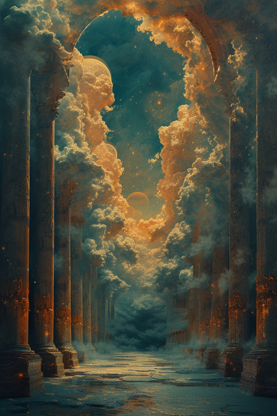
#hdr map
Text
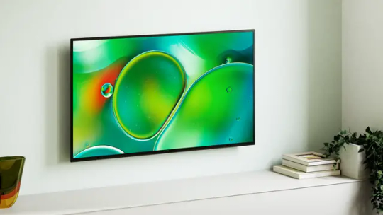
Sony BRAVIA 2 Series S25 and S20: Google TV, 4K HDR LED Displays, X1 Picture Processor, and Enhanced Gaming Features Launched in India
The Sony BRAVIA 2 series has been launched in India with models ranging from 43″ to 65″, available in two variants: S25 and S20. Both variants feature Google TV, 4K HDR LED displays, and the X1 Picture Processor for enhanced image quality. Key technologies include 4K X-Reality PRO for upscaling, Motionflow XR for smooth motion, and Live Color technology for vivid colors.
The S25 variant, aimed…
View On WordPress
#4K Processor X1 TVs#4K X-Reality PRO TV#Apple HomeKit TVs#Auto HDR Tone Mapping for PlayStation 5#Gaming features in Sony BRAVIA S25 variant#Google TV#PlayStation 5 TVs#Sony BRAVIA 2 Series#Sony BRAVIA 2 series launch in India#Sony BRAVIA S25 and S20 variants#X-Protection PRO TVs#X1 Picture Processor TVs
0 notes
Video
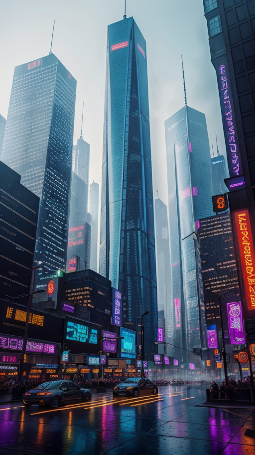
Boat Quay Night by Henrik Sundholm
Via Flickr:
Walking through the Boat Quay area in Singapore.
#boat quay#city#urban#night#street#shadows#building#wet#puddles#stores#restaurants#shops#hydrant#trees#advertisement#signs#map#hdr#singapore#southeast asia#flickr
1 note
·
View note
Text
canmom's notes on fixing the colours
ok so if you've been following along on this blog for the last week or two i've been banging on about colour calibration. and i feel like it would be good to sum up what i've learned in a poast!
quick rundown on colour spaces
So. When you represent colour on a computer, you just have some numbers. Those numbers are passed to the monitor to tell it to turn some tiny lights up and down. The human visual system is capable of seeing a lot of colours, but your monitor can only display some of them. That's determined by its primaries, basically the exact colour* of its red, green and blue lights.
(*if you're wondering, the primaries are specified in terms of something called the CIELAB colour space, which is a model of all the different colours that humans can possibly see, devised by experiments in the early-mid 20th century where the subjects would turn lights at different frequencies up and down until they appeared visually the same. Through this, we mapped out how eyes respond to light, enabling basically everything that follows. Most human eyes tend to respond in pretty close to identical ways - of course, some people are colourblind, which adds an extra complication!)
Now, the problem we face is that every display is different. In particular, different displays have different primaries. The space in between the primaries is the gamut - the set of all colours that a display can represent. You can learn more about this concept on this excellent interactive page by Bartosz Ciechanowski.
The gamut is combined with other things like a white point and a gamma function to map numbers nonlinearly to amounts of light. All these bits of info in combination declare exactly what colour your computer should display for any given triplet of numbers. We call this a colour space.
There are various standard sets of primaries, the most famous being the ITU-R Rec.709 primaries used in sRGB, first defined in 1993, often just called the sRGB primaries - this is a fairly restricted colour space, intended to be an easy target for monitor manufacturers and to achieve some degree of colour consistency on the web (lol).
Since then, a much wider gamut called Rec.2020 has recently been defined for 'HDR' video. This is a very wide gamut, and no existing displays can actually show it in full. Besides that, there are various other colour spaces such as AdobeRGB and P3, which are used in art and design and video editing.
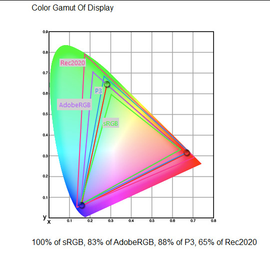
What you see above is something called a 'chromaticity diagram'. the coordinate system is CIE xyY with fixed Y. The curved upper edge to the shape is the line of monochromatic colours (colours created by a single frequency of light); everything other colour must be created by combining multiple frequencies of light. (Note that the colours inside the shape are not the actual colours of those points in CIE XY, they're mapped into sRGB.)
In this case, the red, green and blue dots are the primaries of my display. Since they are outside the green triangle marked sRGB, it qualifies as a 'wide gamut' display which can display more vivid colours.
Sidebar: you might ask why we didn't define the widest possible gamut we could think of at the start of all this. Well, besides consistency, the problem is that you only have so many bits per channel. For a given bit depth (e.g. 8 bits per channel per pixel), you have a finite number of possible colours you can display. Any colours in between get snapped to the nearest rung of the ladder. The upshot is that if you use a higher gamut, you need to increase the bit depth in order to avoid ugly colour banding, which means your images take up more space and take more time to process. But this is why HDR videos in Rec.2020 should always be using at least 10 bits per colour channel.
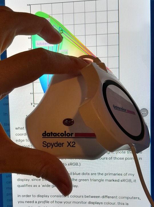
in order to display consistent colours between different computers, you need a profile of how your monitor displays colour. Yhis is something that has to be measured empirically, because even two monitors of the same model will be slightly different. You get this information by essentially taking a little gadget which has a lens and a sensitive, factory-calibrated colour meter, and holding it against your screen, then making the screen display various colours to measure what light actually comes out of it. This information is packed into a file called an ICC profile.
(Above is the one I got, the Spyder X2. I didn't put a lot of thought into this, and unfortunately it turns out that the Spyder X2 is not yet supported by programs like DisplayCal. The Spyder software did a pretty good job though.)
Wonderfully, if you have two different ICC profiles, and you want to display the same colour in each space, you can do some maths to map one into the other. So, to make sure that a picture created on one computer looks the same on another computer, you need two things: the colour space (ICC profile) of the image and the colour space (ICC profile) of the screen.

Now different operating systems handle colour differently, but basically for all three major operating systems there is somewhere you can set 'here is the icc profile for this screen'. You might think that's the whole battle: calibrate screen, get ICC profile, you're done! Welcome to the world of consistent colour.
Unfortunately we're not done.
the devil in the details
The problem is the way applications tell the operating system about colour is... spotty, inconsistent, unreliable. Applications can either present their colours in a standard space called sRGB, and let the OS handle the rest - or they can bypass that entirely and just send their numbers straight to the monitor without regard for what space it's in.
Then we have some applications that are 'colour managed', meaning you can tell the application about an ICC profile (or some other colour space representation), and it will handle converting colours into that space. This allows applications to deal with wider colour gamuts than sRGB/Rec.709, which is very restricted, without sacrificing consistency between different screens.
So to sum up, we have three types of program:
programs which only speak sRGB and let the OS correct the colours
programs which aren't colour aware and talk straight to the monitor without any correction (usually games)
programs which do colour correction themselves and talk straight to the monitor.
That last category is the fiddly one. It's a domain that typically includes art programs, video editors and web browsers. Some of them will read your ICC profile from the operating system, some have to be explicitly told which one to use.
Historically, most monitors besides the very high end were designed to support sRGB colours and not much more. However, recently it's become easier to get your hands on a wide gamut screen. This is theoretically great because it means we can use more vivid colours, but... as always the devil is in the details. What we want is that sRGB colours stay the same, but we have the option to reach for the wider gamut deliberately.
Conversely, when converting between colour spaces, you have to make a decision of what to do with colours that are 'out of gamut' - colours that one space can represent and another space can't. There's no 'correct' way to do this, but there are four standard approaches, which make different tradeoffs of what is preserved and what is sacrificed. So if you look at an image defined in a wide colour space such as Rec.2020, you need to use one of these to put it into your screen's colour space. This is handled automatically in colour managed applications, but it's good to understand what's going on!
(*You may notice a difference in games even if they're not colour managed. This is because one of the things the calibration does is update the 'gamma table' on your graphics card, which maps from numeric colour values to brightness. Since the human eye is more sensitive to differences between dark colours, this uses a nonlinear function - a power law whose exponent is called gamma. That nonlinear function also differs between screens, and your graphics card can be adjusted to compensate and make sure everyone stays on the standard gamma 2.2. Many games offer you a slider to adjust the gamma, as a stopgap measure to deal with the fact that your computer's screen probably isn't calibrated.)
For what follows, any time you need the ICC profile, Windows users should look in C:\Windows\System32\spool\drivers\color. MacOS and Linux users, see this page for places it might be. Some applications can automatically detect the OS's ICC profile, but if not, that's where you should look.
on the web
Theoretically, on the web, colours are supposed to be specified in sRGB if not specified otherwise. But when you put an image on the web, you can include an ICC profile along with it to say exactly what colours to use. Both Firefox and Chrome are colour-managed browsers, and able to read your ICC profile right from the operating system. So an image with a profile should be handled correctly in both (with certain caveats in Chrome).
However, Firefox by default for some reason doesn't do any correction on any colours that don't have a profile, instead passing them through without correction. This can be fixed by changing a setting in about:config: gfx.color_management.mode. If you set this to 1 instead of the default 2, Firefox will assume colours are in sRGB unless it's told otherwise, and correct them.
Here is a great test page to see if your browser is handling colour correctly.
Chrome has fewer options to configure. by default it's almost correctly colour-managed but not quite. So just set the ICC on your OS and you're as good as it's gonna get. The same applies to Electron apps, such as Discord.
To embed a colour profile in an image, hopefully your art program has the ability to do this when saving, but if not, you can use ImageMagick on the command line (see below). Some websites will strip metadata including ICC profile - Tumblr, fortunately, does not.
For the rest of this post I'm going to talk about how to set up colour management in certain programs I use regularly (Krita, Blender, mpv, and games).
in Krita
Krita makes it pretty easy: you go into the settings and give it the ICC profile of your monitor. You can create images in a huge variety of spaces and bit depths and gamma profiles. When copying and pasting between images inside Krita, it will convert it for you.
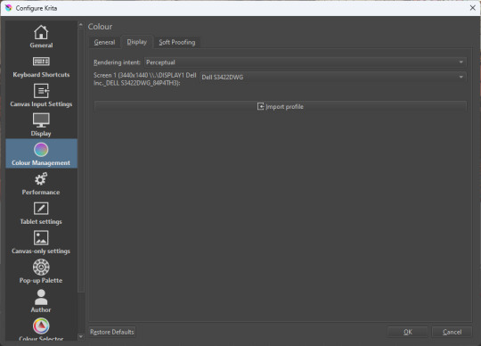
The tricky thing to consider is pasting into Krita from outside. By default, your copy-paste buffer does not have colour space metadata. Krita gives you the option to interpret it with your monitor's profile, or as sRGB. I believe the correct use is: if you're copying and pasting an image from the web, then sRGB is right; if you're pasting a screenshot, it has already been colour corrected, you should use 'as on monitor' so Krita will convert it back into the image's colour space.
in Blender
Blender does not use ICC profiles, but a more complicated system called OpenColorIO. Blender supports various models of mapping between colour spaces, including Filmic and ACES, to go from its internal scene-referred HDR floating-point working space (basically, a space that measures how much light there is in absolute terms) to other spaces such as sRGB. By default, Blender assumes it can output to sRGB, P3, etc. without any further correction.
So. What we need to do is add another layer after that which takes the sRGB data and corrects it for our screen. This requires something called a Lookup Table (LUT), which is basically just a 3D texture that maps colours to other colours. You can generate a LUT using a program called DisplayCal, which can also be used for display calibration - note that you don't use the main DisplayCal program for this, but instead a tool called 3DLUT Maker that's packaged along with it. see this Stack Overflow thread for details.
Then, you describe in the OpenColorIO file how to use that LUT, defining a colour space.

The procedure described in the thread recommends you set up colour calibration as an additional view transform targeting sRGB. This works, but strictly speaking it's not a correct use of the OpenColorIO model. We should also set up our calibrated screen as an additional display definition, and attach our new colour spaces to that display. Also, if you want to use the 'Filmic' View Transform with corrected colours (or indeed any other), you need to define that in the OpenColorIO file too. Basically, copy whatever transform you want, and insert an extra line with the 3D LUT.
Here's how it looks for me:
in games (using ReShade)
So I mentioned above that games do not generally speaking do any colour correction beyond the option to manually adjust a gamma slider. However, by using a post-processing injection framework such as ReShade, you can correct colours in games.
If you want to get the game looking as close to the original artistic intent as possible, you can use the LUT generator to generate a PNG lookup table, save it in the Reshade textures folder, then you load it into the LUT shader that comes packaged with Reshade. Make sure to set the width, height and number of tiles correctly or you'll get janked up results.
However... that might not be what you want. Especially with older games, there is often a heavy green filter or some other weird choice in the colour design. Or maybe you don't want to follow the 'original artistic intent' and would rather enjoy the full vividness your screen is capable of displaying. (I certainly like FFXIV a lot better with a colour grade applied to it using the full monitor gamut.)
A 3D Lookup Table can actually be used for more than simply calibrating colour to match a monitor - it is in general a very powerful tool for colour correction. A good workflow is to open a screenshot in an image editor along with a base lookup table, adjust the colours in certain ways, and save the edited lookup table as an image texture; you can then use it to apply colour correction throughout the game. This procedure is described here.
Whatever approach you take, when you save screenshots with Reshade, it will not include any colour information. If you want screenshots to look like they do in-game when displayed in a properly colour managed application, you need to attach your monitor's ICC profile to the image. You can do this with an ImageMagick command:
magick convert "{path to screenshot}" -strip -profile "{path to ICC profile}" "{output file name}.webp"
This also works with TIFF and JPEG; for some reason I couldn't get it to work with PNG (you generate a PNG but no colour profile is attached.)
It's possible to write a post-save command in ReShade which could be used to attach this colour space info. If I get round to doing that, I'll edit into this post.
video
In MPV, you can get a colour-corrected video player by setting an appropriate line in mpv.conf, assuming you're using vo=gpu or vo=gpu-next (recommended). icc-profile-auto=yes should automatically load the monitor ICC profile from the operating system, or you can specify a specific one with icc-profile={path to ICC profile}.
For watching online videos, it seems that neither Firefox nor Chrome applies colour correction, even though the rest of the browser is colour-managed. If you don't want to put up with this, you can open Youtube videos in MPV, which internally downloads them using Youtube-DL or yt-dlp. This is inconvenient! Still haven't found a way to make it colour-corrected in-browser.
For other players like VLC or MPC-HC, I'm not so familiar with the procedure, you'll need to research this on your own.
what about HDR?
HDR is a marketing term, and a set of standards for monitor features (the VESA DisplayHDR series), but it does also refer to a new set of protocols around displaying colour, known as Rec. 2100. This defines the use of a 'perceptual quantiser' function in lieu of the old gamma function. HDR screens are able to support extreme ranges of brightness using techniques like local dimming and typically have a wider colour gamut.
If your screen supports it, Windows has a HDR mode which (I believe) switches the output to use Rec.2100. The problem is deciding what to do with SDR content on your screen (which is to say most things) - you have very little control over anything besides brightness, and for some reason Windows screws up the gamma. Turning on HDR introduced truly severe colour banding all over the shop for me.
My colorimeter claims to be able to profile high brightness/hdr screens, but I haven't tested the effect of profiling in HDR mode yet. There is also a Windows HDR calibration tool, but this is only available on the Microsoft store, which makes it a real pain to set up if you've deleted that from your operating system in a fit of pique. (Ameliorated Edition is great until it isn't.)
Anyway, if I get around to profiling my monitor in HDR mode, I will report back. However, for accurate SDR colour, the general recommendation seems to be to simply turn it off. Only turn it on if you want to watch content specifically authored for HDR (some recent games, and HDR videos are available on some platforms like Youtube). It's a pain.
is this all really worth the effort?
Obviously I've really nerded out about all this, and I know the likely feeling you get looking at this wall of text is 'fuck this, I'll just put up with it'. But my monitor's gamma was pretty severely off, and when I was trying to make a video recently I had no idea that my screen was making the red way more saturated and deep than I would see on most monitors.
If you're a digital artist or photographer, I think it's pretty essential to get accurate colour. Of course the pros will spend thousands on a high end screen which may have built in colour correction, but even with a screen at the level I'm looking at (costing a few hundred quid), you can do a lot to improve how it looks 'out of the box'.
So that's the long and short of it. I hope this is useful to someone to have all of this in one place!
I don't know if we'll ever reach a stage where most monitors in use are calibrated, so on some level it's a bit of a fool's errand, but at least with calibration I have some more hope that what I put in is at least on average close to what comes out the other end.
94 notes
·
View notes
Text

Picnic at Hanging Rock will be released on 4K Ultra HD + Blu-ray on April 9 via The Criterion Collection. Eric Skillman designed the cover art for the 1975 Australian mystery film.
Peter Weir (The Truman Show, Dead Poets Society) directs from a script by Cliff Green, based on Joan Lindsay's 1967 novel. Anne-Louise Lambert, Rachel Roberts, Dominic Guard, Helen Morse, Vivean Gray, and Jacki Weaver star.
Picnic at Hanging Rock has been newly restored in 4K, supervised by Weir and director of photography Russell Boyd, with HDR and 5.1 surround DTS-HD Master Audio. Special features are listed below.
Special features:
Interview with director Peter Weir
Making-of featurette with executive producer Patricia Lovell, producers Hal McElroy and Jim McElroy, and cast members
Introduction by film scholar David Thomson, author of The New Biographical Dictionary of Film
On-set documentary hosted by executive producer Patricia Lovell and featuring interviews with Peter Weir, actor Rachel Roberts, and author Joan Lindsay
Homesdale - 1971 black comedy directed by Peter Weir
Trailer
Essay by author Megan Abbott and an excerpt from film scholar Marek Haltof’s 1996 book Peter Weir: When Cultures Collide
This sensual and striking chronicle of a disappearance and its aftermath put director Peter Weir on the map and helped usher in a new era of Australian cinema. Based on an acclaimed 1967 novel by Joan Lindsay, Picnic at Hanging Rock is set at the turn of the twentieth century and concerns a small group of students from an all-female college who vanish, along with a chaperone, while on a St. Valentine’s Day outing. Less a mystery than a journey into the mystic, as well as an inquiry into issues of class and sexual repression in Australian society, Weir’s gorgeous, disquieting film is a work of poetic horror whose secrets haunt viewers to this day.
Pre-order Picnic at Hanging Rock.
#picnic at hanging rock#peter weir#anne louise lambert#rachel roberts#criterion#criterion collection#the criterion collection#dvd#gift#eric skillman#70s movies#1970s movies#joan lindsay#mystery
31 notes
·
View notes
Text
Hi pals!
I’ll still be travelling when you’re seeing this and haven’t watched the finale, so I don’t have any new content to share, but last week (maybe longer? I don’t know— rainforest brain lol) I posted a poll asking if anyone was interested in seeing a snippet of my editing process, so here it is feat. possibly one of my favourite Wrecker moments.
I use a myriad of different software depending on: my mood, what computer/tablet I’m using, what the image looks like, and how much energy I’m willing to put into it lol In this video, I’m using Lightroom on my iPad.
The three main factors I look mostly closely at when I’m editing shots are 1. lighting, 2. noise, and 3. resolution (read: clarity).
This image required pretty minimal work so it’s probably not the best example, but ah well. The process in the above video is as follows, and please note the video had been sped up to 2x for file size reasons lol
The first thing I’ll do is see what the auto edit function defaults to. Often times it overexposes the image, resulting in significant colour noise, but it gives me a decent idea of what I should expect in terms of colour corrections and exposure mapping. The auto edit function wasn’t terrible in this case, but did produce some colour noise, mainly on Wrecker’s chest plate, his sleeves, and the officers hat. Once I’m done the initial scope out, I’ll exposure the image as high as possible to crop it— usually with the subject being as centered as possible.
This software lets the user tweak the bones of the image individually in three ways, all of them very quickly demonstrated here. The first is the curve method which I despise and NEVER use— because it alters multiple aspects at once, I don’t feel like I have the same degree of control as the other methods. Next is HDR setting (the default upon import) using the sliders on the right. This is effective for images that are already pretty well lit, and does give me a little more control, but most of the time because the screenshots are so dark, I’m editing in SDR mode.
Once I’m satisfied with the exposure/lighting, I’ll move on to correcting colour distortion and saturating the image. This software also provides three methods for colour alternation and I’ll typically use all three in conjunction with each other. Colour mixing is extremely crucial when it comes to reducing odour noise and distortion. Because this software lets me isolate certain colours to adjust their hue, saturation, and luminance, I can typically reduce most of or all of the colour noise. However, it does have its limitations. In this particular post, desaturating the colour noise in Crosshair’s rifle coincided with blanching his skin tone, because this software does not let me isolate certain areas of an image. It was also important to me to emphasize the warm tones from the sunset in the background for the overall mood of the shot, so I opted to remove what colour noise I could and leave the rest. (You can’t win em all… especially when the starting image is near-black lol)
Correcting the colour distortion in this image was not particularly difficult, desaturating all purple tones removed the noise from his chest plate, and shifting green tones to something near a yellow instead removed the noise from his sleeve. I didn’t notice the colour noise on the officers hat until a little later, but that was pretty easily corrected too.
Once I’ve fixed the colour noise, I’ll shift to toning the overall image. Wrecker particularly looks good in cool tones, but It’s nice to contrast a cool tone background with the warmth of his skin.
Once the toning is done, I’ll move on the image clarity. I don’t have the means to alter the actual resolution of the image, but I’m particularly picky with balancing texture and clarity. Wrecker always looks the best with texture and clarity increased, because it brings out the scarring on his face and further humanizes him, but overdoing the texture can also emphasize pixelation. Once that’s done, I’ll reduce the overall noise only slightly (doing too much makes them look airbrushed and unnatural), and whatever is left of the colour noise (too much of this setting makes them look like ghouls LOL)
This software also offers a series of preset alterations/filters briefly shown in this video… but I’m not the biggest fan of any of them. I’m a bit of a control freak and would rather tweak each aspect individually to the degree that I like, instead blanketing the image with present modifications and then undoing certain aspects.
Before exporting the image I’ll do another once over and make sure I’m happy! In this case, I opted to go back in and add some darker tones back into the image. I don’t do this often, particularly when they start so damn dark, but I wanted to keep the focus centrally on Wrecker’s radiance lol
That’s about it. If I’m working on multiple edits in a set, this software lets me just copy and paste the settings, so the following images only require extremely light tweaks and take almost no time. And that, I’ll export, autograph, and upload!
Thank you for attending this unprofessional Ted Talk.
#starqueensrambles#things no one asked for but are getting anyways#Jedi queue-doo#starqueensedits#ungatekeeped lol#thats not a word#well… it is now
14 notes
·
View notes
Text
I was worried the TV would be too big, but it honestly feels like watching a big movie screen at the theater and it is so immersive. Like you are *in* the frickin movie.
And even in the 2 years since I got my other TV, the picture quality has improved quite a bit. All of the issues I had with my other TV are pretty much resolved. The only thing it can’t do perfectly is deep inky blacks like an OLED screen. But it comes really close and it gets much much brighter than any OLED, so lasers and lightsabers just look soooo cool. Like they could melt your face off.
I am also finally able to notice a difference between 1080p and 4K. Though it is still subtle and I wish people wouldn't think 4K is the ultimate measure of clarity and quality. Resolution has become one of the least important aspects of picture quality.
I mean, our phones can film in 4K. An Arri Alexa cinema camera can also film in 4K. Do you really believe a $1000 smartphone and an $80000 motion picture camera have equivalent quality?
The goal of higher resolutions is to resolve more detail to provide a sharper image. So imagine a tiny tree in the background where the leaves are all mushed together in a blur in a low detail image and the individual leaves can be seen in a high detail image.
What allows you to get that high level of detail?
Teamwork!
You need a really good sensor with a lot of photosites or pixels. And you need a really good lens with a great design and perfect glass. Bigger is better in both cases.
There is this concept called "perceptual megapixels." This is a measurement of how much detail a camera lens can resolve. So if you have a 50 megapixel sensor but a lens that can only resolve 20 megapixels worth of detail... then you are getting a 20 megapixel image.
The dirty secret of smartphone advertising is that while their sensors might *technically* be 4K or 8K or 100+ megapixels, none of those tiny lenses have the resolving power to support those resolutions. That's why a Samsung with a 100 megapixel sensor does not look significantly sharper than an iPhone with a 12 megapixel sensor. And that's why if you took an old DSLR with a 12 megapixel sensor and slapped a Zeiss Otus lens on the front, the image detail would trounce any smartphone.
But honestly, detail and sharpness really only come into play when you are pixel peeping and zooming way into images. At normal viewing distances, pretty much any modern camera or lens is sharp enough to give you an acceptably detailed image.
If you are looking for a quality TV picture, ignore the Ks and look for things like brightness (nits) and black levels (contrast ratio) and color gamut (number of colors) and HDR interpretation (tone mapping). A great site that breaks all this down is rtings.com. They have the most detailed reviews of anyone and they test various aspects of picture quality. You can decide which aspects are important to you and choose a great television accordingly.
78 notes
·
View notes
Text
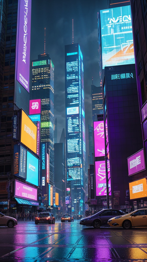
Parameters
Futuristic cityscape of Cyberpunk metropolis pulsating with neon-lit, towering skyscrapers. A sprawling urban jungle bathed in vibrant hues of purple and black, where flickering holographic billboards paint the environment in a kaleidoscope of mesmerizing lights, (8k, RAW photo, best quality, masterpiece:1.2), (realistic, photo-realistic:1.37), professional lighting, photon mapping, physically-based rendering, detailed background, absurdres, (hdr:1.3), (muted colors:1.2), dramatic, complex background, cinematic, filmic, (artstation:0.8), soaking wet,
Negative prompt: (worst quality:2), (low quality:2), (normal quality:2), lowres, normal quality, ((monochrome)), ((grayscale)), skin spots, acnes, skin blemishes, no text font letters, (deformed, distorted, disfigured:1.3), poorly drawn, bad anatomy, wrong anatomy, extra limb, missing limb, floating limbs, (mutated hands and fingers:1.4), disconnected limbs, mutation, mutated, ugly, disgusting, blurry, amputation, extra heads, deformed face, black edges, ng_deepnegative_v1_75t, negative_hand-neg, yam-negative-10000-neg, bhands-neg, disfigured, twisted, fused fingers, long neck, words, text, mutated hands, mutated fingers, interlocked fingers, bad hands, bad fingers, over saturated, duplicate body parts, extra limbs, extra fingers, malformed hands, mutated hands and fingers, contorted, missing limbs, signature, artifacts, bad art, poor quality, (low quality:1.2), easynegative, badhandv4,
Steps: 30, Sampler: DPM++ SDE Karras, CFG scale: 7, Seed: 2548615657, Face restoration: CodeFormer, Size: 513x912, Model hash: a77b8a53eb, Model: clarity_2_vaeFtMse840000Ema_v10, Version: v1.3.2
Used embeddings: ng_deepnegative_v1_75t [1a3e], negative_hand-neg [b740], yam-negative-10000-neg [9586], bhands-neg [9c45], easynegative [119b], badhandv4 [dba1]
Leave your suggestion of what I can create!
#bot#artificialintelligence#art#fy#digitalart#wallpaper#city#architecture#urbanism#building#futuristic#cyberpunk#neon
27 notes
·
View notes
Text
Hills to die on
If it's a JPEG or PNG it's not HDR. It's just tone mapping.
JPEG needs taking out back and euthanising. There are better formats and have been for like 15 years.
In any situation where there is a clearly better option, someone will contrive a way to fuck the situation up so massively that everyone will just keep using the shitty scenario. That someone is usually Sony.
GIMP and people who promote GIMP to unsuspecting would-be artists has done more to harm digital art than the cost of buying all the hardware.
Discord sucks ass. It won't ever not suck.
It doesn't matter what Android can do or how customisable it is, if you e.g. get a Samsung it's going to be so larded down with crap and cruft that any benefits over iOS will be lost.
Windows is not better than MacOS.
MacOS is not better than Windows.
Both are better than any Linux install that isn't running on a tablet.
For drawing, sketching, painting and generally enjoying things, an iPad with a ludicrously overpriced stylus is way better than a full PC with a Wacom...
... and the tablet's a better way to enjoy media.
Customer service agents are not paid enough
Customer service agents should be allowed to say "Jesus fucking Christ I asked what the problem is, not 'Tell me about your day' Shut. The. Fuck . Up. Now what is the problem. 6 words or less, or I'm hanging up and blocking your number".
CSATs and NPS are astrology anti-vax conspiracy theories for middle management. They're deeply flawed, harmful to everyone involved, a huge pain in the ass, and nobody wants to deal with them... apart from some middle manager who firmly believes they can boil down a human being and their entire job to two numbers every month.
Billionaires and politicians should be tried every year and if found guilty of being utter shits, be wired up for life support and encased in amber, and displayed to the public along with a list of the bad shit they've done.
I firmly believe that these dinguses will see their comerades frozen mid scream in a big block of resin, while a machine keeps them alive in permanent hellish torture and still do the stupid things they do.
Nobody likes soft mozarella as much as block mozarella.
UBI and free cheese would probably solve almost all problems.
Nestlé are now so evil they're just doing it to see how far they can push things before anyone actually does something other than tut-tutting.
Most politicians should be guillotined.
15 notes
·
View notes
Text
I am practicing my coloring using @sersi's coloring tutorial and Auto Options in Curves from Pix Imperfect's tutorial.
I started with this. It is from a video file in HDR, and it makes colors look washed out:
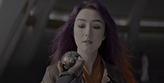
First, I don't want to work on HDR video files again 'cause it's so washed out.
Also, I had to 'de-squeeze' the image because it was a 2165px, and Photoshop squeezes the proportions and rations. I had to multiply with 1.33 to get the gif to look right. When I cropped it, I had to make it: 540px x 275px.
After many turns in adjustments, curves, and gradient maps, I finally got to this. The most significant change was when I messed with the Channel mixer adjustment and slid the saturation levels of red just a bit to get rid of the Reddish coloring in the background.
I finally get this:
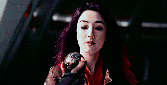
I'm still not happy with it. I feel I could do better with Sabine's skin, but as a first (and many hours) attempt to fix the coloring, I think it's an improvement.
Anyway, part 1 of my adventures in Star Wars coloring!
7 notes
·
View notes
Text
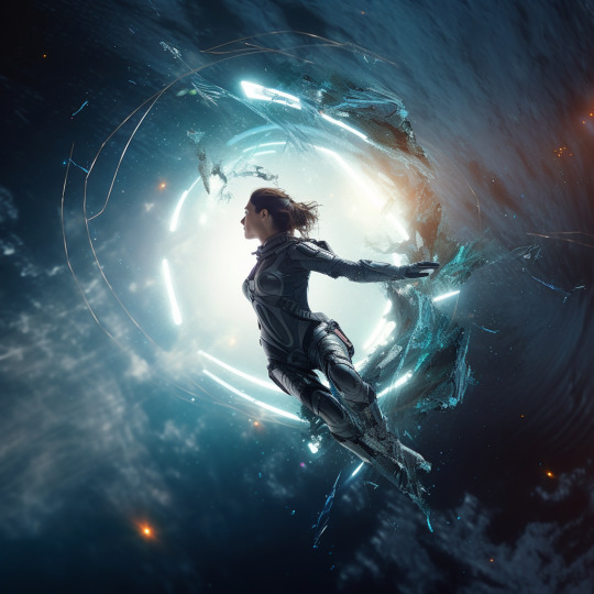
bearsbeetsbattlestargalactica
a woman suspended in mid-air ripping a hole through space-time, action scene, badass epic key visual, hyperspace, visually stunning, groundbreaking, dazzling sfx, dynamic reflective surface, dramatic sci-fi lighting, Optical flares. high detail, hyperrealistic, photographic, cinematic, volumetric lighting, octane render, arnold render, 3D, super close - up, Megapixel film lighting, Anti - Aliasing, FKAA, TXAA, RTX, SSAO, Post Processing, Post Production, Tone Mapping, CGI, VFX, SFX, Full Color, Volumetric lighting, HDR, Realistic, Fury Fire Style Big Muscle Big Jaw God of War Photographic, Cinematic, 8k --v 5
midjourney
16 notes
·
View notes
Text
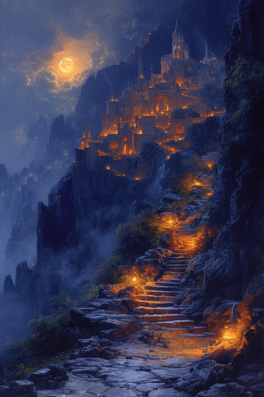
attempts at the City of Brass in the style of Maxfield Parrish
Maxfield Parrish Oil Painting, The City of Brass, classical composition, dynamic lighting, 8k, mythical, ethereal, intricate, elaborate, hyperrealism, hyper detailed, strong expressiveness and emotionality, in the style of Maxfield Parrish, cinematic lighting, visual clarity, 200mm, UHD, 32k, 16k, 8k, HDR, 3D shading, Tone Mapping, Ray Tracing Global Illumination, artistic classical composition --ar 2:3 --s 750 --v 6.0
5 notes
·
View notes
Text
Capturing the ambience of Splinter Cell: Chaos Theory
Chaos Theory's settings offer excellent audiovisual detail in accordance with its gameplay focused on shadows and sound. The Xbox/PC version in particular features beautiful shaders and countless sound design flourishes on each map.
Capturing Footage

SCCT contains hidden console commands that we can use to control the camera and HUD. In typical Unreal Engine fashion, we can bind these commands to inputs of our choosing. Navigate to C:\ProgramData\Ubisoft\Tom Clancy's Splinter Cell Chaos Theory\Profiles[your profile name] and open [your profile name].ini. From there I recommend binding at least the following:
Invisible 1 - Become invisible to enemies.
fly - Fly, with collision, using WASD. Press 4 and 5 to change elevation.
ghost - Fly without collision (aka noclip).
walk - Disable fly and noclip.
disablehud - Turns off the HUD. Press again to re-enable. Note that certain in-game actions won't work unless the HUD is shown.
freecam - Control the camera with WASD. Note that you're still controlling Sam, however. Scroll to adjust speed. Press again to revert to the default camera.
fixecam - Freeze the camera in place. Press again to disable.
We can combine the above commands to get both Sam and the camera into a good position. For example: A.) put Sam's back to wall, limiting his mobility, and use freecam or B.) fly Sam into the desired camera position, enable fixecam, enable walk mode, and then move Sam off-screen.
You'll need to re-enable invisibility whenever you load a new mission.
Optimizing Graphics

To increase shadow map resolution, follow the instructions on PCGamingWiki. If you wish to customize your FOV, the page also has steps for that. For in-game settings, I prefer to disable HDR while maxing out the remaining settings - but this is a stylistic choice, so do whatever you think looks best!
Extracting Sounds
We have a couple of options for different types of sounds. DecUbiSnd can pull WAVs and OGGs out of the game's SS0 and LS0 stream archives. Ambient streams come in pairs of stereo assets, which together represent a "quad" surround sound asset. Be sure to set their frequency to 32kHz before extraction.
We can also decode MAPS.SM0 using vgmstream. The vgmstream foobar2000 component is handy for browsing, but it unfortunately retains vgmstream's default of looping decoded sounds twice. Ultimately we'll use the vgmstream CLI to render a particular sound, e.g.:
vgmstream-cli.exe -i "F:\SteamClient\steamapps\common\Splintercell Chaos Theory\Data\Sounds\MAPS.SM0" -s 7832 -o "D:\Ambience\SCCT\nishin\golf-commentary.wav"
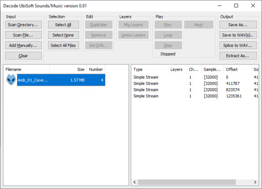
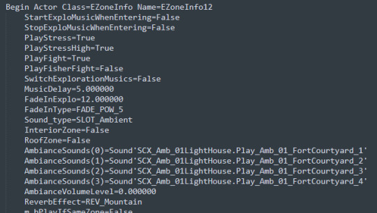
Identifying Sounds
We can inspect the game's UNS dumps to get an idea of which sounds are played on each map. For example: Data\Maps\01_Lighthouse_sound.uns.
Keep in mind the Unreal Engine allows sounds to be played back at varying speeds in-game. It's a good idea to ear-test that extracted assets match your expected pitch.
Putting it all together
Render your ambient and positional sound effects alongside your captured footage.
youtube
2 notes
·
View notes
Text
Disney Illuminations 4K HDR
Disney Illuminations 4K HDR
Enjoy the full Disney Illuminations Nighttime Spectacular from Disneyland Park, Disneyland Paris – featuring fireworks, projection mapping, water jets, lasers and more – in 4K HDR!
(more…)
youtube
View On WordPress
#Disney#disney fireworks#disney fireworks 2022#disney illuminations#disney illuminations 2022#disney illuminations 30th anniversary#disney illuminations 4k#disney illuminations disneyland paris#disneyland#disneyland paris#disneyland paris 2022#disneyland paris 30th anniversary#disneyland paris fireworks#disneyland park#featured#fireworks display#fireworks hdr#fireworks hdr 4k#hdr#hdr video#low light photography#mickey mouse#nighttime spectacular#theme parks#travel#tvpauld#video#Youtube
2 notes
·
View notes
Note
Have you seen some of the new HDR stuff on KDE plasma 6? Still early days, but very exciting!
https://zamundaaa.github.io/wayland/2023/12/18/update-on-hdr-and-colormanagement-in-plasma.html
oh that is interesting! sounds very promising.
“SDR Color Intensity” is inspired by the color slider on the Steam Deck. For sRGB applications it scales the color gamut up to (at 100%) rec.2020, or more simply put, it makes the colors of non-HDR apps more intense, to counteract the bad gamut mapping many HDR displays do and make colors of SDR apps look more like when HDR is disabled
I guess this goes some way to answering why colour accuracy for SDR content was so dodge when I turned on HDR on windows (which lacks such a slider, just a brightness slider). "the bad gamut mapping many HDR displays do" is big oof but also explains a lot. the mathematics for colour space transformation is pretty well-defined, so if hardware is implementing them incorrectly, that's really frustrating. older screens are working with standards that predate the idea of colour management, but now we're bringing in all these new display signalling standards (PQ and all that), it seems like a golden opportunity to do things properly this time... so of course we don't lmao.
the colorimeter I got has an option for high brightness/HDR screens, but I haven't really tested it yet. 'measure your screen colorimetrically and compensate in software' works decently well in SDR land, but I'm not sure what happens in HDR. I haven't played any HDR-enabled games since I got this colour accuracy bug, so I haven't had cause to try and figure out the ins and outs of it yet.
it seems like KDE intend to be a lot less black-box about it than Microsoft, which is very welcome.
#canmom vs colour#linux#computer science#all this is sutff artists tend to be a lot more concerned about than our audiences in general...
12 notes
·
View notes
Text
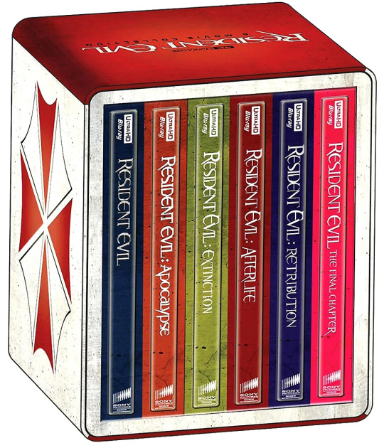

The Resident Evil films will be released in a Steelbook 4K Ultra HD (with Blu-ray) box set on November 3 via Sony Pictures. It includes all six movies in the action-horror franchise based on Capcom video game series.
The series kicked off with Resident Evil in 2002, followed by Resident Evil: Apocalypse in 2004, Resident Evil: Extinction in 2007, Resident Evil: Afterlife in 2010, Resident Evil: Retribution in 2012, and Resident Evil: The Final Chapter in 2016.
Paul W.S. Anderson (Death Race, Event Horizon) directed the first, fourth, fifth, and sixth installments, in addition to writing and producing the entire franchise. The second chapter was directed by Alexander Witt, while Russell Mulcahy (Highlander) helmed the third.
Milla Jovovich stars in all six movies. The cast also includes Sienna Guillory, Oded Fehr, Ali Larter, Michelle Rodriguez, Iain Glen, Shawn Roberts, Mike Epps, and Jason Isaacs.
All six films are presented with Dolby Vision HDR and Dolby Atmos audio. Both the theatrical and extended cuts of Apocalypse are included. Special features are listed below, where you can also see individual artwork.

Resident Evil 4K Ultra HD special features:
Theatrical Trailer
Resident Evil Blu-ray Blu-ray special features:
Cast and Filmmakers’ Commentary
Visual Effects Commentary
Alternate Ending with Director Paul W.S. Anderson’s Video Introduction
12 Featurettes
“My Plague” Music Video by Slipknot
Resident Evil: Apocalypse 4K Ultra HD special features:
Filmmaker Commentary
Cast Commentary
Writer/Producer Commentary
Deleted Scenes
Game Over: Resident Evil Reanimated Documentary
Corporate Malfeasance Featurette
Game Babes Featurette
Symphony of Evil Featurette
Resident Evil: Apocalypse Blu-ray special features:
Theatrical and Extended Cuts
Theatrical Trailers
Resident Evil: Extinction 4K Ultra HD special features:
Resident Road Map: Reflections on the Future of the Series
Theatrical Trailers
Resident Evil: Extinction Blu-ray special features:
Under the Umbrella Picture-in-Picture
Filmmaker Commentary
Deleted Scenes
4 Featurettes
Resident Evil: Afterlife 4K Ultra HD special features:
Alice Activated
Theatrical Trailers
Resident Evil: Afterlife Blu-ray special features:
Undead Vision Picture-in-Picture
Filmmaker Commentary
Deleted and Extended Scenes
Outtakes
7 Featurettes
Resident Evil: Retribution 4K Ultra HD special features:
Evil Goes Global
Undead Retribution
Theatrical Trailers
Resident Evil: Retribution Blu-ray special features:
Director and Cast Commentary
Filmmaker Commentary
Deleted and Extended Scenes
Outtakes
Project Alice: The Interactive Database
8 Featurettes
Resident Evil: The Final Chapter 4K Ultra HD special features:
Maximum Carnage: Best Kills
Creature Chronology
Theatrical Trailers
Resident Evil: The Final Chapter Blu-ray special features:
Retaliation Mode with Paul W.S. Anderson and Milla Jovovich
3 Featurettes
Based on the popular video game series by Capcom, the Resident Evil franchise stars Milla Jovovich as Alice, a superhuman security expert pitted against the sinister Umbrella Corporation as the world’s population is transformed into flesh-eating creatures by one of its most dangerous biological weapons.
Pre-order Resident Evil: 6-Movie Collection.
#resident evil#mila jovovich#paul ws anderson#paul w.s. anderson#capcom#steelbook#dvd#gift#russell mulcahy#sienna guillory#oded fehr#ali larter#michelle rodriguez#jason isaacs#iain glen
19 notes
·
View notes
Text

VRStudio Review [Tim Verdouw et al] My Honest opinion
introduction VRStudio review
Wellcome to my Review blog this VRStudio Review. Tim Verdouw et al is Vendor of the ebook.
Promote A Brand New, A.I Fusion Based Technology To Create & Sell Engaging 360* Virtual Tours Video In Just 3 Clicks From A Single Dashboard!
Register Our LIVE Webinar To Get A Chance To “Win A FREE COPY” & Win Cash Prizes
Overview
Vendor: Tim Verdouw et al
Product: VRStudio
Launch Date: 2022-Nov-15
Launch Time: 11:00 EST
Front-End Price: $47
Recommendatiom: Yes
Rating: 8.5 of 10
Get started Right Now >>>
what are the Features VRStudio Review
3D View
Create A 3D View and Show Your Tour In an Immersive and Interactive Mode
Presentation
A new Way to Present Virtual Tour, Create Your Own Story Telling In A Simple Manner
Gallery
Show A Dedicated Image’s Gallery on Your Virtual Tour
Virtual Staging
Show Before and After Version Of A PANORAMA IN The same view by Splitting The screen
POls Styles
Be creative With Extensive Customization of point of interest
WEBVR
EXPERIENCE virtual Tour in 3D Virtual Reality Mode Directly Inside the Browser
Powerful Hotspot Editor
Be creative with extensive point of interest customization with images, videos, links, 3ds and more.
Live Session & Meetings
Invite peoples to join your shared tour with video/audio call and chat.
Virtual Reality
Experience the tour in virtual reality directly inside the browser with a mobile or with a compatible VR Headset.
Built-In Shop
View your products and sell them directly inside the tour.
Showcase
View all your tours in a single page.
360 Video
Support for 360 degree video as panorama.
Globe
View all your tours in the world map.
Some Other Valuable Features Like VRStudio Review
Voice Commands Support
Multi Language Support
QR Code Features
Room Measurements
what can do this VRStudio
Learn How to Tap Into Billion Dollar Virtual Reality Industry
Learn How To Create Interactive 360º Virtual Tours In The Most Easy And Pleasant Way
Learn How Sell Virtual Tours to Hungry Clients Worldwide and Make $2000-3000 Per Day
Learn How to Start Your Own 6-figure Agency Business With VRStudio
WIN FREE COPY and $300 Cash Prize for most engaged on webinar
why buy VRStudio
A Brand New, A.I Fusion Based Technology To Create & Sell Engaging 360* Virtual Tours Video In Just 3 Clicks From A Single Dashboard!
It Provides Marketers The FULL POWER To Smartly Showcase a 360* Tours Of Their Business Or Product With Their Audience & Get Them Connected For Extended Durations With No Additional Investment.
Create Interactive 360º Virtual Tours In The Most Easy And Pleasant Way: 360º Views (Panoramas), 360º Videos, Embedded Sounds, Videos And Photos, Floorplans And Fully Customizable Frames. Start Telling Actual Stories With Multifunctional Hotspots And Clickable Objects That Your Audience Discovers When Walking Through The Tour.
New 3D Transition Effect And Unique Features, Such As Animated Panorama, Live Panorama (day-to-night effect), Adaptive HDR and 360º video with hotspots on top.
irtual Tours Can Be Seen On Any Computer, Tablet Or Phone (Android & Ios) – No Installation Or Plugins Needed. Online & Offline.
Final opinion
In conclusion, i want to say VRStudio is perfect for freelancer an online or offline business owner. its highly recommended. VRStudio software you can Create & Sell ” Engaging 360* Virtual Tours Video in just Few Click From A single Dashboard. its so easy and newer friendly. so you can choose this software.
Thank you read my VRStudio review
Read Full Review
#VRStudioReview#VRStudioHonestReview#VRStudioReviews#VRStudioReviewandBonus#VRStudioPreview#VRStudioDemo#VRStudioLiveDemo#VRStudioScam#VRStudioLegit#VRStudioSoftware#VRStudioApp#VRStudioDownload#VRStudioOTO#VRStudioUpgrades#VRStudioUpsells#VRStudioBonus#VRStudioBonuses#VRStudioVendorAuthorName#HowDoesVRStudioWork#HowtoBuyVRStudio#HowtoMakeMoneywithVRStudio#MakeMoneywithVRStudio#VRStudioScamorLegit
2 notes
·
View notes
Last Seen Blogs


blueberry-lemon
Blueberry Lemonade

josejoselimongi
El Blog-Blog de José José

goatcloset44
The Love of Alexandersen 130

coffeexsimsx
Work In Progress