#finaloutcomes
Text

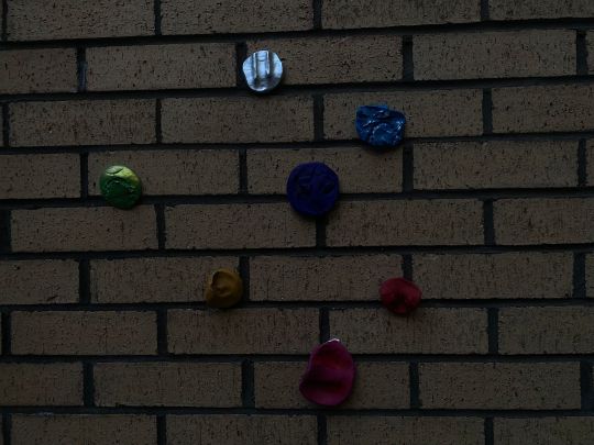
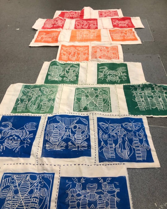
FINAL 10 IMAGES


0 notes
Photo
Final designs
#negotiated study#sarinakaurbcu#moonpig#competition#brief#graphic design#graphics#art#digital#design#artwork#finaloutcomes#photoshop#printing#print#lino#africa#inspired#text#typography#colour#scheme#pallet
2 notes
·
View notes
Photo
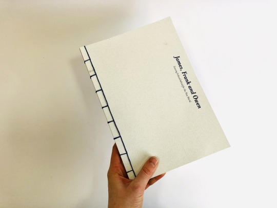


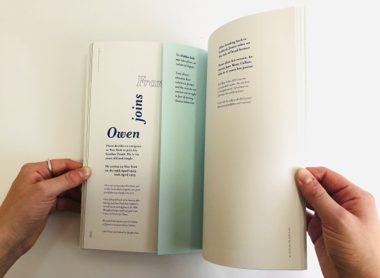

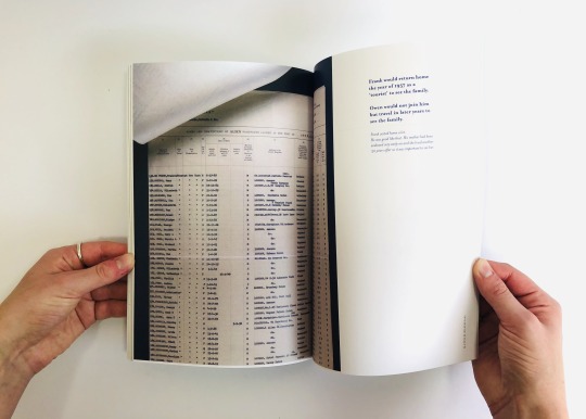
Final book
The final book photographed. I chose the spreads I felt varied and really visualised a combination of scans, documents, photography and type.
I am pleased with the texture of the card and how the type and scans have come out . I feel the front page is very in keeping with the inside and works well. I am very happy with the japanese bind. I wanted to use a traditional bind and show my input into the making of the book so it seemed fitting to use this method over others.
I am not so pleased with how the inserts are read. When reversed its difficult to read as the type is too near the spine. Eventhough I did move the type further away, the bind has made it hard to read all information with ease.
0 notes
Photo

I made this shirt which is from my own design as my final outcome. It is a fit and flare shirt with puffy sleeves, small cuffs, Peter Pan collar and a cloud-like feature under the collar. The shirt is made from cotton and the feature is made from faux fur. #shirt #mydesign #finaloutcome #fitandflare #puffysleeves #smallcuffs #peterpancollar #cloudlike #feature #cotton #fauxfur #uob_students #uob_whoami_2020 #uob_fashion_designers (at University of Bedfordshire) https://www.instagram.com/p/CPG0xxNH8ZC/?utm_medium=tumblr
#shirt#mydesign#finaloutcome#fitandflare#puffysleeves#smallcuffs#peterpancollar#cloudlike#feature#cotton#fauxfur#uob_students#uob_whoami_2020#uob_fashion_designers
3 notes
·
View notes
Text
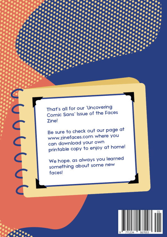
Ask Me Anything - Final (ish) outcome
Honestly, I have had a blast making weekly posts tumblr, but the time has come to wrap this assignment up, and post probably my second last post!
I didn’t want to finish the tumblr without showcasing and talking about my Zine, (even though there will probably be some finishing touches and refinements between now and Friday).
Below is my 8 page zine, with 6 double page spreads and a front and back cover. I have come a long way since I started the zine, even though I am still not 100% convinced it’s my best work, there are elements I really like, like the notebook back-cover from Microsoft bob help messages and some of the illustrations.
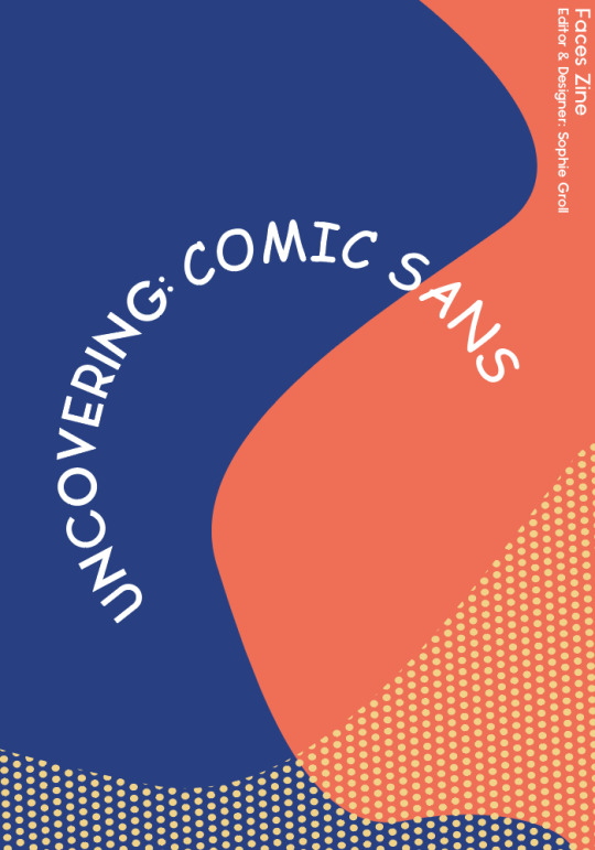
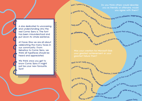

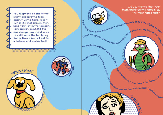
Adding small hints to the origins of comic sans, to allude to its success in fulfilling those criteria helped me add texture and more interest into the zine. The inclusion of ‘extra information’ boxes has also helped the overall feel of a publication I think (I might need to add some more historical info into those).
Through this project I have learnt not to let fear of failure get in the way of starting something. If I had begun the rough design play earlier, I would have had even more days to keep coming back to my work and refine it.
I have also learnt that it’s ok to ask for help, it’s ok to ask the tutor when I’m stuck or ask peers for feedback - It always sparks new creative ideas for me.
#finaloutcome#wrapup#zine#digitalpublication#publication#digitalzine#commdesign#rmitdesign#graphicdesign#progress
24 notes
·
View notes
Photo
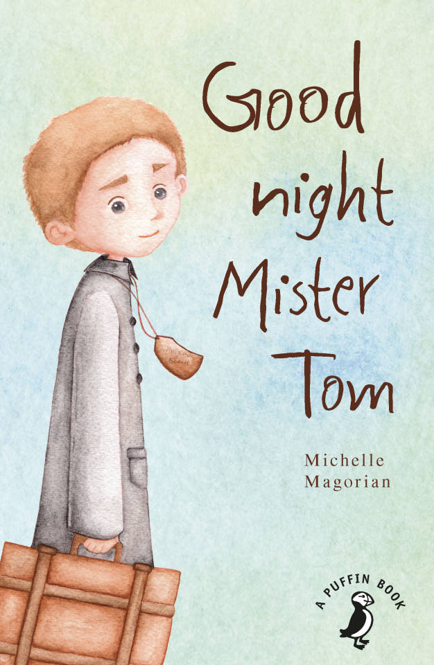


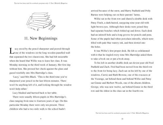
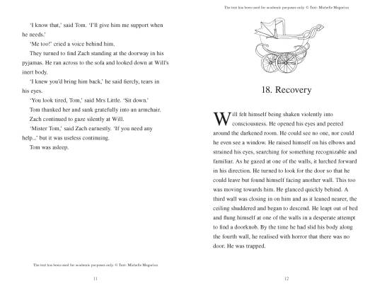
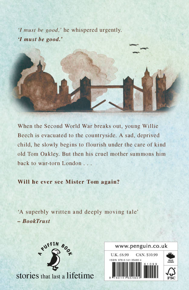
Goodnight Mister Tom Example Book Final Outcome
Concepts Of Visual Language - Year 2 - Unit 3
(21 May 2020)
This example book shows most of my separate deliverables together in one. It includes the front & back cover of the book, the chapter illustrations as well as the full-page illustration in-situ.
1 note
·
View note
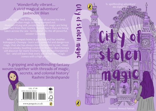
Photo
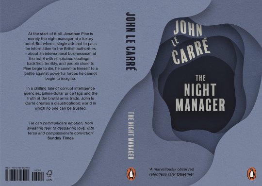
Final Penguin Book Cover
This is the final version of my book cover of The Night Manager by John Le Carre. In this version, I have changed the typeface of the blurb and promotional quotes, adding hierarchy by using italics and bold variations. I have reduced the line length and shifted the barcodes to the left, to make room for more layered shapes. I added another layer to the top of the back to add more depth and interest. I also added subtle inner shading to ‘The Night Manager’ to stay consistent with the shading on ‘John Le Carre’.
1 note
·
View note
Text
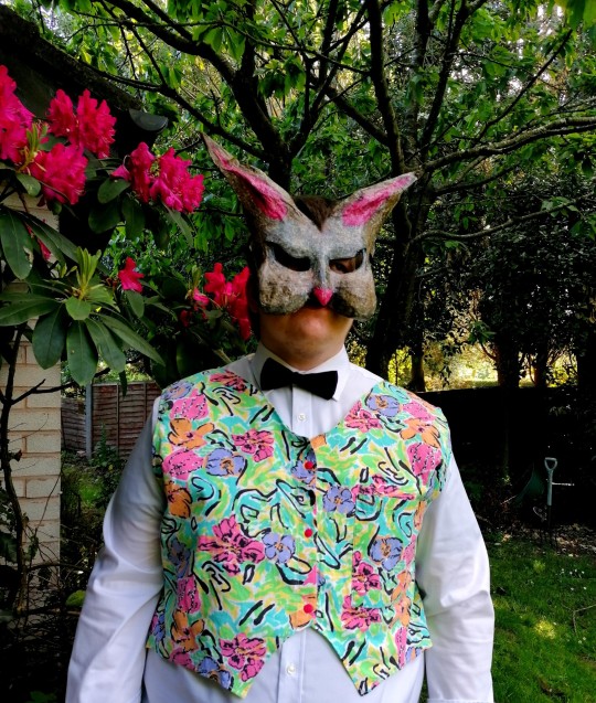
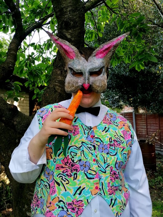
Final Outcome
The final outcome that I had made for this project was a Pop Art themed waistcoat for the character Rabbit from The Wind in the Willows, this piece was part of a full costume which I had created using only second hand or borrowed clothing and materials. When I had completed my Rabbit costume and mask, I decided to have a photoshoot with my model. I paired the waistcoat with a black bow tie, a white long sleeved shirt, black trousers, black shoes, my handmade Rabbit mask and a Pop Art style carrot prop which was made out of felt. I chose to use a garden for the backdrop for these photographs as The Wind in the Willows is set in a woodland area in the countryside. I found some pink flowers in the garden that matched the waistcoat and mask, this added a very nice background to the photos. I am very happy with my final outcome, I think that the waistcoat represents the Pop Art style really well, this project has helped me to understand the key features of a character and how important it is to look at the facial expressons and body shapes of a person/animal so that you can use them within a costume to add a personality and more of a realistic appearance to the character.
0 notes
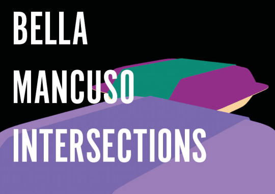
Text
Intersections


1 note
·
View note
Text
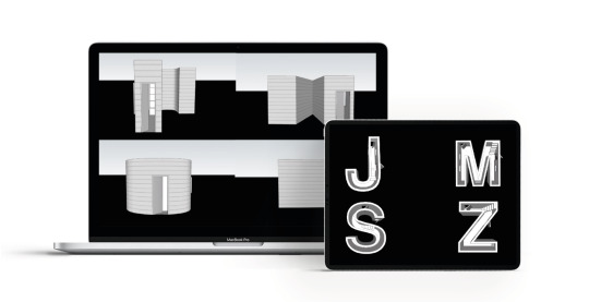
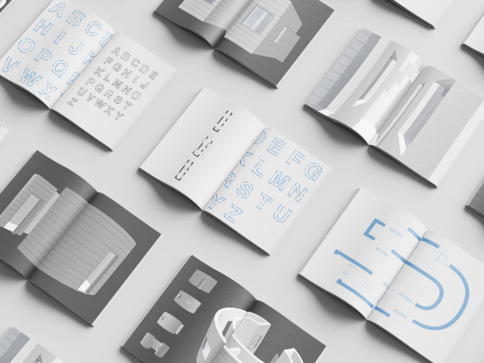
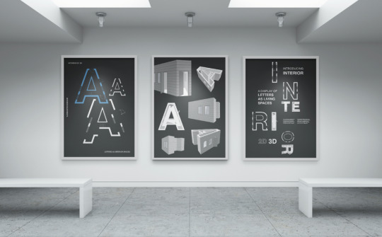
FMP EVALUATION
Am I happy with the outcome?
I was really pleased with the final outcome of completing a 2D and 3D Letterforms to express the correlation between Visual Communication and Interior Architecture through the idea of how we use space. It ended up to be my favourite project I had worked on and I felt really happy with what I was able to achieve, especially in the circumstances we were under as well as pushing myself to create a 3D typeface on SketchUp, a programme I had never used before and felt this was an achievement in itself.
The journey of the investigation was continuously fascinating for me as I have always had an interest in Interior Design and Architecture so to be able to have combined these practices with my own helped to keep my interest ongoing throughout the whole project.
What went well in the project?
I feel I managed to convey the correlation between my practice and Interior Architecture through an insightful investigation by presenting the evolution of letters as interior spaces, where the idea was pushed from research insights as well as my mini experiments that helped get to the final idea of what I felt was most relevant and presented to the audience the main idea.
I was pleased with how I showcased the letterforms through a type specimen booklet alongside, 3 posters and a short animation to present to the audience the journey and progression of the 2D to 3D letterforms of how space is used across practices in different ways but also in similar ways.
I felt my type specimen booklet was produced well and conveyed the journey in a clean and systematic way keeping the viewer engaged with what had been produced. I was also pleased with the posters and the animation that worked alongside to further showcase the letterforms I had produced.
What could be improved?
One part that stood out to me, that if I had time to further continue this project was to carry on using Cinema4D for the animation instead of SketchUp, due to the control and sensitivity I could have on it. Due to the time restraints I had I had to make the decision to swap from Cinema4D to SketchUp to animate as learning another whole new programme sadly was taking more time than I had to complete everything and therefore made the decision to swap.
However although I knew Cinema4D might have produced a more clean and realistic animation with good lighting I was still really pleased that I managed to do an animation at all and on SketchUp as this was still a challenge I managed to push through and showcased the letterforms in a different but still successful video.
Overall my FMP was stimulating and really pushed me which helped me to produce outcomes that I was pleased with as well as trying something new.
0 notes
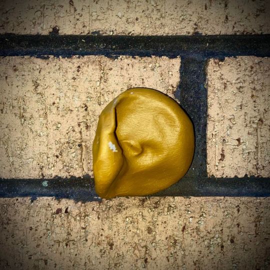
Photo
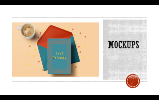
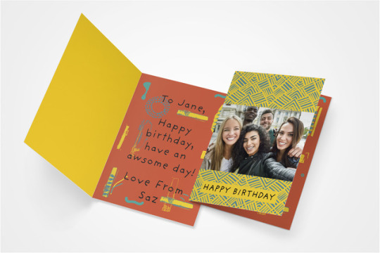
#negotiated study#graphic design#graphics#photography#type#font#design#sarinakaurbcu#mockup#colour#pallet#finaloutcomes#outcome#moonpig#brief#printing#prints#artwork#bestfriends#giftcard#card#african#style
1 note
·
View note
Text
Evaluation
I was interested in my chosen flipside words which was ‘Peace and Conflict’ because immediately I thought of WW1 and WW2. Throughout the years of being an artist I have thought about doing a project based on a massive conflict such as WW1/2. However, I never had the confidence to step out of my comfort zone to actually try and something unique.
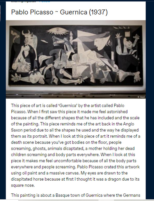
The three pieces of artist research that has had an impact on my ideas/artwork was Pablo Picasso, Angie Lewin and Karl Schmidt. Pablo Picasso had a big impact on my work because of his piece of artwork called ‘Guernica’. His artwork ‘Guernica’ made me realise that I wanted my piece to be based on a massive tragedy and have meaning behind it.
Angie Lewin has been my favourite printer for years. She inspires me because she creates these amazing lino prints using sceneries all around her. I decided that I would use my own photographs of nature and sceneries to base my work on. She had a huge impacted not just on my FMP but me as an artist because her work was the reason for me to start printmaking. I enjoy all types of print making but my favourite has to be lino and that is because of Angie Lewin beautiful lino prints.
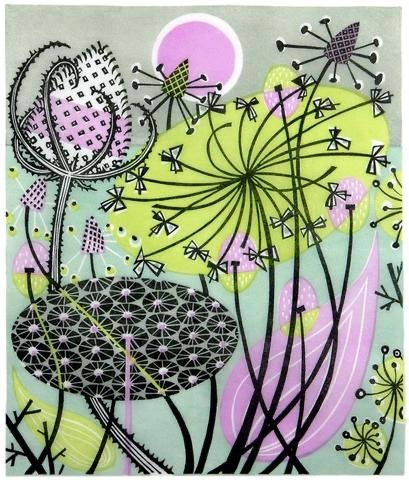
Karl Schmidt has had a impact on my work because again he is a printmaker. Furthermore, he uses geometrical shapes and lines to create this more bolder print and I love including shapes and lines in my artwork. So when I was introduced to this artist I know that I want to include his ideas of the lines and shapes into my FMP.
I did wider world research on the Bayeux Tapestry in Normandy, France. I watched part of a documentary on YouTube about the Bayeux Tapestry and learnt that it was all handstitched with wool. The Bayeux tapestry links in with my flipside theme because its all about a massive conflict. Furthermore, It links in with my thoughts on WW1/2 as that was a massive conflict in the past as well. But it links with my project work as I wanted to create a tapestry with all my prints and hand stitch my work.
The concept behind my work was that I wanted it to be about WW1/2 and the effects of conflict. However, in my work I included peace as I wanted to represent the innocent people that died and suffered during WW1/2. I wanted my work to have meaning and be unique. My main idea was I wanted to create a textile piece of work were I sewed back into my work using hand stitching or even embroidery.
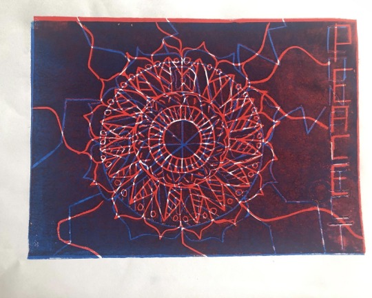
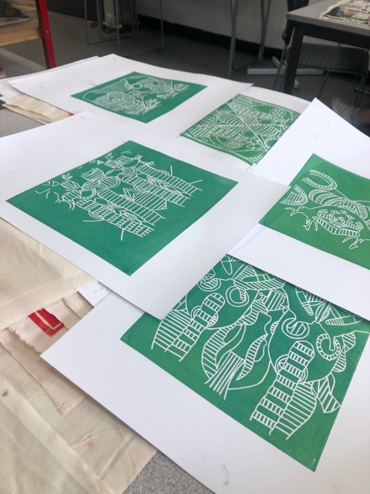
One of the experiments that I did during my FMP for the first time was woodcut printing. The materials I used were fine liners, wooden board, ruler, paper, carbon paper, lino cutting tool, wooden cutting board, newspaper, ink roller, printing press, inking up board, black ink and paper. The techniques I used was wood craving, printing and sketching. I have learnt how to cut out a woodcut print, how to print my wood block design and overall how to create woodblock prints.
Firstly, I started out by drawing out three different designs for my wooden board using fine liners, paper and a ruler. I decided on my mandala design as I thought it was a challenging piece to do. Once I finalised my design using carbon paper I drew out my design onto my wooden board. After I had drawn it all out using my lino cutting tool I carefully cut out my design making sure I cut deep enough so when I printed my design you could see the design. Next, grabbed my inking up board and newspaper and laid them side by side. Placing my wood block design on to the newspaper. I squeezed some black ink onto my inking up board and rolled it out using my ink roller until it was even. I rolled the black ink evenly onto my wood block design. Then I took my design and a piece of paper over to the printing press. I placed my design down first then placed the paper on top. Printed my work I repeated these steps about five times until I was satisfied with all my outcomes.
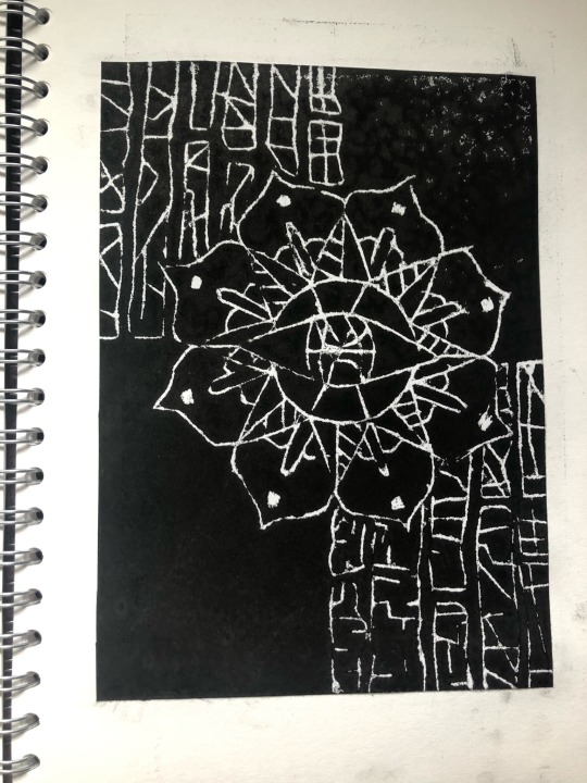
One piece of art work from this project that I feel was the most valuable to my learning was my mandala drawings. The reason I believe this is because its opened another side of my artistic talents I didn’t know I had. I have always been interested in mandalas but I never actually artistically thought that I could create artwork from mandalas. I think the drawings were most successful pieces of artwork because I believed that my mandala gifs looked beautiful epically because I digital edited them. Overall, starting my FMP on mandalas had a massive impact because all I wanted to draw was my mandalas and experiment with them. Its helped build my confidence up a an artist as its helped me to experiment with new topics and ideas.
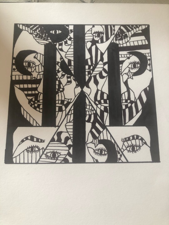
In the beginning on my FMP, I had no idea what my final outcome was going to turn out like. My initial ideas was to use the technique sewing and embroidery into my work. I wanted my work to have both peace and conflict but I had no idea what it was going to be about. When we were introduced at the beginning of our FMP we were give the topic mandalas and I wanted to maybe have a series of posters of mandalas for my final outcome. However, when I had my formative assessment Derek and me discussed about an idea I wanted to include in my work which was WW1. Derek had a gas mask and lent it to me to experiment with. We both discussed about my ‘Flipside mirror faces’ I did during lockdown and thought I could incorporate that into my work. This was the beginning of my final outcome.
I have learnt that your initial ideas don’t always go to plan. In the beginning I didn’t really have an idea at all, I know I wanted to maybe do a series of posters. I have learnt that doing loads of experiments and workshop can help unlock so many ideas. I mean after all the workshops we had do I just focused on the ones I most enjoyed and went from there.
I am so pleased with my final outcome I think it looks extraordinary, I can’t actually believe I manged to handstitched 20 prints and then sew them all together. It turned out better than what I expected because I thought it would be too plain but I love how it looks. The embroidery stitching helps it to stand out from the crowd and it looks so unique and incredible. I am so proud of myself for hand stitching all of my outcomes.
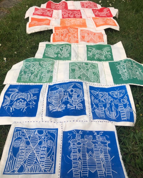
My plan to display my work at the end of year show it to use a painted white background and pin it to the wall. At first I thought about making it into a hanging piece but I realised it would just fold in on itself so I would have to pin it up.
If I could display my work anywhere in the world it would have to be the National WW1 Museum and Memorial in Kansas City, Missouri, United States. I would want to display my artwork here because I feel like I would be almost given back to the innocent people that died during WW1. As well I want my work to be seen by all the people interested in WW1 just like myself so it could inspire other people to create artwork about this historical event.
The 10 words I believe that describe my final piece is:
· Unique
· Extraordinary
· Ambitious
· Glowing
· Bright
· Eye-catching
· Fascinating
· Vibrant
· Appealing
· Astonishing
If I needed a soundtrack or music to go with my outcome it would be ‘Afterglow’ by Ed Sheeran. I would pick this sound track as my work is representing all those innocent lives that was lost during WW1 and its quite a depressing yet happy song. This song sort of makes me think of like all those innocent lives now at peace with the world. I love this song and I feel like it would compliment my work really well.
I spent probably around everyday trying to complete my final outcome. I would go into college, work the entire day then go some and once I had my dinner carry on sewing. Sometimes when my hands were tired I would spend time doing other work such as updating my blog or sorting/planning my week.
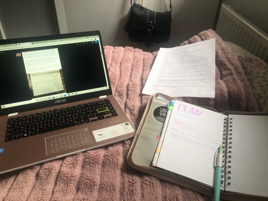
At home I work mainly in my bedroom by sitting on my bed or at my desk. Every now and then though if everyone was out I would sit in the living room or up at the dining room table.
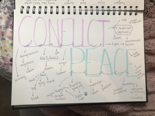
Flipside Theme
Beginning
Expressive
Lifeless
Research
Fascinating
Electrifying
Exploring
Development
Advancing
Eye-catching
Vibrant
Final outcome
Extraordinary
Exquisite
Striking
At the beginning of my FMP I never knew how to produce a woodcut print which is one creative skill I had not done yet. However, one of the workshop we did was a woodblock print and I learnt how to execute and create some. I would like to create some more woodcut prints in the future.
My initial ideas were that I wanted to create a series of posters with embroidery and hand stitching. They have developed from this idea by all of the research and workshops I have done since we have been back from lockdown. As well I started to think about what materials I have access to now that we are back on site and that I don’t have such a small material range. My initial ideas has evolved from the series of posters because I started to experiment with lino printing as that’s one of my skills. Then realised that I don’t want to do posters I really want to create something nobody has ever seen before. I think my ideas really evolved is when Derek formative assessed me and spoke about ‘Guernica’ by Pablo Picasso. I wanted to do something similar to ‘Guernica’ and I wanted it to have meaning.
As I wanted my work to be about peace and conflict but have meaning I decided to add innocent things like flowers and butterflies to my gas mask to represent the innocent people that died. However, the gas mask to show the fallen soldiers that died in WW1 to save our country.
#evaluation#finaloutcome#handsewing#embroidery#linoprints#linocutouts#angie lewin#karl schmidt-rottluff#Guernica#Pablo Picasso#bayeux tapestry#widerworldresearch#Artist Research#artwork#FMP#Conflict#peace
0 notes
Photo

I have started making my final outcome, as a 3D piece. I am making a flared dress with the colour palette of black and burgundy since my chosen word for this project is “darkness”. So far, I have cut out all of the black pattern pieces for the front and back of the dress and the collar. #finaloutcome #3dpiece #flareddress #black #burgundy #darkness #patternpieces #front #back #collar #finalpiece #practical #garment #dressmaking #uob_masquerade #whoami #fashiondesign #fashion (at Harrow, United Kingdom) https://www.instagram.com/p/CHtb9X6HxFc/?igshid=ugkk4ewvrmlc
#finaloutcome#3dpiece#flareddress#black#burgundy#darkness#patternpieces#front#back#collar#finalpiece#practical#garment#dressmaking#uob_masquerade#whoami#fashiondesign#fashion
0 notes
Last Seen Blogs
kenna-fires
🥀KeNNa🥀
alienqueerxx
parásito alienígena🤡

girlstodiefor
Heart Stoppers
7kkkkkkkkkkkk
your lucky bitch