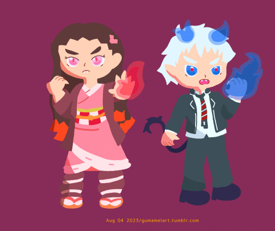
#finally know how to add gradient text yay!
Text
So light em up up light em up up light em up up I'm on fire
Fall Out Boy
#demon siblings with pyrokinesis#kny#kimetsu no yaiba#demon slayer#nezuko kamado#aoex#ao no exorcist#blue exorcist#rin okumura#gumamelart#finally know how to add gradient text yay!
21 notes
·
View notes
Note
hey!!! i hope its not too much to ask, but i was wondering how you did the text effect in the first gif of your mandalorian edit? it turned out so lovely !!!!!
hey it’s no problem at all!!!! thank you and i’m always open to sharing how i make my stuff 💖
basically i use after effects to animate the text! i make and color the gif as usual on photoshop. then, i create a new composition with the same dimension as my gif, then drag the gif into it. for the text, i followed this tutorial beginning from around the 3 minute mark.
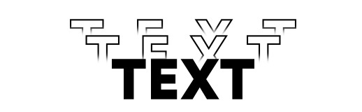
here is the final result
a summary under the cut
keep in mind i’m just showing you what i did! if you want a more in depth explanation about AE, there are many great tutorials all over youtube including the one i linked above!
basically you duplicate your main text and nudge it to your preferred position.
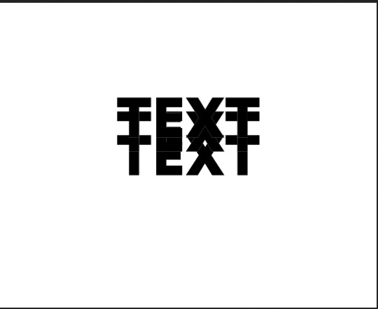
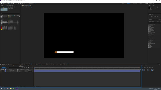
press ‘q’ or select the shape tool (while having the text layer selected) to create a mask over the part of the text you want to show. the overlapping part will disappear. set the feather to 9 for the gradient effect. here’s some screenshot to help visualize it better
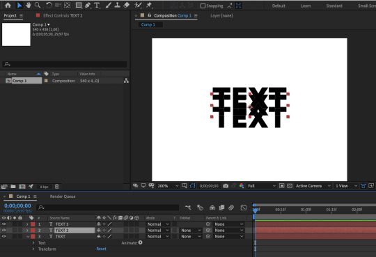
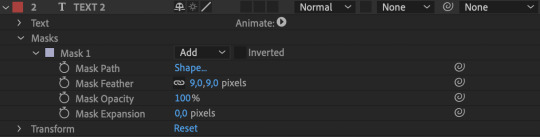
don’t forget to set the character style to no fill and a 1 pt stroke. here’s the final result

next we want to animate it so the text pops from underneath the main text. select the text you want to animate, go to the 1s mark (or any time at all you want the text to pop), press p, click on the clock icon besides to create a keyframe. then go back to around 10-20 frames before, and move the text until it’s covered by the main text. this will automatically create a new keyframe :)
for the spread out effect, click the little arrow besides animate -> select tracking. move the time indicator to your last position keyframe, then click on the clock icon next to ‘tracking amount’. move the time indicator a couple frames forward, and change the amount to 25, or whatever spacing you need.
this is how my keyframes look
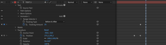
basically i repeated the same steps for the rest of the text! adjust the tracking amount at the topmost text so it spread out more.
yay! to animate the text going back, basically sellect all the key frames, copy them (ctrl +c) move the time indicator to around thee end of your gif (anytime you want the text to move back), paste the key frames (ctrl v), then right click -> keyframe assistant -> time reverse keyframe. move the position keyframes to the right, after the final tracking key frame (because we want the text to contract before moving anywhere).
we want smooth animation! so select all the keyframes, then press f9 (or right click -> easy ease).
now that all your keyframes are in order, you can adjust the timing to your heart’s desire! just drag the keyframes around and see what looks good :) to see the keyframes easier, select the text layer, and press u on your keyboard. here is how mine look:

since the text is above a gif, i select all the text, go to layers -> blending mode -> exclusion. i change the font color to white so it has a nice black and white exclusion color.
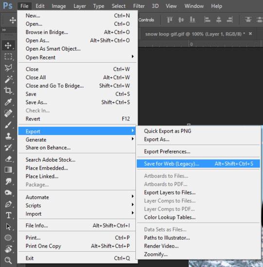
now to export the gif! you have to use adobe media encoder (as far as i know anyways), so go to file -> export -> add to adobe media encoder queue. it’ll open the app, where you can select the file type ‘animated gif’.
and that’s it! i hope this makes sense anon hkjfhakfhak if not, i’m sorry and i’m open to questions if you wanna know more :”) i don’t know how familiar you are with AE and it might be confusing if you don’t know about AE at all. i’m no pro and am also relatively new to AE to be honest 🙂, but there are lots of tutorials online that are so fun to learn and incorporate into your gif creations 💖
#ask#graphic tutorials#the mandalorian#my gifs#HKDJAHKFAJ THE AUDACITY of me trying to make a tutorial when i still google howto create shapes in AE --#🤡#professional video/graphic editor i am so sorry#also if you don't have AE. p*rate them hkfdjhakfjas#i'm open to sharing my pirating resources 😌
52 notes
·
View notes
Note
have you ever done a header tutorial? i've seen a few of yours around the phandom and they're really nice, if you haven't would you be willing to?
hey there, dear! i have not made a header tutorial but i’d be more than happy to for you! since all of my headers are vastly different, there is no real ‘specific’ way i make headers since i do so many different things for all of them!
in this tutorial, i’ll show you how to make this:

*warning* this will be very image heavy and probably very long winded, since i am a very long winded human! sorry if that’s not your cup of tea !!!
step 1:
open up your photoshop and go to file, new and put in these settings:

step 2:
excellent! you have your header canvas ready to go! i decided i wanted something real fuckin bright, so i decided to add a neon gradient. to add a gradient of your two chosen colours, make your brush and eraser colours the two shades you want to make a gradient from! if you’re confused, change these two boxes to whatever you’d like:

now go to your gradient tool and drag it across whichever way you like best to create your gradient!
step 3:
cool! we have our background shade! now we’re gonna add our little bottom bit of our header to make it seamlessly blend with our blog colour! you know what time talking about, the rip effect!
only……i’m not doing a rip effect for this header. if you ever want me to do a tut on that, just let me know! it’s real easy though!………literally, it’s just downloading a brush and using it hjesdxvhfdbj
i’m going to add a diagonal line across the bottom of my header. to do this, grab your polygonal lasso tool and draw where you want your bottom bit to be like shown:

now im going to colour that section in with white! you can colour it whatever colour the background of your blog is though! (also, remember to make a new layer for this bit, so that your bottom is on a whole new layer!)
to deselect your marching ants (the moving dotti bois), simply press command + d (or ctrl + d for windows!)
you should now have this:

step 4:
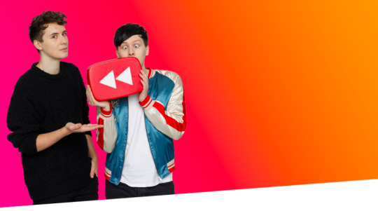
right!! now i like to add whoever i’m adding to the header. in this case, im adding a pic of dnp. place your pic wherever you’d like it to be on the header and cut it out however you like! after you’ve done this, your header should look like this:
i want to colour dnp and make them match the header a lot more, so i’ll turn their layer into a smart object and press edit contents. i colour them there and then press save, which automatically changes them on the header. you dont have to colour them but if you’re familiar with ps and would like to, go for it! i won’t detail this part though because it’s crazy long and honestly unnecessary to add to this tut!
step 5:
alrighty so!! here’s where my header’s at right now:

next, we’re gonna add a basic texture to the background of our header to give it a wee bit of depth! i added three and changed their opacity and filter layers to what i like best, so change yours to your own liking

okay so here’s my header currently! (also excuse how ugly everthing looks, tumblr eats quality for breakfast smh i swear it actually looks decent)
step 6:
okay, so now i’m gonna add a shadow behind dnp for more depth! basically i just duplicate the layer with dan and phil by pressing command + j (or ctrl + j for windows uwu) and selecting the entire layer with the quick selection tool, which selects dnp in their entirety. grab your brush tool and colour the selection black, like so:

drag that layer down and out a bit to the right and change the opacity to 24%. however, shadows are all dependent on your image, so do what looks best to you! here’s what my header looks like now:

step 7:
okay, now i’m gonna add a white outline of dnp!!
once again, duplicate your original dnp layer. now go to layer styles and press styles. there should be a style that looks like a thin black line, like so:

select that and go to stroke, changing the colour from black to white. i also changed the thickness to 2px but you can keep it at one or change it to however you like it! i placed this layer over my original dnp image and moved it to where i liked it. my header now looks like this:

step 8:
text time! write your url out in all caps using the font ‘DIN condensed’. place it wherever you would like on the header. i chose here:

step 9:
now!! duplicate that text layer and go to layer styles. remember our good friend ‘line style’? she’s about to become our best friend! press that style and chnage the stroke colour to white. move the text to the left and you should have this:
yay!! now we’re going to duplicate the line style text we just made. go to layer styles and change the stroke colour again. for this header, i changed it to pink but change it to whatever matches your header best! move that text even more to the left aaaaaaand this should be your result:

okay!! last line text style! duplicate the pink text and make the stroke colour black. move it over to the left. i thought the black was a bit too intense, so i chnaged to opacity of the text to 86%. this should be your final result:

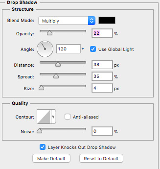
last bit of editing for your text! go to your original url text, the one that’s at the front and bold. go to layer styles, inner shadow and drop shadow and add these settings in:

your text should look like this now:

aaaaaaaaand that’s it!! you’ve made your very own header!! well done, you should be proud of yourself!!
this header is kind of different to my other stuff, so if there’s a header you’ve seen me make that you’d like to know how to make, just let me know and i’ll see what i can do about making a tutorial on it!
i hope i wasn’t too long winded and i hope this is helpful to someone!
if you have any other things you’d like me to make a tutorial on or if you’d like an in depth tutorial on something specific, just let me know!
#hopefully this was helpful and not confusing as fuck!!#yeahps#completeresources#photoshopshit#itsphotoshop#header tutorial#my edit#my tutorials#photoshop#graphic
377 notes
·
View notes
Note
hi! i was wondering how you make gifs. (not the "normal" subtitle ones, but the fancier ones, if that makes sense) you make such pretty ones, i love them so much! ♡♡ :)
hi!! thank you so much for asking! sorry this took so long for me to get to omg school has been absolutely tedious and i haven’t had time to make any new edits until now! since i was making a new header for my festive theme, i thought that i might as well answer this ask while i’m at it.
first off, the program i use is photoshop cc. highkey acquired it for free so if anyone ever wants help with that just dm me cuz it’s actually very easy to get
for this i’m just going to assume that you already know the basics of photoshop and giffing by how you phrased the question so i’m just going to jump straight into the step of putting the edit together and skip the removing background and stuff. (if any of you want a tutorial on the basics i’d be more than happy to put one together! just send me an ask!)

so this is how my photoshop is set up with the photo that i’ll be using for my header with the background removed and the colouring set.
usually i start with an extremely rough idea of what i want to do. like here i’m thinking of adding some snow, having a white bottom that would blend in with my mobile theme, and perhaps a blue gradient-ish background with some snowy pine trees blended in. since it’s a header i also need to find a good font to put my url in. i’m not going to do any fancy text animations though because those require editing in after effects and i’m kinda shit at after effects oops.
sidenote: my favourite site to find fonts on is dafont.com! the one i’m using in this tutorial is called seventeen! also because i can’t download the fonts directly, i screenshot the previews and a handy trick that i learned from this to easily remove a background of something with a solid white/black background is by changing the blending mode of the layer.
the options in the pink box are used for removing white backgrounds and the options in the blue box are used for removing black backgrounds.
(this will also be used later when adding the snow)
anyways, making the background is done with basic photoshop skills of moving and resizing stuff so i’m just gonna skip ahead to the animated snow part because that’s a new concept for people who haven’t made gif edits before.
(white border thing was created with one of these brushes)
wooo look at that! time for snow!
i already have a snow gif texture downloaded on my computer but i’ll show you how to find one!
first go to google images and search up “snow texture”. then use the handy dandy search tool option and select image type “animated” and colour “black”

scroll through some of the images and find one that you like!
then save the image to your computer and open it in photoshop.
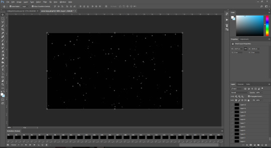
ew the one i have is 120 frames long :/
usually the sparkle textures that i have are around 29 frames long so this is going to be annoying :/
highlight all the frames in the animation panel (select frame 1 and then shift + click the last frame) and press the three line thingy at the top right of the panel. select copy frames.

then go back to the edit and create the number of frames needed to cover the entire snow animation (*cries in 120 clicks*)

there’s probably a faster way to do it but idk it so if any of you do know, please hit me up!!
anyways, after those painstaking clicks, select all of those frames and click on the three lines thingy and select paste frames
now this menu pops up:

select “paste over selection” and press ok
now it looks like this

MAKE SURE TO HAVE THE FRAMES ALL SELECTED STARTING FROM FRAME 1 TO THE LAST FRAME WHEN YOU DO THESE STEPS OR ELSE PHOTOSHOP WILL BE STUPID AND MESS UP YOUR EDIT BY APPLYING YOUR CHANGES TO SOME FRAMES BUT NOT ALL AND WE DON’T WANT THAT TO HAPPEN
select all of the snow layers and group them using the folder button in the bottom of the layer panel
then resize the snow layers to fit the area of the edit.
now we change the blending mode to remove the black background of the snow!
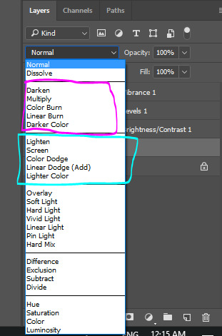
select the group that you put all of the snow layers in and change the blending mode to any of the options in the lighten section
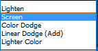
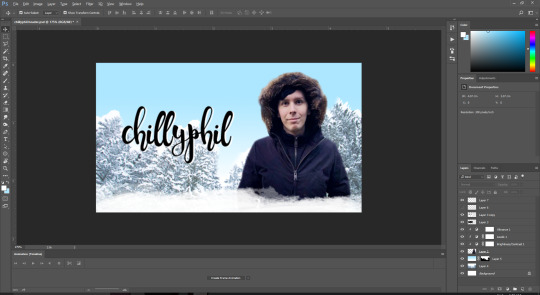
i personally like using screen for most things but i ended up using linear dodge (add) for this one because the background of my edit is very light in colour and the snow doesn’t show up that well if i use screen.

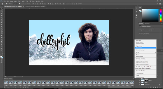
now we don’t want snow covering phil’s face so go and move the snow group layer below the layer of the pic used:
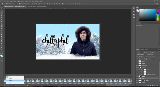
yay! now remember to select “forever” as the frame loop option and let’s export!
these are the export settings i use for basically all of my gifs:
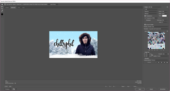
save it and there you go! you have your very own snazzy gif edit!

~ the finished product that i’ll be using as a header when i finally change over to my festive theme tomorrow ~
i really hope this helped! feel free to dm me or send me an ask if you have any more questions! :)
#gosh that took me an hour and a half to make lmao#tutorial#photoshop#perhaps i'll have a tutorial tag now#yuletidegays#jessica answers stuff#crap the screenshots of my full screen are wayyyyy too small sorry about that! i forgot about tumblr's dumb 500px width rule#resources
54 notes
·
View notes
Text
10 Minute Lesson Project: Video Process
01.02.19
I am here, and I have finally finished my video for this teaching project. It took around 14 hours if I had to estimate (not in one sitting, over two weeks). It’s interesting that it took so long to create a three minute and thirty second video—which reminds me of Wallace and Gromit and how long that took to create just one single frame. I think that the final piece is decent. It’s not like I’m extremely pleased with it, but overall I do like it and I am proud of what I’ve created. I think that it is good for what it is and does its job well; to teach a young class about a chosen subject while also still being fun. At the time of writing, I have not yet imported sound, nor have I created the work sheet that I will be handing out after the video has finished playing, but I will add the sound later, and I will probably detail that later on in this post when I have (if not it will be in a separate post). The work sheet process will most likely be a separate post.
Now I must write about my process of the entire thing. Now, I’m not about to bore everyone and use 50 screenshots detailing every single thing that I did throughout, but I have some of the most important ones, which I will be talking about briefly. So firstly, how it all started. I made black solid layer and immediately got to animating the words to come onto the screen. I’d had the idea to have each word separately fly onto the screen to form a sentence for a while, and now was time to put that idea in to motion. This wasn’t so hard to do, but it definitely took the longest time to make out of everything that is in the video. It was very tedious to be honest, there was a lot of duplicating and fiddling with layers etc. The final animation of these parts honestly doesn’t look great, since some of the words follow each other a bit slowly, but I couldn’t do anything about that as that would interrupt everything that came after it.
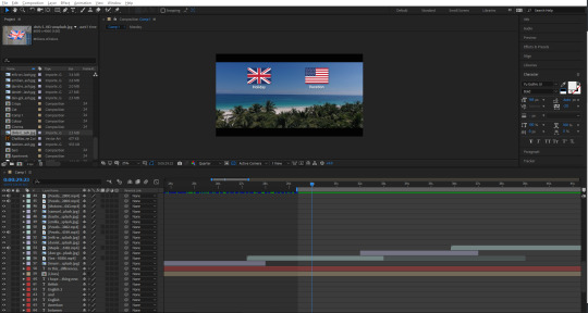
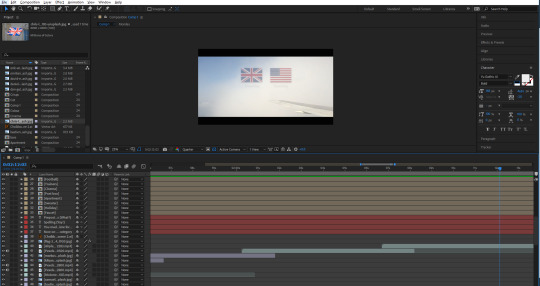
Once I’d done this part, and added all the easy ease to make it look more fluid, I decided to use a technique that I had recently learned from Irene, which involves using trim paths to create some confetti-like things that look like they’re flying around the place. Here’s a link to my experience with this technique. I made the colours correspond to the flags of the UK and USA, which conveniently have the same colours (albeit with different shades).

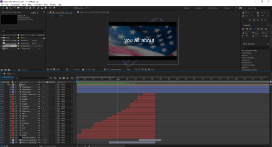
The screenshot below shows a dark screen with a flag in the background. This was the first image to appear after the black screen, which I made fade out using opacity keyframes. I chose to start with USA for no particular reason, and then move onto the Union Jack shortly after. A lot of the early parts of this video are drawn out maybe a little longer than they should be due to me being stressed over the fact that I needed to get the video to four minutes. I was taught by another tutor how to make the flag wave a bit using some technique called turbulent displace, which I couldn’t tell you how to do now, but it definitely adds to the video, instead of having static footage. In fact, I originally had planned to have footage for every single different segment of the video, but I was quickly shot down as soon as I visited various different stock footage websites, and found that there was a lot of bad footage. That or it was incredibly expensive. I quickly abandoned the idea of trying to find footage for flags, though luckily, I was much more fortunate in my search for other footage of the later sections.
I wrote out some messages that would appear on screen while the flags would be in the background, like “I hope that you enjoy, and learn something new.” and the screenshot below. I had them last for a while to draw out the video, but I also knew that drawing something out for so long would not be entertaining for an audience, so I didn’t go overboard, hopefully. Not much else to say about this screenshot.
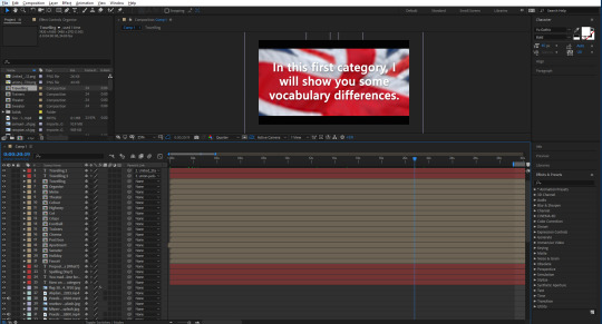
Now I will briefly talk about some of the footage and images that I used for the video. This first part of the video was going to be about the vocabulary, by the way. The first image that I used was one of a faucet, or tap. I got all of my images from Unsplash, and footage was from Pexels. I simply placed the image and then had it move slightly throughout its duration of being there, so that it wouldn’t look too boring. Next, I made the flags that I would be using to differentiate each word. There was a lot of duplicating and then removing things etc. I wrote a word out, and then parented that word to the image of the flag, so that they would move at the same time, but I could simply edit the word to whatever I wanted to without everything messing up. I tried to get each flag and word to move on the screen in a unique way, though I ended up running out of ideas later on, so some of them copy the earlier ones, but I don’t think you would really think that unless I pointed it out. Like right now. I chose to screenshot this scene, as I really like the footage that I chose for it—it may be my favourite footage. Not much else to say, though there were some more creative ones that I did after this one, like with the cinema, I made the words appear on the big screen. The footage for the apartment scene was also nice, it almost looks like I went out and filmed it myself.
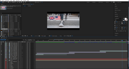
Another scene I liked was this one below, of a girl walking on the street, wearing trainers/sneakers. The way that it is zoomed in looks really good, as well as the flags that fall onto the screen, and then fall off at the end. I think that the contrast between the real life footage with the little icons I made in Illustrator is probably best showcased here, in my opinion. After this was a football/soccer scene, where I ran into a little mishap—there was this short black screen that appeared for half a second, which I was able to avoid by duplicating the footage and moving part of it just before the glitch, which covered it up nicely. That’s pretty much it for this screenshot.
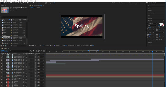
The next part of the video was going to be about spelling, which may be my favourite aesthetically pleasing segment that I made throughout the video. I really like the specific image of the flag, along with the white text over the top of it. I tried to keep it lighthearted, and added a little “(yay!)” under the big word “Spelling”. Some people may catch it. I’ve noticed that throughout the video, the font seems to switch up a lot. I always used the same font, yet it still looked different.
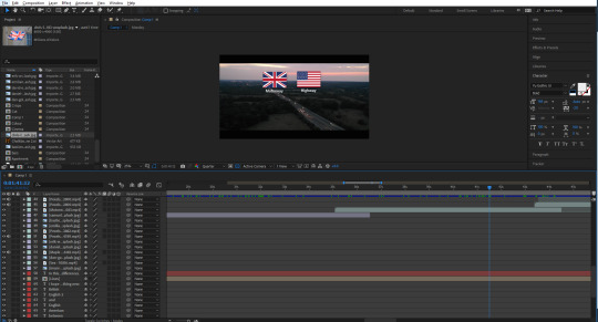
The first part of this category would start with the motorway/highway, which again, very aesthetically pleasing to me. I think that it is pretty perfect footage for this particular part. After this was one about colour/color, which also had the same error that the football/soccer scene had. I was able to cover it using the same technique. After this, theater/theatre, meter/metre, which I think I chose a pretty nice image for from Unsplash, and then organize/organise, which again had some really cool footage to accompany it, and it also looks like I could have filmed it.
Next is undeniably my favourite scene from the whole video. It was of a plane that was just barely in the shot, while there were clouds blowing across the screen. I used this to my advantage and decided to try something new with the animated flags and words. This time, I lowered the opacity of both flags once the cloud went over it. Also, the way they appear on the screen also looks really good (albeit unintentional) as they look as if they’re blowing onto the screen following a cloud that seems to have blown them along with it. The whiter the screen got, the more I lowered the opacity of the flags—even going down to 15% when a big cloud essentially covered the screen. I think that this ended up looking really good, and honestly like it could be a separate thing of its own. I’m hoping my audience will be able to catch the words, with them being covered by the clouds as well. It doesn’t help that the words in this case are incredibly similar; traveled/travelled.
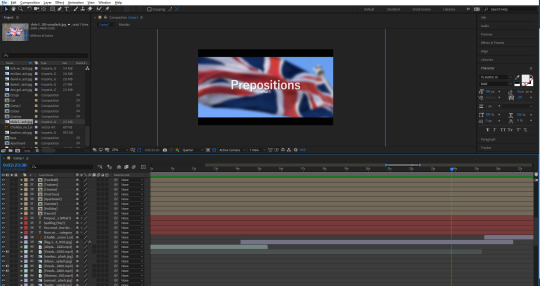
After this was the segment that introduced prepositions into the video. I didn’t exactly know what those were, so I thought I would add a little “(what?)” under the word, just a little lighthearted addition, as I assumed that not everybody would know the word either. Also, before this, I typed: “You made it! Now it’s time for...”. In retrospect, this may seem like I’m being patronizing, but at the end of the day, this was created with the intention of appealing to younger people.
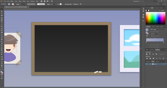
Next, I thought about how I wanted these prepositions to be for awhile, until coming up with the idea of having a chalkboard as a way of teaching. I had no idea what stock footage of image that I would use, so I thought to just make my own thing this time. I took to Illustrator and started working on a little scene that would have a chalkboard in. The chalkboard itself was easy to create. I just made a square and gave it a slight dark grey to darker grey gradient. Just to give it some slight detail. I also did this with the wall in the back, just going from light purple to a more blue purple. I made a border for the chalkboard, and added some chalk sticks using the rounded rectangle tool. I resized them and placed them on the corner of the board. Then next thing I made was the window on the right. This was easy to make, all I did was create a little scene of some hills, and some clouds, then blur them using the gaussian blur to make the whole scene look like it was in the distance. I then made a border around this, and them thick line through the middle to make it look like a window frame.
The last thing that I did for this scene was create a little picture for the wall. I made a white rectangle and then gave it a drop shadow. I made a small rectangle and then made some triangles to cut into the rectangle. I then coloured it the same as the border of the chalkboard, and shrunk it. I then duplicated it and placed it over the paper on the wall—to look like tape. I then made a character out of some shapes and the pen tool. I guess you could call it an Easter egg, since it kind of resembles me.
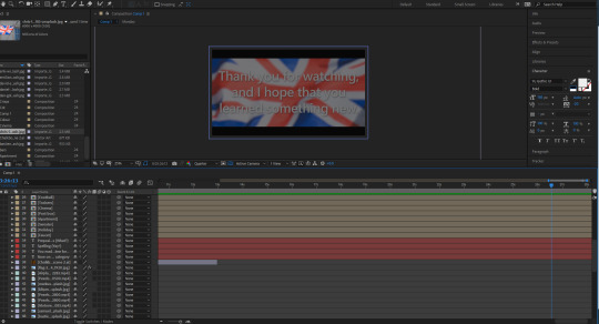
After this graphic, I made the second to last segment—Past vs Present Tense. I got another American flag and placed it into the background. This lead into the final part of the lesson which was just using the graphic that I made of the chalkboard again, and then it came to the final slide, which thanks the audience, and then fades to black, which I did by getting a solid shape layer which I coloured black, and adding a keyframe at the start set to 0%, which moved to 100% at the end.
1 note
·
View note
Text
Let’s get Animating
This was done over the course of 3 days, and I sincerely apologise for the lack of screenshots and progress what-have-yous but this a real ‘sit down and get it done’ kinda moment, and everything else became unimportant.
Character Animating
I’m thanking every star in the universe right now that James made this fully functional rig for me to animate with because oh boy, does it make the whole process so much easier and way less time consuming. He even very nicely created some extra facial expression to work with my guy for me, isn’t friendship beautiful.

So yeah, I plonked him in, set the scale, position and whatever else to get him settled into the comp and got to work.
Leg troubles
Everything was so easy, apart from one leg. I wanted the frog to swing his leg from the knee down, keeping the thigh stationary but sadly, the rig would have none of it. To fix it, James copied the actual shapes of the leg we needed to break, put them into position, and then deleted the rigged leg and all the problems that came with it. Once he did that, it was so unacceptably easy to animate this guy. I genuinely could’ve cried because of how much I had built this up in my head to be a catastrophe and it was done in a day.
Over thinking to its finest, people.
Smoking is bad for you
Why is he smoking a cig? Honestly I don’t know I just had a brain wave when we were storyboarding I didn’t actually think anyone would take me seriously but here we are.
I did all of this on separate comps, just because it seemed like a rational thing to do.
This is how I made this little guy:
created a new comp
made a rectangle
rounded the rectangle corners in the effects tab
set the fill to gradient
played around with the gradient until it looked like a classic cigarette
shortened the orange bit because I realised that his hand will be covering most of it and if I left it normal length it would look horrifically incorrect

And this fun thing:
created another new comp
made a weird upside down tie shape with the pen tool
filled it in white
used ‘wiggle path’ from the animate menu on the actual layer
played around with that until I like the wiggliness of it
used a mask on the top and bottom with some serious feathering to fade it out
Once I finished them, I dragged the cig comp into the main one and scaled/rotated/positioned it to fit with my frog in his hand, and then just used the little lasso tool thing on the timeline to make the arm its parent. Fully animated and I didn’t have to do anything.
Next up I dragged the smoke in, fitted it to the cigarette and then made it the child to that cig, just the same way the cig is to the arm. However, I did have to key the rotation a bit, just so the smoke stayed within the rules of physics and floated upwards.
Premiere Pro saves me again
Can I animate anything without putting it into premiere and editing the timing? Honestly beyond a joke at this point.
vimeo
Here’s a little comparison video for you, and as you can see I fully exported it once only to watch it a few times and decide that the timing still isn’t right so I took it back in. I was a tad worried that speeding up some sections in Premiere would affect the look of the smoke, and that would give me away as someone who can’t time animations correctly during the actual animating process but it surprisingly worked out fine.
Making the Credits
This is where it started to get serious because not only is the typography such a huge thing for this project, but I’m closing the show, shutting the curtains, giving the final goodbye, so it had to look good.
youtube
I had an idea, I wanted the words to actually come out of his mouth instead of form from smoke. Why? Because I didn’t think I could create a smoke effect that I would like or would fit with the style. I found this fun tutorial that was super useful and was exactly what I needed.
youtube
I had an idea, I wanted the words to actually come out of his mouth instead of form from smoke. Why? Because I didn’t think I could create a smoke effect that I would like or would fit with the style. I found this fun tutorial that was super useful and was exactly what I needed.
Basically, I created a path with the pen tool, copy and pasted that path onto the word, positioned it and then keyframes when it would start and stop. To make the words get bigger as they came out of this dudes mouth, I used the scale option under the animate tab on the layer to keyframe the sizing. If I was to do what I would normally and keyframe the scale normally then the path would also be effected and it really wouldn’t of worked. Honestly, it was wayyyyy easier to create the effect I was going for than I thought it would be, so I’m holding back tears of joy.
The rest of the credits were also easy, I just needed to figure out how to create a mask that wouldn’t move with the text which after a swift google, I found out you just need to make a mask out of a solid layer and trkmatt whatever you need to hide to that layer.
Did that make sense?
Well that’s what I did for all my text layers and then I used the position keyframes to make it scroll through the credits. I added the masks to make it a bit more interesting than simply going from the bottom of the screen to the top, it also gives my well a bit more dimension so, yay.
Ignore the words under sound, I came to the soul crushing realisation that I can’t actually finish this until everyone else has finished theirs and added sound so that they can send me their sources and I can put them in. It’s truly quite an anxiety inducing thought but hey, group work.
Conclusion
I’m calling it finished, I mean I need to add my sound and the sources of everyone else’s sound, but the after effects file is set up so that I just have to replace my makeshift credits with the proper ones. Sound won’t be too stressful, i don't think, I just want an inhale, exhale, maybe a ‘hmm’ when he looks down into the well and a splat noise to kind of suggest the outcome of frog numero 2. I plan on getting all that from the usual free sound libraries, so wish me luck.
I really like the outcome though, it went so much better than I had thought it would. Like, I had seriously stressed myself out about not knowing how I was going to pull this off or what it would look like.
14-16/11/18
0 notes
Last Seen Blogs
nightlist
despite everything its still you

originalcin
protect creators
froyo-ocs
Please Read My Desc And Pinned Before Following

olivia-guhr-see-ya
Untitled