#experimenting w some more painterly styles!
Note
hi maya! was looking thru your old art after you linked it in that skirt ask, and just wanted to say how gorgeous that textured, painterly style you used in a few pieces in 2020 is! the warmth and glow is so lovely, and it's cool to see pieces that stay a little looser from you from time to time💖 (also I dont want that to sound negging or w/e because I also genuinely love everything else you draw too!! just expressing some specific appreciation for that style!)
thank you! that was when i when i was getting back into painting for the first time after spending so many years working linelessly. it’s always a struggle for me to keep things loose and painterly but those pieces were a good bridge/experiment, tho my process has changed a LOT since i made them. now instead of going for that really chunky thick pigment look, most of the more loose/painterly aspects of my art come from my digital watercolor underpainting. and i really enjoy doing that!
25 notes
·
View notes
Photo
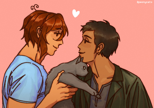
The cat’s wondering why greece picked him up in the first place just to make eyes @ his bf
#hetalia#aph egypt#hws egypt#aph greece#hws greece#egygre#i think i developed a cavity drawing this lies down and sobs#historically inaccurate hair is historically inaccurate#also yes i still cant draw cats :' )#experimenting w some more painterly styles!#hetalia fluff#idk if thats a tag but hell ill use it
216 notes
·
View notes
Text
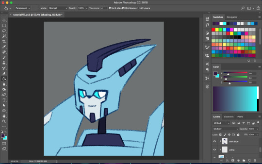
Random art notes, tips, & a WIP
Yo I’m trying a new way of making posts again. I did this once before and kinda liked it bc I can look back at how I’ve grown. Purpose of these types of posts is to say what I learned while doing a piece and include the progress art. Kinda journal style.
For painterly pieces like this one, I’ve lately been starting out w literally no sketch besides a really rough color blob style blocking in with a soft brush. I find that I end up with a more realistic result bc it forces me to not be married to the sketch lines and I can easily adjust proportion and value when it’s just a bunch of blobs. Maybe I can find a middle ground sometime lol.
Continued to flip canvas but less so on this one bc yolo. Probably could have used more value checks but it’s all good. I did flip early to do proportion check.
Have been using photo references to help me nail anatomy and values. However, I look at a ton of references at once for variation and then usually end up making it my own in some way. I did this for Flower Queen wolf piece I just posted over at my art blog @astrikos as well.
Set reference photo to B&W to analyze values bc it’s super easy for me to be distracted by the colors lmao. Switched between a lot, which helped me see color and value together at the same time.
Added a more saturated highlight color this time and tried to make a logical color scheme. Mostly analogous and complementary.
Made use of the liquify tool to make water distortions. Need to look at pond reflections tomorrow so I can alter some of the grass problems I see.
Fur process: soft brush with color block/values included in loose, big shapes. Edge smear with texture brush. Spiky smear for sharper tufts of fur, more on wolf recent and not this piece. Also fur should be semi random but there are defined layers and often these are where there is a joint or bony landmark.
Clipping masks are pretty convenient. I don’t use that many layers though. When I experiment, I usually try a clipping mask first but I merge a lot. Backups I just duplicate groups. I’m very messy w my layers.
Hope this helps! More art at @astrikos ❤️
Custom fur brushes are on my print site, see my pinned post! I’ll link in later. They’re free or pay what you want!
32 notes
·
View notes
Note
Op when did your art get so good?! It was already pretty before but now it feels more uhh professional?? It's still your art style but you made it better somehow? Idk as a summary, it's gorgeous and I love it!!
shshudhsu im blushing omg??? thank you so much for your kind words!! TT//A//TT
I think there's been a huge leap in my art over the past year or so because ive been drawing so much (so much!!!) and trying out so many things in art! in style, in colouring, in additional effects etc.
i also switched over to csp from krita some time this year and have found it very comfortable to work with, and it lets me go wild with whatever im drawing! so it makes me experiment even more with how i make art... :D :D and i've been spending more time on individual pieces, trying to do more detailed works, more painterly styles - i especially enjoy doing fancy outfits!
and i have also been using more and more references when i work ( i used to draw everything from memory bc i was too lazy lol) and have been trying to incorporate more styles from artists i love into my own work
i don't know if you were expecting a serious answer but i think those are the things that mightve cause a noticable change in my art! basically ive been practicing a lot and been very self aware of all the little things that i do when drawing :D
again, thank you!! this ask made me smile so much shsuhshud my heart feels warm that other people can see my progress ! ;w; <3 <3 <3 <3
6 notes
·
View notes
Note
Ibbles, do you have any advice or videos you could share for a beginner digatal artist when it comes to colouring? I know to practice a ton but I need some sorta direction, ya know? Btw I ♡♡♡♡♡♡♡ you're art!!! °°°•▪︎☆°••☆▪︎☆☆°••☆▪︎•°▪︎°
thank you sm! hmmm, i think any advice i could give depends on what direction you want to take you coloring style! you’re right when you say practice cause i think a lot of developing any kind of style is about experimenting and seeing what feels comfortable. what helps me when im trying to figure out a new coloring style or upgrade my main one is looking at artists i admire and trying to mimic parts of their shading, or figure out how they create certain effects.
for my own coloring style i originally started out wanting a mix between cell shade and soft shade and gradually (like over the course of a few years) moved towards a more painterly style just bc i realized i most admired a more rendered look. and im still developing that! but recently ive wanted to have a secondary more simple style closer to cell shading, so ive been trying to examine how artists who mainly cell shade utilize bigger and more basic blocks of shadow. in general if you’re trying to go for a more simplistic style, maybe focus on color picking and really learning how to choose colors that compliment each other, and if you want a more detailed style, focus on depth and how you can incorporate both subtle color shifts between shades, as well as well placed darker colors for depth. i still struggle w/ using dark colors to make light areas pop ^^;
if you specifically want a “tutorial” on how i color, i do have one here...kinda! its specific to shading hair, but the main process is basically how i shade everything else too. im not sure that really helps too much but good luck figuring out your art!!
#ibbletips#when i say simple tho i dont mean easy cause like#simple coloring styles are really hard for me skdkmsdsf#i cant stop myself from wanting to blend#its really hard to get it to look right and not go overboard since you cant blend it out too much#Anonymous#askibble
37 notes
·
View notes
Note
The opposite of your last post for the ask meme! Like 1, 5, 9..
thank you lol sorry it took me a minute to get to posting these answers......i also skipped a couple that got asked previously via answering all primes lol
1: What inspires you?
hm well just basic stuff like “being in a good mood” lol or “being hyped up by friends” or “having reason to be particularly excited about something” which is all like, factors that Contribute Energy......learning about stuff / trying something and discovering like oh i’m Into this thing, or that for whatever reason something turns out to be more within reach / doable than i might’ve thought, like, hey i wanna get on this maybe.......~creatively~ it’s great to like, see other ppl’s art, and while i’ve sure been Inspired by professional artists, overall i’m more like, influenced and motivated by seeing the styles / specific works of Online Randos like me.......i also Draw to create [self-indulgent (usually fairly) niche fanart which is also probably gay and is all the time of characters i like] so like, the Stuff I Wanna Make Fanart Of (which has Whatever characters i specifically would like to draw lol) is sure directly Inspiring in that way. i’d say i never had that experience of like, ppl being kids and seeing some [distributed work in a certain art medium] like oh i want to make my own [distributed work in a certain art medium] as in like, i wanna publish a book, i wanna make movies, etc, but i guess i Did b/c i was like elementary school age in the early-to-mid 00s and experienced some instances of online fanart like :o :o wow damn ppl can do that?? just be a rando drawing fanart and sharing it w/ other people online???? and today i am living that dream, so good for me lol. and also i’d like to shoutout marge simpson anime, which is a particular piece of Online Art (technically fanart even lol) which was like, unusually Motivating as a single work of art lol, i made a notes app fanart like immediately and then a way more “painterly” piece of fanart that was v directly inspired by it lol.......and i was sure Drawing It Up last last winter when bmc 3.0 was impending / happening, b/c i got into like Just in the dec before, so that was Fresh, and then bam the Content is happening concurrently and as soon as we even just learned that jeremy has glasses i immediately spent like honestly 25 consecutive hours making fanart for that exact Inspiration. we didn’t even know abt the hello kitty shoes yet!!! and naturally im not out here for stats or clout but it is Inspiring when ppl enjoy the stuff i make and let me know one way or another. [tag comments that express enthusiasm in any way.....Appreciated]
9: Do you trust people easily, or do people have to earn your trust?
i have to say i am wary! that’s in part just like, a default anxiety defensive mode lol. but it takes me a hot minute (aka weeks....or months.....) to realize when someone like, would like to be friends or something, so while i can be Friendly and Outgoing w/ people like, immediately, i’m not picking up relationships left and right that are close enough that i’d particularly talk about “trust” or whatever. i’m not necessarily Distrustful either lol, it’s more just like, again re: the constant wariness thing. it is not unlike a cat lmao i vibe with them lol i Get that [approach]....and there’s been times i’ve been like “hmm i sure do Not vibe with this person ever and am not comfortable around them / interacting with them to any extent beyond occasional casual interactions that i don’t super enjoy. that’s me being overly anxious and failing to be personable i guess!!” and then that person Does give that reason down the line like oh, actually, that eternal uneasiness was warranted :/ damb
21: How does someone become friends with you?
yknow i was like “didn’t i Also answer this one previously” but it turned out the question i was thinking of, which i Had answered, was “how does someone become important to you” lmao.....same diff
tbh it’s kind of an arduous process lmao like. first of all i am Bad about initiating shit, and a lot of times will like, be wary of Directly Interacting with people for a while b/c i am also Bad At not being too passive / unwilling to assert anything so like, if someone’s regularly interacting with me but i’m not into it / Eventually Realize i’m not into it, it’s that thing again where my main strat is [v gradually sidle away] lol and just find it difficult to extricate myself from interactions / relationships and so that plays into me really feeling like i have to have some real confidence that i’d get on with / vibe with someone Before i start significantly interacting with / getting involved with them which....is also difficult natch lol like. can’t rly get a great feel for what someone’s like w/o talking to them.......but then if i Distance myself at all at any point will that be taken as rejection or whatever.......and then anyways say i Am talking to someone, then it’s like, also i’m just not fantastic at casual conversation always and that stage where you don’t know someone too well and talking is mostly a Polite Ritual and it’s like oh god don’t mess up, respond Normally lmaoo......i am nervous. and i also have a tendency to just naturally try to make an interaction go smoothly than immediately prioritize / feel comfortable busting out My Personality lmao.....so then even if ppl are responding well enough it’s like ah jeez i know we’re all performing always but have i shown them What I’m Actually Like to any significant degree, am i just masking it up / mirroring the crap out of how they talk?? and also it then takes me quite a while to put together “if someone keeps talking to you / choosing to interact with you for like, weeks, it probably means they want to / are interested in doing so” lol.........and then i’ll take ages more of trying to consciously Be More Myself without *also* feeling like this is too much of an act lol, and gradually picking up like oh they’re still not like, annoyed or disinterested or something..............what i am trying to say is it sure takes a minute lol
also when i Am attempting sometimes to like [initiate interaction] with people my version of being Active is still not all that active lmao i will be like [occasional Like] or [even more occasional reply] or [tag comments or no comments coz it’s twitter and im rt-ing stuff] and it’s like oh wow if we’re not having more regular interaction i suppose i’ve failed or something?? does this mean anything further lol, did i do anything.....but welp gotta have that perspective that Not Necessarily lol and i’m not the only person in the world who might not make friends or even friendly acquaintances easily / at the drop of a hat and u can’t necessarily read way into shit that hasn’t Actually been communicated to you.......naturally though it is easier to have some ~perspective~ and Serenity about all this sort of thing when you do already have some Friends lmao........been feeling (and consciously nudging myself towards feeling) More Chill about say like, friendly acquaintances i have who aren’t raring to interact with me on the reg.......ppl i’ll go months or half a year or more between having a convo with and then we’ll be like trading dm’s for a couple days and then it’s back to not really talking, and that Is What It Is, not necessarily a tragedy, and really it feels “rude” to acknowledge to myself like oh i’m not sure that me and whomever even Vibe well enough that *i’d* be raring to talk all the time either, but hey, it’s also true, i don’t have to be Validated by ppl who know me having me in their friend circles in any significant way......i be out here on the peripheral / outer orbits and i can appreciate that for what it is, even if, again, easier to be more Cool with that when i’m not Only in ppl’s periphery...........i appreciate the pal i have who like, 99% of how we Communicate is occasionally sending each other pics of our cats, not very intimate but also back when i was offline for months on end they eventually went out of their way to find someone to get in touch with to verify i hadn’t like died or anything lol........i appreciate the Gestures of Caring that ppl have and do extend, even if we do not actually talk regularly.
and like also i’m bad at like. idk the main way i talk is again, At Some Length and often about real specific shit lol so im like woop aware that many ppl are not into that, or they might be down for having an exchange like that for a day and then they’re done.........not at all like wholly Against more lol Conversational conversations but i gotta say that’s more of a struggle lmao..........so let’s say befriending me takes some Patience. i kinda operate on [cat] rules. jellicle
25: How do you stop yourself from going back to toxic people?
i absolutely am Refraining from launching off on a ted talk of a tangent that is also me being the [the guy about to throw down a card on the pile on the table and that card pile is like “any conversation” and the guy is labeled “me” and the One Card about to be played is labeled “it’s capitalism” or smthing like that and also it’s all in spanish].jpg.......
anyways idk just try to keep things in perspective, right......i generally am pretty Passive about gradually sidling away from relationships that are bad and so by the time i Have exited them it’s pretty overdue lmao and i get to be quite confident that it was The Right Thing........and just when looking back on stuff it’s like, well if you remember the Good or “Not That Bad(tm)” parts maybe consciously think about the whole of it And specifically the Bad parts / the reasons for peacing out.......also the other day i was mulling over some standard [conflicted / complicated feelings about having cut certain ppl out entirely] and it also occurred to me that a lot of the [conflicted] feeling part came from sympathy for them, whereas from the perspective of Entirely My Own Feelings On The Matter minus that “how do/would they feel about it” consideration, the thought of never interacting w/ these ppl is like. fine with me lol........stuff like this is always Complicated and Individual and there’s certainly no like, one-stop simple Guide To Navigating All This Kind Of Thing, Cmon It’s Easy........another consideration i saw the other day via a graphic on twitter, which is probably most relevant re: say, controlling / abusive Partners, was how like, to think about how someone is acting if they’re saying you should Take Them Back b/c they’ve Changed their behavior, but to pay attention to if they’re trying to guilt you into it / justifying or downplaying their previous behavior / shifting blame and otherwise manifesting the inherently harmful and controlling patterns that are supposed to be gone now........anyways yeah complicated stuff and also just p.s. (and what would’ve been the jumping off point for the It’s-Capitalism tangential essay lol) ppl shouldn’t be blamed if they do choose to let someone back in their life like oh now they’re responsible for bringing their mistreatment upon themself.....no better than blaming someone for, say, having a harmful / controlling romantic partner in the first place like oh well they should’ve known better than to have gotten involved with this person..........ppl are in control of their own abusive behavior and shouldn’t be considered Forces Of Nature no matter how intransigent they are
33: Do you have someone you know you can always rely on?
tbt question 9 lol there’s defo some people that i do trust! love it....
45: Do you consider yourself creative?
another #tbt to question 1 lol.......i mean Yes i am creative in ways but like, who Isn’t, really.......think sometimes “creativity” means “do you like, do Art things” which, yes i do, but then within that there’s art that’s deemed more ~creative~ or w/e......not to mention that i don’t think something has to be definitively labeled an Art to be creative. like, for example, Science and Art aren’t opposites / the antithesis of each other, and anytime defines ~science~ as like, people just memorizing and outputting Facts and Numbers and considers this a distinction from Being An Artist.....wild and i Will fight you lmao. i tell you i can v much remember times i have had to completely disengage to keep from losing my cool at people arguing about “why i respect science but could only be an artist :’|” or “why Art is actually harder than Science and also we’re the underdogs b/c society values science so much more :’|” like.....mf...........anyways scientific pursuits may certainly have a different Methodology (see: scientific method) than art but lbr it still requires creativity and science and art are friends you fucking fools................and then also just zooming in on the Art-Making business here, i also like, have never had any interest in coming up with Original stories / characters and the like, and i don’t enjoy trying and it just really is not my thing, and it’s Funny or something when people wanna say that creative fanworks have value b/c they let ppl cut their teeth for what really matters, inevitably making their own original content(tm)......that isn’t inevitable for me lol and certainly is nothing i aim to do ever, and when there’s the suggestion that if you’re Good enough at ur medium you gotta manifest some of that original the character do not steal shit.........anyways i’m not pressed to claim i am an Artist(tm) or Creative(tm) lol like i guess technically i am both but i have no professional aspirations and my brain does not Do [generate original content] so it’s all like, i’m just out here.........s/o to this time i was trying to do my fuckin thing drawing on a tablet in a cafe and some random annoying guy is trying to talk and i happen to mention like “lol i don’t exactly call myself an artist really” and Guy goes “OH REALLY??? WHAT’S WRONG WITH ARTISTS? WHAT’S YOUR ISSUE WITH ART” like please cool it lmao but god p sure it was a guy who was just. very Around and very annoying in general
49: Do you feel like you’re a good person?
yeah i think i’m alright but really what is the use in like considering there 2 be achievable Good or Bad Person Statuses for everyone........let’s say it’s an ongoing, active state to be in the process of consciously choosing to be Good and working towards Better. especially considering that We Live In A Society which tries to teach everyone and continuously imbues our existence with Bad Messages about how to perceive and engage with other people, and being A Good Person is a lifelong effort and it’s unhelpful to feel that if you’re already Good or well-intentioned enough you can just dust off your hands and be like “well my work here is done” and be unprepared to examine your beliefs/actions or deal with the might-as-well-assume-it’s-an-inevitability that even if u have some noble-ass beliefs you’ll fail to live up to them at some point/s.......so like yeah lol again i feel like i am a pretty good person but can always be better and ought to be aware of / willing to work on that at any point
4 notes
·
View notes
Note
I really like how you color things! Do you think you could make a tutorial, maybe? I'm trying to get better and I'd really like to learn from you :D
Thank you! I’ve never made a tutorial before, but I’ll try. I experiment A LOT with every piece, so I don’t have a 100% set in stone process. (Always experiment! You might find something new that works for you!)
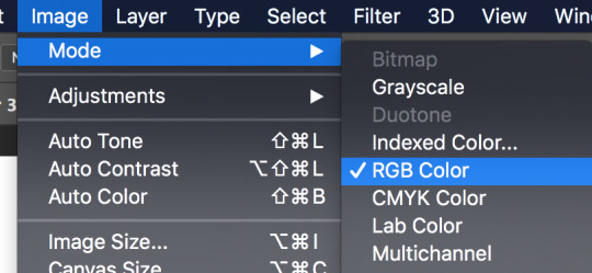
First off, make sure you’re working in RGB color mode. This is so you can abuse Camera Raw Filter later, and you really should be in RGB mode anyway unless you plan to make prints.
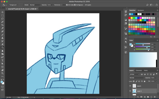
So start with your line/sketch on a multiply layer, or even just a normal layer mode if you want. My lines are usually dark blue but I often change them later on.
Use the wand tool (w) to select the negative space around your lines, invert your selection (command>shift>i), and on a new layer use the bucket tool (g) to create your base layer. On this layer, go to (filter>other>maximum) and set the radius to one or two pixels. This will clean up the base a bit so you don’t get a weird halo around your lines.
Before you start adding colors, change the background color to a mid-tone grayish color. This is to better judge tones and contrast. This doesn’t have to be the end color of your background; you can change that towards the end. If you actually are drawing a background, you might want to choose the general color of that background instead, but checking your colors against a gray background periodically can still help.
Now is when you start using clipping masks. Make a new layer directly above your base. Make this layer a clipping mask by right clicking on it and selecting “create clipping mask” from the pop up menu. Do this for every base color.
As you choose your colors, try to visualize what you want the end result to be. If you want a warmer or cooler piece choose colors accordingly. I do this mostly by eye, so I don’t have a specific process. You can play with each color by going to image>adjustments>hue/saturation.

Once you’re happy with your base colors, create another clipping layer over all the base color layers (except for glowey bits like optics/biolights), and set it to multiply (sometimes another layer mode will be better but I usually go with multiply). This will be the shading layer, so now is the time to figure out where your light source is. You can add your shading using the brush tool, but I tend to visualize lighting better by erasing where the highlights are, so I just fill in the entire layer with the bucket tool and start erasing. Change the opacity of the layer to whatever you think is best. A higher opacity creates more dramatic lighting and a lower opacity makes softer lighting. For the shading color I usually choose a darker, desaturated color, like purple or brown, but again you can just play around with the hue/saturation until it looks right. Sometimes I will make a second shading layer to add even darker shading in areas.
So now the shading is done! If you want, you can make another layer for highlights but I don’t always do this. I don’t have a specific way I do highlights except that I usually add them only in the most intense lighting or on the most reflective areas, but do whatever works best for YOU. If the subject is backlit, adding highlights around their silhouette can add a dramatic effect.
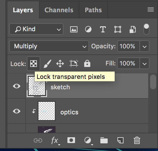
I usually leave my lines as a single color, but sometimes I will use multiple colors over each base color. I did that for my last piece of idw Blurr. To color your lines, lock the transparency of the layer using this button, or make another clipping mask over it. A lot of the time changing the layer mode to overlay will make the new colored lines look nicer. You may need to touch up some of the darker colors though.
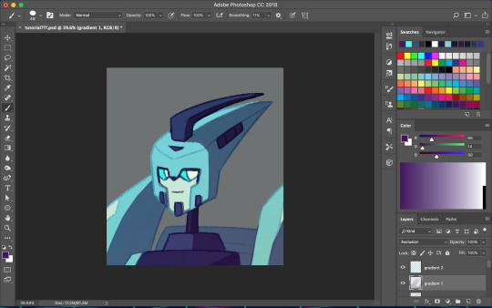
Next is when we start getting really experimental, by which I mean I have no idea what the fuck I’m doing. I make one or twenty new layers with various gradients over all the colors and play with layer styles. These layers are to soften the shading, bring colors together, etc. Something fun I do a lot is set the gradient tool mode to dissolve and then play with the layer mode and opacity on that to get a textured effect. If you still have a gray background switch to your actual desired bg color. Upon doing this you might want to make even more adjustments. If you have any glowey bits like optics, make a new layer for that. I usually use the gradient tool or a blurry brush at a low opacity around the glowing parts and set the layer mode to screen, but again experiment. You can also add reflected light from these secondary, less intense light sources onto the surrounding surfaces.
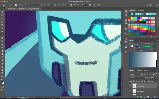

I don’t always work with clean lines and end up having to render and clean up a lot towards the end. I do this on a new layer above everything. Rendering is tedious but can make the end result look a lot softer and painterly, or sharper and more defined, depending on how you do it. Make use of the dropper tool (alt+left click) here to grab colors as you go and define shapes. This step is only necessary if you are going for a painterly look (or you were lazy with the lines and now regret it like I often do). This step must be done only when you are as certain of your color choices as you can be, because after having used the dropper tool to color grab, you will not be able to adjust the layers individually.
So hopefully, you’ve chosen colors that work well and you are happy with how they look at this step. If not (like I usually am), you’re going to cheat with Camera Raw filter. It’s like hue/saturation adjustments but better. Make sure you’re happy with how everything other than color looks here because we’re going to do the thing where we suddenly work deconstructively and probably regret it later. You might even want to do this step on an entirely new canvas so if you fuck up you still have the version with all your layers. There’s always control+z, but if you end up playing around a lot it could be annoying to go back.
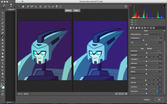
Flatten your image. You can do this by right clicking any layer and selecting the option from the pop up menu. Now that everything is merged into one layer, go to filter>camera raw filter (or command+shift+a). There is a lot you can do here. You can change the temperature of the whole piece and play with values and clarity until things look nicer. You can even go into HSL adjustments and tweak individual hues. I also use camera raw filter to add grain or a vignette sometimes (not color-related but still nice to mention). Also, when I want the piece to look really soft, I lower the clarity to give it a soft, glowing look. I did this for the idw Blurr also.
So now hopefully the colors you weren’t happy with look better, but you can still play with gradients even after this step. Sometimes this last step barely changes anything and other times the colors will be wildly different from what you originally had planned.
So to be honest, my colors are mostly all experimental. I’m constantly changing and adjusting colors as I go along. Try to put thought into your initial color choices, but also it’s fine to change things if you need. I mostly go on instinct, so I’m sorry if this is a lackluster explanation.
If you have any specific questions or don’t understand something I said here feel free to ask! I’ll try my best to clear things up!

#Anonymous#tutorial#my art#it's also like 6 am so this probably is confusing im sorry lol#my art process is mostly me doing something and being pleasantly surprised it worked lmao#the images look like shit on desktop but fine on mobile????#ok tungle thanks
20 notes
·
View notes
Text
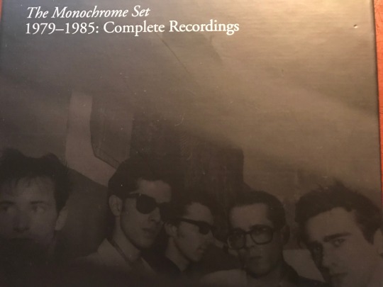
Tony Potts of The Monochrome Set gives us the details! (interview by Steve Michener)
I started writing a weekly post on Facebook about two years ago, wherein I would pick a song from the extensive catalog of The Monochrome Set and write a few words, trying to hep people to their fantastic music. It became a fun, online conversation with friends and fans and the band would sometimes join in, adding to the story or correcting my (frequent) historical errors. I was presenting myself as a TMS scholar when I was really just a doofus with a love for the music. The FB feature eventually led to my volunteering to drive the band on the West Coast swing of their recent US tour, which was a total blast.
Recently, I came up with the idea of interviewing various members of the band and when I initially hit upon this plan, the first person I thought of was Tony Potts, their early ‘5th member.' Tony added another dimension to the band’s early shows by projecting films onto screens (and sometimes the band), helping to differentiate the band in the crowded post-punk music scene of the late 70s/early 80s England. I never personally saw any early TMS shows so I missed out on his contributions until last year when I attended the TMS 40th anniversary shows in London and got to experience his visuals along with the music (albeit from a laptop now instead of a Super 8 film). I’ve always been intrigued by his role with the group and he was nice enough to answer some of my email questions about the early days of the band, his art, and, of course, his favorite TMS song. Tony’s Facebook page is one of the most entertaining around; he doesn’t hold back much, whether it’s about his cancer diagnosis, politics, or the state of the Great Western Railroad. TMSF and now Dagger Zine present the Weird, Wild and Wonderful World of Tony Potts!
That’s Tony far right
Q: How did you come to be involved with the Monochrome Set? What drew you to them and them to you?
Ah, now there are two answers to this question. The first is terse and accurate, although less interesting than the second. Well, I knew John, J.D. Haney. That's the terse answer. However, in the interests of interest, and name-dropping, we have to travel back to about 1974. The story illustrates I think, how our lives are built upon great swaths of happenstance.
While studying on my pre-degree arts foundation I became close friends with Edwin, later Savage Pencil, who later still formed The Art Attacks. After some itinerant drummers, including Ricky Slaughter of The Motors, and Robert Gotobed of Wire, JD became the Art Attacks drummer. Now, Edwin didn't know him, so I can only guess, at this great distance, that I put his name forward. But again, we must spool back in time. How did I know John? After Edwin left for London, and still at my provincial art school, I became good friends with two fellow student artists like myself, Andy Palmer and Joy Haney. They both became founder members of Crass, under the names N A Palmer and Joy De Vivre, and are now exceptionally good fine artists.
It was through my friendship with Joy that I meet her brother, the aforementioned JD, when he came down from university in the summer of '76. We hung out with his college chum, Jean-Marie Carroll, later to join The Members, and discussed narrow neckties and casual trousers. Then Joy, Andy, and I went off to the Greek islands for the summer, before returning to London to take up our degree course at Chelsea School of Art.
Thus it was, with us all now in London, that I believe I introduced JD to The Art Attacks, with whom I worked until their demise, at which point JD took up with TMS. Due to mutual creative interests in art, I was invited to display my films at their gigs. That was late '78, with my first gig with the band being at Acklam Hall, Notting Hill, on 22nd February 1979. Thereafter we fell together and I started to make films specifically for the live shows. It’s worth pointing out that the TMS was not formed in an art school, or by art students. It is lazy journalism that perpetuates the Art School band epithet. Both Bid, the main song writing power behind the longevity of the band, and the other key lyricist, JD Haney, have never been anywhere near an art school.
Q: What were your films like? Who were your art-school influences at the time? What were you doing with the Art Attacks?
I was studying fine art painting, and painting was my main interest. Although I loved films, I never expected to move in that direction. As a painter, I was a devotee of the Russian Constructivists like Tatlin, but mostly the geometric forms of El Lissitzky, and the Suprematist Kazimir Malevich - best known for Black Square and White On White. My paintings were an amalgam of geometric forms in the vein of Lissitzky on grounds inspired by Malevich's painterly surfaces. With the rise of the Punk movement in London, I somewhat changed direction, moving into filmmaking that had a quasi-narrative style, intended to be more emotional and poetic. Although driven by what was happening in music during ‘76/'77/'78, ironically, my films couldn't be any less punk if I tried. Well, not to punks anyway. These days I regret that I never resuscitated my painting practice.
At the time of the Acklam Hall gig, I had made one large scale Super8, and two 16mm works. I think it must have been 'Strange Meeting', which in part was about aliens and The Red Army Faction murders, which we showed at that gig, but as a support. I had previously made some other 8mm films, and I might have used them during the band, but I can't recall. However, I now have vague memories of projecting B & W film over the whole stage and band. With The Art Attacks, I didn't have a creative role, I just supported the band in rehearsal and at gigs with Paul Humphries their manager, and the initial manager of TMS. Paul, JD and I all shared the same squat in Brailsford Road, Brixton. So, with TMS I had something more creative to do.
Q: For those of us who weren't able to see those shows, describe for us what you were doing with the films during the shows. How were the films received by the audience?
As I said, initially I used the films that I had made in another context, and they were added to the performance to create an overall ambiance, a statement of presentation that was not about a band energetically leaping about on stage, as was the order of the day. Soon I started to make Super8 material specifically for TMS performances. This included the scratched and bleached footage for 'Lester Leaps In', or images filmed on the road, like the Berlin footage used for ‘Viva Death Row’, or staged material of the band getting up to also sorts of antics, like the beach ball larks and bits of animations I would make with no specific aim. In the early days, I made two roller blind screens in long boxes, [we took them on the first two US tours] with one on either side of the stage as space allowed, with film projected onto them so the band members were often in silhouette, although it bled onto them also. The stage was very dark, lit by blue footlights, which I made. I think Mark Perry of Sniffing Glue/Alternative TV said something like it was the most brilliantly depressing thing he had seen. That was always the irony at that time, the music was pert and poppy and uplifting, but the show wasn't. What a laugh, we all thought.
The shows became increasingly more elaborate with more screens, more projectors and a theatrical lighting rig. At this time we were using Ground Control, Bowie's original PA, run by a lovely guy called Robin Mayhew. Using the theatre lights allowed me to focus and shape controlled beams of light exactly where I wanted them. For example, I could just illuminate Bid's face or other small areas with geometric shapes, while leaving the stage largely unlit. Then the film screens could glow and flicker in the dark. The lads tended not to move a great deal. A tradition assiduously upheld by Mr. Warren.
As to reception, well some people liked it, and others couldn't see the point. I think it mostly worked as a spectacle, an integrated whole, a total experience, but for those just into the music, it was probably irrelevant. I mean, they are a great band, so nobody missed me when I didn't set up, like at the M80. That stage was toooo big, man.
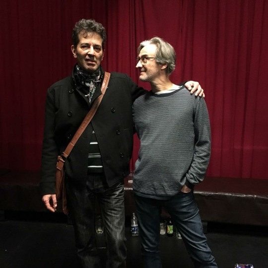
Bid and Tony
Q; As the 'Fifth Member' whose focus seemed to have been on the live performances, how did you fit in with the band in the recording studio?
Yes, my key role was the live performance; anything else was a bonus for me. I was at all recordings from the second Rough Trade single to the end of the second album, as an enthusiastic supporter and admirer. Of course, I chipped in with the odd suggestion or noise and was probably ignored where and when necessary. Being musically incompetent, my timing is off by a good margin so I'm not sure my handclaps ever made a final mix. You can hear me on TWWWWofTP. I've got quite a pleasant singing voice, also, just not in public. Bid once marked out the chord changes for Ici Les Enfants on a plastic organ I had, to fill out the live sound, but after the first chord change, I was lost and bewildered.
Q: You've done promotional videos for the band. Can you talk about a few of those projects? Do you have a favorite video?
The first promotional film I made was the one for Dindisc, and called Strange Boutique, not after the title of the first album as many think, but coincidentally, after the name of a pair of corduroy trousers! Actually, that may not be true. So, this was conceived as a short film, with two songs and a Rod Serling type piece to camera as a linking devise. Done on the very cheap. Unfortunately, there were syncing issues with some of the dialogue and the master got damaged, scratched, and I'm not sure if I still have the original film, or not. It's on our DVD as a complete piece as far as I remember, but it turns up on YouTube, usually cut down to either of the two songs LSD and Strange Boutique, without all the linking material.
We then waited a long time until I was commissioned by WEA to make the promo for 'Jacob's Ladder' with the release of 'The Lost Weekend' album. The deal was negotiated from a public phone box on Clapham Common tube station. It was somewhat compromised by cock-ups at WEA which meant I was forced to hand it over before it was fully edited to my satisfaction. I seem to have made a style out of technical imperfections; at least that's what I'm saying. At the time Top of the Pops had a video preview section, and a short clip of Jacob's Ladder was shown. That’s primetime TV, folks!
And then, of course, I was delighted when Bid asked me to make the official MaisieWorld video for ‘I Feel Fine’, which I was very pleased with. All these projects were very personal to me, not just the execution of a job, and the first two were part of my life at the time of making.
Q. The only footage I've seen of you actually playing with the band is the Old Grey Whistle Test TV spot. Was it common for you to join the band onstage?
Well, I was usually visible on stage, controlling the projectors, which needed constant manipulation, like a DJ scratching, changing speed and switching images, fading and mixing. Also, there might be some little set piece we had devised, which required me to do something. At one point, during the Ground Control days, I remember I had my own mic so I could interact with the stage, which didn't last that long. So, to some extent, I always had a relationship with the stage as both performer and technician. Once, when Lester Square had had enough, I did perform the encore, He's Frank, by incessantly plucking one string of his guitar. Pretty good, actually! Music and Maths very similar to my mind, no sooner do I believe that I have mastered the execution of some small calculation, but I soon discover that I haven't.
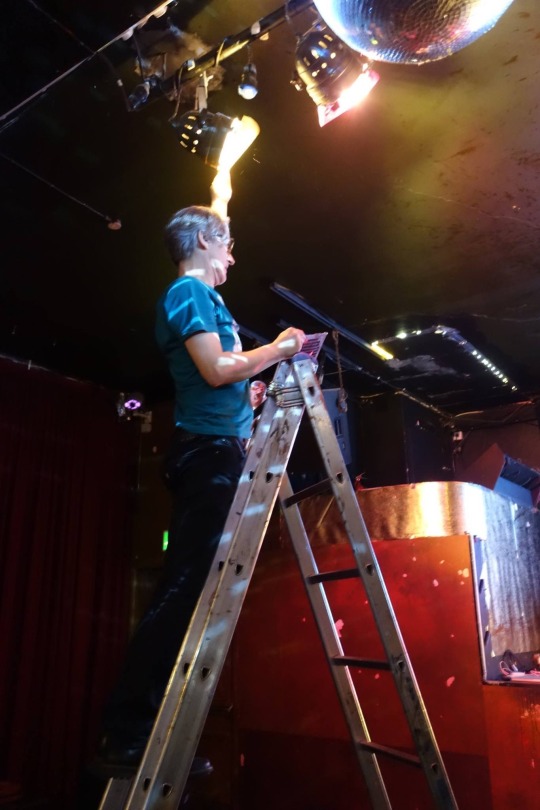
Don’t shake the ladder, Tony gettin’ down to work.
Q: Tell us about your film education and your career in film and video outside the band.
I made a living of sorts working commercially in film and video production, and teaching, but as I mentioned before, I actually trained in fine art. My art foundation took a very academic approach and involved copious hours of life drawing and other drawing classes, while being given time to develop one's own particular discipline and style.
I made one Super8 film based on geometric elements in my painting. I had made three other 8mm film before this. It wasn't until I was on my degree course that I started making more moving image work, but this stemmed from a fine art perspective, so I didn't ever have any film school type training. My own work I would categorise as poetic experimentalism, that is under the general umbrella of artist film and video. Just a reminder that you can catch up with lots more detail of everything I've said at my website, http://tonypottsloopform.altervista.org. Although it has all the history of the films and staging, as well as the making of Jacob's Ladder, it's rather old and not up-to-date. That site includes all the art projects I've worked on, the history of TMS film, and my own films. My creative life can be divided into three separate but overlapping strands. The first being, my personal practice as an artist/film maker, the second, my skills and knowledge deployed in the service of collective artworks and community arts projects, and those same skills employed commercially in film and video production and teaching.
Q: It's obvious from FB that you are a big film fan. Who are some of your favorite directors/favorite movies?
With a few exceptions, I'm not much interested in modern Hollywood, old Hollywood is better, and pre-Hays better still. My film tastes are somewhat esoteric for most folks. I prefer silent film, particularly that of the classic German period of the twenties, Lang, Murnau, Pabst, Dreyer. Then in the sixties, PP Pasolini, Robert Bresson, Akira Kurosawa, soviet era Tarkosky and Parajhanov, plus a host of even less well know eastern European directors like Miklos Jancso, Jan Nemec, or Frantisek Vlacil. Don't you wish you'd never asked?
Q. You live in Wales, pretty far away from the London of your youth. How did you end up there and what appeals to you living there?
Well, we split our time between London and Pembrokeshire at present, while my wife Rachael is still working. In a few years, we'll move out completely, I think. I can't relax in the city anymore. I need some more space to feel comfortable. I've had as much London as I can handle. Rachael is Welsh, although Pembrokeshire is known as little England beyond Wales, and we are fortunate to own her childhood home there.
Q. You were recently diagnosed with cancer and posted your experience on Facebook. How did you discover that you had cancer and how are you doing now?
Yes, that was unfortunate. The prostate gets larger as us men grow older and so puts a bit of pressure on the bladder, changing the way you take a pee, like urgency and frequency. So any chap of a certain age should cut along to a doctor if they have persistent symptoms of this type. Our neighbour in Wales insists on calling it prostrate cancer, but I refuse to take that lying down, and firmly pronounce it prostate, but to no avail. But seriously, although it's a slow-growing cancer, the sooner you act, the sooner you can get the appropriate treatment. I had to have surgery, but it's not necessary for everyone. As my cousin, who luck would have it is a cancer specialist said, do you want to be erect or dead? Haha, what a great choice!
Q: Since this is a TMSF, after all, can you pick a favorite song and say a few words about it?
My choice of song to end this pleasant excursion is 'The Devil Rides Out', from the 'Eligible Bachelors' album. By the time of recording this record JD had left the band and was living in NY, and I was also spending a great deal of time in that city also. I was still contributing to the occasional gig or short tour, but I certainly wasn't around when this album was recorded. Christ, what do you expect for a record made in Luton?
So it is the live performances of this song that I recall, since it was in the repertoire well ahead of it being recorded. Although I could say it of many other songs, the open chords of 'The Devil Rides Out' always gave me a buzz as I waited to play in whatever the film images were [I can't remember]. Even if the audience or critics found the films superfluous or unimportant, I usually enjoyed watching the way that a set of otherwise unrelated images somehow meshed and synchronised with the music and gave the illusion of a premeditated vision. Of course, it was premeditated in as much as I knew what pieces of film would be used for a particular song, but beyond that, there was a lot of slack in the system. With the various parameters of the live installation, having to follow the cue of the band and the hand manipulating the projectors [no computers], there were great possibilities that the extemporisation would result in entirely unique sets of images and sound on each occasion.
Well, I should say something about why I like the song. It's one of a number of Bid's more esoteric lyrical compositions. He had previously pushed the Latin boat out with Adeste Fideles [not everyone's favourite song title to pronounce], and my spell checker isn't too keen on the words, either. In this case, the bridging line is rendered in Latin, but with the exception of the 'Hails', this is written in the ancient language of Sanskrit. Or at least that is my understanding and belief. Whatever the lyrical origins are, this is a classic TMS arrangement, altogether thrilling, incomprehensible and mysterious, yet totally pop, totally accessible and it dumps from a very great height those chart-topping household names who have followed in their wake.
And of course, I can never resist a song that features a sleigh bell, The Devil Rides Out and The Stooges 'I Wanna Be Your Dog' being the two finest examples.
http://tonypottsloopform.altervista.org
www.themonochromeset.co.uk
www.tapeterecords.de
www.facebook.com/themonochromeset
1 note
·
View note
Text
Project Proposal and Research
12/5/20
Idea: Comfort food/human’s conciseness/ figural and its significance in photography
Comfort food, providing a consolation or a feeling of well-being. Everybody has their own sweet and savoury craving, wether its after a long day, a midnight snack or a Sunday morning brunch, we all have one. This personal series will undergo individuals close to me including family and friends, capturing their personality and of course their most desired comfort food. Each image will have its own uniqueness reflecting the person’s characteristics. Constructing an aesthetic series using complimentary colours and artificial lighting to capture theatrical scenes, will tie in each image all possessing the same quality and idea of an individuals own comfort food. I believe this concept connects very nicely to project three, as I will be undergoing this notion of the figural. Figural being a form of significance which relies on imagery and association, capturing symbolic meaning in ones person life. Inspired by Anne Hardy and Henry Hargreaves, and their ability to capture empty spaces and aesthetic foods, still possessing this notion of the lack of human body except its clear that their soul and presence still remain in the image. This feeling of emotion is what I would like to portray and capture in my series.
Journal Articles
The Chicago School of Media Theory: Figurative/Figural
Theorist Micheal Fried, explores the relationship between the figure and literal within the modern art world.
Fried’s understanding of the modern age, views art as literalist and minimalist, suggesting that the whole work “they are what they are nothing more” than shapes, colour and form.
Literal can be seen and used as a metaphor
The introducing of anthropomorphism can be only depended on literalist art once a person seeks a hidden meaning.
Anthropomorphism can be seen as a symbol seen from a singles of a shape.
Literalist art proclaims its object hood
Referring back to literal and the figure, Fried suggest that literalist art is almost seen as non-art because it rejects the representation of art that calls the attention to in the term figure.
The status of an object within Literalist works are further emphasised between the relationship of the view to the artwork in space.
Fried draw attentions around the dichotomy betwen the liter and the furfural and figurative, as he further implies the way in which these dichotomy dissipated within the modern art movement.
Identifying the figure and the literal, yes photography can be seen very literal as we capture something that is clearly identified by all. However once the audience starts to connect the dots (anthropomorphism) thats when the image itself creates it’s own meaning and symbolism.
https://lucian.uchicago.edu/blogs/mediatheory/keywords/figurativefigural/
Comfort Food: Nourishing Our Collective Stomachs and Our Collective Minds by Jordan D. Troisi1 and Julian W. C. Wright1
Food is a powerful motivator in human functioning—it serves a biological need, as emotional support, and as a cultural symbol.
Comfort food in the media is seem as unhealthy, often consumed in moments of stress or sadness
But for anyone who has a love of food and of eating, it will come as no surprise that food also has emotional, cultural, and symbolic mean- ing as well.
Food satisfies our collective minds
Comfort food serve as a memory based link to close others and that those with secure attachment styles would have favorable associations with foods associated with other people.
This article provides information on how society identifies comfort as it can be seen through two perspective, as stress eating (unhealthy food) causing anxiety and is something tradi- tional, cultural, regional, familial, or otherwise imbued with meaning
Eating is the perfect social psychological variable, because it is connected to almost every social variable or process you can think of! (Herman, as cited in Baumeister & Bushman, 2014, p. xxi)
Given the need for humans to consume food in order to maintain numerous homeostatic processes, such topics also seem relevant for courses in biopsychology. Furthermore, there is clear evidence that stressful experiences have numerous bio- logical implications.
This article provides insight on what comfort can really represent for ones individual - it’s a guilty pleasure meal that is close to their hearts. It can be something that endure and crave if feeling overwhelmed or stress which is why some may seem to be fatty and fills with sugar and oil however comfort food isn’t always seen as that. It possess cultural aspects and symbolises their homes - when feeling home sick.
https://journals-sagepub-com.ezproxy2.library.usyd.edu.au/doi/pdf/10.1177/0098628316679972
Artists of Inspiration
Through my online journal I have briefly discussed Anne Hardy and Henry Hargreaves, both strongly influencing me for my idea for project three. I have also done research of artist Jeff Wall. I will be elaborating further below on what aspect of these artists works have influenced me and how I will use this to create a capture my own innovative series.
Anne Hardy
Hardy’s work transforms sculpture into photographic ‘paintings’. Though her scenes are built in actuality, their compositions are developed to be viewed from one vantage point only and it’s only their 2 dimensional images that are shown. Hardy uses the devices inherent within photography to heighten her work’s painterly illusion. In Cipher, aspects such as the hazy aura around the fluorescent lights, faux grotto walls, and the spatial defiance of the hanging ropes, give allusion to gesture and drawn lines.

‘Cipher’ 2007
Henry Hargreaves

Photographer Henry Hargreaves and installation artist Nicole Heffron have spent the past year imaging how famous directors might celebrate their birthdays in order to recreate the scenes for a unique photo series. Pictured: The bloodied samurai sword suggests that this cake was intended for Kill Bill director Quentin Tarantino
The image of the staircase on this birthday cake suggests that this birthday cake was intended for the Vertigo director Alfred Hitchcock
The bear-shaped cake here is an instant giveaway that this is the birthday cake of Ted director Seth Macfarlane
The glass of milk in this set up is a subtle suggestion that this sterile birthday is that of the Clockwork Orange director Stanley Kubrick
The scene at Martin Scorsese's knees-up has elements of New York's Little Italy as well as the gambling and cigars of Casino and his first hit Mean Streets
John Waters' identity is given away by his Pink Flamingos cake, a reference to the title of the 1972 movie starring drag queen Divine
What I love the most of Hargreaves food images is how he can create these bloody to half eaten food scenes look so pleasing to the eye even when it should make you feel a little gross out. Food photography I feel is very difficult to capture and the same goes in films. It’s so easy for people to be gross out by them especially when their hands and mouths involved, however Hargreaves manages to create these aesthetic food series, almost making me hungry and wanting to eat those cakes. Hargreaves has inspired in the past with previous food photographs, and he still manages to continue to inspire me now. His work is so intriguing and the use of colour and composition overall ties in the image very nicely. However, instead of capturing celebrities and prisoners on death row, for my own work I want it to be personal. Using the pope around me such as family and friends and capture what their own comfort food is their favourite and what it means to them. Is it a stress comfort food or is something that reminds them of home, child hood or a distant memory. Even for myself and capturing my own comfort food and exploring why I have chosen that specific meal. I believe exploring on this idea of food and the figural, it will ultimately challenge me, and let me undergo such research and even an experience of capturing something more than just a photograph of food but the human soul behind that.
Jeff Wall
I begin by not photographing.
—Jeff Wall
This quote really speaks to me on what art really means to myself. I believe their is so much more than just taking a photo. Behind the scenes artists have to create this ideal image before capturing the photo itself. I love constructing and forming this perfect composition in my mind and capturing it with a camera allows that form to last forever however just creating art itself bringing forth this new world of what photography can really say.
Jeff Wall’s work synthesizes the essentials of photography with elements from other art forms—including painting, cinema, and literature—in a complex mode that he calls “cinematography.” His pictures range from classical reportage to elaborate constructions and montages, usually produced at the larger scale traditionally identified with painting
Some of Wall’s early pictures evoke the history of image making by overtly referring to other artworks: The Destroyed Room (1978) explores themes of violence and eroticism inspired by Eugène Delacroix’s monumental painting The Death of Sardanapalus (1827), while Picture for Women (1979) recalls Édouard Manet’s A Bar at the Folies-Bergère (1882) and brings the implications of that famous painting into the context of the cultural politics of the late 1970s. These two pictures are models of a thread in Wall’s work that the artist calls “blatant artifice”: pictures that foreground the theatricality of both their subject and their production. Dead Troops Talk (1991–92), a large image depicting a hallucinatory moment from the Soviet war in Afghanistan, is a central example, and was one of the first works to employ digital-imaging technology, which has since transformed the landscape of photography. Wall was a pioneer in exploring this dimension and remains at the forefront of its development.
Doing research on Wall and his work, it’s clear he really wants to capture these somewhat candid images however, behind these image unfold stories and visions. His work in a way have these capturing aesthetic scenes that drawn the audience in. It creates a sense of narrative and story lines by one single picture. I did find the “Destroyed Room” to be very fascinating and it held many similarities on what I wanted to create. However after viewing his other works I couldn’t help but be intrigued by his image “Changing Room”, the image itself look as if it’s some kind of painting. I think it also ties in with this theme figure and figural topic. The top half of the body looks as if it's some kind of bird especially the animal pattern on the fabric. However, on the bottom half it’s clear that a women is simply just getting change. The figure itself seems to be part human and animal, thats how I view the image as a whole. And I do believe thats what Wall was trying to capture this weirdly human figure or it could have been by accident of the lady putting the shirt or another from of dress and it just seemed as if it was a bird. Overall Wall’ work is absolutely amazing, it has this sense of allude affect on the scenes, drawing myself within the images, trying to figure this narrative by just viewing one image. I wanna be able to incorporate this whole emotional effect on my own images and creating this sense of narrative.

200 word Project Proposal
Looking at a variety of artists and articles surrounding this whole notion of the figural within art has allowed me to compose a solid idea of what I will be exploring within project 3. Comfort food is known for providing a consolation or a feeling of well-being. Reading 'Comfort Food: Nourishing Our Collective Stomachs and Our Collective Minds’ it provides insight into what comfort food really means for an individual. It can be seen through two perspectives, including stress and anxiety eating, this makes people crave more unhealthy sugary or high fat food, or is something tradi- tional, cultural, regional, familial, or otherwise imbued with meaning to an individual. Gathering both research on the figural/literal themes within art and this whole concept of comfort food, I believe both have similar qualities and can be captured in a unique form. Wanting to approach this project in a more personal outlook, I will be exploring and capturing my friends and families own comfort food and what it means to them. I will also be using myself and my own desired comfort food, to explore and ask questions what makes comfort food comfort?. Inspired by Anne Hardy, Jeff Wall and Henry Hargreaves, each artists has provided a source of inspiration that I will be incorporating within my own work, however still creating an innovative personal series of my own.
0 notes
Photo
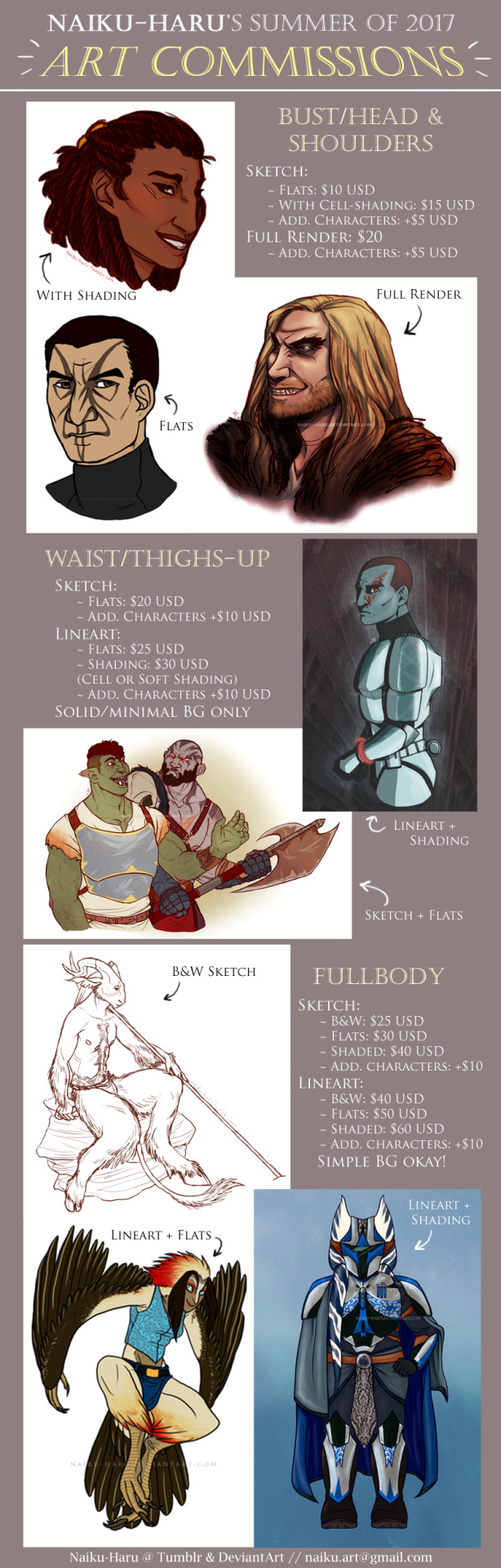
Hi friends! Guess what. Commissions are finally open!
I’m a currently unemployed recent college graduate who is in major need of some money. I’m not gonna go into detail about my full financial situation (though tbh it’s not great and probably won’t improve for a while), but the job market sucks and any help/support/purchases would be greatly appreciated. Please email me at [email protected] if you’re interested in commissioning me!
Prices (all in USD):
Bust/Head & Shoulders:
Sketch w/ Flat Colors: $10
Colored Sketch & Shading: $15
Full Render (lineart + color+ shading): $20
Additional characters: +$5
Waist/Thighs & Up:
Sketch w/ Flat Colors: $20
Lineart w/ Flat Colors: $25
Lineart w/ Colors & Shading: $30
Additional characters: +$10
Fullbody (sketch):
B&W: $25
w/ Flat Colors: $30
Colored w/ Shading: $40
Fullbody (lineart):
B&W: $40
w/ Flat Colors: $50
Colored w/ Shading: $60
Additional characters: +$10 each (for both sketch & lineart)
I will have 8 slots open to start, and I will only be accepting payment upfront through PayPal via an invoice that I will create after the commissioner’s approval of a thumbnail sketch.
Please check under the readmore for additional info, or email me if you have specific questions not answered in this post! Otherwise, please visit my art-only sideblog or my DeviantArt if you would like to see more examples of my work. Thanks!
I will draw:
Your ocs! Favorite canon characters! Fanon babies! Your pets or friends! Whoever you’d like!
D&D Character portraits
Kissing/cuddling/fluff
Animals, both real and fantastical sorry for not really including any in the graphic wh o ops
Mild gore/mild nudity (I have final say on what this entails, however)
I will not draw (this is non-negotiable):
Anything that is NSFW (includes porn, overt gore, etc.), fetish art, or situations that are inappropriate in any way
Complicated mechs
Complicated backgrounds. Simple are okay, but anything that gets way too involved will be declined
Commission Details:
In your initial email for any commission, please provide at least 1 (preferably 2) reference image(s) of the character if possible, or provide a detailed description with an approximate ref -- especially for ocs/RPG pcs! The description should include height, build, any unusual characteristics or traits, scars/tattoos, skin tone, eye/hair color, clothing style, any notable props, etc. etc. Please also specify a pose if you can!
Also, if you are purchasing a waist/thighs-up or fullbody shaded commission, you have a choice of which style you’d like the shading to be! Please specify in your initial email if you’d like cell-shaded or painterly/soft-shaded.
I don’t do backgrounds much because I have almost no experience with drawing them, but simple ones can be negotiated as stated earlier for fullbody commissions. I will only do solid color/minimalist bgs for bust or waist-up commissions, however.
Please notify me if you would prefer to keep the commission private, a surprise for another person, or anonymous ahead of time, otherwise I will be posting them to either my main blog here or to my art blog and DeviantArt with the commissioner’s specified username or first name.
#commissions#commission me#artists on tumblr#art#dungeons and dragons#star wars#critical role#sorry just trying to get this out there#please view the image in another tab!! idk why it did that to look funky ugh#I!! hope this works!!!#thank you to everybody ahead of time
128 notes
·
View notes
Text
Out & About w Scout | July 2019
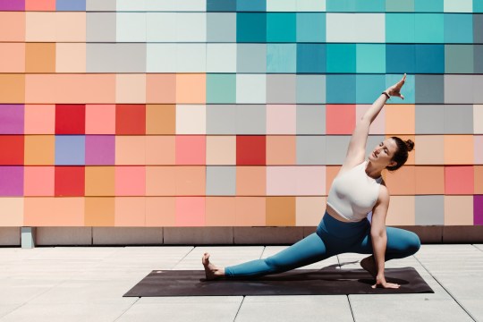
July 1: HALCYON, a hotel in Cherry Creek | Summer Fitness Series featuring CorePower Yoga
Wind down during happy hour yoga classes at Halcyon’s Rooftop Deck. Set your intention for the week ahead while watching the sunset over the Rockies, led by our favorite instructors from CorePower Yoga.
Monday, July 1st @ 5:30pm
July 1: WANDER + IVY | Tasting + Concert at Denver Botanic Gardens
Monday, July 1st @ 4pm
July 1: HOMEFEST | Outdoor Entertaining Sale
Save 25% on all Melamine & Acrylic Barware on purchases of $100 or more.
July 5: WANDER + IVY | Tasting at Conifer Village
Monday, July 5th @ 4pm
July 6: TANSEY CONTEMPORARY | Evanescence, Judith Content Solo Exhibition
Evanescence features a selection of textile works and a ceramic installation by Palo Alto, California artist Judith Content. Known for her use of discharge dyeing and shibori dyeing technique, Content’s work references the natural landscape with painterly movement to explore place and memory.
Opening reception with live artist demo: Saturday, July 6th 2-4pm
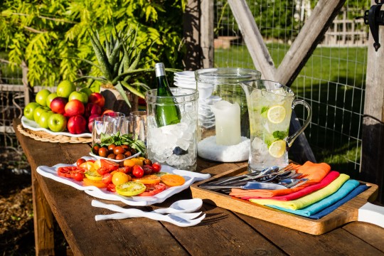
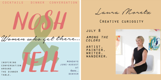
July 8: LAURA MORETZ & Nosh + Tell | Creative Curiosity
Nosh + Tell is hosting Laura Moretz of Among The Colors over a 5-course dinner as she shares about creativity, curiosity, failure and trusting your inner muse. It is destined to be an evening of inspiration, real talk, delicious food, and cocktails.
Monday, July 8th @ 6:30pm - click here for tickets
July 11: RISE WORKSPACE | Eat, Learn, Grow - Creativity + Innovation
"The Power of Creativity in Public Relations" - News outlets get hundreds of press releases and pitches every day and are often an ineffective way to be noticed. Learn from Wendy Greenwald on how she creatively positions her clients to increase their presence in the press. To learn more about memberships, reach out to [email protected].
Thursday, July 11th @ 12noon
July 12: VISIONS WEST CONTEMPORARY | Mountain Standard Time & The Matt Flint and Todd Horton Show
Mountain Standard show is a multi-gallery show Visions West is curating this summer. Inspired by the original Pacific Standard Time show, Art in L.A., this show will span across all four galleries in three states and will embody art in dialogue with the west. From environmental, historical and cultural viewpoints the show will explore the many facets of the west as a space in the American Psyche.
This exhibition featuring the works of artists Matt Flint and Todd Horton involve landscape and wildlife that play between realism and abstraction. Both artists include processes of creating/destroying in their work to create a magical poetical realism that is once enigmatic and literal, opening the possibility of symbolic meanings.
Friday, July 12th @ 6pm
July 12: WANDER + IVY | Colorado Food Works: Summer Palooza
A 90’s party: DJ, snacks & drinks
Monday, July 12th @ 5:30pm
July 15: RISE WORKSPACE | RISE Think Tank
Whether a business is in its formation stage or mature stage, it is critical to get feedback for future growth. Come join the first RISE Think Tank to support Courtney Mamuscia of Juju Be Gone and get inspired with your own business ideas along the way! To learn more about memberships, reach out to [email protected].
Monday, July 15th @ 5:30pm
July 15: HALCYON, a hotel in Cherry Creek | Summer Fitness Series featuring barre3
Wind down during happy hour barre classes at Halcyon’s Rooftop Deck. Set your intention for the week ahead while watching the sunset over the Rockies, led by our favorite instructors from barre3.
Monday, July 15 @ 5:30pm
July 17: RISE WORKSPACE | RISE Up Podcast Club
"How Leaders Can Apply Design Thinking Inside of Their Organizations and Why They Must" - Tim Brown is the CEO of IDEO, the global design, and innovation company behind projects such as the first Apple mouse and the first notebook-style computer. Listen to the podcast and come to Podcast Club to discuss with other members the benefits of teaching design thinking to your employees. To learn more about memberships, reach out to [email protected].
Wednesday, July 17th @ 5:30pm
July 18: Halcyon, a hotel in Cherry Creek | A Cocktail Club
Entertain much? Make great cocktails at home when you learn the tricks of the trade from bartender, Rachel Wistrand. Expand your cocktail repertoire and learn the "How To's" behind two of B&GC's essential summer cocktails, a Ramos Gin Fizz and a Low Hanging Fruit. Both cocktails are equal parts frothy and bright, aimed to enhance your lazy summer afternoons and impress your friends.
Thursday, July 18th @ 5:30pm. Limited space is available.

July 18: TAFARI TRAVEL | Cherry Creek North Sidewalk Sale Brunch Bites
Please swing by to meet our team as well as some fantastic travel-related vendors while enjoying some brunch bites and mimosas!
Thursday, July 18th @ 12noon
July 18-21: ANDRISEN MORTON | Cherry Creek North Sidewalk Sale
Join Andrisen Morton during the Cherry Creek North Sidewalk Sale.
Thursday, July 18th - Sunday, July 21st.
July 18-31: SHAVER-RAMSEY | Summer Sale
The Sidewalk Sale begins on July 18th and Shaver-Ramsey will be offering 20-50% off many items in their collection including rugs, textiles, kilims, and pillows.
Thursday, July 18 - Wednesday, July 31st

July 19: WANDER + IVY | Tasting at Little’s Wine & Spirits
Friday, July 19th @ 4pm
July 21: HOB NOB | Salsa Showdown at the South Pearl Street Farmers Market
The 1st Annual Salsa Showdown benefiting R Bazaar (a non-profit supporting refugee and immigrant entrepreneurs, and chefs too!) is coming to the South Pearl Street Farmers Market. All entries will be judged onsite with individual tastings offered to Farmers Market patrons.
Sunday, July 21st @ 9am

July 23: RISE WORKSPACE | Food for Thought
"Growing Your Business Using Creativity" - We constantly hear about using photography, events, and print/online content to grow our businesses, but it takes more than simply checking the box. Come to this round table discussion to hear from Loni Peterson, Christina Cookson, and me in creative industries about how you can set your business and yourself apart. To learn more about memberships, reach out to [email protected].
Tuesday, July 23rd @ 12noon
July 25 & 26: PITTER PATTER | Silhouette Event by Cut Arts
Silhouette Artist Karl Johnson is returning to Pitter Patter this summer on July 25th & 26th.
Thursday, July 25th @ 10:30am
Friday, July 26th @ 10:30am

July 25: RISE WORKSPACE | Don’t Rush Hour
Curious to see what all the buzz is about at RISE Collaborative? Want to meet some of our members and get a sense of our community? This is your chance! Join us for what is usually a members-only event. Meet us in the RISE kitchen around the island (just like at home!) at 5pm for some fun, no-programming social time.
Thursday, July 25th @ 5pm
July 25: DENVER MOBILE TEETH WHITENING | ABC’s The Bachelorette Auditions
Denver Mobile Teeth Whitening with be at Punch Bowl Social on July 25th during ABC’s auditions for The Bachelorette.
Thursday, July 25th @ 3pm
July 26: VISIONS WEST CONTEMPORARY | Robert McCauley
Friday, July 26th @ 6pm
July 26: WANDER + IVY | Tasting at Westwoods Wine & Spirits
Friday, July 26th @ 3pm
July 27: JENNIFER OLSON PHOTOGRAPHY | New Studio Open House
Join Jennifer Olson for an Open House Party for her new Studio!
RSVP to [email protected]
Saturday, July 27th @ 6pm

July 27: WANDER + IVY | Tasting at Applejack Wine & Spirits
Saturday, July 27th @ 3pm
July 29: HALCYON, a hotel in Cherry Creek | Summer Fitness Series featuring CorePower Yoga
Wind down during happy hour yoga classes at Halcyon’s Rooftop Deck. Set your intention for the week ahead while watching the sunset over the Rockies, led by our favorite instructors from CorePower Yoga.
Monday, July 29th @ 5:30pm
July 31: RISE WORKSPACE | Power Up Coffee
"The Role of Collaboration in Innovation" - The top two most commonly cited barriers to innovation in large companies is politics/turf wars and cultural issues (Harvard Business Review). It simply is not enough to implement design thinking or add ping pong tables to your workspace. Recruited in the first senior executive program for women at AT&T, Linda Kunzweiler has extensive experience solving big problems in innovative and creative ways through leveraging the collective power of a group. Come listen to her share her stories on collaboration and lessons learned. To learn more about memberships, reach out to [email protected].
#scoutedcalendar#tsgdenver#thescoutguide#thingstodoindenver#dayindenver#livelovedenver#beyondthebook
0 notes
Photo
American Landscape
Throughout American history, we see the transformation from the America we found years ago to the America we know today. We see the shift of capturing the American landscape from painting on a canvases to photography.
Landscape painting arose as a distinct genre during the 17th-century Dutch Golden Age as religious art fell out of favor in a Protestant society. In Europe, landscapes evolved from backgrounds in portraits of wealthy landowners to a prestigious art form embraced by Romantic painters in the 18th and 19th centuries who invested the natural world with allegorical and mythic significance in reaction to scientific advances of the Enlightenment.
Landscape painting began to dominate American art in the early part of the 19th century with idealized images of a vast, unspoiled wilderness that reflected a nation whose identity and belief in its boundless prospects were deeply interwoven with its natural environment. As the American frontier was pushed further westward, landscape artists chronicled the disappearing wilderness and the expanding presence of modern civilization in paintings that glorified industrial development for their patrons or served as reminders of the price of progress.
The painters of Hudson River School, founded by Thomas Cole in the latter half of the 19th century, created works of mammoth scale that attempted to capture the epic scope of the American landscape that favored contemplation of natural beauty. Other Hudson River School artists like Albert Bierstadt created works that placed a greater emphasis on the raw, terrifying power of nature. Thomas Moran’s paintings of the Yellowstone River in the 1870s helped to persuade Congress to set aside the Yellowstone area as a national park.
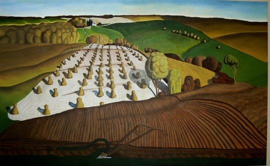
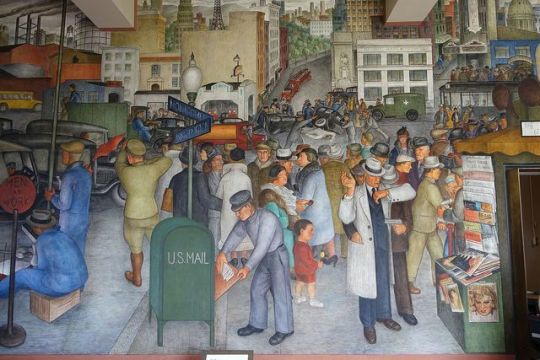
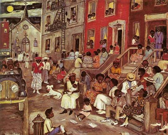
By the dawn of the 20th century, romantic views of nature were beginning to be replaced by themes of urbanization and a yearning for the tranquility of pristine natural spaces. In the 1920s, a group of New York artists led by Robert Henri (the “Ashcan School” or Urban Realists) focused on gritty urban scenes. The Regionalist Painters, a group of artists working primarily in the Midwest during the 1930s that included Grant Wood, Thomas Hart Benton, John Steuart Curry as well as lesser-knowns like Marvin Cone, created portraits that glorified the labor and lifestyle of agrarian rural America.
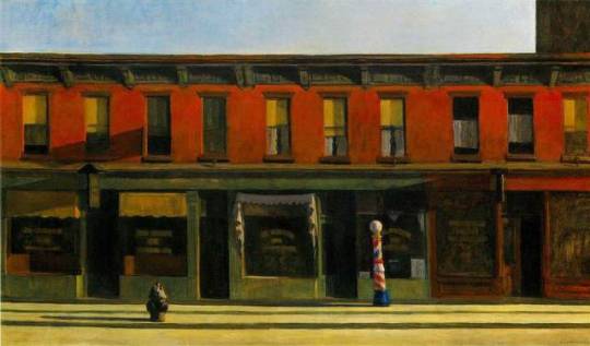
Modern American artists have approached landscape with a variety of strategies influenced by European art movements such as abstract expressionism and cubism; Charles Sheeler painted industrial landscapes in a style that presaged photorealism; Edward Hopper applied a looser painterly style to both urban and rural landscapes; Georgia O’Keeffe created works that distilled the natural world to organic abstractions; Milton Avery’s reductive style led to the pure color fields painted by abstract impressionists like Mark Rothko, where light and color interact brightly together.
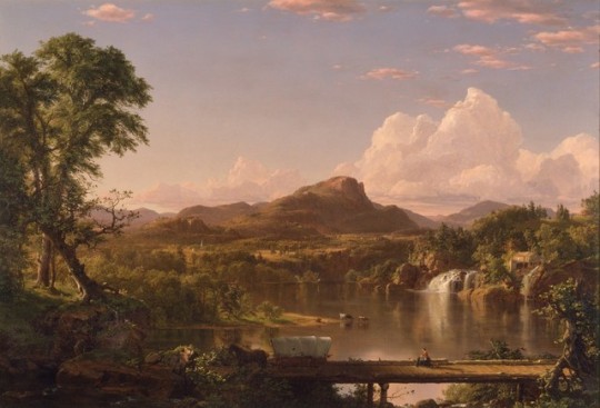
1. New England Scenery
This masterpiece by Frederic Church includes a covered bridge, waterfall, mountain and mill to express the essence of pastoral New England. Like his early teacher Thomas Cole and other Hudson River School artists, Church believed that the vastness and beauty of the American landscape conveyed moral significance. The Conestoga wagon crossing the bridge in this idealized, panoramic vista symbolizes westward expansion and a growing country flourishing in harmony with nature.
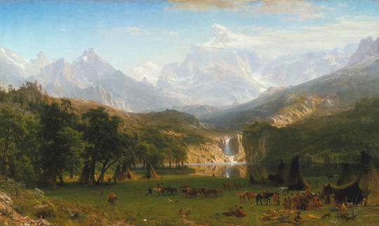
2. The Rocky Mountain, Lander’s Peak
It is based on sketches made during Bierstadt's travels with Frederick W. Lander's Honey Road Survey Party in 1859. The painting shows Lander's Peak in the Wyoming Range of the Rocky Mountains, with an encampment of Native Americans in the foreground. It was among the first of his paintings to be exhibited publicly as a paid-entrance piece, with an accompanying pamphlet for sale that described the significance of the work. The success of Bierstadt’s western paintings has been attributed by the art historian Linda S. Ferber to “public curiosity and excitement about these remote national territories” and to “the powerful idea of Manifest Destiny”, a phrase gained currency in the 1840s and that implied the inevitability of the continued territorial expansion of the U.S, to the west and south, an expansion made more attractive in the early 1960s by anxieties about the future of the Union.
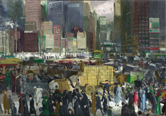
3. New York
While the Ashcan artists were creating new images of urban America, their styles remained relatively conventional. Stylistic innovation was, however, being taken up by many as the formal experiments begun in Europe in the middle of the 19th century spread to the U.S. This “Modernist” art encapsulated a relatively wide range of styles and subject-matter, all of which challenged traditional conventions of visual representation and often created new images in response to contemporary developments such as the expansion of commercial imagery and industrial technology.
4. Early Sunday Morning
This painting shows not the usual bustle of human activity but an empty street and empty buildings. His choice of a hard, white light, which creates striking contrasts between light and dark, emphasizes the emptiness of the scene – you cannot see into darkened windows. The attention to detail in the moldings, window frames, and window coverings and the starkness of the buildings gives the painting a sense of isolation and loneliness.
5. Fall Plowing
In Wood’s painting the viewer stands atop a hill, behind the plow lodged firmly in the rich soil, looking out over fields dotted with stacks of freshly harvested grain. The farmhouse and barn nestle in the distance among a grove of trees.
6. City Life
This piece shows the chaos of the streets of San Francisco. While striking, workers are absent – to have included them would surely have resulted in strong objections from committee members -there is at least one reference to the city’s radical, Pro-Communist cadres.
7. Midsummer Night in Harlem
Midsummer Night in Harlem was meant to embody the community in Harlem. Palmer Hayden portrayed a high-energy community sitting outside of their houses to cool off on a hot summer night. This painting shows the energy and positive attitude through vibrant colors and the expressions of the people. They all have smiles and nice “Sunday church” outfits on. It is fair to assume that the people had just come from church because Palmer Hayden has people still lingering out of the church in the background. Midsummer Night in Harlem was another one of Palmer Hayden’s paintings that got a negative reaction from some black Americans because of how interpreted their physical features. The people in this photo once again had features that were comparable to the minstrel characters. They all have very dark skin, big white eyes, and big mouths. James Porter criticized Palmer Hayden’s painting of “Midsummer Night In Harlem” because of the minstrel characters; he called the artwork “talent gone astray”.
8. Philip Johnson House (The Glass House)
This architecture photograph shows the degree to which architectural forms could be reduced to their basic cubic shapes and then opened to the surrounding environment.
9. Seagram Building, New York
This building was designed by Miles van der Rohe with Philip Johnson, became the prototype four urban sky scrapers whose structural steel framework was revealed in the geometric patterning of the windows and the reduction of the walls to mere curtains of glass. Mies can, in fact, be the counterpart to the critic Clement Greenberg in his emphasis on the purity of forms. The architect boiled his philosophy down to the phrase “less is more”, which represented his search for the essence of architecture, which he found in the rational structure of the building itself.
10. Montreal Exposition
Fuller was given the opportunity to construct a prototype of a large dome when he was commissioned to design the US Pavilion at the 1967 Montreal Exposition marking the 100th anniversary of Canadian confederation. Seen as a celebration of US technological ingenuity, it provided Fuller a platform from which to remind people that the world’s resources were limited, and that the technological might of the nation should be devoted to developing sources of renewable energy and ways to live both comfortably and lightly on the earth.
3 notes
·
View notes
Text
2017 Megaman Valentine’s Day Contest: Talent Category Winners and Art (*Image Overload!*)
Sorry for the delay on this again, but you guys definitely made judging this a challenge, with all the awesome entries! And my internet connection cut out last night, so I had a little retyping to do today. ^^;
There were so many Talent submissions, 25, that it alone was pretty much bigger than any amount of total entries I’ve ever received for a whole year’s contest! Thanks for overwhelming me!! ;D
For this category, entitled “Step into this Capsule X...And Receive This Fashionable Formalwear!”, entrants were required to draw at least one couple in their best formal attire, enjoying time together for an anniversary/party/date.
So both for simplicity, and the fact that it wouldn’t be fair or even remotely easy to rank each one, I will just be listing the Top 3 prize winning entries, and follow that with the remaining entries in alphabetical order. Even if you did not place, I am humbled and wowed by the effort you all put into your artwork. Believe me, I enjoyed them all, and so many were deserving of placing! But unfortunately, even with all I’m giving away this year, I can’t give you all something in return, other than my sincere appreciation. And I’m sure you all will love them, too!
This year, judging was done by @annamariacoppi and myself. With her experience as an illustrator/package designer, AnnaMaria brings some different insight from my own, as I always try to have some added perspective, besides just mine. Commentary from at least one of us on your art will also be seen below.
Each artist’s name will link to a (hopefully) larger version I’ve uploaded, that will work until you guys upload your art on your own pages, followed by their tumblr handle or deviantArt page, if applicable. If a link is broken or I screwed up somewhere, let me know. This was a lot to verify!
Without further ado, here are your winners (who I will contact soon) and the rest of spectacular, snazzily-dressed contest entries:
1.) Kaitlin.EXE (@kaitlinexe) - Zero x Iris, X x Alia, Axl x Pallette:

AnnaMaria said: Love all the outfits you designed! So much detail went into this! I like how "classic" looking everyone is dressed. It's so different compared to the other entries. Even their hair styles look great. I like how their hair is more shiny than their clothes. You can tell it's a different material quality. Would have liked to see a proper background. Right now I can't really tell where they are.
Miyabi said: In many ways, this piece feels like an X meets Disney sort-of-tale, with the elegant Victorian-era fashion flair. Both the overall intricacies of their clothing, like Zero’s braided booblight tassels (I don’t care if you disagree, that’s what they are!! LOL), to their glammed-up hair, I felt your piece overall had the strongest detail and creativity concerning the theme, which involved formalwear and the celebration of love. And still a touch of humor involved, with Pallette’s clumsiness, most likely as she’s getting used to dancing in heels.
2.) Tabby (@digitallyfanged) - Maverick Party Limo:

AnnaMaria said: I like the lighting you have going on. Feels very glowy, and I can tell it's in the evening. Their outfits are nice. Very elegant looking!
I like the movement in the champagne glass in the back a lot! Helps make the scene feel alive. I would have liked to see more detail in the clothing. Since this is a very shadow heavy scene, textures should show up more. That being said, the pattern texture on Sigma's outfit is really nice looking. The other outfits look a bit plain in comparison. Would have loved to see that feather boa fleshed out more. A softer edge around it will help make it look "fluffier". Some more color would help. It's very heavy in the purple and black as it is.
Miyabi said: Those Maverick bosses always have to glow in the dark, don’t they? The fancy digital limo ceiling is fitting for evil robots, while the deep pinks and purples fit the common color theme that links most of them together, besides their penchant for inflicting pain on those Maverick Hunters. The gentlemen look dapper, although paperboy Lumine seems just as uncomfortable in his clothing as he is partying with the squad. I liked how you still kept Ferham and Berkana’s armor motif tied into their dresses. As funny as the bonus Vile image is, I have to imagine he’d rather be popping out the sunroof, with shoulder cannon ready, in his fancy new stretch ride armor! ;p
3.) Iris-Sempi (@iris-sempi) - Zero x Iris, X x Layer, Axl x Marino:
AnnaMaria said: I really like how this looks it could be strait out of an animation scene. It's got all the right framing for it! The emotion with the colors are really nice. The outfits are nicely done, and I like the perspective in Iris dress. It feel like it's moving! I can clearly tell what's going on, and the story is very strait forward. I think if there was a spotlight above Zero and Iris, that would help put the focus even more on them. I would also move them over a tad more to the left. It would make for a even better composition.
Miyabi said: With all the warm colors towards the upper half of this pic, my eye was definitely drawn to the cooler hues of Iris’ dress. Her shocked look, along with the way it flows, definitely gives me the feeling that Zero has some pretty outstanding SA-class Foxtrot Paso Doble skills. I love the looks of excitement and pride on the faces of the other couples, as the lovebirds hit center stage. Truly, a wonderful scene!
And to keep this from extending too long on your dash, the remaining 22 entries for this category are after the cut...
Continuing with the rest of these fantastic pieces, alphabetically by alias:
- Archer-Poyochu (@archer-poyochu) - Subaru x Misora:

Miyabi said: While the bright city lights would probably cancel out viewing of the beautiful shooting stars in the sky, it looks like Subaru is showing Misora the more earthly light show on that romantic balcony overlook. Nice touch with her clef hair clip.
- Artistic Sunny (Artistic Sunny) - Enzan x Meiru:
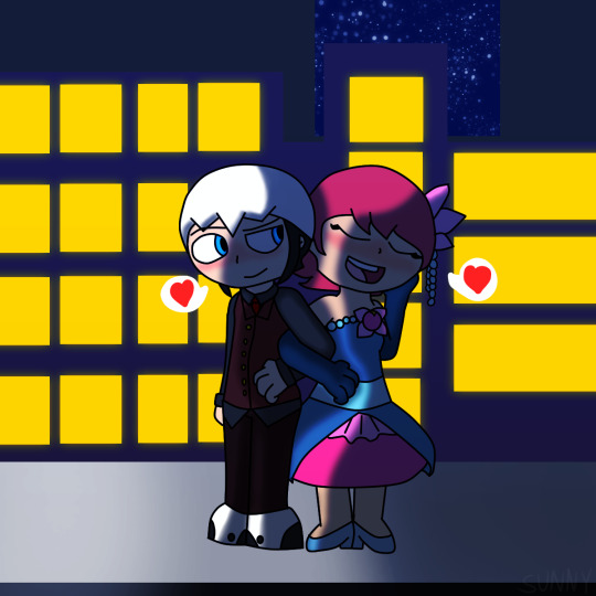
Miyabi said: Cute details on Meiru’s dress, tying in the floral hair clip and pearls with it. Going with the nighttime scene, obviously it should be darker, but the heavier shading on Enzan makes it a little harder to see the details in his outfit. But with arms intertwined, it’s obvious they are both enjoying the night out on the town.
- Bassrocks (@bassrocks) - Prom Dance:

AnnaMaria said: Really cute! I like the feel of this one! Color choices are nice. The pinks and purples feel very "Valentines". The punch bowl and cup stack are a nice touch. I like the effort that was put into the background, but it could use some perspective work. Anatomy is bit off in some places,
but if you work on the perspective a bit, that would help correct it a bit. Would have liked to see more detail in their outfits. I like the accessories you added, but the girl's dresses seem a bit plain. Some clothing construction seams could help.
- Borockman (@borockman) - Zero x Iris (w/ Sigma x Nana):

Miyabi said: What’s this? Why aren’t Sigma and Nana the stars of this red carpet gala?! It’s probably because of that Willy Wonka outfit. Didn’t rate high with the fashion police. Love trying to make out faces in the crowd, and how they are all enjoying their eyecandy. Both couples look quite elegant!
- Chocoorchid (@chocoorchid) - Zero x Layer:

Miyabi said: A cute closeup, and with the border design, almost reminiscent of a camera’s frame. Pinstripes are a sharp look for Zero, and in fact, I think you’re the only one to try that design in this contest. Just would have liked to see a little more of them in the image!
- CptRedder (cptredder) - Aeolus, Thetis, Atlas and Siarnaq:

Miyabi said: Aeolus isn’t sure if he needs to blow out Atlas’ flame with that rose offering! At the very least, he’s getting a little hot under the collar. I really like the sketchy, splotchy white border around them, it’s a different look. And keeping the pink hues to the shading bounces off the background pretty good.
Creator of Worlds (@thecreatorofworlds) - Anniversary Dance, Complete With Rock and Roll Clothing Changing Capsule .gifs, and Instagram party post:


AnnaMaria said: I appreciate the fake Instagram comments! They were fantastic! I like how the outfits feel, like I could actually go out and sew these myself if I wanted. Shows you know how clothing construction works. The outfit designs are very nice. Not too upper classy, but a good fit for them. The slight glow in the eyes is a nice touch. Would have loved to see a proper background. Right now the characters feel a bit disconnected from the background you have right now. Either the character tones/color should be a bit darker, or the background a bit lighter, so they feel more apart of that world.
Miyabi said: I think it’s awesome that you took the time to create the animated .gifs that had both Rock and Roll changing in the capsule, perfectly echoing the title of this category! Creatively, one of my faves, due to all the little extras that come with your submission. Clean lines and colors, where simple is better and still stands strong. Skull Man is adorable in his bowtie!
- Cuddlesnowy (@cuddlesnowy) - X x Zero:

Miyabi said: Blushin’ buds captured in a moment frozen in time. Cute innocent pic, and the photo frame helps show it was a special pic for both of them. Or that there’s still a Sears portrait studio near Maverick Hunter HQ...LOL
- DarlinHope (@darlinhope) - X x Merti:
Miyabi said: I really dig your painterly style, as it creates a really unique look that stands out. The starry sky seen through the large window behind them is gorgeous! The grey vest/pants combo is a nice muted contrast on the dapper X, compared to the bright yellows and gold of Merti.
- DreamingandGaming (@dreamingandgaming) - Ice Man x Roll, Kalinka x Rock, + Blues:

AnnaMaria said: Very cute. I like how the outfits are simplified to match the very cartoony style. Would have liked to see some center pieces on the tables, or other decorations to make it feel more like a party.
Miyabi said: Blues is too cool for your dances! I really thought Roll’s heart-shaped dress and all of Kalinka’s frills were unique touches to their dresses. Kalinka’s reminds me of a delicious multi-tier cake with black frosting trim, actually. LOL The Valentine’s fireworks cap off a fun, adorable scene.
- Gingler (gingler) - Swanky Couple Anniversary Dinner Party:

AnnaMaria said: I like how many characters are in this piece. You've managed to make it look not too cluttered, and I can easily tell what's going on.
Each table and dancing couple is telling a different story, and I love that!
Some constructive criticism would be to add some proper lighting. There's a light coming from above, yet there aren't any shadows. It makes it feel a little off. However, this is great example of storytelling!
Miyabi said: I really hope a bolo tie impresses Akane...a ninja wearing a western tie, what is this?! ;p I love the doctors just soaking in the evening while their humanized robo-children all intermingle. Enjoy having a few waiters and musical entertainment in the scene, too. You have a unique take on all the RMs, yet they are all pretty recognizable. Also, pimp Wily is pimpin’!
- IrisClou (@iris-clou) - Storm Eagle x Axl:

Miyabi said: Eagle looks so casual suave with his open-buttoned shirt and martini. Both he and Axl can leave the penguin suits for...well, Chill Penguin! Your rainbow hues for the warm background and cool couch are an awesome looking contrast. The colors on this are pretty unique.
- Jewel Maiden (@jewelmaiden) - Dynamo x Layer (w/Zero x Iris):

Miyabi said: Dat Iris grin! Seems like she had a plan to keep Layer away from Zero. LOL The floral lace pattern of Layer’s dress is gorgeous, and ties in to the mechanical forest background. Dynamo’s space-y tie is pretty neat, too!
- LightLabs (@lightlabs) - Sigma x Sigma’s Reflection (w/Zero x Iris):
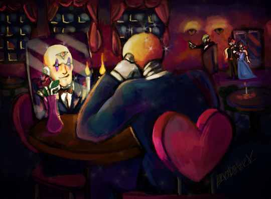
AnnaMaria said: Very funny, but still serious... Nice! This has a nice feel to it. I like your choice of colors a lot. The background looks nice. Would have loved to see more detail in the outfits. I can see a lot in the mirror, but a good chunk is hiding behind the rose.
Miyabi said: I like the dimly lit restaurant scene, and the little details like the heart-shaped chair and Green Biker Dude host. Hilarious giving Sigma those narcissistic qualities, loving himself more than anything else in the world.
- Metakit (@metakit) - Freeze Man x Star Man:

Miyabi said: The background pattern here is pretty unique, and I like how you were able to tie their main colors into it, while still not blending in too much that it takes away from the duo. Freeze in particular gives me a James Bond character vibe in his fancy getup. LOL
- Myan - Gemini Man x Gemini (Wo?)Man:

Miyabi said: Love the movement of Gemini Man taking a dip back! The bottom trim of his shirt coming out also sort of ties into looking like his crystal headpiece, too! Never one to shy from the spotlight, his twin proves that a Gemini can look good in a dress as well.
- Nat-Grim (Nat-grim) - Atlas x Aeolus:

Miyabi said: Rolling out the red carpet, Atlas rocks the V-Day red pantsuit well, while I like the extended tail on Aeolus’ suit, along with his heart-shaped tie. Definitely feels like a gala event photo op!
- Paranoid King Cepheus (@paranoidkingcepheus) - The largest entry ever known to mankind that I can’t even begin to thumbnail on tumblr...so I’ll just crop out this image of Akane dancing with Shadowman.EXE while Top Man spins to the beat:

Part 1. Part 2. Part 3. Part 4.
Miyabi said: You are insane for once again adding in all the characters that you have! And I love the massive effort! An adorable tale of Jack getting to the dance and so many hijinks and easter eggs in-between, with a very cute ending.
- Prosaic Wonder (@vava-fett) - Anniversary Dance:

AnnaMaria said: I really like all the characters packed into here! Each one is telling a different story, and a lot of them are actually pretty funny. I especially love the random leg with the high heel sticking out. I also appreciate you trying to match the original art style somewhat. The cell shading is really nice here! Ok, I'm gonna get super picky here. If those are Roll's hands holding up the cellphone taking a picture... They look more like adult hands. Child hands should be a bit more dainty and rounder looking. The style of her nail polish is also a bit "adult/older looking", even a bit out of fashion in style. I would have expected her to wear some glitter polish, perhaps even some fake rhinestones. Yes, this is silly comment, but since this category is focusing on the attires, I felt I had to address it. That being said, I really wish I could see more of their outfits. You did a great job designing so many of them, but all we really see are their heads a bit of their torso.
Miyabi said: I don’t know which I’ll be able get out of my head first: Gemini Man in a feather boa and thong or Top Man’s sexy stocking leg... A lot of fun and amusing interactions between the characters/couples here; I agree that it’s a little unfortunate for most that we can only see their heads, but there is so much to enjoy about your style and all that’s going on in the scene! It’d work as an awesome cover image, for sure!
Soulivium (@su5anlee) - Dark Kirisaki x Iris.EXE:

AnnaMaria said: I really like the costume design. It's very formal and modern looking! I especially like the lace around the dress, and how they are both wearing purple and red to match each other. Would have loved to see a background.
Miyabi said: Very fancy attire on both. I love the dueling abstract lacy sides to both Iris’ dress and necklace. It’s really gorgeous. The heart-shaped Killer Eye with scythes on top of Kirisaki’s top hat is fun and unique for a character like him to wear.
- Wimzik (@wimzik) - Netto x Food (and also Meiru + Jasmine) + Laika x Pride:

Miyabi said: Typical oblivious Netto, stuffing his face rather than mingling with the ladies! Great job telling a story, showing Meiru’s jealousy over Jasmine’s flirtation, and Laika’s nerves keeping him from leaving Netto’s side. The girls’ dresses are all unique and tailored to their personalities, and I’m amused that Netto felt like a striped tie would double as a fancy headband to make him feel dressed up!
- Wintesm (@wintesm) - Prom Photo Memories Bulletin Board:

Miyabi said: I love the continuity from last year’s prom entry continuing here, with a photo memory board. And there are still Search Snakes running amok! A lot of cute scenes, although I think I lean heavily towards the 3 on the far right as my favorite ones.
Thanks to all once again! Be proud of what you submitted!
Still working on typing the Humor Category results. They are coming soon, too! *faints from organizing this*
#Rockman#Megaman#Rock Miyabi's 2017 Valentine's Day Contest#Too many tags to list#Thank you!#Other people's art
33 notes
·
View notes
Text
INDAH 2015-07-19-2-127
FACEBOOK / INSTAGRAM / FLICKR / TWITTER
photo by: Roman Kajzer @FotoManiacNYC
INDAH – presenting SS16 collection during Swim Week in South Beach Miami at W Hotel 7/2015
WEBSITE LINK: INDAH SWIM
FACEBOOK LINK: INDAH CLOTHING
YOUTUBE VIDEO OF THE HIGHLIGHTS (0:49)
DAILYMOTION VIDEO OF THE FULL SHOW (16:04)
On Sunday, July 19th, 2015, over 500 guests including top media, influencers and buyers, attended the WET Lounge, at the W South Beach, to experience a rocking runway show. Indah debuted its 2016 collection, Collage, during SWIMMIAMI. By definition a collage is assembling different elements to create a new whole, and the designer, Libby Desantis, showcased her new vision with various looks inspired by different eras: 20’s art deco, 70’s punk rock, layered with 80’s glam and 90’s minimalism. Collaborating with artist, Anya Brock, Indah’s color palette is drawn from an abstract painting. Pops of painterly prints and bright hues are contrasted well against darker styles. Handmade with love from Bali, chains, studs, sequins, leather, lattice lace, shag and bones are incorporated into this collection, effortlessly adding an edgy statement to wearable fashion
High wispy hair and loose intricate braids added volume to each look. By using styling products of the highest caliber from René Furterer, and adding depth with luxe hair extensions from Indique, the hairstyle created a rocker chic meets Mad Max style. The look was straight forward, yet simultaneously feminine. It was a smoke show with Ted Gibson’s bold, black smokey eyes and UooLaa’s luscious lashes–creating drama that emulates the collection. FakeBake provided a bronzed goddess look while Zoya provided professional nailcare. Midnight navy and metallic silver polishes popped against the tan models. These colors provided a posh elegance which complimented the tough looks of the metal jewelry provided by Blaine Bowen, which included an assortment of fringed cuffs, braided bracelets and ear-cuffs. Electric Eyewear, available at Nordstrom.com, provided sunnies that mirrored the Collage Collection. Sleek frames with blackout lenses added to the overall look of the Indah woman: a confident, unapologetic mermaid with an “I don’t care” attitude. Indah was also excited to have sponsor support from Airelle, a premier natural skin care line recommended by top dermatologists and plastic surgeons, Silk’n Flash & Go, the at-home solution for painless, permanent hair removal and Braza, a functional, problem solving collection of products that provide women comfort, confidence and a carefree positive dressing experience.
ABOUT INDAH
INDAH is a Bali-based women’s swim and beachwear brand founded in 1997. Known for vibrant colors, seductive cuts, unique details and luxe fabrics, the brand embodies the meaning of Indah, which translates to mean “beautiful” in Indonesian. Rooted in the lifestyle of adventure and excitement, Libby, creates exotic designs inspired by her love for the island—her home. Indah owns and operates their own eco-friendly, solar powered and no waste water fabric processing facility.
The brand can be found in retail boutiques nationwide including Planet Blue, Urban Outfitters, Revolve Clothing, iShine365, Shopbop and Nasty Gal.
ABOUT ELECTRIC
Founded in 2000 in California, Electric makes quality products that enhance active lifestyles – offering ‘Style that performs’. By building upon what has stood the test of time, Electric reengineers classics. The brand designs and markets sunglasses, snow goggles and helmets, watches, backpacks, luggage and accessories. They can be found throughout the Americas, Europe, Japan, China and Australasia in Lifestyle boutiques, department stores, sports shops and online, including Electric’s own e-commerce websites. Electric is part of the Kering Group, a world leader in apparel and accessories which develops an ensemble of powerful Luxury and Sport & Lifestyle brands.
(above text by TANNER WALKER)
ABOUT SWIM WEEK
Even without longtime organizer IMG, Swim Week in 2015 has delivered a bounty of barely-there swimsuit collection for Spring/Summer 2016.
After IMG announced in May that it would be pulling out of what was formerly called Mercedes-Benz Fashion Week Swim, following the loss of its title sponsor, those involved had a lot of scrambling to do. Without a strong sponsor or an experienced organizer, could Swim Week even continue in all its stringy, deeply spray-tanned glory? True to the old adage, the show did go on thanks to the (somewhat) cohesive efforts of the affected brands, production companies and publicists.
Kicking off on July 15, this year’s Swim Week has appeared entirely unblemished — or the collections have, anyway. Old pros like Mara Hoffman and Mikoh delivered even more desirable swimwear for spring 2016, while a few less established names — in the swim world at least — brought some newness to the event. Maxim magazine, for one, showed its first-ever swimwear collection, inspired by Brigitte Bardot and chock-full of high-waisted bottoms and floaty coverups. Others, like Colombia-made Maaji Swimwear, went the Victoria’s Secret Fashion Show route, going all-out on a kooky theme, this year’s being a tousled, bohemian-era road trip.
But whether it was inspired by Bardot or Route 66, the common thread between each collection was an abundance barely-there, Brazilian wax-requiring swimwear. As with every year, some looks were so nude, so thinly-covered…you’ll just have to see them for yourself.
(above text by MAURA BRANNIGAN)
MIAMI SWIM WEEK:
A week spread between the sweaty Miami heat of three separate trade shows – Swim Show, Cabana and Hammock – of various personalities, with relevant brands occupying space in the show that suit their vibe. All of these shows are situated within walking distance of each other. Brands also have parties or fashion shows throughout the four days at nearby hotels and pools, making Miami Swim Week super busy and a whole lotta fun.
There is a lot to take in with over 25 external runway shows after 5pm, parties and the three simultaneous trade shows, but it’s plenty pleasing on the eye. There’s hot, Miami energy and it’s awesome to be seeing a preview of swim collections from the hottest brands for 2016.
MIAMI SWIM SHOW:
The world’s biggest swim show which occupies the convention centre with hundreds of brands from across the globe. Brands featured that we liked included Seafolly, Billabong, NLP Women, Kopper & Zinc, and Rhythm amongst hundreds of others.
CABANA:
This is the boutique show where the brands showcase in two big, cabana-style tents near the beach with coconuts issued to buyers, media and guests on entry. A few of our faves included Beach Riot, Minimale Animale, Tori Praver Swim, Mara Hoffman, Bec and Bridge, Boys and Arrows and Bower Swim.
HAMMOCK:
Situated in the W Hotel, with the coolest brands of today occupying the luxury suites to showcase their latest collection with their marketing teams and a bevy of hot models. Leading Instagram swim brands seemed to be the big brands in this year’s Hammock W show including Mikoh, Indah and Frankies Swim.
OTHER LINKS
www.grindtv.com/transworld-business/news/electric-sunglas…
www.miami.com/wetter-better-look-season039s-swim-week-art…
oceandrive.com/top-miami-swim-week-events-you-need-to-att…
www.aol.com/article/2014/07/29/swimwear-on-miami-beach-ru…
www.fashiondesignersindia.com/fashion-brand-indah/
miamistyleguide.com/indah-x-my-beachy-side-at-swim-miami/
www.bikini.com/style/runway-report-exclusive-look-indahs-…
www.venuemagazine.com/2015/07/20/swimweekonfleek-recap/
vegasmagazine.com/where-to-buy-stylish-bathing-suits
www.realstylenetwork.com/fashion-and-style/2015/07/best-l…
HISTORY OF THE BIKINI
Time magazine list of top 10 bikinis in popular culture
-Micheline Bernardini models the first-Ever Bikini (1946)
-"Itsy Bitsy Teenie Weenie Yellow Polka Dot Bikini" (1960)
-Annette Funicello and Beach Party (1960’s)
-The belted Bond-girl bikini (1962)
-Sports Illustrated’s first Swimsuit Issue (1964)
-Raquel Welch’s fur bikini in One Million Years B.C. (1966)
-Phoebe Cates’ Bikini in Fast Times at Ridgemont High
-Princess Leia’s golden bikini in Return of the Jedi (1983)
-Official uniform of the female Olympic Beach Volleyball team (1996)
-Miss America pageant’s bikini debut (1997)
The history of the bikini can be traced back to antiquity. Illustrations of Roman women wearing bikini-like garments during competitive athletic events have been found in several locations. The most famous of them is Villa Romana del Casale. French engineer Louis Réard introduced the modern bikini, modeled by Micheline Bernardini, on July 5, 1946, borrowing the name for his design from the Bikini Atoll, where post-war testing on the atomic bomb was happening.
French women welcomed the design, but the Catholic Church, some media, and a majority of the public initially thought the design was risque or even scandalous. Contestants in the first Miss World beauty pageant wore them in 1951, but the bikini was then banned from the competition. Actress Bridget Bardot drew attention when she was photographed wearing a bikini on the beach during the Cannes Film Festival in 1953. Other actresses, including Rita Hayworth and Ava Gardner, also gathered press attention when they wore bikinis. During the early 1960’s, the design appeared on the cover of Playboy and Sports Illustrated, giving it additional legitimacy. Ursula Andress made a huge impact when she emerged from the surf wearing what is now an iconic bikini in the James Bond movie Dr. No (1962). The deer skin bikini Raquel Welch wore in the film One Million Years B.C. (1966) turned her into an international sex symbol and was described as a definitive look of the 1960’s.
The bikini gradually grew to gain wide acceptance in Western society. According to French fashion historian Olivier Saillard, the bikini is perhaps the most popular type of female beachwear around the globe because of "the power of women, and not the power of fashion". As he explains, "The emancipation of swimwear has always been linked to the emancipation of women." By the early 2000’s, bikinis had become a US $ 811 million business annually, and boosted spin-off services like bikini waxing and the sun tanning.
Necklines and midriff
By the 1930’s, necklines plunged at the back, sleeves disappeared and sides were cut away and tightened. With the development of new clothing materials, particularly latex and nylon, through the 1930’s swimsuits gradually began hugging the body, with shoulder straps that could be lowered for tanning. Women’s swimwear of the 1930’s and 1940’s incorporated increasing degrees of midriff exposure. Coco Chanel made suntans fashionable, and in 1932 French designer Madeleine Vionnet offered an exposed midriff in an evening gown. They were seen a year later in Gold Diggers of 1933. The Busby Berkeley film Footlight Parade of 1932 showcases aqua-choreography that featured bikinis. Dorothy Lamour’s The Hurricane (1937) also showed two-piece bathing suits.
The 1934 film, Fashions of 1934 featured chorus girls wearing two-piece outfits which look identical to modern bikinis. In 1934, a National Recreation Association study on the use of leisure time found that swimming, encouraged by the freedom of movement the new swimwear designs provided, was second only to movies in popularity as free time activity out of a list of 94 activities. In 1935 American designer Claire McCardell cut out the side panels of a maillot-style bathing suit, the bikini’s forerunner. The 1938 invention of the Telescopic Watersuit in shirred elastic cotton ushered into the end the era of wool. Cotton sun-tops, printed with palm trees, and silk or rayon pajamas, usually with a blouse top, became popular by 1939. Wartime production during World War II required vast amounts of cotton, silk, nylon, wool, leather, and rubber. In 1942 the United States War Production Board issued Regulation L-85, cutting the use of natural fibers in clothing and mandating a 10% reduction in the amount of fabric in women’s beachwear. To comply with the regulations, swimsuit manufacturers produced two-piece suits with bare midriffs.
Postwar
Fabric shortage continued for some time after the end of the war. Two-piece swimsuits without the usual skirt panel and other excess material started appearing in the US when the government ordered a 10% reduction in fabric used in woman’s swimwear in 1943 as wartime rationing. By that time, two-piece swimsuits were frequent on American beaches. The July 9, 1945, Life shows women in Paris wearing similar items. Hollywood stars like Ava Gardner, Rita Hayworth and Lana Turner tried similar swimwear or beachwear. Pin ups of Hayworth and Esther Williams in the costume were widely distributed. The most provocative swimsuit was the 1946 Moonlight Buoy, a bottom and a top of material that weighed only eight ounces. What made the Moonlight Buoy distinctive was a large cork buckle attached to the bottoms, which made it possible to tie the top to the cork buckle and splash around au naturel while keeping both parts of the suit afloat. Life magazine had a photo essay on the Moonlight Buoy and wrote, "The name of the suit, of course, suggests the nocturnal conditions under which nude swimming is most agreeable."
American designer Adele Simpson, a Coty American Fashion Critics’ Awards winner (1947) and a notable alumna of the New York art school Pratt Institute, who believed clothes must be comfortable and practical, designed a large part of her swimwear line with one-piece suits that were considered fashionable even in early 1980’s. This was when Cole of California started marketing revealing prohibition suits and Catalina Swimwear introduced almost bare-back designs. Teen magazines of late 1940’s and 1950’s featured designs of midriff-baring suits and tops. However, midriff fashion was stated as only for beaches and informal events and considered indecent to be worn in public. Hollywood endorsed the new glamour with films such as Neptune’s Daughter (1949) in which Esther Williams wore provocatively named costumes such as "Double Entendre" and "Honey Child". Williams, who also was an Amateur Athletic Union champion in the 100 meter freestyle (1939) and an Olympics swimming finalist (1940), also portrayed Kellerman in the 1952 film Million Dollar Mermaid (titled as The One Piece Bathing Suit in UK).
Swimwear of the 1940’s, 50’s and early 60’s followed the silhouette mostly from early 1930’s. Keeping in line with the ultra-feminine look dominated by Dior, it evolved into a dress with cinched waists and constructed bust-lines, accessorized with earrings, bracelets, hats, scarves, sunglasses, hand bags and cover-ups. Many of these pre-bikinis had fancy names like Double Entendre, Honey Child (to maximize small bosoms), Shipshape (to minimize large bosoms), Diamond Lil (trimmed with rhinestones and lace), Swimming In Mink (trimmed with fur across the bodice) and Spearfisherman (heavy poplin with a rope belt for carrying a knife), Beau Catcher, Leading Lady, Pretty Foxy, Side Issue, Forecast, and Fabulous Fit. According to Vogue the swimwear had become more of "state of dress, not undress" by mid-1950’s.
The modern bikini
French fashion designer Jacques Heim, who owned a beach shop in the French Riviera resort town of Cannes, introduced a minimalist two-piece design in May 1946 which he named the "Atome," after the smallest known particle of matter. The bottom of his design was just large enough to cover the wearer’s navel.
At the same time, Louis Réard, a French automotive and mechanical engineer, was running his mother’s lingerie business near Les Folies Bergères in Paris. He noticed women on St. Tropez beaches rolling up the edges of their swimsuits to get a better tan and was inspired to produce a more minimal design. He trimmed additional fabric off the bottom of the swimsuit, exposing the wearer’s navel for the first time. Réard’s string bikini consisted of four triangles made from 30 square inches (194 cm2) of fabric printed with a newspaper pattern.
When Réard sought a model to wear his design at his press conference, none of the usual models would wear the suit, so he hired 19 year old nude dancer Micheline Bernardini from the Casino de Paris. He introduced his design to the media and public on July 5, 1946, in Paris at Piscine Molitor, a public pool in Paris. Réard held the press conference five days after the first test of a nuclear device (nicknamed Able) over the Bikini Atoll during Operation Crossroads. His swimsuit design shocked the press and public because it was the first to reveal the wearer’s navel.
To promote his new design, Heim hired skywriters to fly above the Mediterranean resort advertising the Atome as "the world’s smallest bathing suit." Not to be outdone by Heim, Réard hired his own skywriters three weeks later to fly over the French Riviera advertising his design as "smaller than the smallest bathing suit in the world."
Heim’s design was the first to be worn on the beach, but the name given by Réard stuck with the public. Despite significant social resistance, Réard received more than 50,000 letters from fans. He also initiated a bold ad campaign that told the public a two-piece swimsuit was not a genuine bikini "unless it could be pulled through a wedding ring." According to Kevin Jones, curator and fashion historian at the Fashion Institute of Design & Merchandising, "Réard was ahead of his time by about 15 to 20 years. Only women in the vanguard, mostly upper-class European women embraced it."
Social resistance
Bikini sales did not pick up around the world as women stuck to traditional two-piece swimsuits. Réard went back to designing conventional knickers to sell in his mother’s shop. According to Kevin Jones, curator and fashion historian at the Fashion Institute of Design & Merchandising, "Réard was ahead of his time by about 15 to 20 years. Only women in the vanguard, mostly upper-class European women embraced it, just like the upper-class European women who first cast off their corsets after World War I." It was banned in the French Atlantic coastline, Spain, Belgium and Italy, three countries neighboring France, as well as Portugal and Australia, and it was prohibited in some US states, and discouraged in others.
In 1951, the first Miss World contest (originally the Festival Bikini Contest), was organized by Eric Morley. When the winner, Kiki Håkansson from Sweden, was crowned in a bikini, countries with religious traditions threatened to withdraw delegates. Håkansson remains the first and last Miss World to be crowned in her bikini, a crowning that was condemned by Pope Pius XII who declared the swimsuit to be sinful. Bikinis were banned from beauty pageants around the world after the controversy. In 1949 the Los Angeles Times reported that Miss America Bebe Shopp on her visit to Paris said she did not approve the bikini for American girls, though she did not mind French girls wearing them. Actresses in movies like My Favorite Brunette (1947) and the model on a 1948 cover of LIFE were shown in traditional two-piece swimwear, not the bikini.
In 1950, Time magazine interviewed American swimsuit mogul Fred Cole, owner of Cole of California, and reported that he had "little but scorn for France’s famed Bikinis," because they were designed for "diminutive Gallic women". "French girls have short legs," he explained, "Swimsuits have to be hiked up at the sides to make their legs look longer." Réard himself described it as a two-piece bathing suit which "reveals everything about a girl except for her mother’s maiden name." Even Esther Williams commented, "A bikini is a thoughtless act." But, popularity of the charms of Pin-up queen and Hollywood star Williams were to vanish along with pre-bikinis with fancy names over the next few decades. Australian designer Paula Straford introduced the bikini to Gold Coast in 1952. In 1957, Das moderne Mädchen (The Modern Girl) wrote, "It is unthinkable that a decent girl with tact would ever wear such a thing." Eight years later a Munich student was punished to six days cleaning work at an old home because she had strolled across the central Viktualienmarkt square, Munich in a bikini.
The Cannes connection
Despite the controversy, some in France admired "naughty girls who decorate our sun-drenched beaches". Brigitte Bardot, photographed wearing similar garments on beaches during the Cannes Film Festival (1953) helped popularize the bikini in Europe in the 1950’s and created a market in the US. Photographs of Bardot in a bikini, according to The Guardian, turned Saint-Tropez into the bikini capital of the world. Cannes played a crucial role in the career of Brigitte Bardot, who in turn played a crucial role in promoting the Festival, largely by starting the trend of being photographed in a bikini at her first appearance at the festival, with Bardot identified as the original Cannes bathing beauty. In 1952, she wore a bikini in Manina, the Girl in the Bikini (1952) (released in France as Manina, la fille sans voiles), a film which drew considerable attention due to her scanty swimsuit. During the 1953 Cannes Film Festival, she worked with her husband and agent Roger Vadim, and garnered a lot of attention when she was photographed wearing a bikini on every beach in the south of France.
Like Esther Williams did a decade earlier, Betty Grable, Marilyn Monroe and Brigitte Bardot all used revealing swimwear as career props to enhance their sex appeal, and it became more accepted in parts of Europe when worn by fifties "love goddess" actresses such as Bardot, Anita Ekberg and Sophia Loren. British actress Diana Dors had a mink bikini made for her during the 1955 Venice Film Festival and wore it riding in a gondola down Venice’s Grand Canal past St. Mark’s Square.
In Spain, Benidorm played a similar role as Cannes. Shortly after the bikini was banned in Spain, Pedro Zaragoza, the mayor of Benidorm convinced dictator Francisco Franco that his town needed to legalize the bikini to draw tourists. In 1959, General Franco agreed and the town became a popular tourist destination. Interestingly, in less than four years since Franco’s death in 1979, Spanish beaches and women had gone topless.
Legal and moral resistance
The swimsuit was declared sinful by the Vatican and was banned in Spain, Portugal and Italy, three countries neighboring France, as well as Belgium and Australia, and it remained prohibited in many US states. As late as in 1959, Anne Cole, a US swimsuit designer and daughter of Fred Cole, said about a Bardot bikini, "It’s nothing more than a G-string. It’s at the razor’s edge of decency." In July that year the New York Post searched for bikinis around New York City and found only a couple. Writer Meredith Hall wrote in her memoir that till 1965 one could get a citation for wearing a bikini in Hampton Beach, New Hampshire.
In 1951, the first Miss World contest, originally the Festival Bikini Contest, was organized by Eric Morley as a mid-century advertisement for swimwear at the Festival of Britain. The press welcomed the spectacle and referred to it as Miss World, and Morley registered the name as a trademark. When, the winner Kiki Håkansson from Sweden, was crowned in a bikini, countries with religious traditions threatened to withdraw delegates. The bikinis were outlawed and evening gowns introduced instead. Håkansson remains the only Miss World crowned in a bikini, a crowning that was condemned by the Pope. Bikini was banned from beauty pageants around the world after the controversy. Catholic-majority countries like Belgium, Italy, Spain and Australia also banned the swimsuit that same year.
The National Legion of Decency pressured Hollywood to keep bikinis from being featured in Hollywood movies. The Hays production code for US movies, introduced in 1930 but not strictly enforced till 1934, allowed two-piece gowns but prohibited navels on screen. But between the introduction and enforcement of the code two Tarzan movies, Tarzan, the Ape Man (1932) and Tarzan and His Mate (1934), were released in which actress Maureen O’Sullivan wore skimpy bikini-like leather outfits. Film historian Bruce Goldstein described her clothes in the first film as "It’s a loincloth open up the side. You can see loin." All at sea was allowed in the USA in 1957 after all bikini-type clothes were removed from the film. The girl in the bikini was allowed in Kansas after all the bikini close ups were removed from the film in 1959.
In reaction to the introduction of the bikini in Paris, American swimwear manufacturers compromised cautiously by producing their own similar design that included a halter and a midriff-bottom variation. Though size makes all the difference in a bikini, early bikinis often covered the navel. When the navel showed in pictures, it was airbrushed out by magazines like Seventeen. Navel-less women ensured the early dominance of European bikini makers over their American counterparts. By the end of the decade a vogue for strapless styles developed, wired or bound for firmness and fit, along with a taste for bare-shouldered two-pieces called Little Sinners. But, it was the halterneck bikini that caused the most moral controversy because of its degree of exposure. So much so as bikini designs called "Huba Huba" and "Revealation" were withdrawn from fashion parades in Sydney as immodest.
Rise to popularity
The appearance of bikinis kept increasing both on screen and off. The sex appeal prompted film and television productions, including Dr. Strangelove. They include the surf movies of the early 1960’s. In 1960, Brian Hyland’s song "Itsy Bitsy Teenie Weenie Yellow Polka Dot Bikini" inspired a bikini-buying spree. By 1963, the movie Beach Party, starring Annette Funicello and Frankie Avalon, followed by Muscle Beach Party (1964), Bikini Beach (1964), and Beach Blanket Bingo (1965) that depicted teenage girls wearing bikinis, frolicking in the sand with boys, and having a great time.
The beach films led a wave of films that made the bikini pop-culture symbol. In the sexual revolution in 1960’s America, bikinis became quickly popular. Hollywood stars like Marilyn Monroe, Jayne Mansfield, Gina Lollobrigida, and Jane Russell helped further the growing popularity of bikinis. Pin-up posters of Monroe, Mansfield, Hayworth, Bardot and Raquel Welch also contributed significantly to its increasing popularity. In 1962, Playboy featured a bikini on its cover for the first time. Two years later, Sports Illustrated featured Berlin-born fashion model Babette March on the cover wearing a white bikini. The issue was the first Swimsuit Issue. It gave the bikini legitimacy, became an annual publication and an American pop-culture staple, and sells millions of copies each year. In 1965, a woman told Time it was "almost square" not to wear one. In 1967 the magazine wrote that 65% of "the young set" were wearing bikinis.
When Jayne Mansfield and her husband Miklós Hargitay toured for stage shows, newspapers wrote that Mansfield convinced the rural population that she owned more bikinis than anyone. She showed a fair amount of her 40-inch (1,000 mm) bust, as well as her midriff and legs, in the leopard-spot bikini she wore for her stage shows. Kathryn Wexler of The Miami Herald wrote, "In the beginning as we know it, there was Jayne Mansfield. Here she preens in leopard-print or striped bikinis, sucking in air to showcase her well noted physical assets." Her leopard-skin bikini remains one of the earlier specimens of the fashion.
In 1962, Bond Girl Ursula Andress emerged from the sea wearing a white bikini in Dr. No. The scene has been named one of the most memorable of the series. Channel 4 declared it the top bikini moment in film history, Virgin Media puts it ninth in its top ten, and top in the Bond girls. The Herald (Glasgow) put the scene as best ever on the basis of a poll. It also helped shape the career of Ursula Andress, and the look of the quintessential Bond movie. Andress said that she owed her career to that white bikini, remarking, "This bikini made me into a success. As a result of starring in Dr. No as the first Bond girl, I was given the freedom to take my pick of future roles and to become financially independent." In 2001, the Dr. No bikini worn by Andress in the film sold at auction for US$61,500. That white bikini has been described as a "defining moment in the sixties liberalization of screen eroticism". Because of the shocking effect from how revealing it was at the time, she got referred to by the joke nickname "Ursula Undress". According to the British Broadcasting Corporation, "So iconic was the look that it was repeated 40 years later by Halle Berry in the Bond movie Die Another Day."
Raquel Welch’s fur bikini in One Million Years B.C. (1966) gave the world the most iconic bikini shot of all time and the poster image became an iconic moment in cinema history. The poster image of the deer skin bikini in One Million Years B.C. made her an instant pin-up girl. Welch was featured in the studio’s advertising as "wearing mankind’s first bikini" and the bikini was later described as a "definitive look of the 1960’s". Her role wearing the leather bikini raised Welch to a fashion icon and the photo of her in the bikini became a best-selling pinup poster. One author said, "although she had only three lines in the film, her luscious figure in a fur bikini made her a star and the dream girl of millions of young moviegoers". In 2011, Time listed Welch’s B.C. bikini in the "Top Ten Bikinis in Pop Culture".
In the 1983 film Return of the Jedi, Star Wars’ Princess Leia Organa was captured by Jabba the Hutt and forced to wear a metal bikini complete with shackles. The costume was made of brass and was so uncomfortable that actress Carrie Fisher described it as "what supermodels will eventually wear in the seventh ring of hell." The "slave Leia" look is often imitated by female fans at Star Wars conventions. In 1997, 51 years after the bikini’s debut, and 77 years after the Miss America Pageant was founded, contestants were allowed wear two-piece swimsuits, not just the swimsuits (nicknamed "bulletproof vests") traditionally issued by the pageant. Two of the 17 swimsuit finalists wore two-piece swimsuits, and Erika Kauffman, representing Hawaii, wore the briefest bikini of all and won the swimsuit competition. In 2010, the International Federation of Bodybuilders recognized Bikini as a new competitive category.
In India
Bollywood actress Sharmila Tagore appeared in a bikini in An Evening in Paris (1967), a film mostly remembered for the first bikini appearance of an Indian actress. She also posed in a bikini for the glossy Filmfare magazine. The costume shocked the conservative Indian audience, but it also set a trend of bikini-clad actresses carried forward by Parveen Babi (in Yeh Nazdeekiyan, 1982), Zeenat Aman (in Heera Panna 1973; Qurbani, 1980) and Dimple Kapadia (in Bobby, 1973) in the early 1970’s. Wearing a bikini put her name in the Indian press as one of Bollywood’s ten hottest actresses of all time, and was a transgression of female identity through a reversal of the state of modesty, which functions as a signifier of femininity in Bombay films. By 2005, it became usual for actors in Indian films to change outfits a dozen times in a single song — starting with a chiffon sari and ending up wearing a bikini. But, when Tagore was the chairperson of the Central Board of Film Certification in 2005, she expressed concerns about the rise of the bikini in Indian films.
Acceptance
In France, Réard’s company folded in 1988, four years after his death. By that year the bikini made up nearly 20% of swimsuit sales, more than any other model in the US. As skin cancer awareness grew and a simpler aesthetic defined fashion in the 1990s, sales of the skimpy bikini decreased dramatically. The new swimwear code was epitomized by surf star Malia Jones, who appeared on the June 1997 cover of Shape Magazine wearing a halter top two-piece for rough water. After the 90’s, however, the bikini came back again. US market research company NPD Group reported that sales of two-piece swimsuits nationwide jumped 80% in two years. On one hand the one-piece made a big comeback in the 1980’s and early 1990’s, on the other bikinis became briefer with the string bikini in the 1970’s and 80’s.
The "-kini family" (as dubbed by author William Safire), including the "-ini sisters" (as dubbed by designer Anne Cole) has grown to include a large number of subsequent variations, often with a hilarious lexicon — string bikini, monokini or numokini (top part missing), seekini (transparent bikini), tankini (tank top, bikini bottom), camikini (camisole top and bikini bottom), hikini, thong, slingshot, minimini, teardrop, and micro. In just one major fashion show in 1985, there were two-piece suits with cropped tank tops instead of the usual skimpy bandeaux, suits that are bikinis in front and one-piece behind, suspender straps, ruffles, and daring, navel-baring cutouts. To meet the fast changing tastes, some of the manufacturers have made a business out of making made-to-order bikinis in around seven minutes. The world’s most expensive bikini, made up of over 150 carats (30 g) of flawless diamonds and worth a massive £20 million, was designed in February 2006 by Susan Rosen.
Actresses in action films like Charlie’s Angels: Full Throttle (2003) and Blue Crush (2002) have made the two-piece "the millennial equivalent of the power suit", according to Gina Bellafonte of The New York Times, On September 9, 1997, Miss Maryland Jamie Fox was the first contestant in 50 years to compete in a two-piece swimsuit to compete in the Preliminary Swimsuit Competition at the Miss America Pageant. PETA used celebrities like Pamela Anderson, Traci Bingham and Alicia Mayer wearing a bikini made of iceberg-lettuce for an advertisement campaign to promote vegetarianism. A protester from Columbia University used a bikini as a message board against a New York City visit by Iranian president Mahmoud Ahmadinejad.
By the end of the century, the bikini went on to become the most popular beachwear around the globe, according to French fashion historian Olivier Saillard due to "the power of women, and not the power of fashion". As he explains, "The emancipation of swimwear has always been linked to the emancipation of women", though one survey tells 85% of all bikinis never touch the water. According to Beth Dincuff Charleston, research associate at the Costume Institute of the Metropolitan Museum of Art, "The bikini represents a social leap involving body consciousness, moral concerns, and sexual attitudes." By the early 2000’s, bikinis had become a US $811 million business annually, according to the NPD Group, a consumer and retail information company. The bikini has boosted spin-off services like bikini waxing and the sun tanning industries.
Continued controversies
The bikini remained a hot topic for the news media. In May 2011, Barcelona, Spain made it illegal to wear bikinis in public except in areas near the beaches. Violators face fines of between 120 and 300 euros. In 2012, two students of St. Theresa’s College in Cebu, the Philippines were barred from attending their graduation ceremony for "ample body exposure" because their bikini pictures were posted on Facebook. The students sued the college and won a temporary stay in a regional court.
In May 2013, Cambridge University banned the Wyverns Club of Magdalene College from arranging its annual bikini jelly wrestling. In June 2013, actress Gwyneth Paltrow, who also is interested in fashion, produced a bikini for her clothing line that is designed to be worn by girls 4 to 8 years old. She was criticized for sexualizing young children by Claude Knight of Kidscape, a British foundation that strives to prevent child abuse. He commented, "We remain very opposed to the sexualization of children and of childhood … is a great pity that such trends continue and that they carry celebrity endorsement."
Four women were arrested over the 2013 Memorial Day weekend in Myrtle Beach, South Carolina for indecent exposure when they wore thong bikinis that exposed their buttocks. In June 2013, the British watchdog agency Advertising Standards Authority banned a commercial that showed men in an office fantasizing about their colleague, played by Pamela Anderson, in a bikini for degrading women.
Links:
en.wikipedia.org/wiki/History_of_the_bikini
en.wikipedia.org/wiki/Bikini_variants
en.wikipedia.org/wiki/Bikini
en.wikipedia.org/wiki/Swimsuit
en.wikipedia.org/wiki/Bikini_in_popular_culture
en.wikipedia.org/wiki/Indecent_exposure
en.wikipedia.org/wiki/Indecent_exposure_in_the_United_States
Posted by FotoManiacNYC on 2015-12-23 12:22:26
Tagged: , INDAH , designer , SS16 , collection , SpringSummer , 2016 , Miami , South Beach , W Hotel , W , swimming , pool , Florida , Swim Week , fashion week , clothing , bikini , swimwear , swimsuit , fashion , walking , catwalk , runway , designs , trendy , new , preview , sexy , beautiful , topless , almost , nude , naked , boobs , butt , booty , model , agency , nycphotographer , long legs , legs , heels , chic , flirting , teasing , presenting , hair , long hair , makeup , eyes , lips , thin , fit , body , tall , MIAMISWIM , SWIMMIAMI , FUNKSHION , curvy , woman , female , girl , show , vacation , vacations , sunbathing
The post INDAH 2015-07-19-2-127 appeared first on Good Info.
0 notes
Text
http://tribelamagazine.com/art-today-12-2-17-gig-depios-suspicious-minds-pink-pop-up-show-castelli-art-space/ TribeLA Magazine • Los Angeles Gig is a painter and an advocate for public art in Las Vegas, Nevada. He was awarded the 2016 Fellowship Grant in Painting by the Nevada Arts Council (NAC), and has worked on various exhibitions and projects with the Nevada Museum of Art… #Allartallthetime #Arttoday #Gigdepio #Pinkpopupshow #Tribelamagazine #William_Wray
New Post has been published on http://tribelamagazine.com/art-today-12-2-17-gig-depios-suspicious-minds-pink-pop-up-show-castelli-art-space/
ART TODAY 12.2.17 Gig Depio's "Suspicious Minds" is irresistibly provocative – The Pink Pop Up Show at Castelli Art Space ends Sunday
Suspicious Minds by Gig Depio
The Pink Show at Castelli Art Space, November 30 – December 3, 2017
5428 W. Washington Blvd., Los Angeles
For show information contact [email protected]
GIG DEPIO
Gig is a painter and an advocate for public art in Las Vegas, Nevada. He was awarded the 2016 Fellowship Grant in Painting by the Nevada Arts Council (NAC), and has worked on various exhibitions and projects with the Nevada Museum of Art (Reno), Nevada Arts Council OXS Gallery, UNLV Marjorie Barrick Museum, UNLV Donna Beam Fine Arts, Clark County Winchester Cultural Center Gallery, Clark County Library Galleries, the City of Las Vegas Galleries, the Nevada State College Galleries, and with curator Dr. Robert Tracy at the UNLV Healy Hayes Gallery.
The Artists
SEONNA HONG
Seonna felt like an outsider in school until she discovered she could open up communication with her art. From photo realist and comic book influences, her art evolved back into the more collage-oriented creations of her childhood. Seonna’s themes often include allegories of that lost child trying to find her way through her imagination onto her path in the world.
BRADFORD J. SALAMON
Bradford is an American portrait painter whose subjects are often fellow artists. He imbues ordinary objects of the past with an iconic art status beyond their cultural history. Bradford’s passion about the California art scene includes curating art shows and documenting fellow artists on film.
SHEPARD FAIREY
(Frank) Shepard Fairey is an American contemporary street artist, graphic artist, muralist, activist, illustrator and founder of OBEY Clothing who emerged from the skateboarding scene. He earned his Bachelor of Fine Arts from the Rhode Island School of Design in Providence, Rhode Island in 1992. He first became known for his “Andre the Giant Has a Posse” (…OBEY…) sticker campaign while attending college, which appropriated images from the comedic supermarket tabloid Weekly World News. He became widely known during the 2008 U.S. Presidential election for his Barack Obama “Hope” poster.
PAT RIOT
The work of Pat Riot, whose artistic view satirizes all forms of media, has been showing in Los Angeles since 1996. His diverse influences include television; MAD Magazine; artists Henry Darger, Ray Johnson, and Tim Hawkinson; the old school video arcade game “Space Invaders”; BANKSY; and the timeless futurist, Buckminster Fuller.
SEAN CHEETHAM
Sean is a figurative painter whose technical accuracy of his Alla Prima paintings, is derived from a deep understanding of drawing and his own system of mixing colors. Using the human form in familiar urban scenes (and often using his friends as models) he reveals a truthful, and often raw spirit that makes his work a distinctive, contemporary testimony of our time.
WILLIAM WRAY
William is co-curator of The Pink pop-up Show. He blends traditional skill sets of realism and the sheer energy of abstract expressionism in an ongoing evolution to find the right balance between two seemingly unrelated styles. He challenges himself to create a brand of realistic expressionism, he hopes to use as a bridge into the customarily circumspect contemporary art world. He has lived in California most of his life and studied painting at the Art Students League in New York. Making his living as a cartoonist who specialized in painted subjects, he spent many years coalescing an eclectic array of art styles, ultimately finding his voice in a contemporized reflection of traditional California regional painting that focus on humble subject matter rarely considered as fine art.
MICHAEL FLECHTNER
Neon has been Michael’s medium of expression for nearly a decade. His work reflects a fascination with the symbols of language, technology, and their influence on popular culture which he transmutes into visual word games from his unconscious. Despite the internal origins of his works, he strives to make them bold and easy to read, as any good sign design should be.
JENNIFER POCHINSKI
Painting for Jennifer is a mysterious process. A figurative painter, she loves the paint itself. The application of the loaded brush has a sensuousness that has developed into her personal language, yet she still feels like a bystander to this internal world that seems to drive itself thru her unconscious mind.
ARON WIESENFELD
Aron Wiesenfeld is an allegorical figurative painter. His work often takes the form of a visual allegory in which a young woman is confronted with the need to step off of some kind of precipice that will lead to the next unknown path of life’s journey.
ASHLEY WOOD
Ash does every kind of art there is from fine art painting to comics and toy design. His painting has his own style comic book structure with a expressionist painting energy confidently applied over the top of it that is at once both tender and violent, sexual yet warm and playful.
CHRIS RECCARDI
The fine art of Chris Reccardi (who is Pink Show artist’s, William Wray and Glenn Barr’s fellow “Ren and Stimpy” alumnus) reflects a wide range of literary and visual influences, from classic Victorian/Edwardian-era science fiction, to classic cartoon styles of the 1960’s and ‘70’s, to modern design. While Chris is known for his digital fine art prints, he will have an original painting in the Pink Show.
DAVID BUCKINGHAM Sculptor David Buckingham roams the gritty industrial areas, dodgy neighborhoods, and low deserts of Southern California in search of discarded metal forms of all kinds. In his Los Angeles studio, he uses an array of power tools and sheer force of will to muscle them into works of art. All colors remain as found, the purity of faded color carrying a history, he refuses to try and duplicate with new paint.
DAVE COOPER
Dave is a self-taught artist who developed his own vision as an animator and comic book illustrator. Turning to fine art in 2003, he produced cartoonish scenes filled with his unique disturbing imagery. Dave explores body image, lewdness, hedonism, and sexually awkward-looking girls with unique flaws and imperfections, in search of his own ideal of feminine beauty.
DAVID SHARPE
David is a contemporary impressionist painter from Canada who recently started to experiment in varied and unusual abstract expressionist styles. That rapid evolution to other disciplines is what interested the curators of the Pink show as David demonstrates that a traditional skill set can help expand the artist’s toolbox of styles.
DAVID LIPSON
David assembles one-of-a-kind robots from random objects. He studied oil painting at the Art Students League of New York and the National Academy of Design. His robots have been featured in museums, galleries, books, and on television. Previously, David spent 17 years as an animation producer for film and television.
ESCOTO + CARRARA
Escoto+Carrara (Frederico Escoto and Roberto Carrara) are Mexican artists and life partners, who still call Mexico home. Photographer and painter, they compliment to one another’s talent in a visual dance, culminating in an array of colors and movements pushing both photography and painting to the next level.
GLENN BARR
The surreal universe of Glenn Barr (who is Pink Show artist’s, William Wray and Chris Reccardi’s fellow “Ren and Stimpy” alumnus) – is a drenched haze in a post-apocalyptic urban Dreamscape. His Detroit work has been labeled a variation of lowbrow pop — or as he calls it, “B Culturalism.” With a nod to old master painting, pulp art, comics and animation, Barr’s paintings are mesmerizing in their narrative complexity and technical depth.
GORDON SMEDT
Gordon was trained in figure painting yet somehow gravitated to doing large paintings of objects and clothing using beautiful bright colors and flawless (yet painterly) rendering. His objective is to infuse the inanimate with energy and life.
GRONK
Gronk Nicandro, a Chicano artist from Los Angeles, has developed an international reputation for a provocative body of work that includes painting, drawing, opera set design, and murals. His work is collected by museums around the country, including the Smithsonian American Art Museum.
ROBERT SOFFIAN
Robert was born into a family that encouraged self-expression and personal artistic journeys. His journey has given him a rich a varied background–he spent part of his youth attending a radical art camp called Lincoln Farm, he went on to expand his personal and artistic horizons by travel throughout the world, and found work in Amsterdam as a government supported artist. He eventually settled in to a 30 year career at Shasta College in Redding, CA as a professor of theater, directing and lighting countless productions. He has curated dozens of exhibitions and is credited with discovering the Violent Femmes. During the last ten years, Soffian ventured from the public world of the theater to the private world of painting.
Soffian says this about his work, “I wish to paint things we all know or dream…very often I am first motivated by the excitement of the materials I am using…obviously I enjoy vibrant colors, and the texture of the physical body of the paint…for some reason, I have felt I needed to express something….what is the nature of that need and what it is compels me to keep doing this work is the subject of my life.”
JOHN BROSIO
John Brosio has found by default that he is a painter immersed in a state of perpetual discontent and learning to see. Though always fascinated by the idea of making “Star Wars” kinds of fantasy movies, he has applied his imagination to layered narrative painting. Following a long series of images that depicted moments of impending disaster, his work has evolved toward a more conceptual combining of imagined tableaus of a child’s toy and drawings into an orchestration of select visual relationships.
LOIC ZIMMERMAN
Loic Zimmermann is a French filmmaker and visual artist based in Los Angeles. His focus gradually shifted from illustration and 3D to photography and filmmaking. He also continues in VFX as an art director in major motion pictures. We have managed to coax him back to doing a mixed media painting for the Pink show.
MARK ENGLISH
Mark English has been one of the leading illustrators in the U.S. and abroad for three decades. In 1995, as Mark began to paint more personal fine art, he sought to infuse new and exciting compositions with a rich alchemy of unusual textural sources that have contributed to a kind of unique painterly collage. Transparency and translucency reign, with rich colors and atmospheric perceptions of space and scale. His works reside in many private collections and exhibit in solo and group shows throughout the world, including the United States, Canada, Europe, and Japan.
Andrea Bogdan
Bill Barminski
Jorge Pinzón Casasbuenas
Noah Becker
Pablo Llana
Rafael Serrano
ART TODAY 10.13.17: Thirty one Artists are poised, tools in hand – Come and see what they have to say at The Pink pop-up Show at Castelli Art Space 11.30.17
ART TODAY 10.14.17 – on November 30th, Witness a select group of extraordinary Artist at “The Pink pop-up Show” curated by William Wray and Hofberg/Iglesias – See artists list
ART TODAY 10.15.17 The Pink Show presents: The diversity between Michael Flechtner and Gig Depio – Part 2 (mark the date 11.30.17)
0 notes
Text
Art F City: This Week’s Must-See Art Events: Virtual Reality Exhibitions and Cyberdefense Workshops
The tight stuff and the right stuff at tonight’s special event with @babycastles –@di_mo_da @micahnotfound @moisesnotfound @akaprash @princessgollum and many more superstars 7-10pm Only @vrworldnyc #virtuallyexcited #actuallyexcited
A post shared by madabouteug (@madabouteug) on Jul 17, 2017 at 2:51pm PDT
Well, this week starts off strong.
Monday we’re looking forward to checking out the new VR World NYC, which is hosting a virtual reality art show and concert until midnight. If that hasn’t sated your cyberpunk hunger, check out Lin Wang’s cyborg wigs tuesday at Gallery Sensei, the NYFA/NYSCA group show Facial Profiling at C24 Gallery on Thursday, or the “Digital Self Defense and Empowerment Workshops” happening all Saturday afternoon at the New Museum. We love when a week’s itinerary in IRL New York looks like a montage from Hackers.
M
T
W
T
S
S
Mon
VR World NYC
4 East 34th Street
New York, NY
7:00 p.m. - 12:00 p.m. Website
Virtual Insanity™: VR + Music
Well this is undoubtedly the coolest thing happening on a Monday night this summer. Babycastles is presenting a virtual reality art show and concert at VR World NYC.
Among the highlights is the Digital Museum of Digital Art, which Paddy and I have both experienced and raved about. It’s seriously one of the best art-viewing experiences you can have this week, so get yourself there ASAP.
Artists: Alfredo Salazar-Caro and his virtual institution Di Mo DA, Art 404, Haleek Maul, James Orlando, HYPER.ZONE, LaJuné McMillian, Michelle Cortese, Michelle Senteio, Nicole Ruggiero, Prashast Thapan
Live performances by:
Icarus Moth, RAFiA, Haleek Maul
Tue
Gallery Sensei
135 Eldridge Street
New York, NY
6:00 p.m. - 8:00 p.m. Website
Lin Wang: Tenant, Tranant, Trance
This show is only up for two days, a unusual duration for an installation that has to do, on some level, with time. Lin Wang’s semi-narrative installation alludes to past tenants of a surreal domestic space, which itself is somewhat anachronistic—referencing a cyborg future where the synthetic and prosthetic wait to merge with absent bodies. The artist has created a series of household appliances associated with comfort (fans, massage chairs, etc.) combined with wigs. Picture mounds of artificial hair quivering in anticipation of contact with a user. So creepy, yet so alluring.
Artists Space
55 Walker Street
New York, NY
7:00 p.m. - 9:30 p.m. Website
People's Cultural Plan Launch
This looks good: Mychal Johnson, community activist and member of South Bronx Unite, and artist Chloë Bass will discuss the ins and outs of the People’s Cultural Plan. It’s a grass-roots, social-justice focused alternative to the Department of Cultural Affairs’ CreateNYC plan, which launches this week. The guiding principles here are de-gentrification, cultural equity, and labor equity—three things the city desperately needs, in particular for the survival of the arts.
The event features drinks, opportunities for discussion and mingling, and translators in Chinese and Spanish. This is a great opportunity to meet other artists thinking politically and getting involved in the interrelated labor/gentrification struggles happening now in New York.
Wed
Equity Gallery
245 Broome Street
New York, NY
6:00 p.m. - 8:00 p.m. Website
Liana Finck: Passing for Human
Liana Finck is the most millennial comic artist I can think of for several reasons. For one, her pen-and-ink melancholic musings on relationships, existential angst, and the never-ending stresses of being a broke 20-something are relatable and often hilarious. Also, she’s built her fan base out of her popular Instagram account. Here’s a chance to see her work (some 80 drawings!) IRL.
EFA Project Space
323 West 39th Street
New York, NY
7:00 p.m. - 8:30 p.m.Website
Setting 1880-1920 / Dinner Party
Liliana Dirks-Goodman’s theatrical dinner party/lecture/performance will introduce guests to “the utopian design visions of seven first-wave white feminists” who lived in the decades surrounding the turn of the last century. This is the era when a lot of social “progressives” advocated for urban planning, design, and architectural movements intended to better the lives of the poor and immigrants. We often hear about men’s grand visions for the “city beautiful” or Garden City movements, but the fact that many of these visionaries and activists were women is often overlooked. Their different perspective was often aimed at improving the lives of women as well.
The dinner (arguably the most highly-gendered domestic social activity of the 20th Century) will be prepared by chef Kristin Worral, who will use recipes from Rumford Kitchen’s cookbook.
Thu
MX
167 Canal Street, 5th floor
New York, NY
6:00 p.m. - 9:00 p.m. Website
My fossil, my echo / my excess, my scrap
This exhibition is curated around the idea of anxieties related to the index. The curatorial statement, from Gabrielle Jensen and Julia Lee, is a bit dense, but the show looks really promising. Chiefly, the concern here seems to be what becomes of an object once it is a record or fragment of itself?
I’m excited to see Carmen Neely included in this exhibition. When I met her on a studio visit years ago I was convinced she’d be an art star. Her work includes personified abstract forms that jump from piece to piece, personal objects embedded in canvases, and plenty of autobiographical ephemera worked into painterly compositions. It definitely fossilizes some weird stuff, and does it charmingly.
Artists: Cristine Brache, Isabel Legate, Carmen Neely, Kayode Ojo, Patrice Renee Washington
C24 Gallery
560 West 24th Street
New York, NY
6:30 p.m. - 8:30 p.m. Website
Facial Profiling
Curated by David C. Terry, this show looks at identity through the lens of seven NYSCA/NYFA Artists. The artists here touch on issues such as “the observed self, the portrayal of individuals as well as the perceived and projected self, and how we interpret/project imagery as portrait.” Included among the seven is master of selfies/constructed identity Sean Fader, so expect there to be a dash of humor among what could otherwise be heady navel gazing.
Artists: Samira Abbassy, Kwesi Abbensetts, Geoffrey Chadsey, Sean Fader, Michael Ferris Jr. , Kymia Nawabi, Oliver Wasow
Sat
New Museum
235 Bowery
New York, NY
1:30 p.m. - 6:00 p.m. Website
Digital Self-Defense and Empowerment Workshops
In conjunction with the exhibition Paul Ramírez Jonas: Half-Truths, the New Museum has teamed up with Equality Labs and NEW INC residents DATA X and Taeyoon Choi to offer an afternoon of workshops about surveillance and autonomy in the digital age. So spend a muggy Saturday nerding out to all your hacker fantasies in the New Museum’s air conditioning.
Here’s the rundown of workshops:
1:30 p.m. – 3:00 p.m. Handmade Computers with Taeyoon Choi—learn how to assemble a basic computer that can perform addition, keep time, and store memory! It’s free, but requires registration by emailing [email protected] .
3:15 p.m. – 4:00 p.m. Data Selfie with DATA X—DATA X is a creative studio that believes in transparency. Here, they’ll be demonstrating their browser add-on Data Selfie, which tracks the way sites such as Facebook track your data, giving the user a peak at how corporations and their algorithms view us. Register here.
4:00 p.m. – 6:00 p.m. Digital Self-Defense with Equality Labs—Equality Labs,
“a South Asian women’s, gender non-conforming, and trans tech collective” will present a workshop about protecting one’s information in the age of the surveillance state. This is pretty useful stuff as the world becomes more and more like William Gibson’s worst authoritarian nightmare. The event is limited to 30 participants, so be sure to register here ASAP.
Pine Box Rock Shop
12 Grattan St
Brooklyn, NY
2:00 p.m. - 6:00 p.m. Website
Meowmania! A Cat Party in Brooklyn
It is Summer in New York City, which means our art event guides tend to be a little heavier on events that are just ridiculous or activism-oriented than usual due to the dearth of art openings. This event is both.
Bring your leashed cat to partake in activities such as a cat photobooth, games, cat-themed drink specials, and a cat costume contest. The whole event is a fundraiser for local cat rescue programs, so all of this “basically internet circa 2012” style shenanigans is at least for a good cause.
Sun
Brooklyn Museum
200 Eastern Parkway
Brooklyn, NY
1:00 p.m. - 3:00 p.m. Website
Performance in the Park: Maren Hassinger's "Pink Trash"
As part of the Brooklyn Museum’s exhibition We Wanted a Revolution: Black Radical Women, 1965–85, Maren Hassinger will be re-staging her 1982 performance “Pink Trash” in Prospect Park. The piece was an important reflection on public space, labor, and “maintenance art”, and seeing it performed three decades later is bound to be something special.
Tickets are $25, but you get a lot of bang for your buck:
1:00 p.m. Special tour of We Wanted a Revolution and conversation with co-curator Rujeko Hockley and Maren Hassinger
2:00 p.m. Walk to Prospect Park
2:15 p.m. Performance of “Pink Trash”
from Art F City http://ift.tt/2u3fqKa
via IFTTT
0 notes
Last Seen Blogs

tvonq
shooters for dream

thaumatologist
was it worth all that war just to win
ogsheen
Pro-Gabrielism

fairytaletold
stories are for eternity.

talehovadu
Untitled