#especially since most of my art is portraiture or characters- it feels really out of place
Note
do you have any drawing advices? like things you wish people told you when you were starting etc
I am perhaps not the best person to ask about good art, nevertheless I am flattered! And not going to lie, I automatically think every ask is from a bot so it has taken me a while to reply, sorry!
Disclaimer in that I am still learning and improving every day, and I‘ve been drawing and doodling alone since a fetus so really I can only speak from my experience without any professional guidance or education in the subject, here are a few immediate thoughts;
- dont be afraid to go darker when using sharp pencil. be bold.
- anatomy is always useful to know when drawing animals/people - it‘s completely okay to use references, copying and interpreting help you learn. If digitally drawing, you may want to rough sketch first or use shaped, though this can be harder with traditional sketching.
- Draw for your own enjoyment or catharsis, seeking to please, forcing inspiration, or only doing so for monetisation sucks the joy?
- Doodle often without a finished image in mind
- Try not to compare your works to others, especially to artists younger than yourself. I once visited a Van Gogh exhibition and didn‘t paint for months afterwards because I know I will never be that good. It‘s not worth the artist block. If you do compare, focus on feelings of admiration and inspiration instead.
- It‘s easy to feel lost if you don‘t have your own ‚style‘ - it‘s not necessary to have, but maybe you will develop one through experimenting and it will come naturally.
- Don‘t feel put off if drawing even something small takes you a long time, or chastise yourself for procrastination. Most of my paintings are unfinished and most of my drawings are doodles because I lose interest quickly and have inspiration for something else.
- Negative space and colour theory is helpful? Though I learned these things on my own by practicing instead of reading because I find that boring. Bonus tip I thought helped me: shadows are often cool shades on a warm object! Not just a darker version of the same colour. Eg. Peach-coloured face with cool blue shading.
- unique perspectives and dynamic poses (even when your character is simply standing like contrapposto) can improve drawings drastically! May be my own bias talking, but sketching greco-roman statues helps so much with posing and anatomy.
And also a valuable question I learned very recently: when creating a portrait, are you drawing the figure as a subject or an object? —> this video has nothing to do with art but in fact it is talked about in depth when analysing Portrait of a Lady on Fire: https://youtu.be/3LcV2HmZUfY (around the 5-6 minute mark)
LASTLY, no art is bad art. If you are hesitant on posting or sharing, post it anyway, as someone out there will find meaning and beauty in it even if it is not your own view. You created something out of nothing, that in itself is to be proud of.
Hope this (essay omg) could help in any way :) apologises if it leans more towards portraiture rather than landscapes.
And now I will commence the ‚I shared my thoughts online oh no‘ and ‚damn i forgot to mention x y z’ emotions.
1 note
·
View note
Photo

Cosplay Photographer : Alive Alf
I believe it was Anime Los Angeles 2017 when I met Alify Nasution or better known as Alive Alf. I remember this because he had a portfolio book of his photography which is rare to me – most photographers would show their photography on their phones. As I flip through the portfolio, I could see he shot differently from other photographers. I could definitely see how being versed in graphic design informed his cosplay photography. When I started interviewing photographers, I reached out to him.
Do you have any photo shoots that come to mind as being one of your favorites to do?
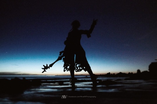
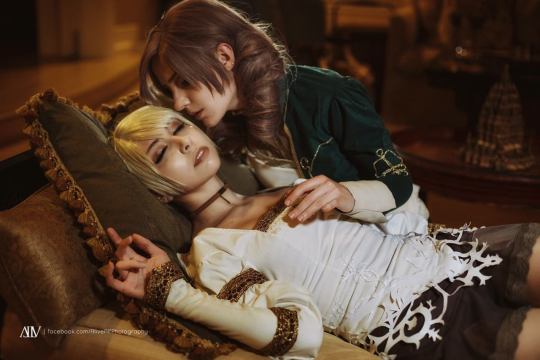
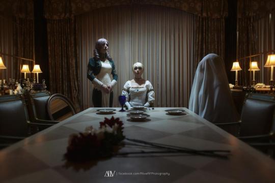
My current favorite photoshoot at the moment will be either Aqua (Kingdom Hearts) or Haunting Ground shoot. Both has similar reasoning which is trying to explore the character’s feeling through photography. I always enjoy doing a project that focus on the character’s feeling, kinda like a character study project. We brainstormed keywords and drew storyboards to develop our ideas together. It was such a great team effort.
How does American style of cosplay photography differ from those in Asia ?
I’ve been asked this question many times since I moved to America in 2015, but this time my answer has slightly changed. Back then I see that American style is really focusing on a single portraiture and stylized like a movie poster, compared to Asian style that are usually focused more on storytelling photosets. I think the reason why American style is heavy on portraiture and movie poster style photos is because most photography works they’ve seen since the beginning of their career has that type of photography style which inspires them to create such photographs. Same goes to Asian cosplay photographers, they’re inspired from the media they already familiar with hence the reason why they have that specific style.
But I think now American style has evolved and I’m starting to see a mix of portraiture and storytelling sets like in Asia, I think biggest the reason is from the influence of the internet especially social media. On my part, I usually share Asian style cosplay photography and try to introduce it to my fellow cosplay photog and cosplayer friends in America because I believe if we learn from both worlds, we can make our community stronger and better!
How did you get started in cosplay photography ? How long have you done photography for cosplay
I started out as a cosplayer first in 2005 in Indonesia. Back then there were not many photographers and I think the term “cosplay photographer” isn’t even born yet. I started becoming a cosplay photographer in 2009! There are two main reason how I started in cosplay photography, the first one is because I noticed that all the amazing craftsmanship of cosplay were only being showcased in a con and usually the only photo we had just simple photo with a convention hall as a background (hall shoots), I realized cosplay has a potential to become something bigger and artistic and I feel like combining photography with all the epic craftsmanship from a cosplayer is a perfect match to create a new form of art. My second reasoning is that as a male cosplayer in the early days of cosplay in Indonesia I felt discriminated by cosplay photographers, not many cosplay photographers treat me equally with other female cosplayers in our group, even during a photoshoot. From that experience I promised myself that when I become a cosplay photographer, I will do my best to treat everyone equally.
What is the process like working with you, what can the cosplayer expect? Usually I ask the cosplayer about what kind of concept or ideas they have in mind. Are they interested to do conceptual cosplay shoot or portrait cosplay shoot. Once we decide which type of photograph they wanted, I'll start gathering ideas and will try to brainstorm ideas with the cosplayer if possible. After doing all the pre-production process, the photoshoot will be pretty straightforward! Sometimes during a photoshoot I suddenly become silent and not saying a word for couple seconds, not to worry though, I'm just accessing my "Mind Palace" for ideas :P
How has cosplay affected your life ? Cosplay open lots and lots of opportunity to me, but one of the biggest thing that cosplay has done to my life is that it gave me the opportunity to move to America and even received an Artist Visa which is one of the more difficult visa to get. I really appreciate cosplay and the community for helping me grow to be a better person.
https://linktr.ee/alivealf
Brinni - Aqua // Brinni - Fiona Belli Kiki Kabuki - Daniella Maka
#kingdom hearts#kingdom hearts cosplay#aqua#aqua cosplay#haunting ground#haunting ground cosplay#cosplay#cosplayer#cosplay photographer#cosplay photographer interview
27 notes
·
View notes
Text
There may come a time when I can look Jonathan Frakes in the eye and have a conversation without turning tomato red and losing track of basic language skills. This past week wasn’t that time.
But we’re getting closer!
We have to start way back in 1987 when the Civil War led me to the Final Frontier. I watched the second part of a huge miniseries called North and South that actually began in 1985, but I don’t remember seeing it then. I was pretty young and going through some rough things in my family. The important thing is North & South had a character called Stanley Hazard played by (drum roll, please) Jonathan Frakes, seen here in Book III in 1994. At the same time that he was making Book I and II of North & South, he was also starting to work on Star Trek: The Next Generation. Presto! I followed “the guy with the blue eyes and the chin dimple” (quickly covered by a Civil War-appropriate beard) from the 19th century to the 24th century when I wasn’t interested in sci-fi at the time.
That’s love, folks.
Most of you know me enough by now to understand that I was born with a desperate need for connection to 19th century American history, so me as a child watching a giant Civil War miniseries, despite its major historical costuming flaws, isn’t that unusual. When Jonathan Frakes narrated a documentary called Lee & Grant a few years ago, I lost my mind when I heard his voice and had to pause the TV long enough to tell everybody in my house. I’m just like that. It’s part of my charm.
Last year, I met Jonathan Frakes when my friend invited me on the Star Trek cruise. Let’s revisit that glorious moment.
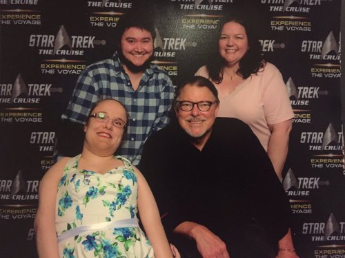
He did a Q&A that week and walked right by me because I was too chicken to ask a non-Star Trek question. What I really wanted to know was whether he did any preparation to play a villainous puppet like Stanley Hazard, whether he has interest in the Civil War period in real life, etc. Stuff that matters to me, not that Commander Riker isn’t a fantastic character. Trust me – I wouldn’t kick Riker out for eating cookies in bed. But I’m so invested in American history that I went to college for it before I got too sick to continue. Rooting out other people interested in American history is my stock and trade. So after the Q&A where I remained silent last year, I silently resolved to have North & South art autographed this year just for myself.
That brings us to last week. I boarded the cruise ship armed with unfinished Stanley Hazard art and sequestered myself in a corner of the pool deck to work on it before our ship even left port. They don’t tell you when autographs are right away and I was afraid there wouldn’t be time to finish it. Portraiture is my business, you see. I was swamped with orders well beyond Christmas and I barely had time to sketch out Stanley’s bewildered, resentful face before I left for the cruise. So I had to work on the ship in between activities.
Here’s how the progress went.
At home:
On the cruise:
How did it turn out? In my opinion … meh. My problem with it was the rolling, rocking ship and the unfamiliar surroundings. I need my little artist habitat to do my best work, although I did enjoy people coming by on the pool deck to tell me they liked it.
One of the crew people on the ship in particular spent quite a while talking to me about my art. I told her all about Jonathan Frakes and showed her what he looked like in the present so she could spot him when she met him. Every time I saw her after that, she had intel for me like, “Oh hi! Mr. Frakes up in VIP lounge now,” (she was Asian, I think, so English was a little tough) or, “Ah, it’s you, Miss Frakes Girl. You see him yet? You finish your art?” She even showed me the photo she took with him one night in that VIP lounge. I never asked for the intel but she was fun. Like, really, what was I going to do? Sneak into a place I wasn’t allowed to go? That’s not cool.
Yet I did see Jonathan every day on the ship. Most of the time he saw me too, but there were a few times when he was engrossed in talking to other people or headed somewhere fast (someone with legs that long moves much faster than I do) and I just didn’t want to be a bother. I ran into him immediately on my way to breakfast on the first day at sea. A big smile came over him and he rubbed my arm and spoke familiar greetings. I hadn’t had my coffee yet but that was a better wake up than caffeine. If you’ve ever been the target of his real smile, you know what I mean. I couldn’t believe it seemed like he remembered me.
The oddest thing was that we ended up on the same tender boat headed out to Grand Cayman. A zillion boats going back and forth all day and we ended up on the same one just a few rows apart. I don’t think he ever saw me since he was with his friends and I kept to myself out of equal parts politeness and shyness. You will have seen a photo of him snorkeling that day on Twitter. He went out there to see stingrays. As soon as I got off the tender, I went the opposite direction as him. Again, I didn’t want to be a bother.
It got better from there. He always had a big smile for me when we saw each other and said things like, “There she is,” or used kind endearments like “my dear” and the like.
Apparently one night while I was trying to find Jonathan’s photo op line, Jason Isaacs very nearly bumped into me and said hello but I never noticed him. So naturally my brother, who loves Jason Isaacs, made fun of me for the rest of the night and swore he was going to tell Jonathan that I was so laser focused on him that I completely missed Jason right in front of me. He never ratted me out. I think he values his life too much. But he might have had a point. Let’s be real. I spent a lot of time looking for a dress that made me feel like a lady to wear in my photo op. I didn’t say that, of course, but I was hoping Jonathan would notice it. He has to be a mind reader or he sincerely meant it because he said, “Beautiful dress,” without being prompted. The photo here is me strolling the pool deck after seeing him. I look drunk. I swear I wasn’t. I rarely get compliments from men that aren’t followed up by unsolicited photos of nude genitalia or being propositioned to send my own nude photos, so it was a moment.
I don’t fit in this century if we’re honest about it.
The autograph session for Jonathan was close to the end of the cruise, so I had plenty of time to finish my North and South art. I never could get it the way I wanted because of poor lighting and total exhaustion on my part. If you’ve never traveled with me, then you won’t know how much pain I go through every day. I don’t like to dwell on it in the moment, which means someone like Jonathan won’t ever see me suffer. The more I smile, the more my body hurts. Traveling causes more pain and more pain causes my artistic skills to decline. You guys probably can’t see it in Stanley’s finished art, but I can see exactly where my physical struggles overrode my creative drive.
However, Jonathan sincerely seemed to like what I did. I was terrified standing in line because people say he can be indifferent or cold sometimes. They say that about Michael Dorn too. My worst fear was him mumbling hi, how are you, scribbling his name, and moving on to the next person. The reward for an artist isn’t money at all but the fulfillment we get from seeing our work touch another person, especially if they are the muse. I really wasn’t expecting back flips, mind you. I just dreaded feeling passed over.
So Jonathan’s handler took the art first and got very excited over it. She asked to take a photo and she said he was going to love it. I have no idea what she did with the photo but I hope she liked it. When my turn came, he gave me that smile and said, “There she is!” as if he’d been expecting me. He took the art from his handler and he didn’t say anything for a second while I chewed a hole in my lip in abject terror. Then looked over the paper at me and said with a grin, “Spineless Stanley Hazard!” Relief flooded my body and I burst into laughter. He spent time studying my art and saying, “This is so great.” I wanted to say that North and South brought me over to Star Trek TNG through him but I was starting to fall into the dumb, speechless, tomato red thing I do around him. Luckily he was busy trying to plan how and where he was going to sign the art to notice that I was starting to freeze.
When he asked for my name and started to write the J, his eyes slid over to mine and he said, “Don’t you have three names?” It took me a second to realize he probably meant my name on Twitter. I’m listed as Jessica Jewett Jones @JJ9828 on Twitter so people who read my books or buy my art as well as people who know me in real life can find me (Jones is my legal name, Jewett is my name for books and art). I don’t know if he saw the panic alarms going off in my head. He never replies to people, so I figured he didn’t read his tweets. I have a have a habit of live tweeting Riker-centric Star Trek episodes. I express Beardo love on @sweartrek too. Twitter has to be the only place he’d see me with “three names” unless he has a secret Instagram account.
Who knows what kinds of embarrassing tweets he’s seen when I thought he wasn’t looking? Oh well. I never truly say anything online that I wouldn’t want the rest of the world to see. You just never know who’s watching. It’s fine for him to know that the Riker Maneuver in the movie (or generally Riker in combat command) turns me into one of those Victorian women in need of smelling salts. You know what? I own it. Still, I was teased the rest of the night for being busted.
I don’t know if photos in the autograph line were exactly kosher but my brother was behind me and he knew how important that night was to me. He discreetly took a few photos while Jonathan and I were talking. Hopefully we won’t get in trouble for this since it wasn’t done obnoxiously.
All joking aside, after Jonathan signed my art and handed it back to my brother (bonus points to him for knowing I can’t hold objects in my hands without being told), he caught my eye and got serious to say something to the effect of, “It’s always a pleasure to see you. Always.” It was a crowded atrium and I was honestly overwhelmed. But he made a point to make me feel valued and wanted. That meant everything to me.
Here’s the finished art with his autograph.
The next time we bumped into each other was unexpectedly at Brent Spiner’s theater show. My brother saw him sitting in my row on the other side of the theater, which was cool, but I wasn’t going to approach him. I never approach him, in fact. I just wait to see if he notices me and he usually does. He spotted me as he was walking by and he called out, “Hey, baby!” and blew a kiss at me with his whole hand. Nope, I can’t tell you what songs Spiner sang for a big part of the show after that. And for most of the second half of the show, while Spiner sang love songs, Jonathan sat right across the aisle from me and it took all of my internal fortitude to stay focused on the show.
I had hoped to catch him one more time on the last day to thank him for being so lovely to me all week. That never happened. I slept in late and then I spent the afternoon with my brother at the bar above the pool deck, ironically not drinking any alcohol. It was just a nice place to sit and watch the world go by.
There were so many other great things that happened on my trip, like Gates McFadden accidentally shoving my chair into Wil Wheaton, but it’s all too much to write in one blog. I mainly composed this one for myself so I could remember the things that were most important to me. If you found it interesting and made it to the end, you’re the kind of person I want to know and I thank you for hanging out here. I think I might do more North and South art once I’m not so buried in commissions too. We’ll see.
Yes, I am going on the Star Trek cruise next year as long as Jonathan Frakes will be there. I’d probably go even if he wasn’t there since it’s my friend Wendy who buys my passage, but he makes it so much more fun for me. And maybe I’ll figure out how to stop blushing like a virgin and say something more intelligent than hi and thank you. That’s really irritating me. I’m a 36-year-old woman who has had almost two dozen surgeries, a dozen broken bones, I’m a domestic abuse survivor, I’m more than a decade sober, and I can’t stand women that get all shy and silent around men. I’m a goddamn warrior! I can handle a 6’4 man like a queen! Next year, I’m going to blow his socks off with my charm and intelligence. He’ll go home and tell Genie Francis how awesome I am (ha!)
Next year’s autograph art? Will Riker vs Thomas Riker. So mote it be.
Oh, PS, it’s Wendy who has the photo ops and she’s in the middle of moving house during a snow storm. I’ll update this blog when she sends me the photo ops. In the meantime, go ahead and follow my social media at the bottom of this blog for more photos and my latest art projects.

Donation
Please consider making a donation to help me keep up with the cost of art supplies, living expenses, equipment related to my disability, and so forth. The minimum is set at $10.00. Thank you for your generosity.
$10.00
Follow me on social media!
Spineless Stanley Hazard (And Other Adventures) There may come a time when I can look Jonathan Frakes in the eye and have a conversation without turning tomato red and losing track of basic language skills.
#19th century#american civil war#art#art commissions#arthrogryposis#artist#atlanta artist#black and white#charcoal#civil war#commander riker#cruise#disability#disabled#disabled artist#drawing#fan art#fanart#genie francis#georgia artist#graphite#history#jonathan frakes#north and south#pencil#pencil drawing#portrait#portrait drawing#southern artist#stanley hazard
2 notes
·
View notes
Text
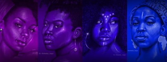
Sheeba Maya: Art with Magical Realism
Sheeba Maya, the artist who has creativity filled within her. Her process of creating art involves getting inspired, developing and creating iridescent artworks that showcase profound stories! The wunderkind individual has achieved a name in the industry and uses her platform to stand against racism. Sheeba also wishes to establish herself as public speaker and lecturer in the near future.

A prominent artist of the Afrofuturism movement specializing in portraiture, fantasy art, and realism, Sheeba Maya has been working as a freelance illustrator, fine artist, graphic designer, curator, and educator in New York, since 2009. She has been featured on popular blogs including Medium.com, Wacom.com, and Shondaland.com. Maya has participated in panels on everything from gender & race to ideation and concept development and also worked for the Nigerian film industry!
ORDER A CUSTOM ILLUSTRATION
Q. Your work has been featured in galleries across the USA, including scholarly works. What is your ethos behind each illustration?
Sheeba Maya: I’ve been making art my entire life. My parents were also artists so art as a lifestyle and an interest in cultural exposure is written in my DNA.
It’s definitely woven into my psyche. It’s so ingrained into how I process information and express thoughts. Filtering my life through art really sharpens my senses as a visionary with an undying drive to actualize what my mind can conceive. I am and always have been seriously self-motivated to learn and grow.
Along with the passion to develop creativity came a desire to share my process and final work. This started a conversation between myself and whoever was looking. I reflect often on this overwhelming amount of feedback and put that together with what I learn about people and the world around me.
So now I’m also developing empathy for humanity through art and art-making. This is especially useful when making art for clients and I have to reach into someone else’s mind and spirit to translate and create THEIR vision that will have an impact and meet a goal.

Q. Which treats of the first sally the ingenious Don Quixote made from home
Sheeba: These preliminaries settled, he did not care to put off any longer the execution of his design, urged on to it by the thought of all the world was losing by his delay, seeing what wrongs he intended to right, grievances to redress, injustices to repair, abuses to remove, and duties to discharge.

Q. Your work has been featured on Shondaland as well. What did that feel like?
Sheeba: Amazing! Anytime my art is featured on a large platform like that it’s a proud moment. Getting into ImagineFX was also a big-time goal that felt great. I like getting notes from other artists saying that they were inspired to push themselves creatively or professionally because they saw my work featured somewhere. It all reminds and affirms me that my work is purposeful.
Q. What would you describe your style as?
Sheeba: Generally I specialize in portraits, people, and characters. Thematically I would call it Fantasy Realism. My work is considered part of the Afrofuturism/Black Speculative Arts Movement.

“..When I read a story, I start to imagine it playing out in my mind. Like a daydream or a mind movie. The moment that best describes the story is the *jump off* concept. From there I can develop that concept or create alternative ideas by asking myself questions and exploring the “what if ?”. These are jotted down as thumbnail sketches.”
Q. Do you think we still have a long way to go before black women artists do not have to work twice as hard to get the recognition they deserve?
Sheeba: If this question is still being asked, then, yes! It is 2021 and we’re still celebrating the first Black female ‘this or ‘that’. The real question is who do we allow to validate that recognition.
Q. What kind of difficulties have you faced as a black woman in order to become a successful artist and reach where you are today?
Sheeba: One problem is this overall ever-present assumption that you lack anything of value or quality. With white men, it’s the opposite. So Black women have to devote more energy into proving otherwise.
Q. What has your experience with Wacom been like?
Sheeba: Simply amazing! I had my eyes set on them as a client for years. Seeing my art on their platform for the first time was a true thrill. I’m always excited for opportunities to create artwork featuring Black people being powerful and fantastical and designed to be enjoyed by anyone regardless of gender, race, or sexual identity.
Q. What software do you use to create your illustrations?
Sheeba: I switch between Procreate and Photoshop as my programs of expertise.
Q. What was your experience while visiting countless Comic Cons and creating art for the Nigerian film industry?
Sheeba: I am very eager for comic conventions of all kinds to return. I seriously miss meeting fans, creators, and other industry pros to exchange ideas, inspiration, and support. It wasn’t just the opportunity to sell my art. I participated in panels on everything from gender & race to ideation and concept development. I also hosted workshops on fantasy portraits, color theory, ethnicity and anatomy. and digital painting techniques.
Q. What is the first thing you do when you receive a brief? Describe your process.
Sheeba: The brief is like a little story. And when I read a story, I start to imagine it playing out in my mind. Like a daydream or a mind movie. The moment that best describes the story is the ‘jump off’ concept. From there I can develop that concept or create alternative ideas by asking myself questions and exploring the ‘what if’.
These are jotted down as thumbnail sketches. Thumbnails and related notes/questions are presented for feedback until the concept is worked out and confirmed. From there research for references or related info is performed and the artwork can be fully drawn and then painted to full detail.
Q. What are some of the most interesting pieces you have worked on so far? And who has been your best client to work with?
Sheeba: One experience that stands out is working with actress Erica Alexander (Living Single, Queen Sugar, Black Lightning). She reached out to me to create illustrative portraits of Michelle Obama and Maxine Waters. The illustrations appeared alongside articles written by Joy Reid (MSNBC) and Alexander herself in a series called MoonRakers featured on medium.com. When Joy Reid mentioned my art, her article and mentioned Michelle Obama in the same tweet!
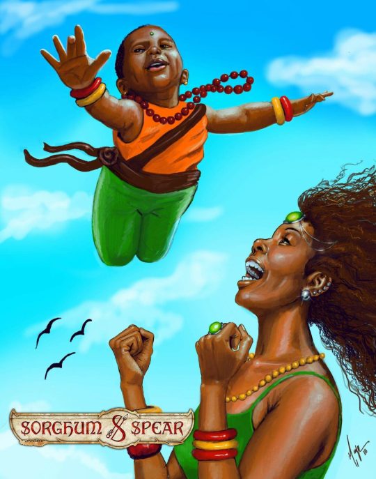
Another great experience was being hired by comic company Sorghum and Spear to paint collaborating actress Nichelle Nichols (Star Trek OTS) as one of their characters. When they shared a pic of her holding my artwork of her it was a seriously proud moment.
All of the women mentioned are personal heroes and have inspired me to discover, develop, and deliver my greatest potential. These were big-time honours!

Q. What are your plans for the future?
Sheeba: I am very eager for comic conventions of all kinds to return. I seriously miss meeting fans, creators, and other pros. My life and work were like a playland full of visionary and imaginative people that created and sustained it. Since the pandemic, I’ve been indulging in a lot of personal art that explores new aspects of familiar themes like magic, witchcraft and voodoo, Erotica, and cosplay. I’ve been enjoying all this in isolation but now I’m itching to share with the public all these new expressions.
I’ll also be offering art talks, lectures, and classes virtually in the coming year. It’s funny how social distancing actually pushed me towards becoming more accessible. Now that virtual learning and events are becoming the norm, I’m better able to offer these things to people who would like to work together but are not local to NY.
These preliminaries settled, he did not care to put off any longer the execution of his design, urged on to it by the thought of all the world was losing by his delay, seeing what wrongs he intended to right, grievances to redress, injustices to repair, abuses to remove, and duties to discharge.
ORDER A CUSTOM ILLUSTRATION
0 notes
Video
EVERYTHING ON MY DESK / IN MY ROOM RELATED TO BROODTHAERS
‘To be bien pensant …or not to be. To be blind’
What is Art? Ever since the nineteenth century the question has been posed incessantly to the artist, to the museum director, to the art lover alike. I doubt, in fact, that it is possible to give a serious definition of Art, unless we examine the question in terms of a constant, I mean the transformation of art into merchandise. This process is accelerated nowadays to the point where artistic and commercial values have become superimposed. If we are concerned with the phenomenon of reification, then Art is a particular representation of the phenomenon – a form of tautology. We could then justify it as affirmation, and at the same time carve out for it a dubious existence. We would then have to consider what such a definition might be worth. One fact is certain: commentaries on Art are the result of shifts in the economy. It seems doubtful to us that such commentaries can be described as political.
Art is a prisoner of its phantasms and its function as magic; it hangs on our bourgeois walls as a sign of power, it flickers along the peripeties of our history like a shadow-play – but is it artistic? To read Byzantine writing on the subject reminds us of the sex of the angels, of Rabelais, or of debates at the Sorbonne. At the moment, inopportune linguistic investigations all end in a single gloss, which its authors like to call criticism. Art and literature … which of the moon’s faces is hidden? And how many clouds and fleeting visions are there.
I have discovered nothing here, not even America. I choose to consider Art as a useless labor, apolitical and of little moral significance. Urged on by some base inspiration, I confess I would experience a kind of pleasure at being proved wrong. A guilty pleasure, since it would be at the expense of the victims, those who thought I was right.
Monsieur de la Palice is one of my customers. He loves novelties, and he, who makes other people laugh, finds my alphabet a pretext for his own laughter. My alphabet is painted.
All of this is quite obscure. The reader is invited to enter into this darkness to decipher a theory or to experience feelings of fraternity, those feelings that unite all men, and particularly the blind.
Ten Thousand Francs Reward (1974)
1. OBJECTS
Q: Do objects function for you as words?
A: I use the object as a zero word.
Q: Weren’t they originally literary objects?
A: You could call them that, I suppose, although the most recent objects have escaped this denomination, which has a pejorative reputation (I wonder why?). These recent objects carry, in a most sensational manner, the marks of a language. Words, numerations, signs inscribed on the object itself.
Q: Did you, at the beginning of your activity, follow so definite a direction?
A: I was haunted by a certain painting by Magritte, the one in which words figure. With Magritte, you have a contradiction between the painted word and the painted object, a subversion of the sign of language and that of painting so as to restrict the notion of the subject.
Q: Do you still value any objects?
A: Yes, a few. They are poetic ones, that is to say, they are guilty in the sense of “art as language” and innocent in the sense of language as art. Those, for example, that I shall describe to you.
A tricolored thighbone entitled Femur d’Homme Belge. Also an old portrait of a general that I picked up at a flea market, I forget where. I made a little hole in the general’s tight mouth and inserted a cigar butt. In this object-portrait, there is a fortuitous tonal harmony. The paint is brown, sort of pissy, and so is the cigar butt. Not just any cigar would suit any general’s mouth …the caliber of the cigar, the shape of the mouth.
Q: Would you call it the art of portraiture?
A: I prefer to believe that it acts like a pedagogical object. The secret of art must, whenever possible, be unveiled – the dead general smokes an extinguished cigar. So, counting the thighbone, I’ve made two useful objects. I wish I’d been able to do other pieces as satisfying to me as these. But I distrusted the genre. The portrait and the thighbone seem to have the strength to make a dent in the falsity inherent in culture. With the thighbone, nationality and the structure of the human being are united. The soldier is not far behind.
Q: There are many shells, mussels, and eggs in your work. Are these accumulations?
A: The subject is rather that of the relationship established between the shells and the object that supports them: table, chair, or cooking pot. It’s on a table that you serve an egg. But on my table, there are too many eggs, and the knife, the fork, and the plate are absent – absences necessary to give speaking presence to the egg at the table, or to give the spectator an original idea of the chicken.
Q: And the mussels – a dream of the North Sea?
A: A mussel conceals a volume. When the mussels overflow the pot, they are not boiling over in accord with physical law, but following the rules of artifice whose purpose is the construction of an abstract shape.
Q: Does this mean that you are close to an academic system?
A: It is a rhetoric that thrives on the new dictionary of received ideas. I don’t so much organize objects and ideas as organize encounters of different functions that all refer to the same world: the table and the egg, the mussel and the pot to the table and to art, to the mussel and to the chicken.
Q: The world of the imaginary?
A: Or that of sociological reality. It is that for which Magritte did not fail to reproach me. He thought I was more sociologist than artist.
2. INDUSTRIAL SIGNALIZATIONS
Q: The plaques made of plastic – do they correspond to this sociological reality?
A: I thought using plastic as a material would free me from the past, since this material didn’t exist then. I was so taken with the idea that I forgot that plastic had already been “ennobled” by its appearance on the walls of galleries and museums under the signature of the nouveaux realistes and American poop. What interested me was the warping of representation when executed in this material.
Q: They were published in editions of seven?
A: I myself was responsible for the edition, since no gallery would assume the risk of bringing them out at that time. To make them I did get some help from the private sector.
Q: What about the language of these plaques?
A: Let’s call them rebuses. And the subject, a speculation about a difficulty of reading that results when you use this substance. These plaques are fabricated like waffles, you know.
Q: Are these plaques really all that difficult to decipher?
A: Reading is impeded by the imagelike quality of the text and vice versa. The stereotypical character of both text and image is defined by the technique of plastic. They are intended to be read on a double level – each one involved in a negative attitude which seems to me specific to the stance of the artist: not to place the message completely on one side alone, neither image nor text. That is, the refusal to deliver a clear message – as if this role were not incumbent upon the artist, and by extension upon all producers with an economic interest. This could obviously be the beginning of a polemic. The way I see it, there can be no direct connection between art and message, especially if the message is political, without running the risk of being burned by the artifice. Foundering. I prefer signing my name to these booby traps without taking advantage of this caution.
Q: What kind of simpletons do you catch with your plaques?
A: Well, those who take these plaques for pictures and hang them on their walls. Although there’s no proof that the real simpleton isn’t the author himself, who thought he was a linguist able to leap over the bar in the signifier/signified formula, but who might in fact have been merely playing the professor.
3. THE FIGURES
Q: Do you situate yourself in a surrealist perspective?
A: This one I know by heart: “Everything leads us to believe that there exists a state of mind where life and death, the real and the imaginary, the past and the future, the communicable and the incommunicable, high and low, no longer seem contradictory.” I hope I have nothing in common with that state of mind. With Ceci n’est pas une pipe Magritte did not take things so lightly. But then again he was too much Magritte. By which I mean that he was too little Ceci n’est pas une pipe. It is with that pipe that I tackled the adventure.
Q: Can you give an example?
A: You can see in the Monchengladbach museum a cardboard box, a clock, a mirror, a pipe, also a mask and a smoke bomb, and one or two other objects I can’t recall at this point, accompanied by the expression Fig. I or Fig. 2 or Fig. 0 painted on the display surface beneath or to the side of each object. If we are to believe what the inscription says, then the object takes on an illustrative character referring to a kind of novel about society. These objects, the mirror and the pipe, submitted to an identical numbering system (or the cardboard box or the clock or the chair) become interchangeable elements on the stage of a theater. Their destiny is ruined. Here I obtain the desired encounter between different functions. A double assignment and a readable texture – wood, glass, metal, fabric – articulate them morally and materially. I would never have obtained this kind of complexity with technological objects, whose singleness condemns the mind to monomania: minimal art, robot, computer.
The nos. I, 2, 0 appear figurally. And the abbreviations Fig. poorly in their meaning.
Q: Is this the condition for your feeling at ease with yourself?
A: What reassures me is the hope that the viewer runs the risk – for a moment at least – of no longer feeling at ease. Be sure to visit the Monchengladbach museum.
Q: But suppose the viewer gets confused, and sees there an expression comparable to that of the nouveaux realistes of the 1960s?
A: My early objects and images – 1964-65 – could never cause that particular confusion. The literalness linked to the appropriation of the real didn’t suit me, since it conveyed a pure and simple acceptance of progress in art …and elsewhere as well. Given that, however, there’s nothing to prevent the viewers from getting confused, if that’s what they want. I do not assume good faith in my viewers or readers – or bad faith either.
Q: Did you begin with an elaborated vision of your project?
A: I have no idea what my unconscious may have fabricated, and you cannot make me put it into words. I have fabricated instruments for my own use in comprehending fashion in art, in following it, and finally in the search for a definition of fashion. I am neither a painter nor a violinist. It is Ingres who interests me, not Cezanne and the apples.
Q: Why haven’t you made use of books or magazines? There are many such means of information available.
A: As it happens I can more easily apprehend conceptual or other data through the information provided by the specific product (especially my own) than through its mediating theorization. It’s much harder for me to grasp things and their implications by reading books – except when the book is the object that fascinates me, since for me it is the object of a prohibition. My very first artistic proposition bears the trace of this curse. The remaining copies of an edition of poems written by me served as raw material for a sculpture.
A: A spatial objects?
Q: I took a bundle of fifty copies of a book called Pense-Bete and half-embedded them in plaster. The wrapping paper is town off at the top of the “sculpture,” so you can see the stack of books (the bottom part is hidden by the plaster). Here you cannot read the book without destroying the sculptural aspect. It is a concrete gesture that passes the prohibition on to the viewer – at least that’s what I thought would happen. But I was surprised to find that viewers reacted quite differently from what I had imagined. Everyone so far, no matter who, has perceived the object either as an artistic expression or as a curiosity. “Look! Books in plaster!” No one had any curiosity about the text; nobody had any idea whether this was the final burial of prose or poetry, of sadness or pleasure. No one was affected by the prohibition. Until that moment I had lived practically isolated from all communication, since I had a fictitious audience. Suddenly I had a real audience, on that level where it is a matter of space and conquest.
Q: Is there a difference between audiences?
A: Today the book of poems in new forms has found a certain audience, which is not to say that the difference does not persist. The second audience has no idea what the first is interested in. If space is really the fundamental element of artistic construction (form in language and material form), then, after such a strange experience, I could only oppose it to the philosophy of writing with common sense.
Q: What does space conceal?
A: Isn’t it like a game of hide-and-seek? Of course, the one who’s hiding will always say he’s somewhere else, and yet he’s always there. And you know he’ll turn around and catch someone. The interminable search for a definition of space serves only to hide the essential structure of art, a process of reification. Any individual who perceives a function of space, especially a convincing one, appropriates it mentally or economically.
Q: What are your political ideas?
A: Once I’d begun to make art, my own, the art I copied, the exploitation of the political consequences of that activity (whose theory can be defined only outside the domain where it operates) appeared ambiguous to me, suspect, too angelical. If artistic production is the thing of things, then theory becomes a private property.
Q: Have you ever made art engage?
A: I did once. They were poems, concrete signs of engagement since without compensation. My work in those days consisted in writing as few as possible. In the visual arts, my only possible engagement is with my adversaries. Architects are in the same position whenever they work for themselves. I try as much as I can to circumscribe the problem by proposing little, all of it indifferent. Space can only lead to paradise.
Q: Is there any difference between the plastic arts and a disinterested engagement?
(Silence).
Q: At what moment does one start making indifferent art?
A: From the moment that one is less of an artists, when the necessity of making puts down its roots in memory alone. I believe my exhibitions depended and still depend on memories of a period when I assumed the creative situation in a heroic and solitary manner. In other words, it used to be: read this, look at this. Today it is: allow me to present …
Q: Isn’t artistic activity – let me be precise: I mean in the context of a circulation in galleries, collections, and museums, that is, whenever others become aware of it – isn’t it then the height of authenticity?
A: Given the chosen tactics – to engage in territorial maneuvers – it is perhaps possible to find an authentic means of calling into question art, its circulation, etc. And that might – although it is unclear no matter how you look at it – justify the continuity and expansion of production. What remains is art as production as production.
Q: In such a game of roulette, how do you keep from losing your bet?
A: There’s another risk, no less interesting, to find the third or fourth degree. And you don’t have to get burned: that is. …
A Dream (1960)
Shattered eyes a Gothic king
strides without end the paving stones
of an ivory cathedral.
Clouds and death embroider his costume.
An angel plays dice:
a dazzling river
a drowned man lain among the flowers
a pewter decoy
a severe path
a harpsichord full of silver
an orchard enclosed with hair of gold
At the cradle of the forest
the paths are empty.
Two o’clock sounds. A
carpenter in a blue apron
descends from the heavens.
He takes a plank from the tree.
What’s the weather like?
It isn’t snowing yet.
The season is mauve. The foliage
opens:
a group of recent sisters roll
their eyes back to a tender storm.
Their hands cross over their enamel foreheads.
The houses burn with a celestial green.
One by one the magi parade by in blood.
It does not cease to sound two o’clock.
Three birds drink a bucket of tears.
Four Five Six Seven
Nine Ten Eleven Twelve
The blue of the fields darkens
at the base of the crystalline night.
Still dreaming the king
takes his hand to his marble heart.
It snows. The street is white.
#A Dream#Midnight#Shadow Theater#video#poetry#literature#art#interview#Ten Thousand Francs Reward#categories#hashtags#Fig. I#Fig. 2#Fig. 0#Marcel Broodthaers#Paul Schmidt#Elizabeth Zuba#Broodthaers#Broodthaers: Writings Interviews Photographs#1987#1974#1960
2 notes
·
View notes
Text
#WHM Petra Collins
We’ll be tapping our incredible archives in support of Women’s History Month and International Women’s Day and posting interviews from our Women issue throughout the month of March.
Petra Collins: me, myself and iphone
You have several collectives, one of which you recently curated a book for. What is the difference between “The Arduous,” “Me and You,” and your “Girls and Guns” blog?
It’s all totally different. “Me and You” is actually a clothing company that is named by my two best friends Mayan Toledano and Julia Baylis. I don’t design any clothes, I just shoot their lookbooks. As for my Tumblr, I use that more as a tool to save photos that I love. “The Arduous” was something I started in high school. I was just starting out as a photographer, and I didn’t really see any platforms that I could put my work on, so I just decided to create one and to invite other female artists to do the same.
How do the photography and art scenes differ between the US and Canada?
I went to an art high school and I went to a university for art. I feel like in Canada, you’re really taught to create art for a cause. I took Criticism and Curatorial Practice at my university and the whole practice is about curating change. We would learn about injustices in the art system. In Canada, it's a little more about the art. Coming here, there is a full commercial world for art
You’ve gotten to travel a lot in the U.S. for your video series and have spent time in L.A. and New York among other places. Which location provides the creative prime for you?
I love traveling across America and meeting girls from different states and suburbs. But I live in New York, and all my friends are here, so for me, it’s a creative hub. All of my friends are in the same field as me, and when we’re hanging out we’re actually working.
It just happens naturally here?
Yeah.
What conflicts have you encountered that you deal with in your work?
I’ve been an artist my whole life. I started the practice of photography when I was really young. Most of the conflicts came from inside, from growing up, and from learning about myself and about the world. It was hard to be taken seriously for a long time, as a young girl. It’s interesting to see how my images have changed since I’ve grown up.
How do you feel your work has changed?
It’s definitely become stronger aesthetically. I’ve been able to harness what my aesthetic is. Mentally, my view has changed toward my subject. I started when I was 15, so I was shooting girls my own age. Then shooting younger girls at my age, I had a different perspective and a wider knowledge of what it means to be a teenage girl.
How do you set up shoots to be more comfortable for them?
It’s almost about being invisible. I usually shoot people in their homes or at parties. I don’t tell people what to do, ever. I let things unfold. I try to remain a spectator.
Do you feel that your work is comforting for young girls to see among the photoshopped images they see in magazines?
I hope so. It’s hard growing up in a world where you don’t feel represented, and you don’t see your image anywhere. That’s what I try to do: create images for people who don’t see themselves in the world.
How do you determine which companies you work for, considering the negativity toward women the fashion world can breed?
It’s a very fine line. I don’t think I would ever do anything for Victoria’s Secret, but there’s always something to gain when a company that has been, or could have been, problematic hires someone who is trying to better the world. For me, it’s always a little bit of a win every time I get to work with a company that hasn’t done anything like I do before. It’s like slowly inserting that message into those companies, and the mainstream in general, who wouldn’t normally promote it.
You preach a lot about women being empowered and owning their bodies. How do you feel about Richard Kern’s near-pornographic work, especially having posed for him and worked as his casting director?
To put it bluntly, what he does is pornography. I really like him as a person, so I guess I’m biased. The one thing I’ve always liked about his work is that he casts literally any girl with any body type, which I find really cool. That’s something you don’t really see in male-heavy sexual photography. I’ve always loved that about him. He’s definitely not Terry Richardson.
You’ve worn many hats in your career: photographer, artist, casting director, and now, filmmaker. How did you adapt into each of those roles?
Film is something that I’ve always really wanted to do. It’s sort of my first love. That’s why I picked up photography, because it was an easier, less expensive way to tell a story. I’m still learning about film. It’s a totally different world. It takes so much longer. I definitely have to learn patience. In my ideal world, I would make a movie in a week and have it out right away, but it takes, like, a year. I’ve always been a multi-medium artist. I think it’s really important, if you’re focusing on one medium, to experience others, because it always strengthens your main focus. It wasn’t even about adapting, it was just something I naturally liked doing because it’s all part of creating images.
On “Girls and Guns,” there’s a couple photographs of you in bralettes on your blog crying. Are these part of a larger series? Or are they just something that happened?
They’re literally just things that happened. I like being open about my life, and I don’t like to censor it. I think it’s important to see that someone is multifaceted, and has emotions and does look like shit, it’s just another selfie that I post. I think they’re cool to see.
There is a focus in your work, especially in Discharge, on selfies and self portraiture in this generation. Where do you see the boundary between selfie and self-portrait? What do they mean to you?
I think selfies are a whole new, exciting way, especially for women, of becoming the creator and the subject of imagery. It’s such a cool medium, that we’re able to create our own stories and capture our own images. There’s always a weird negativity about selfies when it’s just a normal thing, and I think it’s a good thing to be able to mold your own image instead of having someone do it for you.
If aliens landed on the moon and wanted to understand teenage girlhood, what movies would you recommend?
The first one’s “Carrie.” I just saw “It Follows” and I really loved it. Not that it would explain anything, but I think it was a very awesome portrayal of teenage girlhood, where the main character was taken seriously. Did you see that movie?
No, I haven’t. It’s on my “to watch” list.
It’s really, really good. Everything was perfect. And the main character was treated as a proper protagonist. So, maybe I would say those two movies. They’re kind of weird choices.
Where do you see yourself five years from now?
Hopefully, making a movie. I would really love to do that. It might take a bit longer, but that’s something that I’m really working towards, a feature length film.
Would you film it, or direct it, or would you write as well?
I’d like to direct it, but I’d also like to have a hand in the writing. I don’t really write, but I’d like to have a hand in the thought of it.
Do you feel a certain responsibility to women as a female artist? Do you even consider yourself a female artist? Because that tends to be a little bit of a taboo with women.
It is definitely a taboo. I was just talking about this yesterday. I always feel that responsibility when people force me to feel it. When people are like, “You’re not doing enough." It’s a crazy standard that we put on each other. I mean, I don’t put that on anyone but when you’re representing a cause, there are always people who tell you that you need to do more. Sometimes I feel guilty that I’m not doing enough, then I have to sit and say, “OK, you’re one person.” A lot of my work takes place in the realm of pop culture. I’m not a savior. I’m just me, and I’m just doing my thing. A lot of people feel very entitled to other people’s lives. I always have this back-and-forth, where people are angry that I don’t do what they want. But I’m not a teacher. I’m just me.
1 note
·
View note
Text
My Favorite Movies of 2016 in Nine Digestible Categories
Every year it is the same story. As the year happens, people bemoan the state of movies. Then by the end of the year, and people compile their end of the year lists, we realize that movies are not a dying medium, slowly being replaced by television. Studios just succumb to the antiquated model of old release patterns. Movies vying for Oscars has to come out late in the year for momentum and blockbusters must be released in the dead heat of the summer. Both “20th Century Women” and “Why Him?” were close to sell outs last weekend as I attended my local multiplex. “Lion,” although only playing in two theaters in New York, sold out a 560-seat theater and its highest billed actor was Dev Patel.
Sure, those films were helped by the holiday bump and limited releases, causing the demand to look greater due to the lack of supply, but people are still going to the movies. And if not, the means of production has allowed for filmmakers to make $20 million indies with sources of output like Amazon Prime and Netflix along with the traditional studios to distribute to a wider net of audiences. With emerging voices like Barry Jenkins and Damien Chazelle and returning veterans and legends like Jarmusch and Scorsese releasing films this year, it is hard to begin eulogizing cinema.
So, it is my job to highlight 20 of my favorite films of the year. And to not succumb to the usual listicle, this list will be broken down to ten categories because all these films deserve to be watched.
Best Movies of the Year where Mahershala Ali Plays an Untraditional Father Figure for about 10 minutes of the movie
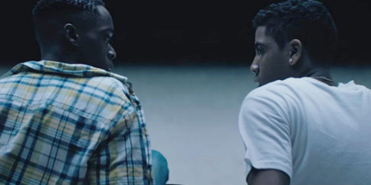
Moonlight, Kicks
Thank god for “Moonlight,” a film that has been written about so much that I do not know what I can bring to the conversation at this point. Without it, people may be left to try to salvage Nate Parker’s ill-begotten “Birth of a Nation,” as the obligatory black film of the year that it was positioned as at Sundance back in January of last year. But, “Moonlight” should not be considered a token of a film. Its rise to the top through think pieces and word-of-mouth speaks to how it was able to naturally build its base of spectators. “Birth of a Nation,” on the other hand, struggled to connect partially due to its controversy but also to its haphazard “Braveheart” style hero narrative and questionable use of victimhood especially that of rape. “Moonlight” is cinema at its best. It is a passport to a world, a mindset, an experience that is not readily available. It is empathy.
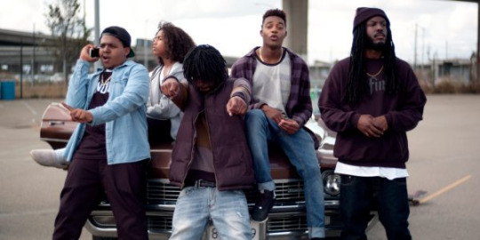
While “Moonlight” has dominated the conversation, Justin Tipping’s “Kicks” has been barely touched upon. It has been spoken so little of that since I saw it I have questioned my love of this small film. Tipping riffs on “Bicycle Thieves,” in which an African American teen, Brandon, gets his brand-new sneakers stolen in a city right on the outskirts of Oakland. This allows for Tipping to breeze through the neighborhood as Brandon and his two buddies searches for the men who stole his shoes. It’s a small film that screams that this is a first feature, but the style is so assured. Tipping is not afraid to take risks, allowing for flourishes of style and metaphors (there is a motif of an astronaut that aggressively highlights Brandon’s alienation for the things around him) that many more conservative filmmakers would not bother to entertain. Like “Bicycle Thieves” the plot is simply an excuse to explore a post-world II Italy, the plot here is an excuse for Tipping to explore the neighborhoods that has been forgotten about in film since the early 90’s. These characters are so richly drawn beyond what could easily be caricatures. If “Boyz in the Hood” gave a glimpse to life in “the hood,” “Kicks” is a portraiture. Also, best Mahershala Ali performance this year.
Best Movies of the Year where the Central Theme is that Grief is a Motherfucker

Manchester by the Sea, Jackie
There are horror movies which relies on jump scares. Like a roller coaster these momentary jumps are fun but ultimately has no lingering effects except for a scratchy throat. That is exactly the same way I feel about tearjerkers. Movies like “Lion” or “Beaches” live on sentimentality and tears. Like a superficial thrill ride, these films have a purpose and place. But, then there is a film like “Manchester by the Sea.” The film is filled with little moments that prove that Kenneth Lonergan is one of the great humane dramatist working today. Sadness and grief seeps into you like water slowly draining into the ground. But, what is so illuminating about the film is how the film portrays people dealing with grief; with anger, ambivalence. These characters are simply living. I have a friend, unfamiliar with Lonergan’s works and what struck as well was how funny the film was. That’s because even when our closest love ones are gone that does not mean that life stops going.

What happens, though, if someone’s life is defined by a person who dies? Pablo Larrain is one of the most exciting filmmakers working today. In “Jackie,” he takes what could have been a maudlin drama and with an incredible score by Mica Levi, creates a horror film. The monster for Jackie Kennedy is the weight of legacy, purpose and the American ideal. Is this what the real Jackie Kennedy went through in the immediate aftermath of JFK’s assassination? Probably not. But, what historical fiction does is to draw a parallel with these pristine historical figures with everyday living. What struck me most with “Jackie” was the amount of decisions that had to be made immediately after the tragedy. The same with “Manchester.” Jackie Kennedy mourns while also keeping up appearances in a role that has been bestowed upon her. She is the first lady of America, after all. She can’t be seen too sad, angry, or drunk. The real-life piece that is written about her weeks after JFK’s funeral which is fictionalized here as a framing device, was instrumental in sculpting that image. It sculpted a Camelot.
The Best Movies of the Year Where Coming-of-age is Manifested as a Monster

Closet Monster, The Fits
Not enough movies talk about how scary it is to become an adult. I’m in my early twenties, on the precipice of doing adult things like getting a full-time career and job and I still go to sleep at night in the fetal position. So, it is no wonder that puberty, adulthood and burgeoning sexuality has been portrayed in films as some sort of monstrosity. “Closet Monster,” a small Canadian film that I do not know anyone who saw, creates a monster in a teenager who is discovering his sexuality for the first time as he goes off to college. But, the complexity of this film from first time director, Stephen Dunn, comes from the fact that he is not defined by his burgeoning sexuality. Rather, this stress is compounded by the facts of adolescence. Pressure come from his single-parent father, whose self-destruction comes from the loosening of his grasp of his child, his artistic ambitions while confined in a small Canadian suburb, and the trauma from the abandonment of his mother. The monster in the on-the-nose title is not just one of repressed sexuality, but rather repression in all fronts. It’s no wonder that the violent act that occurs in this film is not because of sexuality at all.
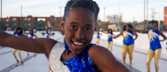
The monster in “The Fits,” another small film by a first-time filmmaker, Anna Rose Holmer, also rides the line of imagined or real. Her characters are on the precipice of teen-hood. This is the time when divisional lines are truly cemented, especially gender norms. Her protagonist starts off in a boxing gym, filled with males but is drawn across the hall to an all-female dance troupe. Insecurities are never immediately present especially from those who are feeling it. It usually comes with a look. Especially for a teenager, there is no greater currency than a sense of belonging. “The Fits’s” ability to hone in on that central need in a way that is not pedantic really creates a powerful image. The final shot of bliss as Royalty Hightower finally embraces the monster that would make her belong is one of the great cinematic images of 2016.
The Best Horror Movies Where the Little Girl is the Most Terrifying Things about It
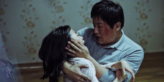
The Wailing, The Eyes of My Mother
To be fair, little girls are terrifying. It probably has something to do with the corrupting of something innocent that gets into the crawl of everyone’s skin. “The Wailing” is a Korean epic of a possession movie. And like the best Korean films, there is fluidity with genre in this film. The film readily goes from horror to police procedural mystery to comedy. Horror films are best when it comes from an assured hand and Na Hong-Jin is certainly assured in his skill and style. He slowly paces out the film with mood, atmosphere and uncertainty. At 2 ½ hours, each layer is lovingly paced. Not all the best movies have something to say in the undercurrent of the film. Some can just be plain scary and fun.
From the epic nature of “The Wailing,” comes the efficiency of “The Eyes of My Mother.” Nicolas Pesce’s first feature runs at a little under an hour and 20 minutes, and will undoubtedly become a cult film in which high schoolers show their friends to revel in how fucked up it is. Once again, this film thrives on the assured hand of Pesce’s direction. The black and white photography, the loving reconstruction of a minimalist household and the combination of aspects of image, costuming and setting creates a total cinematic experience. This film is informed by many in the past. The black and white images is reminiscent of early David Lynch and the economy of violence reminds me of the European art-house horror from Bunuel to Franju. Eyes plays a big role in horror films. It is scary to not be able to see and sight is connected to something so fragile and disposable. The camera is our eyes to this particular world. And the film works with the whole image. In one scene, we saw our hero/monster washing dishes and it is what we see through the window that is grotesque and haunting. These are images, that will not escape anybody who will eventually discover this film.
The Best Movies Where the Traditional Notions of How We Fall in Love is Questioned

The Lobster, The Love Witch
Love is overrated. Well, the way most people think about love is overrated. “The Lobster,” from Greek satirist Yorgos Lathimos, skewers our societal pressure on people to find a partner. The film’s dystopic setting strips away all that feels human so that all that is left is a kaleidoscope view of human interactions. Here, people decide that they are perfect for each other because of the most artificial of reason; short-sightedness, nose bleeds and beautiful hair. Everything is played pitched perfectly to dry deliveries anchored by Colin Ferrell at his best. Oh, and if I was had to be turned into an animal I would be a turtle. They have a portable shelter and could be proficient on both land and water.
I took a B-movie class at SUNY (Inset NY state city here) and the films we saw was a mish mash of exploitation with some rising to the top with subtle feminist’s ideology. But, for most of them, they are pure sexploitation of the woman’s body. Anne Biller lovingly recreates this subgenre of 60’s sexploitation film to create the defining feminist statement of the year. Everything is so acutely detailed that you might get distracted by the immersion into the world. The colors are in technicolor splendor, the clothes are beautifully retro and the acting is purposefully stilted that requires levels of acting that Brad Pitt will never reach. Yet, underlying all this is a story of a woman, a witch, who because of societal pressures keeps changing to what a man wants. She is the fantasy of every man but no man ever becomes the subject of her fantasy. In a genre that is often defined by superficial satisfactions of the id, Biller is able to create a nuanced film while not only embracing all the idiosyncrasies of a form from a bygone age, but by upending them.
Movies that follows the day in the life of its protagonists that eventually leads to drunken screaming and crying
Blue Jay, Krisha
The way people get excited about Marvel Movies is the way I get excited by the latest Mark Duplass joint. His latest film is a micro-budget film with Sarah Paulson that follows the familiar trope of two people walking and talking for a day that had been perfected by Linklater in the “Before Trilogy.” But, what it does with that trope is create an intimate film about lost love that becomes unpredictable. You question why are two central characters are doing what they are doing until the end makes it crystal clear. “Blue Jay” deserves to be watched twice just for the nuances that Paulson is able to portray that will not be clear the first time through. As if anyone needs any reminder that Sarah Paulson was a great actress.

In another micro-budget indie, Trey Edward Shults’ first feature does not even have any actors of note in it. In fact, everyone in the film is played by members of his own family about a story that is based on events from his life. “Krisha” is truly a family affair. Everyone knows the anxiety of coming back home for a big family dinner. Here, Shults films it as if it was a sweeping epic film. The way Terrence Malick films the fields in “Days of Heaven,” is how Shults moves his camera through the big open house as Krisha comes back home after stints in rehab. To call Krisha self-destructive will be an understatement. Here Stults captures moments of family that feels too close to home. With specificity comes relatability; Krisha prepares herself before she goes into the house, children running around with no care for the adult conversations, courtesy small talks with family members who no one cares for. In the end, it is the conflict of hope and shame family has for Krisha that makes the film unforgettable.
Movies in which Adam Driver plays a character who is unsure of himself

Silence, Paterson
Quentin Tarantino has always said that he was afraid about the complacency old age might bring him with his directing. Well, Martin Scorsese has not grown complacent. With “Silence,” Scorsese proves to be as vibrant, self-reflexive and edgy as he was in the 70’s. This film will be the definitive mark of his greatness. “Silence,” is the nearly three-hour epic about Jesuit priests facing persecution for their faith in Japan. The film becomes a meditation of faith in all kinds of obstacles. And as an early-twenties American living in the 21st century with no religion to call my own, I identified with the plight of the people longing for Catholicism and the priests that bring them. Scorsese creates a total cinema that is more sensory than any artificial 4D can create. The theater melts away and you become immersed in 17th century Japan. The first two hours are physically brutal but the genius is with the emotionally brutal last hour when the form of storytelling changes, ending in a beautiful final shot.
Best dog of the year goes to the now departed Marvin, whose presence in “Paterson” puts him in the pantheon of great dogs in cinema alongside Toto and Uggie from “The Artist.” I don’t know how to explain this film to people except to say that it is the exactly what you expect from Jim Jarmusch. He has not made a film like this in a while; a poetic meditation of a bus driver in Paterson, New Jersey. Much of this film was influenced by the poetry of William Carlos Williams and the film moves like a poem. There is a structure but not a traditional story structure. The film ambles along like a NJ Transit bus and characters move in and out. Adam Driver as Paterson warns at one point, before he reads his poems, that it does not rhyme. I feel like I have to preface this film the same way. But, I like my films like that. Jarmusch instead populates the film with colorful characters, including a couple that cyclically fights and breaks up and a gang in a convertible warning about dog-jackers.
Documentaries that subvert the form

Kate Plays Christine, Cameraperson
I love meta explorations into the form of films and why we watch them. So, to see Robert Greene continue to question why people watch film while also making his audiences question what is real brings me pure bliss. Here, Greene follows actress Kate Lyn Sheil as she prepares to play Christine Chubbuck, a real-life reporter who committed suicide on live television in the 70’s. There is no role for Sheil, just the process. But, through the process in which we see her try to get into the head of a person who suffered through manic depression, Greene and Sheil begin to question our obsession with these figures. Chubbuck fought against the increasing exploitation of violence on the news and her senseless violence has since made her into a cult figure that has seen people desperately searching for the video of her death like it is the holy grail. It’s unclear what parts of “Kate Plays Christine” is real but the questions certainly are.

What we learn from that film and “Cameraperson” is the camera is inherently subjective. We see what the camera person wants us to see. And we know based on what images are put together and what sequence they come in. Kristen Johnson has been a longtime cinematographer for some of the greatest documentarians from Michael Moore to Laura Poitras. Through those films, she has saved plenty of footage and compiled a film that is a diary of sorts. Through the montage of out of context footage, we get a story of who Johnson is, despite the fact that we barely see Johnson. The only times we do is when she shows footage of her mom and she documents her struggles through Alzheimer’s. It is an amazing way of presenting self and highlighting the power of the form. Also, it is strangely satisfying to see the philosopher, Derrida, casually crossing a street in Manhattan.
Movies in which little trinkets given to the main character serves as important character development

Kubo and the Two Strings, American Honey
Laika takes a Studio Ghibli approach to filmmaking. Their films take time and persistence to make, not just because of their intricate animation style but because so much attention is put to little humane moments. Animation has the distinct advantage of being able to do the impossible, but the best of animation comes when the human moments are recreated amongst the impossible. “Kubo” is Laika’s crowning achievement in their young history and it is a shame that more people did not see it. It’s an exploration of grief and how people deal with it but it never stops being a children’s film. It achieves the sublime beauty of storytelling and art. This the type of movie that kids will be drawn to because of its beauty and action and watch again to realize the complexity of emotions it is tackling with. Here as an unnecessary dig, “Kubo and the Two Strings” does more for the genre of animation than all of Illumination films combine.

Rhianna is the soundtrack of youth. Last year the French film, “Girlhood” had the best use of “Diamonds” is a film when four young French girls lip-sync to it bathed in neon lights. Now, a bunch of runaways in Andrea Arnold’s “American Honey” does the same to “We Found Love” in a Midwestern grocery store. Rhianna is freedom. And “American Honey” is the truth. A somewhat divisive film, the film follows a magazine crew, a mish mash of reckless youths selling overpriced magazine subscriptions. Our protagonist is Star, played by a future star in Sasha Lane, as she decides to leave her constrained life to freedom with this band of merry people led by Riley Keough and Shia LaBeouf. The film wanders along with this crew who has no destination. Rather, the destination is a journey for Star as she achieves self-actualization through wandering across the American landscape. This is a life unknown to me, a pleasure to be in, and an aftertaste sweet as Tennessee honey.
#best movies#best movies of 2017#american honey#krisha#kubo and the two strings#paterson#kate plays christine#cameraperson#silence#blue jay#moonlight#kicks#manchester by the sea#favorite films#jackie#love witch#the lobster#the love witch#the eyes of my mother#the wailing#the fits#the closet monster#martin scorsese#jim jarmusch#andrea arnold#laika#robert greene#mark duplass#barry jenkins#casey affleck
18 notes
·
View notes
Photo

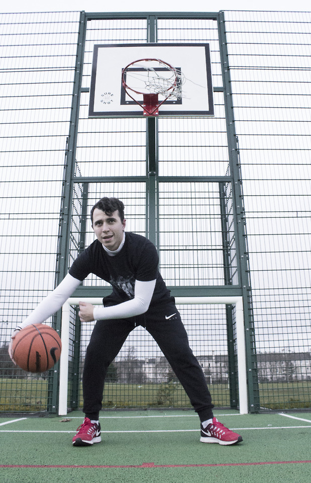
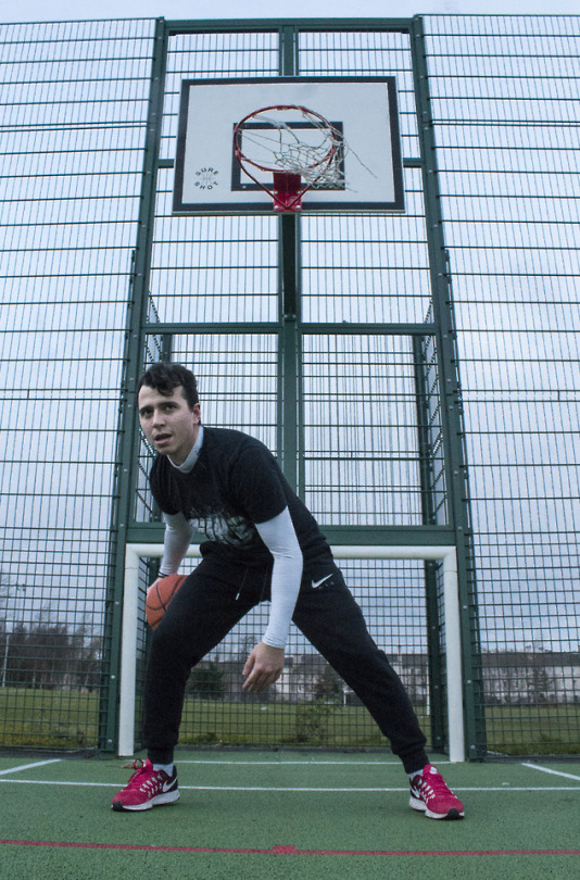
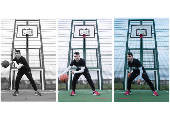


FINAL PROJECT - Portrait of an individual in their environment 🏀🥊👨💻
As a grand finale (of the trimester, though 😅), this last visual exercise was one of the most engaging and new experiences to me.
When we received the task to capture an individual in 3 different locations, demonstrating 3 different light qualities, aaand showing the person in their environment, I knew that I had to photograph somebody close to me.
So far I have been doing mostly spontaneous portraiture rather than staged, planned photoshoots. That’s why I wanted my first serious rendezvous with portrait photography to be with a person I know well. So I picked my boyfriend, as he is my closest person here in Edinburgh. I know his passions, character, nature. So I felt I could capture and introduce this in photographs.
More organized than ever, for this project I had an almost clear idea what I was going to do before I started the executive part. Knowing I was going to use Denis as my model, first I thought about the way I was going to present his image in the photographs. We both considered the options and agreed representing him through his hobbies and passions was the best way of speaking about his personality through visuals.
Making a project with an individual, I cannot not turn it into a story about him - after all, isn’t that the role of photographs?
Denis is a very expressive person, physically(facially) and emotionally. So I really wanted to depict that, and photographing him doing ‘his things’ was the best way to achieve this effect naturally.
Most of all, Denis is a sportsman - practising sports is in his nature. Basketball and Taekwon-do are an incorporate part of his life and have helped him built the person he is today.
For the basketball photograph he even took a day off work so that we can shoot (i.e. he-play basketball, and me-take photos :)). The day was very bright and sunny... until we stepped on the court. Edinburgh weather = for about 3 milliseconds it became extremely windy and cloudy, at the end it even started raining, so the session didn’t go as planned. We couldn’t get the details like getting him dressed in basketball shorts, because it was really cold, so it had to be a quick shoot, which got me fed up. However, I took solidly many photographs and after reviewing them on my laptop it turned out I was actually going to have a hard time choosing which picture to use. That’s why eventually I had to combine three of them into a collage... I couldn’t choose a favourite. But I thought in fact they looked good as a series, first because of the gradual colouring and second, because of the developing motion.
📸 ⚙ specifications: 1/250 sec. f/10 18mm, ISO 3200 (well, it wouldn’t be that high but after it became so cloudy the light available diminished, and I had to use fast shutter to get a sharp fast movement)
🔜I will share some of my other favourites in a separate post.
Taekwon-do has been Denis’ passion since he was a child, so fighting (well in the positive way, of course 🙃) is in his blood in a way. I wanted to capture the fighter in him. So one day before he went out to practice I caught him for a shoot. In order to achieve the dramatic effect, I chose the staircase in the building we live in as a location, where light comes only out of the window. I desaturated the colours, leaving only the red palette stand out - the symbol of danger. The composition has a crucial role in conveying the message of this image. I took the photos from behind the handrails in order to use the vertical lines as a sign of jail cell, reminding of one being a prisoner of his own mind. Deliberately I left the left part of the image empty as a hole leading to the freedom - it serves the choice, and the person is looking at the window, giving the impression he is thinking about this choice. I decided to leave the visible part of the view from the window saturated so that it shows colour, vitality, meaning that this is what awaits him outside. As it was dark inside and light coming from the window was strong, I had to bring up the ISO, open the aperture wider and slower the shutter speed to get more light focused into the inside part of the picture. Thus, however, I burned the window and it came out too overexposed which seems to be not fixable. Still, even in this way there are positive aspects of the picture - as there is not much detail into the window, it doesn’t distract from the main focus of attention. Last but not least, Denis’ facial expression contributes very much to the overall feeling of seriousness and dramatic atmosphere. I believe this picture can be read in different ways, but my motives taking it was to depict how a fighter usually stands alone, and is often faced with serious decisions, being confronted with his own self. You are your own limits.
📸 ⚙ specifications: 1/30 sec. f/13 18mm, ISO 6400
Last, but not least, the third photograph is devoted to Denis’s passion for PC games, especially Counter Strike,and technology as a whole. By first look the light of his computer (behind the screen) and keyboard attracts the attention and speaks for his keenness for state-of-the-art technology. Another thing that is crucial to the reading of the picture is the rapt look he has shot into the screen, on which it can be seen he’s playing his favourite game. He’s entirely devoted to the game and his absorbed look makes it evident. The dark surrounding closes and limits the scenes to what is happening in front and into the screen and conveys how it is the only thing that matters now. The black edges, contrasting with the light in the centre of the photo lead the attention to the focus of attention. Apparently, I took the shot in profile so that both the model’s face and the screen with the game on it would be visible. I experimented a lot with the shutter speed and apertures to take the final image, because it was hard balancing the light between the monitor and the face. In some shots the face appeared perfectly clear, but the screen - overexposed without any detail visible; with faster shutter, I lost some detail from the face to get some into the screen.
📸 ⚙ specifications: 1/13 sec. f/5.6 21mm ISO 6400
On the whole, I am satisfied with the overall look of the images I took. I have to say that the effect I desired to achieve was not depicting ‘hobbies taking over people’, but how strong they can affect them, and in fact how they can contribute to one’s personality. Maybe in a longer sequence of photographs I would tell a better, fuller story on this subject.
For this project I looked up to grand photographers, using portraiture strongly expressively, some examples being Eugenio Recuenco, Henri Cartier-Bresson, Hannah Starkey, as well. For the way I wanted to represent my model, however, I was most inspired by the work of Irving Penn and Richard Avedon. Specifically, these ones:
Football Face, New York, 2002

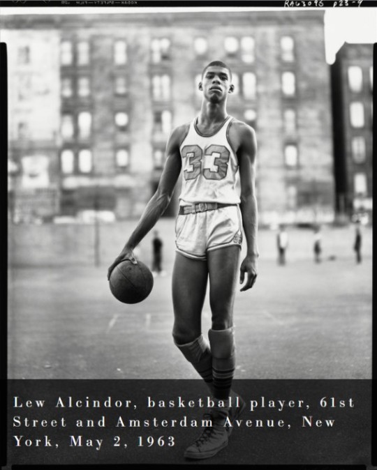
It motivated me to work and elaborate on the idea of ‘when you are your hobby’, which he has depicted in quite a literal and creative way. Initially I imagined taking a photo of Denis with a basketball head, but then I remembered it is not a recreation project anymore. :)
In general, I feel this project was one of the most interesting ones, giving freedom with the broad topic, making us interact with a model, which was a new experience. A significant factor for the opportunity of engagement with my subject was the big period of time we had to work throughout. It was liberating because I had more time to think about the concepts of the photographs I am going to present.
Moreover, I believe the fact that I worked with such close person made the project easier as coordinating and cooperation went naturally and smoothly. Knowing his personality made the creation of the concept of the images easier, but it also liberated me to bring further context to the stories behind.
Having finished this project now, I realize how manipulating photography can be, conveying any message you decide to put into it. I am both terrified and terribly fascinated by this idea.
Anyways, I loved the last project and hope it was a very successful one.
0 notes
Link
FULL DISCLOSURE: As an adult, I’ve only ever really invested in one piece of non-comics art, a painting (Psychedelic Self-Portrait, 2012) by Aline Kominsky-Crumb, the self-described “grandmother” of autobiographical comics. Those who have read her stories know that Kominsky-Crumb spent parts of her early life grappling with an artistic interest and ambition that was at times encouraged and at other times stifled by those — family, lovers, handsy male art professors — around her. While Kominsky-Crumb ultimately found her calling in the wildly confessional, wryly self-deprecating, and always entertaining comics that have been collected, in part, in her book Love That Bunch, her fine arts sensibility — and especially her investment in portraiture — is never far outside the picture.
Kominsky-Crumb’s characters and settings, drawn in an expressive style as willfully intense as the sometimes shocking, often boundary-pushing content of her work, are studies in the contradictions that make up individual inner lives. Her alter egos’ moods fluctuate, from deep self-loathing to keen self-admiration to an assortment of anxious and unanxious states in between. The Bunch (her most often recurring alter ego) takes care of her body’s appearance, but, she wonders in front of hand-drawn mirrors, does this make her overly obsessed and superficial? Her protagonists worry about what others think, but they are also often pictured in flagrante delicto (popping a zit; joyfully being mounted by a husband; seething at a mother or even, though far less frequently, at a young daughter). For me, as for the many who have been captivated by Kominsky-Crumb’s work, the attraction is in the exposure, in the ways her comics get readers to think in new ways about common themes and subjects — sex, love, money, family, trauma, work, aging, motherhood — that are so often represented in tired, masking clichés.
On a sunny day in early May 2018, I called Kominsky-Crumb from my Brooklyn, New York, apartment to speak to her at her friend’s house in the desert in Tucson, Arizona, where she was staying on a brief four-day break from her book tour. Since the 1990s, she has been living, with her husband and earlier also with their daughter, in France.
¤
TAHNEER OKSMAN: I want to start by asking you how this expanded 2018 edition of your 1990 collection Love That Bunch came about. It’s a large hardcover. The design is careful and beautiful. Can you tell me the story of how it happened?
ALINE KOMINSKY-CRUMB: I ran into Peggy Burns at the Angoulême Comics Festival a few years back. We had a drink together, and she said to me, “I’ve just become the editor at Drawn & Quarterly, and one of the things I really want to do is a book of your work.” I said, “If you do it, I’ll do a new, long story for it too.” I did a new cover and endpapers, and I really got excited about it. It’s such a nice version of my work. And I’m old enough now to appreciate the attention.
I was very taken by the cover image of the book, a portrait which is a lot less expressionist than your comics. It looks more like a painting than a cartoon version of you. Why did you decide on that cover?
It’s because that’s who I am now. I’ve been teaching yoga for 25 years, and I have a very different feeling about my body, myself. A different self-image. And that cover reflects who I am now. I felt like, how can I draw what I was 30 years ago, or 40 years ago? I am that person but I’m an evolved, different version of that.
Reading the book from start to finish (which involved a lot of rereading of pieces you had published in different contexts and over three or four decades), I was struck by how many of the themes persisted throughout those years. I was also struck by how often the Bunch’s childhood seemed to come up again and again in different iterations. Why do you think these themes have stayed relevant in your work over time? How does it feel to look back on this body of work?
This collection seems very complete. I feel a great sense of relief that it exists. It covers a lot of territory, and it’s a good representation of my career as a cartoonist.
It’s not like there’s a direct evolutionary line. It goes all over the place, and keeps going back to things. There’s a period of time where you feel better, a period where you feel worse. Where you’re fatter, where you’re not in touch with your body, where you’re drinking too much, doing too many drugs, whatever it is. And I think the work reflects those different periods, but I think there’s a general trend toward fulfillment and self-awareness. Some of the early images are really out there — I was so crazy then, I was just trying to rebel against my upbringing completely. I had so much pain and so much anger. Those stories are very painful, very anger-driven. Some of the later stories are not quite so full of venom as the earlier work.
I was wondering too about how that notorious “monster” image of Blabette — the character who represents your mother — was included in this blown-up version in the index. I’ve heard you talk in the past about how that image caused you some trouble when your mother saw it.
That was the book designer’s decision, but I said it was okay because it was a very significant image in my early years. Now I get along great with my mother. She’s 90, and she’s really a character. I’ve developed a lot of compassion for her, thinking and realizing what she went through as a young mother with a pathological husband who was a liar and criminal. And she was 19 when I was born. Having been a mother and having lived a lot longer than when I first wrote those stories about her, I have much more compassion.
She also had a second husband, after my father died, and she took care of him when he was very old. She was such a wonderful caretaker that I think she evolved because of that, and I think I saw her differently after that, how much compassion she had. It made me love her and accept her so much more. And now we get along great — we enjoy each other and we have fun together. I spent February with her in Miami, Florida. We went to the gym together; we did yoga together. She schlepped to the Everglades with me to look at wild animals, which she never does. We went shopping together and we had lots of dinners with friends and family. I really had a good time.
I was interested in some of your depictions of motherhood in your comics — both the ways you depict Blabette and seeing the Bunch as a mother. I’m a new-ish mother, and it still seems rare today — though a lot less so — to get accurate and genuine depictions of some of the negative emotions and experiences involved in motherhood. How do you think being a mother affected your relationship to your work?
Robert and I both being egotistical artists, both of us felt like we were doing much more childcare than we should and neither of us felt like we had enough time to work. It was the worst that we’d ever gotten along in our whole relationship. We kind of hated each other during that early time.
And the thing that was the hardest for me, and sent me into years of therapy, was that my love for her, which was overwhelming, was painful instead of pleasurable. I couldn’t deal with that and so I went into therapy and what I finally realized, which was pretty obvious, is that I didn’t feel that from my mother. When I felt so much love for my daughter, I guess I realized I didn’t get that from my mother. So it made me feel pain rather than pleasure. And I worked on that a lot.
I think I was able to become a better mother as time went on, but in the early stages it was very difficult for me. I loved her so much — I felt like my heart had been moved to the outside of my body, and it could be pierced so easily by anything. I have never felt so vulnerable in my life as when she was a baby. It was the most overwhelming thing I’ve ever experienced. My pregnancy was easy, the birth was easy, but then when she was there, it was so hard.
Sophie now has three children. She is the most natural, best mother. And she recently said to me, “Yeah, but you were such a great mother, that’s why it’s easy for me.” I said, “Really?” I realized that I did a much better job than I thought I was doing at the time, and she does a lot of things now that I did then. I was a real hippie and I was very organic and I had cloth diapers and I hung them out in the sun and I had chickens and goats. I was really back-to-the-land California hippie. And she’s a lot like that, but in France. Being a grandmother and seeing Sophie as a mother has been a wonderful experience for me. And it has reinforced the fact that I was not a total fuck-up. At the time, I felt really inadequate and unprepared and very bad at motherhood.
I also felt guilty because I was thinking about my art and I was editing Weirdo magazine and I was doing a lot of comics then. It was the peak of my work phase of comics, and I was very productive before that. It was difficult, but I stayed productive throughout her childhood. I was able to do it somehow. Eventually, we got some childcare, but not for a while. I was too scared to leave her with anybody. And I breastfed for a long time. But gradually things got easier.
Your character talks a lot about the influence of creativity in her life. Sometimes she seems to have this kind of ambition, to produce work and be known, but sometimes she just seems to want to be able to do her work and be left alone. Other times, she wants to focus on life and love and sex. What role do you think ambition has played in your life, or your autobiographical characters’ lives?
I think I was in general ambition-impaired. But I think women have a harder time than men. For me, I’m very domestically oriented. I run a tight ship of a house and I really enjoy doing all of the domestic things, like cooking and gardening. It’s very time-consuming, but it’s also deeply satisfying. For all of my life, I’ve been torn between those kinds of “female,” domestic activities — they are totally satisfying to me — and wanting to get my voice out there in the world and participate in the general culture and have my say. I don’t think I ever had ambition in terms of caring about money or getting into movies or TV or whatever. But I do think I wanted to leave something, for posterity, in the culture. Say something. So I had that drive.
But then, I was also totally obsessed with sex and approval from men and wanting to have fun and taking drugs. All of it. It was all simultaneously going on, and there was a lot of conflict.
The way you describe it, you seem somehow more balanced than many people, who sort of zero in on one thing or the other.
Well, I managed to eke out some kind of body of work. And I managed not to be such a terrible mother, and to have a clean house. [Laughs.]
That’s superhero status, right there.
I think so too, a little bit. I was just helping my friend skim her pool, and I was thinking, I love doing this. I love working in my garden. I love cleaning and making order and aesthetic beauty in the house. It is a gratifying creative thing to me, along with everything else. I love decorating — I’m redoing another house. I take these old houses and make them beautiful again. I find that very satisfying also. It’s hard to say that one thing is necessarily more important than another.
You seem always to fluctuate between making comics and doing other stuff. This includes yoga and home decoration, but also working in other art forms, like the video and art show you collaborated on with your friend Dominique Sapel (Miami Makeover: Almost Anything for Beauty, 2012), and the paintings you do. How do you know when it’s time to make comics, or when it’s time to do something else?
Stories tend to fester in my brain and soul until they need to come out. After I’ve been working on comics for a while, and it’s so restrictive and uptight — it’s all black-and-white, these little boxes — after a while I have a huge desire to break out and do something in color. Either work on my house or decorate my house or do paintings. It kind of goes in cycles, and one reacts to the other. And then if I’ve only been working on my house, I might find I need to do something more meaningful and intellectual, and stop and go in my studio.
Sometimes I feel crazy, like I’m running from one to the other. But on the other hand, one thing informs the other. It’s also seasonal. When the spring comes, I want to start planting flowers like crazy. I feel more out there and I don’t want to be confined inside, so I work less. Now I have three grandkids, so I play with the children a lot and take care of them to help Sophie. And I love that too. That’s also creative and satisfying.
Another issue that comes up a lot in your work, and seems to be a uniting theme of the new story you included in Love That Bunch, “Dream House,” is money and class. Why do you think you have such an interest in the topic?
My grandparents were very successful and very comfortable and for the first five years of my life they lived in a big house and I was there a lot. I was very influenced by my grandmother, who had impeccable 1920s furniture. She was very elegant. She dressed beautifully. My fashion and decorating sense definitely come from her. Then when I was five, my parents moved to a very modern 1950s house and my father was a bum and a pathological liar and he never had any money. But they moved to a very fancy area where everyone had money and we had no money and I was always ashamed of my parents and my house and my outfits. I think part of my obsession with it was being in a place where everyone had that stuff and I didn’t, and feeling very inferior.
Later, when the 1960s came, I realized that was all bullshit, all of it, and I was kind of angry about having been raised in such a horrible place with such bad values. I had to deal with those things for a very long time in order to come to terms with them. And gradually, Robert and I developed our own reality with our own values and a bohemian lifestyle. We were poor at times, we had money at times. But that wasn’t what made our life rich. We found other ways of being rich, and that was cultural and trading things with people and being able to grow things and eating our own food and being able to fix things ourselves. We discovered a whole other way of life that had nothing to do with how I grew up. Gradually, I evolved beyond my upbringing. But in the beginning, having been subject to that value system and not having the tools or the equipment to deal with it was a very painful and difficult thing.
Lots of critics have focused on the traumas you depict in your work: sexual and physical and emotional violence. I noticed, in rereading your work in this new form, that there were several stories throughout the book that touched on issues of grief. One was about the loss of your father, another was about the loss of a grandparent. And there was a bit, toward the end, in your new story, that seemed to touch on grief in relation to your brother’s life and your relationship with him. All of this is done with your characteristically over-the-top sense of humor interspersed throughout. Why do you think you’re so drawn to the comedic, even when writing and drawing about these darker topics and themes?
I can’t tell a story unless there’s humor involved. I was raised with stand-up comics in New York, like Jackie Mason, Joey Bishop, Alan King, Henny Youngman, and Don Rickles. That kind of humor is really soulful to me. There’s a history of Jewish humor and storytelling where it’s somewhat self-deprecating. There’s pain and pleasure involved, but there’s also always this fatalistic dark humor about all of it. That’s what makes me want to tell a story — when I can see all of those sides to it.
I could see the absurdity of some of these grief rituals. Like, you’re sitting shiva and instead of sitting on wooden benches they give you cardboard boxes and my overweight relatives caved in the boxes. It’s almost this incredible social commentary about family deterioration at the same time. While I was grieving with my family, as it was happening, I was also thinking, my god, this is unbelievable. I’m really interested in these things happening simultaneously. That’s what makes a story to me: weaving together all of those details and contradictions because that’s how life is. It’s not linear, there’s not one theme. You’re weaving a tapestry. That’s what’s good art to me. And literature too. That’s what I want to read myself.
Are you thinking of any literature in particular? What do you read?
I read a lot of comics. I love Phoebe Gloeckner and Julie Doucet. Alison Bechdel, Carol Tyler. I love Chester Brown and I love Dan Clowes and Chris Ware and all these artists. And I love Lena Dunham and Broad City and Amy Sedaris.
I think it’s all linear, from my work to that. Whether or not they read my work, it’s in the collective unconscious and that autobiographical style of work has developed and spread. I’m always interested in reading that kind of stuff. One of my favorite writers is Jean Rhys. And I also like John Fante and Bukowski and writers from that period, too.
Lately I’ve been trying to keep up with The New Yorker and journalism because I’m so concerned with what’s happening in the United States. So I’ve been reading nonfiction since Trump got elected, to try to figure out what’s going on, and listening to good radio shows too, which I stream from France. I can’t ignore it.
I’ve spoken with a lot of cartoonists who like listening to radio while they work.
Yes. I listen to radio while I’m drawing. I can’t listen to it when I’m writing, but when I’m drawing I’ll stream NPR. I go to KQED in San Francisco, I go to KCRW in Los Angeles, I go to WNYC in New York. I go all over the country to try and figure things out. I also listen to BBC and French radio stations. I listen to ARTE Radio, which is German and French, and I try and get as much input as I can. Especially having grandkids, I wanna have some hope. I do have hope — I have hope that young women are going to take over from the fucked-up old white men, and that’s my hope.
This leads nicely into another question I had, which is about role models and mentorship. In one of your pieces about being in art school, you show the Bunch having a female art professor and finally feeling encouraged in her work, at least for a time. You’ve also been an important role model and champion of autobiographical comics for lots and lots of cartoonists — from Phoebe Gloeckner and Julie Doucet to Gabrielle Bell and Lauren Weinstein and Vanessa Davis. Could you talk about role models and mentorship — whether you feel like you had any, and what, if anything, you feel is your role as a pioneering creator?
I came from a fine arts background and started as a painter. My role models were Frida Kahlo and Alice Neel. Those were the two who influenced me most in terms of my style and how I saw I could express myself. And then Justin Green also, who wrote Binky Brown Meets the Holy Virgin Mary (1972), the first autobiographical comic as far as I know. He influenced me a lot. When I first went to San Francisco, I went there to meet him because I was very influenced by his work.
I also loved Little Lulu comics when I was a kid. Those were the only comics I really read a lot. And I think of Little Lulu as an early feminist character — she was tough and strong, and I really liked that a lot.
I have had friends in my life, too, who were strong women, who have had an influence on me — some older friends. I had one friend who passed away. She said things to me in my life at moments when it was really important. And I have one cousin who is younger than me that I feel I had a really good influence on. We’re close friends and I think I steered her in a direction away from our horrible family values and into a much better way of being.
I’ve met so many inspiring younger people on this book tour. I’m happy about that. What more could you hope for, than that people will keep doing good work and even better work? Because the graphic novel is considered an important art form, people actually study it and learn it and they’re better than we were. We were just groping around, trying to figure out how to make comic books. There was no history and not much precedent — nothing really to base one’s work on. A lot of the work was really crude and not really self-realized in a lot of ways. The work I see now is better — it’s really impressive. And comics have themselves been influential. Alison Bechdel’s work is a Broadway show, and Lena Dunham’s work seems like it could have been influenced by early comics.
In 1976, I drew myself on the cover of [the first issue of all-female comic anthology] Twisted Sisters, sitting on the toilet. And then Lena Dunham put herself on the toilet on an episode of Girls. When I saw that, I fell out of my chair. People said I was crazy and brave for drawing myself, but that’s just a drawing — you can be distanced from it. But she put herself on the toilet on-screen, and I was blown away by that.
Looking back, do you still feel a connection to these earlier versions of yourself on the page? Or are they just characters you used to know?
There’s a connection, but it’s more and more distant, and I feel like a much more evolved creature than I was then, thank god. I don’t use any substances, I’m much more clear-headed, I have replaced alcohol and drugs and cigarettes with yoga for the last 25 years and that’s a very positive change in my life. It took me a long time to get there. Meditation has been a great tool for me as well, and it has helped me so much. I still incorporate that early self in myself. I think it helps me feel compassionate toward young people.
People can really fuck up when they’re young and still come out of it, as long as they don’t die of a drug overdose or get in a car accident while drinking. As long as you stay alive, there’s hope.
¤
Tahneer Oksman is the author of “How Come Boys Get to Keep Their Noses?”: Women and Jewish American Identity in Contemporary Graphic Memoirs.
The post As Long as You Stay Alive There’s Hope: An Interview with Aline Kominsky-Crumb appeared first on Los Angeles Review of Books.
from Los Angeles Review of Books https://ift.tt/2zDCFz8
0 notes
Text
Formative feedback
Student name Kathy Jones Student number 516021 Course/Unit Drawing skills
Drawing 1
Assignment number 5 Type of tutorial (eg video/audio/written) Video tutorial
And short report
Overall Comments
I understand your aim is to go for the Painting Degree and that you plan to submit your work for assessment at the end of this course. In order to meet all the assessment criteria, there are certain areas you will need to focus on, which I will outline in my feedback.
It feels as though you have been grappling with pushing colours and portraiture together, merging ideas and approaches.
What is evident is that you have been generating an overview of the course which is an appropriate route for assignment 5.
When it came to the last assignment I wanted to push myself outside my comfort zone. I could have chosen to draw a portrait of just the face using skills that I am most confident with. Instead I have tried to utilize newly acquired skills and test my ability of putting them into practice.
Firstly, I wanted to create a more complex composition by including a mask and mirrors within my self-portrait, a decision that was heavily influenced by my artist research conducted over the last few months.
Kiki Smith’s and Louise Bourgeois’s symbolic references as well as the works of Matisse, Modiglianni and Giacometti that had been influenced by tribal masks, played a part in my decision. Maybe these influences have not been clearly reflected within my assignment post and I should have included more references to them.
My tutor’s feedback on the online tutorial was that my choice of mask was a bit too specific and a bit too ‘strong’ in terms of colour which made it stand out more than the portrait itself. A toned down mask would have provided a more balanced effect in terms of colour and focus.
To me, the mask was a reminder of the good times I had had in South Africa, of the culture and of its people. So I didn’t really consider how others would perceive it or interpret it within my work. While drawing and colouring the mask, (which is almost black in real life), I tried lightening it by using brown tones and a few coloured highlights here and there so it would fit in with the rest of the tonality within the portrait.
Following my tutor’s feedback I drew a few more mask studies, some simpler than others, using less intense colours. I tried to imagine them within my portrait submission and I could see what my tutor meant by saying that the mask was a bit too specific. A simpler mask would have been more open to interpretation without referencing a specific culture. Less colour intensity would have meant that the mask would have blended better within the portrait and not detracted from the face.
Secondly, I wanted to use colours to portray my subject matter since my personal research was about Colour and emotion. My art in the past was mainly in monochrome and it felt appropriate to try and be bold and use colour. Technique wise, I layered my pastels and worked in a tonal way to create depth and bring the form to life in a similar way I would have done with charcoal or graphite.
I agree with the tutor’s statement that my last assignment reflects an overview of the course as I tried to take all my prior learning into account whilst taking a leap forward.
You seem more aware of why you are drawing and thinking and more critically aware of the process. Looking at your research I can see why you have worked in the way that you have, there is a slight whimsy within the images at times especially the assignment piece.
The tutor recommended artist research really inspired me to attempt something that I wouldn’t have done before. It made me look more deeply within myself and try to find out what really interests me rather than just draw what I see in front of me.
The distortion is interesting and at times there is potential within this process for your drawing, the way the hands, or features become enlarged out of proportion.
Having previously questioned the technical drawing skills within the work it is interesting that you have used a technical process to distort and alter your images and self-portraits.
My visits to the Matisse, Modiglianni and Giacometti exhibitions as well as researching Picasso’s work, were an eye opener as they showed me that the face and figure don’t have to be drawn in a realistic way to capture the attention of an audience or to create a compelling narrative. As a result of this distortion and expressionistic approach their portraits appeared full of intrigue and character while generating multiple questions about the stories being told by the artists.
Looking back at part four it appears that I was already playing with ideas relating to distortion; my monochromatic self-portrait submission had elements of distortion within it. The freehand drawing of my self-portrait drawn while looking into the mirror had created an unusual , slightly distorted angle on its own but I also think that Jenny Saville’s and Schiele’s distorted pieces had influenced many of my decisions.
In assignment five, rather than distort or disfigure my portrait using freehand I used a distorted grid as suggested by R. Kaupelis, (Experimental Drawing), so it could be used as a way of measuring and controlling the degree of distortion, (through adjusting the grid lines (as shown in my two examples within the assignment). I could then use my favourite ‘distorted grid’ for future projects to help me achieve a similar kind of effect.
Throughout my experience of drawing I have tried and tested various ‘technical’ methods to help me achieve a more realistic effect within my art. For example I have used a standard grid and a proportional divider to enlarge or shrink images but the most pleasurable and rewarding method of all is to draw using freehand, without a shadow of a doubt. Freehand drawing is what makes everyone’s art stand out and show the uniqueness, a bit like handwriting. (I have noticed certain similarities of mark-making within my quick, preparatory work and maybe I should focus more on that spontaneity to help me develop my signature style).
I have found distorting effects fascinating and it is something I will experiment with in my future art. I will also look into more artists who employ the use of distortion within their work, as suggested by my tutor.
What is so interesting and positive to read is that you have gained so much through the experience so far, the drawing the connections and the thinking.
Here your drawings begin to look like you are underwater the distortion allows the face to wobble as tough in a pool, lying down, submerged. Can you see how the work starts to be driven by the choices you have made through the methods – even if these are different from initial intentions?
Yes, I can see how the thinking process move and can affect the final outcome of an artwork.
Your technical skills were something that challenged you at times in part 4, trying to marry what you saw and what you drew and articulated on the page was not always as successful as you hoped. However, there is an awareness in this part of the course where you have used certain skills to create images that reflect your thinking and emotional responses.
The seated figure from assignment four had preoccupied me in terms of depicting its foreshortening in a believable way. I should have submitted the larger, brighter collaged drawing as my final piece as it had more character and appeared more ‘fluid’.
There are issues with some of the drawing (mask being treated differently to the rest of the work) that you could unpack in terms of your reflection.
You have let the research, personal voice become part of the imagery more strongly and this seems like a positive step for you.
I agree that the research I have conducted throughout the course has had a massive impact on me and has made me realise the importance of not just being able to draw but also having the ability to express thoughts and ideas in a visual manner and in a unique style.
Feedback on assignment
Demonstration of technical and Visual Skills, Quality of Outcome, Demonstration of Creativity
It is interesting that you begin (in earlier versions) with distorting the figure yet the mask remains the same this creates an odd effect and destabilises the image, the mask is more defined, outlined drawn, and the figure is less significant, and slips and moves through the distortion.
I can now see how this comes across. The squares of the grid the mask was in, were very close to being ‘regular’ squares and therefore the mask’s features appear unaffected by the distortion, (sorry the grid lines are a bit faint). I agree that I should have considered this point which in a way destabilizes the whole image and places more emphasis on the mask rather than the portrait itself. However, I saw the whole body disfiguration as an experimental preliminary study and decided not to develop it further.
The mask in real life is fairly big and I would probably have had to use a much bigger sized support and work on a larger scale. Alternatively, I could have changed the direction of the grid lines.
Supportive study
The gridded image below was the one I used to produce my final piece for the assignment. When comparing the mask in both versions, (distorted and normal), it does appear to be almost the same and therefore unaffected by the distortion.
Assignment five, FINAL
You can see you have been informed by recent research and your drawing reflects that as your approach changes with texture and line and narrative (Kiki smith?)
I really like the naivety of Kiki Smith’s drawings and the suggestion of the metaphysical or celestial. Her tapestry of ‘Sky’ is particularly interesting, especially with regard to the way she has portrayed the figure which is surrounded by the textures of birds, butterflies and stars.
Going forward it is important to really understand how you are treating each of the elements in the drawings through the drawing skills, what it communicates and how you can edit back or add more appropriately
There is often a naivety in the imagery that is at times fluid and confident and at other times can question technical skill. If you want the naivety or the expressive components outside of a literal representation you need to make that clear within the work, by knowing those lines, marks and decisions without hesitation.
Reflect carefully on your decision making, outcomes, composition.
You have worked hard to try new ways of working and really consider colour through the practical work and the research.
All above points raised have been taken on board.
I will include an update section in the blog post: Assignment five, The process and self-reflection against the assessment criteria. Please visit relevant post.
Sketchbooks
Demonstration of technical and Visual Skills, Demonstration of Creativity
The progression of ideas within this
In this part of the course there has been a sense of negotiating your practice and way of drawing, this is seen through different self-portraits and experiments with distortion.
There is a range in the quality of the drawings and observation but more importantly you are trying to find your line, your mark your intention and at times this is beginning to happen.
My way of drawing was very ‘set’ before I started the course; I used to go with the first idea that would come to mind and focus on drawing my subject matter in monochrome. Nowadays my approach is more open minded and explorative and I would like to think there is a bit more character coming through too.
Research
Context, reflective thinking, critical thinking, analysis
In the notes section of your learning log/blog it is clearly evidenced that you are thinking more clearly and thoughtfully about the work of other artists and how they may relate or shift possibilities for your own practice.
It is good to see that these have included your own research, suggested references and seeing current exhibitions.
This has meant there is a better grounding of why you are working and creating imagery the way that you are.
I have thoroughly enjoyed researching other artists and going to exhibitions because they have enabled me to look at art from an objective as well as subjective point of view. I have gained better understanding of critiquing other art and see how it relates to my own practice.
The research around colour has seemed useful and grounded the thinking around your choices for pushing the work that way
That was very useful research especially as I have been working with colour a lot lately. I wanted to better understand the theory behind it, see how other artists have been using it in different ways and to what effect and to help me evaluate its uses within my artistic practice.
Learning Logs or Blogs/Critical essays
Context, reflective thinking, critical thinking, analysis
Your statement starts to set out our thinking for your submission and why certain decisions have been made, I would consider before assessment submission that you extend your statement in term of the following quote from your blog “My way of working with colour is intuitive as I tend to ‘feel’ my way through my drawings.’
It is important to think about what you mean when you say ‘feel’ your way through the drawings. Whilst we may understand this but remember that you have started to make a particular set of decisions with the work you make, and these have developed through the experiences on the drawing course.
I will look into this and make amendments in the relevant blog post; I can see the importance of further elaborating on this point.
You have discussed a potential narrative forming and have chosen elements to draw to try and explore these ideas (wings/mask)
Can you expand your reflection on the final image?
My initial chosen composition for development had been of just me holding the mask. However, the background seemed a bit too plain. Having played with mirror ideas in my earlier sketches, (as a follow on from assignment four), I drew some curved lines behind me which I thought resembled oval mirrors, (my other half insisted they looked like wings!).
I thought of the mask as a symbol for identity, (it is thought that African masks have spiritual significance). The fact that I was holding it symbolized that I had finally reached the destination of finding my artistic voice. In my mind, I interpreted the mask as the newly found, more confident me in terms of voicing my ideas and expressing my artistic preferences.
Mirrors are seen as symbols of reflection. They show us our reflected image but can also be used symbolically to help us look deeper within ourselves, on a spiritual level. In my drawing the mirrors’ edges appear to be fluid, radiating energy, waiting to be consulted but my back is turned on them as a way of signifying that I have found what I was looking for, which the mask that represents me.
I guess the finished piece represents my journey within this course, the constant looking into the ‘mirror’ and searching for myself, my style and my artistic voice. The mask on the other hand represents that I have made a connection with my artistic self and have found a way of expressing it.
I realize that the image can be interpreted differently by others depending on their views and individual experiences.
Suggested reading/viewing
Context
I have added some references here that look at the ideas of playing with distortion whether through scale/water/colour. Whilst you may not have time to research these before your assessment submission they may be useful going forward.
Michael Andrews.
‘Melanie and Me Swimming’ (1978-9) by Michael Andrews at Tate Britain
Dan coombs http://www.dancoombs.co.uk/
Daniel Coombs. Nude, 2014. Oil on canvas, 60 x 45 cm. © the artist.
I will not have the time to research the above mentioned artists before my final assessment but thank you for the suggestions! I will look into these artists’ work see how they use distortion and to what effect.
Pointers for assessment
Reflect on this feedback in your learning log.
Remember to think about the work that represents your journey and that it is all clearly labelled in order and referenced and evaluated on the blog/learning log.
Remember to think carefully how you have evidenced your process and ability through reflecting on the assessment criteria.
Well done Kathy.
Many thanks for your continuous support and invaluable feedback!
Strengths Areas for development A deeper understanding of your personal voice through the work has emerged Keep working on what you want the work to communicate and how it does this through choice in method, and approach. A greater connection with how the contextual research has impacted and informed the work This can develop further now by understanding how you can apply what you have gained through the research as the practice develops. A step forward with the drawings that means you have considered your connection with the work more than in earlier stages of the course. The drawings are beginning to develop differently and with more confidence. There needs to be careful attention on how they are made and all aspects of the images need to equally be considered as a whole image. A more defined critical position that anchors the development of the next stages of the work, Now you state that you have an awareness of voice, narrative, colour that is emergent – you can discuss how you critically understand the work. Continue to think where you need to develop so the approaches you choose are seen as conscious decisions beyond technical ability.
Tutor name redacted Date 23rd May 2018
Assignment five-Tutor feedback and reflection. Formative feedback Student name Kathy Jones Student number 516021 Course/Unit Drawing skills Drawing 1 Assignment number 5 Type of tutorial (eg video/audio/written) Video tutorial…
0 notes
Text
Meet with a Wedding Photographer in New York, NY: Adam W Cohen Photography
Today’s wedding photographer meeting is with Adam W. Cohen of Adam W. Cohen Photography, located in New York, NY! Enjoy:
Tell us a little about yourself and your company.
My family and wedding photography studio is located out of NYC and we cover the Tristate and New England Region. I love this job because people who I am and everything I really care about. I am a romantic realist. Photographing evidence of the feelings that induce individuals to marry each other is not just a big part of my job, it’s also profoundly, personally fulfilling for me.
Read the entire interview after the cut!
The term my customers most often use to describe me would be “sweet” Sweetness has an important place in wedding and portraiture work. Technical mastery of camera settings and light just really matters in a wedding when the bride and groom and all of their loved ones members and guests feel relaxed and positive in my own presence. When you like having your photographer around, then you are truly at the moment with each other, which is what it’s all about, either romantically and photographically.
When I’m not taking pictures, I’m out discovering amazing meals in NYC, playing Ultimate frisbee, taking the ferry to Brooklyn (it’s the ideal amusement park ride from the city for the son), hitting on the shore, and hiking paths. In NYC, there’s endless opportunities to research, and my loved ones and I can not get enough of it. It takes java to get me buzzing with ideas for your essays and stories that I write in my spare time. And I’m still excited about pictures when I’m not recording once-in-a-lifetime occasions. I love analyzing the work of many others, taking workshops, and experimentation and practicing in my.
How did you get to wedding photography?
I had been working mostly as a movie producer and manager when I got back in touch with a college friend who was a successful wedding photographer. I had been curious about what her working experience had been like and she hired me to function as next for a couple weddings. Everything about the job excited me. I had been hired for 3 hours on my next wedding, but I worked for ten. Frankly, I couldn’t pull myself away. The wedding scene was really full of personality and lifestyle, a stream of creative opportunit ies at a life-affirming setting. I had been hooked. We worked together to get a year, and she told me that I was the greatest second photographer she had ever worked with in more than a decade of shooting weddings, which of course was very encouraging and humbling since I was going to throw myself to studying and mastering a whole new art form. My job with her led to other opportunities and then finally I had customers and weddings of my own.
What is your favourite part of the wedding to capture?
Taking pictures of people completely surrendered to what they are feeling at the moment. When I capture this, I know my customers are going to have an authentic record of the wedding experience. As a photographer, that’s the type of film I know I will find at every wedding, in minutes of authentic connection, vulnerability, shared reality, bliss, tenderness, disbelief, ecstasy, poignancy, relief, and overpowering love. These moments occur daily and not necessarily when you’d anticipate. Couples have different styles, different energies appear spontaneously. So it’s very important to pay close attention to what is happening emotionally, not just keep tabs on the series of events, but also to actually be current and receptive to what people feel.
What’s the most embarrassing moment you’ve experienced while on the job?
Awkward moments often precede something amazing, like a burst of tears or laughter or other displays of pent up emotion. A silence that goes on a bit too long, a individual says something somewhat off, people grab each other’s gaze unexpectedly, an elderly comparative dances flamboyantly, a child cries out — function weddings and you also know it’s the off-script minutes that make our weddings genuinely our own.
As for personally awkward minutes, I once had an officiant say in the end of the service, “And the photographer will guide you.” Everybody looked at me, including the couple who had only kissed. I lowered my camera and said, “okay, first let us congratulate the bride and groom as they walk down the aisle, but please remain where you are for a picture later.” I had been caught off guard, but serendipitously the officiant only created a picture that I wished to take a lot easier to pull off.
What is your favourite place and why?
I love outdoor locations–beaches, gardens, the streets of NY for the pure light and grandeur. Gorgeous light are discovered in wide-open spaces and at the most romantic and shadowy corners of a small restaurant. But any place selected conscientiously by my customers is going to be a location where they feel comfortable and excited and “themselves,” and that’s the main factor when creating pictures together.
Having said that, among my favourite places would be the Prospect Park Boathouse at Brooklyn, which will be so romantic and romantic, also Tappan Hill Mansion at Tarrytown, NY (Mark Twain’s mansion overlooking the Hudson River) which is expansive but still warm. Both are surrounded by natural splendor, as it happens both are catered by Abigail Kirsch, who is incredible.
Nikon or Canon?
I shoot with a set of Canon 5D MkIV DSLRs.
What’s your dream place to shoot a wedding?
MOMA in New York! It could be a excellent location for unusual and trendy angles, reflections, and stunning backgrounds. I’m also fascinated by Iceland’s exotic landscapes, I would love to shoot a couple on a black-sandy beach with crashing waves and sheer cliffs behind them.
If you were able to shoot any celebrity wedding (past, present or future), who are the lucky bunch?
Jennifer Lawrence and Bradley Cooper at Silver Linings Playbook. Their characters are so romantic and quirky, too! Especially now that the Eagles have won the Superbowl, that could be a heartfelt party, and the speeches could be hilarious, and the dancing could be crazy!
What is the biggest lesson you’ve learned, and could pass along to some other new wedding photographers only getting started?
Take nothing for granted and always be a student of your craft. Anything you can do to improve, take action. If you do not feel this drive obviously, as part of your response to wedding photography and portraiture, then you might want to think about doing something different. If you aren’t there because you love it, even if it feels like a chore or a task, that’s likely to be more upsetting for you and your clients. If you like it, you are going to get better and better with experience and it will be a fulfilling way to make a living.
What advice or tips can you provide couples who want to hire a photographer to cover their big day?
The most universal advice I would offer all couples is there are a whole lot of talented photographers around the world, so that you can and ought to take some time to discover a person one of that group with whom you feel a personal connection. Your wedding photographer is going to be a significant part of your wedding experience, a part of your memories of one o f the most important days of your life. So after you find individuals whose aesthetics you prefer and whose technical mastery you anticipate, pick one which you get together with.
When you’ve got your short listing, meet your last photographers in individual. There’s really no substitute for doing so and at this point, you can not lose since you are just fulfilling artists whose work you prefer. I adore these meetings! We get to know each other and naturally talk about your wedding, whatever you know up to now and the ideas you are working on. I provide you with a customized estimate within a day or so of our assembly, and that I also include some particular comments meant to assist you make decisions regarding your wedding favors based on my experiences.
Your wedding photographer has appreciated more weddings than you’ve got and you ought to take advantage of her or his insights to help to make your day as terrific as possible. Here are two quick tips:
Less experienced photographers occasionally emphasize they exercise “natural light” photography for a way of sidestepping their own inexperience (and their lack of confidence) with using flash in low-to-no-light circumstances. All photographers prefer normal light, but when a number of your wedding has been scheduled to occur after the sun sets or in dimly lit rooms, then you are going to need a photographer who knows how to take good pictures of individuals with off-camera flash. You should ask photographers to reveal pictures similar to this in their portfolio.
And finally, you are going to be feeling all kinds of emotions and nerves on your big day. Attempt to take a breath and soak everything in. You’ve spent so much time preparing for your wedding day, so that it arrives savor it, do not rush it. And if your vows are all over, forget about everything and everybody and only live during that kiss for a moment longer than usual. Nobody dreamed taking an excess beat with their very first kiss as a married couple.
Thanks, Adam! For more information about Adam W. Cohen Photography, please visit his WeddingLovely Vendor Guide profile or head straight to his site.
Do you have any questions or remarks for Adam? Add them to the comments below!
from Studio 77 Photography Gwent Wedding Photographers http://www.studio77photography.co.uk/meet-with-a-wedding-photographer-in-new-york-ny-adam-w-cohen-photography/
0 notes
Text
Art F City: We Went to Mexico: General Idea at Museo Jumex Restored Our Faith in Art For Fuck’s Sake
General Idea: Broken Time
Museo Jumex
Miguel de Cervantes Saavedra 303, Colonia Granada, Ciudad de México, D.F.
What’s On View: A retrospective of the Canadian Collective, General Idea (comprised of artists AA Bronson, Felix Partz, and Jorge Zontal.) A collection of works spanning two floors of the museum arranged semi-chronologically from their 25-year-long career in a vast array of formats including installations, video art, painting, publications, and performance.
Installation View
Molly: It’s magical when an artist collective syncs so well that their daily performance grows into a personal mythology, especially one that spans such an extensive length of time. I feel like I hit every point on my emotional spectrum walking through the retrospective (I should probably forewarn that I am a General Idea super fan.) General Idea strove to create create humorous, political, and poignant work together, even in times of illness and crisis. The world seems so bleak lately that I feel like I need to run 1 mile, go to yoga class, and take a shot of tequila just to prepare myself to read the news each day. Walking through the exhibition I felt inspirited in a way I feel like I haven’t since the inauguration.
Documentation of the 1971 Miss General Idea Pageant.
Michael: I had a similar thought while we were there: this is the exhibition so many artists in our generation need to see right now. Over the past few months, there’s been all this self-doubt about the role of artists in times of crisis and whether or not an “art practice” is worthwhile.
It’s beyond inspirational to see that General Idea (known for their AIDS art-activism) spent the decades before the epidemic throwing absurd drag beauty pageants, painting dogs fucking, doing wacky Yoko Ono-esque text pieces, and generally having weirdo fun. When the time came to mobilize for a cause, they had all these creative experiences, strategies, and vocabulary from years of experimenting. That’s not to say organizing for an absurdist artwork is important just as “practice” for mobilizing for a political cause—I think they were complementary processes, vital in different, overlapping ways. Never have I left an exhibition with such a strong urge to make weird “objective-less” art again, confident that it wouldn’t be contrary to something “productive”.
“Friends – A Preliminary Series (Xerox),” 1970.
One of the first pieces we saw, for example, was “Friends – A Preliminary Series (Xerox)” from 1970, which comprises a bunch of xerox prints of friends’ penises (as if they had laid on top of a flatbed copy machine) affixed to blocks on the floor like a minimalist installation. Something about it seems so obvious, but it’s so good. The piece is just so perfect and wrong for the time in which it was made—in the heyday of squares-on-the-floor minimalism, nearly a decade after Warhol’s “Thirteen Most Wanted Men” and nearly a decade before punk hit the art world in earnest. And yet it was clearly so personal too.
“Mondo Cane Kama Sutra,” 1984.
Molly: The sheer amount of work included in the show makes it incredibly personal, almost like you are experiencing it with them. Midway through we entered a room with a series of large paintings depicting pink, orange, and yellow poodles having threesomes in various positions. In the middle of the room there were two videos displayed, “Shut the Fuck Up Part I & II.” I think I have watched “Shut the Fuck Up Part II” about ten times since we have left the show. It’s a humorous illustration of how often artists, especially queer, can feel almost forced to create extravagant persona’s for the benefit of others. In the video General Idea members and friends perform a choreographed ballet in zentai suits of various dog breeds, making a mockery of the pampered dog’s “instinct to please.” After the dance members of General Idea, dressed the multicolor poodles in their paintings displayed on the walls of the museum, discuss the media’s insistence that the artist must “live to please and please to live.” The poodle stating “Even if you’re not in drag they always find a way to dress you up” was a clever mockery on the media’s need to make a spectacle of artists.
“Imagevirus Series,” 1989-1991.
In contrast, the final two rooms that directly addressed the AIDS crisis were heartbreaking, especially knowing Partz and Zontal were diagnosed at the time the work was made and eventually passed in 1994. The first room was a collection of reproduced photo albums that once belonged to a man who died from AIDS- related complications in Venezuela in 1988, titled “Maracaibo”. The pictures displayed various nude lovers, mostly soldiers, from various ethnicities and classes. The final room was a series of paintings, mimicking Robert Indiana’s original “LOVE” works from the 1960’s. Robert Indiana’s original work was serialized and reproduced in almost every fashion imaginable, shotglasses, keychains, dinner plates, etc. The logo permeated through culture almost like a virus. General Idea’s hope was mirroring Indiana’s original design the logo would “play a part of the virus itself” and create widespread awareness. The final display was four human sized AZT capsules next to wall lined with miniature versions of the pill. When you first walk into the exhibition you can see the coffin-like AZT tablets in the distance to the left but I was not prepared for the emotional weight they would carry after feeling like I had a walk through of the artist’s lives.
“Maracaibo,” copies of a found photo album, 1988.
Michael: I’m still not sure how I feel about that piece “Maracaibo”. It’s obviously this personal fetishistic collection, but the obsessiveness of it, when reproduced and contextualized like this, evokes the pseudo-scientific mythology of “patient zero” in the epidemic, as if its a specimen in the study of promiscuity or something. It’s further complicated by the accompanying text, which lists and explains an absurd variety of archaic Latin American racial classifications, each based on the percentages of European/Indigenous/African ancestry a person had.
But I think what really sets this retrospective apart from other General Idea exhibitions I’ve seen is the focus on the time the artists spent living rather than dying. I’m thinking specifically of a show I saw at the Warhol Museum way back in 2005. I know that’s a long time ago, and my memory is hazy, but I pretty much exclusively remember their AIDS-related work from that exhibition. That’s not a criticism, obviously, but seeing the cheeky joie de vivre in everything GI did before the epidemic made the emotional impact of their later work so much more potent.
“Artist’s Conception: Miss General Idea 1971”
Molly: I also have never seen such a focus on General Idea’s early work, which toys with glamour and sexuality in a simultaneously frivolous and thoughtful manner. I was especially excited to see the wall of different artist’s embodying Miss General Idea. Miss General Idea was a part of the collective’s mythology who weaved her way through various projects throughout their career but I believe the “Miss General Idea Pageant” in 1971 was her first appearance. The Miss General Idea Pageant was a faux beauty pageant where sixteen artists were mailed entry kits containing pageant rules and a basic brown dress. The thirteen artists who applied were to take photos embodying “Miss General Idea” in the provided dress. She was their ultimate beauty queen and blank canvas. I like to think of Miss General idea as a spectacle that artist’s could project their perceptions and parodies of glamour and queerness onto. I loved the choice to surround all the different incarnations of Miss General Idea, both male and female artists, around a blown up letter from an artist who clearly was lost on the humor in the project, calling it a “chauvinist pig idea.”
“Reconstructing Futures,” 1977.
Michael: Confession: I totally bought the “Miss General Idea” drag queen tote bag in the gift shop with the intention of making a back patch for a studded vest. Hands-down one of my favorite of their strange 1970s projects/happenings. I’m so into how well these sort-of ephemeral art events and interventions translated to documentation that felt like special artworks unto themselves. Everything lives on as posters, handwritten note cards, down to photos of an “installation” that consisted of reflecting light onto various walls. Probably the wildest documentation and recycling of imagery I’ve seen—1977’s “Reconstructing Futures”, in which they burned the then-futuristic “1984 Miss General Idea Pavillion”, a ziggurat containing ephemera from the pageants, and presented the ruins as an installation.
“fin de siècle,” 1990.
Molly: Walking out of the museum we passed a massive installation of glacial structures with three little seal stuffed animals placed in the corner. I honestly didn’t realize it was a part of the show until we left but it makes perfect sense that it was self portraiture. Throughout their career General Idea took portraits embodying the same characters, always just the three of them, whether it be the goth night school graduates, sexy babies, doctors, or poodles, parodying archetypes in a playful yet sardonic manner. The seal installation was playful and cute (Michael can vouch, I was squealing) but after reading the title it also seemed like a perfect monument to their legacy, “fin de siècle” or “the end of an era,” three seals sticking together in a beautiful but lonesome and harsh environment.
Highlights:
“One Day of AZT,” 1991 (foreground) “One Year of AZT,” 1991 (background).
“Nightschool,” 1986.
Miss Paige at The Miss General Idea Pageant in 1971, rocking Princess Leia hair years before “A New Hope” came out!
“Reconstructing Futures,” 1977.
“Jockey Short Shopping Bag,” 1991/1998.
from Art F City http://ift.tt/2kOli65
via IFTTT
0 notes
Photo
Kerry Ellis Shares Her Passion for Book Cover Design
[special]This post was previously published on the 99designs blog [/special]
It’s not every day we tell you to judge a book by its cover, but in the case of Kerry Ellis (aka Llywellyn) we encourage you to.
Kerry has been a prolific book cover designer on 99designs for more than six years. While she may be modest, her portfolio is vast with inspired covers ranging in style from Saul Bass to Celtic classicism.
We recently chatted with Kerry to learn more about what makes her tick creatively, where she finds inspiration for each cover and who she’s reading right now.
Name: Kerry Ellis
99designs handle: Llywellyn
Location: United States
Specialty: Book covers
Tell us a little about yourself.
My childhood was spent moving around the States until high school, which gave me a nomadic travel bug at a young age. That led to a study-abroad program in Ireland during my university days, which connected me to a professor who unknowingly set me on my path to become an editor by hiring me for the Writing Center when we got back to campus. I’ve spent more than a decade in various publishing fields as an editor, and I love it.
You’ve been a member of 99designs for a long time (six years!). Can you talk a little about your experience?
Gosh, has it really been that long? I started like most folks with a passing knowledge of Illustrator: thinking I could easily make some extra money by creating logos. I mean, how hard could a logo be, right?
I was horrible at it. Probably better than some, but my first contests on 99designs showed me how much learning I had to do. So there was a long hiatus where I wasn’t very active at all.
After more hands-on experience with layout design at NASA, I returned to the 99designs platform and discovered the book cover category. As an avid reader and full-time editor, I was smitten with this category. That’s when I really found my niche and started to make good progress on the platform.
What do you enjoy most about freelancing?
The freedom to choose what I’d like to work on. Since I have a full-time day job, I have incredible freedom in selecting what I’d like to work on during my evenings and weekends. Since it’s work on top of a day of working, it has to be work I’m really going to love doing. Freelancing allows me to do that.
You’re clearly a bibliophile. What do you love most about designing book covers?
The stories! There’s such an endless supply of stories, and I love discovering new worlds and characters through them, then trying to bring them to life.
What do you think is the greatest challenge when a designing book cover?
Condensing what took the author several hundred pages to tell into a single image. This is even more challenging when you don’t have the entire manuscript to read. Given only a short brief, you have to rely on the author to identify what’s truly most important about their work.
Often, they’ve spent so long in the company of their own words, they can lose sight of some of the subtle themes and imagery a designer with fresh eyes might pick up on and run with. Doing all that writing justice is so challenging and incredibly rewarding when you get it right.
Your style changes for each cover you work on. How do you decide on each specific “look”?
Does it? Funny, because I feel like I’m always doing the same thing: minimalism and grids!
Sometimes the author has a specific style in mind, which will set me down one path of image mining. Other times, a particular word or phrase will create a picture in my mind, and I set about looking for stock photos or old paintings that fit that image but also spark a gut reaction when viewed. Whatever I find that creates that spark ends up driving the style for that cover.
Of course, I do this all with the genre in mind. Each genre has its own look and feel, but I don’t always like to play by those rules (which is probably why I do so poorly in some genres). For example, if a book is a hard-hitting thriller/mystery, I’m not likely to use a frilly script font on the cover.
However, I also don’t want to use the cliché dark-blue-tones-with-big-serif-font style if I can avoid it (I can’t always avoid it, but I’ll start in left field until the author kicks me out of it!).
Has there been an author you loved working with? Or a certain project you’re especially proud of?
Quite a few! But I’ll keep it to a couple of big personal milestones.
The first was a contest for a trilogy. The books were mystery with Celtic mythology as a theme throughout. If you couldn’t tell from my incredibly Welsh username, a quick look at my bookshelves would tell you just how obsessed I am with mythology and all things Celtic. So that contest was personally thrilling for me.
Even if I lost, I had to try because the subject matter was so near and dear to my heart. It ended up being the first big cover prize I won! I was absolutely elated and kept stalking the books’ publication because I honestly wanted to read them. (The first book is finally out!)
The next was the contest that gave me enough courage to ask for Platinum promotion: The Gondola Maker. That was an intimidating contest—tons of great talent and entries. I personally love reading historical fiction, which is what first drew me to it, but I had also recently been to Venice and had tons of photos from there (what I feel is my best photographic work to date).
I noticed that none of the entries actually had a gondola maker represented. Now, a lot of times going for the obvious thing is also the dumbest thing for book covers, but I still wanted to give the author something different than pages of gondolas and no makers.
That composite ended up being the largest I’ve cobbled together to date (that’s won): the hands and wood file from one photo, the apron from another, the rolled sleeves from yet another, and the gondola itself from one of my own photos. Then the wax seal, the winged lion, the prow fork—all of which I turned to public domain images for because the required stock purchases were starting to add up.
It turned out better than I could have imagined. The author loved it. And she sent me a few copies, all of which I gave to friends and family except one—my own keepsake. That’s the cover that made me think I was actually good at this and should keep going.
Where do you typically draw your inspiration from?
Art and photography, which are a big part of my background. I love modern art museums and the old masters with their classic portraiture. Art history was one of those university classes that I never, ever missed, and started me on a path of visiting art museums in every city I visit across the globe.
About 8 years ago I started delving into photography and immediately fell in love with the likes of Alfred Stieglitz and George Hurrell (probably didn’t hurt that I’m a classic movie buff). Old tintypes and cyanotypes give me butterflies.
And vintage posters. Alphonse Mucha was the first to draw me into that world, and I simply adore it.
Those are my go-tos when I’m in a rut and need reminding how much great art is out there waiting to be rediscovered and repurposed and introduced to a whole new audience.
What are you reading right now? Do you have an all-time favorite book?
I’m in the middle of several books at the moment: The Long Mars, Station Eleven, The Brothers Karamazov, Remembrance of Things Past (which I swear I will someday finish…). I also just bought 6 Thomas Hardy books because I somehow missed reading him entirely during all my years studying literature.
All-time favorite book is tougher. I have many, and each for different reasons. The Lord of the Rings trilogy, because it was my introduction to fantasy fiction courtesy of my father (he gave me his leather-bound copy of The Hobbit, and after I finished it, he surprised me by buying the trilogy for me that week).
Grania, by Morgan Llywelyn, because she blended my loves of Celtic mythology and historical fiction into a powerful woman who I would never had known existed otherwise. So enamored was I that I wrote to Morgan Llywelyn when I went to study abroad in Ireland to ask if I could meet her. To my surprise, she replied and agreed. Unfortunately, her schedule didn’t end up allowing it, but I called her from Dublin right after seeing the real Tara Brooch and had the most wonderful conversation with her.
And The Color of Magic by Terry Pratchett. Because it introduced me to his writing and the Discworld. A journey I’m so sad has ended but I’m forever grateful to have experienced and read.
See more of Kerry Ellis’s work in her portfolio here.
Continue reading %Kerry Ellis Shares Her Passion for Book Cover Design%
by Kelsey Bryant via SitePoint http://ift.tt/2kSBO1v
0 notes
Last Seen Blogs

wildpawed
ʜᴠᴍᴀɴ. :||: ɴᴀᴛᴠʀᴇ.

amechanos
améchanos

wizardcat0901
spder

mddlpth
Untitled

makethiscanon
Make This Canon