#convert raster
Video
crying and shaking etc etc etc
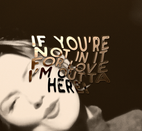
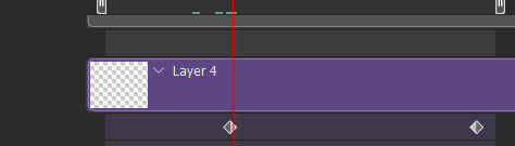
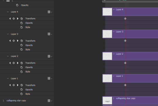
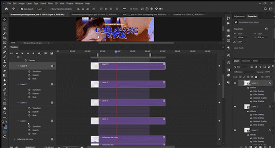
#just thinking thoughts...#I think I deserve some kind of prize for this LOL#EVEN THOUGH IT'S NOT EVEN THAT GOOD#I couldn't figure out how to change the line width in autoaction if I kept it as a vector layer#so I converted the black layer back into a raster layer :sob:#which. not all bad. if I need to draw tails onto the speech bubbles it's probably better that it's a raster layer instead.#the middle two are supposed to be stacked but right now it just looks connected... I think I'm just gonna have to run multiple autoactions#as much as that pains me#almost CERTAIN that there's no fucking shot I can uh. do Arthur's tweet bubble#the tones...
2 notes
·
View notes
Text
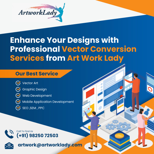
Enhance Your Designs with Professional Vector Conversion Services from Art Work Lady
Are you looking to take your design projects to the next level? Art Work Lady is here to help you! We are a leading provider of vector conversion services, dedicated to transforming your images into high-quality vector artwork.
Why Choose Art Work Lady for Vector Conversion?
Precision and Perfection: Our skilled team ensures meticulous attention to detail while converting images into vectors, resulting in flawless and precise graphics.
Improved Scalability: Vector conversion allows your designs to be scaled up or down without losing any quality, ensuring they remain visually stunning across various platforms.
Expert Raster to Vector Conversion: We specialize in converting raster images into versatile and editable vector files, giving you the flexibility to modify your designs effortlessly.
Seamless Image to Vector Conversion: Our streamlined conversion process makes it easy for you to convert images into vector format without any hassle.
Enhanced Design Flexibility: Vector artwork provides greater flexibility, making it easier to adapt your designs for various applications like printing, web, and promotional materials.
How does Art Work Lady work?
Submit Your Image: Simply visit our website at http://www.artworklady.com/ and upload your image using our user-friendly interface.
Receive a Quote: Our team will promptly review your image and provide you with a competitive quote for the vector conversion service.
Expert Vector Conversion: Once you approve the quote, our skilled professionals will begin the vector conversion process, ensuring utmost precision.
Review and Delivery: We value your satisfaction, and thus, we allow you to review the vector artwork before finalizing it. Once approved, we deliver the converted files to you promptly.
Improve Your Designs Today!
Don't let raster images hold back your design creativity. Embrace the benefits of vector conversion with Art Work Lady. Our exceptional services will undoubtedly elevate your designs and leave a lasting impression on your audience.
Get Started: Visit our website and experience the power of vector artwork. Let us assist you in converting your images into stunning vector graphics today!
1 note
·
View note
Text
God I need to figure out how to make it so the renders from opentoonz don't look like shit
#do i have to convert the raster levels into vector levels. i don't want to do that and risk crashing the program/corrupting the file#fuck#babbles
0 notes
Text
We Are Your Connection With The Creative Mindset

Our Identity: Adroitsquare unique convergence of creative thinking, design acumen, and excellence in shared services. We offer a long-term value proposition of having an extended offshore delivery center that enables our clients to be more competitive, agile, and efficient.
With decades of domain expertise and business insight, we deliver unmatched creative design services for our clients. Our rapidly expanding domain expertise includes newspaper and publishing, custom print products, promotional products, sporting goods, and the automotive industries.
What We Do: We partner with newspapers/magazines, media companies, custom print, and promotional product companies by providing creative digital and graphic design solutions. Besides office supply stores and vehicle wrap companies, we also cater to the sporting goods industries for their embroidery and direct-to-garment designs.
Our domain knowledge and passion for excellence enable us to do more than meet the SLA, which delivers excellent value add to each client we serve.
Our partnership brings significant cost savings, which empower our clients to expand offerings and focus on optimizing operations to delight their customer base. 24/7 operations quickly scale to meet any volume or seasonal demand. We offer a long-term value proposition by having an extensive offshore delivery center that enables our clients to be more competitive, agile, and efficient.
#graphic design#embroidery digitizing#embroidery digitizing service#news page design#newspaper ad design#pagination#vector conversion#raster to vector conversion#convert image to vector#custom vehicle wraps designing#UI design services.#logo design#editorial design#poster#branding#digital illustration#digital art#animation#typography
1 note
·
View note
Text

Creativity penetrates the ordinary to uncover the extraordinary!
And our graphic artists and designers at Cre8iveSkill are always keen to deliver brilliance to your creative artworks with our top-notch vector conversion services, utilizing the latest and most powerful software and tools. When you place a bulk order with us, we make sure that we offer you high-quality vectorized designs that are ideal for a wide range of applications.
We Are Specialists In:
Raster To Vector Conversion
Vector Logo Design
Vector Tracing
Ecommerce Photo Editing
Image Retouching
Photo Manipulation
Background Removing
Graphic Mockup On The Product
Drop Shadow
Click the link below right now to place your vector art conversion order:
#Cre8iveSkill#vector art conversion#vector services#vector conversion#convert png to vector#vector conversion service for bulk orders#vector services for bulk orders#convert image into vector#convert png into vector#printing#jpg to vector#sublimation#png to vector#psd to vector#raster to vector#vector graphic#vectorization#laseremgraving#screen printing#vector art conversion services#vector conversion services
0 notes
Text
uhh yeah you want raster images right? 😁 raster? yeah you want raster? youre working with the pen tool i see. you want raster graphics still right? 😁 ill fucking kill you. asshole.
#why does the pen tool in photoshop get immediately converted to raster if im fucking working with a pen i want it to be clean and crisp.#yknow! like a vector image! yknow!!!! AH
0 notes
Text
Convert raster to vector line drawing

Convert raster to vector line drawing manual#
As a result, all our work is done right here in the United States. To convert your raster files–JPEG, PCX, PDF, PICT, TIFF,etc.–to vector information, especially if the images are from older paper drawings, you need human input if you want to get it right every time. Vector files being based on mathematical points/paths/lines gives them the advantage of scale up or down without any quality loss, unlike raster images based on pixels & blur when resized. Vector design is the primary choice for individuals and companies looking for a crisp and clean print graphic. The best way to convert a raster to a proper vector file is to recreate the original image. When we receive your vector files, we can use them without losing any quality.Įxpand your photo and slogan to sign at your next trade show, create vector line art to engrave your logo, or get a transparent vector to print your symbol on a t-shirt.Ĭonvert Raster to vector is necessary when raster files are created in vector format. Outsourcing can save valuable time on expenses. But, converting raster files to vector files can be a tedious, time-consuming task. Converting raster to vector saves the file with detail and gives you a larger image with crisp, clean lines. If you want to enlarge them from the original raster file, then we can do it. Images and logos for banners, car wrappers, print marketing materials, screen printing, etc., can lose value after a time. If you have blurry images that you want to enlarge, vector conversion is the way to go. But before you do, let’s look at those bullet points and find out why Clipping Path Express is the company to use if you want a fast, priced service with guaranteed data quality. Or, use the navigation bar to find out more about our conversion services.
Convert raster to vector line drawing manual#
Do they work in all formats? Provide high-definition vector files? 100% manual tracing and no auto tracing? Look at samples of previous vector conversion projects to get a sense of their detail and precision.Suppose you need to discuss your project with a professional right now, whether you would like to convert raster to vector. You should look at a vector artist's past work and experience. How do I pick the right professional to do my vector conversion project?.With vectorized logos, you won't lose the quality or the sharpness of the image. There are many advantages of using a vectorized logo instead of a raster, including scalability, flexibility, editable, non-resolution dependent, and smaller files. What are the advantages of a vectorized logo?.Therefore, vector graphics are superior for creating a logo due to their higher quality and scalability. Raster-based images use pixels, where in contrast, vector graphics consist of 2D points connected by curves and lines based on mathematical equations. vector graphics - which are better for logos? Vector images are also preferred for flash animations. On the other hand, vector images scale easily without any reduced resolution, which is why they are the preferred file format for printing, both on paper and clothes. While a raster image may look good on the screen, it does not scale well and will look distorted if printed. For the automatic process, a computer program is used to convert the graphics. Vectoring an image manually means that the conversion is done by hand ("hand tracing") and works best for simpler graphics without a lot of curves or contours. Vector tracing, which is sometimes referred to as vectorization, can either be done manually or automatically. Vector graphics retain all the colors and contours of shapes and lines and are more desirable for graphic design. Raster graphics are represented by a dot matrix and often appear pixelated. In computer graphics, vector tracing is converting raster graphics into vector graphics.
0 notes
Text
Convert raster to vector line drawing

We use this information for support purposes and to monitor the health of the site, identify problems, improve service, detect unauthorized access and fraudulent activity, prevent and respond to security incidents and appropriately scale computing resources. Log data may include technical information about how a user or visitor connected to this site, such as browser type, type of computer/device, operating system, internet service provider and IP address. Pearson automatically collects log data to help ensure the delivery, availability and security of this site. Other Collection and Use of Information Application and System Logs We communicate with users on a regular basis to provide requested services and in regard to issues relating to their account we reply via email or phone in accordance with the users' wishes when a user submits their information through our Contact Us form. However, these communications are not promotional in nature. Generally, users may not opt-out of these communications, though they can deactivate their account information. For instance, if our service is temporarily suspended for maintenance we might send users an email. On rare occasions it is necessary to send out a strictly service related announcement. If you have elected to receive email newsletters or promotional mailings and special offers but want to unsubscribe, simply email Service Announcements Pearson may collect additional personal information from the winners of a contest or drawing in order to award the prize and for tax reporting purposes, as required by law. Pearson collects name, contact information and other information specified on the entry form for the contest or drawing to conduct the contest or drawing. Occasionally, we may sponsor a contest or drawing. Pearson collects information requested in the survey questions and uses the information to evaluate, support, maintain and improve products, services or sites develop new products and services conduct educational research and for other purposes specified in the survey. Pearson may offer opportunities to provide feedback or participate in surveys, including surveys evaluating Pearson products, services or sites. We use this information to complete transactions, fulfill orders, communicate with individuals placing orders or visiting the online store, and for related purposes. Online Storeįor orders and purchases placed through our online store on this site, we collect order details, name, institution name and address (if applicable), email address, phone number, shipping and billing addresses, credit/debit card information, shipping options and any instructions. We use this information to address the inquiry and respond to the question. To conduct business and deliver products and services, Pearson collects and uses personal information in several ways in connection with this site, including: Questions and Inquiriesįor inquiries and questions, we collect the inquiry or question, together with name, contact details (email address, phone number and mailing address) and any other additional information voluntarily submitted to us through a Contact Us form or an email. Please note that other Pearson websites and online products and services have their own separate privacy policies. This privacy notice provides an overview of our commitment to privacy and describes how we collect, protect, use and share personal information collected through this site. Pearson Education, Inc., 221 River Street, Hoboken, New Jersey 07030, (Pearson) presents this site to provide information about Adobe Press products and services that can be purchased through this site.
0 notes
Video
youtube
How to Convert Raster Image to Vector (New Method) - Photoshop Tutorial
#youtube#How to Convert Raster Image to Vector (New Method)#how to photoshop tutorial#photoshop tutorial
0 notes
Text
gif tutorial
i was asked to make a tutorial for this set i made, so let's get right into it!
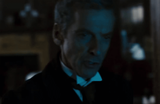
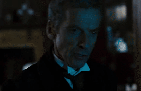
first things first, i downloaded the music videos from youtube in 1080p using 4k video downloader. unfortunately, the quality of youtube videos always seems... not great, to put it simply. plus these music videos are from the 90s, so they've been upscaled to 1080p after the fact. all of this works against us, but i've definitely worked with videos of lesser quality than these, so at least there's that!
when i gif, i import video frames to layers rather than screencapping. this comes down to personal preference. after everything has loaded, i group all my layers together and set the frame delay to 0.05. i then cropped my gif to 540x500.
the next step in my process is sharpening. i did play around with my settings a bit given the quality of the footage and the dimensions of the gif. i compared both @hellboys low-quality video gif tutorial to my regular sharpening action and my vivid sharpening action and in this case, i preferred my normal vivid sharpening action. i used this tutorial to create the action for myself, and you can find other sharpening tutorials here. this action converts my frames to video timeline and applies sharpening.
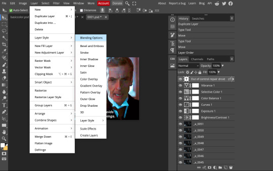
once my gif is sharpened and i'm in timeline, i begin coloring. i wanted to simplify the amount of colors used in these gifs, again because of the video quality -- i knew it wasn't going to have the crispness i would normally like for my gifs. here are my coloring adjustment layers and their settings (not pictured: my first layer is a brightness/contrast layer set to screen) (explanation in alt text):

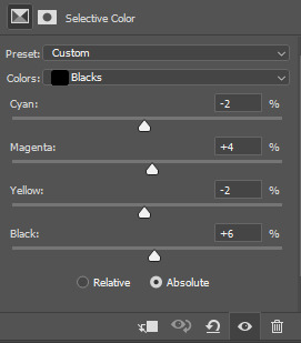
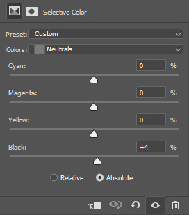
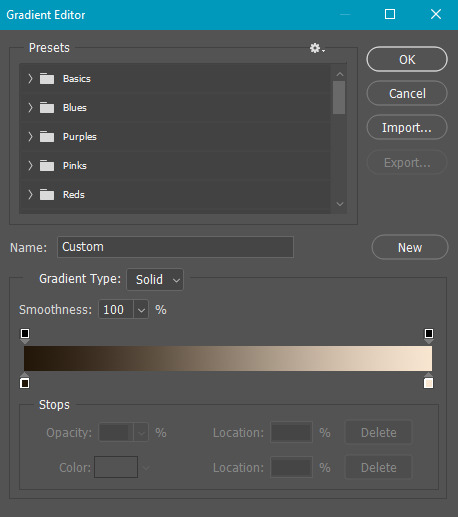
all of these layers and their settings will vary depending on your footage and its coloring (and obviously, feel free to make the gradient map whatever colors you like if you aren't going for this exact look).
pretty basic coloring, especially with just slapping a gradient map on top (my beloved), but at this point, i still didn't like the quality of the gif, so i added a couple textures/overlays.
i put the left one down first and set the blending mode to soft light and the opacity to 8%. depending on what look you're going for, you could increase or decrease the opacity or play around with different blending modes. i like using this texture with lower quality footage because even when it's sized up a bit, it adds some crispness and makes things feel more defined. for the second texture, i set it to overlay and 75% opacity. we love and respect film grain in this house.
now for the typography! sometimes i really enjoy typography and other times it's the bane of my existence for the sole reason of just how many fonts i have installed. anyway, here are the settings i used for this set:
make sure the color of your font is white and then set the blending mode to either difference or exclusion. i can almost never see a difference between the two, but for this set, i used exclusion. below are the blending options (double click on your text layer to bring up this menu or right click and select blending options).
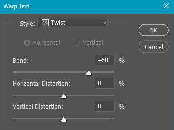
now we have to add the warp effect. with your text tool still selected, click this icon at the top of your screen:

from the dropdown menu, select twist. these were my settings, but feel free to play around with different warp options and their settings. the ones i use most often are flag, fish, and twist.
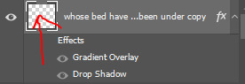
this last step is completely optional, but it's an effect i use in most of my sets with typography. duplicate your text layer (select the layer and ctrl+j), turn off the layer effects (click the eye icon next to effects), and set the blending mode to normal. right click on the layer and select rasterize type. right click on the layer icon itself and choose select pixels.
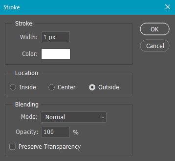
at this point, you should see the moving black and white dotted line showing that only your text is selected. then go to edit > stroke. here are the settings i almost exclusively use.
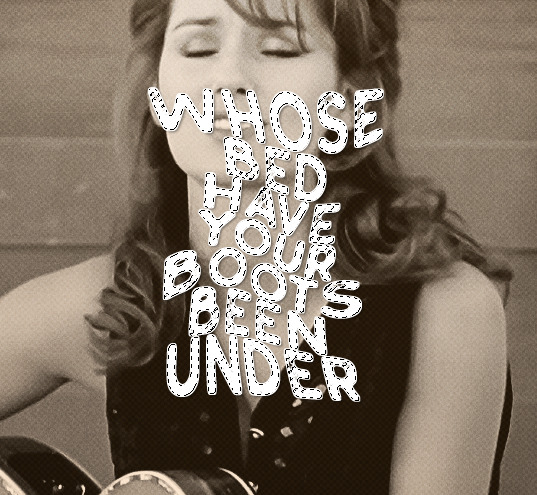
this is what your text should look like now:
using ctrl+T, move the layer off the canvas so you can't see any of the text anymore. you should be left with only your outline. click anywhere on your canvas to de-select the text we just moved. use ctrl+T again as well as your arrow keys to nudge the outline over to the left 2px and up 2px. this is personal preference as far as the positioning, but i almost never move it any other way. you can leave it like this, which i sometimes do, or you can set the blending mode to soft light like i did for a more subtle effect.
and that's it! rinse and repeat for each gif in your set or use a different warp effect on each gif to switch it up! if you have any questions about this tutorial or would like me to make one for anything else, please feel free to ask any time!
#gif tutorial#my tutorials#gifmakerresource#completeresources#dailyresources#chaoticresources#userdavid#coloring tutorial#typography tutorial#tutorial#photoshop tutorial
172 notes
·
View notes
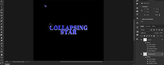
Text
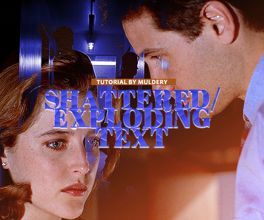
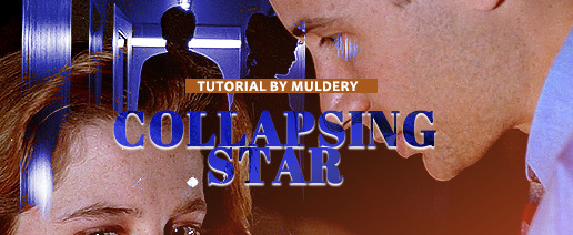
SHATTERED/EXPLODING TEXT tutorial
hiyaa! @krystaljungs asked me for a tutorial on how i made the shattering/exploding animation of the text in this gifset and so i figured i would make it and post it here, like i did with the tutorial for "falling" text.
i must warn you, this one is really tedious and requires a lot of time and patience. honestly maybe there is an easier way to do this but i didn't find any tutorials for when i needed it so i just went off my ps knowledge and did it myself.
note: you will need photoshop with a timeline!
STEP ONE: create your base gif! be mindful of number of frames in your gif. the number of frames doesn’t really matter here, but if your gif is bigger than 10mb and you have to go back to adjust it all again after you have to delete some layers....you might lose the will to live 😂
STEP TWO: make your text the way you want it to look. this effect is basically the last step of your gif making process. (i will be using the typography from my set as an example as i already have that psd saved)
this is what my typography looks like now.
STEP THREE: now, you will create a new file (with background) and transfer the text you want to "shatter" in it.

here is when things get tedious.......
tip: zoom in the document, it will be easier for you.
select polygonal lasso tool aka this
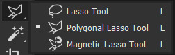
STEP FOUR: before you start, you need to rasterize type layer. then you will have to "shatter" every letter into smaller pieces. using polygonal lasso tool, select a smaller part of your first letter.

then you will click on that part with the right click of the mouse and selct layer via cut.
now you need to make sure that your new layer is selected and using the move tool move that part of the letter somewhere away.

you will have to do this for every part of the letter and every letter. also move every new layer on top of other layers because they will line up better later like that. then create a new folder with every layer of said layers and rename it after the letter you're shattering. see below. (idk why my screenrecord didn't catch me making layers via cut but you should do that after the use of polygonal lasso tool, as stated above)
note: feel free to şelect parts of other letters as you get one letter, for an even better effect.
this is what i have after "shattering" every letter. the lineup doesn't have to be perfect as you will arrange these parts in your main document. (click on images for full view)

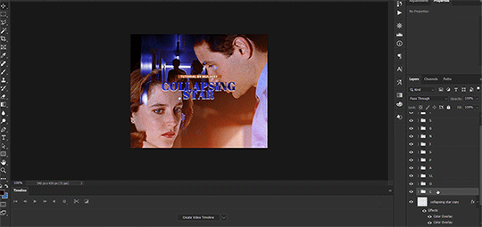
STEP FIVE: go back to your main document and make sure the visibility of your text is turned on.

what you will do now is open the shattered text in the new window and transfer letter by letter (letter folders) to your main document. BUT after you transfer every folder, you need to rasterize EVERY layer and convert it to a smart object. i made an action for this part to make it easier. download here.

(okay i really don't know why my screenrecord doesn't show "pop-up" windows but i was moving the C folder from the document where i shattered the text and then used my action on every layer)
after you transfer the folder to your main document and rasterize and convert to smart object, select the folder and use Free Transform to move it so it aligns with the letter from your complete typography. then you will select each layer and align it with the typography. see below. (click on the gif, i made it bigger so you can see better)

i did this one hastily so the recording wouldn't be too long but i'm hoping you can see what i'm doing.
now, do this for every letter.
after that is done, make the original typography layer invisible, and you should have something like this

STEP SIX: another really tedious part BUT it's time to animate the text.
make your timeline space bigger so it's easier for you to work with it. then select the first layer and click on the arrow next to it (in timeline) so Transform is revealed to you.
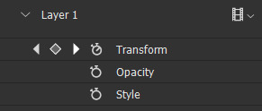
now, you don't want the animation to start from the very beginning of the gif, but a bit later so the text is readable before it shatters.
for example, i did mine like this, but that is your personal preference.
note: make sure that all animations start at the same time.
tip: do this for all layers in one folder before you transform them, as it will go faster.
STEP SEVEN: bring the playhead (blue arrow with the red line) to the end of your gif and select one layer in timeline.
now it's time to transform it. use Free Transform (windows shortcut ctrl+T) and drag the part a bit away and rotate it. press enter.

okay ignore the way my text moved upwards, i used the text i used in my edit and i did that animation in the upper part of the gif and i was too lazy to redo the whole animation lmaoo but i hope you can see what i'm doing with the letter C.
do this for every letter. play around with placing and rotation. then save your gif. when you're done, you should have something like this.

again, i was too lazy to redo the whole thing on this new gif so i'm using the one from my gifset i linked in the beginning.
i hope this was understandable and helpful. if you have ANY questions, don't hesitate to shoot me an ask or dm me! i'm always here to help <33
#usergif#completeresources#allresources#gif tutorial#ps help#userkimchi#uservivaldi#userraffa#tusermona#userelio#usercats#tuserheidi#usershreyu#userhallie#userroza#userdean#userisaiah#thingschanged#tusercasey#usertj#userwwz
256 notes
·
View notes
Text
photopea gif tutorial!
i recently started learning the craft of gifmaking with the free software photopea. when i first started, i had to piece together several different tutorials as well as extrapolate from some photoshop tutorials because-- no one uses photopea.
but they should! it's free! it can run in your browser! it can do most everything photoshop can do and you don't have to deal with adobe or torrenting. so i'm making a tutorial of my photopea gifmaking process because that's what i needed a couple months ago, and i hope it can be of use to some others. let's go!
1: PREPARING
source the scene you want to gif. it's best to download your video when you can, but screen recording can work in a pinch. this is the video downloader software i use.
once the source video is downloaded, i like to pick out the specific moments i'm going to gif and save them as their own files-- this makes future steps easier. an individual gif shouldn't be more than 4ish seconds, so limit your selections to about that. name your files in a way that makes sense to you:

2: CONVERTING TO .JPG
i like to convert my video clips to .jpg format. it is possible to load video clips directly into photopea, but unless it is a very short <30fps clip, it is likely to freeze or crash in my experience. i use this website as it downloads a higher framerate (~25fps) than others i've used.
convert your video files and download the .zip folder containing your frames. make sure to unzip them and name them something helpful if you need to.
3: OPENING YOUR FRAMES IN PHOTOPEA
photopea looks like this when you open it:

select "open from computer" and select only the first frame of your first gif:
your environment should look like this (ignore the other projects i have open, you should just have 0001.psd or similar):
go to file> open and place, and select ALL of the rest of the frames from your first clip:
they'll load in one by one, and your environment should look like this:
notice how all the frames have a little square in the corner? that means they are smart objects, and we need them to not be for our purposes. select all of your frames, right click, and choose rasterize:

in order to make the series of jpgs move as a gif upon download, select all of your frames and go to layer> animation> make frames:
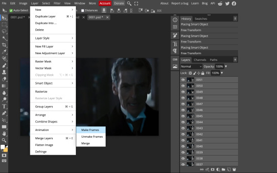
all your layer names should now start with _a_. you can really do this at any point in the process so it's not a big deal if you forget at the beginning.
finally, you want to limit the frames in individual gifs to around 50 or less. if you find you have more, delete some frames off of the beginning or end by right clicking and selecting delete.
4: CROPPING AND RESIZING
select the crop tool on the left hand panel:

at the top bar, select fixed size:
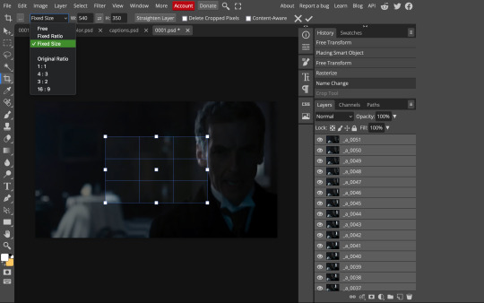
gifs on tumblr are limited to 540px wide for single column gifs, 268px for two columns, and 178px for three columns. the height is up to you; i like to use 350px height with the 540px width.
enter your values into the W and H fields and do not press enter yet. drag the cropped area to where you want it to be-- try to line up the top and bottom edges so as not to lose too much of your image. once you're satisfied with the selection, press enter. your gif is now cropped and resized to tumblr standards.
5: SHARPENING
(if you are working with low-qual video, check out this tutorial by @hellboys before sharpening. basically filter> filter gallery > grain, select soft and play with the settings. then proceed!)
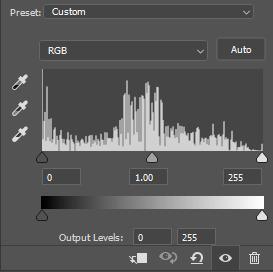
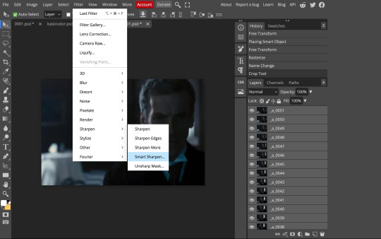
still making sure all of your layers are selected, navigate to filter> sharpen > smart sharpen:
you should see this dialog box:
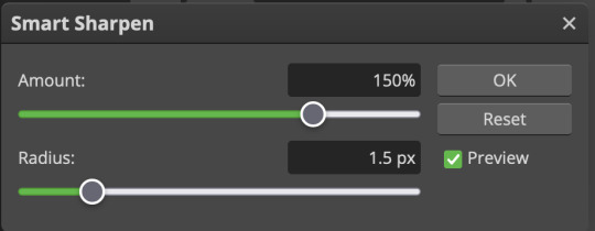
these are the settings i like to use, but you can play around to see what you like. here's the before and after of my sharpening settings:
the difference will be more noticeable once we complete the next step-- brightening and coloring.
6: BRIGHTENING & COLORING
navigate to layer > new adjustment layer:
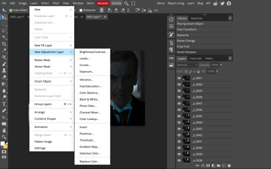
at any time, you can edit your adjustment layers by clicking this button in the right hand panel:

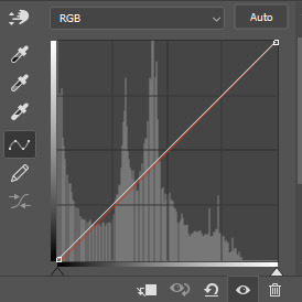
for each edit you make to your gif, you will add a new adjustment layer. always make sure they're at the top of your layer stack. i like to start with adjusting the brightness and exposure, which are both pretty straightforward.
additionally ,you can select a curves adjustment layer, choose the RGB channel, and drag the curve just slightly upwards to further brighten your gif, like so:
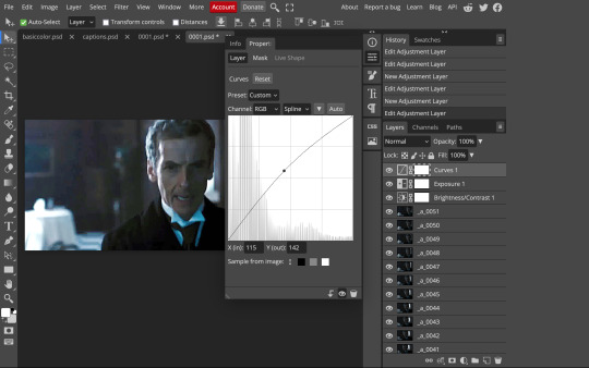
here's a before and after:
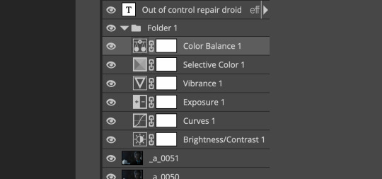
now for coloring-- i mostly use the saturation/vibrance, curves, color balance, and selective color adjustment layers. just play around with all of these until you find a style you like. i like my gifs to look really bright and colorful, so i push the saturation and try to draw out warmer tones in the color balance:
7: CAPTIONS
the font i like to use for captions is arial bold italic. you can download it (or any font of your choosing) from pretty much any free font website. if you choose to download a font not in photopea, go to file> open and select your font; it will now show up in the list of fonts.
navigate to the text button in the left hand panel:

and type in the captions for your gif. i make the font size 20 for 540px gifs.
next, while only your text layer is selected, navigate to layer> layer style > blending options:
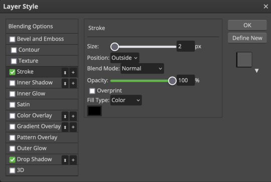
click on drop shadow, and play around with the settings until you get something you like. here's mine:

next, click on stroke and do the same thing:
when you're done, make sure your text is your top-most layer.
8: EXPORTING
you're done! head to file> export as> GIF. you'll be prompted with a dialog that looks like this, with your gif playing (you can also do these steps without saving if you want a preview of your gif during editing):
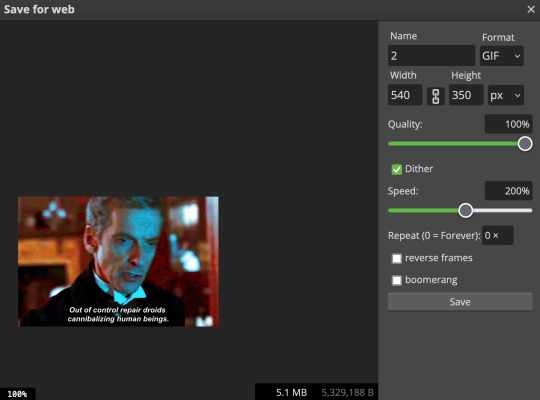
the only thing you should need to adjust is speed. this is the main difference between photopea and photoshop. the only way to specifically adjust the delay in photopea is to manually enter "_05" (or whatever amount of delay) at the end of every layer name. if you're like me you'll agree that is simply too much and settle for the speed slider.
i don't really know what logic governs the speed slider. it doesn't seem to be consistent across gifs, so play with it until it looks right. i've had it on 200% lately which seems insane but looks visually normal.
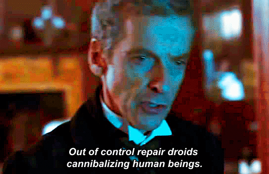
once the speed is adjusted, hit save and you're done! here's a final before and after of all the work:
BONUS: SAVING .PSD PRESETS
did you think manually creating and editing all those adjustment layers was a lot of work? here's how to streamline it for next time.
at the very bottom of your screen, below your layers, select the icon that looks like a folder (third from the right).
it will create another layer called folder 1. drag your adjustment layers into this folder, making sure they stay in the same order. your layers should look like this when you're done:
ONLY ONCE YOU HAVE SAVED YOUR GIF, delete all other layers that are not in the folder. then select file> save as PSD. save it somewhere convenient.
next time you're making gifs, after you've cropped and sharpened your frames, select file > open and choose your .psd file. it will open as another project. select the layer that says folder 1, and drag it to whatever project you're working on at the top bar. voila! your adjustment layers are applied to your new gif!
i still like to play with the settings, as coloring and brightness needs will differ from gif to gif.
thanks for reading! here's the gifset i made while making this tutorial :-)
#milk post#gif tutorial#doctor who#photopea#i can't tell if i went too detailed or not enough lol. tag me if you use this i want to see ppl's gifs!!
188 notes
·
View notes
Text
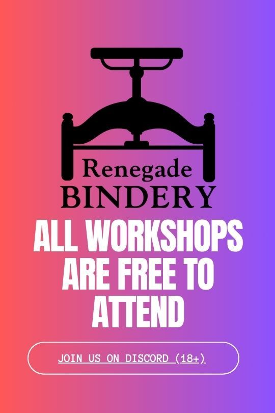
Binderary 2024: Week 4
In the Renegade Bindery Discord Server, we are once again running Binderary during the month of February. Attendance is free, and a link to the 18+ Discord Server can be found on our carrd.
Whether you’re new to the world of bookbinding or an aged veteran, join us for a month of binding fun! This event is all about community & learning, be it trying something new or refining existing skills.

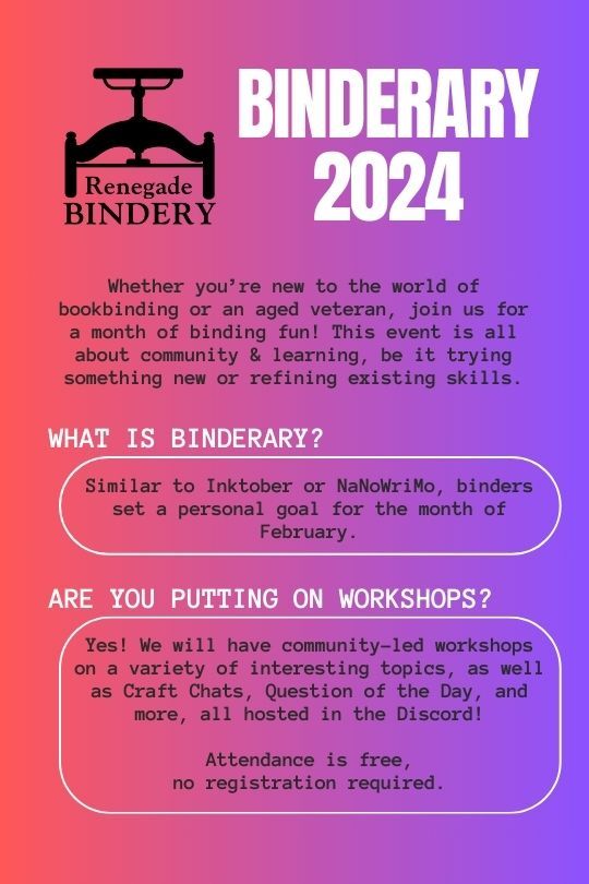
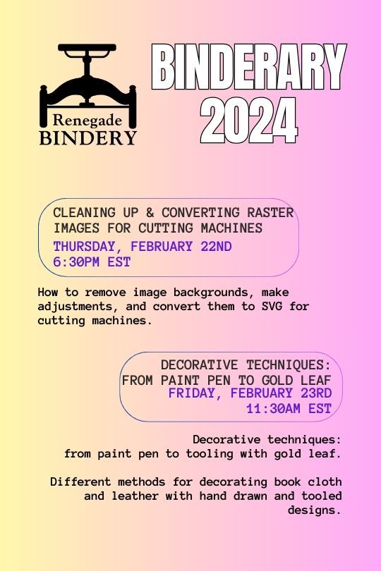


All our workshops are run by members of our fanbinding community, and some of them are even on Tumblr!
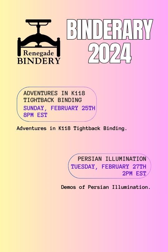
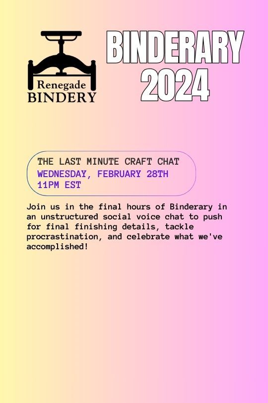
Here's the list of who's running the week 4 workshops:
Cleaning up & converting raster images for cutting machines: @helle-bored
Decorative techniques: from paint pen to gold leaf.: @blackoakbindery
Rounding/Backing & Chisel trimming: @no-name-publishing
Adventures in K118 Tightback Binding: @notwhelmedyet
Persian illumination: @narentabindery
Monster Books!: @simply-sithel
The Last Minute Craft Chat: @gargoyleandgremlinpress
106 notes
·
View notes
Text

Premium Quality Vector Art Conversion Service
Precision is our trademark as you can see through our recently vectorized mech-owl design!
Over the years, our graphics professionals at Cre8iveSkill have mastered the art of converting any image to vector designs with utmost perfection. Whether you are looking for vector art conversion services for promotional campaign purposes, screen printing, or marketing, we have a diverse team of vector graphic professionals who process your orders as per the specifications of your requirements. Furthermore, we make sure that we offer our services within the stipulated timeframe and minimum budget.
If you'd like to experience the level of competence we have in vector conversion services, click the link below to consult with our experts about the vector conversion services we provide.
#cre8iveskill#vector art conversion#vector services#vector conversion#convert png to vector#vector conversion service for bulk orders#vector services for bulk orders#convert image into vector#jpg to vector#png to vector#psd to vector#raster to vector#vector graphic#vectorization#vector art conversion services#raster to vector conversion#vector conversion service usa#vector conversion usa
0 notes
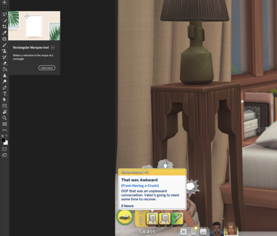
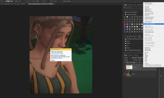
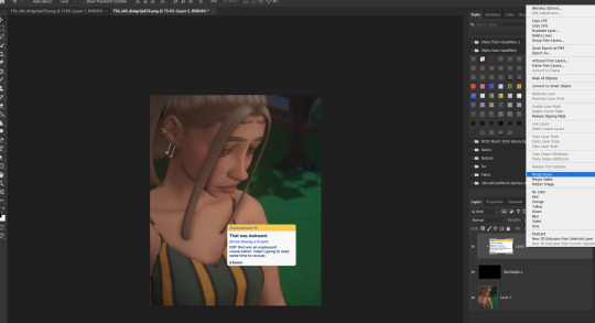
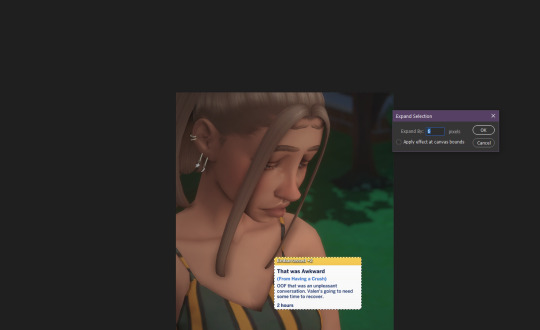
Note
Hi! I hope you don’t mind me asking but do you use photoshop to get the moodlets on your game photos? I love your style and your sims btw💖
Hiii..thank you so much!! 🤎 I do use photoshop and just copy and paste the dialog box onto a rounded rectangle. My screen resolution is 2560 x 1440 so the moodlets aren't too blurry. Since a few people have asked me, I thought I'd show what I do....
Housekeeping: I have my Gshade set to remove all effects from the UI. I use the FFrestore and FFkeep shaders. Gshade UI box will tell you which one goes before all your effects and which one goes after.
Open the photo with the moodlet/dialog box. Use the rectangle marquee tool to draw a box around it. Ctrl + C to copy the selection.
3. Paste the selection onto your photo that's edited and resized and ready to post. If you need to resize the moodlet, right click the layer in the layer panel and convert to a smart object.
4. After you resize, rasterize the layer by right clicking in the layer panel and choosing the option. Sharpen the moodlet/dialog box with smart sharpen. Filter > Sharpen > Smart Sharpen.
5. Then, select the rectangle tool and change the corner radius to 8px. Draw your rectangle about the size of your moodlet. Place the rectangle under your moodlet box.

6. Rasterize your rectangle. Select your moodlet layer and create a clipping mask by right click on the layer in the layer panel. This will give the moodlet the shape of the round rectangle. Merge down once you have them lined up.
7. Then, I add a new layer. Ctrl + click on your moodlet layer to select the box. Then click back on your empty layer in the layer panel. Go to the menu to Select > Modify > Expand and expand your selection to 6 px.
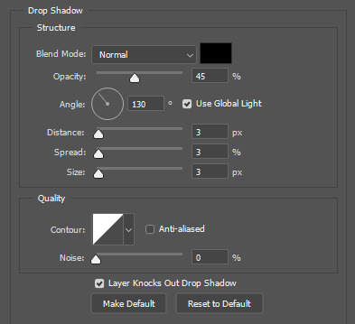
8. Now get your paint bucket tool and fill your selection with a white color. Change the fill layer to 60% opacity. Right click in the layer panel to go to the blending options and add a drop shadow with these settings (or whatever you prefer):
Blend mode: Linear burn | Opacity: 34% | Color: 2C1901 | Angle: 45° | Distance: 10 | Size: 40
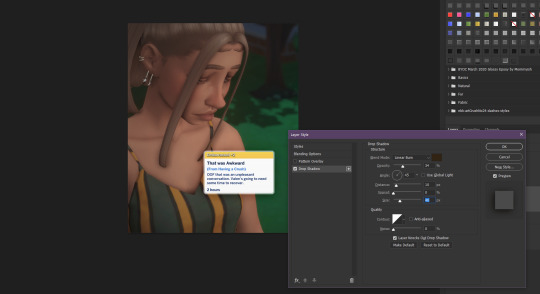
Click okay when you're done. Move your moodlet box wherever you want sand save your photo.

Hope that wasn't too much. It seems like a lot, but it's fairly quick once you do it a few times. 😊
104 notes
·
View notes
Photo
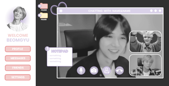
ପ( ໊๑˃̶͈⌔˂̶͈)੭ ✶⠀𝑙𝑜𝑠𝑡 𝑠𝑢𝑚𝑚𝑒𝑟⠀!

introducing lost summer, the latest photoshop template by tinytowns. design was inspired by txt's we lost the summer music video. be aware that the file was originally just practice so the sizing is somewhat wonky. basic knowledge of clipping masks is necessary for this template. please like or reblog if you plan on using, or click on the read more to find an adjustment guide for the gradient circle icon. download link can be found in the source. font used is poppins. large gif is 503x303 & smaller gifs are 154 x 102
✶ tutorial
if you don't want to meddle with the gradient icon then there is an alternative option hidden for you just under the layer. for those that do want to fiddle, though, follow my steps.
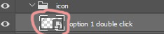
first, we're going to double click on the "option 1 double click," layer right where the transparent box is. if you're unsure, i've circled what you should be clicking in the image below.
a new window should open up. you are going to unhide the "eclipse 1" layer. right click on the layer and hit convert to smart object - then again, but we're going to hit rasterize layer.
put your image over it and try to align where you want the head & where the circle will cut everything else off.
once you're satisfied with your image placement, we're going to right click the transparent box on eclipse 1's layer. like we did above, in the image. except it's a right click, and you're going to hit - select pixels.
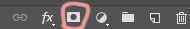
click on your image layer - then hit the mask button that's circled below.
great. now your image is a circle, so lets celebrate by clicking on your favourite lasso tool so we can outline beomgyu (for example)'s body. for mine i used the regular lasso tool. when you've got everything outlined, delete it. make sure you're on the layer mask when you do this in case there's a mistake.
you can go ahead and hide the eclipse shape now. that should be it. but, if you want to change the gradient colour, just double click the "gradient fill 1" layer and it should come up with a window to do so.
now, we're done. so lets save what we've done so it can apply to the template.
i must admit, i never know how to save these things properly. but the method i use that works is just closing the window and making sure to hit "yes" on the "save changes to the adobe document......?" - hit yes otherwise your hard work will not save.
and that's it! let me know if there are any problems or bugs.
#photoshop#photoshop template#free rph#free rpc#template#rph#rpc#resources#rph resource#rpc resource#muse template#gif template#rpc template#rph template#free resources#free resource#tinytowns#m: resources
330 notes
·
View notes
Last Seen Blogs

it-menuforyou
MenuForYou - электронное меню на планшет
1998notes
1998notes
xthes-kai-simera-blog
Μέλλον
stoner-skinnny
I Don’t Want To Be “thick” I Want To Be Skinny

sallypoodles
Untitled