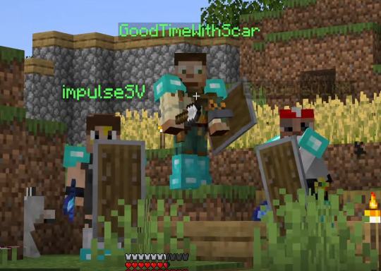
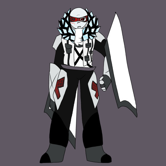
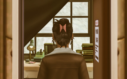
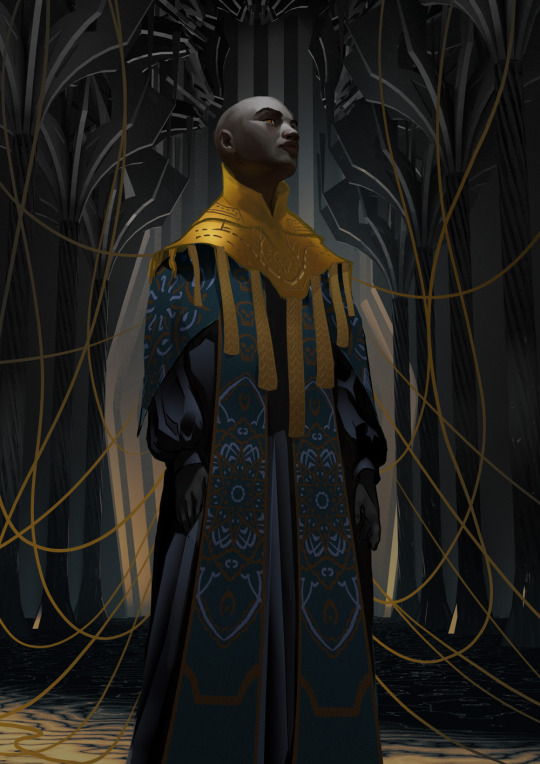
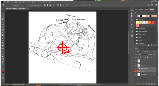
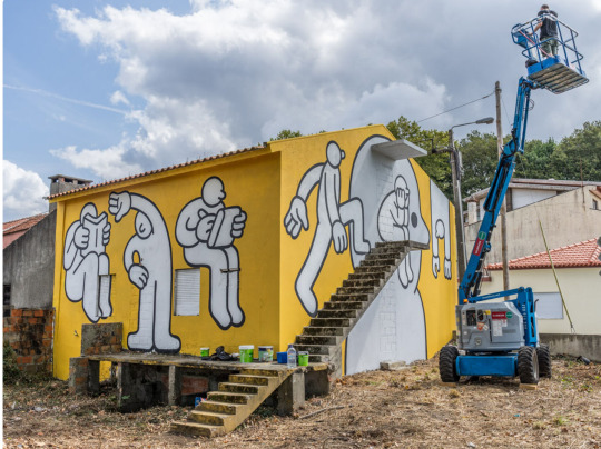
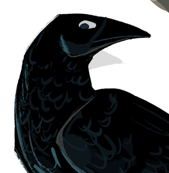
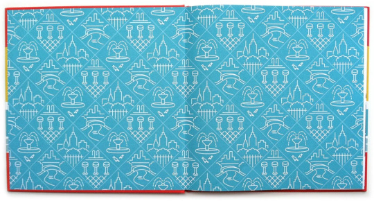
#and i love this screenshot. the symmetry
Text
honestly if there's another season I think this team-up would be spectacular
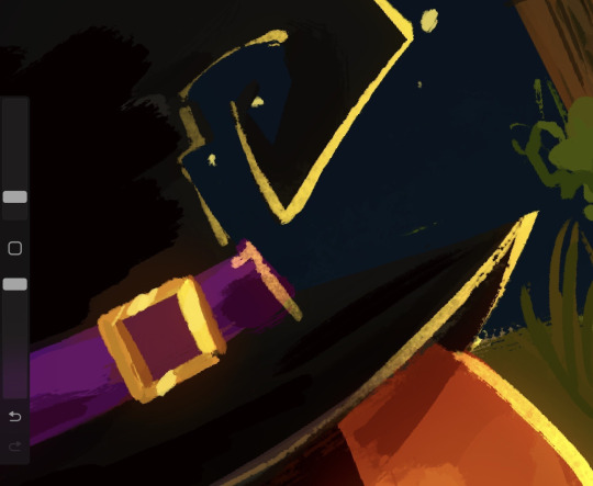
#i loved their shenanigans this session AJKKJ#and i love this screenshot. the symmetry#goodtimeswithscar#impulsesv#bdoubleo100#secret life smp#secret life spoilers#<- not really but just in case ig#actual post
527 notes
·
View notes
Text
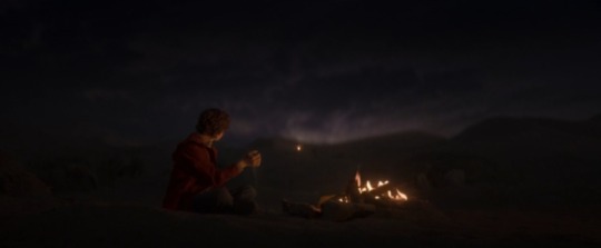
the pjo show’s cinematography is so warm and homey and clever and detail-oriented so i wanna compile a few of my favourite still shots because why not??

^this one had me smiling so hard, not because it’s a particularly beautiful shot but the framing of the three is so well done. the focus is on sally who is talking to grover (both prominently in the front of the shot) while percy – who isn’t a part of the conversation but a listener of it – is still properly visible through the glass of the door and like??? i just think it’s a super cool way of having a passive character in the shot that i haven’t ever seen before, in a way that percy is both highlighted and still so clearly in the background that it doesn’t take away from the focus characters. also percy’s sweater matching the colours on the door is the cherry on top!!
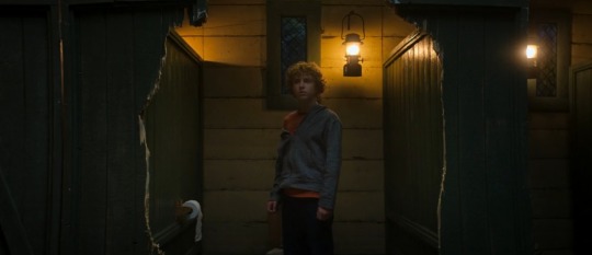
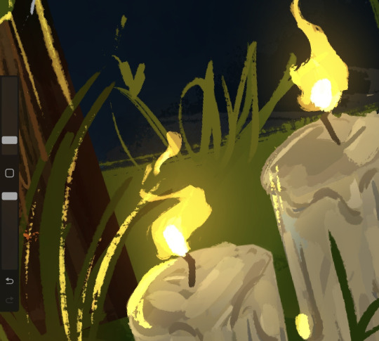
^next is this one. it’s so perfectly angsty and though not complete, the symmetry is still eye-catching. it encapsulates the feeling percy must experience in that moment–him, amidst destruction, knowing he’s the cause but not knowing how or why. he looks all of twelve with his haphazard hoodie and almost forlorn look. he is not gloating, he is not cheerful. though he doesn’t know the gravity of his parentage, it’s almost like the show is telling us that his powers–which cause the door to break, too btw–will always be a source of isolation for percy. he is a force of nature, a destructive one most of the time, and the fact that he is just a child who is confused will never matter because this world doesn’t care for childhood but godhood alone.
idk, this shot just evokes a very unsettling kind of sadness for me. i think it’s beautifully framed.
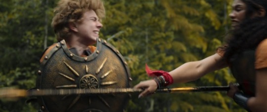
^i absolutely love this one simply for the fact that the sheer struggle of the fight is so prominently visible. and yes, i cheated, this isn’t exactly a still shot but like an action sequence screenshot but whatever, it’s too good to not mention it here. the way percy is, honest to gods, bracing against the spear for his dear life, the evident and overwhelming rage on clarisse’s face, the blocking of the scene – it’s perfect. clarisse is not playing and percy is genuinely in danger and i love how this shot and the whole scene really sold us on that fact.

^ i just think it’s extremely cool that we can see the minotaur howling in pain, percy having his mouth wide open as if he’s letting out a yell as he goes to plunge the horn and that as percy does this act–killing the minotaur–which is surefire source of safeguarding himself and grover, something that will get him to camp, we can see thalia’s tree in the background. there is no reason percy had to make the kill here, with the chaos of the fight, so the fact that this is the spot and this is the shot as he kills the minotaur makes me think it’s deliberate. having thalia in the background is so impactful because again, percy could have met a similar fate in some other alternate universe but here, he wins and he survives.
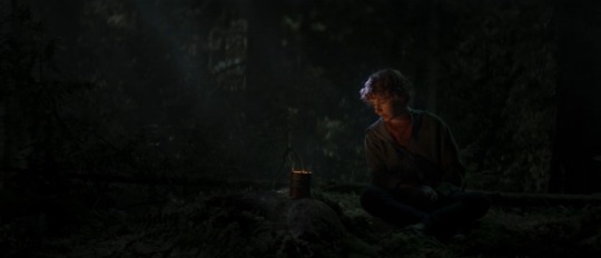
^ do i even need to explain??? the shot is pretty and beautiful and almost magical. percy, alone with a tin of fire, burning blue food and talking to his mother. maybe one thing i can point out is that the sally-percy bond has been heavily indicated through glowing lights since the start. if you recall, the “you are not broken” speech by sally was given in front of the warm, glowing headlights of the car and percy’s face was illuminated by that warmth just the same way it is illuminated by the tin-fire in the forest.
^ first, this is too fucking gorgeous. second, percy is wearing his red jacket again and this dream happened after he reached camp so in my opinion, this dream was initially a comfortable imagining of percy’s mind and was then hijacked by kronos but i could be wrong since i don’t clearly remember how they manifested in the books originally. nevertheless, it’s a great detail to have him wear the red jacket because even if he may not have it with him anymore, it’s still clearly something he holds dear – and might associate sally’s memories with.
also, the fact that percy seems to have alot of scenes with fire might be because as someone who can control water, fire can never truly be a source of danger for him and therefore, he can find comfort in its warmth unhindered, always?

^ how could i not love this epic moment? the trident is perfect, big and blue and grand and majestic. half the screen is water, obviously. but what makes this good shot a great one is that there is literally no one else directly near percy except annabeth. the campers are all far away and in this shot itself only annabeth remains close to percy, though she is fittingly on the land, observing the scene before her. remember how i said percy’s legacy promises isolation but this shot tells me that despite that, percy will have someone who he can count on to be by his side (also cool that even in the bathroom, annabeth was technically still near him, even if she was, well, stalking him) and maybe this is my delusional ass talking, but annabeth being here is foreshadowing for me. i just think it’s a choice to have this epic revelation where they could easily have had percy standing alone in the middle of the lake but no, annabeth is also there and not only because she’s the one who led to that revelation but because she’s someone who isn’t intimidated by percy’s parentage and still can be beside him.
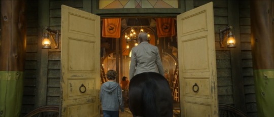
^ i adore this shot because 1) it shows us just how young and tiny percy is and 2) it tells us that maybe that door is so fucking huge because it’s being inclusive of centaurs and other giants of their world. also, symmetry strikes again!!! the colours are so well balanced, not bright and vibrant but on the pastel side that indicates an aged feel to them.
and lastly,
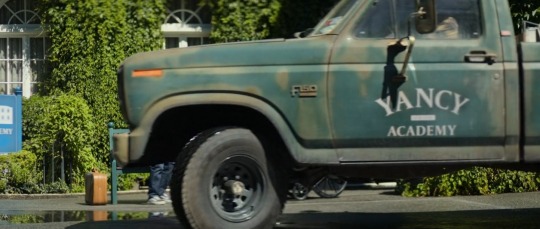
^ i just find it funny that a private academy like yancy has an official vehicle that looks as beat up and terribly malfunctioning as this. 😭 like this half van was so out of place i literally goggled at the screen when it first appeared.
okay, i’m done for now. i also really liked the faceless sally scene in the start paralleling medusa’s eventual beheading but i already made a post about it. this legitmately only covers about 10% of the shots i wanted to talk about but these might be my favourites. this was long af so if you read the whole thing, mad respect to you.
#percy jackon and the olympians#percy jackson#percy pjo#pjo#pjo fandom#pjo series#pjo tv show#pjo tv adaptation#walker scobell#pjo tv series#leah jeffries#cinemetography#direction#pjo tv spoilers#annabeth percy jackson#percabeth
380 notes
·
View notes
Text
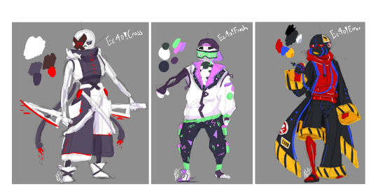
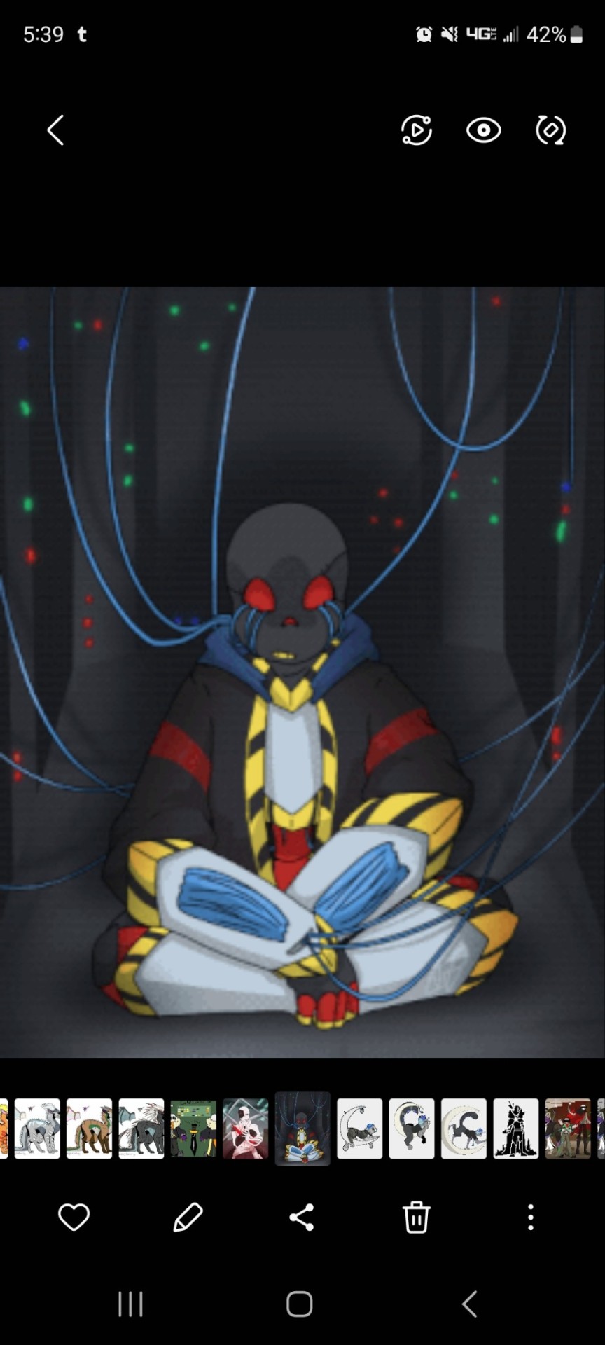
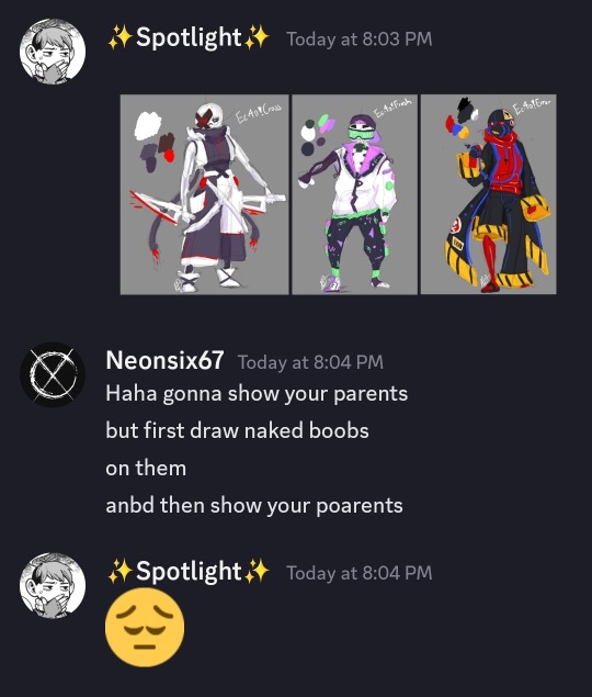
Did some redesign mock-ups for Ec-4o.verse Cross, Fresh, and Error!
These guys didn't really *need* redesigns but I was having a ball with Trech (Ec-4o!Fresh) and gave him Arcade Carpet designs and decided I needed to redesign some others too! (Check below the cut for Old Designs, Lore, and a Stupid Screenshot from my pal @/Neonsix67)
So OLD DESIGNS:
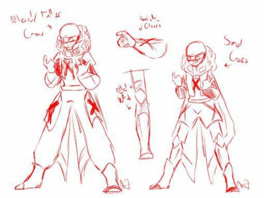
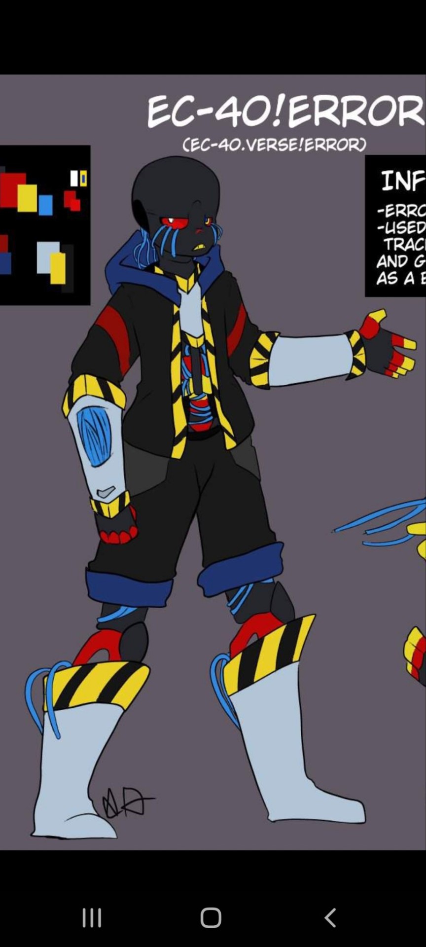
(We're gonna act like I drew Trech more than twice-)
So, old art, yucky, whatever. We know the drill lmao- but because Ec-4o.verse is such an ongoing project these guys have been through a bunch of redesigns. Regrettably, me from 2 years ago was unaware of Layering and Shape Language, so they look kinda gross.
Cross' design has consistently been my favorite I think, just because he was a later addition and so had a bunch of my newer ideas integrated. They all have their flaws tho (Cross was too lean and got thrown between Baby and Grown Guy too often in my art. Error uhhh... yeesh. When I say I couldn't draw him, I meant it. I never knew what to do with his wires and I kept putting him in armor? Fresh just wasn't fleshed out enough. He was that SparkleDog of my verse.)
Also: I wanted Fresh to be top-heavy, like, big baggy round clothes on his upper half then lil guy legs. Cross I wanted to be more flat and strict, hense his clothes being all Tube-shaped. Then Error needed Triangle vibes. His old design was too Rectangle for me. The exposed limbs are mostly just for me because I love a-symmetry and also I don't keep a consistent clothing style, so I like to keep a visually interesting element (like a limb) exposed for clarity's sake when I draw them in new poses later.
LORE:
Cross: A robot (Ecto) who was initially a Guard-Model ecto. He was one of the last to be turned over when the government was rallying citizens to donate their bots to fight in the war. He was remodeled and supplied with a special task by his Programmer: Protect THE FILES at all costs. He's rather small for a guard-bot, but makes up for it with his agility and sheer stubbornness. Blue finds him heavily damaged and on low battery in an old lab, guarding a room that was sealed tight. His Old design utilized Shields (scarf detached to become them) but his new design is much more focused on quick bursts of offense. If he gets you first, then you're no longer a threat.
Error: an Ecto who was one of the first bots handed over. He was a former data storage bot that worked at a small library. As one of the first data-bots to come in, he was immediately modified and put to work alongside other Ectos to compile all of the nation's history into their data banks. Error was particularly receptive to overloads of data, so he continued to be modified and made into the prime data-bank. When the war started, he was eventually hidden away and sealed in an air-tight room. Eventually Cross was sent to guard the door. They were eachother's only company for... years? Error isn't fond of touch or tampering with hid systems, as everything he knows is barely abd haphazardly stored on unsafe files. Each Crash he endures takes more and more of his own personal data away, and he refuses to lose any more.
Fresh (Trech): A Parasite that was created by Sci to repair living beings in the same way that an Ecto can auto-repair itself. Fresh is actually a liquid that, when placed in contact with a wounded/dying person, it can invade their systems and stop all forms of bleeding/dusting. Fresh wasn't supposed to be sentient, and was meant to be scrapped, but he ended up being vital in stopping the war. In turn, Sci granted him freedom. Fresh can inhabit humans, monsters, and Ectos, but prefers skeleton monsters. He often defies the logic of his world, but what Fresh doesn't? Blue meets him far into the story after he's unraveled a lot of mysteries. Fresh just drops by after hearing rumors of Blue's repair work, and is met by less-than-warm reception from Error and Geno.
Other:
I was trying to save the image and my phone was bugging out, so I sent it to Neon. Safe to say she has peak comedic timing 😌💖 (For the record, we are both adults, and also my parents are aware I draw utmv stuff, so she had to make the threat actually a threat lmao---) I also love Chilchuck talking with the Operator. We are the dynamic duo frfr.
#utmv#utmv sans#utmv art#utmv oc#my art#spot!drawn#utmv au#ec-4o.verse#ec-4o!fresh#trech#ec-4o!cross#ec-4o!error#fresh!sans#error!sans#fresh sans#error sans#cross sans#cross!sans#xtale sans#multiverse#I drew the short guys squad#I have a feeling next up is the dustedafterdeath* trio because Reaper has always deserved better#and then maybe??? Pretender gets tossed in and I redo Killer and Horror maybe?#not sure...#this was mostly because the pinterest cyberpunk inspo hits hard for shape-language
49 notes
·
View notes
Note
I was wondering what tips do you have on making sprites for rpgmaker? size? etc? really love your work that i saw on twitter!!! i love your usage of color man
TYSM!! Btw I might go back and forth editing some parts as there is things I've might forgotten over time.
ON DRAWING them:
Most sprite follow a multiples of 8, so whatever size you pick, make sure is something like 16x16, 24x24, 32x32, 48x48... all depending on the RPG maker you have (please read the RPGmaker section).
Picking the size for sprites it's gonna depend on your art style and limits.
The smaller the size you have to reduce your color palettes, less shading, less details, and you're gonna center more on pixel art take. Faster workflow for pixel art style at the cost of some art limitations.
The bigger scales allow more color palettes, and even non-pixel rendering because the space, having more freedom in what you draw, but there is more risk to mistake and takes more time to make.
For reference, these are Gordon and Benrey walking sprites I've made, 48x48 as the biggest RPG maker allows vs 16x16 at smallest.

3. If you can afford it, get Aseprite. It's an art program dedicated to pixel art with a lot of keys to help you and will save you lot of time! But you can still work on your art program of choice as long it has pixel features AND symmetry options (so you make sure both sides on a sprite or asset is the same both sides).
4. On a walking sprite, you don't have to draw every part moving, a slight hint of movement in the feet it's enough to get your point across.
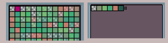
5. If you're going pixel, limit your palette a little, not that you have to restrict yourself to 8bit colors, but isn't necessary have many greens that are identical, and better have very distict shades on green that will help colors pop up better AND will help you draw assest faster and easier when color picking.
IE avoid palettes like the one in the left, and try like ones in the right.
ON RPG MAKER:
Except for MZ, all versions of RPGmakers only have one size of the assets. (And other important limitations)
2003: Only 16x16, and can only work on a 8bit palette (256 colors) meaning you won't be able use sertain colors and will not allow you export your assets over one wrong pixel
Ace: only 32x32.
MV: only 48x48. No layers options.
MZ: multiple sizes (x16, x24, x32 and x38), allows layers!
They're gonna realase RPG maker unite with even more tiles option, but from now I wont opine much on it, because I can't really.
2. (For MV and MZ) Install "zoom" and "pixel perfect" plugins for a better look of your sprites.
In pixel art, in order to have your work appreciated, you have to resize it, as in, zoom it it, and making sure the pixels aren't blurry. Later PRG maker doesn't really aim pixel art, so there is no option to do this on base engine.
But you can install plugins that allow it, here an example left to right: 1) Base game (no zoom, no pixel perfect). 2) Base + zoom plugin (without pixel perfect). 3) Zoom+Pixel Perfect
Or well, here a full screenshot example of with both plugins vs no plugin/base game.


For sake not overwhelming myself I'll leave it here and give more when I remember lol.
52 notes
·
View notes
Text
Sweet Beginnings Tag 🌱
This tag is all about looking at your past. All you need to do is to find one of the first screenshots you ever took (preferably also published), and post it beside the recent one! And tell everybody when you took that first picture! Oh, and don’t forget to tag your posts! #sweet beginnings tag
I was tagged by @gerbits — thanks love!
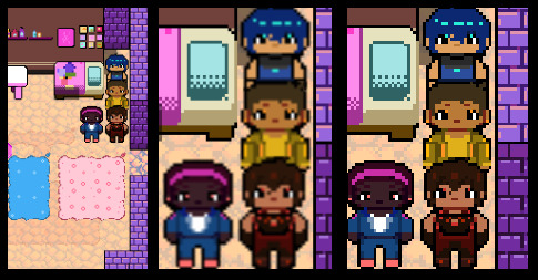
Last time this went around I shared my earliest published screenshot. I've been on a digital cleaning spree that definitely has nothing to do with this post and actually found 4 whole screenshots from my Not So Berry save, dating all the way back to June 2017. An entire first generation lifespan, and this is the only moment I deemed worth capturing. 😁
I actually got in the habit of taking screenshots of my gameplay over the course of this challenge, and made it all the way to gen 9 before abandoning it to start my New Sixam save just before I started simblr in June 2018.
9 generations in 1 year. Playing probably once or twice a week at most in those days! This stuff sure goes by a lot faster when you aren't documenting every minute of it. 🤪 But where's the fun in that?
Here's a somewhat visually similar screenshot (y'know, doors, symmetry, perspective) from the next rotation of my BACC. As to what Octavia is doing in the train depot control tower, well... 👀 We'll just have to wait and see, I guess!
If haven't done this one alread and want to play along, you (yes, you!) can consider yourself tagged by yours truly! 💗
#yes i did nsb#of COURSE i did#it's practically a simblr requirement to start at least ONE nsb#even if you don't post it#I heard that when you take a long enough hiatus you're actually required to start nsb when you come back 😦#sweet beginnings tag#ts4#not so berry#ts4bacc#octavia li extras
27 notes
·
View notes
Text
🛸 exterrasexymenpoll Follow
THE RED KING from TEAM DOGWARTS and BLUE BATS
vs
HAND OF THE KING from TEAM DOGWARTS
Please stop mentioning the Blue Stalker in our comments. They have caused a lot of distress for the Exterra community, no matter how “sexy” they are or “how many bitches” they get.
Once again, we condone voter fraud, but we draw the line at spamming our polls with links to the enemies to lovers Blue Stalker x Red King fic.

🎇 thestarsweremadeforus Follow
OFHHDFJSJDJS ITS HERE!!! DIVORCE POST!!! HAND VS KING the boyfriends are fighting!!!
Not gonna lie I was so absorbed in the potential hilarity of this matchup that I failed to realise I have to vote for someone now. I’m. Im genuinely torn 😭😭😭
💄 gaysloveqoh Follow
stop saying treebark is divorcing when they BOTH are on qoh’s side 😭 they’re united in their respect for our queen 😤
anyways idk what to do now that blueballs is out. anyone wanna make an alliance with the ballgurls 🥰
🦇 starshipspachelbel Follow
You’re right, the gays DO love qoh (gays being treebark)
This is so cruel, putting the king against his loyal hand… I am drowning, there is no sign of land, you are coming down with me, hand in unlovable hand…
#RKSWEEP though (I say with tears in my eyes)
👽 blueballs Follow
sorry but the blue stalker DOES get all the bitches 😎 more sexyman energy than xisuma exterra void anyway
anyways im endorsing red king LETS FUCKING GOOOOOOOOOOOO
👑 princeofhearts Follow
To the #HEARTSWEEP people mourning their loss, why vote for [deadname] when you can vote for his transitioned self, the Hand of the King? Stop being so fixated on [deadname], he’s still RK’s gunner 😭
Btw the ship wars between RK x Hand vs RK x QoH are so stupid like the Hand and QoH are the same people???? Some miraculous laserbug love square type of bullshit? Anyways I support the prince of hearts 🙏
🍬 gunnerwithashotgun Follow
@/princeofhearts ur a freak, stfu!!! queen of hearts and hand of the king are TOTALLY different ppl (they have different bioneos colours) and ur being lumianphobic by thinking theyre the same even tho they're just the same SPECIES (they even have different cultures like the hand keeps on roasting rk for calling tuski "pearl" bc that's the way qoh learned it??)

🪓 handoftheking Follow
I’m adding “not False Symmetry / Queen of Hearts” to my bio. Like, she’s super cool, but I’m unfortunately not her.
Anyways, vote for me over that old man. You’re not letting a potato win, right?
💫 concorp-official Follow
Vote for the Red King! Show a screenshot that you voted for him at any ConCorp intergalactic outlet and receive a 5% discount, effective today!

⏳ rensanddaddy Follow
NOT THE OBVIOUS BRIBERY FROM MR CUB HIMSELF.... we need to vote harder for the Hand!! Just look at his blonde ass hair and blue dishwasher detergent freckles!! He's so pathetic and a meow meow and I want to lovingly crush him against the walls of a spaceship (im not the blue stalker i promise)
🐙 doctagon Follow
... guys. i. The actual Exterra official account on twt sent out the link to this poll?? The ACTUAL account?? We've breached so many layers of containment???????
🪓 handoftheking Follow
... Okay, that miiiight be my fault? It's good PR for us, right? We're the two sexiest racers in the Exterra industry on the podium together. It's good for our image, and maybe people will FINALLY stop truthing I'm transgender QoH
🌲 dilfkisser Follow
I hope we get a perfect 50/50 tie. I want homoerotic RK and his homoerotic Hand to both win. I want them to stand on the podium and make out while holding a pride flag while BlueBalls beatboxes in the shadows. I hope we all win. (Except the transgender lumian theory believers, go touch some stardust)
#unreality#polls#treebark#trafficshipping#space opera au#.... yeah#sorry for making polls again even if its a gag poll#spopera martyn is indeed a pathetic meow meow but spopera false is even more of a pathetic meow meow#theyre all pathetic meows meows. dumb ass blorbo trio i love them 😭#tw unreality
135 notes
·
View notes
Note
4, 13, 15!
ty for the ask🫡!!!! ill answer under cut
4. What defines your artistic style?
sniffle.. aheem aheem... i dont know!!!!! id be nothing without screenshot redraws but thats not rlly my style ya know . uhh um uh . doing whatever i want is my style !!! i dont think i have a set style.. if i do please tell me what it is.. sniffle.. big eyes?
13. Are you looking to pursue a career in art?
dont talk to me about getting a job!!!!!!!! but, probably? im going to an art school starting september (YAY YIPPEE!!!!!) and ! im gonna figure out what to do wth my life there .. like i dnot knowww !!! dont make me think about the future !!!!! noooo !!!!!
.. but if im being honest, i dont rlly wanna make a career out of it.. i like having it as something just for me !! and my blog.. id like to open commissions eventually (most likely not even this year, i wouldnt be happy with charging people for my art rn) !! but i dont knowww ..
15. What do you like drawing the least?
my heart is full of love and joy .. only kindness in my soul .. i keep an open mind .. and when things bring me sadness, fear, or anger, i think about why .. and i learn to love htem .. but umm symmetrical things . i like the symmetry tool :) but i dont like drawing symmetrical things bc i never draw them at the same height..
4 notes
·
View notes
Text

Here's a sneak peek of content that's normally not for the general public! For every illustration I made for Netherrealms, I did a write-up of how I made the piece and release that exclusively for ρatrons.
This is an illustration I’ve been looking forward to painting again with my skill having progressed after 5 years. Here’s the first version I painted back in 2016:
This was my starting point when I started figuring out a way to remake this illustration. I didn’t want to change the composition, but I did want to add a lot of things I learned about lighting, costume design and giving direction to the composition.
As usual, I started with a moodboard to gather reference for lighting, the costume etc.

I then started setting up a scene to create reference for for Than’s pose. I loved the pose in one of the reference images (the mannequin in Cersei’s dress at the top left of the ref board, for the experts) so I decided to emulate that, with some adaptations to have Than look down at us all (as she does).
Eventually, I had a scene set up, but no real idea how I was going to approach the new version of her dress. For a quick mock-up, I just made a screenshot from Blender of the scene I already had and sketched on top of that in Photoshop:
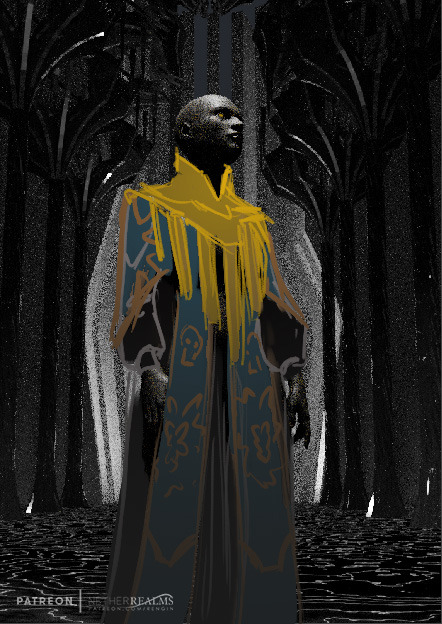
Now that I’ve got the basic shapes down, I have a little fun and recreate the dress in Marvelous Designer. I took the dress I made in Marvelous for Nergui earlier as a base and adapted that to fit Than’s frame, and looked up some really basic puffy sleeves patterns to emulate those, plus her overcoat.

(I actually understand sewing so much better after making a few of these - not that I’d actually be able to sew a dress after this though)
Since her collar would be a hard surface thing, I modeled that in Blender, imported the cloth from Marvelous and voilá, we have some reference:

Her collar didn’t have the shape I wanted exactly and the fabric of her overcoat wasn’t as thick as I wanted it to be, but this gives me a good idea of where I want to take the piece. So now I could go on to the actual drawing!


After the initial sketch I begin to lay in some colors, and make selections to fill them with the gradient tool. After a while, the painting looks like this:

I decided at this point I hadn’t taken Native’s anatomy into account enough: their necks are very elongated and their shoulders rest really low. I ended up adapting my sketch with the liquify tool to emphasise that a bit more, though I realized the collar would cover up a lot of that effect.
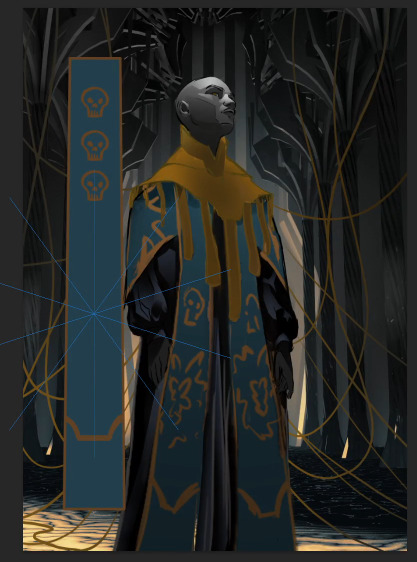
What I’ve also done at this point is create a design for the overcoat. To keep it consistent, I used the symmetry tool with different shapes to create designs, and clipped those to the blue square I’d created. I then made a smart object out of that whole design. That way, I could duplicate it, use it on the other side of her overcoat, and then change the design without having to redo it twice.
I used the same technique on the ribbons hanging from her collar as the rest of the patterned fabric: I created a design within a smart object, and then duplicated that smart object to fit other spaces where I wanted them to fit. I also decided at this point (after looking up some extra reference) that the gold embossing wasn’t looking like it should, so I made it a lot darker.

When I was almost finished I realized that the image was incredibly dark (in a bad way), so I upped the contrast a bit in the whole image, but also brightened up Than a bit to bring her more to the foreground.
I like to let a piece rest for a while after I’ve worked on it. Sometimes I even come back to a piece after a week with new insights. This one went through the same process. After a week of vacation I came back to the piece and made some final color adjustments and brightened everything up a bit more. And that’s how I ended up with the final piece!
I’m happy to have tackled this piece, because I now have a worthy piece to display next to Time. Now I only need a version of Tallulah where she doesn’t have her head in the clouds and I’ll have the full triptych. :)
If you found that interesting, I have about 19 more articles like this on my patreon, for just $2 a month! And with pledging, you help me create more Netherrealms to boot :)
18 notes
·
View notes
Note
Hey! I really love your storytelling :) do you have any tips for someone who wants to start a simblr? How to take screenshots and if there are mods/cheats you use? <3
heyhey! thank you so much! <3 idk if went all out or if these are even good, but tips are below the cut... hope it helps :)
(others are free to comment their own tips as well!!)
first of all, your simblr is all up to you and how you want to customize it (tumblr theme, format of posts, etc)... just remember that you have total control over what you post and all that. ppl on here are usually very nice and welcoming so be free with your own creativity and what you think looks nice/makes YOU happy, no judgment!
you can grab inspiration from everyone here and incorporate that into your gameplay/simblr which i think is totally fine. you're kind of finding your own style in a way. don't straight up plagarize tho and claim someone else's work as yours :'|
taking screenshots is a little tough bc some things can enhance the way they look for example reshade/gshade, your in-game settings, and pretty much manually editing thru editing software which you kind of have to explore if it's for you or not.
how satisfied you are with your screenshots may change over time (ik mine did), so try to keep that in mind. it's a sign of growth!
actually taking the screenshots, i mainly follow the rule of balance in photos that i learned back in art class in high school. i try to make the picture interesting through different angles/perspectives that make the picture look full and not just have the focus only on one side (if that makes sense). symmetry is also good.
having good lighting is also good which you can get by in-game buydebug lights or just editing your pictures.
filters add a lot of character to screenshots, so use those to your liking.
try to zoom in as much as you can when you take pictures so that it looks less fish eye?? (i think thats the term) lol -> obviously this might not work if you're taking room-wide screenshots
no drift cam mod is a must if you want precise screenshots and dont have to fight the camera to sit on the spot you want it on ;^;
no camera fade for sims so your sims dont disappear while taking pictures LOL
6 notes
·
View notes
Text
Angle importance with Fiinia!
A mini explanation I decided to explain during my current sketch project, I will try my best to explain my thought process using my terrible explanation skills.
This is the screenshot I will be showing it off on:
Comparing a straight and shifted angle
If you were to compare this same sketch, displayed at two different angles, you probably felt that this second one was a lot more satisfying to look at, compared to the first.
Let's first find the middle part of the image
The less symmetrical a drawing is and the more off center it is, the more interesting drawings and paintings become. Just comparing these three blobs of blue, the two that are uncentered is often more interesting to look at than the one straight in the middle.


We like putting the focus out of the center for maximal aesthetics or something like that. But that doesn't mean that putting things in the center is boring, I do that all the time.
Note: Countries reading from left to right, they typically look at the top left corner first instinctively. Vice a versa with right to left countries. So putting the focus more on the top left or top right does have an importance. This is all based on an average btw.
So putting your focus of the image on the upper part of an image is the best maximal angle-range.
Left to right readers:
Right to left readers:
Weight shift

This does have some importance as well. Symmtery isn't a bad thing, but it's very common to like drawings and paintings that are asymmetrical. This is a taste thing and is different for every person, I personally love symmetry more in all contexts except drawings. A shift in weight makes it more dramatic and dynamic!
Not everything needs to have the same weight shift either. This can either depend on how close something is to the "lens" or several items etc.
This is where I will be cutting it short.
This doesn't mean that symmetry, even shift weight and low range focus is wrong in any way. Every drawing is interesting in it's own way! You should do what you have the most fun doing.
There is nothing wrong or right in art, because there is no definition of right or wrong in art. No one can draw what you draw better than you yourself.
2 notes
·
View notes
Text
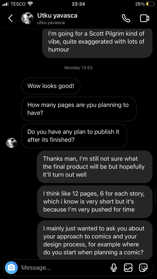
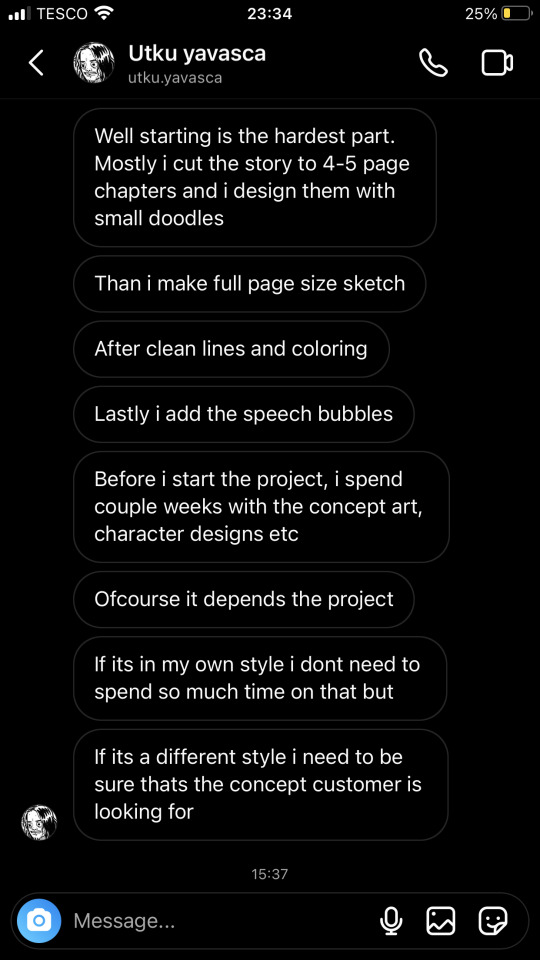
'Intersections' Influences and Inspiration - Pt 2
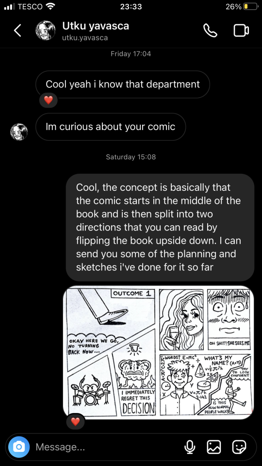
Utku Yavasca
Utku Yavasca is a Portuguese comic artist that I found out about through my cousin, who happens to have met and befriended him on a trip to Portugal. The majority of Utku's work is shared through his Instagram page, where he regularly uploads short humorous comics about his life experiences. These comics usually contain 10 images per post, each being a different panel of the story. Utku is a very versatile artist, creating a variety of pieces that range from simplified and cartoony sketches to incredibly detailed pieces with darker, more mature themes, all of which tend to be created in his preferred medium of black ink.
It was very beneficial that I was connected to Utku through my cousin, as this meant I was able to share a dialogue with him about his work and my final piece. Here are some screenshots of the conversation I had with him.
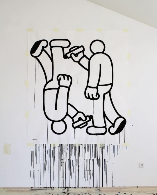
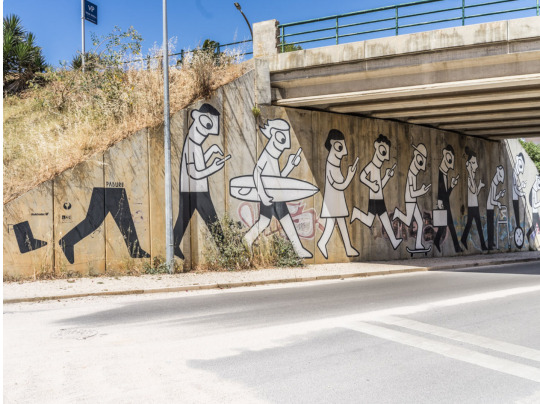
Daniel Padure
Daniel Padure, aka Padure, is another artist who interestingly happens to be from Portugal. He works in the fields of illustration, painting, and street art, primarily sharing his art through Instagram. Padure's work can be recognised by his simplistic, bold illustration style, using minimal details and thick lines, often with his signature ink-dripping effect. What I like about Padure's work is that it's very visually consistent, using symmetry and precise proportions. He often uses the same character design in his pieces, which is very similar to the style of Keith Haring. I have been following Padure's work for a while, but what brought me back to it during my research for this project was his series of mirrored pieces, one of which can be seen below. This links to my idea of adding a flipped aspect to my graphic novel. I also feel that my approach to illustrating characters can often be very similar to Padure's, as I tend to draw with symmetry in mind as well as accurate proportions. I am also a fan of using simplified illustration styles.
Jordan Bolton
Jordan Bolton is a Manchester-based comic artist whom I discovered on the creative blog It's Nice That. Jordan creates beautifully moving short poetic stories that primarily focus on simple everyday experiences such as going to the movie theatre, looking out of the car window, and watching birds sitting in a tree. Jordan's comics, in a visual sense, are deceptively simple; however, they are always accompanied by a meaningful and often philosophical narrative. What I like about Jordan's work is his subtlety as well as the way that it subverts your expectations of a comic that traditionally has panels filled with dramatic and action-packed imagery, instead depicting more real-life settings and scenarios where the focus lies on introspection. In a way, I believe that the imagery Jordan uses is secondary to the underlying narrative, simply being used as a means to express it. Jordan's work links back to my research on Eckhart Tolle and The Slow Movement, as they all share similar themes of living in the moment and enjoying the little things in life.

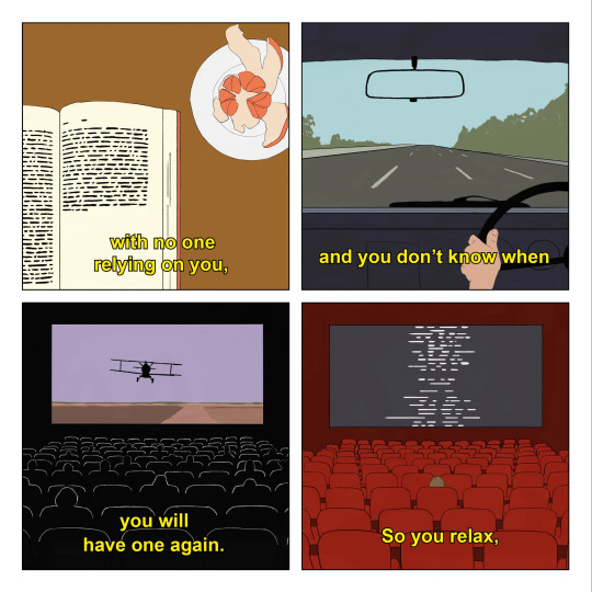
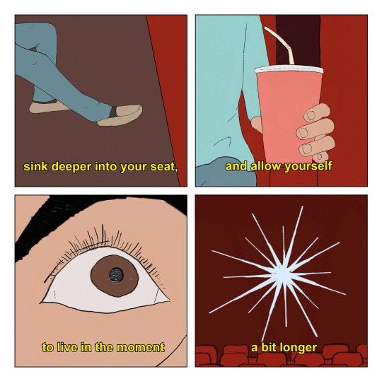
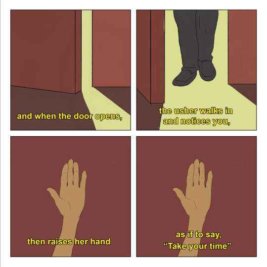
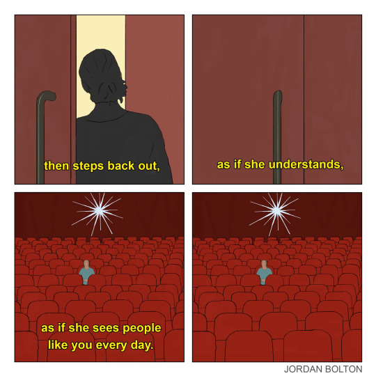
GalleryJordan Bolton: Day-Off. Scenes From Imagined Films (Copyright © Jordan Bolton, 2022) (Accessed: 25th November 2023).
References
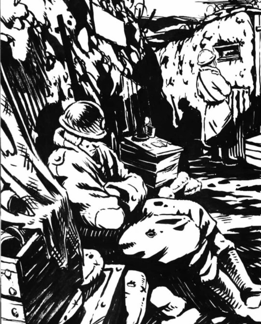
utku.yavaska (2018) trenches [Instagram], 6th September. Available from: www.instagram.com [Accessed 25th Nov 2023].
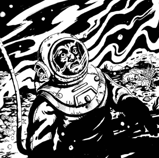
utku.yavaska (2018) inktober 13 [Instagram], 13th October. Available from: www.instagram.com [Accessed 25th Nov 2023].
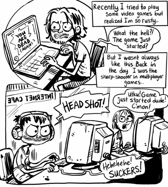
utku.yavaska (2022) 🎬 Nostalgia Series #1 Gaming🕹 [Instagram], 24th August. Available from: www.instagram.com [Accessed 25th Nov 2023].
utku.yavaska (2022) ❤️”Love is blind , and deaf-mute too” - A wise person [Instagram], 5th April. Available from: www.instagram.com [Accessed 25th Nov 2023].
utku.yavaska (2023) Reverse Evolution [Instagram], 24th May. Available from: www.instagram.com [Accessed 25th Nov 2023].
(2020) Lockdown [online]. Available at: Lockdown by Daniel Padure - Street Art Cities (Accessed: 26th November 2023).
(2021) Untitled [online]. Available at: Untitled by Padure, Daniel Padure - Street Art Cities (Accessed: 26th November 2023).
padure_ (2023) 🙃🙂[Instagram], 7th November. Available from: www.instagram.com [Accessed 26th Nov 2023].
Hingely, O (2022) 'Jordan Bolton creates deeply moving comics derived from simple language and imagery', It's Nice That, 27th September. Available at: Jordan Bolton creates deeply moving comics derived from simple language and imagery (itsnicethat.com) (Accessed: 26th November 2023).
0 notes
Text
i’ve got an unhealthy obsession with beautiful female faces. beautiful male faces are fine too, but there’s something addictive about female beauty. just love the overall styling, the lines, the silhouettes of beautiful women
these are all the beautiful faces i’ve looked at today lol
realize the thumbnails in my photo gallery look like that of a total psycho. it’s just an infinite scroll of beautiful female faces, some kai, some screenshots of scenes from films/clips, passages from books, the occasional selfie taken to compare my facial symmetry (or lack of) from one quarter to the next
i used to wake up in the morning and look up faces of kpop idols, then look at my own face in the mirror, then question why i bothered being alive at all in this body (it’s no fun being ugly). this is less of a routine now because im more at peace with my ugliness. but there are still days where i wake up and hate every physical feature of this body
0 notes
Text
Process-Illustrations and Inside of Book
This is some of the process, for making my illustrations and the other bits that I decided to add in the book.
Unfortunately, I forgot to take that many pictures of the process. I know how important it is to back up your process with screenshots but the limited time for the project really made me subconsciously work on all the illustrations without thinking about anything else.
However, I decided to add the timelapse for two of my illustrations. The process for all of them is quite similar anyways so I don't really see this as too big of a problem.
First Page
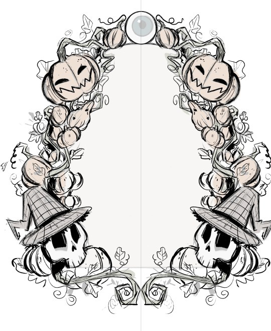
I wanted something special for the first page. In the show Over The Garden Wall, they sometimes put up images or text in these beautifully ornamented frames. They are usually made of the faces/ silhouettes of a character, a very important object for the story, or just intricate patterns and shapes.

I decided to create my own illustration in this style that would serve as the first page in my book.
Since I wanted to capture that old, folklore-inspired, fairy tale book style, I decided to refine the sketch and use it as line art. I mostly made the frame out of pumpkins, vines and leaves, with only two of my characters in it since I think they fit the best with the aesthetic I was going with. This was very easy and fun to make. I used the symmetry and mirror tools to speed up the process.
For the colours, I wanted something very soft and earthy that would suggest autumn. I mainly used browns, oranges and dark greens with just a few of blue-ish tones here and there.
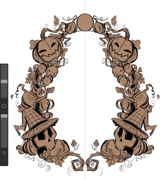
I wanted to make the illustration look like it was made with watercolours so I used a big air brush to fill in all the colours and shading. This made the whole thing look a lot softer, hand-made and as if the colours were mixing together.
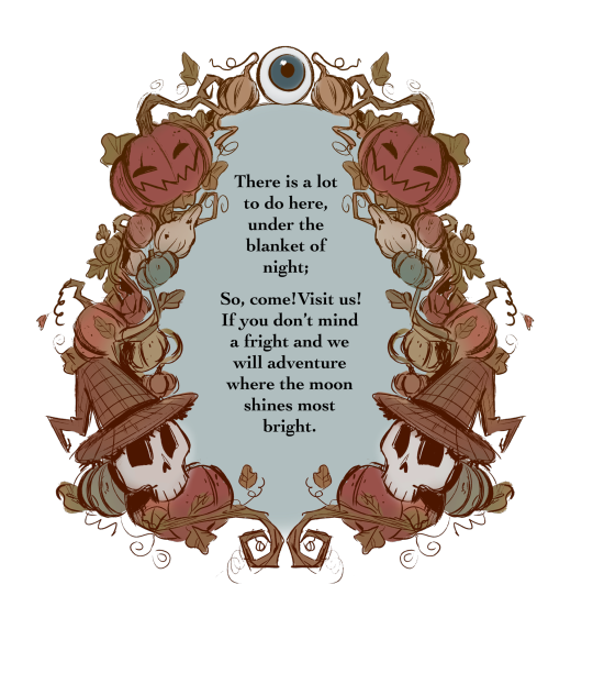
I used a desaturated shade of blue for the centre and then put in the first verse of my story.
I absolutely love how it turned out. The only thing I would've added was some more watercolour texture here and there, to further emphasis the traditional aesthetic of it but in the end, I think it looks passable enough for what It is trying to look like.
Illustrations
I decided to make 3 of my illustrations on the same canvas which means I have all the process in the same video. Working on these was an absolute pleasure and I am very grateful for the techniques and useful things I have learned while painting (digitally) in this style.
As I have mentioned before, I wanted to go with a very sketchy, paint-y look for the illustrations. This gave me a lot of freedom and actually made me more confident in my ability of creating interesting shapes and brush strokes.
Up-close, you can really see how rough and unpolished everything is, and I thing this only adds to the charm, originality and character that children's books usually have.

After I finished the 3 illustrations I had that were on the same canvas. I moved each one on it's on page, where I added any finishing details.
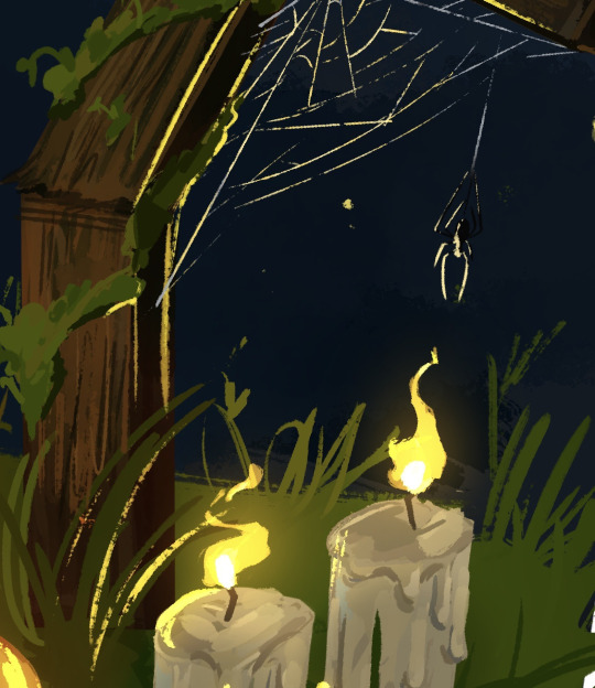
For example, I decided to add a nights sky behind the crow and a stone wall covered in ivy to sit on. I also tried to make some kind of animation/sequence by having the crow drawn three times while it took on flying . I added a white line of action to further emphasis the movement .
Since the crow and the background are both very dark, I decided to add some rim light along the edges of all the crow drawing with a muted shade of yellow, to make it look as if the moon was reflecting on its feathers.
This really separated the background from the crow and really added a lot of dimension.

I did something similar for one of the others illustrations as well. Since I had the lit candles in , I had to make them glow and reflect on all the objects around it.
I started by creating a new layer, on which I added a very dark shade of blue-ish purple over the whole drawing. I put the layer on the blending mode ''HARD LIGHT'' which made everything darker and in harmony with the sky.

After that, I added some highlights all over the place with a bright yellow. This is also where I made the flames of the candles. For this, I used the blending mode ''ADD'' which made everything bright . I also erased the edges of the highlights with a textured brush to make them blend better with the objects they were hitting.

After that, I made another layer with the blending mode add and added a very subtle glowing effect with an air brush on all the highlights and the candle flames.
I loved working on the flames. Thinking about how the wind would hit the flames making them move was so fun and it added a nice touch of realism to the piece.
This illustration was made separately from the others. I decided to draw a cake and some dog paw prints in tune with the verse that it was representing.
I took a slightly different approach for drawing the cake. I made the ''sketch'' out of squares and rectangles using the ''rectangle tool''. I decided to go with a very generic design for the cake, I didn't want to spend too much time on the initial sketch.
After that, I started carving into the shapes, adding shading and dimension. This is where I decided to replace the pink icing with chocolate just to have more variation in colour. The wiped cream on top was a bit hard to do since the shapes was not something I have done much of before, but I think I managed to figure it out.

I added a lot of highlights on the icing to make it look shiny.

As a last, slightly gory detail, I decided to add eyes around the bottom of the cake. They were very easy and quick to do and they really accentuated the Halloween theme in the page.

This is a comparison between the ''sketch'' and the finished drawing.

As always, there is a lot of texture everywhere. This technique of adding random lines and strokes everywhere really became a signature element in my style that I have used for my other project was well. It is something I have learnt from movies like Spider-Man Into The Spider Verse and digital artists like Sam Does Art.

Bonus Illustration
I made also made this final illustration as a son of conclusion for my story, with the skeleton siblings having a fun time with the ghosts in the cemetery.
I was really inspired by the show Cuphead to make this illustration. In the show, all the background are made separately from the characters in a soft, hand drawn style, while the characters and the objects they interact with are made to look a lot more crisp and clean.

This is a technique that Disney used for very old animated movies like Snow White and Cinderella, where the background would be done on plastic sheets and the characters would be added on top of them.

Pattern End/Start Pages
While studying the components of a children's book, I have noticed that all of them would have the first and last 2 pages be made completely out of patterns of drawings or shapes on a simple coloured background.

The functional purpose of these pages is to hold the book's interior to its cover and protect the insides of the book. However, this doesn't mean that they have to be blank, The can have little drawings, repetitive shapes, patterns and other visually interesting elements.
I decided to create my own end pages. This only took around 20 minutes to make. I decided to go with this beautiful violet for the background. I thought this colour worked nicely with the blues of the front and back covers.
Then, I started sketching the little drawing pattern. decided to stick to the Halloween-y theme and have a crow, a witches hat, zombie brains, a few potion bottles and a pumpkin.
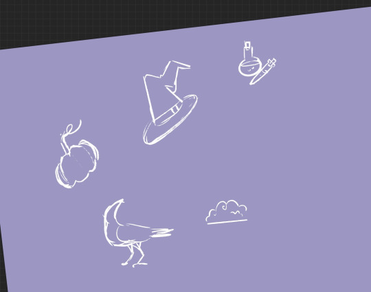
After that, I made the outline for all the objects. I decided against adding any other colours. After that, I simply duplicated the 4 objects and filled the whole page in. I duplicated the whole thing 3 more times after that.

0 notes
Text
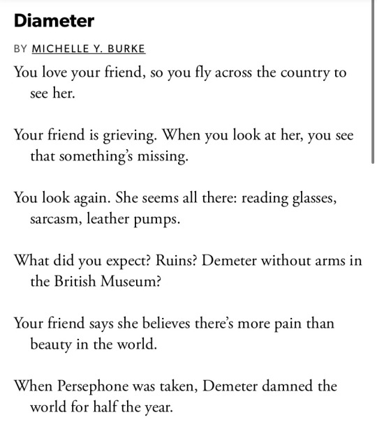
[Image ID: Screenshot of a poem. The text reads:
Diameter by Michelle Y. Burke
You love your friend, so you fly across the country to / see her.
Your friend is grieving. When you look at her, you see / that something's missing.
You look again. She seems all there: reading glasses, sarcasm, / leather pumps.
What did you expect? Ruins? Demeter without arms in / the British Museum?
Your friend says she believes there's more pain than / beauty in the world.
When Persephone was taken, Demeter damned the / world for half the year.
The other half remained warm and bountiful; the / Greeks loved symmetry.
On the plane, the man next to you read a geometry / book, the lesson on finding the circumference of a / circle.
On circumference: you can calculate the way around if / you know the way across.
You try across with your friend. You try around.
I don't believe in an afterlife, she says. But after K. died, / I thought I might go after her.
In case I'm wrong. In case she's somewhere. / Waiting. :End ID]
#words#poetry#diameter#im positive ive posted this before but i cant find it#anyway this poem has lived within me for like half a decade i'll never forget the first time i heard it#rey ankhisms did a reading of this too its on their tumblr and its lovely<3<3
438 notes
·
View notes
Photo
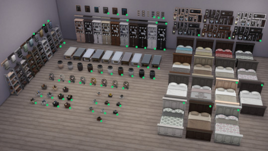
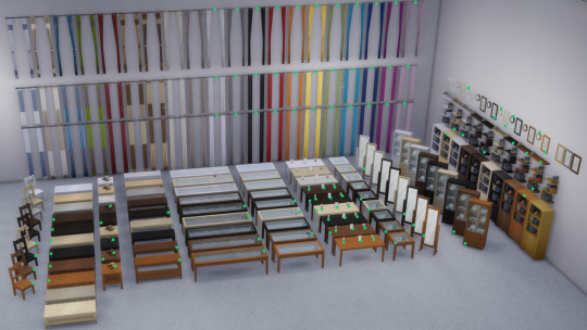
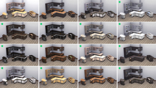
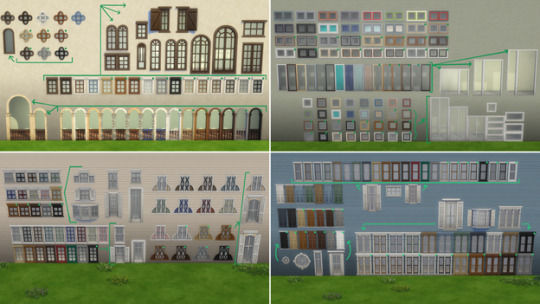
The Sims 4: New Game Patch (September 21st, 2021)
There’s a new Sims 4 update available for PC/Mac and Consoles.
PC: 1.80.69.1030 / Mac: 1.80.69.1230
Console: Version 1.48
Hello Simmers!
We hope this Game Update finds you well!
As Summer has ended and the Pumpkin Spice season starts (you all know I’m ready for my pumpkin spiced coffee!), our Art Team has a treat for Simmers that love to build. If you are not an expert builder that is quite alright, I’m not either, but I do enjoy trying a few styles and choices so no worries in that regard.
Thanks again for your continued support, we truly appreciate it!
Chaus!
-SimGuruRusskii
Over 1000 new swatches for over 100 base game items!! https://t.co/7yjIIBvwLQ pic.twitter.com/KNqpViEfSd
— LlamaGuruFrost (@SimGuruFrost) September 21, 2021
What’s New?
149 assets – 1,200 vaaariants
149 assets – 1,200 variants to enjoy so dear
149 assets – 1,200 vaaariants
How do we tell you about these�� easily?
In pictures, in writing, in cups of coffee.
In gameplay, in video, in pictures, in laughter.
In 149 items – 1,200 variants – how do you measure this new thing we did with this in hand?
How about you just show? Yes, how about you just show?
Don’t measure at all, just show.
Our art team took over this Game Update and they have added about 1,200 new variants (yes, you read me correctly, about 1,200 variants) to 149 Base Game items in Build Mode. The Art Team’s vision was to complement and enhance these assets so Simmers have more choices and have more use out of them. Also, why not?
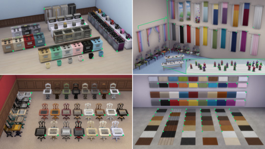
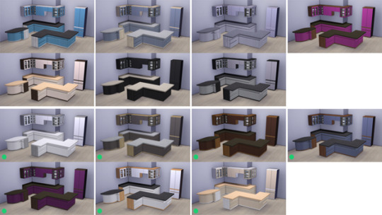
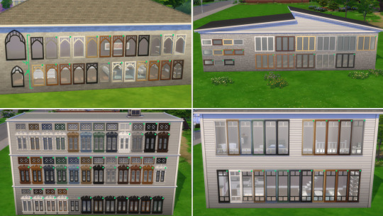
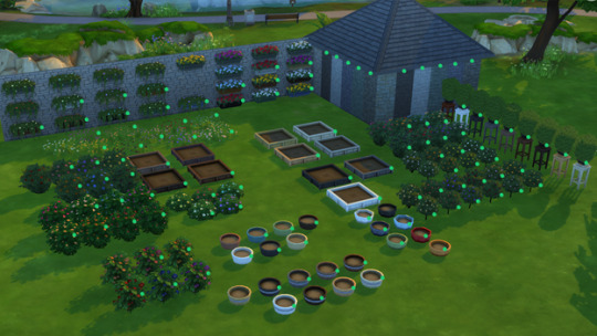
I will list the names of the assets, with images, that we have added variants to. Huge props to SimGuruBeth for providing these fabulous screenshots! In these screenshots you will notice some arrows and green dots, those represent the new additions.
Ok – enough of me rambling about, are you all ready? <takes deep breath>
Illusion Shades
Flaunting Flounces Panels
Minimalist Drapes
Sooner or Ladder Contemporary Dining Chair
Tabula Rasa Coffee Table
Tabula Rasa End Table
Tabula Rasa Console Table
Grand Hall Dining Table
Grand Designs Dining Table
Simplicity Dining Table
Square Meals Dining Table
Floored by Symmetry Standing Mirror
Carina Dining Hutch
Simple Symmetry Bookcase
Intellectual Illusion Wall-Mounted Bookshelves
Great Wall Mirror
Capped Wall Plank
Dodecagon Contemporary Clock
Honeycomb Bottle Holder
On Phantom Wing Framed Art
Apple of Your Eye Framed Watercolor
Pear Essentials Framed Watercolor
Terminus Reclaimed Pipe Towel Rack
RAW Bookshelf
Reclaimed Plank Shelf
Wainscott Gardens Dining Cabinet
Form & Function Industrial Coffee Table
The Barnish Bed
Boardwalk Trashcan
CONCEPT Coffee Mug Rack
Cluttered Mind Box Set
GrammyFone Old-Fashioned Music Player
In Session Novelty Chalkboard
Three Framed Skeleton Keys
Ordinary Things Shadowbox Display
Cooking-U Pro
Crisponix Ultragreat w/ Deluxe Crisper
The Omniwaver
Café Immodéré
London’s Choice
The YumCooker
The Schmapple Oven
The Schmapple Coffee
Garbelle Wastebasket
Popped Color Curtains – Left
Popped Color Curtains – Right
Sunny Shades – Left
Sunny Shades – Right
Junior Wizard Starter Set
Mega Couple Of Books
The Purple Protector Action Figure
The Purple Pursuer Action Figure
The Chessmaster
Chess under the Stars Patio Table
Grand Plans Chess Table
Cabin Slats
Simplicity Shade
Limber Lumber Traditional Hardwoods
Rustic Subfloor Slats
Eco-Craft Hardwood Flooring
ForestFine Wood Flooring
Old World Wide Plank Flooring
Herringbone Hardwood Flooring
VAULT Modular Counter
VAULT Modular Island
VAULT Wall Cabinets
VAULT Pro-Level Bar
BlandCo Contemporary Counter
BlandCo Contemporary Counter Island
BlandCo Contemporary Cabinet
Country Fieldstone
Mega Stacked Stone
Windowbox of Superiority
Neighborly Windowbox
Garden Planter Box
Garden Pot
Bonsai Tree
Oopsa Daisies
Red, Red Shrub
Pink Aster Nots
Purple Perennial Flowers
Shaggi-luscious
Passion’s Kiss
Baby’s Bottom Rose Bush
Red, Red Rose Bush
And all 64 windows present in Base Game!
Whew, that was quite the list! And now to our bug fix of this Update.
Bug Fixes
The Sims 4
Sims living that career lifestyle but their outfits were… not up to par? Were your Sims’ career wardrobe a bit stale as you moved up that career ladder? Not exactly dressing for success, right? No worries, we have fixed that issue and now all career levels should have appropriate outfits. Go you, good luck!
136 notes
·
View notes
Text
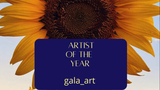
Moonshine Awards 2021 Artist of The Year Feature
To celebrate winning Artist of The Year, we asked @gala-art for a hand-picked list of their feature art and a rec list.
Congratulations, @gala-art !
Postcards from Maggie and Glenn's Wedding by auxsentiers
Such a lovely fix-it idea, and so much fun. I always love a good fix-it.
Haunted House by lemortehomme
These pieces are what I live for—a perfect encapsulation of the pain that Daryl never shows us, even as we know it is there.
All of the works by @paperdollgirl and @boltthrutheheart who always bring such fresh, emotional takes on our beautifully tragic ship.
Personal Rec List
Home for Christmas
My Home for Christmas comic, which I worked really hard on for several weeks. I have always wanted to tell this story, one where Daryl goes back to Atlanta, and I finally found the occasion to do that. My favorite part is probably Part III: I knew it. I just had a really fun time drawing these scenes from “Alone,” and finding the symmetry between the shape of the human heart and the shape of their hands intertwined.
(A or B)
(A or) B, which is another story I’ve wanted to tell for a while. I have many theories about the relationship between A/B in the series and how they may pertain to Beth. Whether B is a storyline we simply did not see, or a story that exists as part of a multiverse theory, I don’t know, but I know there is a story somewhere in which Beth is not dead, and perhaps even where Team Family does not have to endure the hell and tragic loss after tragic loss that comprise nearly all of seasons 6-8.
Still Screenshot Studies Part 1 & Part 2
I am also proud of my “Still” screenshot studies. I did three last year. I love sketching Beth and Daryl in “Still”/“Alone,” because I feel that, even as it’s so short-lived, Beth and Daryl’s bond is one of the show’s most enduring and most intense. “Still” is easily the best episode of the series (I think we all can agree lol), and drawing it makes me feel close to what they actually were (not just what they could have been).
#msa2021#moonshine awards 2021#bethyl fanart#moonshine awards 2021 winner#feature art rec list#fanart recs#art recs
21 notes
·
View notes
Last Seen Blogs

sporadicbirdflower
Sporadic Bird Flower

alemgt
Sin título
unknownasnoone
Hopeless Little Amorist

profenceflorida
Pro Fence Florida