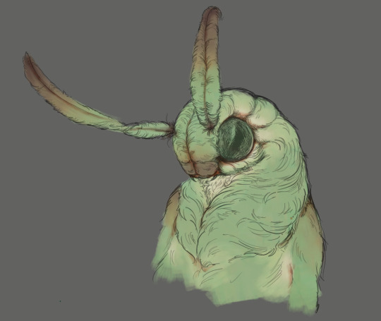
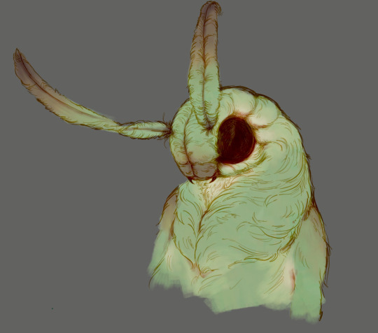
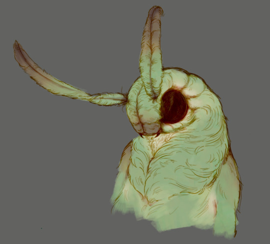
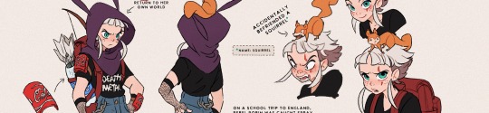
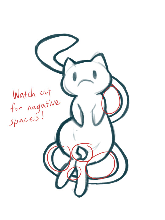
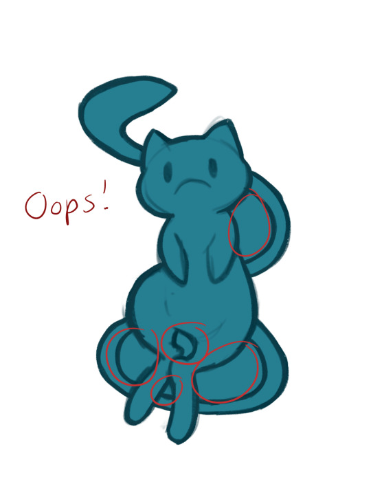
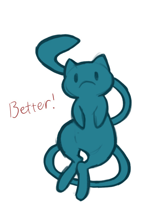
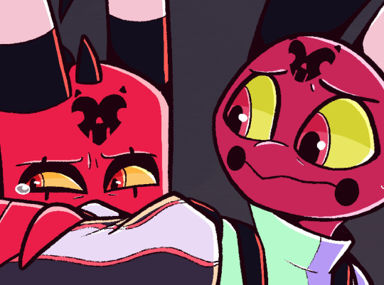
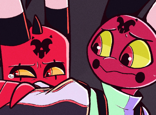
#and also where are adjustment layers in procreate?? where are they??
Photo
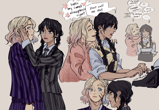
ipad doodles (and topical enid-is-from-san-francisco jokes)
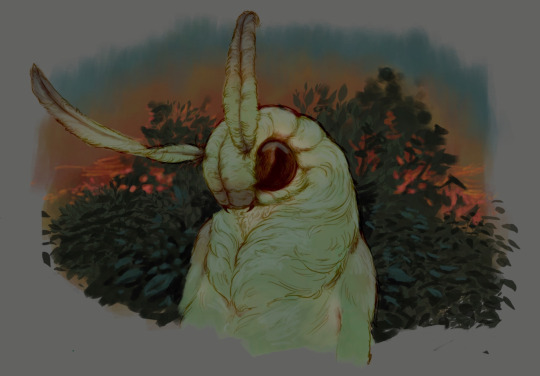
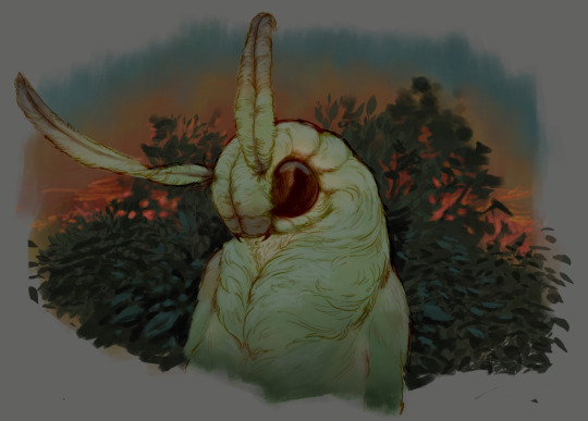
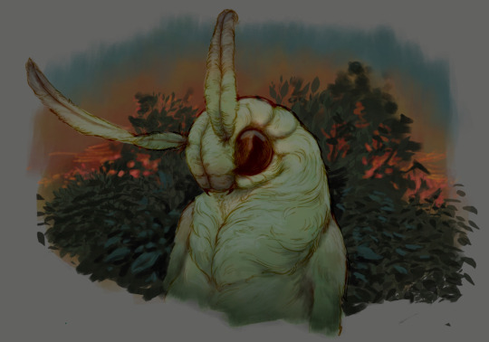
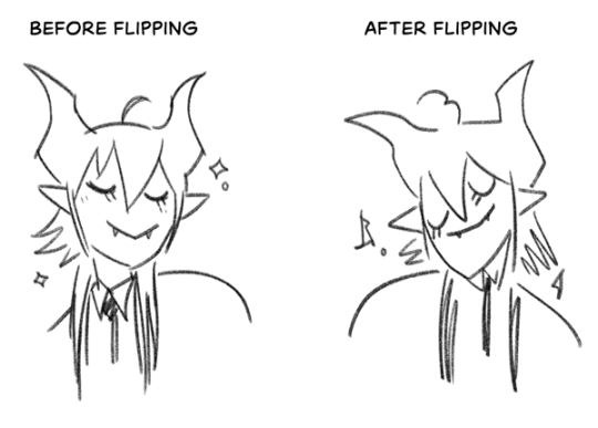
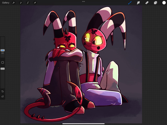
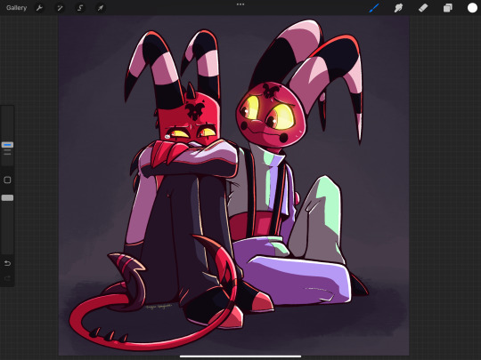
#wednesday#wenclair#[house hippo commercial voice] these look really ... different - but you know they were drawn by the same person don't you?#hello small minority of people from northern california who might understand this rather boring joke#and also where are adjustment layers in procreate?? where are they??
7K notes
·
View notes
Note
i am so in love with how you draw fabric! all the colors! it’s stunning. would you be willing to share some of your process?
Of course!! :]
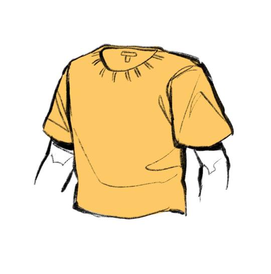
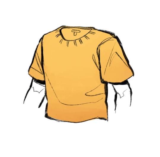
First off, start with a flat color (we're going with yellow), and then using a slightly more saturated and darker color, make a gradient on your clothing going from the bottom up. I prefer to use the Tamar painting brush in procreate for this!
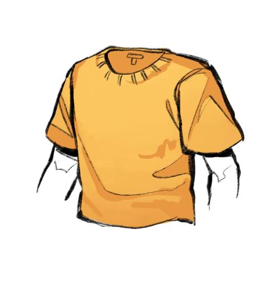
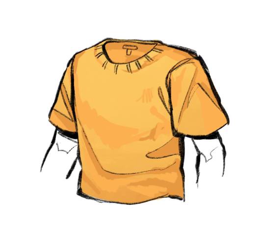
Next, take a pencil brush (or whatever brush you prefer, I used the 6B pencil in procreate) and using that same darker color, block in your darkest areas. Don't worry about being perfect! Take another more saturated color, this time only Slightly darker than your base, and block in the rest of your shaded areas. This will give you clothing item more depth! Be sure that you know what direction your lighting is coming from!
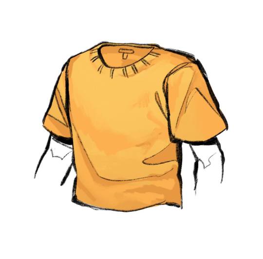
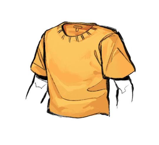
Now, we neaten things up! Use a blending brush (I use the Stucco paint brush) to soften the edges of areas where the lighting is softer, and take your pencil brush and neaten up any areas you would like. This can also involve adding lighter spots like I did, using the base color in the gradient area.
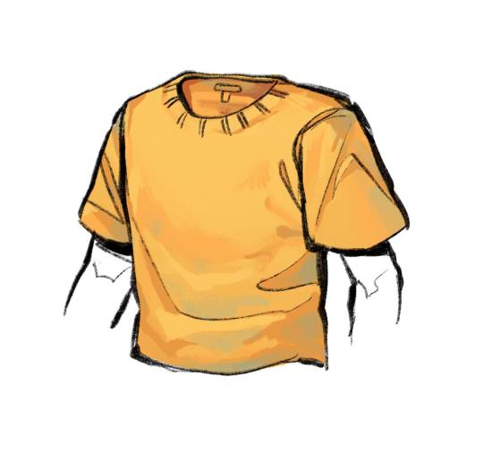
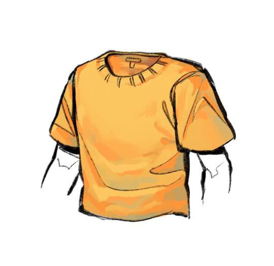
Now into reflective lighting! This is assuming that the clothing is reflecting light from objects around it. If it isn't, you can really just add a bit of warm blue, and be done with this step. If it is, take some warm blue and, using a textured brush (Tamar brush for me), lightly brush it over your main shaded areas! I am going to demonstrate reflective lighting with a more intense lighting, so if you're looking for that, take a brighter, highly saturated color and place it on the Edges of your darkest shading spots. With clothing, if it is thin enough, light will pass through to shaded areas, casting a more warm and satured hue.
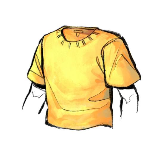

For the actual brighter light, make another layer above your color layer and turn it to an Add/Addition layer. Using your base clothing color and a textured brush (Tamar) just lightly go over the spots that get the most light! It will seem very bright, so turn the opacity for that layer down to 35%, or adjust it however you like!
#gonna add more!!#sorry its so long lmao#i like to be detailed when explaing things fidhdk#eve answers
380 notes
·
View notes
Text
Coloring tutorial I guess
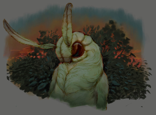
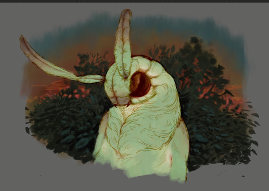
That's my most default shading style, a hybrid of line drawing and painted shadows, and I'll tell you exactly how to get this look.
But before we start, you need a weapon
This is my main brush for basically anything, including line art on days when I don't feel like switching to something actually intended for inking. It's a lightly textured square brush with color variation on every stamp. Intended for Procreate but you can always just rip the alpha texture out of the file and use it for a brush in any drawing program.
That out of the way, let's go. I'll use the same line art as the one in fluff tutorial.
Set the line layer to ~60 or so opacity and get to blocking in the base colors of your character. The jitter brush will introduce some color variation on it's own, but changing the color occasionally will add more visual interest.
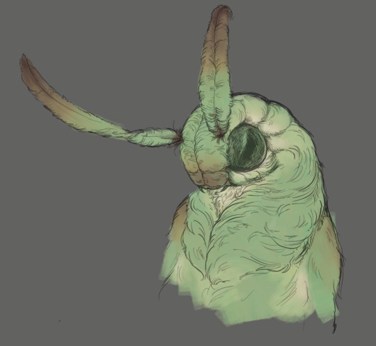
After this I add a multiply layer on top and dab orange or red in places where we might be able to see the base of the hairs or peek at the carapace underneath.
It's places where hair parts and where it's shorter. This accent color works great on joints as well. Example of the thing I'm going for in real life:
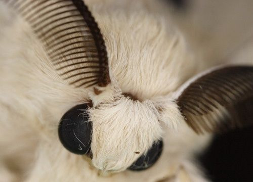
Especially visible behind the head. It's not present on every moth to be fair, but I like to add these accents even where it wouldn't make sense, just because it looks nice. Even on insects without hair.
Block in the eyes and mandibles now, best if it's on separate layer.
Now, the actual funny tricks begin. If you're one of the people who only use multiply or add blend modes, stop it, get some help
Understanding the math behind blend modes is gonna get you a long way.
My lineart is set to subtract more often than not. I find it produces juicier and more colorful results than multiply. I want to give this picture a warm orange feeling, so the color of my lines should be the opposite - blue.
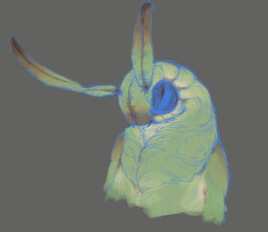
And, subtract.
Perfect, but not quite. We can push the lines to an even softer feeling. Take the line layer, copy it, invert the color and set to multiply. I then throw gaussian blur on the resulting copy and reduce opacity until the lines bleed into the surroundings just a little bit.
On to actual shading. People who shade without getting in some background first scare me, so let me throw something together real quick.
A simple gradient will also suffice for this use. We just need some information on which colors are present in the surroundings.
Copy your background, bring it on top of your character layers and gaussian blur it real hard. Set it to multiply, remove all parts of the layer that go beyond the pixels of the base color layer. Adjust opacity until the character fits in the background.
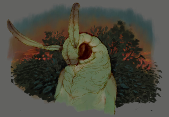
Let's identify the light sources. In this case it's only the sky, but it produces two distinct colors - soft blue lighting comes from the top, slightly stronger red comes from behind.
The blue light I set to exclusion blend mode because it felt most appropriate in this case. Both add and screen looked too strong to be the light coming from such dark sky.
In this lighting context the lower part of the body will receive less light that the upper part. I use the green of the bushes set to multiply to darken the bottom.
The character is surrounded by all kinds of soft light, but it can't get everywhere. It's time to add ambient occlusion, or contact shadows, for those without a 3d background. Anywhere where there is a crevice or surfaces almost touch, a soft shadow will form.
I do it on a multiply layer with a neutral gray-green color. Gray because any color light isn't really getting in there and green because the fluff is somewhat transparent and whatever light does pass through it gains a greenish hue.
Last step, red rim light from the fading sunset behind the character.
Since it's rim light I just work with normal blending mode. Setting it to add or something of the sort would make the rim light brighter than the source of the light. And it'd be odd.
And that's it. I usually throw on some post processing in Snapseed. Pull some curves, throw on a bit of grain, etc. But it's a topic for another time.
In conclusion, try to think about the environment more when shading. What route does light go through to reach where you're coloring? Did it reflect off of any colored surface? Did it pass through something transparent to gain a different hue? What color shadow would this ambient lighting produce?
Go have fun with your colors now.
213 notes
·
View notes
Note
Would you ever share your process or even part of your process for your glowy/exhibition pieces? I totally get it if you don't want people to reproduce the work but I've been interested in compositing drawing with real images and don't know where to begin! Or if you have any good guides for similar stuff and effects you know. Thanks for reading your art is gorgeous ^^
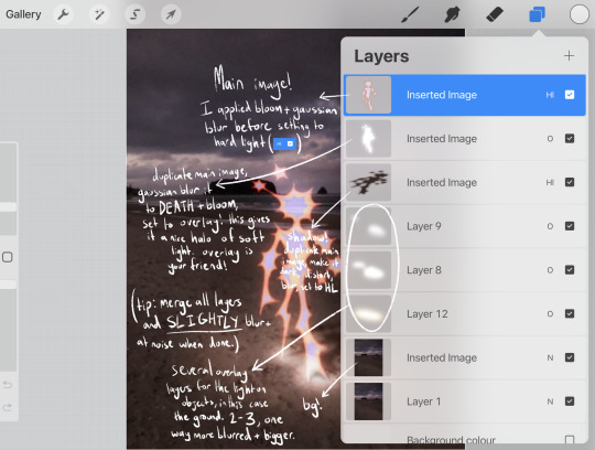

here's a guide for my favourite piece in the style you're referring to!!
if the text is hard to read:
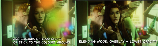
Main image! I applied bloom + gaussian blur before setting to hard light (HL)
Duplicate main image, gaussian blur it to DEATH + bloom, set to overlay! this gives it a nice halo of soft light. overlay is your friend!
Shadow! duplicate main image, make it dark, distort, blur, set to HL (note: lower the opacity!!! adjust opacity of all layers to your liking.)
(TIP: merge all layers and SLIGHTLY blur + add noise when done.)
several overlay layers for the light on objects, in this case the ground. 2-3, one way more blurred + bigger,
just the background!
"bloom" is a procreate feature, it makes things look glowy. I'm not sure if theres a similar feature in other applications!!
my other tips are just. definitely play around with layer effects such as overlay, hard light, divide etc. they're super useful!! also, you want your glowy creature to match the background. if your photo is slightly blurry, blur the creature to match the blurriness of the background!!
please show me if you make something like this, I'd love to see it! and don't be afraid if you think its too similar, I don't mind people taking lots of inspiration from my work!
296 notes
·
View notes
Note
Hello!
Sorry to bother but do you have any digital art tips? I’m quite new to it and any tips, tricks or advice would be helpful! Your coloring style is very beautiful and I love it a lot!
thank you! 💚💚💚 sorry this is a bit late, hopefully there's still something helpful in it!
(also, it got pretty long, sorry!)
I think the biggest thing is to just take things slow -- digital art feels different than drawing traditionally, and it's SUPER easy to get overwhelmed by the billions of cool features that the digital world offers. (I say, as someone who spends a lot of time downloading cool brushes and textures...and then never using them ever.) there is a ton of really cool stuff you can do digitally, but because there's so much, I think it's really important to take time to figure out what is and isn't working for you. spend some time doodling without any intent to do a finished piece, figure out how you like to hold (or not hold) your tablet, what keyboard shortcuts you end up using a lot (and therefore might want to map to your pen/tablet buttons for quicker use)...that kind of thing!
everyone's workflow and preferred program and style are different, so it's hard to give hard-and-fast general advice. but the things that I think of as the essentials for learning digital art programs, and what I think of as a good order to focus on learning them in (although YMMV, especially depending on what kind of art you're doing):
brush customization (e.g. flow, opacity, softness)
layers and layer masks
selections and transformations (e.g. scale, rotate, flip horizontal/vertical, skew) (skew is underrated and I will die on that hill)
blending modes (e.g. multiply, screen)
adjustments/adjustment layers (e.g. hue/saturation, curves)
and I think most stuff after that is gravy! often very good gravy though! but yeah, as overall advice I recommend just taking things one little bit at a time, spending some time just drawing and messing around with each feature and what you can do with it. whether or not you end up incorporating any of it into your workflow, it's always good to try things out and just see how they feel! :D
and just so there is at least a little more concrete helpfulness in here, here's a few more specific things that I think are super important to keep in mind!
use! your! tablet/pen buttons! I mentioned this earlier, but they are extremely useful for keyboard shortcuts that you use often! most programs will also let you create new shortcuts for other things -- personally, I use the magic wand tool to fill in big color blocks a lot, so I made shortcuts for 'expand selection' and 'fill' and then mapped them to my tablet buttons.
flop your work horizontally often! when you're working on something, you get used to the way it looks, so seeing it mirrored is a quick way to see it with fresh eyes! in my experience, it often feels like this:
(a common thing is to find that everything is sort of 'leaning' too much one way, which is where skew really comes in handy!) (seriously, I love skew, it is my savior)

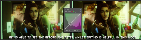
if you're working with color, keep a hue/saturation adjustment layer (or a layer filled with black or white and set to Color) on top and toggle it on occasionally to check your values! a lot of people who know a lot more about color than me (and are better at putting it into words) have written about why values are so important, so all I'll say is that the rule of thumb is that your image should still be readable in greyscale:

there are some exceptions and grey areas (do ho ho), but it's a good general rule to keep in mind! (some programs also have a colorblind mode, so you can check to see how your work will look to someone with colorblindness!)
and finally, here's some digital art programs I recommend, if you're still looking for a good one!
free: krita, FireAlpaca
paid: ClipStudio, Procreate (iOS/iPad only)
#art#...sort of#horizontally flipped mal isn't my favorite drawing i've ever done of him#but it's up there#anyway i do personally use photoshop#but i absolutely do not recommend it when there are better and free-er art programs out there#it is the equivalent of texting with a giant 90s-block phone that has been jury-rigged to somehow install whatsapp#because i don't NEED a new phone i KNOW how to use this one it's FINE#(oh god i've become my dad)#someday i will have to actually switch to clipstudio and learn new keyboard shortcuts :(
393 notes
·
View notes
Text
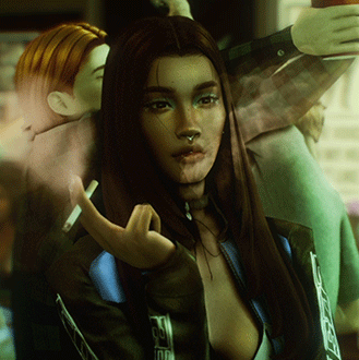
Updated: How I edit my sims 4 screenshots (night-time edition)
A more detailed editing tut so you can understand my process as it may help you, i edited this relatively quickly and usually spend about 1-2hrs editing something...so let's goo.....
Before taking screenshots:
Help yourself as much as you can in-game, I always make sure there is some sort of light source in my pictures or something interesting that I can add to enhance something already there
Understand good/bad composition and add variety by using different angles
I take LOTS of photos just to end up with 1 or 2 good ones

I'll just be using photoshop for this, but i also like to use the procreate app as i'm more confident w it.
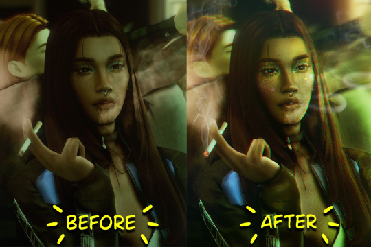
step1: I check if there are any major glitches or hard areas e.g, fingers elbows etc.. that have sharp points and pull them in liquify so they are smooth. Then use curves to change the contrast.
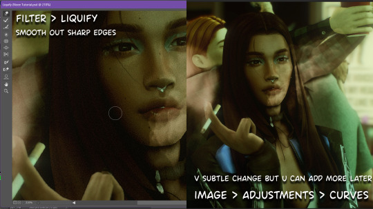
step2: *duplicates image* using the dodge and burn tools (keyboard shortcut: o ) i'll add emphasis to highlights and shadows (be careful with these as the dodge tool can ruin the image if used in excess) *merges image* (i duplicate and merge as i go, utilise using lots of layers so you can go back if you mess up/ want to change the opacity of an effect.)
step3: making light sources POP. *new layer* change blending mode to overlay or soft light and choose a colour you like.
step4: *new layer* draw hair strands. i just use a basic round brush in photoshop and change the hardness or i'll use a sharp caligraphy type brush depending on my sims hair type. (i try not to overdo it as i like maxis hair and don't want it to look too realistic)
step5: i would then add a new layer and set the blending mode to multiply to add more shadows, but i don't feel like i need to at this point.
step6: *duplicates image* go to filter > camera raw filter, i change the "light" and "curve" panels, i like green tints in my screenshots especially the night ones. (this is where all the magic happens really so just adjust all the channels to your liking, lightroom is also really good to use)
step7: *create new layer* blending mode: screen or linear dodge (add) / makeup and finishing touches! - for this look i'll get stars and glitter pngs off google or unsplash same for the smoke, though if i'm using procreate they have free brushes for that :')

step8: add light leaks as they add some fun dynamic lighting and textures to your screenshots. (i also flip my image horizantally [image > image rotation > flip canvas horizontally] whilst editing as it's like a "fresh pair of eyes" when you've been editing for a while so you can see what looks off)
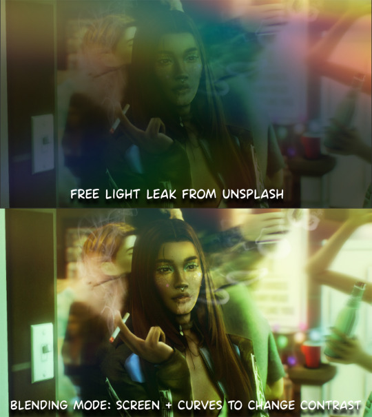
final step: merge all the layers (though i do merge along the way once i'm happy with something) go to filter > sharpen > smart sharpen. I leave it as the default setting.
extra step if u want: for party pics i might add chromic abberation here is a 60 second tutorial on youtube it makes the pic look cool and trippy.
And you're done!! congrats on surviving. if you have any questions please send them in my ask box so others can see and get help too.
140 notes
·
View notes
Note
Thanks for answering! Could you go into how you paint? It's always the trickiest part for me
Hehe sure thing! I even recorded some of it, bc for me personally, i learn a lot easier when it's visualized like that, aha.
So first off, we'll start off with our base!

Personally, I like a lot of gradients and color variations to start off with, but these can be solid base colors of you prefer :3. From this, ALL layers are gonna be merged down into one, no separate layers here yet :D
Going forward, I have a video done here kinda showing what I do :DD. I'll explain below the video in more detail what I do
First the base shadiws and highlights — for the shadows I'll usually pick from the color wheel (a darker, more saturated tone, plus I'll also shift the hue some) and draw right on the canvas. For the base highlights, i'll almost always use a bright orange on whatever adjustment layer makes your color nice and bright and glowy (for PTS it's Luminosity, and for CSP and Procreate I usually use an Add layer).
THEN I DO SOME MESSY BLENDING OUT, nothing pretty yet, just getting some of the colors blended out hehe
Afterwards, the drawing usually looks like this :0 very messy lol
NEXT !!! PAINTING TIME !!! As show in the video, it's allllll about color picking and going over what you've already done. For a lot of it I use a softer brush, letting the colors blend together more softly, and then for other portions I'll use a harder pen for where I want more of the color that I picked to show through. Sometimes I'll draw over the line art all together if I don't think it's needed, or i"ll draw the line art back in after painting over it if I want those lines still :0
And there's just a looooot of drawing over and painting over. The 20 seconds you saw of painting and blending usually goes on for like 3-6 hours, depending on the drawing XD.
After ALLLL of that, I get smth like this

AND this was pretty much just working on leo. Now to work on the background elements >:3c same progress, just for the atmosphere and not the character!

YAY NOW THAT'S DONE !! Now all the paintings done soooooo
Color correction and final touches >:3c no more painting, now there's just a bunch of fun glowy layers we add on top of this heheheeh
AND WE DONE >:DDD
I hope that helped some djejwjww. Tbh, the way I learn the most is if an artist im trying to learn from straight up just streams what they’re doing, but I don't rlly know anywhere i could stream or who would be interested ;w; but I hope this helps enough anyway!
If there are any other questions, I'll be happy to answer! Ive said before I rlly like playing art teacher heheheheh <33
219 notes
·
View notes
Note
Hi, i hope this question doesn't bothers you, do you have any videos of your process?, im currently starting to learn how to do digital art and have trouble knowing where to start and what to do (im always like, should i start drawing this part first?, is it better to do clean lineart or just paint over the sketch?, do i work on the lights first or the shadows?, etc)
I can probs make you a video on this at some point based on something I'm currently working on, although I have a few on my tiktok already (@ xephia) if that helps!
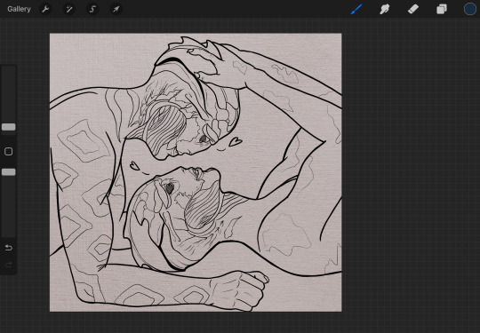
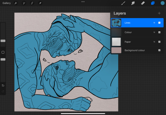
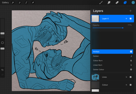
My process is a bit messier than many other artists - I alternate between stages of sketch and colour before I even think about ‘final colour’. I’ll start with a sketch like the ones below, then slap some rough colour on. This is because IMO colour is an important part of the composition so I want to see what works before I line. They’re not meant to be pretty or social media ready. This stage can look super messy or tidy depending on how I feel or how complicated it is. And they can look wildly different; here’s some examples:
That stage also helps me decide if I want to finish the piece or if I should abandon it (I abandon a lot). Sometimes this stage takes 15min, sometimes 2 hours, it really depends on the piece. But for me personally, it’s crucial because otherwise I find it very hard to envision how it will look later, or forget what I was planning.
Then, I do at least one more layer of ‘sketch line art’, which is basically a first layer of line art to see what works and what needs changing. I colour the important bits relatively cleanly (usually character/s) and add might some subtle shadows/gradients and/or lighting to get a feel of what it will look like finished. Sometimes I repeat this process a couple of times if I’m not happy with how the first iteration looked. This stage usually looks a little like this character sheet I’m working on, and this slice from a Kiki delivery service sketch:
It’s usually not until I’ve done all that, that I go over and do the final lineart, making it thicker, colouring the lines, redoing the flat colours, tidying it up, and adjusting where needed. Essentially I don’t start ‘finishing’ a piece until I’m happy with where everything sits and what colours I’ve picked. It’s only at this point I feel like the sketch is ready to line, and lining and final colouring can actually take less time for me than all those layers of planning somehow haha.
At this point I keep tidying, cleaning, lining, colouring, until the piece feels complete. Sometimes complete for one piece is tidier than complete for another, it really depends.
I’ll also use Procreate’s push tool to adjust things as I go in all steps - it saves a lot of time and isn’t cheating.
Although as you can probably tell from my examples, I do change this procress up a lot depending on the piece! Sometimes I’ll even paint over parts of my final piece like I did in this magical girl street. I think find whatever works for you, everyone will work differently and things like mood, energy levels, how patient you feel, how stressed you are, if you have any hand pain or shaking, and how much free time you have that day to draw can all affect your process day to day, week to week.
Some days it will be easier and more comfortable to sketch messily, other days tidier. Some days you will draw well, other days not well at all. At least for me, I find consistency almost impossible.
So I think there's no right or wrong order to do things and it's great to switch it up and keep things interesting for yourself, and different processes work for different people. Hope this helps!
#faq#art process#art advice#art tips#drawing guide#sketch progress#digital art#procreate#human artist
21 notes
·
View notes
Note
That last piece aaaaaaaah beautiful and sweet, really captures how Lav feels about Randy :D
Also I love how you colour and shade everything, how do you do it? Do you think you could record a speed paint or something? What brushes do you use? Canvas size? How do you painstakingly colour within the lines? What device do you use?
Sorry for so many questions in one ask, I’m really curious lol. Hope you can answer these! No rush :3
First off, thank you so much!
I use Procreate on iPad, which has a handy-dandy little feature where it automatically records everything you do on a canvas, and you can create a time lapse of it. So, yes, I can give a speed paint. :3
(Yes I painted this specifically for this ask.)
For comics (and this painting sample), I use a canvas that's 1813X2263.
For doodle dumps and other less dedicated projects, I use a 1955X2357 canvas, rotating as I want or need to.
If I have a bigger project I want to do, I start with Procreates "Square" canvas default (2048X2048) and crop as I need to as I work.
I've been sticking to this Jingsketch brush set for a while now, though I've modified some to make them more comfortable. As of now the set is free to download. (There appears to be a larger Jingsketch set that costs about $15--I may get that someday lol)
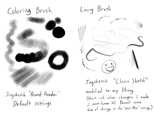
For smudging of shadows and markings, I use the Jingsketch "Jittery Smudge".
Alright, prepare for a thorough rundown of the time lapse. X3
As for how I color, the video shows my two most used methods. I do the Momo method when I want it to look a little neater or smoother, and the Midas method for when I don't care how unpolished it looks and just want to show a colored image.
For flats (the solid red seen in the video) I do it on a layer under the lines. I usually put all the flats on one layer, but this time I did their flats on separate layers for demonstration purposes, and merged them once they were both filled.
For Momo, I colored by drawing just inside the lines, erasing what went outside. Then used a Freehand (or equivalent) selection tool to fill in the inside. This is the more time consuming but smooth of the two methods, in my opinion.
For Midas, I specifically drew the outer lines thicker so that I could use the "automatic" (I guess that's "wand" in other programs? I'm not sure) selection to do a quick fill. This method will usually leave the colors with a hard, semi-unappealing edge. (Feathering the selection a little or smudging the flats can probably help with that, but I don't do that very often.)

What I do is select the OUTSIDE of the lines, expand the "Selection Threshold" so that it barely selects JUST outside the lines, then invert the selection so that it filles everything INSIDE the lines. With this method you need to be careful to get all the negative zones as well--I didn't think about demonstrating that in this painting, so here a mini-tut on that.


For the actual colors, I usually do each color on a separate layer set as a "Clipping Mask" to the flats layer. Eyes usually get a layer of their own--The iris colors and pupil (if present) get the Clipping Mask treatment until I'm satisfied with them and merge them into one eye layer.
For shading, I'll fill an entire layer, still Clipped to the flats, with my color of choice, usually set it to the Multiply blend mode, and adjust the opacity as I want. I usually shade the main body separately from the eyes, but try to match the blend mode and opacity settings.
For more high-effort projects, I'll fill a layer with a solid color under the shadow layer but above all the other colors so that I have a better idea of the shapes. Colors like on Midas here can really badly mess with the perception of the shapes and shadow locations. I may also add more Multiply layers if necessary.
And that's my lengthy and extensive look into how I paint~ Keep in mind this is MY process, and I admit I work in a rather quick, dirty, and even somewhat lazy way. So take what you will from this, and go arting as YOU please! ^w^
94 notes
·
View notes
Note
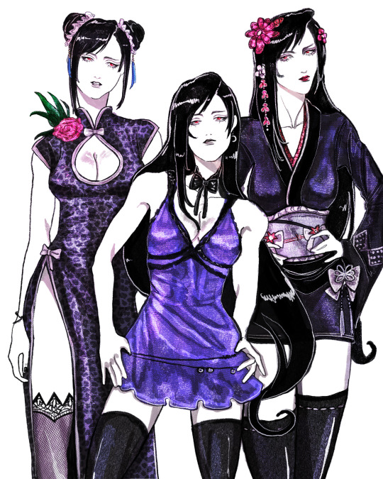
hi hi! first off thank you so much for always serving looks. your art is phenomenal and your style feels like it belongs on the walls of a luxury fashion HQ.
stunning stunning stunning
i was wondering if you ever get the time, would you mind (please) showing us any tips on how to achieve that rich variety of textures you have on so many of your fits? the one you did recently of the three Tifa fits, for example, has so many different textures represented. I wouldn't even know where to begin achieving that!
no pressure of course! if it's a trade secret then please do keep it. I'm just so impressed and curious and had to speak up
thanks so much, keep up the beautiful work x
Hello!
First off, thank you so much for your wonderful words! Working in the fashion industry is my dream so this means a whole lot to me.
I can totally share! I'll try my best to explain my process because it varies quite often, especially now that I switched from Photoshop and Procreate, but if I were to give my step by step, it's this:
sketch> lineart> color> shade> paint over> texture/grain/sharpen/contrast
The unique coloring I had a few drawings back came from working with an Adjustment Layer with a Gradient Map on Photoshop. But now since I use Procreate, my main trick is making the colors much darker than I want initially, and then putting a bunch of highlights with a Color Dodge layer with a textured brush.
Now, my main thing is that I never use blending brushes and my brushes (outside of color blocking) are always textured. Charcoal, pencil, grainy, grungy etc, that is what you're looking for. If you need something slightly softer, watercolor brushes that mimic real ones are ones I use as well, just not as often as the others.
My latest Tifa piece uses all official Procreate brushes that come with the app. The Rosette brush, which is under the Textures brush folder, and the Flicks brush under the Spraypaints folder. (Also Derwent, 6B pencil and Gloaming for sketching and lineart)
General rule of thumb with shine is that it can only get so light, so make sure your base is on the darker side.
Here is my effects folder. That's where I add highlights, mood and texture. I've also been enjoying the noise and sharpen feature on Procreate, and I apply them all on a grey overlay layer on top of all of my art. Also a bunch of color burn and overlay layers.
For reference, here is the art without the effect folder compared to the final art.

Hope this helps! ❤
24 notes
·
View notes
Text


Orange study, plain canvas vs one with textured photograph overlays.
A little guide on inserting texture photographs to add some delicious texture and grit to digital works. I made these using Procreate but the basic priniciple will stand with most programs!
Guide under the cut:
1: Where do you get the textures from?
You can get free ones with an online search. Look for terms like 'paper textures' 'canvas textures' 'oil paintings texture backgrounds' 'pastel papers backgrounds' etc. You'll have to do a little digging, ideally you are looking for PNG's or large jpegs that are grey-white (you can use colours it'll just require more tweaking on your end)
If you are on browser, having an extension like save webp as png/jpeg will help you A LOT. + Always check those creator terms and conditions.

You can also pay for really high res PNG's, it isn't necessary but does give you some nice fancy options. I've been using Manero Brushes thick paint set, which is brushes, tutorials and a whole bunch of oil boards, that's what I used in the above orange example. Below I've used a free canvas one I found with a duckduckgo search.
2: How do you implement them?
This depends on the effect you are going for. For example, if you want to simply add some oomph to a simple line art, adding a paper or canvas effect as a base layer underneath the lines is all you need (I just grabbed some lines I happened to have on my ipad so bare with my KolFer obsession okay 😅)
Plain vs with texture base:

You can then adjust the colour as needed, either with saturation and hue sliders or filling the layer.
Now this looks nice with lines, but if you are colouring, it's not going to show through solid colours:
To get that texture over your colours, you need to add a layer on top of your colouring, then set it to a filter type so that it has transparency. If you set it to multiply, the darker/shadowy parts of the texture will be emphasised. If you set it to overlay, the highlights will be emphasised. Play with layer opacity and layer type until it looks good!:
(multiply vs overlay, note that it effects the colours. For this reason it's a good idea to set this layer early on in the drawing process if you can, and toggle it on and off as you colour so you can see how it is effecting the piece)

So that's the very basics of using texture photographs, I hope this helps some of you :) <3
tagging @hornetofhallownest who asked specifically
16 notes
·
View notes
Note
Hey! New helluva boss fan here. Just got on the train a week ago and I feel like im at pretty strong start. I struggle heavily with lighting and rendering. I use procreate. Could you show me your process? <3
Hi omg!! First off welcome to the fandom I hope you're enjoying yourself ;v; and bet, I also use procreate so that's even handier lmao
Fair warning tumblr destroys image quality in previews so would recommend full screening the images to see clearer 😭
Flat Colours:
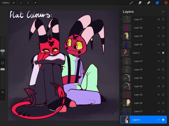
Ok so these are how the base colours look!! Nothing special to report, they're just flats, this is only really here as a reference ;^^
Shading & Lighting:
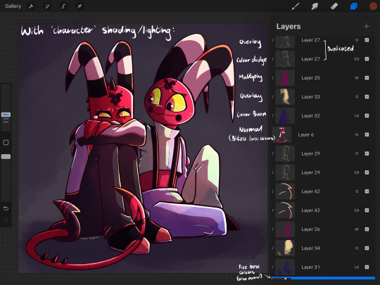
This is where the fun part is for me!! I've written beside the layers what each is set to. I primarily use overlay, multiply, & colour dodge in most pieces. For shading & lighting, you need to figure out where your light source is coming from; in this drawing, it's coming from the top right!! Therefore the bottom left is then going to be darker since it's more in shadow
One of the main things I do is the more 'solid' lines for lighting highlights, like this:
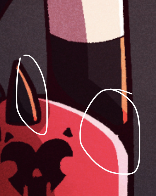
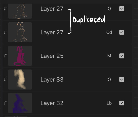
You can see the same for the larger blocks of shading too!! The solid lines give more dimension to me, whilst the more gradient-like stuff is just for extra atmosphere ;v; here's a closer image of the layers used for blitzø; the top three are those more solid shapes for the shading & lighting, whilst the last two are far more splotchy and loose as they're there for colour adjustement
^ For reference, here's how it looks with (left image) vs without (right image) those last two more 'splotchy' layers. The lighting & shadow just looks flatter without them!
Additional Shading/Lighting:
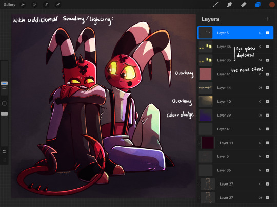
These go over the whole piece rather than just being confined to the characters. Again, main colours I tend to use are the blue/purple for shadow and a yellow for light!! I've noted in this that I added a lil eye glow too, and made sure that those layers were above everything else so that it's not obscured by the shadows. Makes them stand out!!
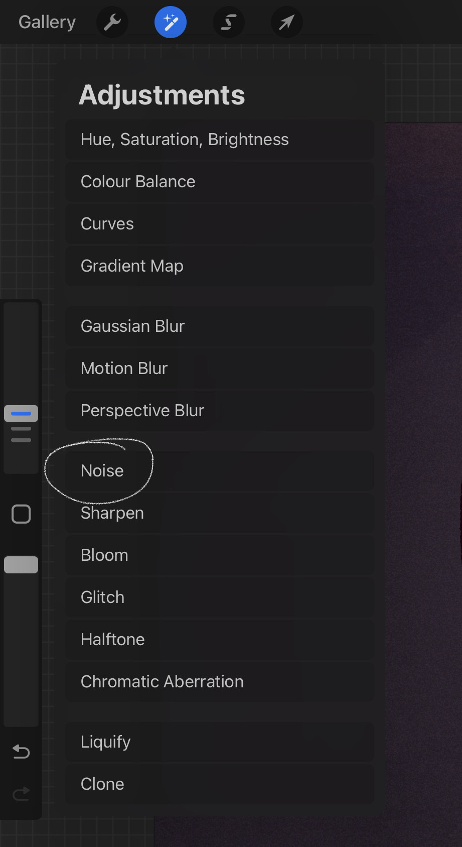
Something I tend to do in the vast majority of my art for that Extra Texture is add a noise effect, which you can find in 'adjustments'
Left image is without noise layer, and right image is with it. I usually use a light pink and have the opacity p low so it's not too jarring!! Also have the layer set as 'overlay'
TLDR:
In summary; blue/purple for shadows, yellows for lighting, fuck around with layer settings cause they're fun, and I personally am obsessed with the 'noise' setting because it just is Good Texture
But that's how I personally do things; I'll be the first to admit I can be too reliant on things like multiply & overlay layers, others may prefer colour picking directly for their shading & lighting and doing everything by hand. That's honestly something I want to get better at, it just takes longer ;^^ again, just go wild with it!! If you're making art for fun, then have fun ✨
#drag replies#tutorials#sorry this is mostly about shading & lighting ;^^#i wanted to maybe add more about extra details but uh. i reached tumblr's image limit LMFAO
14 notes
·
View notes
Text
@jaskersneakthief reblogged your post: #LETS GOOOO #how can you draw bill so perfectly what #it looks like an actual screenshot from the show #bill cipher
I'm assuming this is a sincere question!!! Have a crappy tutorial!
Step one: sketch yourself a Bill. Squint at a bunch of Bill screenshots to get a loose idea for what proportion of his body is taken up by his eye vs his brick stripes, and roughly where under his body his arms and legs hang, and how long his arms are compared to his legs, and how thick his limbs are compared to his body size.
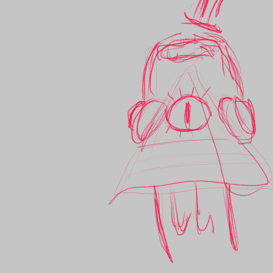
Step two: draw a triangle. I use the "monoline" brush that comes by default with procreate, because it doesn't have any pen pressure so it's perfectly smooth & perfectly round. Push up the brush size up to 100% and it's just the right shape to be the bevels on Bill's triangle body. I maximize the brush's smoothness settings and use computer-guided straight lines and arcs to draw his body. If you don't use procreate: look for a circular brush with a crisp outline and don't use pen pressure.

Step three: draw his bricks. I drew one horizontal line, cloned it twice, then manually scooted around the lines to get the exact right proportions (so they take up the right amount of his body & are evenly spaced), and then draw the vertical ones. I use the same monoline brush, sized down. For his bow, I drew a crappy bow, then erased the edges of it to make it look tidier. (If you look close, you can tell I didn't really try on the bow. The bow is low priority to me.) The eye is also the same monoline brush; again, I'm using a computer-assisted automatic arc so that it actually looks smooth. I drew it on its own layer at nearly the right size then fussed with the exact proportions to get it to fill all the space on the triangle above the bricks.

Step four: draw his arms and legs on a separate layer, with the monoline brush set to almost the exact right width, and then shrink the brush to do the fingers and thumbs, and then use a whole bunch of extra tiny strokes and tweaks to adjust the curves & thickness because I'm a perfectionist and it's annoying. It's not even "perfect" now, it's just perfect-ish. Way too much of my art time is spent shaving lines so they're the exact right curve and then shaving them even more so that they don't look shaved. And then the arms & legs go on a layer under the triangle.

Step five: select the shape of Bill on a layer below the layers you're working on, paint it white, and gaussian blur it. Spend five minutes just on tweaking the blur.
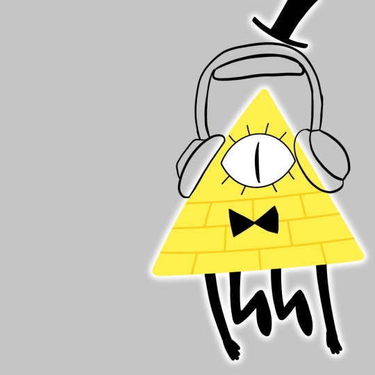
Step six: duplicate the blur, recolor the lower one yellow, and make it a bigger vaguer blur so that you can see it underneath the white blur.

and that's how you make a Bill that can pass as a screenshot: straight lines, beveled corners, no outlines, and the glow. If you half-ass everything else, having no outlines and a big glow will save you.
#(now as soon as i figure out how the heck to draw the pines' heads consistently I'll be unstoppable)#bill cipher#fanart#my art#video#(no audio on the video btw)
40 notes
·
View notes
Note
How does procreate compare to sai for you out of curiosity ?
I’m kind of 50/50 about it.. like once you’re more familiar with the UI and how everything generally works it’s super straightforward which I appreciate! the whole brush customisation aspect is a bit overwhelming for me since im just used to fiddling with a few settings then running with it but now there’s a whole customisation bar so you can get it to exactly what you’re looking for …. which is nice in itself but for me who has like .. virtually no clue on what she’s doing or what any of these means im just ????? 😭 but downloading custom brush packs is so easy too so im not gonna bother with that for now lol
drawing on glass is still a bit tricky for me too it feels like im constantly fighting for grip if that makes sense. I think im still used to how my tablet draws bc the stylus’ nib was a bit sharper compared to the apple pencil’s but it did left scratches on the tablet itself lol. I also like how easy it is to adjust the canvas sizes since you’re just dragging it (compared to sai where you have to type in the exact dimensions) but I also don’t like how they’ll give you less layers the bigger your canvas is 🥲 like I generally work on 3000 x3000 and I’d like more than 100 layers alas
ONE THING that im severely missing is sai’s marker tool though, specifically the marker tool with my own config. like that’s literally my bread and butter and i use that pen in virtually everything - both lineart and colouring. imo that brush gives my prev drawings that soft looking feel (if that makes sense??? idk) but it also doesn’t have that drag that procreate brushes tend to have. like ive been trying to replicate it in procreate or at least find one that feels similar but I haven’t had any luck so far 😭🥲
all in all I do like it better than photoshop or even krita, but I think im just so used to working on sai that I still prefer it, esp since that has the marker brush (my beloved). my opinion will prob change once i do actual illustrations on it though since I haven’t done a fully rendered piece yet and i want to see how I’ll adjust my workflow with the layer constraints. i do like the fact that there’s no colour differences though since the ipad screen is really nice so you don’t have to worry about colours looking different in diff screens
#I also don’t like how you can’t use clipping mask on groups 😭😭#like that’s what made shading easier in sai but now u have to merge everything to be able to do that sigh#i do like the convenience tho!!!! like my ass is really drawing everywheee and it’s SO easy to just boot procreate up and draw#so that’s a win for me specifically lol
15 notes
·
View notes
Note
I love your art so much! Do you have any of your brushes for sale, or any tutorials, especially on colour?
Hi!! Thank you so much! 💕
Honestly, my go-to brushes are all procreate brushes with slight adjustments (like stabilization, etc.) my personal preference is brushes that kind of mimic graphite pencils. The best thing you can do is find a brush that suits you & get very comfortable using it! Specific brushes won’t necessarily improve your work, it’s all about practice! (But yes, a nice brush does help!)
I do have a video on my favourite brushes:
I’ve never really made any tutorials, but I’m happy to try and relay what I know and what I’ve learned so far!
Colours are a big part of illustration! I could probably ramble on for hours, honestly—in any case, it’s always helpful to know fundamentals of colour theory. Once you learn and apply it, it becomes intuitive! I’m gonna stick to RGB colours because CMYK is it’s own thing (printing!)
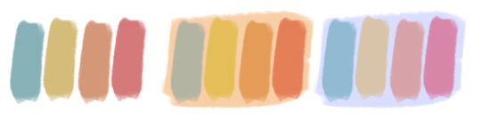
There’s a handful of basic terms like hue (pure colours), shade (adding black to a colour), tint (adding white to a colour), tone (adding gray to a colour) and also opacity (transparency) that help us understand and define the complexity of colours.

My colour choices are more often than not a gut feeling—but that does come from practice! There’s loads of colour palettes available online like this one, but if you wanna come up with your own, there’s some neat ways to do that using a colour wheel! Colours can broken down into primary, secondary and tertiary colours. We can also categorize them as warm or cold. With this we can make colour schemes!
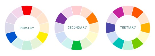
Some basic schemes!
Complimentary: two colours, opposites on the colour wheel
Analogous: three colours side-by-side
Triadic: three colours that form a triangle, evenly spaced
Monochromatic: using one colour (using different shades)
(Bonus) Monochromatic with accent colour : using one colour as a foundation and having an accent colour (similar to analogous, but one colour is used for a majority of the piece while the accent colour is used sparingly)

It’s also important to keep in mind that values (a colour’s range from dark to light) will look different on different colours. Sometimes, you’ll put two colours together and think “huh, something about this feels off” and it turns out, the colours just happen to be very close in value and melt together. Switching your piece to grayscale just to check on your values every so often can help with contrast and muddiness! A light tone on a darker tone will look brighter than it really is. Colours can also influence each other and trick your eyes.

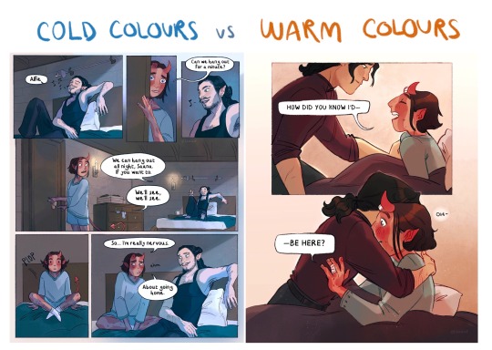
Environment is also a big part of choosing your colours for a piece. Determining what the setting is important! A sunset will make a drawing warmer, while a scene set in the night will usually have colder tones. Using only local colours (true colours, like green grass or blue sky) vs non-local colours (atmospheric perspective, accent colors that give depth, etc) can help enhance your drawing too. Don't be afraid of artistic interpretation!
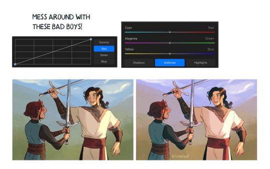
Also, there’s always the option to use gradient maps (at least on procreate & photoshop but I’m sure it’s available in csp and other programs) where you draw in grayscale & apply a gradient map. The gradient map basically applies a color to every value (e.g all the shadows become blue and the highlights become orange) it can look really nice (and help out if colours just aren’t working that day yk)

Another thing, when I’m drawing (and this is specific to me!) I tend to start with pretty desaturated colours. Once my illustration is done, I’ll duplicate & merge my layers to do colour edits. Most programs give you the option to play with curves or colour balance—menus that allow you to play around with the hue of the shadows, midtones and highlights. I tend to make my shadows more cyan-blue, my midtones a little warmer and my highlights warmer as well. Of course, this depends on the mood of the piece, whether it’s warm or cold, lighter or darker, etc!
You can always make adjustment layers on top of your work; a low opacity yellow, magenta or blue (or anything your heart desires) overlay to tie all the colours together.
I hope this helps a bit!! Happy to answer more questions to the best of my knowledge :^)
99 notes
·
View notes
Note
I absolutely adore your art, especially the asheiji painting you did. I am new to painting digitally, so if possible, I would love to learn a bit about your colouring process 🥺
ahhh thank you so much friend!! 😭💗 welcome to the digital art gang! i love getting these kinds of questions, so feel free to send another ask if you want to know anything else in particular ᕕ( ᐛ )ᕗ
here's a speedpaint of that asheiji artwork:
my painting is nothing refined! i get a sketch going on my first layer. the sketch is semi-clean (i erase and clean up guidelines as i go), but i will also write out notes on this layer and more strongly define shapes that i want to emphasize, like those little pouch lines under ash's mouth or the crease on eiji's cheek.
underneath this layer, i lay down my flat colors, and sometimes block in accent coloring (the blue and pink i've shaded with). i eyeball all of my colors from the rgb/cmyk wheel. no hex codes or value sliders, we die like men.
what i'll often do next is something i can only explain with respect to the procreate program: i will duplicate my flats layer > clip it down onto my sketch layer > turn the duplicated flats layer to the "hard light" setting > lower its brightness, increase its saturation, and add gaussian blur > merge it with the sketch. this is just a quick way to color my sketch lines, as one would color line art.
now that i have just one layer, i paint. you can check out how i do this in the timelapse. if you'd like to know what brushes i use, i'm not entirely sure how to upload them here on tumblr, but i'll give it a shot if you'd really like me to (FREE RESOURCES WOO 💪💪🔥💯)! the liquify tool is my best friend for tweaking proportions.
finishing touches are also super important to my painting style. here's where i adjust saturation, hues, contrast, and add details like freckles, eye shine, light source, etc. this process combines a variety of techniques and brushes which i could also break down in a longer, separate post. i definitely think this is what makes or breaks my artwork. (also, never doubt your ipad's gallery effect options!!)
thanks for your time! 🥰
26 notes
·
View notes
Last Seen Blogs
midnight0stars
Midnight Stars
mercy-angel-09
You've Gotta Be Kitten Me
matthieu-noiret
Matthieu Noiret
pinkroses-draws
once in a while i feed yall here

geniecai17
無標題