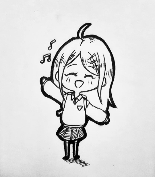
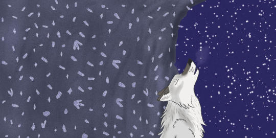
#also if i make more art i'll post it here lol
Text
So idk if I've mentioned it before but I'm a wannabe game developer, and for the past however many months, I've been attempting to make my own farm sim game. Like the world needs more indie farms sims but hey, if everyone else is making one, I might as well try too.
Specifically I'm trying to rip off Animal Parade, because AP is, imo, the pinnacle of all Bokumono and also I just wanna play it again but Marvelous won't make it easily accessible to me (watch them announce a remake/port now). I love Bokumono but one thing I find disappointing about the series is how the games often throw away mechanics instead of iterating on them, so I hope to incorporate some of the good features from other games too.
This is a video of the progress I have so far (with some chopping editing bc farm sim gameplay is not exciting to watch). It's not fun to look at but I'm proud of my one programming brain cell for managing to do this much.
I wish I could focus solely on the art but pretty art does not make a functional game and I have no one to do programming for me lol.
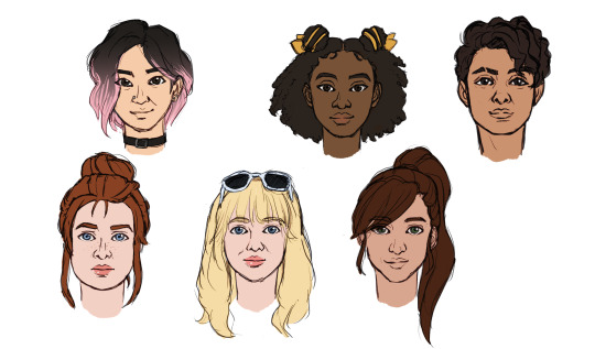
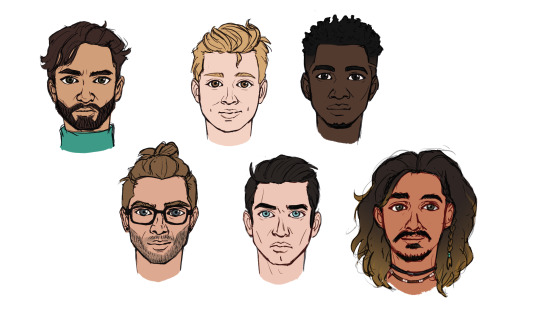
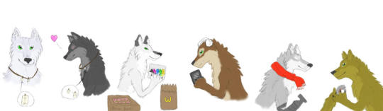
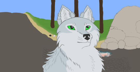
Here's something a little more fun, a sneak peek of the bachelor/ettes I have planned.
In terms of setting, I'm leaning into the Australianism as you might have noticed with the southern hemisphere accurate seasons. In terms of story, I'm thinking maybe something Save the Homeland-ish with multiple storylines. And there might even be a little sci-fi influence too...
So yeah maybe I'll post more about my game dev progress now. It was something I've been meaning to do anyway, I just didn't feel like I had anything interesting to show lol. If you read through all this, thank you! And what features from past Story of Seasons/Harvest Moon games would you like to see included in a farm sim game?
#game development#indie dev#story of seasons#harvest moon#yoru tries to make games#original the farm sim#original the characters do not steal
15 notes
·
View notes
Text
coloured version with an actual background coming when i feel like getting around to it
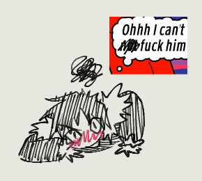
#rick and morty#morty smith#mortycest#evil morty#prime morty/evil morty#prime morty x evil morty#art#my art#bubblegumr1ck-art#i finished this last night but couldn't post it because my internet died#but in the meantime someone rb'd me complaining about the lack of mortycest LOL#shoutout to that person if you see this#also yea soz for killing this blog#i have been keeping up with s7 but i'm always at least a day behind so i've just been reblogging stuff to my main#i might make a text post after the final episode though (its in my drafts but i'd rather it not become outdated within one episode)#also if i make more art i'll post it here lol#ok bye
58 notes
·
View notes
Text

just some 🥥 related sillies i've made for that fic we all know.
#durarara#izaya orihara#shizuo heiwajima#shizaya#a cheap imitation#i made a thing#i've been holding off on posting these here for so long whoops#i'm so shy... check out my lemonade guys#i've been very motivated to make various things for this fic as a result of this book club i've been hosting for my friends#i actually made the first image (not the video) like two years ago?#back around when i first read the fic and started being annoying about it to my friends#never posted it though because the shizuo i drew was ugly!!!#and the shizuo i drew for the second image this time around is still ugly!! unfortunately :(#well anyways if it isn't clear the images are both for chapter 19 while the video is for chapters 28 to 29 and a little bit of 30 lol#also i know izaya's actual problem isn't fucking shizuo but kissing him lol but it was funnier to keep it like this#you can check out more of this deranged behaviour over at my twitter of the same name#i know not everyone wants to go there though especially with the current situation...#so i'll try to bring over the more memorable stuff to post in batches over here which i think is the stuff i did any art for#since i've made a lot of multimedia type things dedicated to particular chapters as “marketing” for my friends#but i'm not sure they'll make much sense out of context so#my plan is to compile all of everything i've made for the fic during the book club into a powerpoint that i'll try to keep for posterity#because ngl i feel i went kinda hard with certain things that maybe only two people will appreciate#but i'll do it for those two people out there#also it's a whole book club for aci!!#*i'd* want to see what some random people have been up to with a book club for this fic#be the change you want to see in the world#side note i wonder if having so many fucking tags on your own post is a bad look...#idk it's so much clutter but i have too many things to say!!#i look back at my own previous tags and i physically can't bring myself to read them ahhhh#i hope anyone's enjoying them anyways
175 notes
·
View notes
Text

ten years ago today i made my fursona :-D
#my art#HAPPY BIRTHDAY KADEN my sweet silly kitty#i wouldve loved to do more for her considering shes TEN!!! had her for ten years!!! but theres so much going on :‚-)#i'll do something silly for her soon hehe#been a furry for ten years lawl. dont think i'll ever get a fursuit buuuut i would like to get a plush made of her in the future#ALSO HI GUYS so sorry for falling off the face of the earth . it may happen again considering i have finals coming up#i still would like to do those bg3 cats soon i just need to find/make time. im also still very much in the thralls of a HEAVY bg3#hyperfixation . that coupled with irl happenings just makes for a perfect storm lol#I ALSO HAVE A COMMISSION I NEVER POSTED!!! doing that here in a bit
108 notes
·
View notes
Text
Some chibi art I made 💕
#at first i just wanted to make a new pfp for myself LMAO#making a whole merch line#would you buy this as stickers 👉👈#also i miss drawing omori sm UGH#back in my sunburn phasee 💕💕#omori and aubrey is literally the best fake ship ever#and my omori people where yall AT#i miss yalls 😭😭 pls be in my notes againn#i swear I'll post more omori cuz im kind of idealising headspace sunburn atm 😩#ALSO ALSO#kokichi with his scarf tied like THAT#ITS REAL NOT CUZ IT CANON CUZ IT CUTE#rl kokichi wouldnt do that 😔 his scarf is literally his lifeline bro wouldnt play around liddat#anyways heres me dumping my OTP and fav crack ship and my fav 2 girls on this hellsite#anyways heres the bullshit clout tags below LOL#omori fandom#omori fanart#omori mari#my art#omori aubrey#omori omori#shuichi saihara#kokichi ouma#kokichi oma#danganronpa kaede#danganronpa shuichi#danganronpa kokichi#danganronpa v3#kaede akamatsu#ndrv3
48 notes
·
View notes
Photo
DAX is just so expressive ♥ (Patreon)
#My art#SCII#Helix#DAX#Lol#Have I mentioned I love him lately#As if I ever stop talking about how much I love any of them lol#Okay but genuinely these were really nice as warmups they were really easy to just knock out one by one#He's very expressive as Dexter! *handwaves about human neurochemistry and expressions* lol#I had to make his Neutral look extra dead inside to make up for the rest haha#Funnily enough I have actually been watching a series of streams of like VAs and visual artists and writers and stuff#And they are constantly uptalking 2D talksprites as mood-setters for dialogue#So it was really fun to make these with that in the back of my head like ''Yeah! :D They /are/ good at that!''#Very cool expressive medium :D#See if you can spot the first drafts for a few of these :3c#I'll give you a hint: Scared and Sad(? Regretful ig lol) were from some posted doodles#His grumpy one was also a doodle but I didn't post it so it doesn't count lol#Oh yeah and and a lot of these had little accessories like the fear bursts and the little sigh bubble lol I just...forgot them here lol#They're there in spirit please feel the grump lines and sweat drops in your heart <3#I had a heck of a time trying to keep his face consistent with different angles lol aren't VUX nervous to move their necks me#Just gotta actually get into 3D modeling properly smh#I keep finding myself wanting to make more now that this set's done but I'm not sure what expressions! Confused? Focused? He's so subdued#Oooh he'd suit an expression meme wouldn't he <3 Now there's an idea#Might even open an ask game for that if I can find a good one :3c Hehehe
8 notes
·
View notes
Text

Smidge My Beloved
I love this fridge so much
#smidge#hfr#hifi rush#hi fi rush#fanart#my art#digital art#i love this fridge ok#i'm allowed one or two or several weird bizarre fictional crushes that make no sense ok#ALSO THE OFFICIAL TWITTER REPOSTED THIS AND IT MADE ME SO HAPPY#ANYTHING INVOLVING SMIDGE FROM NOW ON IN OFFICIAL STUFF I THINK IS MY FAULT AT LEAST PARTIALLY#sorry this took forever to post here also i'll try to post my stuff here more often LOL#comfort characters
50 notes
·
View notes
Text
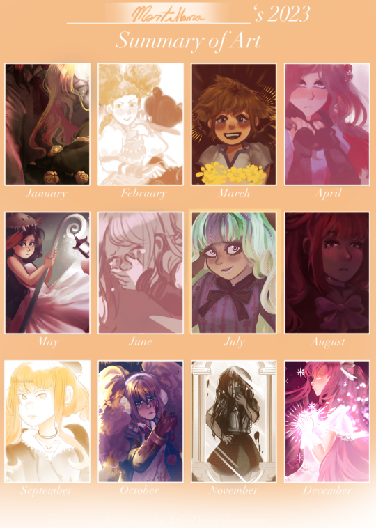
2023 go bye bye
#999 spoilers#art summary#art summery 2023#my art#shoutout to all my monster high drawings that are still in the oven#I haven't posted them anywhere but! my friends made them pins and I've sold them on cons throughout the year :3#I only started drawing them as a request from a boothmate actually and they're such fun designs to draw!!!#I went to a lot of local conventions to participate in the artist's alley and made so many friends that way it was wonderful#I think the next thing I'll reblog will be the game I worked on!#found out the nda doesn't cover me simply saying 'hey I worked on this thing coming out in a few months!'#so I made artist and cosplayer friends selling my art on the beach and I got my first proper job#....then I proceeded to give me a shoulder inflammation because my setup was terrible and it had to catch up to me eventually#but! already managed to get a new tablet and desk for myself!! it's even a screen tablet so there'll be a learning curve but I'm excited#I'm hoping this display will make things easier I always had trouble sketching on digital#and I am more carefully taking breaks now also because turns out relying on hiperfocus is bad for you? never knew#I was going through some stuff in the middle of the year there though I had so many vent drawings of akane from may to october qwq#not featured here are the tons of utena and umineko wips I have accumulated those were my favorite new media I got to experience for sure#in fact I'm watching the adolescence movie rn!! what in tarnation is this last act lol whatever! go Anthy go!!! floor it queen#also not featured the tons of oc stuff I made :D I'm glad I feel like I can start properly working on them soon ^^#but yeah that's that I felt like writing a whole diary entry in these tags and you read it and that's what tumblrs all about ♡♥︎
9 notes
·
View notes
Text
Hey, pikmin fandom, let's talk about how Tumblr works!
I've noticed an uptick in posts made under the pikmin tag. And that's awesome!!!!! And I imagine many of you are here from other sites, to which I say welcome!
But we gotta talk about how this website works a bit. And I imagine it's something you've been told before, and are probably sick of hearing, but it bears repeating.
On Tumblr, likes do nothing.
They send a notification to the person who's post was liked. It also book marks the post for you, so you can always find it in your likes tab.
And that's it.
It may make some people a little happy. But mostly, it does a whole lot of nothing.
If you want to actually help the post be seen, you have to reblog it.
I mentioned before that I saw an uptick in the amount of pikmin posts in the tag. I only noticed this because I regularly check the tag itself. NONE of what I find ends up on my dashboard despite how many pikmin related blogs I follow.
And the reason can be seen here (all of these are taken from various pikmin posts, some mine but others are from other artists)
The ratio of likes to reblogs in general has gotten bad on Tumblr sense people in general don't realize that this site is built on reblogs, but it's particularly bad for pikmin.
For a small fandom like us, this makes it hard to find each other's stuff unless we go out of our way to find it. Which again, is the only reason I'm even able to find pikmin stuff.
And if you don't want it on your main, or want it separate from your art, or some other reason I can't think of, you can just made a side blog for reblogs. I had to make @grubby-reblogs-stuff because I kept having an issue where people would go though my entire blog, like everything and reblog a few things... While very obviously skipping over my own art. Which hurt!!! A fucking lot. So I made a side blog to separate my art from the art I want to reblog.
So make a side blog if you have to, but please, I am BEGGING you guys to show the creative side of the fandom some love and help share their work around so people don't have to go out of their way just to find it!
#pikmin#borb screams#I'll reblog this a few times until the situation starts to fix itself lol#also if you do make a reblog blog either focused entirely on or has a lot of pikmin posts feel free to share here#i need more pikmin content on my actual dash#also reblogging is even more important for those who make a living off their art#can literally be the difference between them getting paid or not getting paid
25 notes
·
View notes
Text
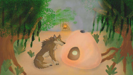
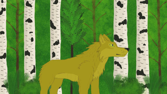
Some of my old WoTB art
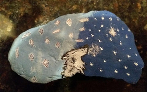
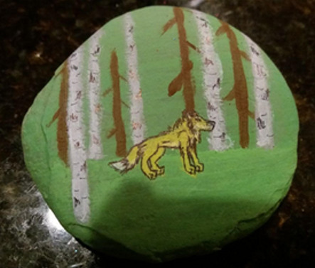
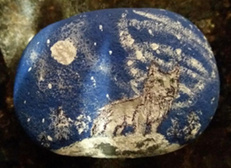
#my art#wotb#wolves of the beyond#this shit is on my main blog#but i dug it up#and decided to post it here#and yes a few of these are wips or doodle type things. whatever lol#there's 3 painted rocks too#i honestly want to make more at some point. those were so fun to make#the howling wolf is the whistler (goat wolf tbh)#obviously there's faolan and heep the horrible asshat#the sark and her kiln with a turquoise matte glazed pot#the owl is gwynneth#twist is by faolan in one of the volcano ring pictures#edme is the black/dark grey wolf#she's curled up next to faolan in the scene from 'under the stars' on the slaan leat in book 3#i drew all of the main gnaw wolves and she's the one next to faolan#i think at some point i'll also draw the watch wolves. i love twist and winks#i don't rly know how to draw bears so well so i don't think i've ever drawn faolan with thunderheart#if i can figure out how to draw a decent looking bear i might draw her as well as other bear characters#owls for me sort of on par with wolves as far as knowing how to draw them comfortably. maybe a bit tougher to draw for me tho#the quality of some of these got screwed up but whatever#if i find the higher res versions i'll post them#i almost certianly don't have the original like. drawing program files anymore. that was years and years ago on a prev computer
2 notes
·
View notes
Text
#see my blog was never intended to be . like . seen by people? thats why its so gross#i tag Nothing. i only tag what i want to tag. i still have the mindset of what i used to be *checks watch* 9 months ago? i think?#i had under 100 followers most if not all being friends and mutuals#and then i made the mistake of posting art. sigh#this still carries over to the fact id Like to move blogs because this ones gotten. way too big#lesson learned for anyone on tumglblr: if you post anything like art or fanfic MAKE IT A SIDE BLOG!!!!!!!!!!!!!#do NOT do what i did. not the main blog. mistake#i used to make sideblogs everytime i got a new main interest but when i got into toh i stopped. idk why. but im stuck here now#if i DO move blogs i'll post about it. it'll prob be a quieter move but yeah it'll happen#im just procrastinating cus all my junk is already HERE#so like. why move. yknow?#i do genuinely love & appreciate the support. people have been very kind to me#i appreciate it a lot#i also just know from experience i am not someone that should have any sort of following on anything. i take it horribly#like. i used to be an active twitter artist for a year and that was HORRIBLE. ppl didnt just want art they wanted my opinions and my biases#i couldnt breath without 5 people asking me things#horrible life to live lol i like tumblr more#i started on tumblr and i moved back. im glad#anywhoo enough rambling i guess. if i move ill let people know! if i dont. well youll know cus im still here#ugh if i move i have to reblock my tags n people blaaaaugh#okey ill talk to you people later
29 notes
·
View notes
Photo
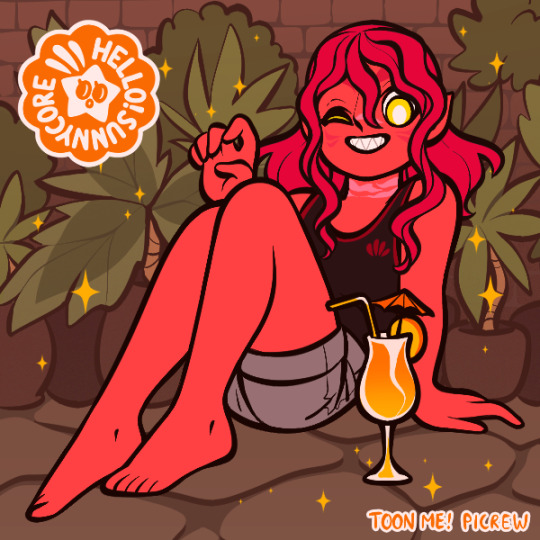

@vihola tagged me to make some OCs in >this< picrew so ofc I jumped on the opportunity!
Tagging (if you want to, up to you & no pressure if not!) @rainofaugustsith @mercurypilgrim @tearlessrain @darth-bagel @outcastcommander @messes-of-men and anyone else who wants to do this one! <3
Have one Saarai because, of course, she is my favourite hahah
Also a Maiite!! because this one has vitiligo!! (honestly it has so many options, props to the OP of the picrew! <3) Maite’s a little more red than she should be (she’s more orange-y red really) and ideally her hair would have a more reddish undertone too buuuut everything else was lovely to be able to find options for her in a picrew for once! :D
I gave Rai a cocktail and a nice jungle bg because honestly ya girl needs a vacation to a planet that has a nice jungle to remind her of home, she’s EARNED it lmao
I had to think a bit for what to put Maite in bc I didn’t really want to cover up all her vitiligo but also I didn’t want them to be dressed exactly the same lmao then I remembered that IRP she likes to steal her husband’s work button-ups and wear them as sleep shirts when he’s done with them so I went for that and some cute shorts & sandals :3
#swtor sort of#OC picrews#swtor oc: saarai ahaszaai#swtor oc: maite ahaszaai#my babiessss#god i love this family. we all know how much i love this family lol#sorry that my activity is so random & sporadic lmfao#i'm trying i really am#but half the time tumblr is the last thing i think of so i don't check here very often anymore when i'm Goin Thru It (tm)#this week has been especially crazy but also a lot of stuff that was stressing me out has now been sorted this week#so hopefully. i will be able to focus on doing more fun stuff soon!!#i'm gonna be playing some more swtor tonight hopefully#so tonight/tomorrow there should be some more screenshot posts#still no art tho sadly D: thats one of the things i've been dealing with#i'm not gonna go into details bc in thegrand scheme of things its dumb really sjhdsjgdhj#but its been kinda...hard. for me to make art. hopefully in the next few weeks that will be resolved & i'll be able to draw again tho
7 notes
·
View notes
Text
i think i might take a few days off from tumblr 👍 dont worry i'm fine and i'm still here i just need a short break
#whatever#i'll be back with more things soon maybe?? just give me a couple of days i'm feeling kinda blue rn lol#it'll pass i promise i know how to deal with myself#also had a really fucked up blog interact with my art and now i feel super super weird about everything and i want to burn everything#hhhujghghh. sorry#i really do like posting my art here but i lose the motivation to do so because so many just. dont reblog stuff#and i dont want to sound whiny and annoying about it but i just feel like stuff i make just. idk whatever#i'll be back shortly lol i couldn't leave if i wanted to#i just uuuuhhhh need a moment. im very tired and stressed and sick of gross people showing up here#both in my notes and on friends blogs and whatever#like. i shouldnt let things get to me but it does#there was a n/azi blog liking my art the other day and it made me feel so sick i dont even know what to say#i just. you know i think i need a break from feeling like i gotta check tumblr all the time#im constantly on edge on here because i dont want yucky people on here#and i feel horrible about it idk.#sorry for the 5000 miles of tags here
26 notes
·
View notes
Text
Me? Being so desperate for Empires SMP content that I’m just desperately searching Spotify for playlists that people made for the first season? Yes
if anybody has any suggestions i find spotify’s search system to be uh. Not Good. but if you have a playlist on there or YouTube and wanna share it... you know. feel free lol
#empires smp#playlists#ngl this is also partially because i want to draw the characters soon...#i just have to finish the project i'm working on rn#but then i want to draw like. each of the people's S1 and S2 characters#cuz i really wanted to draw their S1 characters even back when it was coming out. i just never found the time.#but now there's EVEN MORE CHARACTERS to draw#and i mean. i won't be posting the drawings to THIS blog but i'll still put all the tags and then reblog it here#cuz i have a blog just for my art (@artisticaromantic) on top of little fandom blogs like this#though this is uh. my only active fandom blog lol#but uh. yeah. can't draw without those sweet sweet tunes with the right vibes. but also don't have the energy to make a million playlists rn#my post
4 notes
·
View notes
Text
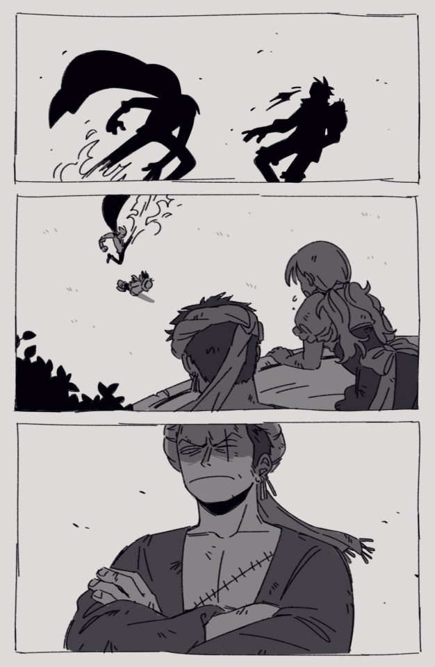
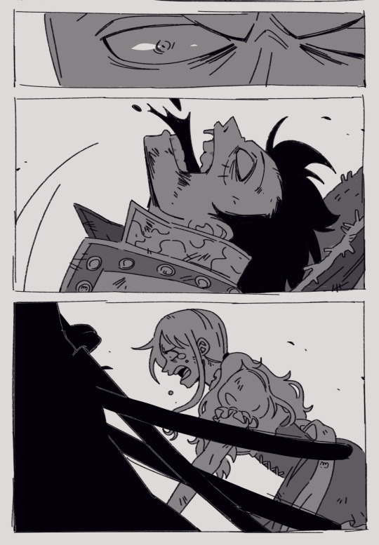
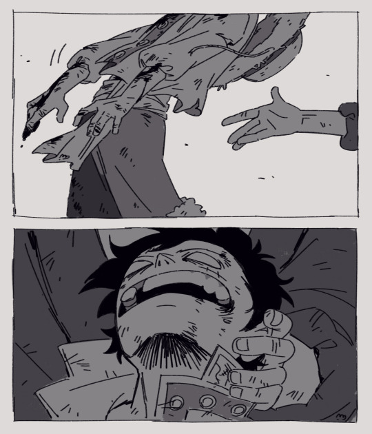

first part of my WCI Zoro AU comic!
sorry Sanji not only am I late for your birthday but also all you get is pain shdjjd
01 02
I really wanna draw a happy birthdayboy Sanji all smiley and wobbly 💗💗💗 but cant sketch anything new rn and cleaning the comic is much easier, no thoughts, head empty
Anyway, ramble time
I don't have much experience with making comics, the żabka AU one being the one I roughed out first, but it was much less complicated. I dont recall making a serious comic effort before that... I now have a newfound admiration for drawing fight scenes, found it extremely hard lmao Generally I keep second guessing myself, always thinking I should have added more panels to make what's happening more clear, not sure if the flow of it is right. Even though I already moved onto cleaning I still keep making changes to the sketched out panels that were supposed to be final lol I also second guess the plot I'd planned, maybe I didn't think this characterization through enough? What if people dislike it?
But! If I keep tweaking and overthinking it I'll end up never posting it and I don't want that. And if I focus on other people's judgement I won't find joy in making art and I don't want that either.
So here's to sharing art! Regardless of mistakes and doubts 💗
#the read more feature was a mistake bcs of it I can never shut up#I think about art and process of creartion a lot#most important thing is I'm feeling ok with this comic again#I succumbed to the doubts thats why I made a detour with the żabka one#zosan#wci zoro au#zoro#sanji#my art#luffy#nami#roronoa zoro#black leg sanji#vinsmoke sanji#cat burglar nami#monkey d. luffy#one piece#one piece fanart#whole cake arc#whole cake island#tw blood
3K notes
·
View notes
Text
My Favorite Cheap Art Trick: Gradient Maps and Blending Modes
i get questions on occasion regarding my coloring process, so i thought i would do a bit of a write up on my "secret technique." i don't think it really is that much of a secret, but i hope it can be helpful to someone. to that end:

this is one of my favorite tags ive ever gotten on my art. i think of it often. the pieces in question are all monochrome - sort of.

the left version is the final version, the right version is technically the original. in the final version, to me, the blues are pretty stark, while the greens and magentas are less so. there is some color theory thing going on here that i dont have a good cerebral understanding of and i wont pretend otherwise. i think i watched a youtube video on it once but it went in one ear and out the other. i just pick whatever colors look nicest based on whatever vibe im going for.

this one is more subtle, i think. can you tell the difference? there's nothing wrong with 100% greyscale art, but i like the depth that adding just a hint of color can bring.
i'll note that the examples i'll be using in this post all began as purely greyscale, but this is a process i use for just about every piece of art i make, including the full color ones. i'll use the recent mithrun art i made to demonstrate. additionally, i use clip studio paint, but the general concept should be transferable to other art programs.


for fun let's just start with Making The Picture. i've been thinking of making this writeup for a while and had it in mind while drawing this piece. beyond that, i didn't really have much of a plan for this outside of "mithrun looks down and hair goes woosh." i also really like all of the vertical lines in the canary uniform so i wanted to include those too but like. gone a little hog wild. that is the extent of my "concept." i do not remember why i had the thought of integrating a shattered mirror type of theme. i think i wanted to distract a bit from the awkward pose and cover it up some LOL but anyway. this lack of planning or thought will come into play later.
note 1: the textured marker brush i specifically use is the "bordered light marker" from daub. it is one of my favorite brushes in the history of forever and the daub mega brush pack is one of the best purchases ive ever made. highly recommend!!!
note 2: "what do you mean by exclusion and difference?" they are layer blending modes and not important to the overall lesson of this post but for transparency i wanted to say how i got these "effects." anyway!
with the background figured out, this is the point at which i generally merge all of my layers, duplicate said merged layer, and Then i begin experimenting with gradient maps. what are gradient maps?
the basic gist is that gradient maps replace the colors of an image based on their value.

so, with this particular gradient map, black will be replaced with that orangey red tone, white will be replaced with the seafoamy green tone, etc. this particular gradient map i'm using as an example is very bright and saturated, but the colors can be literally anything.

these two sets are the ones i use most. they can be downloaded for free here and here if you have csp. there are many gradient map sets out there. and you can make your own!
you can apply a gradient map directly onto a specific layer in csp by going to edit>tonal correction>gradient map. to apply one indirectly, you can use a correction layer through layer>new correction layer>gradient map. honestly, correction layers are probably the better way to go, because you can adjust your gradient map whenever you want after creating the layer, whereas if you directly apply a gradient map to a layer thats like. it. it's done. if you want to make changes to the applied gradient map, you have to undo it and then reapply it. i don't use correction layers because i am old and stuck in my ways, but it's good to know what your options are.

this is what a correction layer looks like. it sits on top and applies the gradient map to the layers underneath it, so you can also change the layers beneath however and whenever you want. you can adjust the gradient map by double clicking the layer. there are also correction layers for tone curves, brightness/contrast, etc. many such useful things in this program.
let's see how mithrun looks when we apply that first gradient map we looked at.

gadzooks. apologies for eyestrain. we have turned mithrun into a neon hellscape, which might work for some pieces, but not this one. we can fix that by changing the layer blending mode, aka this laundry list of words:

some of them are self explanatory, like darken and lighten, while some of them i genuinely don't understand how they are meant to work and couldn't explain them to you, even if i do use them. i'm sure someone out there has written out an explanation for each and every one of them, but i've learned primarily by clicking on them to see what they do.
for the topic of this post, the blending mode of interest is soft light. so let's take hotline miamithrun and change the layer blending mode to soft light.

here it is at 100% opacity. this is the point at which i'd like to explain why i like using textured brushes so much - it makes it very easy to get subtle color variation when i use this Secret Technique. look at the striation in the upper right background! so tasty. however, to me, these colors are still a bit "much." so let's lower the opacity.

i think thats a lot nicer to look at, personally, but i dont really like these colors together. how about we try some other ones?

i like both of these a lot more. the palettes give the piece different vibes, at which point i have to ask myself: What Are The Vibes, Actually? well, to be honest i didn't really have a great answer because again, i didn't plan this out very much at all. however. i knew in my heart that there was too much color contrast going on and it was detracting from the two other contrasts in here: the light and dark values and the sharp and soft shapes. i wanted mithrun's head to be the main focal point. for a different illustration, colors like this might work great, but this is not that hypothetical illustration, so let's bring the opacity down again.

yippee!! that's getting closer to what my heart wants. for fun, let's see what this looks like if we change the blending mode to color.

i do like how these look but in the end they do not align with my heart. oh well. fun to experiment with though! good to keep in mind for a different piece, maybe! i often change blending modes just to see what happens, and sometimes it works, sometimes it doesn't. i very much cannot stress enough that much of my artistic process is clicking buttons i only sort of understand. for fun.
i ended up choosing the gradient map on the right because i liked that it was close to the actual canary uniform colors (sorta). it's at an even lower opacity though because there was Still too much color for my dear heart.

the actual process for this looks like me setting my merged layer to soft light at around 20% opacity and then clicking every single gradient map in my collection and seeing which one Works. sometimes i will do this multiple times and have multiple soft light and/or color layers combined.
typically at this point i merge everything again and do minor contrast adjustments using tone curves, which is another tool i find very fun to play around with. then for this piece in particular i did some finishing touches and decided that the white border was distracting so i cropped it. and then it's done!!! yay!!!!!
this process is a very simple and "fast" way to add more depth and visual interest to a piece without being overbearing. well, it's fast if you aren't indecisive like me, or if you are better at planning.

let's do another comparison. personally i feel that the hint of color on the left version makes mithrun look just a bit more unwell (this is a positive thing) and it makes the contrast on his arm a lot more pleasing to look at. someone who understands color theory better than i do might have more to say on the specifics, but that's honestly all i got.

just dont look at my layers too hard. ok?
2K notes
·
View notes
Last Seen Blogs

busra-tr
busra-tr Sims

levimurdoch
Hey It's Levi

pokemonaday-artillerytortoise
Pokemon A Day

celebshotaf
the hottest celebs