#also i never figured out a boarder / font
Photo
I never quite finished these two cards the first time i tried making a PJO major arcana and I never posted them. I really like the designs though so I’ll probably try to do something similar when I draft them again
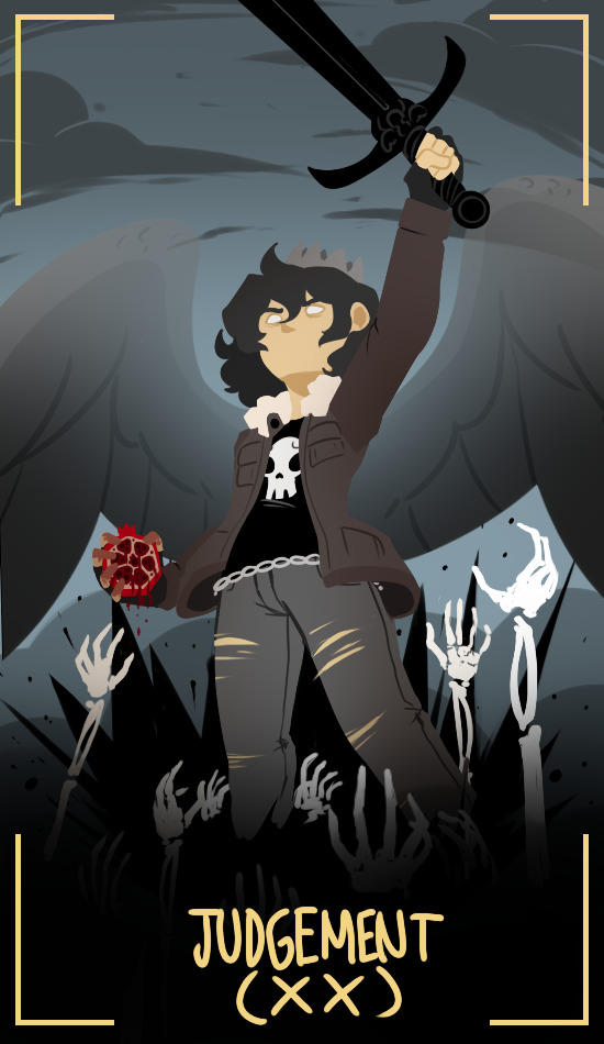
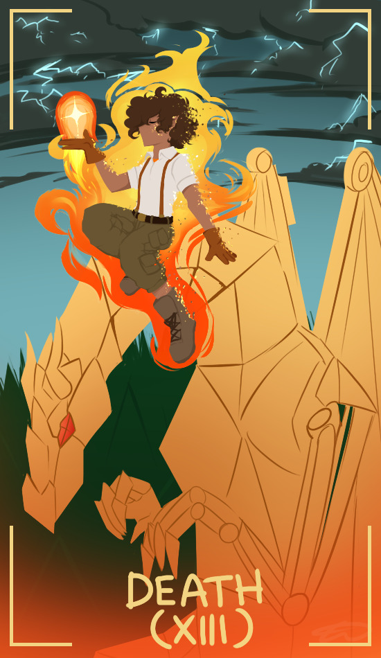
#pjo#riordanverse#nico di angelo#leo valdez#my art#tarot#hoo#the main thing i wanted to adjust for the Leo card was the Festus cause. i was struggling to simplify a mechanical dragon for tarot#also wasn't 100% on the embers detail cause wasnt sure how well that'd translate to a physical card#nico's was pretty close to done though#also i never figured out a boarder / font#im still obsessed with the way Leo was described during the fight in the end of BoO for the record#just ''yup he was MADE OF FIRE'' so cool#i can go through my list of my card assignments if anyone's curious#a couple of cards arent fully solidly decided but a decent amount are#also looking at my old art is reminding me the colors on my old monitor were a Lil Skewed#so saturated....#nico's card will prob stay mostly the same though cause hell yeah that rocks. still love it.#if anyone's curious for these card reasonings -#judgement is traditionally depicted with an angel raising the dead and the planetary association is pluto.#i couldn't NOT. also card meanings: destiny / upcoming decision / putting past behind / healing / judgement / self-reflect / self-doubt#which is very nico vibes to me#then death is resistance to change / major change / endings & start of something new / personal transformation#which feels very Leo to me! plus i like the imagery of instead of Death on a horse it's Leo on Festus at the end of BoO#cause that was him ending a chapter of him trying to find himself and starting anew
930 notes
·
View notes
Text
You can’t fool UConn fans with a fake Civil ConFLiCT trophy

It appears Bob Diaco’s invention is still missing.
A video posted to Twitter has some UCF and UConn fans riled up, and it’s thanks to the appearance of the “rivalry’s” Civil ConFLiCT Trophy. The trophy, which seemingly disappeared after the 2016 game, looked to have resurfaced:
I know millions of you have been wondering what I’ve been up to lately so I figured I’d get a hold of ESPN and make a documentary. Unfortunately, they couldn’t fit me in their schedule so I went ahead and did this one myself. Enjoy! #SettleTheConFLiCT pic.twitter.com/mWUnqZdG9O
— Maximus Conflictus (@MaxConflictus) August 26, 2018
The account even made known where it’d been spending its time:
I’ve been traveling between Connecticut and Florida. I’m an east coast fella, you know? #SettleTheConFLiCT
— Maximus Conflictus (@MaxConflictus) August 27, 2018
Sure, at first glance it looks like the trophy is in fact back:
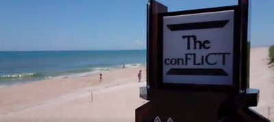
Twitter.com/MaxConflictus
But a clever UConn message board user by the name JMick pointed out that the font is different than the Civil ConFLiCT Trophy awarded. The one on the sidelines in 2015 and 2016 had a font similar to the one from the video, but it’s not exactly identical:
The silver plate in the fake one looks bigger, and there’s a bit more open space in the real trophy’s plate. The font on the fake one is also bigger and bolder, and there’s less curvature in the h and n letters. The c is also different. The two lines surrounding the font appear thicker, too.
But you gotta tip your cap to the the fake trophy’s creators, making their font look somehow even more dramatically awful than the real trophy’s font.
The original trophy that was released in the summer of 2015 had an all-caps font that looked like this:
First day back on campus for #UConnFootball! And just 130 days until the next Civil Conflict with @UCF_Football ! pic.twitter.com/RgOkXiob0T
— UConn Football (@UConnFootball) June 1, 2015
Per The UConn Blog’s Aman Kidwai, Diaco made aesthetic enhancements after receiving some negative feedback on the initial version — that’s why those two fonts are different. Kidwai agrees with the message boarders that believe the seemingly resurgent trophy is fake, too.
Wait, so what happened to the original one?
A brief history lesson:
This whole thing started in 2014. That year, UConn beat UCF in a shocker — it was UConn’s only win against an FBS team and UCF’s only loss to a conference opponent — and UConn coach Diaco used the postgame press conference to recommend a rivalry trophy:
We’re excited about this North/South battle. You want to call it the Civil Conflict? Maybe I’ll win my money and make a trophy. I’ll buy it myself. Put a big giant Husky and a big giant Knight on it. Make a stand. Put it in our hallway. The Civil Conflict. The loser, maybe they’ve got to put nutmeg on the stand when it’s not there and we’ll put a sack of oranges.
UCF claimed ignorance on the trophy:
Just checked w/ @UCF_Football: "We have no involvement with the trophy or creating a rivalry game with UConn." They were surprised by tweet.
— Brandon Helwig (@UCFSports) June 1, 2015
And didn’t wanna participate, either:
I think Regina George said it best pic.twitter.com/OTxNCVo9Mg
— Knightro (@UCF_Knightro) October 10, 2015
UCF lost in 2015, allowing UConn to keep its trophy.
In 2016, UCF beat UConn 24-16. Instead of accepting the ConFLiCT trophy, the Knights hilariously just left it on the field.
Frost gave a diplomatic answer when I asked about the #ConFLiCT Trophy snub. But yeah, UCF clearly wanted no part of it. pic.twitter.com/TVvbDbrjkr
— Brandon Helwig (@UCFSports) October 24, 2016
UConn fired Diaco after the 2016 season, and thus killed the trophy. UCF subsequently denied having any involvement with it, too:
Early morning shade from #UCF in the game notes!
"Because it was never a thing" - RIP #ConFLiCT pic.twitter.com/V7IoCHF1ao
— Tyler Graddy (@TylerGraddy) November 6, 2017
Even Diaco himself has seemingly denounced his own creation:
”I’ve eliminated it from my mind,” Diaco said, per the Hartford Courant in 2017. “I put the experience in a chest, locked it, dumped it into the ocean and I threw away the key. That’s the important thing. I’ve thrown the key away. I don’t even know ‘it” or what you’re talking about. Because I’ve eliminated that whole painful part from my mind.”
In the Knights’ game notes for 2018’s matchup, there’s no mention of the trophy, but the team calling it “a great rivalry” is apparently poking fun at the Huskies.
One of the great rivalries The American East Division has to offer kicks off in less than a week!
Notes and Depth Chart ➡️ https://t.co/bmdI7YCDw4 pic.twitter.com/kqOXQ52KhV
— UCF Football (@UCF_Football) August 24, 2018
“As far as I’m concerned the rivalry lives on,” Kidwai says via email. “As long as you believe it is still alive. It’s like Christmas spirit in Elf.”
“One last thing I will add is that while this was obviously a crazy idea, there was some merit to it,” he continues. “And if UConn wasn’t terrible in what turned out to be Diaco’s final year it could have continued to be a fun thing. Long live the ConFLiCT.”
It appears Diaco’s original ConFLiCT Trophy is still nowhere to be found, but at least these clever Internet folks gave us some hope for a little while.
(H/T to Kidwai and the folks at The UConn Blog for their assistance here.)
0 notes
Text
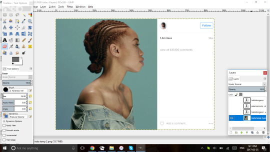
people kept asking how I did them so I guess this is my tutorial sort of thing? I hope it makes sense bc I literally just taught myself what and how to do it and I’ve never actually explained it before so here goes. I’m gonna teach y’all how to make something that looks like this (ALSO I use GIMP and not ps jsyk):
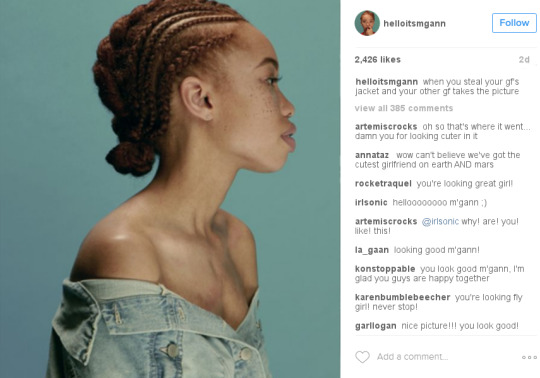
so the base I use is this:

which is literally just a screenshot from Kim K’s insta. Generally I start with the picture part because it’s generally what inspires me to make these edits and I find them from pinterest

So this is the image we’re gonna use for the edit, and the dimensions for the Instagram screenshot is about 538x598px.
First I’m gonna show you what NOT to do with it because it’s a pet peeve of mine:
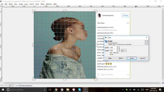
a lot of the time I see people doing this where they stretch the picture to fit what they need, which is totally fine when its only a little bit and like I used to do it all the time too! But when you stretch the image it stretches the image and looks kind of out of place. So instead what we’re gonna do is click this button:
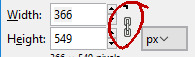
which is gonna keep the image proportionate while you change the size of it so it looks like this:
and then you can move the image to be in the position you want it to be in:

I’d also like to mention that you can make the image whatever size you want. For the sake of clarity and being specific I went and checked the original dimensions of the photo section, but generally speaking I make the width as close to the boarder as possible, but don’t worry if it goes past.
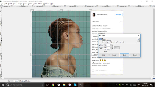
Next we’re gonna move onto the text portion of the edit. I really like how it looks when the whole side is full of comments, but that’s totally my preference and you can add as many or as little there as you want.
The settings for the text are as follows: Font; Arial, Size; 14, Colour; #676767 (except for the “view _ comments” and date posted which are #b5b5b5). These colours are exactly what are used on the site, and Arial is one of the fonts it uses. 14px is the closest size I’ve found but you can make it larger if you want, but any smaller I find gets really hard to read.
I erase everything on the right side of the edit that I actually want to change: user names, comments, amount of comments, amount of likes, and the time it was posted
HOWEVER it’s sometimes easier if you do them one at a time, or at least in chunks so you have a point of reference on where things go. I generally only do this if I need it to look exact or if I’m making multiple edits so it all looks the same, and I generally do it like this:
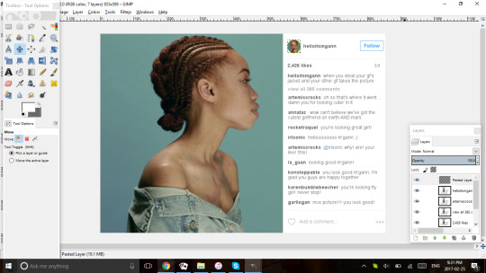
I usually leave the icon there for 1) the placement of the user name and 2) I’m just going to cover it with a new picture so it’s not gonna be seen through.
With all the usernames, I bold them unless someone’s being @ed in the comments, in which I leave it as is and colour it at #5a7c9e. I also hit space twice between all the usernames and their comments because I think it looks better. I also bold the likes, date, and amount of comments.
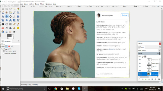
You can move all the text further left or right if you want, but I try to make sure it’s all even despite being multiple text boxes so I can move them to be as proportionately pleasing as I like. For example, i the original screenshot, the caption is way at the bottom of the space between #of likes and #of comments, and I don’t like how it looks so I move my caption to be closer to the middle even when it’s only one line. I also do this so that I can keep the spacing between each comment (-1.0) even throughout the entire section. Note that there’s a little, light grey line at the bottom of the comments; that’s there in the screenshot and I like how it looks and separates the sections so I leave it in, you don’t have to, it’s just my preference.
Also, if you’re unsure about where to go about placing the text just in general, you can leave the original text there and place the new text over it for placements sake and then erase the text afterwards


Finally, I’m not super skilled with this particular program so idk if there’s a way to do it that I just haven’t figured out, but for the icon I use lunapic.com to edit the photo (i usually find on pinterest also) into a circular shape, and paste it into the edit and colour the edges white to matches the background.

Making sure we’re still keeping the resizing proportional, I usually make the icon 40x40px which is big enough to cover the image we left there.
And that’s it! That’s how I make my edits! I hope this was at least semi helpful? If you have anymore questions feel free to ask!
32 notes
·
View notes
Text
Brandon Bittler
Project 3
Rj Thompson
4/11/17
Wolfgang Weingart is a very well-known graphic designer and typographer, that follows under the title of a Swiss Typographer. Wolfgang Weingart is also considered to be the founder of the “New Wave, or Swiss Punk typography.” Weingart was born in 1941, just North of the Alps in southern Germany, in a place called Constance.
Weingart resided there until moving to Lisbon at age 13. After four years of residing in Lisbon he then, got himself enrolled at Merz Academy in Stuttgart, Germany. This is when his schooling for the graphic arts would be held in his beginning years within the industry. When starting his schooling he begin honing his skills in, “linocut, woodblock printing, and typesetting.” After the two-year program Weingart decided to do a three-year apprenticeship at Ruwe Printing. This then lead him to become a student under Ruwe Printing’s consulting designer, Karl-August Hanke who was ultimately the role model for Weingart and directed him to continue with his schooling at Switzerland.
When Weingart decided to follow his mentor’s guidance, it lead him to Basel School of Design as an independent student. Upon completion Weingart decided to teach at the establishment. While teaching and giving lectures around the world Weingart stated that,” he never influenced his students to adopt a certain type of style, especially his own.” But many of his students when on and spread his style around and considered it as, “Weingart style.”
This made him extremely well known in the graphic industry and lead him to write a retrospective book on typography. The publisher Lars Muller compile the book in a volume in ten sections. After decades of teaching, lecturing and writing multiple books the American Institute of Graphic Arts recognized Weingarts advances and achievements in the graphic industry and awarded him the highest honor for a graphic artist in the graphic design profession, the AIGA Medal, in the year 2013. Following getting the most prestigious award for a graphic designer, the following year Weingart was presented the Swiss Grand Prix of Design award by the Federal Office of Culture because of his life-long merits as a designer.
Wolfgang Weingarts’ pieces are genuine in the fact of how unique his style is and how each piece resembles it, all while keeping good design with use of typography and color and contrast. In the first piece Weingart utilizes strong contract with the white text over the black background. This lets him utilize the negative space very well. With the typography being barely legible, it makes the viewer be more interactive with the design based on the human nature of being curious about things that aren’t known or that are hard to figure out. In this design, he creates a spiraling image with the type, which uniquely creates a focal point within the center of the design where it because readable but is still difficult to maintain the understanding of the piece itself. I feel like the design itself was made to cause confusion and to be questioned when a viewer is looking at it. If this is the case then the subject matter and the way weinghart approaches his solution of the piece, is made very affective. But if there was another core concept to this piece I feel like this piece is not successful because of the lack of legibility of the type even though the imagery is executed well. The reason the to the imagery being executed so well is because of his combination of size variants of the front and the distorted font.
In the second design Weingarts use of his typographic element is very playful. This is showcased in the manner of how he placed the font in multiple variants of sizes, weight, and positioning. This design also showcased his extreme comprehension of type as design very well. Because as a design there are many rules that one tends to follow when it comes to type. These rules are broken throughout this design to break up the plane between import information and creating negative space that is visually pleasing to look at. The variety of shapes also direct the to the focal point creating this design into the successful piece this it is. He also used a variant in black, gray, and white to give good contrast but only with a subtle difference in values. The suble addition of wording within the center of the page toward the top where it states what the piece’s information will have for the viewer works well will the sporadic but well-thought out font surrounding it. The space given for the imagery and title of cover was also divided with the information at the bottom of the page in a way that it doesn’t maintain the viewers focus but gives itself enough significance that as the viewer follows the design naturally they will come to the information the to the bottom of the page.
In the third piece weingart strays away slightly from the first to pieces by incorporating different shapes along with his tradition contrasting black and whites and type. I feel like this is one of his least successful pieces out of the five below but is still a well-designed piece. The uses of shapes to direct the viewer’s focal points to multiple areas was a well thought out decision by weingart. This is because that he keeps a pyramid of importance as well as keeping organization in the piece. The more a viewer looks and find relations between the shapes and text the more the viewer can comprehend the focal points and find what they wish to direct themselves towards. The division of the design I feel makes the ending result of the piece indecisive and confusing for the viewer as if it was meant to do so.
In the fourth piece, you see weingart digress from his tradition black, white, and grey valued themes and replace it was an orange and yellow color theme. Normally I tend to stay away from vibrant colors in a design because it can cause one color to be a vibrating color, but he does this very well by breaking up the place with the vibrant yellow. Which causes a boarder effect without making a complete boarder. This works with the orange which has a soft hue to the color and has lack of saturation. Without making the saturation with the orange the colors would have vibrated each other making it near impossible to look at. The style of the bold type that is cut at an angle, leaves just enough that while looking at the piece you can still comprehend and read the fonts without trouble. The only part about this design that I think should have been changed is the white text on top of the orange background. The positioning of the wording in white could’ve been black placed on in the yellow or made black kept within the orange. The while lettering on the orange is strenuous to look at but since the wording is short or brief it lets the viewer not to focus on the least important information rather than focusing on it because the main focal point is written in black.
For the final piece which is one of my favorite pieces out of the selection is where weignart utilizes the same technique as the forth piece by cutting the type in a way that it’s still legible and not over complicated to focus on. The reasoning behind the success of the piece is that he utilizes the strong contracts and negative spaces to create a unique design without leaving quality of type out of the picture. This piece clearly shows his experience in the graphic industry to be able to maintain cohesiveness without causing the mass confusion like some of his pieces. The organization of the font families and size differences were used very well also. Also, the change in font weight and font thickness in the word grotesk was visually satisfying while keeping it to a subtle minimum.
1. 2. 3.
4. 5.
Work Cited
Biography by Philip Burton. "Wolfgang Weingart." AIGA | the professional association for design. N.p., n.d. Web. 05 Apr. 2017.
"Wolfgang Weingart | Biography, Designs and Facts." Famous Graphic Designers. N.p., n.d. Web. 05 Apr. 2017.
"Wolfgang weingart." Typo/graphic posters. N.p., n.d. Web. 05 Apr. 2017.
0 notes
Last Seen Blogs
catnipcarnival
Catnip Carnival

wellwellwell-ben
𝖇𝖊𝖓’𝖘 𝖉𝖊𝖓 📰

not-ur-average-girl7
Where the hell am I?
dvnzook
Devin/Zook
hot-rubber-leather-men
Hot Men In Rubber and Leather