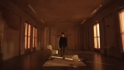
#also i just love the aesthetic and colour palette of this new era
Note
have to second that previous anon on the url & blog title thing. also, your new header is so cool!!! sorry, just really wanted to say this. have a nice day!!
Thank you so much anons for being so nice to me… 🥹💞 and thank you! I love the overall aesthetic and colour palette of the Life Is Yours era, my header’s taken from the 2001 video.
I’m a huge lover of shades of pastel pink so here I am!
2 notes
·
View notes
Text
W11: Objects Update - x10
I have updated the descriptions of each object on the poster to meet the word count of 50.
My object descriptions are now sitting between 40-80 words each. I need to find out if it is strictly 50 words max, because I cant find it on the brief anywhere. This was quite hard and I had to cut out a lot of information that I thought was relevant. Most of the objects still have their importance come across in just 50. I would like to go deeper into many of them, but I could use the essay for that potentially.
This bottle has been kept for many years, and lies among a collection of jewllery. Its origins unknown. A message in a bottle is the essence of storytelling. It is innocent, hopeful and mysterious. It is a story without even being opened. The bottle is repurposed and creates new meaning, but the original story of the remains. It invokes curiousity and imagination to viewers. What could the message inside be? As designers we connect with this concept by creating work that holds the same qualities.
This beaded necklace was a gift from family. It to portrays the history and interest into African cultures and society. The necklace resembles the Zulu jewellery. The Zulu are South Africa's largest ethnic group. They have produced craft objects with beads for ritual and other occasions since the early 1700s.
Collected over time, these sheets serve as colour codes and shades. They show the connection to the current design work through printing and paper. Having a colour palette like this to compare printed colours and digital colours is vital for a designer. This is my personal collection and commonly used tool when designing.
My art journey started with sketches and doodles as a child. It eventually moved onto pastel and paintings, resulting in an interest in digital art and design. This reflects the modern era which is digital and social media influenced. I liked BTS at the time and started creating digital fanarts with fantasy themed aesthetics. It greatly improved my art and illustration by practicing with fanarts that I was passionate about.
Threaded magazine is an award-winning design studio from New Zealand. I aquired it through a lecturer at AUT. It is beautifully illustrated and designed, featuring local and international creatives. Their mission is to creative positive change and interaction with local communities. They love cultural and social contexts which is prevalent in all of their work. This magazine connected me to many amazing designers that are potentially part of my future career.
This represents my culture, origins, and love of stories. There is a humourous story behind this bracelet. In Europe, you will often find people walking around popular tourist locations, with a range of trinkets like jewellery. They attempt to sell things, often in scam-like ways. We paid a very cheap price by handing over South African currency. The bracelet has since gained my affection through this story and my love of Africa.
The newest addition to the design collection, is a flyer from AGI-Open; a design conference held in my area. It hosted many famous creatives and designers revealing new names and designs relevant to my career. This community taught many valuable tips and lessons for design. The flyer holds the timetable, logo and speakers list. Using it as an object also hints to connection with papers and printing.
A mousepad like this is few and far between. It was gifted by family and comes from the game, League of Legends. Their character splash arts and story-lines are absolutely amazing. This object represents my gaming interests and love for fantasy-themed creations.
A weave of metals and wools connecting to eco-friendly sustainable work. This is a current project of mine, that hopes to create a new surface and structure by combining two unqiue materials. It contains the experimental and opportunist personality with the unique and abnormal design concepts.
This bottle has been kept for many years, its origins unknown. A message in a bottle is the essence of storytelling. It is innocent, hopeful and mysterious. It is a story without even being opened. It invokes curiousity and imagination to viewers. What could the message inside be? As designers, we connect with this concept by creating work that holds a similar power.
A very badly put together teddy bear was the start of my crochet journey. The pattern and material were gifted from a graduation bag leftover from AUT graduates. I became interested in wool shortly after because of its sustainable qualities compared to the plastic and polyester materials. It holds interesting properties like flame retardant, good insulation, and soft comfortable textures. Being sustainable and thinking about material qualities is something I hope to hold in regard at all times.
Photography is an assisting of how design became my profession. Photography is an interest that comes in phases, but is a necessary support for design. Even if you are an illustrator, product designer or brand designer etc, you will use photography to capture your inspiration, work in progress. Photography is a necessary skill for design.
0 notes
Text
Album Cover Artist Spotlight - Alex Steinweiss

Something I feel I’m not doing that good a job of is actually giving credit to the people behind the iconic album covers I showcase on this micro-blog. So I’m going to try something a little different. The Album Cover Artist Spotlight will be looking at the people responsible for the album covers we love so much, and what could possibly be a better place to start than with the inventor of the album cover, Alex Steinweiss.
Alex Steinweiss was born in Brooklyn, New York, USA on March 24th, 1917. As his surname would suggest, his parents were European, his father from Poland and his mother from Latvia. Alex studied at Abraham Lincoln High School and earned a scholarship to the Parsons School of Design.
He worked with an Austrian graphic designer named Joseph Binder, who pretty much made the art aesthetic of the 1930s.

This is Binder’s entry for a U.S. Army Poster Competition, and he also did a poster for the 1939 New York World’s Fair.
In 1938, Alex Steinweiss became the first Art Director for Colombia Records, apparently in 1939, he just grabbed a photographer and headed to the Imperial Theatre, where he got the owner to change the letters on the sign temporarily and art history was made.
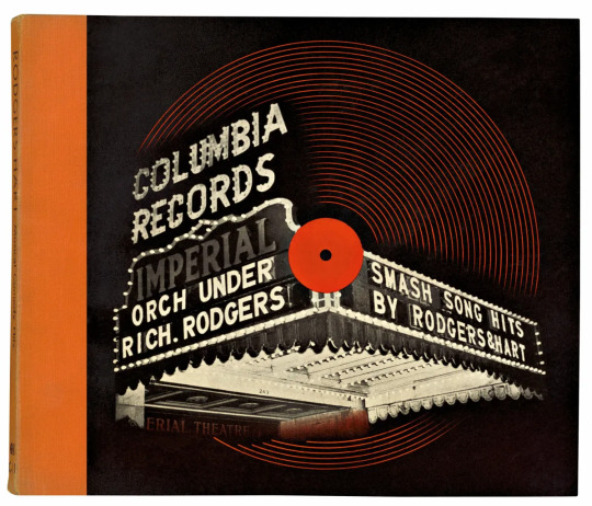
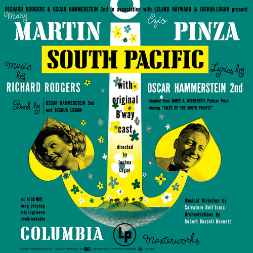
Smash Song Hits By Rodgers & Hart, an album released in 1939 was quite possibly one of the earliest album covers that was seen by a general public, and he continued designing album covers until 1973, when he decided to do more painting than graphic design. Arguable one of his most famous works being the cover art for the original cast recording of the musical South Pacific.
In 1998 he was inducted into the Art Directors Club Hall of Fame, alongside Tom Geismar, Chuck Jones and Paula Scher.
In 2011, Alex Steinweiss would sadly pass away at the age of 94, leaving a legacy of amazing work behind, and a whole side of art that I like exploring.
Prior to Steinweiss, records would come in plain packaging, a brown paper bag, or a bag with the record store’s logo on it. Nowadays, we have made images that directly linked to the sounds on the record, we have band mascots and stories told though the images, he have albums that hide more unique covers behind their front covers. Album covers that have interactive elements, album covers that play with expectations, album covers that have become so iconic that they almost transcend just being an album cover and have become icons in pop culture.
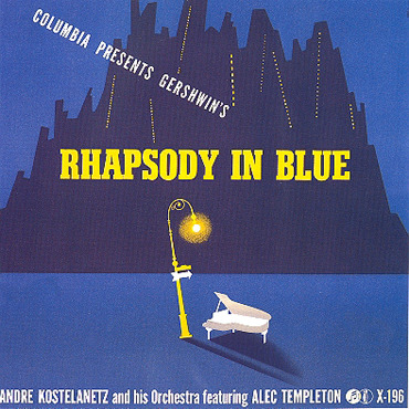
I think this one is my favourite of Steinweiss, the minimalist Art Deco style and the colour palette give the image such an emotion that really defines what a large appeal behind the album cover became. You can almost see how images and designs like this would lead to the iconic album covers of the psychedelic era, and the rise of album designers like Hipgnosis, Jamie Reid and many others.
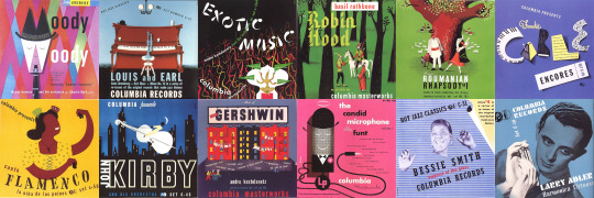
I’ve been wanting to talk about Alex Steinweiss and his contributions to the album cover for a little while, so if you enjoyed this... admittedly very shallow dive into one of the many artists in album design, feel free to let me know. If this goes over well, I may do some more. Now I am going to leave you with a small sample of his work, I hope you learned something new today.
#album covers#album art#music#art#art history#album cover history#alex steinweiss#art deco#joseph binder#Album Covers Wall (Hall) of Fame
0 notes
Text
this entire thing being part of dema's propaganda in such a subtle and yet so blatant way is SO clever


・ the title of the album being an anagram of "clancy is dead"
・ the string of numbers at the bottom of each pic (which is the same as the infraction number on dmaorg.info) also translating to "clancy is dead"
・ dema being literally written all over it (the symbol looking like the map of dema, the "a production by dmaorg" and "good day dema" logos, the writing at the bottom of each pic)
・ the emphasis on colours and saturation, which are the exact opposite of dema's grey, dark, monochromatic aesthetic
・ tøp's ||-// logo being nowhere on the promo pics, because in the narrative of trench it represents hope, which goes against everything the bishops, dema and vialism stand for
・ the blurryface twitter account being the only one who posted about the album, which suggests that tyler and josh are not in control of any of this, blurry/the bishops ARE and they're using them as a tool of their propaganda, to glorify clancy's death and paint dema and vialism in a positive light
the vibes of this entire thing are so off it almost feels fake and it's SUPPOSED to be like that, because this IS, in fact, fake. scaled and icy is not genuinely coming from tyler and josh themselves like the previous albums, it was made by DEMA and tyler and josh are merely a tool to promote blurry/the bishops' message. it's unnerving and scary and i LOVE it, this band is on a whole other level.
UPDATE: another clue that imo further confirms this theory is the wording they chose in their promotional tweets:

notice how they keep saying OUR new album, while in the past they've always said YOUR album (as this clikkie pointed out on twitter). also the tone of those tweets feels very impersonal, very professional, almost cold, almost as if it wasn't tyler or josh or mark who wrote them. the previous announcements felt warmer, as if they were announcing they were gonna give us a gift, as if they were saying "we made this album, but it's yours, it's for you", while this time it feels more like "WE(the bishops) made this album and it's ours and it's for our purpose(propaganda) only". and it's scary af.
ANOTHER ADDITION: the return (but not quite) of the vessel era skimasks in the shy away mv.
what i mean by this is: the masks do look very similar to the ones they used to wear during the vessel era, but are they really the same masks? imo, they're not.
the real skimasks from vessel era used to bring a sense of comfort to tyler and josh and they were a sort of protection, as we can see in the guns for hands mv


now look at the skimasks they wore in the shy away mv
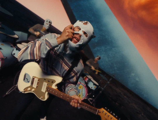
they're full of holes, josh's one is so torn apart it barely covers half of his face. these are certainly not the same masks as the ones in the guns for hands mv. these are a fake, corrupted version of them. blurry/the bishops chose to bring back such an iconic symbol of one of tøp's past eras, for the sole purpose of giving us a false sense of familiarity and security, so they can lure us into their trap more easily.
(or perhaps the masks are just very old and i'm looking way too much into it, but you never know with this band ¯\_(ツ)_/¯)
#this entire concept is just *CHEF'S KISS*#mr pilots sirs your MINDS#also i just love the aesthetic and colour palette of this new era#(even if we're probably not supposed to like it since it comes from dema)#the 80s vibes#and THE DRAGON#i don't even know what part they're gonna play in the narrative yet but I WOULD DIE FOR THE DRAGON#also FUN FACT: there's a dragon god in chinese mythology called azure dragon and he represents guess what? the EAST#idk how that's relevant but i thought it was a fun coincidence#anyway i'm SO excited for whatever the pilots have in store for us on may 21st#CAN'T WAIT#scaled and icy#SAI is propaganda#clancy is dead#twenty one pilots#tyler joseph#josh dun#skeleton clique#clique#i'm back on my clikkie bullshit
213 notes
·
View notes
Video
youtube
This week on Great Albums: a fresh look at quite possibly the 80s’ most hated band, A Flock of Seagulls! Spoiler: their music is good, people in the 90s and 00s were just mean. If you want to find out more about how having the absolute best hair in the business ended up backfiring on these poor sods, look no further than my latest video. Or the transcript of it, which follows below the break!
Welcome to Passionate Reply, and welcome to Great Albums! Today, I’m going to be diving into a discussion of quite possibly the most derided and lambasted music group of the 1980s: A Flock of Seagulls. With a strange name, a perhaps painfully stylish aesthetic, and equally trendy and of-the-moment music, that was, for a time, inescapable in popular culture, their legacy forms a perfect target for the ridicule all popular things must face in due time. But even moreso than that, I think A Flock of Seagulls have become not only a punchline in and of themselves, but also a summation of everything that was dreadful and excessive about the early 1980s, with its “Second British Invasion” of synthesiser-driven New Wave. I can think of no better example of this kind of abuse than a famous line from the 1999 comedy film, Austin Powers: The Spy Who Shagged Me. The film is largely a love letter to the 1960s and its Mod aesthetics, and the protagonist, a super-spy unfrozen from this era in time, dismisses the history and culture of the 1970s and 80s as nothing more than “a gas shortage, and A Flock of Seagulls.” But at the time of this writing, we’re about as far away from Austin Powers as the film was from the release of this album, the band’s 1982 debut LP, so I think it’s been long enough that we can start to re-evaluate A Flock of Seagulls’ rightful place in music history.
While this self-titled album was the group’s first long-player, their first release was the 1981 single “It’s Not Me Talking.” Notably, this track was actually produced by the legendary Bill Nelson, who also released it on their behalf via his personal label, Cocteau Records. Ever since discovering this for myself, I’ve found the connection between Nelson and A Flock of Seagulls fascinating, and also satisfying. Despite the gulf between their respective reputations, I do think their work has a lot in common, at the end of the day: swirling washes of synth disrupted by screaming guitars, not to mention that shared interest in Midcentury rock and roll aesthetics.
Music: “It’s Not Me Talking”
These two acts would, of course, go their separate ways shortly after, and they ended up in completely opposite camps, with Nelson becoming a cult favourite with little crossover success, and A Flock of Seagulls going on to create what is, undoubtedly, one of the most iconic songs of the entire decade.
Music: “I Ran”
What does one even say about a song like “I Ran”? Over the years, it’s certainly gotten somewhat overplayed, but I can’t really hold that against it. It’s just a damn good song. Both ethereally menacing as well as catchy and rather accessible, “I Ran” takes the atmosphere suggested by “It’s Not Me Talking” and kicks it into another gear, with a harder-hitting hook and the introduction of that highly distinctive and of-the-moment echoing guitar effect. Some will hear it as little more than evidence that the song is hopelessly dated, but I’ve never thought of it as anything other than satisfying to listen to. If you ask me, I figure all art that exists is essentially “a product of its time”--nobody ever said Michelangelo Buonarroti’s David was a lousy sculpture, just because you can easily tell it was made during the Italian Renaissance. At any rate, I’d encourage everyone reading to go back and listen to it again, trying to maintain a little neutrality. I’d recommend the album cut of it, which is significantly longer than the single version, and features a rich intro that sets the scene before that famous guitar ever makes an appearance, which I think really adds to the experience. By some reckonings, A Flock of Seagulls are sometimes considered a “one-hit wonder,” but while they certainly are remembered chiefly for “I Ran,” this album’s other singles were moderately successful as well.
Music: “Space Age Love Song”
“Space Age Love Song” is perhaps the band’s second best-remembered single, and takes their sound in a markedly different direction than that of “I Ran.” “I Ran” won popular acclaim by finding a new home for the guitar, in the midst of a sea of synth, and pushed A Flock of Seagulls into a similar space as acts like the Cars and Duran Duran, who had enough mainstream rock sensibilities to sneak a lot of synthesiser usage onto American rock radio...much as one might sneak spinach into tomato sauce when feeding picky children. But I think “Space Age Love Song” is much more palatable to listeners of pop, synth- or otherwise. It’s softer in texture, and really almost dreamy, capturing the hazy, buoyant feeling of limerence as well as any pop song ever has. I’m tempted to compare it to another synth-driven classic, whose influence towers over this period in electronic music: the great Giorgio Moroder’s “I Feel Love.” Much like “I Feel Love,” “Space Age Love Song” combines simple, almost banal love lyrics with an evocative electronic soundscape, painting a picture of an enchanting, high-tech future where human feelings like love have remained comfortably recognizable across centuries or millennia. A similar theme of futuristic love pervades the album’s second single, “Modern Love Is Automatic.”
Music: “Modern Love Is Automatic”
While “Space Age Love Song” uses simplistic lyricism to portray the relatable universality of falling in love, “Modern Love Is Automatic” gives us the album’s most complex narrative. In a world where “young love’s forbidden,” we meet a pair of star-crossed lovers prevented from being together by some sort of dystopian authority. The male member of this union, introduced as the “cosmic man,” is apparently imprisoned for the crime of loving, but the text suggests that he may escape from this prison--or, perhaps, even be freed from it. The title, repeated quite frequently throughout the track, is perhaps the mantra of this anti-love society, a piece of propaganda being drilled into us as thoroughly as it is into these subjects: Modern love is automatic, with no need for messy, unpredictable human input.
It’s also worth noting that the song is consciously set in “old Japan,” deliberately locating it in the “exotic” East. While East Asia was strongly associated with refined, perhaps futuristic culture, I can’t help but think there’s a more pejorative sentiment operating here, rooted in stereotypes of Asian cultures unduly policing sexual freedom, and other forms of personal expression and self-determination. Ultimately, despite its futuristic trappings, “Modern Love Is Automatic” isn’t really a song about technology at all, but rather authoritarianism. “Telecommunication,” on the other hand, engages more directly with that theme.
Music: “Telecommunication”
“Telecommunication” was also released prior to the self-titled album proper, and was also produced by Bill Nelson. While structurally similar to “Modern Love Is Automatic,” with an oft-repeated title, brief verses, and a generally repetitive musical structure full of meandering guitar, its text quite plainly discusses the titular field of technology, in a seemingly non-judgmental fashion--though it could be argued that the fairly upbeat music suggests a positive outlook on things like radio and TV. The one hitch in all of it is the very end of the last verse, which sets the song in the “nuclear age”--a nod, perhaps, to the darker applications of 20th Century technology. “Telecommunication” is perhaps indebted less to figures like Moroder, and moreso to Kraftwerk, who first solidified the rich tradition of stoic synth thumpers about everyday machines like cars, trains, and, of course, nuclear energy. I’m also tempted to compare it to an earlier work of Bill Nelson’s group Be-Bop Deluxe, “Electrical Language,” another bubbly number that playfully bats this concept back and forth.
The theme of “quotidian technology” is also present on the cover of this album, which features an interior shot of a living room, centered around a television set. The TV displays a figure playing guitar--perhaps one of those heroic rock pioneers of the Midcentury like Buddy Holly, whom Nelson was so keen to imitate. But what’s most immediately striking about this cover is its beautiful colour palette, full of deep, saturated jewel tones, treated softly with an “airbrush” style effect. Despite being a somewhat mundane scene, the image also features fanciful, imaginative touches: the floor of this room is actually a miniature beach landscape, with the “floor” beneath the TV actually being the surface of the ocean, and the TV appears to be surrounded by a colourful, glowing group of birds. Given the beachy surroundings, we could perhaps interpret them as the titular seagulls. It’s tempting to think of this scene as a representation of how technology can sweep us away, out of our everyday existence and into something richer and more exciting.
But perhaps it’s not so simple--note also the open window in the top left, whose curtain appears to be agitated by some sort of motion in the air. Perhaps these birds are not the products of television fantasy, but rather have flown in from the window, and hence hail from the “real world?” Given how tracks like “Space Age Love Song” and “Modern Love Is Automatic” tackle the theme of the mundane meeting the fantastical, I think this complex and arresting image is a great fit for the album.
While their self-titled debut spawned multiple recognizable hits, A Flock of Seagulls never came anywhere close to recapturing its success. For the most part, they struggled to remain relevant as time wore on, largely abandoning the sonic footprint of their first album, and chasing after new trends in music technology such as digital synthesisers. They would eventually break up during the mid-1980s, and though they’ve reunited in order to perform live several times, the book is probably closed on A Flock of Seagulls. Personally, I can’t help but wonder what might have been if they had stuck to their musical roots a bit more. You get a bit of that on their third LP, 1984’s The Story of a Young Heart, which thankfully brings back that iconic echoing guitar, and does so without sounding too much like a simple retread of “I Ran.” Out of all their other work, it’s the album I would most recommend to admirers of this debut LP.
Music: “Remember David”
My favourite track on A Flock of Seagulls’ debut LP is “Messages”--not to be confused with the track of the same name by Orchestral Manoeuvres in the Dark! Moreso than anything else on the album, “Messages” has this aggressive, insistent, driving quality, and feels less like yacht rock, and more like punk rock. Despite not being released as a single, I think it’s a very strong track that’s quite easy to get into. That’s everything for today--thanks for listening!
Music: “Messages”
16 notes
·
View notes
Text
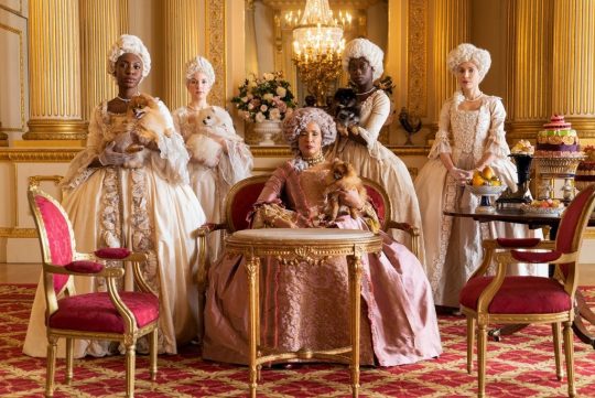
The Dust Of Bridgerton - Review
Based on Julia Quinn’s obsessively Jane Austen inspired nine novels, we as an audience step into a world laced with gossip, love and historically inaccurate details.

Regé-Jean Page & Phoebe Dynevor in 'Bridgerton'
Having audiences and the online world jump from their seats at the news of yet another romantically colourful period drama, Netflix’s 2020 Christmas release set off on a high note. However, it may not have been enough satisfaction to cover all viewers, as the overzealous series that is Bridgerton can be perceived as a cute attempt to outline high-society London, rather than a sweepingly romantic love story. From overplayed themes, to the shallow one-liners, saturated costumes and quite frankly, some controversy in a modern series, we’re not so sure that this was a 2020 release. Granted, some of the artistic involvements are wonderfully intoxicating, creating interest and having it for sure be a visual spectacle. Though, this whirlwind historical insight by creator Shonda Rhimes seemed to be a whitewashed teen-drama, instead of a maturely topical period piece.
Based on Julia Quinn’s obsessively Jane Austen inspired nine novels, we as an audience step into a world laced with gossip, love and historically inaccurate details. Set in 1813 Regency London, Rhimes’ series is a period drama surrounding the esteemed Bridgerton family, and particularly Daphne Bridgerton, the eldest daughter of the four sisters. All surrounding the pursuit and importance of finding a suitor eligible for marriage at that time, Bridgerton is the glossed over, trivial version of Pride and Prejudice. Yet there certainly still is wit, charm, enchantment and change, grabbing our attention. It is these themes that we are known to love, rather making Rhimes’ series all the more predictable and repetitive. There is beauty and moments to remember throughout, yet all in all I felt as though I was watching a weak showcase of what a mock Baz Luhrmann and Wes Anderson collaboration that exerted a blinding pastel macaron palette might look like. There isn’t really any distinguishable, first class authentic directing or writing style. We have all seen it before, which is what makes it so popular. Bridgerton’s successful reception does not seem due to the fact that it is a beautifully great show, but because of the fact that it is something written knowing that audiences will not tire of yet another stylish, skinny period drama. We have seen many renditions of Pride and Prejudice, Emma and Madame Bovary over the years, making Rhimes’ series simply another period drama that rather latches onto others for inspiration, rather than being a strong standalone piece.
Where Downton Abbey meets Gossip Girl, some might say that this show bursts with fervour, yet it can be deemed as shallow in it’s character development and attempted strong plots. Some might say that Bridgerton has riveting grandeur, but it was films decades ago that originated it so, as we have already marvelled at the magic of the many renditions of Pride & Prejudice. And sure, there is drama, eroticism, as well as there are whispers in the streets filling the scenes of Rhimes’ take on a royal drama. But to have to create excitement by only overdoing sex and violence scenes like this doesn’t speak to highly of it’s quality. And it can be that this is what period dramas are about, yet Bridgerton’s over-embellishment of sex, drugs and rock & roll sometimes paints it out to be taking the easy way out; a cheaply written series by just landing on what is easily stimulating to audiences. As though you’re to a stand up only to have the comedian joke about porn and a night out he might’ve gone on, simply to quickly catch the audiences attention. It works, but does not hold as much substance as a joke with true wit, or in this case, a script with deep quality. The character arc’s end quickly, as does the mystery surrounding who ‘Gossip Girl’-like character Mrs Whistledown is. There isn’t much glory in the drama as there wasn’t enough of it. Yet, the focus on female empowerment and rather the female gaze was something that gets points for originality and undertaking a modern stance during the Regency time period.
Amongst the budding romance, glory and messy undertone of the series, the art department does deserve a pay raise, as there is no doubt that the costumes, set and overall work on Bridgerton make it all the more alluring. In saying alluring, it doesn’t necessary translate as the costumes being convincing. Yet the production and costume design is something that seems to define the esteemed privilege of the characters, as they dress in flashy tulle, silks and organza. Luxurious gardens, ostentatious palaces and velvet furnishings tie into the greatly pleasing aesthetics, as we are given the scoop on the Bridgerton’s drama’s, we also are taken in by their lavish lifestyles. Delicacy after delicacy in the ballroom scenes, as champagne towers flow & rich candles burn. Even in the overplayed sex scenes, velvet carpets and luxurious chaises sit on the backdrop. The combination of bountiful costumes and turns this show into an elevated treat for the eyes.
However beautiful, it can still be said that the costume & set design was just overpowering & seemed like a parody of other period drama’s aristocracy. The sickening yellow-green or floral orange gowns blinded, rather than astounded, as none of the costumes seemed entirely accurate. There are countless YouTube videos on the lack of historical accuracy in the dress. But not only are they inaccurate, they’re just unattractive. The completely saturated colours, ridiculous feathers and overall lack of style is another element that makes Bridgerton just look like a parody of that time period. Yet, cleverly enough, this may have been the point. By creating a romance-drama tale, we step into a fantasy world anyhow, so to change up the costuming can be seen as a good thing, as it does allow us to escape into it. We understand the era, but there is a twist in the aesthetic. If the intention was to accurately represent the time period, then it was far from a success. But if it was to create their own take on it, then it was an interesting move.
As much as Bridgerton may have looked beautiful, there were certainly bouts of controversy throughout, showing that it may not have been making the progressive impact that it may have hoped to. Rhimes’ twisted world is created & attempts to include actors from different backgrounds, but it rather plays out as just performative diversity. The only main characters of colour are a light-skinned bi-racial man & a snooty looking Asian queen. Obviously and unfortunately historically inaccurate to 1813 London whatsoever, this pursuit to be progressive was admirable, but rather stuck out like a sore thumb & did not blend naturally or seem at all organic. This is because it more so seemed that characters of colour were rather sprinkled in the background with no definitive lines or moments, making even the inclusion of them quite ironic, as it was not fully inclusive, for a show that may have claimed to be diverse. In saying this, of course, along with the blinding costumes and sometimes plastic-like set design, Rhimes’ had created a fantasy version of 1813 London, yet still was unable to do it justice. Colour and race were apart of Bridgerton, but only comfortably and what is suited to the media.
As stringed instrumentals playing Taylor Swift’s ‘Wildest Dreams’ or Billie Eilish’s ‘Bad Guy’, a make a modern take on classical music is made, this change much like the series itself. Whether or not Bridgerton was entirely convincing, it surely still was entertaining amongst all it’s inaccuracy or shallow writing. As to why it was renewed for three further seasons with Netflix, we are not sure. The colour and pompous nature of the series does grab our eye, but cannot hold it for too long, as we may see ourselves comparing it to any other period drama we previously loved. Shonda Rhimes’ ‘Bridgerton’ succeeded in becoming a household name on Netflix, thoroughly captivating and charming, it is a good teen-based and glossed over period piece. When it comes down to good filmmaking with Rhimes’ adaptation of the sprawling novels that Julia Quinn wrote, it really wasn’t all there.
Stars Out of Five: 2.5/5
visit at: dreamsofthescreen.com
#bridgerton#shonda rhimes#phoebe dynevor#costume design#netflix#writersoftumblr#writer#blogger#cinemaisnotdead
2 notes
·
View notes
Text
Fact file for Atrix (sort of)
Described by strangers as confident
Mostly values Kindness
She likes art museums
Favourite film = animated Disney
She wants people to appreciate her intelligence, needs it actually, if people don’t think she can make educated decisions they will have less confidence in her ability to lead
Adored stylized art
Her favourite music genre is Rock
Would mostly appreciate receiving a tin of baked cookies
She loves the outdoors
If she could, she would love to be a dragon
Finds ignorance annoying - unwilling to learn, closed minded ignorance
Likes cool breezy weather
You got: Alternative
You're someone who positively refuses to lead a boring life. You definitely play by your own rules and hate nothing more than being told what to do. When you get into something — like fandoms, games, or even hobbies — you get really into them and practically become an expert. You have a bold personality and a dark, ironic sense of humour.
She is stylish, but cleverly so, she wears things to speak a language, looks smart to seem smarter; look casual to seem approachable...
whenever she has long hair, she loves braiding it
She isn’t a fan of makeup
Jewellery is symbolic of certain things, she normally just wears a pendant, but on special occasions, she will wear a lot more
Shoes?? If she doesn’t need to wear them, she won’t
She doesn’t wear socks and sandals ever... someone else can, but she is a public figure, fashion is a language
She values her family and friends first
Artistic
She likes cool dark colours, and how they contrast with her generally
Likes quality - if it is going to get done it is going to be carried out with the utmost precision, if she is going to buy something, it will be robust and stylish... she has the money for it
She isn’t much for grandeur; she appreciates getting so see it and occasions, but she also like simplicity in the everyday, and they busyness and beauty of the organised chaos of every day
Vintage-Eclectic
People may say you’re all over the place but I say you’re Vintage-Eclectic! You are not ashamed to love a lot of different types of things and you relish the ‘score’ of a thrift store or side-of-the-road find. Cheers to you! Vintage-Eclectic style is one of the easiest styles to decorate with because pretty much, anything goes! You can have a ‘more is more’ maximalist perspective and layer a bunch of cool vintage items - think shelves with books, crystals, sculptures and candles or choose a more minimal approach and style a few, statement-making vintage items like a gold framed oil painting next to an emerald green lamp and a pretty plant.
Color palette can, and probably will, be anything and everything although rich tones like blue, teal, purple, burgundy and dark brown work really well to highlight all the mixed metals you should use to accent! Furniture can be a mix of Traditional items like old-world chairs or a chesterfield sofa paired with a more streamlined Mid-Century Modern coffee table... #juxtaposition! Remember that anything that is twenty years or older is Vintage and by mixing all those eras, you’re achieving the Eclectic. It’s really just so easy and so fun to have a Vintage Eclectic aesthetic because your decorating can go on and on as you find new thrift store items to add to your layered story. Shop Vintage Eclectic furniture at flea markets, garage sales and online at Etsy or the mecca of all things Vintage-Eclectic
4 notes
·
View notes
Text
A/W 2020 Fashion Month & Top 20 Collections: Before Vogue Went Blank (Part 4)
Hi all,
Welcome to part 4! It’s gonna be a bit of a shorter one because I wasn’t sure if I could fit the last few collections into my part 3 since I also want to include a ranking of my favourite F/W20 shows. I have so many ideas for what I’d like my next few posts to be (there’ll probably be a bit of gap between them as I would like to try and get some fiction writing in too) and I need help and recommendations on one post in particular so I thought I’d open by explaining that if anyone would like to send me suggestions! The post is basically going to highlight the often under-appreciated personal style of PoC, and I’d also like to make sure I include all types of bodies and genders and ethnicities (other than white girls, as we get enough credit as it is, all a tall, skinny blonde woman has to do is wear some light wash jeans, heels and a blouse and high fashion Twitter are posting non-stop about how incredible her style is)! This can be a celebrity, a model, an influencer or even just one of your friends if you think they deserve some hype too! Obviously there’s only so many photos I can include but I will make sure to look at any suggestions, though of course I’m gonna be biased towards the grungier looks; I gave Dolls Kill a pass for a long time because I thought the brand had changed and become more responsible over the last few years but since Shoddy Lynn’s thoughtless Instagram post during the protests last month and then her lacklustre response video, I say fuck that “goth is white” bullshit, alternative black women are hot af. I’ll also make sure to include a list of my favourite black owned clothing lines I’ve seen people talking about on Twitter and Instagram so again, if you have any suggestions feel free to inbox me. Other than that, I have a couple of lookbooks planned and after, either a post about my favourite shows for style inspiration OR a lookbook depending on whether I have the clothes to do it already/can source a few things from Depop-Depp-I’ve made a commitment not to buy anything new for the next couple of months and I want to stick to that this time round! I’d also like to do a general collation of my favourite summer outfits, an almost scrapbook-y kinda post, and another post on some of my favourite fashion icons (I’ll probs end up repeating a lot of the women from the post I was talking about above but I’ll try and include different outfits to keep it varied!).
Now, into the final part, and the top 20, starting with Tory Burch (I’m really pissed off because I added an unnecessary E in after the R and now Tumblr is once again being stupid and not saving any of my editing changes-also I said on the next post instead of in in the last paragraph and my anal-retentiveness is kicking into high gear).
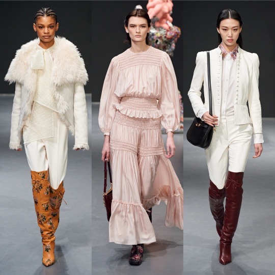
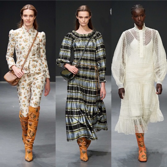


You’d think it’s a kinda anti-climatic one to open with but I do like this collection! It reminds me a bit of last season’s Miu Miu but more so of Brock’s general aesthetic, though with more layers and in some ways to its detriment, a lot more wearable. Looking like something from a bygone era is part of what gives Brock its mystique, but Burch’s designs are practically made for the Chelsea born and bred lifestyle blogger who dresses for a cold spell in the Coachella valley all year long and treats trawling Pimlico’s furniture shops and meeting their girlfriends for coffee like it’s a full-time job. She’s probably born into money and doesn’t work all that hard but hey, she looks angelic holding a bouquet of flowers and in 2020 we all low-key want her life, right? It’d go against my ethics but...*whispers* it would be nice to be that girl just for a couple of days. It is a gorgeous collection, with a lush colour palette and an ever graceful variety of prints and textures, and it toes the line of being accessible and being worthy of a fashion week spot with dexterity. 8/10 and it only loses marks because it’s safe for the brand.


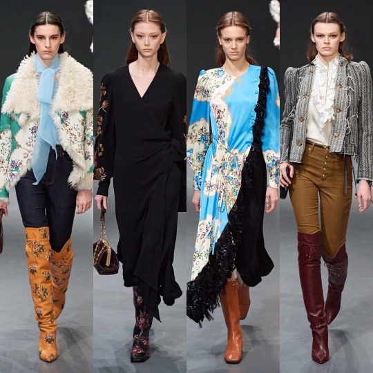
When it comes to Valentino, they’re a pretty reliable favourite for me, and this season’s collection doesn’t break tradition; this one is slightly grittier than usual too which is a big win for me. Whilst the usual sophistication and delicate details are there, quirky embroidery, sequins and tulle, we also get a lot of leather and more black than usual, which I pray doesn’t a herald a return to people thinking “I only own black clothes and listen to Artic Monkeys” is a personality trait. I don’t know if it’s intentional, but there seems to be a lot of aquatically inspired pieces in this collection too; the 3d roses resemble scales to me (and are a really unique texture), and the way the tulle is placed kinda reminds me of fins and has a mermaid on land feel. It wouldn’t surprise me, since Valentino does tend to draw from nature quite a bit. Highs for me were the Valentino red tulle piece and the tulle pieces in general, of course with the embroidered florals as well which the basic bitch in me always looks forward to. The few lows were concentrated in the leopard print section, a print that for me is really overdone and reminds me of recent Dolce and Gabbana. It was cool when layered with the matching coat but I otherwise could’ve done without it.


Vera Wang is another one of my reliable faves-I think I like this collection even more than the last, it really is a fucking DREAM. The overly floral pieces I wasn’t too keen on but I’ll ignore that on the basis that as with Gucci, the tulle-harness combo is everything I look for in a dress and more. I know manic-pixie-dream-girl is a bit of a slur (not a slur slur but you know what I mean) in terms of the associated character, but this 90s Courtney Love grunge twist on that aesthetic is gold, fully realised big anarchist fairy energy (which is a screen name I’m surprised I don’t see more often and which I might now steal). These dresses were made for someone like Zoe Kravitz or FKA Twigs on the red carpet, and if god forbid I somehow ever ended up on one, I would go to the ends of the earth to be wearing one of the dresses from this collection. Aside from the dresses, I appreciated the moody doesn’t-want-to-be-at-the-family-function teenager inspired sleeves and the 2014 Tumblr Cruel Intentions style knee high socks. Love, love, LOVE it.


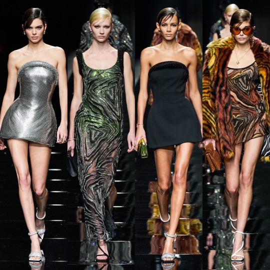
So, Versace started off strong with the all black looks-the cut outs were cute if impractical and the fit and flare trousers in particularly were really well fitted (from a distance, at least). I hated the film Red Sparrow but the visuals were very cool, and this section reminded me of that, like a high fashion collection based on Jennifer Lawrence’s character. There were some stunning colour combos in the Ashish like hyper-floral part too, and the houndstooth, marble and Versace tile prints were sick. The black jumper with the flowers on reminds me of a jumper of my nan’s I always wanted that my aunty ended up donating to a charity shop after she died not knowing I liked it. Gutted (not just about the jumper obviously, looool).
HOWEVER, as with many 91 look collections, it was sloppy at times. A lot of pieces I at first liked (I.E the silver dress we saw Kendall Jenner in, included above) are kind of unfinished up close. There was also a big varsity inspired section which was nice at times but got pretty repetitive and occasionally looked like it could pass for Jack Wills or a bad Michael Kors collection. On the whole, it had both its pros and its cons which puts it directly in the middle of the pack.


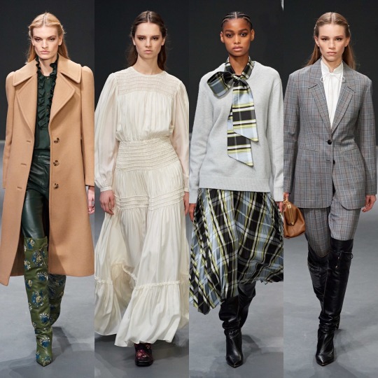
Victoria Beckham’s collection is near the lower-middle quartile when it comes to plotting the highs and lows of the F/20 collections. The pieces are pretty and accessible, I’d definitely wear them, but they’re predictable and mostly a rip-off of other brands who did something similar in a more interesting way. Though her collections are never really experimental, this one is particularly safe, and she and whoever helped design this season’s pieces were clearly avoiding the edges of the box like a child playing the floor is lava. It’s alright, and I hate coming towards the end of the post with negativity, but I have to be honest, and this just doesn’t really interest me beyond a “yeah, that’s nice” glance.

Vivienne Westwood, on the other hand, is always interesting whether I would actually wear it myself or not. Despite the mix and matchiness that is essential to the deconstructed look, which being the basic bitch I am I often struggle to see past, there were some gorgeous pieces and eurgh, I could really talk about that Bella Hadid look all day. The contrast between the exaggerated femininity of the waist cinchers against the androgyny of the less structured, oversized pieces is a really interesting one and the colour combinations work beautifully together. I also love the idea behind the collection, which is, in the words of Andreas Kronthaler about “rites of spring, and the good and the bad, and conflict, and the good prevailing over evil”. Ahhh, I hear you say. THAT’S what’s with the garlic necklace. Can I get another pat on the back for summing up this collection as “vampire slaying uniform” in my notes? I mean, that’s kind of a good vs. evil situation, isn’t it? I know it’s hard to ignore how hot vampires always are in TV series and movies but just think of the true forms of the ones off Penny Dreadful and remember THEY DRINK BLOOD (I personally think being a vampire would be really cool, just need to work out how to do it “ethically”).


Lastly, Zimmerman, and I really can’t say how happy I am to end on a positive note because this collection was stunning. Not without all the characteristically ornate, indulgent and painstakingly detailed efforts we’ve come to expect from Nicky and Simone Zimmerman, these looks (in an icy winter themed colour palette as well) are the offspring of a sophisticated flower child and a 70s glam rocker and I think with this sentence I’ve finally put my style aspirations into words. Honestly, give me the money to produce a modern day Almost Famous and I’ll make my character this no-nonsense intersectional feminist front woman of a fictional Haim-like band who sings with the voice of an angel but is rock and roll as fuck and eats men for breakfast and I’ll put her in this collection and (deep breath) it would be ICONIC. There. Got to the point eventually. Am I talking about a 2020s version of Steve Nicks? Possibly. After all, I do have a framed illustration of her on my wall. But regardless, I need those lace-up velvet BOOTS, that mesh dress with the celestial embroidery, the flame detail pieces, the white pussy bow blouse with the eyes on it. Everything is sooo dreamy; when I was looking through the collection for my favourites, I saved pretty much every. single. look. IT’S EVERYTHING I STRIVE TO BE. WHY CAN’T I AFFORD ZIMMERMAN GOD DAMN IT!?
See, I’ll be going on about Zimmerman in a couple of paragraphs again because it will be very high in my top 20, which I’m so glad is a top 20 BTW. I know I said it would be a top 10 in my last post because I thought that was how I structured it last time but I double checked and it is 20, which is a relief; once again, picking only 10 collections would be very hard. SO! Let’s get into it!
1. Gucci

I hate being predictable but Gucci once again holds the top spot for me. How could I not love this? I would say that I hope Alessandro Michele fucks up next season so I don’t come off as a boot licker but when the boots in question are platform Mary Janes and knee high socks and they’re underneath tulle with BDSM inspired harnesses on top...maybe boot sole doesn’t taste so bad after all.
2. Zimmerman
Well, I did say it wouldn’t be long until you were seeing the same outfits again, so at least you know my word is good.
3. Moschino

Wow, as if putting Gucci first again wasn’t bad enough, Moschino’s also a non-mover. But...Marie Antoinette this season and Picasso last? And this campy? It’s like Jeremy Scott reached into my brain magician-into-a-top-hat-style, picked out an interest of mine at random, and tried to communicate this to me through the medium of design with THE most chaotic energy humanly possible. I an only commend the man, because he succeeded, and I approve. It’s weird because before I always saw Jeremy Scott’s designs as tacky and yet I’ve loved all the collections I’ve reviewed, so I must ask...are the collections getting less tacky or am I getting more tacky? Much to think about.

4. Vera Wang
The battle armour of a punk princess. Not very good at protecting against knives, arrows, bullets or...anything really, but I’ve never really been the kind of person to get into physical fights (apart with a bouncer who tried to push me down the stairs once at an ABBA night but I was really drunk and she was mean, alright!?), so who cares? Nobody can make you do anything in dresses this pretty.
5. Lanvin

I’m a few years behind everyone else but I’m still on the Mad Men hype train and I don’t ever want to get off. All I wish is that Betty Draper had *SPOILERS* divorced Don’s detty arse earlier and rode off into the sunset in that white Bella Hadid coat with the red lip to match (or the checkered one above will do).
6. Etro
As long as she remains the queen of dreamy bohemian fashion, I’m not gonna do Etro dirty by putting her any lower than this ever again on the basis that she’s not conceptual enough which ashamedly is what I implied in my last ranking-yes, Etro is a she because just as most women deserve more from men, she is beautiful and deserves better than my previous disrespect! I said what I said.
7. Dilara Findikoglu
I see your Thom Browne and your Commes Des Garcons and I raise you my “weird”-though-not-actually-that-weird-at-all-can-we-all-just-dress-like-this-on-a-day-to-day-basis-please? fave, Dilara.
8. Paco Rabanne

Battle armour that actually COULD protect you against knives, arrows, and bullets. Maybe. Well, you’d hope so anyway for the price.
9. Rodarte
Suddenly my phobia of spiders has evaporated. And no, it doesn’t have anything to do with the fact that these ones are diamond encrusted, what are you on about?
10. Alberta Ferretti
The colour combinations in this collection were stunning. Honestly. I just picked a really bad pic to illustrate that. Go read my first post to see (grifting 101: complete)!
11. Charlotte Knowles
I saw Bella Hadi wearing a Charlotte Knowles two piece, so I bought a Charlotte Knowles two piece.
LMAOOO, I wish.
12. Balenciaga

It’s occurred to me a couple of posts too late now on the basis that Tumblr is being a dick and won’t go back and let me edit stuff, even little typos, but I’m now wondering if there’s a link between the climate change theming of the show and the exaggerated structures of the pieces? Ya know, the whole abundance is killing the planet line of thinking? I know analysis isn’t exactly on brand with these silly mini captions and that oversized and exaggerated proportions is one of Balenciaga’s running motifs anyway buuut just a thought I had! And sidenote: I do believe overconsumption is killing the planet! The way I phrased that made it seem like I’m a climate change denying dickhead! That I am not! Maybe if I shave my head, legally change my name to Steve, get a British flag tattoo on my bicep, and spend every waking moment in my nearest Spoons I’ll get there but it’s not on the agenda quite yet!
13. Christopher Kane
If fashionable robots took over the world, they’d raid Christopher Kane’s studio and fry us all with laser beams whilst wearing his dresses.
14. Fendi

Siri, play Vroom Vroom by Charli XCX.
15. Olivier Theyskens
Mandarin collar. Mandarin collar. Mandarin collar. NEXT TIME I WILL REMEMBER WHAT THE PROPER NAME IS INSTEAD OF NEEDING TO GOOGLE IT AGAIN. Come on brain, you’re supposed to be good at this kinda thing, make it happen.
16. Elie Saab

Blair Waldorf’s wet dream. Add in some platform boots and chain jewellery and now it’s my wet dream too.
Because Chuck Bass is creepy as FUCK and maybe it’s because I watched Gossip Girl at the ripe old age (lol) of 21 and most people watch it as teenagers but I don’t know why YOU WERE ALL SO OBSESSED WITH HIM! He tries to sexually assault Jenny who is about 14 in the VERY FIRST EPISODE. I think I went off on a tangent here but it had to be said. You girls have no taste.
Don Draper was an absolute dog, but he was played by Jon Hamm, and he might be one of the finest men on the planet. What’s your excuse, Chuck and Blair enthusiasts?
17. Miu Miu
As someone who has probably been/met many a spoilt brat in her time, I appoint Miu Miu as the official sponsor of the Spoilt Brat™ aesthetic and yeah, that’s something I just made up but I’m on the money here. Imagine one of those “daddy, can you get me a pony?” types all grown up. Are you telling me you don’t picture her in Miu Miu? Because that sounds like a lie.
18. YSL
The war flashbacks I get of the Friends episode where Ross tries to get out of those leather trousers aside (I know it’s PVC her not leather but they have the same sheen, you can’t deny it), these outfits turn me into the irl version of the heart eyes emoji. It’s not like I think this is the best collection I’ve ever seen, YSL could def push the boat out a bit in terms of experimentation, but there aren’t many people who wouldn’t look hot as fuck in one of these pieces
19. Balmain
I didn’t like ALL of it, but the looks that I did like were amongst the ones that stuck out to me most when I was reflecting on the collections I’ve reviewed: the breast plates and silk capes and the scorpion detailing are real chef’s kiss moments.
20. Marques Almeida
Miss the collection that gave us this coat off the list? Never.
SO!
That is the end! Wow! I started saving the photos for this review back in late January/early February or whenever it was that the first fashion week began and now it’s mid-fucking July!? I don’t know if that speaks more to my incompetency or what a state the last few months have been. I’m not gonna write a super long ending paragraph because you’ve heard enough from me already and it’s 2:30am and I’m being hassled by Trump supporters on Twitter (literally just for stating that it’s a privilege to be able to pursue a career you truly have a passion for rather than having to be practical about finances first) anddddd I’ve got a closing shift tomorrow so I should probably log the fuck off and remove my clown makeup before it’s time to start my shift, lol!
Quick recommendation before I wrap this up, there was a really interesting debate on ITV literally a few hours ago on the Stephen Lawrence case that I thought I would recommend (they also showed the 1999 dramatic portrayal of events afterwards) about racism in England and whether or not much has changed since the murder. I didn’t catch the whole thing but from what I did see, there were some really strong points being made and I think it could be a good thing to sit and watch with your family members if you want to get talking about the Black Lives Matter movement and aren’t sure how to broach the topic. I bring it up because I feel like most middle-aged white people trust ITV so they’re less likely to turn their noses up (lol, I wish I was joking) at it and maybe go in with a more open mind. I’d like to keep the conversation about social issues going so if there’s anything you’d like me to get some information together on and make a post about-I read yesterday that there’d been arrests of THE PEOPLE PROTESTING the way Breonna Taylor’s death has been handled. No, not the police officers responsible for her death, the people simply pointing out that those police officers have done wrong. It’s a ridiculous situation and just shows how deeply embedded a police officer’s supposed right to kill and to use force is in upholding the American status quo. I wish I could end the post on better news, but let’s hope that next time I post, there is some, and as always thank you for reading til the end if you did get this far! I really don’t have all that many followers on here but do et me know if there’s anything I can reblog or share to help.
Lauren x
#fashion week#fashion#fashion inspo#style#style inspo#style critic#pfw#nyfw#balmain#balenciaga#paco rabanne#gucci#haute couture#designer#runway#ysl#brock#adut akech#bella hadid#model#street style#lfw
28 notes
·
View notes
Text
The Witch Twins
Transmitted from a college dorm room, Robi and Alen Predanič use performance art to create “mysterious VHS tapes you find in the attic of the old house you have just moved in to”.
Let’s start by you introducing yourselves and how you started working together
Alen: We are Robi and Alen Predanič aka The Witch Twins and we are from Slovenia. We are twins, 25 years old and we’ve been living in the same college dorm room for five years. This is where we created our own world. We make our own surreal, eccentric and colourful costumes and perform and pose in them, usually in our dorm room. I mostly shoot and edit the photos and Robi focuses on recording and editing the videos. When we’re finished we post it on Instagram. Robi went to college one year before me. We started listening to a lot of music from the 60s and 70s. We loved the warmness of the sound and visuals of the era. Inspired by that and other stuff like Harry Potter, we transformed our totally white room into a warm, psychedelic looking place. Throughout our childhood we were always in our bubble, creating something and escaping from real life.
Robi: We don’t take life very seriously and we like to challenge man-made social constructs such as gender norms. Two years ago, we came out. Shortly after, we started watching RuPaul’s Drag Race and because of that show we were inspired to experiment with wigs and DIY clothes. Our dorm room really played an important role in all of this, because it represented (and it still does) a safe, cosy and magical place where we could be authentic and creative. We actually used to dress up in women’s clothes when we were in kindergarten and when we were home alone. We stopped, because we realised that boys were not supposed to dress like that. Through the years we used to be terribly embarrassedabout our ‘weird’ past and our sexuality. It’s really liberating that the same thing that used to be such a burden, now makes us happy and proud.
What made you choose the medium of performance art to concentrate on?
Robi: The reason I filmed myself in the first place was because of the cool VHS phone app. I realised I am comfortable in front of the camera while I’m in drag… it feels very natural to me. When I perform, I naturally gravitate towards randomness, humour and exaggeration. There are no rules in performance art, and I like that. Nobody is limiting me, I can express myself how I want to without being afraid of making mistakes.
Alen: Robi once asked me to join him in one of his videos. It was fun and it naturally became our thing. We also started doing photoshoots together. Performance art is not something that I was originally interested in, but it has become something that allows my costumes and fantasy to come to life.
Your work together has a very distinct aesthetic. How did this evolve?
Alen: We both like to be dramatic and ‘’larger than life’’. We are expressing ourselves freely and we just do whatever feels natural. Renovation of our dorm room has helped us to figure out our aesthetic. We developed a colour palette that was very 60s and 70s inspired and we customised everything in the room accordingly, it came out psychedelic, and colourful. We continued that vibe with our costumes, videos and photos. When we buy fabrics for our costumes, we like them to have interesting textures and beautiful colours. Right now, we are into looking like trippy life size toys - colourful and not too complex. We also like to believe that we are undercover aliens hiding our big alien heads underneath our headpieces. We both love dramatic silhouettes and big headpieces.
Robi: When it comes to our drag, we like unusual combinations. If we feel like combining facial hair with long painted nails or a short skirt with a headscarf, we just do it. I enjoy making genderless creatures. I like to make my hips, shoulders, “hair” and accessories big. I like to transform myself; to create the most fabulous version of myself and confuse people in the best way possible… When I edit the videos, I like to combine footage of us with the footage of mysterious buildings and beautiful nature. The videos we make can be described as mysterious VHS tapes you find in the attic of the old house you had just moved in.
I interpret your work as very spiritual. Is spirituality something that’s important or influential to you as individuals and/or your work?
Robi:I love combining art and spirituality, because that’s the way to make meaningful art. I think by being authentically and fearlessly ourselves we send a message that is very much spiritual. I like my work to radiate a peaceful vibe and we do that through music we use in our videos for example. We also include messages of peace and love in our work by using symbols such as heart, sun and flower in our costumes, videos and dorm room décor. The warm edit of the pictures and the videos adds to the welcoming and peaceful fantasy, as well. My work is also spiritual for me, because it feeds my soul. I really enjoy what I do.
Alen: I love spirituality. I am determined to fulfil the highest and truest expression of myself and I know I can do that through art.
What has made you label yourself as a witch? Can you tell me a bit about this side of your creativity and how/if this influences your work as a duo?
Alen: Witches fit perfectly in a great fantasy. I’ve always loved witches. We both love magic, mysterious things and places. For me, a witch represents that. I often do magic and fly on a broom when I sleep, in my dreams and I love it. Not to mention, that when we were about 8 years old, we used to believe that we were magicians. We made a secret alphabet, special objects and we performed special rituals.
Robi: We naturally adopted this label, but we don’t take the label very seriously. We also sometimes say that we’re aliens. We love creating fantasies and by labelling ourselves as witches or aliens we do just that. A witch also represents a metaphor for an unconventional person. We are modern day witches in that sense.
You use very pronounced, textural silhouettes and there is a strong sense of fantasy through theatre. A visualisation of your combined imaginations maybe... can you introduce us to this alternative world you have created? What feeds this?
Robi: We are very compatible when it comes to working together creatively. Our work is heavily influenced by movies with exquisite fantasy worlds. Such worlds are mysterious, dreamy, magical and visually stunning. They consist of trippy characters, stunning costumes, detailed set designs, mysterious places and soul touching music. We’re talking about movies such as Shrek, Spirited Away, Alice in Wonderland, A Series of Unfortunate Events, The Wizard of Oz, Harry Potter, Charlie and The Chocolate Factory and Titanic. Also, horror movies such as The Ring and The Hills Have Eyes. I’m very inspired by operas and musicals as well, because of the dramatic body movements and the dramatic vibe.
Alen: Yes, what we do in the videos and the photos is visualisation of our combined imaginations. A lot of stuff that inspires our world is from our childhood. From a young age we were very aware of beautiful and magical things that surrounded us. Our kindergarten teachers were very creative and really made sure that we experienced a lot of magical moments. We were also encouraged to be creative by our grandma. Her house was always well decorated and we used to draw, make jewellery and decorative napkins from paper when we were at her house. We loved fantasy and magic and we still love it as much as we used to when we were kids. Major influence from many years ago are sticker albums and beautiful illustrations from children’s books.
When it comes to forming new concepts or beginning a new creative venture, how do you normally begin?
Alen: We usually start with a colour palette, or with ideas about our headpieces. We then draw a sketch of the full costume. Sometimes we have a concept about the universe our costumes and characters come from, but most of the time, each of us just does our own thing and at the end it works out.
Can you tell us anything about what you’re working on right now?
Robi: I am making a music video for an artist. We will soon start working on some of our last costumes in our college years era. We are moving out in three months.
Alen: I am working on my music. I am also a singer and I’m looking forward to finally sharing my music. We are also working on prints of our work.
What does the future hold, where would you like to see your work in 5 years?
Robi: I want to continue filming with my phone app and make costumes and short movies. I’m also interested in performing live. Alen and I want to make an exhibition and publish a picture book of our work.
Alen: I definitely see myself on stage, singing in crazy outfits. Robi and I will continue to collaborate creatively on different things, because we love to work together.
courtesy ALEN PREDANIC and ROBI PREDANIC
@alenpredanic
@robipredanic
words KATE KIDNEY BISHOP
@sashasadies
show comments
1 note
·
View note
Text
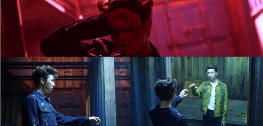
[colour] FAKE LOVE extended ver.
Masterpost | Serendipity | Singularity | Epiphany | Euphoria | bonus 1| bonus 2

A/N: An unexpected follow-up to my colour analysis of the Love Yourself era group music videos (DNA, FAKE LOVE, and IDOL). Turns out, I wasn’t giving FAKE LOVE enough credit. Highly recommend reading the other bonus post (or better yet, the whole series) before reading this. Like the other one, this bonus is definitely less legit that the main four parts of this series... but that’s what bonuses are for!

Having had some more time to reflect, I’m pretty sure when I pointed out who was wearing red and blue in DNA i was being a little too optimistic. That video was a performance video at heart, and I think focusing on just the main structure is probably what I should have done. When it comes to IDOL I think I correctly did just that. That video has a message of its own that it was trying to drive home, so it wasn’t going to be spending lots of time on a story that might get in the way. FAKE LOVE on the other hand is all about telling stories. And upon many more viewings I’m realizing that I wasn’t giving it enough room to say what it wanted to say.
Like with the first bonus, let’s start by talking about the main set structure. In the last post I talked about the transition from DNA to FAKE LOVE to IDOL in the structure that houses the main group dance scenes. Through the videos we moved from bright yellow against a blue sky in DNA, to the rusted and de-yellowed structure of FAKE LOVE, to the aggressively yellow structure in IDOL.

In the original post, I hadn’t considered whether the extended version of the FAKE LOVE might add more to the things I wanted to say in this series. Turns out it does. One of the biggest differences in the extended version is the final scene in the video, where we have a cloaked Jungkook enter a sandy space to join the other members after which they all don their masks and are crushed by a giant block (you know the scene). Because the colour palette is so different in this part of the video, I never looked all that closely at the setting. I was so distracted by the cloaks, masks, and… death (?) that I failed to see that our structure had a makeover.
In the end of this video we see that our structure has changed from cold steel-blue and orange rust to a dusty faded yellow. It isn’t bright like it was in DNA, and we haven’t reached the point of strength of IDOL, but it has shed (most of) its rust and the yellow has returned. When you consider this in the transition of the structure through the series it helps bridge the divide between Tear and Answer.
On top of that it fits well with one of the central themes of Tear. Ultimately this era involves the recognition that the sacrifice of self that has been made isn’t worth it and has gotten in the way of loving yourself. This era is dark and brooding, but it is also decisive (if at times hesitant). It makes sense that in a song that cries that it’s “so sick of this fake love” there would be a progression from start to finish, where we see what’s made them so sick (the rusted state of the world), and also see the results of the first step away from the fake love (the return of yellow).
When we get the reintroduction of our yellow structure, we also get the guys all dressed in black. Pale yellow scenery, with all black clothes – this pops up multiple times in both of the videos from the Tear era. A surprising coincidence. In Singularity, towards the end of the music video, yellow light begins to appear. We see this in the group dance scenes – with the nearly white light that shines from behind – and in the visually busy spring shots. When I talked about Singularity in detail, I related this to the coming of spring that the lyrics reference and the return of yellow as Tae finally begins to push through the other colours. What I didn’t focus on, is that in these scenes, when at their most yellow, Tae is wearing all black.

Moving forward to FAKE LOVE. We’ve already touched on the group scene at the end of the extended version, so now I want to talk about Jin. In the last bonus post when talking about this video I decided that I shouldn’t read into Jin’s colours since the Tear era occurs before Epiphany. I’ve changed my mind about that. Now that I’ve seen this colour pattern, I can see how styling Jin in all black and having him in that warmly light room fits in perfectly with it all.

Seeing our protagonist in black in these Tear scenes leaves a bitter taste in your mouth. In an older post I related Tae’s black outfit to him mourning the relationship that’s about to end when spring comes. I think that metaphor isn’t far off the mark. There has to be an end in order for there to be a new beginning. The black, when interpreted in this bigger story, is able to also suggest the state of our protagonist in this moment. It isn’t just the indication of the death of this last phase, or of hardship/experience (as I’ve mentioned before), but also a reference to the current lack of colour.
In a story built around colour, having a moment of black isn’t a small thing. Covering themselves up for their Other has left them in a state of not knowing who they are. It isn’t just that we couldn’t see the yellow because the reds were obstructing our view, it’s also that by compromising themselves for their Other, they lost the yellow entirely. I got to say, the choice for all the boys to have black hair for this era… it’s feeling like more than an aesthetic choice at this point.
Plus, this colour scheme works as a great visualization for the final stage of the Tear era – in this state, our protagonist has lost/left the reds and blues of his Other that were consuming and stifling him, and yellow has re-entered his world. We aren’t at the point where the protagonist is wearing yellow (or has yellow hair) yet – the return to self is a process, and that sense of identity hasn’t been internalized or realized yet (still literally external). It’s a dull yellow that’s appeared. It’s warm and golden, but much weaker than what we see in the videos before and after. It isn’t until the Answer era and Epiphany that we see yellow within our protagonist, and IDOL that this colour scheme gets reinvigorated with hanbok dancing scenes.

In Jin we see this state of lost identity and being alone, with the yellow returning to the scene. It is especially fitting that they chose Jin to display these colours in this video since he is the one that kicks off our epiphany in Answer. But there’s more to it than just yellow outside and black inside as the step before yellow making it inside with the black. What you’ll notice in Jin’s opening scene in FAKE LOVE is that it’s when the room explodes that the yellow light is really able to light up his world.
As I’ve already said – an end is necessary for a new beginning. Sometimes that end is destructive. Sometimes, if things aren’t built right instead of trying to fix them you need to tear them down. Destruction is everywhere in this video. We get Jimin’s world being washed away, Yoongi with his fire, Hoseok sinking into his chocolate bars, Taehyung’s disintegrating phone, and of course the crushing block at the end. Even our final shots of the structure look like they’ve been roughly weathered. When considering Jin’s scene, it takes disaster and force for the red curtains to push aside and bring yellow back into a world where Jin has already lost all of his own colour.
In my original post about the group videos I only focused on the singers. I assumed that since this story was being told through their solo songs, that the only nods to it I would find to it in the group videos would be with them. But the rappers have a little to add too.
In RM’s scenes we get all of the primary colours. We see Namjoon wearing blue and also being swallowed up by red light (we’ve seen this before!). Then we have the yellow RM in the mirror. Now, the yellow is a call back to his short film for Reflection. I highly doubt the choice to have Reflection RM in yellow back then has anything to do with how I’ve been seeing yellow in this era. But that doesn’t mean that they can’t adapt old images into new concepts. When I watch RM’s story in the FAKE LOVE music video I see him struggling with his identity (the red, the blue, the lyrics), seeing his past self in the mirror, and then choosing to approach his reflection.
When we think about reflection era Namjoon, it’s a sad one. And his choice to return to that in this video aligns a lot with Singularity. He doesn’t know who he is when he’s blue or red, so he’s choosing to return to being yellow and alone even if it involves sadness. “I wish I could love myself” exchanged for choosing to love myself (leading beautifully into the LY: Answer era).
With Suga’s scenes we get the iconic fire ball. Of course this is reference to the burning pianos of yester-video, but it also makes me think of his lyrics in Outro: Tear, when he asks his Other to yeah, yeah burn it. I certainly don’t think that he wrote those lyrics with this video in mind, but the concept of destruction as something cathartic is definitely a theme that runs throughout this era. And when we see Yoongi gazing upon the flames, he is engulfed in yellow and smiling sadly at the scene. There is a sense of satisfaction.

In Hoseok’s story the images of childhood and chocolate bars don’t exactly conjure ideas that relate obviously to our colour plot. But the use of colour holds out. The colours in Hoseok’s scenes include our central red, blue and yellow. His set is super colourful and busy – this fits well given that he is often associated with excess in his story-lines. Sure there’s some yellow in there, but it’s all mixed up in reds and blues. That being said, there is an interesting rivalry with red and yellow lighting, with red often threatening from the fringes.

Yellow on the other hand becomes the most prominent in his final shots as a spotlight that keeps the red at bay. And in his last moment we see him sinking into the chocolate. A dark last look at him. Quite possibly a visualization of being emotionally overwhelmed. This is what shows us we’ve reached a breaking point, and that change is necessarily coming. What colour to better show this than yellow? When he sinks we’re actually left with yellow as the only prominent colour on the screen.

Even in the singers’ plots, there’s progress that I didn’t consider before. We have Jimin’s world being washed away – perhaps able to cleanse the ugly oversaturation, we see Tae being hit by yellow light again and appearing to make the choice to head in that direction. Jungkook is running and moving the whole video and it’s him that leads us to the final scene, and of course Jin’s colouring helps signal how following his world literally exploding, he will help usher us forward with his epiphany.
Something that shows up throughout this video is the visualization of things suppressed, just to have them erupt and overwhelm, followed by an occurrence of yellow. We see Jin shut the curtains to his room before they are violently blown open, bringing with them yellow light.
We see Jimin turn off the tap only to have a deluge explode around him. The final shot we get here is of Jimin in yellow (less discoloured than before, seen most clearly in his face) staring strongly through the waves.

We get Yoongi’s yellow fire flashing briefly off to the side before the final inferno and his complicated smile. Tae gets overwhelmed by the flashing walls before trying to leave the corridor, where we see a choice between red if he turns left and yellow if he turns right.

Namjoon’s world keep changing colours (look at the background), and at times is overwhelmed by red, eventually leading to him walking firmly towards his yellow reflection. In Hoseok’s final shot, after looking lost while lying on the floor, we see him totally swallowed up, with all colours but black and yellow disappearing. And we have Jungkook running endless in this video, appearing completely lost and without colour until he reaches the sandy last scene.
Originally when I was considering this video I was only looking for a static image of the Tear era. It wasn’t until the extended version showed me a transition in the structure that I realized how much Tear is about change. This video doesn’t just show us how things have changed since Her, they also show us that more change is coming. Each of the members’ solo stories in this video goes somewhere. The path looks painful and messy, but each story shows progress towards IDOL.
That’s all folks! Thanks for reading! (well done, if you managed to read through all of these… that is no small feat)
Masterpost | Serendipity | Singularity | Epiphany | Euphoria | bonus 1| bonus 2
Musings Masterlist
#my.musings#bts analysis#bts explained#musings#kpop essays#fake love#fake love extended ver#love yourself#ly: tear#bts#bangtan#bts theory#bts theories#idol#dna#my.bts
9 notes
·
View notes
Text
CAD- Tuesday
On Tuesday, Group B were on campus to work on this new trends project. This day was good to recap previous skills I've learnt and work on a new trend. I used this time to research more into what trend I actually wanted to cover this time. This is because in the last project it took me a while to come up with an topic that I wanted to work around which caused me to rush and my narrative wasn't as clear as I intended. Looking more into depth with the three trends on WGSN, Euphoria, Connected and Resourceful helped me narrow down my interests and concluded me to wanting to do a look book based off or influenced by the late 60s and 70s. I was torn between Woodstock spirits and Summer of Love which share similar qualities however I feel like I need to narrow it down to one trend and be very specific in order to get the best narrative across to my audience. In the mean time, I will continue to look into this in order to perform better than the last project.
Below is some screen shots of the work I did on Tuesday where I mainly experimented with some more tools and layouts for another mood board.
In the previous mood board, there was little connection to the report other than similar designers. In this board I wanted to include other elements which I feel would help me get the trends narrative across. I focused on fabrics which I felt aided this process.
Throughout the day we were told to send our work to the tutor in order to track our progress. This was a good way to get some feed back on my work from not only our tutor but classmates as well. My feed back enabled me to work better for this mood board. One of the pieces of advice was to use the lasso tool to speed up the cropping process as I found myself using the eraser tool often to clean up the edges around a picture which took up most of my time. Above you can see a few examples of me using the lasso tool to get the sharp edges of the fabric, I didn't need to use the eraser for this as I wanted to get as much texture onto the board as possible. These pieces connected to the trend as they were linens and natural fabrics. WGSN expect to see garments with these fabrics as they are much lighter and breathable pieces which help adapt to the climate. Garments such as trousers and shirts which could be a worn as a co-ord will suit this trend also. Not only this but the images of these fabrics are dyed naturally which is a key point I wanted to highlight from this trend report. Hopefully in the future sustainable fashion will become much more easier to accomplish and natural dyed pieces will be more common in the industry. The colours that are created by natural sources such as powders and vegetables match the Woodstock spirit colour palette for the SS2022 report. When researching sustainable fashion brands which I thought I could include into my mood board, I came across the business Story mfg. Despite being very expensive for a minimum wage person such as myself, all of their clothes are made by hand with natural dyes, embroidery and fabrics which are less likely to harm the environment. Al lot of their pieces resemble this trend and its predictions of a more awakened society as their garments are very free flowing hippie like. I am defiantly going to use some of their images for this one of my mood boards. Below are some of the pieces they have in their store and which I was most interested in. This brand helps me show more of a current aesthetic to the Wood stock sprit trend rather than always referring to the 1970s era for pictures.

Left picture- Made with organic cotton, this dress is hand dyed with Sappanwood, Myrobalan and Iron, which gives of a checked effect through the use of red and green. Dyed garments are very much relevant today but more in t-shirts than anything else. I think this trend will develop into dresses and other pieces, making this piece almost ahead of its time. Especially it being hand crafted without any harmful products that could massively harm the planet.
Middle picture- I was interested with this fashion accessory the most as it involved crochet and a flower design which both remind me of 70s fashion within the Woodstock spirit report. Crochet tops are much more relevant in the summer where festivals are in their peak however selling this product mid Autumn may increase the frequency of this sort of garment. This could make crochet design become more normal in everyday wear. Yet again this business has made this hand crochet scarf with Organic cotton. It is naturally dyed in shades of Indigo, Iron, Myrobalan and Babul bark which give off earthy tones and deep reds, matching the intended colour palette in the WGSN report.
Right picture- This final garment is the most common piece within the page and is very popular today in both slow and fast fashion. The pro with this piece is that it is naturally dyed with Babul bark and the positive message is screen-printed with water based inks Artwork by Worn Spiral. They also mentioned that this technique of screen printing is biodegradable which, if others follow could defiantly help the fashion industry and the pollution which it causes. Normally, the mass production of similar screen printed t shirts are make with plastisol inks. And yes these inks are made with plastic inside them and we all should know the impact plastic has on the planet. Plastisol inks are washed from the screens and goes directly down the drain into our water systems, eg. into our ocean making it just as harmful as throwing plastic into the ocean.
To conclude Story mfg was a great find for this trend, relating to what WGSN hope to occur in the fashion industry. I hope that brands can start switching out these frequent habits in order to help the environment with this production as well as making more pieces of clothing which could uplift a persons spirit. If I choose this report to influence my project I will most defiantly use this brand in my look board in order to get my positive narrative across.
0 notes
Text
Leeor Wild Interview
Below are the questions that I asked Leeor over a zoom call and her respective answers which I wrote down after the interview was finished from a recording I took.
- When was the first time you were really happy with a shoot?
She was taking photos before and happy with them, but 1st shoot she conceptualised, put together all makeshift in a loft, low budget, 1st time she thought of a concept and put together a team, this work got into contributor magazine. 1st time she felt like that was great.
- Do you think that using film adds anything to a shoot?
Film is a style that suits certain people. If shot well you can’t sometimes tell if it is or isn’t. Film adds a certain colour/mood/texture that you can’t get with digital. It can sometimes go wrong but it makes it exciting. It is the unknown.
- Do you find stylists for your shoot, or is that something that your manager helps you with?
I have people that I like and I will work with them as much as I can. Have different people in my 3 main places that I work. But then magazines can make their own decision and also celebrities have their own full-time stylists, so you have to work with them. When lucky, there is time before to do fittings and preparation and sometimes there isn’t so it takes up a lot of the day. But best case is that it’s planned and sorted out before. But there’s something nice when you turn up and have to figure it out, unexpected things come from playing with what you’ve got.
- Do you think that getting used to one camera is important, or is using many beneficial?
I like many, I feel that they do different things. Loves Mamiya for portraits, textural feeling photos, getting close to the models. Uses the RZ for most things, 645 she’ll use if she wants more photos on a roll. Switch back and forth to those two usually. Has a point and shoot medium format, brings it out at the end of a shoot if you just want to get last moments. Outtake vibe.
- Do you have an agent and if so what is your opinion on agency work?
Manager from an agency. She reached out to Leeor when someone couldn’t do a job. They’ve worked together for 2.5 years. She doesn’t like doing things by herself. It’s nice to have someone to get feedback from. It’s easy to feel alone as an artist, didn’t know who to ask for advice and didn’t know how to respond to clients and how much to charge. When starting out people can take advantage of you. You can feel hesitant to ask for more money, but the worst thing they can say is we can’t afford it. It’s nice to have support and for someone else to negotiate for you. Feels supported by manager and assistant.
- Do you have a different practise for your personal work and your commercial work?
Kind of the same, with more considerations. There are confines in a directive way. Lucky that commercial work, most of the time, isn’t far off her taste of what she likes shooting. Commercial work is aligned with personal style. Lots of the time she gets asked what she would like to do, and some have strong creative directors. But she likes both ways. When creative directors know what they want, you end up doing things you wouldn’t normally do and it’s an exciting end result. Nice thing about collaboration, you end up in places you wouldn’t have on your own. Other people see different things in people and places that you don’t see. Drawn to specific look/vibe.
- I see your work as one even when the images are quite different, how do you think that you connect all of these images and what do you think is the common factor with all of it?
Sometimes she looks at work side by side and doesn’t see any consistency, but that’s easy to say about your own work. A lot is to do with the format, knowing what films and cameras you like, is baseline consistency. Certain face angles that she uses often, these little pieces provide some consistency if other elements are different.
- Who has been your favourite client to work with?
Loves a lot of them, but really loves working with Marc Jacobs. They are relaxed for a big brand and genuinely they feel artist first in a lot of ways. Last thing she did with them was a dance shoot, frilly collection and they asked what she wanted to do. Lots of creative freedom. They trust the process.
- How did you begin your collaborative relationships and what characteristics do you look for in a collaborator?
It’s a combination. When she first moved to New York, manager asked her to put together a list of top brands and publications she wanted to work with. Manager set up meetings. Has a printed portfolio and it’s a nice thing to have to show people at meetings. Got sent to meetings and met with creative directors and marketing teams. Some things happen immediately and sometimes it can be two years later. Meeting people is really valuable.
- Do you think it’s best to hire your equipment for your shoots or buy it?
She shoots everything on film, hard to rent those cameras. They have them in major cities, but usually isn’t enough time to test a roll, she owns all her own cameras. She doesn’t own any digital cameras, but doesn’t use them. Lighting equipment, she rents.
- Where do you find your inspiration for themes for your shoots or moodboards?
It’s a mix, really drawn to certain colour palette. Colour inspiration comes from film. Certain green she likes and sees it a lot in films from around 2002. Palette comes from specific era of film. Boogie Nights, Paul Thomas Anderson, loves the colour of everything. Photos from the 60s, give her a certain feeling that she finds inspiring. During quarantine, she’s really liked these 3 Jewish Hungarian photographers, one is Man Ray. They’re all different, ones surreal, ones a war photographer, one was more still life. Aesthetically, they are not her vibe, but they provide some sort of connection. Loves artifice. When things feel natural but surreal, they are things she enjoys shooting.
- I’ve always wanted to make a magazine, what was your experience like working with a magazine company?
There’s a lot less money, but so much more creativity and subject matter can be really exciting. Branching out to celebrities. Was never interested in Hollywood or celebrities. Once she shot an actor/actors, she became more of a Hollywood photographer. Shot Regina King and was told usually, we never hire someone without celebrities in their portfolio because sometimes people get weird. It’s a sign you’re not going to be weird around them if you have them in your portfolio. For celebrities and musicians, they are who they are and although you can pose them, you get to chip away at their character and get to know them. She didn’t expect to like that and now she does.
Favourite celebrity, it wasn’t for a magazine but, Emily Ratajkowski, she was chilled out, very relaxed, full creative freedom. Emailed each other without layers of management. Was very personal and honest, she did her own makeup, didn’t need a makeup artist. Willem Dafoe. He moves around a lot in a unique way. He was very memorable because he’s so theatrical. Not her favourite photo, but he was such a character to work with.
- I would love to develop my skills with film and find a way to connect my different styles of photography, do you have any advice for me?
I need to keep doing it, and figure out the things that feel right to me. I should keep working with the RZ67, I’ll understand what lenses I like for certain types of photography. It’s like a language, once you learn it, it becomes second nature. Keep shooting, try and get other styles of photography in at the end of a shoot. So if I’m shooting a fashion editorial, take some beauty style shots right at the end. Everything that I feel compelled to test out, sneak it in to other things. Continue to take pictures, my gold hand pictures were really nice and they are something that other people will like too. Take pictures now, it is an interesting time to be an artist. Although negative, we are lucky to be artists at a time like this.
0 notes
Text
Week 1:2
Google doc of copy for website
https://docs.google.com/document/d/1L6t_F5ZdVzgDUk0shphCDINz21H8ZK3aFKKSzcUVPK8/edit
Page layout:
Home: Packaging in general, what we use it for, how it contributes to climate change, facts - maybe these are revolving blocks of text? Or just one statement, short sweet para
2: Common packaging - what it is used for, how to identify them, how they are disposed of, etc. Both common packaging ie, plastic, glass, aluminium, as well as ethical ones, compostable, biodegradable etc. Explanation of the words "compostable" "biodegradable" etc
3: The life cycle of packaging - maybe this makes home page text redundant? Or is this just the infographic?
4: Symbols of certifications that are valid and actually verify an ethical purchase
5: News/event page that is exclusive to well - includes updated links to places to buy more ethically from, companies to support, events that are happening - an alternative to packaging - ie. zero-waste movement
6: Contact us page - Instagram, Facebook, Twitter
Starting to think about style...
https://www.pinterest.nz/pin/349591989830473374/
Shadow movement affect - super cool idea!! Could maybe try doing this. Interesting way to insinuate the idea of "this is in your hands" whether it is the company or consumer viewing this website, everyone has a choice in what they pick up and create. Also "Tip of your fingertips"

MOODBOARD
I love this style and I feel I can make it work well with the subject, it is minimalistic and focussed on soft imagery and real-life subjects, a bit maybe some greenery or landscapes - it is not flashy or a marketing tool - exactly what I am trying to debunk in what I am talking about in the website. The colour palette is muted and based on nature, font is classic - not display. It's the type of emotive quality I want to portray. Calm, peaceful, based on nature and rooted in a kind consumption of intellect, a smart intake of information.
With this style, I need to figure out what imagery to use, as this is a vital aspect in the design. I have a library of photos I could draw from of images I've taken over the years of landscapes, people etc - however I am not a photographer at all, and the colour scheme/mood between each of these photos are quite different/not the colour story I want to draw from. Therefore, I think maybe found imagery could be the way to go.
In the centre of the mood board, there is an example of a website that has used a crop of an old painting, with a layover of bubble wrap over top -

For the page of explaining materials, I had already thought of using a transparent overlay of each of other materials on top of imagery - semi explaining what the material looks like for the viewer, but still being able to maintain an aesthetic appeal, ie. not just putting a cut out of cardboard on the page and calling it a day.
However, when I found this example, I loved the idea of using historic paintings as the basis of imagery - edited with the material overlay on top.
In terms of look and aesthetic - it is exactly the kind of naturalistic, dull colour scheme, calm kind of imagery that I need to suit the theme above. I also have a particular interest in art history and so involving this is a personal draw for me!
With regard to how this relates to the topic of climate change - it's a stretch! I need to clarify in my buddy session if this link is allowed or if it's totally the wrong way to go... How I've thought it through is... I am thinking of using images of painting from the Realism era of the mid-1800s>

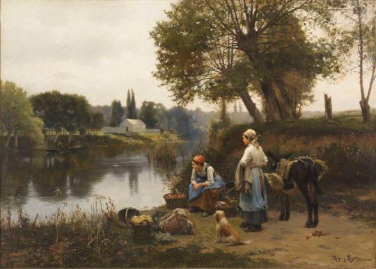

This era of art was focussed on forgetting the depiction of fantasy and tragedy of the eras of Romanticism and Neoclassicism before it, and instead, describing the lives and landscape of regular people, the working class, the farms they tended to, the monotony of the everyday. It is a description of life free from embellishment and image saturation. It is the raw, naturalistic depiction of people's relationship with untouched land. It is the kind of life we would still be living if not for the industrial revolution, and thus the rise of consumerism.
Of course, our world could never go back to this, nor would we want to - however it does provide a reminder of the vast development we have made as a society - and not necessarily in a good way! It's an idea...
I think it could work, because although imagery is a strong part of my style - it will often be used as a sort of visual background to provide a colour palette, or a shape to work from - not necessarily depict a story.
I did a quick mockup of one of these paintings with the type of material overlay I would do...

Works well! Do need to check if this will work or if it is an absolute tangent though!
0 notes
Photo


UTILISING THE SAME ARTIST RESEARCH
Below is the research I used for the overall artist research for my whole project. Sharing a variety of similarities, all of the artists, Golf Wang, Keli Anne and Barry Shultz was my main reference points for all of my shoots. All of these shoots were used due to the simplistic style and plain background that allowed all of the focus to be on the models themselves. Something that I utilised heavily throughout all of my shoots. I wanted them to all share similar characteristics and follow a certain pattern that linked them all together. This being the plain backgrounds and all of the focus and style aspects of the model to be the main focus. This will be continued on throughout the next few shoots once again. Instead of doing all of the research again I will copy and paste all of the research from the last semester below as all of the artists will be heavily referenced once again within the shoots I will be creating.
BARRY SCHULTZ
“Barry Schultz is a photographer who is known for capturing moments of some of the biggest and most important artists of the 1970s. He is known for capturing history during the moment in time, most importantly rock history. Schultz was able to photograph certain interviews, sound checks, concerts, parties and even got to direct the artists themselves in the studio to capture some beautiful posed images. Taking photographs and capturing certain moments around artists such as Michael Jackson, Bob Marley, The Rolling Stones, Iggy Pop and The Police, Barry Schultz was able to make quite the name for himself. One of the shoots in particular that stood out to me, in particular, was his posed shoot of David Bowie in the late 70s.
The photographs above are the outcomes of Schultz photoshoot of David bowie in Holland at the TOP POP TV studios. The shoot itself is nothing special. What makes the shoot so special is David Bowie. Standing out upon the dark blue backdrop, as the musical artist was known to do, completely captures the audience’s attention due to the vibrant coloured outfit. The artist is staged in front of a coloured backdrop that is bright and colourful enough to brighten the whole studio up and make the background a little less boring. Whilst the model can stand in front of the backdrop and capture all of the audience’s attention. Due to the bland empty backdrop, all attention is turned to the artist, David Bowie, and his vibrant outfit. The backdrop was also key characteristics of this shoot, as a spoke about before, it allows the model to stand out, but It also really connects with the time frame. From a lot of research, I have found that quite vibrant backdrops were used quite often during this moment in time. This shoot stood out to me for my project as I wanted to capture something similar. I want all of my musical eras shoots to be set in the studio. Using a variety of coloured backdrops and just a model, or a few models. I want all the attention to be upon my model and how they are styled to mimic the certain moment in time. In a similar fashion to how Barry Schultz captured David Bowie.
What also stood out to me about these photographs by Schultz was the dress sense of David bowie. Wearing bright and very tight red overalls with a shirt, eye patch and scarf around his neck. Straightway as the viewer, you think, Ah the 70s or 60s. This is something I want to recreate through my project. Using the Kanye West sampled from different periods I will be using the time frames as a theme. I will be trying to be recreating this through the styling of the model. I will be using Schultz shoot as a reference when deciding and styling my models to represent certain moments in time. What worked with this shoot, which was obviously unintendedly, was the dress sense. Now the time has passed you can clearly see the time frame of the photograph due to the clothing Bowie was wearing. This will have to be a key part of my project, the dress sense, as it will be the characteristic the audience first recognises or looks at when seeing Schultz photograph of David Bowie, as well as hopefully my project.”
GOLF WANG
“I wanted to use Golf Wang, the fashion brand, as one of my main research points for this project due to the very simple yet beautiful look books they produce on a frequent level. The look books that seem to follow every clothing from the brand always follows a similar style. This similar style is always a coloured backdrop with a mixture of studio lighting with the model style in the new clothes in front of the backdrop. These look book styled shoots are used as advertisements for the brand itself, but also to give the viewer or even the customer a nicer look at the future clothes coming out.
I loved the simplicity and constant theme throughout all of the look books over the years. They all share similar characteristics whilst showcasing something new. There’s always a coloured backdrop behind the model. The backdrops are always vibrant in colour, but not too overpowering as all of the attention needs to be upon the model and new clothing. This being said, the colour is never boring. The colour is normally a shade of green, blue, orange or yellow. The clothing of the brand itself is also very vibrant which works perfectly with the also vibrant background. These individual reasons are why I wanted to use golf Wang’s very vibrant style as one of my main reference points. The pictures also have this beautiful grain to them. The pictures are shot on a digital camera, but they seem to mimic the graininess of an analogue camera. I loved the aesthetic this creates. I will be shooting on film, but I might add a little bit more grain to intensify this feel.
My shooting process will consist of me capturing different musical eras in time. This will be through various styles of clothing and hairstyles, as well as the style of the images itself. I will be shooting the whole of my project in the studio creating setups for the different time frames. I’d like all my musical eras to follow a similar theme to the Golf Wang shoots. They will all be displayed with a different coloured backdrop behind the eras to clearly show the difference between the eras. For example, I hope to use a yellow or orange backdrop for my 70s shoot as I’d like the shoot to be very vibrant and bright similar to some of the work and styles of photography you wouldn’t have seen in that moment of time. Or I’d like to use a dark blue or even a black for my 80s shoot as I’d like to display a dark gritty nightclub from the musical era. Golf Wang do this perfectly through their work. I also like the very basic poses that aren’t too forces or even over complicated. I’d like to utilise this through my shoots as a constant theme to connect all of the shoots of different time period together whilst also being completely different. The basicness of the shoots themselves with the one model and plain background means that all of the focus is upon the model and the models style. This is something I will be using for my shooting process as this idea is something I want to showcase throughout my musical eras. I want all the focus to be on the model and the style they are portraying. Golf Wang will be one of my most important reference points when I start my shooting process in the studio.”
KELI ANNE
“Kelia Anne is a photographer who creates a fictional world you are briefly allowed to live in. By referencing subject matter that has a sense of familiarity, Kelia decontextualizes and re-imagines, creating a distant reality. Common themes involve a distinct colour palette, surreal elements, as well as classic references that are not specific to one decade. By illustrating a timeless and indescribable era, using elements that quietly ‘feel wrong’, and making a quick and effective statement in each photograph, her work evades being too eagerly categorized. Keli Anne a lot like Golf Wang and Barry Schultz’s frequent style, focuses a lot around colour and vibrant backdrops.
Unlike Golf Wang, Kelia Anne takes a different approach to her studio scenes. Golf Wang as a brand uses the vibrant coloured backdrops to showcase their clothing, whilst Keli Anne uses the coloured backdrops to intertwine the set theme with her model. The scenes are very up close and personal. Allowing her models to dress up and pose in certain fashions, the shoots are very forced. As my shoots will be very posed and completely set up, I thought Kelia Anne would be the perfect artist to use as a reference point. Kelia Anne’s photography has a very playful feel to it. It’s very enjoyable to look as. In her bio Kelia Anne says, “making a quick and effective statement in each photograph, her work evades being too eagerly categorized”. I really liked this description of her work, as this is exactly what I thought about when looking through her photographs. Due to the lack of background and use of backdrop, similar to the last two artists I looked at, the viewer has an easy time looking at the photographs as the subject and meaning is already chosen for them. They don’t have a confusing backdrop with hidden features or a model within a scene. The model is there at the forefront. This is something I want to portray through my photography. I don’t want to over complicate or make a complex piece of artwork. I have a meaning, a certain theme and I want that theme to be understood at first glance. I feel as if all of my artists I’ve looked at for my base research have used this technique throughout their shoots. The key features in all of their photographs are the model in a certain outfit and a coloured backdrop. This is why these artists will be my key references throughout the photography aspect of my project.”
0 notes
Text
-05.02.2020- Gabrielle De La Purente - Wednesday Lecture
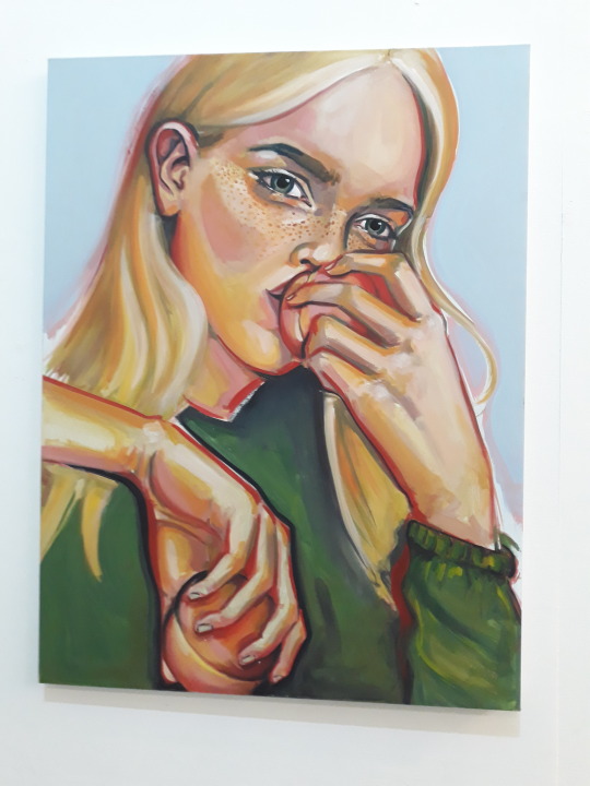


Instagram: https://www.instagram.com/thewhitepube/
Throughout this blog segment I will be analyzing and making a discussion on her gallery and how she chose to develop it.
At the beginning of the lecture she mentioned how she would always think of herself as a painter. She always enjoyed painting portraits and thought of how much she would enjoy making a career out of it. She then mentioned how she always thought of the idea of curating exhibitions and how she always found it to be a passion of hers. From this idea she then created an Instagram account called The White Pube in which she posted art memes and a range of posts criticizing modern curators. From this she then had the idea to create and develop her own exhibition and gallery called the OUTPUT so she could create something for the community. Purente always saw modern exhibitions and curators as snobs who didn't care for artists who lived in this city. Curators are always interested in seeing and getting artists form places such as Paris to get more cultured art rather than seeking out the thousands of great artists in this city. This is why Purente made OUTPUT to give the artists in the city a chance to show their own artwork off within their own city.
Although I don’t find this aspect of her work to be relating to my own I do find it interesting as a thought. As when Purente mentioned this I found myself relating to it heavily. Although I have always enjoyed exhibitions and galleries in this city I have always found them to exclude the artists who are already within the city. It feels like they don’t want to give any of us a chance. Purente mentioned that when visiting the TATE in Liverpool she overheard someone coming in with a portfolio of work to possibly be displayed within the gallery. After they left they scoffed and thought of it as cheeky for them to even consider asking them, to submit it to the gallery. When she was explaining this I personally found it to be a good or correct viewpoint. I have always loved visiting galleries and the Walker is one of my favorites but if I wanted to contribute and have my own work displayed there its honestly disappointing to know I would never be able to from how the institution was built up.
When considering her work in terms of social and artistic movements I don’t feel it particularly connects to any. It could link to activism with how she views modem galleries and how she wants to create her own to help other less fortunate artists in the city. Socially, I feel that the gallery will grow to be a great success in the eyes of the artists within this city. I recently visited the gallery and I loved how cozy and home made it felt. You could see how Purente was passionate about the artists of the city as soon as you walked in. I’m hopeful and exited for her business and I would love to contribute myself one day. She mentioned about hiring people to help with the project and I offered to help as soon as she starts hiring as I am genuinely interested in her ideas for this gallery and why she chose to develop it.
When considering the physical artwork of Purente, I can only really comment on how she chooses to display her exhibitions and how she has organised them as she no longer creates art herself, or is she does its very sparse. When visiting her gallery, she seemed to display the pieces in a very traditional sense; she hung them in the wall at average height so the focal point// mid point was at eyes view. The walls where also painted a very bare white color; I both liked this and didn’t. I liked how they were painted white as they didn't distract from eh artworks themselves as the walls where all just the same neutral colour. Although I didn't like how it was white as personally it feels very clinical to me to have fully white washed walls. For me I would have enjoyed more contrasted walls; maybe where they were all different neutral colours. I have always been a fan of contrasting colours so I felt maybe a muted navy blue would suit the walls, perhaps with a beige accent wall to split up the colours. This could also enhance the aesthetic of the artworks themselves as you could contrast the wall with the artwork and make it further stand out.
When viewing the artworks shown within the gallery, they appeared to be organised into groups of the artists and their styles. Although there was no information given about any of the artists shown within the gallery space. As soon as I entered the room the first thing that hit me was the colours of the pieces. Almost all of the artwork shown had a strong theme of the formal element of colour through them, some used them in different ways. One of mine and my girlfriends favorites was the portrait of the woman eating a peach. One of the things I loved most about this piece was its strong presence of colour and how the portrait was composed. I could tell this piece was part of another painting displayed on the wall from its style and colour palette. Although these two paintings weren't placed next to one another, they were on the ends of two different artworks. I found this to be an interesting detail as usually in more traditional galleries the artworks are set up in themes, or by artists such as in the Walker where they are curated and set up by time period// era. This further shows how she wants to be different and stand out from the more traditional galleries.
Something that further makes the OUTPUT different from traditional galleries is the idea of “Loyalty Cards” in which you would get one stamped per exhibition you visit. This is something new in terms of galleries and its an idea I’m really invested in. It gives you more incentive to visit the gallery again, personally, even if I didn't get anything at the end for having them all stamped i would still visit the exhibitions each month to see something new and to support the artists of Merseyside.
After the lecture had finished I found myself being intruigued by her artwork and her process of developing the OUTPUT Gallery. As a result of this I attended the Q&A she was holding after the lecture. I visited and listed to the talk to gain more information about her process and her passions for making the Gallery into a fully formed idea. There was a range of questions asked at the Q&A such as how she dealt with the taxes and billing of the building and how she coped financially though the process. I found this to be a very relevant and important question to ask. This helped me gain insight to how I and many others could go about making a realistic future with art which honestly made me feel relieved. Overall. I found the Q&A to be a very important and relevant aspect of understanding her process and her artwork. Furthermore I'm glad I attended as she seemed genuinely passionate about the gallery.
Overall, I found Purente’s work and the OUTPUT gallery to be incredibly interesting as I have never heard of any gallery like it before. I would love to continue supporting her gallery as I’m passionate about this city and helping get the artists here recognized. I will be visiting each exhibition at the OUTPUT each month and I will write a blog entry about each visit.
0 notes
Text
How To Use Psychology To Guide Your Color Magic

SL Bear
When you’re just starting out in witchcraft, correspondences are important. They guide new witches through their first spells, giving them structure. After all, many of us have grown up following endless instructions from parents, teachers, and employers who have a set way of doing things and all you have to do is follow the rules. If you’ve grown up with religion, following steps in rituals will already be second nature and correspondences are the perfect roadmap to follow. You want a banishing spell? Simple, use black pepper, black candles, black cord. A money spell? Green candles, green stones, green herbs. I’m not being critical — I don’t think it’s a bad thing at all. You want spells to work and capitalising on tried and true methods seems like the surest bet, not to mention the easiest way to get your feet wet. Just make sure your intentions line up perfectly with your ingredients and ta-da! Magic.
As you grow into your craft, however, you learn that witchcraft isn’t a cookie cutter endeavour like school or a random job, with a one-size-fits-all method for success. You develop your own style, you learn what works for you, and you find new ways to practice. It’s important and second nature for us to evolve and grow into better witches over time. The crutch of online correspondence lists can evolve too. You can create your own personal correspondences based on your experience — not somebody else’s — and in doing this your craft becomes your own.
So where to start? I’ve chosen to focus on colour correspondences because I tend to see the most discrepancies in colour symbolism online and in books. The logic behind some of this symbolism often seems a little shaky. Money is green, so money spells require green. But wait, what if I use the euro? It’s rainbow coloured! Nature is more universally green than money. While herb symbolism is based heavily on tradition, colour symbolism changes at random depending on what source you’re using. Today, I’m going to provide you with information so that YOU can decide what these colours mean to you based on your own personality and life experience, making your magic more personal and therefore more powerful.
What’s your favourite colour?
I’m sure we’ve all asked and answered this innocuous question more times in our lives than we can possibly remember. You asked this question in kindergarten of potential new friends you wanted to get to know. You answered this question when you flirted with a new romantic interest. You posed this question when you were just bored, hanging out with someone you’ve known for years. But why? Is a favourite colour so much more informative than, say, a favourite number? Yes, because colours are evocative. A favourite colour can tell you things about yourself that you never guessed.
Colours capture our minds and hearts. Historically, people have turned to colours to heal, tell stories, and spread messages. In ancient Egypt, healers would place their patients in colour rooms or sit people in the path of light refracted by coloured gemstones, specifically tailored for various ailments. The colour red was a go-to in pre-modern medicine across many eras and cultures. Arab physician Avicenna, born in 980, would cover patients in red to cure them. King Edward II of England was placed in a red room to treat his smallpox. The Chinese wore rubies to ensure a long life. In Japan, sufferers of nightmares turned to red to banish them. The idea of a physician using colours to treat a patient today seems slightly ludicrous until you learn that premature babies are placed under blue “bili lights” to prevent jaundice. Perhaps, the ancient world was more sophisticated than we imagine.
World religions have always ascribed special powers and meanings to colours. Islam is associated with the colour green — the colour of paradise. Buddha and Confucius are both typically associated with yellow and gold, but with slightly different taste in robe colours; Buddha wore red and Confucius, black and white. In Christianity, the Virgin Mother is usually depicted swathed in blue and white robes, symbols of divine purity.
But what do colours really mean? Common knowledge will tell us that red is the most dominant colour that people perceive. Red catches the eye and energises us to act. Or stop acting, if it’s a stop sign. Red’s power is not just psychological, but physiological. In 1958, scientists found that exposure to red light can actually raise your blood pressure. Never underestimate the power of red — advertisers certainly don’t! Huge corporations like Coca-Cola, Virgin Atlantic, and Nintendo all rely on red to grab the consumer’s eye. McDonald’s arches may be golden, but they’re nestled in a bright red background.
That’s not to say that the rest of ROYGBIV is lacking in some power or psychological umph. All colours on the warmer end of the spectrum inspire an emotional response, even the sometimes maligned yellow. While admittedly the traditional colour of cowardice, yellow is also the colour of the sun, which made it particularly important to ancient cultures the world over. And yellow’s sparkly cousin — gold — needs no explanation. People see everything desirable in gold: Valour, wealth, achievement. It sits on the heads of kings and queens. It rings the fingers of the married, a symbol of fidelity and a lasting oath. Perhaps yellow’s problem isn’t its shade but its brightness. Bright yellow can be difficult on our eyes and brains. However, a nice, muted yellow is pleasing.
Orange can be a tougher sell, at least in western eyes. In Asia, orange is associated with spiritual enlightenment. In the west, at least in certain shades, orange is more garish — the colour of second-rate sodas and children’s TV networks. Perhaps, as one psychologist posited, it’s all about climate. People in warmer climates love orange’s warmth and brightness. It’s all around them, in the sumptuous flora and the delicious fruit. It has similar aesthetic qualities to red, in that it brings out strong positive emotions, but they’re less intense — red’s little sister. Where red denotes passion, orange brings fun and youthful exuberance.
Warm colours, orange in particular, are often indicative of levity on the stage and film, even in the characters themselves. What colour is Peter Pan’s, Pippi Longstocking’s, and Ron Weasley’s hair? It’s believed that warm colours induce such good feelings, that warm lighting can even make you feel like time is slowing down. Warm colours are inviting. Extroverts are even said to prefer warm colours, because of their lively natures. We relate to them; even our skin tones are naturally warm.
But don’t discount the introvert’s preferred palette: Blue, green, indigo and violet. You don’t want to be energised all the time — sometimes you want to cool down. Green is regarded as the most calming colour. The colour of nature, of life’s continual renewal, and probably the only member of the Cool Family we really want to eat.
Blue is also generally interpreted as a peaceful, divine, intellectual or transcendent colour but, as with other cool colours, our perception is deeply dependent on context. We might see ourselves as “red hot,” but nobody wants to be blue (or green), literally or figuratively. Warm lighting makes us feel good (and look good), but cool lighting brings out the flaws and brings on the migraines. Purple generally gets a better psychological rap. It’s an exotic, egomaniacal colour which represents opulence and commands attention. Luxury goods (excepting Taco Bell) and royalty favour the appeal of purple and indigo to set themselves apart. In fact, Julius Cesar declared only the emperor may don purple robes. It’s said that the artist’s favourite colour is usually purple (or artists formerly known as…). While the cool tones heavily depend on context for their appeal, they still manage to claim the world’s favourite colour: Good ‘ol moody blue.
Black and white are special cases. In terms of light waves, white light contains all the colours in the visible spectrum and black is the absence of all light. In a physical form such as paint, it’s just the opposite. Black is all colours mixed together and white is the absence of colour. This duality perfectly mirrors the interpretation of black and white across cultures. Black is visually impactful — a startling absence of colour and vitality. Almost universally, black is associated with heavy, dark emotions. It can express foreboding, authority, formality, and even death. But there are really two sides to black. Black is often the colour of mourning and sorrow, but a little black dress is the epitome of sexiness. Black is the colour of intriguing mystery and the unknown.
White is generally associated with purity, rebirth, and cleanliness. But white is also sterile and empty. Interestingly, China flips the association of black and white with death and life. White is the mourning colour, and black is more commonly associated with life. Black and white together are even more stark and eye-catching. Naturally, the combination of black and white has intense symbolism. Yin and yang, dark and light, life and death. You can’t have one without the other. They are opposites whose visual power is enhanced by the other’s presence.
Personal Rainbow
With this information, we can base our colour choices in magic on logic and psychology instead of arbitrarily assigning associations. Most importantly, you can base these colour choices on your own personality. Are you an introvert who would like to be more outgoing? Turn to warmer colours to boost self-confidence. Do you live in a cooler climate? Icy colours will feel like home and you’ll connect with them more deeply.
Instead of turning to green for money and luck spells, look to violet and gold — the luxury colours worn by rulers — and save the green for calming spells and spells with a strong natural element: Rejuvenation, new beginnings, and spells focused on mothers. I live in colourful Colorado, so while blue is a calming colour to me (the association that pops up over and over), primarily it’s the colour of the Rockies and the sky, powerful entities that loom over my city and seem larger than life. For me, blue in spells means natural wonder, immovability, and majesty. However, for someone living by the sea, blue might mean changeability, harvest (fishing), or peace. Someone living in the city might see blue as elusive — the colour shining between buildings, or only seen on trips away from the city. Maybe to you city witches, blue is industrial and commercial — the colour of cars and billboards.
Not only will your colour association change based on your location, but your perception. How do certain colours make you feel? How do you connect and react to them because of your own personal experiences? Black is the colour of mourning, but to a witch, black is the colour of mystery, of the wonderfully peaceful night. It’s the colour of cats, of recently burned sigils and ink scribbled into grimoires. Black is the backbone of our witchin’ aesthetic. It’s the colour of magic at work!
So, witches, for the first time ever I’m giving you homework. Before working any more magic involving colours, sit down, get centred and make a list of colours. Next to each colour, write down exactly how this colour makes you feel, what it reminds you of, and if it’s for “positive” or “negative” magic. Access your psyche! Rely on yourself for your correspondences and watch as this brilliant world of colour magic starts working wonders for your spells!
https://thetravelingwitch.com/blog/how-to-use-psychology-to-guide-your-color-magic
0 notes
Last Seen Blogs

jonsthst002
Untitled

gucibatukapal-campingwisata-blog
Untitled

keun-il-lat-ta-blog
Keun Il Lat Ta

sensry
Autism Goo Blog

writing-is-a-martial-art
May contain writing