#Poster Process
Text


the New Fantastic Four, by Arthur Adams.
#the New Fantastic Four#Fantastic Four#Arthur Adams#Hulk#Wolverine#Spider-Man#Ghost Rider#Master Class#Poster Process#Process#Marvel Comics#Marvel#Comics#Art#Illustration
213 notes
·
View notes
Text
Process of Winter Solstice✍️
Music composed by Ryan Camus http://www.ryancamus.com/
2K notes
·
View notes
Text
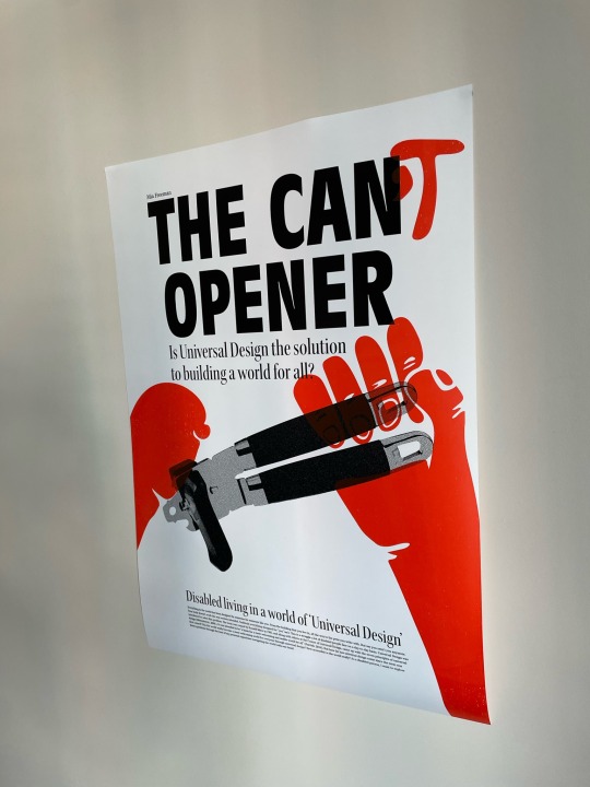
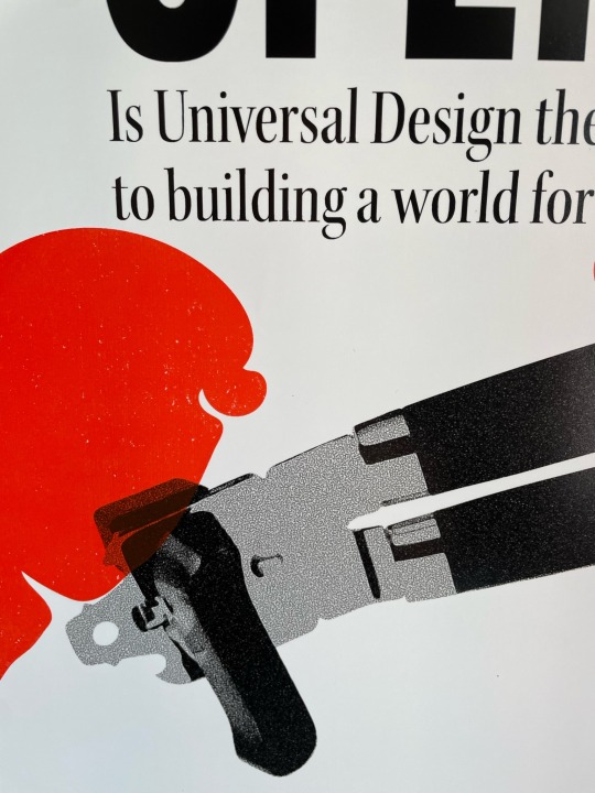
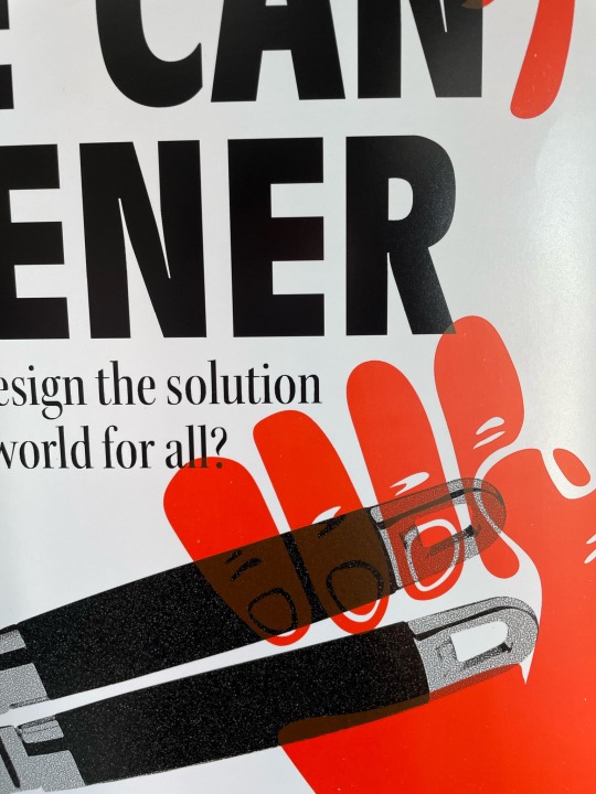
Screen-Printing
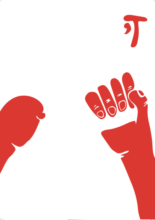
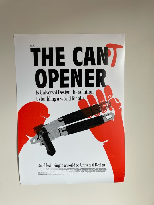
From the beginning of this project, I knew that I really wanted to try out screen-printing. I had never had the chance to do it before and I love the way it looks and textures it creates. My early research and visual mapping led me to keywords that included texture, so I wanted to incorporate this in my final poster design even if I wasn't able to in my research. The red hands and 'T' would be screen-printed over a black & white digital print to create that textured effect and look like someone had graffitied it over a product advert.
This is the screen-print without the digital print underneath on textured paper.
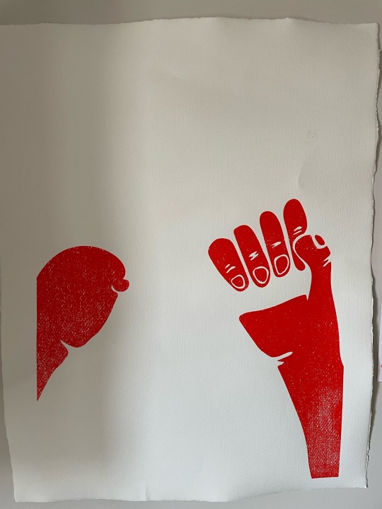
I'm really happy with how the screen-print turned out on the poster. It's really nicely textured and has that graffiti sort of feel to it which I really wanted to achieve through this way of printing. It also doesn't line up or over take perfectly which makes it feels super organic and I love the bright colours it was able to create. Really love how this turned out and I definitely want to try screen-printing more throughout my work.

0 notes
Text

Destroy (og pic by aaron cooper) | edit by me
447 notes
·
View notes
Text

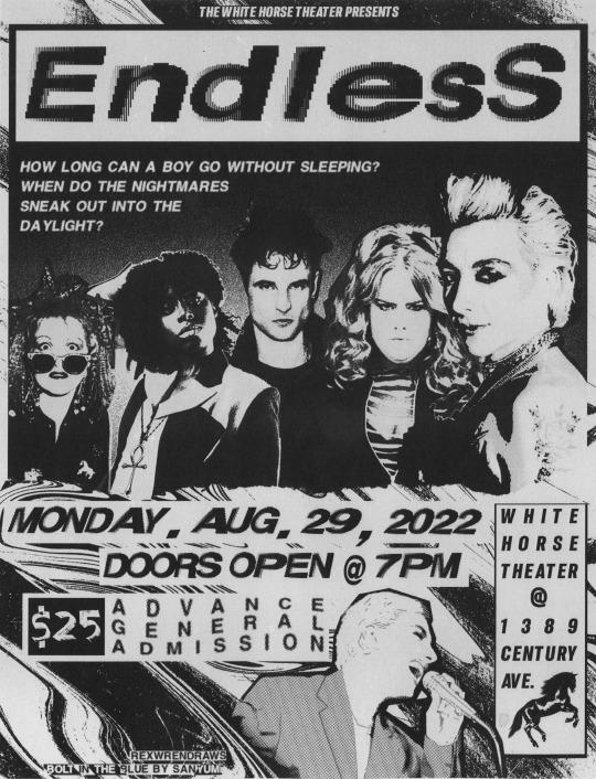
spotted on the wall behind the white horse theater!!
Happy one year to Bolt in the Blue by @valeriianz ! Truly the best band au fics I've ever read, I am Endless' #2 fan forever (#1 is Hob, of course) 💙🎸✨
+ alt. colors for the flyer & other scans:
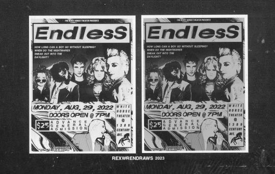
i love taking advantage of my art uni's massive (MASSIVE) scanners for literally anything i can. it's got the most gorgeous grit and scan banding that photoshop trickery cant replicate (though i try lol). so, yes, i literally printed out the b&w flyers, scanned them in, then added color and printed them again to stick on my wall haha.
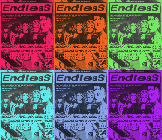
when digitally adding color, i wanted it to really feel like black ink on colored paper instead of trying to print on color paper and then scan it again (i have done this before idk). i think the xerox-y look is pretty convincing! the green, pink, and purple are my personal favs.
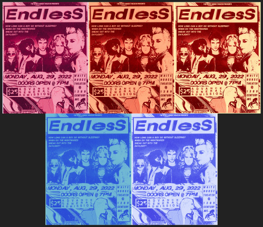
an irl friend suggest i try non-black-ink versions to see what i liked. i think they look cool but some of the text gets a bit lost. still, i like the pale yellow+red ink one. (this almost makes me want to try riso printing this to see what it'd look like 👀👀).

^ this is what the white horse metal barrier edit looked like before I added the Huji Cam filter lol. it wasn't feeling convincing enough like this, so i actually took a photo of my laptop screen with the filter and somehow that looked more real than the actual shot from the show lol. (also, because i've stared at this screenshot for so long, the orange/yellow June 12th poster? is everything on it a reference?? loll)
anyway, had a lot of fun making this!! feel free to print if you want!! READ THE FIC EVERYONE GO READ BOLT IN THE BLUE RIGHT NOW!!!!!!!!!!!!!!!!!!
#bolt in the blue#the sandman#dreamling#dream of the endless#morpheus#desire of the endless#despair of the endless#((it is SO hard to find pictures of donna thats not smiling haha i love her))#death of the endless#delirium of the endless#dc#rex draws#sorta. i dont have an editing tag on this blog hm#rex process#i was also going to try to edit hob/into the first pic but couldnt decide on a photo to use lol. hes there in spirit ofc#desire may be the biggest on the poster but morphy's centered in the white horse manip hehe see what i did there.. framing and symbolism wo#FEEL FREE TO PRINT BTW! use the b/w one!!!!! BUT LIKE DONT REPOST OFC#valeriianz
301 notes
·
View notes
Text
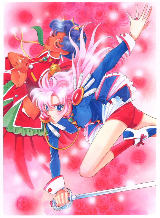
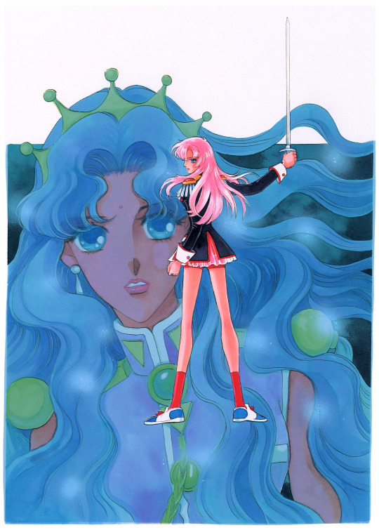
Chiho Saito's 1998 covers for the two Revolutionary Girl #Utena novels written by Witch from Mercury writer Ichirō Ōkouchi, 'Twin Saplings,' and 'Verdant Hopes.'
Saito's commentary on them, roughly:
Twin Saplings: "Utena's dignified in this picture, isn't it?"
Verdant Hopes: "I rarely get to draw Anthy princess-like. Cute..."
Both of these novels have been translated, and are hosted in multiple formats on Empty Movement! I encourage you to check them out if you're a Witch from Mercury fan, and want a glimpse into his earlier work and the show he drew so so much inspiration from!
#revolutionary girl utena#rgu#witch from mercury#utena tenjou#anthy himemiya#shoujo kakumei utena#these are the downscales 4k copies#I am rescanning and processing her artbook with the final images in 8k#these will be big enough to print as posters#and they offer an incredible and rare closeup view of her process
409 notes
·
View notes
Text
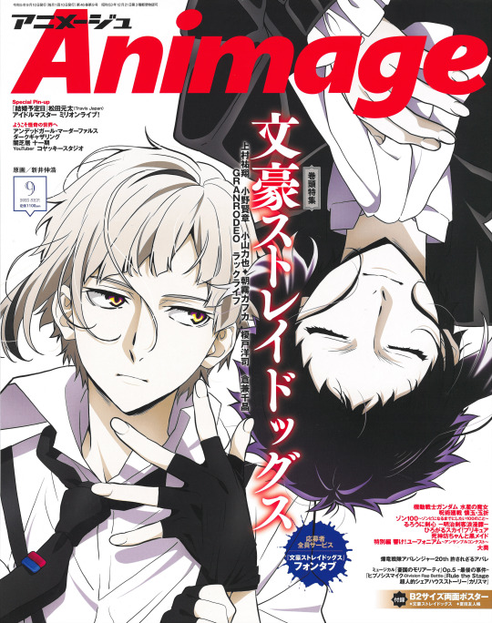
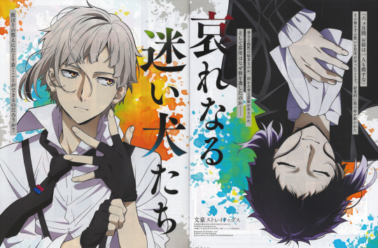

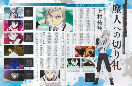

Finally gotten around scanning the September Animage issue. Please enjoy!!
#Finding a scanner I could use was such such a pain ;;;;;;#No way to scan the poster though it's way too big and I can't reach the center...#Unless by folding it‚ but I'd rather refrain from doing that#Anyways I'm in the process of scanning the whole magazine so hopefully I'll be posting the j/jk and g w/itch sections too#Then I'll probably upload a folder with the whole thing#atsushi nakajima#ryūnosuke akutagawa#sskk#shin soukoku#bsd#bungou stray dogs#bsd s5#bsd season 5#mine#Edit: This is another thing I've been trying to do for months and I just spent the last three hours fixing up the pictures#Felt like it was worth mentioning 。:゚(;´∩`;)゚:。#New year's resolution is definitelly to spend less time with my computer
168 notes
·
View notes
Text
Sketch vs final
Ah, the perks of being an artist; you can make your own merch
By yours truly
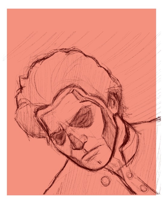
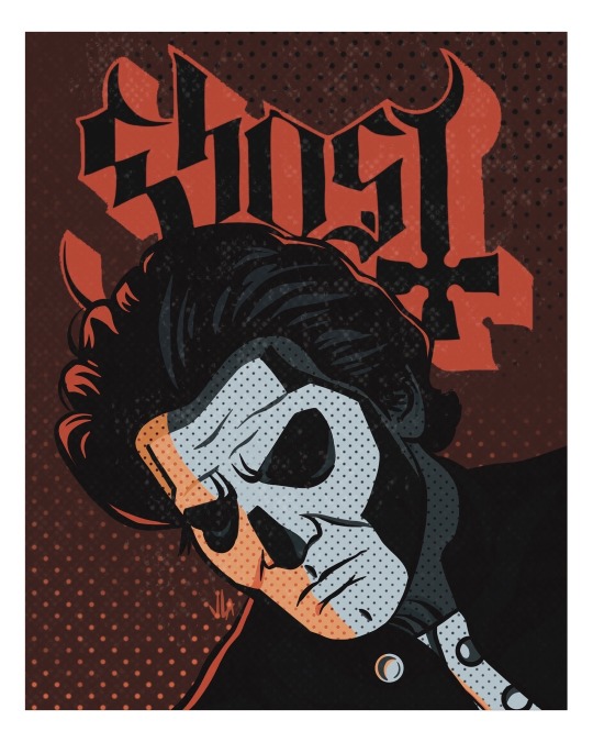
#artists on tumblr#painting process#fanart#my art#taking commissions#procreate#ghost fanart#ghost fandom#ghost bc#tobias forge#meliora#the band ghost#band poster#illustration#digital aritst#digital drawing#procreate sketch#sketch vs final#papa emeritus iii#papa terzo
140 notes
·
View notes
Text
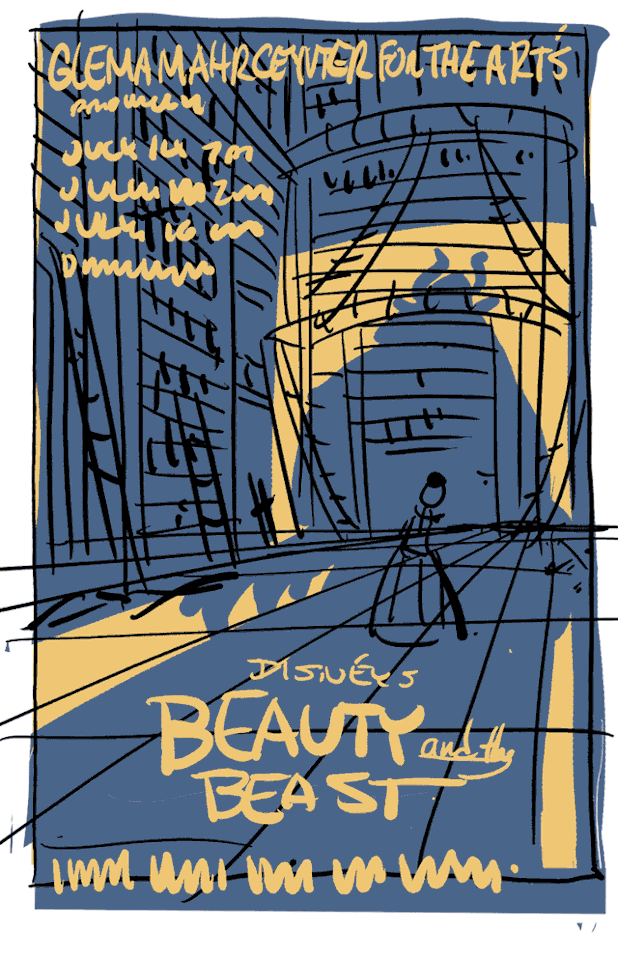
Found this process gif from a Beauty and the Beast stage show poster I did a few years back, thought I'd share!
#beauty and the beast#process#musicals#poster design#art process#disney#disney art#disney musicals#Poster Art#Poster Design Process
138 notes
·
View notes
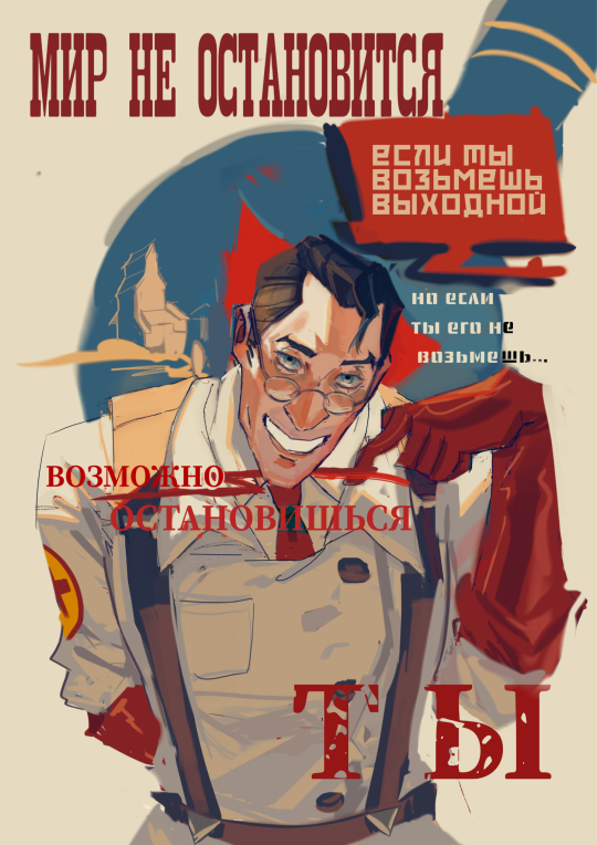
Text
I finished! 🥳
And I tired 😫


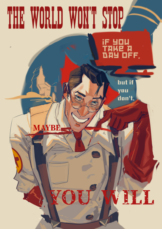
Also, I think it's funny because Doc is a stereotypical German doctor, and all stereotypical German doctors are workaholics.
#my art#art#digital art#artists on tumblr#artwork#art process#poster#tf2 fanart#tf2 medic#tf2#team fortress two
68 notes
·
View notes
Text


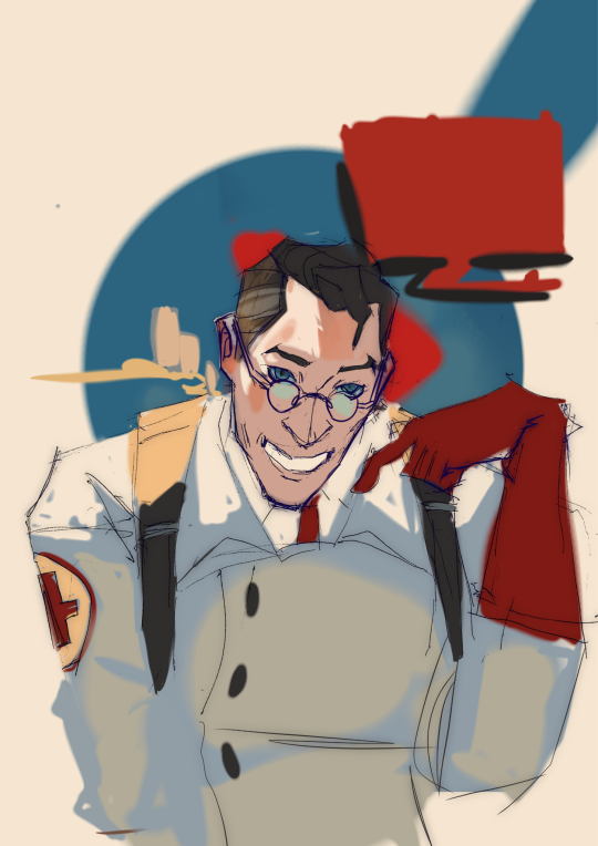
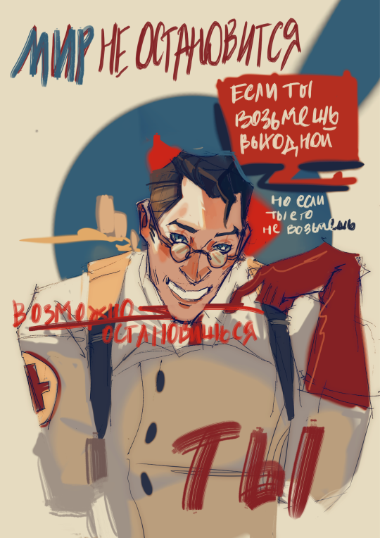
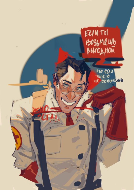
Если смотреть назад, то не так уж и плохо вышло
#art#my art#fanart#artists on tumblr#tf2 fanart#tf2 medic#team fortress fanart#tf2#team fortress two#art process#poster
70 notes
·
View notes
Text


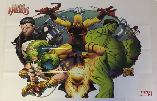
a Marvel Knights poster by Joe Quesada, with Inks by Jimmy Palmiotti, and Colors by Richard Isanove.
#Joe Quesada#Jimmy Palmiotti#Richard Isanove#Marvel Knights#Punisher#Marvel Boy#Daredevil#Hulk#Ghost Rider#Poster Process#Poster#Process#Marvel Comics#Marvel#Comics#Art#Illustration#Mr. Fantastic#Fantastic Four
73 notes
·
View notes
Text

meet me at midnight ✨
#my design process is now#when in doubt flip it upside down sjknskdg#midnights#taylor swift#hellieedits#tswiftedit#taylor swift edit#poster design#concept#ts10#midnights era
1K notes
·
View notes
Text
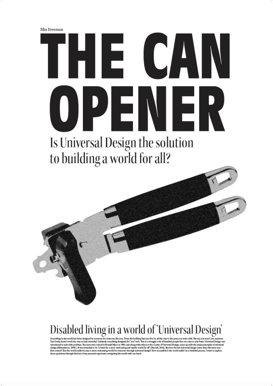
Final Digital Poster

Based on my writing draft and contextual knowledge, I decided to change my question/title to better fit with the research I've done and the direction my writing is heading in. In my writing I talk more about universal design, the history surrounding it and how well it works as accessible design. The title "is universal design the solution to building a world for all?" fits this a lot better.
0 notes
Text
Clump :]
#columbo#kaniart#ill prolly paint these up tomorrow too welll see#iv been developing this process of poster paint n shit and yeha i might as well
323 notes
·
View notes
Text
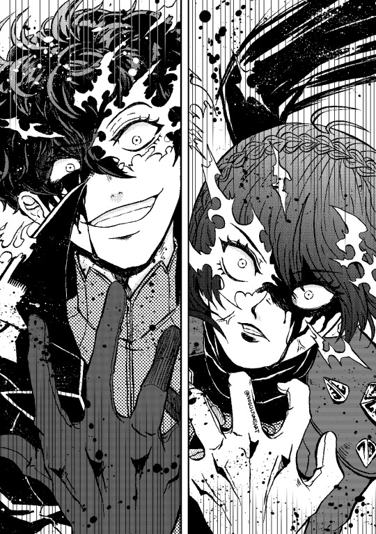
CW: Blood
Drawtober 2023 day 27: Beast
Let's go wild!
Previous days: [1][2][3][4][5][6][7][8][9][10][11][12][13][14][15][16][17][18][19][20][21][22][23][24][25][26]
#shumako#amamiya ren#niijima makoto#kurusu akira#drawtober2023#drawtober#inktober2023#inktober#cw: blood#blood cw#listen yall#I love feral shumako#and splashing ink#cri#srsly tho I appreciated P5S poster so much#you know that one with Joker and his bright smile#pffft#btw hurt myself in the process of making this art#I couldn't see Joker's ref on that P5 art book so I have it on my lap#so it closer to the lamp#btch slide of my lap and the corner of the freaking hit my freaking toe#RIP toe#I'm just glad it didn't take my nail with it#idk if anyone ever read my tag#but I have only 4 pieces left#aaaaaaaaa
116 notes
·
View notes
Last Seen Blogs

anikasharma892-blog
Untitled
r-adio
TESTING, TESTING
hell-is-a-teen-girl
Nitimur in vetitum.

acidsecs
Acid Secs Productions
matabrasaink
Mata.