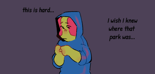
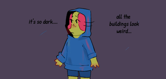
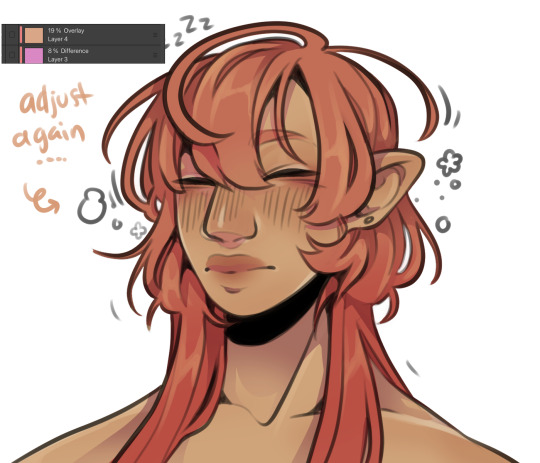
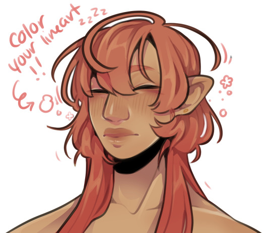
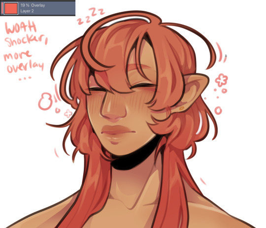
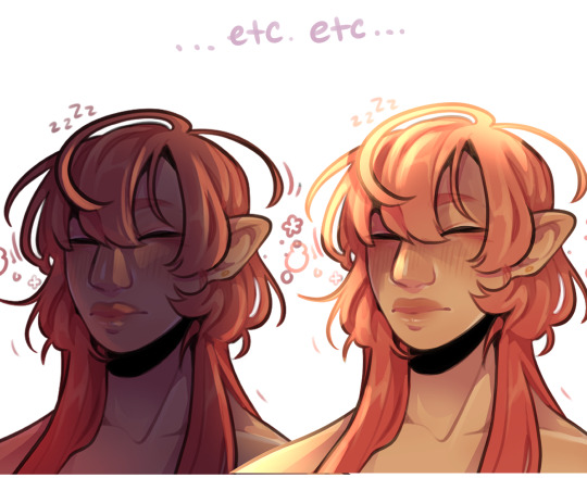
#It's also really messing with my color palettes
Note
Hii do you have any recommendations for bl that’s similar to Bad Buddy, My School President, and Semantic Error? Idk I’m looking for something fluffy, but with some angst for flavor (also potentially school setting but it doesn’t have to be). Anyways thank you so much!! 💟💟
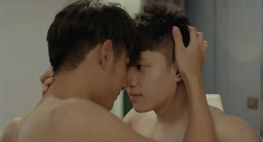
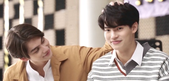
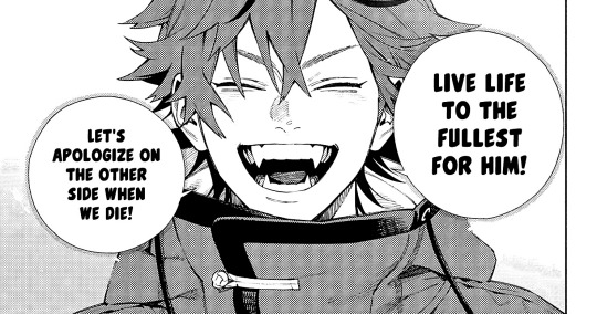
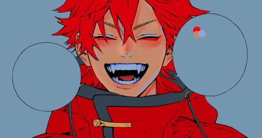
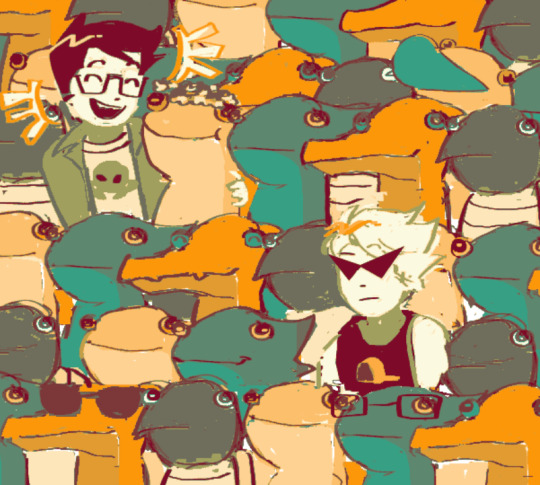
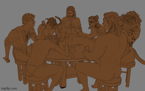
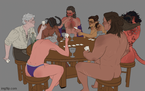
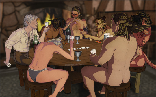
10 Fluffy Yet Angsty BLs + School Setting (By Request Rec List)
Examples: Bad Buddy, My School President, Semantic Error
Interesting selection. I added the "school setting" to keep me tailored down. Let's see what we got.
You'll never guess how we are gonna start...
Did ya guess?
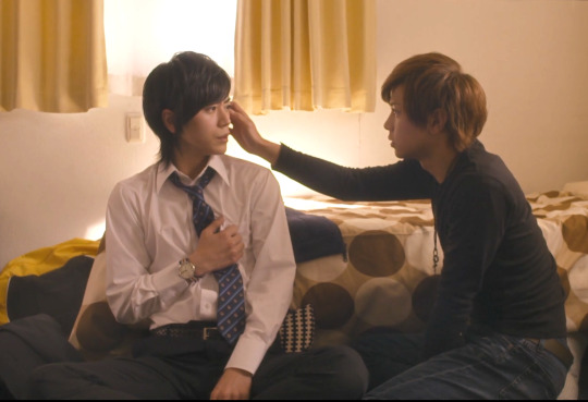
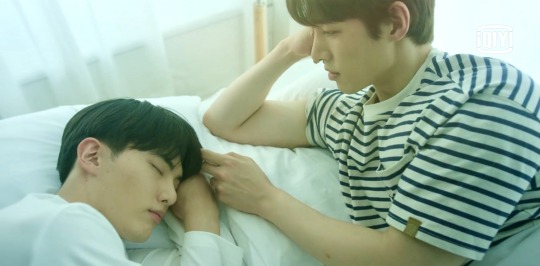
Seven Days
Japan 2015 - grey
Never doubt my ability to recommend this show. One of the best live action yaois ever made, with perfectly structured angst, fantastic characters and acting, and no problematic tropes (rare in Japanese BL). The leads have excellent chemistry although it’s low heat there’s still some really cute mutual kisses.
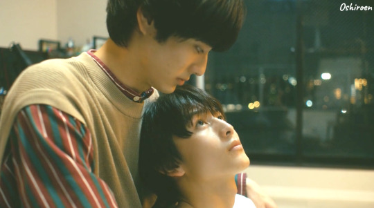
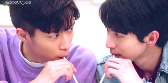
I Cannot Reach You
AKA Kimi ni wa Todokanai
Japan 2023 - Netflix
This classic friends-to-lovers BL is everything Japan does best. Angsty. Emo. Aching. Driven by real thirst. Yamato is deeply in love with his childhood bestie, Kakeru, and has been for ages, unable to hide his ungainly damaging high school need. He wants Kakeru in every way possible and it oozes off of the screen. Kakeru is silly and a little simple, but not frenetic or overly camp about it. He is earnest, and genuinely wants to keep Yamato in his life which means giving a romance (and gayness) a fair chance. We watch him realize his affection and what form it can take in a truly authentic way. This show was impossibly kind to both of its lead characters and I felt almost honored that I got to watch something so lovely and rare play out on my screen. Full review.
Light On Me
Korea 2021 Viki
Korea does an elegant pastiche of traditional live action yaoi but all tropes are cleverly deployed to bolster one of the most riveting love triangles ever put on screen… and I don’t like love triangles. LoM strategically tailors classic BL tropes to 2 different semes resulting in pristine pacing, plot, and character development, explicitly serving narrative (not just to tick boxes). LoM is a master class in this trope drops. (If you write fanfic or romance you should study this show.) Full review.
Cherry Blossoms After Winter
Korea 2022 Viki
Korea took on early Japanese sweet yaoi but gave it their signature softness and precise production with a STUNNING color palette (beautiful pastels, sun-saturated over-exposure), manga framg style, some traditional BL character archetypes, that tiny edge of bullying roughness and out-of-control seme, plus FINALLY a palatable take on the stepbrothers trope and it was, in a word, classic. Sophisticated and understated CBAW is not slow, it’s just subtle. It's dream-like and atmospheric, as if the whole thing took place under cold water on a warm spring day. Is there plot or peril? Not really. Do we care? Also, not really. Look, I can’t help it, I’m old school and so is this show. I grew up reading sweet yaoi, and this was THAT YAOI just on my screen. There’s no objectivity with me and this show. It’s a beautiful pastiche and I loved it for how it made me feel and what it remded me of. It’s not flawless, but it is a wonderful experience. Full review.

Takara-kun and Amagi-kun
Japan 2022 Gaga and Viki
I gnawed on my knuckles and squealed a lot with this show. Reserved cool kid who must learn to communicate to keep the tiny disaster nugget he’s madly in love with. It is beyond charmg: soft and gentle, packed with cuteness and high school angst, thirst, & yearning. Was there plot? Not really. Was it emotionally tense and paced well enough for me not to notice? Absolutely. Did I enjoy the hell out of it? Oh yes. Full review.
Blueming
Korea 2022 - iQIYI
It’s a tiny bit dark and a tiny bit bittersweet, almost too honest to a university experience and first love for BL, but if you want your md ever-so-slightly messed with and your intimacy hellishly sweet, this BL will do it for you in a coldly distant manner, while bitch slapping you with self worth issues. I wasn’t into it at first, but the leads are solid and by ep 5 it got really good, becomg a narrative about self discovery meets understanding and accepting others people’s flaws without hurting them. Ultimately we witnessed two characters maturing because of each other and their mutual affection, without that affection becomg the conflict point. Instead, tension was built around other aspects of identity, popularity, and self-worth. While production values were a touch lower than usual for Korea, Bluemg included decent kisses and other forms of intimacy and a satisfying ending plus there’s judicious and very elegant use of tropes, this is a great BL. Full review.
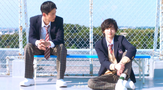
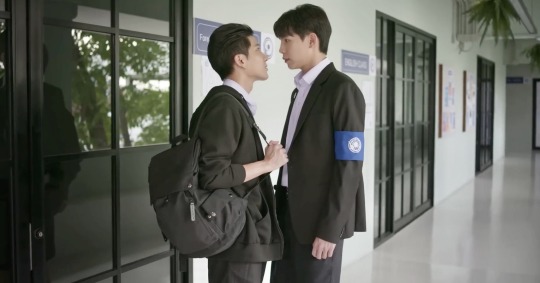
About Youth
Taiwan 2022 - Gaga
A truly lovely little coming of age high school BL with a classic YA low drama but high angst and an earnest depth. I didn’t even mind the singing, and that’s saying a lot. A weak seme/uke dynamic but tons of BL tropes (both rare in a high school setting but common for Taiwan) makes this one feel both sweet and colored by real world authenticity and grit. Full review.
My Love Mix Up
AKA Kieta Hatsukoi
Japan 2021 - Viki
Completely adorable absolute chaos bi disaster muffin falls accidentally and utterly in love with his classmate, hijinx and friendship result. What’s great about this BL is that it deals with things like homophobia, asexuality, and one sided affection in an extremely gentle and palatable way. Perhaps sometimes too subtle, but I believe this is a great show for younger audiences, particularly if you want to spark conversations about identity, sexuality, authority, truthfulness, and consent. Oh and it’s funny.
The Eclipse
Thai 2022 - YouTube
GMMTV does gay Blacklist with a good boy/bad boy pairing. This is a good show but the cast is excellent and the leads are absolutely flawless, which elevates it beyond just good. We got a nuanced and multifaceted burgeoning relationship: philosophical (and socio-political) conflict contrasted to moments of empathy; flirtation contrasted to moments of genuine affection, plus plenty of angst. This narrative is less about love than it is about courage and tenderness. However, near the end the pacing was off and the plot frustrating. Still, this is an enjoyable watch, with a finale that features verbal consent and a fun blooper reel.
Destiny Seeker
Thai 2023 - WeTV
Frankly this probubly ranks along side most of hte runners up, but it's chronically under watched so I wanted to give it a special shout out.
A darn near perfect pulp featuring 3 likable grumpy/sunshine pairings with uncomplicated iterations of enemies to lovers. At least one half of each does a decent amount of pining and there’s good chemistry, classic tropes, and communication rep. It’s fun and full of linguistic jokes. Sublimely cheesy but a good rainy day offering with tons of rewatch potential. Full review.
Honorable mention
These satisfy your criteria but I jsut personally like the above 10 better. And you did ask me, still OPTIONS!
2gether & Still 2gether
A Breeze of Love
Between Us
Dark Blue Kiss (+ Kiss Me Again - PeteKao Cut)
Hidden Agenda
Love By Chance
Love Class
Love Class 2
SOTUS
Star in My Mind
TharnType
Theory of Love
Why R U? Thailand
Why R U? Korea
(source)
#By Request BL Rec List#BL by request#asked and answered#japanese bl#thai bl#korean bl#taiwanese bl#Bad Buddy#My School President#Semantic Error#seven days the series#I Cannot Reach You#Kimi ni wa Todokanai#light on me#cherry blossoms after winter#Takara-kun and Amagi-kun#blueming#About Youth the series#About Youth#My Love Mix Up#Kieta Hatsukoi#the eclipse the series#destiny seeker
50 notes
·
View notes
Text
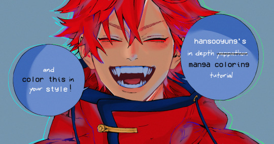
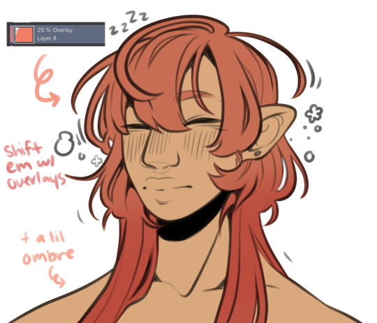
hansooyung's coloring tutorial & ctiys: alma time! 🍒
hello everyone! though i've been meaning to for a while, i've finally gotten around to making my first manga coloring tutorial! i'll be going over cleaning panels and screentones, choosing base colors, and finally shading and lighting.
this will also be a color this in your style challenge, so if you're willing, feel free to post your colored panel and tag me in it!! i'd love to see all the results :)
find details under the cut! 🦋
DISCLAIMERS:
this is just how i personally color! i know for a fact that some of my other friends follow other methods and have such beautiful colorings <33
for colors specifically, i play around a LOT. if you don't like your color scheme for the time being, mess around with it! i don't use psds since i like to mess around by hand with color palettes, but maybe i'll look into it for the future.
i explain a lot just bear with me gang 🙏
TECHNICAL STUFF:
software: ibis paint x (on iphone). i use ibis since it is FREE for all phones and it worked on my chromebook as well.
while this tutorial is made for ibis paint x, everything works on other softwares except the brushes, which i've provided alternatives for below.
brushes: i will be using dip pen (hard) which is automatically included with ibis, and two other brushes i made myself which you can find here and here. for more brushes, @/bkdkdh was incredibly helpful and posted her awesome set here!
for other softwares, you can use similar brushes. dip pen (hard) can just be the default brush, while wet edges is just the default brush on lowered opacity (and more of a rectangle/marker shape?). watercolor pencil is a watercolor brush in the rectangle/marker shape as well. if you can't get the shape, you can always smudge your lines into shape as well, so don't fret too much! a bunch of people only use one brush for coloring everything (which is insane to me, personally, they are so talented!)
fun fact: the first brush listed that i made was originally called "aki tao watercolor smooth" 👍
ok here we go guys!!
STEP ONE: CLEANING THE PANEL
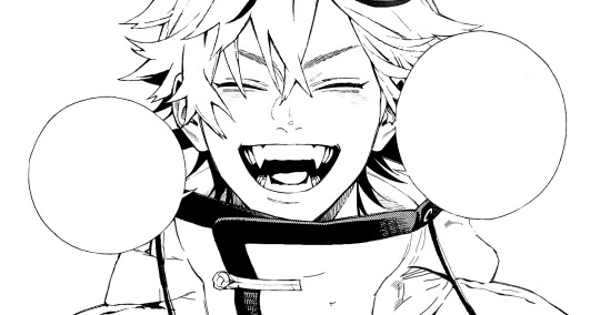
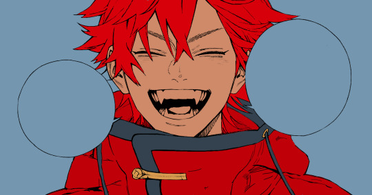
i think of this part as setting up the panel for coloring! usually it's pretty exhausting cuz it's all b&w but it's all worth it i swear. the panel i'll be coloring is this beautiful one of alma from chapter 2:
imgur link here (x)
a lot of people redraw their lines to avoid screentones, which is extremely helpful. however, i work on a phone and my fingers are not steady even with the stabilizer turned all the way up T~T. i do it this way, but a different (possibly easier) way may work for you!!!
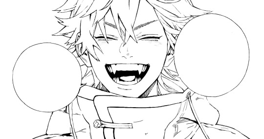
your first step will be to remove all the white, giving us a transparent background to work with. THIS IS THE NUMBER ONE REASON WHY I USE IBIS PAINT X.
when you upload the image to ibis, a popup comes asking if you would like to "extract line drawing". this creates a lineart of your image. click yes, and your work is like 90% done.
if you're not on ibis, you can redraw your panel, put lineart layer on screen, etc. or you can just extract line drawing from ibis and upload to software of your choice
for those of you not on ibis, i've included the line drawing here (x) if it looks black, don't worry and set your background to white.
omg i was not kidding when i said i explained a lot. ok now onto the three main steps of cleaning the panel:
cleaning background
removing screentones
repainting black lines
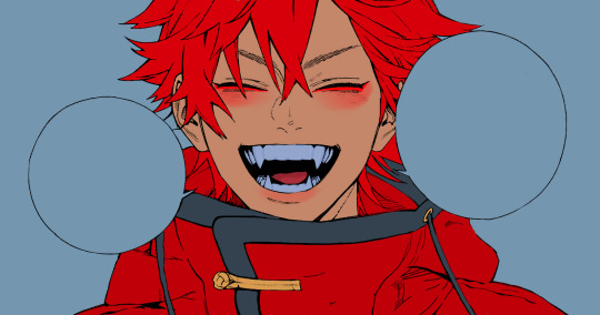
for cleaning the background, we're going to clear off all the extraneous stuff. this includes the text in the speech bubble, the gradient screentones behind alma, and the panel line on the left side. just use your eraser tool and go crazy! (i forgot to save the panel at this point of the coloring OTL)
for removing screentones, we're going to remove all those "dots" that mangakas use for shading. these are used to show value for b&w art, but since we're coloring we don't need them—a lot of people have really cool ways of incorporating screentones in their colorings though, and it looks amazing! i used it on nana's hand in my bnha coloring.
remove the screentones from alma's hair and jacket with your eraser tool. this will take time, but it's worth it in the end!
for portions with a bunch of lines, you can create A NEW LAYER and redraw some of the lines. that way, you can erase indiscriminately from the original layer but the lines you drew are still there. again, like i said, my hand is really shaky so i don't do it a lot, but it's extremely helpful for smaller parts where i have control! i used this on alma's jacket, and here's a screenshot of the process:

(i made his jacket purple so i could distinguish between layers easily).
it should look like this when you're done:
for the final step of cleaning, i like to erase all the things colored black (the collar and strings of the jacket, along with the back part of his hair). that way, i can color them in with dark colors and it adds to the whole look of the coloring.
i've circled the parts i'm going to erase below:

and it should look like this when you're done!
ok everyone cheer we're ready to color now!!!!
STEP TWO: BASE COLORS
CROWD CHEERS ok lets go!
this part is the most important to me, because it sets the tone for the whole coloring. i like to use three-four main colors in my colorings, and it's usually background, skintone, hair, and the secret fourth color. the secret fourth color is usually whatever color fits the character's vibe, or if the character's color is the bg, it'll be an accent color.
for example, with my nagi coloring, i used white for the hair, i had my skintone, i had blue as the main coloring vibe (as nagi's color), and black as the accent color.
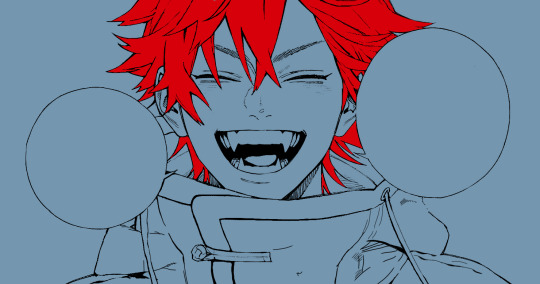
for alma, i chose his main color to be red! it's the color of his hair and his jacket, so i wanted it to be vibrant and stand out. since blue contrasts red, i went for a greyish-blue shade for the background. (i went for grey rather than solely blue because then it would clash rather than complement).
disclaimer please please please take your device off night mode warm mode f.lux whatever you have. this has screwed me over more times than you may think :(
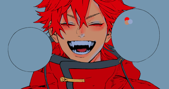
i like to make my vibrant colors closer to the right end of the color square. for alma's hair, i chose this color:

i dragged it down from the corner a bit but kept the saturation since his hair is kind of dark. we can use vibrant colors to shade it though, so don't worry!
here's his hair and the background together:
now from here, play around with skintones until you find one that matches the hair!
i usually drag around the wheel to the orange-red intersection, and have it on the lighter, more saturated side. here's the color i chose for alma's skintone.
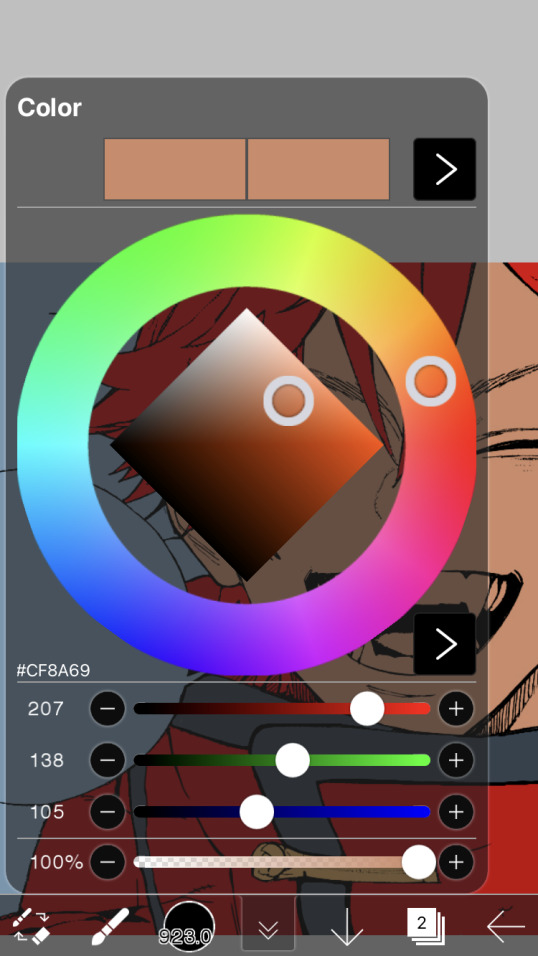
i thought his original skintone looked a bit too orange, so i pulled the saturation back a little bit (moved closer to the left side of the square).
after that, color in his jacket with a bit darker red than hair, choose a gold color for the accents on his jacket, and color in the black parts with a grey-ish color (we will change that later).
here's the base colors!
if it looks a bit bright, don't worry! we can change that with shading. or you might just have to. accept the light.
STEP THREE: SHADING AND LIGHTING
wooo we made it!!!!!!! ok now i lied, we have a bit more of base colors to go. on a layer above the skin, color in your teeth and tongue. for pieces that have a more red feel (like this one), i like to make the teeth and the shading a more vibrant blue color. (for blue pieces, i make it a purple!).
IMPORTANT NOTE: ALL SHADING AND ALL COLORS SHOULD BE DONE ON NEW, CLIPPED LAYER.

i'll then go in and do some light shading with my wet edges brush. i'll use a darker color for hard shadows and then a lighter, more vibrant color to accentuate it.
next up we have blush! a lot of people do this in very different ways but i like to do it directly under the eyes, in a vibrant red shade. make a new layer above the skin and clip it on. color pick alma's hair and drag it to the most saturated shade (red corner). then using the watercolor pencil brush, lower the opacity of the brush and drag a line under the eyes on both sides.
make sure to erase the portion of blush that goes above the eyeline. i also added some lips for alma as you can see, and then added a red line under the eyes! this was back to the regular dip pen (hard) brush on 100% opacity. it may take a few tries to get your blush to the way you want it, so don't worry too much.
now we can start our actual shading!
i break this part up into three steps: skin shading, blue shading, and light shading (highlights?)
for all of them, think about where the light is falling and how it will look on alma.
quick interlude about brushes: i use the watercolor pencil brush for softer, bouncy looks (like blush and noses) and i use the wet edges brush for more hard lines in shading.
again, make a new layer above the skin and clip it on. (i like to have it below the blush, so it doesn't cover it). for skin shading, i take the vibrant red and lower the opacity of the wet edges brush by a significant amount (specifics don't really matter, as long as you're happy with it). i'll trace his neck, from the shadow of his face, shadows of his hair falling on his face, ears, and nose. (for the nose i used the watercolor pencil brush for a softer look).

this is what i have once i'm done!
next we have skin shading part two, where we basically make a new layer on top of our first shading, lower the opacity further, and trace outside whatever we just did to blend it in more.

i used the watercolor pencil brush since it's more softer shading meant for blending! i also added it around the eyebrows for depth.
next up we have our blue shading! this is a technique that i learned from @/bkdkdh's colorings, but adding blue as a shadow really adds to the whole coloring. using the watercolor pencil brush, select a light-ish blue shade (a bit more saturated than background color) and use it to shadow a few more areas than your skin shading. i always make sure to hit the underside of the nose, cuz i think it adds depth!
finally, to wrap up our skin shading we have our lights. i use an orange-ish yellow color, which i set pretty light to not blend into the skin. using the watercolor pencil brush, i'll basically highlight any areas opposite to where the blue was, and highlight different parts. i always highlight one side of the nose as well.
i erased the line around the nose since we now have shading there, and added a darker shade to the teeth since i felt it wasn't shaded enough.
now onto the hair!!! (guys we're almost done bear with me, skin and hair are the two main things and then you can half-ass the clothes)
color pick alma's hair color, then drag the red a bit further down to get a darker yet still saturated color. here's mine:

then, using the wet edges brush, draw lines of shadow wherever clumps of his hair fall or overlap with each other. you can have the opacity set to whatever level you want, i just went with around 90. just try to follow the natural lines and patterns of the original line drawing, and everything should work out fine.

here's how mine looks! then, just like we did for skin shading, place a layer on top and lower the opacity to around 50%. place some more shading to blend it in. you can also shade more parts with this shade for some softer shading. i actually forgot to take a screenshot of this step but you'll see it in the next one!
for our (almost) last part of hair shading, take a layer and place it below both of your shading layers. this is going to be our highlight layer! you can see it below, labeled 49%.

remember how we set alma's hair a bit darker from the corner color? now select that corner color and draw highlights in the center of each hair clump.

lightly visible but it's there!
now here i skipped around a bit bc i was having fun and forgot i was doing a tutorial, but repeat the shading (not highlighting) steps with darker colors for alma's jacket. you should have your base layer, a dark shading, and a softer shading for blending.
we're almost there guys!!!
for the pretty much final step of shading, select a light blue color and do some blue shading with the watercolor pencil brush opposite to wherever your darker shading falls (just like we did on the face). make sure to do it to both your hair and your jacket! here's mine:
now for the black portions, we're going to color the whole thing in a dark blue color. just alpha lock your layer and make a big stroke of dark blue, almost black. for our black shading, we're actually going to go lighter.
select a lighter (but still dark) color and place highlights on the base layer, then take an even more vibrant, lighter blue and place it on the very outside for highlights. a better example of this would be nagi's legs in his blue lock uniform here. then, choose a shade to apply shading to the gold accents on alma's jacket and we're done!
CROWD CHEERS!!!!!
STEP FOUR: FINISHING TOUCHES
we made it guys!!!! for finishing touches, i'll usually do background effects or text or that kind of stuff.
step one is coloring your lines. you can add a new layer and clip it to your lineart, or simply alpha lock your lineart and color directly on top. for hair i like to add vibrant blue/purple lines, along with a few red ones. for skin lines i try to do dark brownish purples, but leaving some black is good too bc it adds flavor!
i colored in the text boxes and added shadows using the wet edge feature, then added some text. for the glitch effect, i duplicated the lineart, dragged the layer below all of my colors (including speech bubbles) and then used the glitch effect with height full from ibis. if you don't have ibis, you can look into features on your software, or you can also just drag your lineart layer a bit to either side and color it in. i also applied just the tiniest bit of noise on top of everything
and there we go!!!!! we made it to the end :)
if you've read all the way til here, thank you so much! if you decide to color this panel of alma (or any other panels!) don't be afraid to post them and tag me for a color this in your style type of thing! (you can also put it in my tracked tag, #user.roy) i'd love to see everyone's works :)
here's the full timelapse: (it stalls for a bit at some times but hey we can't have everything)
#roy colors#tutorials#manga coloring tutorial#useraki#usergojoana#usermica#usernikiforova#tagging some friends <3#alma#gokurakugai
47 notes
·
View notes
Text
November 21 2023
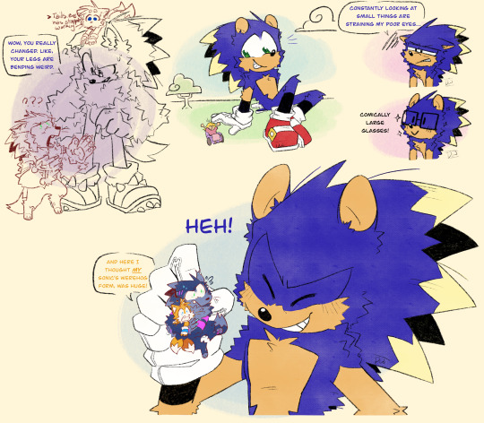
Some fan art for @weirdozjunkary's MvA AU and their Werehog AU.
I absolutely adore the goobers and reading their stories are a lot of fun! MvA was a childhood film of mine and throwing my childhood videogame (and current hyperfixation) tickled my brain.
I'm going to make fan art of every au/ story I love eventually and no one can stop me.
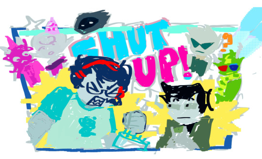
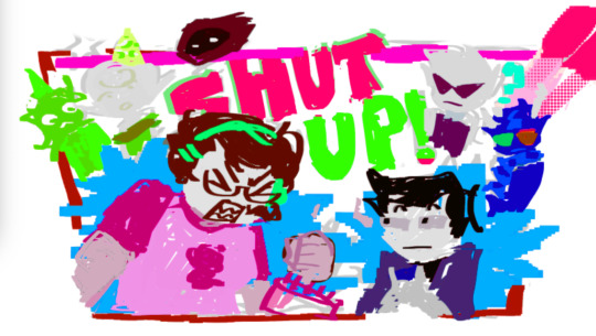
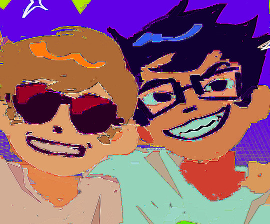
#sonic the hedgehog#sonic fanart#tails the fox#miles tails prower#sonic the werehog#MVA au#sonic unleashed: world reimagined#He's literally so big you can see the paper brush effect repeat itself.#It's also really messing with my color palettes
508 notes
·
View notes
Text

I love that so far I've drawn kethri almost exclusively in happy little non-canon doodles where in most of them she's also being a big flirt, fuckin superb, love this for her
#in other news I was literally in the MIDDLE of drawing something and got distracted and ended up messing with kethri's ref file skjfghdfkg#I was doing figure sketches out of NYSSA'S ref file but I found a pic that made me go 'oh that's kethri's exact figure'#'... does she even have a ref file yet? hang on I've actually drawn her at all now so I need to update it with those drawings'#(she DID already have a file! what was already in there was a bunch of wardrobe refs and color palette moodboards to help DESIGN her)#and now there's also a couple figure refs and what her actual dang face looks like (especially when smoochin) 😌#this DOES a little bit give the impression that she's That Kind Of Bard but she's really not particularly haha#my art#my OCs#kethri#about me
4 notes
·
View notes
Text
You qualify for a veterans account if you somehow remember these two.
#PERMEN AND CARAMELLA.#ITS PERMEN AND CARAMELLA#MY BARONESS VON BON BON FANPARENT DESIGNS FROM MAYBE 2017 OR 2018#I didn’t really want to mess too much with their old designs cause oddly enough I still really like them#I think they could use some tweaks with their old color palettes !!!#for anybody who knew me on DeviantArt#I actually had parent designs for both Permen and Caramella as well but I just.#did not ever post them#I had a very basic lore going on with them way back then#but since I haven’t messed with Cuphead much lately I never really finished that completely#I should also redesign Caramella’s dragons. she had two of them.#she’s a bit of a dragon tamer#meanwhile permen is terrified of her dragons#make of that what you will :))#Permen Von Bon Bon#Caramella Von Bon Bon#Cuphead ocs#very old ocs#ocs#original characters#Cuphead#fanparents#The Kiwi Draws
2 notes
·
View notes
Text
Sneak peak at something I've had brewing in my sketches, i think i got a very good expression? I gave them a nose (i don't usually draw noses but this is a pretty good shape) and the optic looks a nice color of orange. I tried to make it so that they were like looking down at their partner, who i expertly cropped out because well it's a bit of spicy posing, but i think I'm getting better at making my robots seem more alive
#transformers#oc art tag#but these were not previously designed ocs#also i really enjoy giving my mecha little decals around their optics. Top tier i love it#I've been experimenting with my art and ultimately it's helping with my sense of space and trying to draw emotion#I'll probably mess with colors and find what fits just like how i got optic color; though i will listen to whatever color palettes ppl want#or names. these guys don't have names yet.
0 notes
Text


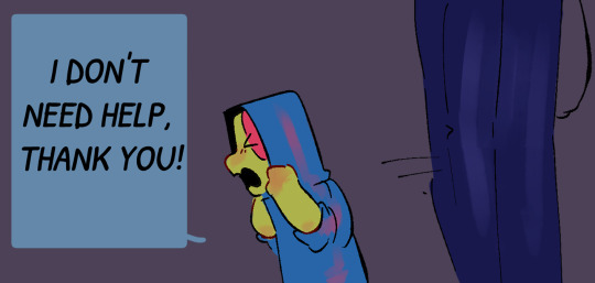
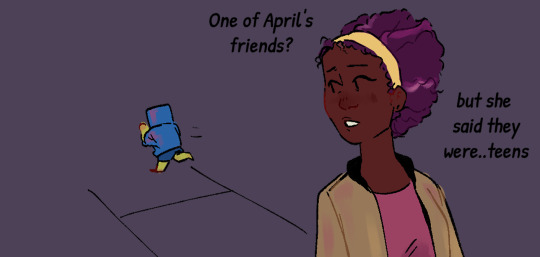
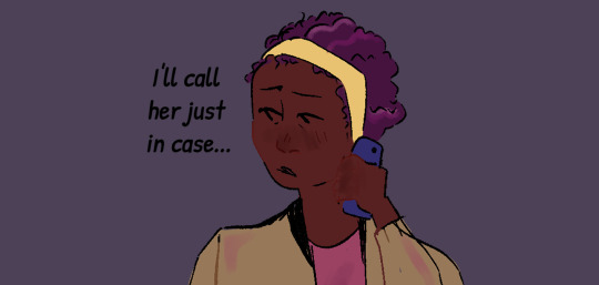
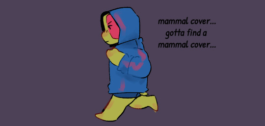


Kid Leo Au: Finding Home
Part 3!!
Shoutout to everyone guessing it was Carol O'Neill!! She was on a late night grocery run :)
her coloring kinda changes between the first two panels and the ones after Leo runs off because CSP decided to delete the palette I LITERALLY JUST MADE FOR HER!! and then I couldn't just eyedrop tool it because I use a gradient map layer over th color layer and coloring these pages was just a mess >:(
ANYWAY!! I really like my design for Carol and I hope everyone else does!! I spent a lot of time researching diferrent hairstyles for her but ended up going with the one that's most like her canon appearance! I also gave her a similar hair color to April ( coloring is messed up a bit in the other two panels cause again, palette issues). I also did a bit of research to get the texture right since I was giving her a slightly different hairstyle than her canon one ( v similar but not exactly the same ) so hopefully it reads well!!
I'll share the sketches I did of her before I finished lining/coloring this in a bit :)
Also hi it is in fact 3 AM im just feeling a bit silly :)))))
Kid Leo Au Masterpost | First | Next
#art#rottmnt#fanart#rottmnt fanart#rottmnt leo#rottmnt comic#rottmnt fanfic#comic#digital art#rottmnt art#rottmnt kid leo au#kid leo au#turtle tots
1K notes
·
View notes
Note
Hi! I finally got the chance to read Aurora a bit ago. It's a wonderful story--all I was expecting and better! I was particularly amazed and delighted by the artwork and visual mechanics used to tell the story, so I wrote a post to yell about how cool it is and break some of it down. (No criticism, just praise.) I'm mostly a hobbyist, so I'm hoping I've done it justice.
That said: zero pressure to read it or respond to this ask. Normally I wouldn't send it since I tagged, but I know Tumblr's notifs are a mess and things get lost very easily. I've been in both the "one (1) word of praise will feed me for a year" and the "oh gods don't talk about my writing/art because anything that seems Off will break my brain" modes before, and I absolutely don't want to push or make you uncomfortable!
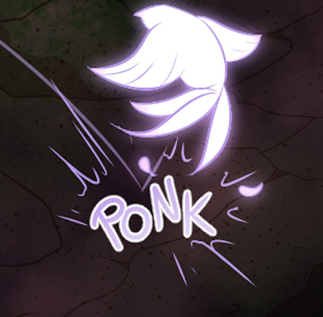
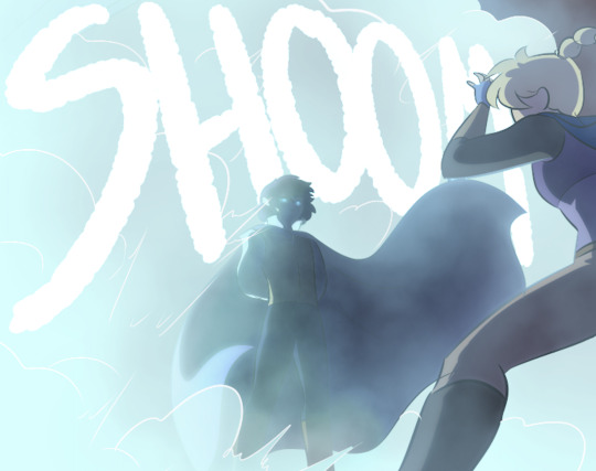
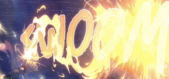
If you are comfortable, however, I wanted to ask about your use of what I'm assuming are Screen and blending modes in sound effect words. (I'm only guessing that's the technique, though, so I could be totally wrong about how it's done! I'm mostly experienced in image manipulation in Photoshop.) Making them semi-transparent over the actions is genius :) What inspired you to do that, and are there specific techniques you use to make it work?
Same questions go for using specific colors to distinguish different characters' words and actions. I really noticed it in the cave sequence with Falst and Dainix, since their colors are so vivid in the dark (ex. Falst's little swats and Dainix's swooping kick at 1.20.9). It lends excellent clarity to busy scenes.
Thanks! Have a lovely day, enjoy your break, and happy holidays <3
You're correct about the technique! "Screen" is the blend mode I use most often for sound effects. I stumbled on it mostly through trial and error - I love how sound effects add depth to a comic panel, but it's very easy for them to obscure the art in a way I find counterproductive, so "Screen" lets me put the sound effect directly over the origin of the sound while still letting it be visible through the word. Early chapters didn't have it as much-
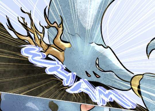
Most of the sound effects in early chapters are just solid colors with reduced opacity if I'm feeling fancy. But I started figuring it out around chapter 8 and 9, because Falst is kind of a sound-effect-heavy guy, especially in his fight scenes.

In order to make sure they don't impede the visibility of the action, I'll often soft-erase the top or bottom half of the SFX to reduce its opacity while still leaving it readable.
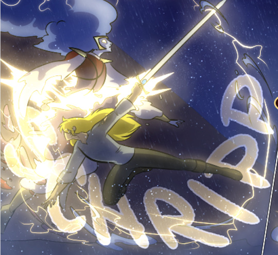
I'll usually double that up with an outline on the SFX so it's still readable. This is an especially important consideration if the SFX goes over an area of the background that's very bright or glowing.

Color-coding the speed lines and SFX to the character or force causing them isn't a hard and fast rule, but I like using it (in part because it's a habit from the OSP illustrations, where every character has a single pop of color in their lineart) mostly because it sort of codes every sound to make it clear where it's emanating from, or the general feeling of the sound. Since I normally do character-colors for SFX, something like this stands out more jarringly-

Which it's supposed to, but a big lightning strike doesn't register as anything too worrying because it's just Tess up to her usual shenanigans.

It's also very useful for magic effects, because each form of magic has its own associated palette.

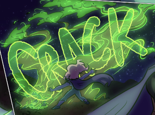

And when I had a very complicated fight scene in a dark environment, I used the texture pattern I'd already made for the monster to color its SFX, so when I Screened them onto the panels they didn't obscure too much while still communicating "this is something else."

Changing the weight, lined-vs-not-lined, and opacity of the SFX words also helps to communicate that not every sound has the same feeling. A strong motion is solid and aggressive, but a crackling, unstable sound is more ephemeral and staticky.

It's definitely been a process of learning as I go - looking back at the earlier chapters I can actually see when I first tried various tricks I now use regularly, like doubling and distorting an SFX to produce the effect of a camera-shaking impact. I haven't really seen any other comics that do it like I do, probably because most other comics follow a more traditional production pipeline where text bubbles and sound effects get locked into the composition early, before the inking stage, because traditional physical comics don't have digital-art layers to play with. Adding sound effects to a page is almost the last thing I do before exporting them, and that only works because digital art and layers allow for a ton of flexibility.
370 notes
·
View notes
Text
how i make color palettes of my ocs before i pick one, an art tutorial?
hello, whenever i made a new design for myself i found a way to make lots of color palettes and pick one! i see this method more in paintings and rendering but not much on character designs? here are some examples i used that on.
it helps me so much when i feel experimental with colors. here are what you need
a wip character design. sketchy or pixel art works better since the colors can have some anti aliasing issues
a program with gradient maps. i'm using clip studio paint but ik photoshop also has it. like i said this is used more on photos or paintings
and here's what you do!
draw your character. i'm making a new fursona for myself but anything should work.
2. decide on their markings/color placement in grayscale. i recommend doing grayscale so you can easily see the values. split your grays into however colors you want. i like doing 5-6 the most. i reccomend duplicating the color layer if you wanna try multiple palettes.
3. this part is program dependent but in csp's case go to edit > tonal correction > gradient map.
4. i made a few default 5 color gradient maps but if don't use gradients like me i reccomend making the graph like this so they become solid color. split the map into however many colors you used. i'll add a color to the red-orange one bc my character has 6 grays.
5. replace the colors by clicking below specified color. it all depends on your creativity and what you want. experiment til you like it.
6. fuck around, try stuff, put them together to see if you like any of em. i made 9 to see if i can focus on one of them and i actually ended up loving the bottom right. it really makes them shiny
7. (optional) if you like a palette you can further and play with colors while keeping the palette. you can use color balance (in the same menu as gradient map in csp) or layers to mess around, have fun!
also a color tip because people seem to compliment that a lot in my art: digital art has millions of colors! don't be afraid of using wacky tones unless you're going pantone. if you want to get something physical i recommend being open to alternative colors as they tend to be more limited. i know whoever is doing it will try their best to keep the colors close.
color theory is something i don't...care much about mostly because this is something i'm doing for fun. i'll consider it in professional work.
#artists on tumblr#digital art#ika's showtime#ikarnival#art tutorial#art tips#drawing tips#art resources#clip studio paint
351 notes
·
View notes
Text
Dipping my toes back into gemcyt for a sec so I could do a real quick sketch for a Fairy Fort fusion
I was going also going to do a Shadow Alliance fusion (Lizzie, Ren, BigB, and Martyn) to go with it, but perhaps another day 👀
General Story/Design Ideas Under the Cut:
This place is then known as: The Fairy Circle [The Garden]
Design:
It was really hard finding a stone that I thought would fit. I eventually found the anyolite (ruby in zoisite) and decided to remove the ruby. Originally, their color palette was leaning more Alexandrite, but that's already a fusion in SU canon and I don't want to mess with that too much.
Overall, I was thinking along the lines of a fairy knight, a forest guardian of sorts. The cape and fur collar are meant to resemble a moth and the horns from Cleo are formed to look closer to antlers.
Story:
After the events of pseudo-3rd Life, Lizzie, Ren, BigB, and Cleo find themselves separated from the other gems and are unable to reconnect. Finding it more safe for themselves to stay put and wait for an eventual rescue, they create a sort of safe haven/nature reserve where they spend most of their time generally tending to the wildlife.
During their time in the Garden, Lizzie and Ren learned to better understand each other and began to grow closer. From their disdain of the other Diamonds and the structure of Homeworld to their respective missing halves, the Garden has done wonders in allowing them to see eye to eye. Accompanying their respect for each other is a fondness that wasn't quite there before, as their bond has led to an almost codependent friendship.
On the other end, Cleo and BigB are just generally polite with one another and are mostly amicable. They understand that they must all stick together if they are to find their lost companions, but neither have particularly latched onto the other with that same desperation that Lizzie and Ren have.
Something or other happens (most likely an argument where Cleo wants to leave and conduct a search of her own and the others don't) and BigB ends up poofing Cleo. Her gem is damaged heavily in the altercation and when she reforms, she is furious. The betrayal leads to Cleo essentially destroying The Garden and leaving on her own to find the others.
487 notes
·
View notes
Text
fuck it! gay robots!
ishimondo wall-e au! it came to me in a dream.
mondo (… M.O.N.D-0???) is the last robot standing cleaning up earth when he gets a surprise visit from a rocket ship. on that ship is taka (… T.A.K.A???) who has been sent to find any proof that earth can support life once again. the two meet and shenanigans ensue. maybe they fall in love???
anyways, more rambling from me about these two under the cut.
okay! so my main thing with mondo and his behavior is that it’s all based on him being the last being on earth, so he really doesn’t have anyone around him (other than his pet cockroach, chuck!) and therefore doesn’t feel the need to act a certain way to impress anyone. so this is version of mondo is if he didn’t have a whole bunch of self-image issues and just was his funki and cringe self. he literally is cringe and free.
after years having to clean up earth, he’s grown an affinity for the little things to pass the time. like collecting little knick-knacks he finds on the job to bring back home or making figures out of the cubes of trash he makes. he’s a little artist and collector.
taka on the other hand is at first rigid and is set out to complete his directive because it’s what he was made to do. he has a whole population back on the axium counting on him to find any traces of life on earth (or so he thinks). he does occasionally display some signs of humanity and happiness. he feels warmth in the little things as well, like a cockroach or bubble wrap or a lighter. he’s enthralled and wants to know more about this strange place but can’t because he has a job to do. maybe the strange little robot guy he meets doesn’t throw him off his course.
design stuff! i know i made mondo look less… anthro ig??? in his design than taka, but i wanted to make up for it by “personalizing” him a bit. he’s doodled all over himself and he thinks his trousers make him look nice. maybe he thinks the doodles look badass because they’re like tattoos. i also did that to contrast more with taka, who looks spotless. i was considering giving him legs, but remembered that of course he would have wheels. biker, and alla that. he was born to roll around. and i don’t think it’s noticeable, but i tried to make his arms and hands bigger than wall-e’s because he’s a little stronger. in this au, mondo doesn’t do the trash compacting his his little cube body, but with his hands (to keep with the idea that mondo likes to work and creat stuff with his hands). so he needs to have bigger and more efficient tools. also, i changed his wheels to be diamond shaped.
taka meanwhile was super easy to design. he and eve have sorta similar design qualities, like a majority white color palette and very simple shapes with not a lot of detail going on. very easy to mix the two. the idea of his design is what spurred me into thinking about this au. the one thing i’ll point out is that i made eve’s little dots that pop up when she scans things vertical so that it can sort of resemble taka’s medal. idk i thought it was neat.
(also, if im being completely honest with myself, if taka was actually any wall-e character, he would be MO. just an angry gremlin that musters up the courage to stray off his path because he is so determined to clean up wall-e’s mess. and then they become friends at the end. he just gives off taka energy.)
anyways, that’s it for right now. im pretty satisfied with taka’s design, but im considering changing some things on mondo’s. mainly the color palette.
am i gonna turn this into a full-fledged story??probably not, but maybe i’ll add more onto it in the near future. like assigning other characters.
wall-e’s a cute movie. gotta put the blorbos in it.
#i actually have no idea what their names would stand for#rewatched wall-e for this post. forgot how sweet it is. :)#danganronpa#mondo owada#kiyotaka ishimaru#ishimondo#danganronpa trigger happy havoc#danganronpa fanart#danganronpa au#doodlepuff#ramblepuff
228 notes
·
View notes
Text
So after spending this weekend doing oil painting. I have some thought as one who has mainly been a Digital painter for most of my art life.
One major thing is that the benefits with digital art is everything but the ability to undo mistakes - you can fix mistakes in traditional art if you know what to do.
No, the true benefits of a digital art program is stuff like.. being able to just pick and choose colors from a whole ass color wheel! Or even better; being able to color pick the exact shade you needed.
With oils, you have to mix paints to get these shades. And its not a good idea to just mix them as you progress because whoops you suddenly ran out of space on your palette because you didnt know you have to actually organize where you arrange the blobs of paint and now you have a muddy mess to clean up!
Know what else is amazing with digital art programs? You can select and transform parts of the image to fix proportions. You cant do that with an oil painting. You cant copy a part of it and paste it elsewhere with the paints intact and workable.
Oh and also bucket fill tool my beloved. Do you think i can just pour a bucket of paint that will cover a specific area on my oil painting and not spill it all over my kitchen floor??
Like ctrl + z is the LEAST thing that ive taken for granted as a digital artist.
Like i swear after painting with irl oils all weekend i went back to clip studio and good god did painting suddenly feel so much easier. It felt like i took off weights from my legs rock lee style.
I still am really really enjoying painting with oils. Its just been a big self discovery on how i make art in different mediums.
117 notes
·
View notes
Text
Tips and Tricks for krita (part two electric boogaloo)
Ok so this one is going to be a doozy because im going to include a lot of examples and tips for how to use filters (AKA YOUR NEW BEST FRIEND)
Link to part one.
Ok so filters in krita can be a doozy so ill cover the ones i use in my art the most, these will be adjust, artistic, and enhance dropdowns. I will be using my art pieces to show how i modify my art- colourwise!
Obviously, start off with opening the filter menu up. Color balance brings you to this menu, where you can play around with the colour of your shadows, your midtones, and higlights. Its a lot of trial and error, just messing around to see what fits, and its how i got to this point. through just pushing the dials up and down. Honestly, a lot of this part of the tutorial is going to be me telling you to hit those dials and levers like you dont know nobody.
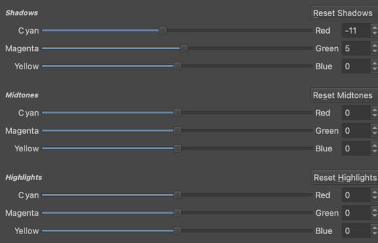

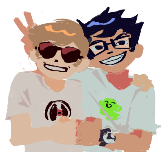
Even just small modifications as you can see can play so much of a difference. For here, i upped the cool tones for john, and upped the warm ones for dave. Colour theory without colour theorising i suppose you could say.
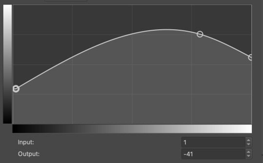
Crosschannel adjustment curves can help with contrast and colour intensity. Usually i have one point which i use to move up and down per my whims to control how bright my work is, and it can really help with really bringing out those colours so it doesnt all fall into one hue.
Colour adjustment curves works similiarly, play around with them to get the desired effect.

Krita also has HSV adjustment, but i usually use just the hue and saturation. Theyre pretty self explanatory, and can switch up your palette in pretty fun ways.
Now we move on to the ARTISTIC part. Again, i recommend you play around with them yourself, but i find index colours works really well for making really pretty art really fast! You just put in a few colours with descending lightest to darkest and you get an awesome art piece! Id say this is useful for pixel artists, but also useful for other parties. I might just start using this more myself. Its so easy wtf.
AND FINALLY THE MOST IMPORTANT THING.
HOW MY ART IS SO CRUNCHY.
If youve been following me for a while you probably noticed theres a slight crunch to my art. It gives it a slight bit of texture and makes it noticable. How do i do it?


You're welcome.
insert image of face on 90% opacity and comedic text for purpose.
Alternatively, if youre looking for a sbahj level of crunchiness, smack that "mean removal"for some fun.
Thats all! Happy drawing.
98 notes
·
View notes
Text
alright, the other day i loosely implied that i would make a behind the scenes/tutorial type of thing. momma didn't raise no liar, so here goes nothing i guess!
step 1) rough sketch
honestly i skip this entirely if have a really concrete idea of what i want to do. sometimes compositions are just beamed into my brain from On High and a sketch is unnecessary.
step 2) 3d ref

this is where i refine the composition, lighting, camera angles, props, etc. i use DAZ studio for model posing and blender for almost everything else (props, horns, lighting, rendering).
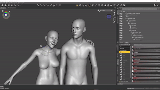
here's a 10 minute video on how to pose models in DAZ if you're interested in doing something like this! it's not very hard! basic posing requires almost no technical know-how.
i've heard magicposer and virt-a-mate are also good for model posing, but i don't have any experience with either program.

after i'm done posing, i transfer the models to blender so i can work on props, environment, and lighting because doing it in DAZ is ass. you can see that i went overboard on the ref for the paladin i worked on last year by modelling armor.
step 3) lineart

at this stage i'm synthesizing my 3d models, reference images, and style choices into lines.
the 3d likeness of my models is poor because I don't have time for that shit, so this is where my humongous folder full of bg3 screenshots comes into play.
for example: looking at my screenshots, astarion's forehead tilts back towards the back of his skull, much more so than my reference model. his chin and jaw are sharper and longer, and the transition between his brow ridge and nose is almost a straight line. if i combine the information from my 3d model and astarion's face, i get something like this:

3d models aren't fleshy (ie, tummy rolls, wrinkles, muscle deformations, butt squish) unless one puts in A LOT of effort like absolute madman chris jones.
you guys know bernini, right? he has a couple great examples of this. see how hades' hands press in on persephone's leg?
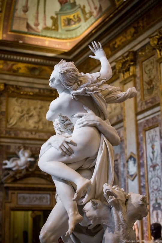

this is what we want to add in the lineart because it's too much effort for 3d. laziness is king.
i guess i draw clothes at this stage too, but for some reason there aren't many in this image. ( ͡° ͜ʖ ͡°)
step 4) base color
i have a little color picked palette that i use for everybody so i get their skintones right before i start messing with colored lighting. i'll use overlay and hard/soft light layers clipped to the base layer during the shading step later.
step 5) shading
if you thought we were done with the 3d part, guess again! i posterize my 3d reference so i can see the shapes of the shadows and highlights better. if i'm not feeling it, i can go back to 3d and change the lighting really easily.
could I make a cel shader for this? yes. am I going to? No. custom shaders are for people with intelligence and I am fresh out. posterization it is.

from there, i do a pretty standard cel shading deal that i usually blur and set to low opacity. (for this image i stuck to no blur because i had been looking at a lot of morebird's art and was really feeling the hard edges)
photoshop is what i use for final rendering because it has bangin tools. the brush customization alone make ps worth it, but i also particularly abuse puppet warp, noise generation, the camera raw filter, and layer styles.

step 6) background
i put the least effort possible into a background and then i blur it into oblivion so you can't fathom the depths of my ineptitude.
and then i have a finished image! ᕕ( ᐛ )ᕗ
#art tutorial#this got long!! the rest is under the cut#i encourage everyone to try out DAZ and blender! theyre both free!!#i love goofing around in 3d
88 notes
·
View notes
Note
Yo! Do you have any notes/tips for your coloring process? I've always had trouble with that part of drawings looking good lmao and I really like yours! If not for your specific style, do you have any tips with that in general?
Iv gotten a few asks about how I color but iv always avoided answering because
A) I am absolutely awful at explaining things, and
B) I am a very Very lazy artist you should probably Not do the things that I do
BUT i feel bad gatekeeping(?) my horrible technique if it helps anybody ig ill try and explain so
✨✨✨Welcome to Reegis’ Probably Not Reputable (But Very Long Winded) Art Advice✨✨✨✨


line art of a random character for the example, just pic whatever colors you have in mind for your base colors, you can try using palette generators or basing it off of existing palettes/characters/whatever I have absolutely no idea how color theory works (& this is why you shouldnt listen to me) so im solely going off of vibes. but it is Rough so onto step 2 & 3
(edit to add i usually start off with the skin hair & clothes on separate clipping layers and merge them together towards the end.. i think i forgot to say that at all here oops)

I abuse the hellll out of layer blending modes. overlay, saturation & multiply mainly, but also difference, brightness & screen. (just doodle something & try all of em out to get a feel for them honestly ik theres a Lot and they can be intimidating) for this i just wanted a more cohesive warmer tone to start with so i added a peachy overlay & a slight ombré to the hair to add a bit more interest to the character.
then just the most basic of rendering, some blush & highlights just wherever i think theyd go.


Another thing they tell you Not to do, my next step is to block out all my shading in a vaguely purpleish multiply layer!!! i cant be assed to do it any other way im sorry…. once i have the basic shading down, i lock the layer & go in with air brush eraser & also airbrush in other colors wherever I think the purple is maybe too harsh/clashing
still wasnt 100% happy with the colors so messed around with some more layer filter/modes/whatever you call them then colored in my line art! i think this is honestly the saving grace for all of my art shshsdhhf color your lines people. doesnt have to be all (i dont, i like the contrast) but it usually helps to make some at least a little less harsh
then with a little more color tweaking im done! one random sleepy dude, fully colored (by my standards)
and then if a piece needs more dramatic lighting you justttt
im so serious play around with layer settings! these are just basic multiply & add(glow), there as so many others you can abuse the shit out of & nobody will know or care in your finished piece.
was this?? in any way helpful???? I hope so.
#THIS IS A BELATED ANSWER FOR ALL OF U MY B#scrolled back to find the earliest one i could bc i mean… you asked first#if this was in Any way helpful…. im glad#and also sorry. probably dont do these things#hmu if youd like me to clarify anything ill… do my best#asks#my art
104 notes
·
View notes
Text
Hazbinverse Salt: Stella
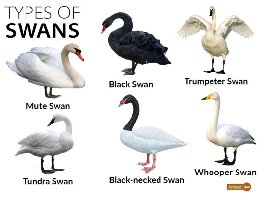
Okay I finally gathered my thoughts about why, as a swan aficionado, I dislike Stella's design so much. I'm also going to point out what I would change.
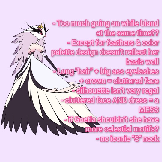
Too much going on while bland at the same time:
On first glance it looks good enough but the more I think abou the more I start to scream internally
So many feathers, face is cluttered, isn't very regal, even her arms (why not make the gloved full length?)
Dress is TERRIBAD
Honestly the design tries so hard it ends up boring
Except for feathers and color palette her design doesn't reflect her basis very well
HER NECK IS TOO SHORT
Either make the dress solid with less feathers and keep the "hair"
Or you could keep the feather dress and make her hair shorter in length
Alternatively turn the hair into a bridal train to symbolize her purpose
Also if her (assumedly full-blood) brother is a peacock wouldn't it make more sense for her to be a peahen?
Eh I'd make her a mixed species; and also include peafowl feathers as part of the dress or an accessory
Long hair + big ass lashes + crown = cluttered face
Again I would shorten the hair length or style it differently
SHORTEN THOSE EYELASHES
Somebody pointed out that her lashes are so long they literally blend into to the background
Change the eyes back to pilot's blue to match Andre & pop out from all the pink&purple
Silhouette isn't very regal
For someone groomed to be royalty she doesn't look like it
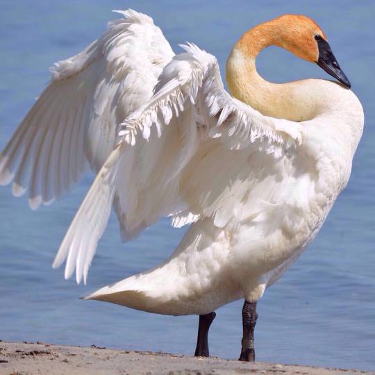
HER NECK IS TOO SHORT WHERE'S THAT GRACEFUL S SHAPE SWANS ARE KNOWN FOR
Amp up the design to be Victorian/Edwardian inspired: that's when circuses really blew up in popularity; fits the circus theme of Hazbin
Some historical refs I found


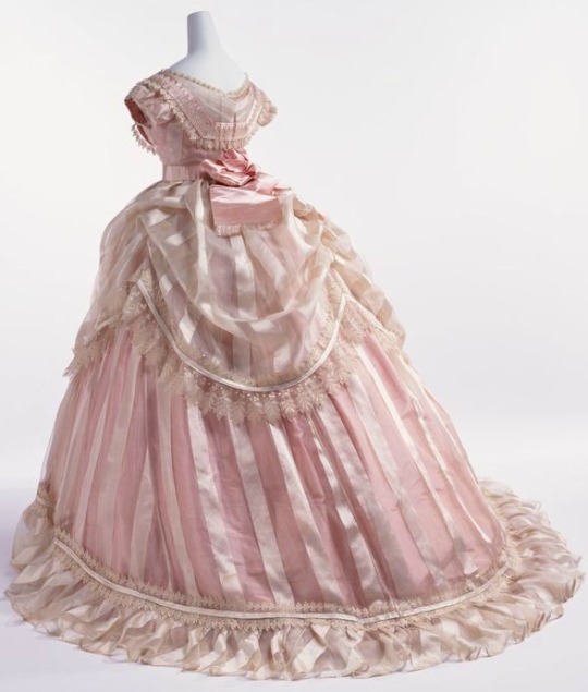
See one of them even has feathers!
Instead of a gradient top make it a solid color and the top layer of skirt the same color; end with a gradient or keep it solid
Change the bottom layer to a lighter purple or pink
Lack of dark colors makes her evil less conspicuous
Probably stripes or a star pattern her name means star after all
Keep the short sleeves
The more evil Stella grows the darker her palette becomes; maybe more plums and maroons with hot pink
Cluttered Face AND hair = mess
See above
Again I'd keep the head hairless and change the eyes to short lashes and blue orbs
If Goetia shouldn't she have celestial motifs?
Have a star shaped crown or jewellery
Make her palette sunset themed
Since Stella means star have her wear solar themed clothing at times
at least SOME heat based power to contrast her brother's ice; since she is demonic royalty I guess she should have some magical power
Having a bit of power shows that she is more of a threat than given credit for; justifies why she's an equal match for Stolas
IT FITS HER PERSONALITY
Adds a sense of tragedy: her power never recognized for their potential due to outdated ideals of hell
Which in turn legitimizes Charlie's crusade; changing Hell for the better would prevent future situations like Stella
Tragically, Stella succumbs to her flaws instead of growing out of them; tragic, complex villain instead of a cartoon caricature for wittle ol' woobie owl to overcome
Aaaand that's about it. I might draw my dream look for Stella. I think as someone who's supposed to be a villain she should've had a way better design. The Pretty Pink Princess turns out to be a total witch. Cool concept, uncool execution.
#stella salt#stella goetia#helluva boss critical#hb critical#helluva boss redesign#helluva boss salt
223 notes
·
View notes
Last Seen Blogs

severetastemakergiver-blog
Untitled

raised-on-champagne
Drunk On Summer


nurseworms
"Im Down For A Ham And Cheese Sandwhich Rn."

lodesbench-blog
s t u d y b l r