#I find red palettes very tricky to work with
Note
hey!i saw your analysis of yeonjun and soobin's outfit swap and i thought it was really good! i did want to point something out though--yeonjun looks good in black when fansites aren't editing his skin to be paper white. in general i think what was kind of off about him in soobin's outfit even after he took the jacket off was the simplicity of it. yeonjun's bone structure seems to thrives when things are a little bit extra. but speaking of colors, what did you think about him wearing kai's sweater? i thought the colors were totally weird on him. also i thought you could really see how broad and soft kai's bone structure is because of the way yeonjun's clothes fit him. what did you think??
Hi! Thank you so much for reading through the Yeonbin soundcheck outfit swap post!!
Good point on the lighting/editing! It is pretty tricky to do seasonal color analysis based on photos/videos since camera quality and lighting would impact the way colors come across to the viewer!
Now I only have a rather basic understanding of seasonal color analysis and haven’t really done a deep dive on the boys so this will just be based on looks they’ve done that stood out to me + the yeonkai weverse outfit swap!
With your comment in mind, I tried to look up less whitewashed photos of Yeonjun to see how his natural skin color is. His actual skintone is naturally warmer than the snow white tone that some sites edit it to be. That said, even with more realistic lighting and coloring, I think softer, more muted colors suit him better than black, which takes away focus on his features. Compare the two red carpet images below.

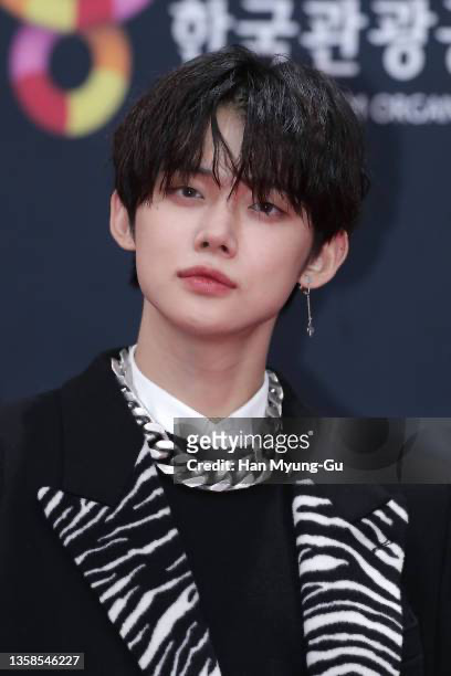
(source) | (source)
In the first image, my focus would be on his face, while the second image draws my eye more to his outfit first then his face. Granted, the heavier styling of the second outfit with the zebra print and large chunky necklace also skews one’s attention so let’s try a simpler styling for comparison.
In the all-black outfit, my eyes quickly scan to his outfit, whereas the neutral outfit allows for my eye to scan the photo from top to bottom. His black hair, black bag, and black shoes in the right photo also helps to guide the eye. As a suspected Summer color type, softer colors and a more muted palette allows the focus to be on Yeonjun first, and his outfit second.
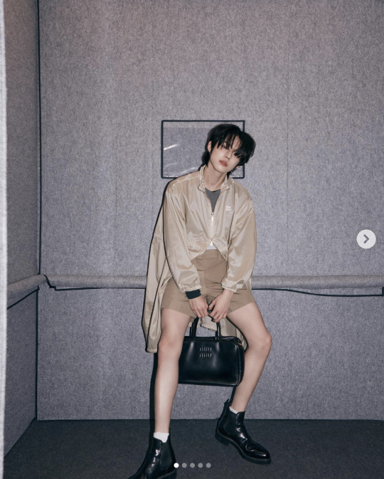

(source) | (source)
Now, black isn’t a bad color on him by any means. In fact, it can be used strategically to highlight his long silhouette or to give him an edgier look (which he does seem to favor). A darker palette helps draw attention to his body, which can be very beneficial when he’s performing as we follow his dance lines more. (can we talk about how the difference in lighting though??? i really should find better pics but this is what my brain thought of rn)
In some ways, a deep/dark color palette on Yeonjun can be a double-edged sword, as I find it can overwhelm his facial features and so we are focused on where the color is more prominent (i.e. his outfit).

(source) | (source)
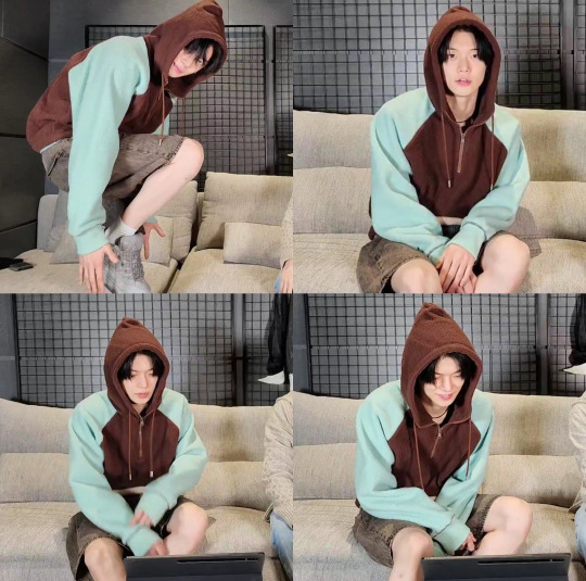
Going to the Yeonkai outfit swap, the jacket might skew a little too warm for his coloring, imo. Notice how his cheeks seem rosier and radiant when he’s in his original outfit versus when he’s wearing Kai’s hoodie.
(source)
Hueningkai in the brown and mint hoodie looks a little more harmonious. He seems to look a little more alive in the hoodie than when he’s wearing Yeonjun’s outfit. Although it might also be attributable to lighting, as even Yeonjun’s cheeks are looking a little rosier in their own outfits than during the livestream.
Like I’ve said, I still haven’t figured out Kai’s coloring (or any of the boys tbh) but I’m leaning towards a cooler, perhaps lighter palette for him atm. Black makes him appear more mature whereas brown or blonde hair makes him look more his age. Both colors still work for him though as they lean cool! Again, it depends on what image they want to achieve in their styling.

Blonde Kai (source) | Black Kai (source)
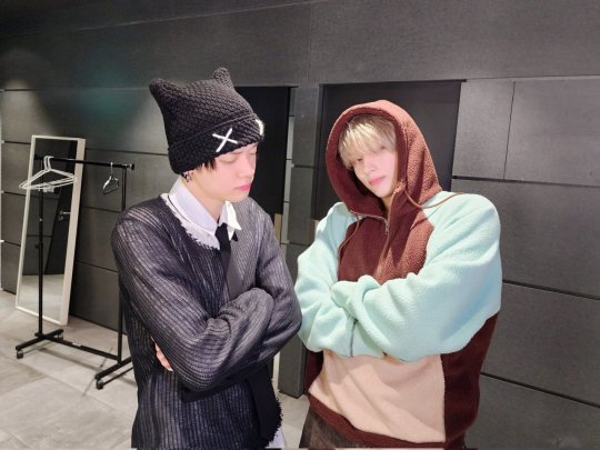
He does seem a bit washed out in Yeonjun’s outfit though – probably because his hair and eyebrows are very light and the beanie is so dark. I think Kai could pull off deeper colors but in this particular instance, due to the high contrast, the clothes are wearing him versus the other way around.
The sweater also looks too delicate on his broad build. The sheer detail and the lightweight fabric does not flatter his build, the way a thicker sweater would. Though he’s a little too young to type,I suspect Kai is a Flamboyant Natural, with his height and blunt, broad frame.

(source)
In my previous post, I mentioned that Yeonjun could be a very slim FN. I may have to revisit that typing after a proper breakdown of the members but similar to Kai, the sweater is also quite delicate on Yeonjun. He could pull off thicker fabrics imo but given his sharper facial features, he’s able to wear the lightweight sweater combo as it highlights his sharp yang (Kai has more blunt yang facial features imo).
I’m not too familiar with styling essences (whether of Kibbe, Kitchener, etc) so I can’t comment too much about it but what I can say is that details like hairstyling, makeup, and accessories can help to make or break an outfit as they serve to highlight the essences of a person. Yeonjun’s piercings help to complete the look – making it look like an entire outfit rather than just wearing clothes!

(source) | (source)
Overall I think it’s interesting to see how a piece of clothing can look completely different on another person and how the boys seem to intuitively lean towards pieces that flatter them. Maybe I should explore their personal style properly next time 🤔 There’s a lot of fashion-related content that’s been coming from them recently after all!
Anyway, if you’ve made it this far, I hope this all made sense!! I’ll likely revisit some of my typings when I get to sit down and be really systematic about them but would love to hear your thoughts about these too! Honestly, seasonal color analysis seems really subjective and there are a lot of external factors to consider so another perspective would be welcome! 😅
And justice for Kai’s hoodies!! He can wear the casual look with ease and it’s very much aligned with his Kibbe type!!
#this was kinda all over the place sorry !!😣#but i wanted to get it out first then just revisit after i let it 'marinate' for a while haha#tomorrow x together#txt fashion#kibbe#kpop kibbe#style analysis#kpop fashion#seasonal color analysis#yeonjun#hueningkai#yeonkai#flamboyant natural#kibbe analysis#fashion thoughts#rambles#asks#asks ❓
3 notes
·
View notes
Text
Great gallery! Many of them are pure funny now, but some would absolutely work and i would love to try them! Here are some highlights:
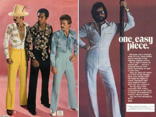
Every one of them is top tier. Flowery shirts, and the velvet abslutely show confidence and great taste. I love the pants on C, the side buckled pants (dont know how to call them rly) are my fav and should make a comeback. All three color palettes are amazing. Yellow and teal this brave are so rare in men's clothing today. And of course the one piece on right, with flared pants and sunglasses. This guy fucks, that's what it shouts and he actually probably knows how to. Love it!
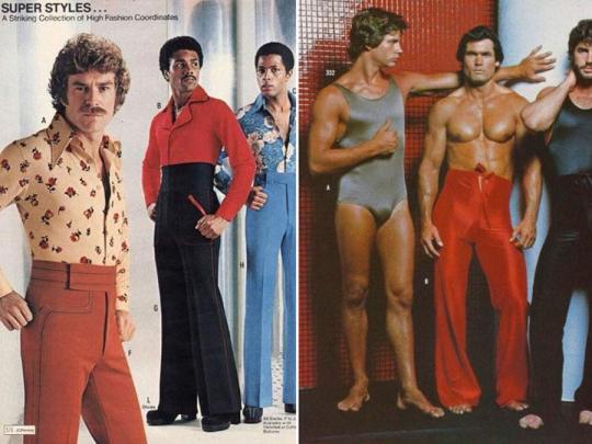
Right is funny of course (though the pants could be a great way to surprise your partner or rival in a karate match). Left is simmilar to the prvious picks. Tight sidebuckled pants and flowery shirts in brave colours. That is what you lack in life, this will fix us trust me. Let's focus our attention to the platform boots on the man in the middle. They slap, absolutely amazing, they fuck, hell yea.
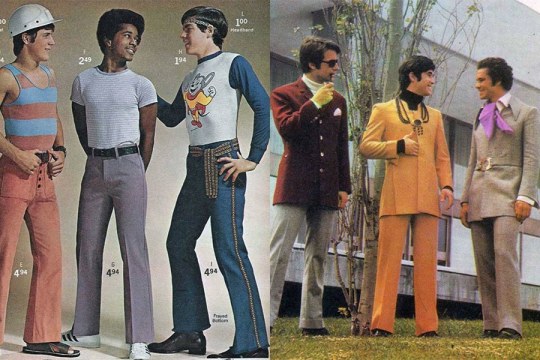
The only one i really like here is the 2nd man. Would absolutely work in todays day and age even in more serious setting. Remember to pick a thicc shirt, to ensure good fit. Tight clothes can be tricky. Pants are amazing lil flare at the end is amazing and superstars actually work great here. The belt? Lil fancy but in the "normal zone. I think it would be a great fit for a normal day actually.

And last, actually BOTH ARE SERIOUS, yes really. First left Love the pants, very f a n c y b o t t o m s. Black and red are a little much, but the flare is a great place for details and thirst three pull it off nicely. Obviously side buckled and with a great, matching shirt, but it's the less interesting part. Saw a girl on TikTok sew a tie to the pants to create a similar flare, it sounds like a great idea (sadly cannot find it it is tiktok, swaths of human knowledge dissapear never to be found again).
Right is amazing, boviously sexy, asked around everyone into men loves it. probably would work as a body for a party with a shitr underneath or something but like, let's not overstate the case. Oh... to be a girl lying next to the sexiest man alive in a circular windowframe...
1 note
·
View note
Text
(week 7) colour workshop
In this week I experimented with acrylic paints:
Cadmium red, Alizarin crimson
Ultramarine, Cerulean
Cadmium yellow, lemon yellow
Titanium white
I firstly constructed the colour wheel with twelve colours- primary, secondary and tertiary. It was tricky to identify the warm/cold colours in the primary paints at first.

Then, after understanding the biased primary colours, I mixed warm and cool tones to create different secondary colours. For example, mixing cadmium yellow with cerulean, lemon yellow with ultramarine, camium with ultramarine and lemon yellow with cerulean.

For the tertiary colours, I used the purest secondary colours and mixed them with the two primary colours on either side of it on the colour wheel. For example, mixing the purest orange with a warm yellow to make a tertiary orange/yellow and some with a warm red to make a orange/red.
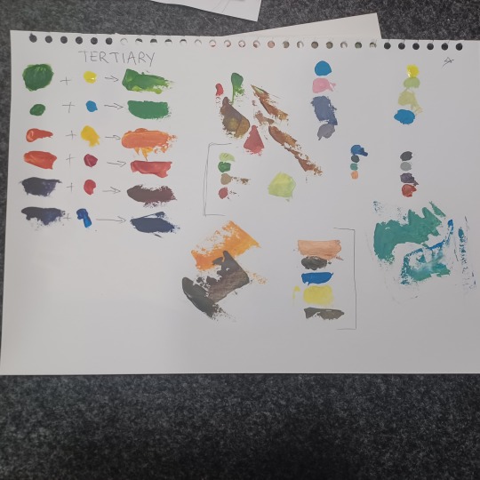
After completing the colour wheel I focused on complimentary colours- yellow and purple, blue and orange, red and green. I used yellow and purple. For tint, I added white and placed the newly mixed colour underneath, and placed the muddy neutral colour in the middle of the scale (mix of purple and yellow).

Using the scale, I created my own palette with more saturated and lighter colours to make simultaneous contrast.

Here, I made a colour wheel where all the colours are tonally equal to the lightest colour on the wheel (yellow). To make a colour lighter/ desaturated, I added white to each other until the greyscale would be the same as the referenced yellow.

Next, I created analogous colour palettes with colours that lie next to each other on the colour wheel. For example, yellow, green and blue or orange, red and yellow. Additionally, I tried creating colour discords- when two or more hues are juxtaposed which results in a negative reaction or a feeling of vibration. For example, red green and a lilac would be a colour discord. This one was the hardest, as it was more of a trial and error before finding the perfect discord colours.

Despite acrylics being a messy medium, I did enjoy playing around with colours to find what I liked the most and what didn’t work out as well. Practicing creating colour palettes with complimentary and analogous colours is very useful to me, as I like character designing and using hues to create tonal atmosphere in my drawings.
0 notes
Text
Guides To Choose The Best Eyeshadow
If you want to show off your fashionista image with a great makeup look that includes foundation, glossy lipstick, blush, and highlighter, simply add a flawless eye shadow palette to the mix and you're ready to rule!
The most challenging component of it all is that choosing an eye shadow palette is always tricky because you can never be too sure if it will work. With so many options to choose from, finding a decent palette can be a bit of a problem.
So, when you go out and buy your next eyeshadow palette, keep these ideas in mind.

Skin Undertones:
Regardless of whether your skin is light, medium, or dark, it has a yellow, ashen, or pink tint or colour. This colour is known as an undertone. Your undertone is 'cool' if your skin appears blue or pink. On the other side, if your skin has yellow, peach, or golden tones like a golden liquid glitter eyeshadow, it has a 'warm' undertone. Neutral undertones refer to those who don't have cold or warm undertones.
So, while picking up an eyeshadow palette, look for colours that bring out your undertone. Choose warm golds, oranges, and reds to highlight your skin's warmth if you have warm undertones. While blues, greens, and purples go well with chilly undertones, neutrals may go either way.
Different types of Eyeshadows:
Pigmented Eyeshadow:
This extremely pigmented eyeshadow has a longer wear time and can be blended effortlessly. They're available in a variety of bright hues.
Liquid Eyeshadow:
These liquid eyeshadow are very pigmented and come in tubes with a glossy finish, helping them to remain on the eyelids more swiftly and smoothly. Their excellent pigmentation allows for a long-lasting appearance, and they may also be blended with fingertips. The most famous type is the liquid glitter eyeshadow.
Pressed Powder Eyeshadow:
This is the most popular of all, and it may be found in a beautiful eyeshadow palette in complementing colours. Singles, duos, and quads of matte brown, dazzling white, vivid blue, and gold shimmer are available.
Cream Eyeshadow:
This style of eyeshadow is soft and natural-looking, yet it leaves a vivid colour and a beautiful completed effect. It's also long-lasting, and it's simple to mix using your fingertips. They are available in a wide range of colours.
Stick Eyeshadow:
One of the easiest eyeshadows to use on the market. The pencil-like end makes it a simple-to-use product that may easily smear into the eyelid. Use your fingertips to mix this one as well. These are likewise long-lasting and come in a variety of colours.
How to choose the right shades?
Remember the basics!
Palettes of neutral and smokey eyeshadows are quite beneficial. Brown, taupe, beige, and champagne tones should be included in neutral palettes, whereas black, grey, and shimmering shades should be included in smokey palettes. Consider utilizing charts and tips to assist you in making your eye shimmer selection if you are a newbie.
Select a palette with a variety
When browsing at eye shimmer, don't forget to think about the quality. A palette with fewer tones and excellent pigmentation is far superior to one with many colours but poor quality. As a result, while selecting eyeshadow palettes, colour schemes and quality are crucial.
In a nutshell:
Next time that you go Eyeshadow palette shopping I hope this guide will come in handy for you to flaunt your eye-makeup without any hassle!
1 note
·
View note
Text
Colouring rainbow gifs
The lovely @buckiecap and @djarsdin requested a tutorial of some gifs from this TFATWS rainbow set.


My colouring process is kinda chaotic and it always depends on the gif itself. These three gifs will highlight the similarities and differences in how I colour my rainbow gifs.
You’ll need some understanding of basic gif making and adjustments. I use Photoshop 2021 but I imagine these processes will still work in other versions.
Some basic tips:
When doing rainbow sets, once I've got my base gif ready, I always make a hue/saturation layer on saturation +100 so I can see what colours I'm working with. I just keep it hidden so i can check how my colours are doing throughout the editing process.
Also something to stick at the back of your mind: you want your final gif to be as “monochromatic” as possible - make sure your final palette will be only black + shades of whatever colour you're targeting. This is not only to make the gif as colour-focussed as possible, but it also helps with saving your gif under 10mb. That saturation +100 layer I always keep hidden at the bottom of my gif so I can keep an eye on what colours are present.
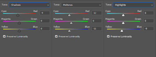
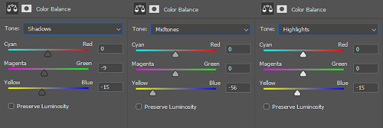
It’s also helpful to understand how RGB and CMYK colours work and what to add/subtract when you want to bring out a certain colour. A good example of this is with Colour Balance:
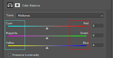
You’ll notice the colours on the left are Cyan, Magenta and Yellow (CMYK), while the other side is Red, Green and Blue (RBG). So if you want more cyan in your image, you’d push the bar towards cyan, but then you’re compromising the reds. In Selective Colour adjustments, the panel is reversed.
This knowledge is absolutely necessary when you’re doing any adjustment, so keep this in the back of your mind as I work through the tutorial.
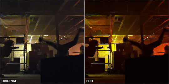
Green gif - Eli's door
So I start with my hue/saturation on saturation +100 to check what I’m working with here. This gif of Isaiah's grandson opening the door has green, yellow and red as the dominant colours, and I can see a bit of cyan on the right. I’ll keep that hue/saturation layer hidden as a reference.
Normally when I make gifs I start with a curve or levels layer to get any unwanted hues or create a more visible scene. But in this gif, I'm pretty happy with the colours, so I'm just using a simple curves adjustment, because I want to have whatever is behind the door as the ‘background’ and the door frame is the ‘foreground’, so only a slight adjustment is needed here.
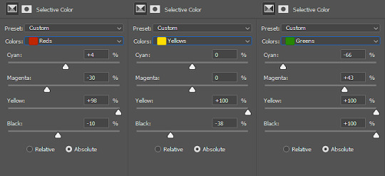
Since the colours are already prominent, I'm going to make the green more visible and vibrant. I do this by using selective colour in the green colour to make the green stand out. When thinking of CMYK adjustments, you might think that Magenta -100 would work, as that normally pushes the greens, but I find that this makes things grainy and patchy looking, as you can see here:
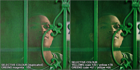
Instead, I’m enhancing cyans and yellows, and only pushing the magenta back just a little bit towards green. I’m not sure why green specifically does this, but it’s useful to know this when you’re colouring.
With the yellows, I want to push those more as well, since the amount of yellow usually influences the green-ness of the gif.. I'm also going to max yellow too since that will also make the green pop, but I also have to be careful not to distort the skin colour too much. I also want to balance the skin tone with a little redness so he doesn’t look like he has jaundice (skin tone will be explored later in the gif process)
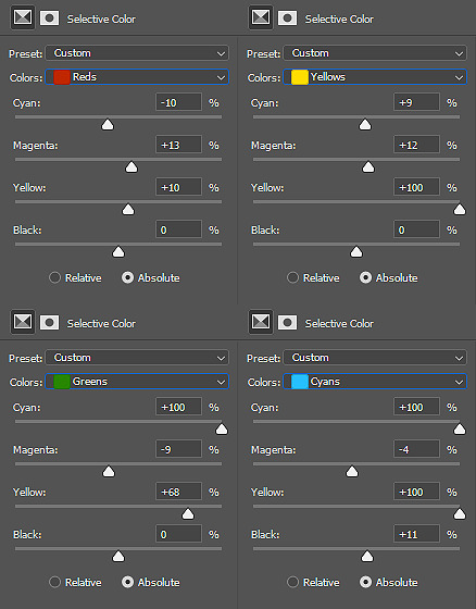
I've added another selective colour layer on top of that, only adjusting the greens just to make it pop a little more. Don’t be afraid to use more than one selective layer, this can really bring out vibrant colours if you use it right.
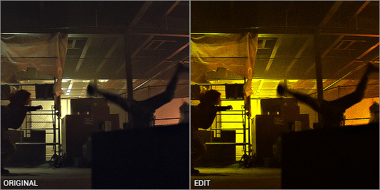
Just to get some more depth, I add a colour balance layer, again just subtly pushing the cyan and yellow up and not playing with the green too much. Then my usual last layers are with a vibrance and brightness/contrast - I’m usually quite generous with contrast so I can bring out the different shades and it makes things a little more vibrant too.
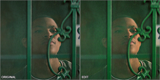
This next step is really important when colouring people with dark skin - you want to lower the redness from their skin so they don't look unnaturally orange, as you can see here:
There is a fantastic tutorial here about colouring dark skin tones and avoiding the orange-washed look, and I recommend all gif makers to take note! It's difficult especially when doing rainbow gifs, and it takes some practice. I do this with a hue/saturation layer, and specifically targeting red and yellow and reducing saturation. I might need to play with selective colour or colour balance to get it right. Luckily Eli doesn’t move around too much, so I can use a mask to adjust only his face.
And that’s the end product! now just ignore me as I re-upload the green gif in my set so you don’t see such a horrible jaudiced skin tone sldkfjsldkf
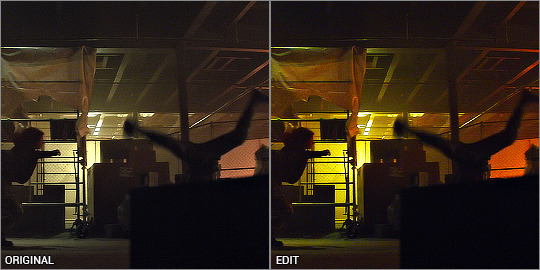
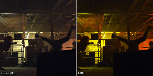
Yellow gif - Karli vs Sam
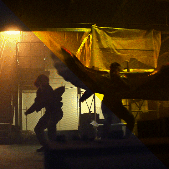
I'm gonna be completely honest here - this gif was very tricky to do. I actually have about three different versions of it. At first I thought "this is the yellow gif so I'm only going to have yellow tones", and did selective colour to get rid of any traces of green AND red, because I didn't want any orange at all. It ended up looking quite dull:
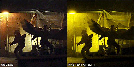
I mean.. yeah it’s yellow........... but it’s kinda boring. So I deleted all adjustments and watched the raw gif, and noted the orange light contrasting with the pale light. The raw gif itself already had some beautiful lighting - why get rid of it? It depends on what you want, but I like my rainbow gifs to have a different colour there to contrast with the main colour.
Starting off with a hue/saturation layer with saturation 100+, I can see there are clearly yellows and reds and a bit of green on the ceiling.
I thought the contrast of the orange and pale lighting was too good to mess up so I started with that. My first layers are vibrance and brightness/contrast to exaggerate the silhouettes and bring out the colours that are already there.
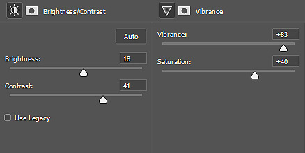
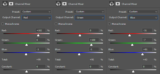
I added a channel mixer layer to narrow down the colours. I wanted to fill the white bits with yellow, and with channel mixer I’m able to manipulate colours into something else while still looking natural and blended. I won’t be doing too much colour manipulating here so the settings are very minimal. I don’t know how to explain it but it just takes a little fiddling to figure out what works for your gif. You’ll notice the white reflections on the ceiling are now a solid yellow colour:
Next is a colour balance layer. I'm basically trying to bring out the yellow out. This is really just trial and error. I added a bit of magenta to bring the depth of the orange colours in the darker shades:
Now for selective colour. I'm often adjusting all of these while hiding/showing the hue/saturation layer I have kept at the bottom. This time, I’m aiming to subtract the reds and bring it down to a warm orange, and I do that by bringing it towards cyan/away from red, and away from magenta/towards green.
Then I max out the yellows so it becomes the most dominant colour. I've also manipulated the green to make sure it is excluded from the gif - again, checking with the hue/saturation layer at the bottom, while keeping my eye on the ceiling and other places where I’ve noticed green lurking about. I don’t want any unwanted shades ending up in the final colour table.
Finally, I finish with yet another vibrance and brightness/contrast layer, just because I like things bright and vibrant!
And there it is! The orange is still there and adds a contrast, but you can tell that the main colour is the yellow. This gif seems very straightforward but I assure you, it took me quite a while to get this one right. This gif was a joy to work on because Sam was so very extra in this fight sequence lolll
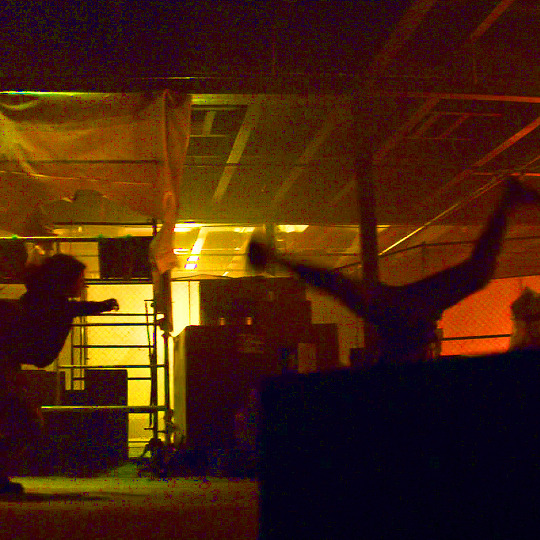
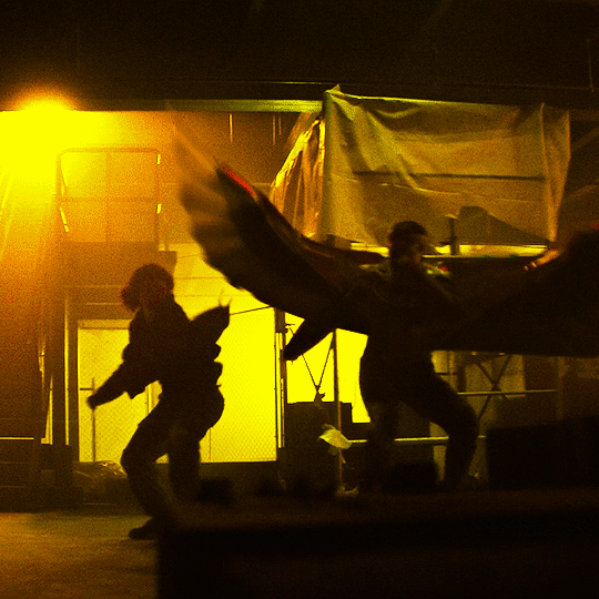
Pink gif - suspicious mechanical grenade? idk
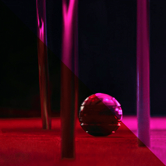
While this gif may look simple, it actually took a couple of tries before I got the colouring right. You'll notice when the ball activates, there is a bright green light that highlights the gas released and it reflects on the chair legs and carpet.
At first I tried this with the above mentioned selective colour method - which I thought turned out okay but it didn't sit with me right. Notice the reflection of the blue light on the carpet - it definitely isn't blue and more like a green-orangey kinda colour, and it doesn't look natural at all.

So I re-started from the beginning and had a look at what I’m working with, starting with hue/saturation at saturation +100. I can see that the original gif has red and green as the dominant colours, with yellow bits blending the two on the carpet. That’s what I was having issues with the selective colour - so I’ll be doing it differently.
Enter: channel mixer. I’m gonna be honest............. I have ZERO idea how the channel mixer really works! It’s all a matter of trial and error, but I’ll try and explain my process step by step.
I normally start in the blue channel (again - no idea why, it just works for me). I start with the reds, and I know if I go over 0, it will push the reds towards cyan, which will get it more purple-y:
Ooooh looking good!!! then I want to push the greens towards magenta, so that needs to go over 0 as well:
Woohoo! It’s already starting to look good. The green light and the way it blends into the red/pinks have all been completely changed into the cyan hues, so there’s a perfect reflection you can see on the carpet! Yay! I had a fiddle with the green and red channels but nothing too drastic. Here are the settings:

Even with just the single adjustment, I was already pretty happy with it and only did a few touch ups: I added a selective colour layer to bring out a more pinky-purpley colour, then a levels layer to brighten things up. It might seem very backwards to add a brightening tool at the end, but I didn’t want to mess up the original colour shades because I liked having the dark shadows lit up by the ball’s light.
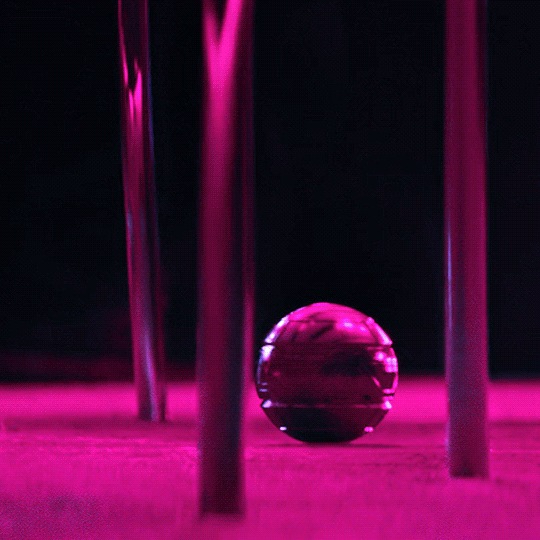
And that’s it! Only three adjustment layers, but it took some time to play with the different adjustments and what worked best. Channel mixer can be really intimidating but it works like a charm when you manage to figure it out.
the end!
Finally I have to give credit to some amazing content creators and their brilliant colouring tutorials that have made such a huge impact in the way I edit. Some brilliant guides include:
this colouring tutorial by @favreaus
this colouring tutorial by @inejz-ghafa
this colouring tutorial by @meliorn
I hope this tutorial has been helpful! I’ve tried to explain myself as best I can, but let me know if you’d like any clarification or have any questions. I’m still learning how to do things, and honestly most times it’s just randomly clicking things until something works out!
#gif tutorial#coloring tutorial#rainbow gif tutorial#gif editing#completeresources#dailyresources#chaoticresources#allresources#photoshop tutorial#fyeahps#dailypsd#**mytutorial
260 notes
·
View notes
Text
#showyourprocess
I was tagged by the wonderful @wangxianbunnydoodles for this gifset. This tag game was started by @lan-xichens (starting post here).
From planning to posting, share your process for making creative content!
To continue supporting content makers, this tag game is meant to show the entire process of making creative content: this can be for any creation.
RULES: When your work is tagged, show the process of its creation from planning to posting, then tag 5 people with a specific link to one of their creative works you’d like to see the process of. Use the tag #showyourprocess so we can find yours!
Process will be underneath the cut!
1. Planning
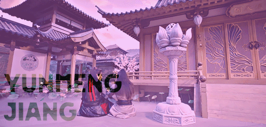
This was the very first post I put a considerable amount of time into, and I’m really proud of it. I wanted to make a set showcasing the Twin Prides, which is my favorite character dynamic of MDZS due to Jiang Cheng. I knew that I wanted to use the scene from CQL episode 14 because that’s where the quote “Yunmeng Jiang will have its Twin Prides” comes from. I also wanted to include the scene from the MDZS donghua episode 10 because it was different visually, and I wanted to incorporate both visual adaptations of MDZS.
I was really happy that the scenes in both the live-action and the donghua are visually captivating. I don’t really know how to explain it very well, but the scenes are just interesting to look at and I’m glad that JC and WWX are in the same frame for every single frame of the gifs.
I took a few notes on paper to organize the layout and decide how I wanted to break up the text.
2. Creation
I choose to gif by using screenshots. I use MPlayer OSX Extended to pull the screenshots and use Adobe Photoshop 2021 to create. I like using screenshots because it allows me to control the exact frames I want to use, so once I open photoshop, I can just load the screenshots and start the actual editing process. I organize the screenshots into folders based on which gif, which makes it easier to load into the stacks.
Step 1: Coloring
I don’t really have a specific process for coloring my gifs. I approach it from the process of “click until it looks good,” but I do like making some colors pop. In the CQL gifs, I wanted to make sure WWX’s red ribbon stood out. I also adjusted the hue/saturation of some of the colors to make the lotus seed pods more green. Here are the hue/saturation levels I used:
Blue: Hue (+24); Saturation (+24)
Red: Hue (+18); Saturation (+18)
Green: Hue (+39); Saturation (+36)
Magenta: Hue (+24); Saturation (+24)
Step 2: Text
Because of the text effect, I knew I needed a blockier type of font. I’m also a fan of simpler fonts, and I didn’t want something that would be too distracting. I tried a couple different fonts until I settled on Forta (downloaded from dafont[dot]com).
Placing the text was a little tricky. If the background was too light, than the text would be too hard to read. I used the setting “soft light” (you can set it to this using the dropdown menu directly to the left of the opacity setting where the layers listed) for the text and moved it around and adjusted the size until I was happy with the placement and I could read the words.
After I was happy with the placement, I used the following steps:
CTRL + click on the text layer to select
Select --> Inverse (or Shift + CTRL + I)
Step 3: Adding more color
This is a continuation of the previous steps, and these steps will get that overall purple/pink color. I chose that color because I thought it matched Yunmeng colors and the color of the scene the most.
Create a new solid fill layer (I chose white first, then adjusted later)
Set opacity to 40%
Play around with the color until you find something you’re happy with! For this set, I used #e67af3.
Done!
This is what my layers look like. Ignore the second Hue/Saturation layer, I don’t know why its there haha.
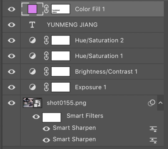
I used the same coloring and font for each of the CQL gifs on my set. As for the donghua gifs, I just played around with the hue/saturation as well as the exposure until I liked how it looked.
3. Posting
For the caption, I used a gradient text generator. I went with the purple gradient text because that is Yunmeng Jiang colors. I chose WWX’s quote as the other part of the caption because I believe that is part of what makes the “Twin Prides” promise so important to Jiang Cheng, and it is also very important when understanding the relationship between Wei Wuxian and the Yunmeng Jiang Clan.
I saved the post as a draft first, so I could see how it would look, then I posted it!
Anyway, I hope that makes sense at least a little bit, and I apologize for this being so text-heavy. I had a really fun time making this set and it was my first time playing around with different elements outside of basic editing.
I am tagging:
@mylastbraincql for this beautiful Lan Wangji color palette edit
@marquisguyun for this awesome WangXian video edit
@perkynurples for this lovely WangXian fanfiction
@blinkplnk for this stunning WangXian waterfall fight edit
@wendashanren for this amazing WangXian lyric edit
Please don’t feel pressured to complete this! Or if you wish to talk about something else, feel free to do so! If anyone else sees this and wants to do it, consider yourself tagged!
Thank you for reading so far. <3
#showyourprocess#tag game#thank you for the tag!#i hope this makes sense#the untamed#cql#mdzs#mylastbraincql#mine*#mymdzsthings#if you have any more questions feel free to send me an ask!#(don't mind me sneaking in commentary on my favorite character)
21 notes
·
View notes
Note
You mentioned in a recent post that the job of scribe was occasionally passed down from father to daughter. Do you know anything about the examples we know of where it happened, and do you have any recommendations for further reading on the subject?
This is a bit of a tricky one, as I distinctly remember being taught this during a lecture on scribes and Egyptian scribe schooling, but I don’t remember the exact example only that it is heavily implied that if the daughter of a scribe is attending the scribal school meant for the sons of the current scribes, then she is training to replace her father. To that end, I don’t really have any resources solely dedicated to this subject either. People simply don’t write much on it other than ‘hey this happened’ and then give some vague mention of examples of female scribes or at least women who could write. Literally. I cite from Gae Callender’s chapter ‘The Middle Kingdom Renaissance’ in The Oxford Encyclopaedia of Ancient Egypt pp.151:
‘The Hekanakhte papers include a rare letter from a woman to her mother - a find that raises the question of the extent to which ancient Egyptian women were able to read and write. Unfortunately, however, this does not constitute definite proof, given that the woman in question may have dictated the letter to a male scribe (as indeed many illiterate male correspondents would have done) and the style of the handwriting can provide no clues. References elsewhere to two Middle Egyptian female scribes suggest that a few women may nevertheless have been literate at this date.’
Pretty much every source I could give you will do what the above does, or simply just mention one. There are no specific or definitive sources on female scribes. However, for the Middle Kingdom at least, W.A. Ward’s 1986 book ‘Essays on Feminine Titles of the Middle Kingdom and Related Subjects’ might be useful for discussions on whether the title of Scribe is applicable to the Middle Kingdom examples. I haven’t been able to get hold of the book itself to read it, but it’s cited in K.Szpakowska’s ‘Daily Life in Ancient Egypt’ (pp.107) and I trust Szpakowska’s work on this.
Since women are not described by their job titles unless they are a Priestess, it’s very hard to determine if they were employed as a Scribe in any capacity. In the 26th Dynasty the God’s Wife of Amun (highest Priestess who could either be the Queen, a Princess, or a ranking member of the nobility) had a subordinate known as the ‘Female Scribe of the divine Adoratrice Irtyru’, and in the 13th Dynasty one queen had a couple of female scribes. Again, all sources I’ve looked up on this (that, and I cannot stress this hard enough, I can actually get hold of) are basically as vague as this when they mention female scribes. Though if you can read German this is where I got that from: Brunner, H. (1957) Altagyptische Erziehung. Wiesbaden.
We have New Kingdom examples of women being depicted in tombs with Scribal palettes under their chairs/at the side of chairs, much like men in the same profession. Such examples can be found in the Theban tombs: TT84 (Iamnedjeh, holds also a rolled papyrus), 69 (Menna), 162 (Kenamun), 147 (unknown), and 148 (Amenemope). Some of the women with the scribal kit under their chair were also Songstresses of Amun (shemayt net Amun), singers in the Amun-temple (cf. Bryan, B. (1984) “Evidence for female literacy from Theban tombs of the New Kingdom). None of these women list their title as ‘Scribe’ but many of them were either from high ranking families, or held jobs like ‘Chantress of Amun’. Both of these things would have led to them to avenues where they could have received private tutoring, much like two daughters of Akhenaten (Maketaten and Meritaten). Both princesses had palettes of ink that was black and red, the scribal colours, which indicates these palettes weren’t being used for painting but for education.
There’s one final source, which I would love to get my hands on (McDowell, 2000, ‘Teachers and Students at Deir el Medina’ in Deir el Medina in the Third Millennium BC: A Tribute to Jac.J.Janssen) and I think that’s the one which would provide me the info on the female scribes being tutored. So if you can get hold of that, it’ll likely tell you what you want to know.
#many bees#thatlittleegyptologistresponses#ummmmm it's nearly 1am good god#I'm sat in the dark with books open all over the place
43 notes
·
View notes
Text
♫ Surfing on a soundwave,
Swinging through the stars,
Take a left at your intestine,
Take your second right past mars!
On the Magic School smelly space bus! ♫
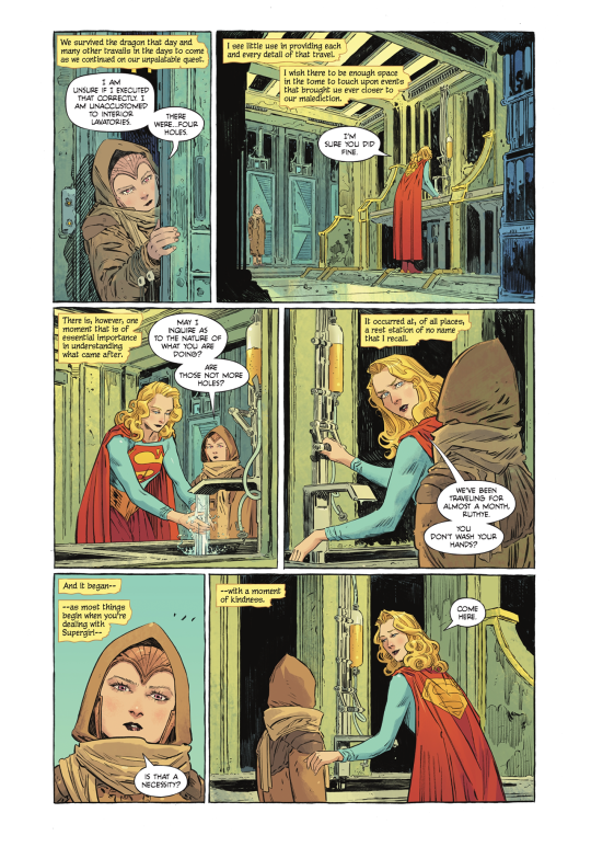
SPOILERS for Supergirl: Woman of Tomorrow #2!
This is a comic where, the longer I sit with a particular issue, the more I’m like, ‘yeah. Yeah. YEAH.’
It’s dense in a way that invites the reader to go through it multiple times, and rewards additional readthroughs.
Also, it helps that the art is FREAKING AMAZING.
Seriously. Evely and Lopes should draw and color everything, forever, always.
(I will honestly be shocked if they don’t get an Eisner nom for this book.)
Anyways, all of this to say: Another issue that I enjoyed. It has one of the most genuinely sweet Supergirl moments I’ve seen in the comics in a good long while.
So, if you’re looking for a quick thumbs up/thumbs down rating, thumbs up!
If you’d like some SPECIFICS, though...
THE STORY
King is an evil genius because we don’t pick up where we left off--rather, we start in the midst of the Space Bus journey.
There is technically a Big Action Scene, but I was honestly surprised by how...casually? the story progressed.
Essentially: Kara and Ruthye are forced to travel by bus because 1.) Krem stole Kara’s rocket and 2.) this corner of the universe doesn’t have the right stars, so Kara’s still recovering from being under a red sun for an extended period of time.
The bus makes occasional stops; they encounter a space dragon; Kara takes some Red Kryptonite and saves the day; they eventually arrive on a planet with a yellow sun.
And again, all of this occurs with a kind of...breezy ease that I was not expecting at all.
I assumed that the space dragon fight would make up the final moments of the issue, after having built up the problem to a point where Kara needed to intervene.
But, noooope. The space dragon happens somewhere in the middle, which helps sell the central idea that this is simply Kara’s life. She’s been there, done that. She’s a badass who takes it all in stride.
But! Important to note! Ruthye still marvels at the sight of Kara taking out the space dragon, as well she should, because:
OH MY GOD. THE aRT.
There’s only so many times I can say, ‘it’s phenomenal, it’s gorgeous, it’s stunning’ before sounding like a broken record.
But it is. It truly is. This is the prettiest monthly book on the stands right now.
(Realizing I’ve been spelling Ruthye wrong this entire time, maybe? IDK. Apologies if I have.)
It’s in the final moments of the book that we learn what transpired after Krem shot Kara and Krypto and fled: Kara managed to get Krypto and Ruthye to a healer, and then passed out for a week.
Ruthye and Kara recovered, buuuuut...
Krypto is still very near death because the arrow was poisoned.
The healer can’t treat him until he has a sample of the poison.
Which Krem has.
(See where this is going?)
So! Kara regains her powers! Ruthye has a super on her side! KRYPTO’S LIFE HANGS IN THE BALANCE!
Gimme. Issue. 3. STAT.
THE CHARACTERS
Very much enjoyed Ruthye in this issue!
There’s a really tricky balancing act you gotta pull off when writing child characters; you don’t want to just write them as tiny adults, but you also don’t want to be obnoxious or cloying in trying to write ‘true-to-age.’
King gives himself a bit of a cheat, by setting her up as a rock farmer from a...what would you call it. An old-fashioned planet? And thus the kind of character who had to ‘grow up fast’ and behaves more maturely than your typical pre-teen might.
BUT! IMPORTANTLY! This is tempered by placing Ruthye in situations where her (understandable) ignorance is challenged/put to the test. Like, yes, she is mature, and well-spoken, and utterly tenacious, but she’s also out of her depth, and still in need of help and guidance.
(Which is how we get to The Best Scene which I’ll get to in just a sec.)
TL;DR - this issue has really sold me on Ruthye as our POV character and I am officially Invested in the relationship between her and Kara.
Speaking of...
It’s KARA-CTERIZATION TIME!
So, okay. There’s some ‘eh’ stuff in this one, but, BUT!
We got the goods again.
And by ‘goods’ I mean this:
Whatever other nitpicks I have (and I do! Have one! Which I’ll get to!) THIS. This right here! This is Supergirl. This is Kara.
And what a beautiful line to introduce this moment:
“And it began--as most things begin when you’re dealing with Supergirl--with a moment of kindness.”
It’s the same gentle concern we saw in the previous issue, where Kara knelt down to address Ruthye eye-to-eye.
Here, Kara’s facial expression, and the way she takes Ruthye’s hands and shows her what to do...
It’s just. SO SWEET.
Ahhhhh it’s so good. :D
So good! In fact! That the above scene offsets my one complaint, which is that Kara came off as harsh, IMO, when addressing the bus passengers, looking for Red K.
Other good stuff from this particular portion of the book: we get Kryptonese (maybe? I think?) And a mention of Kara’s mother being strict about certain things, which is in keeping with the 2000s series version of Alura.
Ruthye also asks if Kara ever tried to avenge the death of her family/culture and she says no; Ruthye says that she heard a lifetime of regret in Kara’s response, which I suppose could be read one of two ways:
1.) That she regrets her choice not to avenge them, or 2.) that she regrets not having the option to avenge them, as there was no one person to punch, no single action that could rectify the destruction of the entire planet.
I personally prefer the second reading.
Which I suppose contradicts the recent-ish “Killers of Krypton” arc, but who knows what is and isn’t canon anymore, honestly. XD
As for the rest of the issue! I found myself thinking of a Grant Morrison interview, actually.
Morrison apparently met a Superman cosplayer at a con and that’s when the character clicked for them: “[The superman cosplayer] was so in the character, but what really got me was the way he was sitting. It was this absolutely relaxed pose with one knee up and the arm bent over, and that’s what broke Superman for me. Suddenly I realized that Superman wouldn’t be a poser, he wouldn’t be a Muscle Beach steroid guy; he’d actually be completely relaxed because nothing could hurt him. He could be so open and friendly to everyone because no one can punch him or hurt him. He can’t get a cold, or be damaged by anything you’re carrying or wearing. For me that was the power of that, whether you want to frame it as magical or not, it actually informed the stories I wanted to write. I felt I understood him in a way I hadn’t until that moment.”
That’s always stuck with me, the idea that Clark would be the most at-ease, chill guy you'd ever talk to.
And THAT, I think, is what we’re seeing here with Kara. That at-ease-ness.
But in a way that is distinct from Clark! In the above quote, it’s clear that Morrison thinks it’s Clark’s powers that are the reason he can be so relaxed and at ease.
But Kara is de-powered here. So why is she so chill?
Because Kara is an alien.
Kara’s in her element, here. She’s used to space travel, she knows the ins-and-outs, she’s not shocked by any of the weird stuff they encounter on their journey.
Love it. LOVE. IT.
I am SO GLAD that King decided to go with Kara being the wizened mentor, as opposed to the naïve kid learning to be tough. It’s a much more interesting angle, IMO.
Also NO MENTION OF RIVALRY BETWEEN KARA AND CLARK. WOO. LET’S KEEP THIS ROLLIN’.
Alright, last, but certainly not least:
THE GOOD BOY! KRYPTO!
When I tell you I stress-read this entire comic first thing in the morning...XD
And I am STILL stressed. And a little sad that Krypto doesn’t get to go on another space adventure but! This is MIGHTY PREFERABLE to what I *thought* was going to happen, which is that Krypto would die from his injuries, and Kara would likewise be out for revenge.
Fortunately, that is not the case!
So like, the stakes?!?! Suddenly sky high. Find that dirtbag Krem and GET THAT POISON BACK TO THE HEALER!!
ART and MISC. STUFF THAT I LOVE
I generally don’t like to post entire pages of a comic, or panels without context, but the...reach? of this blog is extremely limited so. I think we’ll be okay. XD
So, alright! Some moments that I particularly enjoyed!
One of the panels that Mat Lopes shared early on!
I want this lettered version on a mug.
(Also she looks very ’Grace Kelly-ish’ here.)
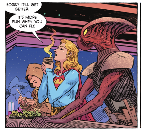
Love Kara’s facial expression and her line about space travel being more fun when you can fly.
From the same portion of the book--such a neat detail that Kara keeps her cash in her sleeve!
Another set of panels that I think Tom King shared a few months back.
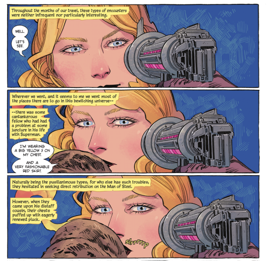
Love Kara’s little smirk, and the, “I’m wearing a big yellow S on my chest, and a very fashionable red skirt.”
It IS fashionable. WE SUPPORT THE SKIRT, IN THIS HOUSE.
Also the slrrrrrrp. XD
It’s good.
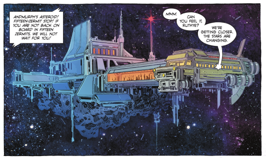
Okay, 1.) VERY COOL SCI-FI DESIGN and 2.) that line is great. “Can you feel it, Ruthye? We’re getting closer. The stars are changing.”
Mmmm, them good cosmic Kara vibes.
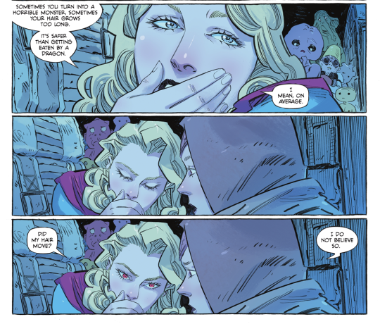
Kara’s attitude about the Red K here is fun, like, ‘WELP, sometimes you turn into a monster, sometimes you don’t!’ but again, the line is what gets me.
“Did my hair move?”
“I do not believe so.”
XD
Honestly? I could post the whole comic here. Evely’s vision of ‘public transit, but space’ is just so immediately...not ‘real’, necessarily, because there’s such a fantastical element to it all, but it is fully realized. I think I used the phrase ‘lived-in’ and that’s it--this world feels like it has always existed; every grimy nook and cranny, every rando space bus traveler.
And Mat Lopes’ colors!
There are like, five distinct color palettes at work in this issue, and Lopes handles them all masterfully.
I think my favorite is the...I’ll call it ‘ethereal space aquarium’ lighting in the bus as they view the space dragon.
The glow and the shadows and the blues and pinks...
GGGGGGGGAAAHHHHHHHHHH so goooooooood
So, yeah. :D
I am very much enjoying this weird, wild ride with small, precocious Ruthye and wizened, crusty Kara. XD There’s some stuff that I don’t *love* but my goodness, it could be a lot worse!
Let us end on the beautiful title page:

#long post#supergirl: woman of tomorrow#supergirl: woman of tomorrow spoilers#dc comics#kara zor el#comic thoughts#comic opinions
4 notes
·
View notes
Text
Mayward Week Day 3 - “How much of that did you hear?” + angst
JJ grows up with his father at more than an arm's length away and without his mother at all. It's been like this all his life, so he is used to it by now, but nonetheless it has been known to sting his heart on occasion. His father has never been one to meddle in JJ's problems- no matter how big or small- and the only time he interfered with JJ's activities was when an opportunity to punish him arose. Which is why it's so ironic when his father suddenly corners him about who he's dating.
A long time ago- what truly feels like ages ago- when he was still sorting through the files in his brain, JJ would, from time to time, bring a girl home with him, and maybe once or twice they would even have sex. Luke never said a word about it, except for the sly little smirk that he would toss JJ's way the morning after when JJ would stumble out of his room with a rat's nest atop his head and irritated red marks running down his back as if to say Good job, son, I'm proud of you because he just couldn't bring himself to actually say it aloud.
But when JJ comes home after spending the weekend at Pope's house, shirt on backwards and an unshakeable smile on his face, his father does not give him a proud look. Instead, it's a scary, degrading expression, as if he can smell the sex without JJ even having to utter a word. However, he could squirm his way out of this one because technically speaking he and Pope didn't... In fact, they never have.
"I thought you went to your friend's house," Luke says when JJ is looking in the fridge for something to eat. "The one whose daddy works at the seafood place."
"Pope's," JJ reminds him, not entirely picking up on Luke's passive aggressive tone. He shuts the refrigerator door when he finds nothing that suits his taste; slimy iceberg lettuce and mustard doesn't make for a very good snack. "I was."
There's a moment where Luke wonders if he should just drop it. Since when has he cared about his son's mischievous happenings? It's not like he should start giving a shit now. He balls his fist and rolls his knuckles while he watches from the kitchen doorway as JJ bops his head to a song only he can hear.
"What's that on your neck then?" he blurts out anyway, gesturing to the wine-colored marks near JJ's collarbone that had not been there when he left.
Immediately, JJ's heart sinks and he tries not to let it show. Just keeps his composure, tucks his chin, and tries to shimmy past his father to get to his bedroom- far, far away from this conversation- because he's suddenly not very hungry.
"I got hit by a kid at school the other day," JJ answers in a steady, lying voice. It's not the first time he's had to make up a scenario to divert the attention away from his neck. He awkwardly reaches a hand up to rub at the marks there.
"You think I'm stupid, boy?"
"No, sir," JJ immediately responds, purely out of instinct, because if he were being more honest, his answer would be yes, a thousand times yes, and a million other terrible names too. He lowers his hand and stands up straight as a pin, preparing for the worst.
Luke makes a face like maybe he knows that JJ thinks he's stupid. Whatever. It doesn't matter.
"Then quit lyin' to me," he says lowly, "I know what you and that kid've been doing."
A surge of fear fills JJ up to the very brim. He tries to keep it tied down in the pit of his stomach where it belongs. I'm not afraid of you anymore. "I don't know what you're talking about-"
"Oh, cut the bullshit, JJ," it's the first time he has said JJ's name in weeks and he spits it out like it burned his tongue, "Last week, on the back porch."
JJ furrows his eyebrows in confusion and tries to remember what it is exactly that his father is referring to. It takes him a moment but he does remember: a black sky spotted with shiny stars, a warm hand against his own, a soft kiss goodnight when he was sure his father wasn't around, a longing gaze minutes after the boy of his affections had gone.
"Wha-" JJ says suddenly, feeling both flustered and cornered. Suddenly he knows exactly what it's like to be a deer caught in the headlights. "How much of that did you hear?" He sounds exasperated but he can't help it, nor can he be bothered by denying this anymore.
"I heard enough."
"You can't just spy on me," JJ says, trying to spin the story so that they are no longer talking about him. "That's so fucked up. Don't I deserve at least some privacy around here?"
"Don't you tell me what you deserve, boy, after what you've done," Luke spits, voice accusatory in a way JJ has heard only him speak.
"What I've done," JJ mutters, scoffing and shaking his head. He looks away from his father, down at the floor where the mud on the bottoms of his shoes has imprinted footprints on the kitchen tile. He isn't sure that he has it in him to hold his head up and look at his father again.
Luke doesn't say another word, but he doesn't move from his authoritative stance- arms crossed over his chest and chin tilted up, legs apart like he's ready to jump into action. He doesn't need to say anything else for JJ to know exactly what he is thinking.
"Look, I've gotta go," JJ says suddenly in a quiet voice. He takes a step forward, head bowed, and waits for his father to move out of the way and grant him permission to leave.
"You're not going to Heyward's, are you?" he asks pointedly, as if that's the only thing JJ does anymore.
"No, I'm not-" JJ sighs, annoyed, and pushes past his father. On the way out the door, he says, "I'm not going to Pope's."
He goes straight to Pope's house.
His bike rumbles beneath his feet, and he twists the handlebars to let everyone know just how upset he is.
When he gets there, Pope is already outside, a garbage bag in each hand as he walks over to the trash bin at the end of the driveway. He has changed his shirts since JJ last saw him half an hour ago; now, a faded grey button-down hangs off his shoulders. One of JJ's baseball caps is sitting backwards on Pope's head.
"Hey," Pope greets him with a smile as he drops the garbage bags inside and lets the lid slap closed. "Long time no see." He laughs at his stupid joke and waits for JJ to laugh too, or at least crack a smile, but he doesn't.
"Hey," JJ replies, putting down the kickstand on his bike and standing up. His voice sounds a little off-putting, a little downbeat, and it's strange because he never misses an opportunity to rile Pope up with compliments and boasts.
Pope hides his frown, and instead bumps his shoulder easily against JJ's as he walks closer. "What're you doing here?" he asks, trying to read JJ's face for any clues that might let him know what's going on, "Not that I don't love to have you around, because I do. But you were, like, just here."
JJ glances at Pope through the shaggy strands of hair that fall in front of his face. The sky is a palette of afternoon pinks and purples and oranges, and he suddenly realizes that it's sunset. If there's one thing that he likes about the Outer Banks other than his friends, it's how beautiful the sky is there. But no matter how pretty the sky is, it will never compete with the way Pope looks at any given time.
"JJ?" Pope says, giving him an odd look.
"Yeah, sorry," JJ tells him, shakes his head. His cheeks burn after realizing he must have been staring. "I was at my dad's," JJ continues, shoving his hands into the pockets of his cargo shorts and kicking his feet around like he wants Pope to ask what his problem is.
"Oh?"
"Yeah," JJ says, and then, "Um, so, he kind of... knows. About us."
Pope's smile drops, and his heart takes a dive into his stomach. This is the stuff his nightmares are made of: JJ's dad finding out about the little relationship they have struck up and taking his inevitable anger out on JJ in more violent ways than Pope cares to think about. He wonders if it's already too late, and Luke has already laid his fists on JJ.
"Oh," Pope says quietly after a moment. He can't deny that he's thought of this before. What's the next step after JJ's dad finds out? He was just hoping that the day wouldn't come until they were old enough to move out.
He reaches out for JJ, lets his fingers run over his arm and up to his shoulder because he knows that during tricky situations like this, JJ can be kind of flighty. But now, he shakes his head like he can't believe Pope would ever think he wouldn't want his arms around him and pulls Pope in.
JJ hides his nose in Pope's shoulder and suddenly things don't seem so bad.
"You're okay?" Pope asks him in a soft voice, "He didn't... y'know..."
"No, no," he assures Pope, voice muffled by the fabric of Pope's shirt. "He actually wasn't as pissed as I thought he'd be."
Pope doesn't say anything, just hugs JJ a little bit tighter and wishes that they were already older. Maybe then they wouldn't have to deal with all this bullshit.
When they finally find it in each other to let go, JJ's eyes are kind of red and Pope notices that the shoulder of his shirt is a little damp. His heart hurts. They don't move; they just stand close to one another as the streetlights start to come on.
"JJ.”
"Yeah?"
Pope sighs. "I think that, um- Well since, y'know, your dad... He... He's kind of a violent guy," he says, in a hushed voice because he really doesn't want to do this, "So maybe we should-"
"Take a break? Chill out for a while?" JJ interrupts, bright eyes staring right at him. When Pope reluctantly nods, JJ's stomach suddenly feels like lead. "I knew you were gonna say that. Always thinking ahead, aren't you?"
Pope laughs sarcastically like he doesn't believe what JJ's saying, even though he most definitely is always thinking ahead. He does it for his own good though, and for his friends' goods too so that they all may be safe and happy. And perhaps that's why JJ isn't so upset about it, because he knows that Pope is doing this out of the goodness of his heart, doing it to protect him-- even though it's typically the other way around.
"That's okay," JJ continues, rubbing at his eye. "Damn. Allergies, you know?" He laughs dryly, and he isn't quite sure why he's crying.
Pope hugs him again because he looks like he needs it.
"We're still friends," Pope tells him, "You can still flirt with me, I promise."
"Like I wouldn't have done that anyway," JJ replies, and he isn't joking at all. "After high school, though?"
"Yeah. After high school."
42 notes
·
View notes
Photo


PDF - Pipes
1 - Marks Upbringing
When I first read the story Pipes I really resonated with and liked the main character. I felt he was someone who had been overlooked and underestimated for being slightly different. He had a life that others viewed as simple but that didn't at all make it any less meaningful or important. He didn't see the bad in people or see what was ‘wrong’ with them like others did. Others also saw what was, in their opinion, wrong with him. He was born and grew in in Dudley, and was from a woking class family. He is close with his mam but his relationship with his dad is difficult, he see’s him as not independent or ‘man’ enough. His mam is quite protective of him and he still lives at home. He doesn't have many friends, his mam being his closest friend but he does talk with the other guys at work in the pipe factory (though they do pick on him a little, not exactly great friends). He is nostalgic of his childhood when things were simpler, people didn't view him as behind or different.
2-3 - Mark
I struggled coming up with a name but Mark for some reason just stuck with me. Mark likely has Aspergers Syndrome (though not diagnosed) He likes plain and safe food choices that remind him of being younger, going to the seaside and paddling/swimming in the sea and he dislikes uncomfortable and itchy clothes and maths. He finds the seaside calming, its open and vast. He works in the Pipes factory near his house and takes pride in his work, he likes being good at specific things and perfecting what he is passionate about. He also likes the shapes of pipes, you can look inside them and see cool dots of lights at the end, they make an interesting noise and you can shape them however you want if you have the skills to do so.
4-5 - Modelling and Colour Palette
I really enjoyed modelling Mark, I was actually surprised by it because I thought I would find 3D modelling incredibly difficult and tedious. It wasn't at all easy, but I was surprised that I managed to do it. Its definitely not perfect, the hands and feet are pretty bad and we won't talk about his underwear (please just ignore it as best you can) but overall I actually like his face and torso. I did use Egon Schiele as inspiration, I love the body shapes Schiele uses in his work, the angular somewhat unwell looking elongated and almost awkward looking figures. This is how I imagine Mark, plus he doesn't eat that well. As for the colour palette I found it got slightly brighter the further through the project I got. Maybe its because I got some new crayola pencils for Christmas (100 colours not to brag) but I think mainly is because I started taking photographs on my dads old film camera and liked the bright and bold and solid colours that it captured once we had the photos developed. It made me think of when I was little and the bright colours I relate with nostalgia. I also liked that Mark didn't see the issue of a boy with no ears, this lead me onto looking into imperfections and the textures and hyperpigmented colours that imperfect skin has. I love seeing the yellow and purple under peoples eyes, the red around spots and the purples on the end of old mens noses, I think its really beautiful so I tried to capture this in my colour palette and UV map.
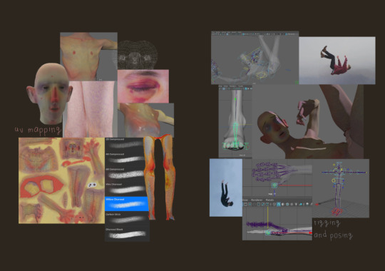
6-7 - UV Mapping and Rigging
I started to UV map my model once it was completed and did find it pretty tricky, I had some issues with unfolding where the computer would crash upon using the tool. I talked to Gary a little about this and it seems it was due to the model having some 3 sides shapes. I tried to fix these but in the end it just kept happening on the head even when I couldn't find any more 3 sided shapes. After this I just unfolded and mapped whatever I could and just didn't unfold the head map. This has led to some stretching on the top of his head but at least it isn't an area with more detail where it'd be very noticeable. I used the charcoal brushes on procreatre to create a mottled skin look and selected colours from my colour palette, I really like the charcoal brush as they blend nicely together. Rigging the character seemed really easily but then again it clearly did not work so maybe I just did it wrong. I used Garys tutorial and the ultimate skeleton rig and it actually fit my character pretty well already. I didn't need to move it too much. I found creating the skin cage a little tricky as his fingers are very skinny meaning it was tricky to hide the cage completely but I did get there in the end. I also then learned that you can hide the cage afterwards as it initially was showing up on my renders.
8 - Posing and Liminal Space
Upon posing my character I knew I wanted him to be falling from the pipe to the space below - somewhere safer and comforting that he was longing for. It wasn't exactly a scary or painful fall, of course it hurt but it seemed better than the alternative. There was not masses of examples of people falling in the way that I imagined so I mainly just freely posed it and held my arms in the pose I was imaging but I did find some okay examples on pinterest. I also had this idea of liminal space in my head that I couldn't shake. I liked the familiarity involved in the idea of liminal space - somewhere we all slightly recognise and feel comfortable with, adding to the feeling of nostalgia and longing for comfort, safety and childhood.
9-10 - Second Character
I know less about my second character but I feel like she ended up in this space for similar reasons. Loneliness, a longing for the past and additionally a feeling of being out of time. Growing up she was what everyone longed to be, young to find a partner and marry, young to have children, a bit of a beauty queen, smart and charismatic too. But thats the past, her husband drinks and doesn't treat her very well anymore. Her children are grown up and she has grandchildren but they don't get to see each other anymore. She didn't work and feels empty now, longing for a time that has now passed.
11 - Self Directed Model Making
I knew that over christmas I wanted to work on my own model making because I feel that I may want to go into character design or stop motion model. I thought this was a perfect opportunity to do both. I decided to use polymer clay because even though it isn't typically used in stop motion due to it not being flexible I thought it was my best option as it'd give me a good solid base to paint ontop of. I used wool, brushed out with a cat brushed and curled for the hair and acrylic paint and pencil for the skin and colour. I tried to capture similar colours to my 3D model so that they look like they could come from the same story/world. I really enjoyed making it and plan on doing more after hand in.
2 notes
·
View notes
Text
Homestuck - Life and Doom
Agency and limitations

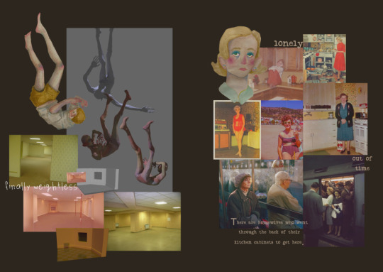
Life
Hey! It’s my aspect :D
The stylised grass is a vivid green, embodying healthiness and vitality (among others). The background is beige, which is a pity as its palette choice is the exception to the rule: darker hue of the symbol’s color. It’s close to a soil like grey-brown.

Petition to create a better color palette for the Life-bound godtier outfits :/
It curls on itself, wiggling and trying to grab something, giving the impression of movement and life. Which isn’t far-fetched as nature, and so grass, is alive and grow. Like ivy for example, that climb and hang into trees and fences.

[Source: Ivy Day (United States), Wikipedia]
The green symbol could also be seen as seaweed.
People have point out that it could represent tentacles, which is relevant as two of the three HS Life-bound are related to a Horrorterror Lusus.
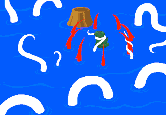
See the shape of the emerging ones? Pretty similar isn’t it. Plus those that are clinging to the red poles.
Now to the signification of the aspect itself.
And I need to untangle some misconceptions and clichés about the Life-bound:
No, we are not all healers, and no, Life isn’t just about energy and nature.
It’s growth, change, substantiality (food), power (and so money), and the most forgotten one, your status in society.
As Feferi find the hemospectrum system (rightfully) awful and unfair, she decides that if she were to access the throne, she would bring change.
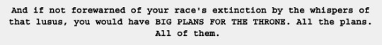

While Meenah on Beforus renounced this status, and played the game with her friends.

Transcript from the Openbound game
So I guess the curled symbol (that can be found in other aspects) embodies the strong grip of energy put into agency, interacting with reality through the physical body and values of the Life-bound. And they way they do it is determined by the way they are: the SBURB class, which is present in everyone, and not only for people fated to play the game.
There’s an element of this aspect that makes me uncomfortable, and it’s urgh, anything that is carnal. Though I can and will talk about how Life is about physical pleasures. Taking a shower, hugging and intimate contact, and my big favorite: eating food :q *drool*

Photo taken before disaster, but hey there’s cake!
Food is here to keep you healthy, up and running. But food is also a great pleasure: the smell, the substance, the taste.. haven’t you go to a cafe just to satisfy your lips and taste buds? I personally love cheese cakes.
Not only it fuels and occupies you, but I’ve also come to learn recently that “saliva contains a painkiller that is stronger than morphine but we don’t produce a lot of it otherwise we’d be consistently high” and that “opiorphin is six times stronger than morphine, and actually contains an antidepressant, which is why some doctors think it’s linked to comfort eating.” Eating is good for substantiality and mental health y’all!
Life-bound recommended lyricstuck: On top of the world by Imagine Dragons, and 100 years by Five For Fighting

Doom
What a great timing to talk about this peculiar aspect, right? *forced laugh*
This aspect is composed of a gas mask with big round googles, to prevent smoke and other dangerous inhalations to reach the immune system.
The dull deep green background is reminiscent of poison, and the hues of military camouflage suits.
The spikes around the shape remind me of edgy bikers helmet.

It’s repelling looking. Like the natural protection of a hedgehog.
Of course, for the Homestucks, the shape immediately remind them of The Tumor, the destructive deus ex-machina bomb.

Doom isn’t necessary about death, it’s about despair and being stuck a difficult situation. “We’re doomed”, is an expression used in many occasions:
When your company is close to bankrupt (ha! Money. Hence the duality with Life)
When a superior authority (boss, teacher, parent) realised that you fucked up and you fear punishment/retribution
When you are in a life and death situation and is very close to die (typical in movies, but sadly happen in real life more times than you can count)
When a virus spreads worldwide and nobody knows what to do, while the infected and death count dramatically continue to increase.
While Life is about the possibilities and optimism, using they to reach a bright future, Doom is about limitations and pessimism. But the Doom-bound work with those blocks and tricky situation, making the best of it to be able to go forward.
Sollux as a Doom bound person is a good example, using the knowledge of his aspect to move the meteor and make the team escape. At the sacrifice of his own life.
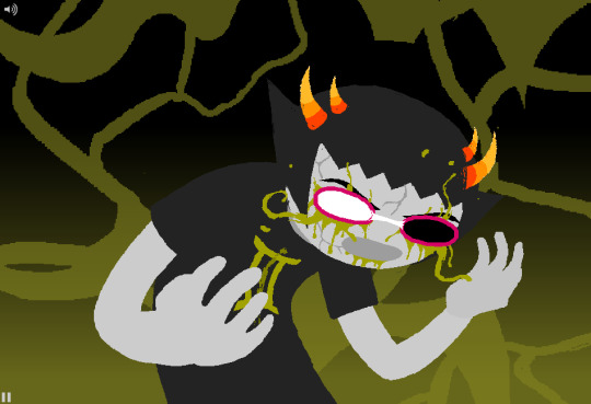
It’s worth mentioning that the color of his pupils echoes to the black and white Tumor. Here, he has ‘one foot in the grave’ while half of his being is still alive.
It is speculated that Sollux has a troll disease called ‘voidrot’, draining his life force and so trapping him in a perpetual decay. If that’s the case, it would explain why he stays by Aradia’s side (among other reasons), to be sustained in energy.
Mushrooms can be seen as Doom-related, as they "assure the release of mineral elements in their necromass and recycling”. Others can be parasites, taking advantage of a wound to penetrate the tree and decompose it from the inside.
Doom-bound recommended lyricstuck: Go Get Your Gun by The Dear Hunter
15 notes
·
View notes
Text
After You Buy All the Essentials, Then What? My Personal List Moving Forward
Switching focus from the urgent to the important is a vital practice in the business world. Have you ever worked somewhere where it’s clear that instead of thinking critically about the core of the organization’s mission for ways to grow and improve, the focus is instead on whatever the newest, shiniest idea is (or often, whatever the latest crisis is)?
I always had a sense of urgency about buying clothes, because my goal was to dress in cool tailoring every day of the week in ways that I would consider meaningfully different. But being constrained by a budget meant I had to think carefully about what I bought, so I wouldn’t end up with something because it was a great deal, only to discover I had very little use for it. So I created a list of clothes I wanted that I imagined would comprise a complete wardrobe (for my tastes and needs). That helped me stay focused on my goals when sale season started and there were so many awesome things to buy.
Now, though, having largely built that wardrobe I imagined, I tend to get distracted by the new, shiny thing much more. I’ll find some product on eBay or in a shop on sale and become obsessed with it, going back to look at it over and over again. Without that hit list of must-buys to bring myself back from the brink, I always have a creeping sense that whatever it is I end up actually purchasing is maybe the wrong choice for me and I should instead be saving that money for some other, better purchase down the road. I’ve picked all the low-hanging fruit, but I have no personal guidance for reaching higher.
So, in an effort to try and refocus myself on buying what I can consider important purchases—not just those with the urgency of desire—here’s my list of next must-haves.
(By the way, if you’re just starting out and want some help building a wardrobe from scratch, check out my “Guide to Building a Tailored Wardrobe.” In it, I explain just that—how to have the right mindset about buying clothes, plus specific advice for versatility in clothing. Check it out here.)
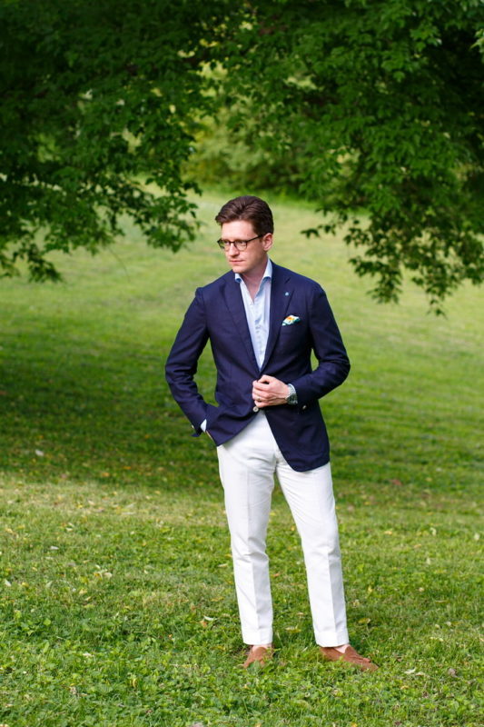
More cotton-linen trousers for summer
Since becoming a dad—but even before then—dress trousers in wool just don’t get much wear from me. Primarily that’s because pants need cleaning more often, and I hate dry cleaning bills. But it’s also because I prefer a silhouette that just doesn’t work with dress pants, at least in wool. Jeans or even chinos made of denim or cotton twill drape differently and thus can work in the tapered cut I prefer. My previously perfectly fitting flannel trousers with that ideal taper from Spier & Mackay are now too slim because my calves got too big. So I have to go fuller. I’m fine going with that in a drapey wool, but day to day I prefer a slimmer knee and slightly tapered opening at the hem.
This is why cotton-linen trousers exist. Cotton-linen seems to have that perfect balance of cotton’s stiffness with linen’s drape, so they hang well but are forgiving if the fit isn’t bespoke-perfect or your proportions make things difficult. Pure linen just doesn’t give off the vibe I’m looking for typically (it feels a little more louche the way it hangs and rumples than I as a person am). And other options like wool-silk-linen blends are beautiful and amazing (I’ll get those below), but what I like about cotton-linen is I can usually machine wash it myself to no ill effect. Currently I have one pair, so it’d be nice to get another 2-3 to rotate through (much as I have with flannel in the winter). My list would be:
A second pair of off-white
Tan / khaki
Deeper brown
Maybe a light blue or mid-navy
Options I have for buying these: Spier & Mackay’s dress trouser fit is still my best bet right now, and I’ve been told they’ll have a crop of 7 colors of cotton-linen trousers in mid-April. That said, I also just purchased some pairs from Brooks Brothers’ Red Fleece line that arrive soon, made from fabric by the same mill as Spier’s, for $37 a pair that might work, too.
A rotation of good chinos and a pair of light wash jeans that fit
Chinos are nice because they dress up or down pretty well (you can wear a tie with them without it being weird, unlike five-pocket pants, but on their own without a jacket they’re good too), and if you get them in the right fabric, they’re pretty hard-wearing.
Finding chinos that 1- don’t have stretch, 2- are made from material that’s a good mid-weight, and 3- fit the way I want is extremely difficult. You wouldn’t think so but man it’s hard to find good chinos. And finding good, faded jeans with similar qualities is likewise hard without spending $200+. That said, if I can find them, what would make my wardrobe happy would be chinos in:
Off-white
Stone
True khaki
Possibly a pair in fatigue, which is a good color when it’s too hot to wear a jacket
Options for chinos are tricky. I like the idea of what fellow menswear blogger Ian is doing with his new shop Lost Monarch; $125 is hefty for chinos, but I suppose if they fit really well and the fabric rules, the investment might be worth it. I also always forget about classic chino maker Bill’s Khakis, which was always hailed as having the highest quality back in my early Styleforum days. They introduced a number of slimmer fitting styles over the years and are still fairly easy to find on eBay. Spier & Mackay’s chinos are a great deal but each time I’ve tried them, the fit’s been off for me in some way or other. I might try them once again this spring.
As for light wash jeans, I’ll be looking probably at American Eagle, Polo RL, Abercrombie, Banana Republic, and other mall brands. Much as I’d like to get some 3-Sixteens or even Naked and Famous, they’re hard to get ahold of where I live and trying jeans on is critical.

A dark navy blazer in both single and double breasted configurations
I have seasonally appropriate navy jackets—one is wool/cashmere for winter, and one is raw silk for summer—and last summer I added a dark blue double breasted jacket for summer as well. When I recently tried on No Man Walks Alone’s Sartoria Carrara jackettried on No Man Walks Alone’s Sartoria Carrara jacket, which was a dark navy twill, I remembered why dark navy jackets exist: they’re classy as heck. All my navy jackets are slightly lighter shades of navy, which is great, but a good, dark navy blazer brings some gravity to an outfit, looks great in the evening and dresses up very well for more formal occasions.
That said, it’s gotta be the right texture. Hopsack wool is a good option; I would also be interested in some kind of blend like wool-silk-linen or similar. I’m not a fan of mohair, so I wouldn’t do that, and the high twist fabrics are tricky because they tend to look fairly smooth, while I like a little more surface texture. Given how much I like my SuitSupply Jort blazer, I’m hoping they release a double breasted jacket that might fit the bill this spring/summer. As for single breasted, I really, really liked that NMWAxCarrara jacketNMWAxCarrara jacket, so something closer to a 3-season fabric from him would be amazing. Of course Spier & Mackay has staple hopsack wool blazers in both their Neapolitan cut and regular cut, which sold out quickly in my size.

A dark navy double breasted blazer by Ring Jacket (model 6) I tried on at The Armoury in New York City. Click the image to see the product page of this actual jacket at their site.
A pair or two of summer trousers in a nicer fabric
Cotton linen trousers and chinos are as dressy as I need them to be most of the time in my life, but it’s still nice to have a pair of classier dress trousers in summer for occasions that call for it. I’ve had gray hopsack and fresco in the past, but those were more corporate than I was looking for.
Summer is the time for levity in the color palette, so I really like the idea of a light or mid blue (maybe a petrol blue). Every time Greg at No Man Walks Alone does spring pre-orders for Rota, they offer these beautiful wool/silk/linen blend fabrics, including petrol blue in the past, and every time, I love how they look but always stopped short of ordering for various reasons. A sufficiently textured, interesting blend in a light gray would also be nice and would be better than a corporate looking fresco or tropical wool. In the swatches below, which were for this season’s Rota trouser made to order options, the blue and gray at the top hold appeal, and even that green at the bottom.

Swatches for Rita wool/silk/linen trousers From No Man Walks Alone.
Some dress shirts from Anglo-Italian
It feels like I’ve been banging on about this for years at this point, I know, but their reverse stripe OCBD is great and I need to just pull the trigger and buy it. But beyond that, Anglo’s house dress shirt model is essentially the perfect shirt: the collar shape is an ideal wide spread with no tie space and that isn’t too stiff; the fit is comfortable but not baggy; and the details are all there both quality and design-wise. The back shirring is maybe a bit out there for many people, but these shirts are meant to be worn under a jacket, which is how I’d wear them. I’d buy white first then probably their blue end-on-end and maybe the bengal stripe. They’re expensive at $175, but that’s less than other comparable Italian dress shirt companies like Finamore or Borrelli.
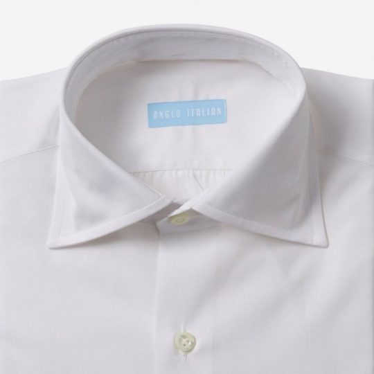
A couple additional pairs of suede shoes
I love suede for its versatility in dressing up or down. What I wear 95% of the time are snuff suede penny loafers, snuff suede chukkas and tan suede tassel loafers. I’m looking to get more dark brown suede, which, sorta like true dark navy blazers, brings some gravity to an outfit. My penny loafers have been through some rough times; I plan to resole them (which they badly need), but it’d be nice to have a pair that aren’t so beaten up. I prefer a sleeker last shape most of the time (not pointy, maybe almond shaped) to the round lasts you see from classic Ivy brands like Alden, which are more casual and carry a lot more of that Ivy feeling (something I’m always trying to temper with more rakish aesthetics). That said, a rounded loafer of some kind to wear strictly casually is something I’d like to get to help share the load with the other shoes. I’ve also been really into the split toe derby look the last year or so. I tried The Armoury’s on when I visited there in 2018, and really liked it.
So, the list would be:
Dark brown suede penny loafers
Dark brown suede Chelsea boots
Brown suede split toe
Dark or mid-brown suede beef roll or similar more casual loafers
I’ve noticed that the most comfortable shoes I love wearing the most are all made by Allen Edmonds, so I’ll be looking at those for sure. The Sea Island in particular looks awesome for that casual loafer. Beckett Simonon has some suede boots and given how comfortable their shoes are, their Bolton Chelsea looks nice. Meermin of course is another option for suede boots, and they have a penny loafer that might fit the bill for me, too. Spier & Mackay’s shoe offerings look very good, including this suede penny loafer. And of course the Armoury’s split toe derby is the one I’m most looking at for that category as I’m sort of picky when it comes to split toe shoes.
So there’s my hit list moving forward. I’ve already deviated from it this season by purchasing an excellent but not-on-this-list jacket from Spier & Mackay in 100% linen by Sondrio in a mid-brown glen check pattern. It surprised me how much I loved it, so I’m letting myself deviate from the list, guilt-free. And at the end of the day, the clothing hobby is all about enjoying life anyhow, and what could be more important than than?
(Help support this site! If you buy stuff through my links, your clicks and purchases earn me a commission from many of the retailers I feature, and it helps me sustain this site—as well as my menswear habit ;-) Thanks!)

Read more at Menswear Musings
10 notes
·
View notes
Photo
Sparkle By the Sea
Pardon me as I just barely squeeze a MerMay piece of art in.
I'll be honest with you guys, I've been pretty lacking in artistic motivation since NaPoWriMo ended. Although if you've noticed my lack of uploads, you probably could've already guessed that. This isn't abnormal for the aftermath of a month-long challenge for me, especially with a brand-new video game calling my name at every moment of the day, but even so I feel like this particular motivation drought was a bit different.
Part of it definitely had to do with the changes to DeviantArt that I'm sure I don't need to remind everyone of, but that's been more of me dreading seeing what the state of the community is than anything else. (However, I have noticed I'm not a fan of the new tag system over the old category one, as confusing as the category system could be sometimes.) Rather, I think this lake of motivation has more to do with the fact that being largely absent from all social media during NaPo reminded me...well, that I hate social media.
This is really a bigger discussion for a journal or something, but suffice to say it did not feel good to realize just how many literal hours I had previously been spending trying to desperately to scrape up just a little bit of support on other social media platforms (namely Twitter), versus the more natural growth I see here on dA that also feels a lot more genuine and less forced/obligatory.
I can't really explain it, but that reminder/realization really helped my brain slip back into a place where I felt like creating again. And with that, I'll transition into talking about the art and save the social media talk for, as I said, a journal or something later on.
Naturally, I've been seeing a lot of mermaid art this month and every year I feel the urge to get in on the fun, though I know better than to try actually doing the MerMay Challenge (especially not this year after having just done NaPo), so I usually either do a one-off drawing or if I'm too busy with other projects I just skip it. But I was starting to feel that need to make art in my brain again and I've had a specific set of stickers from the dollar store sitting in my stash for quite a while now that more or less sealed the deal for me.
How do these stickers fit into the mix? Well, I originally fell in love with/picked them up because they are mermaid-themed and absolutely adorable--See for yourself! And I thought they would make for nice decals in a book project since they're wall stickers and therefore repositionable with minimal adhesive-yuck. And at first, I thought maybe I'd end up making them into said hypothetical book project in time for MerMay...except that felt a little cheap in combination with my lack of uploads. Did I really want to come back with a book project featuring mermaids I didn't even draw? And for MerMay of all things?
So I sat on the idea and left the stickers out where I could see them, and eventually I sat down and took a closer look at them. The art style, upon further inspection, actually didn't look like it would be too far outside my usual art-making realms...Most of the coloring looks a lot like watercolor, except for the skin which I thought was flat and smooth like alcohol marker and the glitter accents which from my perspective pretty much had to be digital, but could potentially be replicated with glittery/metallic supplies...
And that was the moment the idea hatched. I decided I'd try drawing a mermaid myself in the same style. This would work for MerMay, have something to do with the stickers, and based on my plans would work well for me as a mixed-media project, which as I'm sure I've said before is where I think my artistic talent shines best.
I thought the scariest part was going to be replicating the looser and less strict line style, and to a point it was, but it wasn't nearly as bad as I thought it was going to be. I find it's usually kind of tricky to explain this, but really what this part of the process boils down to for me (if I'm replicating an existing style and not using my own), is really just studying the original artwork(s) and looking for patterns, then trying to stick to those patterns. For example, the style here features fairly large & rounded faces, and the hands are more like hand-shaped mittens (which was great news by the way because hands are always a pain in the butt for me), so I did my best to emulate those features.
As per usual, I did start with a sketch, but I tried to keep it looser than usual, and then when I did the inking I started with my 0.2 Micron, again trying to keep things loose and no be too fussy if I could help it. Then I went back with a brush tip liner from Prismacolor to get more natural variation in the lines and to force myself to not have quite so much control over the line weight.
I was also very careful with my choice of liners because I knew pretty much everything except the skin was going to see a lot of watercolors, which meant the lines had to be waterproof. And of course, I went with watercolor paper (my nice 100% cotton stuff this time) to make sure I didn't have any issues with blending or layering.
Now, at this stage, I didn't know what I was going to do for the background, though I was leaning towards the idea of making one separately and placing the mermaid on top afterward, as sort of a nod to the original mermaids being stickers. But I wasn't totally sure yet.
What I was sure of was how scared I was to just dive into coloring. The sketching and inking and gone so well I was thinking I was in for a rude awakening at any moment. So, just in case, I scanned my uncolored lines as a fall-back if I royally screwed up. With my paranoid mind set at ease (for the most part), I could begin with color application.
I started with the skin since it was the easiest; Just one good layer of alcohol marker, leaving a little white space here and there like the artwork I was emulating. Although 1. The marker color turned out a bit darker than I was expecting and later blended too well with her tail, so I had to lighten it in Photoshop, and 2. because watercolor paper really soaks up the ink, I ended up with less white space than I thought I would. But beyond that, this step went off without a hitch.
So then came the second-scariest part: The watercolor. I used a mixture of my Master's Touch watercolors and Mermaid Markers (yes, that was a very conscious supply choice ) and tried to take my time and be mindful of the color balance I was looking for.
I'd decided ahead of time that I wanted to try and stick with a soft-ish palette like the original art, but I still wanted my choices to be different. Since yellow/gold is featured in the original but not used for a tail color, that's what I went with, and I opted for the blue-y-purple hair since a soft blue and purple are also prominent in the original and based on color-theory would be a nice contrast to the gold-orange tail. Though I did also try to get some pink in both the tail and the hair for a bit of unity and calling back to the pink in the original art.
The trickiest part with the coloring was actually the tiny lips and blush spots. I ended up using a fluorescent pink for that turned out as more of a red originally and had to be touched-up via Photoshop because of that and also because of the lightening I did to the skin. It's more that it was a bit of a challenge to get the shapes of these much smaller areas right and in the correct place, since I had to use very minimal pencil markings, lest I end up with nasty graphite marks mixed into the paint.
Getting the hair to be dark enough without being extreme compared to the rest of the drawing was also a great test of patience, but it ultimately worked out, I think.
I also had a hard time deciding what color the piece of coral in her hair should be, which is why it ended up as this vague dusky-orange color. And I got more pink on the sand dollar next to it than I intended, but neither of those things is a huge deal.
While I waited for all that to dry though, I had to decide how I was going to go about tackling all that extreme sparkle the original art had. I could have just added it in digitally and not even attempted it traditionally, but everything else had gone so smoothly that I decided to push my luck this time.
Originally, I started with just glittery gel pens, but I found pretty quickly that they were sinking back into the colors underneath them too much and thus just weren't doing what I wanted. I wanted high-impact sparkle. After some brief consideration, I turned to the metallic watercolor sets I have made by Art Philosophy, which are very high-impact metallic and pretty opaque, which would work well over my failed gel pen and would work wonders for the areas where I wanted that high-impact over an opposing color. (I.E. Where I wanted the blue sparkle over a very orange-yellow area, which would normally make brown mud if the color on top wasn't opaque.)
The funny part about that is that I originally used a different shade of purple and gold for those areas of sparkle that I ended up completely covering with different shades (the purple needed to be lighter and the gold needed to be darker/more gold and less yellow). And her eye shadow cover saw all three colors before I settled; The purple just seemed wrong, and the gold blended too well with her skin. I thought the blue wouldn't work so close to her blue hair, but it actually ended up looking the best out of the three.
Although, I do have to make a full disclosure that the high-impact sparkle you see here is in fact where I went in and re-did it digitally once I scanned the artwork in. Unfortunately, glitter and metallic supplies just don't scan very well and usually end up looking too dark, dull, or flat by comparison. The metallic paints work just fine in person since you can move the art and see how they reflect the light, but it just doesn't work in a still image that's been captured by having a bright light uniformly shined over it.
Still, re-tooling the sparkle digitally ended up being an interesting challenge, especially since it's been a fairly long time since I was messing with digital textures like this.
Also worth noting is that I had to re-paint some of the metallic areas because they weirdly lifted off onto the plastic cover I used to protect the art when I pressed it onto the background to make the glue stick. I'm not sure if it's because those were the extra-layered areas and they hadn't fully dried all the way down to the paper, or if that particularly plastic just picks up this metallic paint really easily or what.
And speaking of that background...
Like I said earlier, I wasn't really sure what I wanted to do for a background for a while, but after reviewing my mermaid-centric Pinterest board I decided a simple rock seat and something to vaguely suggest the ocean/water without getting too detailed would suffice just fine. Based on that, I felt like using gouache would work nicely (and I just really felt like using the gouache since I don't find a lot of opportunities to use it) and that a color scheme that flipped her hair and tail colors would be best for the effect I wanted.
I've found I really like the Strathmore 400 series mixed media paper for gouache because of how smooth it is, so I cut a piece down to size and got busy.
For the most part, I just kind of went in with the colors doing whatever felt right, and trying to use some gouache I'd already mixed from past projects (since gouache can be reactivated and I've found this kind, in particular, seems to reactivate really nicely) either on their own or to mix the colors I felt like I needed. And I also tried to do a lot of blending straight on the paper to get more variations in color and make things a bit more lively.
Oddly enough, this ended up being a good example of gouache's covering power because I accidentally started applying the colors upside down--using more greens and blues on top and more pinky-purple on the bottom--and not only had to flip the paper around but also had to do a fair amount of covering the colors I'd already put down with colors you don't really want to mix with them because they don't make very pretty results. But it worked out just fine, so yay!
I also added some clouds for a little extra ambiance, which I think looks quite nice.
Believe it or not, the most difficult thing about the background was the rocks. I spent far longer than I care to admit (or bothered to document, for that matter) trying and in many ways failing to mix the proper shades of gray I wanted, and the end result didn't turn out quite as clean and graphic as I had hoped, but by the time I put the mermaid on top, you really can't tell because you can only see a fraction of what's actually there. And I mean, the end result isn't terrible, it's just not quite what I was picturing in my mind's eye is all.
Personally, I know it's kind of an odd choice, but I really like how there's no defining line between the water and the sky, and yet you still get a clear idea that they're separate and the rocks aren't just floating in space. I'm not sure how, but I think I'd like to work with this kind of ambiguity more often. It's like a step between abstract and more structured art.
Anyway. With the background done, the next step was to attach the mermaid, which I felt like doing in a more 3D and less flat manner, so I chopped up a cardboard box that previously held a chocolate bunny I had on hand and glued some pieces together to boost the mermaid up a bit. This where those deep shadows between her and the background are coming from.
Here I feel the need to insert a comment about how difficult it was to get my tacky glue to dispense the glue for me, though there's a chance this is because I need to poke the opening in the tip to be a bit wider. (You have to poke it open yourself and I always felt like I never did get it open quite enough...unless you like strenuous hand exercises...)
Of course, once all the above was done then I had to scan the art in, which I was admittedly a bit nervous about after the incident with the plastic cover peeling off the metallic paint (though fortunately, the scanner glass didn't have the same effect), and then all that was left wad the digital retouches.
Overall, I'm really happy with how this turned out. It doesn't blend in as well as I originally wanted it to with the original art, but in the end, that doesn't really bother me. It's just a nice piece of art on its own that is also unique from what I normally do...except it's still got a lot of similar elements to how I normally make art. It feels a lot like the days when all I made was fanart. The key difference here is that I know myself better as an artist now and thus can use that knowledge to my advantage.
I can't promise this a return to regular posting for me, though I do hope it's a gateway to me posting more frequently at least, but I can say I do intend on getting back to working on art more often and therefore being more present online again. At the very least, I can happily tell you guys that I have a couple of new art supplies en route to me that I've been wanting for a while and am excited to share with you once they arrive. If nothing else, we at least have that to look forward to!
____
Artwork © me, MysticSparkleWings
____
Where to find me & my artwork:
My Website | Commission Info + Prices | Ko-Fi | dA Print Shop | RedBubble | Twitter | Tumblr | Instagram
1 note
·
View note
Text
Hello one and all, it’s once again time for my seasonal dose of adorable underdressed anime fun with Matt! My collaborations with him are my chance to see some shows on the more moe ecchi side of things that I wouldn’t necessarily get around to otherwise so it’s a good way to broaden my horizons. So naturally this season Matt suggested Psycho Pass! I had no objections….
Some more astute readers may know that I (much like a whole lot of anime fans) have a very soft spot for the series. I talk about it a lot and to this day this messy fever dream of a post remains one of my favourites!
But enough about me, Matt what are your thoughts/feelings about the franchise?
Hello Irina, everyone, it’s me. My thoughts on Psycho Pass’s first season? Absolutely excellent, one of my Top 20 anime of all time. Thoughts on the second season? A rushed mess that does a disservice to the events of the previous season.
So season 3… Whenever a beloved series gets a new entry, there’s always a sort of backlash from fans. A weird fear that somehow it can go back in time and change what the original was. It’s counterproductive. Which is probably why Matt warned us on Twitter not to immediately compare it to the original…But Boy did this first episode make that hard!
There were parallels to the first season Everywhere you looked. The art style is instantly recognizable, and the environments remain almost untouched (aside from the CG but we’ll get back to it). The colour palette is very close, only slightly warmer and the framing and angles are perfectly consistent. The OP was purposefully similar which made the inclusion of that demon-like creature really stand out.
Beyond that though, we saw glimpses of the iconic Syble control room, the dominators in action, Shion back in force (oh hecks yeah) and even just a hint of Akane. And one of the first scenes was of inspectors Arata and Kei arriving on their very first day at the job, at a rainy crime scene in an opener that directly mirrored season 1’s first episode.
I know you don’t want us to compare the two, Matt, but it certainly seems the show isn’t about to let us forget its roots.
There’s nothing wrong with calling back to things that happened in previous seasons, in-fact they were some of my favourite parts of the episode. The problem is when people dont give a show a fair chance to stand on its own because their too busy holding it up to its predecessors shadow.
There’s something of a deft balancing act done here by making this part sequel and part soft reboot (at least that’s my impression) and I think it pulls off both very well.
To me though, this was an homage, not a rip-off. Tonally, visually and atmospherically it was very reminiscent of Psycho Pass but the character dynamics, faster and grimier corruption storyline set up and quick-fire dialogue are fresh. Not to mention the completely new mind trace gimmick. So far, I like it, but it has the potential of just turning into plot destroying “sci-fi magic”, what do you think?
It’s funny you mention the mind trace “gimmick” because (aside from the visuals) that was my favourite thing about this episode. I don’t know if you’ve seen Bryan Fuller’s ‘Hannibal’ tv series from a few years back but our protagonist in that show has complete empathy which allows him to become other characters which is almost exactly what Arata has (down to the wording) of his trait. So not only was I immediately on board with this but I was excited to see where it would take his character. Oh I vaguely remember it. I was actually thinking of Sherlock myself.
Arata is a light-hearted happy go lucky protagonist. For someone like me, whose favourite character was Kagari, it’s a thrill, but what do you think Matt? And ho do you think audiences will react. It’s a pretty big departure from previous protagonists.
I think a lot of his light-hearted disposition is a coping measure for having to deal with having complete empathy. I enjoyed this kind of protagonist compared to brooding and dour but I still think it’s a bit of a front.
O.k., I’ve avoided it so far but let’s just mention the CG for a bit. I didn’t like it. It wasn’t horrible but the integration was hardly seamless and honestly, it took me out of the moment on several occasions.
Hmm, I have to disagree, I thought it looked wonderful and very dynamic and interesting. I’ve heard streaming things with a lot of small details can look ugly so maybe that was the problem for you? I ~acquired~ a 1080p copy of the episode so maybe that’s why I thought it looked so good? No for me the issue was more that the light and shadow physics where calculated at a very slightly different angle that made the CG pieces sort of stand out in one frame and not the next. Once I noticed I kept on noticing. Also, I disliked the textures but that personal taste. Actually, I got to give it to prime, the quality if their streams are really good!
Overall, here is what I got from the first episode of season 3 of Psycho Pass. The narrative seems to be more action-oriented with hints of humour, rather than dramatic noir. There is a lot more emphasis on tech which leads me to believe we’re going to stray into cyberpunk territory. Political machinations are afoot.
I think it was a necessary change, this felt more like a US crime procedural along the lines of ‘Person of Interest’ so arguably not world’s away from what it was but different enough to feel like it’s carving out its own identity and not resting on everything that it’s previous seasons set up.
There were some red flags. The addition of what seems to amount to incredible psychic powers in Arata is a very tricky narrative element and unless used carefully and sparingly could either render stakes inconsequential or completely undercut and tension in the story. Moreover, the little we saw of the villains did seem a tad too goofball to be taken seriously and, in my experience, this universe really benefits from a strong antagonist.
In the closing scenes, there is a line seemingly spoken by Akane: “We must protect justice even at the cost of a peaceful society”… This was meant as a sort of handoff to a new cast and although a bit heavy-handed still cute. Except that to me, it sort of goes against what Akane stands for and negates some of her most important and powerful character moments (by the way, I’ve seen season 1, the old movie,
Seeing Akane at all was kind of unexpected–the opening monologue and the sort of revelation that she’s still imprisoned (I think that’s what they were going for–its been a while since I watched season 2) hit me harder than I expected.
On the other hand, I pretty much fell head over heels for Mika. Every scene she was in made me smile and glued my eyes to the screen. I always wanted to know more about the tech of Psycho Pass and that seems to be the direction the season is heading in and although we don’t know much about Kei and Arata, I like them both so far.
I like all the characters (both new and returning ones) so far, I quite liked the banter between our two inspectors and their chief–she seems like a pretty understanding woman–hope she doesn’t end up working for the bad guys!
From what I can remember of my very first impressions of the franchise at all, this is pretty much on par. I mean I’m way more excited but I’m bringing that down because a lot is due to fuzzy nostalgia feelings. I didn’t really have any expectations for this episode, all I wanted was a strong narrative and characters set in the familiar future fictional Tokyo of the Psycho Pass universe that I���ve got a lot of fondness for and on that front it absolutely delivered. If I have one complaint it’s that it introduced a lot of characters that didn’t do much (specifically those three mysterious characters who are either politicians or something I’m not quite sure) but there’s still plenty of time to find out what their deal is. All in all, I thought this was an excellent continuation and new beginning for the series.
Psycho Pass s3 ep1 – A New Start Hello one and all, it’s once again time for my seasonal dose of adorable underdressed anime fun with…
6 notes
·
View notes
Note
Hi! I'd like to request a palette for a character I made for a Curse of Strahd campaign. She's Naireh Silverscream, an LG aasimar cleric of Kelemvor. She grew up in a merchant family, but had enough of the crime-centered workings of her city and left to be an acolyte. They were close with her deva guide, so when they disappeared she decided to look for them, and find out what destiny meant for her to accomplish. I associate her with silvers (she has silver markings on her face), reds and greens.

Given this aasimar is in a Curse of Strahd campaign, I wanted to include a very special vampire d10, along with gorgeous silvers, greens, and reds. I hope this manages to survive Raveloft and all the terrors it brings. I know it’s a tricky one!
Help support the blog?
#dice#my dice#dice palette#request#dice set#polyhedral dice#ttrpg#dungeons & dragons#dnd#d&d#aasimar#cleric#d&d oc
27 notes
·
View notes
Photo
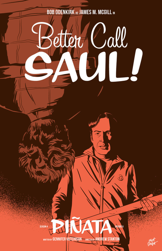

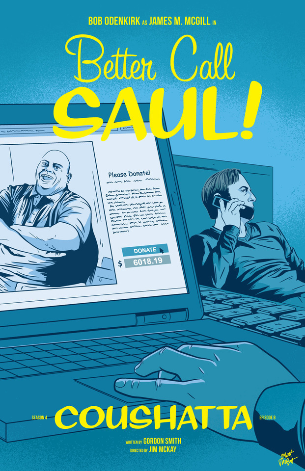
APPRECIATION & INTERVIEW
Better Call Saul episode posters by Matt Talbot
After 4 nearly years, I thought it was time to catch up with Matt Talbot about his Better Call Saul poster project. The last time we talked during Season 1, Matt was deep in the hustle of making his name as an illustrator: juggling a full-time job, freelance projects, as well as band. Finding time for personal projects like this one can be a significant challenge. (Not to mention surviving the death of your tools: During Season 1 his Mac laptop died, and this season, his Wacom tablet bit the bullet). But despite these challenges, the 43-year-old New Hampshire native has persevered to create a clever and thoughtful series of episode posters that has garnered considerable attention, and brought with it new high-profile clients and art exhibitions.
First, congratulations on all of your success and recognition with this series of posters. It’s well-deserved. What’s been the most gratifying feedback you’ve received?
Thank you! Every interaction I’ve had with anyone from the show has delighted me. I've been surprised by all of the cast and crew members who have said nice things – every note I’ve gotten has meant a lot to me. That being said, Michael McKean randomly tweeting at me that he has my poster for Chicanery hanging in his home blew my mind. I was eating dinner when my phone showed the notification and I literally jumped up from the table. I’ve been a fan of Michael’s since I saw Spinal Tap in the ‘80s and never in a million years would I have guessed I’d make something he valued enough to hang in his home.
Tell me about your contributions to Gallery1988 exhibitions. How does that process work?
It's a pretty simple process. They invite me to be part of a show, and I make something to send them. I’m very excited for the opportunity to show there, and I feel like it’s a milestone in my art-making career.
Across the 4 seasons, which BCS posters are your favorites? Which one are you most proud of? I’m particularly fond of Rebecca, Rico, Marco, Switch, Sunk Costs and Something Beautiful.
Oh man, it's hard for me to evaluate my own stuff. I tend to like the posters where I find a way to get a different take on something they did in the episode. I would say that “Sunk Costs” is also one of my favorites because I did something differently than how they shot it, and because Mike is so recognizable even from the back. I was also pleased with “Off Brand” because it was when I finally figured out how to draw Bob Odenkirk.
How has your process for creating these posters evolved over 4 seasons?
When I started this project I had a vague idea that I would focus on scenes rather than portraits or likenesses, but that didn’t even last half a season! The characters were too good not to include. In that way, the posters have evolved in my willingness to draw characters, and also, hopefully, my ability to draw them.
My process is now something like: Watch the show on Monday; think about it on Tuesday, figure out what stood out to me and do a thumbnail sketch or two; draw it on Wednesday night; post it Thursday afternoon. I’m a bit faster at drawing these now compared to when I started. And I’m a bit more decisive on choosing which subject matter to depict.
There have been quite a few changes on the visual side of Better Call Saul over the last 2 seasons. New directors (Minkie Spiro, Daniel Sackheim, and Andrew Stanton), a new cinematographer Marshall Adams, even new cameras. What are your thoughts on how the show’s visual grammar has evolved? Has any of this impacted your posters from Seasons 3 & 4?
I try not to just redraw literal scenes from the show, and I don’t need to tell you that they shoot the show in an incredibly beautiful way. I mean, they always, always, pick the best angle, the best shot to capture something. For that reason, it’s sometimes hard to to come up with another take on a moment from the show.
That being said, the visual style hasn’t really impacted my posters as much as the evolving subject matter has. The show, I think, is substantially darker than it was in the early going. It was easier to depict Jimmy’s hi-jinx in the first couple seasons. But with Chuck’s deteriorating mental state, the cartel stuff, Mike going deeper into Fring’s world and of course, Jimmy’s loosening sense of morals, the funny moments are harder to spot. That’s lead me to some more somber layouts and color choices.
We didn’t discuss this in our first interview. Which typeface are you using in your posters, or is this custom typography?
The main logo and episode titles are set in Sign Painter, from the excellent House Industries.
The Heisenverse is known for it’s color theory and use of color. How has that impacted your color choices in these posters?
I’ve kind of adhered to their blue=good/red=bad symbolism, but I also try to balance out colors between episodes and not repeat myself in sequential posters.
Many of your posters (especially ones this season) use a monochromatic, or simple palette of 1-2 colors. Tell me more about why you chose that approach. Is this a signature of your style? I’ve seen this approach in a lot of your work.
You know, in the early seasons, I was trying to use simpler color palettes, but I wasn’t very disciplined and I got away from that. I’m trying to stick to a more consistent style in season 4. It is a conscious decision. I also feel like with the week-to-week nature of this project, it helps quickly set apart each poster. And, I really do love limited color palettes. Giving myself color constraints helps me figure out different ways to solve layout problems.
I’ve heard other illustrators say that Bob Odenkirk’s facial features are tricky to capture. Do you share that sentiment? Which characters are more challenging to illustrate?
I do agree with that. I had a really hard time with him at first. I kind of think I have a better handle on it now, but I’m always trying to get better. I feel like if you can get his mouth right, it goes a long way.
I found Hector hard to capture both times I drew him. Mike, on the other hand, is just pure fun to draw. Jonathan Banks is so distinctive and iconic.
What’s been the most difficult poster thus far? Why was it challenging?
Maybe it’s because a lot of time has gone by, but I can't think of one that stands out as having been really difficult.
Francesco Francavilla did alternate posters for some of his Breaking Bad posters. Inevitably, when artists look back at their work, they consider revising or redoing it because of a variety of reasons – their point of view has changed, their skill/style has evolved, or maybe they were never truly content with the final product. Looking back at 4 seasons worth of posters, are there any that make you want to scratch the revision itch?
Yeah, more than I would care to admit. I would really like another crack at Amarillo. I know I could do a better job and that drawing is just super flat. In season two, I decided to to experiment with style and I kind of wish I hadn't. I like Cobbler, but I wish I had drawn it in my normal style. I would redraw Nailed for sure. Oh man, if I start going down this road it's not going to end well, so I'll just stop.
You mentioned earlier this season you were excited to draw Track Suit Jimmy. Who or what haven’t you drawn, that you are eager to illustrate?
Howard! It bums me out to no end that I haven't drawn him, but it just hasn't worked out. And I need to include Kim more. It's kind of criminal that her face only appeared for the first time in a poster this season.
What’s your opinion of Season 4? Tell me about your favorites – episode, scene, character.
I think season 4 is brilliant so far. The Kim/Jimmy relationship has deepened so much this season, and feels so real, but full of inevitable heartache. Oh, the flash-forward to Breaking Bad’s timeline was amazing. Mike doing his audit in the Madrigal warehouse. Really, anything Michael Mando does on screen. It's hard to pick. I so enjoy the deliberate pace of this show.
Where’s your favorite place to discuss the show?
I honestly don’t talk about it too much online, though I lurk in a few places and read a lot. I actually discuss it mostly with my wife!
I know you get this question a lot, so let’s cover it here so folks understand: Do you have plans to sell any of this work online?
I really appreciate that people like it enough to want to buy it or hang it, but I don't plan to sell the Better Call Saul posters online. I’m doing this for fun, not to make a buck off the show, and I don’t own the rights to sell it anyway.
What’s next for Matt? Do you have any other poster or illustration projects in the works? Is you band performing soon?
I have several more pieces for Gallery1988 shows coming up. I’m pulling together an art show at a local brewery for whom I design all of their labels and stuff. I’m patiently waiting for a t-shirt I designed for one of my all-time favorite movies to be announced. And for the past several Octobers, I spent the month drawing a horror poster per day. I’m not sure if logistically I can do that again this year, but I’ll probably fit at least a few in. We’ll see how it goes. Sadly, with all of my illustration work, I haven’t had any time for music making, but someday I hope to get back to that!
Follow Matt: Web site / Tumblr / Twitter / Dribbble / Instagram / PosterSpy
– Interview by Shayne Bowman, Heisenberg Chronicles
#better call saul#artist interview#matt talbot#mine#heisenberg chronicles#illustration#fan art#posters#favorites#mattrobot#bcs season 4#gallery1988#g1988#house industries#sign painter
90 notes
·
View notes
Last Seen Blogs
heylessi
𝙡𝙖𝙯𝙮 𝙡𝙚𝙨𝙨𝙮 ♡
aleksandrgorska
ola:)
booksmovieswebcomicstvshows-blog
Hi I’m good now
bartolomeo-the-cannibal
mellorine moron

3369looking4fun
Untitled