#Especially since while kind of 'revamping and updating' I want to add a few features which are mostly easy but every once in a while
Text

I’m always paranoid of my tumblr being deleted or malfunctioning or something like that someday, so here’s other places to find me/follow me, just in case lol
~ instagram - https://www.instagram.com/lucalicatte/
~ main youtube - https://www.youtube.com/c/LucaLiCatte
~ games/sims youtube - https://www.youtube.com/@cloudycatte
~ facebook page (I rarely use this because I hate facebook but.. it at least allows text posts better than instagram does, so idk maybe I’d use it more if tumblr went away? lol) - https://www.facebook.com/cloudycatteart/
~ Other Links (stuff I don’t use often/isn’t Main enough to list here, like twitter, neopets, other tumblr sideblogs, youtube channels, etc.) are here - http://icewindandboringhorror.tumblr.com/otherlinks )
#An updated version of this since some of the links on the old one are no longer the same lol#I might make a website website one day (not with a custom domain since I'm not paying for that/dont have the money lol#but like a 'my name.weebly.com type thing lol) but I haven't had the time recently. If I ever get around to it I'll update the post and#reblog that version. ANYWAY.. I just like to have one of these written out to reblog every once in a while. During the once ever few months#when poeple are like 'tumblr is failing again! it wont survive!' which has happened like 80 times but I'm still always like :0c what if!#also love the ms paint art done with a mouse ghhj#ANYWAY.. also if you want to see the stinky game I made that's not actually related to my own worldbuilding really (why I have never#posted anything about it publilcy because it's like.. how do I talk about it lol) I have my itch.io linked in the 'other links' page#as well as my General Projects blog. which talks about all the ongoing and upcoming projects I want to do that are#actually set in my world and can give you previews of some of the things I'm working on. Currently resuming my Game after abandoning it#basically for the entire pandemic and a little before that - as mentioned before - so that's OUgh.. in terms of A Lot Of Work#Especially since while kind of 'revamping and updating' I want to add a few features which are mostly easy but every once in a while#I don't understand something and it's like....... hGGhh...... Ironically despite Blogging I just hate talking to people in public open foru#.. I love privacy and security lol.. and I always feel that ONE day I am going to have a question that has not already been asked on a foru#somewhere and I am going to have to post myself and.. no.. I shan't even imagine it.. It's not even really social anxiety it's just like..#efficiency.. instead of wating like days to get an accurate response and resolve the problem with the general public I would rather just ha#e a one time 30min conversation with an expert and resolve it quickly. PLUS then I also only interact with One stranger instead of Many Of#Them lol.. any 6+ yrs of experience Ren'py experts hmu so I can pay you like $50 to have a single 45min conversation#with me over an insanely simple question and then never talk to you again until a year later when I have a second question. hhjb#ANYWAY.. I still really don't like instagram or it's layout and I never understood how it works like.. if I should be tagging photos or wha#or how you really use it and I just... euGH... stimky.. but it is one of the most popular so I feel obligated to link it. I wish facebook w#sn't such a nasty poo poo because I do actually like the variety of posts you can make and how Pages on facebook operate. In the scense of#it being similar to tumblr that you can make a VARIETy of styles of post. not just Only Post Photos or Only Short Text or Only Video which#is still like.. how the funk does sutff like that even get popular lol.. the Limited nature.. hewwo.. but alas.. and NO way I'm touching#fucking Threads please do not make an account on there and don't let your friends do it and don't let that shit catch on lol.#BUT YEahg... links...... just in case.. i hope tumblr stays aroundin it's current format forever though lol..#I'm pretty sure even facebook doesn't have audio posts. or tags the way this does. or CHRONOLOGICAL FEED. custom html for pages.. aaaaa
13 notes
·
View notes
Text
Precure Day 140
Episode: Futari wa Precure Splash Star 42 - “Welcome Back! Michiru and Kaoru!”
Date watched: 3 July 2019
Original air date: 3 December 2006
Screenshots: https://imgur.com/a/xgCNJSJ
Project info and master list of posts: http://tinyurl.com/PCDabout

The title kinda spoiled it
Another excellent episode! We left off with Saki and Mai in a bind because the Fairy Carafe was stolen and Dark Fall’s agents were revived and now more resistant to Precure’s attacks. Dark Fall holds all the cards and Saki and Mai are stranded in the Land of Fountains. It’s a good setup! Where do we go from here?
The Plot
Princess Filia reveals to the girls that the Fountain of the Sun is in the Land of Greenery and uses her own power to transport the girls, their fairies, and herself there... but she loses her corporeal form and ends up as a sphere of light that possesses Korone, Saki’s cat. Meanwhile in Dark Fall, Gohyaan has revived the rest of the generals, but Akudaikaan chews him out for not kidnapping the Princess when he had the chance, as she knows the location of the Fountain of the Sun, so Gohyaan dispatches Karehaan and Dorodoron to track her down.

This is the only time all 6 of these characters are together
Back at the Sky Tree, Filia explains that she needs the Fairy Carafe to return her body, but the villains appear before she can tell the girls more. Saki and Mai transform into Bloom and Egret but their power isn’t enough to defeat the enhanced warriors. Filia pointedly comments that the two spirits (Flappi and Choppi) alone aren’t enough, so she, Korone, Moop, and Foop gather their power and wish for a miracle. In a very emotional sequence, they connect with the slumbering Michiru and Kaoru, who receive the last remaining energy from the Fairy Carafe, and then revive and rush to the Sky Tree to save their friends. It’s a touching reunion, and some words are exchanged between both the sisters and their friends, as well as the villains who were eliminated before they changed sides. Ultimately, words aren’t enough, and Michiru and Kaoru fight Dorodorn and Karehaan.... and they’re winning! The power that Moop and Foop especially lent them, combined with their powers of darkness, are the perfect counter to the blend of dark and light that the villains possess, and the sisters are able to negate Gohyaan’s powerup (Dorodoron flees instead). This allows the Precures to perform Spiral Heart Splash and destroy Karehaan, who dissolves into a bunch of mini-Gohyaan heads that bounce off.

The four girls finally have a moment to take in their reunion, and Saki and Mai cry tears of happiness as the camera zooms out and the credits roll.
(speaking of the credits, stick around at the end for my take on Ganbalance de Dance finally)
The Analysis
What a great episode. I could probably write pages about Michiru and Kaoru’s revival scene, the dialog and music and visuals all come together to make an emotionally powerful sequence. Bloom and Egret are overpowered, Michi and Kao feel so helpless and they can’t move, but they can tell their friends are in danger and they struggle their hardest, so their feelings connect with the energy Filia is trying to send and create a miracle. I love it. Also, you can really tell that Nishio Daisuke worked on Dragon Ball prior to this series because the sequence of the two powering up and emerging from the water is EXTREMELY evocative of something DBZ would do. Joke’s on me, he only worked on FW and MH and had no hand in this series, he was tapped for Powerpuff Girls Z instead. Still very Dragon Ball, I wouldn’t be surprised of some of the other staff had their hands in that before working on this.
Karehaan proves to be his own worst enemy. He doesn’t like working together, believing he’s strong enough on his own to dispatch the girls. He does make a better team with Dorodoron than with Moerumba though, as they don’t butt heads so much as Doro just kind of goes along with that Karecchi says, until it’s in his best interests to run. However, Karehaan’s arrogance and ignorance about Michiru and Kaoru’s betrayal allow him to overestimate himself and the threat the sisters pose. Together with Dorodoron, they actually do have the Precures on the ropes at one point, they could have defeated them there, but they hesitated too long and allowed the Kiryuus to save them. Ah well.
Princess Filia posessing Korone is..... weird, to say the least. For some unexplained reason, beyond simply habitating in his body, her power allows him to speak as well, independently of her, so you have this tiny cat talking in a pretty deep voice. Not the first time an animated cat has talked, of course, but since it’s not Filia speaking through Korone, it’s odd. I don’t remember how long this lasts, presumably up until the finale of the show... in fact I must have blocked it out of my memory completely because I forgot about it happening at all. Korone was portrayed as an intelligent cat up to this point, of course, but now he’s standing on his hind legs and talking like a middle-aged guy and it’s all so strange.
Last thing I want to touch on: animation. It’s uh.... not great here. Close-ups are passable, although the shading is often minimal. The faces may be a little off-model but it’s nothing extreme. Anything further out than a close-up is pretty bad though, especially for human faces.


I guess it’s the usual conserving budget for the finale syndrome but it’s still pretty laughable.
The Opening and Ending
Okay it’s time I finally talked about these.
youtube
The opening theme is called “Makasete★Splash☆Star★” or “Leave it to Us★Splash☆Star★”. While the FW/MH opening was a drama, the SS opening is more of a poppy, light rock number. The composition features lots of strings, bowed and plucked at key moments providing both the melody and the bass line. Some high brass comes in here and there and I think there’s some kind of synthesized percussion providing the rhythm. It could be an electric guitar, though, I’m having trouble picking it out. There’s definitely some guitar towards the climax of the song. Mayumi Gojo has been swapped out for Uchiaye Yuka on vocals, and she sings about how there’s strength in life and to use that as inspiration. All together, it’s a nice uplifting tune, and the visuals give us a good idea about what Saki and Mai are interested in, the fairies, and some action sequences. There’s even a scene of the Tree of Life glowing with energy that might be foreshadowing the end of the series? For the revamped intro starting with episode 31, they add a few scenes of Bright and Windy, as well as Moop and Foop, and impressively they edited all shots of Boom and Egret to replace the Mix Communes with the Crystal Communes.


Now, the ending!
youtube
“Ganbalance de Dance” is a little bit notorious for being used, and reused, and re-reused. Yes 5 and GoGo both used reversions of it for their second ending themes, and I kind of get it, because it’s a cute tune, but there’s another more important aspect: this is the first dance ending in all of Precure. Why a dance ending? Well, there was a rather popular anime that aired in Spring of 2006 that featured a dance ending, and the world would never be the same. That show was “The Melancholy of Suzumiya Haruhi” and the dance, the “Hare Hare Yukai” took the world by storm. It’s speculated that Precure adopting dance endings was a copycat move. The timing lines up, Haruhi started in April and ended in early July of that year so Toei had time to say “Hey this is really popular, let’s do that in our show.” Dance endings were already commonplace in the contemporary Super Sentai shows as well, so there was precedent. (although somewhat ironically, the Sentai of that year didn’t have a dance) Whatever the reason, they did it again and again but the cell animation was not always the best, so they switched to CG with Fresh and never looked back. However, we’ll cross that bridge when we come to it.
The lyrics to “Ganbalance de Dance” are half instructions for doing the dance, and half general uplifting messages about positivity and believing in yourself. The dance itself is fairly simple, due to limited animation most of the movement is in the upper body, so the girls twist their torsos and extend their arms while keeping their legs mostly still. when they move their legs, it’s only to stick them out and then back in, or to do some small marching. None of the more energetic moving around that later shows will use, again, probably a byproduct of the animation. Notably, since it’s cell animation rather than more expensive CG, they draw the girls in all three of their outfits: school uniform, Bloom/Egret, and Bright/Windy. The villains also dance a little, and I should point out that the text behind them reads “Uzaina” with only one “a” at the end. Suffice to say, I understand but I’m sticking with two. Also look at these guys.

Kintolesky is not present because he hadn’t been introduced in the show yet, and sadly they never update it to include him. This also marked the first reappearance of Michiru and Kaoru, only to segue into a shot of Bright and Windy and then they’re never seen again, but hey, it’s something.

Anyway, it all comes together to make a fun ending song. I’m sorry it took me so long to write about it.
I may revisit this if I think of more things to say about the episode, but for now I think that concludes it. Next time, everybody celebrates Michiru and Kaoru’s return....... but first it’s time for We Are Splash Gays: The Movie. Look forward to it!
Pink Precure Catchphrase Count: 0 Zekkouchou Nari!
No more miracle drop count
14 notes
·
View notes
Photo

Poptropica has gotten a handful of features the last several months between member gifts, a friend/profile page revamp, housing, Realms returning, additional things to Home Island, and even a new island (currently in Early release).
And as much as I adore the sticker wall and how colorful it is/can be (I think if I had one complaint about the old page, it’d be how blue it was), I’m also really disappointed as two of the things I liked most are gone:
The personality picks. I loved those. I always hoped they’d add more. And now they’re just gone. I wish I screencapped them or something. Maybe I recorded them somewhere? Either way I’m super disappointed as I love personality things like that.
The photo board being blank. As far as I can tell, I’m guessing it’s for Photo booth stuff since the add-on (also I... can’t seem to find the photo booth at the moment thus no photos, but we’ll deal with that later), but it also seems to have replaced the photo system that had been added in the past that I really liked. I really can’t stress enough how much I kind of hate replaying things and I worked really hard on replaying the islands to get all the photos (as they sadly weren’t added retroactively using however your Poptropica currently looks). Only for the photos to be gone now. I love souvenir photos so much and it being gone breaks my heart.
I know the Colorizer was brought up in a blog post, but it still doesn’t effect everything which is also frustrating:

Just let me have my wavy ponytail, game T___T
I’ve been pretty much MIA with most Poptropica updates since Membership started having monthly items. I hate missing out on things and I get membership rather sporadically. While I get that this is likely a thing to keep people subscribed, I feel a lot of games forget, especially with a collecting/customizing element, people are also less likely to sign up if they’ve already missed out. And Poptropica has unfortunately had a handful of limited time things, not even counting the recent membership item addition (and don’t even get me started on how I missed the Puppy buddy item by a few hours-- at least I have a pet puppy...). I also just genuinely can’t afford to stay long-term on most subscription services. SO MANY things have subscriptions lately and it’s actually kind of exhausting as my finances vary so much per month right now.
On a different note, I wish there were more ways to earn credits. As mentioned, I don’t really replay things and you only get about 100-200 credits (depending on your Membership status) upon an island replay. That’s genuinely just not enough for me to find it worth it. The arcade games don’t give much. I’m surprised there isn’t an option to just buy credits, but while I understand why membership items have prices now, I do miss when I could just buy things for free while having membership. My savings are dead and my house is still empty. I also attempted watching Ads, but they... just wouldn’t end? Like they never came to a stop, I actually had to refresh the game to even exit them.
Finally, Poptropica Worlds seems just... completely MIA now. There’s no link to it anymore, though you can still access it, and no updates or mentions of such for ages with focus seeming back on the original Poptropica.
I really enjoyed the updated customization of Poptropica Worlds, but I’m not really surprised if it was less popular and thus may not be receiving any more updates. Essentially, like Club Penguin Island, it was a soft reboot. And nobody wants a reboot. People either want something new or an expansion to what they already had. And starting over and doing the same things/stories and not have any of their stuff isn’t a great way to go about it. While some of the islands were big revamps or even sequel-ish, it still didn’t feel like a sequel when we essentially had nothing.
I’d love if they found a way to bring that updated customization to normal Poptropica, but I don’t know if that’s possible.
Anyway, tl;dr version: I miss my personality modules and photos and credit earning sucks </3
3 notes
·
View notes
Text
“Along For The Ride”, a reasonably complex demo
It's been a while since I've been anticipating people finally seeing one of my demos like I was anticipating people to see "Along For The Ride", not only because it ended up being a very personal project in terms of feel, but also because it was one of those situations where to me it felt like I was genuinely throwing it all the complexity I've ever did in a demo, and somehow keeping the whole thing from falling apart gloriously.
youtube
The final demo.
I'm quite happy with the end result, and I figured it'd be interesting to go through all the technology I threw at it to make it happen in a fairly in-depth manner, so here it goes.
(Note that I don't wanna go too much into the "artistic" side of things; I'd prefer if the demo would speak for itself on that front.)
The starting point
I've started work on what I currently consider my main workhorse for demomaking back in 2012, and have been doing incremental updates on it since. By design the system itself is relatively dumb and feature-bare: its main trick is the ability to load effects, evaluate animation splines, and then render everything - for a while this was more than enough.
Around the summer of 2014, Nagz, IR and myself started working on a demo that eventually became "Háromnegyed Tíz", by our newly formed moniker, "The Adjective". It was for this demo I started experimenting with something that I felt was necessary to be able to follow IR's very post-production heavy artstyle: I began looking into creating a node-based compositing system.
I was heavily influenced by the likes of Blackmagic Fusion: the workflow of being able to visually see where image data is coming and going felt very appealing to me, and since it was just graphs, it didn't feel very complicated to implement either. I had a basic system up and running in a week or two, and the ability to just quickly throw in effects when an idea came around eventually paid off tenfold when it came to the final stage of putting the demo together.

The initial node graph system for Háromnegyed Tíz.
The remainder of the toolset remained relatively consistent over the years: ASSIMP is still the core model loader of the engine, but I've tweaked a few things over time so that every incoming model that arrives gets automatically converted to its own ".assbin" (a name that never stops being funny) format, something that's usually considerably more compact and faster to load than formats like COLLADA or FBX. Features like skinned animation were supported starting with "Signal Lost", but were never spectacularly used - still, it was a good feeling to be able to work with an engine that had it in case we needed it.
Deferred rendering
During the making of "Sosincs Vége" in 2016, IR came up with a bunch of scenes that felt like they needed to have an arbitrary number of lightsources to be effecive; to this end I looked into whether I was able to add deferred rendering to the toolset. This turned out to be a bit fiddly (still is) but ultimately I was able to create a node type called the "G-buffer", which was really just a chunk of textures together, and use that as the basis for two separate nodes: one that renders the scenegraph into the buffer, and another that uses the buffer contents to light the final image.
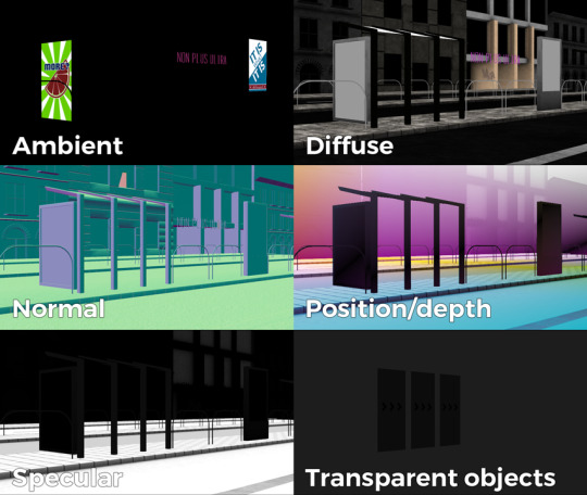
The contents of a G-buffer; there's also additional information in the alpha channels.
Normally, most deferred renderers go with the tile-based approach, where they divide the screen into 16x16 or 32x32 tiles and run the lights only on the tiles they need to run them on. I decided to go with a different approach, inspired by the spotlight rendering in Grand Theft Auto V: Because I was mostly using point- and spot-lights, I was able to control the "extent" of the lights and had a pretty good idea whether each pixel was lit or not based on its position relative to the light source. By this logic, e.g. for pointlights if I rendered a sphere into the light position, with the radius of what I considered to be the farthest extent of the light, the rendered sphere would cover all the pixels on screen covered by that light. This means if I ran a shader on each of those pixels, and used the contents of the G-buffer as input, I would be able to calculate independent lighting on each pixel for each light, since lights are additive anyway. The method needed some trickery (near plane clipping, sphere mesh resolution, camera being near the sphere edge or inside the sphere), but with some magic numbers and some careful technical artistry, none of this was a problem.
The downside of this method was that the 8-bit channel resolution of a normal render target was no longer enough, but this turned out to be a good thing: By using floating point render targets, I was able to adapt to a high-dynamic range, linear-space workflow that ultimately made the lighting much easier to control, with no noticable loss in speed. Notably, however, I skipped a few demos until I was able to add the shadow routines I had to the deferred pipeline - this was mostly just a question of data management inside the graph, and the current solution is still something I'm not very happy with, but for the time being I think it worked nicely; starting with "Elégtelen" I began using variance shadowmaps to get an extra softness to shadows when I need it, and I was able to repurpose that in the deferred renderer as well.
The art pipeline
After doing "The Void Stared Into Me Waiting To Be Paid Its Dues" I've began to re-examine my technical artist approach; it was pretty clear that while I knew how the theoreticals of a specular/glossiness-based rendering engine worked, I wasn't necessarily ready to be able to utilize the technology as an artist. Fortunately for me, times changed and I started working at a more advanced games studio where I was able to quietly pay closer attention to what the tenured, veteran artists were doing for work, what tools they use, how they approach things, and this introduced me to Substance Painter.
I've met Sebastien Deguy, the CEO of Allegorithmic, the company who make Painter, way back both at the FMX film festival and then in 2008 at NVScene, where we talked a bit about procedural textures, since they were working on a similar toolset at the time; at the time I obviously wasn't competent enough to deal with these kind of tools, but when earlier this year I watched a fairly thorough tutorial / walkthrough about Painter, I realized maybe my approach of trying to hand-paint textures was outdated: textures only ever fit correctly to a scene if you can make sure you can hide things like your UV seams, or your UV scaling fits the model - things that don't become apparent until you've saved the texture and it's on the mesh.
Painter, with its non-linear approach, goes ahead of all that and lets you texture meshes procedurally in triplanar space - that way, if you unwrapped your UVs correctly, your textures never really stretch or look off, especially because you can edit them in the tool already. Another upside is that you can tailor Painter to your own workflow - I was fairly quickly able to set up a preset to my engine that was able to produce diffuse, specular, normal and emissive maps with a click of a button (sometimes with AO baked in, if I wanted it!), and even though Painter uses an image-based lighting approach and doesn't allow you to adjust the material settings per-textureset (or I haven't yet found it where), the image in Painter was usually a fairly close representation to what I saw in-engine. Suddenly, texturing became fun again.

An early draft of the bus stop scene in Substance Painter.
Depth of field
DOF is one of those effects that is nowadays incredibly prevalent in modern rendering, and yet it's also something that's massively overused, simply because people who use it use it because it "looks cool" and not because they saw it in action or because they want to communicate something with it. Still, for a demo this style, I figured I should revamp my original approach.
The original DOF I wrote for Signal Lost worked decently well for most cases, but continued to produce artifacts in the near field; inspired by both the aforementioned GTAV writeup as well as Metal Gear Solid V, I decided to rewrite my DOF ground up, and split the rendering between the near and far planes of DOF; blur the far field with a smart mask that keeps the details behind the focal plane, blur the near plane "as is", and then simply alphablend both layers on top of the original image. This gave me a flexible enough effect that it even coaxed me to do a much-dreaded focal plane shift in the headphones scene, simply because it looked so nice I couldn't resist.
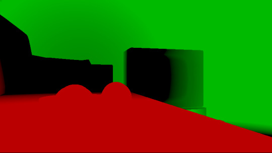
The near- and far-fields of the depth of field effect.
Screen-space reflections
Over the summer we did a fairly haphazard Adjective demo again called "Volna", and when IR delivered the visuals for it, it was very heavy on raytraced reflections he pulled out of (I think) 3ds max. Naturally, I had to put an axe to it very quickly, but I also started thinking if we can approximate "scene-wide" reflections in a fairly easy manner. BoyC discovered screen-space reflections a few years ago as a fairly cheap way to prettify scenes, and I figured with the engine being deferred (i.e. all data being at hand), it shouldn't be hard to add - and it wasn't, although for Volna, I considerably misconfigured the effect which resulted in massive framerate loss.
The idea behind SSR is that a lot of the time, reflections in demos or video games are reflecting something that's already on screen and quite visible, so instead of the usual methods (like rendering twice for planar reflections or using a cubemap), we could just take the normal at every pixel, and raymarch our way to the rendered image, and have a rough approximation as to what would reflect there.
The logic is, in essence to use the surface normal and camera position to calculate a reflection vector and then start a raymarch from that point and walk until you decide you've found something that may be reflecting on the object; this decision is mostly depth based, and can be often incorrect, but you can mitigate it by fading off the color depending on a number of factors like whether you are close to the edge of the image or whether the point is way too far from the reflecting surface. This is often still incorrect and glitchy, but since a lot of the time reflections are just "candy", a grainy enough normalmap will hide most of your mistakes quite well.

Screen-space reflections on and off - I opted for mostly just a subtle use, because I felt otherwise it would've been distracting.
One important thing that Smash pointed out to me while I was working on this and was having problems is that you should treat SSR not as a post-effect, but as lighting, and as such render it before the anti-aliasing pass; this will make sure that the reflections themselves get antialiased as well, and don't "pop off" the object.
Temporal antialiasing
Over the last 5 years I've been bearing the brunt of complaints that the aliasing in my demos is unbearable - I personally rarely ever minded the jaggy edges, since I got used to them, but I decided since it's a demo where every pixel counts, I'll look into solutions to mitigate this. In some previous work, I tried using FXAA, but it never quite gave me the results I wanted, so remembering a conversation I had with Abductee at one Revision, I decided to read up a bit on temporal antialiasing.
The most useful resource I found was Bart Wroński's post about their use of TAA/TSSAA (I'm still not sure what the difference is) in one of the Assassin's Creed games. At its most basic, the idea behind temporal antialiasing is that instead of scaling up your resolution to, say, twice or four times, you take those sub-pixels, and accumulate them over time: the way to do this would be shake the camera slightly each frame - not too much, less than a quarter-pixel is enough just to have the edges alias slightly differently each frame - and then average these frames together over time. This essentially gives you a supersampled image (since every frame is slightly different when it comes to the jagged edges) but with little to no rendering cost. I've opted to use 5 frames, with the jitter being in a quincunx pattern, with a random quarter-pixel shake added to each frame - this resulted in most edges being beautifully smoothed out, and I had to admit the reasonably little time investment was worth the hassle.
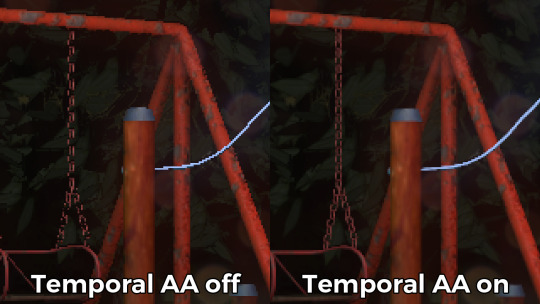
Anti-aliasing on and off.
The problem of course, is that this works fine for images that don't move all that much between frames (not a huge problem in our case since the demo was very stationary), but anything that moves significantly will leave a big motion trail behind it. The way to mitigate would be to do a reprojection and distort your sampling of the previous frame based on the motion vectors of the current one, but I had no capacity or need for this and decided to just not do it for now: the only scene that had any significant motion was the cat, and I simply turned off AA on that, although in hindsight I could've reverted back to FXAA in that particular scenario, I just simply forgot. [Update, January 2019: This has been bugging me so I fixed this in the latest version of the ZIP.]
There were a few other issues: for one, even motion vectors won't be able to notice e.g. an animated texture, and both the TV static and the rain outside the room were such cases. For the TV, the solution was simply to add an additional channel to the GBuffer which I decided to use as a "mask" where the TAA/TSSAA wouldn't be applied - this made the TV texture wiggle but since it was noisy anyway, it was impossible to notice. The rain was considerably harder to deal with and because of the prominent neon signs behind it, the wiggle was very noticable, so instead what I ended up doing is simply render the rain into a separate 2D matte texture but masked by the scene's depth buffer, do the temporal accumulation without it (i.e. have the antialiased scene without rain), and then composite the matte texture into the rendered image; this resulted in a slight aliasing around the edge of the windows, but since the rain was falling fast enough, again, it was easy to get away with it.

The node graph for hacking the rainfall to work with the AA code.
Transparency
Any render coder will tell you that transparency will continue to throw a wrench into any rendering pipeline, simply because it's something that has to respect depth for some things, but not for others, and the distinction where it should or shouldn't is completely arbitrary, especially when depth-effects like the above mentioned screen-space reflections or depth of field are involved.
I decided to, for the time being, sidestep the issue, and simply render the transparent objects as a last forward-rendering pass using a single light into a separate pass (like I did with the rain above) honoring the depth buffer, and then composite them into the frame. It wasn't a perfect solution, but most of the time transparent surfaces rarely pick up lighting anyway, so it worked for me.
Color-grading and image mastering
I was dreading this phase because this is where it started to cross over from programming to artistry; as a first step, I added a gamma ramp to the image to convert it from linear to sRGB. Over the years I've been experimenting with a lot of tonemap filters, but in this particular case a simple 2.2 ramp got me the result that felt had the most material to work with going into color grading.
I've been watching Zoom work with Conspiracy intros for a good 15 years now, and it wasn't really until I had to build the VR version of "Offscreen Colonies" when I realized what he really does to get his richer colors: most of his scenes are simply grayscale with a bit of lighting, and he blends a linear gradient over them to manually add colour to certain parts of the image. Out of curiousity I tried this method (partly out of desperation, I admit), and suddenly most of my scenes began coming vibrantly to life. Moving this method from a bitmap editor to in-engine was trivial and luckily enough my old friend Blackpawn has a collection of well known Photoshop/Krita/etc. blend mode algorithms that I was able to lift.
Once the image was coloured, I stayed in the bitmap editor and applied some basic colour curve / level adjustment to bring out some colours that I felt got lost when using the gradient; I then applied the same filters on a laid out RGB cube, and loaded that cube back into the engine as a colour look-up table for a final colour grade.
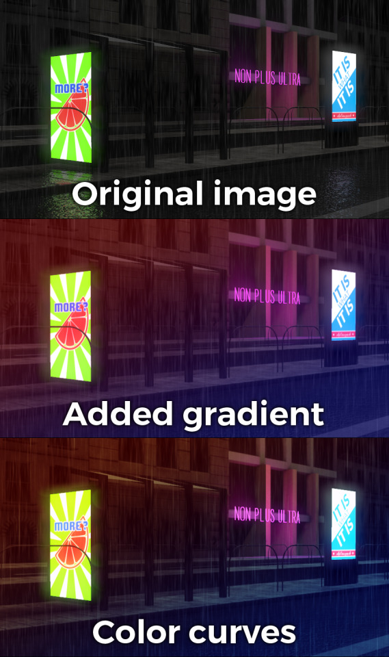
Color grading.
Optimizations
There were two points in the process where I started to notice problems with performance: After the first few scenes added, the demo ran relatively fine in 720p, but began to dramatically lose speed if I switched to 1080p. A quick look with GPU-Z and the tool's internal render target manager showed that the hefty use of GPU memory for render targets quickly exhausted 3GB of VRAM. I wasn't surprised by this: my initial design for render target management for the node graph was always meant to be temporary, as I was using the nodes as "value types" and allocating a target for each. To mitigate this I spent an afternoon designing what I could best describe as a dependency graph, to make sure that render targets that are not needed for a particular render are reused as the render goes on - this got my render target use down to about 6-7 targets in total for about a hundred nodes.

The final node graph for the demo: 355 nodes.
Later, as I was adding more scenes (and as such, more nodes), I realized the more nodes I kept adding, the more sluggish the demo (and the tool) got, regardless of performance - clearly, I had a CPU bottleneck somewhere. As it turned out after a bit of profiling, I added some code to save on CPU traversal time a few demos ago, but after a certain size this code itself became a problem, so I had to re-think a bit, and I ended up simply going for the "dirty node" technique where nodes that explicitly want to do something mark their succeeding nodes to render, and thus entire branches of nodes never get evaluated when they don't need to. This got me back up to the coveted 60 frames per second again.
A final optimization I genuinely wanted to do is crunch the demo down to what I felt to be a decent size, around 60-ish megabytes: The competition limit was raised to 128MB, but I felt my demo wasn't really worth that much size, and I felt I had a chance of going down to 60 without losing much of the quality - this was mostly achieved by just converting most diffuse/specular (and even some normal) textures down to fairly high quality JPG, which was still mostly smaller than PNG; aside from a few converter setting mishaps and a few cases where the conversion revealed some ugly artifacts, I was fairly happy with the final look, and I was under the 60MB limit I wanted to be.
Music
While this post mostly deals with graphics, I'd be remiss to ignore the audio which I also spent a considerable time on: because of the sparse nature of the track, I didn't need to put a lot of effort in to engineering the track, but I also needed to make sure the notes sounded natural enough - I myself don't actually play keyboards and my MIDI keyboard (a Commodore MK-10) is not pressure sensitive, so a lot of the phrases were recorded in parts, and I manually went through each note to humanize the velocities to how I played them. I didn't process the piano much; I lowered the highs a bit, and because the free instrument I was using, Spitfire Audio's Soft Piano, didn't have a lot of release, I also added a considerable amount of reverb to make it blend more into the background.
For ambient sounds, I used both Native Instruments' Absynth, as well as Sound Guru's Mangle, the latter of which I used to essentially take a chunk out of a piano note and just add infinite sustain to it. For the background rain sound, I recorded some sounds myself over the summer (usually at 2AM) using a Tascam DR-40 handheld recorder; on one occasion I stood under the plastic awning in front of our front door to record a more percussive sound of the rain knocking on something, which I then lowpass filtered to make it sound like it's rain on a window - this eventually became the background sound for the mid-section.
I've done almost no mixing and mastering on the song; aside from shaping the piano and synth tones a bit to make them sound the way I wanted, the raw sparse timbres to me felt very pleasing and I didn't feel the sounds were fighting each other in space, so I've done very little EQing; as for mastering, I've used a single, very conservatively configured instance of BuzMaxi just to catch and soft-limit any of the peaks coming from the piano dynamics and to raise the track volume to where all sounds were clearly audible.
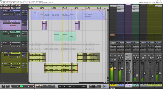
The final arrangement of the music in Reaper.
Minor tricks
Most of the demo was done fairly easily within the constraints of the engine, but there were a few fun things that I decided to hack around manually, mostly for effect.
The headlights in the opening scene are tiny 2D quads that I copied out of a photo and animated to give some motion to the scene.
The clouds in the final scene use a normal map and a hand-painted gradient; the whole scene interpolates between two lighting conditions, and two different color grading chains.
The rain layer - obviously - is just a multilayered 2D effect using a texture I created from a particle field in Fusion.
Stuff that didn't make it or went wrong
I've had a few things I had in mind and ended up having to bin along the way:
I still want to have a version of the temporal AA that properly deghosts animated objects; the robot vacuum cleaner moved slow enough to get away with it, but still.
The cat is obviously not furry; I have already rigged and animated the model by the time I realized that some fur cards would've helped greatly with the aliasing of the model, but by that time I didn't feel like redoing the whole thing all over again, and I was running out of time.
There's considerable amount of detail in the room scene that's not shown because of the lighting - I set the room up first, and then opted for a more dramatic lighting that ultimately hid a lot of the detail that I never bothered to arrange to more visible places.
In the first shot of the room scene, the back wall of the TV has a massive black spot on it that I have no idea where it's coming from, but I got away with it.
I spent an evening debugging why the demo was crashing on NVIDIA when I realized I was running out of the 2GB memory space; toggling the Large Address Aware flag always felt a bit like defeat, but it was easier than compiling a 64-bit version.
A really stupid problem materialized after the party, where both CPDT and Zoom reported that the demo didn't work on their ultrawide (21:9) monitors: this was simply due to the lack of pillarbox support because I genuinely didn't think that would ever be needed (at the time I started the engine I don't think I even had a 1080p monitor) - this was a quick fix and the currently distributed ZIP now features that fix.
Acknowledgements
While I've did the demo entirely myself, I've received some help from other places: The music was heavily inspired by the work of Exist Strategy, while the visuals were inspired by the work of Yaspes, IvoryBoy and the Europolis scenes in Dreamfall Chapters. While I did most of all graphics myself, one of the few things I got from online was a "lens dirt pack" from inScape Digital, and I think the dirt texture in the flowerpot I ended up just googling, because it was late and I didn't feel like going out for more photos. I'd also need to give credit to my audio director at work, Prof. Stephen Baysted, who pointed me at the piano plugin I ended up using for the music, and to Reid who provided me with ample amounts of cat-looking-out-of-window videos for animation reference.
Epilogue
Overall I'm quite happy with how everything worked out (final results and reaction notwithstanding), and I'm also quite happy that I managed to produce myself a toolset that "just works". (For the most part.)
One of the things that I've been talking to people about it is postmortem is how people were not expecting the mix of this particular style, which is generally represented in demos with 2D drawings or still images or photos slowly crossfading, instead using elaborate 3D and rendering. To me, it just felt like one of those interesting juxtapositions where the technology behind a demo can be super complex, but at the same time the demo isn't particularly showy or flashy; where the technology behind the demo does a ton of work but forcefully stays in the background to allow you to immerse in the demo itself. To me that felt very satisfactory both as someone trying to make a work of art that has something to say, but also as an engineer who tries to learn and do interesting things with all the technology around us.
What's next, I'm not sure yet.
3 notes
·
View notes
Text
Hey all, back at it again with the random posts, aha. I have been working on something that will formally address the month long art / comic hiatus I’ve been on, but that’s taking a bit longer than I expected. So as a break (I guess?) I took it upon myself to update what I call my Original Stories Timeline, i.e. a chronological list of all of my story ideas (as of October 2019 anyway). I have not posted this list anywhere, but I like to update it on my laptop every now and again.
There is a bit of ambiguity with some of the years that these were made, as sometimes there’s a difference between coming up with the title or lead character for a story versus actually making it a “thing” with an idea or scenes attached. As an example, Moth to the Flame technically began when I first drew Kiida in April of 2015, but aside from a snippet of reasoning for why she was an archer, the story as it is now did not start to take form until I drew Zander in December of 2017. Other times I flat out can’t remember when some of these stories were made, and digital files don’t always have the correct dates.
For this post (and for curiosity’s sake), I wanted to add up and categorize them to see just how many stories I have in this brain of mine. It was actually quite a fascinating exercise, so I thought I’d share! I might as well list the titles for each category too, even if some of these are only titles at this point. I’ve renamed a few over the years and others are still working titles, but if any pique your interest at all, feel free to send me an ask about them! I love chatting about this stuff. :)
This got quite long once again so I’ll put it under the cut. Enjoy!
Stories that are old and/or need revamping: 6
Titles in this category: Pasha & Marley (2003), Sonora (2004), Billy and the Rainbow Fish (2005), Spirit Fire (2006), The Darkest Light (2013), Polarity (2013).
These are stories that I’ve either had since I was a kid and would need overhauls to make them usable, or are simply dormant stories that I haven’t touched in a while and may need similar upgrades. This doesn’t mean that I will revamp all of them, but either way they serve as an interesting look at my progression as a story writer and character designer. My oldest story dates back to around 2003, and to put that into perspective, I was 8 years old that year.
Stories that are just titles / a smattering of ideas right now: 10
Titles in this category: Fletcher (2016), The Dragons of Kitevale (2016), King Ace (2017), Ochako & Mai (2018), Psychanimate (2018), Mage Lights (2019), Trickster’s Gambit (2019), Switching Gears (2019), The Owlands (2019), Goodnight, Starlie (2019).
I always have too many of these for my own good, but this happens a lot if I have stray character designs that I think could maybe go together, and then before I know it the gears start turning in my head to add something more. I’m also really good at coming up with titles and logos to make me love the idea even more, even if there’s not much else to it. I guess you can blame my affinity for wordplay and clever puns for that, haha. Coming up with titles is really fun, but at this point I don’t know what kinds of stories these will be if I choose to develop them, so I gave them a separate category. Making this timeline reminded me of how many logos I still need to make!
Short films / animatics that I could also make into short comics: 7
Titles in this category: The Aurora’s Child (2016), Blue (2016), Harpy (2017), Hearth & Lantern (2017), Leif & Shel (2018), The Healer (2019), In Your Orbit (2019).
My background in animation has afforded me the skills of writing for animation, specifically short films. I have always loved short films that communicate their story through little or no dialogue, and using the character’s actions and emotions to do the talking instead. Unfortunately my dreams of making a short film during school did not come to fruition, but that doesn’t mean the ideas have to go away, regardless of what form they take. I’ve made too many at this point to stop now anyway! I will likely do both a comic and an animatic for each one I decide to flesh out, as I want to practice both kinds of storytelling and they each have their advantages. Plus I could potentially make a comic anthology of these shorter stories in the future. Much like the animatics, the comics would likely be “silent”, in that they communicate more with action than dialogue.
Things I call “illustration worlds”: 2
Titles in this category: Fruit Bats (2017), Lucky Stars (2019)
This one is a bit strange to explain, honestly. I picture these as more of a series of character interactions rather than a cohesive narrative, i.e. snippets of ideas carried out in a bunch of individual scenes, portrayed via illustrations. I am reminded a lot of the character interactions that exist in concept art for games and movies (the ones from Spyro: Reignited Trilogy come to mind). These illustrations would feature characters that could be in any sort of environment or setting, and we learn more about their personalities through each one, whether it’s a simple domestic scene or a fantasy world. There may not be anything much deeper than that, but there doesn’t have to be. A great deal of energy and expression can still be shown with these, and I love illustrations that have their own little stories contained within them. I could even compile them as a series of themed illustrations, hence why I still gave them titles (and once again, titles are fun).
Novels / story ideas I don’t plan on making into comics: 2
Titles in this category: Shining Trigger (2014), A Mightier Pen (2017)
I’ve always loved writing long-form prose ever since I was a kid, and based on how many words these posts end up having, I can’t say much has changed! As such, I’ve always wanted to write a novel someday, but it does require a different skill set than script writing. With my background in animation and my new love of comics added in, I’ve done a bit of both. I might do novelizations of some of my comics later on, but these stories are, for the most part, better suited as written prose in my mind. They focus more on the characters and dialogue, rather than an imagined visual design. Not to say that novelists can’t paint detailed pictures of a character or world’s attributes, but it is communicated differently via words than pictures, especially when you consider the mind’s eye of a novel reader. That “design” has to be malleable enough for the mind’s eye to interpret, but clear enough so the reader knows what it is. I’d have to make sure that any reader could picture what I’m describing with my writing alone, and that’s a difficult balance to strike for a primarily visual storyteller such as myself, but a challenge worth taking nonetheless.
Large comic stories that have big worlds, a lot of characters, etc.: 3
Titles in this category: Starglass Zodiac (2015), Id Pariah (2015), Feather Knights (2017).
I call these “The Big Three”, as they are the stories that will take the most world building, character creation, and story development to complete. They will have multiple chapters, expansive lore, several character arcs, you name it. I am very excited to tackle all of this development of course, but I want to make sure these are given the time they need to come to fruition. These projects will take me years to complete, which is why I choose to balance them with smaller projects in between. The potential these stories have is not something I want to squander, so even if the production moves slower, I feel it’ll be worth it in the end.
Smaller comic stories with fewer characters, simpler concepts, etc.: 5
Titles in this category: Moth to the Flame (2015), The Onomancer (2015), Demon Exchange (2018), Take Wing! Emilia’s Tale (2018), Ashes (2018).
This is worded kind of strangely, but this category is meant for stories that have a smaller “scope” than the larger comic stories I mentioned. That doesn’t mean I love them any less or that they’ll be less developed, but they are far simpler in concept and rely less on the development of a massive world and lore and more on individual character experiences. I feel like any creator needs these smaller projects to tackle every so often, especially when tackling the behemoths gets tough. These stories will also have a faster turnover when it comes to completion, and I hope to complete one of these stories in the near future. These will also help me practice writing good foundations for stories, like proper character motivation, pacing, and relationship development that would translate into investment for the reader. There’s a great degree of skill required to do this correctly for any kind of story, but starting smaller in this regard is usually better.
Smaller stories that are supplements or spin-offs of other stories: 3
Titles in this category: Counting Hearts (2019), The Serpent and the Sun (2019), Riders of Eldrigar (2019).
I know it probably seems a bit early to be thinking about stuff like this, but I do like thinking about the extended stories or supplements that I could add to my pre-existing projects, especially with characters or ideas that would best be told separate from the main story, be they backstories or another perspective on something. I also like the idea of stories that could exist in the same worlds, but can function independently of them as well. It’s a lot of fun to see how these could connect with each other, like having your own equivalent to a cinematic universe. This category currently only has smaller supplements to my comic stuff rather than fully fledged sequels, but who knows what might happen later on? I need to make the beginnings of these stories first!
And with that, the grand total is: 38!
-me after reading this total and spending way too much time on this post-

In all seriousness though, while it is a bit daunting to see just how many things my brain keeps tossing at me and how much that number has increased in recent years, it does make me excited for the future, even if I panic about time a lot. It tells me that I always have stories to tell, and new ones could be right around the corner. I’ll always have something to work on at least! I might periodically update this post as I edit the timeline as well, but for now, thanks for coming along on this little journey with me! :D I hope it was at least entertaining, haha.
#rambles#projects#stories#titles#random#don't worry I'm not tagging all of the story titles lol#long post#oh boy this took me hours and i don't know why lmao#i rant about my stories too much i guess
0 notes
Text
2019 Home Renovation Ideas
This was a wonderful two-phase project that began when these clients decided they wanted to remodel their kitchen. This east-coast family had been living with builder-grade finishes that were dark and “Tuscan-Inspired” and were ready to have an updated kitchen that reflected their New Hampshire roots. Amy Tausk of Swoon Interiors and Stephanie Frees of Plain & Posh (previously featured here) worked together to design all new custom cabinetry that is more functional and beautiful.
Take notes on all details shared by the designers. I am sure this home renovation will give you many ideas for your own renovations this year!
Photography by Picture Perfect House.
2019 Home Renovation Ideas
The kitchen felt dark and outdated before Amy and Stephanie worked their “magic” in this space!

Kitchen “After”
Kitchen Renovation: The designers revamped the kitchen into a clean, white and fresh space – but with a warm and cozy vibe like the rest of their house. Quartz countertops, clean-lined white cabinetry, a farmhouse sink, reclaimed wood and handcrafted subway tile laid in a herringbone pattern really transformed the space.
Counter stools – Spin Swivel Backless Counter stool from Crate & Barrel – Other Beautiful Counterstools: here, here, here & here.
Shiplap
Shiplap: Reclaimed wood shiplap on the island really added warmth and the rustic vibe the designers were looking for.
Cabinetry
Kitchen cabinets are from the Plain & Posh custom collection and are a non-beaded inset.
Range
The range is by Viking.
Flooring: Solid hardwood flooring – similar here.
Cabinet Hardware
Cabinet Hardware is by Schaub and is the Menlo Park knob and pull.
Backsplash
Backsplash: Masia 3×6 Subway Tile in Ivory – Other Tiles: here, here, here, here & here.
Kitchen Island
Kitchen Island Design: Keeping the island a square size made the best spatial sense in this room – and lent itself to using one larger chandelier instead of two pendants. Amy decided to make that the main light feature in the room and just reconfigure the can lighting around the rest of the space.
The light fixture is by Currey & Company the Simpatico Small Orb Chandelier.
Kitchen Island Dimensions – The island is 56” square
Wall Ovens
Wall Ovens: Wolf – similar here & here.
Kitchen Countertop Decor Ideas: Wooden Cutting Boards, Cake Stand, Crocks, Pitcher, Canisters, Dough Bowl, Planters, Topiaries.
Kitchen Sink
The sink is the Kohler Whitehaven apron front in their sea salt finish.
Kitchen Faucet
Faucets is by Kohler, Artifacts.
Beautiful Kitchen Tea Towels: here, here, here & here.
Kitchen Countertop
Countertops are Caesarstone London Grey.
Cabinet Paint Color
Kitchen cabinets and trim are Benjamin Moore White Dove OC-17.
Window Treatment
Window Treatment – Hunter Douglas Designer Screen Roller Lite Rise and Skyline Panels.
Breakfast Room
Their clients also wanted a cozy spot for their family to gather – in the mornings with coffee or for dinnertime conversation. The slip-covered chairs and weathered-wood table are now a favorite spot in the house. Even on a cloudy day, it feels bright and cheerful … truly the heart of the home for this wonderful family.
Table – Eldridge Dining Table, Home Decorators Collection – Others: here, here, here & here.
Dining Chairs
Chairs – Linen Slipcovered Accent chairs from Wisteria – Others: here, here, here, here, here & here.
Bar
Previously the corner of the kitchen housed a tiny desk and became a catchall for a little bit of everything. They knew they could turn it into a much more usable and beautiful space. Now it is an entertaining-workhorse – with antique-mirrored upper cabinetry and a beverage refrigerator and wine rack below.
Home Remodel
Fast-forward a couple years and this family knew it was time to transform a few other rooms in their home into the fresh clean look we had given them in their kitchen. On the list, the Master Bathroom, Laundry Room and first floor Powder Room.
Powder Room
“Good things come in small packages! The jumping off point for this room was this fantastic watercolor-inspired wallpaper. We matched the color on the custom-built vanity and added shiplap to the back wall. A favorite library sconce, fun crystal knobs and this gorgeous wall-mount faucet are other details we love. Once again, we warmed up the space with a touch of natural wood, in the form of this wood-framed mirror that ties in with the existing wood floors. Finally, it’s hard to see in photos, but the quartz countertop has a lovely textured, “leathered” finish.”
Powder Room Sconce: Anette Library Light by Ralph Lauren – similar here.
Shiplap
The Shiplap behind the sink area is painted in Benjamin Moore White Dove OC-17.
Mirror – Bentwood Rounded Rectangular Mirror from Rejuvenation.
Faucet
The faucet is from Newport Brass and is the Fairfield wall Mounted faucet (3-947).
Wallpaper
Wallpaper: Graham & Brown Indigo Aqua Wallpaper (available through the designer) – Others: here, here & here.
Artwork: One Kings Lane.
Vanity
Vanity was custom Built by the Plain & Posh collection and painted Benjamin Moore – Affinity collection Blue Echo 505.
Master Bathroom “Before”
“The builder of this home was obviously of a “More is More!” mindset … more arches, more walls, more steps – all if it making what is not a huge space to begin with feel even more cramped and choppy. While the colors were neutral, they still felt dark and dingy.”
Master Bathroom “After”
“We wanted to make the room feel light, bright and luxurious. Now, it is the exact same square footage as before but it feels huge!”
Ceiling
“Even with all of the lights off – it is so bright and cheery. And check out the ceiling! With all of the arches gone, Stephanie was able to see what it could become! She created this unique hexagon shape which inspired the rest of the room layout. The gorgeous wood bead chandelier looks stunning in the space.”
Flooring
“One of our preferences when doing bright white spaces is to bring in a warm element. We could have easily done a light floor – white or gray marble, and it would have been beautiful, but maybe a little cold – and certainly not as cozy feeling. Amy approached our client about doing a wood-look tile in a herringbone pattern for the floors – (especially since the adjoining bedroom is carpeted … we wouldn’t be competing with more wood), she wasn’t sure if she would be on board. Thankfully, she loved the idea of giving the room a slightly more rustic, farmhouse element.”
Flooring: wood/tiles: Hill House Field Tile 6×36 – Others: here, here & here.
Vanity Layout
“What used to be one straight vanity and a big empty wall … … is now a beautifully designed double vanity that wraps the corner with mirrors and provides and extra spot with seating for putting on makeup.”
Make-up Drawer
The two small drawer fronts under the makeup area mirror are actually doors that swing open to hidden outlets. Genius!
Vanity Stool – Pottery Barn
Countertop
“And … just the right quartz counter tops are still a win-win in our book, for both their beauty and durability. This one has such great movement and even some soft brown tones that tie in with the flooring.”
Beautiful Bathroom Accessories: here, here, here, here, here & here.
Cabinetry
Bathroom cabinetry is by the Plain & Posh custom collection. Timeless design!
Chandelier
Chandelier: Dauphine Wood Empire Chandelier by RH Baby & Child – Other Beautiful Chandeliers: here, here, here, here, here, here & here (different sizes).
Cabinet Paint Color
Cabinet paint color Benjamin Moore Classic Gray 1548.
Artwork from Minted.
Bathroom Sconces
“Amy had been dying to find just the right project in which to use these vertical double light sconces, and I knew this was the one. As big as they are, they don’t take up much visual space when mounted to the mirror, yet they still make such a statement in the room.”
Sconces: Visual Comfort – Graydon Double Bath Light by Thomas O’Brien.
Faucet & Sink
Bathroom faucets are Rohl, Palladian collection.
Sinks are Kohler Caxton Rectangle (K-20000-0) in White.
Hardware is by Atlas – The Elizabeth pull in Polished Nickel Both 419 and 420PN.
Freestanding Tub
Tub is by Signature Hardware and is the Rosalind Pedestal tub.
Tub Filler: Rohl.
Tub Stool
Wooden Stool – Dip Dyed Stool from Serena & Lily.
Shower
The entrance to the shower is now on an angle.
Window
A large window was added facing the tub to allow you to see through to the gorgeous mosaic tile on the back wall.
Shower Window
A high window was added inside of the shower to bring in light. The water closet (with cabinets for extra storage!) is located on the left.
Tiling
In addition to the sparkle the mosaics add, we dressed up a classic white subway tile with beautiful marble hex tile on the shower floor, gleaming polished nickel fixtures and a stunning lucite door handle.
All of the plumbing fixtures are from Rohl Palladian collection.
Shower Tiles: – Madrid Handmade Subway Tile in Blanco – similar here & here.
Accent Tile: Calacatta Gold Polished Interlocking Mosaic Accent Tile – similar here.
Floor Tile: Calacatta 5” Hexagon Honed on floor – similar here & here.
Laundry Room “Before”
Next – the laundry room. Like most builder-grade laundry rooms, this one was functional with no style. And … it was not even functioning to its full potential. The entire right wall was left blank … our clients put in their own table as a makeshift folding area.
Laundry Room “After”
“The cabinets were painted this lovely custom shade and given new doors and hardware. And in a room like a laundry room, why not go fun and bold with the flooring? We selected this tile that mimics the look of more expensive cement tiles.”
Tile is from Home Depot and is the Merola Tile and is the Arte Grey encaustic porcelain– similar here.
Sink Area
A new sink, countertop and faucet updated the old utility sink.
Color
The cabinetry is Plain & Posh collection. Stephanie, was extremely kind and called the cabinet maker to get the cabinet color just for you! The cabinet color is Slate Tile by Sherwin Williams SW 7624.
The faucet is the Litze pull out spray Square spout and industrial handle from Brizo in the brilliance stainless finish.
Laundry sink is from Sterling the Latitude 995-0.
Washer & Dryer: LG.
Cabinet Countertop & Hardware
“Of course, we had to add some warm wood tones too, which we did with a custom built wood countertop over the washer and dryer.”
The counter top on the washer and dryer are a wood top in a custom stain.
Hardware is by Atlas and is the Bradbury pull in their black finish.
Dream Laundry Room
“And on the other side of the room … brand new cabinetry was added, along with a true designated area for folding laundry and wall-mounted drying racks.”
Beadboard Drying Rack – Ballard Designs – similar here & here.
Storage
“But that’s not all … previously this corner behind the door was just a place for piling up all of the tall household items that wouldn’t fit elsewhere. Now, this “bottom-less” cabinet is the perfect place to hold a clothes steamer or vacuum that you can simply roll right out and use when needed.”
Folding Area Countertop
The folding area counter top is Caeserstone Pebble (4030) in a honed finish.
Laundry Basket – Steele Divided Canvas Sorter- Crate & Barrel – also available here.
Aren’t these designers just amazing? Besides being very talented (yes, you should hire them!
), they were kind enough to share all details, so you can not only feel inspired but also, guided.
Interior Design: Swoon Interiors – ( Instagram – Facebook)
Cabinet Designer: Plain & Posh – (Instagram – Facebook)
Photography: Picture Perfect House. – (Instagram – Facebook)
Best Sales of the Month:
Thank you for shopping through Home Bunch. I would be happy to assist you if you have any questions or are looking for something in particular. Feel free to contact me and always make sure to check dimensions before ordering. Happy shopping!
Serena & Lily: 25% Off Outdoor Furniture!
Wayfair: Up to 70% OFF – Home Remodel Sale!!!
Joss & Main: Warehouse Clearout – Up to 70% off!
Pottery Barn: Free Shipping – Use code: FREESHIP
One Kings Lane: High Quality Design Decor for Less.
West Elm: Best time to shop. Up to 40% off Everything!!!
Anthropologie: See the super-popular Joanna Gaines Exclusive line!
Urban Outfitters: Hip & Affordable Home Decor.
Horchow: High Quality Furniture and Decor. Up to 30% off the entire site!
Nordstrom: Up to 40% OFF. New Easter Decor!
Arhaus: Dining Sale. Up to f0% OFF!
Posts of the Week:
Modern Farmhouse with Front Porch.
Small Lot Modern Farmhouse.
Coastal Farmhouse Home Decor.
Painted Brick Cottage.
2019 New Year Home Tour.
Modern Coastal Shingle Home.
Beautiful Homes of Instagram: Fixer Upper.
Classic Colonial Home Design.
New England Home.
Kitchen Renovation with Before & After Pictures.
Full-scale Home Remodel Inspiration.
Beautiful Homes of Instagram: How to Build your own Home.
Connecticut Beach House.Grey Kitchen Paint Colors.
Follow me on Instagram: @HomeBunch
You can follow my pins here: Pinterest/HomeBunch
See more Inspiring Interior Design Ideas in my Archives.
“Dear God,
If I am wrong, right me. If I am lost, guide me. If I start to give-up, keep me going.
Lead me in Light and Love”.
Have a wonderful day, my friends and we’ll talk again tomorrow.”
with Love,
Luciane from HomeBunch.com
Come Follow me on
Come Follow me on
Get Home Bunch Posts Via Email
Contact Luciane
“For your shopping convenience, this post might contain links to retailers where you can purchase the products (or similar) featured. I make a small commission if you use these links to make your purchase so thank you for your support!”
from Home http://www.homebunch.com/2019-home-renovation-ideas/
via http://www.rssmix.com/
1 note
·
View note
Text
Dell's XPS 13 (2018) is easily one of the best laptops you can buy
yahoo
The Dell XPS 13 has been one of my favorite laptops since the company first revamped the line with a near-edgeless display and super-slim design in 2015. And like Apple and its MacBooks, Dell has decided to offer incremental, but meaningful updates to the XPS 13 over the years.
Which brings us to the latest incarnation of the Dell XPS 13. Available starting at $999, the 2018 version of the XPS 13 includes a thinner display bezel, improved performance, realigned webcam and, most noticeable of all, a beautiful rose gold and white color combination to compliment the current silver and black offering.
Dell’s clearly got a winner on its hands, and when it comes to the competition for your cash, this notebook comes out on top.
Rose-colored glasses
Dell’s latest XPS 13 is the first to be made available with a rose colored chassis and white keyboard deck, for an extra $50, of course. The styling has received rave reviews around my office, save for the white keyboard deck and palm rest, which at least one coworker found off-putting.
The reason you don’t see many white palm rests is because they tend to stain easily. To ensure the XPS 13’s palm rest stays clean, Dell manufactured it with woven glass fiber. I’ve had the notebook for a few weeks, and haven’t noticed any stains from things like sweat, oil, food or drinks, which would typically accumulate on my laptops’ palm rests.
(Ed.’s note: That’s gross.)

If you opt for the rose gold XPS 13, you’ll also get a white keyboard deck and palm rest. Choose wisely.
Outside of its new color scheme, the updated XPS 13 trims about 0.14 inches off of last year’s model, making it one of the thinnest 13-inch laptops on the market. In fact, the XPS is slimmer than all of Apple’s (AAPL) MacBooks, as well as Microsoft’s (MSFT) Surface Laptop and Surface Pro with that device’s keyboard attached.
In reality, though, the weight and thickness of most modern laptops have reached a point where you won’t notice much of a difference between one or the other. It’s more about bragging rights now than anything else.
More screen
Since its debut, the redesigned XPS 13’s claim to fame has been its near-edgeless InfiniteEdge Display. For 2018, Dell went even further in its attempt to make the laptop’s bezels disappear by shrinking them by 23%. I didn’t notice the change at first sight, but if you’ve got a 2017 or older model, you should see the difference.
The base model XPS 13 comes with a 13.3-inch, non-touch, 1,920- x 1,080-pixel resolution panel. You can, however, upgrade that to a 13.3-inch, 4K touch screen panel with a 3,840- x 2,160-pixel resolution. The Surface Pro comes with a 12.3-inch, 2,736- x 1,824-pixel display, while the Surface Laptop gets a 13.5-inch, 2,256- x 1,504-pixel screen.

The XPS 13’s 13.3-inch InfiniteEdge display offers crisp, colorful visuals.
Apple’s MacBook features a 12-inch display with a 2,304- x 1,440-pixel resolution. The MacBook Pro gets 2,560- x 1600-pixel panel. All of these screens, with the exception of the base XPS’s, are more than crisp and sharp enough for everyday users and photo editors.
The one notebook that falls short is the MacBook Air, which is still rocking with an ancient 1,440- x 900-pixel resolution screen. Going from my trusty Air to any of these other laptops is always a shock when I see how their screens compare with Apple’s offering.
Colors look absolutely stunning on the XPS 13, thanks to its 1,500 to 1 contrast ratio, which makes blacks look infinitely deep. Even desktop icons pop on this display. Especially dark shows like “Stranger Things” also look fantastic, but you do end up seeing reflections in the panel.
There’s just one problem with the XPS 13’s screen: it messes with the position of the laptop’s webcam. With such a small bezel, there’s no place for Dell to fit a webcam above the display. With older models of the 13, Dell moved the webcam just below the bottom left corner of the panel. Naturally, that resulted in whoever you were talking to getting a weird look up your nose.

Unfortunately, the XPS 13’s camera still looks straight up your nostrils.
For 2018, however, Dell centered the bezel below the screen. It makes for a slightly better experience, but anyone you talk to is still going to get a great view of your nostrils. And forget about typing while using the webcam. Unless you recently got a manicure, you’re not going to want the person you’re chatting with to get an up-close look at your nail beds.
Power and battery life
My review unit came with an Intel (INTC) Core i7 processor, 16GB of RAM, 512GB of storage space, a 4K touch screen, and handled all of my daily tasks with ease. I ran Chrome with 20+ tabs, streamed Spotify and was chatting on Slack and didn’t run into any issues. For the kind of power this XPS is packing, it would be more of a story if it did have a problem handling any of those simple processes.
For 2018, Dell said it managed to increase the XPS 13’s power by improving its internal heating system. It now uses Gore Thermal Insulation and a dual fan and dual heat pipe setup to help move heat away from the processor and graphics chip. Doing this allows the XPS 13 to maintain stable performance levels longer than competing devices.
But don’t expect to do things like play the latest and greatest games on the XPS 13 at their highest settings, though, as it only packs an Intel graphics chip. I managed to fire up “PlayerUnknown’s Battlegrounds,” but the graphics were so low that every characters’ head looked like it was covered in individual pixels rather than hair.
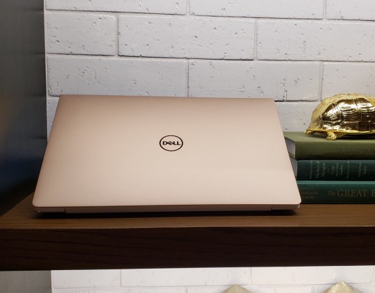
The Dell XPS 13’s rose gold chassis is a stunner, but it’ll cost you an extra $50.
If you really want to get your game on, you can plug an external graphics card into the XPS via its USB C port, and get gaming. Naturally, that requires you have a graphics card and adapter readily available, but it can be done.
The XPS 13’s battery was also a solid performer. I worked through my entire workday, eight hours or so, without having to worry about the machine giving up the ghost. That said, the XPS’s 4K display does eat through power faster than the standard 1080p screen, so make sure to take that into account when configuring your system.
Pricing and the competition
At its base price of $999, the XPS 13 comes with an Intel Core i5 processor, 4GB of RAM, 128GB of storage and a 1080p, non-touch display. 4GB of RAM and 128GB of storage is small potatoes in today’s world, though, so I’d recommend moving up to the $1,199 model to get 8GB of RAM and 256GB of storage.
If you’re itching for more power you can get a Core i7 processor, 8GB of RAM and a 256GB SSD for $1,399. If you want that sweet 4K display, you’ll have to add an additional $400. And if money is no object, you can get an XPS with a Core i7 processor, 16GB of RAM, a 1TB SSD and a 4K display for $2,299.
Microsoft’s Surface Pro is slightly more expensive in each of its configurations thanks to the fact that you’ll need to spend an additional $130 on a keyboard cover to use the device as a laptop. The Surface Laptop, on the other hand, starts at $799 with a much less powerful processor. For $899 you can get a similar configuration to the base Dell XPS 13, but you’ll also have to upgrade the machine from the Windows 10 S operating system it comes with to full Windows 10 for $49.

The XPS 13 is one of the thinnest 13-inch laptops in the world.
You’ll end up spending slightly less on the low- to mid-range Surface Laptop, but you don’t get that 4K display found on the XPS 13. And when you push the Surface Laptop’s specs to match the top-of-the-line XPS, you end up paying $2,699.
On the Mac side of things, a base MacBook Air starts at $999, but comes with a fifth-generation Core i5 processor. That’s three generations behind the processors available with the Dell. You do get 8GB of RAM for that $999 price, but with the older chip and lower resolution screen, it’s not really a bargain. What’s more, Apple is rumored to be updating the Air in the spring, so it’s probably not worth buying the Air until we find out more about Apple’s plans.
The MacBook, for its part, starts at $1,299 with a less powerful Intel m3 processor, 8GB of RAM and 256GB of storage. You’re basically paying for the MacBook’s slender frame and sleek design, but that’s a lot to ask. Jump up to a Core i5 with 8GB of RAM and a 256GB SSD and you’ll pay $1,399.
Apple’s MacBook Pros all start at higher prices than the XPS, with the base model coming in at $1,299. But the Pros are designed for use by professional video and photo editors and pack a heck of a performance punch, so it makes sense that they’d cost more.
Should you get it?
The Dell XPS 13 is the best Windows 10 laptop in terms of overall value and looks. It’s also less expensive than Apple devices, which makes it a solid option even for Mac fans. If you’re in the market for a new PC, and don’t mind its odd webcam placement, the new Dell XPS 13 is easily a top pick.
More from Dan:
Trump is wrong about video games and violence
Vero is the anti-Facebook social network everyone is talking about
Sony’s PlayStation Vue just became an even better cable TV killer
Samsung’s Galaxy S9 and S9 Plus bring major camera improvements
What to do when you’re hacked
Email Daniel Howley at [email protected]; follow him on Twitter at @DanielHowley.
Follow Yahoo Finance on Facebook, Twitter, Instagram, and LinkedIn
#tech#XPS 13 (2018)#_revsp:yahoofinance.com#$MSFT#New Dell XPS 13#Dell XPS 13#_lmsid:a077000000BAh3wAAD#reviews#$intc#_uuid:1f79667b-c438-3b2c-90c0-621056133061#review#Dell XPS 13 (2018)#$AAPL#laptop reviews#_author:Daniel Howley#laptops#XPS 13
0 notes
Last Seen Blogs

kindredspiritsarentsorare
Kindred Spirit

helluvamystery
the only ship we need is our friendship bro

inerus
Inerus

omnitool
moved

ketothefakeaccount
Untitled