#Dichotomy Desaturated
Text
This One Song… Charles Moothart on Hold On
Tell you what – we love hearing from artists when things go right. We equally love hearing from artists when things go dreadfully wrong. A song that was a piece of piss, written in 20 minutes? Or years in the making and a bastard to write?
Whether it’s a song that came together through great duress or one that was smashed out in a short amount of time, we’re getting the lowdown from some of our…

View On WordPress
#Birthday cake for breakfast#Black Holes Don&039;t Choke#CFM#Charles Moothart#Dichotomy Desaturated#Fuzz#In The Red Records#Little Egg#Soft Crime#Soundtrack to an Empty Room#The Fire I Call Home#Ty Segall#Ty Segall’s Freedom Band
1 note
·
View note
Note
love the dichotomy of vasco’s lovely gold/bronze/blue against machete’s harsher red/black/silver in the kissing painting :)
Thank you for noticing!
Their respective color schemes go something like this
Vasco

Machete

Vasco's colors are supposed to resemble sun, gold and honey, he looks warm, inviting and charismatic. Up close his coat has a healthy sheen to it that gives the impression of vitality and understated regalness. I tend to add a little bit of light yellow overlay on him to make it seem like he's glowing softly. He likes dressing in blues, which provide this breezy sky/sea backdrop to his otherwise uniformly tan and brassy fur.
Machete is albinistic so he doesn't have any colors of his own, except white and an array of pale pinks, which come from blood showing though skin and tissue instead of actual pigmentation (he's kind of translucent in a way if you think about it). He dresses nearly exclusively in black and aggressive orangish red, mostly for work reasons of course but also because together they create one of the most striking color combinations. After growing up desaturated and mousy, he craves contrast and vibrancy.
#answered#elios-zosimos-bandy#Vasco#Machete#Machete had his eyelids and lips permanently tattooed/dyed black early on they're not natural markings#don't ask how that works it's just how it is
536 notes
·
View notes
Text
So I have a fanfic where a human from our world is randomly proofed into the HK world as a Vessel in the Abyss, and a large part of the story revolves around how they have knowledge about the game, aka the world and future.
But I’ve been wondering about an alternate scenario, like what would happen if they weren’t from our world, if they didn’t have that advanced knowledge?
If they were just a normal person who randomly wakes up in a completely alien world, foreign and unfamiliar, in the body of a strange creature that’s vaguely humanoid in shape but definitely not in biology. Surrounded by a terrifying black sea that lashes at them with icy sharp tendrils and hovering black ghosts that looked like they were made of solid shadow.
To walk on unsteady lanky legs across thousands of small corpses that look disturbingly similar to their new body, a fact they intentionally try to ignore because thinking about it deeper horrifies them too much.
This place seems like hell, and they want, desperately, to escape it.
They climb, carefully and gradually more fearfully the higher the pit stretches with no sign of ending. They’re terrified of falling, fairly sure they wouldn’t survive. But they climb anyway, seeking freedom.
Until they do find the top, that muted metal platform desaturated of color, and discover with dismay that there is a barrier, there’s no where else to go, it’s a dead end, they wasted all that effort climbing for nothing.
(They haven’t encountered anything else alive here; they aren’t sure if they’ll starve to death. Or of thirst.)
They would give up hope if it weren’t for the faintest sliver of light peeking from a paper-thin slit in the barrier, telling them that there was something on the other side, potential freedom. They try to dig at the stone with their clawed hands, but the stone is too hard, their claws split and crack and break. They bleed black.
But now that they have had the temptation of escape, they’re vehement to not let it go, and while their body might be this strange alien creature, their mind remains sharply and cleverly human.
It they can’t dig with their hands, they’ll find or make a tool to do it instead.
And they remember seeing a lot of sharp metal back where they woke up.
It takes a while to slowly, very slowly, chisel their way through the stone, to make a hole big enough for them to squeeze through. They don’t know what to expect on the other side, but it certainly wasn’t to come face to face with a glowing white being.
The human-turned-Vessel has no idea what or who the white being is, nor why they act so strange around them. They can understand the language it—he—speaks, but the words lack context and they don’t understand what he’s actually saying half the time. They’re confused, and scared. They don’t know anything about this world, and things happen so fast that they can barely keep up with it.
They can only go with what the other beings around them are doing.
The fact that the white being—the King—keeps ordering around another that is clearly the same kind as them makes them uncomfortable, as does how readily that other is to obey. They are stoic and silent, and the way they do nothing until commanded is very unnerving. It feels wrong. They wonder if the other is a slave, but is confused when they themselves aren’t made into one.
In fact the King seems to fall in love with them, treating them like his child. Decrees them the prince/princess after less than a day. Lavishes them with luxury and attention.
It makes them even more discomforted.
They do not understand why he seems to revere them, but treats the other so much worse. They were the same! Such dichotomy was so wrong it was repulsive.
It makes their time in the palace almost as uncomfortable as the dark pit had been. It wears on them, the way the King constantly tries to treat them like his child, to ‘teach’ them and ‘dote’ on them, until it becomes unbearable.
They need to leave, to flee this place as well.
But they won’t leave without the other of their kind. They deserved freedom as much, if not more, than themselves. They would go together.
A feat easier said than done, because the other was strangely resistant to trying to escape. They didn’t seem to listen to them when they tried to form a plan with them. Didn’t move when they tried to convince them to come with them. And actively fought when they tried to pull them along with them.
It was utterly depressing, in their perspective. The other was so brainwashed and conditioned into being the kings slave, they refused to escape. Refused to even try.
It only made them all the more determined to save them.
They eventually manage, though how they do so leaves a bad taste in their mouth. They had to use their ‘rank’ as the prince/princess and command them like the King did. Only then did the other comply and follow them.
They resolve to make sure that was the last time anyone ordered them around. They’d help break the conditioning, no matter how long it took. The other would know freedom, they’d make sure of it.
They know nothing of this world, but they know the King will not be happy once he discovers them both missing. It’ll be obvious that they took the other. They both need to find a place the King will never find them. Or get beyond the reach of his influence. That would be safer.
He could not touch them if they left his kingdom entirely.
They didn’t know how to survive on their own, but they would learn. They knew of the essentials that they needed, food and water and medical supplies. Coverings to protect against exposure. Potentially fire starting items.
Most of it they stole from the palace’s supplies. They didn’t feel the slightest bit guilty.
They also took along the jewelry given to them as gifts when they became the prince/princess. The gold and gemstones would be valuable no matter where they ended up, able to be sold for money.
Providing for two would be a bit harder, but they would manage. They both would. There had to be somewhere else out there where they would be safe.
(Out in the Wastelands, it takes a while for them to realize that something was wrong. That it was a problem, how much they were struggling to remember things. How much it felt like they were struggling to remain cognizant. It felt like their mind was slowly slipping away from them like sand through their fingers.)
(When they realize something was happening, it terrifies them. They don’t know what to do, how to stop it. They don’t even know what it was.)
(The terror doesn’t last long. They soon forget about it. Forget that something is wrong.)
(Soon they forget almost everything. Who they are, where they are from, why they were out in this terrible wasteland that seemed never ending. Everything but their name and the name they gave the other leaves them.)
(The other is not unaffected either. It’s clear by how they start to behave they’ve forgotten themselves too.)
(Perhaps this is better for them. Perhaps loosing those memories is actually a mercy for them. Unrestrained from the binds of their former life down to their very memories, perhaps now they are, in some way, truly free.)
(They don’t know. It doesn’t matter. The only thing they both know is each other.)
(As far as they are aware, they’re all they ever knew.)
x
The Pale King finds them, eventually. It’s far too late.
The miracle Vessel who had, against all odds, retained its full cognitive abilities from conception, that, despite the void permeating and corrupting its flesh, was somehow still alive, was now little more than a shell of itself. It remembered nothing, and the look in its eyeholes were far too blank. Oh, sure, it still had a personality, it still clearly had thoughts and emotions, but the individual identity was gone. Erased. Relinquished entirely after so long away from the light of his beacon.
Seeing it so aloof was…painful.
And the Pure Vessel was ruined. Tainted, corrupted, somehow. Likely from the influence of the other Vessel. It looked at him in the exact same way as the prince/princess, eyes filled with a mild curiosity. The exact same aloofness where should have been absolutely nothing.
It still responded to commands, somewhat. It would give him its attention, body tensing in a vague muscle memory of its old proud posture, but that was largely it. Sometimes it would obey, but never in the detached manner it used to, and sometimes it would just stare, like it no longer understood what it was supposed to do. Sometimes it’s attention would be taken away by the other vessel.
It would do things on its own. Do whatever it wanted. Followed whatever thoughts that existed in whatever sort of a mind it now had. It was surly a very underdeveloped, primitive one. Potentially even damaged.
Seeing it as it was now stung, both with guilt and in failure. With the Pure Vessel ruined, the future of his kingdom was uncertain. The future of the Vessels’ own lives was uncertain...
Looking upon both had always hurt before, due to what he’d done to them, what he made them into. But now it hurt in a whole new way to look at them.
He’d found his children, but still lost them all the same. He could not fix them.
The process of them regaining their full minds would be a very slow one, if it was even possible. He had no idea if his light affected Void creatures’ minds. The Wastelands could have erased their minds permanently.
They could be stuck like this forever.
It didn’t matter. He’d take them home, and keep them as safe and comfortable as he could, protect them from the infection tot he very end. And hopefully, in that time, he’ll find another way to save his kingdom...
#hollow knight#Fanfic Idea#hk pale king#hk oc insert#Angst?#is this angst?#It's probably angst :3#Honestly I'd probably cut the last like half of this scenario#The Wastelands and Finding parts#They're a bit too angsty for a fully-fledged idea#But hold on cuz there's a second version of this idea entirely too
8 notes
·
View notes
Text
Altraeninity
An outherine midbinary quality, that rather than derive from or being in between feminine and masculine, exist separated from and alongside both, in a complementary way. It matches femininity and masculinity, but it's a thing on it's own, fully distinct from either.
A brand new quality that resembles androgyny without being in between masculinity and femininity. It could be described as a sense of "pure androgyny".
Here the coining post (archived). I've expanded the definition a bit in this repost.
Flags:
[PT: flags]
Original flag by me:

[ID: Two wide vertical lilac stripes can be found on each side. Beside each of them, closer to the centre, there are two dark purple stripes a third their size. In the middle, three horizontal stripes; from top to bottom the colours are: mint green, purple, mint green. In the middle of the purple stripe there's a cyan circle with three stars: two start below, one pink on the left and another blue on the right, and a purple star above and in between the other two. /End ID]
Flag by Plural-void (Originally posted here)

[ID: A five striped flag, going from up to down: Saturated purple, saturated light purple, off white, desaturated yellow, and dark yellow./End ID]
Some altraenine genders
[PT: some altraenine genders]
Daen: The gender label that inspired me to coin altraenine. Coined here. Defined by the coiner as: "A nonbinary identity that feels like it matches both male and female, without being connected, influenced, or shirking from either, while also not feeling like another nonbinary identity. A complete and utter feeling of gender androgyny would likely be the closest comparison. This gender might feel like it’s in a triangle with Male and Female." Flag also by the coiner.

Proxaen: Circabinary equivalent of daen coined by me (archived). Definition: "A gender near Daen. It's relative to Daen, but separate and entirely on its own. It's proximal to Daen in the gender spectrum."

Trinäq: "A gender characterised by a strong sense of autonomy and inherent genderqueerness/gender non conformity and a sense of rejection of/rebellion against the fem/masc dichotomy and the male-female binary. It's not generic or unisex/gender neutral, but rather specific. It rejoys in being a "something else". Trinäqs rebel against re-binarisation by (re)claiming a ternary existence of their gender. It's associated to/with any term and role, real or fictional, that exist in opposition to/separated from the feminine/female and the masculine/male, with the colour violet (but not purple), and with the elements of aeather, sand and thunder/lighting. It can be described as daen, but not as dae." (archived)

2 notes
·
View notes
Photo
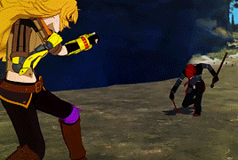
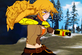
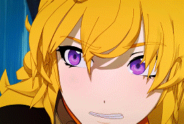
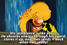
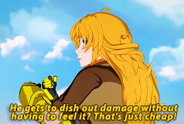
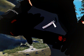
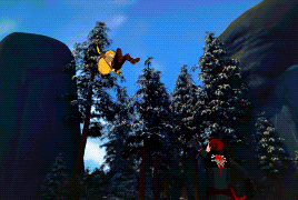
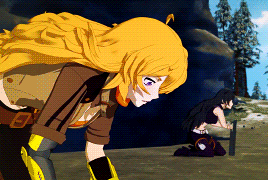
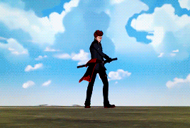

It's okay. We have unfinished business.
→6x11
#rwbyedit#yang xiao long#rwby#adam taurus#rwby6#rwby volume 6 spoilers#guess who's back back again... shady's back.. tell a friend#REMATCH#KILL HIM#tumblr's begging me to desaturate every time I upload it tries to eat them#hey#tumblr?#I haven't giffed in a year and I will do as I please#the last time I giffed the limit was still 2mb and I've abused the upgrade substantially#SORRY: HANG ON#I love that yang makes that comment bc it represents the dichotomy between them#yang's been through immense pain in her life and her semblance takes physical damage -- but she still feels it and still has to feel it#to dish it out#adam's been through immense pain in his life but his semblance allows it to return it without any consequence to himself#easy to see who maintains their humanity#the woman who has to hurt to hurt or the man who can do harm recklessly and freely#¯\_(ツ)_/¯
1K notes
·
View notes
Audio
CFM - Rise And Fall
Amerikalı müzisyen Charles Moothart, Ty Segall ve Mikal Cronin ile yaptığı işbirlikleri ve Segall ile beraber Fuzz grubunda yer almasıyla biliniyor. Wand, Fuzz, Meatbodies ve Mikal Cronin zaten birçok projede ortak noktada buluşuyorlar. Moothart, bir yandan da CFM adlı solo projesini yürütüyor. Nisan ayında Dichotomy Desaturated adlı albümünü yayınlayan müzisyene ait Rise and Fall şarkısını dinleyebilirsiniz.
#cfm#rise and fall#dichotomy desaturated#new song#new music#yeni şarkı#yeni müzik#music#musica#müzik#müzik haberi
1 note
·
View note
Note
describe color theory as it applies to Lefy’s design
damn u rly in my inbox testing me on wether or not i remember anything about what u said wrt color theory
and i am here to offer a hearty............maybe
for the reference of everyone else, heres the full pic of lefys design:
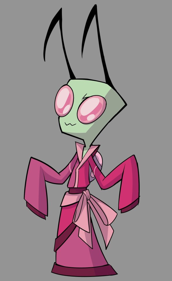
theres a lot of elements to his design that convey a specific Thing, some of them i did and most of them you did, but as per The Instructions im gonna focus on color theory only
so first off his eyes are three different shades of pink as opposed to the usual two shades of the base color and the shine color, so immediately thats striking and ensures that a viewer will remember this specific character- which is good, since he's one of the more important ocs
(im realizing a lot of protagonist ocs have striking features nobody else has, be it a rare eye color, a missing limb, prominent hybrid traits etc BUT THIS ISNT ABOUT THAT)
i had to erase a BUNCH of shit cause it veered a little too hard into spoiler territory BUT. THE COLORS.
so first off the Top Part of lefys uniform is asymmetrical- one side is a muted, desaturated pink, and the other side is a more vibrant, almost neon, pink. to me this shows that there are two "sides" of lefy's character: a more boisterous, intense side, and a "muted" version of himself. the muted color is there more than the vivid color in the skirt part, but the vivid color is on top, signifying that his more intense nature is what people recognize him for.
the dichotomy of mute vs intense is a pretty good clue that lefy is a defective that only sometimes displays his true personality as one- which, in the realms of defectives, isn't uncommon
theres more wrt color theory that i could dive into but i really wanna stay out of spoiler territory BUT you bet your ass that im gonna do a full writeup analysis of lefys design after all that shit drops because damn. you nailed it perfectly despite not knowing like..... all the important shit about the character. how did you do thAt
#note 2 self do a full analysis on lefys design at Some Point#anarchisma au#should lefy have his own tag??? why do i post him so much when i gotta do the fuckin tango around spoilers#why couldnt some other oc be the tumblr darling#fuck it. gonna post more ocs so yall latch onto SOMEONE else ;A;#now calling the tallest
36 notes
·
View notes
Text
Film Language; Scene Comparison: Mary & Max.
The first clip is a scene with Mary.
In this clip first of all I notice the story is being told from a point of veiw; The narrator. A narrator can provide strong exposition and is usually a trope in fairy tails lending to this idea that Mary has this young “idealistic” world veiw. This is complimentented by the next scene which has the narrator telling Mary’s enthusiastic outlook on her fathers job, while we are shown a slow, repetitive, colourless work environment. Her father stiff and weary, telling the veiwer that this job is not as ideal as Mary is told to believe.
A really neat and interesting scene of the “Earl Grey” tea packets are shown after this and I particularly like it as the camera pans up an endless tower of exactly the same, grey early grey packet. The tea bags have almost no stand out features making them almost difficult to separate from eachother visually which would usually be considered poor scene composition, however here it lends to the idea of the never ending and repetitive job of making tea bags. Each one being indestinguishable from the next. Scenes like these are where stop motion animation really shine becasue it provides narative context without breaking the imersion of realism becasue the stop motion already has us in suspended disbelief.
In the clip focused on Max, we are again introduced with the narrator, however he feels much less involved, perhaps inmplyying Max has a more grounded understanding of his life. The story is that Max is currently struggling to think what to say in a letter to a pen pal and the scene plays out a very neat montage that attempts to express the idea of inspiration. It uses a classical song in acompnament to the sounds of a typewriter. Showing inspiration as a quick musical burst that is played out through us.
Unlike the scene with Mary, we are shown a very dull world, reflecting Max’s world veiw that the world is not the same as how Mary sees it. The colours are so desaturated and Max is quite pesemistic about other people but by the end of the scene is rather optimistic in himself. This is different to the end scene of Mary who is said to be an “accident” and she is sadded and confused; Max on the otherhand refuses other people opinions to “fix” his mental illness. This is an excelent dichotomy between two characters that the cinematography lends to very well.
0 notes
Photo

21 Hater You Tried
22 A Victim Of Society Freaktown
23 OCS Memory of a Cut Off Head
24 Hoops Routines
25 Grandaddy Last Place
26 Forest Swords Compassion
27 CFM Dichotomy Desaturated
28 Meatbodies Alice
29 Marika Hackman I'm Not Your Man
30 King Gizzard and the Lizard Wizard Polygondwanaland
31 Perfume Genius No Shape
32 Blanck Mass World Eater
33 Vagabon Infinite Worlds
34 Jen Cloher Jen Cloher
35 Oh Sees Orc
36 Godspeed You! Black Emperor Luciferian Towers
37 Waxahatchee Out in the Storm
38 Chastity Belt I Used to Spend So Much Time Alone
39 Arca Arca
40 LCD Soundsystem American Dream
41 Liars TFCF
42 Pile A Hairshirt of Purpose
43 School Damage School Damage
44 Shannon Lay Living Water
45 Makthaverskan III
46 Palehound A Place I'll Always Go
47 King Gizzard and the Lizard Wizard Sketches Of Brunswick East
48 Jane Weaver Modern Kosmology
49 Cende #1 Hit Single
50 Real Estate In Mind
1 note
·
View note
Photo
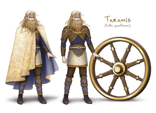
You folks remember my head design for Taranis? (Irish name: Tuireann) Well he has a full costume now! Some leather, some chain mail, some cloth. These designs are mostly mock-ups for my own future reference. (Hence the boring poses and no environment, etc.)
Taranis is one of three thunder gods that appear in Godlings, and I plan to make super sure you could never confuse one for either of the other two. This guy’s color scheme gave me some trouble, but I’ll tell you how I got to it. I started with the hair color; Zeus will have gray/silver hair, you see, and Thor will be a redhead (that’s canonically accurate, btw) so I had to differentiate from them. Next I addressed the confounding dichotomy of Taranis being a thunder god, who has been shown to wield lightning, yet also a sun god... sort of. (The wheel is supposed to represent the sun.) However I also have Lugh in my Celtic pantheon, and he is primarily a sun god, so he’s gonna have the majority of the bright sun colors and glow. Taranis therefore has yellow golds, but they’re desaturated. He has a lightning-ish pattern along his cloak, but he also wears stormy blues. I liked the contrast.
The browns of the wood and leather was a choice to keep them visually humbled, somewhat. The gods of Godlings, especially the weaker ones, are not meant to be gleaming, high-tech, video game style deities. Their pantheons were born of times and cultures that couldn’t dream of the fantastical, overdesigned armors and such that we see so much of today. I want their designs to recall that.
I’ll hopefully work on finishing Cernunnos next!
8 notes
·
View notes
Text
15 Composition Tips to Improve Your Photography - Photography Life
New Post has been published on https://photographyguideto.com/trending/15-composition-tips-to-improve-your-photography-photography-life/
15 Composition Tips to Improve Your Photography - Photography Life
The following article contains a list of important composition tips to help you take the strongest possible photos. It goes without saying that composition is a very personal creative decision, so there are no truly universal do’s and don’ts. Nevertheless, there are certain techniques you can use to improve your photos, from forming a vision to refining your initial composition in the field. The goal is to make your image’s final message as clear and effective as possible.
1. Have a Vision in Mind
The first step in making a successful photo is to have a plan – a vision – an idea. In your mind’s eye, see the image you want to capture, and then do everything possible to make it a reality. This is called visualization.
It’s not an easy skill to learn. You need to be so familiar with your camera, your post-processing abilities, and your printing/output characteristics that it’s second nature to picture the final image in your head before you even capture it. That takes a lot of practice.
But good visualization skills are worth it. In the field, you’ll know exactly what you can and cannot do to improve a photo in post-processing. You’ll see ahead of time which elements of the image are going to annoy you later – and how to deal with them as best as possible in the field.
You’re thinking about the best possible version of a photo, then doing everything you can to make it a reality. Every decision you make in the field should be in service of your vision.
2. Make Conscious Decisions
You have a large number of decisions to make each time you take a photo. Many of them are automatic or obvious, and they only matter occasionally (like deciding to change your memory card). But some decisions impact every photo, even if they slip behind the scenes all too often.
Ideally, you’ll want to bring as many subconscious decisions to the surface as possible. Every choice in photography is an opportunity to push the photo closer in the direction of your vision. This isn’t just about composition or creativity; your technical decisions also have a huge impact on your photos and their mood. I’m fond of saying that every technical choice is really a creative choice in disguise – because it is.
The important thing is to not let these decisions fly by on autopilot. When you pick a particular set of camera settings, know why you’re doing so. Don’t just use a focal length because that’s what you had for the last photo. Instead, evaluate the scene in front of you and deliberately pick which focal length will meet your vision the best. And so on, for every decision you make.
3. Keep It Simple
Your vision for a photo is another way of saying your intended message. Which emotions do you want to convey to a viewer? What mood or ideas do you want your photo to express? This is where simplicity plays a critical role.
When you’re making conscious decisions to meet your vision, remember that the emotional message won’t land if it’s hard to understand. Simplify your idea down to its essence; exclude anything from your photo that takes away from what you’re trying to say.
Simplicity might just be the biggest “trick” to improving your compositions. Before you take a photo – but after you know what you want to say – look for any distractions in the frame that harm your message. Get rid of them in your composition, or minimize them as much as possible.
Unless you’re doing studio photography where you have total control, some flaws will almost always appear in the image. But the sooner you recognize them in the field, the less of a problem they’ll be in the final photo.
I recently was photographing salt formations at the Dead Sea around sunset. It was a beautiful location, but a dark peninsula on the left-hand side of the frame made the composition tricky. So, as the light turned good, I packed up my camera and went to the tip of the peninsula itself (thereby excluding it from the composition). I took perhaps my favorite image of the entire trip from that spot.
Although the earlier location had a lot of merits, the peninsula distracted from the hazy, peaceful message I wanted my photo to convey. For the sake of simplicity, I needed to change locations.
4. Watch How the Light Changes
As we’ve covered before, light and color are two of the most important qualities for determining the mood of a photo. High-contrast blue light is very different from pastel orange at sunset. Yet both of them can occur within thirty minutes of each other. That’s why it’s so important to watch the changing light in a scene.
Don’t just choose “both” and photograph the same scene the entire time. Perhaps the light at sunset is perfect for wildlife photography, but it gradually shifts to working better for a landscape instead. In any case, by watching the mood of the light, you can get multiple keepers from a photoshoot rather than just one.
I recently was taking sunrise photos from an amazing overlook, and the obvious landscape for photography faced one particular direction. I could have composed a good photo, set up my camera on a timelapse, and selected the one with the best light later. And while that certainly would have resulted in a keeper, I instead ended up with four different successful images from that single sunrise, the most I’ve ever gotten at a time. That happened because I watched the changing light and focused on different subjects throughout the morning.
5. Balance the Composition
One of the many decisions you should make consciously is whether to create balance or imbalance in your composition. In other words – will the photo lean left or right and create a sense of tension? Or will it have equal weight on both sides, appearing more static but also more harmonious?
Balance is about assessing the visual weight of your scene and simply figuring out whether there’s more on the left or right. I generally want my landscapes to be as balanced as possible, with no real sense that they are “leaning” one direction or another. However, I have seen some documentary photographers and even nature photographers aim for strong imbalances to make the photo feel more “on edge.”
To me, this is the first element of composition that you should learn and think about for every photo, wether you choose to go for balance or imbalance in a given image. In my opinion, photographers who master balance and simplicity already understand the fundamentals of composition, since they know what looks harmonious (balance), what looks tense (imbalance), and how to get there (simplifying the frame). Read our more detailed article on the subject as well.
6. Pay Attention to the Edges
The edges of a photo are just as important as the center. In some ways, they’re more important; a tiny distraction near the edge of your frame has a far greater effect than the same distraction near the center. There’s a reason why vignetting – darkening the edges and corners of a photo – is so popular, since it practically spotlights the rest of the frame without appearing unnatural (so long as you don’t overdo it).
This isn’t to say that your photo should always be dark and empty in the corners. That’s not always possible, let alone desirable. But you should at least think about the edges of your photo while you’re composing.
Keep your subjects away from the far edges unless your goal is to create an unusual composition. Try to cut off the boundaries of a photo in a thoughtful, careful manner. And, in post-processing, crop, darken, desaturate, or clone out distractions along the edges of the composition if they harm your image significantly.
7. Use Contrast and Color Contrast
Another important emotional dichotomy in composition – along the same lines as balance and imbalance – is high versus low contrast.
Photos with high contrast attract the eye and pop out, conveying a sense of intensity and power. Low-contrast images, on the other hand, are more subtle and subdued, but they also have a refined quality to them. Neither type of photo is better than the other, but both send different messages, so it’s important to make this decision in service of your vision for the image.
Madhu wrote a more detailed article on contrast, but the biggest takeaway is that there are multiple types of contrast. Although the classic high-contrast image has bright highlights and deep shadows, you can attract the eye just as strongly through color contrast – placing two opposing colors next to one another. The same emotions apply, though.
So, in the field, seek out scenes and light with contrast that suits your emotional message. And, in post-production, add or decrease contrast (locally or globally) to further refine your photo’s emotions.
8. Know How to Draw the Eye
High contrast isn’t the only feature of a photo that draws a viewer’s eye. We’re attracted to anything that catches our attention in the real world: bright objects, vivid colors, people’s faces, interesting shapes, unusual objects, strong texture, interesting patterns, and so on.
This is very useful information to know as you compose a photo. On one hand, it helps with balance – you can balance out your main subject simply with a bright object on the other side of the photo, since both may have similar levels of visual weight. But beyond that, if you know how to draw a viewer’s eye, you can post-process a photo to emphasize the important elements and diminish the ones that harm your message. This is where the classic “dodge and burn” edits come into play.
9. Give the Composition a Structure
Every photo has a structure to it – an organization behind the scenes. This is essentially the path a viewer takes through the photo, although of course it is impossible to predict exactly how someone’s eye will flow through an image.
I’ve always found it interesting that you can reduce most photos down to a handful of lines and shapes, yet still retain much of the emotional mood of the original image. That’s because the emotions of a photo are fundamentally tied to its structure, perhaps more so than we consciously realize.
So, in the field, give a bit of thought to the structure of a photo. Arrange the elements of your composition as if they are abstract shapes placed on canvas, not simply literal subjects. And, in post-processing, strengthen the photo’s structure through global and local adjustments as needed.
10. Watch for Patterns
Repeated patterns in a photo make your composition feel interconnected and intentional, as if the photographer took a particular image for a reason. But that’s not the only type of pattern in photography. Just as important – maybe more so – are the cycles that occur in the real world, repeating themselves with remarkable regularity.
Several years ago, when I was taking pictures of a glacial lagoon in Iceland, an Arctic tern flew in front of the perfect iceberg. I had set my camera for landscape photography, not wildlife, so I missed the shot. But fifteen minutes later, it flew by the same spot, and I started to think that it was going in circles. I changed my camera settings and waited, and sure enough, what I believe to be the exact same bird flew by a third time, and I captured the photo I had in mind.
So, watch for patterns – not just visual repetition that appears in a photo, but also patterns and cycles in nature. If you miss the shot you wanted, chances are good that a similar scene will appear again eventually.
11. Match the Tripod to Your Composition
The easiest way to use a tripod is to set it up at its full height, then attach the camera and start composing. But that technique can be quite harmful if it’s your default.
On one hand, how often does the best possible photo really match up with an eye-level tripod? Maybe for some images – like distant landscapes or wildlife in the sky – it doesn’t really make a difference. But in many other cases, the best compositions are much lower to the ground. It could be wildlife at eye level with your subject, landscapes with a dramatic foreground, street photography to capture the reflection in a puddle, and so on.
Second, before you set up your tripod in a given spot, you need to have a good reason to choose there rather than somewhere else. Composition should begin well before your camera is on the tripod. Otherwise, you might anchor yourself to a frame out of convenience rather than quality.
Instead? Walk around, try different heights, tilt the camera, change lenses, compose – and only then match your tripod to your composition.
12. Keep Moving
Along the same lines as the prior tip, it’s important to remember that photography is not a spectator sport. Sometimes, you almost have to fight the scene in front of you to wrest free the best composition. You’ll need to move around, walk or run into place, try out different angles, and rarely stay still.
As much as I like the sound of standing by a tripod as the sun sets, sipping a warm drink and enjoying the atmosphere, that’s rarely what ends up happening. Instead, I tend to dash around like a madman as the light changes, jumping from one vantage point to another. Even at overlooks where there isn’t much of a different location in the first place, I still change lenses and compositions whenever a spark of inspiration hits.
Some exceptions are when you wait around for ages in a wildlife blind or on a street corner to catch the perfect moment, or arranging a tabletop studio scene meticulously. In those cases, you might not be moving much, but you’re definitely still putting in the effort to capture a good photo.
13. Give Your Subjects Breathing Space
When you’re composing a photo, it often helps to give your subject a sense of breathing space – not placing other subjects too close, and especially not crossing the primary subject with one that isn’t as important.
For example, if you’re photographing a mountain in the distance, take the time to move around and change the composition so the peak isn’t covered by a nearby tree. The same goes if you’re photographing a flock of birds, for example; you don’t want them to cross one another and become distractions.
Breathing space alone is not enough to guarantee a good composition. But it’s still important; give your subjects the space they deserve, or your message could get lost and muddled.
14. Unify the Photo’s Emotions
Many of the tips so far have danced around the topic of emotion, such as balance, light, color, and structure. All of these elements, among many others, are part of that decision-making process you practice for every image. If you can make it so that all these elements work in tandem, each working in service of a singular emotional message, your photo will be successful on many different levels.
This is what I mean by unifying the photo’s emotions. If the light in a photo is soft and gentle, but your subject is jagged and harsh, the image’s emotional message is unclear. If your composition is dynamic and imbalanced, and the structure of the photo is a tense series of jagged lines, does your subject convey a similar mood? Or is your composition like that by accident?
Every decision you make is a chance to skew the emotional message of the photo in the direction you want. Crowded or empty; bright or dark; low or high contrast; blurry or sharp – and so on. The key is to make these decisions deliberately and intentionally. The more choices you can make consciously rather than by happenstance, the better.
15. Refine Your Composition
Last, and among the most important tips in this list, is to refine your composition when you’re taking pictures. Work with the scene. Take some sample photos and see how they look, analyzing them critically to see what works and what doesn’t. Compare the emotional message – the vision – in your head, versus the image on the back of your camera screen. How do they differ?
Not everyone’s style of photography works well with refining the same composition. Some people prefer spontaneity and on-the-spot emotional decisions. That is an equally fair approach, although even then I believe photographers will benefit from refining the idea in their head and the goal they have in mind. We also have a longer article on the refining process if you want concrete examples of how this works in the field.
At the end of the day, though, the real takeaway is that there’s always room to improve. Not just in a single photo – in your overall composition and visualization skills, too. No one out there has “solved” composition, and there’s a lot of personal style involved as well, so finding an endpoint here isn’t really the goal. The biggest piece of advice I can give is to just keep taking photos along the way.
Source
15 Composition Tips to Improve Your Photography
0 notes
Text
My Top 20 Albums Of The Year
I said it in my piece Under The Radar: The Overlooked Albums Of 2017, I’d say that 2017 was quite a win when it came to music. In a world where many say that rock n’ roll might be dead, bands still seemed to flourish. Going over the many albums this year, these are the ones that stood out to me. I hope you’ll check them out. Happy New Year everyone, keep rockin’.
20. Six Organs of Admittance – Burning The Threshold
19. Mastodon – Emperor of Sand
18. Feral Ohms – Feral Ohms
17. Pile – A Hair Shirt of Purpose
16. Zola Jesus – Okovi
15. The War on Drugs – A Deeper Understanding
14. King Gizzard and the Lizard Wizard – Polygondwanaland
13. The Black Angels – Death Songs
12. Ty Segall – Ty Segall
11. Fleet Foxes – Crack-Up
10. Once And Future Band – Once And Future Band
9. Pallbearer-Heartless
8. Pissed Jeans – Why Love Now
7. Elder – Reflections of a Floating World
6. CFM – Dichotomy Desaturated
5. The National – Sleep Well Beast
4. ORB – Naturality
3. Japanese Breakfast – Soft Sounds From Another Planet
2. Julien Baker – Turn Out The Lights
1. Richard Edwards – Lemon Cotton Candy Sunset
from Rocknuts http://ift.tt/2pWprc0
via IFTTT
0 notes
Photo

CFM - Dichotomy Desaturated (2017) Second “solo” album from Charlie Moonheart—multi-instrumentalist and longtime Ty Segall collaborator in bands like Epsilons, Fuzz, Ty Segall Band, and GØGGS, among other bands. The first CFM album didn’t do much for me but this one got me right out the gate. A few mellower psych songs alongside some hard psych shredding. What’s not to like if you’re a fan of Ty and Fuzz? Too 10 material.
0 notes
Audio
https://soundcloud.com/desaturatemusic/sets/desaturate-false-dichotomies-album
0 notes
Audio
0 notes
Audio
no love for ned on wlur – may 31st, 2017 from 5-7pm
artist // track // album // label
sea pinks // places she goes // watercourse // cass/flick
scrabbel // all night // all night 7" // where it's at is where you are
hazel english // birthday // just give in // never going home // polyvinyl *
blanket rule // different ways // tba cassette // osborne again
the pits // shouting in caps // shouting in caps // cubbyhouse
dream machine // all for a chance // the illusion // castle face *
nap eyes // your samples, our obsession // our first one hundred days compilation // secretly group
my teenage stride // gamma radiation // living in the straight world cassette // unblinking ear
daniel romano // modern pressure // modern pressure // new west *
kissing is a crime // nervous conditions // kissing is a crime // don giovanni
jesse // wild sun // hard sky // uniform group
hungry cloud darkening // i am seen // glossy recall // off tempo
man forever featuring yo la tengo // you were never here // play what they want // thrill jockey
super tentemba jazz // mangan // the original sound of mali compilation // mr. bongo
the lloyd mcneill quartet // just 71% moor // washington suite // soul jazz
dominik strycharski core six // ametyst // czôczkò // for tune
han bennink trio // peer's counting song // adelante // instant composers pool
craig taborn and ikue mori // two disagreeable pigeons // highsmith // tzadik
dave rempis, matt piet and tim daisy // no jazz // cure for the quotidian // amalgam
alison cotton // the last sense to leave us // the last sense to leave us- a tribute to pauline oliveros // rural colours
daniel hart // go to new york // tumbledown soundtrack // milan
sophie cooper and julian bradley // congratulations // the blow volume three cassette // front and follow
david stackenäs // pictor // bricks // clean feed
jake xerxes fussell // have you ever seen peaches growing on a sweet potato vine? // what in the natural world // paradise of bachelors *
amen dunes // sousta politiki // on a steady diet of hash, bread and salt compilation // soundeyet
charles f. moothart // pinch the dream // dichotomy desaturated // in the red *
courtney barnett // how to boil an egg // split 7" w/ blank realm // milk!
the hayman kupa band // no more bombs // the hayman kupa band // fika
* denotes music on wlur’s playlist
0 notes
Last Seen Blogs

satans---wh0re-blog
† † †

dieexeto-sololetras
Solo (y) letras.

witchysis31
Witchysis31

yuria1
Yuria

rokahemrvea-blog
Untitled