schupanitz
Schupanitz Creative
See more of my work at schupanitz.com
22 posts
Don't wanna be here? Send us removal request.
Last Seen Blogs

masukm
★¡Hey welcome!★

albografi
ALBOGRAFI

ladyplantpots
Hark! A Dork

mcgonigle
McGonigle Dental Associates

cassthepilot
Meet Cass
Photo
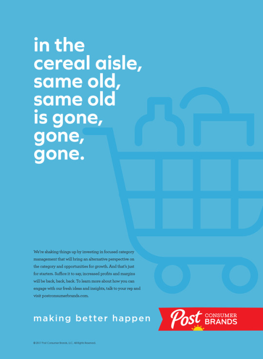
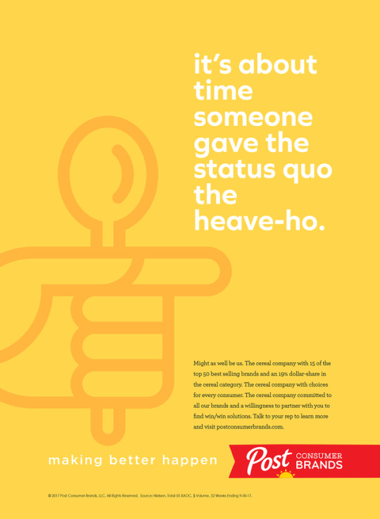
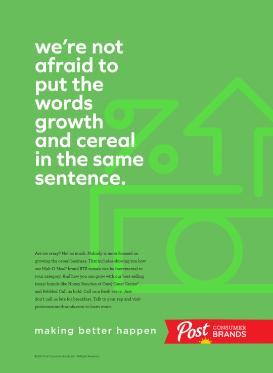
Cereal Aisle Disruption
This trade campaign I created for Post announces changes in the category that the combination of MOM Brands and Post is bringing about. The tone is aggressive, the look clean and fresh — definitely not your same old, same old.
2 notes
·
View notes
Photo
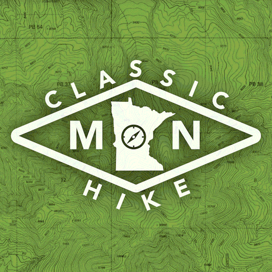
Four Directions To Go
Alternative identities developed for Explore Minnesota to brand classic hikes in the state.
8 notes
·
View notes
Photo
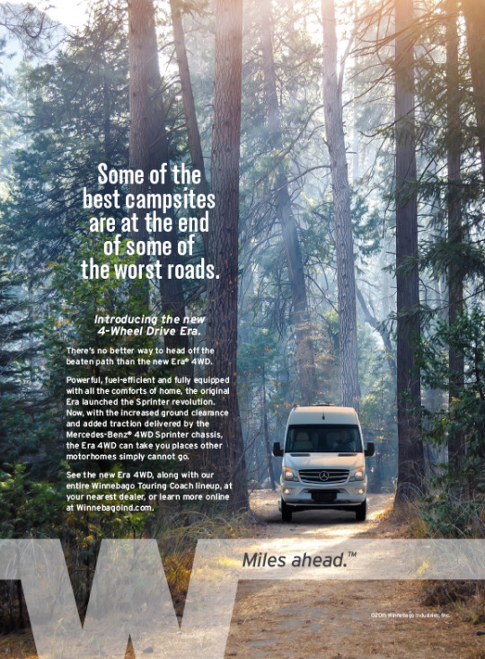
Getting out there, in style.
Winnebago is introducing its new motorhome built on a 4-wheel drive Mercedes chassis — so now you really can rough it in comfort. The ad introduces this new model and continues the MILES AHEAD campaign I’ve developed. Watch for more to come!
#advertising#motorhome#graphic design#design#marketing#ads#outdoors#minnesota#minneapolis#magazine ad#marketing campaign#ad campaign
0 notes
Photo

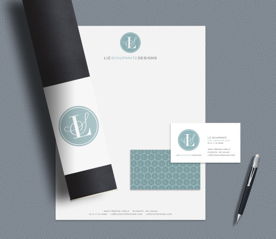

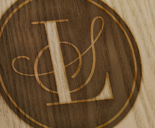
Brand Design for a Designer
Designer Liz Schupanitz (my wife) is an award-winning, creative kitchen and bath designer who needed a logo and look that lived up to the quality and beauty of her finished projects. And yes, she was very involved in the process of developing the identity — a collaboration that yielded a monogram and logo that capture her style, exactly.
11 notes
·
View notes
Photo

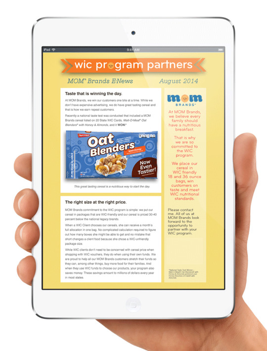
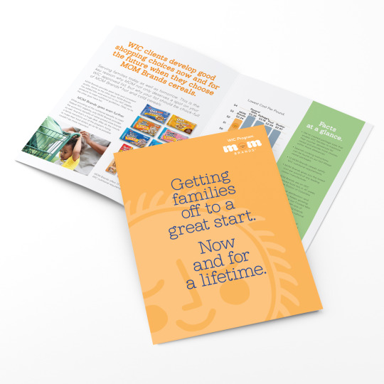
MOM cares about kids.
Over the years I’ve done work with MOM Brands (now Post Consumer Brands) including ads, emails, collateral, and trade booth graphics for their WIC program. Cereal is a favorite for breakfast. Who better to get kids off to a great start than MOM?
2 notes
·
View notes
Photo
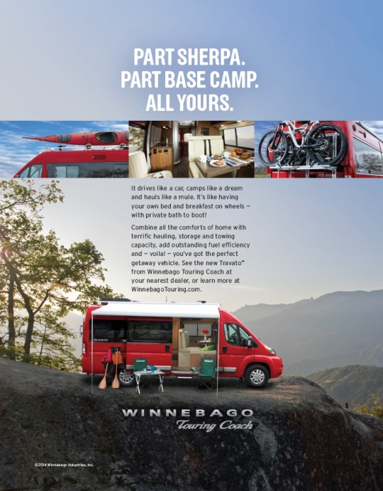
The Journey AND the Destination.
After a successful introduction, Winnebago added even more features for active people to their Travato — kayak and bike racks. Ads run in RV magazines, outdoor enthusiast magazines and online.
#advertising#rv#magazine#minnesota#graphic design#outdoors#bicycle#minneapolis#marketing#kayaking#bicycling#camping#ads#branding
1 note
·
View note
Photo
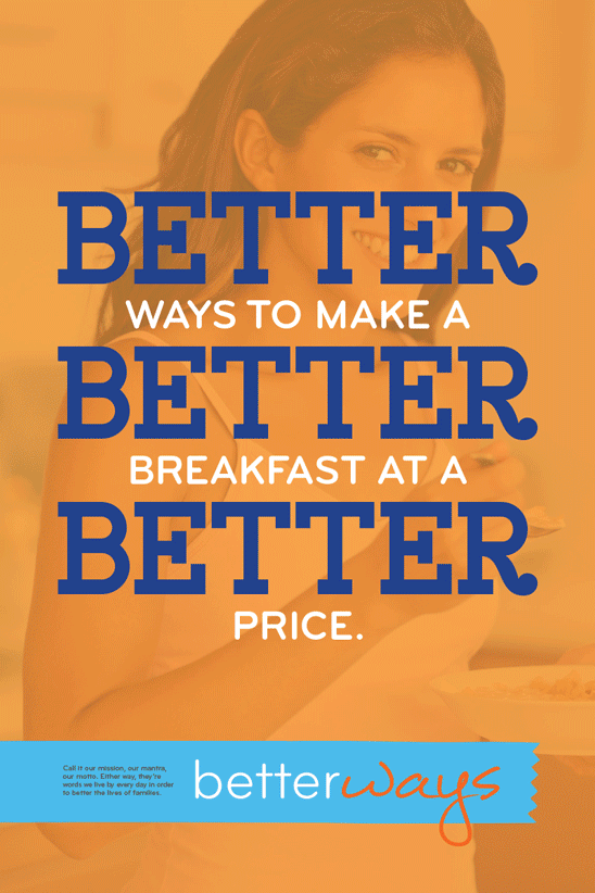
Poster Campaign for MOM.
These are part of a series for longtime client MOM Brands. They appear throughout the headquarters campus and plants around the country as part of the BETTER WAYS campaign targeting employees.
1 note
·
View note
Photo
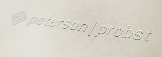
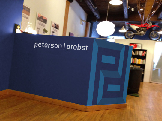

Making a Mark.
Over the past few years I’ve worked a lot with local agency Peterson|Probst, so I was excited when they asked me to do their new identity. The new logotype and double-P symbol are the result — here is a sneak preview.
#identity#design#graphic design#Branding#minneapolis#minnesota#advertising#logo#logo design#logotype#trademark#art direction#advertising agency
2 notes
·
View notes
Photo

This Billboard Goes Up with the New Stadium.
I did this billboard that is posted right across the street from the new Vikings stadium construction site. It's the first of a campaign aimed at the thousands union workers on the job site from the credit union that was built just for them.
#advertising#outdoor#marketing#minneapolis#minnesota#union#credit union#art direction#metrodome#vikings
3 notes
·
View notes
Photo
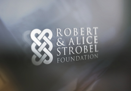
Promoting equality and justice.
This foundation's mission is to care for those who are most vulnerable. The logo I designed for them reflects that mission. The symbol uses interlocking hearts and an S in a infinite knot to show that we are all connected.
#design#logo design#logo#graphic design#branding#non-profit#foundation#charity#logotype#symbol#trademark#identity#marketing#minnesota#minneapolis
1 note
·
View note
Photo

Back from the 60s.
I’ve been working on some pretty groovy stuff, including the introduction of this updated-retro Winnebago model. If you see one on the road, be sure to flash the W-sign.
#advert#advertising#design#60s#minnesota#minneapolis#RV#winnebago#marketing#branding#creative#art direction#groovy
2 notes
·
View notes
Photo
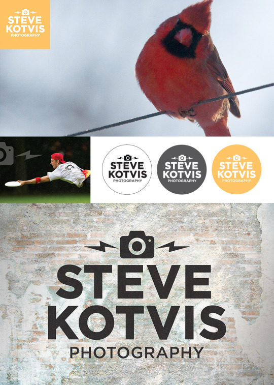
New Brand Identity for Minneapolis Photographer.
Steve shoots lots of action sports and other outdoor imagery. I designed a logo for him that is bold, clean, simple and contemporary.
#graphic design#identity#branding#photography#minnesota#minneapolis#schupanitz#logo design#design#logo#advertising
2 notes
·
View notes
Photo
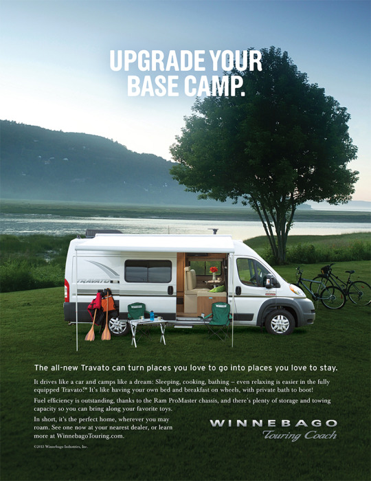
The perfect home, wherever you may roam.
This new model from Winnebago is made for active people who love to be outdoors, but don't mind a little comfort. I wanted to make the ad really draw the viewer into the scene. Hey, It works for me — I can see my self spending the night there!
1 note
·
View note
Photo
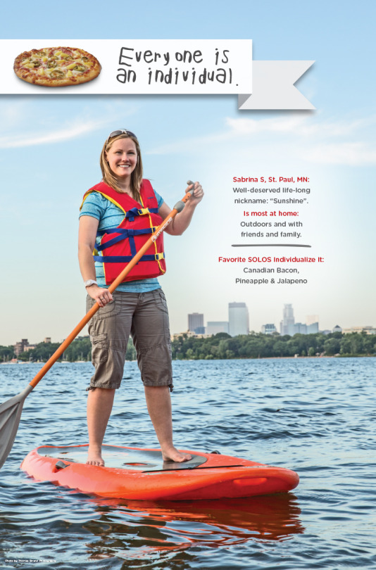
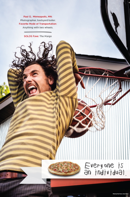
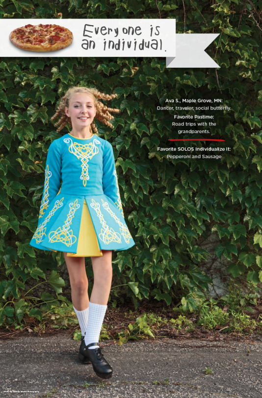
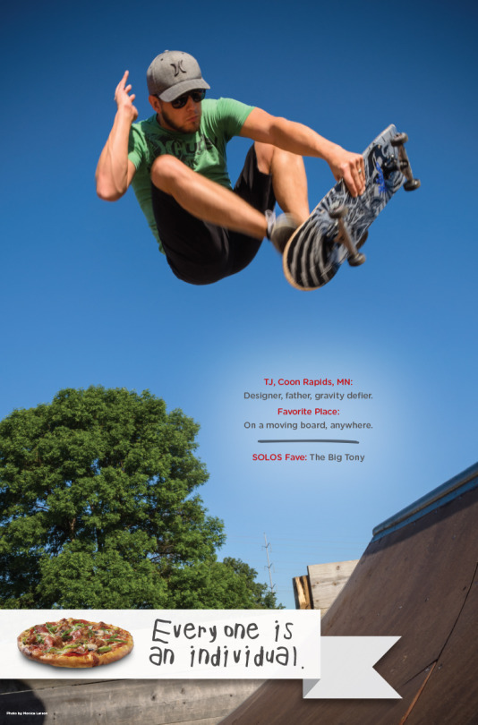
One-of-a-kind people and their one-of-a-kind pizzas posters.
This in-store poster series features some unique individuals and their favorite Solos pizzas. Meant to reinforce the EVERYONE IS AN INDIVIDUAL theme, the posters also suggest pizzas that other customers may want to try on their next visit.
#minneapolis#minnesota#pizza#advertising#graphic design#poster#instore#restaurant#fast food#retail interior#advert#photography#indiviuality#restaurant decor#marketing
1 note
·
View note
Photo
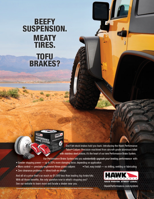
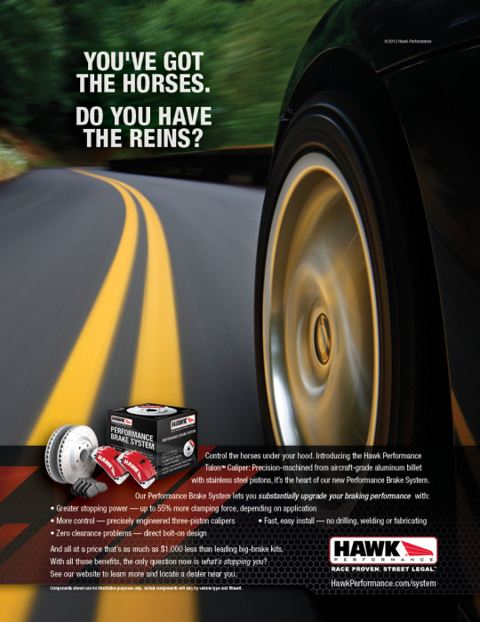
Whoa! These ads should stop you if you're in the market for brakes.
Targeting the off-road and performance aftermarkets, these ads are part of a complete new product introduction. The campaign included everything from product packaging to ads, online ads, landing page, brochures, posters and more.
#minneapolis#minnesota#advertising#automotive#graphic design#art direction#art director#ad agency#high performance#freelance
2 notes
·
View notes
Photo

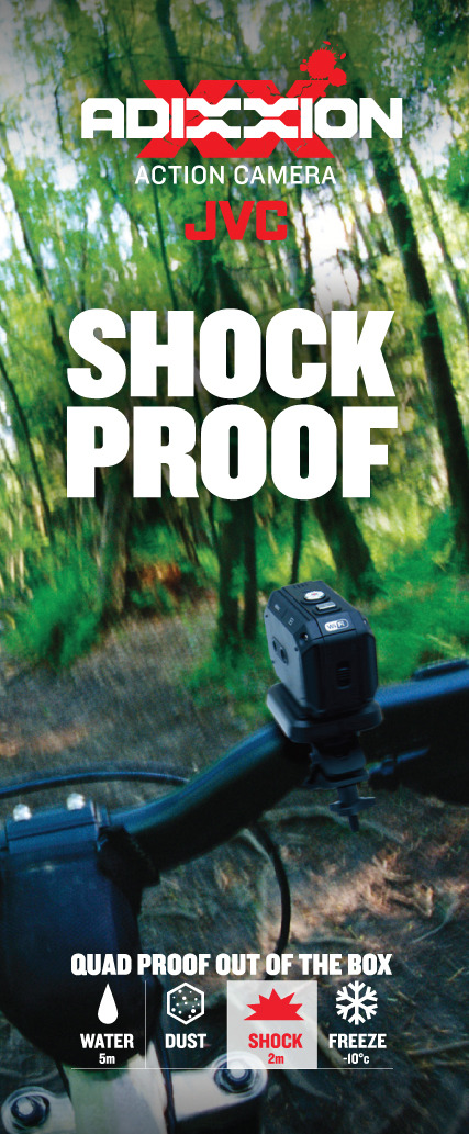
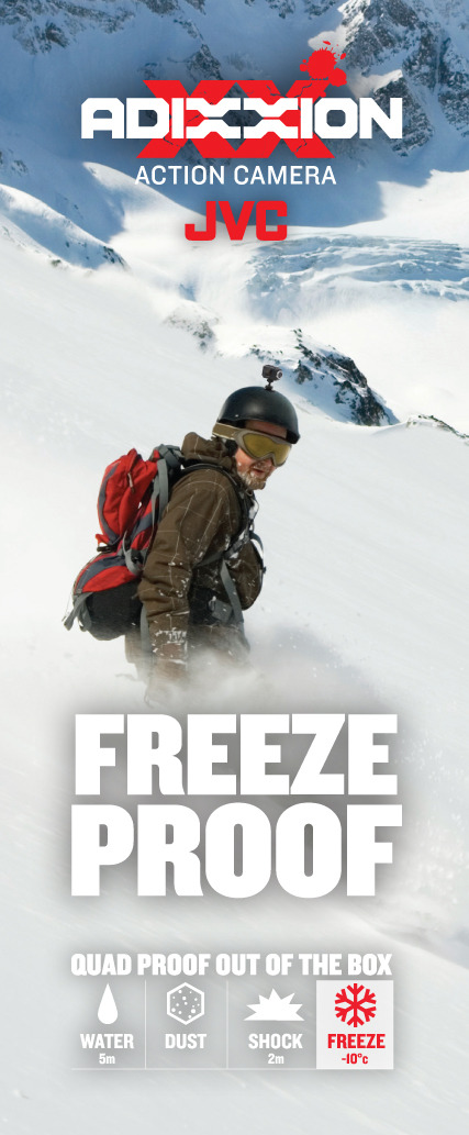
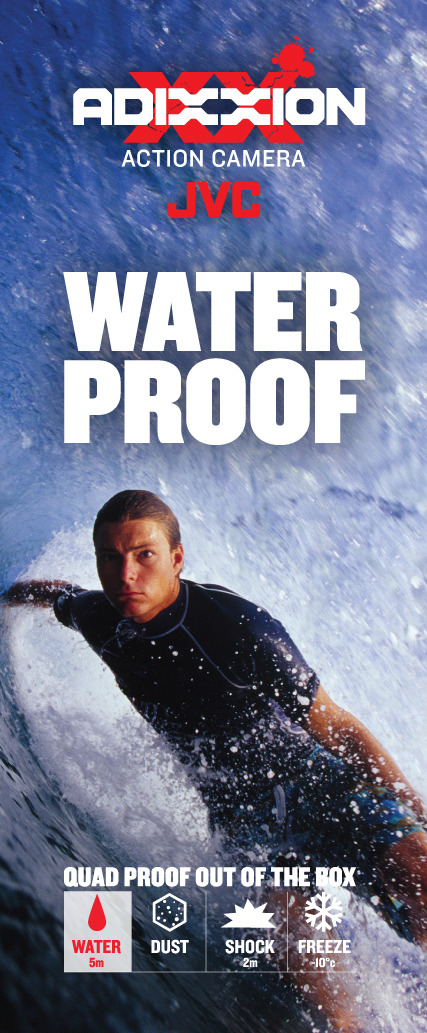
Smile! Trade Show Displays for JVC Action Camera.
This is one tough camera — and the proof is in the pixels.
0 notes
Photo
Logo for Hawk Performance Brake Calipers.
As part of a product expansion, Hawk is introducing an aftermarket brake caliper. I also did packaging and other materials for the introduction.
#logo#logo design#graphic design#advertising#minneapolis#minnesota#automotive#high performance#marketing#Branding
0 notes