#viscom student
Text

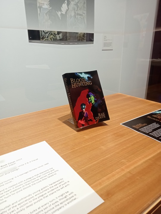

Excited to announce that my work is featuring in the Emergent 2023: Graduate Showcase Exhibition at Bunjil Place Gallery!!
This work was part of my final project for Units 3&4 Visual Communication and Design, a mockup book cover of a teenage fantasy novel 'Blood Hunting'. I'll go into more details about the story behind the project itself in another post later in the week <3
The opening night was last Sunday and dude it was a wild experience getting to see people looking at my work in person. The works of all the other artists in the exhibition are all so insane, seriously an honour to be among them wtff. If you're nearby I strongly recommend checking it out, it's going on until the 7th of April 💥
Thank you to Bunjil Place Gallery for providing this amazing opportunity. Special thanks to my VisCom teacher for his guidance (and constant critique) with this project and to my best friend for keeping me sane while we were working on it 💥
#bunjil place gallery#viscom student#book cover art#book cover design#fantasy art#fantasy book cover#blood hunting#ellise#lyari
1 note
·
View note
Text
I've realised i should have an introduction post :)
I'm izzy, and I'm a year 12 vce student based in melbourne, australia
this is my studyblr that i do try to stay active on, as it's hopefully going to provide some study motivation, which I severely lack.
The subjects I'm taking this year are physics, chem, general, english and viscom and i've already done methods 3/4
Some fun facts about me:
my favourite colour is purple but since thats kinda hard to pair with stuff my whole colour scheme for everything is blue/greens and neutrals :)
I'm not really sure what i want to do uni career-wise but we can worry about that later (that's next year's problem).
favourite music artists: new hope club, one direction, louis tomlinson, vansire :)
sports I like: i have like zero hand-eye co-ordination, so I swim (competed at my first ever nationals this year!) and run (casually) :)
I am a chronic, chronic procrastinator. I cannot emphasise this enough. i have written full 1000 word english essays on the day they're due which is good except for the part where that tells me procrastination is ok to do again...
I play the drums :)
favourite book is the secret history!
I draw sometimes (I'm not very good but it is fun)
I will add more if I think of more :)
Feel free to reblog with your own intros! I'm always open to make friends :)
#study space#study#student#studies#study tips#study hard#studying#aesthetic#study aesthetic#light aesthetic#aesthetic vibes#vce#biology#chem#chemistry#physics#maths methods#math#english#viscom#aboutme#maths#history
41 notes
·
View notes
Text
So, I've been thinking of cross-posting all my ieytd fics onto Wattpad and I know (from experience) that it's a pain in the ass to do-- I am very indecisive so please help me out
#ieytd#kitkatrambles#help me#short poll cause I want this indecision out the way asap#crossposting on wattpad is NOT fun#last time I did this was back in 2021..?#I think it was when I did whumptober for the fandom that shall not be named#but it took me like an hour to copy past all that shit into a single book#even then I couldn't be bothered to make individual books for all the different oneshots#As much as I love the cover feature it pains me to use it#the viscom student in me NEEDS them to be perfect
2 notes
·
View notes
Text
one again i need to reiterate how fucking dreadful doing graphic design at uni is. please don’t make this mistake im begging you
#do viscom!! or smth!! ANYTHING ELSE but graphics#im beyond pissed off at the lack of engagement and quality we get here#the lack of effort students put into their work as well. makes me feel like all this stress and time i put into my own is for nothing#bc knowing how life works i’ll end up with some average grade & these useless pricks will graduate with firsts
2 notes
·
View notes
Text
The out of touch keychain they’re pushing rn is so ugly it literally makes me feel sick the color palette is fine but the way they cut the text up and the font and the lack of literally any connection to the original meme (& the ethics of trying to capitalize on a meme but that’s not what I’m on about) make me want to start killing hire graphic designers please please please please please
#having a viscom/GD student moment.#which I have for every god awful piece of merch tumblr drops because they’re all fugly
3 notes
·
View notes
Text
overheard my homeroom teacher tell one of her viscom students that theyd get a better grade if they ai generated images for their inspiration moodboard than if they. used images made by actual people and just credited them. for some reason. like girl what….. you’re an art teacher. why are you actively advocating for ai art over human art whats the point
3 notes
·
View notes
Text
just because they said posting an intro is important...
I'm mihika, (if you didn't already guess) a teen from India.
I've been wanting to join tumblr since foreverrrr, but right thing right time i guess. This is the studyblur i do stay active on, only in the hope, that someone somewhere will find good study inspo :)
you can find me on pinterest @basicallymihika
p.s. I'll keep adding stuff to this
#study space #study #student #economics #studies #study tips #study hard #studying #aesthetic #study aesthetic #light aesthetic #aesthetic vibes #vce #bio #biology #chem #chemistry #physics #maths methods #math #english #viscom #aboutme
8 notes
·
View notes
Text
Viscom Showcase event Background:
What is the context to the creative brief that you are solving, what do you know from the given information and your research? What is the history and the contemporary relevance of this creative problem.
VisCom Showcase Event is an event that started in March 2022 by Yasmina Frej. The aim of the event is to inspire students and give them a chance to make connections with students closer to their age who are starting off in the industry and learn from their university experience by choosing a few students from different courses across VisCom to showcase their work. Additionally, there will also be at least one industry professional who will be presenting alongside, and students who will be selling their work outside the event hall.
Objectives:
What is the purpose of this advertising/branding/design campaign.
1. Inspire students across VisCom to see what type of work they could be creating
2. Build connections and networking across different courses.
3. Encourage the importance of collaboration in the creative industries.
Target Audience:
Who are you communicating to and where? What is the Demographics/Lifestyle of your audience?
The primary target audience would be students from the School of VisCom because they would be the ones who are more likely to be interested and benefit from the event. since it’s all about learning Creative skills. The secondary target audience would be any other student who is interested in creative courses.
Tone of voice:
What is the tone of your communications, what is the language (including visual and audio)
Formal but not too formal Creative Friendly Networking Lively and inspiring Inspirational Insightful Transition
Approaches:
What are the key approaches that you have identified as part of your communication strategy?
One of the main key strategies would be to communicate the networking side of the event, as well as seeing the best work of students from across VisCom and not only one course. Also encouraging students to join because there will be free food because who doesn’t like some free nibbles!
Media:
For example - Integrated media; Print & Screen; Digital; 3D; Poster; and Publishing etc.
Social media posts (teams, email, Instagram etc) Printed posters
Deliverables:
What elements do you need to consider developing as your outputs? Leave this open where possible and explore through experimentation as you develop your project.
Logo and branding
Social media posts and printed posters to promote the event Unique marketing designs (for example a QR code for event ticket attached to a sweet) Presentation templates for speakers (optional)
Motion design for advertising (optional)
2 notes
·
View notes
Text
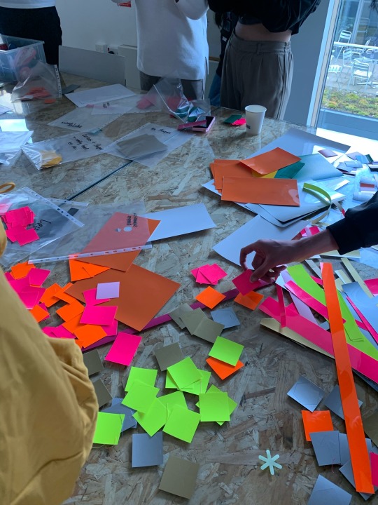
Viscom L4 Unit 2 - Pick, pack, sell and idea generation
For our first project that we will be doing throughout the course of unit 2, we have been given the task to pick a product from a list of 9 product sets, design and create the packaging, and then advertise the product. Throughout the briefing presentation we were shown several examples how packaging can be used in creative ways, such as incorporating the physical product as part of the packaging using transparent sections, and how using an unconventional form and shape for the packaging can make a package more functional rather than just a space to hold the product. An example of this was some pulses and grains packaged in a milk carton style package, which have a practical use since you could pour out the grains in a more controlled and less messy way. We have been advised to consider the sustainability of the packaging by researching and testing out various materials.
For the rest of the day we did some idea generation where we were tasked in groups with creating a response to a quick brief to help promote/advertise eBay. We aimed to target young audiences such as teens and students. To start this we did some mind mapping to help map out things we liked and disliked about eBay, then did some scamping, drawing quick sketches to quickly get several ideas out. We used the 4Rs method which allowed us to come up with more creative ideas and draw links between eBay and something random.
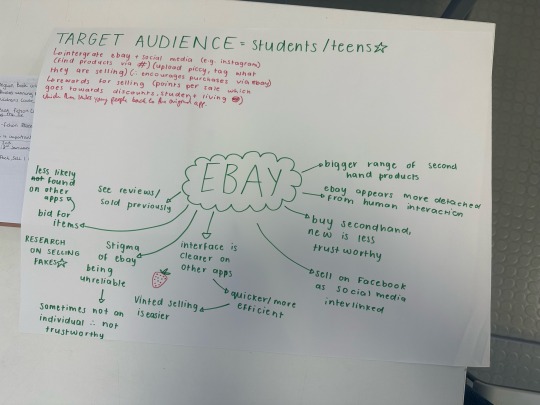

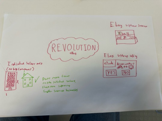
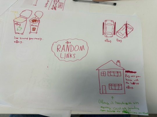
One idea was a self service system for eBay, which could be placed in a university for example, where second hand items could be bought and resold by browsing a tablet where an order can be placed on the item with a focus on reusing items to help promote sustainability.
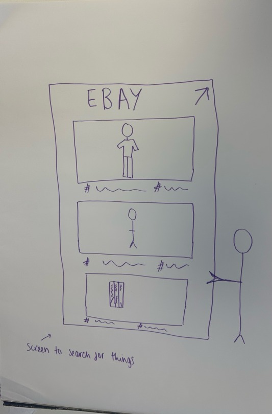
To finish the day did a pin up of our outcomes as a class and briefly presented them.
0 notes
Text
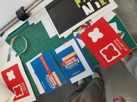
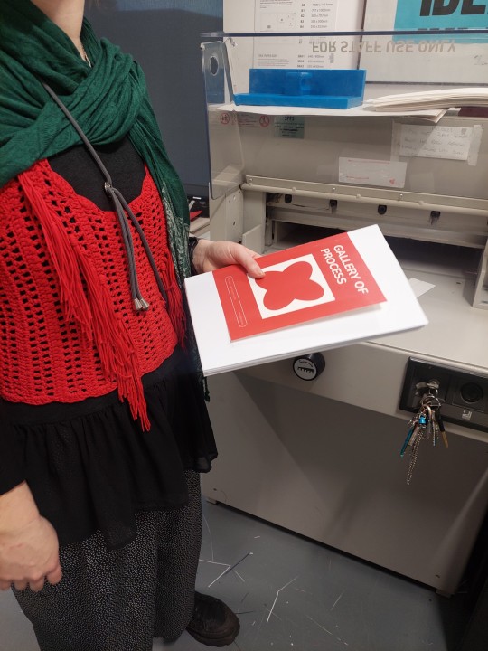
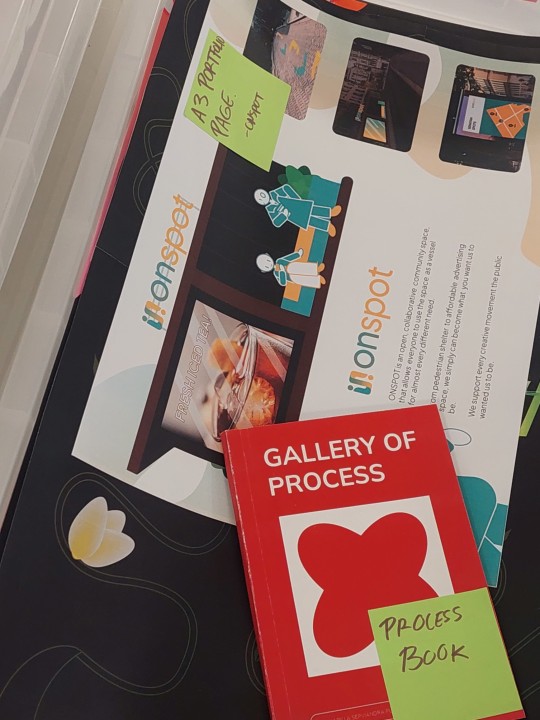
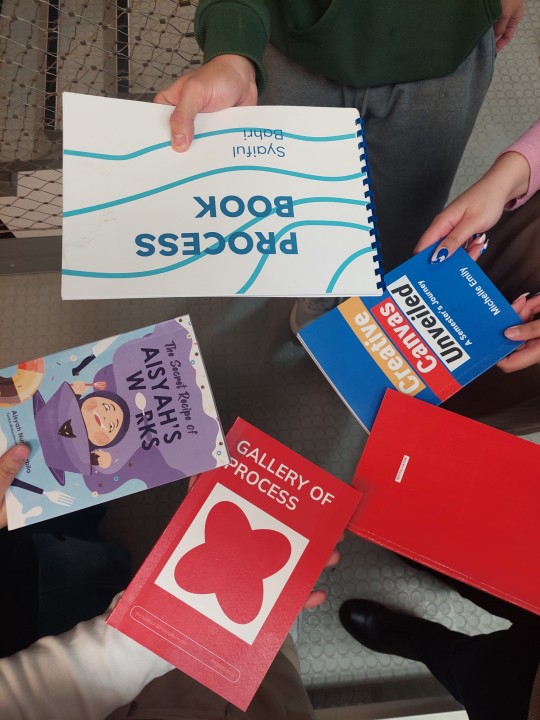
WEEK 9: My Galore of Autumn 2023.
It reached week 9. Time flies so fast, can you believe? I reached the point where it's time to submit Process Book, a book that consists of my work that I had done in AUB Viscom. A lot happened in the process of making, from layout to binding.
This also marks my time as an exchange student of AUB has come up. It was such an honor and great experience to be a part of Visual Communication in AUB!
0 notes
Text
26 September 2023
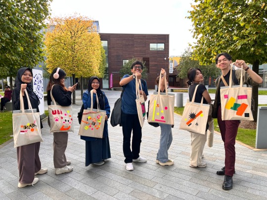
First day of the induction week.
This is the week we were introduced to the learning system and did some creativity warm-ups activities that also help us in making friends since everyone is new to the course. We were given a talk about the course overview as well as learning outcomes expected.
After the talk, we were given opportunities to design our own tote bag that contains some essential tools for a VisCom student like threads, book binding tools, cutting mat, ruler, etc with the heat-press printing method.
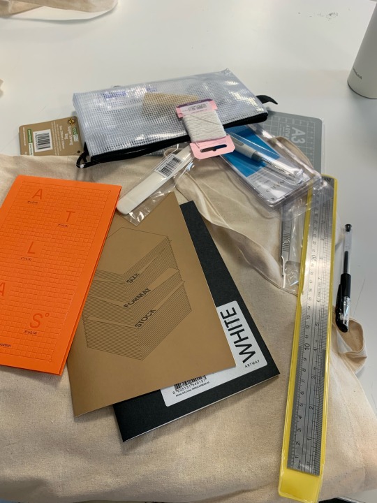
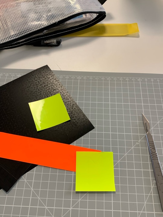
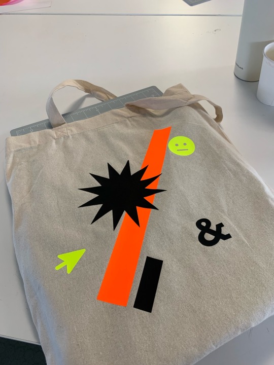
Here’s my first design in AUB :)
I tried to keep it simple with overlapped shapes since it is one of the design trends that I’m interested in these days. I also paid attention to the color selection which is black as the dominant color and yellow to orange tone as the compliment colors.
0 notes
Text
This week long project was a really good introduction to third year VisCom. It was an intensive experience but I ensured that I experienced thoroughly with my ideas. I loved the idea of using a tail in a typographic sense and I managed to include mediums that I’m not that familiar with, like animation.
While my animations were basic in nature, I love the outcomes, they are simple but fun, and perfectly illustrate the ‘tail’ like nature of a Q. I also really enjoyed using ink on top of printed media to showcase different variations of the letter. I was then able to use these to make graphic versions of a capital 'R'.
One of my aims this year, as I'm sure is the same for many students, is to create things to improve the quality of my portfolio. I know where I want to be with my practice upon finishing my degree and so I have created specific aims to ensure I get there, one of which is to really improve my layout skills, as this is something give really struggled with over the course of my degree. Ive never been a fan of grids, and I want to try and change that by creating work that is clean and has a well considered system supporting it.
The type posters are again simple, but I wanted to really strip back and focus on layout and type and I'm really happy with the result of them. It's reassured me that I'm capable of using grids and I can continue to improve my skills in this area throughout the year.
On reflection of this project, I think it's been a great warm up to get us started for the competition briefs. While I wish I had given more time to my research and gaining more visual inspirations, I'm glad I focused on experimentation as this is a skill that I think really drives my work.
0 notes
Text
Viscom Level 5
As an introduction to a new year and this new chapter on my tumblr feed, i thought id set my intentions with this blog and how I intended to utilise tumblr to log my work.
If not daily, Weekly (at the very least) I intend to commit to updating this blog with my work and project progress. Last year my greatest vice as a student was how poorly I attended to my Tumblr :( this year I really want to get it right. my hope is that it will keep me on track of projects and my reflections will be more accurate and useful this way.
0 notes
Text
DESN2002- Week 9 and 10
Week 9
This week SLAYEE met and assigned roles to each member of the group. We assigned each role on what each person is comfortable in working on to ensure the outcome of our design process was at a high standard. Using week 8's 'Stage 4 in the Design Thinking Process: Prototype' (Rikke Dam & Teo Siang, 2018) course reading on prototyping as a guide, we sketched up a guide for the interface of the app so that myself and Lydia could start creating the mockup app on Adobe XD. Lydia and I made sure the app was ergonomic for all users and flowed better than other transportation apps. Lydia and I met this week to finalise the mockup for the app. We are happy with how the app had turned out and are interested to gain feedback from the rest of SLAYEE team to improve it in any areas.
Week 10
This week we started organising our presentation structure and started planning our promotional video. After creating brainstorming ideas we decided that Annelise animating, Emily-Jane voicing and Sam doing the music/sounds for the video would be the most effective way to promote our app. Yas has begun storyboarding our promotional video as this will help us structure and visualise what aspects of sound and animation is needed.
Lydia and I were discussing (being some of the 'VisCom' students in our group and the people that are designing the style guide and app interface) we should create collateral for social media and posters? This would enable us to advertise to our stakeholders.
------------------------------------------------------------------------------
Using the "Rose, Buds, and Thorns" design summary to evaluate our design process and group work:
Rose: Our group is working cooperatively together and the design process is running smoothly.
Buds: Our group could communicate ideas better to improve our understanding of everyone's vision for each part of the assignment.
Thorns: There are no 'thorns' to our project and design process at this point in time. The only struggle we come to as a group is not being able to meet due to lack of time and other commitments.
0 notes
Text
Evaluation
To begin my evaluation, I chose to create my final piece following viscom, as it’s a design style i grew up with, I taught myself the ins and outs of editing softwares when I was younger, and always felt a deeper connection to it than any other creative art.
My specialist considerations included design theory, studying various artists, books, shows, films, photography, and even peoples lifestyles themselves to better understand and grasp what Visual Communication really is.
My ethical considerations included things like how mental health affects people, and what I can do as an individual to shed a better light on people’s struggles with these problems, and raise awareness for mental conditions that aren’t as considered as others.
Culturally, I have researched into various different artists and writers from all around the globe, taking inspiration from all sorts of people with their own walks of life, ideals, and of course, cultures.
My sustainability considerations revolved mainly around power saving. Our earth is depleting all of its resources, but i am more than aware that every bit of sustaining even things like electricity helps our earth in ways beyond what words can explain. I have also done my best to reuse and recycle any materials I use/find lying around in our studio to make the absolute most out of our resources and ultimately cut down on waste.
I chose OCD as a subject for my FMP as it’s A: Not something I would normally do, and i wanted to find a way out of my repetitive style and comfort zone, B: because I strongly believe that OCD isn’t represented in many areas worldwide as a serious mental issue, and growing up with people who struggled with those issues, it grew to be a really serious topic for me because I wanted to shed light onto that subject specifically. As I started this project, I learnt so much about the mental condition, and I was able to talk to so many brilliant people who opened my eyes to the real struggles of it all. One key thing I learnt that I found extremely interesting, is that in just the US alone, over 1% of people struggle with OCD. While that doesn’t sound like many people at all, it actually equates to over 70 million individuals. And keep in mind, that is just the US alone. I also learnt that OCD is a developed mental condition, which means that at any given point in your life, you could get it. Which is tough to think about when you acknowledge the fact that your family, friends, or even you could end up one day developing the condition. Because of this, the idea of my project never changed one bit. Throughout this whole process of my FMP, I have only wanted to work hard to push a strong message about OCD. When looking back at my final pieces, my peers all told me that creatively they work very well while also being minimalistic. While it’s not as eccentric as I’d like it to be, everybody said they could see my works being on billboards, advertisement screens etc as informational posters, that help push my agendas and hopes for the mental health community.
To begin with addressing how my experimental works influenced my final outcomes, the main thing that stood out to me was the content aware workshop we did, where we took our faces and distorted them beyond recognition, placing eyes and mouths where they shouldnt be, duplicating aspects of the face, and making things really obscure, and that spoke to me widely because of how similar these things are to OCD. People who struggle with it have to ensure everything is either perfect, or is done in a certain manner, and i feel like showing off visually what something ‘wrong’ is to a viewer, it sends such a strong and influential message about it all. One student in our class also inspired me with different typeface styles, gradients, and design techniques thatI would have never thought of incorporating, but in hindsight, listening and paying attention to all of these new things was an amazing time for me, and i’m so grateful to have learnt these things. Another person i’d like to mention is Wes Anderson, he was the main inspiration for my works, because his style is based around symmetry, and my works obviously have things to do with symmetry. when things aren’t symmetrical, sometimes we want to change them to make them perfect, however, perfection is what people fighting with OCD live this each and every day.
In regards to how workshops affected me, again, i was so grateful to have the opportunity to learn these new skills to hat i never bothered with or had even heard about. Things like the Content Awaring and PNG Sequencing. If i’d had had more time to do a png sequence short film for the exhibition, i definitely would have. Even with just these two skills combined, it managed to get me out of my comfort zone, which is exactly what i needed for my project. I feel much more confident in my new various styles, and cannot wait to continue exploring these new stylistic approaches to better myself in the absolute creative way I can. While I’m aware there’s still many many more creative avenues to choose from, I would love to continue mastering the current skills I have been taught, because I know that I co do so much better than what I have come out with, and I know that there is still a long path ahead to becoming a good designer.
Over last projects, facing a mistake or failure was brutal to me, I hated the thought of it and wished i could be the best at everything, but over recent years after picking up the creative arts, especially in this project more than ever, i have used the information ive had to better my pieces and understandings of design and the elements of composure. I’ve learnt that taking a step back and retrying things from a different angle can make things work, and that it’s not just all over when it may seem like it. One particular time where i resolved an issue was with one of my final posters. There was a typeface bug that made all of my text look wonky and slanted, and while it was frustrating, I slowly realised that I could use it to my advantage to create a meaningful piece. You can see the example of this wonky type in my second poster. Thinking about this all, dealing with problems in a level headed and optimistic manner has led me to make nee creative breakthroughs i would have never made before in previous projects because i would just throw the idea away and start anew.
I chose my ideas and methods of my final pieces through minimalism and black and white colourways. The reason i chose these styles is because I feel that you can push a strong message with something so bleak and small. And that is relative to OCD in the sense that something so bleak and small in the life of a person who struggles with this issue can cause such a huge difference in their mindset. I thought that that was a really interesting way to perceive things through a creative lens, so i stuck with it, and i think it worked amazingly. I believe that my pieces will relate to my audience through the type that is displayed on the page, it goes over factual information and also talks about struggle, which is something each and every human can understand, no matter what walk of life you come from.
When presenting my project, I used facts as my strategy to hook people on my project and get involved. I mentioned in my presentation the fact i stated earlier, which was about how 1% of people suffer with OCD, and how that actually equates to millions and millions of people. And i think that that really opened peoples minds up to the project really well. These facts are appropriate to my project from the standpoint of trying to help people to understand just how severe this mental condition is, and how badly media and various other things need to bring much more attention to it.
Through using facts and researching properly into the correct points, I was able to construct and explain my ideas clearly and concisely to anybody who had questions. I’ve had a clear idea of what i’ve wanted to do with this project throughput it’s entirety, and i think that that all boils down to doing the right research.
Because of all of this, I think my project went quite well. While there are always rooms for improvement in all things creative, i’m proud to say that I feel complete in this project and the outcomes I have managed, and it’s been completely refreshing to break out of my comfort zone, and into a new stylistic choice that so many people agree is brilliant.
0 notes
Text
My university fucking hates viscom students it’s so funny.. they want us dead so bad……
them w the capstone for other art majors: here’s some constructive criticism :) we’ll rent out an entire space for your concert/exhibit. We love you. We are live streaming your performance for free.
Them w viscom capstone: your piece sucks and I hope you get hit by a car on the way home. You want to present your final project? Want us to pay for creative suite? Absolutely not. You don’t deserve it. Now go take the two hardest classes at once.
#girl in my interactive design class was like yeah they told me my final piece fucking sucked. ????#mine#they hateeeee us so much a petitition had to be started to let viscom students have an exhibit for their finals#and they got mad. at the petition. bc it made them look bad. i sure hope so?#offering 2 classes per semester of a class u absolutely have to take is fine. love it. fantastic.#they don’t even teach u how to use creative suite that well…….
0 notes
Last Seen Blogs

rayan786
Untitled
filthysins
sinful/filthy

flyhightotheskyicarus-blog
nhịp bước chân,
bcacstuff
The Right to be Wrong

countrygrl4jesus
Jesus is the ONLY Way☝🏻❤️