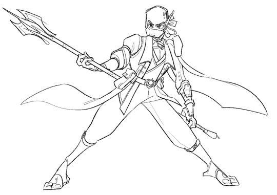
#the first pic in the default version is actually a 3d model
Text
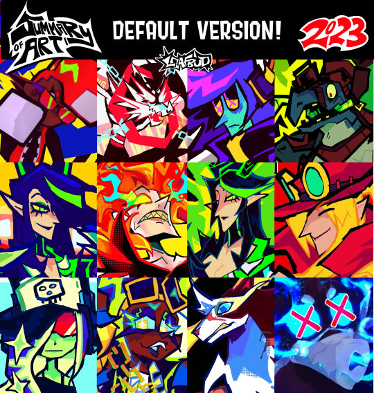
art-wise, this year was fun to be honest haha
#summary of art 2023#summary of art#my ocs#fanart#twisted wonderland#twst#splatoon#splatoon 3#splatoon 2#the first pic in the default version is actually a 3d model#i mostly worked on 3d models in jan 2023 lol#obey me!#warrior cats oc#salmon run splatoon
109 notes
·
View notes
Text
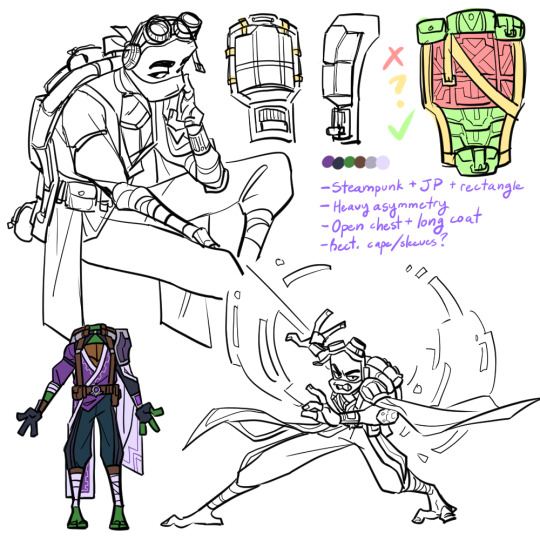


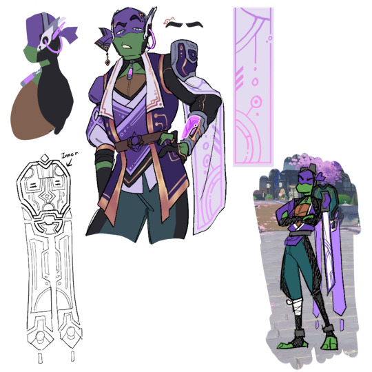

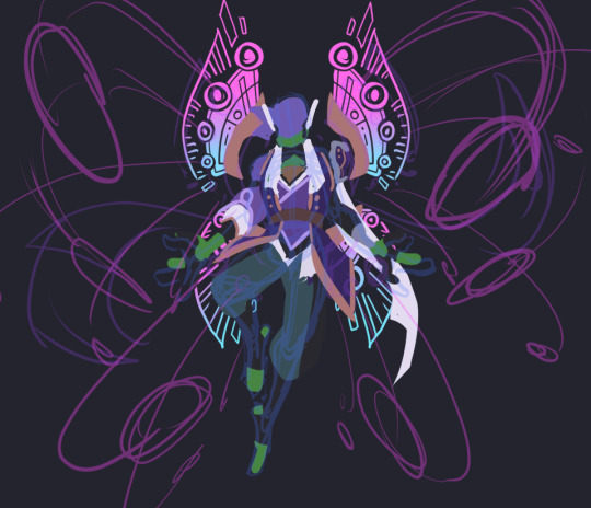
donnie had. SO. much concept art lol. i really enjoyed the whole design process though. his base design is very difficult to work with because of the battleshell, but it gave me a lot of chances to get creative and i'm happy with the results :)
(also as a disclaimer so i don't get asked about this: i don't have motivation to finish raph or the wish art for donnie, so i'm just posting what i've got)
i didn't annotate these as much since there'd be a lot to write, but i'll write out some of my thought processes and go into some detail about his final design below the cut if you're interested! (it's long. i'm talkative 😔)
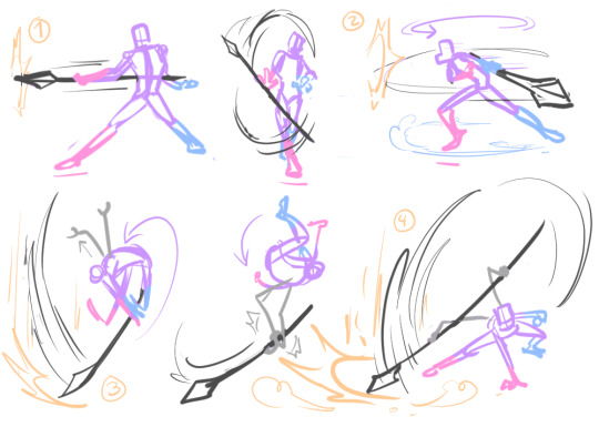
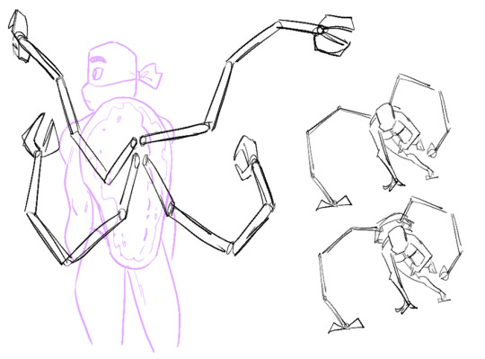
1st row - first iteration; much more literal 1:1 translation of his design into a fantasy setting. very steampunk-y. ended up completely scrapping it because, simply put, he looked more like an npc than a playable character. obviously, several features did still carry over throughout the design process :3 also wanted to imagine his attack pattern cuz i thought it'd be fun to incorporate his spider arms.
this was actually the first design of any of them i'd come up with! i've definitely learned a lot about genshin's character design style since then and i think it shows 😂
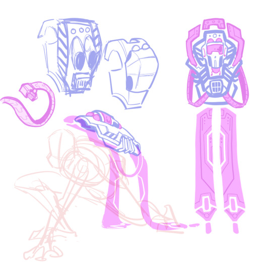
2nd row - playing around with the idea of a floating battleshell (rather than a backpack-like one in the the show & first version), inspired by nahida's cape. also hard light constructs/attachments. was leaning too into the sci-fi and rectangular motifs with the design, but i liked the idea.
3rd/4rth rows - concepts for his final outfit and shell designs (the colored/more-detailed pics are the more finalized ones). took a lot of inspiration from sumeru this time around. it's a lot sharper, shinier, and less rectangular than his og aesthetic, but i think it's more in-line with genshin's design philosophies.
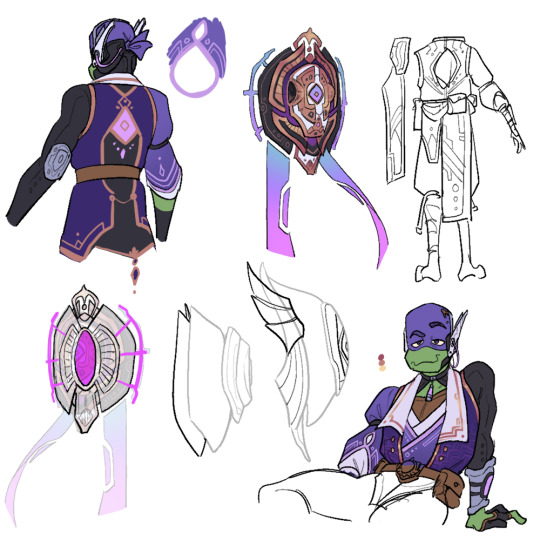
5th row - not entirely sure why i went through all the trouble of making a 3d model for this. i mostly just thought it'd be fun and good for reference. i was right, but i don't know what to do with it now lol. can't be bothered to be a perfectionist about it though, so don't look too closely at it 😭
6th row - incomplete thumbnails of his burst/wish art. not super sold on that "wing" design in particular, but i do like the idea of his shell splitting and deploying hard light weapons/rocket launchers/etc sort of like in canon.
battleshell/misc notes - i'm thinking his battleshell is controlled using the pink sensor on the back of his coat, possibly in combination with his headset. it floats behind him by default and is sturdy enough to protect his back, but he can also freely fly it around like a drone if he wants. the holes on the side are mainly for the spider arms and the banners(?) and handles(?) with the blue/pink gradient are made of hard light and only appear when the shell is in use.
i imagine like in the series, his tech here isn't necessarily very reliant on his vision/powers; much of it he likely made himself long before he received a vision and he just uses his vision to enhance it.
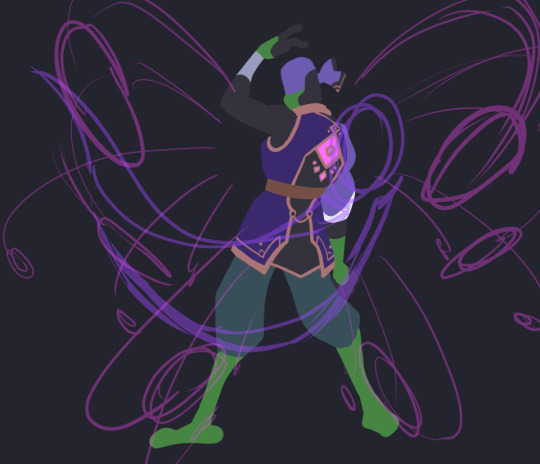
his burst is a barrage of missiles from his shell that lock onto an enemy and deal a large burst of electro damage in an AOE. not sure if i want his skill to be a deployable or some sort of electro-infusion/boost 🤔 maybe something that involves deploying his shell to boost his damage while leaving him vulnerable, like a glass canon? though i'm not sure he'd be that sort of risk-taker... 😅 dunno! his signature weapon would totally be his tech bo though.
that's about all i can think of. thanks for reading!
#rise of the teenage mutant ninja turtles#rottmnt donnie#rottmnt au#rise genshin au#rottmnt art#my art#mangastudio#3d#art#process
1K notes
·
View notes
Text
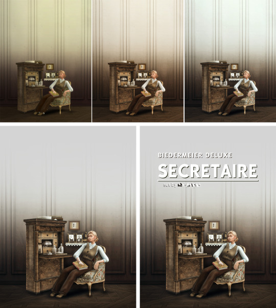
WORK-IN-PROGRESS : A Secretaire desk
Not really a guide, but can be interesting for those who would like to know how I create an object or a set. Originally I wrote this essay for a course at my uni but I translated and simplified it.
💡☝️ INSPO
The secretaire desk is an iconic piece of Biedermeier furniture. My fascination with the elegant yet straightforward style is beyond measure.

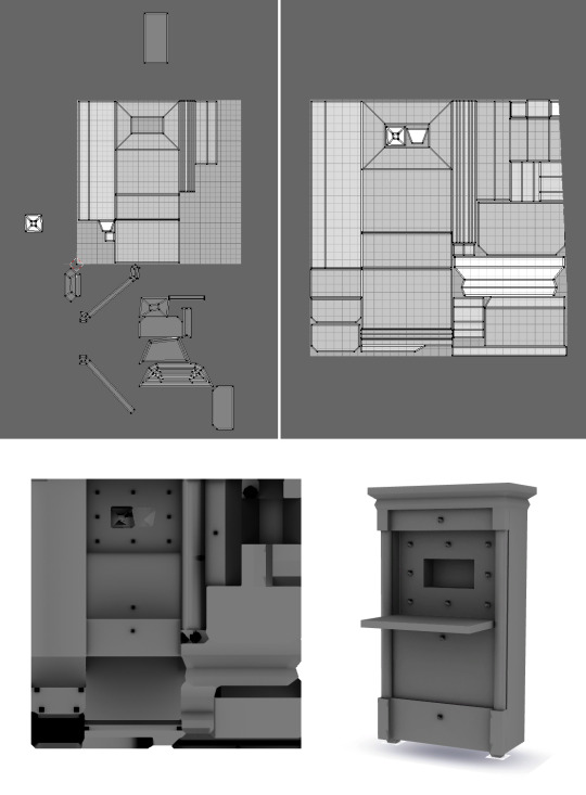
🧊🕸️ MODELLING
I used Blender for modelling. (I made it when I was still using the old 2.7 version.) The design process for the object consumed a significant amount of my time, spanning a total of three hours.

After I finish making the model, I need to do something called "unfolding." This means turning the 3D object into a 2D mesh. Once that's done, I "burn" the shadows onto it, which gives it the final look you see below.
🎨🖌️ TEXTURE
After that, I use the Sims 4 Studio program. This is where I make sure that the object looks right with its texture and I decide how it should act in the game.
To create the special intarsia effect, I use patterns that I've already prepared in Photoshop. I carefully rotate and arrange them until they fit just right. It takes a lot of time, but the final outcome is totally worth it.
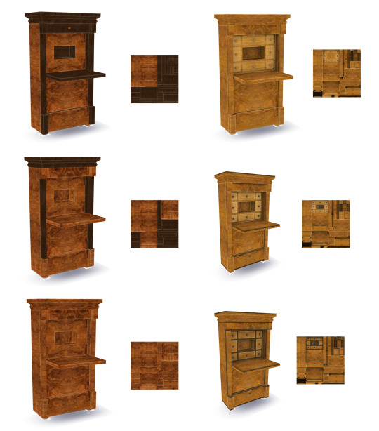
🌐✨ NORMAL & SPECULAR MAP
The Normal map is really important for objects with low levels of detail. It determines how light behaves on different surfaces. With the Normal map, even a surface that looks completely smooth can actually appear uneven when light shines on it. This creates the illusion of more intricate details without slowing down the game's performance.
In the game, they use a simpler version of the Normal map called the Bump map. To make it, I use a plugin in Photoshop and save it in a specific format called .DDS. I have to tweak the channels and choose the right settings to get it just right.
When I apply the Bump map to my Biedermeier writing cabinet with shelves, it creates small shadows at the edges of the shelves when light hits the center. This makes the shelves stand out from the flat surface and adds depth to the object.

The shine of an object is controlled by the specular map. It determines how reflective the surface appears, whether it's a shiny metal, a glossy glass, or a completely matte material. By adjusting the color values, we can create different types of shine.
In this project, I want to achieve a specific type of shine that looks like wax or honey. Fortunately, I already have a template ready for this. I just need to find it and apply it to the object in the program.
📊📐SIMS 4 STUDIO SETTINGS
After that, I need to make a bunch of tweaks to make sure the object works properly in the game. It involves doing both small and big adjustments. For example, I add tags to make it easy to find in the catalog, figure out how the surface should look, find the right spots where other objects can connect to it, decide where chairs and writing surfaces should go, and more. The first picture shows how things are set up by default, while the second one shows the changes I've made.
Throughout this whole process, I have to carefully figure out the exact positions for different parts using a coordinate system. It can be a bit tiresome and take up a lot of time.

📈 💼 WORK IN PROGRESS
First, I made a work-in-progress picture. This is how I announce the new collection.

💃🎞️ GIF
In the post, there's a gif that demonstrates various color combinations. Creating this gif involves a careful and detailed process. I have to take individual photos of all 16 color combinations for each of the two cabinets. Afterward, I need to carefully match and merge these photos together. Finally, I use an online Gif maker site to edit and finalize the gif.

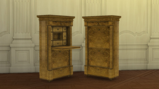
📷🖼️ PREVIEW PIC
I spent a good 2 hours setting up the scene, and it wasn't easy finding the right items and creating the perfect environment. Editing the image also took me another 2 hours, as I paid close attention to every little detail.
Out of the three images you see above, the first one is the default color scheme generated by the game itself. The second image, on the other hand, was created using a program called Reshade. It's an extra tool you have to install separately, and its main purpose is to change the lighting inside the game. It adds depth and creates a whole different atmosphere. As for the third image, that's what it looks like after I adjusted the colors in Photoshop. And finally, I added shadows and highlights to the image to give it a more three-dimensional and immersive feel.
I hope you enjoyed this post and see you soon. The release date of the set is tomorrow!
99 notes
·
View notes
Photo
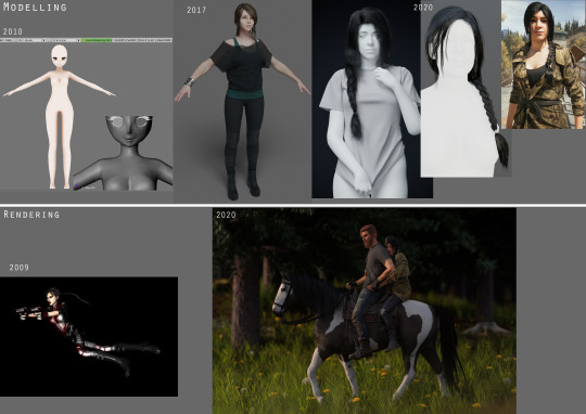
First vs Last
Tagged by the wonderful @ziorre ♥
Rules: you choose one of your first art (even if you don’t like them) and one of your lastest art. Don’t forget to specify the years when you drew them and you can even write what, when and why these pics were drawn! Oh, and make sure you tag your fav art.
I cheated and chose more than one, forgive me.
Modelling:
2010: a weird ugly anime base created in blender 2.49 aka the ugliest ui under the sun. Suits the model lmao xD I think it was supposed to be an anime version of an OC but I never actually finished it. Looks more like an alien creature now.
2017: She’s Tessa, an OC from an original story I write. My first full character model, i made everything you see here myself, including textures. She was sculpted, then retopo-ed to be game res. Would change a lot of things nowdays but eh.
2020: Rheese base model is extracted from the game but many of her clothes and all of her hair was modelled entirely by me. Her hair is usually particle based but I learned how to convert that properly into a mesh for her in-game model. Her default shirt is also my own model, but it uses an edited version of Jacob’s shirt texture for accuracy.
Rendering:
2009: My very first 3d render using a retexture of a Tomb Raider: Underworld model. This was done in Maya xD and I evidently had no fucking idea what I was doing.
2020: Not technically my last render but the one that shows best where my skill level is at now I think :) Self made 3d background, particle hair, waaaay better posing and a camera angle that makes sense.
Throwing some tags to @p0lkadotdotdot @fadedjacket @dep-yo-tee @dieguzguz @yokobai @v3ryvelvet @veinereastath @theknifegame
39 notes
·
View notes
Photo

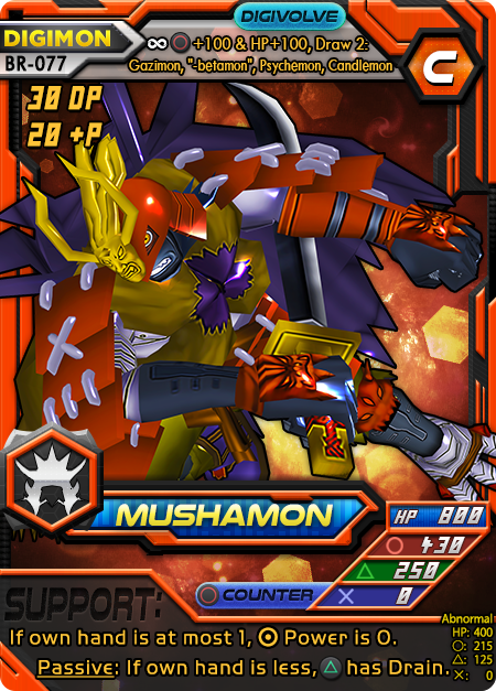
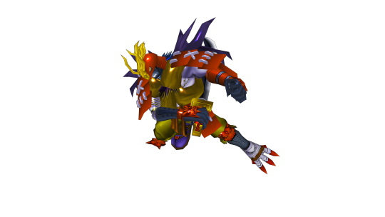
Mushamon’s art fix went through several “final” renders before I got one I liked properly. The old art is just someone’s screenshot of a low-fidelity version of its DMO (Digimon Masters Online) model. First in this pic list is the actual final I think I’m going with, but it was a journey to get there. Second is the same render as the final but blown up more and without the aura effect. Third is my unused render which I figured was good.
So this model has problems. Toei problems. Again. Long (and repetitive) story short: Digimon models are usually based on Toei art, not Bandai, and Toei is an animation company that makes washed-out color drawings of the original designs using short stubby limbs and huge extremities. Works for animation. Bad for model posing. REALLY bad. It makes posing them an absolute nightmare as things clip around and never quite make the distances I need to use weapons especially. This model was actually rigged incorrectly. See that chest dent in the third image? That’s from someone during the chain of ripping or rigging messing up the weight paints so that the central purple foxtail thingies would stay still while the model deforms, causing a chest cave-in. How did I fix that in the other two images? I moved the entire model and perspective at once, instead of the waist...it was really difficult and annoying. In fact, I could only make those renders because I knew how to pose the model already from having done the third.
At first, I used a reference of a sprite from the Wonderswan games since it was the best pose. Unfortunately, sprites are bad at conveying 3D space so I borked it up pretty bad. The chest is facing the wrong direction, the sword angle never worked, and everything is pretty much just wrong and off. Eventually, I found the Bandai card the sprite was based on and realized my error. Good thing too, since I would’ve gone with that ugly third render. It already took a long time to clean up the artifacted and washed-out texture, blow it up to HD, make color corrections for accuracy, and find a good material to replace the ugly clay matte look of the default model.
The final render used the card art as a pose reference and I got everything right (as much as possible) finally. Interestingly, the model uses a falchion sword instead of a thick katana or thick shamshir—whatever that thing Mushamon has is supposed to be. Not sure why they did, but I love me some falchions. Either way, the sword won’t be as curved as the original no matter what and I’m good with that.
I was just about to use that second image as my final card art when I remembered Zanbamon and the sicc looking aura. I took that effect that I had created and applied it to Mushamon due to his draining sword attack glowing. I found out it’s also violet but I didn’t want to reuse the color so I dipped the aura into blue. I also scaled it down because after not looking at it for a while, I realized such a huge image was actually hard to make out if you didn’t know what all the details were before seeing it. And players wouldn’t. So now it’s good, visible, and has cool post-processing effects and color grading! :D yay. I love the final version. Maybe if other people don’t, I can go back to the huge, blown up version lol.
2 notes
·
View notes
Text
3D Effects Are Amazing For Influencers. Not So Much For The Influenced.
tech
The wearable camera’s first-person footage is wonderfully — and surprisingly — personal. But Snapchat’s new 3D effects don’t add much.

Nicole Nguyen
BuzzFeed News Reporter
Posted on November 12, 2019, at 5:00 a.m. ET
Snapchat’s Spectacles are like GoPros for your face. The sunglasses’ two embedded cameras immediately capture photos and videos when one of the discreet buttons on the temple is pressed. Released today, Spectacles 3 is Snapchat’s latest model, and can now produce three-dimensional photos and videos with animated augmented reality effects.
For the past week, I’ve been testing the company’s new, quite pricey $380 face camera, which is currently available in limited quantities on Snapchat’s website. The new Specs seem to be the ultimate ~influencer~ wearable, designed specifically to create eye-popping imagery that will stand out in a social media feed.
For normals, the first-person footage captured by the Spectacles is wonderfully — and surprisingly — personal. But the new animated AR video filters don’t add much and, in fact, distract from intimate scenes.
The new Spectacles are unquestionably hip. They have steel, rounded frames like the kind that Natalie Portman wears in Léon: The Professional — and that typically only people with angular, Portmanesque faces can pull off.
The sunglasses snap elegantly into their case, which is also their charger. The Spectacles can capture up to 70 separate 10-second videos on a single charge. The case holds four full charges — enough for a “long weekend,” a Snap rep said.
Unless a passerby looks closely at the glasses, or the LED light is blinking, they wouldn’t notice that there are two cameras onboard, which is largely the point.
Previous versions of Spectacles had a camera built-in on the right side and an LED light on the left to indicate recording. The Spectacles 3 have two embedded cameras on each side, with an LED ring around the lens that lights up when you capture photos and videos. Snapchat’s software combines the footage from the two cameras to sense the scene’s depth and project 3D effects, which can be applied to videos using the Snapchat app.
While you need the Snapchat app to import media from the Spectacles, sharing isn’t limited to Snapchat. The default capture is a circular video, but it can be exported in a variety of orientations and sizes, including a portrait (for Instagram stories), square, or 16:9 ratio.
I added one of Snapchat’s new AR filters to a video of my husband, Will, performatively biking across the Golden Gate Bridge. The filter is supposed to add neon arcs over what it detects as a road or pathway. The software did a good job of applying swirling lasers in the right places — but I genuinely can’t imagine ever adding these effects in earnest. They’re reminiscent of the heavy-handed Hipstamatic filters people used in 2010, to make the then-low-res smartphone pictures look good.
And I love a good snap filter. They give you long eyelashes! They make your skin look amazing! They make presidential debates more fun! Kids love ’em! But these new Snapchat AR effects, which include confetti that drops from the sky, an overly-energetic bird that follows you around, and big blobs that float in space, don’t feel as interactive or clever as those face-focused options (though perhaps that’s because I’m a selfie-obsessed millennial). A Snapchat representative said new effects will be delivered regularly.
Snapchat had professionals — actual video directors and photographers — shoot with the new glasses (their videos below). The AR effects looked so artistic and clean in those pro videos that I couldn’t believe we were using the same devices. When I added the filters, the animations often appeared shaky and pixelated, like in this slightly overexposed scene of Will hanging laundry.
The 3D pictures, however, are a different story. They’re very cool. In the Snapchat app, you can wiggle your phone back and forth to get a sense of the depth. The exported version of the photo is a video that moves the image on loop, like a GIF.
Snapchat’s pro examples obviously look way better than mine. Again, this is a device that’s seemingly ideal for influencers, professional creatives, and the like. I could absolutely see a fashion blogger sharing 3D #outfitoftheday pics on Instagram.
Normals/non-creatives, like me, will find the new Spectacles’ 3D wizardry less compelling.
The Spectacles can only capture video in 10-second spurts, which is fitting for a typical social media browser’s short attention span, but unsatisfying for those reliving intimate memories. Another downside is that the Specs’ video quality is good, but not quite as good as my iPhone’s, especially when it comes to camera stabilization (or lack thereof). Unless you keep your head very, very still, Spectacles videos look shaky.
Yet another limitation is Spectacles’ nice weather–only form factor. I took the sunglasses out for a morning bike ride and, as is typically the case in San Francisco, a dense fog layer had rolled in overnight. While it was neat to capture parts of the ride I would never be able to with my phone, the Specs’ dark, tinted lens made it difficult to see. I ended up stashing the Spectacles in my back pocket for most of the ride.
Snapchat’s headquarters are in Santa Monica, a beachfront city about 15 miles from downtown Los Angeles. So it’s no surprise that the Spectacles are sunglasses, and not eyeglasses, and work best in bright, well-lit conditions. (As I write this, on a mid-November morning, it is 81 degrees and sunny in LA.)
I also hesitated to wear the Spectacles in public, aware that people might think that a discreet wearable camera could film them at any time and invade their privacy. In 2014, a woman was attacked for wearing Google Glass, which were lensless glasses with a camera. A few months later, another Google Glass wearer had theirs smashed to the ground by a stranger.
But for private moments with close family members and friends, the Spectacles were delightful.
I was surprised at how personal the footage is. It’s all shot from a first-person perspective and, because the recordings are nearly identical to how you experienced and remembered them, they feel incredibly intimate.
Because the capture is hands-free, you can record many things you wouldn’t be able to with your phone: hiking, playing with kids, drawing, cooking, or virtually anything that requires working with your hands. Sure, you can strap a GoPro to your chest or forehead, but that requires a lot more gear and effort. With the Spectacles, you just put on the sunglasses and tap a button. You can capture moments without having to look at a screen.
Best of all: You don’t need the latest Spectacles to do that. The Spectacles 2 (much cheaper at $150) can do the same, plus they’re water-resistant, which the Spectacles 3 aren’t.
Sahred From Source link Business
from WordPress http://bit.ly/32GexVV
via IFTTT
0 notes
Text
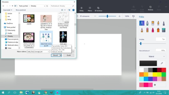
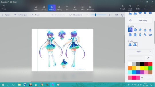
Modeling attempt in P3D - a walkthrough of sorts
Hi, it´s me again. Today I´m gonna try model something in Paint 3D and show you how exactly I did it, hoping that some of the possible future readers (including you of course :) ) will find it useful or at least interesting. Let´s get started!
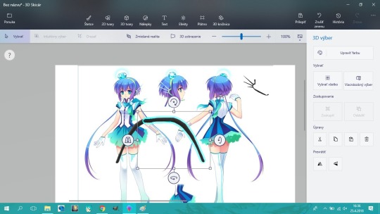
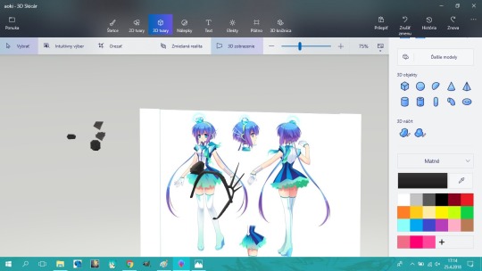
I decided to try model Aoki Lapis´ headset and even a bit of her hair if possible. First, I opened the program and inserted the official reference pic from the menu up left.
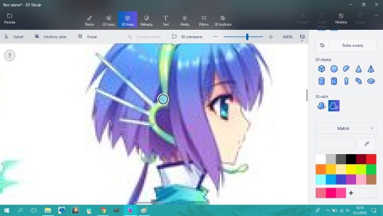
Next, I go into the “3D objects” menu and choose the “Soft edges” version of the 3D sketch tool.
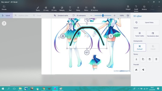
Now I zoomed in and traced the ornament on the side of her head. The rest of the headband must be done individually.
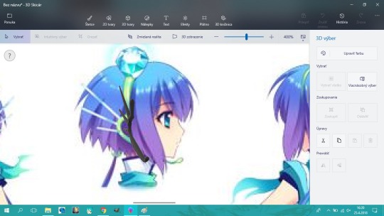
And it popped up!

Now I rotated it a bit and adjusted the thickness.
For the headband I made a half-curve, duplicated it, flipped and connected into something that looks decent.
Then made it into a group.
You can move objects around the z axis using the left side icon...
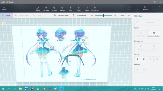
...or turn on the 3D view.
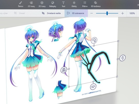
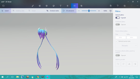
Now I just had to model the gem. Please, if you´ll ever want to model a gemstone like this, do it in some other program. (I´d use SketchUp, but this is about P3D, so...) I had this idea that´s so bad it actually worked. I traced the gem from the front, copied and rotated the pieces so that it will form an octagon. The lower part is made out of two (default) pyramids.

After some repositioning, the mesh is finally complete! Now we just have to paint it.
P3D does not have a transparency option, so I had to use white as a base.

Ta-da! The effect used is my current favourite. It´s called “Candy” and it´s the third one.
I made up her hair in a similar way and here´s the result:
(Looks bad tho, if I´ll ever want to make her hair seriously, screw Paint 3D!)
Thank you for reading ;)
0 notes
Last Seen Blogs

severesuitcasepalacemaker-blog
1нαуαℓιмσℓ∂υи

uniquenightmaremoon
Untitled

belgarhd
Belgarhd

athled
athled.net | athlé nouvelles générations

yougotthatonefic-blog
You Got That One Fic