v-mundi
Digimon Battle Evolution
A game that doesn't suck
72 posts
Don't wanna be here? Send us removal request.
Last Seen Blogs

din-djarins-riduur
rayanne

tyra-mondlani
Untitled
jumbiedesu
mika

musicpromotionclub
Music Promotion Club

vibedev-blog1
Vibe
Photo

Uh oh...I figured out how to make models in Blender. So of course the first thing I do is use it to create impossible items. By “impossible”, I mean these are from Digimon World (PS1). There are no models of these. These will be making an appearance in the next set, which is a set of item cards!
Firstly, these images are huge so click to zoom.
Polaris Sigil — 北極星の印 Whamon evolution item. Had to be pretty interpretive about what this even is. It’s clearly a gold-colored star with 4 points and a grey colored ring around it. Is the ring round? pointy? beveled? flat-topped? Who the F knows. Is the star metal or supposed to glow? Are these gold and silver or yellow light and a white cloth loop??? WHO KNOWS! So I decided to make them literal gold and silver shining brilliantly. Then I remembered real objects are very imperfect...so it’s pretty scratched up.
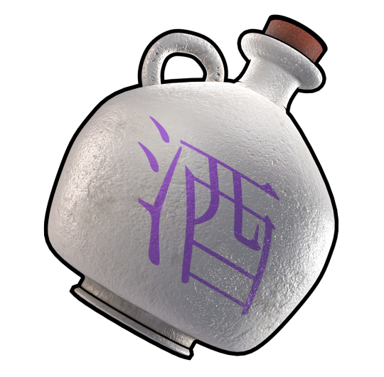
Offering Sake — お供え酒 Seadramon evolution item. Had to model a freakin Japanese liquor jug. 酒 “Sake” (liquor) char printed on there idea from this Bandai card. This is something that’s very hard to get a reference for outside of Digimon, meaning I had to interpret a lot about its material properties and shape that you can’t easily see in that tiny card image. Probably hard to find because it’s historical. For the cork stopper, I tried my hand at subsurface scattering and it got that nice reddish hue I wanted. Another great thing this did: I now I know how to make candle wax! Same technique.
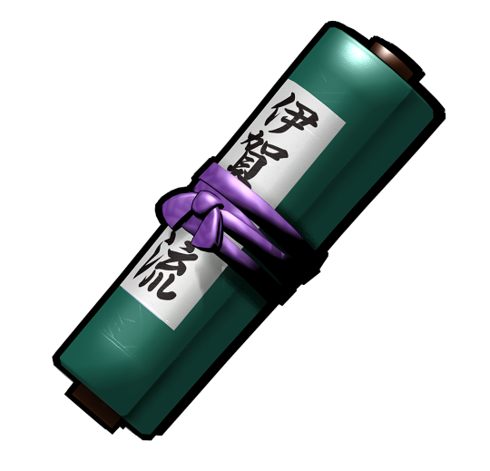
Iga-Style Secret Scroll — イガ流の秘伝書 Igamon (Ninjamon) evolution item. Bonus non-Blender, made in Miku Miku Dance PMX editor. Funny enough because they put “Iga” in katakana, I knew it was Igamon’s scroll specifically. So for this one, I stuck the actual “IGA-RYU” characters on it...I guess so players who know how to read Japanese in my English card game can feel good? Here’s the comparison with the old render Bandai did (different name).
#Digimon#Digimon card game#digimon card#digimon tcg#Seadramon#Igamon#Ninjamon#Whamon#シードラモン#イガモン#ホエーモン#digimon battle evolution
10 notes
·
View notes
Photo
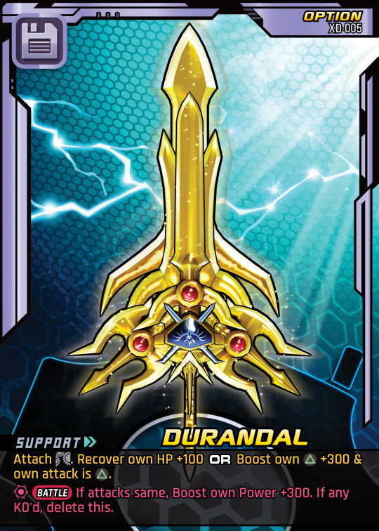

hurrr durrr
This abomination on the right is what happened when we naively tried to fold the Durandamon model into its sword form. It’s absolutely gross right? We had to completely remake the entire goddamn model to get it to look like the left, which was based on the official art of Ragnalordmon.
just a small thing but indicator of regular crap we deal with lol!
3 notes
·
View notes
Photo


NEW SET AND NEW TEMPLATE WOOOOO!
First, check the New set (Aux D) post if you havent.
Then, check the artfix page so you can see each type in the new card frame.
This template is crazy, people. Let me lay this down.
It’s huge. 2.5″ x 3.5″ but at 600 DPI for the art, 1200DPI for the UI elements. These images above? click them to see how huge they are. No more tiny garbage.
This is MADE for print! Not just big but my source files have bleed available up to 2.71″x3.71″ and all colors are tested thoroughly in CMYK before export. All the text is further inside an invisible margin called the safe area, meaning the text won’t be cut off by a horrifically bad cut at an offset printer.
IT IS FULLY AUTOMATED LUXURY CARD CREATION. I have a spreadsheet that is more or less drop-down menus and auto-population to assemble all the card pieces. Then I data merge that to InDesign.
The art is now great stuff. Our artfixes we’ve been posting to the tumblr? Yeah now that can actually be seen fully as the template is full art with no UI elements totally hiding the art.
Completely scalable based on the content. What this means is the longer a support effect, the more lines and EVERY element that would get in the way pushes itself upward to compensate. The evo-box at the top scales itself down with each line. No more cramming paragraphs of text into 2-3 lines!
Abnormal power is now displayed under the relevant stat! No more checking some awkward text-block in the corner that gets cut off if you print and squishes the effect text.
Supports and attack abilities now have Speed like in the original Playstation game. These were ommitted on launch partly because I didn’t know, and because when I learned about it, I already had a pretty good system of alternating support resolutions and keeping attack abilities in the Battle Phase. Now things are different and the game is a bit more dynamic. The increase of timing collisions gives players more choices of what to resolve first!
The card name font (except Masteries) is the actual font from the old Bandai 1990s english cards. Not the first release with the light-blue backs, the one with the dark blue cyber backs. The first release is just Serpentine. The Nulshock I was using on my old template was me trying to approximate this font which I finally found.
Icons now exist for every card category instead of only Digimon! Evolution, Data, Option, even Mastery cards have an upper-left icon so you can easily tell what this blasted thing is.
Important card elements moved to the left side. Now the game is much more compatible with these things we humans have called hands. You can print the cards, fan them left-to-right as most people do, and see your Level/Category, DP requirement, +P value, type color, stats, and whether you have a Support in your hand. Instead of like...half of those where the old template was right-aligned. Subtypes are also more intuitive since I just put the icon right next to the primary icon instead of a separate bar.
Evo-bonus, Firewall, ACE, Proxy all made to look like computer board modules that slot into pin holes with visible pinouts! This was just an extra touch we wanted to add so they would feel more like opening up your old v-pet and installing a crazy custom module.
TLDR; version:
Huge cards
Print colors and bleed
Automated card creation
Full art template layout
Template auto-moves/scales to content
Abnormals near their stats
Speed added to effects
Nostalgic name font
Icons for every card category
Left-aligned for in-hand fanning
Small thematic touches to elements
#Digimon card game#digimon game#digimon card#digimon#digital monsters#digica#digimon tcg#Card Design#Card game#card game design#digimon battle evolution
4 notes
·
View notes
Photo

Finally, the last of the artfix backlog.
Hagurumon - This one got the works: model edits (for the gear), rig edit (for the hands), texture HD & recolor, lighting, custom spheres, custom shaders, and heavy post-processing to add the reflective metal on top of the existing reflective metal, and variable weight black outlines. These are all techniques we use off and on with other art, but all together here. It is shiny and chrome now! Above all, this was meant to be a speedrun challenge for me. I made this art in the time it took my wife to make coffee in the morning. But my favorite part is how it turned out. This was the last created before we abandon this card template for something better.
#digimon#digimon card#digimon card game#digimon tcg#card game art#hagurumon#ハグルモン#digimon battle evolution
5 notes
·
View notes
Photo


Angels! Royal Domain needed some art fixes to feathery, heavenly powers. Since RD contained Holyangemon and Angewomon, we took the opportunity to make the existing ones look a lot better.
Holyangemon - I heavily edited this Battle Mode model to have reflections, partial visor/shield transparency, galactic sparkle sword excalibur, metallic boots, and shiny wings! It was a lot of work but it paid off in the end. After the RD version was posed, we made a more neutral one for the old version’s art fix.
Angewomon - For this, we wanted elegance but not so ·派手, not so garish, reflective, shiny, and flashy as Holyangemon. Angewomon has a matte finish with superdense stylized outlines. We found the hard shader not to be as useful here, since she’s a very complex shape overall. It was hiding tiny pieces of wing or fingers everywhere. Unlike the much more aggressive and battle-hardened RD version, this Base Set Angewomon is floating gracefully.
Valdurmon - The biggest birdie was pretty ugly before, since it was really just a pre-rendered JPG I had to cut out from the DMO wiki. Ugh. Now that I have a real model from a more updated game (Cyber Sleuth), we have a real Valdurmon art! We added an octagonal rainbow ring to symbolize the 8-way paths and the full-circle rainbow of Valdur. Funfact, we got the word for Ruler-type from the word Valdur here. We made a shiny material that’s part rainbow, part aqua colors for the wings. This was also used in RD on an evolution card.
#digimon#digimon card#Digimon card game#digimon tcg#card game art#holyangemon#magnaangemon#angewomon#valdurmon#ヴァロドゥルモン#ホーリーエンジェモン#エンジェウーモン#digimon battle evolution
4 notes
·
View notes
Photo
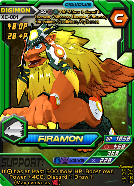
Firamon - This one has a weird story. Set XC came out with some DOT art, Firamon is one of them. But afterward, Digimon New Century released a Firamon model! We grabbed it and had to make a lot of edits in Blender. NC models have some very difficult shaders to work with and we still don’t have it all the way correct. But in the end, we upgraded the card art...for a brand new set lol
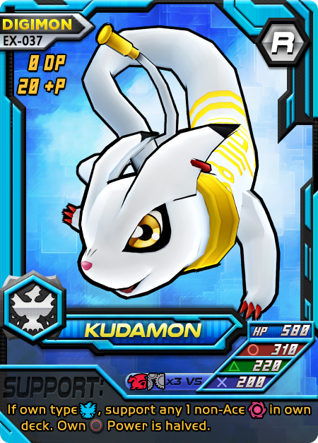
Kudamon - The original Kudamon was a T-posing monstrosity on top of only being the 2006 anime version. I’m not a fan of those anime changes, which probably makes sense given how often I rail against the Toei designed models. We had to rig and convert this one for MMD (available for download on deviantArt) plus make some edits to make it actually correct as a 2006 version! It turns out they didn’t actually go all the way. The normal map really helped it stand out. Later, I took this base and made heavy edits to the mesh, rig, and texture to create the original Bandai Kudamon (compare art) card in Set RD, which I much prefer. One thing this model is missing are the hind legs. Yeah, apparently they made the 2006 version without one of its significant features. It’s astounding what gets past people.
#digimon#digimon card#Digimon card game#digimon tcg#card game art#kudamon#firamon#クダモン#ファイラモン#digimon battle evolution
1 note
·
View note
Photo

Fixing Base Release (BR) set!
Kabuterimon - Long awaited, we finally have a beetle fix. Its shiny, has a slight prismatic effect on the wings and helm, posed with strength, and has hard shadows.
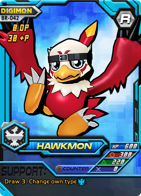
Hawkmon - We tried to make the Toei-model Hawkmon look more like Bandai. By changing the color from brown-orange to a more crimson-magenta, I got partially there. It also needed some model tweaks and a normal map. Unfortunately, the feet are...feet, and will never act like the talons they should be.
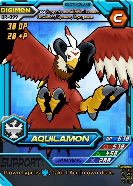
Aquilamon - Standard fix. We’re trying to get as many out as possible. Fun trivia: these 4 fixes were all done because of the upcoming release for set RD. It included lots of use of some of these Digimon plus related ones, so we took that chance to make whole decks look better.
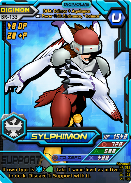
Sylphimon - This was a basic edit (for our current standards), not much to say! 😋
#digimon#digimon card#Digimon card game#digimon tcg#card game art#kabuterimon#hawkmon#aquilamon#silphymon#シルフィーモン#カブテリモン#ホークモン#アクィラモン#digimon battle evolution
0 notes
Photo


This is a very special art fix. For this one, we edited the models themselves. It’s pretty crazy but this built our skill at mesh editing, texture editing, rigging, weight painting, and creating transforms to use later.
Giromon - Well if you can’t tell how this is different from the Toei model, I don’t know what to say 😅. This is meant to look like the Bandai design: very long horns, thin arms, small ball head. I added the hard shadow Bandai-like shader we made and some extra lighting/shaders for a metallic reflection. This had to be rigged because no one rigged this model (distributed on our deviantArt)! Turns out rigs do nothing good without weight painting 😅. That’s a whole new skill we had to learn and implement correctly and this is the first try! It’s the dawn of a new age on Digimon Battle Evolution art. Now we are not even limited by models others have rigged, HD-ified or ripped!
Tekkamon - A lot of the same after-effects as with Giromon. We obviously just edited that (now-rigged) model for new purposes. The only Tekkamon edit that exists is...kinda gross (no offense!) so this was a must. I studied Tekkamon to get the sworsmanship gloves just right, the eyes, the color grading. Then I had to create the sword. That sword (Zandenken 斬電剣 ) had to be created unfortunately. But that means I got more practice. The sword texture was also created but I merged elements from Zanbamon’s side sword. The good news is in the end, I think we got an amazing look. Tekkamon is also distributed on the deviantArt.
This is our pledge to you: any time we must create a new rig or heavily edit a model to get a good result for card art, there’s no reason for us to keep it to ourselves. We will make it available to the public whenever possible! Or more probably...whenever we remember and stop being lazy :3
#digimon#digimon card#Digimon card game#digimon tcg#card game art#giromon#tekkamon#テッカモン#ギロモン#card game design#digimon battle evolution
1 note
·
View note
Photo
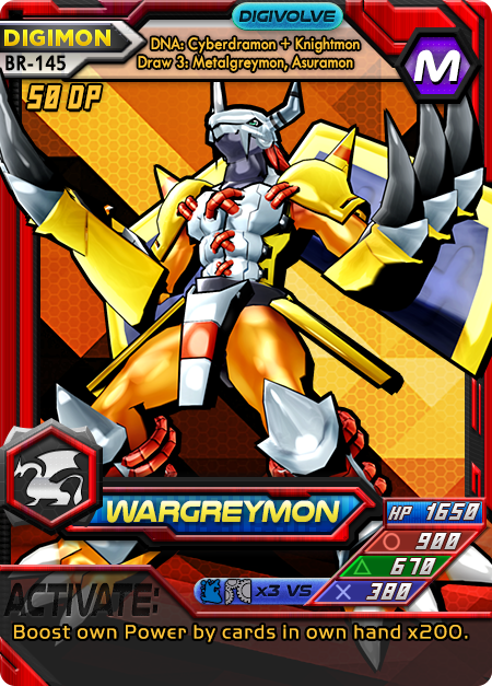
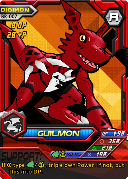
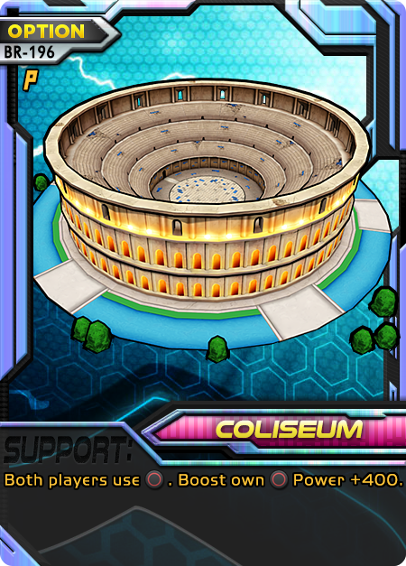
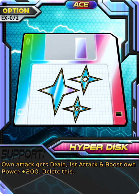
Continuation of fixing starter deck art! Again, players should have a good first impression to lead them into the rest of the good impressions :3
Wargreymon - So boring before! But now he’s dynamic, about to charge up that Gaia Force. I did a lot of shading fixes to this one after my wife posed it. I tried to get as much depth from darks to lights as possible everywhere, without putting in the same insane work I did for the Dracomon.
Guilmon - Before, it was absolutely comical. Low-res t-pose lol. But the shiny new Guilmon is cool and cute. This was a tough pose because we wanted a more feral Guilmon but the model is rigged to be...weird? It’s hard to describe the way Toei-style models are rigged. They work closer to stubby humans than the demons and animals being depicted.
Coliseum - I’ve waited a long time to fix this one. After finally understanding some things about 3D modeling, I was able to isolate a real example of a Digimon coliseum and use that. I made some texture and color edits so it would stand out even more.
Hyper Disk - Gone are the days of using 2D CG, this is an actual 3D diskette model. The rainbow is now CMYK compatible so prints won’t look as ugly.
#digimon#digimon card#Digimon card game#digimon game#digimon tcg#card game art#card game design#wargreymon#guilmon#ウォーグレイモン#ギルモン#digimon battle evolution
2 notes
·
View notes
Photo
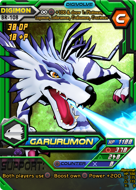
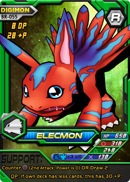
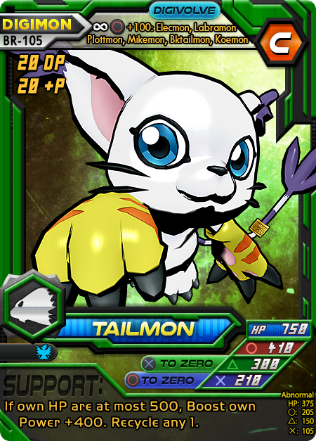
This is part of the effort to fix the starter deck art, particularly Nature’s Howl in this case. We want a good first impression with the game, since that part was lacking. Of course we made all the textures for everything HD as usual.
Garurumon - Back to doing those action-oriented poses with an attack! Since Garurumon is part of the Digital Monster ver. 2, we used the custom “Bandai”-like shader. Okay, okay, we use that for most things...In any case the Fox Fire effect was pretty tough. Blue is one of the worst colors for print, so the color balance was difficult but I finally managed to get it to be good in print and on screen.
Elecmon - This thing had to be reconstructed a bit since the model design was meant to be bipedal (like in the Toei anime) and not quadrupedal (like the real design). Once again, blue is evil so this took a long time to color balance. The pose is bizarrely tough to produce even though nothing is really happening. That’s because making it move like an animal instead of a human by default just makes the mesh clip through itself everywhere. This is about when we started to think we should learn how to actually model, rig, and weight paint...
Tailmon - This kitty needed a lot of love. But eventually we got a nice, dynamic cat scratch pose. I also figured out how to incorporate normal maps. They’re pretty great but only good for occasional use, otherwise you lose the animated look. This one is much more dynamic so it is the first of many exceptions to come.
#digimon#digimon card#Digimon card game#digimon tcg#card game art#card game design#game design#tailmon#gatomon#garurumon#elecmon#digimon battle evolution
22 notes
·
View notes
Photo
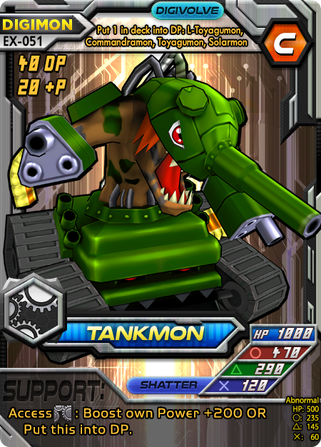
Artfixes from when Cyber Junk was released
Tankmon - This was another that sorely needed updated. While not the most egregious, we are trying to keep art fixes relevant to the set being released since they often have card errata as well. Tankmon’s base texture has completely the wrong color from its official art, which is odd. I fixed that and he got a much more threatening pose. What’s annoying is how this Toei-based model actually abandons Tankmon’s true design. Go look it up, the Bandai version has very different elements.
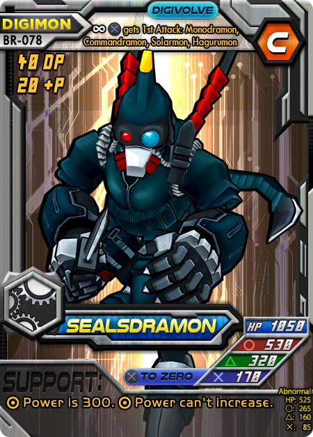
Sealsdramon - Remember the Commandramon and Tankdramon fixes? Yeah I have no idea why we didn’t put the Sealsdramon in there. This one is a real US Navy SEALS knife pose, as close...as this model rig would allow. We even had to edit the model to make the knife work correctly.
#digimon#digimon card#Digimon card game#digimon tcg#card game art#card game design#game design#tankmon#sealsdramon#digimon battle evolution
2 notes
·
View notes
Photo

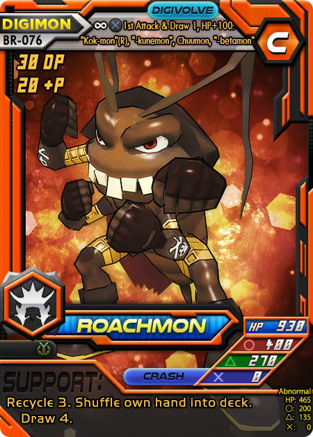
Zudomon - Finally that old thing is gone. The new Zudomon has a real pose, better shading, and a thicc outline.
Roachmon - Now all the arms and the legs are doing something. He’s a fighter!
#digimon#digimon card#digimon card game#digimon tcg#card game art#card game design#game design#roachmon#zudomon#vamdemon#myotismon#digimon battle evolution
5 notes
·
View notes
Photo


Now that I can post on Tumblr again, time to catch up to all the year old art fixes since! These are the unposted fixes from before we created the hard shadow shader to make art more like the Bandai art.
Greymon - I really like this fix. The shading on the Greymon had to be done manually but it’s worth it.
Agumon - One thing the game’s art has sorely needed for a while are attacks baked into them. It’s not really feasible to do for every Digimon, but this Agumon’s baby flame was a necessary addition. The model isn’t very posable, so the final result is a typical pose for its attack.
Slayerdramon - This was a tough one. Turns out swords are not great at fitting within a rectangular card frame, especially one with so many UI elements. But luckily, Fragarach is a flexible flame sword! So it turns out it’s actually supposed to do this. The lighting took a lot more effort than normal.
#digimon#digimon card#digimon card game#digimon tcg#card game art#card game design#game design#board game design#slayerdramon#digimon battle evolution#greymon#agumon
3 notes
·
View notes
Text
Tumblr sux
Lost the ability use tumblr last year (”outdated browser” they said). Did absolutely nothing and now works again! lmao
0 notes
Photo
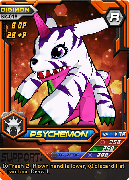
Psychemon was a quick art fix we did the day before the errata release which is always a big oof. I always planned to have the art fixed when the effect was changed (or rather, moved to another card). In this case, we took the DMO model since the new Psychemon from TOY used the very anime-gabu model from Cyber Sleuth. This DMO version is worse looking but a lot less identical to the exact likeness of Yamato’s Gabumon. Obviously, we made a custom texture so it could be Psychemon. Danielle made the original edit and I tweaked it for color range. For the pose, Danielle did a cool forward stance and I changed it up to show less of the underside, since I didn’t think the lizard arms looked very "psychemon”. I can’t explain why, but the grabby magenta hands just look too gabu. Afterward, it was rendered and tweaked a bit more in phtooshop before being merged into the card!
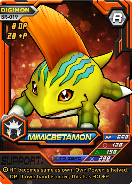
Mimicbetamon (Modokibetamon in JP) was a fix a LONG time in need. Moreso even than Betamon. We used the Cyber Sleuth model this time and Danielle tweaked a texture edit of Betamon from an existing one labeled “Modokibetamon” from GuilTronPrime. I found this to be TOO Betamonlike. I know, that’s the point. But in the game, I need players to not be confused. So let’s say players have a special “Tamervision” that makes mimicbetamon a bit more spring-colored! I also lightened up the stripes to a cyan and added more color range to the dorsal fin. Then I posed it. Cut content: originally, I had this doing a water tower attack since it’s the only Betamon species that can manipulate water. Unfortunately, the SimpleMagic version of water is too out of place for this cel-shaded style of the main character model. I manipulated that tower for hours, even going so far as to re-paint much of it myself in vibrant colors and looking more toon-ish. Ultimately it was cut for not matching the clean quality of the rest of the model and not adding anything vital to the piece.
#digimon#digimon card#Digimon card game#digimon tcg#card game art#card game design#game design#board game design#modokibetamon#betamon#psychemon#digimon battle evolution
13 notes
·
View notes
Photo
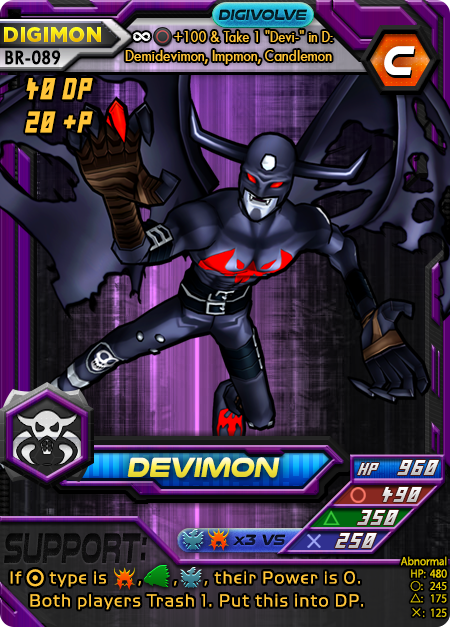
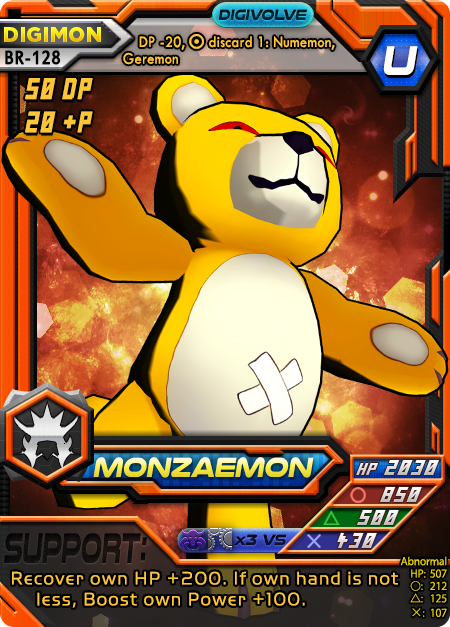
Continuing the last of the Digital Monster (DMOG v1 V-Pet) Digimon getting a re-art. Here, Danielle has completed these two. In both cases, she HDified/recolored the textures and used the new custom toon shader I made to get that old Bandai hard shadow look.
Devimon - This pose is awesome and fairly unique. I haven’t seen anything like this one and really enjoy how it turned out. One thing that’s not obvious with these art pieces is how tough it is to fit them into the card frames. Yes, they’re technically full art frames, but they’re also like the old square shape due to the lower HUD obscuring much of this. So this Devimon fits nicely without a lot of obfuscation and it really pops. I fixed up the colors in photoshop so the card is more printable. Anyone remember when this was called “Darkmon” in the US? lmao
Monzaemon - Love how her pose turned out here. This is a particularly difficult model to work with and generates a lot of glitchy vertex clipping. This result definitely looks a lot like the cute yet menacing Monzaemon we all know. Incidentally, I changed the card stats back to the PS1 card game originally and this card is just so ridiculous. I had to put in at least some mitigating factors. Anyone remember when this one was called “Teddymon” in the US? Or even better, weird fake cheats on how to get a “flaming Teddymon”?
#Digimon#Digimon card game#digimon tcg#card game#card game development#card game design#card game art#board game design#monzaemon#devimon#digimon battle evolution
0 notes
Photo

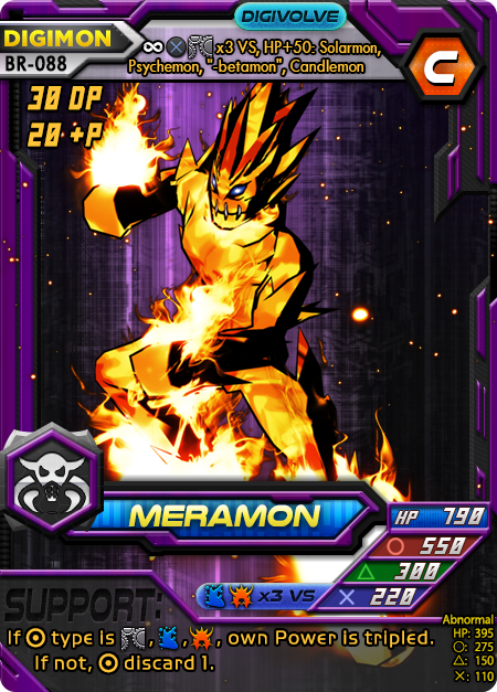
More DMOG v1 art updates! These two took some serious effort and time. While Tyrannomon, Numemon, and Betamon were mostly typical texture fixes (HDify + coloring) with some simple poses and a custom toon shader to get the stark black shadows of the 1990s Bandai appearance; these two hellions took quite some more effort but the payoff was equally good I think.
Airdramon - Beyond a typical texture fix, I had to use Blender for this one. The problem is not all Digimon are converted for MMD. But like the upcoming set CJ will show, I have learned recently how to better increase the quality of the renders and their appearance by providing environment details and working with the shader nodes. It’s really interesting to see the game develop alongside my own skill at making it. I spent a lot of time posing this just right and tried to mimic the original style for Airdramon’s pitched look with the Digital Monster. The basic form is possible to mimic but of course the full style is out of reach due to significant changes in the final production officially. I went for that “squished” and fat look, it’s adorable. I spent even more significant time in post production airbrushing many of the parts and manually fixing the shading. Overall, I think it looks the best of the DMOG re-art set!
Meramon - This is a bastard! Meramon’s CSHM model is really gross in general. He just looks like he has orange fur. This one is a bit better though it’s still like he’s made of frozen fire spikes. Honestly I get why a Meramon model is tough to build. Fire rises in the atmosphere and each spike on a meramon would therefore have to curve with a vector toward the top of the screen, which is prohibitive. I used copious time on the textures, attempting to create my own custom ones. I succeeded in the end but it was arduous with no immediate access to the UV. I replaced the face texture with the Meramon 1990s Bandai official art as well, which I think shows nicely. I assumed this would require a lot of post-production touchups but I was wrong, it only needed color graded to not lose significant detail when converted for print. The fire effects added are all done in 3D space unlike the prior one which was done as 2D in post. I think this turned out OK, but maybe some of you hate it or love it. It was nearly impossible to use my new custom toon shader to get the proper blackbody shadow look from the Bandai art, but I tried anyway. At one point I used MMDTools to import this to Blender and created a custom Normal map in photoshop just to see if it would help a bit. Turns out, you should not use a normal map for fire! lmao
#Digimon card game#digimon tcg#Card game#card game design#card game art#game design#card game development#meramon#airdramon#digimon battle evolution
2 notes
·
View notes