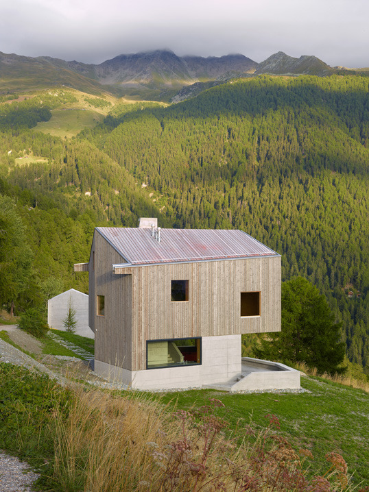
#swiss design
Text
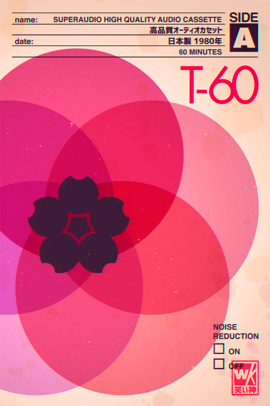
Superaudio Sakura T60
#lofi#cassette tape#nostalgia#retro#sakura#design#swiss design#bauhaus#graphic art#graphic design#minimalist#minimal#cherry blossom#pink#cassette#flower#art#superaudio#pop art#aesthetic
661 notes
·
View notes
Text
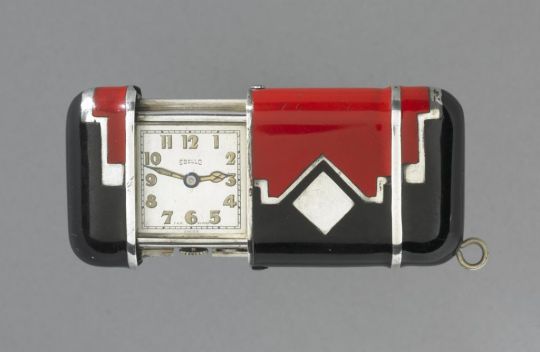
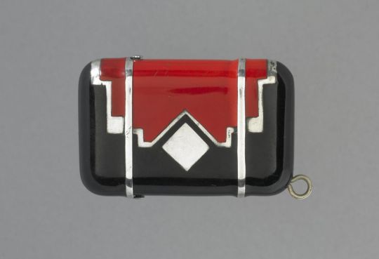

Hermetic Case Pocket Watch. Dated around 1925–1935, made by Ebel SA in La Chaux-de-Fonds, Switzerland. Medium is silver with red and black enamelling; dimensions (when closed): h. 31.2 x w. 48.5 x 12.9 mm. From the British Museum collection, museum number: 1970,1208.1
(Source: britishmuseum.org)
#clock#pocket watch#timepieces#metalwork#1920s#1930s#art deco#swiss design#silver#enamel#red#black#grey
318 notes
·
View notes
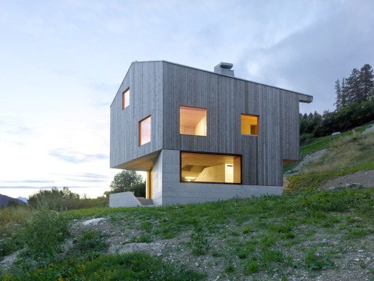
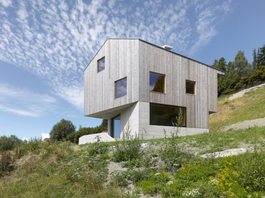
Text

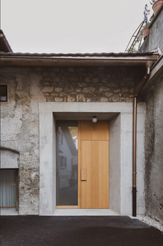
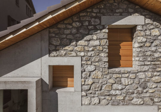


Stable Conversion, Chernex, Switzerland - Link Architectes
#Link Architectes#architecture#design#building#modern architecture#interiors#minimal#house#concrete#old and new#renovation#reuse#stone#old building#cool design#garden#beautiful homes#plywood#swiss design#switzerland
221 notes
·
View notes
Photo


Susi & Ueli Berger, Soft Chair, 1967. Synthetic: cover imitation leather matt (Cuiril Vistram); filling polyether foam. Switzerland. 3. Studies for seating landscape, 1967.4. Variations on the Soft Chair and the sculpture "Symptom II” Via e-Museum
244 notes
·
View notes
Text

Easy Chair (1933) designed by Marcel Breuer for Embru/Switzerland
55 notes
·
View notes
Text

Here’s a project where we had to design a poster using just one font! I was assigned Helvetica, which was used on the subway signage in NYC, so I based the poster around that
#helvetica#graphic design#swiss type#swiss design#poster design#typography#max meidinger#posters#museum exhibit#type
21 notes
·
View notes
Text

(unused) poster for my schools upcoming faculty music recital
#art#my art#digital art#graphic design#design#swiss design#modern design#swiss iso#womens history#girl month#poster#flyer#typography
5 notes
·
View notes
Text

This is a poster for a Lo-fi music concert night that will remix popular 90s songs. I chose Swiss Design as the main approach because I'm a big fan of this minimal style that promotes using grids, structures, simple shapes, and basic colours.
The challenge here is going with Swiss design means having a conflict with the 90s design trend, which tends to utilise bright, highly saturated pop colours and plenty.
To overcome this, I used red, yellow, and blue as accent colours, then I reduced the saturation of accent colours and added a
noise texture to the background ( to stimulate the old newspaper effect).
What I love most about this poster is those midi notes that visualise
an iconic 90s song - “Smell LikeTeen Spirit” by Nirvana. This is the intro melody that is visualised by the 16px grid. Each 16x16 square represents a music note from the Midi sheet.
2 notes
·
View notes
Text

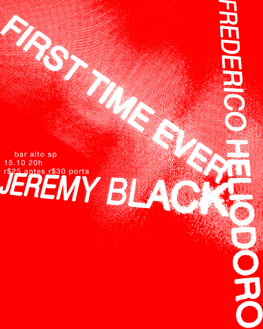
frederico heliodoro and jeremy black, first and second time ever
2023
2 notes
·
View notes
Text
Merry Christmas 🎅🏻🎄
#graphic design#typography#graphic#design#logotype#swiss design#motion graphics#y2k#merry christmas#nostalgia#nostalgic#merry xmas#グラフィックデザイン#平面设计#作字
1 note
·
View note
Photo

David Bowie — “Heroes” (1977) Poster
A poster for one of my all-time favourite albums by my favourite artist. Inspired by Swiss layout/typography.
File on Figma: https://www.figma.com/community/file/1166335842688589304
#poster#david bowie#figma#design#typography#minimal#layout design#swissposter#swiss design#monochrome#visualdesign#photo edit#graphic design
12 notes
·
View notes
Photo

Jewelled Art Deco Pocket Watch. Manufactured by Longines, Swiss origin, dated ca. 1922-25. The façade is made up of diamonds, emeralds and platinum with onyx numbering. Loaned to the Cooper Hewitt, Smithsonian Design Museum for their ‘The Jazz Age: American Style in the 1920s’ exhibition.
(Source: collection.cooperhewitt.org)
#watch#pocket watch#timepiece#horology#jewelry#1920s#longines#swiss design#art deco#decorative arts#diamond#emerald#platinum#onyx#glitzy#grey#green
241 notes
·
View notes
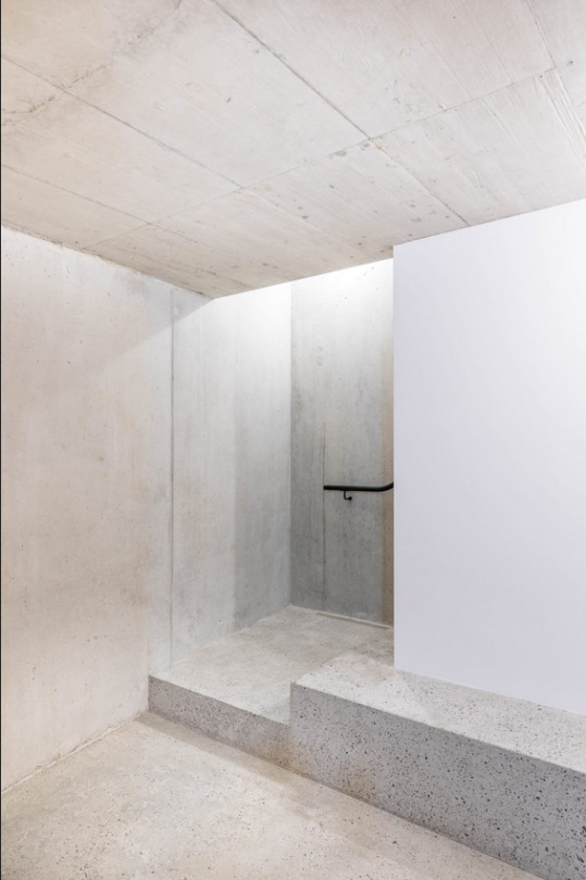
Text


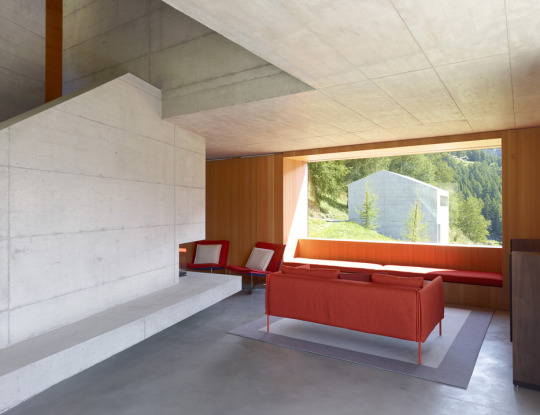
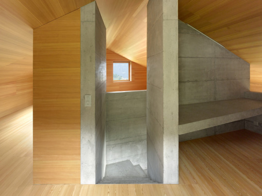
Chalet, Val d'Hérens, Switzerland - Savioz Fabrizzi
#Savioz Fabrizzi#architecture#design#building#modern architecture#interiors#minimal#house#concrete#house design#modern#concrete house#timber#wood architecture#landscape#nature#roof#stairs#living room#swiss design#switzerland
167 notes
·
View notes

Photo

The influence of Willy Guhl (1915-2004) on Swiss „Gestaltung“ goes well beyond his actual designs as it also extends to his long-term work as teacher at Kunstgewerbeschule Zürich: from 1941 to 1980 Guhl qualified several generations of young designers through his example as a skilled craftsman and humble person and the practice-orientedness of his teaching. Up until 26 March 2023 the Museum für Gestaltung Zurich shows the comprehensive retrospective „Willy Guhl - Denken mit den Händen“ that equally takes into account his teaching and his design work. Consequently also the accompanying catalogue published by Lars Muller Publishers includes works by former Guhl students but also examines his actual teaching and highlights his hands-on mentality: Guhl not only used his own designs to illustrate his attitude but also encouraged the students to „think with their hands“, i.e. to soon translate their drawings to actual models in order to review their ideas. At the same time he didn’t limit his class for interior architecture and furniture to these two categories but extended it to industrial and product design, a direct link to his own multidisciplinary practice: by means of the work catalogue included and individual chapters covering e.g. type furniture, his work for and with Eternit, product design and furniture for the industry the reader is presented with comprehensive insights into Guhl’s versatility.
But the starting point for all of his endeavors always was the human being and its needs combined with durability, material honesty and utility: already during WWII Guhl designed low-cost and ready-to-assemble furniture and in 1948 took part in the New York MoMA’s „International Low-Cost Furniture Design“ competition. Together with his brother Emil he designed seat shells derived from human body prints, just like Charles Eames and Eero Saarinen did.
“Willy Guhl – Denken mit den Händen” finally is the long-awaited and comprehensive publication on the work of a key protagonist of Swiss modern design: extensively illustrated and competently explained it is a true reference work that conveniently is also available in an English edition for international audiences to discover the designer’s oeuvre.
#willy guhl#swiss design#monograph#lars muller publishers#design book#furniture design#design history#book
19 notes
·
View notes
Photo

Exhibition poster, catalogue and invitation cards for “Machen Menschen Maschinen? H.R. Giger and F.A. Wyss, Frühe Druckgraphiken”, 2023, Kunsthaus Grenchen
5 notes
·
View notes
Last Seen Blogs

deviljesterlamb
🐑Asmo's Lil' Lamb🐑

cuttlefishwarrior
Don't Mess Wit)( Me

therogueheart
The Rogue Heart

elfgender
Social Justice Rogue

zekrommoo7
Random Anime Trash