#region: northern europe
Text
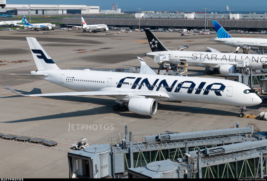
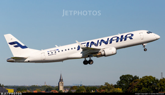
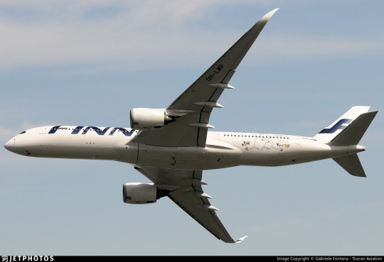
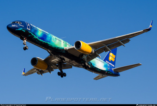
No. 55 - Finnair [+ Centenary Livery]
So I know I'm in the process of writing a bunch of longer posts and thus haven't posted in absolutely forever, but I had to let something cut the line very quickly because in this case it was somewhat time-sensitive. I've missed the actual date by two months, but if I get in a post while it's still 2023 (...in my timezone, at least, so sorry to actual Finns busy enjoying 2024) I think that counts, and this entire blog is about what I think, so that means it counts.
On 1 November 2023 Finnair became the sixth airline to turn 100 years old, consistent with its status as the sixth oldest airline in continuous operation. I wish I'd started this blog earlier in the year, or prioritized differently, because Aeroflot and Czech Airlines also turned 100 in 2023, but...well, I didn't. You'll probably see them both in 2024 instead. Finnair, however, was requested by @kuivamustekala - particularly their centenary liveries. Requested a long time ago, even. So I'm going to hope that late is better than never and throw Finnair one last birthday party to wrap up 2023 by looking at where they started, where they are now, and what they've been doing to celebrate.
1923: PROTO-FINNAIR
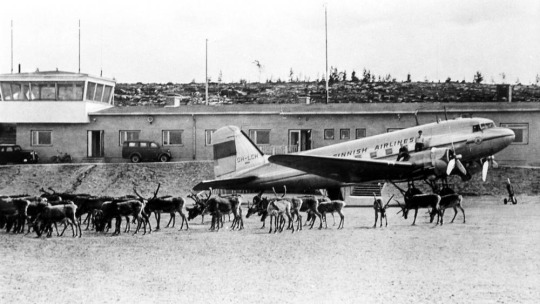
Finnair, obviously the flag carrier of Finland, was founded in 1923, but its first service was in early 2024, using a Junkers J.13 (fitted with obligatory floats, as there were no suitable airstrips in Finland at the time).
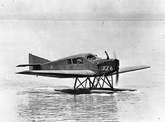
image: Joseph Eaton via US Navy National Museum of Naval Aviation
This is actually the US license-built version, the Junkers-Larsen JL-6, but I couldn't find any pictures of actual J.13s on floats.
Unfortunately, Finnair was founded under the name 'Aero', which is probably the actual single worst name for an airline I have ever heard. We can jest and joke about things like Jet2 and Fly Air, but I sincerely do not think I have ever seen anything with worse SEO than an airline named 'Aero'. Even for 1923 this was fairly dire - back then, as for much of history, airlines were generally named for the area they served. Aero may have been a private company, rather than state-owned, but that didn't mean they couldn't name themselves for the area they served - private airlines have always done this and still do. Incredibly enough, there was a second 'Aero' founded in Poland in 1925, but that was quickly merged into what would become LOT Polish Airlines, shedding the name like a chrysalis.
Bafflingly, even when the Finnish government bought the airline in 1946 (they still own a majority share of it today) they didn't bother to change the name. They did begin writing 'Finnish Airlines[1]' on the fuselages, but as far as I can tell this appears to have been more of a stylistic flourish of sorts than an actual rebrand, or maybe even a clarifying subtitle on the very nonspecific name. In 1953 they began marketing under the much catchier 'Finnair', but the company remained legally named 'Aero' until literally 1968 and the fuselages still read 'Finnish Airlines'.
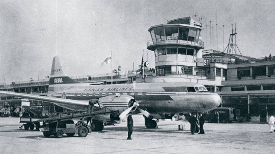
image: Finnair
An Aero/Finnish Airlines Convair 340, photographed in 1953 in a livery which included both the large 'Finnish Airlines' wordmark and 'Aero' on the tail.
Early Finnair, like most early airlines, didn't have a particularly standardized livery for its fleet, and even where it did it's not very well documented. Finnair unfortunately has some of the poorest documentation for livery evolution of any large airline I've discussed so far, which really surprised me. That said, it's when the name became Finnair that things begin to be easier to find, and so that's where I'll begin.
1968: CLASSIC FINNAIR

This original logo[2], introduced in 1968, was designed by Kyösti Varis - at least, that's what every logo database I looked in said. I actually couldn't find either Finnair or Varis confirming this[3], but I still think it's probably true. Unlike designers like Vic Warren and Lindon Leader, who wrote and gave interviews about their designs for major airlines, Varis appears to have other preoccupations. He is enormously successful and prolific, to the point where his website doesn't even mention Finnair. According to the timeline he provides he would have either been creating this logo freelance or in his very last days at Advertising Agency SEK (probably the latter, since they did the two subsequent iterations), and based on his history as a typographer I think it's safe to say the letterforms are his creation as well. Also according to his timeline, he is younger than Finnair! And we almost have the same birthday.
I like the original Finnair branding. It's not ostentatious, but it's nice and sleek, with that forward slant I love in airline branding and a long unbroken line (both in the 'F' logo and in the even heights of the letters in the wordmark). It looks aerodynamic and the rounded, blocky letters have a hint of that 60s futurism while not being gimmicky. It's kind of incredible looking at it next to the '91-'94 FedEx wordmark, which occupies the opposite end of the sliding quality scale of TRON-looking text. The design as a whole is simple enough to easily reproduce but distinct enough to easily recognize. The shade of blue chosen is a fair bit lighter than the blue of the Finnish flag, but visually pleasing enough. They basically keep iterating on this general concept for the rest of their history, which I think is fantastic - no need to get rid of something that's working for you. It's nice to see an airline not feel pressured to reinvent its logo and livery every 20 years. That's about it for the logo[4] - what about the livery?
As mentioned prior, Finnair's liveries, before quite recently, were very poorly documented. Variants definitely existed between different types and different periods in the company's history, but the broad strokes of the branding seem to have remained almost startlingly intact for around thirty years.
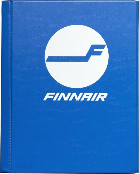
image: Letterform Archive
The cover of a style guide from 1985. If it's changed from the 1968 original, I can't tell how.
But I'm really here to talk about one thing: the liveries.
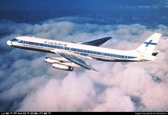
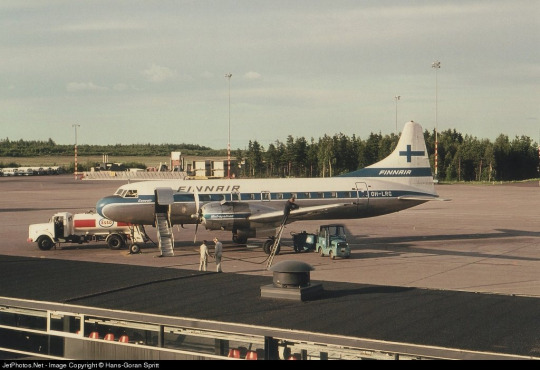
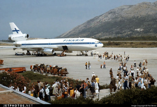
The above image was from Finnair's own archive and was taken in 1968[5], making it contemporary with the introduction of the Kyösti Varis branding, as well as lining it up with the 1969 addition of DC-8s, like the pictured airframe.
For the majority of Finnair's history, their livery is always going to look something a little bit like this. Primarily white, with a thick blue cheatline (in what I call the domino-mask style, where it's vertically centered around the cockpit windows) that lightly flips up at the very end and a blue cross on the tail to represent the Finnish flag.
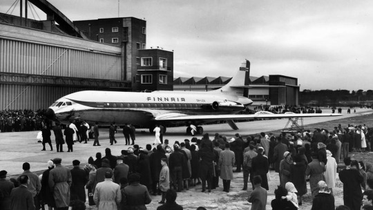
Finnair says this image is from 1960. If so, the livery was already well on its way to existing prior to 1968, with my guess being that it was introduced in 1960, along with the first jets in Finnair's fleet - the pictured Sud Aviation Caravelle, which pioneered the swept-wing, aft-engine format later seen on immensely popular jets like the DC-9 and Tu-134 - the latter of which was commissioned specifically because Nikita Khrushchev was so impressed with the Caravelle's aft engines and the quiet cabin experience they provided. It's a plane with a lot of unique visual features, featuring a nose that looks almost slanted downwards (a copy of the de Havilland Comet nose), a cruciform tail (instead of the more efficient T-tail used for future rear-engined designs), and triangular passenger windows. Most crucially, though, it was more or less the first short-range jet on the market. This made it perfect for an airline like Finnair, which at this point didn't really go that far from actual Finland.
This 1960 photograph provides a very strong blueprint for what was to come. It's the first iteration of the livery to say 'Finnair' instead of 'Finnish Airlines', and it's introduced a modern-for-1960 single-rule cheatline, although this early version was flipped horizontally, curling up at the front to frame the cockpit windows instead. (I think the white paint also cuts off behind it, leaving the space in-between the cheatline and painted nose blank metal, but in black-and-white it's somewhat hard to tell.) I do think I prefer the modern version. The use of the white downward curve with no blue hemming it in creates a really nice effect where it blends with the unpainted metal underside, due to the metal being right where you would expect to see a shadow anyway. (This effect is why I'm not quite sure where the paint ends on the Caravelle, and am just guessing based on which parts are noticeably reflective.) I definitely prefer the change made to the tail, where the single line of trim at the end of the rudder was replaced with a white canvas for the Finnish flag.
While I do tend to have a slightly pessimistic outlook on primarily-white liveries, I will say that if you're going to have a primarily white plane, and you are the flag carrier of Finland, this is a fairly understated and stylish way of incorporating it. While I probably would have done it on the main body, over where the first set of doors is, instead of on the tail, I think this is far from the end of the world. What they have is a nice, elegant taper where the tip seems to point directly at the tailplane, and it looks neat and intentional. A lot of airlines tend to just awkwardly slap a logo on their tail, which often looks really sloppy due to poor alignment or even just out-of-place entirely, and Finnair avoids that while keeping the tail from being completely blank. Having an element on the tail that's more horizontal than vertical, like the old 'AERO' rectangle or the tail rectangle on the one decent livery Lufthansa ever had.
If you look in the background, you can see that wow has the Olympic Air livery looked like that for a long time! But that's a story for soon.
Additionally, some details were added on the nose. You can see on this DC-8, photographed in 1969, that the nose features an e-girl cheek stamp of the Kyösti Varis logo. Next to it is the name of the aircraft - in this case, Jean Sibelius - in really difficult-to-read thin text. (Finnair unfortunately appears to have stopped naming their planes by the late 1970s, but at one point they would frequently be named for Finnish people and places.) The 'domino mask' goes quite a bit beyond the cockpit windows to create a wider line from the side. I wish that the logo could have been integrated some other way, because the extra little blue thing just looks cluttered, but I can't imagine how they would do it without just replacing the cheatline. I mean, that would have been an option - indeed, it's what I would have done[6] - but assuming that they keep this general look I think the logo just can't fit in on the livery. The engine nacelles, maybe? Though that would still present issues on the Caravelle, where the engines are directly over the cheatlines. I also wish they would have made it a bit easier read the name, because I like to know what the plane's name is - thankfully, some later paint jobs actually do this before, tragically, Finnair stops writing names on their planes at all.
I believe this to be the strongest iteration of the classic Finnair livery, and it was pretty obviously optimized for the DC-8. Modern airlines tend to not bother adjusting their liveries between types, creating some absolute travesties of proportion, but Finnair boldly went in the opposite direction by modifying it for each airframe and yet still having it look worse.
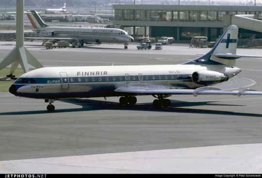
The sharpest deviation arises in the CV-440 version of the livery. This image is from 1971, just two years after the DC-8 liveries would have carried their first passengers, and it's wildly different. The cheatline is lowered sharply, sitting below the cockpit windows and wrapping around to contour the body of the airplane. There's a certain je ne sais quois to the domino mask that I find myself missing here. This design also has an unnecessary second 'Finnair' added to the tail, which kind of looks awkward stacked on top of the existing cheatline besides being redundant, and the Finnish flag on the tail is somewhat awkwardly made free-floating. It feels a lot less sleek and a lot more arbitrary.
On the other side of the plane the cheatline goes down quite a bit farther than on the jet models, probably because they thought it would be a better way of negotiating the Convair's rather bulbous nose, and I actually think I prefer the wide, upturned variant. This version, if anything, is too close for my taste to the livery VARIG operated in a similar timeframe. There are a lot of differences, yes, but in the 70s having one big solid cheatline on a white body and metal underbelly was the equivalent of the Lufthansa Line, so if you toed said line, be it cheat or Lufthansa, you risked becoming easily mistakeable for any airline with too similar of a color scheme. And blue-on-white was maybe the most common color-scheme at the time.
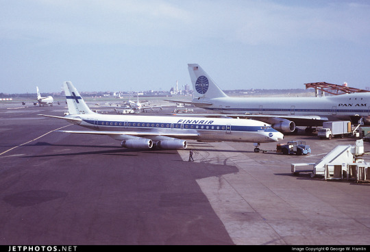
I doubt Finnair shared many tarmacs with VARIG, but here they are with Pan Am, and they could also expect to run into airlines like Sabena, Icelandair, and probably a half-dozen I've never heard of, all competing to be the one the others get mistaken for. It's a tricky position to be in.
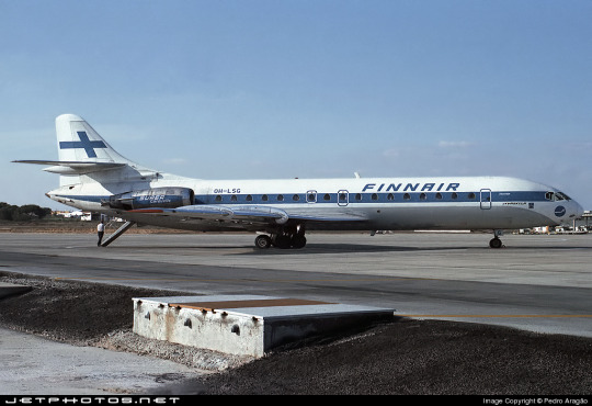
I do quite like the livery on the left, maybe even more than the DC-8 one, but I can't seem to find any other airframes painted like this. I'm not sure why this one is.
These images are from 1971 and 1969. They are both the same model of airplane - the Super Caravelle or Caravelle 10B. Their liveries are completely different. And that's just how it was back then - not even standard within the same airline, somehow still trying to stay distinct from dozens of other non-standardized blue-on-white cheatlines.
When evaluating classic Finnair, I have to keep myself tempered in both directions. When I think it's clean and well-proportioned I have to remind myself that it's just a complete nothingburger. When I think it's a lazy and cowardly non-design I have to remind myself that, no, at its best classic Finnair does look like it was designed with some thought, and it does have some traits that feel at the very least interesting enough to merit not being totally dismissed.
But...look, I have to give classic Finnair a D+. Because they tried, and they did something, sure, but it's ultimately not something especially memorable and the implementation is just spotty.
Even given a canvas like the DC-10, they fumbled. The DC-10, in my opinion, was a big test for them. And I do mean big. In the DC-10 is a plane with all the space in the world to add visual elements, and a space where just a couple lines can go from a detail to a fin that towers over anything that isn't a 747, showing off the Finnish flag as if someone had flown it from a building mast. The third engine, which I feel like a lot of airlines really struggle with on the DC-10, gets a nice horizontal line of writing that's not intrusive but helps prevent it from feeling like a giant gap. The wordmark gets larger, is moved forward, gets to really own the space it takes up instead of being squeezed in. And...they made the cheatline just....a really thin flat line that looks bad and stiff and boring. There's nothing setting them apart from Icelandair, and Icelandair's livery from this point in time was so boring that my only comment on it was that it looked like they forgot to paint the rest of the plane. You can do white planes well, but Finnair just really doesn't get there.
...hey, Finnair? You can't just decide to do belly stripes but worse, Finnair, you're literally next door to like two thirds of SAS and that livery was designed from the ground up. They have a couple of near-misses with SAS's toes but this is the one that makes me actually go 'is this allowed?'. It seems to have been exclusive to their late-80s MD-80 fleet, but it's just incredible to me that it ever happened. (That said, those three shades of blue are so nice together and I wish they had ever brought them back. I understand the appeal of sticking to the stark contrasted blue-on-white of the flag, but there's so much potential out there!)
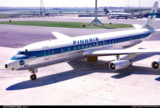
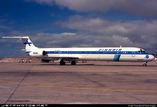
1997: NEW TYPE, NEW LIVERY
I really like the 757. It deserves a better livery than this.
Removing the cheatlines was a very trendy choice to make. This is the sad beast I call the Deltalite - a Deltalike but without the painted nacelles and belly that are usually slight redeeming factors. There's such a beautiful design on the tail that could have been put on the whole fuselage, honestly, and that's sad, but even on the most granular of levels...why keep the little cheek stamp if you have the logo visible on the tail now? Weird choice. Being so desperate to do the Deltalite thing everyone else is doing that you get rid of your country's flag on the tail is just a bad choice of priority, I think. There's not much to say about this. Honestly, I'd drop it to a D-. There's enough happening that it would lose something by being painted into Star Alliance colors, but it wouldn't lose terribly much.
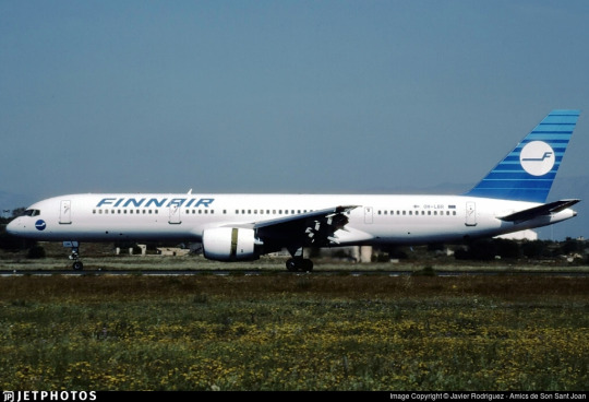
2000: NEW FINNAIR

Oh, Finnair. Why? Did no airline resist the siren song of getting way too into airbrushing in the early 2000s?
Maybe I just have whatever the opposite of nostalgia is for the early 2000s, but this just makes me sad. They've made the wordmark look worse, overcomplicated the simplicity of the logo, and gone ham with the gaussian blur.
Look, it's not all that bad. The shades used on the actual plane are noticeably darker, and the colors at least don't look half bad now. And they've even bothered to paint the engines this time around! But...come on. You've changed 30 years of something that was working just fine for...this? Something which maybe climbs up to a flat D?
The 2000 brand overhaul, including the logo, was done by Finnish agency SEK & Grey. They're nearly as old as Finnair and have worked for brands as prominent as Coca-Cola and Kellogg's, but their about page puts Finnair front and center. They have an entire page describing their Finnair work.
Despite claiming to have included humanity and warmth and movement, I see none of this. I'll admit upfront I generally dislike what's dubbed 'Nordic' design. It's not the minimalism which I dislike but the banality.

What does any of this have to do with Finnair? What here represents the history of one of the world's oldest airlines? What here really speaks to the Finnish people? Why is just designing something generic and making sure it's all crisp (when you're photographing it fresh out of the plastic, before it's been tripped over and stepped on and yanked down staircases and accidentally sat on and stained with tea) considered a substitute for designing something that people will see years down the line and get nostalgic for? I'm nostalgic as hell for Alitalia, an airline that doesn't exist anymore. I still use the bag from an amenity kit I got on Alitalia nearly ten years ago to store small essential things like toothbrushes and medication while traveling, but I wouldn't know it was Alitalia by looking at it, because it's lovely and convenient and ergonomic but it's literally just grey. It evokes nothing, and it doesn't even say 'Alitalia' on it anywhere. Nothing here could ever be considered ephemera or memorabilia. I could steal Finnair's look at the Gap.
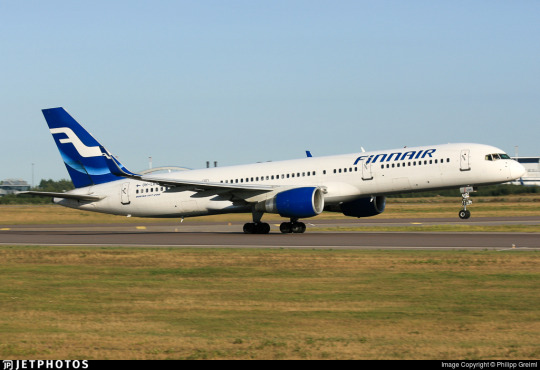
2010: SORRY, HERE'S NEW FINNAIR FOR REAL THIS TIME

SEK & Grey gave it another shot. This one's a lot better.
I like the change in the logo, first off. And this, the word 'Finnair', is the logo, but I'm comparing it to the earlier wordmark. 2000's attempt felt like it was taking the original and just trying to sand off the corners to make it more modern, but the 2010 take on it actually shapes each glyph into a neat little space-age thing that creates this curved shape by way of a lot of straight lines, in a way that feels visually pleasing and interesting. I enjoy the square holes in the A and R, the return of the crossbar on the N, and the extreme range of widths which gives the letters a real weight to them. This isn't a typeface - these glyphs exist in the context of the word FINNAIR in this exact configuration and one of four colorways. Finnair does have a proprietary typeface, Finnair Sans, and it looks nothing like this because this is not a font, it's a logo.
I think it is a shame that this is the logo now. I really liked the F. And they haven't gotten rid of it, but it's now been relegated to an official subordinate position, according to their branding guide:
The official Finnair logo is the text version of the logo, and it is primarily used. The F emblem is used as an additional symbol.
Look, I'll always think it's a shame when your main logo is just the name of your company. Some airlines do it, and it feels like an empty space to me. It can be satisfactory but not outstanding. When you start out with a nice little symbol and then take it away, though, I do feel somewhat robbed.

It stings extra because I really like the way the new F looks. It has that long brushstrokey look and it almost makes me think of Hebrew characters. The way it tapers now really adds to the feeling of movement I get from it, and it's a great base for a livery. Now that it's darker, even though this does bring Finnair into competition with airlines like SAS, LOT, TAROM, Lufthansa, and even Ryanair when it comes to dark-blue-on-white, it also contrasts better with the main body, and it's still light enough that you can recognize it as blue. Anyway, it doesn't take a genius to know how to integrate this into a livery. Long line for the fuselage, go up to match the tail...
Finnair. Are you serious, Finnair?
Look! I get it! Billboards are in now, it's fine, I get it. it's probably the nicest billboard I've seen in a while, font-wise. It feels comfortable on the fuselage and it feels like it earns the space it occupies. The F is nicely centered on the tail, cuts off at a pleasant point. But...why?
I really can't be too mean about this. I want to be meaner than I actually can justify, because I think if any other airline made their plane this featureless I would hate it but Finnair's billboard livery is actually nice enough and everything is placed well enough that it's not at all unpleasant to look at. It's an acceptable livery. If maybe 25% less planes were basically all white it would shoot up in my esteem. I don't really like the fact that they put the little Fs on the inside of the wingtips of their A350s, but that's really my only nitpick. It's just sort of...bringing a really fantastic loaf of bread to a potluck when you were asked to bring baked desserts. You've done a very good job, but you didn't quite get the assignment.
It's a bit hard to critique the modern Finnair livery in detail because I think it's executed fine. There's nothing really wrong with it except that it has a logo that could lend itself to all sorts of interesting shapes, it has 30 years of variants of a very specific design to draw on, and it's chosen to go tabula rasa just to be all clean and minimal instead of doing any of the interesting things it could have with this new start.
I want to dislike this take on the Finnair livery, but at the end of the day I just don't. I think it's completely satisfactory. A lot of airlines try to get this look and somehow end up seeming cluttered for it. Finnair is one of the only instances I can think of where a white fuselage with just a wordmark has looked okay. It isn't ugly. It hasn't failed at the thing it's trying to do, but I think that it should have tried to do something else.
At the same time, though, this is the most Finnair that Finnair has ever been. The blue cheatline and the Deltalites were stumbling over well-trod ground. The modern livery, at least, isn't sloppily tail-heavy and seemingly thoughtless.
I give modern Finnair a C. This took an excessive amount of deliberation, but it really is...good enough. It's satisfactory. It's fine! I would have taken a completely different direction, but they have done a good job with their sort of lackluster idea. It's alright. We'll check on them again in another hundred years and see where they're at.
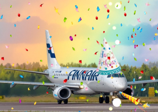
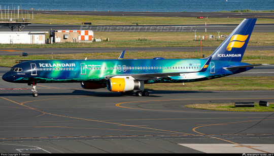
2023: CENTENAIRY
A century is a very long time. Finnair is older than my oldest grandparent. Finnair is older than over a dozen sovereign countries. Finnair is older than aerodromes in Finland. It's older than every currently operating airline except KLM, Avianca, Qantas, Aeroflot, and Czech Airlines. As of the first of November, Finnair is in triple digits.
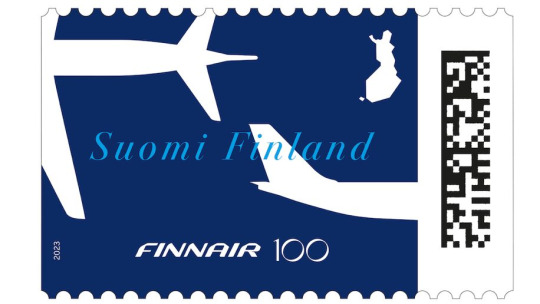
I adore this centenary stamp Finnair has put out, celebrating the long relationship between aviation and the mail. It's not complex, but it's not barren, either. It combines the dark blue of the modern livery with the light blue of the classic one, all with the white silhouettes of airplanes elegantly soaring over an outline of Finland. The outstretched white wings on the deep blue have the grace of a giant fish swimming beneath a glass-bottomed boat.
But of course it isn't just stamps. Finnair is an airline. Airlines do special liveries. Qantas and KLM both slapped a big 100 sticker on an airplane for their big anniversaries. Finnair has of course done something similar.
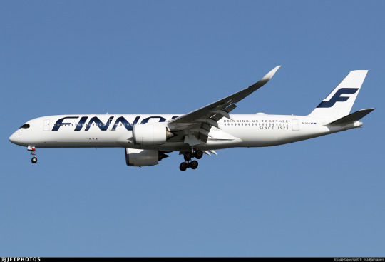
Three airframes - the pictured A350-900, OH-LWR, and two A320s - OH-LXK and OH-LXM - have had a 'bringing us together since 1923' sticker applied. Matching the rest of Finnair's branding, it's certainly quite minimal, but it's a nice gesture. It's not what people have been talking about. That's OH-LWO and OH-LWP, both A350-900s, who have been given something more substantial to wear.
youtube
I'm going to assume that after its renaissance on tumblr a few years back most people reading this are familiar with the Moomin franchise. I definitely am, because when I was in my larval stage my mother first taught me to read Russian using an omnibus book of Moomin stories. Creator Tove Jansson apparently designed both the shape of the eponymous white critters and the sound of the name Mumintrollen itself are designed to evoke a feeling of softness, and it's clear why these characters are so beloved.
It isn't the first time Finnair, which frequently collaborates with Finnish brands and highlights its Finnish roots, has featured Moomins.
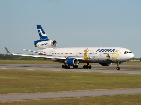
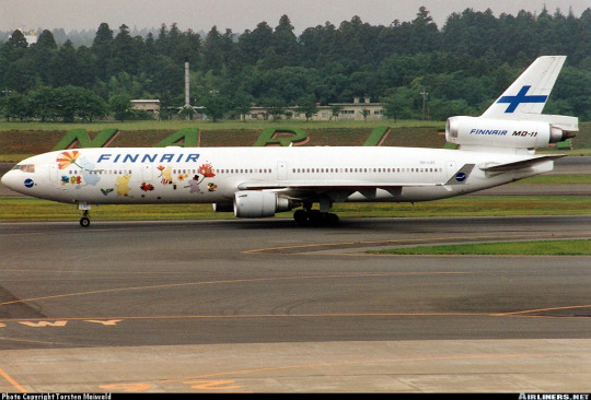
image on left: Antti Havukainen
In the 1990s, the airline first flew a Moomin jet. They had another in the 2000s. Both were withdrawn from service before 2010. It's been a while now since Finnair flew their last MD-11, but when celebrating their 100th birthday, a milestone that the vast majority of airlines will never see, they chose to do it by way of a soft Moomin embrace.
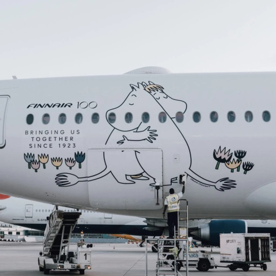
image: Changi Airport
And, I'll be honest, I think it's very sweet. It got an actual, sincere little smile out of me.
100 years is a really long time. In 1923 aviation was unrecognizable. What we would now consider an airliner didn't really exist yet - space for ten passengers, closed cockpits, and metal fuselages were the exceptions rather than the rule, and the Ford Trimotor was two years from its first flight. Cabin crew were barely even a concept. Airplanes, for all intents and purposes, were considered a type of boat. A nonstop flight across the Atlantic was a ridiculous concept. In a report published by the US National Bureau of Standards, it was said: 'there does not appear to be, at present, any prospect whatever that jet propulsion of the sort here considered will ever be of practical value, even for military purposes'. There were no aerodromes in Finland, so a small company called Aero attached floats to a plane just large enough for four passengers and took them from Helsinki to Tallinn.
Look how far we've come.
Footnotes:
[1]: The Finnair website's history page, which I used as a source for much of the background and several images in this post, renders it as 'Finnish Air Lines', but on the airplanes themselves it clearly has no space, so I've corrected that seeming error for them. I don't know why this discrepancy exists, because as far as I know during this period they were marketing themselves as Aero so this text would only have existed on the livery itself.
[2]: Actually, I very occasionally see this version where the F logo isn't fully surrounded by the circle and the F in the wordmark doesn't have the rounded top, and I don't know which came first or if the less round version is just somehow...not real? I did try to figure this out, I swear, but at some point I realized I am literally not a professional logo historian, and nobody is going to be let down if I don't brute-force an answer despite not even speaking Finnish, and I should finish writing the post before it's 2024.
[3] The closest thing to an official source I can find is the descriptions of two listings for the centenary stamp including a quote from designer Ilkka Kärkkäinen attributing it to him. I don't at all doubt that he did design it, but I always like to find concrete attribution for things if I can and would hate to spread misinformation and the sparseness of confirmation here is something I find very strange. My best guess is that there's plenty of good sources on it in Finnish but nobody has bothered to make it as clear in English.
[4] Admittedly this is a stretch, and I certainly don't think it was intentional, but it does remind me of the longship prow used in early SAS liveries. This motif was introduced in 1946 and continued to see use after the Finnair logo was introduced. The overlap is fairly limited in that SAS never used the longship in their logo (...I kind of want to talk about their logos one of these days) and the Finnair livery you'll see shortly doesn't look like SAS's at all, plus SAS has the extra pink on their liveries, but I couldn't get it out of my head that they do look sort of alike.
[5] The absolute hero who uploaded it to jetphotos mentioned that Finnair had given him the photograph while planning to dispose of it, and this makes me wonder if the lack of documentation is just because Finnair doesn't hold onto their old materials, which makes me very sad. A lot of companies, more broadly, didn't bother to keep records until somewhat recently, but in Finnair's case it seems to be particularly egregious. As someone literally studying to be an archivist it makes me exceptionally sad to see history lost just because nobody cared enough to preserve it.
[6] Maybe they didn't want to look like backwards SAS. Who can say?
#tarmac fashion week#finnair#grade: c#grade: d+#region: finland#grade: d#grade: d-#region: northern europe#era: 1960s#era: 1970s#era: 1980s#era: 1990s#era: 2000s#era: 2010s#era: 2020s#special liveries#commemorative liveries#requests
50 notes
·
View notes
Text
Recently extinct species make me sad for all the usual and normal reasons (loss of life, biodiversity and unique life forms that experienced the world wholly uniquely and acted in it like no other, to name three), but a big thing that also makes me so sad is the forgetting that comes right after. Many endangered species are greatly ignored to begin with whilst alive of course, which is awful, but the way that extinction also causes us to forget. A species could’ve been so abundant a hundred years ago, people would’ve used a fish species or a tasty plant for food, or parents would’ve warned their children to not put a poisonous toadstool or insect in their mouth, a diver would exclaim, “Aha!” after emerging from the shallows holding an especially big bivalve, or someone making a species diary would sketch out a local bird or fasten a single flower to the page. But.. then the species goes extinct. It doesn’t exist anymore. None of these events, these actions happen anymore. Not with these species. The people who had these experiences dwindle out and they may not even realise that their experiences were among the last of their kind. And we forget.
#i was thinking about the new zealand greyling which was once abundant#the maori people used to fish it and use it for food#for generations upon generations this fish species was their normal#but now it is just gone#could they have guessed that this will happen? that their everyday food item would go extinct one day#i was also thinking about the atlantic sturgeon and how it went regionally extinct in the baltic#the old northern europe people knew sturgeons. heck we had them less than a hundred years ago still#it was a native fish just like any other. just like salmon and trout#now? no one talks about them#they are forgotten#we dont learn about them alongside the perch and the pike and the roach and the trout#they are a mystery of a time gone by here#and it makes me so sad… how quickly we forget. we shouldnt
185 notes
·
View notes
Text

French soldiers buying and reading newspapers at a kiosk in Rexpoede, in the far north of France (Department Nord, Region Nord-Pas-de-Calais) September 1917. The town is just 20 miles from Ypres, in Belgium, where the Battle of Passchendaele was being fought at this time. The battle was one of the bloodiest of the entire war, but is perhaps more infamous for the mud. The worst rains to hit the Flanders region for 30 years turned parts of the battlefield into a quagmire so deep that men and horses drowned in it.
#first world war#world war one#wwi#ww1#history#europe#european#france#french#première guerre mondiale#nord#department#north#northern#ypres#belgium#flanders#soldiers#rexpoede#region#nord pas de calais#1917#newspapers#newspaper#journal#journaux
487 notes
·
View notes
Video

flickr
Weathering the Storm by Jos Buurmans
Via Flickr:
Driving in Iceland presents an ever-evolving adventure. The scenery transforms continually, matching the ongoing shifts in weather. During our journey along the East Iceland fjords, we encountered particularly adverse conditions, subjecting us to the unforgiving elements – gale force winds and unyielding rain were our constant companions. Worst of all (at least for a photographer), we gazed at a perpetually overcast sky, draped in a monotonous, oppressive gray. However, as they often say, the weather in Iceland is among the most fickle aspects of this land. In a fleeting, magical instant, the sky defied its gloom and breathed life into the rugged terrain, casting a radiant light upon the mountain. Only moments later, the sky once again veiled itself, and we pressed on towards the next clearing on our journey.
#Atmospheric Nature#Austurland#Clouds#Daylight#Eastern Region#Europe#Iceland#Landscape Photography#Mountain#Mountain Landscape#Mountain Peak#Mountains and Peaks Photography#Nature#Northern Europe#Peak#Reyðarfjörður#River#Sky#Storm#Stream#Tiered Waterfall#Water#Waterfall#Fjarðabyggð#flickr
4 notes
·
View notes
Text
Jealousy Poll: would you consider this situation common?
I know two couples where the men are local (Bulgarian) and the women are from two different parts of Asia, and I've heard two separate stories of them being upset because of their boyfriends' female friends.
Story 1: A and B start officially dating after meeting at the same dance class. They are part of a dance group with several other people. A schedules a day to hang out with several girls from their dance class, as friends. When B finds out he's hung out with them, she becomes upset on the basis of him spending time with other women.
Story 2: C and D have been together for many years and even live together. One day, they run into E - a very close female friend of C. E hugs him tightly, and afterwards, D is livid - she straight up says she never wants to see that woman again and refuses to go out with C's friends if E is there.
This is all the context I have, and it's entirely possible that there are missing bits of information that upset these ladies. But I found this interesting because, in my experience, Bulgarian women wouldn't be as upset over these two specific cases, if at all.
So I'm curious if you think it's a common reaction where you're from or where you currently live?
Note: I have limited options for the poll so I tried to group regions by cultural similarities I've noticed. Feel free to correct me 😅
#p: poll#p: mine#It really didn't feel fair to group Southern European countries with the Northern ones based on them being 'west' so it took up more space#and my focus here is mostly Europe / Asia so I couldn't properly include a huge chunk of this planet#but I think most of my followers are from WE/EE and the MENA#I'm also not judging the women in the two stories. Just wondering if it's more of a personality trait or relatively common for their region
3 notes
·
View notes
Text
Husband of former Scottish First Minister arrested over party finances investigation | CNN
London
CNN
—
The husband of former Scottish First Minister Nicola Sturgeon, Peter Murrell, was arrested on Wednesday in connection with an investigation into the funding and finances of the Scottish National Party.
Murrell, 58, stepped down as the SNP’s chief executive last month after more than two decades in the role following Sturgeon’s shock resignation as first minister in February.
A…

View On WordPress
#arrests#brand safety-nsf crime#brand safety-nsf sensitive#conflicts and war#continents and regions#crime#criminal law#domestic alerts#domestic-international news#europe#iab-crime#iab-law#investigations#law and legal system#law enforcement#law enforcement and corrections#nicola sturgeon#northern europe#political figures - intl#political organizations#political parties - intl#scotland#scottish national party#separatism and secession#united kingdom#unrest
0 notes
Text
Video from Antarctica shows ice shelf the size of London breaking off
Video player was slow to load content
Video content never loaded
Ad froze or did not finish loading
Video content did not start after ad
Audio on ad was too loud
Other issues
Ad never loaded
Ad prevented/slowed the page from loading
Content moved around while ad loaded
Ad was repetitive to ads I’ve seen previously
Other issues

View On WordPress
#affordable#antarctica#breaking:#continents and regions#england#environment and natural resources#europe#from#glaciers and icebergs#housing#ice&8217;#landforms and ecosystems#London#Northern Europe#off#shelf#shows#size#the#United Kingdom#video]
0 notes
Text
God I wish I had more knowledge on incredibly niche and obscure subjects. I wish I could just learn things immediately and accurately when it strikes my fancy
#I want to know about how armour is made#and whats the best armour designs#and how practical that sword design is#and when were the common techniques of making patterns in fabric#and what materials are the best for clothes in certain regions#and how easy it was to forage mint in Europe#specifically Northern Europe/England#and about different kinds of nudibranchs#and sea levels and pressure dynamics#and and and and#half of this is for writing half of this is cause I’m just so so sosooso curious#I want to know so much information all the time always#but then I FORGET OLD INFORMAITPN#going rabid#the ducks quacked about something
0 notes
Text
I am legitimately so upset, I don’t have very much longer at my current job and I only just realized that I have the perfect opportunity to casually but forcibly educate the public that earthworms are an invasive species in most of the northern half of North America. NOBODY realizes that earthworms are invasive because most of us grew up learning about how good earthworms are for the soil and finding them in the ground and there’s generally a lot of positive cultural messaging about earthworms*. While most people are generally aware of invasive species and try not to spread them, they don’t think of earthworms in that category. It can be really surprising to learn that earthworms can be bad for the environment - I know it was for me. So I’ll take advantage of my audience here:
Earthworms are an invasive species in large parts of the USA and Canada, especially notable in the Great Lakes region. They disrupt the normal ecological processes of hardwood forests by eating organic material (duff) that is needed for native species to survive.
Please be aware of this if you live in the region and use earthworms for fishing or gardening. Further resources can be found at the Citizen Science Project Great Lakes Worm Watch and the UMN Invasive Species page.
*Positive cultural messaging about earthworms is great - for the regions that they’re native to, such as Europe. Not so much in regions where they’re invasive.
6K notes
·
View notes
Text
No. 24 - Icelandair's Special Liveries


Congratulations to Icelandair's Hekla Aurora livery for being my first multi-request. And for a special livery, no less!
So, as a quick supplement to my main Icelandair post, I'm going to discuss the airline's three special liveries (excluding those which are crossovers with other brands). They've even been kind enough to provide a page for each, describing their various inspirations and how they relate to Icelandic identity.

Þingvellir
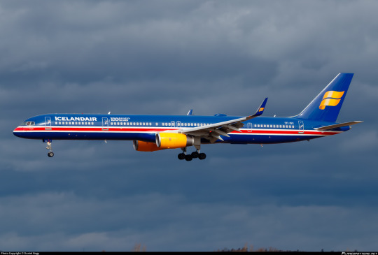
I'm starting with Þingvellir. Painted on a Boeing 757-300 registered TF-ISX, this livery was released in 2018 to celebrate 100 years of Icelandic independence and also something involving football, which in a very classic moment are treated as being equivalent in weight. I think Iceland may have won at the football? If you are aware of the context of the football, please don't tell me. I don't care about football.


Her colors are drawn from the Icelandic flag. It's really incredible how many flags out there manage to be red, white, and blue. It's honestly a kindness on Icelandair's part to not have those colors dominate their livery to begin with because it's incredibly saturated with flag carriers. (Red, white, and green are another similarly done-to-death scheme.)
Although I think the actual cross-shape of the flag could have been used to some decent effect, I have no real problem with where we ended up. I think this is recognizable as the Icelandic flag and visually pleasing. The first time I saw this I thought it was a heritage livery, because I didn't know off the top of my head what Icelandair's old liveries actually looked like. I think if they'd done this back in the day they would have been the talk of the tarmac.

Looking at it from the right angle, though, I can't deny that when you add in the glossy modern look of the Icelandair logo and the yellow nacelles it does sort of look like a football jersey somehow. Unsure if this is intentional, but all in all I just think this looks nice and I genuinely think if you did something about the yellow this would be a better standard livery for Icelandair than most airlines have. It's quite unique, as far as what's flying today.
Grade: C+
A few notes to close out: first, 'Þingvellir' is the name of the aircraft. Icelandair names all their planes after features of Icelandic nature, and Þingvellir is a national park known for being the site of parliamentary sessions. 'Þ' is pronounced roughly like 'th' in English.
Second, you may notice a distinct...how do I put this? Longness about her. This is because

('normal girl' here means 'narrow-body airliner'). image by @lobstersinmyhouse.
and I really like that.
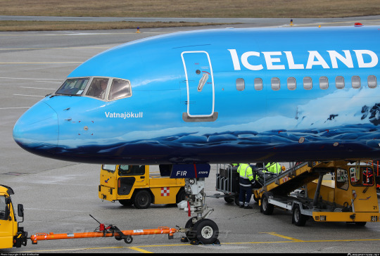
Vatnajökull
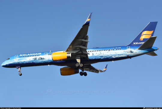
Vatnajökull is a slightly less long but still delightful normal girl, a Boeing 757-200 with the registration TF-FIR. Icelandair bills her as the world's first flying glacier. I don't think there was much of a risk of anyone else getting that record, but she...sure is!
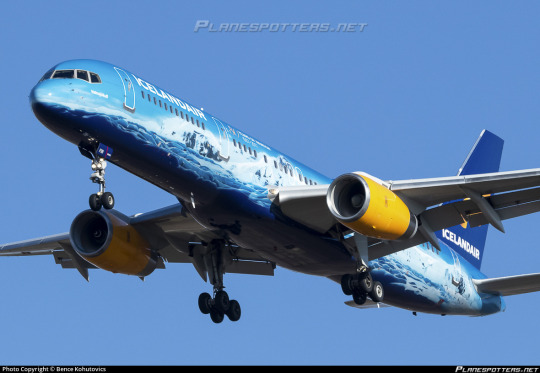
Vatnajökull is a fairly self-explanatory livery. It's an incredibly detailed glacier scene, representative of the very landmass for which the airplane is named. From Icelandair's website:
Even if you have lived in Iceland your whole life, the wonders of Vatnajökull never cease to amaze and enthrall. The largest glacier in Europe tumbles down the highest mountain ridge in Iceland, creating tremendous icefalls just above the southeast part of Route 1.
The ice giant covers 8% of Iceland and is up to 1000 meters (3280 feet) thick. That equals 30 meters of ice evenly spread over all of Iceland – but we are in fact quite happy to keep it where it is. The Icelandic climate can be challenging enough without adding dozens of meters of ice on top of us.
It's actually somewhat difficult to find much more to say about her. This is just a very pretty glacial landscape drawn onto an airplane, and I think it looks very very nice.
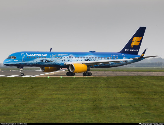
This paint job is undeniably both pretty and impressive. I do sort of wish the tail and engines had been integrated as well, but what we got is more than alright.
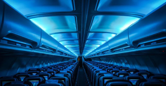
Vatnajökull also features a glacier-themed interior, including glacier-themed headrests and drinks carts and, of course, some lovely blue mood lighting. The whole package makes me want to go potholing in a glacier very badly. They've definitely put a lot of effort into making the world's first flying glacier, and they've succeeded in that.
Grade: B
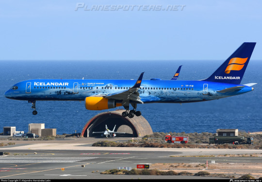
Hekla Aurora

It was very hard to choose pictures of this plane to include in this post. Hekla Aurora is stunning. She looks dramatically different depending on the lighting, but no matter which angle she's seen from she looks gorgeous and vivid.
Hekla Aurora is named for the active volcano Hekla and the aurora borealis, two noteworthy features of Iceland's unique natural environment. Obviously, though, she leans a bit towards the latter part of the name. The plane even comes with special interior mood lighting like Vatnajökull.
This looks so nice. It's even more striking than the simple blue Vatnajökull has. I want to fall asleep on this plane more than anything else in the world.
This plane is basically Icelandair's flagship. I swear this is one of the best-known planes flying right now. And she deserves every bit of it. This is a uniquely beautiful paint job and I am severely envious of anyone who has ever been able to fly on her.
I do, again, wish more had been done with the engines and the tail, but it's really hard to say anything about Hekla Aurora because this is just as much of an art piece as it is an airplane livery.
I have it as an active goal of mine to see her in person, even if from a distance, while she's still in service.
Grade: A
Unfortunately, this request was timely in the worst possible way. On the 7th of July, Icelandair announced their intention to acquire between 13 and 25 Airbus A321XLR airplanes. This is an interesting move from an airline which has up until now exclusively operated Boeing aircraft, but Boeing's refusal to actually build a 757 successor is a separate conversation. What's important to note is that Icelandair's special 757s are getting on in years. Hekla Aurora is nearly 30 years old. While far from derelict, that's definitely around the point most major airlines will begin to retire their planes. The confirmation of Icelandair's intentions to acquire a replacement model just makes it even clearer.
There is time to talk about what Icelandair will do going forward, what new special liveries they'll make. It's clear that all their existing ones are born from an appreciation for Iceland, and I'm sure they won't stop just because their planes are going to look a little different ten years from now. But It feels like an important time to voice my appreciation for TF-FIU, who has been bringing the northern lights everywhere Icelandair flies for nearly 10 years, even as those years finally begin to wind down.
#tarmac fashion week#era: 2010s#era: 2020s#special liveries#compilations#region: northern europe#region: iceland#icelandair#cabin fever
36 notes
·
View notes
Text
Boris Becker: Tennis great says a prison inmate tried to kill him while in UK jail | CNN
Boris Becker: Tennis great says a prison inmate tried to kill him while in UK jail | CNN
CNN
—
Boris Becker says a prison “inmate tried to kill” him during the tennis great’s incarceration in a British jail during an interview that was aired Tuesday by German broadcaster Sat 1.
The inmate at Huntercombe prison, who Becker calls John, had been in prison for over 16 years, for killing two people when he was 18.
Becker claimed that John was unhappy with the German’s friendship with…

View On WordPress
#boris becker#brand safety-nsf crime#brand safety-nsf sensitive#continents and regions#corrections system#crime#europe#iab-crime#iab-sports#iab-tennis#law enforcement and corrections#northern europe#prisons and jails#sports and recreation#sports figures#tennis#united kingdom
0 notes
Text
Britain is being hit by a wave of strikes. Why have things got so bad? | CNN
Britain is being hit by a wave of strikes. Why have things got so bad? | CNN
London
CNN
—
Another day, another round of strikes in Britain.
As the Christmas holidays approach, railway workers have brought the transport network to a standstill. Border Force staff are preparing to walk out. Postal workers, bus drivers and civil servants are either in the middle of strike action or threatening to strike.
This week, nurses staged their biggest walkout in decades. And on…

View On WordPress
#business#business and industry sectors#continents and regions#domestic alerts#domestic-international news#economy and trade#education#europe#iab-business and finance#iab-education#iab-education industry#iab-healthcare industry#iab-industries#labor and employment#labor disputes and negotiations#labor relations#labor strikes#labor unions#Northern Europe#rail transportation#teachers and teaching#transportation and warehousing#United Kingdom
0 notes
Text
Euro 2022 winner Alessia Russo on making history, inspiring a generation and that viral backheel goal | CNN
Euro 2022 winner Alessia Russo on making history, inspiring a generation and that viral backheel goal | CNN
Euro 2022 winner Alessia Russo on making history, inspiring a generation and that viral backheel goal
Alessia Russo burst onto the scene in her first major tournament capturing the media’s attention with her stunning improvised backheel goal against Sweden in the semifinals. Russo has been speaking with CNN about why England’s Euro exploit could prove be the springboard for further Lionesses…

View On WordPress
#business#business and industry sectors#continents and regions#diving#economic policy#economy and economic indicators#economy and trade#England#europe#european union#eurozone#government organizations - intl#media industry#monetary unions#northern europe#sports and recreation#sweden#united kingdom#water sports
0 notes
Text
Dua Lipa has been granted Albanian citizenship | CNN
Dua Lipa has been granted Albanian citizenship | CNN
CNN
—
Dua Lipa has been granted Albanian citizenship for spreading international awareness of Albania.
Albanian President Bajram Begaj said Lipa, the daughter of Albanian immigrants, has made the country proud.
“Happy to give the one and only Dua Lipa the decree of Albanian citizenship,” he said. “She has made us proud with her global career and engagement in important social causes.”
Happy…

View On WordPress
#albania#celebrities#citizenship and displacement#citizenship and naturalization#continents and regions#dua lipa#edi rama#europe#immigration#international relations and national security#northern europe#political figures - intl#southern europe#United Kingdom
0 notes
Text
Popular abroad, at home Finnish PM Sanna Marin faces battle to keep her job | CNN
CNN
—
As Finland prepares to go to the polls on Sunday, the country’s left-wing Prime Minister Sanna Marin is fighting for her political life.
Marin broke the mold to become the world’s youngest sitting prime minister in 2019 at the age of 34.
She leads the country’s Social Democrats party, heading Finland’s governing coalition of five parties.
Marin worked as a cashier after graduating…
View On WordPress
#conservatism#continents and regions#domestic alerts#domestic-us politics#europe#Finland#government and public administration#government bodies and offices#heads of government#iab-politics#international alerts#international-us politics#northern europe#political ideologies#political organizations#Politics#prime ministers#us democratic party#us political parties
0 notes
Text

https://www.bangladeshweekly.com/why-britain-needs-a-more-humane-asylum-system/
On 24th November last year, a fishing boat spotted dozens of bodies floating in the icy water. A rubber dinghy had left the French coast the previous evening but capsized before reaching England.
#conservatism#continents and regions#england#europe#government and public administration#immigration#citizenship and displacement#international relations and national security#london#northern europe#political asylum#political ideologies#politics#undocumented immigrants#united kingdom
0 notes
Last Seen Blogs


postalcoasta
Untitled

malinconiacronica
marisa angela

thevitabumin-blog
thevitabumin
noodlesbatches
“It was the best thing I’ve ever done.”