#procreatetips
Photo

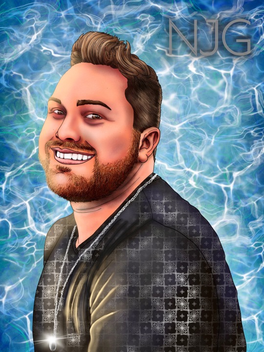
Today I just felt like drawing some Protoman on stream. The McDonald’s colors just pop. #protoman #megaman #sega #gaming #procreate #procreatetips #clipstudiopaint #clipstudiotips #howtodraw #digitalart #artist #igartist #gamingartist #twitchartist #anime https://www.instagram.com/p/Co_hy7OrsAH/?igshid=NGJjMDIxMWI=
#protoman#megaman#sega#gaming#procreate#procreatetips#clipstudiopaint#clipstudiotips#howtodraw#digitalart#artist#igartist#gamingartist#twitchartist#anime
35 notes
·
View notes
Photo
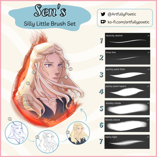
My custom Procreate brush set is now available to download for -ˏˋ FREE ˊˎ- in my Ko-fi shop!
Happy drawing and let me know what you all think!
Link: https://ko-fi.com/s/f29739e436
#procreate#procreatebrushes#free procreate brushes#digital art#danaerys targaryen#game of thrones#house of the dragon#art brushes#procreate brush set#procreatetips
21 notes
·
View notes
Photo
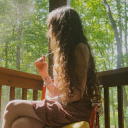
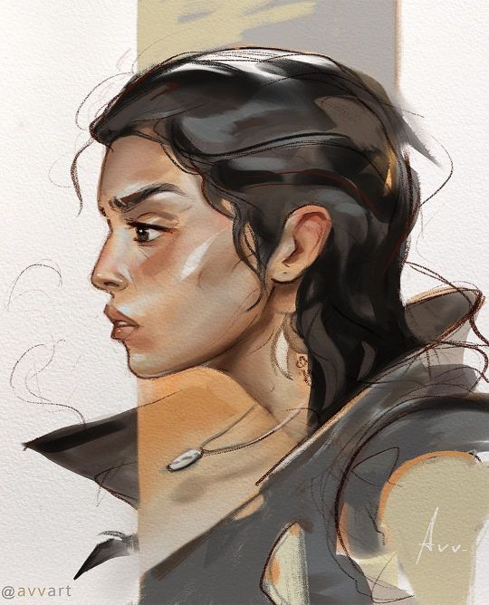
Light study 🌅:) I tried to catch the lighting first with large strokes🎨 🖌 I used my Brushes for procreate (New Portrait Big Brushset) ,(Portrait Watercolor Big Brushpack)(oil brushpack) more study on my Patreon : Link in bio! Reference: @taaarannn ⠀ 🖌️ Thanks for your support, like and comments 🤗 #procreatebrushes #procreate #brushes #dashataran #procreatetips #Illustration #asmr https://www.instagram.com/p/CroalXLsGok/?igshid=NGJjMDIxMWI=
11 notes
·
View notes
Photo

Making covers for my Procreate folders is maybe more satisfying than making actual artwork. 🤭 #procreate #ipadart #procreateart #procreateapp #procreatetips #digitalartist #digitalart https://www.instagram.com/p/CpaPcx3ua4x/?igshid=NGJjMDIxMWI=
0 notes
Photo

63#365_happysnaps @hyoga.x . #painttoolsai #painttoolsai2 #painting🎨 #paintingoftheday #paintinginprogress #digitalpainting #portraitphotography #portrait_vision #portraitart #eboy #procreatebrushes #procreatebrush #procreatebeginner #procreateprocess #procreatetips #procreatepocket #procreate5 #procreate5x #followforlike #followforfollowback #sketchdaily https://www.instagram.com/p/Ck98hoALlee/?igshid=NGJjMDIxMWI=
#365_happysnaps#painttoolsai#painttoolsai2#painting🎨#paintingoftheday#paintinginprogress#digitalpainting#portraitphotography#portrait_vision#portraitart#eboy#procreatebrushes#procreatebrush#procreatebeginner#procreateprocess#procreatetips#procreatepocket#procreate5#procreate5x#followforlike#followforfollowback#sketchdaily
1 note
·
View note
Photo

Excited to share the latest addition to my #etsy shop: 36 Procreate Sewing Stamps, Procreate Brushes, Procreate Brush Set, Brushes for IPad, Stamp Bundle Set, Procreate Palette, Procreate Stamps #birthday #halloween #digitalstamps #stampbundle https://etsy.me/3QSZTUz #procreate #procreateart #procreatetips #procreateprojects #procreatedrawing #procreateillustration #procreatebeginner #procreatepocket #procreatetutorials #procreatestickers #procreatedoodle #procreatenew #procreatenovice #procreatenewbie https://www.instagram.com/p/Cio014uI17S/?igshid=NGJjMDIxMWI=
#etsy#birthday#halloween#digitalstamps#stampbundle#procreate#procreateart#procreatetips#procreateprojects#procreatedrawing#procreateillustration#procreatebeginner#procreatepocket#procreatetutorials#procreatestickers#procreatedoodle#procreatenew#procreatenovice#procreatenewbie
0 notes
Text

FREE Check out my new class: Procreate Landscape Painting Techniques and Tips. Get Skillshare free for 1 month. https://skl.sh/3R5IXL1
#digitalart#freecourse#procreate#skillshare#artcourses#artclass#skillshareproject#painters#artoftheday#artists#procreatetutorials#procreateartist#procreatetips#procreatelandscape
0 notes
Photo
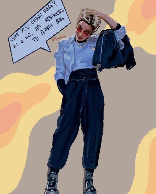
🦩🟤⚪️⠀ ⠀ ▷▶︎▷▶︎ @pepi_jun⠀ ⠀ ⠀ ----------------------------------------------⠀ ⠀ #pink #brown #White #procreate #procreateart #procreatedrawing #procreateillustration #procreateartist #procreateapp #ipadprocreate #procreatelettering #procreateartwork #procreatebrushes #procreatepainting #procreatetutorial #procreate5 #procreatesketch #procreateanimation #procreatepocket #procreateportrait #procreatetimelapse #procreateillustrations #procreatecalligraphy #procreateartists #procreatevideo #procreate5x #procreatetips #procreatebeginner #procreatedesign #procreatedoodle (Hokkaido Japan) https://www.instagram.com/p/CoGu246PME_/?igshid=NGJjMDIxMWI=
#pink#brown#white#procreate#procreateart#procreatedrawing#procreateillustration#procreateartist#procreateapp#ipadprocreate#procreatelettering#procreateartwork#procreatebrushes#procreatepainting#procreatetutorial#procreate5#procreatesketch#procreateanimation#procreatepocket#procreateportrait#procreatetimelapse#procreateillustrations#procreatecalligraphy#procreateartists#procreatevideo#procreate5x#procreatetips#procreatebeginner#procreatedesign#procreatedoodle
1 note
·
View note
Text
Blending Modes!
Blending modes alter the way layers appear and blend with other layers. Each layer's default blend mode is Normal, but there are several different options. To switch to a different option, open up your layers and select the N that is on the right side of a layer. This will open a drop-down menu that allows you to scroll through the various modes and shows a preview before you actually decide to stick with it.
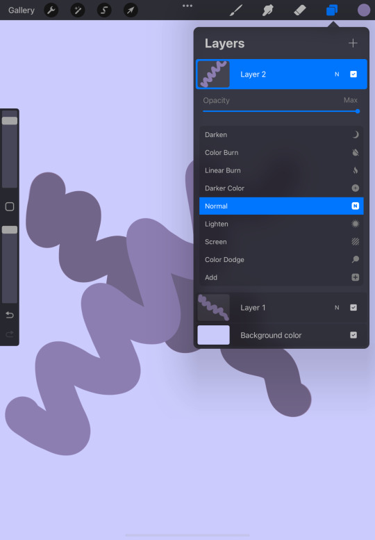
Before the list is the bar that gives you the ability to change the layer's opacity. While you do have the interface that changes the opacity of your brush, this changes the layer's transparency as a whole.
The first blending mode is Multiply. This mode changes the appearance of a layer by making the art darker. This will be helpful when trying to create an appearance of a shadow.
The next mode is Darken. Darken, depending on whether or not there is a difference in color and darkness between two layers, will keep the darker layer, bringing it to the front. If there is little to no difference, however, nothing will change.
The next two modes are Color Burn and Linear Burn. Though both give the layer a darker effect, Linear Burn's darken effect does not have as much saturation as the other and shows more of a contrast in the darker colors.
Darker Color is similar to Darken in the sense that it will not change if the colors are similar, but it takes a slightly different approach when comparing the colors.
Normal is the default mode where nothing is changed. The image that you've created stays the same.
Next is Lighten. Lighten does the opposite of Darken, using the lighter color and blending it.
Screen, Color Dodge, and Add all do similar things, but with different approaches. Screen brightens the colors, making your image somewhat transparent and transforming it into a highlight. Color Dodge makes the layer even brighter. This can also be for highlights, but if you want it to have more of an exaggerated effect. Add brightens the lighter colors without brightening the layer below it as much as Color Dodge.
Lighter Color lightens the layer, but just like Darker Color, takes a different approach to performing the task.
Overlay lightens and darkens aspects of the layer depending on the tones. It darkens the darker tones and lightens the lighter ones. This can be used if you want both the effect that Multiply and Screen apply to the layer.
Soft Light, Hard Light, Vivid Light, Linear Light, and Pin Light are all like Overlay with the way that they lighten and darken the layer. Soft Light is a more subtle version, while Linear Light would be a much harsher mode. Hard Light and Vivid Light would be considered in between the two, but Hard Light is a lot less bright than the other.
Pin Light darkens and lightens the layer at the same time. Depending on the colors that are used, that layer may seem as if it doesn't exist.
Hard Mix reduces the colors that you have used on the layer, replacing them with black, white, cyan, yellow, magenta, red, green, and/or blue based on the colors used.
Difference inverts and darkens colors using the base and contrasting colors as a reference. This will completely change your layer, but if that's something that you're interested in, I'd recommend testing it.
Exclusion, much like Difference inverts and darkens colors, but if there are variations of gray in the layer, those colors will remain unaffected.
Subtract darkens the lighter parts of an image and leaves darker colors with almost no effect.
Divide performs the opposite task as Subtract, lightening darker colors and keeping the lighter ones the same.
Hue is for when you want to slightly change the hue, but want to keep the tone and saturation that already exists on the layer.
Saturation changes the intensity of the layer, making it less vivid.
Color uses the hue and intensity of the layer above, while keeping the radiance of the bottom layer. Depending on the colors used, there could be little to no difference.
And finally, Luminosity. This mode does the opposite of Color, keeping the hue and saturation of the bottom layer, but using the radiance of the top.
Thank you so much for reading! For any questions, comments or concerns, please don't hesitate to visit my ask box or Instagram!
#Procreate#procreate tutorial#procreatetutorial#procreate for ipad#procreatehelp#procreate help#procreate tips#procreatetips#procreateforipad#procreate
227 notes
·
View notes
Photo
“Damnation War” I haven’t drawn the Daniel Llanso Spawn in decades. I loved the design but never could achieve the detail Dwayne Turner could. I’m still not there yet but it was fun trying. The scene is from Curse of the Spawn #4. Done in Procreate. #spawn #curseofthespawn #spawncomics #dwayneturner #procreate #procreateart #procreatedrawing #procreatetips #toddmcfarlane #imagecomics #comics #comicart #artistsoninstagram #art #drawing #draw #illustration #digitalart #digitalillustration #danielllanso #spawnfigures #instaart #instaartwork #artwork #drawdaily #fanart https://www.instagram.com/p/CKkOwABhklD/?igshid=f18ag3lru2b1
#4#spawn#curseofthespawn#spawncomics#dwayneturner#procreate#procreateart#procreatedrawing#procreatetips#toddmcfarlane#imagecomics#comics#comicart#artistsoninstagram#art#drawing#draw#illustration#digitalart#digitalillustration#danielllanso#spawnfigures#instaart#instaartwork#artwork#drawdaily#fanart
11 notes
·
View notes
Video
Posted a YouTube video! 🐰🎨 How I drew this bunny step by step with voiceover. I had lots of fun recording and editing this video. 😁 Link in bio . . . . . . . #procreatetutorials #procreatevideos #digitalartvideo #procreatetips #procreatevideo #procreatetimelapse #procreatebeginner #procreateillustrations #procreateartists #drawingtutorials #arttutor #arttutorials #learndrawing #easydrawings #easydrawing #cutedraw #easyart #digitalarttutorial #procreatetutorial #procreateartwork #drawingvideo #drawingtips #drawingprocess #drawingdigital #drawingtutorial #cuteart #procreatedrawing #cutedrawings #cuteartwork #cuteartstyle https://www.instagram.com/p/CU53acvqY-u/?utm_medium=tumblr
#procreatetutorials#procreatevideos#digitalartvideo#procreatetips#procreatevideo#procreatetimelapse#procreatebeginner#procreateillustrations#procreateartists#drawingtutorials#arttutor#arttutorials#learndrawing#easydrawings#easydrawing#cutedraw#easyart#digitalarttutorial#procreatetutorial#procreateartwork#drawingvideo#drawingtips#drawingprocess#drawingdigital#drawingtutorial#cuteart#procreatedrawing#cutedrawings#cuteartwork#cuteartstyle
1 note
·
View note
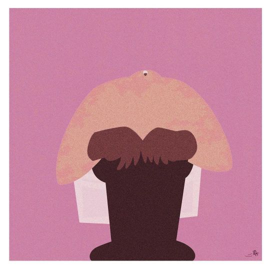
Photo
Today I just felt like drawing some Protoman on stream. The McDonald’s colors just pop. #protoman #megaman #sega #gaming #procreate #procreatetips #clipstudiopaint #clipstudiotips #howtodraw #digitalart #artist #igartist #gamingartist #twitchartist #anime https://www.instagram.com/p/CpCIDw8uX6C/?igshid=NGJjMDIxMWI=
#protoman#megaman#sega#gaming#procreate#procreatetips#clipstudiopaint#clipstudiotips#howtodraw#digitalart#artist#igartist#gamingartist#twitchartist#anime
9 notes
·
View notes
Text
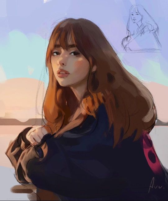
Self portrait [ 5 • 27 • 2021 ] drawn in Procreate
#digital artwork#self portrait#procreate#digital art#procreate art#art#artist#artwork#artists on tumblr#procreatetips#procreate tips
3 notes
·
View notes
Photo
I added a little geometric spots to the composition, and who loves Asmr😼, scroll => :) 🖌 I used my Brushes for procreate (New Portrait Big Brushset) ,(Portrait Watercolor Big Brushpack)(oil brushpack) more study on my Patreon : Link in bio! ⠀ 🖌️ Thanks for your support, like and comments 🤗 #procreatebrushes #procreate #brushes #procreatetips #Illustration #asmr https://www.instagram.com/p/CrjM2irMma2/?igshid=NGJjMDIxMWI=
3 notes
·
View notes
Photo

A portrait of @itsdaliashawky. Dalia is an incredible talanted actress who possess such a beautiful energy and soul that's so hard to miss. I'm so pleased to have completed her portrait and share it with you. . . . . . . . . #onyxkawai #nftcommunity #uniquenft #portraitpainting #egyptianactress #uniqueart #inspiringart #digitalportrait #dubaiart #dubaiartgallery #beautifulfaces #artaddict #sketchbook #procreatetips #procreate #arttherapy https://www.instagram.com/p/CPA7QJOn8X8/?utm_medium=tumblr
#onyxkawai#nftcommunity#uniquenft#portraitpainting#egyptianactress#uniqueart#inspiringart#digitalportrait#dubaiart#dubaiartgallery#beautifulfaces#artaddict#sketchbook#procreatetips#procreate#arttherapy
1 note
·
View note
Photo
53#insta365 @artbynips @offcellcomic . #procreate4_1 #procreatecarepack #procreatepainting #procreatetips #procreateportrait #digitalartists #memelife #memereview #jokeoftheday #attitudequotes #inspirationalquotes #painttoolsai #ipadproart #ipadprograffiti #ipadpropainting #dialogues #ipadpainting #ipadproartist (at Richmond) https://www.instagram.com/p/CkjzOJoPfYr/?igshid=NGJjMDIxMWI=
#insta365#procreate4_1#procreatecarepack#procreatepainting#procreatetips#procreateportrait#digitalartists#memelife#memereview#jokeoftheday#attitudequotes#inspirationalquotes#painttoolsai#ipadproart#ipadprograffiti#ipadpropainting#dialogues#ipadpainting#ipadproartist
0 notes
Last Seen Blogs