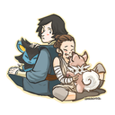
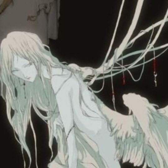
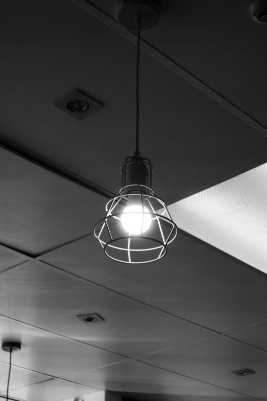
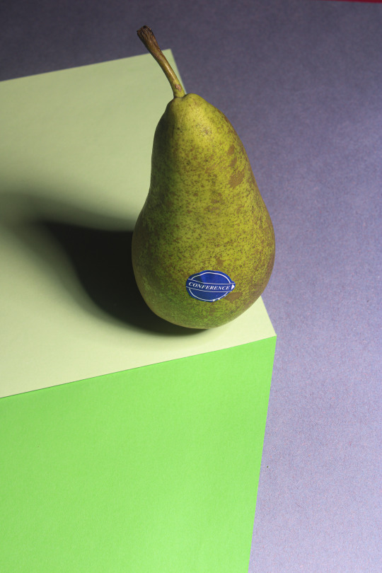
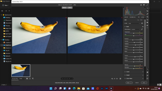
#overexposed layout
Text
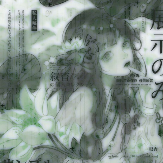
joy overexposed moodboard
joy odd recipe teaser
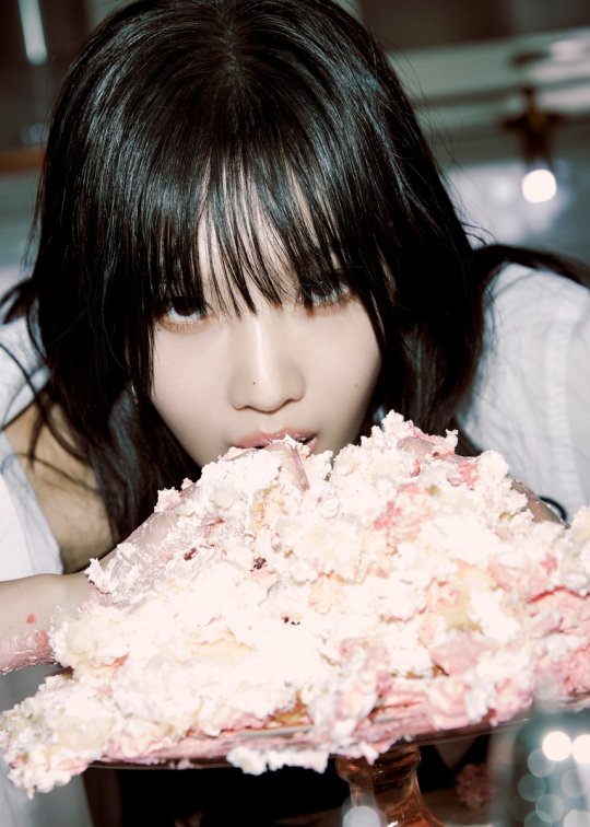


#red velvet#red velvet icons#red velvet layouts#red velvet moodboard#joy moodboard#park sooyoung#rv joy icons#rv joy#rv joy moodboard#joy layouts#aesthetic#aesthetic moodboard#vintage#vintage moodboard#overexposed#overexposed layout#messy moodboard#joy icons#joy#rv sooyoung#sooyoung park
72 notes
·
View notes
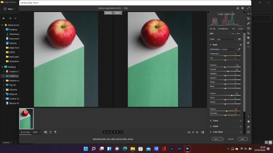
Text
youth is never coming back


#aesthetic#moodboard#icons#mood board#aesthetic moodboard#messy layouts#aestheitcs#messy icons#bts hyyh#twitter icons#pinterest#pinterest dump#photo dump#blue icons#blue aesthetic#overexposed aesthetic#overexposed icons#overecposed moodboard#overexposed layout#overexposed packs#messy packs
30 notes
·
View notes
Text
coming home from the first day of my new highly anticipated job and there's a girl sitting in front of me on the bus reading fnaf bonnie x reader fanfic. can one of those tarot card bitches explain this to me pleas e
#dont recognise the app layout. is that amino? i never used it#you know what. she's probably happier than i am#but i'll never understand people who hold their phones so visibly in public. girl you're gonna get your bank details stolen!#anyway. um. gojna go make cookies and try not to thunk of that overexposed imagebof fnaf bonnie lookign at me#mine#work
1 note
·
View note
Text
𝐌𝐘 𝐎𝐏𝐈𝐍𝐈𝐎𝐍 𝐀𝐁𝐎𝐔𝐓 𝐎𝐍𝐄 𝐏𝐈𝐄𝐂𝐄 𝐋𝐈𝐕𝐄 𝐀𝐂𝐓𝐈𝐎𝐍


𝐆𝐄𝐍𝐄𝐑𝐀𝐋 𝐎𝐏𝐈𝐍𝐈𝐎𝐍
I loved the series!
I devoured it in one sitting and, although I had small problems with certain points which I will return to below, I really liked it. My favorite episodes are those at Buggy's Circus and in Baratie. Plus, when I heard the One Piece theme music, I was in heaven!
The critiques and comments I make are purely personal and will just be nuances to add to a work that I greatly appreciate. I couldn't wait to see the live action and I was definitely not disappointed! Being French gave me a little extra laughter.
I would like to have your opinion on two points if possible (the last two of "NEGATIVE POINTS").

/!\ 𝐀𝐋𝐄𝐑𝐓 𝐒𝐏𝐎𝐈𝐋𝐄𝐑𝐒 ! /!\
𝐏𝐎𝐒𝐈𝐓𝐈𝐕𝐄𝐒 𝐏𝐎𝐈𝐍𝐓𝐒
𝐀𝐂𝐓𝐎𝐑𝐒
I loved the acting of each of the members of the Straw Hat crew because they represented for me the image that I had of them, whether in their ways of speaking, acting or behaving.
I also liked the fact that Usopp's "lying coward" side was less emphasized compared to what I remembered from the manga in favor of giving him a more "goofi" attitude. I suddenly found him more appreciable than in the manga since I remember taking a lot more time to appreciate him there.
Also Sanji, the fact that he wasn't so "Nami-swaaaaaaaaaaaaan" while still being flirtatious is something I was grateful for. I was a little afraid that his slave for women behavior would make him more annoying in live action than in manga or anime.
𝐑𝐄𝐋𝐀𝐓𝐈𝐎𝐍𝐒𝐇𝐈𝐏𝐒
After a while, the family side of the Straw Hat Pirates was so good especially in the scenes when they teased Nami - excuse me, madame - like little brothers after she was hit on by Sanji or the look between her and Luffy when Maya announces that she is offering them the Going Merry and, therefore, that Luffy has won his bet against Nami.
I laughed at the "discussion" between Zoro and Luffy in the fog after they escaped Syrup Island. It reminded me a lot of Manny and Diego's "guy talk" in Ice Age!
The relationship between Zoro and Sanji is also nice with Zoro insisting on Sanji's waiter job as well as their bickering during the battle at Arlong Park.
P.S.: Did I have a few tears in the corners of my eyes during Sanji's departure from the Baratie? ... Maybe.
𝐁𝐀𝐂𝐊𝐆𝐑𝐎𝐔𝐍𝐃𝐒
The decorations were really impressive with the boats which were magnificent, even with their peeling paint, as well as their designs. Whether it was the ships of Alvida, Garp, the Going Merry or the Baratie (I WANT to eat there at least once in my life, please!), it was incredible.
The other settings were also very beautiful (the town of Shells Town, Buggy's circus or Syrup Island with Maya's mansion) and even the very artificial side of Arlong Park worked well since it is basically a manufactured water park made by humans. The only setting that I'm less of a fan of is the courtyard of the Shells Town barracks which I find too "flat" and too overexposed in terms of lighting.
𝐒𝐓𝐀𝐆𝐈𝐍𝐆
The fight scenes were awesome for me! Whether it was the boarding at the beginning or all the combat scenes afterwards, I found that they were very well choreographed and that we kept the manga vibe with the aerobatics at the slightest impact, like the pirates that Mihawk cuts who fly into the air.
The devil's fruit powers were also well done in my eyes. Whether it was Gomu Gomu no Mi or Bara Bara no Mi, I found that the attacks were not too unrealistic and did not contrast with the realistic universe that the directors seem to have wanted to give to the live action.
Finally, the camera work was nice, especially with the effort they put in. At the beginning, I had a little difficulty with the cuts every two seconds with very close-ups on the faces but I understood that it must be to flesh out the manga side and resume a sort of layout of the frame with boxes characteristics of this genre of literature (as with the segmentation of the image during the announcement that Garp is Luffy's grandfather). Then I ended up getting used to it after a few episodes! Plus, there was a sort of traveling in Maya's mansion when they passed from the entrance to the dining room, which I found rather nice to see them try things. Fortunately, they didn't keep the sort of artistic blurs from the first episodes (during the execution of Gol D. Roger or when Zoro speaks with Mr. 7) because I really didn't like those. The shot we saw in the trailer with Kuro's claws extending behind Merry in the cellar was also very beautiful!
𝐂𝐎𝐒𝐓𝐔𝐌𝐄𝐒
They really looked like normal clothing for the most part (there will be some examples in the negatives points) and it was nice that they didn't seem crafty. Even the Marine uniforms had quite a bit of detail while remaining realistic. There are certain wigs that look better than others (Helmeppo's wig!!!) but they are still very good. Merry is also very cute for a man with curls stuck on him, just like Kobby who is so cute with his faded pink hair and his little glasses.
𝐒𝐂𝐄𝐍𝐀𝐑𝐈𝐎
I appreciate that they "mixed" the different adventures of the East Blue Arc a little since it allows us to move forward quite quickly in the stories and avoids the aspect of they arrive somewhere, there is an enemy, they defeat the enemy, they leave, they arrive somewhere, etc. Plus, we already have mentions of Barrock Work, Skypiea and Loguetown (with Smoker) so that’s always nice.
I don't remember if the scene was present in the manga but I liked seeing the panic and lack of coordination of the crew during their first attack by the Marine. In addition to Luffy's problems finding his place as Captain, I thought it fleshed out the series well!
𝐍𝐄𝐆𝐀𝐓𝐈𝐕𝐄𝐒 𝐏𝐎𝐈𝐍𝐓𝐒
𝐂𝐀𝐒𝐓𝐈𝐍𝐆 𝐑𝐄𝐃 𝐇𝐀𝐈𝐑 𝐏𝐈𝐑𝐀𝐓𝐄𝐒
I didn't like the casting at all as well as the scenes with Shanks and his crew. I had the impression while reading the manga that they were a bit the equivalent of charismatic and festive uncles - and a bit alcoholic on the edge - who throw out a few wise words in joy and good humor with a few jokes here and there. There, I found that they were already older (even Makino, which surprised me) and they all behaved in a somewhat moralistic and not very amusing manner.
𝐀𝐂𝐓𝐈𝐍𝐆
Some acting really took me out of the series like that of Alvida, Cabaji or Nojiko (which is not very important in itself) but also those of Garp, Kobby and Helmeppo. The problem for the latter was that, as a result, I couldn't stand all the scenes where we follow their evolution on Garp's ship. I unfortunately found myself skipping these passages.
Gol D. Roger, Alvida and Garp's laughs also took me out of the show a bit given how unnatural they seemed.
𝐃𝐄𝐓𝐀𝐈𝐋𝐒
✧ … The Den Den Mushi… Nope? They looked like creepy toys with a weird digital effect. They made me a little uncomfortable like the old, slightly scary dolls. Nami's tiny Den Den Mushi, on the other hand, I really enjoyed. I would have liked the bigger ones to look like him.
✧ The wanted poster photos also looked strange as if they had the old, not-so-pretty Instagram filters that saturated the colors and erased the shadows and depth of the images. The giant portrait of Morgan at the base of Shells Town also bothered me since it reminded me a lot of a digital drawing.
𝐂𝐎𝐒𝐓𝐔𝐌𝐄𝐒
I had two big "downsides" with the costumes: the Black Cat Pirates and Arlong's crew.
I think that Kuro's was okay, but for his two crew members, it surprised me to notice the lower quality of their costumes compared to the others. Already, Bushi's cape seemed too thick to me and we see during his fight with Zoro in the hall that it bothers him. Yet it was especially Sham's that I was surprised by. Her combat outfit looked like a faux leather outfit from a fast-fashion brand with cheap headband and bow tie as well as her shorts + sleeveless shirt combo. Her makeup was also curious given that her "cat" makeup is a unibrow with an arrow that connects said unibrow with her nose where the tip of the arrow that forms the nose is. I was also not convinced by their dynamic as well as by their growling which appeared to me above all to be ridiculous.
The makeup of Arlong's crew also bothered since, as much as Arlong and several members of his crew were okay because we could still see their facial expressions, Chew and Kuroobi bothered me because they had rough and inexpressive faces. Mostly Chew who reminded me more of a mix between an overbotoxed woman and the masks from American Nightmare 1...
𝐋𝐔𝐅𝐅𝐘/𝐆𝐀𝐑𝐏 𝐑𝐄𝐋𝐀𝐓𝐈𝐎𝐍𝐒𝐇𝐈𝐏
It's not so much a negative opinion as a sort of realization? In the anime, when I saw Garp hit Luffy, I found it funny. You could see the accumulation of small bumps on his head as well as his acrobatics and his plans to dodge his grandfather. In the memories with Ace and Sabo, Garp's presence when they talk about becoming pirates is quite amusing since they start to resemble the man in Munch's painting "The Scream" more than real children.
However, when we saw it in the live action with the flashback where Garp destroys young Luffy's boat while telling him that he would never become a pirate, it gave me more of an atmosphere of a beaten child and that made me feel uncomfortable. I don't know if it did that to you too.
𝐌𝐈𝐇𝐀𝐖𝐊
This character does not at all resemble the image I had of him and I would like to know if I am the only one to have this distorted image. In my head, he barely spoke and, probably a cliché given his name, I saw him as a very cold and rudimentary guy. However, in the series, he appears to me to be more extravagant - whether in the way he looks or speaks - and the Latin music that appears every time he is on screen disconcerts me. And also reminded me a little of Hisoka. Am I the only one who was surprised to see him treated this way?
𝐎𝐓𝐇𝐄𝐑𝐒
𝐅𝐔𝐍 𝐌𝐎𝐌𝐄𝐍𝐓𝐒
✧ Every time I saw Nami's outfit at Baratie, it reminded me of Dora the Explorer

✧ I can't stand anymore Sanji's head movement to push back his bangs
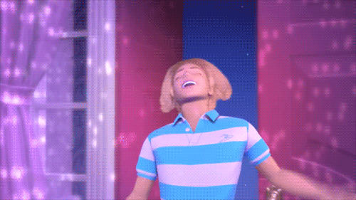
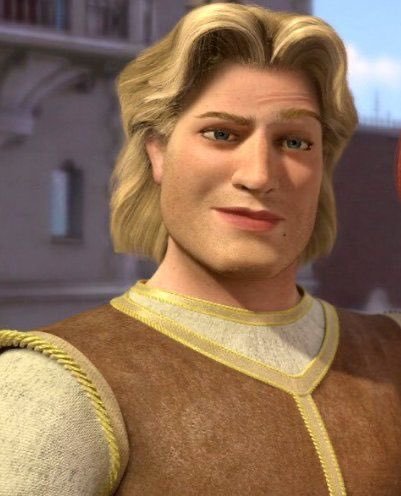
✧ When Sanji dives to save Luffy in the water, the movement of his hair directly reminds me of Prince Charming in Shrek.
✧ What is this flag chick for "One Piece" episode 5? Is it for the Baratie?
𝐅𝐑𝐎𝐌 𝐀 𝐅𝐑𝐄𝐍𝐂𝐇 𝐕𝐈𝐄𝐖𝐄𝐑
✧ I watched the original version but some accents were such (Z.E.F.F) that I had to put the subtitles on to be able to understand everything
✧ I realized that I had been pronouncing Baratie wrong my entire childhood. I pronounced it like it was an English word but it seems like it was supposed to be pronounced like a French one?
In the French subtitles, they translated mosshead into cabbage head…
N O P E!
✧ I died laughing when I heard Sanji announce his attacks at Arlong Park ("côtelette, collier, épaule, poitrail"). I realized that if there was one place in the world where a french speaking person will never be lost in the world in terms of language, it is in a kitchen!
26 notes
·
View notes
Text
WEEK TEN_CONTACT SHEET_V1
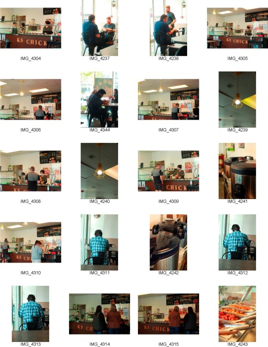

now fully diving into my concept i went to the store during the lunch rush 12-1pm and tried to take photos. i went into this photo shoot with an open mind. whatever comes into focus I would take a photo off. because of this process, I didn't get many useable photos, for the final series but it helped me understand the type of photos I take when documenting the world.
there are some limits of course since I aiming for natural and unstaged photos I try to become the camera stand. Unseen is the position I need to take when taking photos.
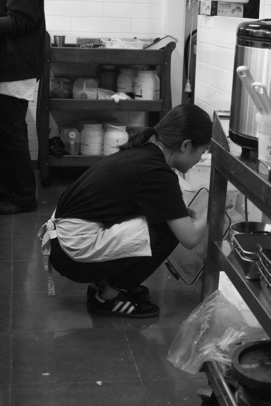
the people in the photos i focus on are some of our customers, my mum, Dowon unnie and Sungung unnie which are our part-timers.
(unnie is an older sister in Korean)

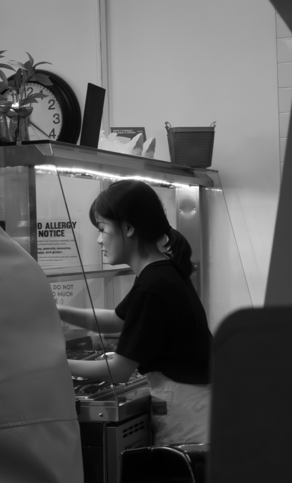
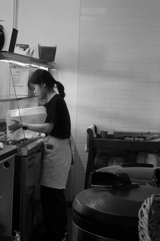
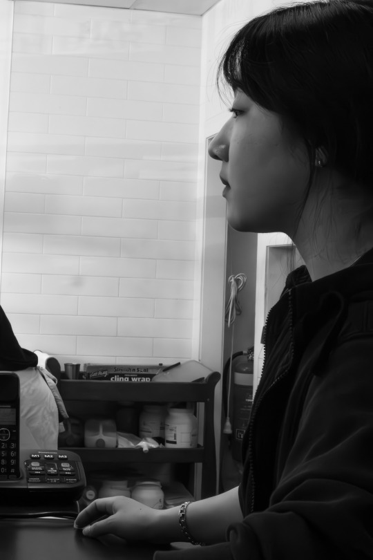
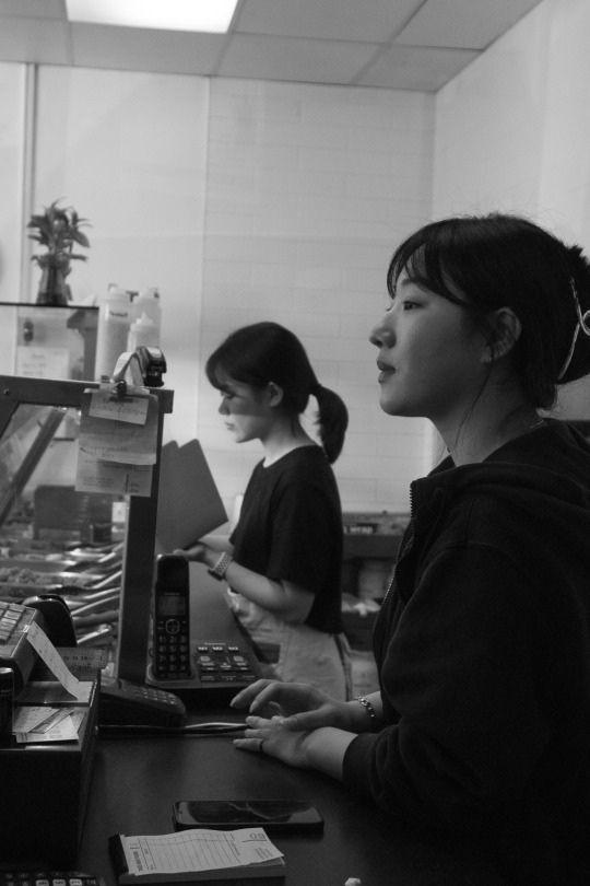
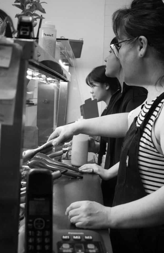
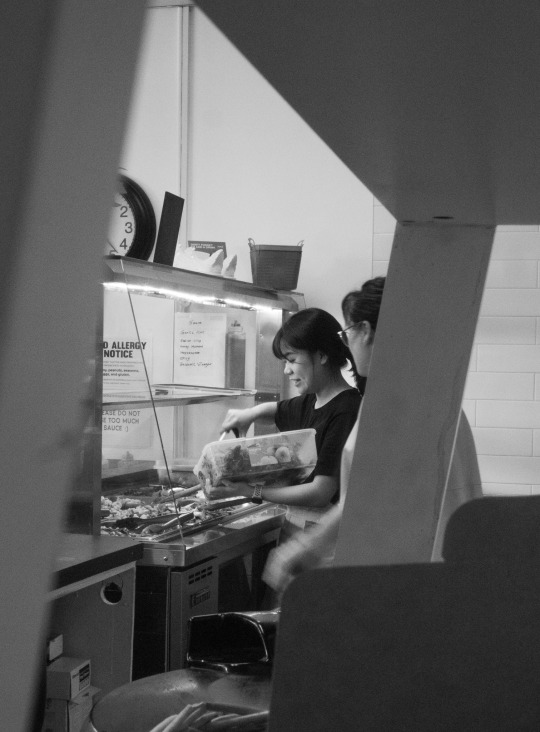
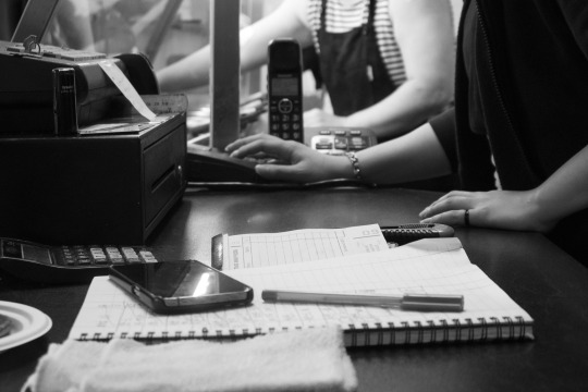


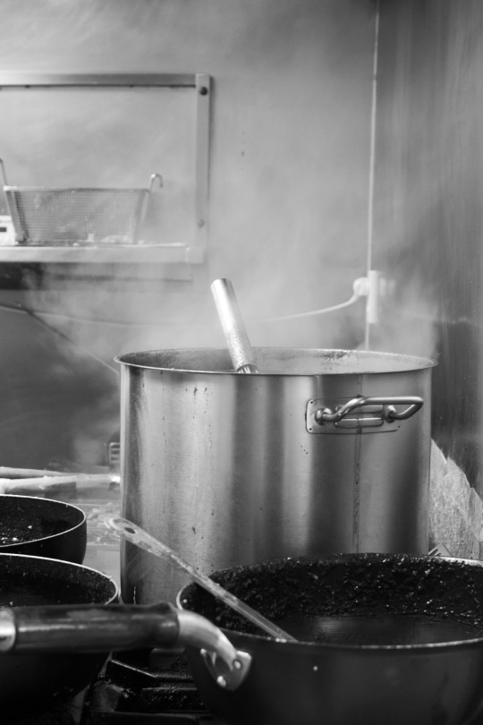
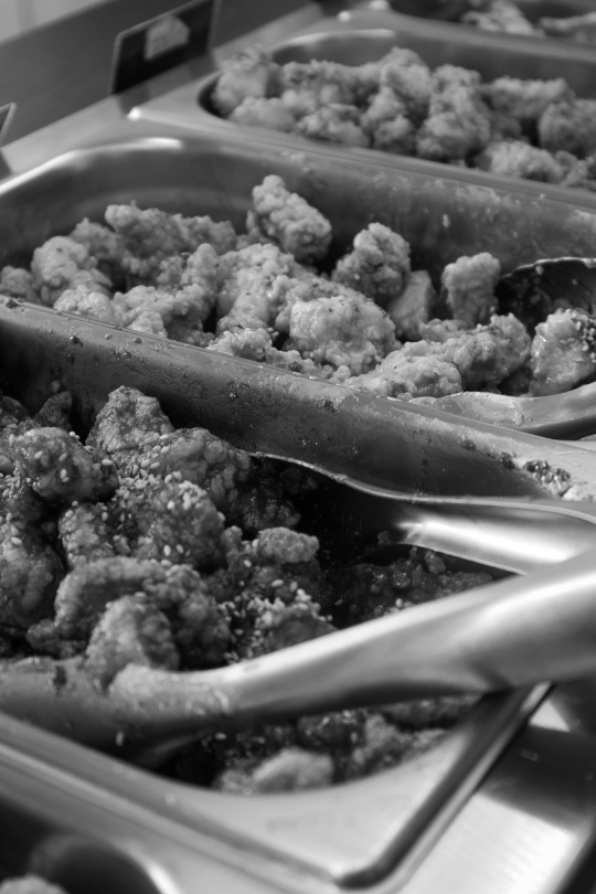
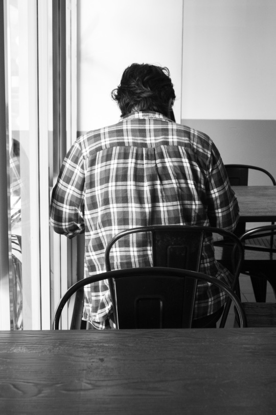
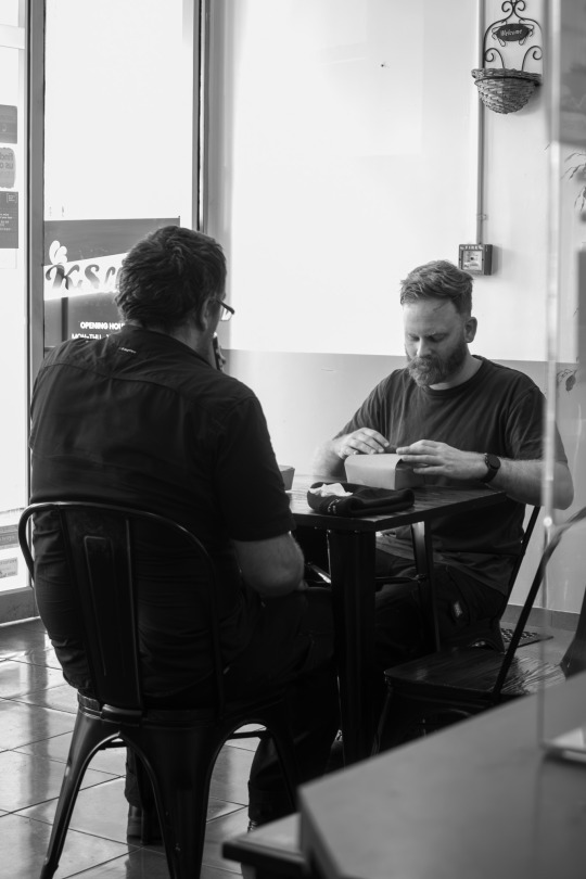
i found the lighting condition and colours very inconsistent. the lighting coming from the windows makes the dining area very bright and overexposed in certain photos while behind the counters and kitchen is much darker and the yellow lighting makes everything look warm.
to fight this and make the photos look connected I decided to make them b&w post-production. i also like this look for the type of story and photos I'm taking. this is a documentation of the people who work in the store as well as the customers that come and go I've felt from my photography and experimentation b&w makes the photos less busy and since we naturally focus on people in photos, this makes the focus on the people in the story.
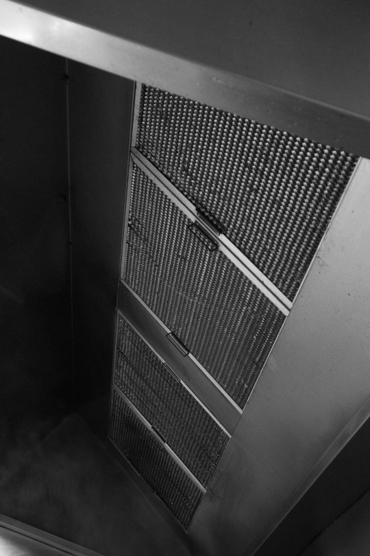
i took photos of both the people and environment like the kitchen hood, the pots and pan on the stove etc to expand the type of story and the location.
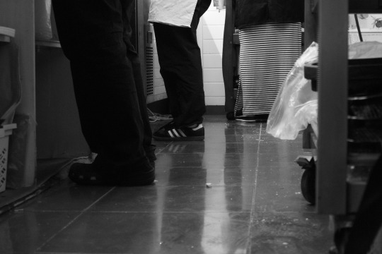
i had some difficulty finding interesting and more dynamic compositions. i feel like my go-to style of taking photos was in portrait and just straight ahead. i tried taking photos behind a shelf and of the shoes and floors. the outcome wasn't bad so i plan to try these compositions again in my next shoot. i was also mindful to try some landscape photos and in the end, i found a lot of the landscape photos to work the best.
i already have some ideas on the spread and layouts of the photos. for example this photo:
i want it to be spread over a full two pages.
one advantage of B&W and the reason I love using it for more busy-looking compositions is the space it allows.
first is Dowon unnie, second is Sunjung unnie
0 notes
Text
The Camera-Shy Hoodie is a DIY adversarial garment designed to give the user the option to anonymize themselves within the recording of a night vision security camera.
The hoodie embeds a number of high-power IR LEDs, utilizing the same wavelength of infrared light commonly used by security cameras as flood lights for night vision. By pointing the LEDs back at the camera and setting them to a tuned strobe, the security camera’s capture becomes overexposed, significantly losing definition of the scene. The LED strobe, tuned to interfere with these cameras auto-exposure, causes a strong loss of definition where the light is strongest. In this layout, where the LEDs are arrayed around the upper chest, shoulders, and upper back of the wearer, that head of the wearer is then significantly obfuscated.
1 note
·
View note
Text
Photo supreme vs lightroom timelapse

PHOTO SUPREME VS LIGHTROOM TIMELAPSE PROFESSIONAL
PHOTO SUPREME VS LIGHTROOM TIMELAPSE WINDOWS
This brought down the exposure of the sky to bring out more color and more closely match the exposure of the rest of the scene. The sky was quite overexposed in the original photo, so I used the HSL tool in Lightroom to bring down the luminance of only the blue colors in the photo. The wider the lens you shoot, the more overlap you need to overcome the distortion. The area in this photo was a bit too wide even for the real estate recipe, so I shot three photos in vertical orientation overlapping them by about 30% and later stitched them together in Photoshop. To make this photo, I used the typical real estate photography recipe: Smash yourself up into the corner so as to take advantage of every inch of the space, set your lens to the widest possible focal length, and fire the shutter. The photo of the back yard shows a little distortion, but I think the advantage of seeing the entire yard in one photo is more valuable than avoiding the little bit of distortion. This illuminated the darker areas of the room and made the room lights look like small warm accent lights while still leaving the room with a neutral daylight color temperature. To fix this problem, I used a YN-560 flash pointed at the ceiling that matched the daylight from the windows. Since the light bulbs in the room were warm incandescent lights, it produced ugly competing color temperatures in the areas further away from the windows.
PHOTO SUPREME VS LIGHTROOM TIMELAPSE WINDOWS
I opened all of the windows to let in bright clean light. On wide angle lenses, the areas nearest the edges of the frame distort far more than the center of the frame. To avoid distortion from the wide angle lens, I avoided putting the intersection of the vertical walls and the ceiling anywhere near the edge of the frame. TIP: I found that placing an area of carpet closest to the camera (instead of furniture, a wall, etc) made the room look extremely large because the super wide angle lens distorts distances to make things closest to the camera look larger than they appear in real life. I walked around the room for a few minutes looking through the viewfinder until I found the best angle for making the room look as large as possible. This is where people spend most of their time in the home, so they want to see that it is open, attractive, and functional. The living room photo is probably the most important photo in a real estate listing. Living area photo Photo of the Main Living Area I don't claim that any of them are perfect–after all this was the very first time I shot real estate–but hopefully it will provide you with helpful pointers if you are asked to do real estate photos at some point. The following are some of the photos I took in the shoot and a step-by-step guide of how I made the photos. Check out the Real Estate Photographer Starter Pack here.
PHOTO SUPREME VS LIGHTROOM TIMELAPSE PROFESSIONAL
In the bundle, you also get a legal contract to use between you and the real estate agent, and 10 Lightroom presets for real estate photography to make your photos look polished and professional right from the get-go. If you need to figure out your own real estate photography pricing, I actually sell a real estate photography pricing template for just $15 in my Real Estate Photographer's Starter Pack. This home has many large windows, so I wanted to show off the lighting in the home. (2) I wanted to capture photos that were unique from what most real estate photos look like so as to grab attention of potential buyers, and (3) I wanted the home to look bright and clean. It is a large 5 bedroom home, but the layout is not open. I set out to accomplish three things in this shoot: (1) I wanted the home to look large. Also, the home we eventually bought wasn't even on our short list of homes we saw online because the photos made it look very small. When I purchased a home a year ago, I wasted a tremendous amount of time looking at homes that I would have known weren't a fit for me if the photos had done a better job of showing the layout of the home. I am firmly convinced that real estate agents intentionally make houses look terrible in MLS listings. My parents are selling their home, and I couldn't bear to let the real estate agent take the photos of the home I grew up in. Anyone who has read Improve Photography for a while knows that I'm not a real estate photographer, but this week I had the chance to do a real estate photography shoot and I learned a lot of tips and tricks that I hope to share.
0 notes
Text
Adobe photoshop cs6 for windows vista

ADOBE PHOTOSHOP CS6 FOR WINDOWS VISTA PATCH
ADOBE PHOTOSHOP CS6 FOR WINDOWS VISTA SOFTWARE
Use the integrated Lab B&W Action to interactively convert color images create gorgeous HDR black-and-whites with greater ease and speed and experiment with new presets. The HDR Toning feature offers an easy way to bring the rich aesthetic of high dynamic range to your 8-bit images.Įxplore an endless variety of black-and-white looks. Give any single-exposure image the photo-realistic or wildly surreal look of an HDR image. Get stunning results thanks to automatic ghost removal and greater control with tone mapping and adjustments.
ADOBE PHOTOSHOP CS6 FOR WINDOWS VISTA PATCH
Use the Neutral Density preset to emulate a neutral density filter, clicking once to have the Gradient tool darken an overexposed patch of a photo while leaving the rest unaltered.Ĭreate either photo-realistic or wildly surreal high dynamic range (HDR) images with unprecedented speed, control, and accuracy. Gradient tool preset for neutral density new Simply drag a straight line from the Ruler tool onto your image, and the image will snap to the line. The Grid display is now off by defauenjoy better-than-ever raw file conversion thanks to improved demosaicing. Remove an image element and see the space fill in almost magically.Īchieve superior results in fewer steps when you remove noise, add grain, create vignettes, correct lens distortions, sharpen, and create HDR images. Easily select intricate image content, such as hair, for refinements, compositing, or placing in layout. Get exactly the look you want, more quickly than ever before. Warp or stretch graphics, text, or image elements to create unique looks. Paint naturally and realistically with on-canvas color blending and textured brush strokes. And enjoy better-than-ever raw file conversion.Įxplore fresh design possibilities with powerful new tools. Enjoy cross-platform 64-bit support and a wide range of workflow enhancements.Īchieve superior results in fewer steps when you remove noise, add grain, create vignettes, correct lens distortions, sharpen, and create HDR images.
ADOBE PHOTOSHOP CS6 FOR WINDOWS VISTA SOFTWARE
Experience fast performance on 64-bit systems.Ĭreate powerful images with the professional standardĪdobe® Photoshop® CS5 software redefines digital imaging with powerful new photography tools and breakthrough capabilities for complex image selections, realistic painting, and intelligent retouching. Create stunning HDR images, remove noise, add grain, and create vignettes with state-of-the-art photography tools. Remove any image element and see the space fill in almost magically. Industry-standard Adobe® Photoshop® CS5 software helps you create images with impact.
0 notes
Text
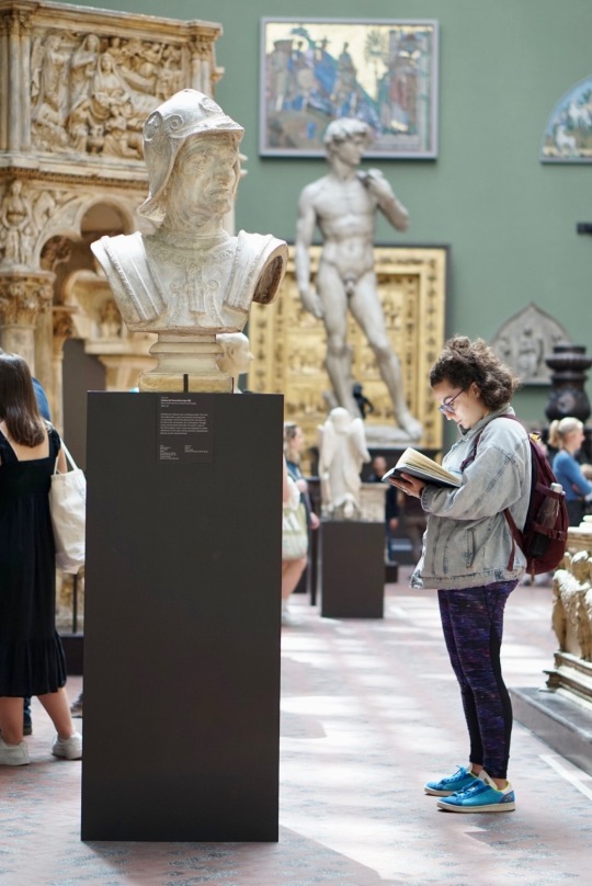
This is the photo I selected from our exercise in the Victoria & Albert museum. To take this photo, I set my shutter speed to 1/100, my aperture to F2.0, and my ISO to 250. I wanted a relatively low shutter speed so that the photo would still be well-lit, but I also decided to put it higher than 60 so that the image would appear crisp, since there is some movement in both the subject and the background. I chose to set the aperture to F2.0 so that the focus would be on the subject and the statue she was drawing, and the other art and people in the background would be less distracting. I set the ISO to 250 because this helped the photo to be bright, while keeping it from being overexposed. I really like the layout of this photo - how the main statue and the David statue are both looking out of the frame, as the woman stands facing them. I also like the light in this photo - it appears happy, thoughtful and calm.
0 notes
Text
Graded Unit Contact Sheet 4
🟢Good, consider for optimisation 🔴Underexposed 🔵Overexposed 🟡Poor composition 🟠Out of focus
This shoot was one that compromised the authentic aspect of my project. I was running out of time to get all the shots I needed and my schedule was a bit ruined due to models not being available when we had planned for them to be, so I had to try and force some candids. Although they don't look entirely how I wanted them to, I am still happy with the shots I got and think they look great. I tried to get a variation of landscape and portrait shots to choose from during post-production as I still wasn't sure what layout I wanted for my final images yet, I just knew I wanted them to be either all landscape or all portrait to help keep my final images consistent.
0 notes
Photo
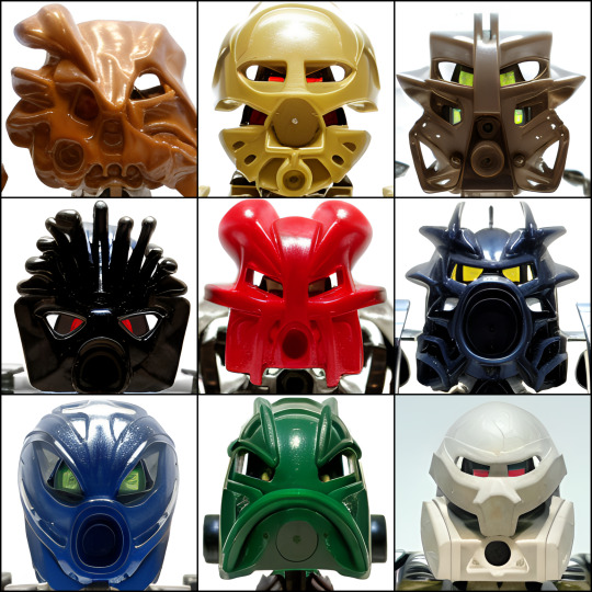
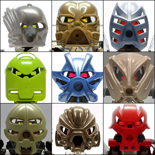

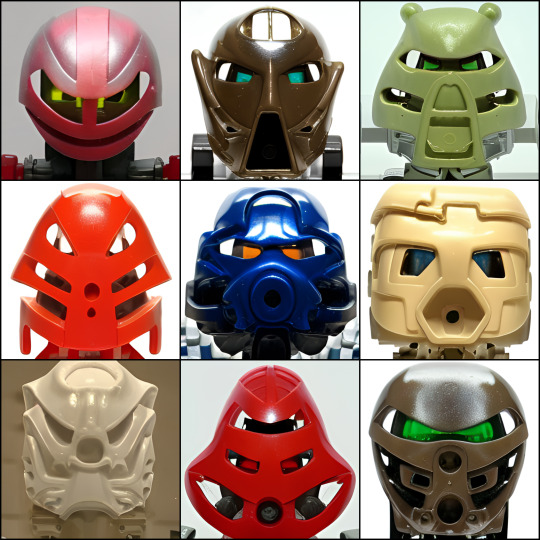
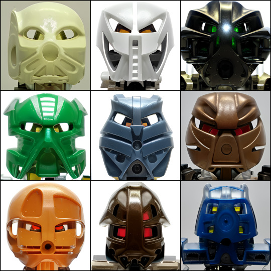
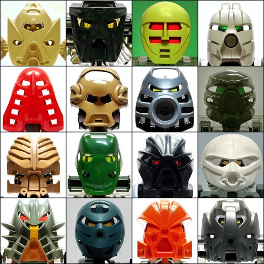

These Bionicles Do Not Exist
Made with Looking Glass AI. I showed it a bunch of headshots of Bionicle characters wearing various Kanohi—these were the results that I liked and kept
Looking Glass AI v1.4 (and creator’s twitter and tumblr)
Albums of all 83 input images: [1], [2], [3]
Album with all outputs as individual 512x512 pixel images
Information about generating these / rambling commentary below the fold:
All images were generated on Low Universe Similarity. The number of epochs used for training was varied between runs, and some runs used only a subset of the inputs in the linked galleries (e.g. early runs used only the first album; some later runs omitted particular inputs I thought might be noisy or contributed to outputs I didn’t care for; etc.)
There’s clearly some overfitting, especially for some of the outputs. (Some appear to basically be a modification/variation on one specific input in particular—e.g. top-center in the fifth image as a variation of the Kanohi Miru)
For others, it’s hard to tell what’s overfitting, vs. what’s just a result of the design space itself being small—there’s only so many ways to make a mask that looks Kanohi-ish, and of those, most of them are variations on the basic O: or ▷: layout. So, a lot of the outputs basically look like a Hau or a noble Rau
For the input images, I tried to get a variety of Kanohi, and 2-3 different colors per Kanohi when possible. Some were harder to find good photos of than others. In particular: it was hard to find head-on photos of the white and black masks that were decently lit. A lot of photos of white masks were overexposed and also on white backgrounds, so you just....couldn’t see any features, or even where the masks’ edges were. And some photos of black masks stood out from the background, but weren’t very easy to read (you could see specular highlights but not much else). I settled on grainier or less-clear photos than I would have liked sometimes, and you can see that reflected in the outputs a bit, especially for the white masks
#bionicle#lego#looking glass AI#machine learning#aes#my posts#my uploads#pls clap#my uploads (jank)#my uploads (unjank)#AI art /#trypophobia /#unreality /#ask to tag /
1K notes
·
View notes
Text
Wed 17 March ‘21
Did we really get a SHOW from Niall AND a new song with Zayn on it AND a Zayn interview and photoshoot? I guess it is a lucky day, Happy St Patrick’s Day to us!
“Happy Paddy’s day to my fellow Irish and anyone who celebrates our great country today,” said our resident leprechaun Niall, and “love how I’ve got more texts today than I got on my birthday,” haha well glad he’s getting the Irish love- and he played a show!! He streamed from the Toucan pub in London- it’s short, not even 15 minutes and only four songs (you can watch the part of the stream right before it where they… make a sandwich?? though if you’re wanting to stretch it out), but damn so good! He opened with two old favorites from Flicker, aw nice to hear you, somehow makes the fun poppy Black and White sound like it was always meant to be a tearjerker slow song, and then worked everyone into a frenzy by covering U2’s With or Without you and rightly so, that’s an awesome cover! No complaints about that set at all, heck yeah!
Zayn’s new song came out today, not last night; I thought I just got confused by timezone stuff but actually it wasn’t me! Something weird happened and they delayed it and it was super confusing (the term ‘technical difficulties’ was used so that clears up nothing) but anyway it’s out now! Technically it’s not Zayn’s new song but Ingrid Michaelson’s with a Z feature but anyway it’s so pretty, worth the wait. Ingrid said she wrote the song the night Biden won the election, about the intense relief she felt, that she hopes it can be a song of hope as we come out of COVID, and that Zayn reached out to her to let her know he was a fan and he’d like to work together. Merch for the song is available in Ingrid’s shop, and that’s really pretty too!
And NOT ONLY THAT, Zayn’s INTERVIEW is out as well plus PICTURES and wow they are, yes you guessed it, also extremely pretty! He’s always a model but we see him so infrequently that it’s always shocking all over again to be confronted with just how damn perfect his face is, and they show him off very well indeed. And he SPEAKS; it’s very brief but the few glimpses inside he allows us are always a gift. He says, "I feel like, in general, no one is listening at the moment. With everything going on, and in a world of unnecessarily overexposed opinions, with people yelling at each other to see who makes the most noise, I feel like no one is being heard. People love to talk, but nobody likes to listen," "I think the quarantine has affected me in the same way as everyone else. I am not a person that spends too much time outside home or outdoors and I like to have my own space, so that is the only advantage, other than that now it is also driving me crazy," and less thoughtful but my personal favorite, I love salty Zayn telling haters what’s what, “if I haven’t worked with them, it’s because I don’t want to work with them yet.” Plus: "It really is not easy to have some form of creative freedom or control. The truth is that I have to continually go against the grain when people tell me to do things a certain way, but my stubbornness and my willingness to want to do things differently help me get through it.”
An article about Harry talks to Kid Harpoon, who Harry continues to outsource that part of Fine Line promo to-- as Harry’s stand in he talks about songs they wrote together in Japan that didn’t make it on FL including one that “nearly made it to the record” that “he and Styles are still obsessed with,” saying “it’s the same as the Watermelon thing with this song, it’s got… there’s a certain feeling in it, we’re just going to have to chip away at it and hopefully get it.” Fans-- HS3 is coming? Lol WHAT?? Like someday yeah but as usual I do NOT know how you got from that point A to that point B kids, it is not coming anytime soon. We also saw a video of Harry (via a dad!) saying “hi I’m Harry” for a fan, we KNOW Harry, and looking super cute, we also know that already, truly nothing new there, but news to me was that after Harry’s performance there was a spike of interest in leather pants and boas, I look forward to the fashion I see at the grocery store getting wild in the coming months; nothing about interest in Clueless jackets though, sorry Harry. Mitch posts to say, “as the grammy hangover wanes, just want to say how proud I am of my friend Harry,” and the Daily Mail included Harry in a layout of “pop princesses” at the grammys, nice to see the tabloids printing some TRUTH for once!
122 notes
·
View notes
Text
Ledge illusion images
3 things I learned today
1. Hard lighting images create ore overexposed results
2. Soft lighting creates an even spread of light and prevents vertain areas of an image being more over exposed.
3. The layout of the 3 pieces of paper is crucial to the overall ledge effect trying to be created.
HARD LIGHT IMAGES


SOFT LIGHTING IMAGES


6 notes
·
View notes
Text
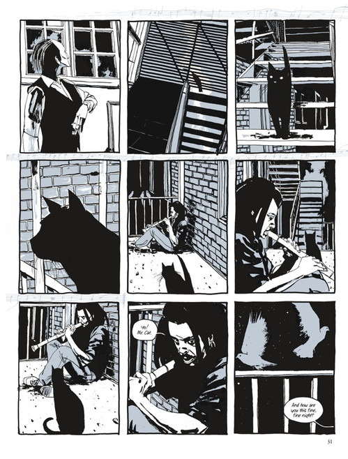
Dave Mckean Comic Illustration:
Arkham Asylum - A Serious House on Serious Earth:

- What about the novel drew me in?
The novel follows batman and his interactions with his archenemies within the walls of Arkham Asylum. Keeping with the theme of insanity and mayhem, the art style of the graphic novel is quite hectic and all over the place. Some panels depict overexposed illustrations of the joker in a crazed poses and others show more detailed and gruesome scenes of the villains in action causing trouble. This effect drew me to the novel because of my fascination with gritty themes in comics and the creepy characters that go along with them. I find that this is a very clever tool in linking the illustration and story together by alluding to the madness of the location, characters and their circumstances throughout the novel to keep the reader on their toes and expecting the unexpected.
Black Orchid:

- What about the novel drew me in?
There is a lot of contrast in the novel between the background and the characters. In an attempt to draw more attention to the characters and events in the novel the artist leaves less detail in the surrounding location and uses highly detailed features and bright colours across the characters face to emphasises the importance of pivotal moments in novel of important feelings the subject may have. Something about this technique is very effective and interests me as a possible concept for my final comic book draft. Personally, I think that the most important aspect of a graphic novel is the movement of the character and the effectiveness of their emotions when portrayed on paper.
Sandman:

- What about the novel drew me in?
The panel layouts are very interesting and dynamic which is something I desperately need to work on in my own comic. However, I have an issue with the piece about, as I find it far too difficult to read which is the complete opposite point of the purpose of a graphic novel or comic book. Because they are intended for easy reading, I think that although the layout looks superb from an artistic perspective, the page as a whole is far too muddled and would be complex to read if tackled by someone with reading difficulty. After looking at the novel I have determined that although the artwork and panel layout looks lovely it is far too busy. This has helped me to understand what I look for in a graphic novel and how I may approach my own book after looking at Dave McKean’s artwork.
Cages:
- What about the novel drew me in?
Cages is an interesting contrast to other illustration pieces by Dave McKean as it is drawn in black, grey and white, whereas his other comics have been in full colour. The comic follows characters living in the same apartment building and how their lives intertwine and effect one another's in unforeseeable ways. I think that this is a fun twist for McKean as he usually looks at semi-mystical themes in his graphic novels and so a more relatable story of ‘real people’ and their lives and how they mysteriously interlock and relate to the struggles of one another.
- Dave McKean art styles overall:
I found it very interesting to discover the array of art styles McKean uses in his various novels and how that are used with intention and purpose within each book. Cages is very rough and blocky because it is supposed to portray an unfiltered view into the lives of people, whereas Sandman is very detailed and mystical looking. Using dynamic panel layouts to contribute to the idea of riches, and how time interlocks with all things and his beyond any of our understanding. (the panels branch off like a wise tree, which is why I inferred the previous comments.
- How might I use this to further my work?
After looking at the outcomes of illustrator Dave McKean, I have identified elements of his artwork that I will not be including in my own comic. Dizzyingly busy panel layouts and blocky colour techniques. Looking at the illustrations made for Arkham Asylum and Black Orchid I have decided that I want for my artwork to be detailed and dynamic with small breadcrumb like clues that subtly imply elements of my characters personality and their backstory. Looking at if they are a traveler and how to hint at this without mentioning the word, are they a professional knife thrower? What elements of their costume hint at their backstory and why.
Website Links:
https://www.davemckean.com/
3 notes
·
View notes
Text
Recycle project - inspiration - 5 images
Giovanna Griffo is a fine art Italian photographer and retoucher. Additionally, she teaches retouching and digital photography at workshops in Italy.
She fell in love with photography since she was six years old, her favorite place was her father's darkroom where she spent a lot of time, the whole process of developing film was like magic for her. She grew up surrounded by art, both parents are painters and sculptors, thanks to them she fell in love with art.
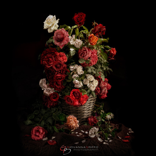
Usually, when I look for inspirational photos, my attention is drawn to those with flowers because i simply adore them. I like the composition of flowers in the basket and those laying next to it the same as petals. The whole layout feels neatly messy ( not sure if that makes sense in English the same as in Polish :) and I feel like it adds to the overall composition. I like how the flowers were lighten and how this bouquet stands out from the background. I think the artist spent a lot of time lighting everything as it looks perfectly planned and done.
Last year in NQ we did some light painting and it was great fun and I’m looking forward to do that again.
Julie Powell is a still life and portrait photographer from Australia. She runs workshops and teach about light painting, still life, portrait and product photography. Julie tried different styles and genres of photography before she knew what she is passionate about. That reminds me about myself because before I started study Photography I never thought I will like still life or even studio portraiture it just sounded really hard for me but once I tried I loved it :)

I chose this image made by Julie because I like the lines and shapes. I like how the wooden table/desk add a little warmth to whole image. The light that falls from the upper left has created an interesting shape (like a flashlight) and focuses my attention. An image looks like it have been painted and it has soft appearance.
Amanda Casadio is a fine art photographer from Brazil. Photography at first was her hobby which became her passion.
High lights and shadows, light painting and high contrast, are searches and techniques that I use to show what delicately reveals the light.
Amanda’s work is very delicate and subtle, the images are often black and white.

While looking for inspiration I didn’t see many black and white images with use of light painting technique. I like this image for simpleness and contrast. I like the way the vase is lit the most, it perfectly emphasizes its beautiful shape, texture and pattern. I personally think that the flower was a little overexposed from the left side, but it is possible that it was supposed to look like this. Lovely and simple image.
Unfortunately I wasn’t able to attend Harold’s Ross at the Winter Photo - festival. His work is stunning - very interesting and inspiring.
Harold Ross is a famous American fine art photographer. Hi is well know for his fine art work with use of light painting method. Harold’s interest to photography started when he was small while watching his dad in the darkroom. When he was sixteen he bought his first camera and that’s how his journey with photography begun.
Inspiring words of Harold Ross:
If I had to compress my photography into one single message I’m trying to communicate, it would be this: There is beauty everywhere. We can walk into the backyard and find a beautiful leaf or an amazing feather, take a longer look at things that others pay no attention to. When looked at from a certain viewpoint or camera angle, and with lighting that brings out the otherwise hidden aspects of an object, we can make the seemingly mundane into something truly extraordinary.

In this image I like how the plate pop out from wooden background. I also like the contrast between cold and warmth tones as well as texture and colors. Everything works together perfectly and creates an interesting picture.
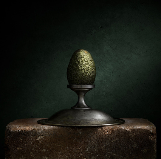
This is another image of Harold Ross that i find interesting. Four different textures work together perfectly. I like all different colors and patterns and how the background cooperates nicely with avocado.
What drew my attention is that when searching for my item, it would be good to look at each side of it as it can have a different/new purpose (look differently from another perspective) just like this fruit bowl rotated upside down.
Dirk Ercken, nature and urban photographer from Belgium. Dirk is also a biologist, fascinated in natural world and animals.
He worked for a long time in a field of aquatic ecology. During his travels, he took photos, after returning home, however, he was not satisfied with the result, because of that he put the camera aside, which did not develop his photographic skills. After a while, he decided he wanted to learn how to take good pictures. He enrolled in a four-year analog photography course and in the meantime he was learning digital photography himself. Now he is a full time photographer. His greatest inspiration is nature.
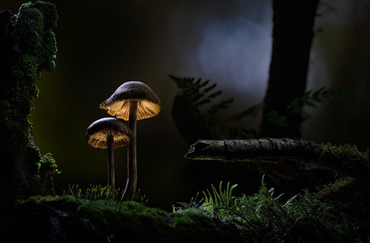
In this photo, I like the perspective from which it was taken and the way it was lit. The most attention is paid to the mushrooms which are perfectly lit, they look as if they are glowing from below, and also how their shape has been emphasized.
I like the contrast between the light and the shadows and the background. The whole scenery looks magical.
https://www.behance.net/giovannagriffo
https://www.juliepowellphoto.com/
https://www.lensculture.com/projects/1047508-what-the-light-unveils-a-lig
https://www.haroldrossfineart.com/
https://www.haroldrossfineart.com/still
youtube
2 notes
·
View notes
Text
VSDC Free Video Editor
About VideoPad Video Editor
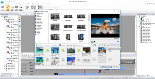
Rotating videos Sometimes videos recorded with the smartphone camera are displayed in the wrong orientation on the PC. In this selection you will find free programs with which you can shoot your videos on your PC or directly on your smartphone and align them correctly again. You get the standard version of the program free of charge on your computer. The software is smooth and straightforward and supports a variety of file formats. Overall great for a freebie. The "VSDC Free Video Editor" as icing on the cake offers an integrated diagram function especially for the visualization of figures. The video program has an abundance of 2D and 3D chart types such as dot chart, line chart, pie chart, spline chart, pyramid, bar finance chart and many more. However, the program is anything but self-explanatory and requires a certain amount of training. You can export finished projects in various formats, including AVI and MKV with H.264 codec. The tool also includes DVD authoring options for DVD creation and special profiles for various devices, including iPod, XBox 360 and smartphones.
While programs like OpenShot offer a high degree of user-friendliness, you first feel overwhelmed here.
>
Storyboard was added to edit footage.
The timeline makes it very easy to use picture-in-picture (PiP) effects, because every picture and video element can be freely sized, Place, show and hide position and duration.
Please see our data protection declaration.
In the new version, the functionality of the parameters of object / effect processing has changed fundamentally changed.
While programs such as OpenShot offer a high degree of user-friendliness, you first feel overwhelmed here. Countless tools, tools, setting options and repair options await those who are willing to invest a certain amount of time in the start of the program. First, in Free Video Editor you mark the start and end point of the scene that you want to remove from the video. If you wish, you can do this precisely. If you want to link to the download of VSDC Free Video Editor, you can have a corresponding link generated here. Simply select the desired style downvid and copy yourself the source code from the text field. Edit Videos With various video editing tools, you can cut or convert your videos at no additional cost. SMann can even add a digital watermark so this software can be very useful for small businesses. The software is fairly easy to use and has a clear tile layout. Adding titles to videos has never been easier. Use a template or create your own. In other words, a pixel-precise shift is generally either not possible at all or is not shown in the preview. I also love this wonderful white aperture throughout the window when I add an effect. working and very fast working program without any frills. And since it offers a stable, powerful video editing solution with literally hundreds of YouTube guides, you should definitely give it a try. What's even better, with the adjustments, you can easily save overexposed and underexposed videos.
1 note
·
View note
Last Seen Blogs