
vsykesphoto
victoria
hnd2 photography at cogcig|@vsykesphoto
78 posts
Don't wanna be here? Send us removal request.
Last Seen Blogs

artoatsblog
soldier has my autism in his hands

atbgrakichin
イラストレーターあきちん(馬栗工房)

skiprocksontheocean
made of starlight

cookie-club
♥ Cookieclub

Text
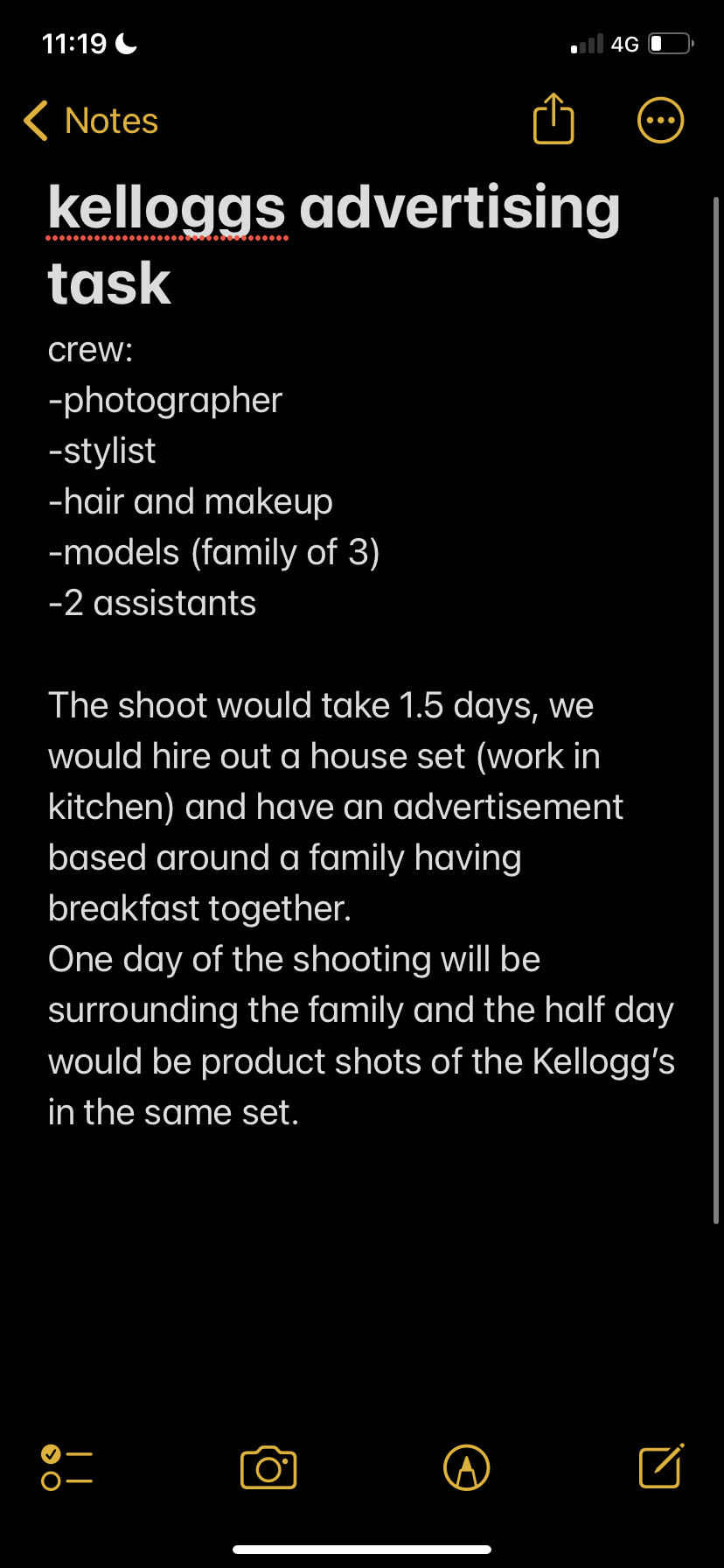
Landscape Contextual Task
I am very interested in environmental landscape photography because I enjoy seeing the different techniques used by photographers to enhance the scenery, whether it be in the darkroom or more modern in photoshop. You would usually see this style of landscape photography in galleries and more artistic settings, even perhaps in brochures for different countryside attractions.
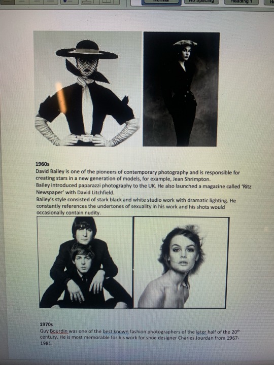
Ansel Adams was an American landscape photographer and avid environmentalist, which played a big role in his work. Adams only ever shot the parts of nature which had remained untouched by man, he strongly believed in preserving the wilderness. Ansel Adams is renowned for his work in the dark room, his images have intense contrasts which are only amplified by him solely working with black and white film.
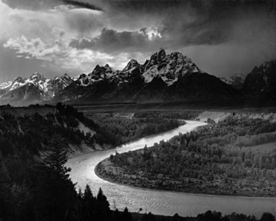
Ansel Adams, The Grand Tetons and the Snake River, Grand Teton National Park, Wyoming
I chose this image because not only is it one of Adams’ most famous images, but it is a great example of how his work often looks like a painting. The attention to detail in an image where he cannot control the scene in front of him is incredible and very impressive. It’s also a good example of his tendency to shoot snowy mountain tops. He would carry out a lot of his work when there were rain clouds looming nearby so that he could capture the stark contrast between the dark, gloomy clouds and the sun shining right behind them – he was quite partial to a silver lining as you can see in the image above.
1 note
·
View note


Text
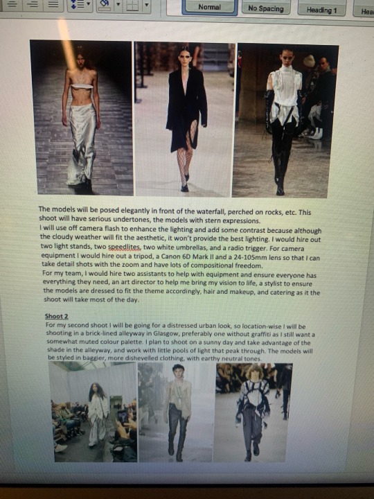
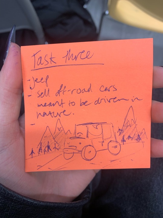
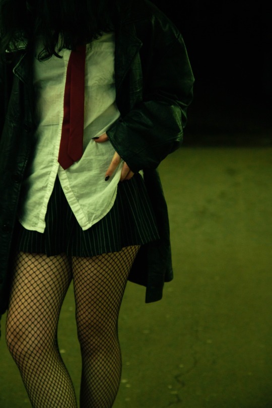
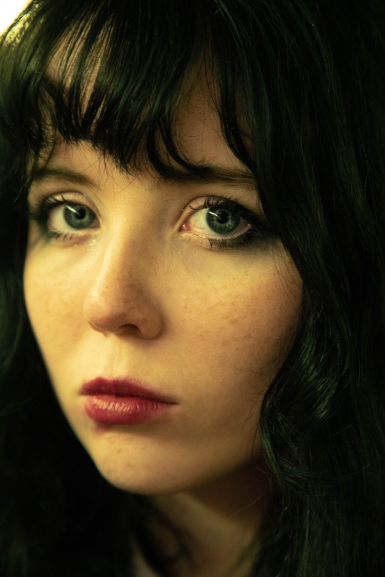
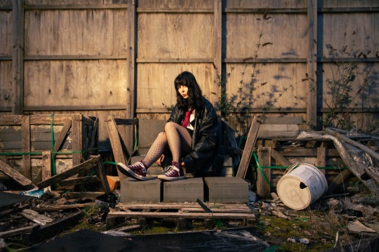
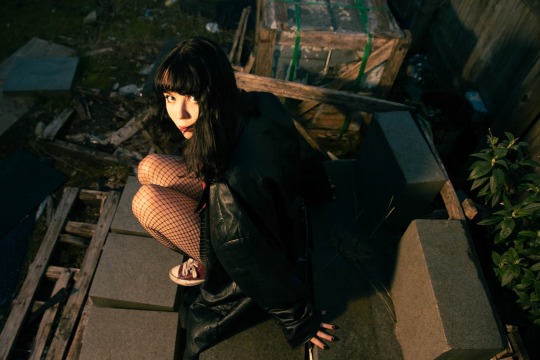
Fashion Contextual Task
I will be uploading pictures of my word document as tumblr won’t let me upload all of the reference pictures included.


0 notes
Text
Glassware Contextual Task
Task A: Look into the history of glass making and how it has developed over time, both in different methods of production and its ever-expanding list of application.
The first created glass can be dated back to about 4000 years ago.
Craftsmen working in Mesopatamia discovered that mixing lime, sand and soda created glass. They began creating glass jars to store oils and ointments.
It is believed that the Ancient Egyptians furthered the art of glassmaking around 1500BC as smaller glass articles such as amulets and pebbles have been found from this period in Egypt and Syria.
The production of glass vessels is known to have occurred sometime around 500BC on the Italian Peninsula. About half a millennium later the technique of blowing glass was invented by Phoenicians.
Glassmaking made its way into the western world and was further developed in Venice, making it the centre of glassmaking.
By the 4th century, glass blowing had become a global industry as the craft spread through places like Italy and Spain.
During the 15th century, a Venetian glassblower named Angelo Barovier created transparent glass, or “cristallo”. This was a big step forward in glassmaking as glass is naturally green.
During the colonisation of North America by the British in the early 1600s, glassblowing was taken to America, which began the domino-effect of some of the most important developments in glassmaking, such as the discovery of bifocal glasses.
In the 1820s, the mechanical press was invented, which made glass production easier and cheaper than ever. Glass became commonly available and used in households within two decades of this.
Glass has become so important in every day life. It is used for things such as windows, cups and jars, glasses, many electronic devices, and artistic pieces.
Sources
https://feltmagnet.com/crafts/A-History-of-Glass-Making-and-Blowing-Throughout-the-Ages
0 notes


Text
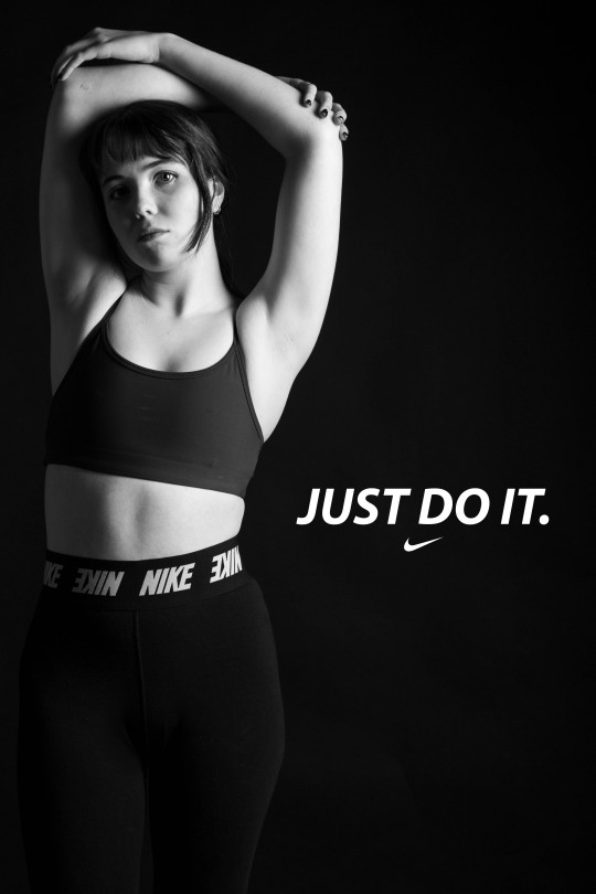
Nike Collab Studio Editing Process
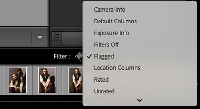
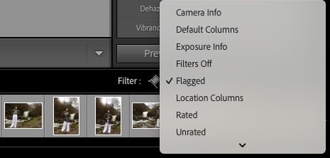
I imported my images from the shoot and went through them all on Lightroom, flagging the ones I liked best. I then went to the filter section and chose "flagged" and began working through my selected images.
I work best on location, so I had some difficulties navigating the lighting in the studio and it took me a few tries to find what worked best. I eventually got the lighting right but knew I would need to rely on my post-production work quite a bit to bring my images to life a bit more.
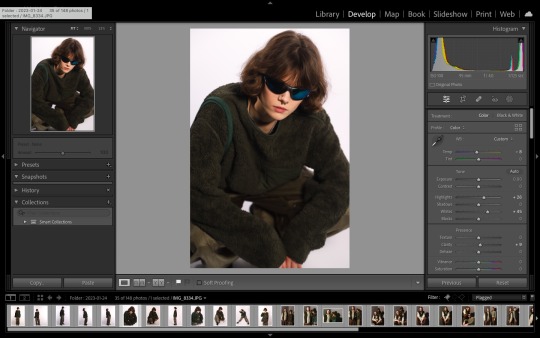

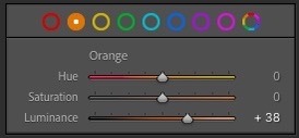
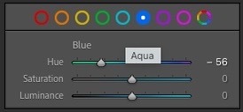
I needed my images to pack a bit more punch as I wasn't very confident in the lighting I had used, so I increased the whites and highlights quite a bit and then slightly increased the clarity. In the colour channels, I increased the orange luminance so the model's skin tone could appear brighter and less washed out, and altered the blue hues to make the model's sunglasses pop more. In addition, I put a slight blue colour grading on the shadows on some of my images.
Once I was finished with these images, I exported them into a folder. I then opened this folder in Bridge and filled out the metadata.
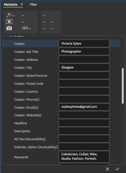
Once finished with the metadata, I used WeTransfer to send off the images to the students at Cal U.
0 notes
Text
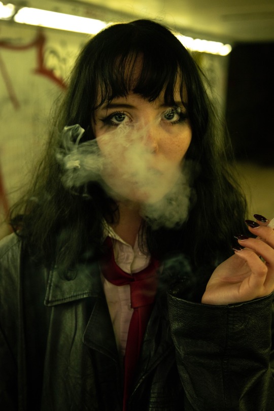
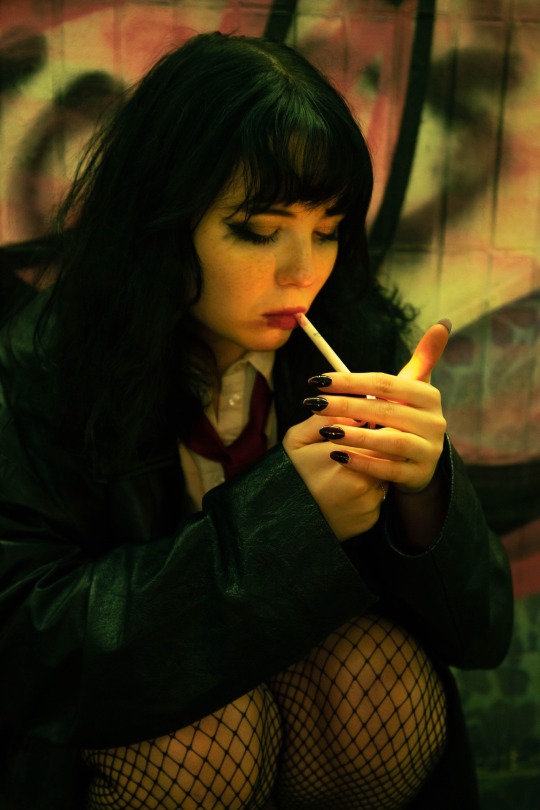
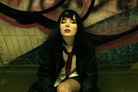
Nike Collab Location Editing Process
I imported my images from the shoot and went through them all on Lightroom, flagging the ones I liked best. This was a really successful shoot in my opinion, so there were a lot. I then went to the filter section and chose "flagged" and began working through my selected images.
Due to the foggy weather and the use of off-camera flash, the lighting stayed consistent throughout the shoot and I was able to use the same editing techniques on the majority of my final selections.

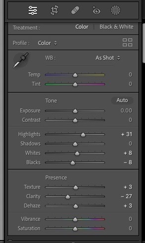
These are the settings I used on most of my images. We were fortunate enough to have heavy fog at the waterfall we were shooting at, so to emphasise this I took the clarity down quite a bit to give my images a dreamy and mystical look, specifically the sky and the running water which were both an off-white colour. To compensate for the loss of detail in the model, I took the texture up slightly. In some cases if I wanted the background really foggy but the model's detailing got lost in the process, I would create a mask over the model and turn up the clarity and/or texture on them. I also put a very slight orange/yellow colour grade on the shadows to give the images a more earthy look.
Once I was finished with these images, I exported them into a folder. I then opened this folder in Bridge and filled out the metadata.
Once finished with the metadata, I used WeTransfer to send off the images to the students at Cal U.
0 notes


Text
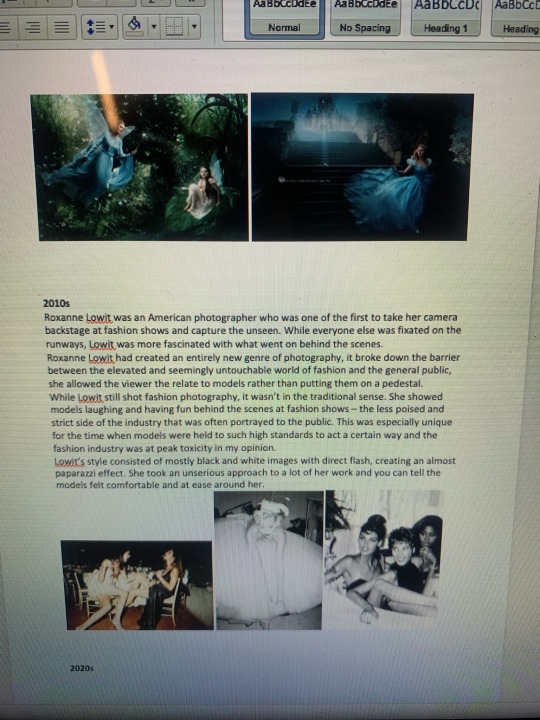
Editorial Plan + Mood Board
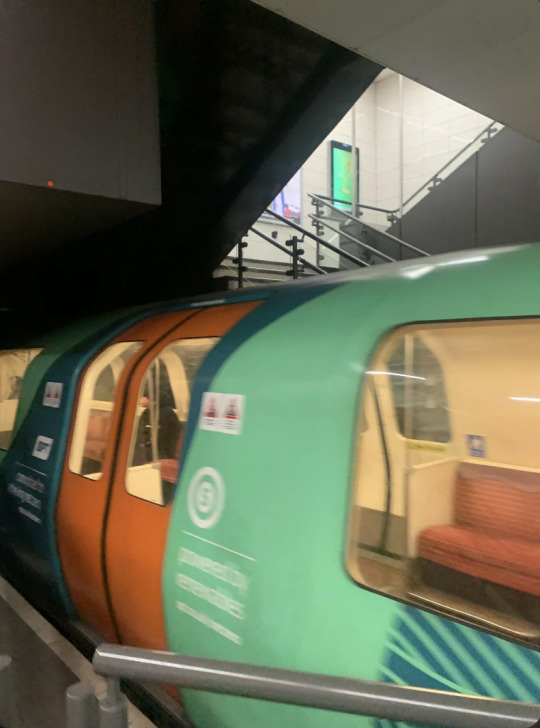
Model: Eleanor Cooke
Locations: Cowcaddens Subway, Phone boxes outside George Square, Wallace Street flats.
Time: 5pm onwards
Equipment: Canon 6D Mark II, 24-105mm lens, two flashes (master and slave), flash stand, white umbrella, red/orange/green gels.
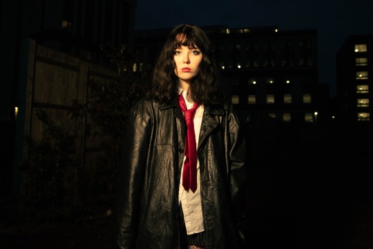
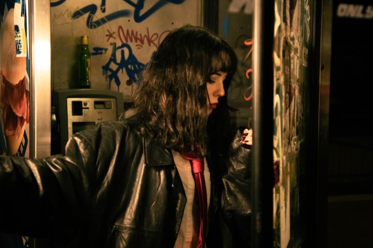
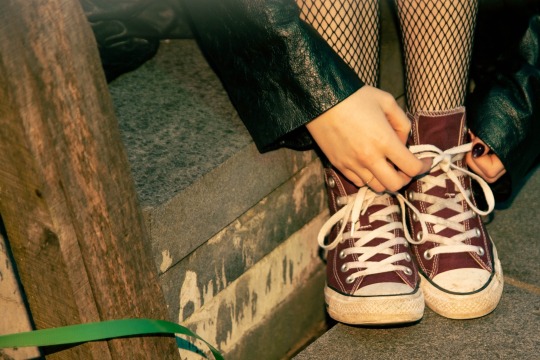
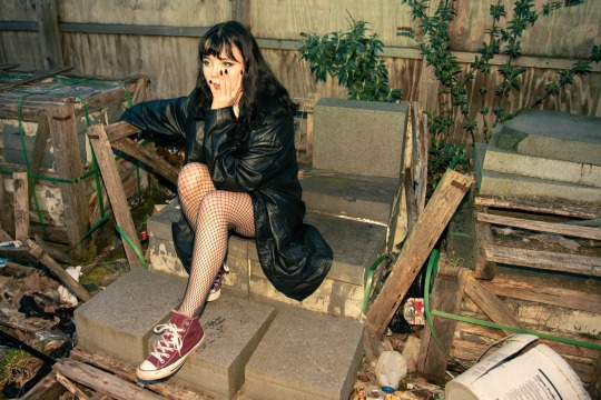
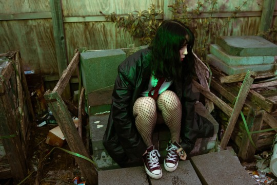
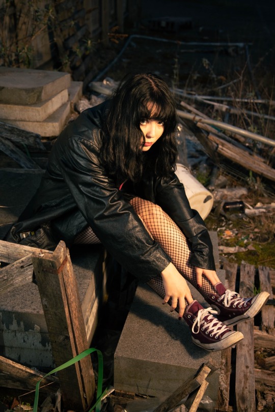
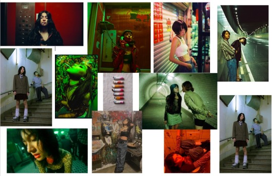
In this shoot I'm going with a grungy, messy look. I want my model to look dishevelled. I also plan to experiment with direct flash in the shoot (i.e. Terry Richardson). I am inspired by the works of Megan Doherty, specifically the colouring she uses in her images. I am also inspired by the TV show Skins which was a massive influence for the "indie-sleaze" wave that is currently resurfacing.
Megan Doherty inspiration
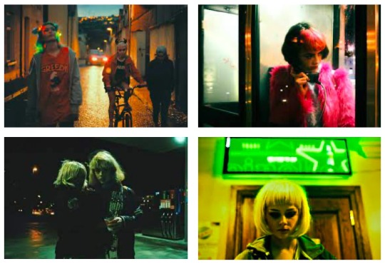
Overall Shoot Mood Board
Makeup
Setting

0 notes
Text
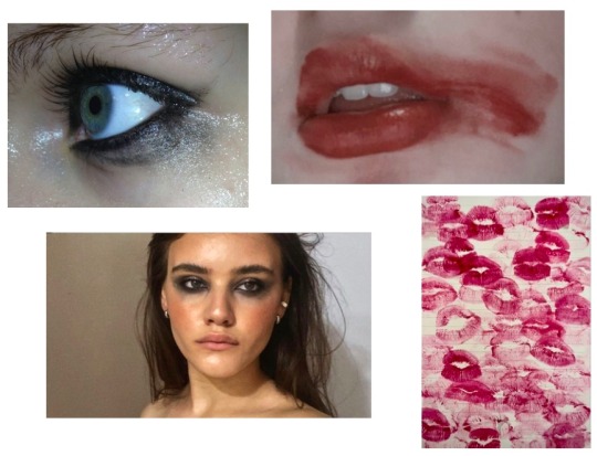
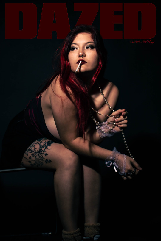
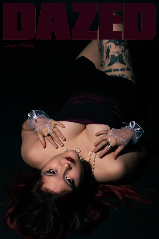
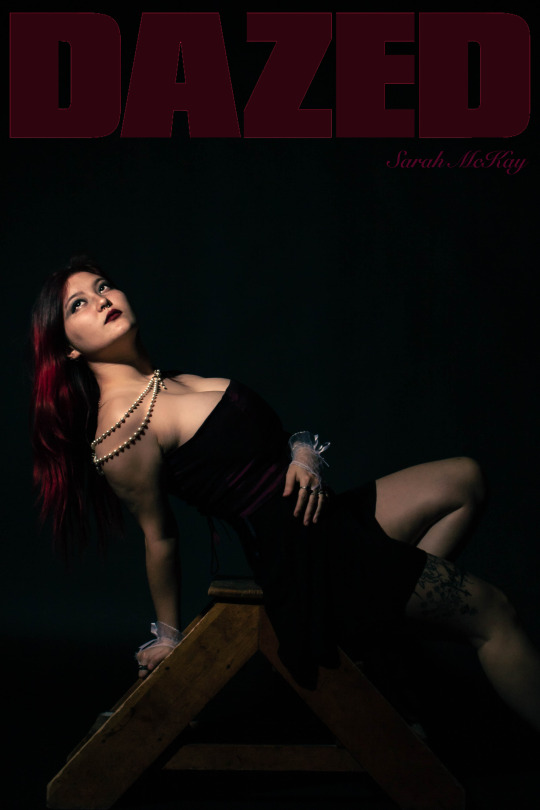
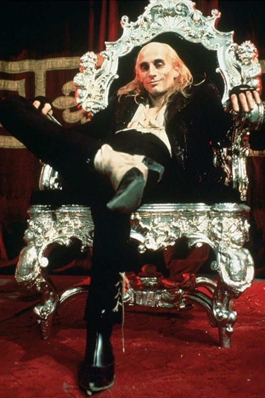
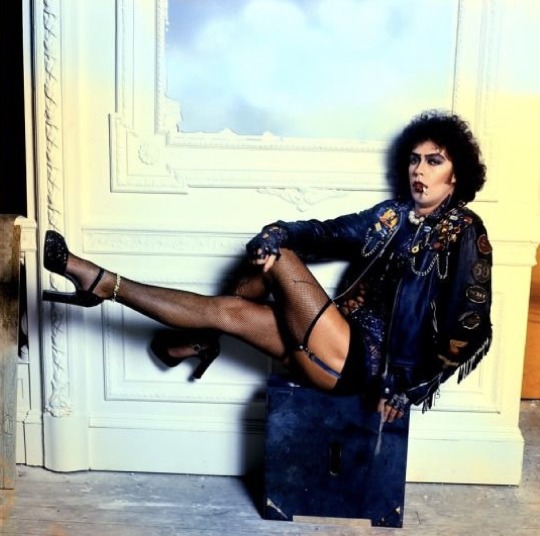
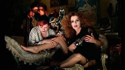
Front Cover Plan
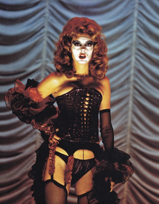
My inspiration for my magazine cover shoot is Rocky Horror Picture Show. This movie has strong burlesque themes with raunchy undertones. The costumes and poses are risqué in nature.
I want to focus mainly on my model's outfit and the posing.
Outfit ideas:
Corset, glitter, pearls, fishnets, lace or mesh gloves.
Makeup:
My model will have smokey black eyeshadow with winged black eyeliner and dark red lipstick.
Location:
Studio, black or dark red background
Lighting:
I would like to have relatively dim lighting and deep shadows. I want to create a sultry mood. My colour scheme will predominantly be black and red.
Posing:
My model will be posed elegantly in some images and very confident/over-the-top in others as I want to have a variety of images to work with post-production.

1 note
·
View note
Text
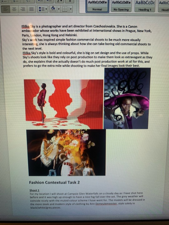
Architectural Research
Berenice Abbott
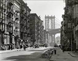
Berenice Abbott was a documentary photographer born in 1898, who is best known for her series Changing New York (1936-1938). In this series, Abbott captured the architecture of New York City during the Great Depression as part of the WPA's Federal Art Project. I have personally noticed that in some of Abbott's images, she has a lot going on in the frame, yet somehow manages to expertly draw the viewer's eye to the main subject. As shown in the above image, there are many high-contrast buildings in the foreground with lots of interesting shapes and lines casting shadows, however, our eyes are still instinctively drawn to the bridge in the back of the image, even though it is low-contrast and far away. This is because Berenice Abbott is clever with her composition and knows how to make her subjects pop, the main technique here being the leading lines of the street closing in on the street, and photographing the bridge on the shaded side which, although it is a less common approach when photographing a structure, gives it a unique and interesting silhouette.
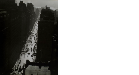
In this shot, Berenice Abbott did something a little out of the norm. Abbott had used the angular shape of the buildings to frame the streets below, which were bustling with cars and people. The buildings are extremely underexposed and shaded, leaving only the streets lit. This piece really emphasised the social aspects of living in New York at the time. The enormous buildings made the hundreds of people look tiny by comparison, thus highlighting just how many people were living in the city at the time, each facing their own struggles while living through a major historical event.
Berenice Abbott had a unique way of photographing architecture; not only was she not afraid to involve the surrounding buildings in her shot, but she also utilised them to draw emphasis to her main subject - something that can be quite difficult to pull off successfully, but Abbott made it seem effortless.
Iwan Baan
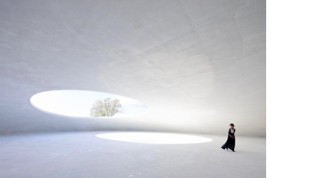
Iwan Baan is a Dutch architectural photographer who photographs very modern builds with unique structures. It's one thing to photograph odd buildings but Baan has the ability to set the scene and make these buildings look like they are from an alternate reality. As we can see in the shot above, Iwan Baan uses models to add a sort of deserted feel to the structure. He utilises these figures to highlight the scale of these structures and create a sense of isolation from the rest of the world.

While mainly keeping his work centred around clean and modern builds, Baan explores a variety of different styles. For example, some of his work is filling the frame with entire buildings and other works of his depict only half of a room. While most of his work is futuristic, he touches on worn and rustic scenery from time to time, playing with the different textures of the run-down buildings.
It is evident that Baan enjoys using shape as the main element in his work, so consequently, the buildings he photographs the most are really oddly shaped - certainly not your average cuboid with doors and windows. I find it fascinating how Iwan Baan takes these already unique buildings and creates an eerie and deserted feel in his images.
Jack Boucher
Jack Boucher was born in 1931 and was the primary photographer for the Historic American Buildings Survey. He devoted over 40 years of his life to documenting and preserving America's architectural heritage.
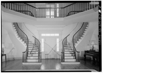
This image is a perfect example of the sheer elegance exhibited in Boucher's work. The image is almost perfectly symmetrical, with the exception of a few shadows and the furniture at the side. The shadowed 'X' shape in the centre of the image creates a starting point for the viewer to look at before they are guided along the curved lines of the staircase banisters and led towards the balcony, which then extends outwards through the room, past the viewer's field of vision. The dark accents of the staircase placed with the white of the walls and steps provides a beautiful contrast which makes the image more enticing, but it is not too harsh and still preserves the simplistic and graceful nature of the photograph.

This image appears to have been taken in a barn or stable of sorts, the walls lined with cobble and the ceiling supported by asymmetrical wooden beams. The asymmetry of the beams play a very important role in the structure of the image; I feel that the slanted beams placed one after the other provide an unusual guiding element to the back of the image where we see a small, brightly lit window - the leading lines of the fencing helps with this also. The angular and choppy shapes of the wood going in all directions creates a bit of a chaotic framing for the small window.
Ezra Stoller
Ezra Stoller is a photographer from New York. After being drafted in World War II, Stoller continued his career in architectural photography and focused on industrial and scientific commissions.
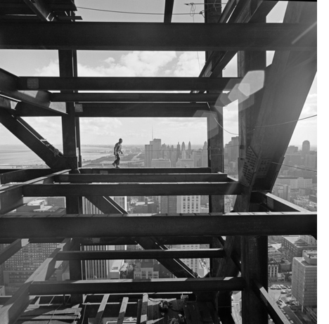
The image above is a perfect example of Stoller's love for direct sunlight and harsh shadows, which can be seen in the majority of his work. He utilises the straight, angular lines of the structure to frame the horizon line that splits the image through the centre. The use of direct sunlight in the image allows the beams to cast shadows on themselves which, in turn, creates a very interesting overlap effect of the different mid-tones and dark-tones.
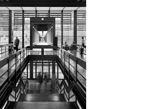
This image is extremely varied and visually interesting. We can see in the top third of the image that Stoller has included the horizontal lines from the windows in the frame, giving the shot an initial feeling of calmness and setting the tone for the symmetry of the image. The leading lines of the railing in the foreground of the image guide the viewer's eye in towards the doorway in the centre which offers the brightest highlights in the picture and even more leading lines to draw you deeper into the building. Lastly, we are met with a set of stairs at the bottom of the image that is lined with zig-zag railings. These further broaden the range of lines and shapes used in this shot.
Frederick H. Evans
Frederick H. Evans was an English photographer born in 1853 who worked through the Gothic Art period. He mainly photographed English and French cathedrals.
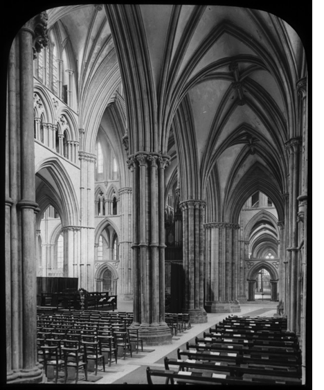
In this image, the pews form horizontal lines across the bottom of the shot, creating a stable foundation for the rest of the image and a sense of tranquillity. The viewer's eye is immediately pulled through the arches on the right hand side and is enticed by the repetition of the structure that seems to go on forever. The viewer is then drawn to the brighter left side which has a tiered effect, created by the different sized arches situated next to each other. The light and dark sides of the image, which are split by the large pillar in the centre, aid in giving the photograph a subtle contrast that suits the nature of the image very well. I feel it is a graceful and eerie image and if there was harsh lighting and shadows, it would take away from the elegance of the image.

In this image, Evans' main subject is a staircase which has gleaming soft light falling down on it from above which, in contrast, enhances the dark abyss of the room surrounding the foot of the staircase. Frederick H. Evans has deliberately composed the image so that a large, dark pillar is blocking the view of the staircase, making it more enticing and creating a stark contrast between the tones of the two. It feels as though the staircase is holy due to how beautifully lit it is and that it is a stairway to heaven, which is being guarded by the pillars - this places the staircase on a pedestal as the main subject and enforces the feeling that it is important.
1 note
·
View note