#low res art
Text
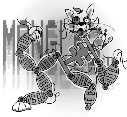
drew a mango c: (mangle)
15 notes
·
View notes
Text

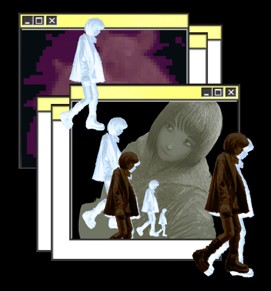
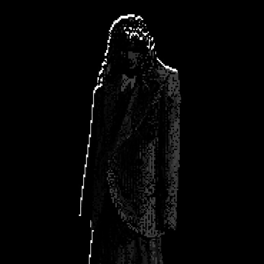
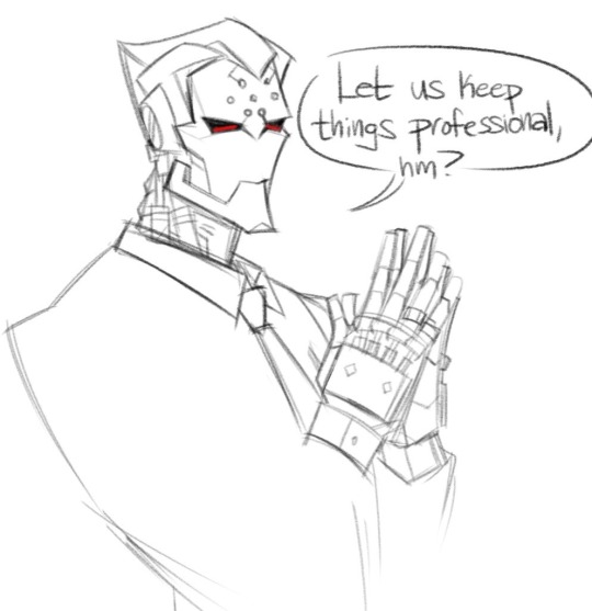
NPC + Dialogue - Style Test #2
A more refined version of what God's Reject will look like. And this one is in-engine, too!
I like this style, will probably be the one i settle on for the final game. Mostly Black & White, +1-2 colors for accents. A tri-color monochrome... a tri-chrome? Eh.
It certainly cuts drawing time in half if i can draw everything in black/white, and as a single-nerd dev team, you gotta know where to set priorities. I could draw super colorful assets, but that would take centuries to complete... so monochrome it is! Minimalism rules, anyway.
The whole thing is heavily inspired by this one game nobody besides me played, called Looming: https://www.youtube.com/watch?v=7qidHZDrQAw
A game from the super early Flash days of indie games, back when the words "indie game" meant new and exciting things.
3 notes
·
View notes
Text
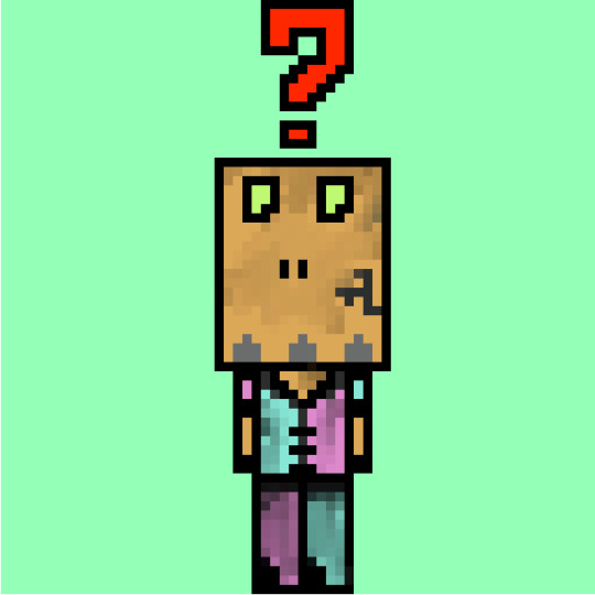
Pixel zombie doodle
0 notes
Text
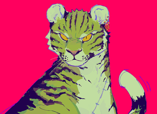
marimeow
#render practice!!! i rarely ever render/paint cause i hate doing it !! even if i love the end result i just do not have the patience!#but sometimes u gotta work those muscles anyways#btw click it or dieeeee. low res af#wtf... art#roronoa zoro#zoro#tiger zoro#one piece fanart
1K notes
·
View notes
Text
#ultrakill#my art#ultrakill gabriel#girl dinner#9k x 3.6k is low res btw#the og file is 14.7k x 5.9k
3K notes
·
View notes
Text
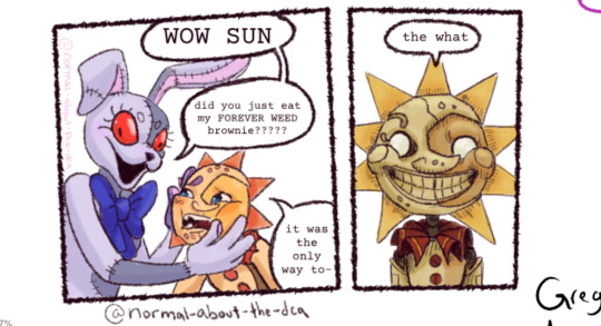
Happy belated 4/20! From @daycarefriendpickup's weekly magma.
#normal beetle art#sun fnaf#fnaf sun#fnaf sundrop#sundrop#vanny fnaf#fnaf vanny#fnaf vanessa#drug use#drugs#cw drugs#420#fnaf#fnaf security breach#magma#aaaaaaaaaaaaa it ended up being low res cause i drew it tinyyyy#it is a little funnier this way#yes i did steal this joke from punkitt-is-here she's hilarious
531 notes
·
View notes
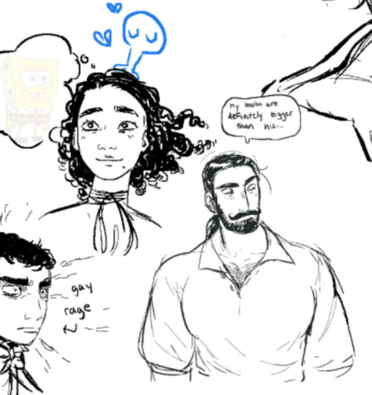
Note
YOURE A TIGERS FAN????
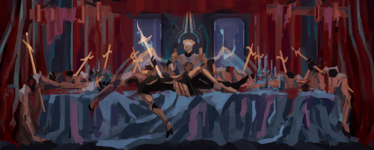
YES here are some doodles from an aggie I did with friends like a year ago I don’t think I ever posted
614 notes
·
View notes
Text
I got older👍
447 notes
·
View notes
Text
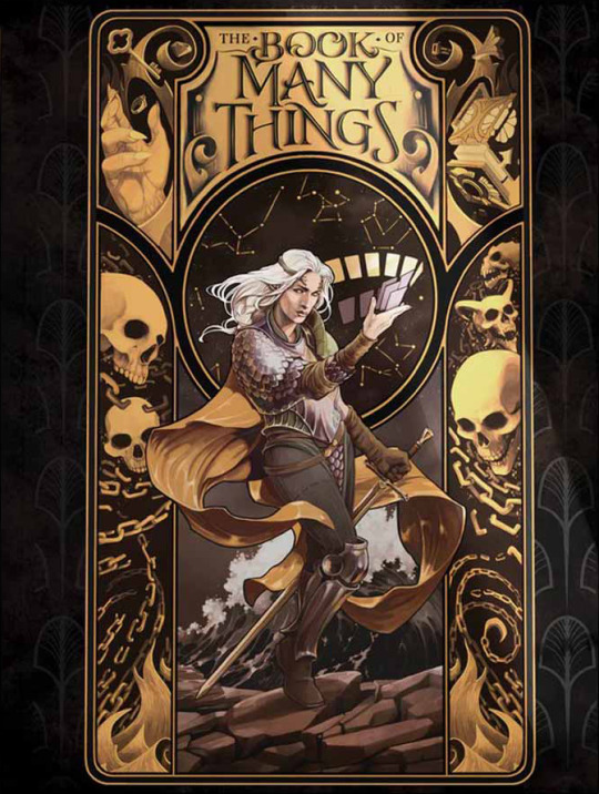
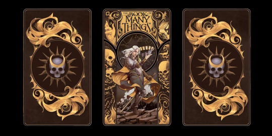
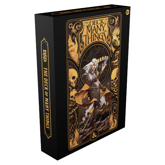
An alternative cover I've painted last year for the Book / Deck of Many Things has been released, and I am very happy with how it turned out in print / on the final product :)
#dnd#book of many things#deck of many things#Asteria#kooks art#sorry for the low res prevs#i dont have a good quality pic with typography yet
612 notes
·
View notes
Text


_art (2021 - 2024)
My ko-fi acc - for people who want to support my stuff:
https://ko-fi.com/zannko
#zannko zannko#art#cyber#surrealism#mspaint#glitch#pixel aesthetic#futuristic#cyberspace#expressionism#cyberpunk#cybercore#2000s#computer#low res#anime aesthetic
546 notes
·
View notes
Text


S5 Mike Wheeler concept (and a couple of Wills)
-that was literally born because of this story I saw a few weeks ago 💀
#byler#mike wheeler#will byers#stranger things#artovna#the second image is from bujomoss' art sesh hence to low res#have i fulfilled my need to draw mike caring for and supporting will? maybe#byler fanart
5K notes
·
View notes
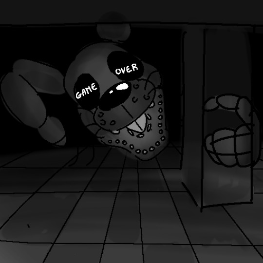
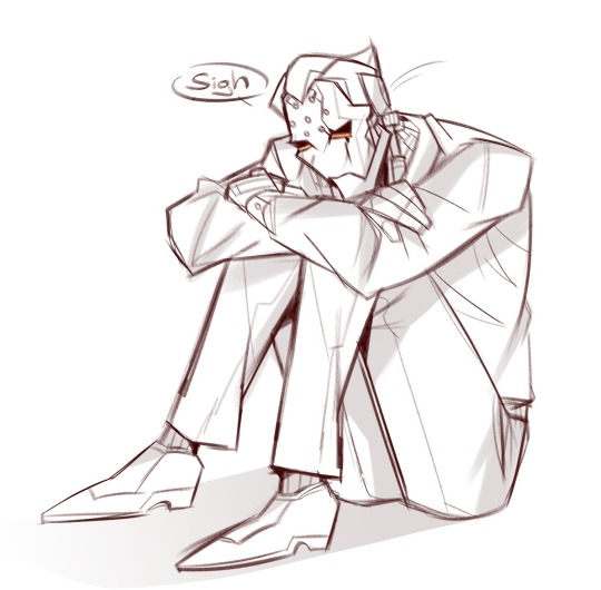
Text
Game Over...
3 notes
·
View notes
Text
Happy Birthday, Barbara!
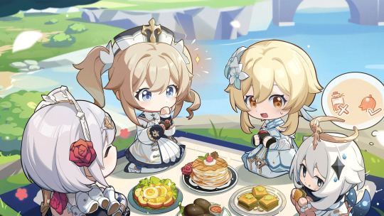

#genshin impact#genshin impact updates#genshin impact news#official#official art#birthday art#barbara pegg#the person who usually posts these on hoyolab hasn't been doing it lately >:(#so if they're low res that's why
1K notes
·
View notes
Text

I’ve just been drawing a lot of Maximilien unfortunately.
501 notes
·
View notes
Text

#stob nation i bring you food after 200 years#my art#basslinegrave art#stobotnik#no idea for a caption#used a pose reference cause i started drawing something else at first but it was too complicated i just ended up picking a simple ref cause#anatomy is hard unfortunately#also i made a sketch on a very low res but the lineart was atrocious so i ended up using the sketch but had to enlarge it so its blurry#im fighting for my life here
454 notes
·
View notes
Text
Erenville in the new pvp gear.... 💭
(sketch is from a warmup page i did a couple days ago, so its a little messy hehe)
[insp under the cut]
based off of my machinist glam on my Erenville alt <:) a mix of the tactical gear, and punching gloves for the handgear

#my art#art#ffxiv#ff14#ffxiv art#ffxiv fanart#final fantasy 14#final fantasy xiv#erenville#ffxiv erenville#ffxiv gpose#<- ??? i think idk#its low quality bc i just copied it from an image i sent to myself- dont wanna bonk anyone on tumblr with a super high res image o7#he is my babygirl ever my little mippy okay i am so in love with him im so excited for dawntrail#lord forgive me for the man i will become
613 notes
·
View notes
Last Seen Blogs

mvlt10line
Mevlüt

effectanswer9
Unbetitelt
artfordayyz-blog
Just Some Art
z3rohero
My Dirty Mind & Other Things
