#im actually respecting sumi MORE by doing this
Text
I posted 2,985 times in 2022
That's 1,767 more posts than 2021!
23 posts created (1%)
2,962 posts reblogged (99%)
Blogs I reblogged the most:
@elytrians
@thekidsfromyestergay
@cttrajan1206
@discardedcandywrapper
@greenbeany
I tagged 1,232 of my posts in 2022
#mcr - 290 posts
#ofmd - 79 posts
#art - 65 posts
#toh - 41 posts
#birds - 21 posts
#tiktok - 18 posts
#lol - 15 posts
#lmao - 14 posts
#fuck capitalism - 14 posts
#prev tags - 13 posts
Longest Tag: 74 characters
#🦀🦀🦀😁🦀😁😁😁😁😁😁🦀🦀🦀🦀🦀🦀🦀🦀🦀🦀😁😁🦀🦀😩🦀🦀🦀🦀🦀🦀🦀🦀🦀🦀🦀
My Top Posts in 2022:
#5
HELP ITS ME SUMI
The londoner in ur birmie squad sjdhhdf
i am so sorry bro i dont think i am who u think i am 😭😭
8 notes - Posted June 11, 2022
#4
aras have you seen the Joan of Arc outfit yet
I HAVE NOW KSKDKLEODJ DKDOEOL I AM GOING RVEN MORE INSANE GOING TO WATCH THE STREAM NOW
10 notes - Posted November 19, 2022
#3

3000 posts!
ashamed 😔
16 notes - Posted July 31, 2022
#2

clownwife
19 notes - Posted August 25, 2022
My #1 post of 2022
I love the energy and all and I don’t want to offend but as a Muslim girl i can tell you that it is literally haram to identify as anything other than your god given gender. Like I’m not trying to be rude and I’m glad that there a respectful supportive people out there but if you’re looking at the Quran and other islamic book you’ll find stories about how its considered haram. Accepting the islam religion means accepting everything and dedicating yourself to it you can’t just pick and choose.
omg my first anon hate hahaha
i know im not obligated to answer hate but im going to anyway bcuz of i have things to say (sparkle emoji) (im on pc and dont have the energy to find an emoji keyboard)
okay first of all nowhere did i say that I identify as Muslim. i get that it was ambiguous tho so its cool. to clarify,, I am personally not Muslim but I kind of have to act like one so I don't get kicked to the streets or some shit lol and maybe I'm a bit of a coward idkkk but anyways
I would be interested to know what other Islamic books ur talking about btw, but I'm pretty sure the quran doesn't mention being trans anywhere at all. in fact I'm pretty certain, I've read it multiple times with translation and commentary interpretations and anyway being trans wasn't really a 'known' thing back then? bcuz obviously patriarchy and gender roles n segregation blah blah was wayyyy more yk. shit I forgot the word. uhhh yk like prevalent?? ofc the quran does mention a shitton about gender roles,, so yk men r the breadwinners, women raise the kids and keep house and be good wives etc. and also remember the big important fact:: GENDER AND SEX R DIFFERENT THINGS!!! meaning technically u cant be 'born' a gender (omfg my keyboard hates me imagine a question mark here) ur born with certain genitals and society assigns u a gender based on that . sounds a bit fucked when u put it like that actually but anyway back when the quran was being revealed this wasn't a known thing cuz yk they didn't have studies on this stuff,, and yea ur probably gonna say 'but the quran came from allah and he knows everything' well the fact of the matter is he either forgot or smth idk I don't speak for God but trans people definitely exist that's a fact we know so yeah. oh I should come back to my point which was, even with the quran saying those things about what ur supposed to do based on whats in ur pants which is crazy outdated anyway it doesn't take gender ≠ sex into consideration either soo ye that's the most it could've said about being trans and that not very valid anymore rip and that's not even mentioning non-binary people
and anyway Islam is literally all about acceptance and respect and everything so idk it would probably be better if u didn't go around telling ppl they're 'literally haram' for being trans or gay or any typa queer bcuz its literally not our choice (insert question marks) believe me I would fucking love to be comfortable in my 'female' body but I cant no matter how much I try to force myself so I'm sorry dude. no one would choose to be stuck in a situation like this. personally, I believe Islam needs a super massive reformation. well not Islam exactly, but a lot of things said in the quran r outdated wildly now, while a lot of it will also always be relevant, eg. everyone being equal and yk give to the poor etc. i have absolutely nothing against Muslims (I have it against my family for being so forceful about religion - different thing) yall r super cool and ik being a Muslim girl isn't easy believe me, but genuinely seeing Muslim people around and yk, just existing in wider society outside of Islamic spaces makes me feel so proud of where I came from even if its not been the best experience. have u seen the show We are Lady Parts (question mark) its about an all female Muslim punk band and there's only six episodes I literally watched it all today but the message of it is what I'm trying to get to you. u don't have to be the perfect pious wife to be considered a 'good Muslim',, there are so many ways u can show faith. you don't have to be a big strong man who can handle all pain with ease while single-handedly providing for a family either.
anyways peace out that sure was a journey lol and I definitely have forgot some of the things I wanted to say but yea that's all don't forget to like and subscribe <3
(colours r to make it easier to read for people with shorter attention spans,, they don't have any other significance)
36 notes - Posted February 9, 2022
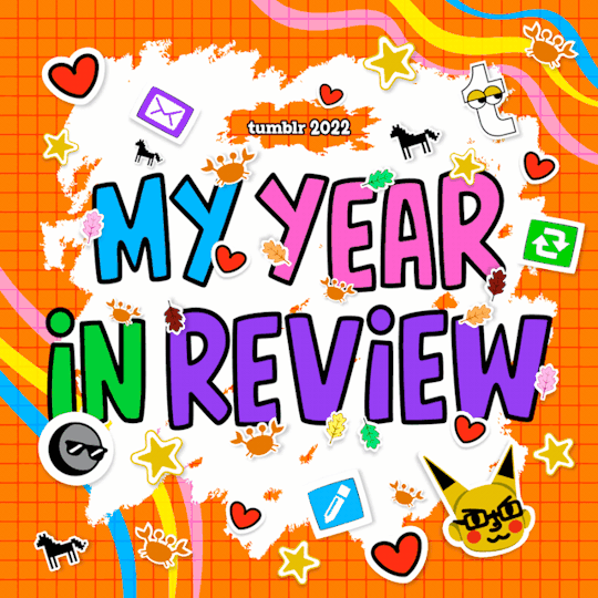
Get your Tumblr 2022 Year in Review →
#tumblr2022#year in review#my 2022 tumblr year in review#your tumblr year in review#this is so funny lol#this is a cringefail blog fr#look vel and frederico ur on here thats crazy#omg and michael hiii
5 notes
·
View notes
Note
oh look another episode where i want to kick minwoo :) this man fails at everything he does. im glad the other attorney had morals and didnt use that and got her in trouble but im wondering by the end of this show if she's still gonna be working there tbh im not sure
every single episode i somehow hate him more like the absolute low point of every episode is just his sheer presence can't even pull off evil properly bc like if he had an actual motive and competence you would still feel intrigued by him as a character and it would be love to hate him but the way he is it's just sheer annoyance it's the whole voldemort vs. umbridge bc tae sumi (who i genuinely understand the motivations for even if i dislike what she's doing there is still a Reason for it!) is written as a great character whereas minwoo's motivations are merely i'm a trash man
and i don't know about that tbh bc the hanbada ceo is actually so good and i think has a lot of respect for youngwoo and so does myeongseok so maybe his arc would affect where she ends up at the end?
2 notes
·
View notes
Text
HEADCANON for SUMI
actually, this is a headcanon for karam too but this specific post is more sumi-centric so maybe i’ll talk about the karam end of things later. for now, though, it’s sumi’s turn bc i don’t talk about her enough (:

Okay, so I’ve decided to drag Sumi into Karam’s plotline for no reason besides that...I Wanted To but it also helps his plotline make more sense if he has a sort-of go-between character like Sumi in there somewhere. This post will explain what that means and why I’ve come to this decision! Until now, Sumi was kind of just her own character and she wasn’t really tied to any plot besides her own but I didn’t really know what to do with her beyond her backstory. I think this was definitely limiting her as a character so I’d like to use this chance to give her more direction! So, from hereon out, she’s going to be part of the Karam plotline! She’s still her own character but I like making my muses know each other bc,,,idk,...it feels like a more complete universe in my head. Anyway, with that out of the way, I’ll get on to explaining the story behind this connection! Full disclosure though, I’m sticking it under a Read More because it got kind of lengthy. I did TRY to be more succinct but maybe it’s about time I just accept that I’m not capable of that /:
First off, a lot of stuff might be setting or verse-dependent. I guess I’ve written stuff where these muses aren’t strictly based in one country and there’s always the chance of one of them moving somewhere else for the sake of a certain plotline? But the fun thing about rp is its fluidity so I’m going to try and stop getting overly concerned about details that don’t really matter too much. Sumi travels a lot. Maybe Karam tags along sometimes. Shit gets vague. It’s fine. ASDFGHGFDS......
To keep things simple, Sumi is the one who first found Karam when he wound up in the city after his forest was destroyed -- or, rather, she was the first person to try and help him. Other people had likely found/seen him but ignored him one reason or other (he would’ve been pretty dishevelled and tbh,,,probably naked bc what the fuck is he gonna wear clothes in the forest for). As I’ve said before, Sumi can tell when people aren’t human. Her senses aren’t especially strong so she can’t always place what somebody actually is, only if they’re a human or a ghost; she doesn’t have an inherently ability to sense what somebody is but, because she’s spent so much time learning to separate living humans from the spirits of the dead, she’s developed the ability to tell when somebody is neither, even if she can’t say for certain What they are. Because it’s a feat of applied knowledge and not a natural ability, mistakes happen. Now, Karam is a spirit. Not remotely human, despite his appearance. Still, long story short, Sumi mistook him for a ghost and, despite her charging humans for help with their ghostly issues, she’s often willing to help a ghost in need free of charge (because um...ghosts don’t have money). When she found Karam, he was in a state of obvious distress so she assumed he must have been a pretty new ghost, the sort who haven’t at all come to terms with the fact that they are, y’know, dead. Much to her shock, he wasn’t dead and was instead very much alive and tangible but still very much in need of help. More in need of help than she’d expected, in fact.
Sumi has always been the sisterly type so it felt natural to reach out a hand to somebody in need, mostly out of the goodness for heart and because she felt bad for him but also partly because Karam reminds her a little bit of Chulsoo, her late brother (despite being much much older, Karam looks about the age Chulsoo would be if he were still alive) with whom she is in no longer contact despite his being a ghost because he decided to use the afterlife to See The World until he was ready for Sumi to exorcise him. Yikes. That’s another story for another post. She was able to offer Karam a place to stay, a spare room in her apartment (where he’d start this new experience by staying in his room for a fortnight straight, only leaving to slink his way in and out of the bathroom), and help him make sense of a new and confusing world. First, she would offer him her brother’s old clothes to wear and then she would eventually resign herself to the reality of the situation and agree to buy Karam his own clothes, letting him pick out what he liked but also giving him tips wherever possible (financially speaking, this wasn’t her smartest move but she has a guilty pleasure in clothes shopping and the knowledge that she was doing it to help somebody else made her feel better about the whole thing).
In fact, she helped him get tidied up in general. Let him pick out a hairstyle from a pile of magazine and used her experience with hairdressing to replicate it for him. Maybe it’s because Sumi’s rather vain herself (and proud of it, mind you) but she’d fully believed a good start for Karam was to help him discover his own image and use that to regain confidence. Well...that, and the fact he’d looked an absolute state when she found him and she was of the firm belief that it was a shame for him to be wasting his pretty face on dishevelled hair and ill-fitting clothes that hung off him. But, really, Sumi sees her image as the ultimate form of self-expression. The way she styles herself is her way of telling the world who she is --- and, for someone who spends so much time with ghosts, looking as bright and lively as possible means a lot to her --- so she believed that helping Karam with that sort of thing might help him with this strange transition into a new world and come into his own. Yes, she was aware that this plan might fail and Karam might have been distinctly uninterested in his own looks but it ended up working out well. Karam is slow to warm to most very human things but he picked up on this quite quickly and was very willing to engage with it. For Karam, it was a matter of everything changing too fast and those changes being so overwhelming that making these dramatic changes over which he had full control, changes that he made himself and that weren’t forced on him, helped him to process the situation --- but I’ll talk about that in more detail another time, this is Sumi’s post.
Karam is very distrustful of humans and, although he trusts Sumi more than most on account of her having helped him so much, there’s a part of him that is paranoid it’s some kind of trick. Because of this, he tends to keep Sumi at an emotional distance. After all, despite her abilities, she’s still essentially just human and he’s been forced to regretting humans in the past (that is also another story for another time because, again, this is not Karam’s post so I won’t be going into details here). Although it’s frustrating, Sumi understands this and lets Karam keep his distance. She understands that he’s grateful regardless and she doesn’t want to cause any unnecessary discomfort. But, even besides that, their relationship is a little odd simply because they butt heads a lot. She kind of just lets him away with shit because she finds him endearing. Often, Karam won’t even stick around at her place. He’ll just disappear for days on end and resurface when he feels like it but it’s more about the choice to have somewhere he can return. Y’know, the illusion of home.
Perhaps it’s because of that initial comparison she made between him and Chulsoo or perhaps it’s because he has such a young appearance but, despite the large age gap (wherein Karam is just under 240 years older than her), Karam brings out the big sister in Sumi. Maybe this is also why Karam doesn’t like her that much LMAO...............actually, he kinds of HATES it but asdfghgfd. In the time since she’s met him, she’s seen him struggle with things; she’s seen that he does have good moments and that he’s not intentionally rude in any way so much as he just has a hard time with certain social rules. She’s grown fond of him and feels that she has to try and help him out. Again, it’s hard to say if this is because of the time she spends helping ghosts or if it’s because he ignites the part of her that feels guilty for not being able to protect Chulsoo. It could just be that she’s sincerely worried about Karam. Maybe it’s a combination of them all, Sumi can’t quite tell for herself.
#« 𝐇𝐔𝐌𝐌𝐈𝐍𝐆𝐁𝐈𝐑𝐃 (sᴜᴍɪ) » / 「 headcanon. 」#« 𝐀𝐋𝐋 𝐀𝐑𝐎𝐔𝐍𝐃 𝐘𝐎𝐔 𝐒𝐋𝐎𝐖 𝐃𝐄𝐂𝐀𝐘 (ᴋᴀʀᴀᴍ) » / 「 headcanon. 」#like this if u read it i guess!! but no pressure ofc ASDFGH#the actual hc part of this is like 1.2k words long and i was gonna try and revise it but i can't be bothered#i UNDERSTAND if it's too long for anybody to bother reading it but i just wanted to get it out there#im gonna write a drabble abt when she finds him i think and idc if nobody reads it ASDFGHGFDS#i wanna write abt karam from another person's perspective bc writing him just from his OWN perspective doesn't really#let anybody know what kind of vibe he has ?? bc he keeps everything to himself#but also bc i love writing sumi's perspective on ppl bc she's just...she has strong feelings abt things ASDFGFDSA#anyway i just felt it was time i fleshed stuff out for sumi and i feel bad making her a supporting character in another muse's plot but#since she didn't even really have a concrete plotline on her own this is actually BETTER for her#im actually respecting sumi MORE by doing this#bc now she's actually part of smth instead of being that oc i vaguely ignore#also i like making my ocs know each other who cares#i can't be bothered rereading this to make sure it's not dumb sorry
7 notes
·
View notes
Text
rating mankai company based on character design
Note: I will take into account hair, color scheme, sprite poses, mostly outfits that are not from plays or scouts, and memorability. This is half an objective view and half my personal opinion.
Disclaimer: I curse a lot for comedic effort. I am mean because I am funny. No, you cannot disagree.
Spring 🌸
sakuya: you get what you see. a literal spring babey. his hair and color scheme’s a little generic, but he’s mankai’s poster boy, so that’s understandable. speaking of generic, his main pose is just this emoji 🧍♂️ his outfits tend to be kinda basic, but any outfit with a mostly pink top gets him bonus points. 6/10
masumi: okay his hair is elite. probably one of the most memorable character design aspects among the cast. his mole and eyes also make him very pretty. love my boy’s dark color scheme. unfortunately, points must be docked for baiting us with the emo fit, then as the story progresses, he starts dressing like the trust fund kid he is smh. 9/10
tsuzuru: i love you tsuzu but. my mans is so basic. if he didn’t have such a great personality, he’d be as bland as untoasted white bread. the saya of a3. his best design aspect is the fact that he doesn’t dye his roots. his outfits look comfy, but not necessarily eye-catching. 4/10
itaru: everyone who starts a3! with no knowledge of these characters has one (1) thought about itaru. sec sea man. so obviously there’s something appealing/good about his character design. i think part of the appeal is his fuck-all demeanor. obviously, his eyes and hairstyle are attractive, but the way the artists draw him gives him an air of not caring, which is also attractive in a way. his dyed tips are also nice. he looks kinda lame when he dresses professionally, but his casual outfits hit. especially the ones with light pink. 8/10
citron: although i’m not a big fan of the “character is foreign and therefore must talk and dress different and be funny” trope in these types of media, his fashion does make him stand out from the other characters who tend to have more basic clothes. citron’s summer, travel, and autumn outfits SLAP and anyone who says otherwise has bad taste. his hair and eyes are interesting, but his overall color scheme can be a bit repetitive. 7/10
chikage: i hate this guy’s fucking bowlcut. fucking salad bowl lookin ass. every outfit is the same turtleneck and sneakers in two alternate colors. his outfits are so plain. only thing i like is his casual outfit glasses. HOWEVER. that’s the point. he’s supposed to look boring and blend in because he’s a spy. it’s a smart design, i just don’t like it so im docking points. stay mad about it. 5/10
Summer ☀️
tenma: im yawning. you think tsuzu was boring? this guy has orange hair and i still find his design boring. that’s how you know he’s basic. he’s got generic messy shounen protag hair. he could be from any property. if i drew fanart of him, people would ask where he’s from. he either dresses like your slightly homophobic frat boy classmate or a grandfather who gets his shit stolen by the asshole kids next door. 2/10
yuki: he has the r a n g e. all of yuki’s casual outfits hit. they’re all different, but cute in their own way. to no one’s surprise, one of the best styled characters. though i like his general color scheme, i’m personally not the biggest fan of his hairstyle. it’s okay, but a little plain at times. but i think it suits him well. 7/10
muku: i love him. muku’s design is what i love about this game. you see him, and you immediately know what his character archtype is supposed to be. he’s the soft, cute boy. and if this was a mediocre series, that’d be all muku is. but since this is a3, he’s so much more than that. he’s smart, passionate, sensitive to others’ feelings, and protective. a3 does a great job designing characters that look exactly like their archtype, but having a much more developed personality than that. getting back to the actual subject at hand, i love his hairstyle and color, as well as his outfits. you can never go wrong with light pink hair. i may be biased but fuck you. 10/10
misumi: another great memorable design. his eye shape and hair style are really unique. his outfits also elevate his design. street fashion is always a plus for me. though sumi’s design is special in the world of a3! where most of the characters are just. guys. regular lookin dudes. i think that outside of the game, his design would not be as unique. 8/10
kazunari: personally, im a fan. maybe it’s cause i have an affinity for blonde anime boys. but his hairstyle is pretty unique and his trendy looks set him apart from most characters, even outside this game. and he has a pretty lovable expression in his sprites. his fatal flaw is that his fits are either a hit or miss. they’re either really cute or wtf. at least he’s memorable. 8/10
kumon: i love that he reminds me of an owl. his hair and eyes are very cute and his color scheme is great. and i think they did a great job making him look related to juza, but still very much his own character. but he dresses like your classmate from middle school that looks like a nike-sponsored highlighter. yeah, he’s the sporty one, and i like the windbreakers but... i cannot excuse his summer fit. also, i find his design a little tame compared to some of the other characters in the game. 6/10
Autumn 🍂
banri: i hate his hair. i hate it so much. i know in canon it’s nice and he takes good care of it, but it looks so fucking greasy. the style makes him look so greasy and it makes me mad. he looks like an asshole. i mean, he is, so it fits. if this dumb bitch changed his hair more often, i’d like his design so much more. you saw this coming; his love for cheetah print is fucking repulsive. BUT, maybe unpopular opinion, minus the animal print, his sense of fashion is not bad. why do yall clown on it. if the fit is fresh, the fit is fresh. anyway, he looks like an ass, but objectively his design is kinda eh. 5/10
juza: im sorry im DEADLY fucking biased when it comes to juza, but he’s so handsome. his hair is a such a rich, pretty shade of purple and his eyes are so mesmerizing. his hairstyle is so attractive. his face is so pretty. yeah his design isn’t crazy unique, but the simplicity just works. im so sorry im this man’s whore i didn’t choose this life... but i can stop being a simp for one second to say that he has a boring fashion sense. i mean it’s kinda hot how simple his outfits are but his travel fit is good-- wait a minute i just remembered the fucking sandals. docking one point. 9/10
taichi: okay shut the fuck up i LOVE taichi’s design. so eye-catching and fun. as i’ve said i love street fashion, and taichi’s lil e-boy fits are right up my alley. that shade of bright red goes so well with his fashion sense, making a really cohesive design. with his main outfit, you can tell he purposely dresses like that to be trendy and it’s so smart. 10/10
omi: im sorry omi stans but his design is kinda,, boring. i legit had such a hard time identifying him when i first got into this game. the scar saves it a bit. but... only a bit. he’s just got. hair. and a dad outfit. i mean his tits are huge, but i don’t think i can call that a character design aspect. kinda forgettable design. i don’t dislike it though, so he ranks higher than tenma did. 3/10
sakyo: im not sure why but i really like sakyo’s design?? the contrast of his light hair and his dark clothes is nice. also, megane rights. even when i thought he was an npc during my first playthrough, i really dug his design and thought he was memorable. i actually cannot pinpoint a reason why. i wish i had more constructive things to say... but upon thinking about it, he has a karen haircut, which kinda dampers my thoughts on his design. i like his moles, but i honestly did not notice them until the game pointed them out. 7/10
azami: azami has a damn good design. i don’t think anyone can deny that. the long hair, the contrast of black hair and bright blue eyes, his eye shape. all very eye-catching design aspects. and the street fashion style strikes again. the color scheme matches well with everything. this review is lame, but there’s really only good things i can say about his design so. 10/10
Winter ❄️
tsumugi: it’s so late and im so tired of looking at these sprites. anyway, tsumugi’s design is okay. i think his color scheme’s a bit limited and his outfits are a bit meh. he has a more respectable bowlcut than chikage, but it’s still a bowlcut and it’s still boring. i think the best part of his design is his eyes, they’re very soft and kind. but other than that, tsumugi looks pretty basic. 5/10
tasuku: tbh, i didn’t even realize that the godza member tasuku was the same character as the winter troupe guy in the game’s opening until the middle of episode 3... yeah. im slow. ooooooor... tasuku has the worst fucking design in the game. yeah i said it. come at me, but tasuku’s design fucking sucks. i literally thought he was a minor character until they forced me to realize he wasn’t. his fashion sense is... questionable at best. i look at that man’s hair and think he doesn’t shampoo. he looks so bland i could dry up from looking at him. im sorry but his tits do not make up for the sheer fucking snorefest of his character design. he’s so boring i won’t elaborate anymore. 1/10
hisoka: ya get what ya see part 2. i like that i can tell he’s the sleepy and mysterious character just by his design, but honestly, that’s a character trope im generally not a big fan of. so i wasn’t thrilled by hisoka’s design at first. but it’s effective. i like the hairstyle with the white hair, but i’m not too fond of his color scheme. his outfits look comfy and soft though. it makes sense, but it’s nothing too memorable if you compare him to characters outside the game. 5/10.
homare: ah, now this is a memorable character design. his hairstyle annoyed me in the beginning, but now i love it. it’s so unique and fun. and i like the purple. i also like his outfits. very classy. but honestly, most of his charisma lies in his face. i think that the pure eccentricity of the hairstyle is enough to put him in the top tier without considering any other element. you really could not find this design in any other media. fuck it. i don’t need to consider anything else. 9/10
azuma: i’ll be honest. im not a fan of long-haired anime men. especially the pretty, flirty types. i don’t know, i just don’t vibe with them. originally, i didn’t like azuma’s design, but now i do. i don’t know how, but i think it’s because azuma is just that powerful. his ponytail makes it more bearable for me and i like the way his bangs frame his face. he just has pretty eyes and face. unfortunately his color scheme is a little too repetitive for me and his casual outfits are a little boring. 6/10
guy: maybe it’s because he looks dead inside, but i love him. i don’t even know this character that well yet, but i think his deadass expression is great. the darker under-eyeline sets him apart from the other characters and i love how he dresses. i think his hair is kinda eh. i personally like it, but objectively, it’s meh. it’s a solid design, but ngl it’s nothing special when i really think about it. 6/10
#for legal reasons this is a joke#this entire post should be underlined with a /lh#i love them all very much im sorry for being mean#except for chikage he deserves it#long post#a3!#a3! act! addict! actors!#A3! Actor Training Game#mod tsuzu talks
63 notes
·
View notes
Text
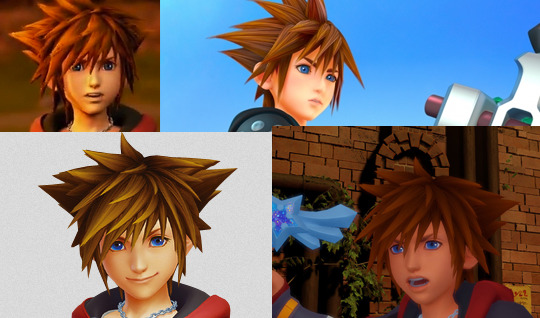
What’d they do to Sora?—A visual analysis of KH 1, 2, & 3
One of the biggest staples of the original Kingdom Hearts games is their visual charm. The team managed to do what Disney rarely could: transform the animation giant’s 2D into amazing 3D and then some.
But something kinda funky is happening in KH 3. Somehow Sora and the gang are looking less, well, Sora-and-the-gang-y, and it’s not just the new wardrobe.
Before I get into what’s off about KH 3, I need to map out what makes KH 1 and 2 so visually appealing. There are three big reasons for why KH’s visuals have stood the test of time:
Color
Style
Animation
Color is usually what our eyes notice first in a given scene and is a vital tool for setting the mood. We universally associate color with so many things that we can immediately assume the tone of an image with a quick glance before even looking at the details. This psychology of color is utilized in everything from retail, to movie posters, to social media, and so on. Unsurprisingly, KH has also tapped into this with lush, playful color palettes that hearken back to each respective property. Disney takes us to places with magic, fairytales, talking animals, and monsters—nothing of the “real” variety, and KH reflects this first and foremost with color palettes that immediately tap into that fantastical setting. The color schemes that exist throughout KH are not likely to exist in real life settings, and they work hand-in-hand to assist cartoony shapes.
(At least, I would hope you don’t find something like this in real life.)
This lack of realism ties directly into style, another key factor in letting your audience know what kind of vibe you’re going for. KH sets this fantastical tone by taking elements from Disney and breaking them down into their most basic parts, playing with stylistic choices popular in both Western and Japanese character design to create something new. It’s a “less-is-more” approach to art direction. Simplify, simplify, simplify. This, combined with its vibrant colors, allow for unreal environments, ones reminiscent of the same childhood wonder classic 2D films instilled in audiences. Likewise, Final Fantasy characters, who normally exist in realistic settings, become softer in order to accommodate their new space. The end result is a world that seamlessly blends the simplified visuals of hand-drawn animation together with the complexities of 3D modeling.
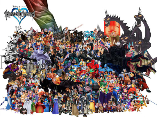
(The gang’s all here.)
These would not be complete, however, without equally fantastical animations. No matter the medium, the best way to tell the audience more about your character is through body movement. How characters move is also dictated by the overall tone of your content. Sora and the gang are animated with exaggerated motions and grandiose body language to remind us of the fanciful world they inhabit, and the larger-than-life personalities they have.
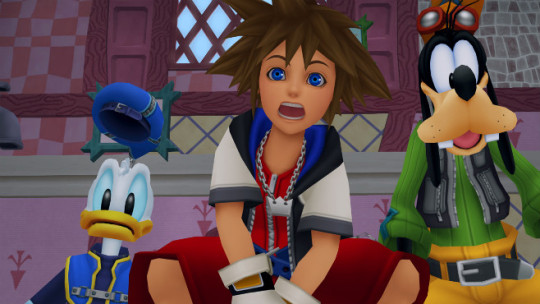
(Donald’s hat jumps with a mind of its own while Sora’s facial features spread across his face. Goofy unfortunately missed the pantomime memo.)
Contrastingly, characters from live-action movies rather than animated films move with much less grandiosity because they exist in realistic worlds. They are dictated by their setting just as much as stylized characters.
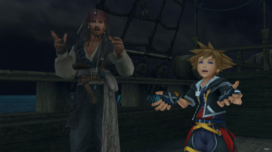
(Jack Sparrow may move in dramatic ways for a human, but Sora’s got all that and more thanks to being a spiky-haired shounen with giant feet and hands.)
Levels like Port Royal are where we can begin to see the problem with KH 3: once you strive for realism, you’ve already aged.
Achieving realism is still incredibly limited by technology. We’re getting closer, but as it stands we don’t have the necessary technology to make 3D indistinguishable from reality. Games especially fall victim to what’s known as Moore’s Law, which (as far as games are concerned) states that a graphics chip will upgrade every two years. So, once something is put out, it already has to worry about looking dated within as little as two years. Because of these limitations, a lot of media dip into uncanny valley real fast. Simply put, when something is meant to look realistic but fails, our brains take issue with it. We think, “Hey, I know that’s supposed to be a real bear, but it doesn’t quite look or move like a real bear, so I’m uncomfortable.” But take that same bear and turn it into a stylized cartoon and we no longer have a problem with it not looking like a real bear. The former is what’s happening to the KH 3 crew, while the latter is what they should be aiming for.
To begin, let’s look at these two screenshots of KH 2 and KH 3 respectively.

(Feel old yet?)
The bottom shot may be an early reveal, but it’s not far from the material they’ve released recently. As you can see, it’s much more detailed than the top image, but this is actually hurting the scene rather than helping it. The colors are muted and muddy in comparison, which would more accurately represent a real environment, but it’s so starkly contrasted by the unrealistic characters that it doesn’t connect. Sora is harder to see against the background because his colors and effects are also mimicking a more realistic application. Even the UI is harder to see, compared to the brilliant colors and shapes of the top image. What the top image lacks in explicit detail it makes up for in readability, creating a cartoony scene of implied information that more closely resembles a classic Disney film (which is the point of KH’s art direction to begin with).
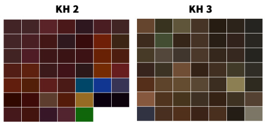
(While both swatches contain brown hues, KH 2 is more vibrant and thus allows for better readability and contrast. KH 3 literally looks like mud here.)
KH 1 and 2 largely avoid this readability and incohesive problem because hardware limitations were used to their advantage. When you’re tasked with creating a game full of Disney- and Final Fantasy-inspired assets but lack the technology to make anything look as “real” as pre-rendered cutscenes, you opt for airbrushed gradients, vibrant colors, cartoon features, and exaggerated shapes. Everything needed to look distinguishable from one another because PS2s were still developing and TV screens were fuzzier. Looking at the games now, it’s easy to see that they were made in the early 2000s, so of course they show age, but it’s also easy to see how beautiful they still are when compared to other games of the era which took on a realistic approach. (Also, imagine if Okami had gone with realism like it originally planned instead of sumi-e, and you can get a further idea of why style can easily trump realism in 3D aging.)
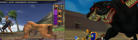
(Only one year apart. Neither are ugly, but when you aim for realism like in the first game, your age shows more and you dip a bit into uncanny valley.)
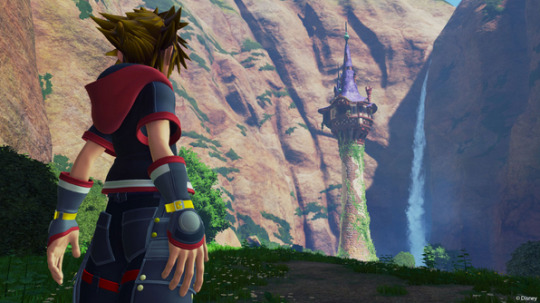
Now, I don’t think all of KH 3 looks terrible. The technology and efforts should be applauded, and in truth the Disney characters and Heartless shown thus far retain much of their original charm, and definitely benefit from the graphical upgrade most of the time. The animation is spot-on, as well.

(You just can’t look too closely, or else you get a face full of suddenly detailed textures that do not belong on a cartoon character.)
The counter is, unfortunately, that based on other released material, the art direction is not cohesive yet. You have some great-looking enemies and allies, those of which you know right away belong in a KH game, but stacked against a realistic background with lighting, effects, and muted colors that make it difficult to see. Details that are there solely because the technology allows it. More-is-less rather than less-is-more. They can’t seem to find a balance between simplified and detailed, 2D and 3D, Disney and Final Fantasy, that the original games built.
(I don’t even know what to say about this. It’s just straight up ugly. Why do his hands look like that? I feel like I’m looking at one of those nightmare-fuel fan renditions of “X character in real life.”)
(fix this.png)
Until they make up their minds about modeling Sora and other original characters, and about how to handle the lighting, effects, and other issues which are holding simplification hostage, there’s always going to be something off, something that isn’t translating well from the jump to next-gen consoles and preventing the games from feeling as KH as possible—and it has everything to do with the industry’s fixation on realism. Cartoony/anime-esque characters comprised of simple shapes and designs, like 90% of the ones in KH, do not mesh well with realism, whether it’s in the details on their clothes or their environments. Hopefully the team can see that before release date, otherwise, KH 3 is going to be full of uncanny valley and readability issues.
im still gonna play the shit out of it tho
#kingdom hearts#kh#kh3#kh tag#for the record I like the Toy Story models but overall the scene was difficult to see#also if I see anyone regarding this as hate...............do u know me#Do U#kingdom hearts is my momther#this should also be titled WHATD THEY DO TO RIKU???#bc wow. that shot of him with kairi i just. water u doin
14 notes
·
View notes
Last Seen Blogs
sethstudiees
seth studies
biraleynadaha
aleyna
khonshu-spector
✡️𝔖𝔲𝔫𝔯أ𝔰𝔢🗡

nocontexttaskmaster
No Context Taskmaster
thewoodbetween
The Wood Between