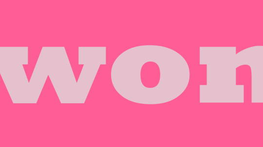
#i wanted to make the logo and title so that i could change the colour if i wanted to hehe
Photo
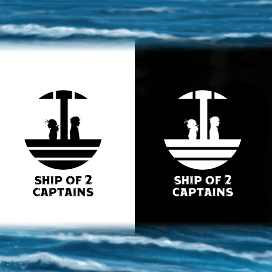
✨ TITLE AND LOGO REVEAL ✨
(For my pirates wip!)
This title is the bane of my existence, honestly. By the time I realised most people who use the internet think ship (relationship) first and ship (sailing vessel - which is what I mean) second, it was too late and I'd already gotten used to the title. I,)
BUT THINK SAILING VESSEL IT'S WHAT I MEAN
So there we have it, Ship of Two Captains. I can start calling it SoTC instead of 'pirates' or ‘october pirates’ all the time. X'D Moving up in the world. 💪
#title#title reveal#logo#logo design#comic#comic wip#wip#story#story wip#webtoon#webtoon wip#pirates#pirate#oc#original character#artists on tumblr#story concept#i wanted to make the logo and title so that i could change the colour if i wanted to hehe#i thought it could create some pretty cool effects on webtoon#i'm gonna thumbnail the prologue today#I'M REALLY GONNA DO IT I'M GONNA MAKE MYSELF EVEN THOUGH IT'S SCARY#wish me luck 👌
10 notes
·
View notes
Text
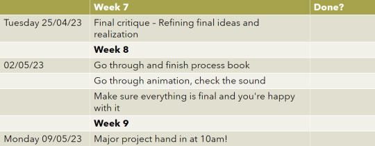
Setting Up Menu screens in Unreal
This morning I did some research on YouTube to find a tutorial series for Unreal 5 on setting up a basic menu screen system with customisability options etc. Below are the 3 Parts to the tutorial series I found and followed:
youtube
youtube
youtube
After following along with these videos I felt like I knew what I could and needed to do next when it came to making these menus. I firstly started by adding more buttons to the options menu as I wanted a few extra different types of graphics settings that could be adjusted.

Here I have added things I felt were missing from the videos which are a necessity to an options menu:
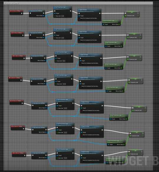
Framerate Locks
Screen Modes
An Epic Graphics setting option
A back button (returns to menu screen)
And a Save settings button
I firstly started with the framerate options and created all of them and coded them so that when the button was pressed it would change the framerate in the user game settings. After testing this I discovered Two Issues. The first issue was that for some reason the game was running in slow motion when playing it as a Standalone game and the Second was that the framerate was not changing. I decided to firstly look into the framerate and saw there was an option to just enable Vsync which should do my job for me. After swapping out the set framerates with Vsync because THAT worked for some reason, I then went to google to find out why the game was running in a slow motion like state. To my annoyance, I found on reddit that it was due to me changing the editor to a fixed framerate a lot earlier in the project which makes unreal slow everything else down in order to meet that framerate.
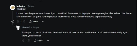
So to solve this problem I switched the framerate back to smooth mode instead of fixed. This then created a new issue for me which was that VSYNC no longer worked (Yay... :/). SO I then decided to test if the framerate lock option now worked by adding another button, which it did. So after all of that I had to remake all my individual framerate buttons again and set them as options.

In terms of the other options they were far easier to find as all I had to do was search for them off of the game user settings with no external settings having to be changed.
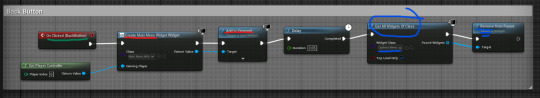
After getting the graphics menu setup I had to create a way for the main menu and options menu to switch between each other without overlapping. To do this I made it so that when a button to enter either menu is pressed it will remove itself and add the other menu you're trying to access back to the viewport.
Now that I had a functioning main menu along with options menu I felt that the main menu needed a game title logo and a background of some sort. I started by making the logo for the game and researched for some Ai logo creators. I found a website I liked, put the title of my game in and it made me a logo.
After that I pulled the logo into paint.net and started adding my own touches to it trying to include some hints of tic tacs within the logo. Here is what that looks like:
I really liked how the logo looked with its colour scheme and simplicity.
Next I decided to have some blurred background gameplay footage looping while you're sitting in the menu screen as I had previously seen one of my friends do that on the last project and I really liked the idea of doing that for this one. I followed the same method shown in an earlier blog post of turning a media file into a widget and then made it so that It plays when you're only in the main menu.
Now the only thing I had left to do was make a pause screen for the game. I followed along with the YouTube Video closely. I changed a couple of the options for the pause screen adding a 'return to menu' button and a 'retry' button as I felt these were also missing from the tutorial. The code was really simple with that being it would open up either the main menu level or the current level you're playing again.
Background Audio
The last short thing I want to talk about was that I decided to get some copyright free background audio to have in my game from YouTube. I used the same channel as my last project because I really liked the music they produced. I have a more upbeat happy song for the menu screen and a faster paced intense song for when you're playing the game.
Here are the two songs:
Gameplay Music -
youtube
Menu Music -
youtube
_
Here is a video showing off all of the menus and background music in game:
youtube
0 notes
Text
Pick, Pack, Sell!

Pick, pack, sell has been a very long yet very fulfilling project.
When the project began, I was immediately excited, and started researching for inspiration, which in turn, made me have ideas for every product, so it was challenging to narrow it down. After conducting some primary research, I noticed that bon-bons had sparse availability in shops which settled my decision as I knew I had the creativity to give them new life. I then decided my target market and made a start on some inspiration and rough planning. As I was curating my sweets to children, I looked into what things draw them in and thought it might be a fun idea to relate them to the children’s book – The very hungry caterpillar. This soon sparked some idea generation, and I started designing.
However, I struggled with bad artist block during this project and felt like I wasn’t making any progress – which I wasn’t. I was incredibly stuck for ideas and felt like I had hit a bit of a brick wall.
My final products have come a long way from my initial plan and I definitely think this is for the better. I research further into kids food products and made the decision to make my bonbons healthy and stand out from the regular market of them – taking an immunity boosting, ‘part of your 5-a-day’ route with them. This decision took my artist block away rapidly and I started producing work and generating ideas again. This change of plan alongside art block slowed down my progress and I fell behind slightly, I really had to pick up the pace and make some prototypes. To my luck, the first prototype I made, needed no alterations other than a logo move – it received great feedback and this helped me push for more designs. Soon after, I had finished the designs for all three boxes and completed the nets. 
Working one box at a time and altering the final one to fit the other flavours is definitely the way that works for me, as it was pretty straightforward to just change the layers and colours to suit. Another thing that helped me out immensely was having an asset sheet of colours, illustrations, titles and my bon-bon images, as it meant I could copy paste over to whatever I was creating i.e. my moving poster and standing poster. While making my poster, I wanted to keep it on brand and very child friendly. I kept it quite simple and used the typeface I made for my packaging to spell out a phrase on my poster. I think the final outcome really works well with the packaging and is bold enough to be eye-catching as I used simple block colours. For my moving poster, I took inspiration from an after effects session where we made a moving poster for AirUp. I use the same motions to have fruit fly out of my box to show all the flavours. While my digital poster is quite hectic, I feel this is very on brand as it will draw in attention from my target audience 
I made a lot more work for myself by including a sticker sheet and mini snack packs to my boxes for the bon-bons to be encased in. However, I managed to get everything completed before deadline and think this addition gave a really nice effect and made my product feel moreauthentic.
I wanted my packaging to have a recycled/organic feel to it with textured matte paper that wasn’t entirely crisp white. This posed as a struggle as I wasn’t able to get my hands on something like this so had to find an alternate way. I downloaded a paper texture and overlayed this on my nets before printing which actually gave a really nice effect – alongside the nets being printed using an ink-jet printer meaning it had a matte finish, this way worked perfectly. While prototyping I encountered some misalignment with the inside vs the outside, I didn’t alter this as every printer has a different alignment so instead, I hoped for the best which actually worked out okay and there was barely any misalignment.
One thing I faced when creating my packaging was envy of other classmates work. I know that everyone has different target markets and products, but this didn’t stop me from beating myself down about my project being bad. Another problem I faced which could have been avoided was that my boxes would not fit 5 packets in, only 4. This wouldn’t have been a problem if I had scaled the box differently and measured the size of the mini packs before sending it off to print.
Overall, this project has been super successful and has made me feel much more confident in my abilities. I have a better understanding of how I like to work, how I make the most progress and what my style of work is. Seeing everything come together and having it photographed properly has definitely made me like my product a million times more and made it feel much more real. I feel like it fits into my target audience perfect and will blend really nicely on the shelves next to yo-yo bear and organix snacks – exactly my aim :)
0 notes
Text
Hybrid Forms: Illustrating and designing the cover
Before starting to illustrate the final product, I made a rough plan of what I will include. This was not necessarily the final design, just a rough idea of what I need to have in each page, such as a publisher logo on one of the flaps and quotations, the kind of thing you expect to find on a book.
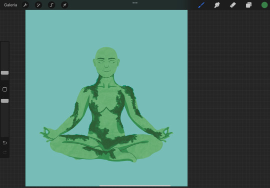
I decided to start off with the front cover, so that after that I can organically design and make decisions based on what I created for the first page. I started by drawing a meditating lady, and used the stock image below as my guideline.
While I followed the reference I used the symmetry tool in order to make her perfectly symmetrical with the exception of the crossed legs, so that it looks very visually harmonical. I made her green to emphasize the mother nature look and added hard shadows to make it a modern sleek look but there is texture since she is supposed to come from nature which has a lot of texture. My intent was to achieve a polished, upgraded version of the illustration I made in the workshop.

I changed the colours as I felt the background was too green leaning, and I wanted a strong but soft blue in order to transmit calm. I used a textured brush to moss to her as I felt it would make her more visually interesting than just vines.
I added her hair by making it out of leaves just like the original drawing I did in the workshop. I drew a bundle of leaves and duplicated them until it was a halo of leafy hair.
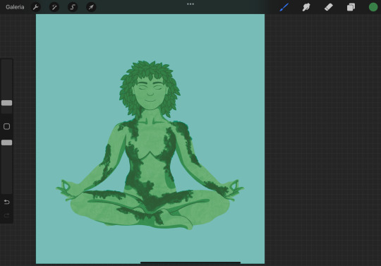
I added a hill under her and roots to show her grounding through meditation. I added more texture to the sky to make it look painterly and soothing. Continuing to pull from the drawings in class, I added blooming pink flowers as it again communicates her emotion, as well as being reflective of her giving life to things - a mother. It also adds a nice contrast and a third accent colour that makes the whole piece more eye catching.

I played with what I had and drew a tree silhouette as it is part of the drawing but should not take the focus from the lady. This give a nice framing to her and adds interest to the piece without taking from her. The paler colour fo the tree silhouette also allows the text of title that I inserted to pop out more against the background and be more legible. Overall, I liked the ideas I was playing with but there was something about it that felt off - it was not giving me book cover vibes. It was looking more like a poste that stands by itself, and feels a bit flat too overall, partly due to the tree silhouette removing some of the 3 dimensionality from the figure. I could not figure out what was missing so I left it to rest and returned to it the next day.
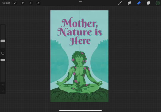
The next day I came to the conclusion that what was bothering me is that it was not giving the polish and refinement that I intended with this cover, as it should want to attract a side of the public that would want to purchase it just to display it on a shelf. I realised that part of this refinement was not coming due to the overuse fo textures, from the one on her skin, to the moss and the one in the background and hill. I scrapped all of them, moss included, and substituted the moss for vines that still insinuate she is one with the nature, but it looks less overwhelming to the eye. I made the blue a slighter deeper more saturated in order to catch the eye better, and also changed her tone of green to be in balance with this new colour.
I added back the tree, this time the shape more flowy and less detailed, and with a much fainted contrast with the background in order to distance it from the figure. I also added tree branches to make her seem like she is the tree itself. Because of the business of the branches I added a light shadow to the title to try to make it stand out more.

From this last addition of making her into a tree, I also realised the trunk did not need to be there at all, as she is the trunk, the stability of that tree. This imagery also alludes to the mother’s role in a family and how she is many times what gives stability to the family. By erasing the trunk it draws the focus again to her. Even though I just removed all of the texture, I realised now that it was lacking too much now, so instead of adding too much texture like before I should pick one spot only. I decided to add it to the main background colour and it added the relaxing painterly texture I wanted it to have initially, without taking from the piece’s polish.
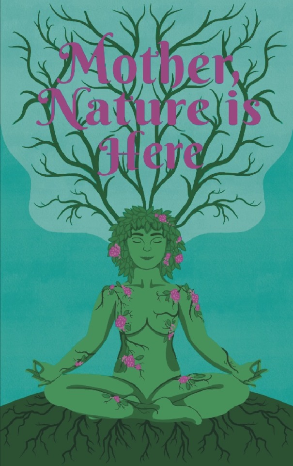
The title was still a bit lost against the branches, so I added an outline to it. It however made it look cheap and unharmonious with the rest of the piece. I also realised here that the font is part of the issue here and I had to change it to something more mature that reflects the adult themes of this book. Choosing a serif font could also make it more professional, academic looking (a doctor is supposed to be the author of this book) and make the book feel more reliable.
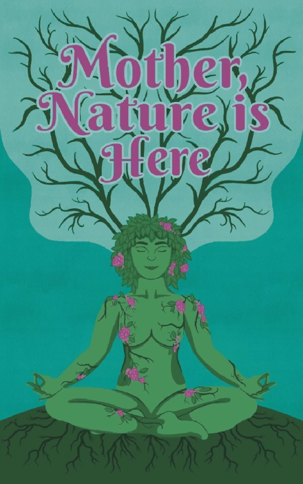
Changing the font gave it a sense of maturity that was lacking from the cover, and I was a lot more content with this result. I went ahead and added a subtitle and the author’s name, making sure to include Dr in it to add authority and reliability to the book. The title was still getting a bit lost in the branches so I added a slight light pink shadow to it by duplicating the title and putting it behind the main title. To make the title less lost I also toned down the saturation of the branches to make it bleed more into the background.

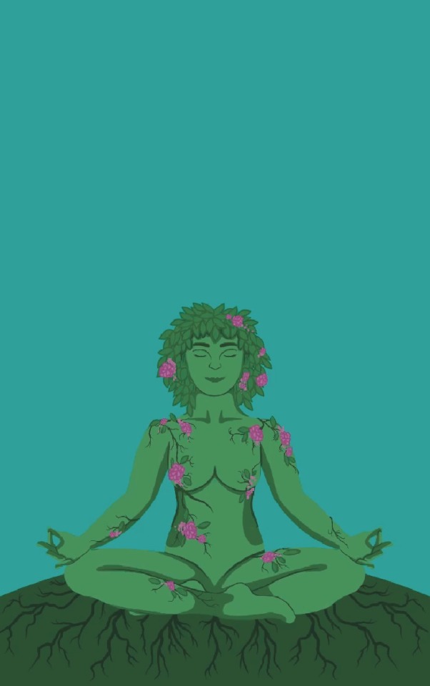
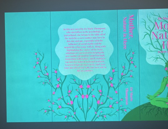
With the front cover mainly complete, I brought it into photoshop where I would be able to edit it more thoroughly using the healing tool. I started by making the front flap, and used the content aware fill for a base of what it woill look like. I want the whole cover to flow, and there to not be any illustration interrupted suddenly. The fill however predicted the shapes a bit off and non geometric. I also felt like the title was not standing out quite enough yet, so I further faded the branches behind it and got it to finally stand out enough. I also included the new york time bestselling author in a circle that looks like a sticker, just like many books have it as a sticker.

I used a simple brush tool with the right colours to make the shapes inside the front flap continue the ones on the cover. I used high streamlining so that the shapes would come out nice and smooth. If I look at the front flap by itself, the shapes that bleed into it look very gaphric aand pattern like, which I liked, so I decided to add one more shape on the right side in order to make it look intentional.

I replicated the shape of the tree, which made it look like there are more trees outside what the dust jacket covers. I also realised that the shapes gave me dynamic negative spaces perfect to insert the quotes, which I created using very flaterring lanugauge. I made them come from several sources, from media outlets to other authors and other doctors, which would give credibility to the book.

For the Back cover I knew there would be a significant amount of empty space as the description of the book won’t take over the whole page, so I decided to add another tree. I went back on procreate and I edited the same flowers I put on the lady on the tree to make it more interesting.

I added the text in a bok in a very geometric, flowy shape that is in the3 style of the other blobs of colour, however made it geometric. I chose this shape as it slightly resembles a flower, adding to the whole nature theme. The spine was still empty, so I decided to make the tree spill over onto the spine as it adds a nice feminine accent that will make the spine stand out against other books. This created these two nice negative spaces that perfectly fit the title and the author. However when I looked at everything as a whole, the tree was not balanced anymore as it ended before the back flap, so I made it completely symmetrical and allowed the branches to also adorn the backflap. This again would add a nice feminine touch to the back flap. I just had to add the text about the doctor and pick out a stock image of a professional lady, as well as a publisher and bar code.
0 notes
Text
Creating The Logo
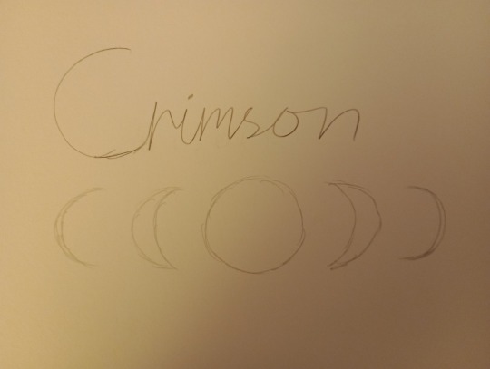
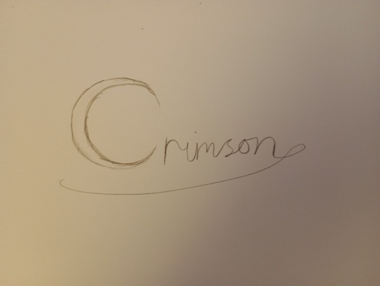

For today I wanted to make a logo for my front cover. So I jot down a bunch of ideas for it. I knew I wanted this series to be called “Crimson” since it's an interesting title and hasn't been used yet for the little red riding hood adaptations. Since Crimson means Red in a fancy way, this name was perfect.
But before I got started I wanted to research a bunch of Webtoon series and have a look at there titles.

Looking at them all here, I can see that the titles are quite posh looking but also very simple. Sometimes that has regular don't that you can find for free but then add something to it that relates to the story. For example, a sword in one of the letters.
So this is a style I believe would be perfect for my title in the series.
After hitting down a few sketches, I came across this on.

This one was my favourite out of all of them, I loved how the “C” was also a crescent moon 🌙 which I thought brought a lot of spice to the table. The flick was also quite nice since a lot of totals had something like that.
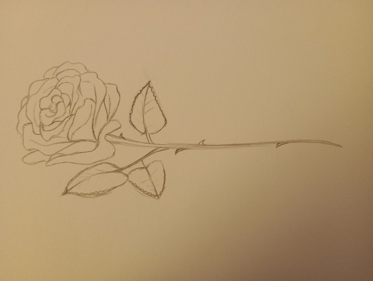
But after I sketched this, I thought maybe I could put a rose in there somewhere so I drew a rose so I can outline it later in Procreate and fix it somewhere.
After I finished sketching, I took pictures of them and put them into Procreate and tried to figure out the title. I started on the moon which I ended up liking, I then started to look for different fonts, after some looking around, I landed on this font.

This font was my favourite but I knew it wouldn't work well with how the moon is looking right now, so I put in a slit down the moon like the font I am using and also the two points sticking out of the moon. I then pointed to the rest of the font because some of it was curved at the ends which didn't look quite right because of the pointed moon. I pointed the font by rasterizing it which made it so the font is a part of the layer, not an editable font.
After that I was so happy with it, but something was missing so I decided to go through my stamps and see what I had. I found these cool calligraphy stamps that are useful. I went through them all and found a sweaty one with leaves on it which were so perfect because it related to water and forests. I placed the stamp inside the crescent moon and then it was time to colour the font.
I coloured it a dark red and then duplicated the whole logo and changed the one underneath to be a darker red than the top logo. I then turned down the polarity of the bottom logo, the gave the logo a 3D effect which I'm quite happy with.
I then coloured the top logo by selecting it and making another layer and drawing on some lighter red stripes. After that, I created another layer and changed the settings to ADD to make this new layer glowy, I got an airbrush and with the same red I created a few stripes along the logo to create a metallic red effect.
Looking back I am so happy with how this turned out, it looks so perfect and I can't wait to see it on the front cover and also see it on the Webtoon as a story people can read!
0 notes
Text
Assignment 3
For Assignment 3, I've decided to do an infographic based on the topic of Food Security in Singapore, as this is a current issue with the recent ban of live chicken imports from Malaysia and the rising food prices.
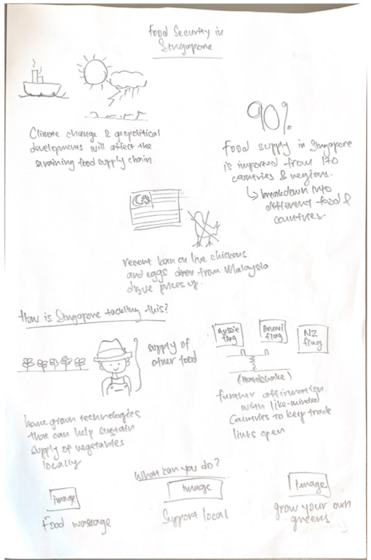
Before embarking on my infographic, I did a rough sketch on its flow so that I will be able to plan my information accordingly. Most of the information was retrieved from SFA's website (https://www.sfa.gov.sg/food-for-thought/article/detail/world-food-day-2022-joining-forces-to-ensure-our-supply-of-safe-food) with additional information for individuals retrieved from DBS' website (https://www.dbs.com/livemore/food/5-things-you-can-do-to-boost-singapores-collective-food-security.html)
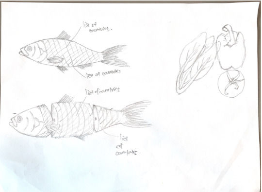
From researching on the SFA website, there was a myriad of information that I would need. I did a rough sketch exploring the different types of icons to represent my information in the infographic.


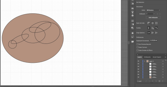
Throughout the planning stage, I realised that there were a lot of icons that I needed to draw and it would be time-consuming for me to draw them physically, take a photo and trace using the pen tool on Illustrator. I decided to explore the different affordances of the app, such as using the Shape Builder tool to create my icons.

For example, in creating this raw chicken drumstick, I referenced the real version on Google and planned out roughly on what are the basic shapes and how do they intersect. After a rough guide, I included the base colour first, followed by the chicken skin, and then proceeded to use the Shape Builder tool to remove the unnecessary intersecting lines.

During the critique session, I had no idea on how to portray the icon for "Supporting Locally-Made Produce", as this is one of the recommended actions for individual to take. My tutor suggested using the "Made in SG" sticker, and advised that I could trace it. As there were texts in the sticker, I decided to use the "Type on a Path" tool to recreate the texts. Initially, I created a circle and then use the "Type on a Path" tool. But the result was different as the text produced was convex (1) rather than concave as per the real logo. To rectify, I explored creating a concave line using the "Pen" tool, followed by the "Type on a Path" tool, creating the desired outcome (2).
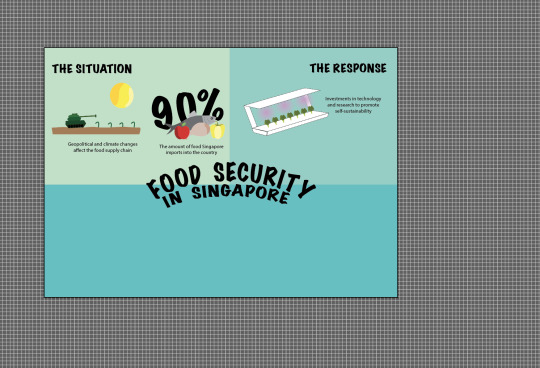
Despite my initial sketch being done vertically, I explored using a horizontal canvas when laying out my infographic. I wanted to focus on the portion of what individuals can do to contribute as the main information of my infographic but I realised that it does not allow me to put a visual hook, plus with 3 different icons in one section being placed together, it might make the whole infographic messy.

This was the first prototype done, presented during the critique session. Shifting from the horizontal experiment earlier, I decided to adopt the vertical approach, per my initial sketch. Piecing this up, I realised that there were considerable amount of spaces in between each icon. With regard to the visual hook, there was also no space to put it in, despite me realising that it is the most important feature missing. Further, as the intent for this infographic was for the use by SFA, I was not satisfied with the fonts used as it did not bring about a sense of professionalism.
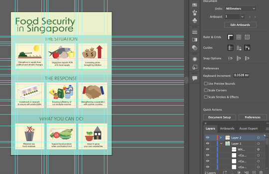
I explored further in using a "box" to encapsulate each icon and the accompanying information to make the infographic neater. I changed the font family to sans serif to keep the whole infographic clean, while making it contemporary and professional-looking as well. The visual hook, which is still missing, was intended to be placed on the top right hand corner of the whole infographic. Again the space looked small and I felt that the font sizes for my sub-headings and the accompanying icons could still be further minimised. Also, I felt that the dark green title against the lighter green background was a little bit like Grab colours, possibly creating a misrepresentation that this infographic was produced by Grab.


In this first version of my final prototype, I chose the teal colour family. I was initially inspired by the use of the colour in SFA's website, as they provide information to their users. I also felt that this colour combination was soothing however, upon further scrutiny, I felt that this combination was not able to drive the urgency of the food situation.
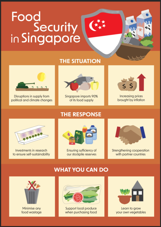
To bring across the urgency of the situation (which is brought about by the ever-changing political and climate landscape), I decided to adopt a colour scheme based on SFA's orange. Also, the adoption of this colour scheme allows the infographic to command a certain level of credibility as it represents SFA.
0 notes
Text
Blog Post 7: Rationales Rough
Project 1
TITLE: Logo redesign for La Stella Trattoria
CHALLENGE:
– Current logo lacks a cultural connection to the cuisine of the restaurant; Italian cuisine.
– Aim was to help bring in new customers while attracting loyal customers as well.
– Current design lacks personality, passion and is simple not up to the mark despite how well know this place is, due to their exquisite tasting pizzas
APPROACH:
– Only restaurant on the block that fires up the pizza in front of customers
– My research indicated I need to design with the mentality that my revised version must connect to their core values of serving fresh, homemade-style, delicious pizzas and pasta that satisfies the taste buds of an Italian cuisine lover and the way their interior is designed.
– This led me to make the design choice of creating a pizza oven as my logo for La Stella
WHAT I DID:
– Procreate, Illustrator and Indesign
– Warm tones incorporated to paint the experience of dining in a warm, cozy, energetic, passionate, positive enclosure.
– My type choice was Voyage and Filson Soft. The voyage font was chosen as it portrays a sleek, professional and classy look.
– Once finessed I brought it into Indesign and created my standard sheets.

Project 2
TITLE: Menu design for Le Petit Belge
CHALLENGE
– The current menu is very text heavy and crowded
– When people are either indecisive and/or anxious by nature they tend to feel the same if not more when placing an order. Since I am the same when I go to a restaurant when handed a complex and text-intensive menu, I used my knowledge, emotions, and personal experience to steer my creative choices for this menu design in the direction of a design that is simple, fun, organized, with a sense of hierarchy.
– My way of going about how to solve this design problem was to create a menu that’s easy to read, understand, and navigate through each category.
APPROACH
– Since their current one is very simple and plain it lacks connection to the cuisine of the restaurant, which is french. They say France is the “land of art” hence I aimed to incorporate that thinking into my design choices.
– I used their website as one of my sources to see if I could incorporate or be inspired and encouraged in any way.
– Their menu design lacked character, passion, energy, and emotion and all in all didn’t have a personality. So I utilized these insights to introduce cute and simplistic drawing that captures exactly what a customer can expect from the title of the dish on the menu
– I had to make a decision, based on the items on their menu, whether my illustrations would be intricate, simplistic, cute, cartoonish etc.
WHAT I DID
– I then just sketched to figure out what I wanted my layout, content and illustrations to look like.
– I achieved these wonderful illustrations through procreate and then import them into Indesign where II designed the layout and content for my revised design of their menu
– For my type I needed it to be simple and cute. Nothing distracting so that it wouldn’t get in the way. Legible, Formal and friendly was what I was going for.
– As for my colour palette. I struggled and found it challenging but how I overcame it was, I remembered hearing about this place because of their decadent waffles and creamy, rich hot chocolate. Hence I utilized a subtle, light and neutral colour palette.
– To conclude, what made this revised version more successful was that it gives off positive energy, love and passion for french delicacy through the use of art and a neutral colour scheme which also kind of portrayed a Parisian aesthetic.
With the introduction of illustration, it now allows the customer to relax a little knowing that they now know what their meal looks like instead of imagining and panicking later on that they changed their mind about it.

Project 3
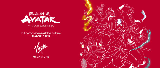
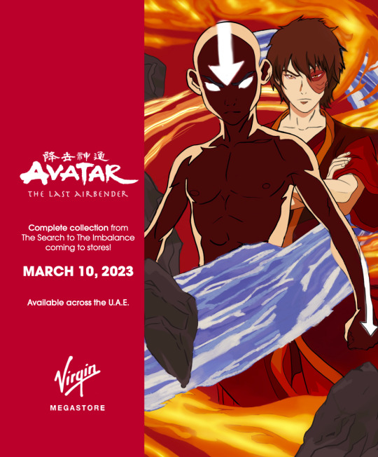
TITLE: Advert Mediums created for the announcement of Avatar: The Last Airbender (A.T.L.A) Comic Series at Virgin Megastore
CHALLENGE
I knew what I was showcasing as an advert at the time I was just indecisive on how to portray it. What would the content say, what would the layout look like, and how am I going to connect or match the vibe and art style of A.T.L.A to the aesthetic of Virgin Megastore’s interiors of red and white
For the word to spread fast, I needed to create two eye-catching posters one that people could stop and look at and another where you would only have a second to get hyped up.
APPROACH
For my target audience it was pretty clear that it would be Avatar’s fan base regardless of age, gender or status.
Research wise it was more of an easy design direction as I grew up with A.T.L.A and virgin megastore. I asked around to see what my other A.T.L.A lovers preferred if they were to see an advert of this sort. More than 80% confirmed that Aang and Zuko would immediately catch one's eye. They’re both dominant, and energetic and carry the most value in the show and series altogether. Also, the group was a favourite as well.
After some sketches and a little internet browsing I came to a decision to create a bus wrap and a bus stop poster, that can also be utilized as a window sticker in Virgin Megastore.
Using my knowledge of how slow or fast people react to their surroundings I figured that in order for my bus wrap to be successful it needed to be simple yet attractive and eye-catching enough so that an A.T.L.A lover on the sidewalk would immediately recognize what the advertisement is about.
WHAT I DID
I wanted my design to incorporate simple content and dramatic illustration as my main element to draw in the audience was through A.T.L.A’s art style.
One way to capture the audience's attention was by creating a drawing where Aang and Zuko’s friendship, dominance, personality and energy would be vibrantly and dramatically portrayed.
Even though the red background was bright and vibrant it didn’t distract the viewer from the main elements of the poster.
For my bus wrap I decided to keep it simple as all I had was a second to draw in the viewer. Since Virgin Megastore’s aesthetic is that of red & white I utilized their colour palette to draw up white outlines of team Avatar with only their bending elements illuminated.
I used procreate to create my illustration and Indesign to add my content and tie it all together.
0 notes
Photo
BLOG POST #7: RATIONALES ROUGH
GLUCABEAR
Title
Glucabear Travel Glucose- Making diabetes a little less scary
Challenge
Make glucose less scary and “medicinal”- make it friendly.
Carrying glucose can be embarrassing, make It a bit more fun
attempt to eliminate plastic packaging and make sustainable
Approach
found out that no brands that cater specifically to children with diabetes
have used glucose all my life, used to be embarrassed by it as a kid
Illustrate pattern & sticker in procreate, brought into illustrator to turn into scaleable pattern
kids alphabet blocks and fun mascot to make things friendlier
size of tube made for small hands, honeycomb shape from honey =bear eating honey
strip and tube are tactile with diff textures
colours are bright and easily recognizable to grab in emergency
tubes should be travel size and fit in backpack
fits exactly 4 rounds of glucose
playful and fun to look at
What I Did
The Stuff
Illustration, logo design, packaging design, typography, brand identity
The Tools
Procreate, Illustrator
DOWNTOWN NANAIMO
Title
Downtown Nanaimo - Shining New Light on a Historic Harbourfront
Challenge
Downtown Nanaimo is seen as dirty and dangerous despite it having a rich history- people don’t want to visit
detached- no solid branding or wayfinding
Approach
explored downtown to find what was missing or what felt off
took inspiration from Parksville, as it’s deemed a comfortable, touristy place
create comprehensive branding system with custom illustrations done in procreate
developed signage, way finding, street lights, etc to give downtown Nanaimo a fresh face and make it easier to navigate, as well as distinguish the three areas of downtown
create merch to show off pride of downtown Nanaimo
art installation in under-utilized space draws in visitors and gives them a new reason to visit
What I Did
The Stuff
Illustration, logo design, typography, brand identity, way finding, merchandise design, icons
The Tools
Procreate, Illustrator, InDesign, Photoshop
As mentioned down below, my third project will be a selection of illustrations, likely with a brief summary of the illustration and the tools used.
I’ve had to recalibrate my initial timeline a bit and go back to my schedule and fiddle with it. My original idea of having my illustrations scattered and hidden under icons in the background is very difficult to implement. I’m saving it as a possible idea for later on, but for now we’re changing it up a bit.
For projects, I’ll be using Make it Right as my case study, and using 2 other projects, Downtown Nanaimo and Glucabear. My case study will have long-form text and rationale of course, and then Downtown Nanaimo & Glucabear will both have relatively long rationales (based on the video how-to. The case study, and three projects, will look be 4 clickable squares so it looks nice and even in a grid. The illustrations will be look the same as the projects on the front page, but different when you click on it. It will likely have the illustration image with a title, then when you click on it, an overlay box will pop up with the short-form rationale as well as a mockup of how the illustration could be used.
I think this will be significantly easier to implement than the previous plan, and this way I have a bit less to create as I won’t need to create a bunch of Dice Tower collateral, I’ll just be able to use the posters as part of the illustration project. So still showing the project, but much simpler to deal with.
0 notes
Text
FAS3002 Creating the Logo and Presentation
Now our garment illustrations are complete, I have been able to fully turn my focus onto starting the presentation as Izzy and I have become increasingly concerned about the development of our branding. Indeed, at this stage we did not have a logo or brand identity to work with, so we decided to develop our own in order to ensure our progress was not stunted.
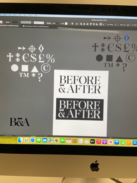
Working with will, we explored various fonts that could be suitable for a logo. We focussed on creating a distinctive ampersand as this could serve as a shortened logo for us should we so need. We ended up with a shortlist of around seven fonts, which after looking at the whole font, discovered only one would be truly suitable as a logo. This is pictured above, including some of the other symbols we kept as useful motifs for our presentation in order to keep it fitting with the brand identity. To create the final logo, we moved the letter spacing to be closer to have some overlocking serifs. We then tidied up these overlaps to create smooth joins that would make it look more like a logo than simply a block of text. This is most evident on the join between the ‘R’ and ‘E’ and ‘A’ and ‘F’, which I am really pleased with as it looks rather professional for something we created in only a couple of hours. On the left of the image above there is the shortened ‘B&A’ logo, however I doubt we will use this as I am not overly happy with it. Personally, this feels too much like B&Q, H&M and B&M, which are all brands we do not want to resonate with. Hence, we might just use the ampersand as the shortened logo, as this is a more unique shape with regards to the font we used. We then changed the colours to be an off-white and a grey background which will also be the general theming of the presentation in order to remain cohesive. We decided that the text will be at the base of the background, but the actual grey background of the logo could be as long as necessary depending on where the logo is being used. This is something we shall develop more when it comes to creating labels and packaging.

We then moved on to creating the powerpoint, specifically focussing on developing the format for the presentation that would allow the brand identity to remain clear. The first thing we decided on was to alternate the colours of each slide; with some being grey with off-white text and vice versa. I then placed each slide's general title to ensure all aspects were covered and developed. The only slide I could instantly place the text onto was the customer slide as I had already developed all of the customer profiles last week. This has not yet been laid out to be presentable, but it is comforting to have the text on the page as a basis for the slide. I then moved to do the same to the other slides, in particular the packaging, garment, and place slides. I also left a few slides to hold narrative text, like the second and seventh slides pictured above; this will be vital in ensuring we successfully communicate our brand identity in the presentation, and it will hopefully give us more direction when it comes to planning the script and how we will show the brand. However, this still needs a lot of development and I still need to work out the exact text for these slides as what we have at the moment is only a vague outline of what we will try to say more professionally.

I feel significantly more at ease with the presentation now we have a logo and more focused brand identity. Izzy has also finished developing the patterns to add colour and texture to my illustrations which allows me to develop the presentation further already.
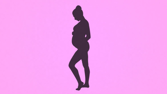
To further my development, I shall continue to work on the presentation and my technical drawings to have a presentation ready to be fully rehearsed by the end of next week. I am also hoping that Tingting will provide me with a suitable mood board that includes pregnancy and competitor imagery that I can also instantly include in the presentation.
0 notes
Text
Creating our final presentation:
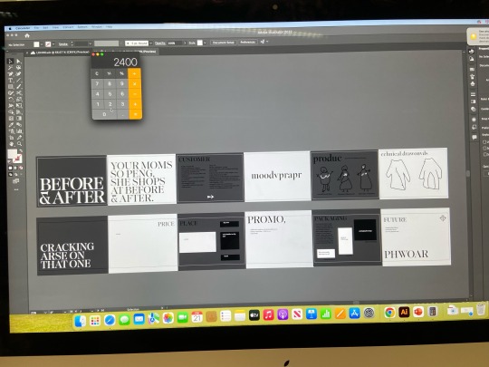
Once we had all the areas covered and done we could being to create the final presentation.

We wanted to make sure that our vision and purpose slide it was supper clear what we were about as a brand, we needed to make sure that it was clear to read and also wasn't too much to read which is why we broke it all down into 4 bullet points. On each of the slides we also wanted our logo somewhere so that it made the entire presentation cohesive.

In terms of our brand identity slide this was all about the rules that Amber had set about our logo usage. We wanted it to be clear what rules we had abut our logo and the size and the fonts that can be used. However when creating the presentation we did use a different font for the titles and some of the text, we felt that Gilrock font was great for our logo but it wasn't always really easy to read, so we picked a font called Kigelia which we felt still went with our brand and it was much easier to read. After deciding this Amber just had to add this onto the identity slide as this would be the font we used in future presentations as a brand.

Our customer profile we felt was really strong and clear, by having the collage next to the customer profile we felt was a really good visual to have so that people who don't necessarily like reading words can still get a clear idea as the type of customer we are trying to reach.
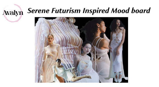
This was the mood board that Ysa had created, the job of the moodboard was to inform what the products would be, so when you look at the mood board you should start to build up a visual idea in your head as to what the products were going to look like. I feel that our mood board is strong as the images that have been used really sum up the vibe we wanted to create in our products. One thing that we did think to potentially change was the background colour and maybe changing it to be one of the priest I had done just because black didn't really go with the vibe of our garments or brand.

For our products we had to find the technical names for some of the pieces ie funnel sleeve top. We wanted the page to be clear and the right names as to what each item of clothing is called, we didn't want to much on this page as we wanted the big focus to be on the illustrations of the garments.
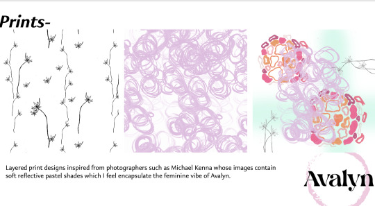
We then had a slide on my prints. On this slide I didn't want to have to much as similar to the product slide I wanted the focus to be on the prints. On this slide I would talk about how each print was designed to be layered as each one would be on a different garments. Also I would talk about the inspiration behind the prints and the photographs that I used to get some of the shapes and the colours.
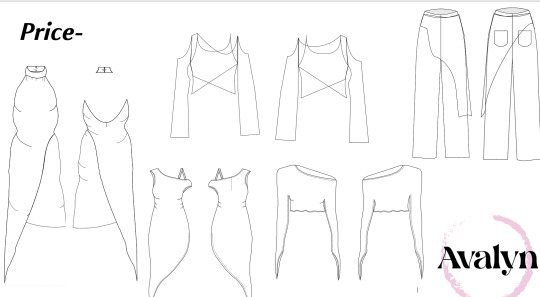

Amber had worked out our prices for us, she had done them as a mark up of X2 because we were selling directly through our website and we weren't going wholesale to begin with, because our garments are made from fully sustainable materials it meant that our prices were always going to be quite high. We hope that our customers are willing to spend this much as they are pieces that are made to last.

She had also worked out the price of our products if did want to go whole sale. To help set our our price page we had our technical drawings, which we could then write the price each one next to it which would make it really clear as to the cost of each of the garments.

On our packaging slide we had all the designs for our packaging with some key bits of information as well, for example we wanted to make sure that everyone knows that its all recyclable and fully recyclable. We also wanted to have an estimated price of all the packing, at first we were going to have this on the price page but we felt it made more sense on this page as its about the packaging.
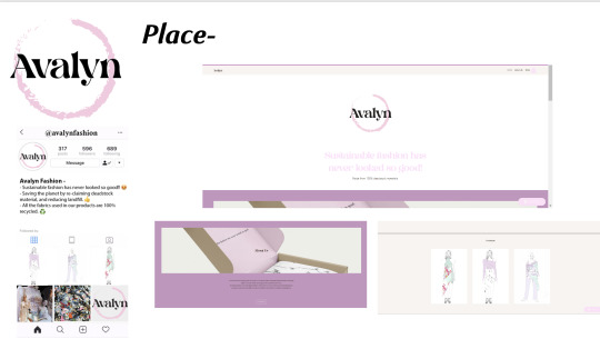
For place we had a picture of the instagram that Ysa had created and a picture of the website that Amber had mocked up. We were going to have some text on this page which talked about how for the short term we would sell through our website but more long term we would hope to move to retail space, but we felt that actually these were points that we could discuss in the pitch rather than have then on the slide as we felt that the pictures said enough about where our place is.
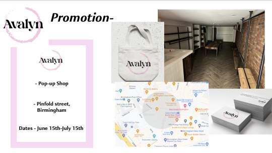
On the promotion slide we decided to set it out almost as an invitation with what holding, where it's going to be and the dates that we were going to be in the space. We also wanted a picture of the space where we would be holding the event and we decided to put o the images of the tote bags and business cards which we give out at the event.

The final slide of our presentation is all about our future and what we hope to do, we had some big ideas as to the future of our promotion so we wanted this to be on here, we also left a space as we needed to add in the future of sustainability as this is a huge part of our vision and purpose so in the future it will be something that we will constantly be looking to better. In terms of the layout of this slide we did feel that maybe the last couple of points needed to be turned into bullet points as at it looks like quite a lot and isn't the easiest to read.

I added in a little segment about the development of smart textiles. From the lecture on critical thinking about the future we had spoke about using materials that breakdown into the environment to create our garments from by doing this it keeps in line with our brand as instead of material ending up in landfills they actually break down into the environment and don't cause harm.
The very final part to the presentation is for us to all practice it, by practicing and rehearsing it all we will be able to pitch the entire thing with confidence and will be able to confidently answer any questions at the end.
0 notes
Text
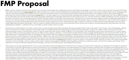
MP development

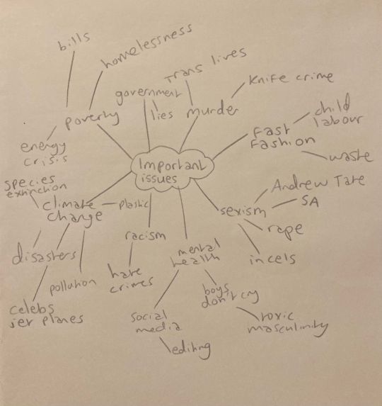
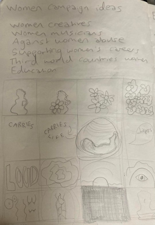

The first things I did when starting with the creation/development of my project was write down anything I’m interested in, as well as issues I find important. I landed on the idea of female empowerment as this was something I felt passionate about. I researched into lots of existing campaigns and videos on this and decided I wanted to create one, specifically one including cut-out collage and stop motion.
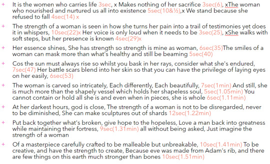
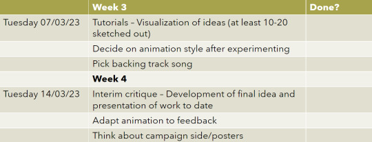
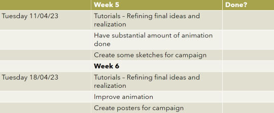
I found a spoken poem titled ‘The Strength Of a Woman’ which I resonated with and found extremely powerful, so wanted to create visuals to go with these words. I wrote my proposal, time plan and then worked out the specifics like how many pictures I would need to have per verse of the poem. I sketched storyboards of what came to mind when listening to the words of the poem, thought of possible names for the campaign and thought about which creative women in history inspire me.
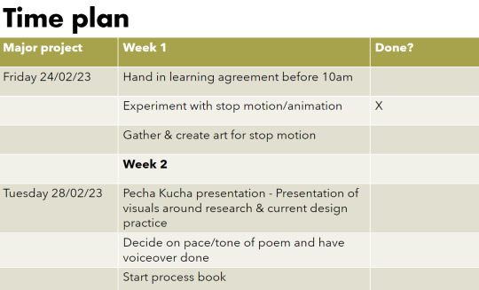
I got my friend, Talulla, who writes her own poems, to record the voiceover for the poem/video, as she has a very soft voice which feels fitting to the words/vibe. I also sketched some storyboard ideas, as well as name ideas, subjects to focus on and some examples of powerful creative women in history.
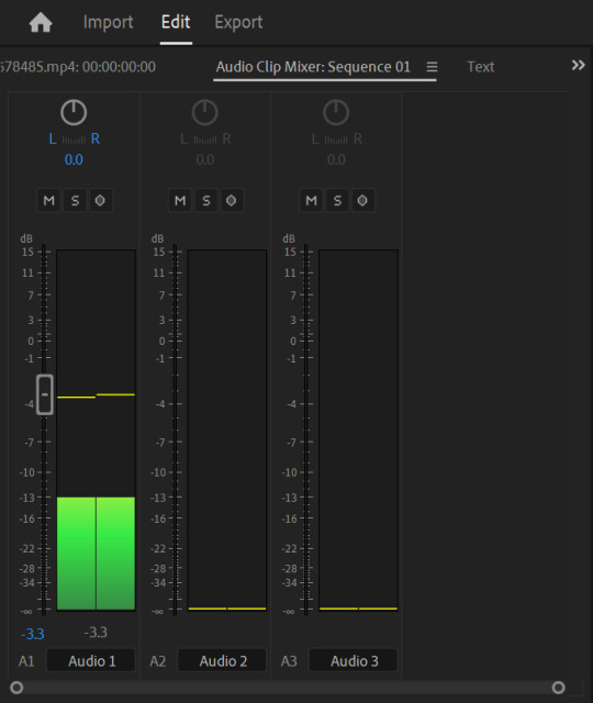
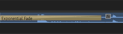
I found copyright free music to add under the words, and adjusted the volume of these tracks accordingly in Premiere Pro. An effect I like to use is ‘Exponential fade’ to make the sound fade in and out.

I experimented a lot with creating visuals. On After Effects I learnt some skills on the programme like keyframing and discovering some interesting effects. I had a lot of fun trying new things, for example making images 3D.


I made elements of an animation in After Effects, showing text transitioning into image, vice versa and both of these moving around the screen in the pace and tone which I wanted to convey, which matched the words of the poem.
It was interesting experimenting with this, adding many layers and learning how to move them around in the way that I wanted, with the use of effects
and keyframes. I enjoyed creating different ways for certain words to stand out visually, and give more of an impact.


I created different ways for certain words to stand out visually, and give more of an impact.
I also experimented a lot with physical art, and abstract ways of showing the meaning and feeling behind the words of the poem. I used a lot of colours to express emotions, and really enjoyed the process of drawing and colouring in this way, to create stop motion.

I created series of photographs for the different verses in the poem, and made sure the amount of pictures I had for the stop motion element matched the time stamp for when they are spoken, so it flows nicely and shows the words in greater detail through visuals.


I made many versions of the different verses in my stop motion animation so that I had lots of different options and could pick one that fit the poem the most. I also added text over some parts of the video to enhance the meaning behind them, and carefully selected a handwritten style font. I decided to remove some font as it looked too busy, and ended up changing the font.
I also added real footage of creative women in history, which I feel made the video a lot more empowering/inspiring.

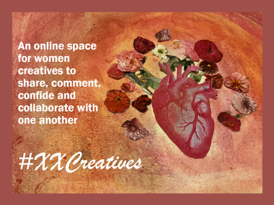
After completing the stop motion and feeling happy with it, I felt like I had to create something more. I wanted to design an online space for women creatives to be able to interact with eachother and get recognised more easily, as I feel as though women creatives are overlooked a lot in society.
I chose the name ‘XXCreatives’ as it sounds feminine, and used an illustration from a still in the video as the main logo for it. I changed this slightly, and decided to create mock-ups for the Instagram page of #XXCreatives.

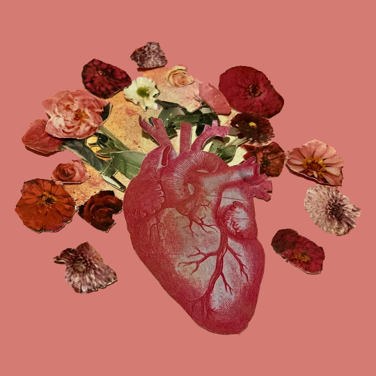
I took a still from the stop motion animation to use as the logo for the ‘XXCreatives’ campaign and in their social media presence, specifically an Instagram page I created for the platform of creative women to share, comment, collaborate and uplift eachothers work.
0 notes
Text
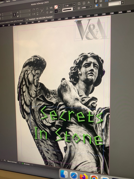
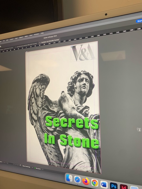

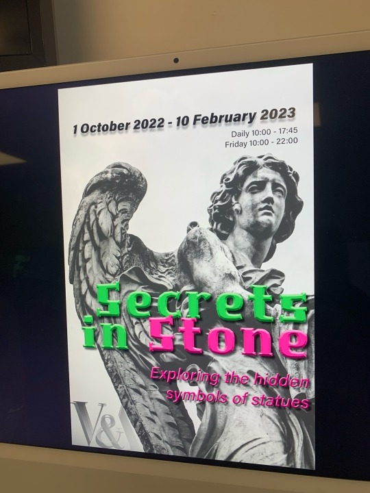

24/01/23 - second poster design
I made a second poster to really test my skills on Indesign. I chose to use one of the other lead images I liked from the first look; this stunning carved angel. I cropped the image so the wing was the focus, as it spanned quite well across the page because of the zoomed in scale. This time, I wanted a pure black and white image so I could experiment with using bright, trendy colours like this lime green.
Because the main reason for this exhibition is sculptures made of stone, I decided to change the typeface of ‘stone’ to a hot pink to contrast with the green, which I feel was effective. I then also had the subtitle in the same pink to lead your eye to that second, before looking at the black text at the top of the page. I decreased the leading between the title lines, as I wanted the ‘stone’ to slightly overlap the ‘secrets in’ to hint at the hidden secrets these beautiful sculptures hold.
I played with the location of the logo, first in the top right corner, then in the bottom left, which I felt were both pushing it to the side a little and it was not clear this was a V&A exhibit. Instead I had the website in the bottom left corner to isolate it a little (as that is where the viewer can find more information) and overlayed the logo onto the sculpture itself. It stood out due to the negative space in between the wing and the head, however was not the focal point as it was also in greyscale. I could have made it a little bigger though, and maybe tried to edit it to partly be hidden by the sculpture to give it a more contemporary feel.
I felt the secondary text was clear, as the black worked well with the light background, however I did not need the drop shadows, especially as the title was so eye-catching with the bold colours. My intention was to make it stand out and to make the eye go there first after reading the title, but I think it was too much. I do like the two column layout of the times and address, and it was clear with the descending sizes of the typeface what order you had to read it in.
The lime green type on my computer came out of the printer looking a little more forest-green, which was not my intention and I feel it did not stand out as well as the brighter colours. In future, I would do a few more test prints to make sure that the colours I had in mind were printing correctly onto the paper.
1 note
·
View note
Photo
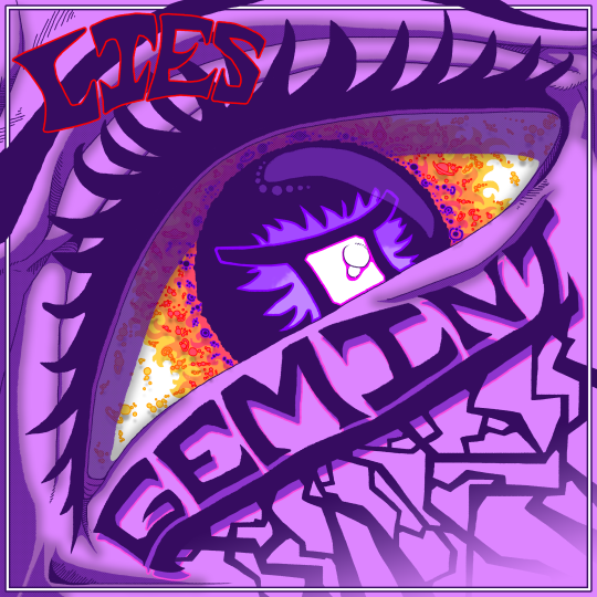
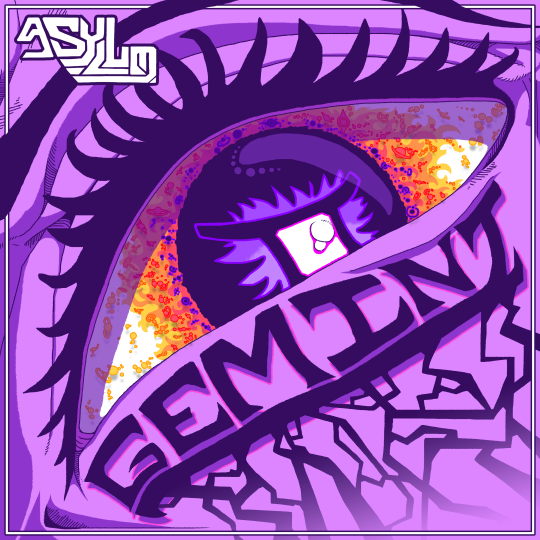
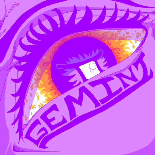
This is the second finished single cover from Gemini, being taken from the top right prototype single cover. This piece is nearly unchanged from it’s original pitch, having minor changes applied to fill space and such. I went with an abstract, paste look, which can be seen more presently in its earliest look. The work focuses on an eye, slightly turned to the left, no other details like the nose or mouth as present, leaving the emotion, conveyed solely through the eye and brow, to be taken into interpretation. I saw it as a sort of cocky, unbeatable stare, emotionless in it’s certainty of success, helped by the ye looking down at someone or something that we have no grasp of. Planets and stars swirls around the cornea and elsewhere as if the pupil is its own galaxy, a black-hole taking all that comes in it’s way. While its human, it also feels off, unnatural and confusing. The title track lays under its eyelid, streaks spreading down into nothingness at the edge of the piece.
The biggest problem of this piece isn’t that large in my view, as I think the piece is conceptually and visually sound, while it has a main colour it has enough variety that its not overpowering, your eye is drawn to the eye that leads you to the title and so on. The only thing I could see being a criticism is its biology. I didn’t reference a face while making it, because I just wanted to get into it and try, I believe that realism is second to understand-ability, if you see and eye, you see an eye, even if it looks off or unnatural, but that is my only true critique.
In my view, I think this is one of my strongest works to date, Its visually interesting and it feels larger than life through its posing, which I was inspired from my previous try at the cover as I wanted to make it feel larger through perspective, which I believe I achieved through this. It’s simplistic yet detailed and looks human enough to be understandable and to pass across its intent. The only other problem I had was no problem at all, that being its early colours. Originally, the dark purple used in its line work was far lighter. I wanted to go for a more colourful and bright piece, but the band preferred me to make it darker, which is fine as, after all, its for them and I do wish to please in my final products. This was quickly fixed with a colour overlay of a darker purple, and it was done.
And, the final problem was the band logo. They still have yet asked me to make them one, but for this I made a hypothetical logo for Asylum, which was quickly shot down, they didn’t say if it was bad of if they even liked it, they just told me to change it to “Lies,” which, due to poor communication, I had no idea why, but I am not one to judge what people want and did another piece of text for them saying lies.
Asylum logo variant and frame added around piece:
Streaks added:

Darkened colours and original Asylum logo:

Original colouring and shadows (far Brighter and pastel like):
0 notes
Text
InDesign Development
Once I had finalised my photoshop files I added them into an Indesign file, A5 portrait with facing pages and a 3mm bleed. I used the frame tool to draw a frame and then I added my photoshop files and fitted the content to the frame proportionately. I used the type tool and pen to draw paths to type on. At first I wanted a fun font and experimented with a few bubble writing styles shown below.
I decided that it gave quite a retro style and changed my mind to pick a more minimalist font that would go with my theme and also look similar to classic fonts used for fashion magazine logos. I decided to use Campaign serif (regular and italic) and Minion pro which I think visually improved my lookbook a lot. I used size 8 for my main text and size 12 for my sub-headings in Minion pro so that it is readable but not too large. I used size 22 for my main titles in Campaign serif. My fabrics and colour page has the curved text showing where I have used the pen to make a path and the type tool so the text follows the squiggly mines.


I decided to change my front cover to add to my minimalist theme by making a border around my photoshop file with the text on the top and bottom of the file to look like an old book. Making the back the same layout and colour border is also a way to have them link together. I experimented with some different colours and shades of purple and pink. I decided to go with a bubble-gum pink, a shade of the pink colour in my lookbook. I made it a bit brighter to make my front and back cover stand out better. Once I had made the text central I moved my model to the middle, made her bigger and made the colourful swirl bigger so my cover looked less empty and it shows the style I have flowing throughout my whole lookbook. Although, I kept my back cover the same as I think the asymmetry looks better when its not framed by text and it doesn't have to look as bold as the front cover.

When I was ready to export my file, I first packaged it and made sure 'include IDMLs' are clicked. Doing this ensure all my files and fonts are copied and put in a separate folder, and if someone needed to open my Indesign file I could send them the folder so they would have all the links to open the file correctly. Then I exported it into a pdf by clicking, file, export, with spreads, all pages, all printer marks, and use document bleed settings all ticked so It shows all my guidelines and colours on the outside. This pdf can now be opened by anyone and they can see my whole lookbook.

0 notes
Text
Start of Mood Board
For my mood boards my plan is to make two that won’t necessarily be perfect or fully finished, they’ll just be visual brain dumps of I think I should include in them and then my third mood board will be the finalised perfect version of the mood board that I liked the most out of the two. Doing this to sort of help try understanding what my trend a bit more.
For the first mood board I didn’t really have any thought as to what I wanted to add onto it and was just trying to put what I felt like fit the trend and showed it. To try and capture the dream aspect of the trend, I went on Behance and found an image of staircases that lead up to a bed with clouds surrounding it which I think quite literally conveyed the daydream concept and then I also found on Behance of a door that had stairs leading up to it surrounded by clouds, which in a creates a sense of escapism. The colour palette is more of your light pastel colours instead of dark colours. As well as the bed and the door that I had added, before that I had added a block colour of the key colour for the trend, which is Digital Lavender. I then added a picture of the sky that I took to also show the colour palette and then I added an image of pink satin fabric and with the way I cut out the image to make it look less flat. When it came to trying to figure out what images I could use to show the digital aspect of the trend ,the first thing I thought when looking at the title of this trend was metaverse and there is this girl group whose concept is the metaverse so I decided to look through their Instagram and YouTube to see if there was anything that I could use. I ended up just using their logo for their new album and the earpiece that one of the girls was wearing in the solo trailer video. I didn’t really have any good idea for them so I just added them on to it just in case I ended up with a better idea or better images I could put in their spot.


For the background I wasn’t sure about because it was quite dark compared to the rest of the board, so I ended changing it in the first session we had on Tuesday with Will after showing it to Natalie.


Within the Tuesday lesson, I spent around half the lesson for images and the other half messing around with my board. Since I was so focused on actually finding images to go with my trend, I completely forgot that I needed to have models wearing garments that linked to what WGSN has said on the trend forecast and did ended up finding one but it did look pretty random as it was a formal gown and I had put moon boots before Natalie said that I should add a model on to the board.

0 notes
Text
Testing: Exploring lift-the-flap interactive elements and 8-fold draft
An idea I had earlier on in the project but never tested was lift the flap elements in my work. This could be a way of making my content more engaging as well as strengthening the idea of undercurrent, by playing with physical underneath elements.

Above: My newest 8-fold iteration. I have lightened the colour as Meighan suggested. The last print out was looking too boxy, so I’ve removed the scribble background, which means the text can be read on the background. I’ve added a brick texture. I think its an improvement but it still feels clunky. Feedback:
-biggest thing is irregular leading- I need to create some paragraph styles for this doc.
-make scribble a clearer part of the design system. People need to see it and think of the campaign, so it has to be on everything in some way. I also need to decide on what my logo is. I know it’s a scribble but I’ve been using different scribbles and combing them with the logo type in different ways.
add some info on the back as to what the reader should do with it- give it away, go to a website, etc.
-maybe make brochure cover something other than the campaign title. This will strengthen the tone of the campaign.
-brick walls show stigma- but everything else is organic and irregular, so shouldn’t these be a bit wonky too?
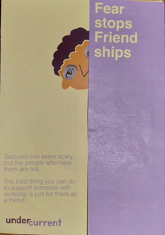
Above: I’ve stuck with this message for the zine poster as it’s the part of my research I found most shocking, especially as from the people I talked to this seemed to be quite a common misconception. If people think they can catch something they will stay away from a person.
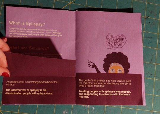
Above: the lift the flap here enhances the message. the text “an undercurrent is something hidden below the surface” is itself hidden beneath something. Raul said: make it obvious that it is a part that lifts up, or move it to opposite side. Because it is on left, reader will hold the edge of that page and not realise it lifts.
Raul’s feedback: why is Helvetica the title? it says something different to what the logo type (hanna) does.
Initially I changed the display from hanna because of feedback that the leading was uneven, but actually the imperfections of hanna are suited to my campaign. It should feel accessible to a child, so it should be a bit wonky. Furthermore, are these clean lines and colours suited to the organic, child-friendly tone of my campaign?

Above: one of my posters. I think the lift the flap is cool, but I’m wondering about it practically- in a school hallway it would get ripped straight away.
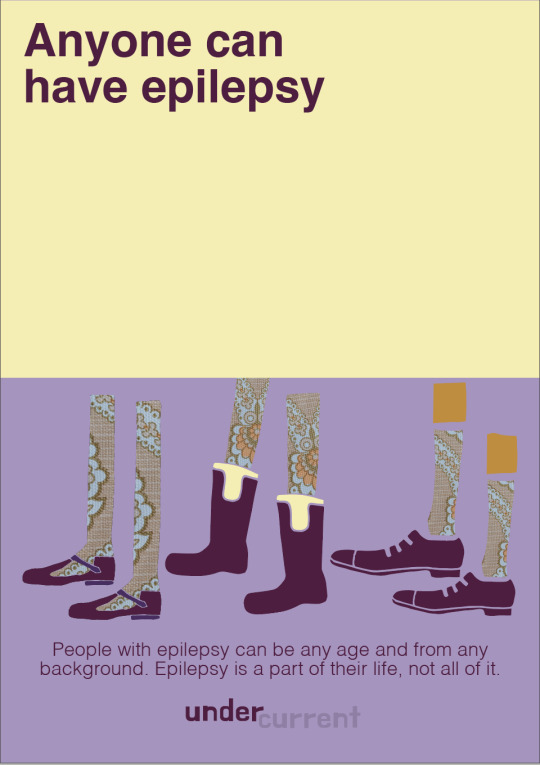

Above: Underneath the flap of this poster would be a mirror at eye level. Update: after talking to Evette (from the epilepsy community page), this doesn’t seem like a point I want to emphasise- the part of the brochure which didn’t resonate for her was “people with epilepsy look like everyone else.” The sentiment of anybody can have epilepsy is good, but I should probably steer it away from what people look like.
0 notes
Last Seen Blogs
princesssmars
mars maiden
emmania
Emmania Watson
aislingangel
the enstars tik tok arc was overrated tbh
theunchartedd
THE UNCHARTED
spacebunniesmha
IzuOcha & MinaTsu world domination!!