
Last Seen Blogs

academicwritingservices-us--blog
Academic writing services

ricewalrus4
The Journey of Holden 269

imnotevenherern
Uchiha Slut(19)
m3adowss
cait

enochianribs
👁️👄👁️
Text
Reference list:
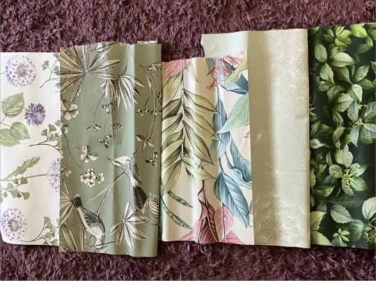
BeautifulWalls(N/D) Rifle paper co. strawberry fields. Available at https://beautifulwalls.co.uk/shop-by-design/floral-wallpaper/rifle-paper-co-strawberry-fields-blue-large-sample?code=RP7356 [accessed 12 April 2023]
Elle Décor(2017) The new pretty, Modern pastels for spring. Wish List, p 25.
FashionUnited(2019) Alexander McQueen taps Kate Moss for AW19 campaign. Available at https://fashionunited.uk/news/fashion/in-pictures-alexander-mcqueen-taps-kate-moss-for-aw19-campaign/2019072444411 [accessed 27 March 2023]
Gillian Bates contemporary textiles(N/D)Gallery. Available at https://www.gillianbates-textiles.com/gallery[accessed 22 May 2023]
1Granary(2015) New Waves: The floating dresses of Susan Fang. Available at https://1granary.com/designers-3/schools/central-saint-martins/susan-fang/ [accessed 16 March 2023]
I-D(2021) Screwing with silhouettes: designers changing the literal shape of fashion. Available at https://i-d.vice.com/en/article/93y4pp/new-designers-sculptural-fashion [accessed 18 March 2023]
Iris Van Herpen(2017)Between the lines. Available at https://www.irisvanherpen.com/collections/between-the-lines [accesssed 19 March 2023]
Iris Van Herpen(2021)Earthrise. Available at https://www.irisvanherpen.com/collections/earthrise/collection#img-11932 [accessed 29 March 2023]
Livingetc(N/D)The power of pattern. Available at https://www.livingetc.com [accessed 27 April 2023]
Marimekko(2023)Marimekko. Available at https://www.marimekko.com/gb_en/ [accessed 20 May 2023]
MoMa(1998) Donal Baelcher, The benefit flower from exit 8. Available at https://www.moma.org/collection/works/105593 [accessed 27 March 2023]
MoMa(1996) Donald Baechler, The two sided flower. Available at https://www.moma.org/collection/works/59868[accessed 27 March 2023]
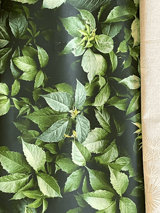
Sanderson(2023)Angel ferns. Available at https://sanderson.sandersondesigngroup.com/product/fabric/dmay221927/ [accessed 17 April 2023]
Sanderson(2023) Robins wood. Available at https://sanderson.sandersondesigngroup.com/product/wallpaper/dabw217225/ [accessed 17 April 2023]
School of stitched Textiles(2022) Textile Artist Inspired By Nature. Available at https://www.sofst.org/textile-artists-inspired-by-nature-you-have-to-follow/ [accessed 15 May 2023]
Tate(N/D)David Hockney, Lillies. Available at https://www.tate.org.uk/art/artworks/hockney-lillies-p06290[accessed 12 April 2023]
Tate (1995) Georg Baselitz. Available at https://www.tate.org.uk/art/artworks/baselitz-no-title-p77940 [accessed 27 March 2023]
Tate(1995) Georg Baselitz. Available at https://www.tate.org.uk/art/artworks/baselitz-no-title-p77969 [accessed 27 march 2023]
Tate(1995) Georg Baselitz. Available at https://www.tate.org.uk/art/artworks/baselitz-no-title-p77937 [accessed 27 March 2023]
Tate(N/D) Oriental poppies. Available at https://www.tate.org.uk/whats-on/tate-modern/georgia-okeeffe [accessed 15 April 2023]
Tate(2016)White flower. Available at https://www.tate.org.uk/whats-on/tate-modern/georgia-okeeffe [accessed 15 April 2023]
TextileArtist.org(N/D) Discover: Floral textile artists. Available at https://www.textileartist.org/textile-artists-inspired-by-flowers/ [accessed 20 May 2023]
TextileArtist.org (N/D) Textile artists inspired by architecture. Available at https://www.textileartist.org/textile-artists-inspired-architecture/ [accessed 13 March 2023]
Vouge(2019) A look back at some of Alexander McQueen’s most beloved and beautiful rose creations. Available at https://www.vogue.com/slideshow/alexander-mcqueen-rose-dresses [accessed 27 March 2023]
0 notes
Text
Final evaluation
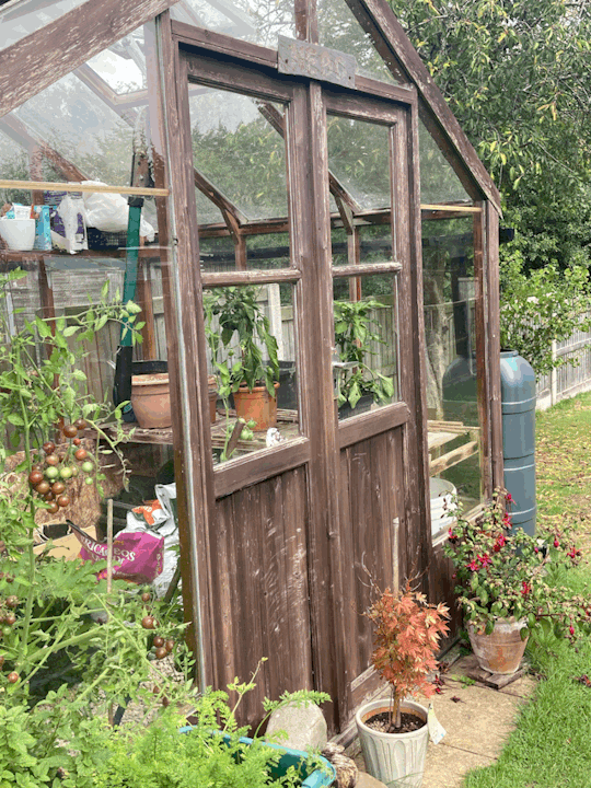
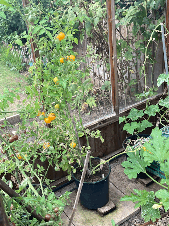
This module has been different from all the other as rather than been given a starting point this module was all about us. We were allowed to do this project on whatever we wanted to as long as it would suffice the whole 8 weeks and we were able to support it with research and samples. To start out this module I came up with a few different ideas as to what I though it could do my project on, from Charlie and the chocolate factor, architecture in my hometown Craven arms to my Grandads Garden. The one that I decided to go with was my Grandads Garden. I decided to go with this one because I felt that I would be able to do good secondary research from this and I knew that I would be able to get lots of primary research from it as well. I began this module by collecting primary photos of my Grandads Garden I took a variety of photos from the different flowers in his garden and then also the greenhouse. By collecting these images, it meant that I could begin mark making which I could then use as starting points for different motifs. I also took pictures of the greenhouse as I felt that if using the images for mark making the sharp lines of the greenhouse would be a nice contrast. Once I had collected all my images, I could then begin to use then for mark making.
After having played around with different mark making and creating different collages in my sketchbook I then had to begin to think about final outcomes. In terms of final outcomes, they could be whatever we wanted as long as we had the research and evidence to back it up. They were holding a competition with the back to backs museum in Birmingham where if our narrative linked to family, heritage etc then we could enter. As a textile student my brief was to produce a wallpaper alongside my sketchbook. I decided that alongside the wallpaper I would also aim to produce a range of fabric samples that could be used in interiors. To begin with I started out by creating different potential motif in my sketchbook using my images and the mark making that I created, by playing around with these in my sketchbook it allowed me to explore many different options before beginning with photoshop.
I began to do some secondary research into other interior houses to see what type of wallpapers they produce and to start gather some inspiration for my own. I started by looking through different interior magazines to see if I could find some wallpaper companies, I found one called OHPOPSI and the inspiration that I took from this company was their use of colour, what drew me into the wallpaper was all the bright colours and I knew that I wanted to use some bright colours within either my wallpaper or fabric samples. I didn’t just want to look at interior houses and wallpaper samples because I knew that I wanted to produce a range of fabric samples alongside the wallpaper. So, I started to look at different textile designers, I came across a designer called Rosa Andreeva and what I liked about her work was the little French knots that she adds to her work I felt as though that these added a nice amount of texture without being too much. I decided to add some to my smaller prints that I felt without anything were a little flat. In terms of my other prints that I had done I didn’t want to add embroidery into all of them because I felt that I wanted some more simple ones and because if the material of some of them I didn’t want to add anything. For example, on the voile (which was very sheer) I didnt want to add anything because I felt that it would have looked weird as you would have been able to see the stitches on the back. However, for most of them I did add in a small amount of either hand embroidery or free machine embroidery.
Throughout this module I feel as though I have further developed on my photoshop skills, I feel as though I have gained confidence on photoshop. Once my sketchbook pages were scanned in, I then had to play with them on photoshop. I started out by taking the shapes that were on the page and then refining then by smoothing them out and filing then I with a block colour. What I liked about having my designs on photoshop was that it meant that I could play around with different colours that weren’t necessarily on the original page, it also meant that I could play around with scale which allowed me to have some smaller scale prints and some much larger scale prints. In this module I also did some secondary research on people that I had used in previous modules, for example in this module I looked at Marimekko who I looked at in the trends module I looked at her for inspiration when prints my large-scale flower prints as prints like this is what she best known for.
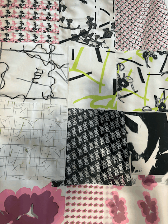
Overall, I am very happy with how my final samples turned out, imaged to produce three different wallpaper samples and a range of fabric samples. I think that if I were to have more time with this module, I would try to produce some different wallpapers, I feel as though if there were more time I could work on a different pattern and produce some samples that had different parts of the greenhouse and the garden in them. I also feel that if there were more time, I could have produced some more fabric samples in different materials, but I also feel that I could have experiment with my samples some more, for example I could have used some different techniques ie aqua film I could have cut into my samples and experimented in that way. I also could have added in some appliqué to them it would have been another way to add texture rather than just embroidery.
0 notes
Text
Finalising my final samples
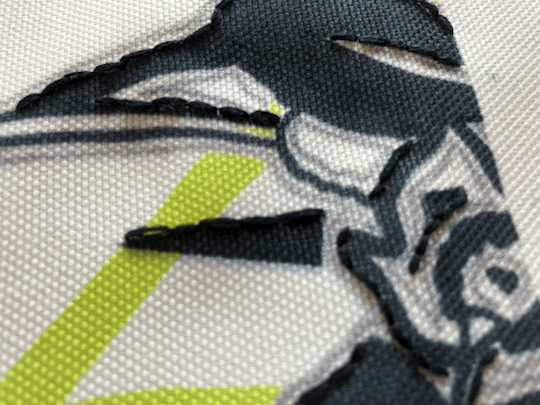
Once I was happy with all the embroidery that I had done to my final samples I had then had to neaten then all up. As the edges were all frayed and they were all very different sizes with wonky edges. To tidy them up I had to use something called invisible tape, and using a set square I had to draw a starting square and then place the tape over the line and cut it by doing this it meant that the edges of my samples would no longer fray and it also meant that they all look neat and uniformed.

Once I had done this to all my samples I began to play around with different layouts that I could potentially use in the final exhibition, I wanted to see which ones work well next to each other. By doing this is gave me a rough idea as to how I could potentially set it all out in the final exhibition.

When laying them out I knew that I wanted my two sheer ones layered on top of another one that way you get the full affect of them.


0 notes
Text
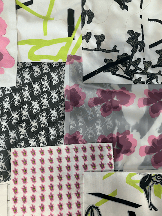
Developing my fabric samples.
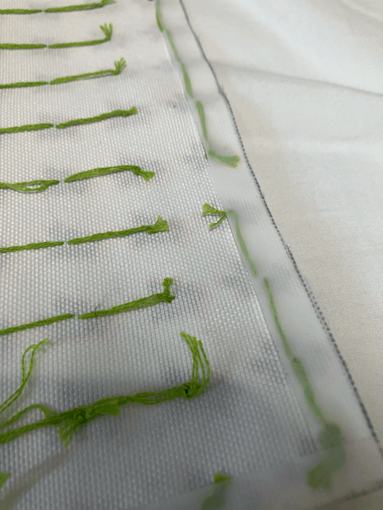
Once I had printed out all my different patterns and motifs I then wanted to begin to work into some of them. I feel that if I were to leave them all as they were then they would be very flat so by embroidering into some of them it would help to add texture. I dint want to embroider into all of them as I felt that some of them were fine as they were due to the print or the material that they were printed onto. For example this print of the vines and the greenhouse lines I didn't want to work into because this one had been printed onto the suedette solarno material which is velvet like and because if this I felt that material alone had enough texture and didn't need anything else.

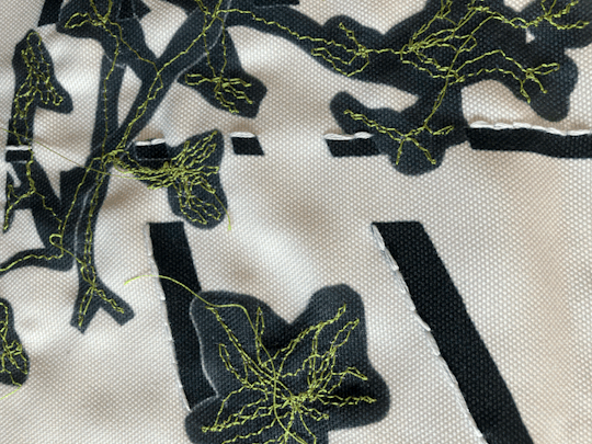
On this one of the ivy I decided to do both hand embroidery and free machine embroidery, to begin I started with the hand embroidery and I only wanted to do a small amount just to add some texture to the piece. I then took it up to embroidery and began free machine embroidering into it, I made sure to pick a green thread that was a close match to the green that is in my other prints and then just began work into with a zigzag stitch. I wanted it just look free and messy to represent the vines that are in the ivy in the picture.

I wanted to see if I could find a textile designer who uses machine embroidery. I found a textile designer called Gillian Bates and she uses machine embroidery to create landscapes from her home town.


What I liked about her work is the way she uses the stitch, I like how free it is and the texture that it adds. I also like how in some of them she leaves the thread and feel that on the ivy it could look cool to have some of the threads hanging.


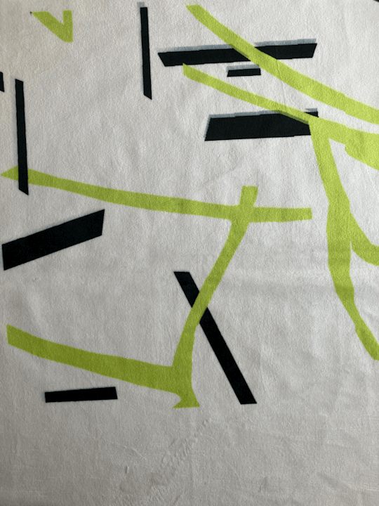
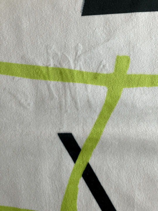
This print was based of the greenhouse lines so to add to it I decided to add in some green lines which I felt could represent the green tomato vines that are in the greenhouse, I also wanted to add in a small amount of pink to tie it in with my other samples.

For some of samples I didn't want to add anything to them for example with the small ivy print I didn't feel that it needed anything because I already felt that there was enough going on in the print. The same goes for the large bamboo black and white print I felt that it was enough on its own. I also think that it would be good to have some simple ones as it will give my sample range some variety.
I then wanted to do dome hand embroidery into some of them.


I only wanted to add a small amount of hand embroidery to this print. I felt that it was slightly flat so by adding in a small amount of embroidery it would lift it off the fabric slightly. I wanted to use a pink thread that was as close to the shade that I had used in the print, at first I was going to use a contrast colour of green but then felt that it would have been too distracting.

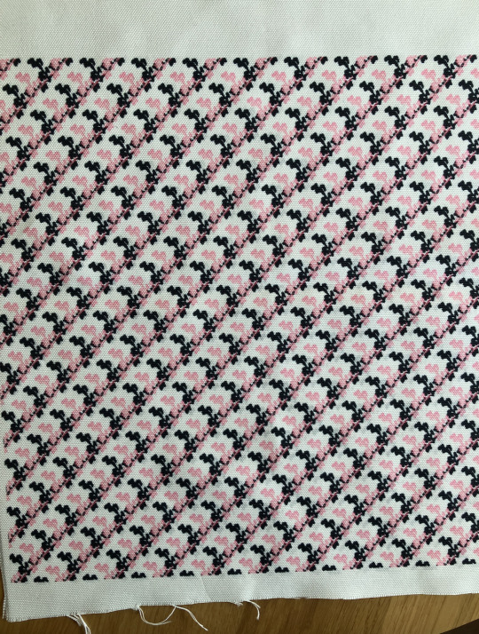
For this one, again I didn't really feel that it needed that much all I wanted to do was to highlight the flower pattern that is on it. To do this I used some black thread and just stitched around parts of the flower pattern.
0 notes
Text
Developing fabric samples.
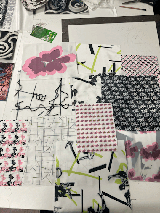
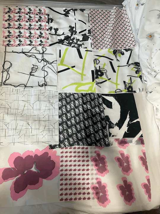
After developing my wallpaper samples I began to develop some fabric samples, along side my wallpapers as my final samples I will also have a range of fabric samples. to start with I had to pick the different materials that I would then sublimate onto. I decided to pick three different materials all of different weights and would be used for different things in interiors. The three that I decided to pick were all synthetic as I was using the heat press. They are a polyester voile (for my sheer fabric), a polyester suedette solarno ( which is a velvet like material the biggest weight ur of the three) and the final fabric was a polyester canvas Albany. I went with these three because I felt that between these I had a good variety of different weights.
In terms of the design that I printed I wanted to print a range of different ones I also wanted different scales, I knew that is I didn't use all of them as final samples I could put them in my sketchbook.


When experimenting with different scales I took inspiration from Marimekko who I had looked at in previous modules, I wanted to do a print similar to hers where she uses large scale prints and uses them in interiors and fashion.

What I like about the dress is the way that she has used the large scale print along side the smaller ones, I feel like I can experiment with this as I have printed some on a sheer fabric and that way I can layer them over each other to see how they look.


For my large pink flower print I didn't want to add to much to this one all I really wanted to do was add in some definition of the shapes within the print, again for the colours I wanted to use blacks and pinks as these are in my colour palette I didn't want to add in any other colours that didn't go with my prints or wallpapers. I felt that by simply adding in some definition to the flower it added some texture to it and maddest less flat.
I then decided to start to embroider into some of them because if I were to leave them as they are I think that could look flat. On the lines one I decided to stitch in some green, I wanted to pick a green that matched the green on my other prints and in my wallpaper. I felt that by adding in some green it represents the green vines in the greenhouse (which is were the lines came from).

I had found a textile designer called Rosa Andreeva who specialises in flora embroidery, I began to look at some of her work to see if I could get any inspiration from it as to what I could add to some of my prints.

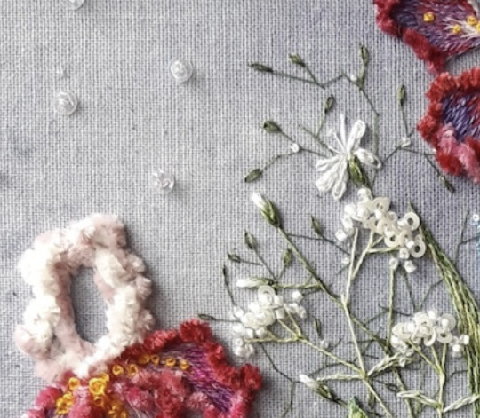
What I really liked about her work was the level of detail that is in it, and although I don't think I'm going to get that level of detail in mine, I can certainly take inspiration from certain sections of it. What I like is the little French knots that she has done and I think that I could do something similar on my smaller flower print as I feel like this one needs some texture added to it.


By adding in the French knots I feel as though it gives the print more more texture and makes it much more interesting to look at.
1 note
·
View note
Text
Getting some wallpaper samples and finalising my final ones.
After working on a bunch of different and potential wallpapers on photoshop I decided that I needed to pick some to print out so that I could see how they looked when they were printed onto actual wallpaper. I decided to pick the ones that I felt would look best as wallpaper and the ones that I felt I was more likely to pick as my final ones. In order to print the wallpaper it was done on a machine called Mimaki and all I had to do was upload my photoshop files onto the computer and then the machine printed them out.
Once the samples were printed I could then look at them and see what I needed toward on and how they actually looked on the wallpaper.
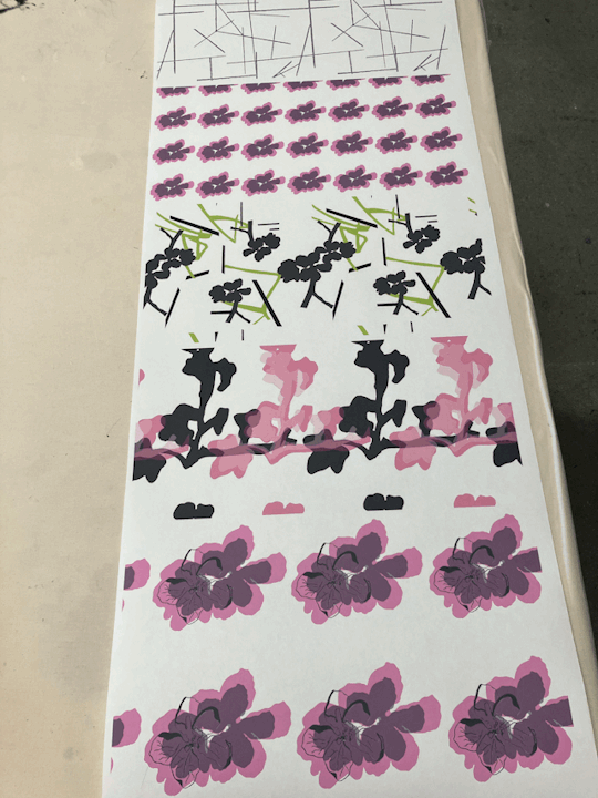
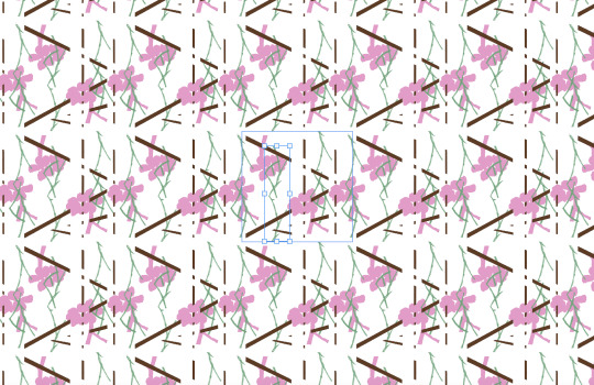
After looking at them on the wallpaper I realised that I needed to put the prints into half drop repeat as at the minute they are all just in repeat meaning that there is a lot of blank space so by putting them into half drop repeat it would cover some of the blank space. Also after seeing them printed put I think that I could combine some of them. I think that the lines and the pink flowers would look nice together. There are also just small things such as I need to get rid some little parts of my green one so that it lines up when put in a half drop repeat.
I found this example from a company called Graham&Brown, and this example you can see that there isn't a lot of blank space.

For mine by putting them into a half drop it would mean that there would be less blank space and it would fill the roll of wallpaper more.
After seeing them printed I began to continue to develop them on photoshop. I wanted to work on my green on as this was my favourite, I needed to get rid of some of the little bits at the bottom and then put it in a half drop repeat.
I do think that it looks much better as a half drop, I decided to leave some white space as I felt that if I filled it, it would have been to much whereas leaving the white space it gives your eyes a rest. I also wanted to work on mixing the lines and the pink flowers together.

I really liked how this one looked I liked how the lines added something to the background, when it was just the pink flowers even though I liked how they looked it looked I did think that there was a lot of blank space so by adding in the lines I think that it breaks it up.
I then wanted to work on a black and white one.
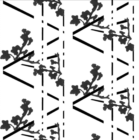
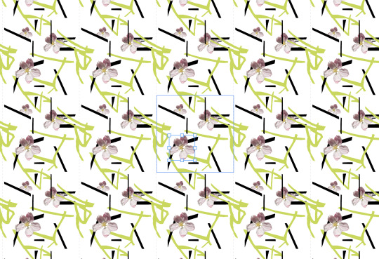
I wanted to use my thicker black lines and my ivy as these were both in my sketchbook and I really liked how they looked. Again I put this one in a half drop repeat. I did have to make sure the my ivy lined up when put in half drop and also had to make sure that the lines weren't touching the edges of the box as if they were then it wouldn't match up when out into half drop. Overall I much prefer how these look when put in half drop as I do think that have less white space and they line up nicer when repeated. I had decided on these three as my final ones to be printed, as I felt that these looked the best and they had the best variety of different parts of my Grandads garden.
0 notes
Text
Continuing development on photoshop.
Once I had a few samples on photoshop that were made from only my mark making and my motifs that I had done in my sketchbook I wanted to experiment with adding in some of my original photos. I had taken some samples of wallpapers from Dunelm to see how different companies use different motifs.

After looking at my samples that I had taken, I liked how the one that was all photos looked, and decided hat I wanted to experiment with using my original photographs in with my digital motifs.

Because this had the flower motif on it, I decided that I should add in the original image of the blossom. I put this into photoshop and then cut it out using the object selection tool. Once it was cut out I could then duplicate it and begin to play around with the placement.
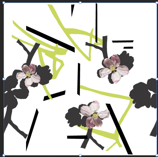
I really liked how it looked on this one I felt as though it almost looked as though the grey flower was a shadow of the original image and because of this I felt that it made it more 3d looking and added some texture to it. I then went to add the blossom onto my other print.
Again I liked how it looks on this one I feel as though it adds something extra to it and helps to break up the white that is on show in this one. However I do feel that with this one there is too much white and it does either need a background colour or some more parts to the motif.
0 notes
Text
Research- Interior magazines
I wanted to look at some interior magazines to see if they had any interior bits that were the same vibe I was going for. I found some pages in LivingETC and Elle Decor that I scanned in.

This was the back page of LivingETC and what I liked about this was not only the print which I feel is similar to the wallpaper that I'm trying to create, but also I like how it shows how the print can work in both interior ie being a wallpaper but also that it can work in fashion as being a garment. In the fashion piece I really like the scale of the print compared to the scale of it in the wallpaper behind her and is something that I want to experiment with looking at the impact that scale can have on a print.
I then looked some issues of Elle Decor,
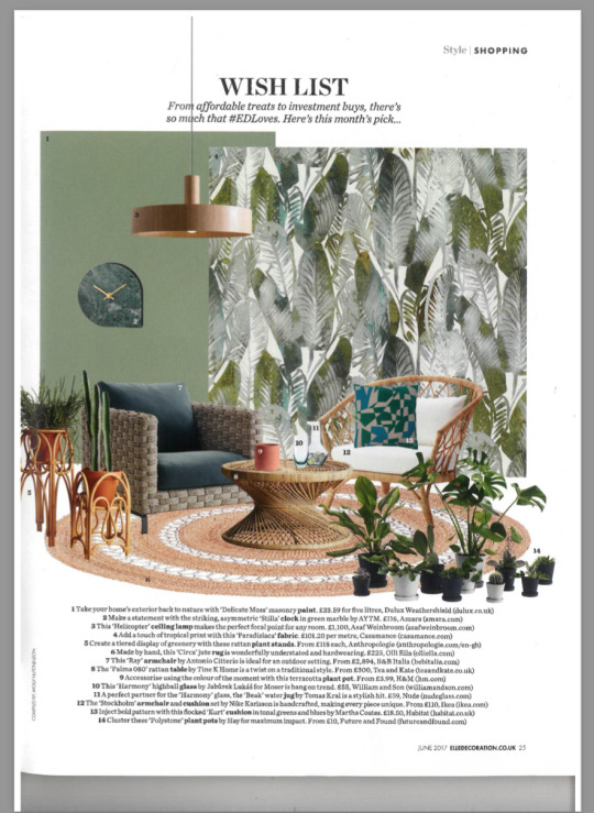
On this page I really like the colour pallet, and the way that its set out really shows how the wallpaper works. In terms of the wallpaper I really like the combination of colour I like how they have mixed grey in with green and I think it makes less in your face. I also feel that from this I can create my own colour palette, by having a colour palette it meant that all my samples will be connect and they will look like a set rather than just a bunch of miss matched samples
0 notes
Text
Pattern development
After the last print that I developed I wanted to se if I could work on it some more.

During it I decided that I really liked how just the vines and the lines looked so I wanted to see if I could take it further. What I felt that I needed to do to this was to try and conceal the square shape that you can see in this one.

What I decided to do take the vines and split the in the middle and then that way I hoped that they would line up when in repeat, I also split them and then put them at the top and the bottom of the square that way they would line up on all sides of the square.


I was very happy with how this one turned out, once I had played around with the scale and angle of it I wanted to see how it would look with a background colour. To get the colours that I would use for the background I decided to look at one of my original images.

I then used the eye dropper tool to get the exact different shades of pink that are in this image. I then used them as the background colours to the print.


Over all I really liked how all these looked with the background colour, I do think that I prefer the more lighter pink as I feel that with the darker shades it almost takes away from the lines and the vines and you're more so focusing on the darker background. I think for the darker background to work I would need to fill the square up a bit more I could try adding back in the flower motif to these ones to see how that would look as I feel that having more in the square would make the background less in your face.
0 notes
Text
Continuing my patterns
I wanted to take some inspiration from my sketchbook and see if I could turn one of my pages into a pattern on photoshop.

To begin with I put this picture onto my square in photoshop and used the polygon-laso tool to begin and cut around the vines. Once I had cut them out I then used the eye dropper tool to pick the exact green that was in my book as I really liked how bright this green was. I then did the same thing with lines that were in the background.
I actually really liked how just these two looked together when I put them into repeat I liked how simple this was. The only thing about this one is the fact that I feel like you can see where each square ends and starts so I do think that this needs some of the vines and lines to overlap of the edges so that they all link up.
I then added in the flowers and instead of them being black I decided to make then grey, because I felt that if the flower was also bald then you couldn't really see the lines in the background.
0 notes
Text
More repeat patterns on photoshop
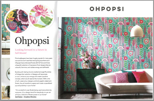
After looking at some other wallpaper companies and find some inspiration I wanted to try and do some where I use more colour as I really liked this one from OHPOPSI.
I decided to use the same print that I had done my first one but just add the colours.

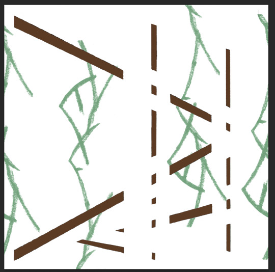
For the colours I decided to go with the colours that were in the original images, so for the green house lines I went with brown as that is the colour of my Grandads green house.
I then added in the vines and again I kept these green as that's the colour that I can see in my original image. I think what could be cool would be if I were to do one where I use the colours that are in the original images but use them on different parts so for example using the pink in the flower for the lines of the green house.
Similar to the first one I split the vine in half so that, that way when put into repeat you wouldn't be able to see the square as much.

After I had added in the pink flower I did think that potentially it looks a little flat, but I do think that the vines help to bring in the texture. But what I could do is try adding in some shadows onto the flower to see if that makes it more textural.

Overall I really liked how the coloured one turned out, I think that by adding I colour it complete changed the vibe of the print I think that the coloured one is much fun and playful where the black and grey one is more sophisticated and a bit more serious.
0 notes
Text
Research
I began to look through a book called Wallpaperdirect to see if I could find any wallpapers that could give me some inspiration.

I found this page and what first drew me in was the colour palette I really liked the blues and the greens but with the hint of orange, and is something that I have experimented with only having little pops of colour.

But what I really liked on this page was the print that is bottom right hand corner.
What I love about this wallpaper is the abstract shapes and I feel like this is very similar to some of the design that I have done where rather than having loads of detail I've just drawn the silhouette of the flowers and leaves.
In the same book I also found some others that I really liked.

I found this one by OHPOPSI and what I like about this one is all the bright colours. I feel at the minute all my samples have been very black and white but I do think I want to do some where I use all the colours. Another thing that I love about this one is the amount of different plants and flowers it has on it. This has inspired me, and I also want to experiment with designing some motifs where I use all of my different marking to see how that looks.
The final wallpaper that I found in this book that I liked was this one called 'Kelapa in pink'.

What I liked about these were the fact that in the leaves you can almost see the different layers through the different colours I like this because I feel as though it makes it more textural rather than it just being a green leave which could look quite flat. I also like the fact that in this wallpaper the background is pink. I want to do some samples where I use different coloured backgrounds to see the affect that this has, in this wallpaper I really like the pink and I feel as though if it were to be white there would be too much white whereas with the pink I think that it breaks it up.
0 notes
Text
Making repeat patterns on photoshop
In the lesson today I began by scanning in all my pages of my sketchbook so that way I could use them to begin to create some repeats patterns on photoshop.

I started by picking this print which represents the green house, I decided to start with this one because I felt as though this would make a nice background for me to then add different things and begin to layer things over the top. To begin with I had to play around with the fuzziness of it so that it cleaned up the background and I could then go in with the eraser tool to get rid of any other bits that I didn't want. Once I had cleaned it all up I them began to try and fit it onto a square which would the become my repeat. The issue that I had was that because the original print had been scanned in and it was a rectangle it meant that when it was in the square once put into repeat you see where it didn't line up properly. In order to fix it what I had to do was cut of all the parts that didn't fit in the square and then I had to make it smaller so that the edges of the lines weren't touching the edge of the box.
Once I had done this I could then begin to layer it up.

I knew that I wanted to use this silhouette because I had used this one in my book and really liked how it looked.
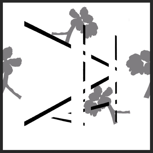
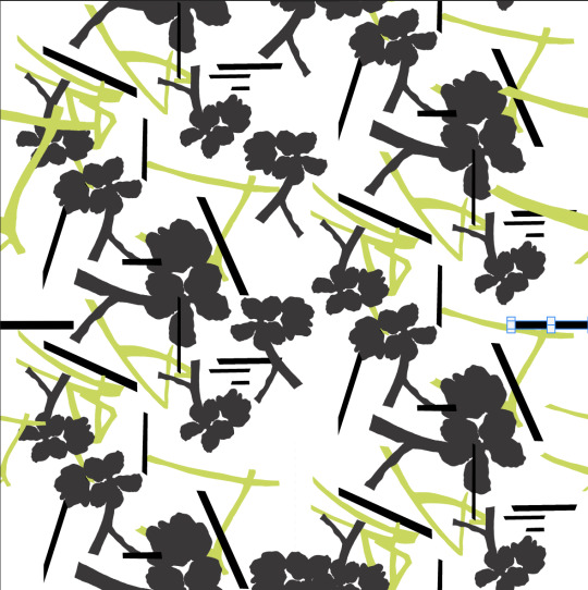
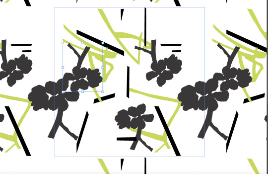
I added a colour overlay over it because I felt like if I were to keep it black you wouldn't be able to see the black lines in the background but I did like how in my book the black and white looked so I decided to go with grey, I do want to do some that are all colour to see who they look as well. With the flower I had also split it so that when its in repeat they line up and it fills the gap so you can't the square as much.

I then wanted to add in some of the vines, at fist I had placed all the vines on top of the motif but I felt that they were just toon much so I decided to just cut out one of the vines and have that on my print.

Similar to the flower I decided to split the vine down the middle that way when put into repeat the vine would line up. I decided to make the vine green because as much as I liked how it looked black and white I felt that because the vines were such pale grey you couldn't really see them when it was in repeat.
One I had it in repeat I could then begin to play around with the scale.
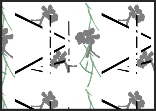


I really like how they all look, but I think that I prefer it when its bigger just because I think that with the smaller one it slightly harder to see all the details and it also makes my eyes go funny when looking at it where as with the bigger one you can see all the detail. I feel as though this print would look really nice as a fabric sample ie for a pillow case.
0 notes
Text
Printing
In the lesson today I began to work on taking my motifs that I had had created in my sketchbook and wanted to start to print then to see how they would look on fabrics. By doing them on fabric I can then scan them in to photoshop and begin to play around with them to see how they would look as wallpaper samples. I could haver just done them all digitally but I felt that it could look very flat and I don't then feel that it keeps with my narrative as I want all my samples to have some texture.


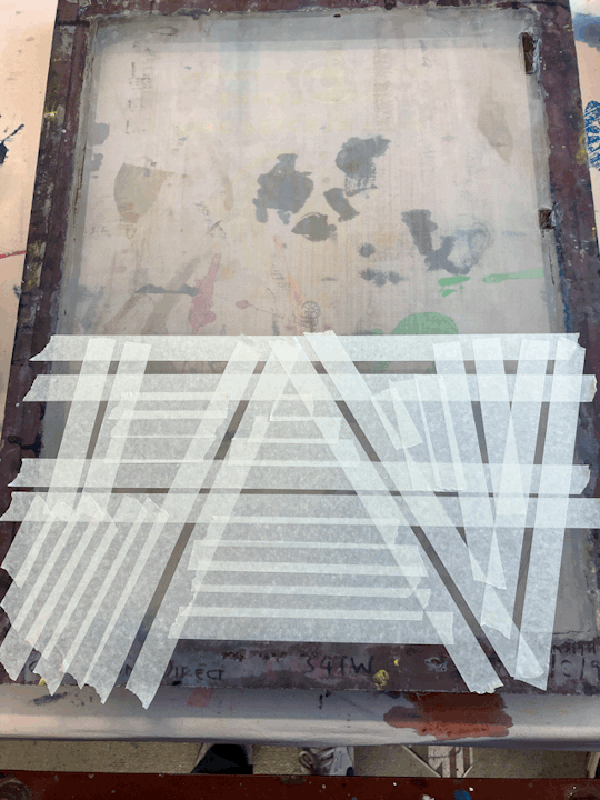
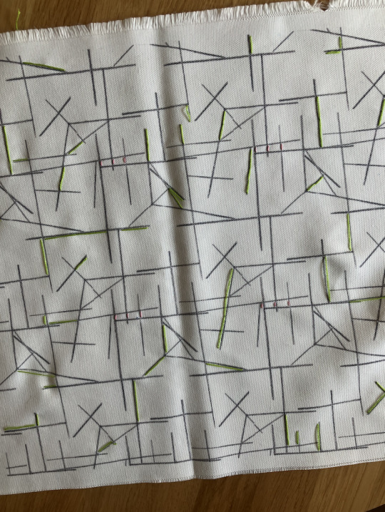
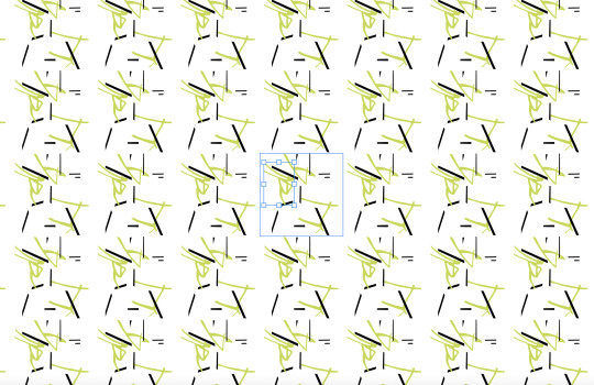
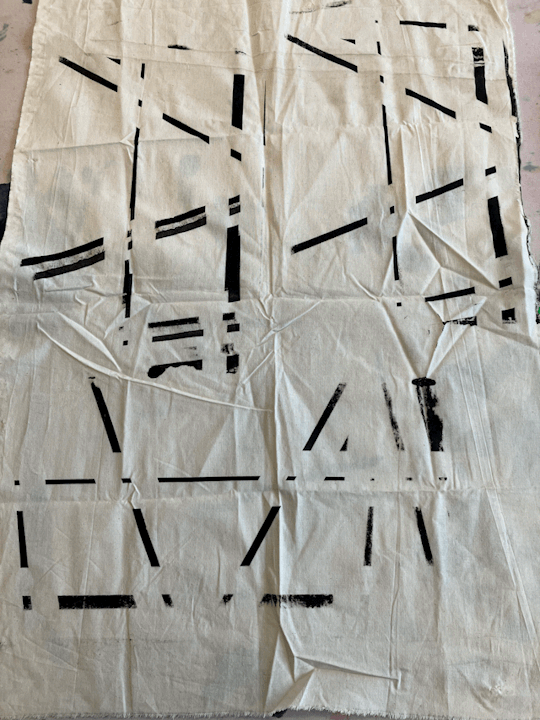
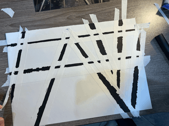
I started by taping up a screen so that I could recreate the green house lines that I previously done with paper and pens. I had to tape off all the areas where I didn't want the black to come through.
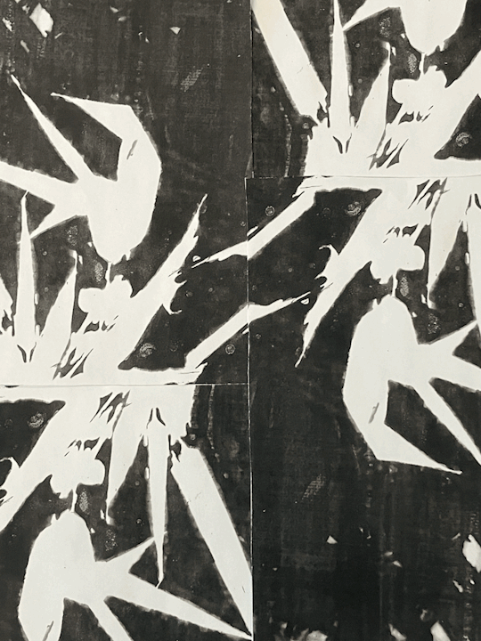
I then went on to begin to cut out some stencils off the flower shape and the vines that I wanted to print.

I decided that I wanted to print the vines in green, at first I was going to do it all in black but felt that potentially you wouldn't be able to clearly see the difference in the lines so by doing it in green you can clearly see the difference and contrast in the lines. For my flowers I really liked how the black silhouette looked, and knew that I could edit it on photoshop later if I wanted to play around with colours. I also feel like I could embroider into this now to help build up the texture in the vines and on the flowers. I do think that the only downside to screen printing is that I loose the sharp defined lines that I get on the computer, so potentially for final samples I may keep them digital that way I can keep them looking crisp.
0 notes
Text
Continuing to develop my motifs
In the session today I was continuing to develop my motifs in my sketchbook. Using the mark making that I had refined I wanted to try and develop as many different motifs as I could so I began to play around with layering my imagery on top of one and other.

I began to look at how I could use them together, I had drawn out the silhouette of my flower drawing and then I thought I could draw another one out on tracing paper that way when I layer them on top of each other I could see how they work. I really liked how this looked, I like the way that the dark silhouette and the more delicate drawing go with each other I feel like they contrast each other really well. I do however feel like if I were to go on and refine this I would need it to be on some sort of background for example I think that this flower would look nice layer with the mark making that I had done looking at my grandads green house.

With this one I decided to take it into photoshop and see if I could create a repeat print with it.

0 notes
Text
Development
I wanted to begin to develop and refine some off initial mark making so that I could potentially use them as part of my prints.

I stared to look at my mark making that I had done from my Grandads green house and I wanted to refine the lines in it. I felt that if I were to make them more sharp and straight that way when I go to line them up they would match. I also feel like at the minute there is to many lines so if I were to make this a background it would be too busy and might potentially take away from the different layers I build up. So I decided to use my graphite stick and a ruler in order to create the sharp lines.


This is how it looked, I think that this looks really nice, I prefer that its much more simple and I think that this would work much better as a background for me to build on top off.

I then went on to look at this photo of another green house structure, and I wanted to see if could create some more sharp lines.


Because I wanted the lines in this to be thicker as they are in the picture I decided to use masking tape to make sure that my lines were sharp and clean. Once I had filled in all the lines I waited for it dry and the peeled it off.


I went on to look at another picture at a different angle and used the same tape technique, the good thing about using the tape is that's its also something that I can do on a bigger screen if I were to screen print them.

0 notes
Text
Research-
I wanted to look into Georgia O'Keeffe who we spoke about in my presentation pitch. She is best known for her enlarged painting of flowers. What I like abut her work is the level of detail that are in her pieces.

I also feel like although its just a painting I feel like you can see the movement in it. This is something that I definitely want to create within my wallpaper as I don't just want to create a simple flowery wallpaper I want to create something is different, so being able to create movement within my motifs will mean that there will be movement in the wallpaper. I also really like the level of detail in her pieces.

I feel like similar to Florence Manlik I need to do some more detailed drawing of the flowers that way I feel like they will constant the more abstract mark making that I have created. By being able to show that I can draw some more detailed flowers I feel like this will be able to show my full range of skills as I don't just want to do abstract mark making I want to be able to show that I can do more detail. I also feel that because my final pace isn't just going to a wallpaper I'm hoping to create some fabric samples for different interiors along side it, I feel like maybe have some abstract fabric samples and then some more detailed ones will contrast each other nicely.
0 notes